#the smaller q is the bigger is the difference in the ratios
Note
Hello! I just saw your cat colors master post and you seem very knowledgeable on the subject so I have a question. I was reading about the O/o gene for a little school assignment to talk about X linked genes. And since male cats only need one X to show orange color or black color. Wouldn't there be more orange and black male cats than female cats? I always hear people say an orange cat is more likely to be male than female but I never hear people say a black cat is more likely to be male than female. Is there some way for cats to be black that isn't linked to the O gene that changes the ratio of female to male black cats? Or are people just not noticing the ratio in black cats vs orange cats for some reason?
Yes, you're right, there are more black males than females, because the tortoiseshells are diminishing the numbers of both the black and and the red females.
Let's calculate the ratios; let p be the frequency of the black and q is the red allele. (This is also their probability: if you choose a random allele from the cat population, it'll be black with the chance of p and red with the chance of q.)
Black male: p/2 (1/2 of all cats are males and with p chance a male cat has the black allele therefore he is black)
Red male: q/2 (similarly)
Black female: p²/2 (both of her alleles need to be black, so we need to choose twice)
Red female: q²/2 (similarly)
Tortoiseshell female: pq (we need to choose a black and a red allele, and we can do it in two orders, so this is actually the more simple form of 2pq/2)
Let's check: p/2 + q/2 + p²/2 + q²/2 + pq = (p+q+p²+q²+2pq)/2 = 1, because p+q=1 and p²+2pq+q²=(p+q)²=1²=1. Good.
What could be the frequency of the red allele? I don't know, but for the sake of simplicity let's say it 0.2 (so every fifth male cat is orange).
Black male: p/2=0.8/2=0.4 (40%)
Red male: q/2=0.2/2=0.1 (10%)
Black female: p²/2=0.8²/2=0.64/2=0.32 (32%)
Red female: q²/2=0.2²/2=0.04/2=0.02 (2%)
Tortoiseshell female: pq=0.8*0.2=0.16 (16%)
So this means the male:female ratio in red cats is 10:2=5:1 (for every five males there's one female), while in blacks 40:32=5:4 (for every five male there're four females).
You see why it's much easier to notice.
#if we stay with p and q#reds: m:f=q:q^2=1/q#blacks: m:f=p:p²=1/p#the smaller q is the bigger is the difference in the ratios#if p=q=0.5 then the difference is gone#ask and answer#cat genetics#orange
25 notes
·
View notes
Photo

All-terrain tires are the coup de foudre of the internet. They’re neat, conspicuous, and multifunctional. We like to think of them as the one thing that all travelers and racers love to have. They work on every terrain imaginable; from wet to dry and even snowy.
Best all-terrain tires use a series of clever tread markings to fair every land, while others focus more on the strength of the rubber.
For your convenience, we have prepared a list of the 10 best all-terrain tires available on the market, followed by an in-depth look into what makes these tires stand out.
BFGoodrich All-Terrain Radial Tire
The BFGoodrich has one of the best designs that we have seen. It uses wideset sipes and extra hard rubber to give you maximum control and suspension even on the toughest terrains. The extra thick rubber only helps to keep the tire safe during rocky rides.
We recommend the BFGoodrich for riding on mountain and sandy terrains, but ultimately the tire can work for any and all surfaces. The rubber has been formulated from special chemicals and compounds to reduce wear and tear even when on hard crusty gravel.
The rim of the tire has been embedded with premium quality tread patterns. This is a computer generated design, and helps to keep gravel, microparticles, dust, mud, water, and snow from accumulating in the ridges. Even the sidewall has tough bold markings to prevent this.
The BFGoodrich uses three-dimensional sipe technology, and the sidewall has hard rubber blocks protruding out. Coming on to the size and speed specs, this model has a width of 285 mm and a sidewall height aspect ratio of 75%.
The radius of the tire is 16 inches, perfect for smaller trucks, jeep, and SUVs. The speed index is an all-time low R (170 Km/h) and the weight load index is 126 (1700 Kg/tire).
Hankook DynaPro ATM
The Hankook DynaPro is the best example of how dynamic this brand really is. It features a wraparound tread technology and a tough new formula. All of this only enhances your mobility and control skills.
Speaking of mobility, have you ever been driving a truck and get a piece of rock stuck in your tread? That happens often. The DynaPro overcomes this problem by keeping its ridges deep and wide, allowing enough traction while also keeping out any unwanted pebbles.
The tread extends into the sidewall, with rubber blocks protruding out to keep you grounded and balanced. The Hankook DynaPro also makes use of two-step sipes to increase lifespan and performance of the tire. Sure enough, regardless of the road, the DynaPro can traverse it all.
This tire has a speed index of T (190 Km/h) and weight load index of 106 (950 Kg). This makes it optimal for light trucks and bigger wagons or SUVs.
The speed is a bit faster than other tires, which shows that it won’t work well with heavier vehicles. We recommend it for all types of small trucks, vans, carriers, minibusses, and SUVs.
Toyo Tire Country
Toyo Tire uses the best and most loved silica tread compounds. The tires have excellent mileage and can withstand all sorts of weather and terrains. Now running on water or on snow was never easier.
The Toyo Tire is best known for mud terrain and off-road traction. Usually, with almost every tire optimized for water and snow, most people forget that dirt traction is a complicated task too.
This tire has a 3-layered polyester tread compound embedded with refined silica to give it a characteristic strength and shine. The tread pattern itself is open enough to lower accumulation of mud and water.
The tread blocks are for the most part hook-shaped and extend over to the sidewall. This helps give extra traction, as the sidewall can occasionally lose balance or drift. Another great feature to note is the deep siping on either side, giving it better traction on water.
Toyo’s tires are made for heavier vehicles of at least 20 inches wheel radius. However, the speed rating is Q (160 Km/h) and the load index is 121 (1450 Kg). This makes it perfect for heavy trucks and SUVs or snowmobiles and dirt vehicles.
However, since the speed is very low and the weight index is high, we do not recommend the Toyo Tire for passenger or tourist cars or trucks.
Buying Guide For The Best All-Terrain Tires
If you like our top 10 list but can’t decide which one to choose, or if you want to choose a different brand altogether, then read on. We’ve prepared a list of the most important things to look for in an all-terrain tire.
Get The Right Size
Many people don’t even know what those numbers and letters on the side of the tire mean. An example would is: 225/65 R 15 91 V. These markings represent the width, aspect ratio, layer arrangement, radius, weight load index, and speed rating of the tire respectively.
The Difference Between All Season And All Terrain Tires
So you may have heard the words “all season tires” and “all-terrain tires” quite often, and thought that tire is essentially the same thing. Most people do. After all, the only issue that tires face in the different season is the terrain, right?
What’s the difference between a winter tire and a tire optimized for snow? While the two may correspond in terms of terrains, they are certainly two very different categories and should be treated as such.
All season tires are optimized for the season. They are usually capable of not only traversing the terrain but also overcoming obstacles caused by temperature drop and pressure. So a summer tire is not just designed to work on sand and dry roads, but it has special mechanisms to overcome heat, bursts, and friction.
Conclusion
To conclude, you can benefit from an all-terrain tire in all situations, surfaces, and even in any weather. From our top 10 list, we have no personal favorites. You can pick out anyone that you like. If not, then consult our buying guide to learn more about how to choose the best all-terrain tires. Our guide should be able to inform you enough.
So there you have it. The top 10 best all-terrain tires and how to buy them. We hope you enjoyed our list, and stick around for more great lists just like this one.
4.7
1 note
·
View note
Text
50.17 Percent Profits in 75 Trading Days: The Success Story of RvR Ventures!
Forex, also known as foreign exchange, FX or currency trading, is a decentralized global market where all the world's currencies trade. The forex market is the largest, most liquid market in the world with an average daily trading volume exceeding $5 trillion a day, which much more than the volume on the New York Stock Exchange.
Also, the most traded currency is the US dollar, which features in nearly 80% of all forex trades. Nearly 90% of forex trading is speculative trading. The majority of foreign exchange trades consist of spot transactions, forwards, foreign exchange swaps, currency swaps and options. However, as a leveraged product there is plenty of risk associated with Forex trades that can result in substantial losses.

Interestingly - challenging the risk-reward ratio & trading frequency of the biggest Forex Traders & Portfolio Managers in the world, RvR Ventures achieved 50.17% profits by trading on Real ECN Account of $ 1 Million. The traders of RvR ventures traded pairs like XAUUSD, EURUSD, GBPJPY, GBPUSD, EURGBP and other cross currency pairs on Real ECN accounts with 1:500 leverage through automated & manual mode of trading based on the algorithms developed by RvR Ventures & a Dubai Based Indian Cryptographer & Forex Trader.
As per the data verified by us on the Track Record Verified & Trading Privileges verified portfolios of RvR Ventures on MyFxBook.com: (Link: https://www.myfxbook.com/members/rvr005/2739956)

RvR Ventures achieved a total gain of 50.17% on their portfolio RvR005 with a daily gain of up to 0.39%, Monthly gain of 12.62% with a drawdown of 44.5% only. Total profit of $ 5,02,116 was booked in 75 Trading Days / 3 months (15 October, 2018 – 27 January, 2019) on a total portfolio size of 1,000,000$ with 83% accuracy on 2,067 trades with 20,876 lots executed during this span on their portfolio RvR005, a Real – ECN account with 1:500 leverage.
RvR Ventures achieved profit returns ranging from 68.44%- 5.78% on their various accounts. A total profit of $ 3,473,648.50 was booked with a daily gain of 0.30 % & monthly gain of 12.64% at an average trading accuracy of 71% on total 46,811 trades executed with 66.579 lots on their portfolio through manual & automated trading as seen in Image 2.
Q&A with Mr. Kevin Albuquerque, Chief Trading Officer - RvR Ventures.
How can a trader make profits safely in highly volatile & high-risk market?
"How much can I make as a trader"? This is one of the first questions that many people ask me followed by "How long will it take"? Each person is unique in their goals. Some traders want to make millions while others want to improve their financial situation and enjoy the flexibility of Forex trading. Forex Trading has unlimited possibilities. Hence one should not be greedy & should be patient enough to focus, calculate & mitigate the risk while booking / planning profits in highly volatile currencies in Forex Trading. We took less than 5% risk on the basis of our automated trading algorithm & achieved upto 68% profits in 75 trading days.
What is the trading strategy of RvR Ventures?
We at RvR Ventures focus on profits & work on profit sharing basis only without charging any handling charges, service charges, trading commissions or fund management charges. We started working on our algorithms in 2008, so that we can trade with maximum accuracy by minimizing the risk to achieve higher profits in any type of volatile markets & on any currency pair in Forex. Making our offering a win-win situation, our proposal is very simple: We earn only if you earn.
Explaining further with more insights, Mr. Kevin Albuquerque said, "The Forex is a highly leveraged market, with typical leverage ratios ranging from 1:100 to 1:1000. If you use the maximum available leverage, your account can be wiped out in a matter of seconds when the market moves against you. I generally prefer leverage of 1:400 - 1:500. In addition, I always make sure that total risk taken by me doesn't exceed more than 10% of total portfolio size in the very beginning. Once the profits in the first few trades are booked, we generally take calculated risk on the profits earned only, keeping the principal amount entirely safe. Most of the trades opened by us are closed the same day to minimize the risk on the principal/profit amount in case of sudden one directional volatility.”
Is Forex Trading A Gamble?
All trading appears as speculative as to be little more than legalized gambling. There are no guarantees and making a profit on the exchange seems a totally random matter. The reality is that successful Forex trading is a highly skilled business that is not like betting at all. A common misconception is that Forex is gambling, but I personally do not consider it gambling. If you want to be successful at trading currencies, you need to take a Forex related course, need to be actively updated regarding latest market trends, market conditions, political – economic current affairs, economic data & economy of various countries.
Does Forex Broker play an important role in Forex Trading?
Yes, definitely, the trading platform provider & Forex brokers play an important role in the same. The tight spreads, negligible slippage and timely execution of trades always boost the confidence & accuracy of a Forex Trader, hence we always & only work with Regulated Forex Brokers.
What do you prefer: Smaller Lots – Higher Profits or Bigger Lots – Smaller Profits?
Recently, we were able to book up to 2,100$ per trade’s profit on lot sizes of just 0.30 in sequence, repeatedly and on the other hand, we also booked 1,14,000$ profits in 48 trading hours by trading on lot sizes of up to 100.00 each. It doesn't matter whether a trader trades on big or small lots, what matters is how much profit he is able to book on the same & in how much time, without holding any floating losses.
Smaller the lots, lesser the risk, however, to book 20x or 30x profits on small lot sizes you need to have accurate and in-depth knowledge about markets, volumes, moving averages, pair range, market sentiments, pivot points, resistance & support of a particular pair on which you are trading. On the other hand to trade on higher lots ranging from 25.00 to 100.00 each to achieve higher profits in few minutes, you need to be more alert, very cautious & accurate on your strategy. A movement of 1000 pips can instantly make your account stand in a floating loss of 100,000$ in minutes!
What makes your automated trading more efficient & accurate?
We have integrated more than 132 parameters including OHLC, market sentiments, volumes, Live News based volatility factors, EMA, SMA, Pivot Point based volatility assumptions, Momentum, Summary of various successful indicators, Technical Analysis, Fundamental Analysis, RSI, Fibonacci Retracement, SL TP ratio, Session-Based Volatility Calculations, Ascending, Descending, Symmetrical - Triangle Strategy, Head & Shoulder Strategy & Dynamic support & resistance trackers in a single algorithm to achieve utmost efficiency, trading accuracy & right point of entry & exit in different pairs of currencies in Forex Trading through our automated Trading & Forex Trading Strategy Algorithm.
Do you also offer Training?
Yes, recently we have started training courses for the candidates who qualify for Forex Trading. We offer extensive technical & fundamental analysis based real-time training sessions on Real ECN accounts for more than 2500 trading hours. This prepares the candidates to trade with higher accuracy in highly volatile markets. In addition, we also offer the option to experience our automated trading strategy as a guide in the learning process.
What are your future expansion plans?
We are now planning to expand our Portfolio Management Business in different countries of the world, by offering the option to copy our trades on Social Trading of various regulated Forex brokers which will help beginners, experts & professional Forex Traders, to minimize the risk & maximize the opportunity of returns on investment in Forex Trading. We have no plans to sell or reveal our automated trading robots, strategy & trading algorithms to any party.
1 note
·
View note
Text
Dell S2422HG Review: Premium 24" Curved Gaming Monitor
Dell S2422HG
8.50 / 10
Read Reviews
Read More Reviews
if(window.reviewItemsImgs == undefined){ window.reviewItemsImgs = []; } window.reviewItemsImgs['1Img1'] = "" <div class=\"body-img responsive-img img-size-review-item\" > <figure> <picture> <!--[if IE 9]> <video style=\"display: none;\"><![endif]--> <source media=\"(min-width: 1024px)\" sizes=\"755px\" srcset=\"https:\/\/static3.makeuseofimages.com\/wp-content\/uploads\/2021\/06\/Dell-S24HG-OSD-Menu.jpg?q=50&fit=contain&w=755&h=430&dpr=1.5\"\/> <source media=\"(min-width: 768px)\" sizes=\"943px\" srcset=\"https:\/\/static3.makeuseofimages.com\/wp-content\/uploads\/2021\/06\/Dell-S24HG-OSD-Menu.jpg?q=50&fit=contain&w=943&h=540&dpr=1.5\"\/> <source media=\"(min-width: 481px)\" sizes=\"727px\" srcset=\"https:\/\/static3.makeuseofimages.com\/wp-content\/uploads\/2021\/06\/Dell-S24HG-OSD-Menu.jpg?q=50&fit=contain&w=727&h=425&dpr=1.5\"\/> <source media=\"(min-width: 0px)\" sizes=\"440px\" srcset=\"https:\/\/static3.makeuseofimages.com\/wp-content\/uploads\/2021\/06\/Dell-S24HG-OSD-Menu.jpg?q=50&fit=contain&w=440&h=250&dpr=1.5\"\/> <!--[if IE 9]><\/video><![endif]--> <img width=\"4008\" height=\"2682\" class=\"lazyload\" alt=\"dell-s24hg-osd-menu\"\/> <\/picture> <\/figure><\/div>""; Read More Reviews
if(window.reviewItemsImgs == undefined){ window.reviewItemsImgs = []; } window.reviewItemsImgs['1Img2'] = "" <div class=\"body-img responsive-img img-size-review-item\" > <figure> <picture> <!--[if IE 9]> <video style=\"display: none;\"><![endif]--> <source media=\"(min-width: 1024px)\" sizes=\"755px\" srcset=\"https:\/\/static3.makeuseofimages.com\/wp-content\/uploads\/2021\/06\/Dell-S24HG-Back-View.jpg?q=50&fit=contain&w=755&h=430&dpr=1.5\"\/> <source media=\"(min-width: 768px)\" sizes=\"943px\" srcset=\"https:\/\/static3.makeuseofimages.com\/wp-content\/uploads\/2021\/06\/Dell-S24HG-Back-View.jpg?q=50&fit=contain&w=943&h=540&dpr=1.5\"\/> <source media=\"(min-width: 481px)\" sizes=\"727px\" srcset=\"https:\/\/static3.makeuseofimages.com\/wp-content\/uploads\/2021\/06\/Dell-S24HG-Back-View.jpg?q=50&fit=contain&w=727&h=425&dpr=1.5\"\/> <source media=\"(min-width: 0px)\" sizes=\"440px\" srcset=\"https:\/\/static3.makeuseofimages.com\/wp-content\/uploads\/2021\/06\/Dell-S24HG-Back-View.jpg?q=50&fit=contain&w=440&h=250&dpr=1.5\"\/> <!--[if IE 9]><\/video><![endif]--> <img width=\"3975\" height=\"2659\" class=\"lazyload\" alt=\"dell-s24hg-back-view\"\/> <\/picture> <\/figure><\/div>""; Read More Reviews
if(window.reviewItemsImgs == undefined){ window.reviewItemsImgs = []; } window.reviewItemsImgs['1Img3'] = "" <div class=\"body-img responsive-img img-size-review-item\" > <figure> <picture> <!--[if IE 9]> <video style=\"display: none;\"><![endif]--> <source media=\"(min-width: 1024px)\" sizes=\"755px\" srcset=\"https:\/\/static3.makeuseofimages.com\/wp-content\/uploads\/2021\/06\/Dell-S24HG-Lowest-Angle.jpg?q=50&fit=contain&w=755&h=430&dpr=1.5\"\/> <source media=\"(min-width: 768px)\" sizes=\"943px\" srcset=\"https:\/\/static3.makeuseofimages.com\/wp-content\/uploads\/2021\/06\/Dell-S24HG-Lowest-Angle.jpg?q=50&fit=contain&w=943&h=540&dpr=1.5\"\/> <source media=\"(min-width: 481px)\" sizes=\"727px\" srcset=\"https:\/\/static3.makeuseofimages.com\/wp-content\/uploads\/2021\/06\/Dell-S24HG-Lowest-Angle.jpg?q=50&fit=contain&w=727&h=425&dpr=1.5\"\/> <source media=\"(min-width: 0px)\" sizes=\"440px\" srcset=\"https:\/\/static3.makeuseofimages.com\/wp-content\/uploads\/2021\/06\/Dell-S24HG-Lowest-Angle.jpg?q=50&fit=contain&w=440&h=250&dpr=1.5\"\/> <!--[if IE 9]><\/video><![endif]--> <img width=\"3432\" height=\"2296\" class=\"lazyload\" alt=\"dell-s24hg-lowest-angle\"\/> <\/picture> <\/figure><\/div>""; Read More Reviews
See on best buy
If you're looking for a gaming monitor with great specs, and don't mind having a curved screen that's more for style than practicality, the Dell S2422HG is worth checking out.
Key Features
165Hz Refresh Rate
1920 x 1080
1ms (MPRT)
4ms Gray-to-Gray (Super Fast mode)
Tilt -5° / 21°
Height Adjustable 100mm
Anti-glare with 3H hardness
AMD FreeSync
Specifications
Brand: Dell
Resolution: 1920 x 1080p
Refresh Rate: 165Hz
Screen Size: 23.6"
Ports: 1 DP1.2a, 2 HDMI 2.0, 3.5mm Audio
Display Technology: LED, 1500R Curved Screen
Aspect Ratio: 16:9
Pros
Picture custom settings
Great for FPS games
Height and tilt adjustments
Sleek and compact design
Cons
No HDR
Premium price tag
Curved screen isn't a game changer on smaller screens
Buy This Product
Dell S2422HG best buy
Shop
// Bottom
Are 24" gaming monitors like the Dell S2422HG a good fit for you? They offer several features making them best for serious gaming, especially FPS games when you need to see all the action at once, but perhaps not the best for productivity.
Dell's new S2422HG is a curved gaming monitor that packs impressive specs, features and looks, but with its more premium price tag, does it offer enough to stand out from competing 24" models?
youtube
Many gaming monitors either tend to be too "gamey" with their red accents and ostentation branding, or rather cheap and bland with thick bezels and minimal adjustments. The Dell S2422HG takes a rather unique direction offering users a sleek design and great height and tilt adjustments, without feeling over the top or looking out of place.
Dimensions & Weight
As life resumes and we can go back to playing games together in person, fans of LAN parties will appreciate the portability and size of this slim monitor. The monitor itself weighs less than 10 pounds with its stand. If you keep the original packaging and box it came in—which is probably the easiest and safest way to pack and travel with this—you're looking at a total weight of about 16 lbs.
With Stand: 21w x 7.5d x 13.8h inches; weight 9.4 lbs.
Without Stand: 21w x 3.5d x 3.5h inches; weight 7.4 lbs.

Connectivity & Controls
Similar to most other monitors, the Dell S2422HG houses its ports directly behind the screen and facing downwards. There is plenty of space between the monitor's stand and the ports allowing you to easily attach and remove cables without needing to flip the monitor around.

In the box, you only get a single DisplayPort cable. Unfortunately, if your PC or device only supports HDMI, as is most common, you'll need to provide your own HDMI 2.0 compatible cable. With this monitor carrying a higher price tag to competing models, this is one area I would have expected Dell to go the extra step to include a wide selection of cables to ensure it is compatible for all users out of the box.
OSD & Customization
The OSD (On Screen Display) is controlled by a joystick and a series of buttons running vertically behind the right side of the panel.

They take a bit to get used to as you can't easily see or identify which buttons you're hitting. When the OSD menu is up, there are visual indicators on the right-hand side of the screen which help you navigate more easily. I still would have preferred if all the buttons were on the right side of the panel where I can physically see them, as opposed to hidden behind.
Dell includes a handful of gaming features like Dark Stabilizer to enhance visibility in dark areas as well as an FPS Counter if you prefer those figures directly reported from the monitor rather than in-game or 3rd party software.
AC Input
Thankfully the power inverter is built into the monitor and you only need to plug a single cable to power it up. No additional power supplies need to be hidden away. The monitor is relatively efficient consuming only about 0.2w in standby and a max of 37w when in use.
HDMI 2.0 (x2)
If you do not have a compatible device that supports Displayport, you can still connect using the other two HDMI 2.0 ports. Again, it's a bit odd that an HDMI cable is not included with your purchase.
Displayport 1.2a
While this Displayport does have more bandwidth than its HDMI ports, there shouldn't be any noticeable difference or benefit to using it as both support this monitor's max resolution of 1080p 165Hz.
3.5mm Headphone Jack
The Dell S2422HG doesn't have built-in speakers, but you can still output your audio over HDMI or Displayport from your PC or Device and then use the 3.5mm jack to connect to external speakers or headphones.
Still, it would have been nice to have speakers included here. Although built-in speakers are notoriously bad, they can be especially convenient to have when you want to minimize your desk clutter or if you're frequently taking this on the go and don't want to pack speakers too.
Screen Size & Viewing Angle
Contrary to other monitors and screens designed primarily for content consumption or multi-tasking, bigger isn't always better when it comes to gaming. While larger gaming monitors do exist, they are typically much more expensive, and for more serious gamers, can come with a handful of disadvantages.
The Dell S2422HG is a 23.6" screen with a wide 178-degree viewing angle. These ≈24" monitors make it easier for gamers to see all the on-screen action without needing to turn their heads from side to side, helping you more quickly see that enemy sneaking up behind you compared to a larger monitor which could have enemies outside of your peripheral vision.
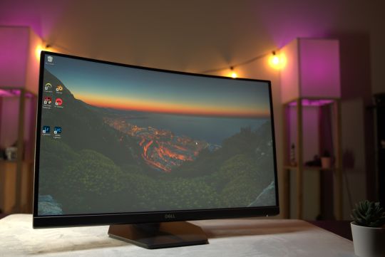
The S2422HG takes this a step further with its 1500R curved screen which is supposed to make the whole experience feel slightly more immersive. Whether or not you'll really notice that curved screen, though, will vary.
Being just a 24" monitor, I didn't notice too much of an advantage. Larger screens like my 49" Samsung Ultra-wide definitely benefit from it, but with this Dell, I frequently forgot it was curved.

Honestly, the biggest benefit of the curved-screen on this smaller monitor might just be that it helps it look more sleek and premium on your desk. Aside from that, I don't think this is a must-have feature for most.
Design, Stand, and Mounting
The smaller footprint of 24" monitors is another advantage compared to larger options. Larger monitors usually need bigger and clunkier stands which in turn take up more desk space, possibly impeding on mouse pad real estate.
The monitors' polygonal-shaped stand is pretty compact compared to some other competing models which have a wider V-shaped design. This helps it fit on smaller surfaces more easily as its stand needs less space. The stand offers tilt adjustments between -5° and 21°, with 100mm of height travel.
If you're a fan of wall mounting, the stand is easily removable with its quick-release back, revealing the 100 x 100mm VESA mount. On the back, you'll also find vents that allow for passive air cooling.
Response Time & Panel
When it comes to gaming monitors, especially for competitive E-Sports titles, 24" models with high refresh rates and low response times are most popular. Gaming monitors typically are at least 120Hz and have a response time of 5ms or less.
The Dell S2422HG with a 165Hz refresh rate and 1ms Moving Picture Response Time (MPRT) and 4ms GtG (Gray to Gray) response time. This is great for reducing motion blur and in competitive games, allows you to keep up with the action. Adaptive-Sync is supported including AMD FreeSync Premium with a 48 – 165Hz Vertical Refresh Rate.
One thing I noticed, or rather didn't, is any perceivable difference between 120hz and 165hz when gaming. If you're on a tighter budget and can't find a 165hz monitor in your price range, don't hesitate to look for 120hz models.
The screen has a matte anti-glare surface and features a 3000:1 static contrast ratio and 8-bit color. The backlight is a flicker-free WLED with 99% sRGB gamut coverage and a 350 cd/m² typical maximum luminance. HDR is not supported with this model, however.
When you're gaming at night or need to relax your eyes from longer sessions, a Low Blue Light (LBL) setting called ‘ComfortView' can be enabled.
Do You Need 4k?
Resolution is a bit of a hot debate. Does higher resolution always translate to a better gaming experience? 4k gaming monitors might seem like a no-brainer, but just as with increasing their physical size, increasing resolution also has its drawbacks.
For starters, you might not actually be able to easily perceive the resolution difference if you're sitting at a distance of about 2 feet from the screen, which is pretty common for a monitor this size. Even if you could, 4k gaming is still very demanding on even the most specced out PCs. You'll usually either have to compromise on framerate or turn down the graphical quality. Competitive gamers usually turn their settings to the lowest and really only care about getting the highest FPS.
Value vs Style
If you're not too keen on multi-tasking, this monitor has all the specs and customizations that make it a great choice for gaming and other casual tasks.
Beyond that, it has a minimal yet very sleek design that doesn't scream "gaming" and can actually fit nicely in most spaces. That said, there are many competing models with similar if not better specs that cost less, but perhaps don't have the same refined and mature design as the Dell.
If you're looking for a gaming monitor with these specs and don't mind having a curved screen that's more for style than practicality, the Dell S2422HG is worth checking out.
Dell S2422HG Review: Premium 24" Curved Gaming Monitor published first on http://droneseco.tumblr.com/
0 notes
Text
Dell XPS 17 (9700) review: The 17-inch laptop is back, and it's spectacular
Dell's XPS lineup has been among the best for years, and the company has gradually refined whatever pain points it did have, such as when it used to put the webcam below the screen. But this year, the lineup underwent a major redesign, with Dell chopping down the bezels even more, something that I wouldn't have guessed was possible.
The firm has long touted how small the footprint is on its laptops, always saying that the XPS 15 fits in the footprint of a 13-inch laptop, and that the XPS 13 fits into the footprint of an 11-inch laptop. With the XPS 15 fitting into an even smaller footprint this year, there was room for something bigger.
Dell announced the new XPS 17 in May, and it's the first new XPS 17 in around a decade. If you read my review of the latest XPS 15, then there are pretty much two things to know. The screen is bigger, and it's more powerful with Nvidia RTX graphics. In fact, it's the first XPS laptop ever with RTX graphics.
Obviously, these specs are for the unit that Dell sent me. The base model starts at $1,399.99, although that one has integrated graphics, a Core i5-10300H, an FHD screen, and 8GB RAM.
Design
While the XPS 17 was introduced alongside the XPS 15 redesign in May, this design was actually first shown in January at CES with the XPS 13. This design consists of a 16:10 display, narrow bezels on all four sides, and no USB Type-C ports. Indeed, if you put the XPS 13, 15, and 17 next to each other, they look nearly identical except for being different sizes.
The Dell XPS 17 is indeed the 17-inch laptop that can fit into the footprint of a 15-inch laptop. The most important thing that that means to me is that it can fit into a regular-sized bag. That's not always the case with 17-inch laptops; in fact, it's pretty rare. It's a bit heavy at five and a half pounds, but that's the kind of laptop that this is. It's got a lot of power under the hood, and it also fits into a small footprint. That combination makes the XPS 17 unique.
The top-down view is the one thing that looks the same. The chassis is made out of aluminum, and the laptop comes in a silver color with a chrome-colored Dell logo stamped in the lid.
The sides are silver-colored as well. This was a big change with the redesign since the sides have more traditionally been black. I think this gives it a much cleaner look. But as I mentioned, there are no USB Type-C ports, even on the 17-incher.
Instead, there are four Thunderbolt 3 ports, two of which are on each side. The bad news is that they're not full Thunderbolt 3 ports, so if you're like me and you work from a Thunderbolt 3 dock that has two 4K monitors attached to it, you won't be able to use the full resolution. My workaround was to disconnect one of the monitors from the dock and connect it directly to the laptop. Still, it's disappointing, considering how premium and powerful this PC is.
The cool thing about having two Thunderbolt 3 ports on each side is that you can charge the PC from either side. I know that this sounds like a small thing, but it's really nice, and it's a rarity in laptops.
Also on the right side, you'll find an SD card reader and a 3.5mm audio jack. I'm kind of surprised that the SD card reader is there with everything else being cut, but I guess it's nice that it's there.
Display and audio
The screen on the Dell XPS 17 is a flat 17 inches, compared to 17.3 inches on a traditional 17-inch laptop. The reason for that is because this has a 16:10 display, and to be clear, being that it's measured diagonally, this display is larger than a 17.3-inch 16:9 screen. It comes in your choice of 3840x2400 or 1920x1200 resolutions. Dell sent me the former, and it is absolutely beautiful.
It comes in at 500-nit brightness, so it works great in bright sunlight, and indoors, I only found myself using it at about 25% brightness. It also has 100% Adobe RGB, 94% DCI-P3, and a 1600:1 contrast ratio.
The colors are also nearly perfect, and that actually goes for whatever angle you're viewing the display from. Dell promises a 178-degree viewing angle, and it delivers. You can look at this thing from any angle and not see any visible distortions.
Plus, it's big. I'm not always a fan when companies make taller screens like this because it means that it's also narrower. But at 17 inches, there's plenty of screen real estate for everything.
The company also has something called Dell Cinema, which includes CinemaColor, CinemaSound, and CinemaStream. CinemaColor includes HDR technologies and more, and there's actually an included app that lets you apply different display settings such as movie, evening, sports, and animation.
The bezels are small, but that doesn't mean Dell removed the webcam, or moved it. It's shrunken down to fit into that tiny top bezel, and there's an IR camera for facial recognition as well. You're not making any sacrifices in that department like you would have been in the old days.
CinemaSound has to do with the Waves MaxxAudio Pro speakers. There's an app for that too, but this one is called MaxxAudio Pro instead of CinemaSound. The XPS 17 has large speakers on either side of the keyboard, and they sound fantastic. The dead giveaway is that it has both woofers and tweeters, a rarity on laptops.
Indeed, this has four speakers, two of which are 2.5W and two of which are 1.5W. Obviously, they're used for different frequencies. If you're looking for sound quality and volume in a laptop, you definitely came to the right place.
Keyboard and trackpad
The keyboard found in the XPS 17 is the same as can be found in its other clamshell laptops. Dell does have a technology called MagLev that it uses in the XPS 13 2-in-1 and XPS 15 2-in-1, but perhaps surprisingly, the technology didn't make it into the smaller, redesigned clamshells.
Dell didn't add a numpad, which is a decision that I'm happy with. I'm not a fan of the numpad, and it's not even easy to ignore because it moves the regular keyboard to the left, leaving it off-centered. I'll take the quad-speaker setup instead.
Key depth is 1.3mm, which is pretty standard for a consumer laptop these days. It's quite comfortable to type on, and it's definitely one of the better keyboards in a consumer laptop. If we were talking about commercial laptops, that might be another story, but we're not talking about commercial laptops. I find that I make very few mistakes with this keyboard, something that I do appreciate after using some keyboards that I've had some issues with.
There's a power button in the keyboard, which doubles as a fingerprint sensor. Unfortunately, you do have to scan your fingerprint after the PC boots up, as opposed to how everyone else with a fingerprint sensor in the power button does it, scanning your finger before it boots up.
Dell considers this to be a security issue, assuming that you might walk away from your PC between when you press the button and when it boots up and someone might sit in front of it. I have a bit more faith in the user than Dell does, and I think you'd get to know your PC and whether or not you're safe to grab a cup of coffee while it's booting up.
My favorite feature of the XPS 15 is on the XPS 17, which is that the Precision trackpad is massive. Huge trackpads are something that Apple introduced on its MacBook Pro PCs a while back, and I've been waiting for a Windows OEM to follow suit. If the real estate on the keyboard deck is there, I say use it. The large, clickable trackpad feels great, and it makes drag-and-drop operations a breeze.
Performance and battery life
Both performance and battery life are excellent on the XPS 17. This thing is great for anything. I used it for things from gaming with Forza Horizon 4 and Halo: Reach to 4K video editing to general work. Sure, there was the occasional bump in the road, particularly when it came to gaming, but it absolutely handled anything that I threw at it.
After all, this thing has top-end hardware for its class. It has an Intel Core i7-10875H processor, which has eight cores, 16 threads, and a 45W TDP. It's the better Core i7 from the H-series, the other one being the hexa-core Core i7-10750H. It's only bested by the Core i9-10885H, which is available in the XPS 17.
For graphics, it comes with an Nvidia GeForce RTX 2060 Max-Q with 6GB GDDR6. With RTX graphics, it supports things like real-time ray tracing and deep learning super sampling (DLSS). RTX graphics was how I knew it would support some solid gaming. You can get it with integrated graphics if you don't want the power at all, or you can get it with an Nvidia GeForce GTX 1650 Ti.
Keep in mind that this is a creator laptop, not a gaming laptop. It uses a 130W charger, while most gaming laptops are closer to the 230W range, and it doesn't have the thermals for it. This is primarily a work machine, but I'm here to let you know that it does have the power to play as well.
Even more impressive is battery life. I often say that you have to choose between power and battery life, and with the UHD+ display, you can bet that this uses a lot of power. I used it with the power slider one notch above the battery saver, and with the screen at around 25% brightness. I can tell you that you can easily get six hours out of this, and in many cases, you can take it further than that. With general work, I was able to get up to eight hours.
Of course, the touchscreen model comes with a 97Whr battery. In other words, this has one of the biggest batteries that you'll find in any laptop (much larger and you can't take it on a plane). The non-touch model comes with a 56Whr battery.
For benchmarks, I used PCMark 8, PCMark 10, 3DMark, VRMark, Geekbench, and Cinebench.
If you're not the type to go through benchmark scores, all you need to know is that this is a powerful machine.
Conclusion
My biggest complaint about the Dell XPS 17 is that it doesn't have full Thunderbolt 3 ports, which would have been able to handle two 4K displays on a single port. If that bothers you too, just wait for the next one. Intel's next generation of CPUs is going to support Thunderbolt 4, which is really just the full Thunderbolt 3 that I'm describing. My other gripe is that there's no cellular model. I realize that it's something of a rare feature on more powerful laptops, probably because it uses battery, but I don't care. It's 2020 and I should be able to work from anywhere.
Let's be clear that this is an absolutely incredible laptop that's nearly perfect. It's an absolute pleasure to use, no matter what you're using it for. If you're playing games, it can do that. If you're streaming movies, it's got a killer HDR display and stunning speakers. If you want to edit video, it's got the power for that as well.
All of it comes in a beautiful chassis and yes, a small footprint. The fact that this thing has a 17-inch display and can fit in a regular bag is a feat of engineering. Honestly, the Dell XPS 17 is in a class all its own, and I can't think of anything like it. If you're looking for a laptop that can do everything, this is it.
0 notes
Text
How to Train Neural Network?
As we know one of the most important part of deep learning is the training the neural networks.

So, lets learn how it’s actually work.
In this article we will try to learn how a neural network gets train. We will also learn about feed forward method and back propagation method in Deep Learning.
Why training is needed?

Training in deep learning is the process which helps machines to learn about the function/equation. We have to find the optimal values of the weights of a neural network to get the desired output.
To train a neural network, we use the iterative method using gradient descent. Initially we start with random initialization of the weights. After random initialization of the weights, we make predictions on the data with the help of forward-propagation method, then we compute the corresponding cost function C, or loss and update each weight w by an amount proportional to dC/dw, i.e., the derivative of the cost functions w.r.t. the weight. The proportionality constant is known as the learning rate.
Now we might be thinking what is learning rate?
Learning rate is a type of hyper-parameter that helps us to controls the weights of our neural network with respect to the loss gradient. It gives us an idea how quickly the neural network updates the concepts it has learned.

A learning rate should not be too low as it will take more time to converse the network and it should also not be even too high as the network may never get converse. So, it is always desirable to have optimal value of learning rate so that the network converges to something useful.
We can calculate the gradients efficiently using the back-propagation algorithm. The key observation of backward propagation or backward prop is that because of the chain rule of differentiation, the gradient at each neuron in the neural network can be calculated using the gradient at the neurons, it has outgoing edges to. Hence, we calculate the gradients backwards, i.e., first calculate the gradients of the output layer, then the top-most hidden layer, followed by the preceding hidden layer, and so on, ending at the input layer.
The back-propagation algorithm is implemented mostly using the idea of a computational graph, where each neuron is expanded into many nodes in the computational graph and performs a simple mathematical operation like addition, multiplication. The computational graph does not have any weights on the edges; all weights are assigned to the nodes, so the weights become their own nodes. The backward propagation algorithm is then run on the computational graph. Once the calculation is complete, only the gradients of the weight nodes are required for update. The rest of the gradients can be discarded.
Some of the optimization technique are:
Gradient Descent Optimization Technique

One of the most commonly used optimization techniques that adjusts the weights according to the error/loss they caused which is known as “gradient descent.”
Gradient is nothing but it is slope, and slope, on an x-y graph, represents how two variables are related to each other: the rise over the run, the change in distance over the change in time, etc. In this case, the slope is the ratio between the network’s error and a single weight; i.e., how does the error change as the weight is varied.
To put it in a straight forward way, here we mainly want to find which weights which produces the least error. We want to find the weights that correctly represents the signals contained in the input data, and translates them to a correct classification.
As a neural network learns, it slowly adjusts many weights so that they can map signal to meaning correctly. The ratio between network Error and each of those weights is a derivative, dE/dw that calculates the extent to which a slight change in a weight causes a slight change in the error.
Each weight is just one factor in a deep neural network that involves many transforms; the signal of the weight passes through activations functions and then sums over several layers, so we use the chain rule of calculus to work back through the network activations and outputs. This leads us to the weight in question, and its relationship to overall error.
Given two variables, error and weight, are mediated by a third variable, activation, through which the weight is passed. We can calculate how a change in weight affects a change in error by first calculating how a change in activation affects a change in Error, and how a change in weight affects a change in activation.
The basic idea in deep learning is nothing more than that adjusting a model’s weights in response to the error it produces, until you cannot reduce the error any more.
The deep net trains slowly if the gradient value is small and fast if the value is high. Any inaccuracies in training leads to inaccurate outputs. The process of training the nets from the output back to the input is called back propagation or back prop. We know that forward propagation starts with the input and works forward. Back prop does the reverse/opposite calculating the gradient from right to left.
Each time we calculate a gradient, we use all the previous gradients up to that point.
Let us start at a node in the output layer. The edge uses the gradient at that node. As we go back into the hidden layers, it gets more complex. The product of two numbers between 0 and 1 gives you a smaller number. The gradient value keeps getting smaller and as a result back prop takes a lot of time to train and produces bad accuracy.
Challenges in Deep Learning Algorithms
There are certain challenges for both shallow neural networks and deep neural networks, like overfitting and computation time.
DNNs are easy affected by overfitting because the use of added layers of abstraction which allow them to model rare dependencies in the training data
Regularization methods such as drop out, early stopping, data augmentation, and transfer learning are used during training to combat the problem of overfitting.
Drop out regularization randomly omits units from the hidden layers during training which helps in avoiding rare dependencies. DNNs take into consideration several training parameters such as the size, i.e., the number of layers and the number of units per layer, the learning rate and initial weights. Finding optimal parameters is not always practical due to the high cost in time and computational resources. Several hacks such as batching can speed up computation. The large processing power of GPUs has significantly helped the training process, as the matrix and vector computations required are well-executed on the GPUs.
Dropout

Dropout is a well-known regularization technique for neural networks. Deep neural networks are particularly prone to overfitting.
Let us now see what dropout is and how it works.
In the words of Geoffrey Hinton, one of the pioneers of Deep Learning, ‘If you have a deep neural net and it's not overfitting, you should probably be using a bigger one and using dropout’.
Dropout is a technique where during each iteration of gradient descent, we drop a set of randomly selected nodes. This means that we ignore some nodes randomly as if they do not exist.
Each neuron is kept with a probability of q and dropped randomly with probability 1-q. The value q may be different for each layer in the neural network. A value of 0.5 for the hidden layers, and 0 for input layer works well on a wide range of tasks.
During evaluation and prediction, no dropout is used. The output of each neuron is multiplied by q so that the input to the next layer has the same expected value.
The idea behind Dropout is as follows − In a neural network without dropout regularization, neurons develop co-dependency amongst each other that leads to overfitting.
Implementation trick
Dropout is implemented in libraries such as TensorFlow and Pytorch by keeping the output of the randomly selected neurons as 0. That is, though the neuron exists, its output is overwritten as 0.
Early Stopping

Here we try to train neural networks using an iterative algorithm called gradient descent.
The idea behind early stopping is intuitive; we stop training when the error starts to increase. Here, by error, we mean the error measured on validation data, which is the part of training data used for tuning hyper-parameters. In this case, the hyper-parameter is the stop criteria.
Data Augmentation

It is a process where we increase the quantum of data we have or augment it by using existing data and applying some transformations on it. The exact transformations used depend on the task we intend to achieve. Moreover, the transformations that help the neural net depend on its architecture.
For instance, in many computer vision tasks such as object classification, an effective data augmentation technique is adding new data points that are cropped or translated versions of original data.
When a computer accepts an image as an input, it takes in an array of pixel values. Let us say that the whole image is shifted left by 15 pixels. We apply many different shifts in different directions, resulting in an augmented dataset many times the size of the original dataset.
Transfer Learning

The process of taking a pre-trained model and “fine-tuning” the model with our own dataset is called transfer learning. There are several ways to do this. A few ways are described below −
We train the pre-trained model on a large dataset. Then, we remove the last layer of the network and replace it with a new layer with random weights.
We train the pre-trained model on a large dataset. Then, we remove the last layer of the network and replace it with a new layer with random weights.
We then freeze the weights of all the other layers and train the network normally. Here freezing the layers is not changing the weights during gradient descent or optimization.
We then freeze the weights of all the other layers and train the network normally. Here freezing the layers is not changing the weights during gradient descent or optimization.
The concept behind this is that the pre-trained model will act as a feature extractor, and only the last layer will be trained on the current task.
For more blogs/courses on data science, machine learning, artificial intelligence and new technologies do visit us at InsideAIML.
Thanks for reading
#insideaiml#artificial intelligence#machine learning#data science#datavisualization#python courses#deeplearning
0 notes
Text
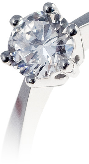
Diamonds — Buyers Guide


When you buy a diamond ring, it’s important to consider your diamonds’ quality… especially if it’s a wedding ring, which you will wear for the rest of your life!
Diamond quality is ultimately how well the diamond appears. Besides, a high-quality diamond is secure long term.
So no matter, if you are buying a women’s diamond wedding ring or a men’s diamond wedding ring, make the perfect choice with our Diamonds Guide for your Wedding Ring!
The 4 C’s
In order to work out a diamonds value and quality there is a standard way of appraising it, by using criteria called the 4 C’s. The 4 C’s are the Clarity, Carat, Cut and Colour of a diamond. Diamond appraising is a complex task with only very minor differences between grades which can only be determined using the relevant tools and under strict lighting conditions.
To try and simplify diamond appraising the 4 C’s are explained below in greater detail.
Diamond Clarity
Diamond Clarity relates to the number of imperfections a diamond has. These imperfections are called inclusions, which are technically anything from minute cracks to small traces of non crystallised carbon. Diamonds are natural products and invariably will have inclusions to some degree, however the fewer the inclusions the better.
Diamond clarities such as SI 1/2 provide a diamond that technically has inclusions but do not show to the human eye, and are only apparent upon magnifying the diamond. These clarities offer a good balance of appearance and value for money.
To grade a diamond’s clarity a gemmologist will use a 10x magnification glass also known as a jeweller’s loupe to zoom in on the diamond and analyse the clarity.
Below are the standardised levels used for expressing a diamond’s clarity:
IF — absolutely free from inclusions, no imperfections visible through a 10x loupe.
VVS 1/2 — very very small inclusions, nearly invisible through a 10x loupe.
VS 1/2 — very small inclusions, barely visible through a 10x loupe.
SI 1/2 — small inclusions visible through a 10x loupe but invisible to the naked eye.
P1 — inclusions immediately evident with a 10x loupe though hard to see with the naked eye.
P2 — large/numerous inclusions visible to the naked eye and affecting brilliance.
P3 — large/numerous inclusions very visible to the naked eye and affecting brilliance.


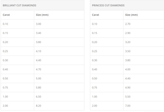
Diamond Carat
Diamond carat relates to the weight of a diamond. Diamond carat does not relate to the size of a diamond.
One carat weighs precisely 200mg or milligrams.
Jewellery that comprises more than one diamond will have a total diamond weight. Total diamond weights are not as valuable as the equivalent individual diamond weight, i.e. a ring with five diamonds with a total weight of 1 carat is not as valuable as a ring with one diamond weighing 1 carat.
Big diamonds have bigger prices, as the size of a diamond increases so does the rarity and value. For example a 2 carat diamond is around four times as valuable as a 1 carat diamond of equal quality.
The chart below will help you understand the approximate size of a diamond for its stated weight.
Diamond Cut
Diamond cut determines two things about diamonds.
Firstly it refers to the actual shape of a diamond (e.g. round, square, oval etc). Round shaped diamonds are actually called brilliant cut diamonds and square shaped diamonds are called princess cut diamonds. The chosen shape of a diamond will determine the pattern used and how the diamond is actually cut and formed by a diamond cutter.
Once a diamond has been shaped the diamond cut usually then refers to the proportions, symmetry and polish of a diamond. These are some of the most important factors for a diamonds overall finish, and will determine how well a diamond will sparkle.
The proportions of a diamond are very important as there is an ideal ratio of width by depth for every weight. For example a 1 carat brilliant cut diamond could actually have a width of less than 6mm rather than the ideal 6.5mm and be a deeper stone, which would obviously offer less appearance once set in a ring and actually look like a smaller 0.75 carat diamond, but cost a lot more. An ideally proportioned diamond is usually achieved at the expense of losing some of the diamonds weight, which is why bigger isn’t always best.
A diamonds symmetry relates to how well aligned the facets of the diamond are. Alignment is one of the main contributing factors in how much a diamond sparkles, as this determines how the light travels through the diamond. Ideally when light enters a diamond it should be reflected out at the top towards the person looking at it, not out of the side or downwards as a poorly cut diamond would.
The polish of a diamond is how smooth or rough the facets are, and the smoother the facets the better. A diamond with excellent polish can be likened to a well polished car, offering amazing depth and shine.
Diamond Colour
The colour of a diamond is based upon a standardised scale which is set by The Gemological Institute of America. In order to determine a diamonds colour a set of master stones are used to compare diamonds side by side with the masters. A gemmologist will perform this comparison under strict lighting conditions.
GIA’s diamond colour grading scale:
Colourless — D, E, F
Near Colourless — G, H, I, J
Faint — K, L, M
Very Light — N, O, P, Q, R
Light — S, T, U, V, W, X, Y, Z
There are only very few diamonds in the world that are truly colourless, and these are the most expensive of diamonds assuming they are of excellent clarity, cut and carat. Generally speaking the more colour a diamond has the less valuable it becomes, although there are exceptions for very rare fancy colours.
It is also worth noting that the surrounding environment can affect a diamonds colour, this is why it’s best to let an expert gemmologist asses a diamond’s colour under strict lighting conditions.
Conflict Diamonds
We only select diamonds that are ethically sourced and free from worldwide conflict.

SafeGuard Jewellery Assessment
For additional peace of mind when purchasing stone set rings from us, we can also offer a SafeGuard Jewellery Assessment Report. The report is an independent expert assessment carried out by SafeGuard, who are part of the Birmingham Assay Office.
The report is an overall description of the ring, but also includes:
Diamond Quality
Diamond Sizes and Gross Weights
Precious Metal Type
Digital Photograph of Ring
Individually Hologrammed Booklet
The standard timescale for a Jewellery Assessment is approximately 1 week, although an express service is also available.
We cannot offer a refund on Jewellery Assessments, however we are happy to send your jewellery for appraisal after you have tried it first.
Please note: The SafeGuard Jewellery Assessment is not a valuation service, for Independent Valuations we use SafeGuard Valuations.
0 notes
Text
Phantom Reactor Review - The Most Powerful Compact Speaker in 2019
CURRENT PHANTOM REACTOR PRICE [EU]
Ok first of let me just say Phantom Reactor…that just might be the most awesome speaker name I ever heard… If you know of a speaker with a better name this let me know.

So imagine you’ve got this speaker in your house & your friends are like “what wireless speaker is that?” …and you’re like “hey you know I just got myself a phantom reactor….it’s 900 watts, up to 98dB. Bass as low as 18hz…why what speaker have you got?”
The Devialet Phantom reactor. What a powerful name it has, and trust me it is powerful! You WhatGear legends (YT Subscribers) who have been subscribed to the channel for a while will know… I’m a big fan of Devialet.
Now we have this new addition to the formidable French Hi-Fidelity companies Phantom line up. I can’t tell you how excited I am about this.
You know I was one of the 1st people on YouTube to put a video out on the Phantom. I was as excited then as I am now. Honestly, guys, the Phantom Reactor is going to open your ears & eyes.
DEVIALET PHANTOM REACTOR PRICE [US]
Design
The Devialet Phantom Reactor is roughly a quarter the size of it’s bigger brother the Devialet Gold/Silver Phantom. It’s roughly 16 x 17 x 22cm. It is tiny, but it is also no lightweight speaker. The Reactor weighs in at over 4.KG and it’s a heavy hitter.

Just to get an idea of its size, in the Devialet Phantom Reactor review video, you can see it side by side with a Bose SoundLink mini and my current favorite BT speaker the Sony SRS X7.
It is virtually identical to the original Phantom with the white sides, and snowflake grill on the front. Power button and ports as well as heat vents at the back. Of course it has got the iconic aluminum woofer covers on sides. except this time the are 10cm’s in diameter.
There are a couple of differences here in comparison to the big phantoms. The way the Phantom Reactor has been manufactured is slightly different. It’s still a single piece cabinet but now you’ve got capacitive touch buttons across the top.
The original phantoms had a mid driver and a seperate tweeter. Whereas the phantom Reactor has single 3cm aluminum midrange/treble driver. This is due to reduction in size of the speaker.
Just so you know there are 160 patents and 981 part on this thing. So when it comes to design the Reactor is certainly unique.
Usability
Let’s go back to the capacitive touch buttons. Across the top we have got BT pairing, volume down, play/pause, volume up, and a sync button for the app. There’s also a LED indicator light to help you with pairing etc.

As for input methods you’ve got airplay, BT, Spotify connect, upnp optical and analog
I’m a little disappointed there isn’t Deezer integration. Especially being that Deezer is also a French company. Don’t worry I’m sure thats something they could add that later.
To get the full Hi-Res audio 24bit 192kHz out of the reactor you’re going want to use either airplay, upnp or optical and analog from a compatible source.
Now onto the app. So the volume control dominates the majority of the home screen. With the volume dial.
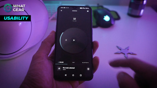
All the options to switch sources are there. Due to the fact, I use an Android phone. To get the most out of the phantom wirelessly you will need to download the Bubble UPNP app.
It kind of works in tandem with the Devialet app. Would be nice to see this integrated into the Devialet app…but to be honest once you set it up it works pretty seamlessly.
Also, you have the option to add multiple phantoms to the one app… And even pair two of them for stereo sound…
So that brings me on nicely to the Quality.
Quality
When it came to testing the sound quality. You know I wasn’t going to be testing this epic HiFi compact speaker with some horribly compressed source. So I went out of my way to download some HiRes Flac tracks , especially for you guys.
It is important you understand, that what you are hearing in the video is recorded via a video rode mic pro. Then rendered in premiere pro. Then played back on the device your watching on… So the Phantom Reactor really is something you have to go to the store and hear and see for yourself.
Click on this image above to watch the Devialet Phantom Reactor sound test segment of the video.
I really did try my best to visualize the sound quality in the demo video. I hope you can appreciate that.
I’ve heard a lot of Hi-End speakers… I actually worked in the Harrods technology department…you know that dusty old building in London Knightsbridge for a long time. I’ve heard a lot of end stuff. Hopefully you can trust my opinion more than most.
The great thing about the sound quality is even at lower volumes you still get that full sounds. When it comes to the sound stage it’s not fair to judge it without listening to a stereo pair.
Just know this. In my opinion a single Phantom Reactor packs more than enough power to fill a large room with powerful bass and amazing clarity and smooth mids.
The best thing about the Reactors sound quality is that even at its highest output level there is no sharpness to the highs. Nothing is lost in the mids or bass notes. It is incomparable to anything you will find on a speaker this small. I can promise you that.
And I don’t even need to tell you about the build quality… Because you already know.
Awesome Features.

ADH Technology
Devialet has its own patented amplification tech. The ADH which is essentially combining class A and Class D methods.
The advantage of this is that the size of the amp can be much smaller. You get the raw power of an analog amplifier combined with the efficiency of a digital amp.
So to break it down simply you can blast this thing from zero to 100 in second and suffer no distortion, 0 saturation, and zero background noise. Just a clean room-filling audio track at whatever level your listening at.
It’s amazing that even at low volume you still get a really full rich sound.
HeartBass Implosion - HBI
Next up the heart bass Implosion tech. Did you know the cabinet of this speaker has been sealed with 500KG of pressure?
So all that pressure just wants to explode out of this thing with those bass notes…and hopefully, you could really see that in the sound test section.
Signal Active Matching - SAM
Signal active matching… So basically Devialet says the phantom will match the exact rhythm and tempo of your music with absolute precision.
Active co-spherical matching - ACE
So the idea is the way in which the phantom outputs the sounds from either side and from the front. You get this real waveform coming from the speaker.
Sort of like the pattern you would see if dropped a pebble into still water. That sort of smooth ripple effect.
SubWoofer Covers
And the last awesome Feature has got to be those woofer covers. What other HiFi speaker is there out that is visually pleasing as this.
Summary
I know the sticking point for a lot of people will be the price. All I can say is “You get what you pay for.”
Yes, there are lots of cheaper options out their…but that’s not what you’re looking if you are watching this. The Devialet Phantom is head and shoulders above anything else of comparable size. That’s why it costs so much.
If I had space I would probably opt for the bigger phantoms. That statement comes from real life experience because I actually had a gold phantom here, and I quite literally couldn’t find anywhere to put it.
The Phantom Reactor is so compact and fits perfectly in any room in my apartment.

My dream setup would be to have two phantom Reactors either side my TV on the official Devialet …stands. That would quite literally be the perfect setup for me.
The Phantom Reactor is the best in class when it comes sound to size ratio. Yes, you could get more bass and more mids from the Devialet Gold Phantom but damn they take up a lot of space.
But not as much as a floor standing speaker.
So should you buy the Phantom Reactor? Yes if you are after the best quality compact speaker on the market. If it’s the power you’re after then check out this video you will like it.
See you in the next one. Don’t be late.
MORE DEVIALET PHANTOM VIDEOS FROM WHATGEAR
Check it out! One year later I finally get my hands on maybe the FINEST wireless speaker known to man! Watch #WhatGear shootouts : https://youtu.be/x9oYZCs9vGg It’s the WhatGear Devialet Gold Phantom review. The Gold Phantom has 4500watts of power…Is it a sound investment?
So Devialet have just launched a new addition to the Phantom range…Its the Devialet Gold Phantom. I caught up with Andy from Devialet to find out whats up with this new speaker. Check it out!
Check the price : https://amzn.to/2GJ9kG2 This is a GROUND breaking bit of kit from a french company. Engineered to perfection. This really takes wireless speakers to a whole new level. If you get a chance to actually hear one of these I’m pretty sure you won’t regret it.
DEVIALET ON AMAZON : http://amzn.to/2IzQhf9 So If your a Sky Q user you can pick up a £799 Devialet Speaker for as cheap as £249. The question is it really worth what they asking for? Well I’ve been using the Devialet soundbox for some time now…
Source: https://www.whatgear.net/technology/devialet-phantom-reactor-review
0 notes
Text
Phantom Reactor Review - The Most Powerful Compact Speaker in 2019
CURRENT PHANTOM REACTOR PRICE [EU]
Ok first of let me just say Phantom Reactor...that just might be the most awesome speaker name I ever heard... If you know of a speaker with a better name this let me know.

So imagine you've got this speaker in your house & your friends are like “what wireless speaker is that?” ...and you're like “hey you know I just got myself a phantom reactor....it's 900 watts, up to 98dB. Bass as low as 18hz...why what speaker have you got?”
The Devialet Phantom reactor. What a powerful name it has, and trust me it is powerful! You WhatGear legends (YT Subscribers) who have been subscribed to the channel for a while will know... I'm a big fan of Devialet.
Now we have this new addition to the formidable French Hi-Fidelity companies Phantom line up. I can't tell you how excited I am about this.
You know I was one of the 1st people on YouTube to put a video out on the Phantom. I was as excited then as I am now. Honestly, guys, the Phantom Reactor is going to open your ears & eyes.
DEVIALET PHANTOM REACTOR PRICE [US]
Design
The Devialet Phantom Reactor is roughly a quarter the size of it's bigger brother the Devialet Gold/Silver Phantom. It's roughly 16 x 17 x 22cm. It is tiny, but it is also no lightweight speaker. The Reactor weighs in at over 4.KG and it's a heavy hitter.

Just to get an idea of its size, in the Devialet Phantom Reactor review video, you can see it side by side with a Bose SoundLink mini and my current favorite BT speaker the Sony SRS X7.
It is virtually identical to the original Phantom with the white sides, and snowflake grill on the front. Power button and ports as well as heat vents at the back. Of course it has got the iconic aluminum woofer covers on sides. except this time the are 10cm's in diameter.
There are a couple of differences here in comparison to the big phantoms. The way the Phantom Reactor has been manufactured is slightly different. It's still a single piece cabinet but now you've got capacitive touch buttons across the top.
The original phantoms had a mid driver and a seperate tweeter. Whereas the phantom Reactor has single 3cm aluminum midrange/treble driver. This is due to reduction in size of the speaker.
Just so you know there are 160 patents and 981 part on this thing. So when it comes to design the Reactor is certainly unique.
Usability
Let’s go back to the capacitive touch buttons. Across the top we have got BT pairing, volume down, play/pause, volume up, and a sync button for the app. There's also a LED indicator light to help you with pairing etc.

As for input methods you've got airplay, BT, Spotify connect, upnp optical and analog
I'm a little disappointed there isn't Deezer integration. Especially being that Deezer is also a French company. Don’t worry I'm sure thats something they could add that later.
To get the full Hi-Res audio 24bit 192kHz out of the reactor you're going want to use either airplay, upnp or optical and analog from a compatible source.
Now onto the app. So the volume control dominates the majority of the home screen. With the volume dial.

All the options to switch sources are there. Due to the fact, I use an Android phone. To get the most out of the phantom wirelessly you will need to download the Bubble UPNP app.
It kind of works in tandem with the Devialet app. Would be nice to see this integrated into the Devialet app...but to be honest once you set it up it works pretty seamlessly.
Also, you have the option to add multiple phantoms to the one app... And even pair two of them for stereo sound...
So that brings me on nicely to the Quality.
Quality
When it came to testing the sound quality. You know I wasn’t going to be testing this epic HiFi compact speaker with some horribly compressed source. So I went out of my way to download some HiRes Flac tracks , especially for you guys.
It is important you understand, that what you are hearing in the video is recorded via a video rode mic pro. Then rendered in premiere pro. Then played back on the device your watching on... So the Phantom Reactor really is something you have to go to the store and hear and see for yourself.
Click on this image above to watch the Devialet Phantom Reactor sound test segment of the video.
I really did try my best to visualize the sound quality in the demo video. I hope you can appreciate that.
I've heard a lot of Hi-End speakers... I actually worked in the Harrods technology department...you know that dusty old building in London Knightsbridge for a long time. I've heard a lot of end stuff. Hopefully you can trust my opinion more than most.
The great thing about the sound quality is even at lower volumes you still get that full sounds. When it comes to the sound stage it's not fair to judge it without listening to a stereo pair.
Just know this. In my opinion a single Phantom Reactor packs more than enough power to fill a large room with powerful bass and amazing clarity and smooth mids.
The best thing about the Reactors sound quality is that even at its highest output level there is no sharpness to the highs. Nothing is lost in the mids or bass notes. It is incomparable to anything you will find on a speaker this small. I can promise you that.
And I don't even need to tell you about the build quality... Because you already know.
Awesome Features.

ADH Technology
Devialet has its own patented amplification tech. The ADH which is essentially combining class A and Class D methods.
The advantage of this is that the size of the amp can be much smaller. You get the raw power of an analog amplifier combined with the efficiency of a digital amp.
So to break it down simply you can blast this thing from zero to 100 in second and suffer no distortion, 0 saturation, and zero background noise. Just a clean room-filling audio track at whatever level your listening at.
It's amazing that even at low volume you still get a really full rich sound.
HeartBass Implosion - HBI
Next up the heart bass Implosion tech. Did you know the cabinet of this speaker has been sealed with 500KG of pressure?
So all that pressure just wants to explode out of this thing with those bass notes...and hopefully, you could really see that in the sound test section.
Signal Active Matching - SAM
Signal active matching... So basically Devialet says the phantom will match the exact rhythm and tempo of your music with absolute precision.
Active co-spherical matching - ACE
So the idea is the way in which the phantom outputs the sounds from either side and from the front. You get this real waveform coming from the speaker.
Sort of like the pattern you would see if dropped a pebble into still water. That sort of smooth ripple effect.
SubWoofer Covers
And the last awesome Feature has got to be those woofer covers. What other HiFi speaker is there out that is visually pleasing as this.
Summary
I know the sticking point for a lot of people will be the price. All I can say is “You get what you pay for.”
Yes, there are lots of cheaper options out their...but that's not what you're looking if you are watching this. The Devialet Phantom is head and shoulders above anything else of comparable size. That's why it costs so much.
If I had space I would probably opt for the bigger phantoms. That statement comes from real life experience because I actually had a gold phantom here, and I quite literally couldn't find anywhere to put it.
The Phantom Reactor is so compact and fits perfectly in any room in my apartment.

My dream setup would be to have two phantom Reactors either side my TV on the official Devialet ...stands. That would quite literally be the perfect setup for me.
The Phantom Reactor is the best in class when it comes sound to size ratio. Yes, you could get more bass and more mids from the Devialet Gold Phantom but damn they take up a lot of space.
But not as much as a floor standing speaker.
So should you buy the Phantom Reactor? Yes if you are after the best quality compact speaker on the market. If it's the power you're after then check out this video you will like it.
See you in the next one. Don't be late.
MORE DEVIALET PHANTOM VIDEOS FROM WHATGEAR
Check it out! One year later I finally get my hands on maybe the FINEST wireless speaker known to man! Watch #WhatGear shootouts : https://youtu.be/x9oYZCs9vGg It's the WhatGear Devialet Gold Phantom review. The Gold Phantom has 4500watts of power...Is it a sound investment?
So Devialet have just launched a new addition to the Phantom range...Its the Devialet Gold Phantom. I caught up with Andy from Devialet to find out whats up with this new speaker. Check it out!
Check the price : https://amzn.to/2GJ9kG2 This is a GROUND breaking bit of kit from a french company. Engineered to perfection. This really takes wireless speakers to a whole new level. If you get a chance to actually hear one of these I'm pretty sure you won't regret it.
DEVIALET ON AMAZON : http://amzn.to/2IzQhf9 So If your a Sky Q user you can pick up a £799 Devialet Speaker for as cheap as £249. The question is it really worth what they asking for? Well I've been using the Devialet soundbox for some time now...
source https://www.whatgear.net/technology/devialet-phantom-reactor-review
0 notes
Text
Phantom Reactor Review - The Most Powerful Compact Speaker in 2019
CURRENT PHANTOM REACTOR PRICE [EU]
Ok first of let me just say Phantom Reactor...that just might be the most awesome speaker name I ever heard... If you know of a speaker with a better name this let me know.
So imagine you've got this speaker in your house & your friends are like “what wireless speaker is that?” ...and you're like “hey you know I just got myself a phantom reactor....it's 900 watts, up to 98dB. Bass as low as 18hz...why what speaker have you got?”
The Devialet Phantom reactor. What a powerful name it has, and trust me it is powerful! You WhatGear legends (YT Subscribers) who have been subscribed to the channel for a while will know... I'm a big fan of Devialet.
Now we have this new addition to the formidable French Hi-Fidelity companies Phantom line up. I can't tell you how excited I am about this.
You know I was one of the 1st people on YouTube to put a video out on the Phantom. I was as excited then as I am now. Honestly, guys, the Phantom Reactor is going to open your ears & eyes.
DEVIALET PHANTOM REACTOR PRICE [US]
Design
The Devialet Phantom Reactor is roughly a quarter the size of it's bigger brother the Devialet Gold/Silver Phantom. It's roughly 16 x 17 x 22cm. It is tiny, but it is also no lightweight speaker. The Reactor weighs in at over 4.KG and it's a heavy hitter.
Just to get an idea of its size, in the Devialet Phantom Reactor review video, you can see it side by side with a Bose SoundLink mini and my current favorite BT speaker the Sony SRS X7.
It is virtually identical to the original Phantom with the white sides, and snowflake grill on the front. Power button and ports as well as heat vents at the back. Of course it has got the iconic aluminum woofer covers on sides. except this time the are 10cm's in diameter.
There are a couple of differences here in comparison to the big phantoms. The way the Phantom Reactor has been manufactured is slightly different. It's still a single piece cabinet but now you've got capacitive touch buttons across the top.
The original phantoms had a mid driver and a seperate tweeter. Whereas the phantom Reactor has single 3cm aluminum midrange/treble driver. This is due to reduction in size of the speaker.
Just so you know there are 160 patents and 981 part on this thing. So when it comes to design the Reactor is certainly unique.
Usability
Let’s go back to the capacitive touch buttons. Across the top we have got BT pairing, volume down, play/pause, volume up, and a sync button for the app. There's also a LED indicator light to help you with pairing etc.
As for input methods you've got airplay, BT, Spotify connect, upnp optical and analog
I'm a little disappointed there isn't Deezer integration. Especially being that Deezer is also a French company. Don’t worry I'm sure thats something they could add that later.
To get the full Hi-Res audio 24bit 192kHz out of the reactor you're going want to use either airplay, upnp or optical and analog from a compatible source.
Now onto the app. So the volume control dominates the majority of the home screen. With the volume dial.
All the options to switch sources are there. Due to the fact, I use an Android phone. To get the most out of the phantom wirelessly you will need to download the Bubble UPNP app.
It kind of works in tandem with the Devialet app. Would be nice to see this integrated into the Devialet app...but to be honest once you set it up it works pretty seamlessly.
Also, you have the option to add multiple phantoms to the one app... And even pair two of them for stereo sound...
So that brings me on nicely to the Quality.
Quality
When it came to testing the sound quality. You know I wasn’t going to be testing this epic HiFi compact speaker with some horribly compressed source. So I went out of my way to download some HiRes Flac tracks , especially for you guys.
It is important you understand, that what you are hearing in the video is recorded via a video rode mic pro. Then rendered in premiere pro. Then played back on the device your watching on... So the Phantom Reactor really is something you have to go to the store and hear and see for yourself.
Click on this image above to watch the Devialet Phantom Reactor sound test segment of the video.
I really did try my best to visualize the sound quality in the demo video. I hope you can appreciate that.
I've heard a lot of Hi-End speakers... I actually worked in the Harrods technology department...you know that dusty old building in London Knightsbridge for a long time. I've heard a lot of end stuff. Hopefully you can trust my opinion more than most.
The great thing about the sound quality is even at lower volumes you still get that full sounds. When it comes to the sound stage it's not fair to judge it without listening to a stereo pair.
Just know this. In my opinion a single Phantom Reactor packs more than enough power to fill a large room with powerful bass and amazing clarity and smooth mids.
The best thing about the Reactors sound quality is that even at its highest output level there is no sharpness to the highs. Nothing is lost in the mids or bass notes. It is incomparable to anything you will find on a speaker this small. I can promise you that.
And I don't even need to tell you about the build quality... Because you already know.
Awesome Features.
ADH Technology
Devialet has its own patented amplification tech. The ADH which is essentially combining class A and Class D methods.
The advantage of this is that the size of the amp can be much smaller. You get the raw power of an analog amplifier combined with the efficiency of a digital amp.
So to break it down simply you can blast this thing from zero to 100 in second and suffer no distortion, 0 saturation, and zero background noise. Just a clean room-filling audio track at whatever level your listening at.
It's amazing that even at low volume you still get a really full rich sound.
HeartBass Implosion - HBI
Next up the heart bass Implosion tech. Did you know the cabinet of this speaker has been sealed with 500KG of pressure?
So all that pressure just wants to explode out of this thing with those bass notes...and hopefully, you could really see that in the sound test section.
Signal Active Matching - SAM
Signal active matching... So basically Devialet says the phantom will match the exact rhythm and tempo of your music with absolute precision.
Active co-spherical matching - ACE
So the idea is the way in which the phantom outputs the sounds from either side and from the front. You get this real waveform coming from the speaker.
Sort of like the pattern you would see if dropped a pebble into still water. That sort of smooth ripple effect.
SubWoofer Covers
And the last awesome Feature has got to be those woofer covers. What other HiFi speaker is there out that is visually pleasing as this.
Summary
I know the sticking point for a lot of people will be the price. All I can say is “You get what you pay for.”
Yes, there are lots of cheaper options out their...but that's not what you're looking if you are watching this. The Devialet Phantom is head and shoulders above anything else of comparable size. That's why it costs so much.
If I had space I would probably opt for the bigger phantoms. That statement comes from real life experience because I actually had a gold phantom here, and I quite literally couldn't find anywhere to put it.
The Phantom Reactor is so compact and fits perfectly in any room in my apartment.
My dream setup would be to have two phantom Reactors either side my TV on the official Devialet ...stands. That would quite literally be the perfect setup for me.
The Phantom Reactor is the best in class when it comes sound to size ratio. Yes, you could get more bass and more mids from the Devialet Gold Phantom but damn they take up a lot of space.
But not as much as a floor standing speaker.
So should you buy the Phantom Reactor? Yes if you are after the best quality compact speaker on the market. If it's the power you're after then check out this video you will like it.
See you in the next one. Don't be late.
MORE DEVIALET PHANTOM VIDEOS FROM WHATGEAR
Check it out! One year later I finally get my hands on maybe the FINEST wireless speaker known to man! Watch #WhatGear shootouts : https://youtu.be/x9oYZCs9vGg It's the WhatGear Devialet Gold Phantom review. The Gold Phantom has 4500watts of power...Is it a sound investment?
So Devialet have just launched a new addition to the Phantom range...Its the Devialet Gold Phantom. I caught up with Andy from Devialet to find out whats up with this new speaker. Check it out!
Check the price : https://amzn.to/2GJ9kG2 This is a GROUND breaking bit of kit from a french company. Engineered to perfection. This really takes wireless speakers to a whole new level. If you get a chance to actually hear one of these I'm pretty sure you won't regret it.
DEVIALET ON AMAZON : http://amzn.to/2IzQhf9 So If your a Sky Q user you can pick up a £799 Devialet Speaker for as cheap as £249. The question is it really worth what they asking for? Well I've been using the Devialet soundbox for some time now...
Source: https://www.whatgear.net/technology/devialet-phantom-reactor-review
0 notes
Text
JPEG Optimization Algorithms Review
Author: Fyodor Serzhenko
JPEG is probably the most frequently utilized image format in the world, so the idea about JPEG Optimization software could be valuable for many applications. Every day billions of JPEGs are created with smartphones and these pictures are stored somewhere. Much more JPEG images are displayed on different sites and they generate huge internet traffic. It means that the question about file size for JPEG images is essential. As soon as JPEG Standard doesn't specify everything for JPEG encoding, then we could look for existing methods to improve image quality and compression within that Standard.

Offline JPEG recompression could be really useful to take less storage for acquired images. This is critical issue for web applications where we need to reduce page load time, to improve user experience, to decrease traffic and bandwidth cost. In general we need to solve the task how to get the best JPEG image quality for specified file size.
We consider for review several methods for JPEG optimization software. We will focus on ideas and algorithms to achieve better JPEG compression. That review deals only with those algorithms which are fully compatible with JPEG Standard.
The main idea about JPEG optimization software looks quite simple. If we have a compressed JPEG image, we need to offer the best possible compression and quality. Actually we have to take into account all available requirements concerning image quality, file size, processing time, ease of use, etc. If we already have JPEG image, we still can ask themselves: can we improve JPEG compression without adding additional artifacts or with a small distortion, to make file size less? Quite often the answer is positive and below we consider how it could be done in detail.
JPEG artifacts
To discuss JPEG optimization techniques, we need to start from understanding of JPEG artifacts. We could easily identify stages of JPEG compression algorithm, where we could get image losses: Color Transform from RGB to YCbCr, Subsampling, Discrete Cosine Transform (DCT) and Quantization. All other processing stages in JPEG algorithm are lossless: Zigzag, DPCM, RLE, Huffman. Eventually, lossy methods give rise to image artifacts which are common for JPEG algorithm:
Image blur (ringing and contouring): removal of spatial high-frequency data from the image leads to blurred edges if they were sharp.
Staircase noise (aliasing) along curving edges: as soon as we apply DCT both in horizontal and vertical directions, then we get artifacts along curved or tilted edges and they look pixellated.
Posterizing: if we have a look at slowly varying gradients (for example, sky, sunset) in the case of strong compression, we can get new artificial boundaries which arise from roundings at strong quantization. The presence of posterizing shows that utilized JPEG quality factor is too big.
Blocking (block-boundary) artifacts: after JPEG compression and decompression we can see new borders on some 8×8 blocks and it mostly happens at low bit-rates in decompressed images. Quantization is applied individually to each block and in flat (low-frequency) regions it could lead to some discontinuities at block boundaries between adjacent image blocks. They are visible because there is little detail to mask the effect. We can apply deblocking filter which blurs block edges and suppresses blocking artifacts. Unfortunately we can't remove them completely, we just can make them less visible.
All these artifacts are the consequences of lossy stages of JPEG algorithm. That's why any JPEG optimization approach should take them into account. We will visually check image quality for each optimization step to understand how distinct algorithms and parameters could influence on these artifacts.
How we could optimize JPEG Encoder?
Below we discuss several ways to control standard JPEG encoding. We will consider JPEG Baseline part of the Standard and Progressive option. These are parameters and algorithms which strongly influence on JPEG file size and image quality:
JPEG quality factor
Subsampling mode
Quantization tables for luma and chroma (standard and custom)
Quantization algorithms (standard, trellis, software-generated tables)
MIN and MAX values in quantization tables
Optimization of Huffman AC and DC tables
Processing of any supplementary info (metadata, ICC profile, RST markers, EXIF)
Perceptual quality measures to increase the perceived quality of JPEGs
Image preprocessing
Other techniques (deblocking filters, quality metrics, quantization table interpolation, etc.)
Progressive JPEG vs Baseline JPEG
JPEG quality factor
That factor, which is called "q", was introduced in JPEG Standard to implement scaling for quantization tables. Actually we have a formula which is converting each value of quantization table according to that scaling coefficient. Within that approach q = 100 means no quantization and in that case we get the best image quality (the lowest level of distortion) for JPEG compression algorithm, though this is not a lossless compression, we still have very small distortion due to roundings in Color and DCT transforms. For smaller values of q we get better compression ratio with some quality degradation, and this is user's responsibility to choose appropriate value of q for the current task.
Usually, the same q is applied both to luma and chroma, though it's not forbidden to utilize different values for each color component.
It is possible to control the chroma quality by setting the second quality value, as in Mozilla JPEG project: it could be "-quality 90,80" and it will apply quality 90 to the luma (Y) component and 80 to the chroma components (both Cb and Cr).
The formula to convert quantization tables according to JPEG quality factor q is not included in JPEG Standard. We can choose our own way of quantization table transform which could be more appropriate in comparison with the Standard. This could be the way to improve image quality and compression ratio if we know how to take into account image content to create such a quantization table and such a transform.
We believe that the name "JPEG quality factor" is somewhat misleading because this is actually not a quality factor, but this is a scaling coefficient to scale initial quantization table to get resulted table to be applied to DCT coefficients of each 8×8 block.
JPEG subsampling
According to the results of numerous experiments, Human Visual System (HVS) has different responsivity to luma and chroma. People see luma signal with much better resolution in comparison with chroma. This is the ground why we can remove some detail from chroma and still see the picture with almost the same quality. We can do that by averaging values of Cb and Cr components horizontaly, vertically or both.
The most frequently utilized subsampling modes are 4:4:4 (no subsampling), 4:2:2 (horizontal subsampling) and 4:2:0 (horizontal and vertical subsampling, so that from one block 16×16 we get four 8×8 blocks for Y component, one 8×8 block for Cb and for Cr right after subsampling).
This is essentially lossy operation and we will have to restore lost data at the decoding stage. That's why we can restore chroma data approximately if we applied subsampling during encoding.
There are some more subsampling modes apart from widly utilized 4:4:4, 4:2:2 and 4:2:0. Nevertheless, they are quite rare.
JPEG quantization tables for luma and chroma
According to the Standard, user has to define quantization tables 8×8 to apply them to the results of Discrete Cosine Transform. Basically, at JPEG encoding, we divide each value of 8×8 DCT block to corresponding value of quantization table and then we round the result. This is the way to get lots of zeros in each DCT block, which is very good for further compression with RLE and Huffman algorithms.
Though quantization tables are not defined in the Standard, there are two tables which are widely utilized. These are quantization tables for luma and chroma. They are different, but in general case they are scaled with the same coefficient which is actually JPEG quality factor.
We have a linear function F(x) = (200 - 2*x) / 100 which generates scaling coefficient to be utilized to calculate a new quantization table. If JPEG quality is equal to 100, it means no quantization and in that case quantization value for each element is equal to 1. Division to 1 doesn't affect any DCT block, so it's the same as no quantization. If JPEG quality is equal to 50, then we get the following tables:

Fig.1. Standard JPEG Quantization tables for luma and chroma (q = 50)
As we can see, Standard Quantization table for luma (luminance) is not symmetrical and is not monotonuous in frequency domain, though it's symmetrical and monotonuous for chroma. There is no strict proof for that issue and it looks like HVS responsivity for luma is not isotropic. Standard JPEG Quantization tables were derived in the past from the processing of some image set, so it could be a problem of that set as well. There are some other models which utilize symmetric luma tables and anyone is free to implement and to test such an approach.
JPEG quantization algorithms
Quantization algorithm is not defined in JPEG Standard and we can actually implement any algorithm in JPEG encoder. To make it compatible with JPEG decoder, we just need to create quantization tables which will allow to restore original image and save them in file header.
There are quite a lot of software models to generate quantization tables with the software. The most simple approach relies on the fact that for higher spatial frequencies we need to get bigger amplitude in quantization table. This is reasonable approach, though not really popular. It's quite difficult to test such a solution to prove that it's correct not for just available evaluation set of images.
More viable approach is based on the idea to find the best quantization table for a particular image. This is multi-parameter task and it's very complicated, as soon as the total number of possible solutions is just huge. Still, there are some methods which could help to find a good solution for that task.
MIN and MAX values in JPEG quantization tables
If we have a look at any quantization table, we can easily find minimum and maximum values in the table. Minimum value is usually somewhere around upper left corner, and maximum is not necessary in the right bottom corner either. Sometimes MAX value could be very close to that position and it reflects the idea that in some cases the strongest HF suppression should be done not for the highest spatial frequency. For Standard JPEG Quantization tables for q = 50 from Fig.1 we see that for luma MIN = 10 and MAX = 121. For chroma MIN = 17 and MAX = 99.
As soon as we divide each DCT block to quantization matrix, then minimum value of that matrix defines minimum bit depth reduction for all DCT coefficients. If in the source file we have 8-bit RGB data, then after DCT we get 10-bit DCT coefficients. Division of DCT values to quantization table leads to more compact representation of DCT data at encoding, that's why minimum and maximum values from quantization table shows us the limits of data reduction (bit depth reduction) at that step.
This is actually very interesting subject, why we have data size increase after DCT and why it's necessary for an algorithm which is intended for data compression. DCT representation is capable to be compressed significantly, so initial data size increase is temporary and we still have excellent chances to get data reduction due to further compression.
Optimization of Huffman AC and DC tables
In many cases, JPEG encoders utilize Standard Huffman tables for DC and AC coefficients (both for luma and chroma) which are exactly the same for different images. These tables could be optimized for any particular image and in that case we could achieve better compression ratio without introducing any additional losses, because Huffman encoding is lossless algorithm. We just need to get image statistics to create optimized AC and DC Huffman tables. Many software have "-optimize" parameter which is responsible for that procedure. Such an optimization could bring us around 10% of additional compression, so it's worth doing, but the software will work slower with that option on.
Processing of any supplementary info in JPEG images
Each JPEG image could have metadata, comments, embedded thumbnail, built-in markers, EXIF info in the file header. That data could be of no importance if we need to make JPEG image as small as possible. The software could remove all that data to decrease file size. This is not always reasonable and user has to be careful to make right decision with such a method. Removal of EXIF section could offer significant file size reduction for small JPEG images, but for big images it's not really an issue.
ICC profile could also be embedded into JPEG image. In many cases this is default sRGB, so we can remove it to get less file size.
RST markers (restart markers) in the JPEG Standard could help us with faster JPEG decoding. Presence of RST markers increases file size and this is crucial issue to define optimal number of such markers in the image. Each restart marker is 2-Byte value. If we are not going to utilize fast JPEG decoding for the image, there is a point to remove all restart markers to reduce file size.
When we use RST markers, we have one more issue which influences on file size of compressed image. In JPEG Standard there is a procedure which is called "padding". If for MCU encoding we need a certain number of bits which is not a multiple of 8, then we have to fill spare bits with "1". Such a situation happens before each restart marker and we could loose several bits before each marker. Without RST markers it could happen just once, at the end of file.
As soon as RST marker starts with FF, then we need to do so-called "byte stuffing" - to write FF00 instead of FF in the bitstream. If we don't have restart markers, then we don't need to do byte stuffing and this is one more way to make file size less.
If we have RST markers in JPEG image, then we start doing DPCM differential coding for DC coefficients right after each RST. If we don't have restart markers, then differential coding is continuous and we spend less bits for DC coefficients, so we decrease file size.
Perceptual quality measures to increase the perceived quality of JPEGs
To implement any lossy compression algorithm, we need a metric to control distortion level for compressed images. The most simple choices are MSE (Mean Square Error), PSNR (Peak Signal to Noise Ratio) and MPE (Mean Pixel Error), etc. These are very simple algorithms which don't account for HVS (Human Visual System) properties. To solve the matter, SSIM was introduced. SSIM means Structural Similarity and that metric shows the extent of resemblance between two images. It was proved that in many cases SSIM turned out to be more precise and reliable in comparison with MSE/PSNR to distinguish perceived differences.
Now we can do JPEG compression and decompression and then calculate resulted SSIM to evaluate distortion level. With such an instrument we can automatically test different parameters to achieve better JPEG compression.
The primary use case of JPEG optimization software is smaller file size, it can also be used to increase the perceived quality of JPEGs while keeping the file size the same. That approach could bring us closer to real human perception, and that understanding will let us improve both compression ratio and image quality.
Image preprocessing
JPEG compression is always burning out spatial high-frequency (HF) detail from each 8×8 block and such a removal is non-reversible. This is one-way road and if we apply such a transform several times, we gradually enforce image distortion and there is no any method for data recovery. Any transform of JPEG encoding and decoding leads to some distortion, even if we don't apply any quantization. In general, main reasons of JPEG image distortion are roundings and quantization.
After DCT and Quantization we can evaluate acceptable distortion level for each block 8×8 according to SSIM metrics for original and quantized/dequantized DCT blocks. Then we can classify blocks as having high / average / low HF detail. As soon as we are going to apply the same quantization table to each block, we see that for some blocks we could apply much stronger quantization. That's why we can create three (or more) temporal quantization tables to be applied to each block (both direct and reverse quantization), depending of HF detail presence. After that action, all processed blocks will have less HF detail because they are burned-out. Now we can apply standard quantization table and we will get better compression for these blocks and eventually it will improve total compression ratio for a particular image. Still, we need to check quality metrics to be sure that we are within allowed limits for image quality.
We can also use, for example, trellis quantization method. Trellis quantization is an adaptive quantization algorithm for DCT-based encoding that selects the set of levels for each transform block to minimize rate-distortion metric. That aproach was implemented at Mozjpeg project and this is the way to improve compression ratio, though it's not fast. Eventually, at the decoding stage we will restore the image with quantization table which is in JPEG header and we will do that for the whole image. It means that trellis quantization helps us to remove some data from the image, but after that we will have to apply quantization table before entropy encoding.
Other techniques (deblocking, quality metrics, quantization table generation)
Finally, all optimization methods are mostly rely on content-based image compression.
JPEGmini software is based on patented method, so please bear that in mind. JPEGmini calculates three internal metrics (PSNR, Texture and Blocking) together with their own algorithm for iterative generation of quantization tables. Deblocking metrics helps to cope with JPEG boundary artifacts which could arise due to stronger quantization. At the output, user gets optimized JPEG image with individual quantization tables which differ from Standard JPEG quantization tables for Y and Cb/Cr.
Progressive JPEG vs Baseline JPEG to get better compression ratio
Progressive coding is a part of JPEG Standard. In progressive coding of the DCT coefficients two complementary procedures are defined for decomposing the 8×8 DCT coefficient array, spectral selection and successive approximation. Spectral selection partitions Zigzag array of DCT coefficients into “bands”, one band being coded in each scan. Successive approximation codes the coefficients with reduced precision in the first scan; in each subsequent scan the precision is increased.
A single forward DCT is calculated for these procedures. When all coefficients are coded to full precision, the DCT is the same as in the sequential mode. Therefore, like the sequential DCT coding, progressive coding of DCT coefficients is intended for applications which need very good compression for a given level of visual distortion.
The simplest progressive coding technique is spectral selection because of its simplicity. Note, however, that the absence of high frequency bands typically leads (for a given bit rate) to a significantly lower image quality in the intermediate stages than can be achieved with more general progressions. The net coding efficiency at the completion of the final stage is typically comparable to or slightly less than that achieved with the sequential DCT.
Much more flexible progressive system is attained at some increase in complexity when successive approximation is added to the spectral selection progression. For a given bit rate, this system typically provides significantly better image quality than spectral selection alone. The net coding efficiency at the completion of the final stage is typically comparable to or slightly better than that, achieved with the sequential DCT.
In general, Baseline JPEG and Progressive JPEG are parts of the JPEG Standard and they use the same methods for entropy encoding and decoding (DPCM which is DC delta coding, RLE, Huffman coding), but they are applied to different entities. In Baseline JPEG they are applied to quantized DCT coefficients from AC1 to AC63, but in Progressive JPEG they are applied to AC bands of quantized DCT coefficients (either spectral selection or successive approximation), which leads to different compression ratio. Compressed file size is content-dependent, so there is no exact answer which compression is stronger.
In many cases Progressive JPEG gives better compression ratio in comparison with Baseline JPEG and to get fair results we need to compare the same modes for different software. For example, mozjpeg software is using Progressive mode by default and any comparison with other software should take that into account. Sure, mozjpeg could produce Baseline images as well, but this is not default mode of operation.
Removal of higher bands from DCT coefficients could bring us even better compression ratio, though it's closely connected with additional image quality losses.
Performance of JPEG optimization software
This is quite important issue to understand how fast we could perform such an optimization. As soon as most of the cited algorithms are quite complicated and computationally intensive, we could expect slow performance and this is exactly the case. Some software could be very slow, like Google Guetzli, which does a good job, but it's far from being fast, unfortunately.
High quality solutions like JPEGmini are doing very well in terms of image quality, but they have iterative algorithms which are not really fast. The authors of JPEGmini state that their algorithm converges quickly, and we've got the performance about several dozens of MPix/s for our test images at our hardware.
Mozjpeg, which is based on fast libjpeg-turbo, doesn't have the performance of libjpeg-turbo, it's much slower, because it's focused on optimization and interface tasks, not on the performance. We can run such a software on different threads/processes on CPU, though the performance is an issue if we need to utilize such a solution for high load services.
According to our tests, the performance for CPU-based JPEG optimization software is usually in the range of several dozens of MPix/s. This is fast enough if you need to optimize a small set of your photos or several hundreds of images for your site. If we consider the case with much higher load and continuous operation, the performance could be the main bottleneck.
How to achieve very high compression ratio with JPEG codec?
This is very interesting question and it mostly concerns applicable limitations for JPEG algorithm. That algorithm was created with the idea of HF detail suppression for natural images. If we apply very low JPEG quality factor to get strong compression ratio, we definitely get severe blocking artifacts and posterizing. Decent compression ratio could reach 10-15-20 times, not more. If we still need to get stronger compression, it would be wise to combine Resize (downsize) with JPEG encoding, but Resize should be implemented first. If we apply Resize 50% both to width and height, then we will get additional 4-fold compression and final image will have smaller resolution. Despite the fact that compressed image looks smaller now, it doesn't have unacceptable aftifacts and we can see the picture quite well apart from HF objects which could be lost during Resize. An attempt to get 50-fold compression ratio for JPEG encoding without Resize, will probably give you low quality image and you will see annoying blocking artifacts and posterizing which make the image look really bad.
If we need to get very high compression ratio for JPEG encoding and we also need to display the image with original resolution, we could apply Resize (downsampling) + JPEG to get high compression and before visualization we could apply Resize with upsampling. The resulted image will be somewhat blurry, but it will not have blocking artifacts. This is not the best choice, but decent solution. Please note that upsampling could be done on GPU via OpenGL, so it could be implemented automatically without any additional load for your CPU.
That idea could help you when you will be in need for very strong image compression. Combination of Resize and JPEG encoding is an excellent choice for such a task. There are several image compression algorithms which could offer better compression ratio or image quality in comparison with JPEG, but the difference with JPEG is not really big. That's why we would suggest to evaluate Resize + JPEG approach.
JPEG optimization tricks which you need to be aware of
The most common situation in image optimization software is misrepresentation of JPEG quality factor q or subsampling mode. For example, user could believe that JPEG compression is done with quality q = 80, though in reality it's done with q = 70. In all cases, JPEG compression with q = 70 will give us less file size in comparison with q = 80 for the same image, subsampling mode and the same quantization tables. There is very simple method to check that issue. You can download the software JPEGsnoop to visualize exact JPEG quality factors both for luma and chroma for available image together with applied quantization tables and Huffmen tables.
To check the issue with subsampling, we can run mozjpeg software with the following command line:
cjpeg.exe -quality 90 -quant-table 6 peppers.bmp > peppers90.jpg
It will perform JPEG compression with quality 90 and 4:4:4 subsampling, though the following command line
cjpeg.exe -quality 89 -quant-table 6 peppers.bmp > peppers89.jpg
will perform JPEG compression with quality 89 and 4:2:2 subsampling.
This is unexpected behaviour of the software, when such a small change of JPEG quality factor leads to much better compression, though it could be easily checked by JPEGsnoop or any other software. Subsampling change from 4:4:4 to 4:2:2 offers substantial boost in JPEG compression ratio, and it would be a good idea to do that explicitly.
Non-standard grades instead of JPEG quality factor
The same issue could be more subtle. You can run into non-standard approach which substitutes JPEG quality factor, like 12 grades for JPEG compression in Adobe Photoshop which has its own quantization tables. Such an approach does make sense, but it's far from widely utilized JPEG Standard and now you will need JPEGsnoop once more to check what's inside each JPEG image. Just do that and you will know what does it mean "Quality for Web" preset value in terms of standard JPEG compression quality factor, subsampling and quantization tables.

Fig.2. Photoshop SaveAs to JPEG option
Let's do very simple test to visualize what's going on with Adobe Photoshop when it comes to JPEG compression. We can take the same source image peppers.ppm and compress it with JPEG Baseline with grade 8. Initial file size is 576 kB, compressed image is 56.2 kB. Then we take that compressed image as a new source, open it with Photoshop and try to recompress it with quality grade 12 (this is the highest quality). We see a big surprize here - now the size of compressed image is about 192 kB, though we haven't introduced any new detail to the image. To clear up the issue, we take JPEGsnoop software and can easily find the answer. Photoshop has applied the same subsampling 4:4:4 to the 8th grade and to the 12th grade, but utilized quality factors are different:
8th grade: q = 88 for luma and q = 90 for chroma
12th grade: q = 98 for luma and q = 98 for chroma

Fig.3. JPEG Quantization tables for luma and chroma for 12th grade of Photoshop
Stronger quantization leads to better image compression which we finally see as JPEG file size. If we apply weaker quantization (12th grade) at JPEG recompression, we will need more bits for every DCT coefficient which leads to bigger file size. This is an illustration for the fact that JPEG is not good as intermediate format. We have an impression that the image has maximum quality because it was compressed with the 12th grade, though it was originally compressed with the 8th grade and we can't see any info about that. In that case some distortion to the source image has already been introduced and it can't be recovered.
This is actually a good indication of what should be done by good JPEG optimizer software. The software should be able to discover maximum JPEG quality factor and corresponding quantization tables which will not add extra distortion to that particular image. And an attempt to compress that image with the 12th grade should be substituted with the 8th grade instead. This is a minimum requirement for a good JPEG optimization software. It should be also able to reach better compression without extra quality losses in many other cases.
Non-standard quantization tables
Another way of misrepresentation is connected with non-standard quantization tables. Most of manufacturers have created their own quantization tables which could be more appropriate for their image sensors, cameras, scanners and other imaging equipment. This is quite reasonable approach. Here you can see such quantization tables for cameras from Nikon, Canon, Sony, Olympus, etc. Still, if you work with such JPEG images, you will need to get new experience to understand correspondence between JPEG quality factor, compression ratio, image artifacts and perceived image quality. If you edit such JPEGs in other popular editors, you can apply Standard Quantization tables instead of original and after storing the compressed image, you could be surprized with unexpected changes in file size and image quality.

Fig.4. JPEG Quantization tables for luma and chroma from Canon PowerShot G7 camera
Below we can see embedded quantization tables from Apple IPhone XR which could be considered alike Standard with q = 76 for luma and q = 78 for chroma (this is also not an exact match, but just an approximation). We should also note that Apple in that camera applies chroma subsampling 4:4:4 by default.

Fig.5. JPEG Quantization tables for luma and chroma from Apple IPhone XR camera
Apart from that, for example, mozjpeg software can take quantization table as a parameter and in that case we just can't expect that standard JPEG quality factor will produce the output that we could usually expect, because quantization table could be different from a Standard one. Utilization of custom quantization table changes the standard approach of JPEG compression, so the result will be different.
Advertizing and JPEG optimization software
The most strange situation is connected with advertizing and promotion in the field of JPEG optimization and image recompression. In most cases, advertizing "facts" about JPEG optimization software are quite far from being real. As a starting point for optimization we usually see images with minimum compression. In terms of standard JPEG quality factor, they are usually in the range of 97-100, which means very high image quality, low compression ratio and quite big file size. This is the reason why you can see slogans which promise you to cut-off 80% or even more from your source JPEG file size. None of that could be true if your original JPEG image has already been compressed with standard JPEG parameters for so-called "visually lossless compression". In many cases it means Standard JPEG quality factor q = 90 or less, and subsampling 4:2:0.
Such a comparison will help you to realize authentic level of optimization which could be delivered with any JPEG optimization software. You can do your tests with JPEGsnoop software to check what's inside each source and target images. We believe that correct estimation for JPEG optimization efficiency could bring file size reduction around several dozens of percents in general case for good optimization software.
JPEG format originally wasn't considered to be intermediate format. When photo cameras save images as JPEGs, it's implied that you will be able to do some JPEG processing to get good image quality and quite high compression ratio afterwards. This is actually the reason why cameras offer not very high JPEG compression ratio in order to offer a possibility for future post processing. This is eventually a trade-off between file size and image quality in photo cameras. To get the best possible image quality and excellent color reproduction, you need to store RAW instead of JPEG. If you try to recompress JPEGs from cameras with JPEG optimizer and with conventional JPEG compression software, the difference will not be so significant, as you can see at advertizing.
Brief info about JPEG optimization software to be worth mentioning
jpegtran - open source application to optimize JPEG images
MozJPEG - this is open source fork of libjpeg-turbo, which is slower than libjpeg-turbo, but it could get better compression ratio due to progressive mode, introduction of alternative quantization tables and trellis quantization. It has encoding performance around 10 MPix/s.
jpeg_archive - open sorce iterative solution which is based on mozjpeg and utilizes different metrics to achieve better compression at predefined quality metrics value.
JPEGmini - proprietary and patented software for jpeg optimization and recompression.
Kraken.io - online service for JPEG optimization.
Guetzli - software from Google to optimize JPEG compression. It uses a new psychovisual model which is called Butteraugli. Interesting solution, but super slow.
Original article see at: https://www.fastcompression.com/blog/jpeg-optimization-review.htm
0 notes
Text
Wal-Mart and Target: Financial Statement Analysis and Decision Making
Wal-Mart and Target: Financial Statement Analysis and Decision Making
Introduction
Business competition might be a common phrase in the world today as companies have stood strong in the application of modern research in the market. It should, however, not be the company’s first priority to compete, but it should be the company’s top target to make as high an income as they can. The aim of all businesses is to add to their profit margins to ensure the progressive growth of the business and assure the businesses sustainability. Experts are roaming today’s business markets studying competitors’ activity, as it has been taken as a prime factor in ensuringsuccess. These activities are healthy to businesses but it is important to note that the main goal of the business should be making high profits and raising the net income.
This paper seeks to compare two companies’ activities and financial statements, Wal-Mart and Target. Results from evaluations of the relationship between the net sales and the net income will be used to draw conclusions on the impact of competition on profit making. Businesses should have more input on what makes them grow, for example, technology, security and product focus.
5-Year Trend Analysis 2011 - 2015
One thing becomes very clear in the comparison of these two businesses, Wal-Mart is, by far, the larger and more lucrative company year over year. Wal-Mart’s Net Sales for the five years reported, rise from $418,952,000 to $478,614,000 (Annual Reports, 2013b). Their net income waivered a bit from year to year, with dips in 2012 and 2016, but remain within expectations and an acceptable range (Annual Reports, 2016b). Target, however, is a very interesting case during this period. While Target is much smaller, with Net Sales in the high 60 to low 70 million range, it’s Net Income fluctuated significantly into the loss territory in 2014. In the 3rd quarter of 2013 Target experienced a massive data breach that cost the company, time, money and the trust of consumers. This led to a Net Loss of $1,636,000 (Annual Reports, 2016a). Target was able to bounce back from this loss and had its highest Net Sales and Net Income the following year and remained relatively stable in 2016, with a small dip in both. Overall, both companies appear to be stable and profitable.
Figure 1.5-Year Trend Analysis for Wal-Mart and Target, Amounts in Millions. This figure illustrates the Net Sales and Net Income for Wal-Mart and Target for the years 2011 – 2016. (Annual Reports, 2013a) (Annual Reports, 2016a) (Annual Reports, 2013b) (Annual Reports, 2016b)
Solvency Ratios for 2014 and 2015
In looking into the Solvency Ratios for Wal-Mart and target both have very strong showings in the Debt to Asset Ratio for 2014 and 2015. Wal-Mart’s Debt to Asset Ratio in 2014 was 60% and in 2015 was 58% (Annual Reports, 2015b). Targets Debt to Asset Ratio was a bit higher at 66% in 2014 and 68% in 2015 (Annual Reports, 2015a). This means that both companies have debt to asset ratios that were lower than the industry average of 88% in 2014 (Kimmel, Wygandt, & Kieso, 2016, p. 55). Target does have a slightly higher ratio, making it a bigger risk when it comes to debt repayment than Wal-Mart. With the Times Interest Earned Ratio,Wal-Mart provides a much more stable number at 11.89 in 2014 and 11.37 in 2015 (Annual Reports, 2015b). Targets Interest Earned Ratio actually dips into the negative in 2014 in response to the net income loss and ends at -.83, but bounces back up to 7.37 in 2015 (Annual Reports, 2015a).Wal-Mart has a much greater ability to pay interest as it comes due and with Target’s negative ratio in 2014, Wal-Mart comes out as the more solvent of the two companies when comparing.
Figure 2.Solvency Ratios for Wal-Mart and Target for 2014 and 2015, Amounts in Millions. This figure illustrates the Debt to Asset Ratio and Times Interest Earned along with all data needed to create the ratios. (Annual Reports, 2015a) (Annual Reports, 2015b)
Profitability in 2014 and 2015
The profitability differences between Target and Wal-Mart are significant in 2014. Target saw a negative Profit Margin, Return on Assets, and Return on Common Stockholders Equity due to the data security breach in late 2013 (Annual Reports, 2015a). Target's 2015 numbers are much more comparable to Wal-Mart with even higher profit margins of 4.6% to Wal-Mart's 3.4% (Annual Reports, 2015a). Asset turnover for Target is generally lower than Walmart, in the 1.70 – 1.80 range compared to Wal-Mart's 2.30 range (Annual Reports, 2015b). Return on Assets is comparable for both companies in 2015, with Target edging out Wal-Mart at 8.3% to Wal-Marts 8% (Annual Reports, 2015b). Finally, Target’s Return on Common Stockholders Equity in 2015 was at 24%, overtaking Wal-Mart's 19% (Macrotrends, 2019c) Macrotrends, 2019d). Overall, Target and Wal-Mart are both similarly profitable companies, when you take out the 2014 data breech anomaly. Either company would be worth investing in.
Figure 3.Profitability for Wal-Mart and Target for 2014 and 2015, $ Amounts in Millions. This figure illustrates the Profit Margin, Asset Turnover, Return on Assets and Return on Common Stockholders Equity for 2014 and 2015. (Annual Reports, 2015a) (Annual Reports, 2015b)(Macrotrends, 2019c) Macrotrends, 2019d)
Financial Opportunity and Investment
A creditor’s primary job is to make sure that the company he or she loans money too will be able to pay the loan back plus interest. A key aspect that an investor or creditor would look at on whether to invest in Wal-Mart or Target would be the company’s return on assets (ROA). ROA indicates the amount of income generated by every dollar of assets invested. The higher the ROA the more money a company makes on its assets. Wal-Mart’s ROA was 7.9% in 2014 and 8.0% in 2015 respectively (Macrotrends, 2019b). Target had an ROA of -3.8% in 2014 and an ROA of 8.3% in 2015 (Macrotrends, 2019a). This means that Target lost money for every dollar that was invested in 2014. Wal-Mart, on the other hand, was generating income for every dollar that was invested. For this reason alone, Wal-Mart is the best choice for a creditor to lend money too and the best company for an investor to invest in when using ROA to evaluate.
Global and Ethical Implications
Wal-Mart has asomewhat negative reputation and it’s well known in the business world for not having fair worker’s right policies. Wages status for its employees is also one of the lowest as in comparison to Target. However, Wal-Mart has made improvements in these areas in order to keep its position as one of the most successful companies in the world (Scipioni, 2018). Target, on the opposite end of the spectrum, has just started to make improvements on itssustainability front. Target has upfronted Wal-Mart in 3 out of 5 human impact categories (Schwartz, 2010). EvenGreenpeace Carting Away the Oceans has Target ranked number one when it comes to enacting seafood policies (Wheeler, 2018). Target tends to recycle up to 70% of its solid waste materials (Waste 360, 2018). But on the other hand, Target has not published or provided a business report when it comes to sustainability metrics.
Conclusion
Target facedsome challenges which are an indication that businesses should direct their focus onto security and technology. One can conclude that for business prosperity and sustainability, key decisions need to be made on the point of focus market-wise and inside the company. This will help the companies improve scores when it comes to management and payment of its debts. Wal-Mart and Target have devoted considerable resources to both their stores and online operations. Wal-Mart has done an excellent job in promoting its brand, opening new stores, increasing employee wages, providing more employee amenities and focusing on better training of its employee worldwide force. Target has been exploring new options to improve and upgrade its website and increase online growth to compensate for the falling foot traffic within their stores. Both Wal-Mart and Target clearly understand that investing in technology will benefit their companies and provide much better profits in the long run.Companies must keep up with consumer demands in order to improve business and gain profitability. In both cases,when Wal-Mart and Target invest heavily in technology and employees the company will benefit and stay competitive in this highly technological world.
References
Annual Reports. (2013a). Target 2013 Annual Report. Retrieved from http://annualreports.com/HostedData/AnnualReportArchive/t/NYSE_TGT_2013.pdf
Annual Reports. (2013b). Walmart 2013 Annual Report. Retrieved from http://annualreports.com/HostedData/AnnualReportArchive/w/NYSE_WMT_2013.pdf
Annual Reports. (2015a). Target 2015 Annual Report. Retrieved from http://annualreports.com/HostedData/AnnualReportArchive/t/NYSE_TGT_2015.pdf
Annual Reports. (2015b). Walmart 2015 Annual Report. Retrieved from http://annualreports.com/HostedData/AnnualReportArchive/w/NYSE_WMT_2015.pdf
Annual Reports. (2016a). Target 2016 Annual Report. Retrieved from http://annualreports.com/HostedData/AnnualReportArchive/t/NYSE_TGT_2016.pdf
Annual Reports. (2016b). Walmart 2016 Annual Report. Retrieved from http://annualreports.com/HostedData/AnnualReportArchive/w/NYSE_WMT_2016.pdf
Kimmel, P.D., Weygandt, J.J., & Kieso, D.E. (2016). Accounting: Tools for Business Decision Making (6th ed.). Retrieved from The University of Phoenix eBook Collection database.
Macrotrends. (2019a). Target ROA 2006-2018. Retrieved from https://www.macrotrends.net/stocks/charts/TGT/target/roa
Macrotrends. (2019b). Walmart ROA 2006-2019. Retrieved from https://www.macrotrends.net/stocks/charts/WMT/walmart/roa
Macrotrends. (2019c). Target Balance Sheet 2005-2019. Retrieved from https://www.macrotrends.net/stocks/charts/TGT/target/balance-sheet?q=Walmart+Balance+Sheet
Macrotrends. (2019d). Walmart Balance Sheet 2005 – 2019. Retrieved from https://www.macrotrends.net/stocks/charts/WMT/walmart/balance-sheet
Schwartz, A. (2010, May 4). Sustainability Faceoff: Walmart vs. Target. Retrieved from https://www.fastcompany.com/1634995/sustainability-faceoff-walmart-vs-target
Scipioni, J. (2018, January 11). Walmart Just Took its Employee Benefits to the Next Level, Here's a Look. Retrieved from https://www.foxbusiness.com/features/walmart-just-took-its-employee-benefits-to-the-next-level-heres-a-look
Waste 360. (2018, July 24). Target Surpasses 2020 Waste and Recycling Goal. Retrieved from https://www.waste360.com/recycling/target-surpasses-2020-waste-and-recycling-goal
Wheeler, P. (2018, August 15). Greenpeace Report Marks Decade of Retailer Progress on Sustainable Seafood. Retrieved from https://www.greenpeace.org/usa/news/greenpeace-report-marks-decade-of-retailer-progress-on-sustainable-seafood/
Read the full article
0 notes
Text
It’s true, you’ve got the Galaxy Note to thank for your big phone. When the device hit the scene at IFA 2011, large screens were still a punchline. That same year, Steve Jobs famously joked about phones with screens larger than four inches, telling a crowd of reporters, “nobody’s going to buy that.”
In 2019, the average screen size hovers around 5.5 inches. That’s a touch larger than the original Note’s 5.3 inches — a size that was pretty widely mocked by much of the industry press at the time. Of course, much of the mainstreaming of larger phones comes courtesy of a much improved screen to body ratio, another place where Samsung has continued to lead the way.
In some sense, the Note has been doomed by its own success. As the rest of the industry caught up, the line blended into the background. Samsung didn’t do the product any favors by dropping the pretense of distinction between the Note and its Galaxy S line.
Ultimately, the two products served as an opportunity to have a six-month refresh cycle for its flagships. Samsung, of course, has been hit with the same sort of malaise as the rest of the industry. The smartphone market isn’t the unstoppable machine it appeared to be two or three years back.
Like the rest of the industry, the company painted itself into a corner with the smartphone race, creating flagships good enough to convince users to hold onto them for an extra year or two, greatly slowing the upgrade cycle in the process. Ever-inflating prices have also been a part of smartphone sales stagnation — something Samsung and the Note are as guilty of as any.
So what’s a poor smartphone manufacturer to do? The Note 10 represents baby steps. As it did with the S line recently, Samsung is now offering two models. The base Note 10 represents a rare step backward in terms of screen size, shrinking down slightly from 6.4 to 6.3 inches, while reducing resolution from Quad HD to Full HD.
The seemingly regressive step lets Samsung come in a bit under last year’s jaw dropping $1,000. The new Note is only $50 cheaper, but moving from four to three figures may have a positive psychological effect for wary buyers. While the slightly smaller screen coupled with a better screen to body ratio means a device that’s surprisingly slim.
If anything, the Note 10+ feels like the true successor to the Note line. The baseline device could have just as well been labeled the Note 10 Lite. That’s something Samsung is keenly aware of, as it targets first-time Note users with the 10 and true believers with the 10+. In both cases, Samsung is faced with the same task as the rest of the industry: offering a compelling reason for users to upgrade.
Earlier this week, a Note 9 owner asked me whether the new device warrants an upgrade. The answer is, of course, no. The pace of smartphone innovation has slowed, even as prices have risen. Honestly, the 10 doesn’t really offer that many compelling reasons to upgrade from the Note 8.
That’s not a slight against Samsung or the Note, per se. If anything, it’s a reflection on the fact that these phones are quite good — and have been for a while. Anecdotally, industry excitement around these devices has been tapering for a while now, and the device’s launch in the midst of the doldrums of August likely didn’t help much.
The past few years have seen smartphones transform from coveted, bleeding-edge luxury to necessity. The good news to that end, however, is that the Note continues to be among the best devices out there.
The common refrain in the earliest days of the phablet was the inability to wrap one’s fingers around the device. It’s a pragmatic issue. Certainly you don’t want to use a phone day to day that’s impossible to hold. But Samsung’s remarkable job of improving screen to body ratio continues here. In fact, the 6.8-inch Note 10+ has roughly the same footprint as the 6.4-inch Note 9.
The issue will still persist for those with smaller hands — though thankfully Samsung’s got a solution for them in the Note 10. For the rest of us, the Note 10+ is easily held in one hand and slipped in and out of pants pockets. I realize these seem like weird things to say at this point, but I assure you they were legitimate concerns in the earliest days of the phablet, when these things were giant hunks of plastic and glass.
Samsung’s curved display once again does much of the heavy lifting here, allowing the screen to stretch nearly from side to side with only a little bezel at the edge. Up top is a hole-punch camera — that’s “Infinity O” to you. Those with keen eyes no doubt immediately noticed that Samsung has dropped the dual selfie camera here, moving toward the more popular hole-punch camera.
The company’s reasoning for this was both aesthetic and, apparently, practical. The company moved back down to a single camera for the front (10 megapixel), using similar reasoning as Google’s single rear-facing camera on the Pixel: software has greatly improved what companies can do with a single lens. That’s certainly the case to a degree, and a strong case can be made for the selfie camera, which we generally require less of than the rear-facing array.
The company’s gone increasingly minimalist with the design language — something I appreciate. Over the years, as the smartphone has increasingly become a day to day utility, the product’s design has increasingly gotten out of its own way. The front and back are both made of a curved Gorilla Glass that butts up against a thin metal form with a total thickness of 7.9 millimeters.
On certain smooth surfaces like glass, you’ll occasionally find the device gliding slightly. I’d say the chances of dropping it are pretty decent with its frictionless design language, so you’re going to want to get a case for your $1,000 phone. Before you do, admire that color scheme on the back. There are four choices in all. Like the rest of the press, we ended up with Aura Glow.
It features a lovely, prismatic effect when light hits it. It’s proven a bit tricky to photograph, honestly. It’s also a fingerprint magnet, but these are the prices we pay to have the prettiest phone on the block.
One of the interesting footnotes here is how much the design of the 10 will be defined by what the device lost. There are two missing pieces here — both of which are a kind of concession from Samsung for different reasons. And for different reasons, both feel inevitable.
The headphone jack is, of course, the biggie. Samsung kicked and screamed on that one, holding onto the 3.5mm with dear life and roundly mocking the competition (read: Apple) at every turn. The company must have known it was a matter of time, even before the iPhone dropped the port three years ago.
Courage.
Samsung glossed over the end of the jack (and apparently unlisted its Apple-mocking ads in the process) during the Note’s launch event. It was a stark contrast from a briefing we got around the device’s announcement, where the company’s reps spent significantly more time justifying the move. They know us well enough to know that we’d spend a little time taking the piss out of the company after three years of it making the once ubiquitous port a feature. All’s fair in love and port. And honestly, it was mostly just some good-natured ribbing. Welcome to the club, Samsung.
As for why Samsung did it now, the answer seems to be two-fold. The first is a kind of critical mass in Bluetooth headset usage. Allow me to quote myself from a few weeks back:
The tipping point, it says, came when its internal metrics showed that a majority of users on its flagship devices (the S and Note lines) moved to Bluetooth streaming. The company says the number is now in excess of 70% of users.
Also, as we’re all abundantly aware, the company put its big battery ambitions on hold for a bit, as it dealt with…more burning problems. A couple of recalls, a humble press release and an eight-point battery check later, and batteries are getting bigger again. There’s a 3,500mAh on the Note 10 and a 4,300mAh on the 10+. I’m happy to report that the latter got me through a full day plus three hours on a charge. Not bad, given all of the music and videos I subjected it to in that time.
There’s no USB-C dongle in-box. The rumors got that one wrong. You can pick up a Samsung-branded adapter for $15, or get one for much cheaper elsewhere. There is, however, a pair of AKG USB-C headphones in-box. I’ve said this before and I’ll say it again: Samsung doesn’t get enough credit for its free headphones. I’ve been known to use the pairs with other devices. They’re not the greatest the world, but they’re better sounding and more comfortable than what a lot of other companies offer in-box.
Obviously the standard no headphone jack things apply here. You can’t use the wired headphones and charge at the same time (unless you go wireless). You know the deal.
The other missing piece here is the Bixby button. I’m sure there are a handful of folks out there who will bemoan its loss, but that’s almost certainly a minority of the minority here. Since the button was first introduced, folks were asking for the ability to remap it. Samsung finally relented on that front, and with the Note 10, it drops the button altogether.
Thus far the smart assistant has been a disappointment. That’s due in no small part to a late launch compared to the likes of Siri, Alexa and Assistant, coupled with a general lack of capability at launch. In Samsung’s defense, the company’s been working to fix that with some pretty massive investment and a big push to court developers. There’s hope for Bixby yet, but a majority of users weren’t eager to have the assistant thrust upon them.
Instead, the power button has been shifted to the left of the device, just under the volume rocker. I preferred having it on the other side, especially for certain functions like screenshotting (something, granted, I do much more than the average user when reviewing a phone). That’s a pretty small quibble, of course.
Bixby can now be quickly accessed by holding down the power button. Handily, Samsung still lets you reassign the function there, if you really want Bixby out of your life. You can also hold down to get the power off menu or double press to launch Bixby or a third-party app (I opted for Spotify, probably my most used these days), though not a different assistant.
Imaging, meanwhile, is something Samsung’s been doing for a long time. The past several generations of S and Note devices have had great camera systems, and it continues to be the main point of improvement. It’s also one of few points of distinction between the 10 and 10+, aside from size.
The Note 10+ has four, count ’em, four rear-facing cameras. They are as follows:
Ultra Wide: 16 megapixel
Wide: 12 megapixel
Telephoto: 12 megapixel
DepthVision
That last one is only on the plus. It’s comprised of two little circles to the right of the primary camera array and just below the flash. We’ll get to that in a second.
The main camera array continues to be one of the best in mobile. The inclusion of telephoto and ultra-wide lenses allow for a wide range of different shots, and the hardware coupled with machine learning makes it a lot more difficult to take a bad photo (though believe me, it’s still possible).
The live focus feature (Portrait mode, essentially) comes to video, with four different filters, including Color Point, which makes everything but the subject black and white.
Samsung’s also brought a very simple video editor into the mix here, which is nice on the fly. You can edit the length of clips, splice in other clips, add subtitles and captions and add filters and music. It’s pretty beefy for something baked directly into the camera app, and one of the better uses I’ve found for the S Pen.
Note 10+ with Super Steady (left), iPhone XS (right)
Ditto for the improved Super Steady offering, which smooths out shaky video, including Hyperlapse mode, where handshakes are a big issue. It works well, but you do lose access to other features, including zoom. For that reason, it’s off by default and should be used relatively sparingly.
Note 10+ (left), iPhone XS (right)
Zoom-on Mic is a clever addition, as well. While shooting video, pinch-zooming on something will amplify the noise from that area. I’ve been playing around with it in this cafe. It’s interesting, but less than perfect.
Zooming into something doesn’t exactly cancel out ambient noise from outside of the frame. Everything still gets amplified in the process and, like digital picture zoom, a lot of noise gets added in the process. Those hoping for a kind of spy microphone, I’m sorry/happy to report that this definitely is not that.
The DepthVision Camera is also pretty limited as I write this. If anything, it’s Samsung’s attempt to brace for a future when things like augmented reality will (theoretically) play a much larger role in our mobile computing. In a conversation I had with the company ahead of launch, they suggested that a lot of the camera’s AR functions will fall in the hands of developers.
For now, Quick Measure is the one practical use. The app is a lot like Apple’s more simply titled Measure. Fire it up, move the camera around to get a lay of the land and it will measure nearby objects for you. An interesting showcase for AR potential? Sure. Earth shattering? Naw. It also seems to be a bit of a battery drain, sucking up the last few bits of juice as I was running it down.
3D Scanner, on the other hand, got by far the biggest applause line of the Note event. And, indeed, it’s impressive. In the stage demo, a Samsung employee scanned a stuffed pink beaver (I’m not making this up), created a 3D image and animated it using an associate’ movements. Practical? Not really. Cool? Definitely.
It was, however, not available at press time. Hopefully it proves to be more than vaporware, especially if that demo helped push some viewers over to the 10+. Without it, there’s just not a lot of use for the depth camera at the moment.
There’s also AR Doodle, which fills a similar spot as much of the company’s AR offerings. It’s kind of fun, but again, not particularly useful. You’ll likely end up playing with it for a few minutes and forget about it entirely. Such is life.
The feature is built into the camera app, using depth sensing to orient live drawings. With the stylus you can draw in space or doodle on people’s faces. It’s neat, the AR works okay and I was bored with it in about three minutes. Like Quick Measure, the feature is as much a proof of concept as anything. But that’s always been a part of Samsung’s kitchen-sink approach — some combination of useful and silly.
That said, points to Samsung for continuing to de-creepify AR Emojis. Those have moved firmly away from the uncanny valley into something more cartoony/adorable. Less ironic usage will surely follow.
Asked about the key differences between the S and Note lines, Samsung’s response was simple: the S Pen. Otherwise, the lines are relatively interchangeable.
Samsung’s return of the stylus didn’t catch on for handsets quite like the phablet form factor. They’ve made a pretty significant comeback for tablets, but the Note remains fairly singular when it comes to the S Pen. I’ve never been a big user myself, but those who like it swear by it. It’s one of those things like the ThinkPad pointing stick or BlackBerry scroll wheel.
Like the phone itself, the peripheral has been streamlined with a unibody design. Samsung also continues to add capabilities. It can be used to control music, advance slideshows and snap photos. None of that is likely to convince S Pen skeptics (I prefer using the buttons on the included headphones for music control, for example), but more versatility is generally a good thing.
If anything is going to convince people to pick up the S Pen this time out, it’s the improved handwriting recognition. That’s pretty impressive. It was even able to decipher my awful chicken scratch.
You get the same sort of bleeding-edge specs here you’ve come to expect from Samsung’s flagships. The 10+ gets you a baseline 256GB of storage (upgradable to 512), coupled with a beefy 12GB of RAM (the regular Note is a still good 8GB/256GB). The 5G version sports the same numbers and battery (likely making its total life a bit shorter per charge). That’s a shift from the S10, whose 5G version was specced out like crazy. Likely Samsung is bracing for 5G to become less of a novelty in the next year or so.
The new Note also benefits from other recent additions, like the in-display fingerprint reader and wireless power sharing. Both are nice additions, but neither is likely enough to warrant an immediate upgrade.
Once again, that’s not an indictment of Samsung, so much as a reflection of where we are in the life cycle of a mature smartphone industry. The Note 10+ is another good addition to one of the leading smartphone lines. It succeeds as both a productivity device (thanks to additions like DeX and added cross-platform functionality with Windows 10) and an everyday handset.
There’s not enough on-board to really recommend an upgrade from the Note 8 or 9 — especially at that $1,099 price. People are holding onto their devices for longer, and for good reason (as detailed above). But if you need a new phone, are looking for something big and flashy and are willing to splurge, the Note continues to be the one to beat.
Source link
Samsung Galaxy Note 10+ review It’s true, you’ve got the Galaxy Note to thank for your big phone. When the device hit the scene at IFA 2011, large screens were still a punchline.
0 notes
Text
Celebrities: A Guide to Social Media
Cutting to the chase:
This is a manifesto about the ways celebrities use and leverage social media, how their activity is valued by fans and corporate partners (studios, networks, publishers, etc.) and how they can derive even more value from their efforts by evolving the classic agent, manager, publicist ecosystem.
I all-too-often see them getting taken advantage of by partners focused on a specific, short-term goal (promote the next movie, the upcoming show, etc.) at the expense of a quality social media strategy set up for long-term success (and profit).
And beyond those types of relationships, there is a whole undiscovered country online for most talent – one that offers the ability to create their own content, explore their own passions, drive attention to their causes, and enjoy a level of creative control and intellectual property ownership that they likely haven’t experienced previously.
Taken to the rare extreme, we see savvy celebrities create entire digital businesses. Short of that, there are specific, powerful ways that a smart digital strategy can benefit a talent with even the most traditional career ambitions (bigger roles, better parts, larger venues, conventional spokesperson deals, etc.)
Ultimately, I believe each celebrity who understands (or is curious to understand) the value of their digital presence will grow to have a “head of digital,” who works alongside the other members of their ecosystem, to help them navigate ever-changing trends, vet opportunities and maximise the impact (and income) from everything they do on everything they want to do.
Celebs getting social:
By the way, I’m using the words “celebrities, talent, creators, influencers” interchangeably and focusing almost exclusively on “traditional” talent, as opposed to digital-native stars. Some celebrities are adamant about staying offline, some dip their toes in the water hesitantly, some consider social media for purely promotional purposes, and others embrace the medium as I do, as a fascinating and impactful storytelling platform, offering endless possibilities for sincere engagement, authentic creation and serious business.
For those that do make the leap, there’s a whole spectrum of how they do so, from tackling social media personally, to outsourcing to ghost writers, assistants, publicists and high school friends.
The corporate comparison:
Regardless of whether or not the talent is active themselves, celebrity social media is executed very differently from corporate social media.
Companies usually employ “social media managers,” as well as analysts, designers and editors, to carefully craft and implement strategies that learn from case studies, exemplify every-changing best practices and experiment. Companies have budgets for staff, as well as for vendors and tools to help track, analyze and publish.
A celebrity, as an individual, typically doesn’t have any of those resources. That’s where we get either the celebrity handling things themselves (and figuring stuff out as they go along, sometimes with help from reps at the various networks) or relying on assistants and maybe someone junior from the agent, manager, or publicist.
Unfortunately, in almost all these cases, there is little to no actual social media expertise in the mix. And even if there is a little experience there, it can’t compare to well-staffed, well-funded, well-trained and well-connected corporate teams.
That’s not meant as a value judgment. Even when they lack a professional level of savviness and resources, talent that love it can still excel at creating personal and energetic social media presences … while those that don’t love it, and perhaps rely on outsourcing, are left with a mostly generic, uninteresting social media presence.
And even then, those that don’t love it, and maybe don’t even care about it, might nevertheless have huge digital followings, which come from the sheer force of their celebrity. Unfortunately, when you dig below the surface of those staggering numbers you’ll usually find accounts that can’t deliver the quality reach, engagement or click-throughs of much smaller-but-better accounts. And by “better,” I mean “more authentic.”
Not shitting on agents/managers/publicists:
In general, I’m avoiding the claim made by some agents/managers/publicists about their teams’ social media expertise and resources as I draw a clear distinction between their expertise and the expertise needed to really capitalize on the potential of the digital revolution on behalf of their clients. It’s simply a different job.
Very few invest in creating the sort of full-blown digital practice you’d need to really compete. Instead, if they do try to pitch this type of service to clients, they more often than not hire a few junior social managers and call it a day. This approach falls short for various reasons:
The resulting content will never be as authentic and impactful as that coming from the talent themselves – especially when considering interactions like replying to fans, live-tweeting and Q&As.
There are more and more outlets that require personal, real-time content creation that can’t be faked, ghost-written or produced ahead of time – like live-streaming and Snapchat. Just in the last few days we’ve seen news that growth on Facebook will soon be very difficult without live-streaming video (or spending lots of money).
There’s a vast difference between young, social-savvy social media managers and overall, high-level digital strategy that only comes from seasoned, senior executives, who have deep relationships with investors, the social platforms themselves, vendors, startups and apps, as well as experience with insight analysis, trend-spotting and overall business strategy.
Having said all that, it’s not impossible to conceive of agents/managers/publicists who can pull this off to the high standard I’m setting. It takes money, commitment and planning because it isn’t easy, can’t be done in a day or with a few junior folks.
Talking ROI:
If you’re a celebrity who’s chosen to embrace social media, hopefully you’re not overwhelmed or intimidated while growing a quality fan base, enjoying unfiltered feedback and interaction, ignoring the haters and welcoming it all as a fun part of your overall career.
From the perspective of “return on investment,” you likely feel the potential for your social media activity to benefit specific projects, like getting the word out about new shows, movies, albums, books. You probably also tried leveraging your following to benefit the social causes and non-profit orgs closest to your heart. Maybe you’ve even made some money from companies who were willing to pay for specific promotion.
When not done in the right way, these attempts at ROI can really harm your reputation. Its easy to “sell out,” seem overly self-promotional or come across as just boring/generic. You or your friends might have even questioned whether it’s worth the effort, wondering, “what are my millions of followers good for?!”
That’s because being “worth the effort” depends on who you ask – it definitely benefits your corporate partners (film studios, production companies, retailers, etc.) But their interests are usually short-lived, focused on the project at hand (let’s say a new movie’s release) instead of the long-term quality of your digital reputation.
Similar to how relying on external resources might not lead to the best digital strategy, likewise only valuing your efforts through external lenses (like promotional partners) misses the point.
Recognizing your intrinsic social value: Hopefully you’re not falling into some of the traps I described because, even when not tackled with high professionalism and resources, your celebrity social media can still bring massive, tangible impact.
That’s because, as a general rule, anything you do with your digital presence will overshadow anything corporate partners do with theirs. Of course there are exceptions but, again, generally, audiences are much more apt to act based on the post of a celebrity, someone they theoretically love, than the post of an official show account, which everyone knows is corporate-run.
In short, companies might theoretically have the savviness and resources but celebrities have the audience trust and attention. Of course you want to make money and promote your projects but only you have your long-term reputation with the audience in mind.
Recent research from the film world:
Twitter teamed with analytics firm Crimson Hexagon to analyze tweets for 33 movies released in 2015, spanning each film’s lifecycle from trailer release to post-premiere. The films included 15 “over-performers,” which had an average box-office-to-budget ratio of 2.5, and 18 “under-performers,” with a B.O./budget ratio of 0.5.
The key findings: Over-performing movies had 150% more posts on Twitter than the pics that bombed, among the films analyzed. Overall, movies that had talent who were active on Twitter saw a 326% boost in average daily volume of conversation on the service, compared with those whose actors or directors did not have Twitter accounts.
“It’s a powerful story to tell: Having your cast on Twitter does boost the overall conversation about your movie,” said Rachel Dodes, head of film partnerships for Twitter.
Recent reporting from the branded marketing world:
It turns out that consumers have little interest in the content that brands churn out. Very few people want it in their feed. Most view it as clutter—as brand spam. When Facebook realized this, it began charging companies to get “sponsored” content into the feeds of people who were supposed to be their fans.
On social media, what works for Shakira backfires for Crest and Clorox.
The problem companies face is structural, not creative. Big companies organize their marketing efforts as the antithesis of art worlds, in what I have termed brand bureaucracies. They excel at coordinating and executing complex marketing programs across multiple markets around the world. But this organizational model leads to mediocrity when it comes to cultural innovation.
Cashing in on your value:
Your activity online as a celebrity, with an active, long-term and hopefully authentic, vibrant, smart social media presence, is WORTH REAL MONEY and, therefore, should be treated with the sensitivity, forethought and business savviness as any new venture, promotional appearance, endorsement and the like.
I said I wasn’t shitting on your agent/manager/publicist and here’s exactly where they play a key role – fighting for what you deserve, based on the real impact you can have digitally. And they can do this for you when properly empowered by insights and hard numbers from your digital strategy. Imagine them preparing pitches (for your traditional work) that include things like average engagement rate of your posts, breakdowns on genders, ages and locations of your digital audience, and on and on. Real stuff!
Don’t get taken advantage of by partners who only care about their one project with you. Don’t assume you need to live-tweet your show as a *favor* to the company or that it “comes with the territory these days.” Don’t swap out your header banners with something gaudy and over-promotional just because the VP of Marketing asked nicely or offered to do it for you. Don’t give out your passwords, admin access and advertising rights (the permission of a company to put money behind “boosting” your posts) because an intern of the VP said it’d save you time. Don’t participate in some sort of spin-off web series or other digital campaign as a freebie/bonus even though it’ll “just take a few minutes during down-time on set.”
Yes, this means you:
My thesis applies not just to the biggest stars but to every working talent who’s committed to their own digital presence and the role it can play in their career and business.
Of course, there are some stand-out examples of celebrities that have seriously capitalized on their digital activity, which can be used as points of reference and inspiration for us all.
Celebrities like George Takei have become full-blown masters of content curation. Celebrities like Jerry Seinfeld, Steve Buscemi and Nicole Richie have enjoyed great success with web series (where they can enjoy more creative control than traditional media). Celebrities like Lauren Conrad, Gwyneth Paltrow and Reese Witherspoon have launched their own entire digital publications and full-blown lifestyle offerings. Celebrities like Ashton Kutcher and Justin Timberlake have created, invested in and nurtured multiple digital businesses. Others, like Louis C.K., have experimented with leveraging digital strategy to radically disrupt the standard operating procedures of their fields. And don’t get me started on the digital mastery of the Kardashians.
Even if you’re not going to launch a digital business, there is still a wide middle-ground between just doing what your corporate partners want and exploring the potential for you to leverage your efforts to earn extra money, bring attention to the for-profit and non-profit causes you care about, and use your digital activity to achieve real goals in your traditional career.
Where do we go from here:
It might be a little extreme to say, and we’ll likely see various hybrid models emerge, but the bold pronouncement I’d like to make is, welcome to the birth of the Personal Chief Digital Officer!
As a celebrity, you probably have or had some combination of agent, manager, or publicist. I believe you’ll soon also have a “head of digital” on your team that is probably independent of the other three. This person will be much more than a social media manager. In fact, you might still have a social media manager and they may actually work for one of those other three.
Your own personal ‘head of digital:’
This will be the person bringing a digital perspective to everything you do. Sometimes they’ll equip your agent with analytics regarding the online demographics you resonate most with to help with pitches. Sometimes they’ll brainstorm with your manager what new content to create that’ll help attract your desired audience or show off your specific “range” that you might think isn’t currently obvious in the industry. Sometimes they’ll work with your publicist to make sure all the right media outlets – traditional and digital – are targeted with the right stories that exemplify what you’re doing and how it’s special.
From day to day the job will change. There’ll be a mix of making sure you’re always up to date with new features of existing networks, which new networks to experiment with, which old networks to drop – as you always want to be on top of the right trends and growing at a respectable pace.
Then there’ll be specific initiatives that capitalize on your traditional projects, partnerships, causes and general interests. Maybe it’ll be a cool way of working with an interesting startup or a savvy way of connecting between your passions and what’s trending on any given day. There’ll certainly be a lot of dialog and coordination with all your corporate partners to insure that your digital footprint is properly valued and suitably leveraged, with your own long-term interests in mind. So when you promote those partners, are they promoting you too, and are they providing you with the most effective content to use, customized to your audience, not just the same generic materials your costars are promoting?
The idea is simply to take the resources, capabilities and intelligence of what a company has and bring it to the realm of what you, as a celebrity, should have for yourself… because you deserve it, because your digital presence can be even more powerful and make even more of an impact that those corporate accounts. It’s time for you to have someone on your side that you can trust who is savvy to these issues, someone who lives and breathes every breaking trend, startup, vendor, case study and best practice.
Takeaways:
Many studios, networks and agencies like to claim they are “talent first.” In this day and age, given the state of the Internet and its impact on popular culture, I don’t think claims of being “talent centric” can be sincere without serious investment in the sorts of strategies and resources I described. It is possible, and I’m not throwing anyone under the bus.
Hopefully I’ve helped you, as a talent, see this topic in new light. Hopefully I’ve equipped you with new ways to evaluate who you chose to work with and the claims they make.
And if you’re curious to talk more about these issues, just say hi!
Celebrities: A Guide to Social Media was originally published on Blue Unicorn
0 notes
Last Seen Blogs

ruskyart
RuskyArt

crescent-nightss
cresent-nightss

amaradinda
amaradinda

pinkscrap
Pinkscrap

haveagaydayorg
Have A Gay Day