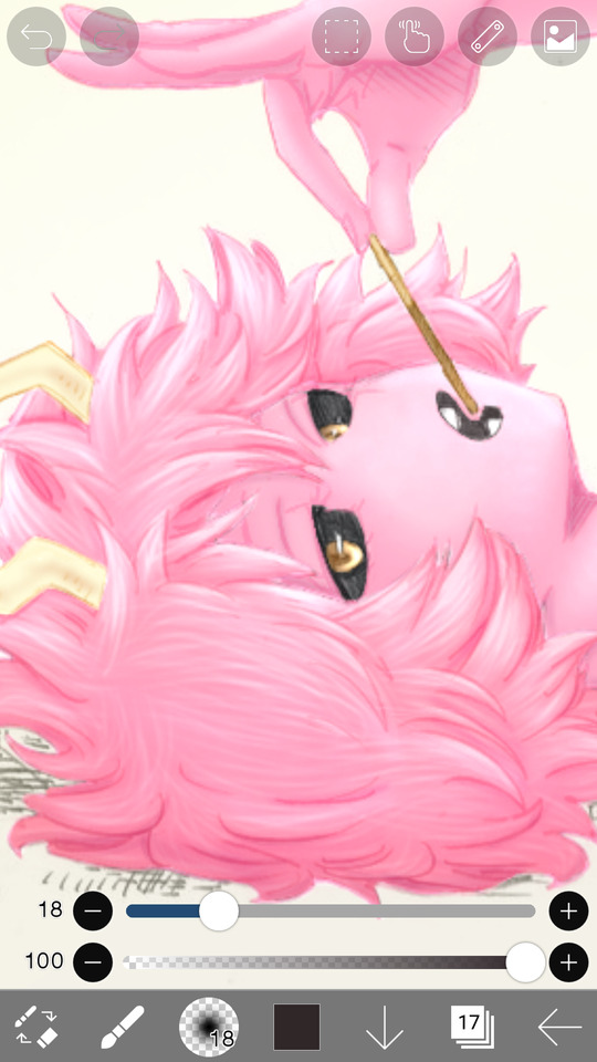
#then changed the blending mode to screen on ibisPaint
Text
squisters…….squignatures……….. ;-;
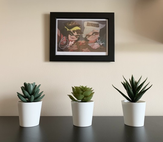
#this is my new favourite thing i own#i don’t think I’ll be able to get the signatures properly transparent#but all I did was get them on plain black from the Calamari Inkantation 3MIX album cover#(messed with the colours a bit to make it completely black n white but I don’t know whether I needed to)#then changed the blending mode to screen on ibisPaint#just in case anyone wanted their own signed squid sisters merch ^w^#anyway look at them they’re so inspiring#squid sisters#splatoon#callie splatoon#marie splatoon#callie cuttlefish#marie cuttlefish#callie and marie#sunken scroll#Marie after Midnight
38 notes
·
View notes
Note
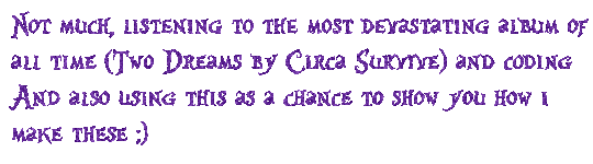
HOW ARE YOU DOING/WHAT ARE YOU UP TO?
[^PRETEND IT'S SPARKLY AND FUN BECAUSE I DON'T KNOW HOW TO MAKE THE COOL THINGS]
below the cut ~~
So the sparkle things are gifs, which means we need to
1.) make the frames and
2.) turn the frames into a gif
Step 1: Making the frames
I use ibispaint bc its free and has great versatility, it doesnt matter what photo editing app you use it will just change how you add the glitter. To keep this super simple im just going to show you how to glitter
In ibispaint, open whatever size canvas you want/open the image youre glittering. Choose the text tool and add your chosen text
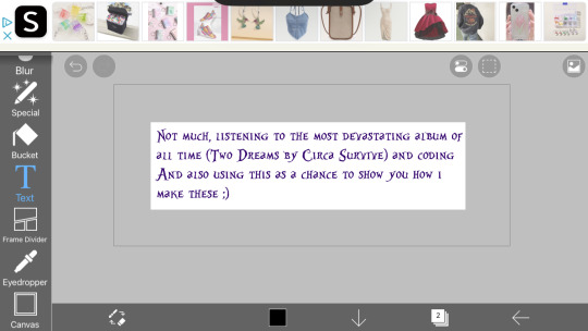
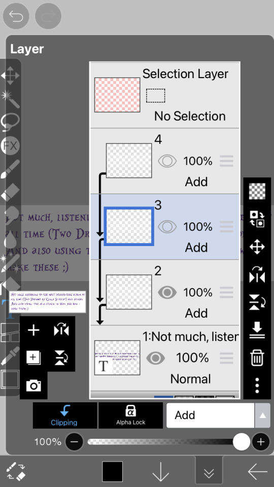
On the bottom row here ^^ you can see a little button with a number two, its where you can open the layer/canvas menu. Click that
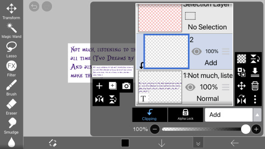
Click the "+" on the left hand side, click clipping, and click the dropdown that says "normal" and choose "add" (this is the blending mode). Your screen should now look the same as above.
in the menu on the righthand side (the "tools" menu), click the fx filter icon
Scroll to "artistic"

Fix the settings until they look like the ones above
Type: color
Strength: 75
Amount: 25
And blending mode normal
Click the green check
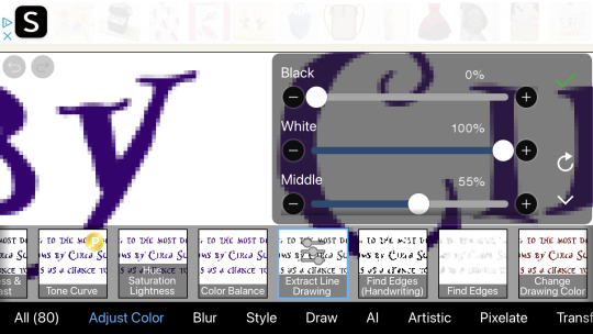
Now go to the adjust color section and click "exact line drawing" and match it to the settings above
Black: 0
White: 100
And middle: 55
Click the check
The layer is now going to be black rather than the colors it was before, that means youre on the right track
Click the x to leave the filter menu, go back to the layers/canvas menu
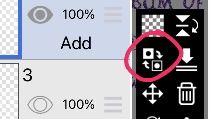
Click this little flippy button, "invert layer color" now you should have a glitter layer!! This glitter layer is going to be part of one of our frames
Now repeat the steps of making a new layer, clipping it and changing the blending mode, adding the filters, and inverting the layer color 1-2 more times to have two or three glitter layers (yes theyll be stacked on one another but that is okay for now)
Saving the frames to make a gif:
Now we have several layer, descending they should be:
2-3 glitter layers
A text layer
(And an empty base layer, just ignore it lols its just chillin, u can delete it if you want it doesnt matter)
All these layers have eye images on them. If the eye is dark the layer is visible. If its not its invisible. We are going to save every glitter layer over the text layer individually to get the frames for our gif
The text layer needs to be visible at all times during these next steps.
Turn off the visibility of all the glitter layers except the bottom one (by clicking the eye icon on the layer)
Only one should be visible while we're saving the frames
There is an arrow on the bottom bar all the way at the right
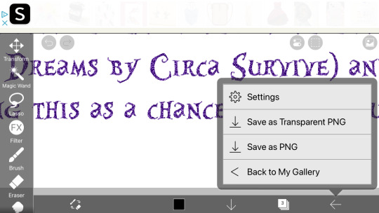
Saving as transparent png makes the background see through like the gif above, save as png makes the background white. Pick whichever, but choose the same one for all of them (if you choose transparent choose transparent for all frames)
Go back to the layer canvas menu, make the glitter layer that is currently visible invisible. Click the eye on the layer above that one to make it visible (the second glitter layer)
Repeat the saving process. If you have a third glitter frame, make glitter frame 2 invisible, glitter layer 3 visible, and save.
Part 2: making the gif itself
go to ezgif dot com. ezgif dot com is the best simple gif maker. ezgif dot com is now your best friend. hashtag not sponsored
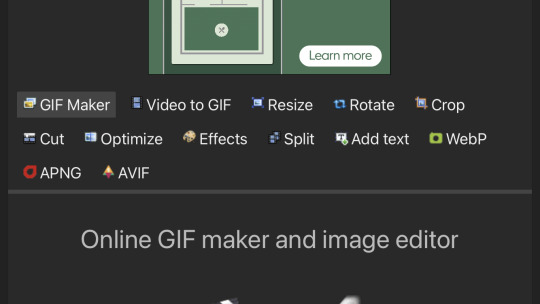
Click gif maker
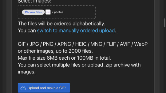
Click "choose files", "photo library", add the glitter frames you made and click add or choose whatever is at the top idr
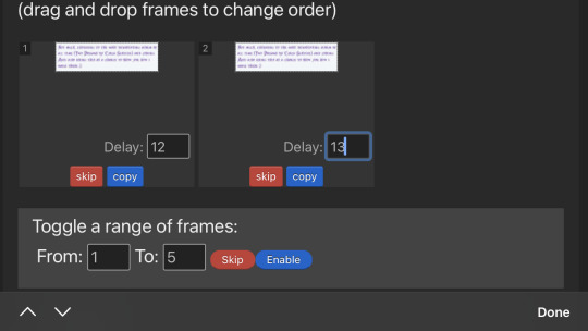
(I wound up using 3 frames not 2) where it says delay under each gif, delete the "20" and add 12 to one and 13 to the rest (the delay is how much time each frame will take in the gif, using one number thats different keeps tumblr from screwing up and accidentally converting them into videos. Idk why that happens but sometimes it does.)
Ignore all the rest of the settings, you dont need to mess with them just for lil glitter gifs and click the create button at the bottom
Now you can either click download when your gif pops up or you can long press to save it directly to your camera roll
Extra notes:
If you want your glitters to be rainbow, skip the "exact line drawing" and "invert layer color" steps
Ezgif isnt good for high quality gifs. For the gifs on my website i make the frames in ibispaint and use photopea (a free online photoshop) to make the gifs themselves. But thats more difficult to do as you cant really use photopea on mobile without a mouse and its much more complicated (so thats a separate tutorial if you ever need high quality gifs)
#If any part of this was confusing or if you need help lmk on discord im more than happy to help you ^w^#gifs#crimson answers#crimson explains#kaikaikaikaikai
3 notes
·
View notes
Note
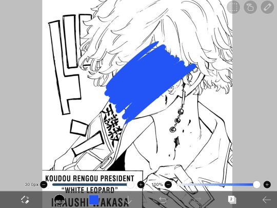
hi babe! i’m new to ur blog and i’m wondering if u can tell me how u color ur manga panels? idk if it’s a filter u use :* but i’ve seen multiple ppl color it and idk how to!!
hello! welcome, thank u for checking out my blog <3
i usually edit my header and icons on photoshop but same process applies for ibispaint (its a free app both on android & ios). so heres a tutorial:
Import your image.
Add new layer.
Pick your desired color.
Scribble the whole area or use the bucket tool.
Then go on layers again then change the blending mode.
I mostly use screen or lighten but you can play around w the modes depending on ur liking and thats it, export the image. enjoy customizing ur icons and headers! just slide in my dms if u have more questions. sending lots of love, ty <3

#[🤍] anon asks!#sankyu (´◡`)#tokyo revengers#wakasa imaushi#manga edit#manga panel#colored manga#icons#headers#manga#anime#ibispainttutorial#ibispaintx
11 notes
·
View notes
Text
Icon tutorial
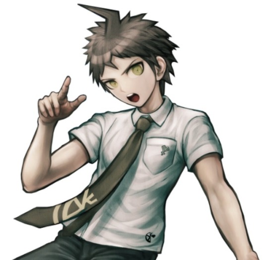
Alright so I’ll show you guys how to make icons like all those fancy blogs you see on here so you can make your own. I’ll be using ibispaint for this but you can probably use anything that has layers let’s start with our picture:

I’ll be using this one.
1. So the first thing you want to decide when making icons is the size of your canvas. The size of your canvas will largely depend on the size of your pic usually I like to go for a nice 1000x1000 size but for the sake of this tutorial we’ll use 500x500.
2. So you’ve got your canvas ready now you want to import your sprite or whatever you’re using just make sure it has a transparent background otherwise this tutorial is moot! Import your picture by pressing this:

3. Once you import it, it may look something like this:

That’s okay just adjust the pic to your liking and then press the green check mark:
Much better!
4.) Now moving onto backgrounds. You can choose any brackground you want, you can either make one, use the backgrounds ibispaint provides, or import a background the same way you imported the picture. Let’s import a background:
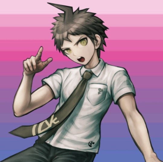
Now we’ve got Hajime looking all smooth behind the background but it doesn’t exactly look pretty let’s fix that!
5.) Add a new layer under Hajime then select the paintbrush, after hitting the paintbrush select filter (fx) it’ll bring up a menu scroll down until you see stoke outer select that and follow these settings

You can change the color and size to your liking those settings are just if you want a simple white outline. So now the sprite looks better but in my opinion it could use some finishing touches, let’s add an overlay and a shadow for hajime.
7.) To add a shadow duplicate the sprite you’re using for the icon, then duplicate your background and clip it to the duplicate sprite. After doing so merge the duplicate background onto the duplicate sprite and change the blend mode to linear burn(I like to duplicate this layer and then merge it down so the shadow looks darker but you don’t have to) once done move the linear burn layer over slightly:

(Make sure the shadow layer is underneath the white outline layer as shown in the pic otherwise it’ll look weird plus it gives it that nice cardboard cut out look)
8.)Wow looking good! For the final step let’s add an overlay. When doing overlays you can pick any color but I like to pick a color from the background so we’ll use a nice pink. Make a layer above everything and completely color it your overlay color. Once you’ve done that change the blend mode on your overlay layer and adjust the opacity to your liking. I’ll go with screen and about 30% opacity:
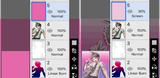
And now the final product!

Hey he’s looking good!! Get a load of this bicon!! (This was a really long tutorial but I hope it helped if you have any questions feel free to ask.) the icon is free to use I posted it separately from this tutorial here
35 notes
·
View notes
Note
Can you talk about blending layers on ibisPaint some more? I I saw your response to another ask about tips for new colorists. This would be awesome to learn more about! Thank you~
Honestly, I still don’t use most of them so I can’t help too much, but I’ll explain the ones I do use!
First off is the multiply layer. It makes for easy shading.


In the multiply layer, using the same pink I can get a decent looking shading color! Personally, I duplicate the flat color layer, use “multiply” and erase that layer to lighten up the shading (which is WAY quicker than making sure you don’t go outside the line when you shade/selecting the precise area you want to shade), but you could make a blank multiply layer and shade using the flat color if that’s more your style.
The other “darken” layers will give you other shading affects, but with different tones. Multiply is my favorite
Meanwhile the “add” layer can be used for “glowy” highlights

The color does matter! So let’s say I change the color I use to green, it would look like this

Then there’s the screen affect, which I used to use to change the line color (as done in the Mina examples), but is also just really fun for doing cool overlay affects


* make sure background is white, add desired image above it and turn that image layer into a screen layer. Opacity can be changed and this would probably look better at a lower opacity, but I already closed out!
** white and light colors won’t show the screen image very well! The darker the colors, and the more vibrant the screen layer colors, the better it’ll show up :D
I don’t really use the other blending modes that much, if at all, but hope this helps!
Bonus screen effect:
(Seriously, mess around with the screen effect asgdjfk)
20 notes
·
View notes
Last Seen Blogs

8thereisnowarinbasingse
“I Must Find The Avatar To Restore My Honor.”

splitch-draws
Splitch_Dies

adidassuperstardiamondbw-blog
adidas superstar diamond - carpenters superstar mp3
pope-francis-quotes
Pope Francis' Daily Reflections And Homilies
kaffees-archive
two faced bitches never lie