#there is No Reason for the whiteboard ui to be there
Explore tagged Tumblr posts
Visit Tumblr Blog
Explore Tumblr blogs with no restrictions, modern design and the best experience.
Last Seen Tumblr Blogs


Fun Fact
Celebrities use Tumblr as well.
Note
Odyssey duo my beloved
odyssey duo hehe i lovre them too 🫶
#ignore the shitty ass quality. again#jet makes art n stuff#there is No Reason for the whiteboard ui to be there#none at all#unstable universe#unstableverse#parrotx2#wifies#odyssey duo#parfies
58 notes
·
View notes
Text
Part 79


Rate my kid's school uniforms!
Poor Cinder felt more isolated from his sisters than ever now that they'd be getting the highschool experience without him.

It was a beautiful morning in Copperdale, which the teens wouldn't get to enjoy thanks to being stuck inside for school all day.

Ana had been hoping she'd find The One as soon as she set foot on the grounds, but it seemed the sims townie aging issues prevailed, as all the teens goofing around had been there since Andre and Ellis were teens!

Ella was more focused on school-related activities, and tried her hardest to get on the principal's good side right off the bat.

To Ella's dismay, the principal remained in a foul mood until Ana showed up with a bright smile and vouched for her twin.

The whole thing made Ella particularly grumpy, but what could Ana say! It wasn't her fault she was likeable!

Ana eventually noticed her twin's bad mood, and she had just the solution to help Ella become as popular as herself!

Nothing gets your classmates to like you like pouring on the body spray!

But when classes actually began, there was a noticeably empty seat...

Ella really had tried to sit still and pay attention, but the sims was actively working against her! For whatever reason, the school "event" ui hadn't shown up for her, so there was literally nothing she could do.

Well, sure there were things she could do, but they weren't at all class-related.

With nothing to do, Ella set about trying to solve her needs. But that's when the principal realised she had the perfect excuse to lay into the teen who she'd hated on sight for whatever reason.

Ella tried to explain the problem, but ended up just confusing the principal. Luckily that got her off with just a warning instead of detention!


That could've put Ella on her best behavior, but she still couldn't attend class. So, she did the next best thing! At least she could prove her attendance!

When all the whiteboards were fully vandalised, Ella decided to turn her artistic talents elsewhere. She'd kind of gotten into painting at the romance festival, but mostly it was just something to pass the time with.


Her first school day was going a lot better than Ana's, who was having a one-of-a-kind learning experience.

As the battered and bruised Ana tried to return to her seat, she found it occupied by a sim who had apparently decided to show up halfway through class. She had to admit, he was kind of cute...
4 notes
·
View notes
Note
Hey, this is a longshot—but d’you have a link to that “how to remove bloatware on Windows/what bloatware to remove” post?
I’m asking because a friend sent me a link to that one about pc specs you reblogged a while back, and I could’ve sworn I saw the bloatware one in the recommended posts for that one, but I forgot to like the post and now I can’t find it. I finally picked up a windows laptop and need to know what to disable.
So it sounds like you're referring to a post I reblogged from @ms-demeanor but I cannot seem to find it. But tumblr search and even the option of using duckduckgo to search tumblr for me is letting me down. Though the PC Specs post might be this one? https://ms-demeanor.tumblr.com/post/726025900027789312/so-the-counter-to-this-is-that-ssds-are-static
I may poke around a bit more later to see if I can find the post but for now... I can list off some of what I did based on my own recent experiences of setting up a new laptop after my old one decided to start blue screening if I moved it five inches in any direction. (That old laptop is now doing perfectly fine when left completely stationary, so I've been using it to experiment with creating a local file sync for back ups using some old hard drives i had lying around.)
Bloatware Social Media/Video Media Apps:
These are probably pretty obvious bloatware since this is a computer and all these services are therefor going to a.) work on the browser and b.) work better on the browser than the app anyway. Also there are a few cases like Facebook where there's a c.) why would I touch <insert application> with a ten foot pole anyway? reason for removing the App
Instagram
Facebook
Netflix
Prime Video
News - Microsoft news aggregation App (there are better options out there than this for news aggregation)
TikTok
Spotify - depends on your spotify usage tbh, but I don't use it since I just dumped all my music onto my local plex server and use that to play music all over the house
Twitter - Or X, whatever
Additionally:
Any preloaded game you don't find interesting. Depending on the vendor there could be a lot of games or no games.
X-Box gaming apps - while there are some reasons to keep the x-box gaming stuff, most people are gonna find it useless
WildTangent Games
Omen gaming - if you've got an HP laptop specifically, you will probably want to give Omen related game apps the boot too
Vendor specific applications - YMMV, I do keep some of these for diagnostic purposes, but you definitely want to at least give any HP this or Dell that or whatever type programs a harder look. Any program starting with the name of the vendor that created your laptop? At the very least look it up to see how important it really is/isn't
Adobe programs - there are free versions of everything adobe does that do it better than adobe does
3D Viewer - it's a 3D modeling program, but odds are you won't need/want this
Microsoft 365/Office/etc - Unless you need these programs specifically for professional reasons, LibreOffice is free and reliable and has multiple UI modes for the toolbars depending on your preferences
Microsoft Teams
Microsoft ToDo
Microsoft Family
Microsoft Maps
Mixed Reality Portal - Unless you're doing VR dev/VR gaming using this computer, there's no real reason to keep this one
Microsoft Whiteboard
Microsoft People
Sound Recorder - YMMV, this is useful for recording lectures and the like, but I prefer freeware like Audacity which is more reliable/just works better
Sticky Notes
Weather
Cortana
Amazon Alexa
I'll usually keep Edge around as a backup browser, but Firefox is definitely the best browser out there right now.
5 notes
·
View notes
Text
Walk a Mile in Their Shoes: Why Role-Playing Should Be Part of Your Employee Training
Traditional training often falls short when it comes to building soft skills like empathy, problem-solving, and conflict resolution. That’s where role-playing in employee training comes in—a hands-on, immersive strategy that teaches your team to think on their feet while understanding different perspectives.
Whether you're training your customer service, sales, or product management teams, incorporating role-play into your learning programs can elevate your employee development and make your sessions not only educational but engaging.
What is Role-Playing in Training?
Role-playing involves employees acting out real-world scenarios that they may encounter in their job. This could mean simulating customer interactions, sales pitches, or even internal team conflicts.
Instead of passively learning through presentations or modules, employees practice real-life responses, experiment with different approaches, and receive immediate feedback in a risk-free environment.
Why Role-Playing Works
Here are some reasons why role-playing is one of the most effective employee training ideas:
Active Participation: People learn best by doing. Role-play encourages learners to actively engage with the content.
Empathy Development: Taking on different roles helps employees understand others’ perspectives, especially in customer-facing positions.
Immediate Feedback: Trainers and peers can provide suggestions in real-time, accelerating the learning curve.
Safe Space to Make Mistakes: Mistakes become learning opportunities when there's no real-world fallout.
Confidence Building: Practicing responses to difficult scenarios helps employees gain confidence in their communication and decision-making.
How to Run a Successful Role-Playing Session
To make your role-playing training sessions effective and enjoyable, follow these best practices:
1. Create Realistic Scenarios
The more relevant the scenario, the more impactful the learning. Use real challenges your team faces regularly. For example, simulate a tough client meeting or a crisis that needs urgent resolution.
Need help identifying key role-specific challenges? Explore our expert talent pool by hiring AI/ML developers, UI/UX designers, or data analysts who bring real-world case study examples.
2. Rotate Roles
Encourage employees to take on roles they aren’t used to. For instance, a junior developer could act as a project manager, or a marketer might play the role of a customer. This perspective shift leads to stronger team understanding.
3. Keep It Structured but Flexible
Use role-play scripts to maintain direction, but allow space for improvisation. Real situations aren’t predictable, and your team should learn to adapt.
4. Facilitate Constructive Debriefs
After each scenario, ask questions such as:
What went well?
What could be improved?
How did it feel to play a different role?
This reflection reinforces learning and uncovers insights that might otherwise be missed.
5. Make it Regular
Like any skill, communication and empathy improve with practice. Schedule role-playing sessions monthly or as part of your team’s onboarding process.
Role-Playing for Remote and Hybrid Teams
Role-playing isn’t just for in-person training. Use tools like Zoom breakout rooms, virtual whiteboards, and screen sharing to simulate real-world interactions for remote teams.
Looking to build a remote-ready workforce? Start hiring with Swissmote to find adaptable, collaborative professionals across roles, including frontend developers and social media managers.
Best Roles to Use Role-Playing With
Customer Service Teams: Practice handling complaints or escalations.
Sales Teams: Simulate sales calls and objection handling.
Product Managers: Work through stakeholder discussions or project planning meetings.
Software Developers: Rehearse code reviews or pair programming communication.
UI/UX Teams: Act out user testing sessions or design critiques.
Role-Playing + Swissmote: Better Training Starts with the Right Team
At Swissmote, we don’t just help companies hire; we help build learning cultures. From hiring fullstack developers to freelancers and beyond, we connect you with global professionals who thrive in interactive learning environments.
Explore our Knowledge Base and learn more about Swissmote. Follow us on LinkedIn and Instagram for talent tips and training trends.
Need fast answers? Visit our FAQs or hire top talent today.
Final Thoughts: Train Smarter, Not Harder
Role-playing transforms passive learning into proactive growth. It enhances communication, empathy, and confidence—all essential skills in today's collaborative workspaces.
By implementing role-playing as a core training method, you’re preparing your team to think critically, respond calmly, and act confidently in any situation. And when you pair that training approach with top-tier hires from Swissmote, you get a team that’s not only capable but unstoppable.
Keywords: role-playing in employee training, interactive employee training methods, training with empathy, active learning strategies, Swissmote hiring solutions, remote team development, hire developers online, customer service training ideas
#Recruitment#talent aquisition#Hiring#Staffing#Staffing solutions#Hiring Solutions#Recruitment Agency#Swissmote
0 notes
Text
What Is the Best Video Conferencing Software for Distributed Teams?
Introduction: The Dawn of Remote Working
Times are changing. Offices aren't restricted to a location anymore—now they're virtual that cover whole continents. Teams of individuals work together now from their living rooms, cafes, and even from the peak of mountains. That's introduced an imperative requirement along with it: crystal clear, glitch-free video communication.

What Makes a Great Video Conferencing Solution?
Not all conferencing platforms are created equal. A great platform needs to be easy to use, lag-free, secure, and full of collaboration features. It needs to integrate with calendars, document-sharing software, and offer real-time chat. Elegant yet simple—that's the holy grail.

Scalability: From Startups to Global Enterprises
Whether you’re a five-person startup or a multinational juggernaut, your video conferencing app must grow with you. The best solutions offer flexible plans and seamless scalability—no growing pains, just smooth transitions.
Security First: Protecting Conversations and Data
Data breaches are a nightmare. That’s why best video conferencing apps for remote meeting prioritize encryption, multi-factor authentication, and admin controls. Confidentiality isn’t a feature—it’s a necessity.
Zoom: The Reigning Champion
Zoom exploded in popularity for a reason. It's easy to use, holds 1,000 participants, and offers features like screen sharing, virtual backgrounds, and breakout rooms. It's the gold standard in remote meetings.
Microsoft Teams: The Business Darling
Designed for business, Microsoft Teams is more than a video app. It's a communication hub that blends chat, video, file sharing, and app integration—all within your Office 365 ecosystem.
Google Meet: Integration Meets Simplicity
Part of the Google Workspace ecosystem, Google Meet is ideal for users who value simplicity and speed. It’s browser-based, so there’s no need for downloads. Just click the link and you’re in.
Cisco Webex: Enterprise-Level Robustness
If you’re all about control and customization, Webex delivers. It’s packed with features like real-time translations, background noise removal, and powerful admin dashboards. Webex is enterprise-grade to its core.
Skype: A Timeless with a Twist of Modernity
Skype is old news, but that doesn't mean it's outdated. With improved UI, real-time captions, and live translation, it's a good bet for small businesses and personal conferences alike.
Teaching Conferencing Apps – Classroom Tools
The cloud classroom. Teachers don't merely require video tools—teachers require engagement tools, grading tools, attendance tools. That's where conferencing apps for teachers shine.

BigBlueButton: Built by Teachers
Open-source and specifically designed for instruction, Big Blue Button offers whiteboards, polls, and breakout groups. It integrates seamlessly with LMS platforms like Moodle and Canvas.
Google Classroom + Meet: Efficient Schooling
Google Classroom goes hand in hand with Google Meet. It simplifies assignments, grading, and communication—while keeping video conferencing at a tap away. It's the ultimate one-stop education bundle.
Jitsi Meet: Open-Source, Education-Focused
Free, secure, and browser-based, Jitsi Meet is a favorite among teachers who want total control for free. No account required. Just share the link and start teaching.
Features That Matter: Screen Sharing, Chat, Recording
Any decent video conferencing application must have these basic features: screen sharing for demos, chat for sidebar discussions, and recording for asynchronous students or absent colleagues. These are no longer amenities—they're essentials.
Cross-Device Compatibility: Meeting Anytime, Anywhere
Laptops, smartphones, tablets—your conferencing solution must be able to play nice with all of them. If you're working from an Android phone on the train or a MacBook in your home kitchen, the experience should be fluid.
How Business Mobile App Development Brings Conferencing to the Forefront
Companies can go beyond off-the-shelf solutions using specially created mobile apps. benefits of mobile app development for business include custom user interfaces, better analytics, better branding, and better security options. These custom solutions make remote teams work like never before.
Final Thoughts: Selecting the Right Tool for Your Team
whether teaching, enterprise coordination, or social team check-ins. The trick is finding what's most important to your workflow and matching the tool to make your team's efficiency shine.
0 notes
Note
🦩.o0(It's a world full of boards with games on them. I came from that world.)
🦩.o0(Connecting three did almost the exact same thing it did back there, too, but for some reason the Materia isn't naturally dissipating.)
🦩.o0(There was a whiteboard in the middle, so it's not exactly three sheets of paper. I doubt you could recover the paper from the score itself.)
🦩.o0(Hang on, let me try...)
INVENTORY: ✨⏳🌱 ✏️✨⬜ ✏️👝✨ Scores: 📜 - 1
👝 INVENTORY: ⬜⬜⬜ ⬜⬜⬜ ⬜⬜⬜
🦩Flamingo [🐦Avian / (No Class Selected)] Description: [PLACEHOLDER] A flamingo from The Ludoplane. 🧱Durability - 6 🕰️Stamina - 6 👍Agreeability - 7 🌅Experience - 8 💥Vigor - 2 👁️Perception - 5
EQUIPMENT:
INVENTORY: ✨⏳🌱 ✏️✨⬜ ✏️👝✨ Scores: 📜 - 1
🦩.o0(I found the rest of the UI, but there is indeed no obvious way to convert the point back into anything physical.)
A flamingo driving a half-destroyed wagon waves at Druid. They seem...tired. Looking for somewhere to rest. Perhaps even looking for somewhere where they can call home...
(@questimingo)
Oh! Hi there! Do you need anything?
54 notes
·
View notes
Text
Hire JAVA Programmers for Developing Asynchronous E-Learning Systems

To see how JAVA controls the nonconcurrent e-learning frameworks, it is imperative to comprehend the idea of offbeat e-learning and the job of JAVA in building it. Commonly e-learning can be bifurcated into coordinated and nonconcurrent e-learning. In simultaneous e-learning, understudies need to plan a specific time when students across the limits sign in to the virtual study hall and connect with others. Here the understudies can get refreshes with respect to what's happening through the whiteboard.
Offbeat e-learning is totally unique and more normal as it makes independent and quick learning experience according to the understudy requests. Since there is no planned arrangement along these lines this type of e-learning is more adaptable and calls for innovation that has the potential for quick updates and consistent continuous data sharing. This sort of e-learning calls for different composing devices and learning frameworks that sudden spikes in demand for web. This is absolutely one reason why engineers are assessing the JAVA improvement stage.
The excellence of JAVA lies in the way that it is both a programming language and a programming climate. The article situated programming empowers the production of applets and applications that influence the highlights of a realistic UI consequently, assisting one with establishing learning conditions with vector illustrations, sound and video documents. The Swing and the AWT libraries of JAVA empower the concurrent introduction of intelligent components, for example, fastens, names, and featured content fields in a solitary window.
No big surprise why increasingly more JAVA software engineers are drawing their profession in the area of e-learning applet improvement. This naturally has provoked an interest in the market to recruit JAVA engineers.
The nonconcurrent learning comes in two unique structures in particular the encouraged and the independent. In the encouraged one, the educator is liable for posting tasks on a task board. This followed by web based perusing or exploration along these lines, permitting the understudies to examine on the web and present their work through email. For this situation of JAVA improvement, JAVA Server Pages is utilized for content showcase rationale, programming reuse, stage independency, extensibility, and apparatus uphold. Aside from this, JSP additionally empowers the worker to embed dynamic substance. On account of independent learning, JAVA offers certain useful points of interest, for example,
• Integration with web pages-JAVA has the adaptability to get incorporated with ASP, PHP and HTML pages. Accordingly, JAVA developers can make intelligent substance.
• Handling of organization conventions Programs in JAVA can be effortlessly composed for expanded openness and data sharing consequently, empowering a smooth two way information preparing.
• Interoperability across various stages Developers have the adaptability of utilizing any working frameworks, for example, UNIX, MS Windows, and MacOS.
• Interaction among facilitators and students JAVA's developed web climate empowers concentrated mathematical investigation that offers the capacity of making open finished evaluations.
• Running applications locally-JAVA has the capacity of running applications locally along these lines taking out the cycle of persistent information move from a distantly found worker.
Also Read:- Java Technical Interview: Tip and Tricks
From the above conversation, it is very certain that with JAVA the eventual fate of electronic advancement looks encouraging. This adequately clarifies why advancement ventures need to enlist JAVA designers for taking their improvement capacities to the following level.
1 note
·
View note
Text
Exploring the Benefits of Buying a Refurbished Samsung Mobile in Australia
The Samsung Z Flip 3 is a foldable smartphone with a 6.7-inch AMOLED display with a resolution of 2208 x 1080 pixels. The Samsung Flip is a digital flip chart for business and educational purposes. It is a large touchscreen display that can be used to write, draw, and share content with the touch of a finger. It is like a traditional whiteboard but has the added advantage of saving, storing, and sharing the contents digitally and has the following features:
Camera- The device features a triple-camera system on the back with a 12MP main sensor, 12MP ultra-wide sensor, and a 3D depth sensor. On the front, it has a 10MP camera.
Performance- The device is powered by a Qualcomm Snapdragon 888 processor and comes with 8GB of RAM and 256GB of internal storage.
Battery- The device has a 3,300 mAh battery with 25W fast charging, 15W wireless charging, and 3W reverse wireless charging capabilities.
Connectivity- The device supports 5G, Bluetooth 5.1, WiFi 6, NFC, and GPS.
Operating System- The device runs on Android 11 with Samsung's One UI 3.1.
Durability- The device has a glass and metal build, with a water and dust-resistant design.
Fingerprint sensor- The device has an in-display fingerprint sensor for security and convenience.
Stylus support- The device supports the S-Pen stylus for taking notes and drawing.
Flex mode- The device features a Flex mode, allowing split-screen multitasking and unique camera angles.
It's often used in meeting rooms, classrooms, and other collaborative spaces. Samsung Flip is an interactive display that enhances productivity, communication, and creativity. It has built-in whiteboarding and annotation tools and can be used for presentations, brainstorming, and other collaborative activities. There are several reasons why someone might choose to buy a refurbished Samsung Z Flip 3:
Cost- Refurbished electronics are generally less expensive than brand-new items, making them more accessible to a wider range of consumers.
Environmental concerns- Buying refurbished electronics reduces the demand for new products, which can help to reduce electronic waste and the environmental impact of manufacturing new devices.
Quality- Many refurbished devices are thoroughly inspected and tested to ensure that they function properly and meet a certain standard of quality.
Availability- A refurbished version may be a good alternative if a new product is out of stock or unavailable.
Warranty- Many refurbished devices come with a warranty, so you can have peace of mind knowing that your device is protected.
Support- Many refurbished devices come with support, so you can know that your device is protected.
Local sourcing- Buying a refurbished Galaxy z flip 3 in Australia will ensure that you support local businesses rather than buying from overseas sellers.
Customization- Buying refurbished devices opens an opportunity for customization. You can have the device to your liking, adding more memory or changing the colour.
For more details, visit us :
Samsung galaxy tab s7
Samsung tablets
Ipad refurbished
Galaxy watch 5
#Samsung s21 fe#Samsung s21#Samsung galaxy s20#Refurbished samsung s10#Note 20 ultra#Samsung galaxy note 10 plus#Samsung 10
0 notes
Text
Online Whiteboard Tool
4 Ways You Can Use Creately to Enhance Remote Collaboration
Best collaboration sessions often take place around a whiteboard. Writing down a thought in words or sketching it out with a visual or diagram helps you think better and generate ideas and innovate faster.
However, the days of a team huddled together around a whiteboard inside a conference room spitting out ideas are temporarily over – at least till COVID-19 is eradicated fully. And while most teams are working from home to support the latter cause, digital or online whiteboards have become an indispensable tool to them.
Importance of Visual Collaboration for Remote Teams
When it comes to collaboration, there are many ways and tools to facilitate the process. However, collaboration through visual means stands out for a few good reasons.
Our brains can grasp visuals faster than speech or text. If you want to clarify something quickly, accompany it with a visual in the form of a diagram, chart, or sketch.
Helps overcome language barriers. Everyone understands a picture or a diagram, and breaking down a complex idea with a visual, helps everyone digest it faster, whatever the language they may speak.
Provides structure to discussions, meetings, and planning sessions. Sketching an idea, design, system or process using a mind map, UI mockup, use case diagram or a flowchart gives something abstract a formidable shape that is comprehensible to anyone – even someone with little technical knowledge.
It enhances memory. When we hear something we tend to remember only 10% of it, but accompanied by a visual, we are likely to remember 65% of the information.
It stimulates imagination hence innovation. Want to generate new ideas faster? Start with a mind map. It helps capture the free flow of thoughts and organize ideas in a meaningful way.
Helps build a common understanding of the bigger picture. When everyone contributes to drawing out an idea in a shared space, it helps align their vision and knowledge of the concept.
Increases participation and engagement. An online whiteboard gives everyone access to the same space, allowing them to express themselves freely through visual means.
How to Use Creately to Enhance Remote Collaboration
As a visual workspace for collaboration, Creately can be used in a number of ways to increase efficiency by remote teams.
Brainstorming & Idea Development
In an office, a brainstorming session would usually take place in front of a whiteboard. Remote teams mostly use video conferencing or a chat platform to do this.
An online canvas is far more brainstorm-friendlier than any of the methods above. It gives everyone access to the same space, enabling them to share and discuss ideas in real-time.
With Creately, you can start a video call within the app itself and watch as your team adds ideas onto the canvas during the session. For an effective brainstorming session on Creately,
Create a document, name it and add collaborators
Start with a premade template like the one below.
Mind Map for Brainstorming (Click on the template to edit it online)
Assign a facilitator to develop the diagram and organize ideas put on the canvas
Color code the diagram to highlight the ideas added by different people
Use the same canvas to discuss, finalize and prioritize the ideas gathered
Use comments to add notes for anyone who would refer to the map later
Share the document link on Slack, to give anyone quick access to the diagram
Sprint Planning
A whiteboard is essential to any Sprint Planning meeting. And luckily, with the availability of online whiteboards, teams working from home can still conduct the session as if they are in the same room.
To effectively use Creately for Sprint Planning
Have templates ready prior to each session and have them shared with the rest of the Sprint Planning team. You can also use the premade templates available in the resources below.
Assign a designated person to handle and update the templates
Online Meetings & Workshops
With built-in video conferencing, an infinite canvas, real-time collaboration, and the range of editable templates, Creately can support the entire process of running an online meeting or workshop.
Some best practices for Creately online meetings include,
Have the templates ready and shared with the team prior to the meeting or workshop
Meeting Notes Template (Click on the template to edit it online)
Clarify guidelines on how to use them. You can add a section on the template itself or do so separately
To give easy access, create them using the Creately Google Drive integration which allows you to control access permission from there. Or share an edit enabled link on the relevant Slack channel.
Project Planning
Whether it’s a development, design, or marketing project, you can use Creately to collaborate around it using the relevant tools.
Creately offers access to 50+ diagram types including flowcharts, Gantt charts, UML diagrams, UI mockups, wireframes, mind maps, etc. And the pre-made templates cover a wide range of scenarios from project charters to popular marketing models.
Involve the team in all planning meetings. Their input can be captured effectively by incorporating Creately project planning templates listed in our Visual Guide to Planning a Project
Create a separate folder that is shared with the team in Creately and move all project-related documents into it. This allows you to maintain all resources in a shared location.
Use a Gantt chart or a project timeline to mark task/ project progress. Assign someone the responsibility to update the document regularly.
Share progress with stakeholders by sending them a review only link to the relevant Creately documents
What’s Your Take on Visual Collaboration
Visuals make everything better. We think that Creately has already established this by now. The question is how you incorporate visual collaboration to improve what you do.
Try and incorporate Creately in your daily tasks and see how it can help you improve your workflow. Let us know your experience in the comments section below.

1 note
·
View note
Text
What Is The Most Ideal Approach To Create Apps For IOS And Android?
In staying up with the occasions, having your own mobile app is a significant and fundamental prerequisite. Mobile apps are not anymore an extravagance but a need for a business. These apps assume a significant part in building a brand by giving simplicity of leading the necessary business (look, choices, buys, after-deals administrations, and some more). It completes the work in a hurry.
The development of mobile apps has advanced numerous folds in recent years. The use of man-made reasoning and AI are turning into an essential piece of the mobile app plan and development cycle to give an extreme UI/UX experience and to make these apps more instinctive. Thus, when we consider building up an iOS and Android app, it is critical to see each moment as part of the mobile app lifecycle.
IDEATION:
Like all the other things throughout everyday life, an app likewise needs an ‘aha’ second. The first occasion when that a thought snaps or pushes its way through our psyches. We either promptly examine it or scribble down the central matters on the closest writeable stage like a paper napkin or an always present whiteboard. It can emerge out of the business side or from the item development side or a client or from any place.
Arranging:
To give this thought a solid design, arranging is a significant angle. We set up an arranging report. This archive answers the general, introductory inquiries on ‘the item’ (mobile app for our situation), how we intend to develop the item, and how would we intend to have a monetarily practical and beneficial item. To determine this, we need to respond to the accompanying inquiries:
Investigation:
Post the conversation in the arranging stage, we need to begin with the investigation and specialized documentation. In this stage, we answer some more inquiries (generally specialized in nature). Development choices: we can choose in-house development (utilize online app manufacturer or use engineers) or re-appropriate the app development measure.
Plan:
At this progression, we begin to offer shape to our vision of the app. We start to plan its look and feel. This is the stage where we: Begin planning the screen design – a basic and natural UI to amplify UX.
Build up a style manage: picked the shading subjects, symbol plans, text style and text dimension, button size, and so on characterize and plan a smooth route structure.
DEVELOPMENT:
In view of the choice made in the examination stage on the innovation and stage to be utilized and the development alternative to going for, the app development measure starts.
The other significant utilitarian prerequisites that should be taken into consideration during the development stage are:
Responsive app:
The app ought to have the option to work on all gadget sizes and all adaptations of working frameworks. Advanced app size: – clients with less mobile memory ought to have the option to introduce and utilize it
TESTING:
Once more, as concluded during the examination stage the development group will carry on the testing. Deft testing is the standard nowadays. Under light-footed testing, the development and testing go connected at the hip. This testing approach empowers remedies, adjustments, and upgrades to be made on the spot along these lines, saving a great deal of time.
Delivery:
When the app is totally tried against all experiment situations, the D-day shows up. The app is made accessible to the clients. The app is delivered on Google Play Store and Apple App Store, App criticism is gotten and examined.
POST Delivery Backing:
Crafted by the business expert and the designer isn’t over even after the arrival of the app. In light of the client’s input, the necessary upgrades and improvements are done in the app. Very much started, is half done. If we have worked really hard in the underlying phases of preparation, investigation, and planning the excess cycle can be a smooth sail as everybody will realize what is normal from whom and how is the eventual outcome expected to look.
THE Innovation
As expressed before, each sort of innovation is valuable relying on the particular reason and app highlights that we expect to have. Both the local innovation Android and iOS and cross-stage innovation have their arrangement of faithful clients. Along these lines, to choose which innovation to select we do essential advantages and disadvantages investigation of every last one of them.
Local Innovation:
The created app will be more productive as it will be upgraded by the gadget highlights like simple incorporation with google aide in android or with Siri or apple watch in iOS It will have innovation explicit UI and UX in this manner guaranteeing smooth working of the app
CROSS Stage Innovation:
At the point when the app is made utilizing the cross-stage innovation then the source code is divided among the advancements and the structure helps in interpreting shared code for every one of them.
android app development website development ios app Mobileappdevelopment
0 notes
Text
How to Use Animation in Mobile Apps and Follow App Design?
As we understand that computer animation can surely make your web site or application more easy to use and innovative and also we understand that the target market is more brought in by great visuals, styles, as well as interactive atmosphere. If you use computer animation in your mobile application, it comes to be more eye-catching and also pleasant. Movement styles are really valuable to comprehend the works as well as attributes of the aspects of your application. So, utilizing movement layouts and activity video in your software program effects substantially you.

Today's article is about ways to effectively utilize computer animation in your mobile application you obtain a correct concept of ways to utilize it and apply it to build your Application more luring.
Let's dive in
The essential objective of activity make
Initially, you need to understand the advantages of UI computer animation and exactly how it can transform good application principles into phenomenal personalized options.
Describe the reasoning
The essential job of any kind of whiteboards animation is to provide help the customer to know the user interface aspects while browsing into the application. By utilizing movement video, an application provides an appropriate demo to the customer to make sure that the individual can recognize what is taking place, it can surely likewise present the hierarchy of web pages and displays.
Follow individual involvement
Computer animations for mobile applications can surely likewise be useful to boost an individual to do something about it that is essential for a service. For instance, take post-reaction on facebook and twitter. It allows the customer to respond to a specific blog post and also is critical for companies to make certain social communication as well as involvement.
Offer a one-of-a-kind experience
In-app computer animation can surely guarantee an outstanding and also remarkable individual experience. Movement impact can surely likewise enhance brand name identification by highlighting the advantages supplied by the particular brand name and also fetching the brand's worth to consumers.
Let's know their area and work with your application.
Kinds of computer animation as well as peculiarities of their application.
Aesthetic responses
Aesthetic responses is very important for any kind of interface. In the physical world, items reply to our communication with them. People anticipate the very same responsiveness from application components. Application responses create makes customers really feel in regulate whether it's distinct and haptic. It additionally offers a much easier operate that suggests that the application is functioning appropriately! when a switch expands or a swiped photo actions uncertain instructions, it's get rid of that the application is doing something in action to the customer input.
Operate transform
The work of an aspect adjustments when the individual interacts with the component. Useful computer animation is typically utilized with switches buttons symbols toggles as well as various other little create aspects. Inning accordance with the communication the symbol or an aspect modifications
Framework as well as navigating
A lot of mobile applications have actually complicated frameworks so it's the job of the developer to streamline the navigating as high as feasible to ensure that, the individual can comprehend the components appropriately. Computer animation can be exceptionally practical for achieving this job.
For example;
Your computer animation resource where a component is concealing a customer will have the ability to conveniently locate it as well as quickly browse for your application.
Aesthetic motivate
When the customer navigates for your Application for the very first time, in some cases it's crucial to comprehend the visuals of your application. It's specifically crucial to use aesthetic hints when an application has actually an unforeseeable pattern of communication make. Computer animation decreases tip regarding how you can secure with application aspects.
Enjoyable computer animation
When developers wish to make customers fall for their items, they built hand computer animations or we can state distinct computer animation to create an application simpler to utilize and also comprehend.
System specify
There's constantly a great deal of procedures taking place backstage in your application information has been downloaded and install from the web server estimation are happening and more so your job is to create the application programs the real functioning of the procedures. New individuals need to recognize the standing of continuous procedures with aesthetic indications. As an example, when an sound videotaping remains in progression the application display Could reveal a removaling sound track. easy computer animation need to offer
The major concept of computer animation make
Currently let's comprehend the primary concept of computer animation create making effective computer animation.
You should keep in mind these concepts to attain the objective.
Product
This programs that what your component contains it's light or hefty level or multidimensional or inflexible or adaptable. It offers an appropriate suggestion to the customers that exactly how your UI aspect interacts with each various other.
Trajectory of activity
You need to specify the nature of the activity. You should have to choose which impact you desire your present then persevere.
Timing
Timing is among the crucial factors to consider when making whiteboard computer animation. You need to utilize contours to build your item more all-natural. So you should determine the precise timing inning accordance with the user's activities.
Rhythm
rhythm and computer animations carry out the very same operate as it carries out in songs as well as dancing it's organized the movement utilizing vitamin e or computer animation makes the appearance more all-natural.
Indicate keep in mind when applying mobile application
1. Bear in mind that the target market is and also create your mobile UI computer animation as an option to their troubles
2. Every aspect of your computer animation has actually a reasoning behind it.
3. Making your item stand apart, pursue natural-looking computer animation that resembles real-world motion.
4. You need to need to seek advice from the designer whatsoever the phases of your task.
This was about this website. You can possibly take the aid of Essence Studios, we are constantly there with you. Best of luck.
Original content by this URL https://medium.com/@essencestudios2d/how-can-i-make-a-mobile-animation-81860df440e4
0 notes
Text
Advent of Code 2020: Reflection on Days 1-7
All in all, a pretty simple week. Tougher points, for sure – though I was often coding at the stroke of midnight, and often with a brain addled with melatonin and ~other things~ – but nothing so revolutionary it couldn't be done.
Day 1: I must admit, this pandemic season made me forget all about the Advent of Code until December 2nd, when it popped up on my feed. So, Day 1 I had to do out of sequence. No problem.
As usual, Day 1 is just to help those who are unfamiliar with competitive-style programming get their feet wet with the input-algorithm-output workflow. The dataset was nowhere near big enough to cause the naive O(n^2)[1] solution not to work, so I decided to focus on making my solution elegant, Pythonic, and making appropriate use of the standard library. itertools.product came well in handy here, and using an iterator kept memory complexity lower than a list-based product.
My roommate's solution, conversely, was a deeply cursed Frankenstein's Monster of linear algebra. I still don't want to talk about it.
Fun fact: According to Reddit, the first star (i.e., Day 1 Part 1) was earned just 36 seconds after midnight, probably by someone with at least two monitors and a light-up keyboard.
Day 2: Whenever my brain sees regularly-formatted strings of different pieces of data, my Regex Lobe immediately starts firing synapses. Though, of course, as it was famously said:
If you have a problem and solve it using regex, you now have two problems.
Just some good ol' split() tokenization was all that was needed here. Python's comparison-chaining (e.g., lower <= x <= upper) syntactic sugar really helped here. I could have made it even more terse if I really wanted to – competitive programmers are usually averse to lines of code like:
counter = 0 if condition: counter += 1
But it really, really wasn't worth the effort here. Save that for days that start with 2, not end with it.
Day 3: This one gave me more trouble than I care to admit, and I actually had to revisit it later in the day. Ultimately, although I had immediately realized that this was a modulo problem (cf. simulation), I was having difficulty visualizing just where all the numbers needed to go. A little bit of funkiness with the ordering of lines in my algorithm here, but once I figured out Part 1, Part 2 was a breeze. Got to use a pretty cool looking slice –N[dy::dy] which ended up doing exactly what I needed it to do to handle the various slopes. Cool puzzle, and great winter theming!
Day 4: Glory to Arstotzka! Even though I solved this problem in Python as well, my roommate agreed that my solution was pretty friggin' JS-y. I ultimately caved to my reptillian regex brain, using a whopping 7 different re.match calls (though some of them were just out of additional caution, such as making sure certain numerical values were exactly 4 digits). Call me a UI dev, because I don't trust my input to be well-formed at all. Ever.
I also used a neat little field->validator function lookup table, though the clunkiness of Python's lambda keyword really starts to show itself. It's a shame van Rossum so vehemently opposes (opposed?) making Python more amenable to function-style programming. I learned a lot about it from my JS days, and it's often a very reusable way to solve problems. CAUSE NO TROUBLE.
Day 5: I've been had. My roommate got got too. I followed the problem directions too closely, not realizing the obvious solution right under my nose. Ugh. Maybe checking others' solutions on the AoC subreddit – after I finish my own, of course - is detrimental to my mental health.
My solution for Part 2, considering, is quite clever – I just sorted the list of flights, lopped off the first and last values, and enumerated it starting the index at whatever the second flight value was. Then, whenever there was a mismatch, we had found the gap. I saw others using the famous XOR hack, which was probably slightly more efficient than my list sorting. Oh well. I was too tired to be doing that kind of math.
Day 6: Every first week of a programming challenge needs a sets problem. I don't use sets very much at all, so I did it in a more programmer-oriented approach; my roommate, conversely, is a data scientist who lives and breathes sets, both in Python and math. He absolutely crushed my time on this one. (Not that it's a competition or anything...)
Day 7: The first challenge to give pause to both my roommate and me. The hardest part, to be honest, was just parsing the friggin' data. I tried to use regex again, if for no other reason than to flex my skills on my roommate. But, it turns out that Python regex doesn't support non-greedily capturing lists of repeated groups, i.e., r'([ab])+' will only ever capture a single letter, usually the first to satisfy it. So, matching on aba will just yield a single group of a. Sigh.
After doing it properly with some list comprehension-fu, it was a pretty straight shot, using some good ol' DFS on both parts to calculate paths. I was almost disappointed that the input data, despite being so intimidatingly large, allowed my relatively naive solutions (i.e., just checking every bag for Part 1 to see which led to shiny gold, and simple, non-tail-recursive sums in Part 2. Considering I just had a whole test on recursion efficiency in Racket, I should probably have done something smarter. Lol.) to run almost immediately. I was hoping to have to be clever to tackle the larger dataset.
To make myself feel better, I renamed my graph – really just a lookup table, tbh – SAURON, because it sees all. Also, I was tipsy and couldn't think of a better name. We live in a pandemic; leave me alone.
Anyway, this was a fun first week, and I'm looking forward to problems becoming increasingly head-scratching. My living room has a gigantic whiteboard in it for a reason.
[1]: TODO: add MathJax support to my blog :)
0 notes
Text
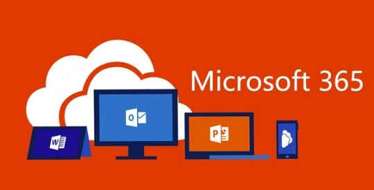
The Future of Microsoft Office 365 Apps
The Microsoft 365 apps are undergoing a redesign, and the company has recently provided a look into the future layout changes and what they’ll offer to the users.
The teaser released by Microsoft provided a look into its upcoming 365 apps along with some of the new features that’ll be available to the users. With remote work culture gaining popularity amidst the shadow of the pandemic, Microsoft is all set to welcome a future where a large number of people will rely on the Office applications following the trend of remote work culture.
In April, Microsoft released a Remote Work Trend Report. The report was gathered by examining the global usage of Microsoft Office apps during the initial stage of the worldwide lockdown. This report indicated that people continued to work from home even after the lockdown was lifted. Meanwhile, Microsoft has been working on developing its Office 365 features with the help of regular updates and launching additional features. This was done in order to keep up the pace with the competitors. It has been three years since Microsoft has been working to integrate its Office utility apps under the umbrella of Office 365 Apps, this also consists of the arrival of several developments to the UI, for making it a smoother experience to the users. Today several companies rely on Office apps. Word, Excel, PowerPoint and Teams, are some widely used applications for carrying out day-to-day office work.

Due to this reason, the future of Microsoft 365 excites many stakeholders. Microsoft has now teased about some more developments. Microsoft Office’s design head, Jon Friedman, in a Medium post, describes how the designers aim to make the UI minimalistic. The changes, however, span beyond the look of the apps; and also comprise a bunch of features to improve functionality and smoothness.
Features to Expect from Future Microsoft 365
As of now, Microsoft 365 UI makes use of a ribbon toolbar that contains most of the commands. The new version will feature commands contained in a flexible ribbon that’ll only feature commands when needed, depending on the type of work that is being done. It’ll also feature fading brand colours for the app headers.
Also, the company’s Teams communication app is set to become more versatile. Users can now benefit from the features of PowerPoint, Planner, and Whiteboard. Project Cortex and Cortana, will now also leverage AI to provide greater utility. The new ecosystem will come paired with a Family-Safety App for monitoring and controlling the screen-time across devices along with filtering undesirable content and encouraging “healthy digital habits.” Friedman adds that the team aims to provide a better and consistent experience across all the platforms. All this is made possible by leveraging Microsoft’s Fluid Framework Technology, which was launched last year at the Build conference.
Microsoft surely promises a progressive future with it’s Office 365 ecosystem. With the work-from-home culture gaining momentum, it seems obvious that the company will continue to enjoy its dominance over office utility applications in the long run.
Visit:office.com/setup
Source:https://daniel11ryan.wordpress.com/2020/09/08/the-future-of-microsoft-office-365-apps/
0 notes
Text
The Future of Microsoft Office 365 Apps
The Microsoft 365 apps are undergoing a redesign, and the company has recently provided a look into the future layout changes and what they’ll offer to the users.
The teaser released by Microsoft provided a look into its upcoming 365 apps along with some of the new features that’ll be available to the users. With remote work culture gaining popularity amidst the shadow of the pandemic, Microsoft is all set to welcome a future where a large number of people will rely on the Office applications following the trend of remote work culture.
Sources : https://office5.uk.com/the-future-of-microsoft-office-365-apps/
In April, Microsoft released a Remote Work Trend Report. The report was gathered by examining the global usage of Microsoft Office apps during the initial stage of the worldwide lockdown. This report indicated that people continued to work from home even after the lockdown was lifted. Meanwhile, Microsoft has been working on developing its Office 365 features with the help of regular updates and launching additional features. This was done in order to keep up the pace with the competitors. It has been three years since Microsoft has been working to integrate its Office utility apps under the umbrella of Office 365 Apps, this also consists of the arrival of several developments to the UI, for making it a smoother experience to the users. Today several companies rely on Office apps. Word, Excel, PowerPoint and Teams, are some widely used applications for carrying out day-to-day office work.
Due to this reason, the future of Microsoft 365 excites many stakeholders. Microsoft has now teased about some more developments. Microsoft Office’s design head, Jon Friedman, in a Medium post, describes how the designers aim to make the UI minimalistic. The changes, however, span beyond the look of the apps; and also comprise a bunch of features to improve functionality and smoothness.
Features to Expect from Future Microsoft 365
As of now, Microsoft 365 UI makes use of a ribbon toolbar that contains most of the commands. The new version will feature commands contained in a flexible ribbon that’ll only feature commands when needed, depending on the type of work that is being done. It’ll also feature fading brand colours for the app headers.
Also, the company’s Teams communication app is set to become more versatile. Users can now benefit from the features of PowerPoint, Planner, and Whiteboard. Project Cortex and Cortana, will now also leverage AI to provide greater utility. The new ecosystem will come paired with a Family-Safety App for monitoring and controlling the screen-time across devices along with filtering undesirable content and encouraging “healthy digital habits.” Friedman adds that the team aims to provide a better and consistent experience across all the platforms. All this is made possible by leveraging Microsoft’s Fluid Framework Technology, which was launched last year at the Build conference.
Microsoft surely promises a progressive future with it’s Office 365 ecosystem. With the work-from-home culture gaining momentum, it seems obvious that the company will continue to enjoy its dominance over office utility applications in the long run.
0 notes
Text
ClickMeeting Review – Create Webinars With 30 Days Free Trial

Are you planning to run webinars?
When you want validated ways to reach more people to learn about your products or services, it’s a great choice to do webinars.
A webinar is typically a web-based seminar that involves a presentation of videos. Usually, every webinar includes a specific topic, and for running a webinar, two or more people are associated.
Here are some common benefits of doing webinars:
Helps in getting a new audience.
Helps in educating them easily.
Helps in engaging and turning your audience into customers
So, what are the ways of creating webinars?
There are tons of tools available in the market, out of which one struck me is ClickMeeting.
Here is the detailed review of this tool, where you will learn about, what is this tool, comprehensive features, attractive pricing, and other details.
Are you inquisitive in finding them? But before we start, let us know,
What Is A Webinar?

The Webinar is the fusion of words Web+Seminar. In general terms, a webinar is a seminar conducted over the internet.
A webinar can have more than one host or participant. The hosts can invite people through email and provide the link of the specified time and date, where this internet-based seminar will happen. Thus, the presenter in the webinar talks to the participants through audio or video. The participants can also communicate in a similar way, and also provided with chat options in the section. The presenter or the host can share images, videos, and SlideShare using the available screen sharing options.
But now the question arises,
How To Create Webinars?
If you are creating a webinar for the first time, then it may sound a little awful for common people in conducting them, as it is difficult to run webinars without good technical skills.
Thankfully, ClickMeeting got developed. It is by far one of the best webinar software that helps in creating webinars easily and effortlessly, even if you are creating them for the first time.
As this tool provides access to tons of features which includes:
Multi-users
Customized invitations
Add ons
Subaccounts
Webinar timeline and many more.
ClickMeeting Coupon Promotional Codes 2020

These features serve you the best in creating and running webinars just by three simple steps.

The webinar scheduling feature allows you to easily access all your past and future webinars, and you can view all your stats from one single location. This tool also helps in creating new events starting from the initial phase, or you can even reuse your past webinars, which help in reaching out to the new crowd. It helps in saving a great deal of time by breaking out the need for creating webinars every time.
The user-friendly registration page allows you to quickly fill up your room by allowing your users to join with one tap registration process that helps you in building a strong relationship with them in the future.
This software also comes with one of the coolest features named “waiting room with agenda” that helps in keeping your crowd highly engaged well ahead of the webinar. It helps the participants know about the things which are going to include in the webinar. You can also share important files and messages if want your participants to know before the webinar goes live.
Apart from these, there are also various other incredible features help in choosing the tool.
User-friendly Interface
ClickMeeting is one of the very easy to use interface. As errors are more common when you conduct live events than you realize. When you try to manage a lot of things simultaneously, you are prone to making mistakes. For example, you might give your attendants presentations while taking audio questions from them while allowing two people to be at the same time on the screen.
Thus, when organized intuitively, it’s easy to manage all these things at the same time.
Run Webinars Platform-Independently
Whether a smartphone, tablet, or PC, you can run your webinars across any device. It works seamlessly, and they do have applications for Android and iOS to make hosting your webinars simple for you.
These are some of the features that help in using this tool to connect and run your webinars.
Social sharing
Webinar room
Whiteboard
Toll-Free Phone Numbers
Online Meetings
Polls and surveys
Audio modes
Audio and video
Presentation
ClickMeeting Mobile Application
Quick Live Interactions
Live interactions are quite important to the success of a webinar. When it comes to conducting interactions live with the participants, webinar platforms can have different levels of restrictions. First, the controls for interacting live with your audience should be user-friendly during a live broadcast to avoid confusion and blunders.
Whether you want the participants to chat with you or use a whiteboard to illustrate an idea to them, it should be easy to find the choices for doing so. In addition, you should be able to interact in multiple ways with your audience. Chats are fine, but sometimes survey’s are the perfect way to interact. It also simplifies the process of doing surveys, allows you to talk with your audience live, and even get questions from your audience so that you can respond later.
ClickMeeting also has the function of video conferencing to improve communication with your participants. Also, if you just want to listen to the audio, you can create a toll-free number for people to tune in from their phone on the go to your webinar.
Record ClickMeeting Webinars
Recording your webinar will encourage you to submit replays to those who have not been able to do so. It also helps you to use this webinar tool to build an evergreen webinar in the future.
Though, it provides you with a limited number of hours to record and does not allow you to trim and convert your recording to a mobile-optimized format. But there are also some great financial advantages to documented webinars. The recording can be used as a video-on-demand and sold for a fee. You can even decide to sell it as a one-time purchase or lease.
Get Complete Analytics
While hosting webinars, analytics is considered to be highly important. As to run better webinars in the future, this helps you know how your webinars are doing (how many people are listening, how many are taking action, etc.)
To conveniently evaluate your webinar results, this software offers you outstanding functionality. To deeply evaluate your webinar results, you will get the following great features.

Webinar Recording
Performance Rating
Webinar And Attendee Statistics
Social Media Sharing, etc.
Thus, check and export the complete information about your organized webinars from your dashboard. Find out the number of people currently watching your webinars so that you can easily monitor patterns among the participants.
ClickMeeting Branding
Do you seriously care about your brand? And, wish to have a consistent brand impact on your audience, then this webinar tool will be the best to try.
It enables you to rebrand your UI to your liking. But do you want your brand to be restricted only to your webinar room? If no? Then ClickMeeting takes your needs for rebranding seriously and that’s why it allows you to rebrand the webinar room as well as your email notifications and waiting room.
As, this tool you to rebrand and use the pre-loaded templates. The program is impressively flexible if you want to bring into the work with clear branding, professional email templates, and persuasive call-to-action buttons.
Apart from all these features, the first thing this tool beats out many of the webinar tools and attracts most of the users is 30 Days Free Trial.
If you’re completely happy with their technology and want to try ClickMeeting, then give it a free trial and you don’t even have to provide any credit card information.

Once the trial is over, pick the plan that fits your budget to develop and expand your audience in the future.
You can see a huge price difference, i.e. the tool is much cheaper than most other well-known webinar tools. There’s more to it than just the price of 100 visitors. What if you have fewer than 100 participants? Do you need to pay $55 with an annual plan every month? No, you don’t have to consult with the support team. Check out the image below.
If you see that the number of participants is reducing from 100 to 50 has reduced the software’s price, $55 to $30. This proves that this software cares about people who are beginners and those who are not confident but are planning to experiment. I can confidently say that such low prices are one of the reasons why webinars can be used today for marketing and promotion. There are few other costs associated with hosting webinars when you buy your webinar package.
Conclusion
ClickMeeting, within the top webinar tools I’ve seen, is a seriously a high contender.
The way it was designed by its designers, it shows their understanding of webinars and marketers’ pain points that choose to use webinars as the best marketing vehicle.
ORIGINALLY PUBLISHED ON: SAASTRAC
ABOUT THE AUTHOR
SaasTrac is one of the trusted places where users can find reviews on different Saas Products, Softwares, and Platforms. Our major goal is to let users know the detailed and the most helpful information possible about every product—the good, the bad, and the ugly in the SaaS space.
0 notes
Text
10 years of iPad - the curse of an early adopter
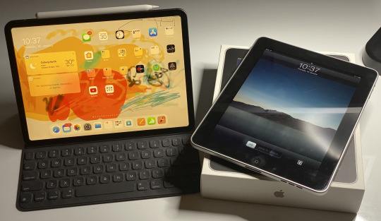
In early 2010, I wrote this piece on Apple’s newly introduced tablet computer for MacTalk Australia, speculating on what it could mean for the future of personal computing. Ten years later, we all know now how that turned out.
Steve Jobs heralded the iPad as a ‘third’ category of devices (the other two being smartphones and computers) that performed a key set of functions far better than the others - he identified these as web browsing, reading and writing email, viewing photos and video, listening to music, playing games, and reading e-books. Rather than replace the other two categories, the iPad would supplement them - where the PC was a multipurpose agricultural truck, the iPad was a car that simply got you from A to B with no fuss or frills.
That first reveal was polarising (as is the case with the launch of many first generation Apple products) - either you were sold on Jobs’s vision of the future of computing or this was nothing more than a big iPhone / iPod Touch with larger versions of existing apps (somewhat true at the time). And the name provided much mirth to the American crowd many of whom would compare it to a sanitary product.
In my initial reaction, I mentioned that the iPad may not be a PC killer (at least not yet), but a real threat to Netbooks. Remember Netbooks? Cheap, tiny, cramped, underperforming PC laptops that were all the craze of the late noughties? I didn’t think so. The iPad annihalated them (as, to be fair, did larger smartphones and lighter full featured laptops like the MacBook Air and its ilk). It did so for largely the reasons Jobs highlighted - it made some key computing functions more pleasurable by making them simpler and more tactile. And the roughly A4 sized handheld screen made it a perfect device for mobile content consumption, something a mini laptop with a dim low-res screen could never do as well.
Despite much incremental enhancement over the years (especially in multi-tasking), the one challenge that many contend the iPad has not been able to overcome entirely has been content creation. While the iPad features Apple’s own slick productivity suite (and more recently Microsoft’s own Office applications) and dedicated apps for media creation, certainly when it comes to detailed word processing and spreadsheet manipulation, or photo and video editing, a laptop is undoubtedly a superior tool. The availability of better external connectivity, file management, and cloud syncing have certainly improved the iPad’s ability to be used for productivity but for some the absence of a pointing device or a fully transparent file system without sandboxed limitations means that the iPad won’t match the utility of a laptop anytime soon (which, in Jobs’s view, it was never supposed to). Even Google’s line of stripped down, cheap Chromebooks (that have taken a strong lead in the educational space for now) would equally struggle with replicating some of the ‘truck’-like functionality of a proper laptop.
But still nothing compares to the iPad as a dedicated tablet. By eliminating the control layer of a computer and focusing the large screen UI on dedicated tasks, it makes completing those tasks more accessible (and dare I say it more enjoyable). Despite the passage of a decade and heated competition from Android manufacturers in the smartphone market, no other tablet device has even come close to the iPad - it overwhelmingly dominates its niche. Comparisons have been drawn to Microsoft’s Surface line, which are impressively nimble devices in their own right and run a full implementation of Windows. I currently work at an organisation where Surfaces are standard issue. But Surfaces are used primarily as light (and slightly underpowered) laptops, not as tablets or true hybrid devices. When it comes to consumption and dedicated tasks leveraging a simple UI, iPads win every time (indeed, part of my work relates to the use of iPads and the like to replace previously analog processes through the use of a CRM platform).
There will be many retrospectives that will cover the specs and evolution of iPads over the past 10 years, its impact on modern consumer technology, and missives on how far it still has to go. Instead of rehashing all that, I thought it would be a better tribute to reflect on how I have used this most personal of computing device over the years. As a perennial early adopter, I have had the privilege (curse?) of owning and using almost every model of iPad that Apple has released over those 10 years. Thanks to a complex web of hand-me-downs and repurposing, many of them are still in use today.
iPad (2010)
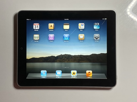
As with the iPhone before it, the original iPad was a US-first release that came to other markets several months later. I had the fortune of having willing relatives in the US order one of these online on my behalf at launch and then forward it over to me in Australia. I later had the dubious pleasure of waiting for hours on a freezing May morning to pick up another model (with 3G) for work on the opening day of the Apple Store at Bondi Junction.
It didn’t take much more than a few minutes holding and using the device to feel its transformative potential. While the iPhone completely changed the way we thought of a phone, the size of the iPad made it feel more like a window into a simplified computer - and using a computer had never before felt so tactile. Immediately it ticked off some of the “far better” objectives Steve Jobs had listed - a far better web experience, viewer for photos and video, and a great way to read eBooks and magazines. I took this iPad on an overseas trip not long after which quickly reinforced the fact that the touch-tablet form factor would be the absolutely perfect flight companion - a light, large screened device, that for the most part could be stowed in a magazine pocket and didn’t have to be removed from your bag through security (benefits that have fluctuated over the years). While it was great to use while seated, it wasn’t particularly well suited to using whilst lying flat - I probably still have a few indents on my nose from dropping the original iPad on my dozing face. The original iPad’s accessories included a fully-enclosing case that allowed it to be opened up like a book or propped up on an angle, as well as a 30-pin connector keyboard for use in (unusually) Portrait mode.
I would use this iPad for a year, until the release of the iPad 2. My wife used it for a little while before it ended up in a Fisher Price case to be used by my kids just emerging out of infancy to watch videos of themselves and play some educational games to learn the alphabet and vocabulary. I finally retired it around 2015 by which time the kids had finally received a superior hand-me-down and compatibility of the iOS was no longer able to keep up with the apps they were using. This original iPad shipped with iOS 3.2 and was not updated past iOS 5, so did not quite have the longevity of its successors (that being said, Apple launched it with the promise of support up to iOS 5, so they did deliver on that). Neither did it receive the “polish” of the over-the-top skeuomorphism in iOS 6 or the extreme flatness of iOS 7. I still occasionally take it out for a play with the past or to compare it against whatever is new - remarkably, the battery still holds up even if the home button is a little flaky.
iPad 2 (2011)
The iPad 2 shipped in several international markets very soon after it did in the US. In Australia it was also widely available at resellers, so I joined a friend for a few hours at a local JB HiFi. Unlike almost every other release to come, the iPad 2 officially went on sale at 5.00pm local time so for once this simply involved passing time inside an already-open store.
The iPad 2 had a few significant things going for it over and above its predecessor. Most apparent was the fact that it was thinner, lighter, and finally had feature parity with the iPhone with front-facing and rear cameras. Much fun was made of those who dared use the iPad camera at public events (see the infamous shot of Spike Lee with President Obama) but despite their relatively low resolution each of these cameras paved the way for significant functionality - such as taking photos of meeting notes / whiteboards for later reference, and FaceTiming on a screen with a more lifelike size. Rather than adopting a fully-enclosed case like the original iPad, the iPad 2 was accompanied by a magnetic “Smart Cover” that snapped on the side, sat on the front of the display and could wake or sleep the iPad by being opened or closed. It could also be folded up to prop up the iPad at the ‘laptop’ viewing angle.
I got a year’s worth of use out of this iPad before handing it down to my mum, who would use it for email and web browsing while traveling. After that my toddler daughter used it for about a couple of years or so for watching videos while traveling and at home. While I updated the iPad to iOS 7 (rather painfully given the relatively low non-Retina resolution screen) and it made it all the way to iOS 9, I took advantage of an uncharacteristic Apple bug to downgrade it back iOS 5. After nearly 9 years, it’s now still in regular use by my son for certain apps that he still loves that never made it past the iOS 7 watershed, and can only be accessed on this iPad.
This was also the final iPad (and product) that Steve Jobs keynoted, and it was already apparent that he was under considerable strain - he would step down as CEO of Apple Inc soon thereafter, and passed away later that year.
iPad third generation aka iPad 3 aka the “New” iPad (2012)
The first iPad launched by Tim Cook came with problematic nomenclature - to achieve some sort of unnecessary simplification, instead of calling it iPad 3 it was simply introduced as the “New” iPad. The point of this move was never explored or allowed sufficient air to make sense, as it was followed quickly later in 2012 by the “iPad 4” which reverted to the old naming scheme. Even Apple would come to refer to the “New” iPad as either the “iPad 3” or “iPad third generation”.
This was in many ways a transitional iPad - with Retina screens available on all other products, Apple needed to bring one to the iPad but had missed the boat for the iPad 2 in 2011. On the other hand, the processors needed to drive the Retina screen well wouldn’t be ready until late 2012, so Apple instead enhanced the graphics power of the chips used in the iPad 2. Similarly, the Lightning connector that would used in the iPhone 5 - and all future iOS devices until the 2018 iPad Pro - was also not yet ready to ship. The iPad 3 was also the first iPad that was actually thicker and heavier than its predecessor (though still lighter than the original iPad). In Australia it was initially advertised as offering 4G connectivity, at a time when no Australia carrier offered 4G on the bands accessible by that model. This resulted in Apple having to offer refunds and a rare instance of having to redo its packaging to meet local regulatory requirements by referring to future iPads (and in turn, Apple Watches) as offering “Cellular” connectivity, without reference to the specific type of connection. Nearly all of these issues were rectified by the iPad 4 not long afterwards. Accordingly, the third generation iPad was only available for sale for a few months and is often criticized as the worst iPad for its sub-par performance and longevity.
All that being said, my iPad 3 is probably the device that has given me the most joy and value over the many years it’s been used. It was a day one release in Australia, and represented the least amount of work in acquisition for me - it was delivered to my door before any Apple Store had opened on launch day. The Retina screen finally coming to an iPad (before it made the leap to any Macs) was incredible and finally came close to replicating the experience of holding a digital piece of paper in your hand. It elevated the already-great experience of viewing photos and watching movies to another level entirely, and made reading eBooks or PDFs rival the clarity of paper. If ever there were a device that felt like it had dropped out of Star Trek and into your lap, it was the iPad 3.
My iPad 3 was my primary device and frequent traveling companion for a good year and a half. I saw no reason to upgrade to the iPad 4 that followed because the iPad 3′s performance was more than adequate for what I needed - mostly watching movies, web browsing, and taking notes. As with the iPad 2, I handed this one down to my mum for a year or so, but it was the third life of the iPad 3 that meant the most to me. My son was diagnosed with an Autism Spectrum Disorder (ASD) during the time I had this iPad, and it represented my first exploration of how such a device could leverage customised apps to provide assisted communication, targeted learning, and other sensory functions for children with ASD.
Eventually this iPad was later handed down to my son during his years in early intervention and school as an augmentative and alternative communication (AAC) device using the Proloquo app (which used to require a very costly standalone device), as well as a device for him to use for learning, behavioural regulation, and leisure. My son used this device (the “Purple iPad” as he called it, after the colour of its rugged case) for almost four years at a critical time of his development. During that time it took a daily beating in his school bag and was dropped frequently, but all the while pulled through. It received software updates through to iOS 9, and we only replaced it a little over a year ago when some of the apps he used needed iOS 10 or beyond for future updates. It currently still sits on a wall at home, functioning as a hub for some smart home devices and a security camera.
iPad Mini (2012)
After a swathe of Android tablets (and ‘phablets’) made the case for the 7 inch form factor, Apple finally caved in 2012 and released the iPad Mini. The Mini’s launch was slightly delayed after the launch of the contemporaneous iPad 4 (requiring online pre-orders) and turned up on our doorstep a few weeks later. It was a hot commodity as it encapsulated essentially all of the features of the beloved iPad 2 and shrunk them down to an almost A5-notebook size that was almost pocketable, and at the very least could easily slip unnoticeably into most small bags. It was the debut of the modern iPad design language, drawing on the chamfered edges of the iPhone 5 with uniformly rounded sides that would be echoed later in the iPhone 6 and beyond. The design persists to this day in all modern iPad models, with the sole exception of the 2018 iPad Pro. The iPad Mini’s official accessories included a full-body leather “Smart Case” that was one of Apple’s better cases (but sadly hasn’t stuck around for as long as I’d have liked, with Apple reverting to “Smart Covers” like they did with the iPad 2).
This was the first iPad that I didn’t buy for myself - it was to replace my partner’s aging original iPad, and due to its size it quickly became a mainstay of her handbags (where its successors continue to find a home to this day). The old adage about the best camera being the one you always have with you easily transfers over to the iPad Mini, whose easy portability vaulted it to becoming her best web browser, email composer, gaming device, and e-book reader. This Mini was eventually passed down to both my kids as a play device for videos and apps, then briefly performed a similar function for their younger cousins while visiting at my parents’ house. We finally parted with it very recently when a friend wanted a simple device to give it to her grandmother to FaceTime with their kids.
iPad Air (2013)
The original iPad Air was released in late 2013 as the new flagship iPad. It adopted the “Air” moniker ostensibly because it was much lighter and thinner, taking the design of the iPad Mini and shaving off some of the vertical bezels on the sides of the screen - the first substantial change to the size of the 9.7 inch screen iPad. It was famously advertised by using a side profile comparison to a pencil, alluding to similar versatility. It was also the first iPad that shipped with the flat, minimalist software of iOS 7.
This was the first iPad since the original for which I lined up on the launch morning at an Apple Store. If I recall correctly, I had my young son with me as it was a relatively brief wait due to there being plenty of stock and comparatively low localised demand given the expansion of the iPad distribution chain. As a relatively mature product, the iPad Air probably represented a first significant upgrade for many early iPad adopters as well. I also took the leap back into acquiring a cellular model as the iPad Air had ‘proper’ 4G in Australia (which was resolved in the iPad 4 a year earlier) as well as a Smart Case like the iPad Mini.
This was a solid workhorse iPad that served me well for a year, and was then given to my mum who used it for almost four years for her basic computing needs, which by now had shifted more towards media consumption. About a year ago it became my daughter’s primary device, which she uses to play videos, watch YouTube Kids, colour and draw, and use educational gaming apps. It did not receive last year’s update to iOS 13 and is starting to feel slow to use, so to may be on the path to an early retirement or relegation to feature duty like the iPad 3 - but over six years of solid service is not bad at all in isolation, even if slightly less impressive than some of its counterparts.
iPad Mini with Retina Display aka iPad Mini 2 (2013)
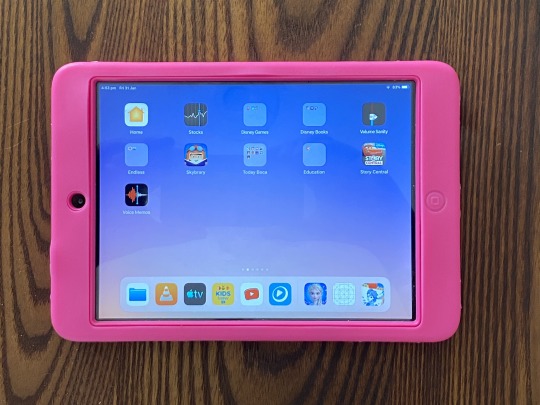
Shortly following the launch of the iPad Air came the iPad Mini 2, which I snagged on release day at a nearby Big W store. The iPad Mini was the final iOS device to receive a Retina screen - this was especially significant given the iPad Mini’s smaller size, which meant higher pixel density had a far greater impact on clarity than in the larger iPad. Interestingly the iPad Mini 2 had mostly the same internals and resolution as the iPad Air, leaving Tim Cook to famously suggest that the feature parity between the two models meant that all that was left to decide was what size you preferred – though to be honest, he should’ve added price, as the iPad Mini and iPad Mini 2 were easily the cheapest iPads on offer to date.
It was an easy decision to get the iPad Mini 2 to replace my partner’s iPad Mini, as it freed up the latter to be used by the kids when traveling (which was far more convenient than traveling with their bulky full-size iPads in rugged cases). After a couple of years it became my son’s primary device for play and travel (used alongside his iPad 3 for school and AAC), following which it also went to my parents’ house for use by visiting cousins and other guests where it remains to this day. We never ended up getting the iPad Mini 3 that followed the year after, primarily because it shared the internals of the iPad Mini 2 and only differed in its selection of colours and the TouchID home button.
iPad Air 2 (2014)

The iPad Air 2 is what I would call “peak iPad” - much like the iPhone 6 before it, iPads are still being released to this day that superficially could not be distinguished from the iPad Air 2. It represented both a refinement to its predecessor and probably the first iPad that was clearly overbuilt for its time, with a level of performance that would see it and be able to cope with years of updates to come (right up to today, and likely beyond). It was much thinner and lighter than even the original iPad Air, and held that record right up until the release of the 2018 iPad Pro. Here was an iPad you could read in bed, without worrying too much about the injury you’d suffer if you dozed off and dropped it on your face. It also came in a fetching shade of gold, the first new colour variation in the iPad line since the iPad 2 introduced black and white.
The iPad Air 2 also came with the TouchID home button (taken from the iPhone 5S the previous year) and introduced the celebrated ‘laminated’ display, which eliminated the tiny air gap between the glass surface and screen, reducing apparent latency and making it feel as if you were practically touching the screen itself. Unfortunately, the trade off for this was higher cost and lower repairability - if you happened to break the screen, you’d have to replace the entire digitiser and not just the glass surface on top. The inclusion of this display has been a distinguishing feature of higher-end iPads since, though its absence from the lower-end ‘budget’ iPads has been a sore spot for many. For me, while it’s certainly a ‘nice-to-have’ that enhances the experience of using an iPad, it is far from a necessity and its absence does little to hamper the usability of iPads that have non-laminated screens.
By this stage everyone in my family right down to the kids were all using iPads, so we’d entered the phase of repurposing all retiring older devices. I got a good year out of the iPad Air 2 before passing it on to my father, who continues to use it when traveling and on the go. He has only recently started commenting on it being a little slow at times, which I put down to perception rather than reality due to the slow internet at places he visits - and while it still multitasks really well, he now has an iPhone XS Max with a four-generation faster processor which makes the Air 2 seem clunky in comparison. I expect that when the 2020 line of iPads Pro debut, this iPad Air 2 will find its way to my daughter to replace the iPad Air.
iPad Pro 12 inch (2015)
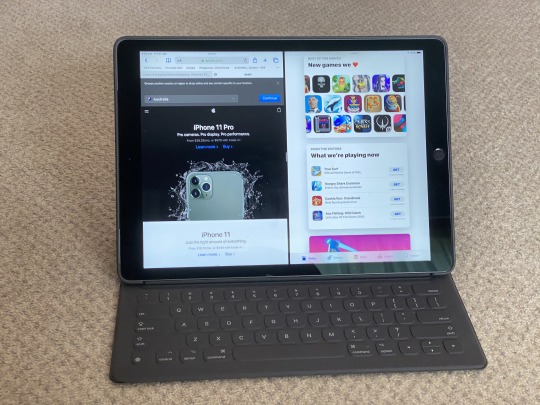
The first iPad Pro debuted in a massive 12.9 inch screen that was a sight to behold (and hold). While 13 inch screens have been standard (if not small) for years in laptops, having such a screen float freely in your hands in a (relatively) light slate was an experience resembling the tactility of first using an iPad but on a full-sized computer display - 5K iMacs had finally been released the year prior, and the iPad Pro’s screen had roughly the same usable area. Interestingly, the dimensions of the screen more closely resembled an A4-sized piece of paper then the original 9.7 inch iPad, but somehow this still felt bigger - almost like an A3 page. The size of the 12.9 inch screen would enable it to allow split-screen multitasking of two apps in the full-screen display they’d have on the 9.7 inch iPad - a feat still unequalled by any other iPad, including its younger 10.5 and 11 inch siblings.
With the iPad Pro came the first “Smart Connector” on the rear of the device, which allowed accessories to connect and draw power through three small magnetic dots. This connection held much promise but in the years since has only really ever been used for keyboards, like the Smart Keybord Folio released at the same time for the iPad Pro. What appeared to be a relatively simple case (if quite thick) needed to be folded out almost like an accordion in order for the iPad Pro and Smart Keyboard to resemble a small laptop. The fabric covered keyboard itself was quite durable, though the Smart Connector pins have worn out over time creating occasional connection problems.
The iPad Pro had an odd launch in Australia - rather than morning or midnight, I found myself waiting for 1.00pm to tick over on launch day at my local Apple Store before they were made available for sale. As such, it was pretty much a sight-unseen purchase. The full-screen multitasking is what really sold me on the iPad Pro. Even if limited, it felt like a step in the right direction towards not just emulating a computer’s multitasking but creating a more effective paradigm for multitasking where only the windows that really matter are open and featured front and centre.
On the other hand, the downside to the iPad Pro’s size was... its size. At 12.9 inches large (and considerably heavier when adding the new Smart Keyboard Folio and rear case) it was far larger than even the original iPad (let alone the Mini) and as such was no longer as snug and comfortable a fit in many bags and cases tailor made for iPads - rather it approached the heft of a laptop. Neither was it as handy a traveling companion, especially on aircraft where the iPad had previously excelled. This was a tablet that was better used at home. After a little over a year I’d finally decided that such limitations didn’t work for me and handed it over to my father, who continues to use it more properly as a “home” iPad for most computing tasks (email, browsing, basic mobile gaming) that he’d previously have done on an iMac.
The one other significant feature of the iPad Pro was the concurrent introduction of the Apple Pencil, still one of the most responsive input devices for a tablet. Writing with the Apple Pencil on the huge iPad Pro resulted in fine script that felt as close as you could to writing on paper (without the same level of friction). This also resulted in revealing deficiencies in handwriting for which a pen and paper were more forgiving. But the Pencil really excelled when used for drawing, colouring, and painting using the pressure-sensitive tip. Despite its much maligned “eraser” charging port, I rarely separated the Pencil from my iPad Pro and was more than happy to have it awkwardly stick out for a couple of minutes for hours worth of charge. After finding some teeth marks in that “eraser” area and finally updating to a newer model, I gave that original Apple Pencil first to my son who used it for handwriting practice with his current iPad (replaced by a Logitech Crayon), and then to my mum to use with her current 10.5 inch iPad Pro.
iPad Mini 4 (2016)
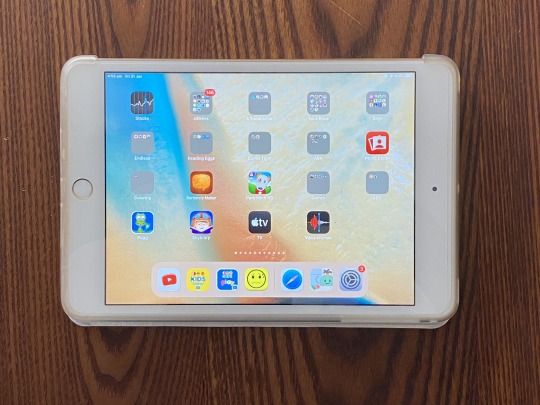
While the iPad Mini 3 was a somewhat unimpressive reskin of the iPad Mini 2, it wasn’t until the quietly introduced iPad Mini 4 that we got a true mini version of the “peak” iPad, with the same incredibly thin and light profile, TouchID, and laminated display. And with its even smaller size, this made the Mini 4 effectively lighter than most A5 notepads and, with the bright laminated display, almost as pleasant to read from.
The Mini 4 replaced my partner’s Mini 2 for about three years, freeing up both the Mini 2 and original Mini to be used as travel iPads in rugged cases for both kids. The Mini 4 was not updated by Apple again for several years, and for some time appeared like it would be the final Mini Apple would release - thankfully not the case, as the form factor really made the device incredibly appealing to those like my partner to whom it represented the perfect compromise between screen size and portability.
iPad Pro second generation 10.5 inch (2017)
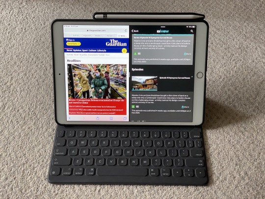
Some of the issues I had regarding the size of the original iPad Pro were mitigated soon after by the release of a smaller 9.7 inch iPad Pro in early 2016, also with the benefit of a better camera and wider range of colours (Gold and Rose Gold). However this was basically a beefed up iPad Air 2, so I wasn’t yet ready to give up on a larger sized iPad until the following year when the intermediate size 10.5 inch iPad Pro landed. Both the new 10.5 inch iPad Pro and updated 12 inch iPad Pro came with a new display with a 120Hz refresh rate for more ‘lifelike’ scrolling and transitions, and more importantly greater responsiveness from the Apple Pencil.
The 10.5 inch iPad Pro also signalled a clear differentiation between two sizes of ‘Pro’ iPads - one larger with more usable space, and one smaller and more portable. However, with that smaller size came a significant compromise - unlike the 12 inch iPad Pro, the 10.5 inch model could not do full-screen split-view multitasking, instead reverting both apps to the ‘compact view’ that more closely resembled a smaller iPhone app than a full-sized iPad app. I sweated on this difference for some time and sat out the launch, for the first time seriously considering passing on a new iPad. However, not more than a few hours after store opening I buckled and drove over to one of the only Apple Stores in the city still showing stock.
In the end I found the 10.5 inch iPad Pro to be an absolute pleasure to use, a good compromise between size and portability, much lighter and easier to carry, but without what I then considered to be the killer feature of the iPad Pro - a sacrifice I simply learned to live with, and did not end up missing as much as I thought I would. As a consequence, I pushed my usage of this iPad Pro and tried using it as much as possible as a laptop replacement (indeed, during this time I stopped carrying around my laptop with me and relied on a combination of this iPad and the newly functional iCloud Drive file browser in iOS 11). While there were inevtiably certain tasks I still needed to use my laptop for, I was surprised at just how much of my mobile computing needs were achievable (and possibly even more pleasant) on this iPad Pro.
This was also one of my longer used iPads, giving me a good year and a half of service before being handed to my mum to replace her long-in-tooth iPad Air. I used it with its Smart Keyboard accessory, which unfortunately now did not have a matching rear case leaving the back of the device exposed - the first time I had carried around a ‘half-naked’ iPad in pretty much forever. This required a degree of extra care on my part, having to use the front keyboard side as a buffer against other items while ensuring that the exposed side was always flush to padded fabric in my bag. When I gave it to my mum, I was sure to pick up a third party accessory that would both protect the back of the iPad and also included a holder for the Apple Pencil (which sadly she does not use as frequently as I’d like).
iPad sixth generation (2018)
While the iPads Pro had established themselves as the new flagship line of iPads, Apple quietly released a ‘budget’ iPad in 2017 based on the old, thicker iPad Air chasis and non-laminated screen, but featuring more updated internals (similar to the first iPad Pro). This product matured even further the following year with a processor similar to my then-current iPad Pro and a screen that was compatible with the original Apple Pencil - for a fraction of the cost of the iPad Pro.
To this point my son had been using the old iPad 3 as an AAC device at school and the iPad Mini 2 at home, and this new iPad represented the best of each device - so I bought one on sale a few months after it launched to consolidate and allow him to be able to use updated versions of his apps that were no longer supported on the older devices. In particular, Pencil compatibility has opened a way to use the device to enhance his fine motor skills, and the relative thickness and non-laminated screen are beneficial from a repair perspective in the event of unforeseen kid damage (mercifully not yet required due to adequate encasement). I’ve given him one of the Logitech Crayons, which lack the pressure sensitivity of the Apple Pencil but are cheaper, more durable, and have a flat, textured surface that is much easier to grip. This iPad’s already clocked up almost a year and a half’s worth of use and still looks and feels brand new in use.
iPad Pro third generation 11 inch (2018)
Following the release of the iPhone X with its all-screen display, FaceID security mechanism, and infamous “notch”, it was only a matter of time before that design found its way to the iPad line. It took a year but it was finally realised with the release of the 2018 iPad Pro, which eliminated the notch by simply having a smaller uniform bezel around the entire screen. The 12 inch model shaved its bezels and shrunk in physical size substantially, more closely resembling an A4 size page. Instead of retaining the 10.5 inch size, Apple traded some of the bezel of the smaller model for a tiny bit of extra screen space, brining the screen up to 11 inches. While that seemed quite close to the 12 inch, the difference was deceptively significant. In particular, even at 11 inches the smaller iPad Pro couldn’t quite do full screen split-view multitasking.
Finally, instead of the iPhone X’s rounded stainless steel sides, the 2018 iPad Pro adopted a slate-like appearance with a flat aluminium back and thin, flat sides - making it the thinnest iPad ever at just 5.9 mm, and more closely resembling the back of the original iPad than any other model. The iPad Pro is covered in magnets to enable easy attachment of the corresponding Smart Folios and Smart Keyboard Folios (now with a smaller profile that involves less folding). The flat sides and magnets also enabled a new Apple Pencil 2, with a flat magnetic side that attaches nicely to the top of the iPad Pro - good to carry around in the hand, though not quite strongly enough to withstand significant movement or friction when carried in a bag.
But the two most important developments in this iPad Pro were first, the use of a USB-C instead of Lightning port (opening up a variety of charging and IO options that had long eluded iOS devices) and increased performance (said to rival then-recent benchmarks for the MacBook Pro) making a compelling argument for its ability to replace a laptop. With improvements in multitasking in iOS 12 and iOS 13, and the ability to use the new Files app and USB-C port to directly access external storage, some significant limitations that had dogged the iPad since its original release had been mitigated (if not quite overcome). Of course, the primary limitation - availability of apps that fully take advantage of this new functionality - persists, and may yet take some time to overcome. For example, there are some great video editing apps available for iPad (such as Luma Fusion) but I would love to see Apple port its own Final Cut Pro to the iPad, and take advantage of the external file management options offered by the USB-C port, to really kick the iPad up a notch. If nothing else, the passage of the past 10 years has demonstrated that such functionality may take some time to come, but when it does it should represent a refinement of the experience that makes much more intuitive sense than something slapped together for the sake of feature creep.
This is my current iPad, and the device on which I am currently typing this post - other than the early adopter urge and my dad’s unreasonable concerns about his iPad Air 2 (which let’s face it, are probably enough), I wouldn’t see any compelling need to upgrade to whatever new version of the iPad Pro is released in the coming months. I rarely carry around a laptop anymore as the iPad Pro (in conjunction with iCloud) now meets almost all of my mobile computing needs. But for a few tasks that I can’t yet do without a laptop (mainly organising storage of file libraries and some video editing), I’d almost be prepared to get rid of my MacBook Pro entirely (in fact, I haven’t bought a new MacBook Pro in almost eight years, in which time I’ve bought all but three of the iPads in this list).
iPad Mini 5 (2019)
For a while it seemed like the aging iPad Mini 4 would never be replaced, and the iPad Mini product line would fade into obscurity (much to the chagrin of my partner, and many others who relied on its small form factor). Apple pulled a cat out of the bag by surprising everyone with a very late update to the iPad Mini in early 2019, bringing it back into line with the specs of the newly-refreshed iPad Air (feature parity not seen since the original iPad Air and iPad Mini 2 in 2013). I picked this up from a local Apple Store a few months after release to replace my partner’s iPad Mini 4, and it currently sees daily use from her handbag.
Touching quickly on the recent products not in this list, the new 2019 iPad Air is essentially a refresh of the 2017 10.5 inch iPad Pro model, with some minor differences such as the lack of stereo speakers. It allowed Apple to offer most of the performance of the Pro line at a lower price point. Initially it also brought smart connector accessories and Pencil functionality as well, but Apple has subsequently released an updated ‘budget’ 10.2 inch iPad with a smart connector on top of the existing first generation Pencil compatibility. The iPad Mini 5 is thus currently the only model offered without a smart connector (though plenty of third party keyboard accessories are available) and the entire iPad line offers some form of Pencil compatibility.
0 notes