#theres a colored version but its unfinished so
Text
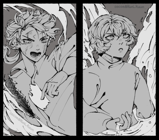
Trial by flame and by flood
#theres a colored version but its unfinished so#ill post it next time xoxox#soo.. that last chspter right guys#cant believe we got kndz crumbs right as dazai was dying#bungou stray dogs#kunikida#kunikida doppo#bsd#bungou stray dogs kunikida#kunikidazai#dazai#dazai osamu#kunikida x dazai#bungou stray dogs fanart#bungou stray dogs dazai
1K notes
·
View notes
Text
I've made a few maps in Minecraft over time. I'll show a few of them here with a bit of trivia. From Largest to Smallest.
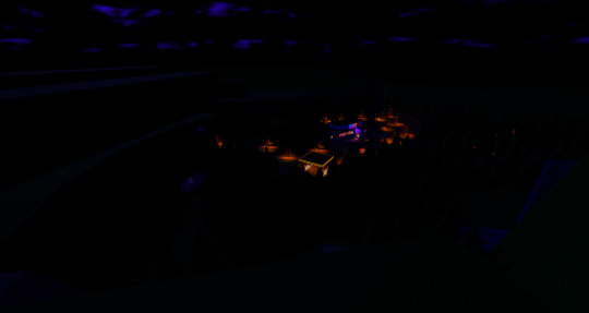
Dead Bird Desert


Dead Bird Desert is by far the biggest map out of all of mine.
The Canyon itself took me about 3 days to complete and Dead bird Studio took me 5 days to complete, but sadly chisle and bits sucks because of performance drops, so I need to redo all of Dead Bird Studio.


The Front of the Owl Express used to have wrong colors, since in Train rush theres a shader applied, which makes red, gray and blue parts have completely different colors.
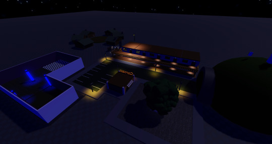
The Airship


The Second Largest map that I've created, I mean you can look at the first Image, its a massive map. The Airship's Bridge/Cockpit was the first area I started to work on and If Im gonna be honest, The first version sucked ass.

Liberty County


The most out of place map I've done, it's literally a roblox game. Got cancelled because it wasnt really fun rebuilding it. I gave a random youtuber an unfinished version of this map.
National Museum of History and Culture


Nothing really said about this one except that the Layout of the Museum is official since Puffball has a floorplan which he showed during his dev playthrough.
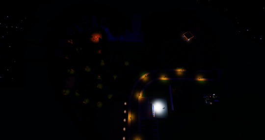
West Mesa Penitentiary


It's not the largest but it's the second tallest map I ever did.
I also did a render of the bathroom but it's literally all black, that's one hour of my life wasted.
City of Calcite and Adventure, Calcite era

Nothing really said about this one, other than that this was from a very early a hat in time, search up A Hat in Time's cutting room floor wiki for more info.
Breaking the Bank

Again, nothing wrong with this one, expect for the dome at the top of the bank, it looks ugly, I hate it.
Theres also a bunch of maps I didnt finish since Im a lazy person


The last one has a lot of details
12 notes
·
View notes
Text
every day i wonder what happened during the design process of equestria girls for them to all come out the way they did. i can see where the skirts thing came from cause they wanted them to be undeniably girly i guess or whatever but. every other weird decision is just confusing
like fluttershys whole outfit, the shortish skirt but especially the tank top. maybe its meant to indicate that shes outdoors a lot with animals, but it completely betrays her shyness and tendency to try and hide herself
they kinda messed up big mac and shining armor? mostly shining armor. his jaw could slice metal. why he look like that
also i only realized while looking at the characters that. okay i was just going to say 'lol cheerilees hair is stupid its like 1 foot taller than her head, why didnt they just give her normal bangs wtf' and i still mean that but then i realized... they swapped her mane and fur colors for her human counterpart ??? so now her usually darker coat and light hair became dark hair and light skin ??
which leads me to the point about the skin colors being weird. like. i dont like how they lightened them up, i dont like how aj and big mac have human skin colors (i have to assume maybe they thought for them that the colors looked bad, or possibly even close to caricature territory, especially with big mac), and the way they outright lightened up the colors of at least 2 normally darker ponies? like i said, cheerilee, but also
luna. even back when i first saw the movie and adored it, i DID NOT like the princesses designs. how did they fuck up some of the best characters in the show, especially the ones that are the prettiest (imo).
i would say that of the 3, cadence is the most okay design (i know we dont see her in the first movie just roll with me here). its clearly her, she looks like her and has her vibe (visually), all around not bad. not necessarily my favorite, theres still something slightly off? but it doesnt rub me the wrong way
celestia... i dont like her vibe. who is she. shes light pink and she has hair spikeys that are meant to look like a crown but just made it look like she didnt brush her hair properly. she has celestias hair but her face does not read like celestia to me. she looks like an imposter. where is my mother
and finally. the pinnacle of the issues with the designs. luna.

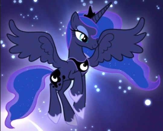
WHO IS SHE. THAT OUTFIT? NOT LUNA. THAT HAIR? YOU WOULDVE BEEN BETTER OFF JUST DOING A GRADIENT. OR PUTTING IN LITTLE STAR HAIR CLIPS. THAT FACE? THATS SOMEONES WINE MOM WHO SINGS EXTRA LOUD AT CHURCH. same critique about the hair spikeys as before. AND THE SKIN??? HELLO??? THE PRINCESS OF THE NIGHT GOT TURNED INTO PRINCESS OF MIDDAY. WHY.
the design of the show vs the movies is, i guess now literally, night and day. pony luna is so inspired and pretty and meant to invoke such regality, its very clear what her theme is, and she very much sticks out amongst the others, both in shape and details!
but the human version feels generic, she could easily be a background character (and she basically was), she feels unfinished, the colors on their own arent the worst but moreso feel insulting when compared to the original (i like the addition of pink/pinkish purple to the palette, but not so much to luna as a character. it just isnt her imo), she doesnt even look like an authority figure aside from obviously looking older than the other characters, let alone being someone meant to be somewhat equivalent to royalty. also again she was a minor character here but its like... her pony version has such a stone strong personality, both when shes freshly back from the moon and later on when shes more grounded and princess-like. human luna is just... generic teacher person. did human luna even ever experience significant isolation and feeling completely unseen by everyone she cared about? doubt it.
and yeah, they significantly lightened her skin ?? why ?? theres literally no reason to do that? she wouldnt look like a caricature unless you somehow chose the wrong colors (how possibly would you), and its not exactly impossible to draw characters with darker skin, again her pony form literally has a dark coat !! but also plenty of people have redesigned her human form to have the right skin color and they look great!! and in general obviously theres plenty of characters with dark skin, like... what was the reason they did that. it just feels gross.
dont cross me when it comes to luna dude i love her so much
anyway yeah its been over 10 years since EG first aired and i loved it back then and i still love it but i think a lot more about character designs now. mlp g4 is known for having these really pleasant and well put together designs with lovely colors (for the most part), its so weird how that gets easily messed up, like in g5, but also still in g4 itself(in the spinoffs and the main show lol)? wish i had the motivation to redesign them all lol, i probably will someday. please go look at redesigns theyre very lovely
#mlp#my post#long post#my little pony#equestria girls#in which i talk a lot. this was obviously an excuse to rant about the luna choices#luna was one of the first characters i ever related to dude dont fuck with me when it comes to her !!!!#i actually like the decision to keep the characters mostly whimsical colored as humans since its the colorful pony franchise#and it also means they ideally wouldnt be excluding or alienating anyone by having to choose canon human skin colors#but that second one really falls flat with the lightening and also aj is literally. human skin colored instead of orange#man can you imagine being paid to design human luna and you make her look like that. and somehow shes approved#it costs 0.00$ to not do that. or maybe it cost them money idk but like. i have to wonder if#if they ever made her look like herself in concept or she always looked like that#cause if she ever looked like herself in concept. why change her.#i could probably answer some of my own questions through google but. its late and im tired#its Free to make a dark skinned character and make them look good. it costs nothing. and its easy.
6 notes
·
View notes
Text
NAMJOON SOULMATE READING
Disclaimer~ tarot is interpretation and it is in no way fact. Take it with a grain of salt and lets continue
Oki. Let me just say some words. I forgot to take a picture of the cards BUT I made a video? You might be wondering, "why a vid?" And I'd say, "idk, nan mola." I might post it (I'd definitely have to make a YouTube channel for that and I'm not really intrested in doing videos that often but I honestly thought, "hey I should record so its faster to write it down and make sense of my thoughts" and then I was like, "well, if I do a video then I won't have to type" and that was intriguing but the video was over an hour long and I go on so many tangents its nuts (also editing who? Don't know her) I think its also nice to have written out version that just gets to the point (I personally prefer written ones because I have the attention span of a fucking goldfish) So long story short. Maybe I'll upload it for those who want to watch but if I do, don't wate your time if you dont want to. All the key info is written here. blah blah blah let's get to Joonie.
Right off the bat I just want to say that both him and his soulmate have the same energy color. It's like a silver-white color? (This is just how I personally perceive energy) Through the process of connecting with Nams and his Soulmate, I envisioned him putting his hand up to mine as a way to I guess channel his energy to me? It was like a stringy thing on my palm and then I mirrored him putting his hand over his heart and then to his forehead and then he was gone? It was like he gave me a tether to his energy which hasn't really happened before. It still felt kinda distant but still like I was trustworthy enough to have a line to him? Idk if that makes any sense or not but there. Now onto the soulmate.
I got some messages from his soulmate. I feel like we had a weak connection that was only there because Namjoons energy let me into it. So the first message was, "You need to leave her" wut. I asked my guides like, "hey, do I need to write that down?" And they were like yeah fam you gotta. Okay. I have no clue. Part of me thinks it was more of a warning to joon. Maybe his soulmate is cautious of people poking around his energy idk. It could be anything. So there's that.
For the other messages I got, "open your mind more", "You're strong, don't be taken for granted" and "ones own soul" that last one makes no sense to me but maybe you need to have iq 148 or be the soulmate of Namoo to get it. I think the others make sense. They are pretty self explanatory.
Now, onto the cards. So knight of cups fell out and I was like ?? And I asked like, "what do I do with this?" And it was v clear that this is his soulmates personality. Like this card represents the soulmate. Now. This is VERY romantic. Romantic af is all over my notes. Also, Joon knows his soulmate. I'm pretty sure. That might come in handy later. This person is in touch with their intuition and emotions. They are compassionate and understanding as fuck. Also I touch with their more feminine energy. I also made a note for a possible career in the art field. V v v loving. Also a possible Taurus, Virgo or Air sign. (I lean towards virgo) personality cards are damsel, warrior, judge, gossip and destroyer. This person is very strong and helps to bring perspective. They have a way of making you think in a way you never had before. I wrote down, "its like panning for gold, you bring up a bunch of shit. Stir up the riverbed, to find pieces of gold". Its constructive and organized chaos. (Art???) They make you consider things with a more critical and objective eye.
Okay, so the next cards are kind what his Soulmate brings out in him/what they help joon with. Justice rev. King of swords rev. And queen of wands. So Justice rev. Represents a lack of accountability, unfairness, dishonesty and favoritism. So I think his soulmate essentially checks him when he gets to close to any of these things. Like his soulmate is all, "hey, you made a mistake. I trust you'll do the right thing and right your wrongs"like this person essentially helps to point out what he might be too close to see. King of swords rev. Represents quiet power, inner truth, misuse of power, manipulation. So with this, his soulmate helps him to discover his inner truth and quiet power but also when he gets too... into it... it can turn toxic and become manipulative and he can maybe use his power in a not so healthy way. I don't think its conscious but its there. And for queen of wands, it represents courage, confidence, independence, determination. This is so cute. His soulmate amplifies all of these amazing qualities that he already has in himself. His soulmate encourages and fosters these amazing qualities. Its so cute. Its hard to really convey the feeling but damn. Its cute as fuck.
As far as the relationship goes we had the world, 10 of coins, 9 of coins and 8 of wands rev. So. They rich. They are so abundant and this is in a sense of self sustainability and stability as well as in a family sense. Now now now. Everyone is curious about joon and if hes married with kids and what not. Idk. Thats my answer. Idk. But he and his soulmate will def have luck in the family department (child or no). Now. With the world and 8 of wands rev. There is a sense that they might be on pause or that they are waiting for something to end before the relationship reaches its full potential. Now. With the 8 of wands rev. It can mean rushing into something (like kids and marriage) and I think that joon and his soulmate are smart enough to know that it might not be responsible right now. OR they have already rushed into it and are now keeping everything private until BTS enlist and go on hiatus. The world symbolizes a completing of a cycle (successfully) so that drives home that they are haulted where they are until they can start a new chapter. There is also a chance that they are acquaintances or something but won't pursue a relationship until later on.
Now we have Play, Boundries and Protection. This is also about the relationship. They have a very strong respect for eachother so they have very strong boundaries and they protect themselves and eachother. It's very healthy.
Now we have progress not perfection, ready to love and prosperity. They are so so so supportive of eachother and encourage eachother to grow and be better people. They both also have gone through a period of learning that they are worthy of love. They also have a prosperity mindset. Its about abundance and being like, "wow, I have everything I ever could have asked for" and they are truly greatful for all that they have. Theres also a feeling of money guilt from Namoo but I'll not go on a tangent for that.
Now we have stop obsessing, stop whining, and stand by your commitment. essentially the world is scary and these cards are to Nams from his soulmate. They essentially mean, stop obsessing about what you can't change and don't wallow in it. It doesn't serve you. All you can do is move forward. Also, making good on your promises. Seeing shit to the end and not leaving unfinished business.
Now now now we have the physical qualities: serious, long hair, gifts, physical touch, feminine, music, music (again), introvert, romantic, sweet, playful (I think its intresting bc I have a lot of physical descriptions in my little cards but pulled more personality...)
And for little cards that soulmate wants Joo to know: faith, Fate, seek, healthy, selfless
Now now now now. We have the finishing oracle cards. Dream a beautiful dream and going beyond normal. These essentially talk about seeing beauty in chaos, letting things not go according to plan and being okay with it, seeing beauty as it is instead of trying to fit it into a box. One of my favorite sentiments is along the lines of not trying to fit the ocean in a teacup but rather learning to swim and not confining something so vast into a small vessel. Don't confine yourself to please others. Live on the fringe of normality and push boundries.
TLDR: Namoo has a sweet soulmate who wants him to grow and become a better person. Its super great and supportive and he and his soulmate probably read books together and have museum dates. Soft af. A subtle domestic love.

114 notes
·
View notes
Text
Im making a funny thing in roblox and Im gonna talk about it here because I think if I don’t my head’ll explode! its still a work in progress but its getting there.
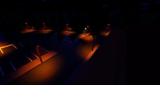
heres a picture of the spawn, you spawn right by the bus stop (the green thing which I gotta remake the model for sometime), next to the parking lot and across from the hotel.
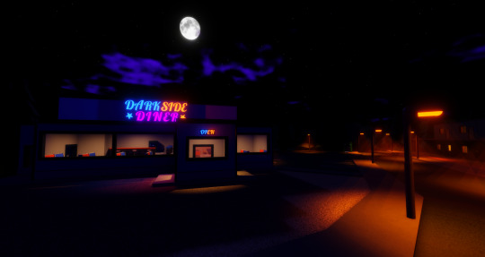
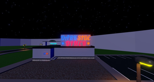
On the same side of the street you spawn on is the Dark Side Diner! A space themed diner though it doesn’t quite look it yet, I picked Blue & Orange for the main two colors for a few reasons but one of them is just that I think its a nice color combo, the purple is just there for a bit of extra possible variation.
The neon letter models weren’t made by me I just yoinked em off the toolbox and unlike most other toolbox items in here I do not intend to eventually replace em, the stars are mine tho.
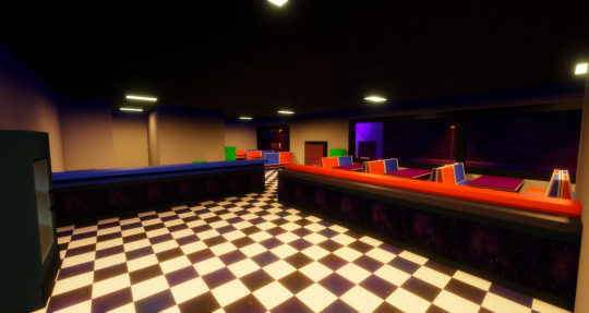
The Interior from over the counter looks like this, there’ll be a small kitchen area just behind where the camera is.
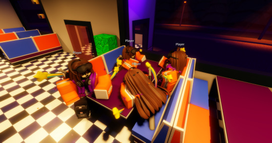
every 4 seats per cubby(?) gets its own sitting animation, as showcased by my 4 mes, though if I turn this into an actual publicly playable game I might look into getting a list of sitting animations for the player to use rather then making it depend on what seat they use.

another shot of the main area, the tables and chairs are unfinished right now. the stools are good though. if you’re curious about what those green cobblestone objects are, they’re placeholders for props I haven’t even started on.
at some point I wanna draw a space background out and have it go over some of the walls, the lighting of the inside is also something Im kinda iffy about right now so it might get changed soon. quick funfact tho when I started, this was just gonna be a small basic square coffee shop.

and the current version is still technically v3, if you count the coffee shop. I don’t think I have a save with the og layout of the diner but I do have one with the og exterior.
you can see the scrapped arcade in the background of this one actually, it was what this whole project was based around before I decided it didn’t fit with what the project had become anymore. still plan to include an arcade machine somewhere, maybe I can make some extra room in the diner.
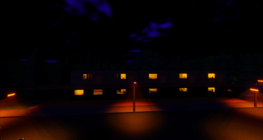
Next up is the hotel I mentioned earlier, kinda unfinished, it has 9 rooms and an office that hasn’t even been started. this is what it currently looks like.
as for the interior.
all the other rooms look like this too.
The bed model is one from the toolbox and Im just using it as a placeholder till I decide to actually make my own, same with the dresser which you can’t really tell is a dresser from this angle. The clocks supposed to make ticking sounds but if I just give every rooms clock this ability they end up stacking in some parts of the rooms, roblox does have an inbuilt proximity sound thing but its not the best. Thats supposed to be a CRT TV but it doesn’t look the best so thats another thing I gotta remodel.
theres an extra room by the shelves but idk what to put there yet so they’re empty
behind the hotel is a small area. with a big tree that has its leaves set to not cast shadows, a few barely noticable picnic tables and an unfinished little campfire that Im gonna move probably.

and since I shared the diners history I’ll also share the hotels history, the exterior and interior. this was how it looked before I decided to revamp it.
heres an overhead shot of the main forest area.

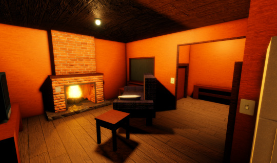
and heres the forests first landmark, one of three cabins. again, sort of unfinished since my work on this is very scattered.
the interior is mostly finished, with the fireplace and lights being switchable on and off as well working opening doors (both of the which are also applied to the hotel rooms I just forgot to mention that)
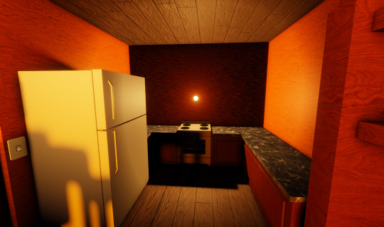
kitchen area with cupboards and more detail on the stove coming soon
and a very small bedroom, the bunkbed is also a placeholder from the toolbox.
I would like to add an attic but Im still working out the kinks of the how the roof is gonna look so that comes later.
the next landmark off on its own sidepath is this shack thats very unfinished as well. based off a memory(or possibly dream that just stuck with me idfk) from ages ago. its nothing too special really, just sorta there.
and the back of it leads to a river caused by a waterfall.


nothing much else to say about this spot yet, its just where the main path leads.

going back to the street, across from the front of darkside diner is this little pit that leads to a sewer grate. I should probably put a light in there.


further down the street is the gas station and its store with a slushy machine and freezer for frozen sweets.


a bit further down and on the other side is another cabin placeholder, once Im finished the first one they’ll also get placed here.

and back on the other side is gonna be a small campsite where Im probably gonna move the campfire to. right now theres just an extremely unfinished RV

and here is a way up to this one cliff spot where Im gonna make an overlook point where the last cabin placeholder is right now (though it won’t stay there tbh). theres gonna be rocks at the edges of and its gonna look more like an actually cliff, theres also gonna be a parking lot here though it’ll be more gravelly then the paved one by the diner and hotels.

finally, the most unfinished thing here I’d say is the foreground (picture has the invisible walls made visible).

I want it to look like you’re in a forest valley but thats far from obvious right now. nothing else to say really. this is it as of now but here are some are notable older versions, from when I started this on January 26th of this year

to February 13th

February 25th
April 4th

and finally April 20th
though there are more versions after this I have saved, Im just gonna end it here since theres not as much huge difference.
And its worth noting that when I started this, I had no prior experience with roblox studio at all. so it just goes to show how beginner friendly this thing is.
1 note
·
View note
Text
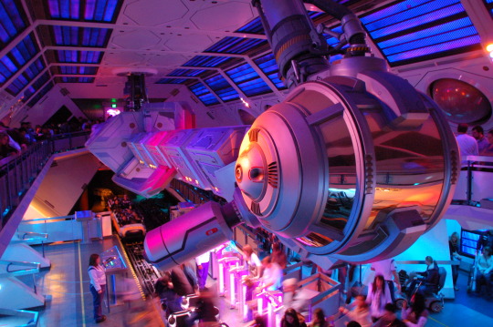
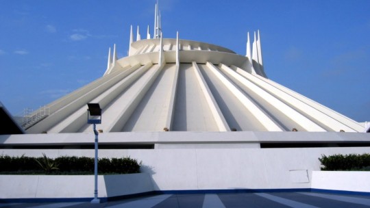
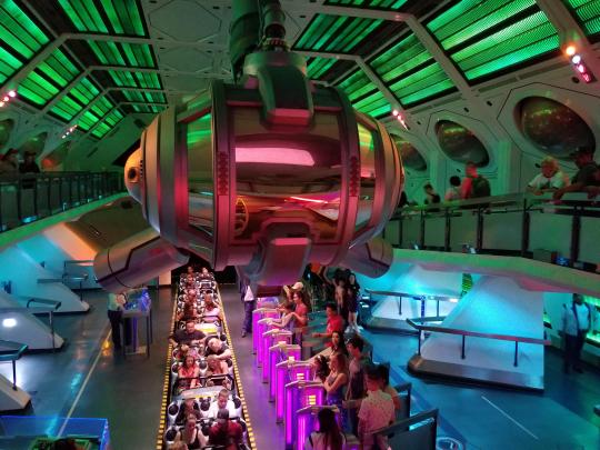
[Sneak Peek]Walt Disney World vs Disneyland Space mountain. Which is Better?
I feel like I should put this out, Space mountain is one of my favorite roller coaster of all time. But the question is; Which one is the best one: The one in Disneyland or the one in Walt Disney World? Well lets take a look. This my new series where I compare which one is better.
First lets look at the history of how this mountain came to be
During the Space age in the 50′s, Walt Disney was making a documentary on television about the potentials of space travel. While working on Disneyland in Anaheim. Walt Disney had help from a Disney animator John Hench. He and Walt wanted to make a land called ‘Tomorrowland’, a futuristic land of the year 1986, being educational and preparing others for the future. When Disneyland opened in July 17 of 1955, it was a big success. In Tomorrowland, their most thrilling attraction was Rocket to the Moon: a space themed ride which gave guests a thrilling sneak peak of commercial space flight that would be popular in the future. While Disneyland was a huge hit in its first year of operation, Tomorrowland would never be completed. The problem with Tomorrowland is that tomorrow will always come, new ideas for the future will always come, and Tomorrowland would be outdated.
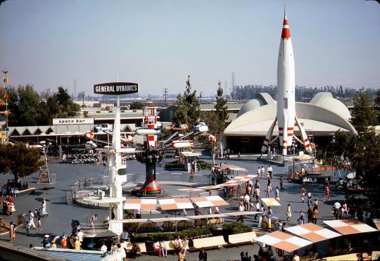
This is what Tomorrowland used to look like in the 50′s in Disneyland
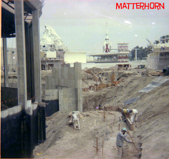
In 1959, Disneyland got its first expansion with the Monorail, The Submarine Voyage, and the Matterhorn Bobsleds ride, this would make Matterhorn the world’s first steel roller coaster. During the 60′s, Walt Disney replaced Rocket to the Moon with The Flying saucers in 1961 which closed in 1966 due to technical issues. He decide to get help with the other artists to plan a Major overhaul for Tomorrowland showcasing new ideas and technology for the future.

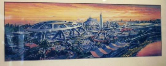
Concept art for the New Tomorrowland
In 1964, The World’s fair was showcased, showing newer technology. When Matterhorn was a big hit, Walt Disney said to the imagineers “Why can’t we have a ‘Space mountain’ ride?” With these words and the many artistic lessons learned in The World’s Fair, John Hench would work with Walt Disney once again on the land that challenged him and Walt from the very beginning. But how would he capture a lasting mystery and intrigue within an ever-changing land how would the danger and thrill of space travel be captured in a theme park attraction? John Hench had the solution, he just didn’t know it in 1964.

The New York World’s fair ran thru 1964-1965
With the New York World’s fair come and gone but what remained as a profound purpose and vision for Disneyland. While the discoveries made in New York were inspirational to Walt and his artists. It would inspire more for the vision for a newly realized Tomorrowland. Not that much imagineers seemed to solve John Hench's problem by bringing a so-called Space Mountain real in a land that focused on making the future a tangible reality. Outer space was still a intangible mystery to the American public. Not only that but the technology required to make an indoor space themed roller coaster was non-exsistent.
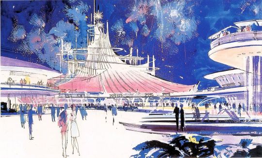
This is the original Concept art for Space Mountain
The original idea for this so-called ‘Space mountain’ was expanding Matterhorn’s format by having a single car coaster to run on four separate tracks in a futuristic alien-like mountainous structure. During development on this space roller coaster, the original name for it was going to be called ‘Space Voyage’. This is where the technological issues lied. But primarily, Walt Disney swept the project away by the creation of Pirates of the Caribbean for the newly minted New Orleans Square. But Hench kept working on the ‘Space Voyage’ project, designing concepts for the future attraction that would be part of a major part of the new planned Tomorrowland.
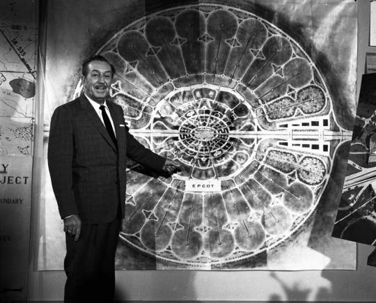
Walt Disney showing E.p.c.o.t. (Experimental. Prototype. Community. Of. Tomorrow.) for his new project for the Florida project (Plans for building Walt Disney World)
Unfortunately, in late 1966, Walt Disney past away. And with him went the vision and advocacy for new and daring attractions and projects, the space thrill ride would have to be delayed for the new Tomorrowland in 1967 would open without Walt’s Space Mountain.
Opening ceremony for the New Tomorrowland in 1967
Vintage footage of the New Tomorrowland in Disneyland
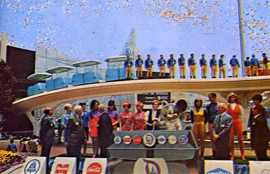
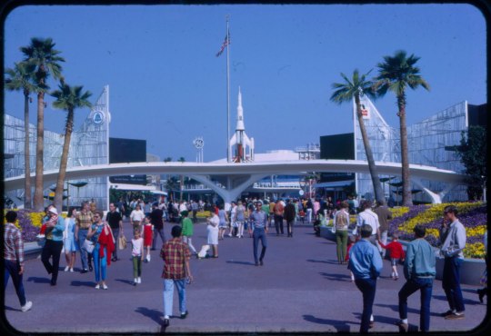
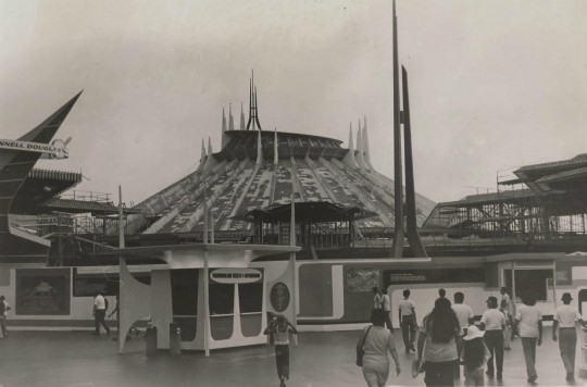
The New Tomorrowland was a big success and became one of the most popular lands in the park, but now WED Enterprises (Walt Disney Imagineering) would be occupied by bringing Walt’s dying vision to fruition: Walt Disney World. While the Magic Kingdom’s Tomorrowland in California would serve the same philosophical function as it’s Disneyland counterpart in Florida, WED was partnering up with different companies to sponsor brand new attractions. Just like when Disneyland opened in 1955, Tomorrowland would prove to be the hardest land to plan and design. WED decided to open Tomorrowland attractions in a series of different phases. And so, Walt Disney World opened on Oct 1, 1971 with a very unfinished Tomorrowland.
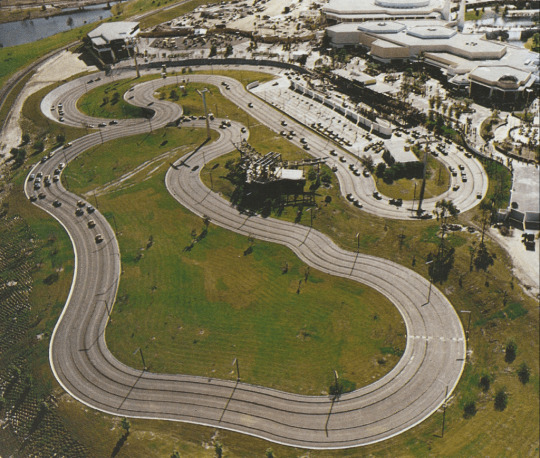
A picture of the Tomorrowland’s Grand Prix Raceway in Walt Disney World in 1971.
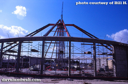
For the next phases, WED would seek out bigger and better projects. Marty Sklar and John Hench approached RCA (System Communication Center) to sponsor an attraction for Tomorrowland. Because RCA was an electric company, Sklar and Hench began work on designing a computer themed attraction. But when they finally met with the company had to pitch the idea, it resulted into an absolute failure. So they went back to the drawing board, this time, they noticed an overwhelming lack of thrill rides in the park because there was no room to build a Florida version of the Matterhorn. It then became clear that this might be the perfect opportunity to bring Walt’s Space Mountain to life. And so, they did. George McGinnis would help design the attraction, along with former pilot Bill Watkins. Together. They would design the ride system that would perfect with the Matterhorn attempted; less than 20 years earlier. And so, after many many MANY YEARS, Space mountain would finally begin construction in 1972.


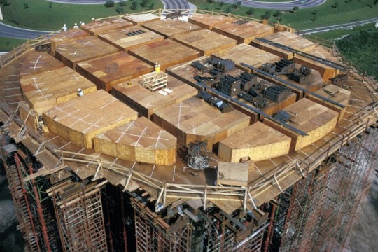


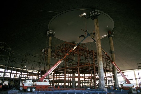

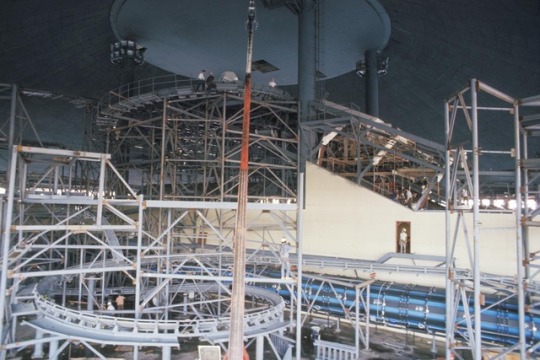
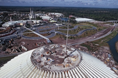
Pictures of Space Mountain’s construction updates in Walt Disney World
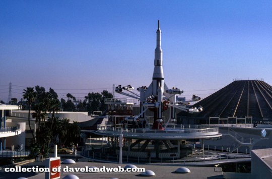
Space Mountain finally opened at Walt Disney World on Jan 15, 1975, with a huge ceremony and would forever change the definition of thrill ride. This would declare Space mountain the World’s first fully indoor roller coaster.

Picture of the grand opening of Space mountain on Jan 15, 1975
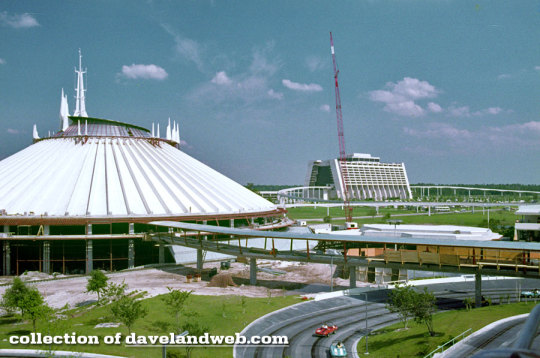
Six months later; work began immediately on bringing a version of this attraction, where it was originally attended. Disneyland. Because of space issues, the ride would have to go from having two track to just one. But with the technological advances made with the Orlando version, the team of artists and imagineers would be able to consolidate and perfect the tubular steel roller coaster and even increase capacity.
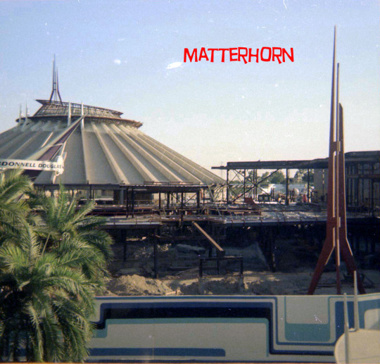
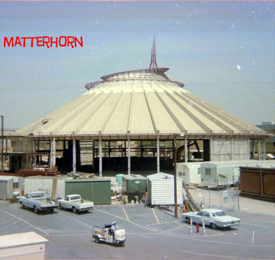
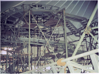

Pictures of Space Mountain’s construction updates at Disneyland
Space mountain in Disneyland opened on May 27, 1977 [two days after the movie Star Wars premiered] on the site of the former flying saucers. Like the other space mountain in Florida, it was a phenomenon. With a line stretching all the way to the parks main entrance.
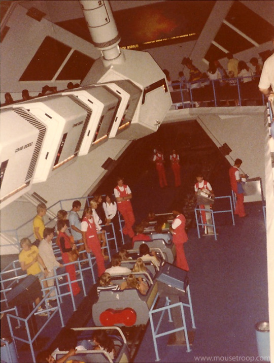

Original pictures of Space mountain in 1977 (top): The original loading station for guests to go on their rocket ships and blast off into space.
But could it last long? What would happen to the excitement over the Space age die out from the American people? Could a space-themed thrill ride survive the event relevant cultural trend, or would it have to go to the way of many of its Tomorrowland predecessors? Not only with the public demuth a staple of the theme park experience, the future generations of artists would find themselves itching to breathe new life into this journey into the unknown
I’m going to have to tell more history of Space mountain in Disneyland because theres more story to it.
in 1996, Space mountain got some speakers on the sides of the vehicles to amplify music. The song is made by Dick Dale Combining a sci fi horror feel and a surf song as well.
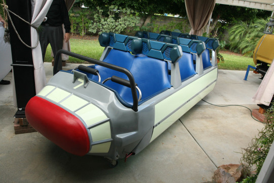
Original ride vehicle with speakers on the side
Then on 1998, they redid the dome to make it a bronze color, because Originally In the 90′s, Disney was trying to be cool and hip, a bunch of projects were scrapped due to EuroDisneyLand’s (Disneyland Paris) massive failure but we’ll get to that later. They tried to make Tomorrowland 2055, a very great renovation, but we got this instead due to their low budget.
Original concept


What we got
Space mountain closed in 2003 to refurbish the ride. Luckily, the exterior would be restored. And a new music track was put in to replace Dick Dale’s version. This new soundtrack is composed by Micheal Giacchino.


Pictures of the dome getting back to its white color and ride vehicle were refurbished to look more space themed
in 2005, for Disneyland’s 50th anniversary, Space Mountain re-opened to the public. The loading station has now a different spaceship hanging from above and a bunch of set pieces were redesigned.
In 2009, Space Mountain got its first seasonal overlay called Ghost Galaxy on Halloween seasons. The screen on the front of the station is all glitched and corrupted, giving the illusion that a ghost is lurking. And in 2014, they made the station lighting to green
In 2015, to help promote the new Star Wars movie ‘The Force Awakens’, they themed Tomorrowland into “Star Wars: Season of the force” putting Star Wars music around the land. And Space Mountain was seasoned to Hyperspace Mountain, where you have to help the rebellion fight off the Galactic Empire from invading Jakku. This season wouldn’t change back to the original version till 2017 for both Star Wars’s and Space Mountain’s 40th anniversary. Space Mountain would return to its original ride.

Front entrance shows the sign for Hyperspace mountain (left) and the theater entrance shows a theater saying “Star Wars: Path of The Jedi” (right)
This would also be the last time that the inventor of Space Mountain; 87 year-old Bill Watkins would ride it for the last time.


87 year-old Bill Watkins the guy who came up with Space Mountain rides it one final time
In 2018, a new queue was added, this had a satellite for hanging and some LED lights on the ceilings

New queue area in the standby line.
In 2019, Disneyland had to temporarily closed Space Mountain, two weeks after a man climbed out of one of the roller coaster cars while the ride was still in motion, ABC Newsthis link opens in a new tab reported.The incident happened on Tuesday, but unfortunately, Disneyland park-goers were still unable to ride the indoor roller coaster as of Thursday.According to The Orange County Registerthis link opens in a new tab, the man, in his 20s, was uninjured but was guided to safety by employees in order to receive first aid and was taken to the hospital later as a precaution.The man has some cognitive disabilities and was moving around in the dark during a slower part of the ride when he was able to get around the safety mechanism and climb out of the car, The Orange County Register reported. Once employees realized he was not in the car, they stopped the ride to find him.
Thanks for reading the history of Space Mountain. I’m sorry this had little to comparing and which one was better. But I wanted this to be a little history behind this roller coaster. But this took me SO LONG TO DO!!!! I was working on this for 10 HOURS TODAY TILL 12 AM!!!!!! 10 HOURRRRRRRRRSSSSSSSSSS OF SUUUUUUUUUUUUUUUUUUUUUUUUUUUUFFERING!!!!!!!!!!!!!!!!!!!!!!!!!!!!!!!!!!!!! I promise that I will do a comparison with Disney World and Disneyland to see which one is better. As a bonus, I will also compare the one from Disneyland to Disneyland Paris to see which ones are better. I’ll also do a little bit of history on the one in Disneyland Paris since I rode on it and I thought it was amazing. But which one will be more supremer? Find Out next time when I talk about “Which Is Better?”. I do not own any of these photos, they belong to these rightful owners in the links. I don’t know all the owners but I got a few of them.
http://matterhorn1959.blogspot.com/
http://www.imagineeringdisney.com/
https://davelandblog.blogspot.com/
Again thank you guys so much for supporting this! I can’t wait to do more episodes of this. And let me know on the comment section what is your favorite Space Mountain ride and to see who you think will win. Have a good day!
#disney#space mountain#disneyland#disney world#compare#preview#history#longest post I've ever done#I might do it again
0 notes
Text
Leonardo da Vinci may have painted another ‘Mona Lisa’ and there’s a legal battle over it
With her straight dark hair and beguiling smile, the so-called “Isleworth Mona Lisa” bears an uncanny resemblance to her namesake in the Louvre.
To some experts, these similarities suggest the painting is a mere copy, though a handful of art historians believe it to be an earlier, unfinished version by Leonardo da Vinci himself.
This debate has raged for decades. But now the portrait stands at the center of a new dispute: an impending legal battle over its ownership.
And if 2017’s record-breaking sale of another disputed Leonardo — the “Salvator Mundi,” whose authentication is still hotly debated — is anything to go by, there could be millions of dollars at stake.
(Photo by Chris Radburn-Pool/Getty Images)
Known to some as the “Earlier Mona Lisa,” the painting has spent much of the past five decades hidden in a Swiss bank vault. Acquired by a secretive consortium in 2008, the painting has since been shown in a number of galleries, most notably in Singapore in 2014 and Shanghai two years later.
Then, in June, it went on display at Florence’s Palazzo Bastogi — the first time it has been seen in public in Europe this century. As the show came to its conclusion, an anonymous claimant made a dramatic legal grab for a quarter ownership of the artwork.
The claimant’s lawyer, Giovanni Battista Protti (who, during a telephone interview, would only describe his client as a “distinguished European family”), says he has historical evidence showing that the painting’s former owner agreed to sell a 25% stake in the artwork that was subsequently inherited by his client.
Worried that the painting will disappear back into storage in Switzerland, Protti has asked a Florence court to sequester it — essentially impounding the artwork in Italy — while its ownership is investigated. The request will be heard by the court on Monday.
The owners — or majority owners, in Protti’s view — remain anonymous, and thus could not be contacted for response.
But a Zurich-based organization called the Mona Lisa Foundation, created to research the painting’s history (while insisting that it is “distinct and separate” from the owners), said in an email that the family’s case is “without merit.”
The Mona Lisa Foundation has confirmed to CNN that it will be participating in the court hearing.
A century of questions
The unidentified family’s claim is rooted in the painting’s colorful recent history.
While there are large gaps in its early provenance, art historians trace the work’s story back to the early 20th century, when it was discovered by artist and collector Hugh Blaker in an English country house.
Blaker moved the painting to his studio in Isleworth, a west London suburb after which it is now unofficially named. Convinced that it was an earlier portrait of a younger Lisa del Giocondo, the subject of the Louvre’s “Mona Lisa,” Blaker’s stepfather John Eyre published research declaring it to be the work of Leonardo, who was known to produce multiple versions of the same painting.
After Blaker’s death, the artwork was sold to collector Henry F. Pulitzer. Like Blaker and Eyre, he was certain it was an authentic Leonardo. The collector even went on to publish the 1966 book “Where is the Mona Lisa?” in which he argued that his painting was, in fact, Leonardo’s only portrait of Giocondo.
Pulitzer moved the work into storage in Switzerland in 1975, and, upon his death four years later, it was left to his partner Elizabeth Meyer. When Meyer herself died in 2008, the “Isleworth Mona Lisa” was acquired by the international consortium that currently owns it — and the Mona Lisa Foundation was established that same year to research its origins.
But Protti claims that Meyers only ever owned three-quarters of the painting.
He says that in 1964, The Pulitzer Gallery sold 25% of the painting to a Portugal-based porcelain manufacturer named Leland Gilbert. A purported 1964 purchase order — a copy of which was seen by CNN — appears to show Pulitzer agreeing to sell the stake for £4,000 (around £80,000, or $98,000, in today’s money). Protti says his clients are the heirs to Gilbert’s estate and are thus entitled to his share of the painting.
A lawyer for the Mona Lisa Foundation, Marco Parducci — who stressed that he does not speak on behalf the owners — told CNN in an email that Protti’s claim “is clearly without merit.”
Although he did not specifically comment on the purchase order, he said that the evidence submitted to the court “show(s) precisely that Pulitzer’s heir was the full and rightful owner of the painting to the exclusion of all third parties.”
Legal wrangling
The spoils could, potentially, be huge. The aforementioned “Salvator Mundi” became the most expensive artwork ever to sell at auction when it was bought for $450.3 million in November 2017. It, too, had long been considered a copy before it was speculatively bought by a group of art dealers for under $10,000 in 2005.
After the painting was restored and extensively researched, the National Gallery in London unveiled it at its Leonardo exhibition — an endorsement that ultimately led to the historic sale.
With fewer than 20 Leonardo paintings believed to have survived, of which only the “Salvator Mundi” remains in private hands, the owners of the “Isleworth Mona Lisa” may be hoping for a similar outcome.
But according to Protti — who is working on the case pro bono — the family he represents is not motivated by future windfalls. The claim, he said, is about leveraging ownership to return the painting to public view.
“As owners of the painting, their (aim) is to let this painting be shown to the public, because they don’t want to keep it for another 40 or 50 years in Swiss bank vaults,” he said, adding: “When you own this kind of (artwork) you have to be a custodian.
“It’s not a matter of money. It’s just a matter of patience, of something that has to be done. It has a value not just for private (individuals) but for humanity.”
The Mona Lisa Foundation, however, questioned the timing of the claim. In an email to CNN, general secretary Joël Feldman suggested that Protti’s clients may have been motivated to act by newly published studies backing attribution to Leonardo — or the huge interest surrounding the painter on the recent 500th anniversary of his death.
“We note that this legal action has only been taken now, although the painting has been on public exhibition internationally over the past few years,” Feldman said, while his organization’s lawyer, Parducci, added that the timing and nature of Protti’s claims were “very curious and contradictory.”
Protti, meanwhile, argued that the decision to lodge his client’s request during the Florence exhibition was a matter of jurisdiction: “This was the first time that the painting was shown to the public in a European country. This was just the time that we were able to ask the court to do something.”
Scholarly disputes
As the “Salvator Mundi” demonstrated, attempts to authenticate artworks as original Leonardos can be difficult and divisive. And given how long the “Isleworth Mona Lisa” has spent in storage, few experts have had an opportunity to examine the artwork and determine whether it’s the work of the painter, his studio, a follower or a forger.
The Mona Lisa Foundation cites a range of research, some of which dates back to the time of Blaker and Eyre. Its arguments often center on the differences between the Isleworth and Louvre paintings. The former’s unique composition, background and subject’s sitting angle — as well as the fact that it was painted on canvas, not wood — suggest, to some, that whoever painted it was not attempting to produce a copy.
A 2015 paper in the peer-reviewed journal Conservation Science in Cultural Heritage concluded that the paintings are “two original works… both painted by Leonardo in two different periods.”
“The subject is the same, but the paintings vary considerably, making them two works in their own right and not a copy of each other,” the paper said.
But leading scholars have continued to dismiss it as a copy. One of the most vocal critics is Martin Kemp, a Leonardo expert and professor emeritus at Oxford University who questions the quality of the scholarship surrounding the painting.
“The picture has never entered the Leonardo mainstream,” he said in a phone interview. “All of the people who have written substantially and seriously about Leonardo have either ignored it or have dismissed it.”
Kemp described the painting as one of a number of “non-Leonardos” existing in “limbo” on the fringe of art history scholarship. He also cited a spectral analysis that revealed structures underneath the painting that are, in Kemp’s view, “very unlike Leonardo.”
“You see a lot of ‘Mona Lisa’ variants … and this one I would classify in the middle of the range. It’s not nasty, but it’s equally not overstatingly convincing.”
from FOX 4 Kansas City WDAF-TV | News, Weather, Sports https://fox4kc.com/2019/09/06/leonardo-da-vinci-may-have-painted-another-mona-lisa-and-theres-a-legal-battle-over-it/
from Kansas City Happenings https://kansascityhappenings.wordpress.com/2019/09/07/leonardo-da-vinci-may-have-painted-another-mona-lisa-and-theres-a-legal-battle-over-it/
1 note
·
View note
Text
Celebrating 100 Weeks of Wednesday Wait Loss!
Welcome to Wednesday Wait Loss. I can’t wait to see what you’ve been working on! But first I need to scream with joy because WWL is 100!
Can you believe it? Wednesday Wait Loss is celebrating its 100th week! I can’t tell you how much your support has meant to me, especially when (like this last month) you keep coming back even though I haven’t been able to post much on my blog lately.
Really. Your love and support are the fuel I need to keep going. Thank you!
First let me tell you what I've been up to
Good news! I got that last quilt done, bound and shipped off to Island Batik. So that three quilts this month, designed, patterned, cut and sewn, bound and shipped off to be featured this Spring in the Island Batiks Spring Market booth.
Woot!
Here are the colors for each, side by side. Again, I can’t show actual details of the fabrics because they haven’t been released to the public yet.
I didn’t get my Island Batik December challenge done however, but I’m working on it. There’s a reason I’m behind on that and without oversharing, I can tell you that a member of my family was diagnosed with cancer and it’s not good. So my head’s been elsewhere. On the plus side, my family is large—I have eight siblings, sixteen nieces and nephews, seven great nieces and nephews, and tons of cousins all doing their part to support this person so none of us is facing this alone.
Thanks in advance for your love and support! Really, it does keep me going. If you know me personally, you can reach out with questions, but I don’t want this to fill my blog or my social media. I debated whether to share this at all, but in the end decided that my Wednesday Wait Loss group can handle it because you guys are the best. And I wanted you to know why my blog has been so barren lately. I promise I’ll have more content up soon as I get my feet back under me.
Before we find out what you did this week, let’s take a look at who made this week’s feature.
Let's see who made this week's feature
First up is Laura @ Slice of Pi Quilts, who shared a memory from her childhood—a peak a boo Santa toilet seat cover! Laura made a new one to replicate the one she had as a child. Read the full story on her blog.
Next is Nancy @ Grace and Peace Quilting, who shared several recent finishes. What I loved most about her post was the closeups of her quilting. Here are a few of them. Jump over to her blog to see all the quilts.
Gail @ Quilting Gail shared the cool gift she got from her quilting cousin. I love Angela Waters so this would be a great gift for me as well. What a nice cousin!
You must visit Gail’s blog to learn what her cousin sent to Gail’s husband! Too cute.
Next up is Melva @ Melva Loves Scraps, who shared her version of the latest block in the It’s a Wild Life BOM—Midnight Picnic. I've really enjoyed watching this quilt come together.
Finally, Susie shared her latest project—Caribbean Village. I got to see her start this one at the last quilt retreat. Isn’t it wonderful? I love those Caribbean colors she’s chosen.
Congratulations ladies! Here's an I Was Featured badge for your blogs or to simply print out and wear with pride! Thank you for supporting my blog!
Let’s Celebrate the100th week of Wednesday Wait Loss!
This week is the 100th anniversary of Wednesday Wait Loss and I think we should celebrate with a big giveaway!
So I’ve got three prizes to give away! Here’s how we’re going to do it.
If the total link ups is ten or below, I’ll give away one prize—an Island Batik Stash Builder (five 2-1/2” x WOF strips).
If the total link ups is 11 to 25, I’ll give away an additional prize—a bundle of fabric scraps from Island Batik!
If we get over 25 linkups, I’ll give away one more prize—five fat quarters from Windham Fabric’s Isadora collection.
So work together and link up as many blog posts, Flickr/Facebook/Instagram photos, or direct photo uploads from your computer/cell phone as you can! Let’s make this the biggest Wednesday Wait Loss ever! Spread the word through social media and link directly to this page.
You can link up any kind of quilt project—finished or unfinished. I only ask that you not link up something you’ve linked up before. Let’s see some new photos even if they are old projects (or old blog posts).
You’ll get a chance to win a prize for every linkup you do. I’ll announce the winner next week. I’ll keep this one open to everyone, even International. (Crossing my fingers this doesn’t end up costing me an arm and a leg. <wink>)
I’m not sure how to link up
Need help? Click the Wednesday Wait Loss tab above to get step by step instructions on what to do. You can link up a blog post, a photo from Flickr, Instagram, or Facebook, or a photo direct from your cell phone provided it is low resolution.
Time to link up!
Now it’s your turn to link up your works in progress and recently completed quilts! Here are some quick reminders about the linky party:
This linky is all about encouragement, so please visit a few of the links and leave a comment.
If you’re uploading a photo from your phone/computer, leave a comment below that explains your project. And for the rest of us, please reply to a few of these comments leaving words of encouragement for a quick finish.
Please link back to my post somewhere in your blog post or use @inquiringquilter and #wedwaitloss to tag me in your Instagram/Flickr post.
If you link a photo from Facebook, please mention @InquiringQuilter and my Wednesday Wait Loss.
An InLinkz Link-up
Linking to several fun quilty linky parties.
you might also like
Tell me..what have you been Working on this week?
0 notes
Text
Beware: There’s a Blend Mode Bug in Photoshop CC 2019
Beware the Photoshop CC 2019 update! It does not come without bugs. When everyday tools do not behave the way they should, we should pay very close attention!
With the latest update released earlier this week, Adobe released the latest versions of all the Creative Cloud apps, including the latest Photoshop (version 20.0.0). I was actually inclined to give it a chance right from the go. I’ve been let down in the past by Adobe’s update strategies, but this hasn’t been the case for me for any of the CC updates yet. As pretty much all the bugs in the earlier version have been ruled out by now, what could go wrong?…
The answer: A LOT!
What Doesn’t Work in Photoshop CC 2019
I think we all can agree that what makes Photoshop so valuable to us all is its layers and with it, the usage of blend modes. I do not know a single user who does not rely on these features, no matter what field you are working in — you need these functionalities!
The Photoshop CC 2019 Blend Mode Bug
Blend modes. I need them, I love them, but not in Photoshop CC 2019!
I have no technical insight into what exactly is happening, but I can tell that many blend modes do not do what they are supposed to. This is especially true of the blend modes Hue, Saturation, Color, and Luminosity.
Here’s a demonstration of what happens. The image has one color with a blend mode active and as a reference, I have the same color included as a patch.
You can clearly see the color is not the color it is supposed to be (in the image I used the Hue blend mode). The hue of the blended color and the sample color should remain the same.
Here is an example with the correct rendition of the Hue blend mode. The blended color and the reference color are the same hues!
How To Fix Your Blending Mode Issues in Photoshop CC 2019
I have done quite a bit of research, and Adobe does not mention this issue in the list of known bugs. But there is something mentioned by Adobe that I found relevant to this issue and voila, it fixes the blending mode issues too!
To get your Blend Modes to work correctly, go to Preferences->Performance and switch to Legacy Compositing Engine. Once you’ve saved this changes, you can sit back, wipe the sweat off off your face, and continue working!
I know it’s sometimes maddening to deal with these issues, because we as users shouldn’t have to. I think we have the right to not wait another 6 months until this version is finally usable. What’s the point of releasing unfinished software anyways?
About the author: Daniel Hager is an award-winning, internationally-published retoucher and Adobe Photoshop Certified Expert based in Germany. The opinions expressed in this article are solely those of the author. You can find more of Hager work on his website, Facebook, and Instagram. This article was also published here.
source https://petapixel.com/2018/10/19/beware-theres-a-blend-mode-bug-in-photoshop-cc-2019/
0 notes
Text
Beware: There’s a Blend Mode Bug in Photoshop CC 2019
Beware the Photoshop CC 2019 update! It does not come without bugs. When everyday tools do not behave the way they should, we should pay very close attention!
With the latest update released earlier this week, Adobe released the latest versions of all the Creative Cloud apps, including the latest Photoshop (version 20.0.0). I was actually inclined to give it a chance right from the go. I’ve been let down in the past by Adobe’s update strategies, but this hasn’t been the case for me for any of the CC updates yet. As pretty much all the bugs in the earlier version have been ruled out by now, what could go wrong?…
The answer: A LOT!
What Doesn’t Work in Photoshop CC 2019
I think we all can agree that what makes Photoshop so valuable to us all is its layers and with it, the usage of blend modes. I do not know a single user who does not rely on these features, no matter what field you are working in — you need these functionalities!
The Photoshop CC 2019 Blend Mode Bug
Blend modes. I need them, I love them, but not in Photoshop CC 2019!
I have no technical insight into what exactly is happening, but I can tell that many blend modes do not do what they are supposed to. This is especially true of the blend modes Hue, Saturation, Color, and Luminosity.
Here’s a demonstration of what happens. The image has one color with a blend mode active and as a reference, I have the same color included as a patch.
You can clearly see the color is not the color it is supposed to be (in the image I used the Hue blend mode). The hue of the blended color and the sample color should remain the same.
Here is an example with the correct rendition of the Hue blend mode. The blended color and the reference color are the same hues!
How To Fix Your Blending Mode Issues in Photoshop CC 2019
I have done quite a bit of research, and Adobe does not mention this issue in the list of known bugs. But there is something mentioned by Adobe that I found relevant to this issue and voila, it fixes the blending mode issues too!
To get your Blend Modes to work correctly, go to Preferences->Performance and switch to Legacy Compositing Engine. Once you’ve saved this changes, you can sit back, wipe the sweat off off your face, and continue working!
I know it’s sometimes maddening to deal with these issues, because we as users shouldn’t have to. I think we have the right to not wait another 6 months until this version is finally usable. What’s the point of releasing unfinished software anyways?
About the author: Daniel Hager is an award-winning, internationally-published retoucher and Adobe Photoshop Certified Expert based in Germany. The opinions expressed in this article are solely those of the author. You can find more of Hager work on his website, Facebook, and Instagram. This article was also published here.
from Photography News https://petapixel.com/2018/10/19/beware-theres-a-blend-mode-bug-in-photoshop-cc-2019/
0 notes
Text
a campbells soup can has three crests: the uppercase c, the lowercase b, and the slanted double ll’s. you could argue that theres a third, the apostrophe hanging off the side of the last l like a misspelled remnant, but you’d be wrong. the weight is off, bailey thought, and he had thought a lot- about the gold medallion being centered, and the flourishes on either side of “soup” being uneven. still, they were bold. symmetrical. simple. a line of campbells condensed cans, well assembled, could run a stripe of red across an otherwise cluttered keyfood shelf. if you turned them slightly, with emphasis on the “C” and not on the center, you could pretend that the icons on either side of the word soup were balanced. the thought of that could soothe a person. he had even thought, on one very slow day in september or october, about the red on the chunky versions of those cans not matching the original condensed kind. wouldn’t a person want them all to match, in sharing a namesake? if one could choose?
sometimes, stacking cans in between customers, he came across dents that made the entire structure lean. he hid these in the back, not because they were necessarily worth less, but because they made his skin crawl. soup cans, pasta boxes, pickle jars, even the regular margarine sticks could otherwise be stacked into perfect rows. most were manufactured with these little dips, where each new piece slotted and fell. he liked those the most- quiet little guides.
bailey knew he was paid for quantity, not matching labels. if the tower leaned but it was done, it was better than the unfinished produce. he made sure the pickle jars faced out. he looked away before leaving so he could stack tuna without tingling. this worked some days. other days an elderly woman would tap his shoulder and say, “pasta sauce?”
did you know, for example, that a vlasic pickle jar has no uppercase v? the entire word is lowercase. bailey thought that was strange, because he could have sworn that it had once been an uppercase v. she would tap again and say, “the meatless kind.”
there are two crests on that royal blue label: the lowercase i and the lowercase l. they make a sort of brooklyn bridge between the other letters. you could draw the cables connecting them, sweeping.
she would say, “can you hear me?” and he could, but he pretended that he couldn’t.
all of keyfood, in its messiness, in its crampedness and always expanding-ness, had a beautiful order. things had a place. oranges wouldn’t go near the pickle jars. and even though their stickers werent evenly placed on each little globe, they did belong as a sort of bunch. have you ever seen a perfect line of koolaid tubs? a color coded family? a tower of mirror shined apples?
she yanked a bud from as close to his ear and she could reach- he wasn’t tall, but she wasn’t either. bailey snapped a head to it; he looked the headphones into her hands. she said “this shit drives me crazy,” but he didn’t hear her. she said “do you understand english? are you fucking retarded?” and he didn’t hear that either. eventually saidah, the girl from the back with the swinging braids, came over and stepped between the two of them. she said something thick and pointed the woman to another aisle. they spoke for a second. at some point- he saw their hands do this- the woman let the headphones fall into saidah’s fingertips; they tumbled out like a joy. bailey thought she might have even laughed as she walked away.
saidah looked at him, or through him, he couldn’t really tell. he saw her pupils for only a second before glancing down at her shoes, the kind that gripped the otherwise slippery linoleum floors because it was their job. she held the headphones out, and he slipped a hand underneath them to catch the pile. he made a little nod of appreciation, or he thought he did- did he? and put the buds back in his ears with the end tucked into his collar.
“are you serious?” she said. and he pretended not to hear her, but her shoes squeaked and she was gone.
1 note
·
View note
Last Seen Blogs


an-albino-pinetree
Just A Tree

mrrastalaleyenda-blog
Untitled

mrknoblob14
Untitled

mrpackrat101
Live Fast, Smoke Grass, Eat Ass