#this also means modulus zero and divide by zero return the same thing
Explore tagged Tumblr posts
Visit Tumblr Blog
Explore Tumblr blogs with no restrictions, modern design and the best experience.
Last Seen Tumblr Blogs


Fun Fact
In February 2021, Tumblr had 518.6 million blog accounts.
Text
Oh by the way I can't explain it right now BUT I figured out a way to sorta think about dividing by zero that means anything divided by zero is 0 r (x) where x is the original number to be divided
#so like imagine somebody asks you to spread 5 cakes equally among 3 plates#you put 1 cake on each plate then you have 2 left#you cannot equally divide the cakes without breaking them. so you cannot put the cakes on the plates#next to the plates is a special table where “cakes you'd have to cut” go (remainders)#this is for anything you cannot put on the plates provided#when zero plates are divided#you cannot put the cakes on the plates#so instead you put it all on the remainders table#because that's the only other place it can go and going there requires nothing else but “there is leftover quantity”#such 12/0 = 0 r 12#this also means modulus zero and divide by zero return the same thing
2 notes
·
View notes
Text
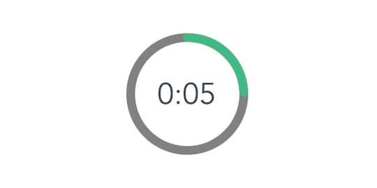
How to Create an Animated Countdown Timer With HTML, CSS and JavaScript
Have you ever needed a countdown timer on a project? For something like that, it might be natural to reach for a plugin, but it’s actually a lot more straightforward to make one than you might think and only requires the trifecta of HTML, CSS and JavaScript. Let’s make one together!
This is what we’re aiming for:
CodePen Embed Fallback
Here are a few things the timer does that we’ll be covering in this post:
Displays the initial time remaining
Converts the time value to a MM:SS format
Calculates the difference between the initial time remaining and how much time has passed
Changes color as the time remaining nears zero
Displays the progress of time remaining as an animated ring
OK, that’s what we want, so let’s make it happen!
Step 1: Start with the basic markup and styles
Let’s start with creating a basic template for our timer. We will add an svg with a circle element inside to draw a timer ring that will indicate the passing time and add a span to show the remaining time value. Note that we’re writing the HTML in JavaScript and injecting into the DOM by targeting the #app element. Sure, we could move a lot of it into an HTML file, if that's more your thing.
document.getElementById("app").innerHTML = ` <div class="base-timer"> <svg class="base-timer__svg" viewBox="0 0 100 100" xmlns="http://www.w3.org/2000/svg"> <g class="base-timer__circle"> <circle class="base-timer__path-elapsed" cx="50" cy="50" r="45" /> </g> </svg> <span> <!-- Remaining time label --> </span> </div> `;
Now that we have some markup to work with, let’s style it up a bit so we have a good visual to start with. Specifically, we’re going to:
Set the timer’s size
Remove the fill and stroke from the circle wrapper element so we get the shape but let the elapsed time show through
Set the ring’s width and color
/* Sets the containers height and width */ .base-timer { position: relative; height: 300px; width: 300px; } /* Removes SVG styling that would hide the time label */ .base-timer__circle { fill: none; stroke: none; } /* The SVG path that displays the timer's progress */ .base-timer__path-elapsed { stroke-width: 7px; stroke: grey; }
Having that done we end up with a basic template that looks like this.
Step 2: Setting up the time label
As you probably noticed, the template includes an empty <span> that’s going to hold the time remaining. We will fill that place with a proper value. We said earlier that the time will be in MM:SS format. To do that we will create a method called formatTimeLeft:
function formatTimeLeft(time) { // The largest round integer less than or equal to the result of time divided being by 60. const minutes = Math.floor(time / 60); // Seconds are the remainder of the time divided by 60 (modulus operator) let seconds = time % 60; // If the value of seconds is less than 10, then display seconds with a leading zero if (seconds < 10) { seconds = `0${seconds}`; } // The output in MM:SS format return `${minutes}:${seconds}`; }
Then we will use our method in the template:
document.getElementById("app").innerHTML = ` <div class="base-timer"> <svg class="base-timer__svg" viewBox="0 0 100 100" xmlns="http://www.w3.org/2000/svg"> <g class="base-timer__circle"> <circle class="base-timer__path-elapsed" cx="50" cy="50" r="45"></circle> </g> </svg> <span id="base-timer-label" class="base-timer__label"> ${formatTime(timeLeft)} </span> </div> `
To show the value inside the ring we need to update our styles a bit.
.base-timer__label { position: absolute; /* Size should match the parent container */ width: 300px; height: 300px; /* Keep the label aligned to the top */ top: 0; /* Create a flexible box that centers content vertically and horizontally */ display: flex; align-items: center; justify-content: center; /* Sort of an arbitrary number; adjust to your liking */ font-size: 48px; }
OK, we are ready to play with the timeLeft value, but the value doesn’t exist yet. Let’s create it and set the initial value to our time limit.
// Start with an initial value of 20 seconds const TIME_LIMIT = 20; // Initially, no time has passed, but this will count up // and subtract from the TIME_LIMIT let timePassed = 0; let timeLeft = TIME_LIMIT;
And we are one step closer.

Right on! Now we have a timer that starts at 20 seconds… but it doesn't do any counting just yet. Let’s bring it to life so it counts down to zero seconds.
Step 3: Counting down
Let’s think about what we need to count down the time. Right now, we have a timeLimit value that represents our initial time, and a timePassed value that indicates how much time has passed once the countdown starts.
What we need to do is increase the value of timePassed by one unit per second and recompute the timeLeft value based on the new timePassed value. We can achieve that using the setInterval function.
Let’s implement a method called startTimer that will:
Set counter interval
Increment the timePassed value each second
Recompute the new value of timeLeft
Update the label value in the template
We also need to keep the reference to that interval object to clear it when needed — that’s why we will create a timerInterval variable.
let timerInterval = null; document.getElementById("app").innerHTML = `...` function startTimer() { timerInterval = setInterval(() => { // The amount of time passed increments by one timePassed = timePassed += 1; timeLeft = TIME_LIMIT - timePassed; // The time left label is updated document.getElementById("base-timer-label").innerHTML = formatTime(timeLeft); }, 1000); }
We have a method that starts the timer but we do not call it anywhere. Let’s start our timer immediately on load.
document.getElementById("app").innerHTML = `...` startTimer();
That’s it! Our timer will now count down the time. While that’s great and all, it would be nicer if we could add some color to the ring around the time label and change the color at different time values.

Step 4: Cover the timer ring with another ring
To visualize time passing, we need to add a second layer to our ring that handles the animation. What we’re doing is essentially stacking a new green ring on top of the original gray ring so that the green ring animates to reveal the gray ring as time passes, like a progress bar.
Let’s first add a path element in our SVG element.
document.getElementById("app").innerHTML = ` <div class="base-timer"> <svg class="base-timer__svg" viewBox="0 0 100 100" xmlns="http://www.w3.org/2000/svg"> <g class="base-timer__circle"> <circle class="base-timer__path-elapsed" cx="50" cy="50" r="45"></circle> <path id="base-timer-path-remaining" stroke-dasharray="283" class="base-timer__path-remaining ${remainingPathColor}" d=" M 50, 50 m -45, 0 a 45,45 0 1,0 90,0 a 45,45 0 1,0 -90,0 " ></path> </g> </svg> <span id="base-timer-label" class="base-timer__label"> ${formatTime(timeLeft)} </span> </div> `;
Next, let’s create an initial color for the remaining time path.
const COLOR_CODES = { info: { color: "green" } }; let remainingPathColor = COLOR_CODES.info.color;
Finally, let’s add few styles to make the circular path look like our original gray ring. The important thing here is to make sure the stroke-width is the same size as the original ring and that the duration of the transition is set to one second so that it animates smoothly and corresponds with the time remaining in the time label.
.base-timer__path-remaining { /* Just as thick as the original ring */ stroke-width: 7px; /* Rounds the line endings to create a seamless circle */ stroke-linecap: round; /* Makes sure the animation starts at the top of the circle */ transform: rotate(90deg); transform-origin: center; /* One second aligns with the speed of the countdown timer */ transition: 1s linear all; /* Allows the ring to change color when the color value updates */ stroke: currentColor; } .base-timer__svg { /* Flips the svg and makes the animation to move left-to-right */ transform: scaleX(-1); }
This will output a stroke that covers the timer ring like it should, but it doesn’t animate just yet to reveal the timer ring as time passes.

To animate the length of the remaining time line we are going to use the stroke-dasharray property. Chris explains how it’s used to create the illusion of an element “drawing” itself. And there’s more detail about the property and examples of it in the CSS-Tricks almanac.
Step 5: Animate the progress ring
Let’s see how our ring will look like with different stroke-dasharray values:

What we can see is that the value of stroke-dasharray is actually cutting our remaining time ring into equal-length sections, where the length is the time remaining value. That is happening when we set the value of stroke-dasharray to a single-digit number (i.e. 1-9).
The name dasharray suggests that we can set multiple values as an array. Let’s see how it will behave if we set two numbers instead of one; in this case, those values are 10 and 30.

stroke-dasharray: 10 30
That sets the first section (remaining time) length to 10 and the second section (passed time) to 30. We can use that in our timer with a little trick. What we need initially is for the ring to cover the full length of the circle, meaning the remaining time equals the length of our ring.
What’s that length? Get out your old geometry textbook, because we can calculate the length an arc with some math:
Length = 2πr = 2 * π * 45 = 282,6
That’s the value we want to use when the ring initially mounted. Let’s see how it looks.
stroke-dasharray: 283 283
That works!
OK, the first value in the array is our remaining time, and the second marks how much time has passed. What we need to do now is to manipulate the first value. Let’s see below what we can expect when we change the first value.

We will create two methods, one responsible for calculating what fraction of the initial time is left, and one responsible for calculating the stroke-dasharray value and updating the <path> element that represents our remaining time.
// Divides time left by the defined time limit. function calculateTimeFraction() { return timeLeft / TIME_LIMIT; } // Update the dasharray value as time passes, starting with 283 function setCircleDasharray() { const circleDasharray = `${( calculateTimeFraction() * FULL_DASH_ARRAY ).toFixed(0)} 283`; document .getElementById("base-timer-path-remaining") .setAttribute("stroke-dasharray", circleDasharray); }
We also need to update our path each second that passes. That means we need to call the newly created setCircleDasharray method inside our timerInterval.
function startTimer() { timerInterval = setInterval(() => { timePassed = timePassed += 1; timeLeft = TIME_LIMIT - timePassed; document.getElementById("base-timer-label").innerHTML = formatTime(timeLeft); setCircleDasharray(); }, 1000); }
Now we can see things moving!

Woohoo, it works… but… look closely, especially at the end. It looks like our animation is lagging by one second. When we reach 0 a small piece of the ring is still visible.

This is due to the animation’s duration being set to one second. When the value of remaining time is set to zero, it still takes one second to actually animate the ring to zero. We can get rid of that by reducing the length of the ring gradually during the countdown. We do that in our calculateTimeFraction method.
function calculateTimeFraction() { const rawTimeFraction = timeLeft / TIME_LIMIT; return rawTimeFraction - (1 / TIME_LIMIT) * (1 - rawTimeFraction); }
There we go!

Oops… there is one more thing. We said we wanted to change the color of the progress indicator when when the time remaining reaches certain points — sort of like letting the user know that time is almost up.
Step 6: Change the progress color at certain points of time
First, we need to add two thresholds that will indicate when we should change to the warning and alert states and add colors for each of that states. We’re starting with green, then go to orange as a warning, followed by red when time is nearly up.
// Warning occurs at 10s const WARNING_THRESHOLD = 10; // Alert occurs at 5s const ALERT_THRESHOLD = 5; const COLOR_CODES = { info: { color: "green" }, warning: { color: "orange", threshold: WARNING_THRESHOLD }, alert: { color: "red", threshold: ALERT_THRESHOLD } };
Now, let’s create a method that’s responsible for checking if the threshold exceeded and changing the progress color when that happens.
function setRemainingPathColor(timeLeft) { const { alert, warning, info } = COLOR_CODES; // If the remaining time is less than or equal to 5, remove the "warning" class and apply the "alert" class. if (timeLeft <= alert.threshold) { document .getElementById("base-timer-path-remaining") .classList.remove(warning.color); document .getElementById("base-timer-path-remaining") .classList.add(alert.color); // If the remaining time is less than or equal to 10, remove the base color and apply the "warning" class. } else if (timeLeft <= warning.threshold) { document .getElementById("base-timer-path-remaining") .classList.remove(info.color); document .getElementById("base-timer-path-remaining") .classList.add(warning.color); } }
So, we’re basically removing one CSS class when the timer reaches a point and adding another one in its place. We’re going to need to define those classes.
.base-timer__path-remaining.green { color: rgb(65, 184, 131); } .base-timer__path-remaining.orange { color: orange; } .base-timer__path-remaining.red { color: red; }
Voilà, there we have it. Here’s the demo again with everything put together.
CodePen Embed Fallback
The post How to Create an Animated Countdown Timer With HTML, CSS and JavaScript appeared first on CSS-Tricks.
via CSS-Tricks https://ift.tt/2vK8ZyR
0 notes
Text
How to Create an Animated Countdown Timer With HTML, CSS and JavaScript
Have you ever needed a countdown timer on a project? For something like that, it might be natural to reach for a plugin, but it’s actually a lot more straightforward to make one than you might think and only requires the trifecta of HTML, CSS and JavaScript. Let’s make one together!
This is what we’re aiming for:
CodePen Embed Fallback
Here are a few things the timer does that we’ll be covering in this post:
Displays the initial time remaining
Converts the time value to a MM:SS format
Calculates the difference between the initial time remaining and how much time has passed
Changes color as the time remaining nears zero
Displays the progress of time remaining as an animated ring
OK, that’s what we want, so let’s make it happen!
Step 1: Start with the basic markup and styles
Let’s start with creating a basic template for our timer. We will add an svg with a circle element inside to draw a timer ring that will indicate the passing time and add a span to show the remaining time value. Note that we’re writing the HTML in JavaScript and injecting into the DOM by targeting the #app element. Sure, we could move a lot of it into an HTML file, if that's more your thing.
document.getElementById("app").innerHTML = ` <div class="base-timer"> <svg class="base-timer__svg" viewBox="0 0 100 100" xmlns="http://www.w3.org/2000/svg"> <g class="base-timer__circle"> <circle class="base-timer__path-elapsed" cx="50" cy="50" r="45" /> </g> </svg> <span> <!-- Remaining time label --> </span> </div> `;
Now that we have some markup to work with, let’s style it up a bit so we have a good visual to start with. Specifically, we’re going to:
Set the timer’s size
Remove the fill and stroke from the circle wrapper element so we get the shape but let the elapsed time show through
Set the ring’s width and color
/* Sets the containers height and width */ .base-timer { position: relative; height: 300px; width: 300px; } /* Removes SVG styling that would hide the time label */ .base-timer__circle { fill: none; stroke: none; } /* The SVG path that displays the timer's progress */ .base-timer__path-elapsed { stroke-width: 7px; stroke: grey; }
Having that done we end up with a basic template that looks like this.

Step 2: Setting up the time label
As you probably noticed, the template includes an empty <span> that’s going to hold the time remaining. We will fill that place with a proper value. We said earlier that the time will be in MM:SS format. To do that we will create a method called formatTimeLeft:
function formatTimeLeft(time) { // The largest round integer less than or equal to the result of time divided being by 60. const minutes = Math.floor(time / 60); // Seconds are the remainder of the time divided by 60 (modulus operator) let seconds = time % 60; // If the value of seconds is less than 10, then display seconds with a leading zero if (seconds < 10) { seconds = `0${seconds}`; } // The output in MM:SS format return `${minutes}:${seconds}`; }
Then we will use our method in the template:
document.getElementById("app").innerHTML = ` <div class="base-timer"> <svg class="base-timer__svg" viewBox="0 0 100 100" xmlns="http://www.w3.org/2000/svg"> <g class="base-timer__circle"> <circle class="base-timer__path-elapsed" cx="50" cy="50" r="45"></circle> </g> </svg> <span id="base-timer-label" class="base-timer__label"> ${formatTime(timeLeft)} </span> </div> `
To show the value inside the ring we need to update our styles a bit.
.base-timer__label { position: absolute; /* Size should match the parent container */ width: 300px; height: 300px; /* Keep the label aligned to the top */ top: 0; /* Create a flexible box that centers content vertically and horizontally */ display: flex; align-items: center; justify-content: center; /* Sort of an arbitrary number; adjust to your liking */ font-size: 48px; }
OK, we are ready to play with the timeLeft value, but the value doesn’t exist yet. Let’s create it and set the initial value to our time limit.
// Start with an initial value of 20 seconds const TIME_LIMIT = 20; // Initially, no time has passed, but this will count up // and subtract from the TIME_LIMIT let timePassed = 0; let timeLeft = TIME_LIMIT;
And we are one step closer.

Right on! Now we have a timer that starts at 20 seconds… but it doesn't do any counting just yet. Let’s bring it to life so it counts down to zero seconds.
Step 3: Counting down
Let’s think about what we need to count down the time. Right now, we have a timeLimit value that represents our initial time, and a timePassed value that indicates how much time has passed once the countdown starts.
What we need to do is increase the value of timePassed by one unit per second and recompute the timeLeft value based on the new timePassed value. We can achieve that using the setInterval function.
Let’s implement a method called startTimer that will:
Set counter interval
Increment the timePassed value each second
Recompute the new value of timeLeft
Update the label value in the template
We also need to keep the reference to that interval object to clear it when needed — that’s why we will create a timerInterval variable.
let timerInterval = null; document.getElementById("app").innerHTML = `...` function startTimer() { timerInterval = setInterval(() => { // The amount of time passed increments by one timePassed = timePassed += 1; timeLeft = TIME_LIMIT - timePassed; // The time left label is updated document.getElementById("base-timer-label").innerHTML = formatTime(timeLeft); }, 1000); }
We have a method that starts the timer but we do not call it anywhere. Let’s start our timer immediately on load.
document.getElementById("app").innerHTML = `...` startTimer();
That’s it! Our timer will now count down the time. While that’s great and all, it would be nicer if we could add some color to the ring around the time label and change the color at different time values.

Step 4: Cover the timer ring with another ring
To visualize time passing, we need to add a second layer to our ring that handles the animation. What we’re doing is essentially stacking a new green ring on top of the original gray ring so that the green ring animates to reveal the gray ring as time passes, like a progress bar.
Let’s first add a path element in our SVG element.
document.getElementById("app").innerHTML = ` <div class="base-timer"> <svg class="base-timer__svg" viewBox="0 0 100 100" xmlns="http://www.w3.org/2000/svg"> <g class="base-timer__circle"> <circle class="base-timer__path-elapsed" cx="50" cy="50" r="45"></circle> <path id="base-timer-path-remaining" stroke-dasharray="283" class="base-timer__path-remaining ${remainingPathColor}" d=" M 50, 50 m -45, 0 a 45,45 0 1,0 90,0 a 45,45 0 1,0 -90,0 " ></path> </g> </svg> <span id="base-timer-label" class="base-timer__label"> ${formatTime(timeLeft)} </span> </div> `;
Next, let’s create an initial color for the remaining time path.
const COLOR_CODES = { info: { color: "green" } }; let remainingPathColor = COLOR_CODES.info.color;
Finally, let’s add few styles to make the circular path look like our original gray ring. The important thing here is to make sure the stroke-width is the same size as the original ring and that the duration of the transition is set to one second so that it animates smoothly and corresponds with the time remaining in the time label.
.base-timer__path-remaining { /* Just as thick as the original ring */ stroke-width: 7px; /* Rounds the line endings to create a seamless circle */ stroke-linecap: round; /* Makes sure the animation starts at the top of the circle */ transform: rotate(90deg); transform-origin: center; /* One second aligns with the speed of the countdown timer */ transition: 1s linear all; /* Allows the ring to change color when the color value updates */ stroke: currentColor; } .base-timer__svg { /* Flips the svg and makes the animation to move left-to-right */ transform: scaleX(-1); }
This will output a stroke that covers the timer ring like it should, but it doesn’t animate just yet to reveal the timer ring as time passes.

To animate the length of the remaining time line we are going to use the stroke-dasharray property. Chris explains how it’s used to create the illusion of an element “drawing” itself. And there’s more detail about the property and examples of it in the CSS-Tricks almanac.
Step 5: Animate the progress ring
Let’s see how our ring will look like with different stroke-dasharray values:

What we can see is that the value of stroke-dasharray is actually cutting our remaining time ring into equal-length sections, where the length is the time remaining value. That is happening when we set the value of stroke-dasharray to a single-digit number (i.e. 1-9).
The name dasharray suggests that we can set multiple values as an array. Let’s see how it will behave if we set two numbers instead of one; in this case, those values are 10 and 30.

stroke-dasharray: 10 30
That sets the first section (remaining time) length to 10 and the second section (passed time) to 30. We can use that in our timer with a little trick. What we need initially is for the ring to cover the full length of the circle, meaning the remaining time equals the length of our ring.
What’s that length? Get out your old geometry textbook, because we can calculate the length an arc with some math:
Length = 2πr = 2 * π * 45 = 282,6
That’s the value we want to use when the ring initially mounted. Let’s see how it looks.
stroke-dasharray: 283 283
That works!
OK, the first value in the array is our remaining time, and the second marks how much time has passed. What we need to do now is to manipulate the first value. Let’s see below what we can expect when we change the first value.

We will create two methods, one responsible for calculating what fraction of the initial time is left, and one responsible for calculating the stroke-dasharray value and updating the <path> element that represents our remaining time.
// Divides time left by the defined time limit. function calculateTimeFraction() { return timeLeft / TIME_LIMIT; } // Update the dasharray value as time passes, starting with 283 function setCircleDasharray() { const circleDasharray = `${( calculateTimeFraction() * FULL_DASH_ARRAY ).toFixed(0)} 283`; document .getElementById("base-timer-path-remaining") .setAttribute("stroke-dasharray", circleDasharray); }
We also need to update our path each second that passes. That means we need to call the newly created setCircleDasharray method inside our timerInterval.
function startTimer() { timerInterval = setInterval(() => { timePassed = timePassed += 1; timeLeft = TIME_LIMIT - timePassed; document.getElementById("base-timer-label").innerHTML = formatTime(timeLeft); setCircleDasharray(); }, 1000); }
Now we can see things moving!

Woohoo, it works… but… look closely, especially at the end. It looks like our animation is lagging by one second. When we reach 0 a small piece of the ring is still visible.

This is due to the animation’s duration being set to one second. When the value of remaining time is set to zero, it still takes one second to actually animate the ring to zero. We can get rid of that by reducing the length of the ring gradually during the countdown. We do that in our calculateTimeFraction method.
function calculateTimeFraction() { const rawTimeFraction = timeLeft / TIME_LIMIT; return rawTimeFraction - (1 / TIME_LIMIT) * (1 - rawTimeFraction); }
There we go!
Oops… there is one more thing. We said we wanted to change the color of the progress indicator when when the time remaining reaches certain points — sort of like letting the user know that time is almost up.
Step 6: Change the progress color at certain points of time
First, we need to add two thresholds that will indicate when we should change to the warning and alert states and add colors for each of that states. We’re starting with green, then go to orange as a warning, followed by red when time is nearly up.
// Warning occurs at 10s const WARNING_THRESHOLD = 10; // Alert occurs at 5s const ALERT_THRESHOLD = 5; const COLOR_CODES = { info: { color: "green" }, warning: { color: "orange", threshold: WARNING_THRESHOLD }, alert: { color: "red", threshold: ALERT_THRESHOLD } };
Now, let’s create a method that’s responsible for checking if the threshold exceeded and changing the progress color when that happens.
function setRemainingPathColor(timeLeft) { const { alert, warning, info } = COLOR_CODES; // If the remaining time is less than or equal to 5, remove the "warning" class and apply the "alert" class. if (timeLeft <= alert.threshold) { document .getElementById("base-timer-path-remaining") .classList.remove(warning.color); document .getElementById("base-timer-path-remaining") .classList.add(alert.color); // If the remaining time is less than or equal to 10, remove the base color and apply the "warning" class. } else if (timeLeft <= warning.threshold) { document .getElementById("base-timer-path-remaining") .classList.remove(info.color); document .getElementById("base-timer-path-remaining") .classList.add(warning.color); } }
So, we’re basically removing one CSS class when the timer reaches a point and adding another one in its place. We’re going to need to define those classes.
.base-timer__path-remaining.green { color: rgb(65, 184, 131); } .base-timer__path-remaining.orange { color: orange; } .base-timer__path-remaining.red { color: red; }
Voilà, there we have it. Here’s the demo again with everything put together.
CodePen Embed Fallback
The post How to Create an Animated Countdown Timer With HTML, CSS and JavaScript appeared first on CSS-Tricks.
How to Create an Animated Countdown Timer With HTML, CSS and JavaScript published first on https://deskbysnafu.tumblr.com/
0 notes
Text
CHAPTER THREE.
input & output
This chapter will go over reading input from the keyboard, use that input to reach an end, and then allow for the output to be displayed.
3.1 --- the system class
System is a keyword that refers to any methods that are related to where the program is run. Thus, System.out refers to output from the system & the methods for displaying that output, println & print. When System.out is printed ( java.io.PrintStream@685d72cd ), the address of System.out is shown and it is revealed to be a PrintStream. The numbers and letters that follow the @ symbol are the location of the system in the computer’s memory in hexadecimal form. Thus, it is different on different computers. These values are all part of the Java library.
3.2 --- the scanner class
The System class also grants access to System.in, an InputStream that makes it possible to read input from the keyboard. But this method is not an easy one. Instead, it would be wise to make use of the Scanner class. It allows for the input of words, numbers, and other forms of data, and is given in the java.util package, a package of “ utility classes ”. To use the Scanner class, it must be first imported at the beginning of the code by using import java.util.Scanner;. This import statement informs the computer that this is what the programmer means when they use the keyword Scanner.
To create a Scanner, the code Scanner name = new Scanner(System.in); must be used. This will create a Scanner variable and a new Scanner that will be able to be accessed by System.in. Scanner also provides a method called nextLine. This method reads a line of input from the keyboard and returns a String.
Without the importation of the java.util.Scanner package, an error will be thrown.
3.3 --- program structure
A package contains classes which contain methods which contain statements which contain expressions which contain tokens.
Packages can be found here.
3.4 --- inches to centimeters
Programs can be created to convert inches to centimeters & vice - versa by the use of a Scanner & expressions. This will be turned in in class.
3.5 --- literals & constants
Values that appear in programs that are constant are referred to as literals. If they appear without explanation as to why they are there, they are also known as magic numbers. This is not a good thing because it implies that the programmer came upon those numbers as if by magic. Thus, it is important to assign these kinds of numbers to variables with meaningful names. In order to ensure that these variables remain constant, like how many centimeters are in an inch, it is important to put the keyword final before them. Once that is done, these values cannot be reassigned unless the final keyword is removed.
3.6 --- formatting output
By replacing the print in System.out.print() with printf, one can format it to display less than the 16 decimal place maximum of a double number. The location of where this will be cut off can be designated by inserting “ %. ” followed by the number of decimal places that will be allowed. For example, System.out.printf(“Four thirds = %.3f”, 4.0 / 3.0 ); will generate 1.333.
Other format specifiers include:
%d - decimal integer - 12345
%08d - padded with zeros, at least 8 digits wide - 00012345
%f - floating-point - 6.789000
%.2f - rounded to 2 decimal places - 6.79
3.7 --- centimeters to inches
Programs can be created to convert centimeters to inches & vice - versa by the use of a Scanner & expressions. However, if 2.54 is the number of centimeters in one inch, the integer type must first be cast onto the floating - point variable before these numbers can be divided or multiplied by each other. For example, if there are 5 centimeters and one wishes to divide them by 2.54 cm to determine the number of inches there are, this would not work unless both values were of the same data type.
3.8 --- modulus operator
In modulus division, one number is divided by another, but instead of the whole number being kept, only the remainder is stored in memory. The symbol used for this kind of division is a percent sign. For example, 76 / 12 in integer division is 6, but 76 % 12 is 4 in modulus division.
3.9 --- putting it all together
By importing Java library classes, creating a Scanner, inputting information from a keyboard, formatting that information, and dividing & / or modding it, programs can be written that can take out much of the legwork that some computations require.
3.10 --- the scanner bug
When running a Scanner, be sure to use the correct statements in the correct order or create additional statements so that certain ones are not skipped. If using the nextInt command, one that already calls a newline, before a line filled with just a String, that entire line will be skipped since it awaits the next numeric character or a newline escape sequence. In order to avoid this, another newline must be added so that it is read before the String, thus allowing the following String to be read. Alternatively, laying out the code differently, to begin with, can prevent this issue. Presenting the String before the int value will allow for the String to be displayed, then for the newline to be reached, then for the integer to be read.
3.11 --- vocabulary
package: A group of classes that are related to each other.
address: The location of a value in computer memory, often represented as a hexadecimal integer.
library: A collection of packages and classes that are available for use in other programs.
import statement: A statement that allows programs to use classes de ned in other packages.
token: A basic element of a program, such as a word, space, symbol, or number.
literal: A value that appears in source code. For example, "Hello" is a string literal and 74 is an integer literal.
magic number: A number that appears without explanation as part of an expression. It should generally be replaced with a constant.
constant: A variable, declared final, whose value cannot be changed.
format string: A string passed to printf to specify the format of the output.
format specifier: A special code that begins with a percent sign and specifies the data type and format of the corresponding value.
typecast: An operation that explicitly converts one data type into another. In Java, it appears as a type name in parentheses, like (int).
modulus: An operator that yields the remainder when one integer is divided by another. In Java, it is denoted with a percent sign; for example, 5 % 2 is 1.
0 notes