#tintColor
Explore tagged Tumblr posts
Visit Tumblr Blog
Explore Tumblr blogs with no restrictions, modern design and the best experience.
Last Seen Tumblr Blogs


Fun Fact
The Tumblr office adopted Tommy, an 11-year-old Pomeranian.
Text
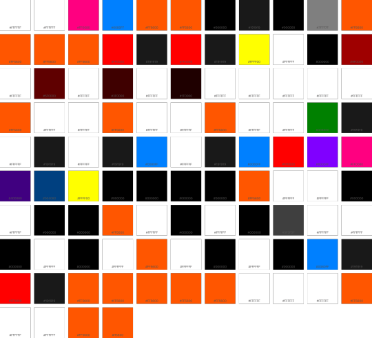
Apple Spark Ultra Palette
#000000 #004080 #008000 #0080FF #191919 #1F0000 #3F0000 #3F3F3F #400080 #5F0000 #7F7F7F #8000FF #9F0000 #FF0000 #FF0080 #FF5600 #ff5600 #FFFF00 #FFFFFF Source {
"author": {
"name": "Clay Russell",
"email": "[email protected]"
},
"name": "Apple Spark Ultra",
"style": "Dark",
"editor" : {
"textColor" : "#FFFFFF",
"tintColor" : "#FFFFFF",
"timeBlockColor" : "#FF0080",
…
View On WordPress
1 note
·
View note
Video
youtube
Swift: Create Facebook's Tab Menu system with UITabBarController
my review point is 9/10
https://youtu.be/1Sg7HjR_k2c?t=2m30s UITabBarController 만들어 사용하기
https://youtu.be/1Sg7HjR_k2c?t=4m3s UITabBarController에 있는 viewControllers 프로퍼티를 다른 view controller로 채운다. 하단의 텝에 나오는 tab bar styling은 UINavigationController obj를 이용한다. title, tabBarItem 속성을 이용한다.
https://youtu.be/1Sg7HjR_k2c?t=16m43s tab bar가 투명하게 하는 것을 막는 작업 (UINavigationController 내의 tabBar.translucent = false )
https://youtu.be/1Sg7HjR_k2c?t=18m tab bar top border 바꾸기
https://youtu.be/1Sg7HjR_k2c?t=21m35s 기본적으로 텝이 선택되고 안 선택되고에 따라 버튼의 색이 ios 에 의해 지정되는데 이를 수정하는 작업 ( AppDelegate에서 UITabBar.appearance().tintColor 를 수정한다. )
#ios#brian#facebook feed#facebook#UITabBarController#tab#bar#viewController#tabBarItem#UINavigationController#navigation#transparent#tabBar#translucent#border#UITabBar#tintColor#color
0 notes
Photo
Sophie’s Garden
“One thing you can always count on is that hearts change.”
Watch me build it!<3
Lighting Properties
Brightness [5] OutdoorAmbient [135,140,128] ShadowSoftness [0] ExposureCompensation [-0.5] Technology [Future]
ColorCorrection:
Saturation [-0.2] TintColor [255,255,248]
93 notes
·
View notes
Video
tumblr
Happy Thanksgiving day!Color tint (Yeti) laser engraving on titanium using 30 watt Raycus installed on Endurance DIY galvoscanner
https://www.endurance-lasers.com/products/endurance-diy-marking-machine-30-watt-fiber-raycus-diy-galvo-system
#galvo #galvoscanner #raycus #titanium #laser #lasers #endurance #endurancelasers #colorengraving #tint #tintcolors
0 notes
Text
Week 329
Happy Thursday! Is it me or is Apple publishing more content for developers? Such as this article about choosing between SFSafariViewController or WKWebView. It’s a good, basic article, especially with the upcoming UIWebView AppStore ban. But, of course, no one is using UIWebViews anymore, right? 😅
Marius Constantinescu
Articles
iOS Keyboard Shortcuts in SwiftUI, by @lostmoa_nz
Introductions: HealthKit, ResearchKit and CareKit, by Neil3079
View Communication Patterns in SwiftUI, by @V8tr
Binding in SwiftUI, by @mecid
tintColor, by @sarunw
Dressing up your UIButton, by @jeffwatkins
Xcode Previews for View Controllers, by @kharrison
Using Closures to initialize properties in Swift, by @donnywals
Tools/Controls
IBLayoutConstraint, by @maksim_kurpa
Videos
Creating a simple Raffle app with Combine, by @freak4pc
Credits
nataliapanferova, Jan Seredynski, Maks Kurpa, Neil3079, V8tr, JPEGuin, mecid, sarunw
0 notes
Text
OpenGL, GLSL and Optifine -- A Peek into Minecraft’s Shader Facility 1
There is very little information about the creation of Minecraft shaders, and, unlike Minecraft mods, there is only a handful of shader developers(almost forming a oligopoly IMO).
Recently I’ve been digging into Optifine, the all-famous Minecraft plugin that adds advanced graphic control for gamers and developers alike. Its Github documentation, although very beginner-unfriendly as of now, provides enough information for me to get started with Minecraft shaders.
Before talking about Minecraft, we should first focus on OpenGL, since it forms the backbone of Minecraft’s graphics. OpenGL provides an interface for developers to operate on the rendering pipeline, in which a ton of GPU-level programs process small-scale data and form them into a bigger picture. Vertex data, after being specified in CPU-level programs, are fed into Vertex Shaders, which proceed its data to the Geometry Shader to form primitives. These primitives are then rasterized(as opposed to ray tracing) to correspond with the 2D pixels on the computer screen. Each pixel is assigned with a fragment shader that adds color data. In the end, the texture can be stored into a buffer that’s later rendered to the computer screen. Developers have total control over the fragment, geometry and vertex shaders, while the other parts of the pipeline is wrapped by OpenGL.
The shadowmap buffer is what it is: a storage of values that denote how far the closest geometry in a certain spot is from the light source(in this case, the light source can be the sun, the moon or torches).
GBuffer renders the raw data of objects and is separated to different intermediate framebuffers, a technique called deferred shading. Deferred shading allows Optifine to render to different intermediate framebuffers before putting them together. Among these, there is one for the terrain, one for fluid objects( such as water and ice), one for the sky and one for entities. Each GBuffer has its separate data as well: GNormal as object normals, GColor as raw colors, GDepth as the depth buffer used to test occlusion. Occasionally, developers use GBuffer’s lightmap data as well. Note: in development, we often set the values of these data, which are processed by the developers after being extracted from Optifine’s pipeline.
The composite shader is the second last stage of the programmable pipeline. There are about 10 composite shaders that’s rendered in full passes, unlike GBuffer. This is oftentimes the most heavily developed area within the pipeline, since, as full passes come by, developers have access to color data from GBuffer and can add a variety of effects here. Different composites can implement features such as lighting, shadows, reflections, clouds and so on.
The last files, final.vsh and final.fsh, wrap up everything and output the final texture buffer that’s used by the game to render. If this confuses you, remember that each vertex shader shall have a fragment shader that rasterizes vertex based data to and feeds them to pixels for rendering.
During development, I created the following file structure for a basic Optifine shader:
-- GLSLang Folder
------ GLSLang Binary
-- Shader Root Folder
------ gbuffer_terrain.vsh
------ gbuffer_terrain.fsh
------ composite.vsh
------ composite.fsh
------ final.vsh
------ final.fsh
------ Lib Folder
---------- framebuffer.glsl
Which should be self-explanatory after the introduction above. GLSLang a program from the Khronos group that compiles the shader files. Next, before going into the implementation details, I want to emphasize that Optifine requires the developer to re-implement the default stages within the pipeline. This seems to be tricky, but advanced shading is the process in which the developer adds customized and intermediate modifications to what Minecraft already has.
framebuffer.glsl in the Lib folder should provide helper methods, denote subordinate fragment data, modify GBuffer format to increase accuracy and resolution, and provide some useful helper methods.
The gl_FragData[] array contains attributes of a GBuffer texture and stores the information that used to render a GBuffer. Oftentimes, gl_FragData[0] denotes the raw color, gl_FragData[1] denotes the normal, and gl_FragData[2] denotes the depth field. I used several macros to better identify these components:
#define GCOLOR gl_FragData[0] #define GNORMAL gl_FragData[1] #define GDEPTH gl_FragData[2]
Usually, the indices don’t really matter as long as the referencing files follow the defined convention.
Next, we are going to convert the texture resolution to a higher standard:
int RGBA16 = 1 int gcolorFormat = RGBA16
1 is a placeholder that Optifine identifies as the RGBA16 format, which encodes more data into each texture than the default RGBA8 format.
Now we also have several samplers that come from Minecraft’s pre-defined CPU space, as shown below:
uniform sampler2D gcolor; uniform sampler2D gnormal; uniform sampler2D gdepth;
sampler2D is a variable that loads data from a texture unit, which is a position to which a texture object is bound to. Thus, the sub-components of a GBuffer texture can be sampled with:
texture2D(sampler2D sampler, vec2 P)
Which extracts a single pixel from the sampler variable. This allows us to implement the helper functions below, which are used after the GBuffer stage when the subcomponents are ready:
vec3 getAlbedo(vec4 tex_coord){ return texture2D(gcolor, tex_coord.st).rgb; }
vec3 getNormal(vec4 tex_coord){ return texture2D(gnormal, tex_coord.st).rgb; }
getAlbedo returns the current raw color of the pixel, while getNormal returns the normal. Oftentimes, in the composite stage, the normal has to be processed with the Normal Matrix:
normal = normalize(gl_NormalMatrix * normal);
So that the normal vectors are in the camera space, in which most processes take place.
Now let’s go to the first stage of the Optifine pipeline: GBuffer. I’ll only focus on GBuffer_terrain for now:
#version 120 varying vec4 texcoord; varying vec3 tintColor; varying vec3 normal;
void main(){
gl_Position = ftransform(); texcoord = gl_MultiTexCoord0; tintColor = gl_Color.rgb;
normal = normalize(gl_NormalMatrix * gl_Normal);
}
Above is the vertex shader for GBuffer_terrain. The varying keyword both receives and passes a variable. Texcoord is the texture coordinate in UV space; tintColor is the color add-on for an existing texture; normal is self-explanatory. The vertex shader gets information about its position in the world through ftransform() and stores its texture coordinate(through multi-texcoord that accesses information stored in a texture unit, which in this case is in location 0) that’s later interpolated to fragment shaders. In Minecraft this interpolation is quite straightforward since each vertex matches the corner of a textured cube. Tint color is used for tinting effects that does not need much processing for now, so we’ll deal with it in a standard pass.
Next comes the fragment shader for GBuffer_terrain:
#version 120
#include "/lib/framebuffer.glsl"
varying vec4 texcoord; varying vec3 tintColor; varying vec3 normal;
uniform sampler2D texture;
void main(){
vec4 blockColor = texture2D(texture, texcoord.st); blockColor.rgb *= tintColor;
GCOLOR_OUT = blockColor; GNORMAL_OUT = vec4(normal, 1.0);
}
Just a quick reminder about the usability of the GBuffer uniforms in framebuffer.glsl in GBuffer_terrain: they should be referenced in shaders of later stages(such as composite) after being passed to the pipeline, which is exactly what we are doing here.
The sampler texture contains block texture data and is modified by the tintColor(which doesn’t do practical stuff at this stage). Then the terrain texture is passed to GColor’s storage of raw color while the normal is passed to normal storage.
Now that we are done with the GBuffer, we can focus on the composite shader, in which GBuffer textures are processed as unified entities instead of separate G channels:
#version 120 varying vec4 texcoord; #include "/lib/framebuffer.glsl"
uniform int worldTime; uniform vec3 sunPosition; uniform vec3 moonPosition;
varying lightPosition;
void main(){
if(worldTime < night_start || worldTime > night_end){ lightPosition = normalize(sunPosition); }else{ lightPosition = normalize(moonPosition); }
}
In the next update, I’m going to talk about the processing of light within the composite shader.
0 notes
Text
Qt, QML and Felgo tutorial. NASA Astronomy Picture of the Day app for Desktop, iOS and Android
Javier did it again! Thank you very much for your NASA Astronomy Picture of the Day app tutorial. We at Felgo team enjoyed reading this easy-to-follow tutorial.
We hope Felgo users will find it useful and put it into practice. This is the original article that we fetched below:
This is an introductory tutorial to getting started with Qt/QML and Felgo to design multi-platform apps for desktop (Linux, Window & macOS) and mobile devices (iOS & Android). A complete app is developed in this tutorial: NASA Astronomy Picture of the Day app. This tutorial also describes how to create custom QML components and how to perform HTTP requests by accessing one of the NASA Open APIs.
Have a look at the following video to see the app in action! This app works on Linux, Window, macOS, Android and iOS, all from the same code. Isn’t it cool? But there is more, Felgo roadmap includes building apps for different platforms in the cloud, support for embedded and IoT devices and publishing apps to the web.
youtube
Astronomy Picture of the Day app
Background
If you are not familiar with the Qt framework or Felgo, I recommend first having a look at Qt 5 framework technology and tools: QML, Qt Quick, Qt Creator and Felgo.
Outline
Astronomy Picture of the Day (APoD) app
NASA APoD open API
Performing an HTTP Request
Creating Custom QML Components
How can I execute the app? How about live reloading in my mobile phone?
What can I do to learn and improve the app?
Astronomy Picture of the Day (APoD) app
Let’s see how we can design a QML app for accessing NASA Astronomy Picture of the Day open API and test it in our mobile phone or tablet using live code reloading. The cool thing is that you can use any combination of desktop operating system (Linux, Windows and macOS) and mobile device (Android or iOS).
The code of the APoD app is open source and available at our APoDapp repository hosted on GitHub.
APoD app screenshot
The first thing to do is to download and install Felgo. It integrates everything needed. Felgo includes the Qt framework and the Qt Creator IDE. Once installed, execute Felgo and you should see Qt Creator. Have a look at the Example section to see what can be done with this Software Development Kit (SDK).
Felgo – Qt Creator IDE
The next step is to create a new app, click on File -> New File or Project, and then select Felgo Apps, Single-Page Application. Give it a name “APoDapp” and select the destination folder. In the kit selection, choose only Felgo desktop, click next, again next and finish.
The QML code in Main.qml is a hierarchical tree of QML objects. The import statements define the modules and versions we want to use. We can set an alias if needed (such as Quick2) in case there are components with the same name in different modules.
The general structure of our app is shown below. The App component in the main node. The NavigationStack component adds a navigation bar that shows the page title and is used to navigate between pages. A Page is a container for components.
import QtQuick 2.11 import QtQuick.Controls 2.4 as Quick2 import QtMultimedia 5.8 import Felgo 3.0 App { id: app NavigationStack { Page { id: page title: qsTr("NASA - Astronomy Picture of the Day") ..... ..... } } }
Each QML object has a different set of properties, but some of them are common to all of them, for instance the id property. Each QML object can be referenced by the name given in its id property. The title property in the Page object defines the text shown in the navigation bar. The qsTr function is a helper function for translating your app to different languages.
Inside the assets folder in your app main folder you can place the assets (images, videos, documents, etc.) you want to distribute with your app.
The app appearance can be customized implementing a handler (onInitTheme) for the App initTheme signal. This code set a new tintColor (app-wide default main color), and the background and text colors of the navigation bar.
App { id: app onInitTheme: { Theme.colors.tintColor = "#1e73be" Theme.navigationBar.backgroundColor = Theme.colors.tintColor Theme.navigationBar.titleColor = "white" } property bool isVideo: false ..... ..... }
In the App object, a variable (property in QML) is declared to store if the media from the NASA open API is a video (isVideo), because the requested media can be an image or a video link as we will see later.
In page, we define a background image and a set of QML components inside a Column object which is nested with a Flickable object.
..... ..... Page { ..... ..... Image{ anchors.fill: parent source: "../assets/MTB_background.jpg" fillMode: Image.PreserveAspectCrop opacity: 0.5 } Flickable{ anchors.fill: parent contentWidth: column.width contentHeight: column.height flickableDirection: Flickable.VerticalFlick interactive: !dateControl.isDialogOpenend Column{ id: column width: page.width spacing: dp(10) topPadding: dp(10) bottomPadding: dp(30) ..... ..... } } } ..... .....
The first component inside page is the page background Image. Qt Quick provides a way to layout components using the concept of anchors. In this case, the background image is filling the whole area of its parent (page object). Besides the image source, the fillMode and opacity properties are also set.
The Flickable object places its nested objects on a surface that can be dragged and flicked, causing the view onto the nested objects to scroll. Inside the flickable, objects are organized following a Colum layout. The flickable object properties contentWidth and contentHeight are therefore set to the width and height of the column. The flickable direction is also set to be only in the vertical axis (VerticalFlick). Additionally, we disable the flicking when the calendar is opened (interactive = false), more about this later.
QML components can be organized considering different layouts (column, row, grid, etc). In the column object, we set the width, which corresponds to the page width, and also the top and bottom paddings (topPadding and bottomPadding) and the spacing between the QML objects inside the column layout. The dp method provides a density-independent unit for the value passed as an argument, that must be specified in pixels.
The QML objects inside the Column layout are given below.
Column{ ..... ..... Image // Logo AppText // Text: "Choose date" DateControl // Date control (custom QML object) AppText // Picture title AppText // Picture author ProgressBar // Loading image progress bar Image // Media - Image YouTubeWebPlayer // Media - Video Rectangle // Black rectangle DescriptionBlock // Description of media (custom QML object) }
The following QML components are the logo and the text “Choose date”, both are horizontally centered. We also set the image width with respect to its parent width. The image height is implicitly calculated by setting the preserve aspect fit mode.
Image{ source: "../assets/MTB_logo.png" fillMode: Image.PreserveAspectFit anchors.horizontalCenter: parent.horizontalCenter width: parent.width - dp(40) } AppText{ anchors.horizontalCenter: parent.horizontalCenter text: qsTr("Choose date") }
There isn’t a stock date picker or control in QML, but we can create our own component. This component is described later in this tutorial. Our date control trigger an signal when a date is selected accepted, and we can implement a handler of such signal (onAccepted) where we call a JavaScript function (request_nasa_image_QML). This function is also described later. Our date control also implement two additional handlers: onOpened and onCanceled.
DateControl{ id: dateControl onAccepted: request_nasa_image_QML(dateStr) onOpened: hideVideo(isVideo) onCancelled: showVideo(isVideo) }
The video component (nasaVideo) is tricky since we need to hide it to show the date dialog over it, so we call JavaScript functions to show (showVideo) or hide (hideVideo) it. When we hide the video component, we show a black rectangle (rectangle) with its same size. Also, we have to hide this rectangle when the video container is shown.
function hideVideo(isVideo) { if (isVideo) { nasaVideo.stop() rectangle.width = nasaVideo.width rectangle.height = nasaVideo.height nasaVideo.visible = false rectangle.visible = true } } function showVideo(isVideo) { if (isVideo) { rectangle.visible = false nasaVideo.visible = true } }
Next, we have two AppText components that show the title and author of the retrieved media. Some configuration is done in both components, such as: width minus some spacing, center horizontal alignment, bold font and word warp mode.
AppText{ id: message horizontalAlignment: AppText.AlignHCenter font.bold: true wrapMode: AppText.WordWrap width: parent.width - 2*dp(10) } AppText{ id: author horizontalAlignment: AppText.AlignHCenter wrapMode: AppText.WordWrap font.pixelSize: sp(12) font.bold: true width: parent.width - 2*dp(10) }
A progress bar shows the loading progress when the retrieved media is an image, hence it is only visible when an image is loading (nasaImage.status === Image.Loading). The loading progress is obtained from the image progress property (nasaImage.progress). This value is between [0,1], so we set accordingly the progress bar interval (from and to properties).
Quick2.ProgressBar{ anchors.horizontalCenter: parent.horizontalCenter visible: nasaImage.status === Image.Loading value: nasaImage.progress from: 0 to: 1 }
If the retrieved media type is an image, we show it in the nasaImage component. If we click or touch this image (MouseArea component), the image URL is opened in the default browser (onClicked handler) thanks to the functionality provided by the Felgo nativeUtils object.
Image { id: nasaImage anchors.horizontalCenter: parent.horizontalCenter visible: nasaImage.status === Image.Ready fillMode: Image.PreserveAspectFit width: parent.width - 2*dp(10) MouseArea{ anchors.fill: parent onClicked: nativeUtils.openUrl(nasaImage.source) } }
It may happen that the media retrieved from the API REST call is a link to a YouTube video instead of a link to an image. In this case, we use the Felgo YouTubeWebPlayer QML component (nasaVideo) to load the video.
We also have a Rectangle component (rectangle) that is shown when the YouTubeWebPlayer component is hidden.
YouTubeWebPlayer{ id: nasaVideo anchors.horizontalCenter: parent.horizontalCenter width: parent.width - 2*dp(10) visible: false } Rectangle{ id: rectangle color: "black" anchors.horizontalCenter: parent.horizontalCenter visible: false }
Finally, we include another custom QML object (DescriptionBlock) to customize the appearance of the media text description obtained from the API REST call. This custom QML object is described later in this tutorial.
DescriptionBlock{ id: descriptionBlock }
NASA APoD open API
One of the NASA Open APIs is Astronomy Picture of the Day (APoD) API. To get access to this API we have to perform a GET request to the following URL.
GET https://api.nasa.gov/planetary/apod
Three parameter can be provided as shown below. We don’t need a key for testing but it is required for expanded usage, we can easily apply for one here.
Parameter Type Default Description date YYYY-MM-DD Today The date of the APoD image or video hd bool False High resolution image api_key string DEMO_KEY Key for expanded usage
A successful request returns a JSON object with the following structure.
{ "title", // Media title "copyright", // Author/s "explanation", // Media description "media_type", // "image" or "video" "url" // Media URL (image or YouTube link) "hdurl", // High-definition media URL "service_version" // "v1" }
Performing an HTTP Request
We have different ways to perform a GET request to the NASA APoD API in our QML app. We can use pure JavaScript or a Felgo QML object. Let’s have a look at both.
XMLHttpRequest JavaScript object
The get_request function is a general function that performs an asynchronous GET request using the XMLHttpRequest JavaScript object. This function has three arguments: url, parameters and a callback function that is called when the request is finished.
function get_request(url,params,callback) { var http = new XMLHttpRequest() http.onreadystatechange = function(myhttp) { return function() { if (myhttp.readyState === XMLHttpRequest.DONE) callback(myhttp) } }(http) http.open("GET", url + "?" + params, true) http.send() }
The request_nasa_image_JS function uses the get_request function. It receives as an argument (dateStr) a date in string format (yyyy-mm-dd).
The first thing done in this function is to clear the GUI (clearInfo). Then, the request is performed. Inside the callback function, we check that the status is OK (Http_OK = 200). Then, the responseText is parsed to a JSON object (res_json). If everything went well, the requestSuccess function is called, otherwise requestError is executed.
function request_nasa_image_JS(dateStr) { const url_base = "https://api.nasa.gov/planetary/apod" const apiKey = "DEMO_KEY" const Http_OK = 200 var params = "date=" + dateStr + "&api_key=" + apiKey clearInfo() get_request(url_base,params, function(http) { if (http.status === Http_OK) { var res_json = JSON.parse(http.responseText) if (requestSuccess(res_json)) return } requestError() }) }
The clearInfo function simply clears all the previously shown information in the GUI.
function clearInfo() { message.text = "" nasaImage.source = "" nasaVideo.visible = false isVideo = false rectangle.visible = false author.text = "" descriptionBlock.text = "" }
The requestError function just sets an error message and the text color to red.
function requestError() { message.color = "red" message.text = qsTr("No data found") }
The requestSuccess function checks that the JSON object (res_json) is not empty. Then, it sets the title (res_json.title) and description (res_json.description).
After that, it checks if media is an image or a video, and set accordingly the image source or open the YouTube video. We use the youtube_parser function to obtain the YouTube video id from the URL, since the NASA APoD API provides a URL but the YouTubeWebPlayer object asks for the YouTube video id.
It may happen that there is not author information in our JSON (res_json.copyright), in this case the author QML component is hiden.
function requestSuccess(res_json) { if (res_json && res_json !== {}) { message.color = Theme.tintColor message.text = res_json.title descriptionBlock.text = res_json.explanation if (res_json.media_type === "image") nasaImage.source = res_json.url else if (res_json.media_type === "video") { nasaVideo.loadVideo(youtube_parser(res_json.url),true) nasaVideo.visible = true } if (res_json.copyright !== undefined) { author.visible = true author.text = "Copyright " + res_json.copyright } else author.visible = false return true } return false }
HttpRequest QML Component
Another way to perform an HTTP request is to use the Felgo HttpRequest QML object. The following JavaScript function makes use of it. Notice that we are also using here the clearInfo, requestError and requestSuccess JavaScript functions previously introduced.
function request_nasa_image_QML(dateStr) { const url_base = "https://api.nasa.gov/planetary/apod" const apiKey = "DEMO_KEY" const Http_OK = 200 const timeout_ms = 5000 var params = "date=" + dateStr + "&api_key=" + apiKey var url = url_base + "?" + params clearInfo() HttpRequest .get(url) .timeout(timeout_ms) .then(function(res) { if (res.status === Http_OK) if (requestSuccess(res.body)) return requestError() }) .catch(function(err) { requestError() }); }
Creating Custom QML Components
To create a new QML component, go to File -> New File or Project, then in File and Classes, select Felgo Apps and then choose Item (this is the base class of our custom component, it can be changed if needed). The name of our QML custom component will be the same as the given filename, also make sure that you create this file inside the qml folder.
DateControl QML Component
Our DateControl component has a row layout (Row) and a custom Felgo Dialog.
Calendar QML component
Item{ id: item width: parent.width height: row.height property date selectedDate: new Date() property alias isDialogOpenend: dateDialog.isOpen signal accepted(string dateStr) signal cancelled() signal opened() Row { id: row anchors.horizontalCenter: parent.horizontalCenter property date selectedDate: new Date() signal accepted(string dateStr) ..... ..... } Dialog{ ..... ..... } }
The components inside the row layout will be horizontally centered. A property (variable) is defined to store the chosen date (selectedDay), its default value is today (new Date()). Another property tracks when the dialog is opened (isDialogOpened).
We also define signals that will be emitted when a date is chosen by the user (accepted), the dialog is opened (opened) or the selection of a date cancelled (cancelled).
DateControl has three additional components: a read-only (enabled: false) text field (textDate), an icon button and a calendar (calendar). The calendar is inside a custom dialog (dateDialog).
Below, you can see the text field and its custom property values.
AppTextField{ id: textDate anchors.verticalCenter: parent.verticalCenter width: dp(120) height: dp(30) borderWidth: dp(2) borderColor: Theme.tintColor radius: dp(20) placeholderText: "yyyy-mm-dd" horizontalAlignment: TextInput.AlignHCenter enabled: false }
When the icon button is clicked (onClicked) the calendar dialog is shown (dateDialog.open()) and the opened signal is emitted. The Felgo IconType object provides a set of cool icons to use in our apps.
IconButton{ anchors.verticalCenter: parent.verticalCenter icon: IconType.calendar onClicked: { item.opened() dateDialog.open() } }
The calendar dialog is a custom dialog that includes only one QML component, a calendar. A dialog has two buttons by default, “Cancel” and “OK”.
In the calendar component, the default date is given by the selectedDate property in the row component. A locale can be set if needed.
When “OK” is pressed, the onAccepted signal is emitted in dateDialog. The same happens if the date is double clicked. On the other hand, when “Cancel” is pressed the onCanceled signal is emitted.
We intercept the onAccepted signal to format the selectedDate in textDate (Qt.formatDateTime), close the dateDialog and also emit the accepted signal in the row component.
For the onCanceled signal, we close the dateDialog and emit the cancelled signal to the dialog parent object (row).
Dialog{ id: dateDialog title: "Choose a date" autoSize: true outsideTouchable: false onAccepted:{ textDate.text = Qt.formatDateTime(calendar.selectedDate,"yyyy-MM-dd") dateDialog.close() parent.accepted(textDate.text) } onCanceled: { dateDialog.close() parent.cancelled() } Calendar{ id: calendar width: parent.width locale: Qt.locale("en_EN") selectedDate: parent.selectedDate onDoubleClicked: dateDialog.accepted() } }
DescriptionBlock QML Component
This QML object is used to define the style of the description block in the app. We use two Rectangle components. One of them defines a border around the description text and the other sets a semi transparent background. The column object has two nested AppText components: the text “Description” and the media description itself obtained from the APoD API call.
Custom description QML component
Rectangle{ id: root anchors.horizontalCenter: parent.horizontalCenter width: parent.width - 2*dp(10) height: columnDescription.height border.width: dp(2) border.color: Theme.tintColor radius: dp(20) visible: text color: "transparent" property string text Rectangle{ anchors.fill: parent opacity: 0.2 color: Theme.tintColor radius: parent.radius } Column{ id: columnDescription width: parent.width topPadding: dp(15) bottomPadding: dp(20) spacing: dp(10) AppText{ anchors.horizontalCenter: parent.horizontalCenter text: qsTr("Description") color: Theme.tintColor font.bold: true font.pixelSize: sp(18) } AppText{ id: description anchors.horizontalCenter: parent.horizontalCenter width: parent.width leftPadding: dp(15) rightPadding: dp(15) wrapMode: AppText.WordWrap font.pixelSize: sp(14) horizontalAlignment: AppText.AlignJustify text: root.text } } }
How can I execute the app? How about live reloading in my mobile phone?
Let’s see the functionality of each one of the buttons placed in the bottom-left corner of Qt Creator.
Qt creator buttons
Live Reloading – Start the live server.
Run – Run your app locally in your computer
Debug – Debug your app locally in your computer
Build – Build your app
The live reloading button opens a new window (Felgo live server) and starts the live server. Now, you can connect to it from your desktop client by hitting start, see the figure below, or in your mobile device. In both cases, the app will be automatically updated when you save new changes in your code.
Felgo Live Server – Start desktop client
For live code reloading in your mobile device, you have to keep the Felgo Live Server window opened and use the Felgo & QML Live Scripting App in your mobile device to connect to the live server. Download and follow the instructions given in the app (we have to press the Connect Desktop option in the app to connect to our desktop live server). Felgo & QML Live Scripting app download links for Android and iOS are below.


Felgo & QML Live Scripting App
Check Felgo Live Server documentation for detailed information.
Note: if your app includes custom C++ code (not considered in this tutorial), you have to turn out your own application in a Felgo Live Client Module and deploy it conventionally to your mobile device. After that, you will be able to connect to it and use live code reloading for your QML and JavaScript code.
For deploying your apps conventionally to mobile devices (Android and iOS), follow this guide.
What can I do to learn further and improve the app?
The APoD app is nice but there is room for improvement for sure. Some ideas are listed below.
Editable date component (introducing text).
Automatically load the astronomy picture (media) of the day when the app is loaded.
Change the month and year easily and directly in the date dialog.
Share a link to the media of the day (copy to clipboard or post in social networks).
We hope you enjoyed this tutorial and find it helpful for learning Qt, QML and Felgo! Feel free to share it on Facebook or Twitter.
Get Felgo Apps!
More Relevant App Development Resources
Qt AR: Why and How to Add Augmented Reality to Your Mobile App
Handle Safe Area Insets, Notch & Display Cutout for iPhone X, iPad X and Android P
Real-World Examples of Machine Learning and A
The Best App Development Tutorials & Free App Templates
All of these tutorials come with full source code of the mobile apps! You can copy the code to make your own apps for free!
How to create a mobile app for iOS & Android with a single code base
How to support multiple languages and internationalization in your mobile app
Common Widgets & Controls in a cross-platform App
How to support multiple screen sizes & screen densities – Responsive App Guide
Guide for App Layout
Guide for App Navigation
How to add native code to your mobile App
How to easily style your App with Themes
How to add Animations to your App
How to add a Chat to your Mobile App
How to make a Weather App accessing a REST weather service
Conference App Template
Widget Gallery App Template
Twitter App Template
Messenger App Template
Property Finder App Template
App Development Video Tutorials
Make Cross-Platform Apps with Qt: Felgo Apps
youtube
How to Add In-App Chat or Gamification Features to Your Mobile App
youtube
How to Make a Mobile App with Qt Quick Designer (QML Designer) & Felgo
youtube
The post Qt, QML and Felgo tutorial. NASA Astronomy Picture of the Day app for Desktop, iOS and Android appeared first on Felgo.
Qt, QML and Felgo tutorial. NASA Astronomy Picture of the Day app for Desktop, iOS and Android published first on https://medium.com/@TheTruthSpy
0 notes
Text
#XfEffects: Xamarin.Forms Effect to change the Tint color of ImageButton's image - (new series)
I just blogged: #XfEffects: #Xamarin.Forms Effect to change the Tint color of ImageButton's image - (new series)
The documentation recommends using Effects when we just want to change properties on the underlying native control. I have begun to love Effects as they make my code more readable. With Effects, I always know that there is a platform-specific implementation attached, while that is not obvious when using a custom renderer. Nowadays, I always try to implement an Effect before a Renderer.
The basics
View On WordPress
#Android#AppCompatImageButton#bindable properties#color#ColorStateList#effects#Imagebutton#iOS#PlatformEffect#renderer#ResolutionGroup#RoutingEffect#Tint#UIButton#UIImageView#xamarin#xamarin forms#XfEffects
0 notes
Text
Customize Navigation Bar iOS Tutorial
The look of the Navigation Bar can be customized. In this tutorial we will change the background colour, the tint colour and add an image to the Navigation Bar. This tutorial is made with Xcode 10 and built for iOS 12.
Open Xcode and create a new Single View App.
For product name, use IOSCustomizeNavBarTutorial and then fill out the Organization Name and Organization Identifier with your customary values. Enter Swift as Language and choose Next.
We need an image to put on top of the Navigation Bar, download the image. Open the Assets Library and drag the image into it. Go to the Storyboard. Select the View Controller and in The Editor menu select Embed in -> Navigation Controller. Next, drag a Bar Button from the Object Library to the left side of the Navigation Bar and name it "Left Item". Repeat this for the right side and name it "Right Item". The Storyboard should look like this.
Go to the ViewController.swift file and add the ViewDidAppear method.
override func viewDidAppear(_ animated: Bool) { // 1 let nav = self.navigationController?.navigationBar // 2 nav?.barStyle = UIBarStyle.black nav?.tintColor = UIColor.yellow // 3 let imageView = UIImageView(frame: CGRect(x: 0, y: 0, width: 40, height: 40)) imageView.contentMode = .scaleAspectFit // 4 let image = UIImage(named: "Apple_Swift_Logo") imageView.image = image // 5 navigationItem.titleView = imageView }
a nav helper variable which saves typing.
the Navigation Bar Style is set to black and the tint color is set to yellow, this will change the bar button items to yellow.
an Image View with a width and height of 40 points is created and the contentMode is set to scaleAspectFit to adjust the image to the size of the Image View
The Swift Logo image is assigned to the Image view
The ImageView is assigned to the titleView of the Navigation Item
Build and Run the project to display the customised Navigation Bar.
You can download the source code of the IOSCustomizeNavBarTutorial at the ioscreator repository on github.
0 notes
Text
Windows Acrylic für jeden!
In diesem Post will ich euch erklären, wie man den Acrylic-Effekt, welchen man in diversen Post bereits in Aktion sehen kann.
In diesem Post befasse ich mich mit dem HostBackdrop, auch Acrylic genannt. Das ist der Effekt, welcher den Hintergrund der App verschwimmen lässt. Damit ihr euch selber ein Bild davon machen könnt, bevor ihr es selbst einbaut, zeige ich euch hier ein paar Bilder von zwei Projekten, in denen ich den Backdrop angewendet habe.
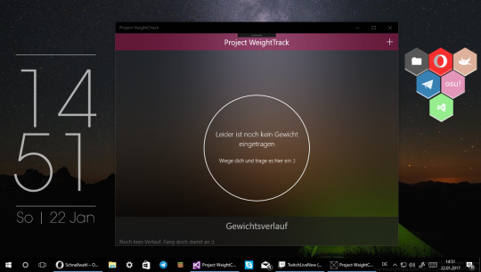
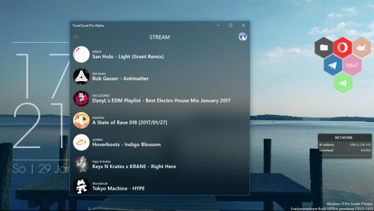
Beides sind funktionierende Projekte, auf die ich nicht weiter eingehen werde. Man sieht aber schön, wie der Hintergrund der Apps das verschwommene Abbild vom Bereich hinter den Apps ist.
Voraussetzungen:
Visual Studio 2017 RC (Da das Insider-SDK, welches die Methode zum Erstellen des Blurs, nur mit dieser Version von Visual Studio funktioniert)
Windows 10 Insider Build 15003 oder höher
Windows 10 Insider SDK Build 15003 oder höher (Ich habe es mit Build 15003 gemacht, aber es sollte auch mit aktuelleren Versionen funktionieren)
Mein “HostBackdrop”-Kit (Beinhaltet alles in der Backdrop.cs-Datei und eine .png-Datei)
Schritt 1: Installieren von Visual Studio 2017 RC und des Insider SDK 15003 oder höher
Zuerst einmal solltet ihr logischerweise Visual Studio 2017 RC und das Insider SDK installieren.
Schritt 2: Das HostBackdrop-Kit runterladen und extrahieren
Das HostBackdrop-Kit enthält alles, was man für den Effekt benötigt. Extrahiert den Ordner dorthin, wo ihr es auch schnell wieder erreichen könnt.
Schritt 3: UWP-Projekt erstellen
Nun öffnen wir Visual Studio und erstellen eine leere universelle App. Im nächsten Schritt werdet ihr nach der Zielversion gefragt. Gebt da die kürzlich installierte Build 15003 oder höher an. Falls ihr bereits ein Projekt erstellt habt, springt zu Schritt 3.1.
Schritt 3.1: Zielversion bei vorhandenen Projekt anpassen
Diesen Schritt könnt ihr ignorieren, wenn ihr ein neues Projekt mit Schritt 3 erstellt habt.
Um die Zielversion zu ändern, klickt auf Properties im Projektmappen-Explorer (1) und wechselt die Zielversion auf Build 15003 oder höher (2)
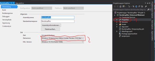
Visual Studio sollte kurz von alleine neustarten.
Schritt 4: Win2D installieren
Für den Blur-Effekt braucht ihr außerdem Win2D.UWP. Dieses ladet ihr euch als NuGet-Paket runter. Dazu macht ihr einen Rechtsklick auf Verweise im Projektmappen-Explorer und wählt NuGe-Pakete verwalten aus (1). Nun sucht ihr nach Win2D.uwp (2) und installiert es (3)

Schritt 5: Das Backdrop-Kit importieren
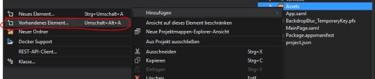
Jetzt kommt mein Backdrop-Kit ins Spiel. Öffnet den Ordner, den ihr in Schritt 2 extrahiert habt. Ihr solltet eine Backdrop.cs und eine Noisey.png darin vorfinden. Die Backdrop.cs verschiebt ihr irgendwo in euer Projekt, indem ihr den Projektordner im Explorer öffnet und sie dort reinzieht. Die Noisey.png kopiert ihr in den Asset-Ordner. Anschließend müsst ihr nur noch die Dateien in euer Projekt einbinden, indem ihr einen Rechtsklick auf den Ordner eurer Wahl macht und mit Hinzufügen->Vorhandenes Element die Datei auswählt. Öffnet die Backdrop.cs und prüft, ob es keine Fehler gibt.
Schritt 6: Backdrop anwenden

Jetzt gehts zum spannendsten Teil des Tutorials: Dem tatsächlichen Anwenden des HostBackdrops. Das ist ganz einfach. Aber erstmal etwas Erklärung, was man beachten muss. Der Backdrop ist ein alleinstehendes XAML-Element, welches dafür sorgt, dass das Layout, in dem es sich befindet, ungeachtet dessen Hintergrundfarbe, den HostBackdrop-Effekt besitzt. Es gibt ein paar zusätzliche Attribute, die das Element besitzt, aber dazu später mehr.
Startet, falls nicht schon geschehen, eure App erstmal. Danach könnt ihr schon mit der Implementierung loslegen. Dazu fügt ihr dem Page-Element einfach nur das Attribut xmlns:blur=“using:Blur” hinzu. Nun braucht ihr einfach nur das Backdrop-Element in das Layout einzufügen, welches den Effekt besitzen soll (<blur:Backdrop/>)
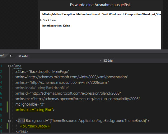
Höchstwahrscheinlich wird eine Ausnahme im Designer ausgelöst, was unpraktisch ist, allerdings keine weiteren Auswirkungen auf die App hat.
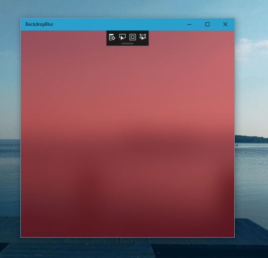
Nun starten wir die App und voilà. Das Ergebnis sollte so aussehen.

Es gibt ein paar eigene Eigenschaften, die das Element zum Beispiel besitzen kann. Da wären zum einen BlurAmount, TintColor und die Standard-Eigenschaften wir Opacity.
BlurAmount bringt absolut keine Veränderung mit sich. Der Grad des Blurs bleibt gleich, egal ob BlurAmount=“0″ oder BlurAmound=“9000″.
Mit TintColor kann die Farbe des Blurs bestimmt werden. Wählt man eine der Farbe aus dem DropDown-Menü aus, zb. Cyan, dann überdeckt das zu 100% den Blur. Resultat ist, dass der verschwommene Hintergrund nicht sichtbar ist, alles ist Cyan. Daher kann man Tools wie Alpha Color Mixer den Code für die gewünschte Farbe mit Alpha-Wert generieren und diesen einfügen. Das Ergebnis sieht bei #7EC90000 zum Beispiel so aus:
Mit Opacity könnt ihr (obviously) die Deckkraft des Effekts anpassen. Dabei vermischt sich der Effekt mit dem Hintergrund des Containers, in dem es liegt. Das ergibt einen interessanten Effekt, gerade wenn es ein Bild ist, welches zur Hälfte mit dem BackDrop gemischt ist, der natürlich im Bewegten spektakulärer aussieht.

Experimentiert damit rum, wie es euch gefällt. Nachteil ist allerdings, dass man nicht mehrere Backdrop-Elemente innerhalb einer Page hinzufügen kann. Ebenso kann es passieren, dass es nicht funktioniert, wenn es innerhalb bestimmter Container verwendet wird (Splitview.Pane zum Beispiel).
Falls es euch passiert, dass ihr das Element falsch eingesetzt hat und dadurch der Bildschirm ständig schwarz wird und kurz aufflackert, drückt Strg+D und wartet etwas. Dann schließt die Anwendung mittels Taskleistenpreview.
0 notes
Photo


Woodland Farmhouse
The outdoors welcomes you with a cool breeze and the song of birds. It’s peaceful. You feel as if all your worries have been carried away by the wind. You feel safe.
Watch me build it!<3
Lighting Properties:
Ambient [84,82,76] Brightness [3] ColorShift_Top [101,110,125] OutdoorAmbient [139,132,120] ShadowSoftness [0.05] Technology [Future] FogColor [143,114,105] FogEnd [900] FogStart [100]
ColorCorrection:
Brightness [0.01] Contrast [0.2] Saturation [-0.2] TintColor [255,237,224]
14 notes
·
View notes
Text
That offset does what?
Whether you’re editing EBX files or writing configure scripts, you have to deal with offsets. The names are unhelpful and ambiguous, and unless you’re a trained in cinematography, you probably have absolutely no idea what a fresnel is or how specularity can change your life. And don’t get me started on the inspired names that start with “TintColor”. TintColor... what? TintColorHelmet? TintColorGloves? TintColorBackground?
Anyway, I figured out the whole TintColor thing a while ago.
TintColor1 is always Cloth Slot 1.
TintColor2 is the only leather color, so that’s one thing you don’t have to worry about. With cloth, it’s only present when the material is textured. It’s the pips in samite and Infused Vyrantium Samite, the cracks between the clumps of lambswool and Everknit Wool, and a bit of sheen in King’s Willow Weave. Since it has its own name, you’d think it’s some kind of big deal or something, but the only way I was able to see it at all was to blow the texture up 10 times and get out the magnifying glass. Make it the same as your other colors and you’ll be fine.
Tint Color 3 is always Cloth Slot 2.
What is fresnel, anyway? Well, technically, it should be capitalized, since it’s some guy’s actual name, and it’s pronounced fray-NELL, but you’re never going to have to pronounce it, trust me. You know how a folded terrycloth towel is lighter along the folds or how a piece of draped velvet is brighter along the creases? It’s because light reflects off the greater surface area of the pile in those steeply-angled regions, and it looks lighter. So the higher the fresnel, the more shine you get around the edges. Take a look at what happens when you set the fresnel at 10. The base color is black and the fresnel color is white.

Oooh, silvery! I haven’t tried going over 10, but there’s little point. A value of 100 might crash the game, but are you ever going to go that high?
There are two flavors of fresnel, primary and secondary. Primary corresponds with Cloth Slot 1 and secondary corresponds with Cloth Slot 2. In the image below, I’ve set primary fresnel to red and secondary fresnel to blue. Both are set at FresnelEnable=10.

Both of these images are cotton, by the way. You can change the attributes of any cloth.
ColorSpec is a measure of the specularity, and you’re only ever going to be able to change the value. Specularity is what happens to reflected light when you view it head on. When you sear your retinas by pointing your headlights at a reflective road sign? That’s because reflective tape has a high specularity. You get the most bang for your buck for values between 0 and 1. After 1, you get sharply diminishing returns. The material is cotton again, and the color is set at 20% red so you can see the changes clearly.
ColorSpec=0

ColorSpec=1

ColorSpec=5

ColorSpec=50

Is there even a difference between 50 and 5? I can’t tell.
Anyway, ColorSpecPrimary and ColorSpecSecondary obey the same rules as fresnel: Primary=Cloth Slot 1, Secondary=Cloth Slot 2. Here, I set the specularity at 0 for Primary and at 1 for Secondary.

The difference is obvious.
At this point, there’s only one crafting material question left to answer: Why is everything listed twice? I thought it was because there are fully-textured and flat-textured versions of everything, like for Cloth Slot 2, how the collar is textured but the sash is not. I was wrong.
I wasn’t mucking around with fresnel or ColorSpec here. I know how that works now. I was meddling only with TintColor. I set the first instance at red and the second at blue. The results were surprising.
Apparently, the first iteration is a freeloader, and the second iteration does all the heavy lifting.

Notice how the only red thing here is a tiny band on the bow? Yeah, it’s all the second set of values. But it isn’t that simple. When you craft an item, sometimes, other values are filled in by default. When you make the Inquisitor’s Hat, it’s two cloth slots. When you select the first one, you get this:

But then when you put cotton in the second crafting slot, you get this:

About the only time you will ever see the first set of values is when you craft something like the Orlesian Helmet, where the plumes retain their default value.

Anway, I hope some of you find this useful. It’s always good to know which offsets do what.
#dragon age inquisition#dragon age modding#TintColor#ColorSpec#Fresnel#color tutorial#have fun storming the castle
59 notes
·
View notes
Text
How to Add a Messenger or Leaderboard to your Mobile App
Custom social features in your app boost retention and engagement rates. Many successful apps allow users to interact, compete or build social relationships. This is because social features are one of the key drivers to build up your user base.
Using Social Services is Easy!
… at least with the SocialView, which includes many ready-made social features. This makes it easy for you to create apps with e.g. user profiles, leaderboards or a messaging and friend system. This year’s conference management app for the Qt World Summit 2017 uses these services and allows you to:
Search conference attendees to schedule Business Meetings.
Store custom user data like the company, job position or main Qt interest.
View user details and find conference attendees that match certain criterias.
Log in via Facebook to synchronize your data across devices.
Become friends and get in touch with the included messenger.
See a leaderboard with a ranking of users that favor many talks and are active.
You can have a look and try out the features by downloading the app for iOS or Android:
A cloud-based backend and easy-to-use client QML components are the core of all these features. The SocialView type integrates the available cloud services so you can use them in your app. Among many other features it includes:
User Profiles and Authentication: Each user registers with the social services as soon as he first opens your app. No registration required.
Social Leaderboards: You can let players compare against each other in a competitive way, keeping them playing.
Fully Customizable UI: With the strength of QML you can customize all views to your app and give an extra-polished look.
Integrated Cloud Storage: Store project-specific data for your users in the cloud.
Friend System: Add your friends or make new friends with other users you meet in-app.
In-App Messenger & Push Notifications: You can chat with your friends, even if they’re not online. This makes it easy for your users to get in touch. They also receive Push Notifications for each incoming message.
Facebook Login & Account Synchronization: You can allow users to log-in with Facebook. This enables them to synchronize their profile and progress across devices.
Native Look and Feel: The view provides a native style and user experience on both iOS and Android.
Fully Cross-Platform: All features work cross-platform, so your iOS users can also connect or play with Android users.
To see how to add such services, have a look at the Qt World Summit 2017 app. It shows how to use the SocialView and enriches it with custom features. The full updated source code is available for you on GitHub.
See Full Source Code on GitHub
How to Add User Profiles or a Messenger with the SocialView
The SocialView offers a flexible usage for both games and apps. You can add user profiles, leaderboards or the messaging and friend system to any project.
Use the SocialView Standalone
The view contains several pages that each cover a certain use-case:
profilePage – shows the user profile a GameNetworkUser
leaderboardPage – shows the highscores for a certain leaderboard and time frame
inboxPage – shows the active chats of the currently logged-in user
chatPage – shows a chat of the logged-in user with another user
newMessagePage – shows a user search and allows to start a chat
If not specified otherwise, it shows the user profile of the logged-in user by default. This is how a minimum example setup for a full-featured SocialView integration looks like in QML:
import VPlay 2.0 GameWindow { VPlayGameNetwork { id: gameNetwork gameId: 285 secret: "AmazinglySecureGameSecret" multiplayerItem: multiplayer } VPlayMultiplayer { id: multiplayer appKey: "dd7f1761-038c-4722-9f94-812d798cecfb" pushKey: "a4780578-5aad-4590-acbe-057c232913b5" gameNetworkItem: gameNetwork } SocialView { id: socialview gameNetworkItem: gameNetwork multiplayerItem: multiplayer } }
No extra code needed. The view also is a full-featured NavigationStack type by itself. So you can configure the initialPage or e.g. push the default leaderboard with simple call to:
socialView.push(socialView.leaderboardPage)
This is the perfect way for integrating the view to V-Play Games.
Add SocialView Pages to your App Navigation
The SocialView contains several individual social pages. They are independent pages, but linked to the SocialView behind the scenes. Each page can work with any NavigationStack layout you might use in your existing V-Play App.
The following code snippet creates an app with two separate navigation tabs. One for the user profile, and one for showing the inbox of the friend and messaging service:
import VPlay 2.0 import VPlayApps 1.0 App { VPlayGameNetwork { id: gameNetwork gameId: 285 secret: "AmazinglySecureGameSecret" multiplayerItem: multiplayer } VPlayMultiplayer { id: multiplayer appKey: "dd7f1761-038c-4722-9f94-812d798cecfb" pushKey: "a4780578-5aad-4590-acbe-057c232913b5" gameNetworkItem: gameNetwork } SocialView { id: socialView gameNetworkItem: gameNetwork multiplayerItem: multiplayer visible: false // hide social view, as we show the pages on custom NavigationStacks instead } // main navigation Navigation { // first navigation item: Profile NavigationItem { title: "Profile" icon: IconType.user NavigationStack { initialPage: socialView.profilePage } } // second navigation item: Messenger Inbox NavigationItem { title: "Messenger" icon: IconType.comment NavigationStack { initialPage: socialView.inboxPage } } } }
This already shows the flexible usage possibilities of the new view. The approach in the above example works with the page properties of the SocialView. This is the fastest way for adding e.g. the own user profile or the default leaderboard to your app navigation.
You can also show a different user profile or leaderboard. The SocialView provides functions that let you pass your desired settings. For example, the following call displays the profile of a certain user:
socialView.pushProfilePage(gameNetworkUser, targetNavigationStack)
The function also allows to specify the target NavigationStack for adding the page. Similar functions exist for all available SocialView pages. So you can integrate the social pages anywhere in your app!
Customize the Features and Look of your Social Services
Each project is different and has its own unique style. To add your own style to the view, there are several customization options you can use. They allow to:
Match the view colors and fonts with your project style.
Enrich the UI with custom elements and features.
Introduce completely new social pages.
The V-Play Apps types build the core of the customizable SocialView UI. This means, it also comes with a native look and feel for Android and iOS and e.g. offers a native back navigation.
Change the View Colors and Fonts
The SocialView offers several properties for the general look of all social pages. It is possible to customize used fonts and colors to match your project style with a few lines of code.
The view tint matches the configured color of your app theme by default. No further adjustments needed if this is the color of your choice for the social pages.
The following example disables the user country feature and sets an orange tint. It also switches to the configured theme font instead of the default social view font:
SocialView { gameNetworkItem: gameNetwork multiplayerItem: multiplayer // custom styling tintColor: "orange" tintLightColor: Qt.lighter(tintColor, 1.2) countryCodeEnabled: false bodyFontName: Theme.normalFont.name headerFontName: Theme.normalFont.name }
Add Custom UI Elements with Delegates
The V-Play Game Network service allows to store project-specific data of your users. In your app, this data is available with the customData property. The Qt World Summit app also sets this field to store personal information, e.g. the Qt interest, on the profile page.
But how can you display the UI for editing or showing this information in the user profile?
The SocialUserDelegate type lets you provide the full QML code of such additions. It is set up to represent a single GameNetworkUser, which the view displays in the social pages.
Let’s say you allow users to enter a custom description text somewhere in your app, which you store as custom data. This simple code snippet allows you to display the description in the user profile:
SocialView { id: socialView gameNetworkItem: gameNetwork multiplayerItem: multiplayer // show custom user data in profile profileUserDelegate: SocialUserDelegate { AppText { text: gameNetworkUser.customData x: dp(Theme.navigationBar.defaultBarItemPadding) // add indent / padding width: parent.width-x font.pixelSize: sp(14) wrapMode: AppText.WrapAtWordBoundaryOrAnywhere // add social view style to text font.family: socialViewItem.bodyFontName color: socialViewItem.bodyColor } } }
That is all you need! The new custom text now shows up in the user profile page:
The above example uses the profile user delegate, which is not set to a specific item by default. Other delegates for e.g. the leaderboard and inbox page are already predefined. Each delegate item represents a single user of the displayed list in this case.
To customize these user lists, you can overwrite the used delegates. This example replaces each score entry of the leaderboard with a custom QML item:
SocialView { id: socialView gameNetworkItem: gameNetwork multiplayerItem: multiplayer leaderboardUserDelegate: SocialUserDelegate { height: col.height // show user name and score below each other Column { id: col anchors.centerIn: parent AppText { anchors.horizontalCenter: parent.horizontalCenter // center name horizontally text: gameNetworkUser.name } AppText { anchors.horizontalCenter: parent.horizontalCenter // center score horizontally // it is possible to access each response entry of the related API request using modelData text: "Score: " + modelData.value } } } }
The new social delegate system is the perfect way to customize the social pages to your liking! But that is not all, you can even throw in completely custom social pages.
How to Create New Social Pages
The ability to add your own delegates also opens another possibility. You can extend the view with custom social pages, which extend the new SocialPage base type. It works together with SocialView to:
Offer quick access to the Game Network and Multiplayer features.
Show a loading indicator in the navigation bar. Your users will see that there’s a loading process going on whenever there are pending API requests.
Apply the configured SocialView styling like the view tint color or body font.
Let’s upgrade the profile page and add a button. It will take us to a new social page, where we show the custom data of the user:
SocialView { id: socialView gameNetworkItem: gameNetwork multiplayerItem: multiplayer profileUserDelegate: SocialUserDelegate { id: userDelegate SocialViewButton { anchors.horizontalCenter: parent.horizontalCenter text: "Show User Details" onClicked: { // show custom social page and pass gameNetworkUser parentPage.navigationStack.push(userDetailPage, { gameNetworkUser: userDelegate.gameNetworkUser }) } } } } Component { id: userDetailPage SocialPage { // add a property for the user we want to show on the page property GameNetworkUser gameNetworkUser: null // show custom data AppText { text: gameNetworkUser.customData x: dp(Theme.navigationBar.defaultBarItemPadding) // add indent/padding width: parent.width-x font.pixelSize: sp(14) wrapMode: AppText.WrapAtWordBoundaryOrAnywhere // add social view style to text font.family: socialViewItem.bodyFontName color: socialViewItem.bodyColor } } }
This addition uses the profileUserDelegate to extend the profile page. It adds a button, which takes us to a new custom social page:
That page only shows the plain string text value of customData. But of course you could do much more. The following example extends the above code to allow saving the favorite song and food for each user. The userDetailPage now shows input fields to edit and store the data for the logged-in user. When viewing the profiles of other users, it just displays the stored values:
import VPlay 2.0 import VPlayApps 1.0 import QtQuick 2.9 App { VPlayGameNetwork { id: gameNetwork gameId: 285 secret: "AmazinglySecureGameSecret" multiplayerItem: multiplayer } VPlayMultiplayer { id: multiplayer appKey: "dd7f1761-038c-4722-9f94-812d798cecfb" pushKey: "a4780578-5aad-4590-acbe-057c232913b5" gameNetworkItem: gameNetwork } SocialView { id: socialView gameNetworkItem: gameNetwork multiplayerItem: multiplayer profileUserDelegate: SocialUserDelegate { id: userDelegate SocialViewButton { anchors.horizontalCenter: parent.horizontalCenter text: "Show User Details" onClicked: { // show custom social page and pass gameNetworkUser parentPage.navigationStack.push(userDetailPage, { gameNetworkUser: userDelegate.gameNetworkUser }) } } } } Component { id: userDetailPage SocialPage { title: "User Details" // add a property for the user we want to show on the page property GameNetworkUser gameNetworkUser: null // parse the JSON data stored in customData property, if it is set property var userCustomData: !!gameNetworkUser && !!gameNetworkUser.customData ? JSON.parse(gameNetworkUser.customData) : {} // for logged-in user, allow editing the custom fields Column { x: dp(Theme.navigationBar.defaultBarItemPadding) // add indent y: x // padding top width: parent.width-x spacing: x visible: gameNetworkUser.userId === gameNetworkItem.user.userId // only show if profile of logged-in user AppText { text: "Edit the fields below to set your details." } AppTextField { id: songInput text: !!userCustomData.song ? userCustomData.song : "" placeholderText: "Enter your favorite song." } AppTextField { id: foodInput text: !!userCustomData.food ? userCustomData.food : "" placeholderText: "Enter your favorite food." } SocialViewButton { text: "Save" onClicked: { var customData = JSON.stringify({ "song": songInput.text, "food": foodInput.text }) gameNetworkItem.updateUserCustomData(customData) } } } // for other users, show data of custom fields Column { x: dp(Theme.navigationBar.defaultBarItemPadding) // add indent y: x // padding top width: parent.width-x spacing: x visible: gameNetworkUser.userId !== gameNetworkItem.user.userId // only show if profile of other user AppText { text: "Favorite Song: "+(!!userCustomData.song ? userCustomData.song : "") } AppText { text: "Favorite Food: "+(!!userCustomData.song ? userCustomData.food : "") } } } } }
The detail page now allows to enter and store the custom data:
You can see all customization features in action with the Qt World Summit 2017 app on GitHub:
Now it is up to you to add customized social features to your apps – the SocialView is definitely the right tool for it!
More Posts Like This
youtube
Release 2.14.1: Update to Qt 5.9.3 | Use Live Code Reloading on macOS and Linux
How to Make Cross-Platform Mobile Apps with Qt – V-Play Apps
The post How to Add a Messenger or Leaderboard to your Mobile App appeared first on V-Play Engine.
How to Add a Messenger or Leaderboard to your Mobile App published first on http://ift.tt/2vCN0WJ
0 notes
Text
Tab Bar Customization iOS Tutorial
Tab Bars provides the ability to quickly switch between different sections of an app. In this tutorial the look of the Tab Bar and its items will be customized. This tutorial is made with Xcode 10 and built for iOS 12.
Open Xcode and create a new Tabbed Application.
For product name, use IOSTabBarCustomizationTutorial and then fill out the Organization Name and Organization Identifier with your customary values. Enter Swift as Language and choose Next.
Go to the ViewController.swift file and change the viewDidLoad method to
override func viewDidLoad() { super.viewDidLoad() // Do any additional setup after loading the view, typically from a nib. guard let tabBar = self.tabBarController?.tabBar else { return } tabBar.tintColor = UIColor.white tabBar.barTintColor = UIColor.black tabBar.unselectedItemTintColor = UIColor.yellow guard let tabBarItem = self.tabBarItem else { return } tabBarItem.badgeValue = "123" tabBarItem.badgeColor = UIColor.blue }
The tintColor of the Tab Bar is set to white, and the barTinitColor is set to black. When an item is unselected, its tint color is set to yellow. Each item can have a supplementary badge. Here a blue badge is created with the value of "123".
Build and Run the project, to see the visual customization of the Tab Bar.
You can download the source code of the IOSTabBarCustomizationTutorial at the ioscreator repository on Github.
0 notes
Photo


Color stainless steel marking (engraving). Engraving on a silver ring
https://www.endurance-lasers.com/collections/frontpage/products/an-endurance-10-watt-dpss-impulse-infrared-1064-laser-attachment
#mark #marking #laser #lasermarking #silver #jewelry #tint #tintcolors #stainless #stainlesssteen #steel #etching #endurance #endurancelasers #nice #ring #dpss #dpssl
0 notes
Photo


Working on color stainless steel marking (engraving) using Endurance DPSS laser modules
https://endurancelasers.com/all-you-need-to-know-about-dpss-laser-modules/
#steel #stainless #endurance #endurancelasers #color #tint #tincolors #tintcolors #colorengraving #engraving #etching #marking #testts #experiments #projects #research
0 notes