#tony côme
Text
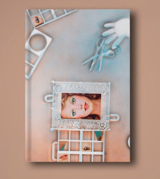
IMAGIER
224 pages
Bilingual FR/EN
Published by Le Lait, Albi and L'Artothèque, Caen
ISBN 978-2-913042-07-0
35€
Our new book!
🌿☘️🌿☘️🌿☘️🌿☘️🌿☘️🌿☘️
Imagier brings together thirteen years of artistic production, from 2009 to 2022. With an essay by Claire Gilman, chief curator of the Drawing Center, New York; an interview with Tony Côme, art history teacher-researcher; and a contribution by Jad Fair, musician and visual artist.
Published on the occasion of Hippolyte Hentgen's exhibitions Ficus (2021) at the art center Le Lait, Albi, and Femme Pratique (2022) at the Artothèque de Caen.
Graphic design @catalogue_general
https://www.lespressesdureel.com/ouvrage.php?id=10589
#imagier#hippolyte hentgen#clairegilman#tony côme#jad fair#centre d'art le lait#artothèque de caen#catalogue général#marie proyar#lina hentgen#gaelle hippolyte
0 notes
Photo


The Palace of Typographic Masonry. A Guided Tour by Dirk van Weelden, Edited by Richard Niessen, with contributions by Moniker, Hansje van Halem, Nejc Prah and Fanette Mellier, Texts by Dirk van Weelden, Juan Luis Blanco, Matthijs van Boxsel, Tony Côme, et al., Spector Books, Leipzig, 2018. Designed by Esther de Vries
#graphic design#typography#book#cover#back cover#the palace of typographic masonry#richard niessen#esther de vries#wogd#moniker#hansje van halem#nejc prah#fanette mellier#dirk van weelden#juan luis blanco#matthijs van boxsel#tony côme#spector
47 notes
·
View notes
Text
tonis favorite disney movie is mulan *winks*
13 notes
·
View notes
Photo

Did anyone see this DeValence Studio exhibition at Kyoto DDD Gallery? Systems as Playgrounds Available at www.draw-down.com This volume is published on the occasion of the first exhibition in Japan devoted to the Paris-based deValence graphic design studio. Systems as Playgrounds presents a selection of deValence works designed for the fields of theater, architecture, design, publishing and contemporary art. It also features the editorial work the studio has undertaken with its associated publishing imprint Éditions B42. An essay by historian of design Tony Côme, along with an interview by the Japanese art critic and publisher Kiyonori Muroga with Alexandre Dimos and Ghislain Triboulet, shed light on the studio’s most memorable creations while analyzing the design and production processes implemented over the last few years. The catalog highlights the inspirations and influences that France and Japan share. #DeValence #DDDGallery #design #TonyCôme #grahicdesign (at Paris, France) https://www.instagram.com/p/B7UrAZfn3dm/?igshid=13yohas2ktwv3
7 notes
·
View notes
Text
Mésopotamie
En quelque sorte, hommes et les femmes de ne pas les associer homestay†avec l'Europe. Paul Reubens: L'acteur Américain, scénariste et comédien mieux connu comme Pee-wee Herman a un grand bite. Cet hôtel de luxe est placé dans le quartier de Midtown, à Manhattan, et est à proximité de Broadway districts et plusieurs restaurants gastronomiques. La plupart des hôtels de luxe dans la ville de placé dans le centre-ville.
Le temps est chaud, le rythme de vie ralentit, le repas délicieuse, et il y a beaucoup de merveilleux hôtels de la région pour la détente et bien mérité de soins. Ici sont neuf excellente idées pour que vous ayez le temps de votre vie Hôtel de charme en Abruzzes dans le Lac de Côme. Vous pouvez lire certains commune suggestions sur les hôtels à San Francisco et l' différente variétés de logements qui peuvent être trouvé nombreuses composants du centre-ville zone.
I identifié un hôtel en bord de mer proche la ville de Santana avec grande vues de la côte, j'ai décidé que ce serait un grand lieu à rester nuit. Avignon est un magnifique et incroyable lieu dans le sud-est de la France, situé sur les rives du Rhône. Fondée par les Romains c'est bien connu vacances LOCATIONS EN ESPAGNE, car la ville a un riche patrimoine historique et culturel.
Revenir à Florence et juste sur le côté nord de la Siuslaw River vous allez prendre du plaisir dépenser un quelques heures à la Vieille Ville Historique de Florence, dans un charmant élément de la ville où vous pouvez découvrir les galeries d'art ou visite antique détaillants ou savourer un délicieux déjeuner ou un dîner à 1 de la régionaux restaurants spécialisés dans les plats régionaux et des vins.
Avec le beau côtes, les eaux chaudes de l'océan et d'un plage hôtels de luxe en Turquie, choisir, on pourrait avoir l' expertise de toute une vie. Suffolk bénéficie d'un massif, littoral diversifié, spectaculaire Britannique campagne, de charmants villages et massif divers d'attractions, de l' populaires Newmarket Racecourse pour le spectaculaire Château de Framlingham.
Un quantité de prix raisonnable auto à la restauration des propriétés et minuscule hôtels sont obtenu et a propos de la ville. I a commencé mon voyage en direction du nord-ouest à Braga, ville connus son gorgeous églises. Anthony Quinn: Un seul de son amoureux mentionnées de l'oscarisé Mexicain-Américain, acteur: "Il y a simplement en plus beaucoup de Tony." Un plus ex-amant a écrit: "la bite de Tony était au moins un pied longue, vraiment épais et belle-recherche.
De la musique et de réserver des passionnés de vraiment comme voir Abbey Road et le Musée de Sherlock Holmes (au 221B Baker Street, bien sûr). Les Îles Vierges fournir un large plage de chambres allant de la confortable auberge, et mode villas pacifiques, campings, monde hôtels de classe, charmant bed and breakfast.
0 notes
Text
LUMICHROME →
Pour la “cité idéale” de l’Abbaye royale de Fontevraud, nous avons investit la sacristie de l’abbaye. Fermé au public, cet espace qui jouxte la grande nef de l’abbatiale a la particularité d’être éclairer par un oculus, unique ouverture sur l’extérieur. C’est à partir de cette spécificité architecturale que nous avons conçu l’installation Lumichrome avec comme intention d’utiliser cet oculus pour unique source de lumière, et de jouer avec la lumière naturelle pour en augmenter le flux lumineux. Et cela à des fins pratiques puisque Lumichrome est en fait une salle de lecture où l’ouvrage L’oculus est consultable.
Conception et fabrication : Rond Point
Conception graphique : Rond Point
Textes : Tony Côme
Impression : Media Graphic
0 notes
Photo

Back Cover (Issue 7) Available at www.draw-down.com Issue #7 of French graphic design journal Back Cover responds to a request by the British design writer Rick Poynor: “... more interesting new (and historical) French subjects, please.” In response, in different forms and with a certain degree of eclecticism, the topics in this issue go in search of French design. Six French designers have been invited to choose and present the work of another French designer, or an object of their choice. Included are features and profiles of M/M Paris, Benoît Bonnemaison-Fitte, slanted.cc, Matthieu Cortat, and Claude Closky. In addition, Gilles Rouffineau writes about “Reading Barthes (typo)graphically” by taking a specific look at Barthes's text “The Death of the Author.” Étienne Greib examines the record sleeve design of Olympia, Washington's K Records over the last thirty years. An interview with the art director and designer Yorgo Tloupas highlights his many media collaborations related to board sports and art. Helmut Völter examines the photographs of Mount Fuji by Masanao Abe, a Japanese physicist. Jean-Marie Courant presents the first part of a history of the French journal, and later, publishing house, Macula, and Tony Côme writes about Otl Aicher's teachings and legacy. #design #graphicdesign #frenchdesign #designmagazine (at Paris, France) https://www.instagram.com/p/B4H8kVcnNhb/?igshid=hns9vtzaue82
5 notes
·
View notes
Photo

Back Cover Issue 7 / Available at draw-down.myshopify.com / Six #French designers have been invited to choose and present the work of another French designer, or an object of their choice. Included are features and profiles of #MMParis #BenoîtBonnemaison-Fitte #slanted.cc #MatthieuCortat and #ClaudeClosky / Gilles Rouffineau writes about “Reading Barthes (typo)graphically” by taking a specific look at Barthes's text “The Death of the Author.” Étienne Greib examines the record sleeve design of Olympia, Washington's #KRecords over the last thirty years. An interview with the art director and designer Yorgo Tloupas highlights his many media collaborations related to board sports and art. Helmut Völter examines the photographs of Mount Fuji by Masanao Abe, a Japanese physicist. Jean-Marie Courant presents the first part of a history of the French journal, and later, publishing house, Macula, and Tony Côme writes about #OtlAicher. / Designed by #deValence / In French & English #graphicdesign #typography #BackCover #magazine
#krecords#devalence#french#benoîtbonnemaison#claudeclosky#typography#mmparis#slanted#backcover#otlaicher#magazine#graphicdesign#matthieucortat
8 notes
·
View notes
Photo

Back Cover Issue 7 / Available at draw-down.myshopify.com / Six #French designers have been invited to choose and present the work of another French designer, or an object of their choice. Included are features and profiles of #MMParis #BenoîtBonnemaison-Fitte #slanted.cc #MatthieuCortat and #ClaudeClosky / Gilles Rouffineau writes about “Reading Barthes (typo)graphically” by taking a specific look at Barthes's text “The Death of the Author.” Étienne Greib examines the record sleeve design of Olympia, Washington's #KRecords over the last thirty years. An interview with the art director and designer Yorgo Tloupas highlights his many media collaborations related to board sports and art. Helmut Völter examines the photographs of Mount Fuji by Masanao Abe, a Japanese physicist. Jean-Marie Courant presents the first part of a history of the French journal, and later, publishing house, Macula, and Tony Côme writes about #OtlAicher. / Designed by #deValence / In French & English #graphicdesign #typography #BackCover #magazine
#slanted#backcover#claudeclosky#benoîtbonnemaison#matthieucortat#graphicdesign#krecords#magazine#mmparis#otlaicher#typography#devalence#french
13 notes
·
View notes
Photo

Back Cover (Issue 7) / Available at draw-down.myshopify.com / Issue #7 of French graphic design journal Back Cover responds to a request by the British design writer Rick Poynor: “... more interesting new (and historical) French subjects, please.” In response, in different forms and with a certain degree of eclecticism, the topics in this issue go in search of French design. Six French designers have been invited to choose and present the work of another French designer, or an object of their choice. Included are features and profiles of M/M Paris, Benoît Bonnemaison-Fitte, slanted.cc, Matthieu Cortat, and Claude Closky. In addition, Gilles Rouffineau writes about “Reading Barthes (typo)graphically” by taking a specific look at Barthes's text “The Death of the Author.” Étienne Greib examines the record sleeve design of Olympia, Washington's K Records over the last thirty years. An interview with the art director and designer Yorgo Tloupas highlights his many media collaborations related to board sports and art. Helmut Völter examines the photographs of Mount Fuji by Masanao Abe, a Japanese physicist. Jean-Marie Courant presents the first part of a history of the French journal, and later, publishing house, Macula, and Tony Côme writes about Otl Aicher's teachings and legacy. Designed by #deValence / In French and English #graphicdesign #typography #BackCover #magazine
11 notes
·
View notes
Photo

Back Cover (Issue 7) / Available at draw-down.myshopify.com / Issue #7 of French graphic design journal Back Cover responds to a request by the British design writer Rick Poynor: “... more interesting new (and historical) French subjects, please.” In response, in different forms and with a certain degree of eclecticism, the topics in this issue go in search of French design. Six French designers have been invited to choose and present the work of another French designer, or an object of their choice. Included are features and profiles of M/M Paris, Benoît Bonnemaison-Fitte, slanted.cc, Matthieu Cortat, and Claude Closky. In addition, Gilles Rouffineau writes about “Reading Barthes (typo)graphically” by taking a specific look at Barthes's text “The Death of the Author.” Étienne Greib examines the record sleeve design of Olympia, Washington's K Records over the last thirty years. An interview with the art director and designer Yorgo Tloupas highlights his many media collaborations related to board sports and art. Helmut Völter examines the photographs of Mount Fuji by Masanao Abe, a Japanese physicist. Jean-Marie Courant presents the first part of a history of the French journal, and later, publishing house, Macula, and Tony Côme writes about Otl Aicher's teachings and legacy. Designed by #deValence / In French and English #graphicdesign #typography #BackCover #magazine
7 notes
·
View notes
Photo

Back Cover (Issue 7) / Available at draw-down.myshopify.com / Issue #7 of French graphic design journal Back Cover responds to a request by the British design writer Rick Poynor: “... more interesting new (and historical) French subjects, please.” In response, in different forms and with a certain degree of eclecticism, the topics in this issue go in search of French design. Six French designers have been invited to choose and present the work of another French designer, or an object of their choice. Included are features and profiles of M/M Paris, Benoît Bonnemaison-Fitte, slanted.cc, Matthieu Cortat, and Claude Closky. In addition, Gilles Rouffineau writes about “Reading Barthes (typo)graphically” by taking a specific look at Barthes's text “The Death of the Author.” Étienne Greib examines the record sleeve design of Olympia, Washington's K Records over the last thirty years. An interview with the art director and designer Yorgo Tloupas highlights his many media collaborations related to board sports and art. Helmut Völter examines the photographs of Mount Fuji by Masanao Abe, a Japanese physicist. Jean-Marie Courant presents the first part of a history of the French journal, and later, publishing house, Macula, and Tony Côme writes about Otl Aicher's teachings and legacy. Designed by #deValence / In French and English #graphicdesign #typography #BackCover #magazine
8 notes
·
View notes
Photo

Back Cover (Issue 7) / Available at draw-down.myshopify.com / Issue #7 of French graphic design journal Back Cover responds to a request by the British design writer Rick Poynor: “... more interesting new (and historical) French subjects, please.” In response, in different forms and with a certain degree of eclecticism, the topics in this issue go in search of French design. Six French designers have been invited to choose and present the work of another French designer, or an object of their choice. Included are features and profiles of M/M Paris, Benoît Bonnemaison-Fitte, slanted.cc, Matthieu Cortat, and Claude Closky. In addition, Gilles Rouffineau writes about “Reading Barthes (typo)graphically” by taking a specific look at Barthes's text “The Death of the Author.” Étienne Greib examines the record sleeve design of Olympia, Washington's K Records over the last thirty years. An interview with the art director and designer Yorgo Tloupas highlights his many media collaborations related to board sports and art. Helmut Völter examines the photographs of Mount Fuji by Masanao Abe, a Japanese physicist. Jean-Marie Courant presents the first part of a history of the French journal, and later, publishing house, Macula, and Tony Côme writes about Otl Aicher's teachings and legacy. Designed by #deValence / In French and English #graphicdesign #typography #BackCover #magazine
14 notes
·
View notes
Last Seen Blogs