#truetype
Explore tagged Tumblr posts
Visit Tumblr Blog
Explore Tumblr blogs with no restrictions, modern design and the best experience.
Last Seen Tumblr Blogs


Fun Fact
In Q3 of 2020, 31% of US users access the Tumblr app daily.
Text
Write Like a Dragon
I'm making a fantasy language font for Windows based on an ancient dragon language from the universe of my dragon characters. All characters on the font are fully hand drawn and it should have ALL possible latin symbols.

#mike dragon#Windows#Font#TrueType#Dragon language#Dragon#language#hand drawn#fantasy#writing#letters
1 note
·
View note
Text


In a leap forward in my freelancing adventure, I have my first digital good available for $$ up in my online Ko-Fi storefront!
Presenting Gael’s Lich Hand - a truetype font face that will make spellcasting in your creative works a breeze! Tired of having to redraw everything over and over when it came to spells, I created a simple A-z font face with an organic brush-like feel that will streamline your spellcasting word-smithing with absolute ease. The Upper Case letters have a more rigid, linear structure while the Lower Case letters are more loose and flowy; mix and match to your magical whims for something totally unique!
GET IT HERE
18 notes
·
View notes
Text
font-face is going to be the end of me, gahhhhhhh.
#why are you working for one font but not the other#why are you like this#damn you truetype#css is fine and totally not frustrating at all#i love web design :)#it's great :)#so cool :)#personal nonsense
4 notes
·
View notes
Text
Nvm I've grown since then and I'm done gatekeeping I'll upload assets in a sec
Everyone's jealous of me because I have the official Blockbuster TV Sreaming App for Android.apk Compatible with Android 7
7 notes
·
View notes
Text
oookayy vent post. I would post this on benz-majora bc that’s my vent blog, but I want people to see this (hpd moment]
I have never been TrueType romantically loved I think. My linkmate doesn’t feel romantic attraction, I respect that so much, but i feel like I’m doing him wrong because I love him romantically. My best friend has never liked me romantically even though we act like a couple. She knows I’m in love with her, but she’s never seen me that way. I know I’m not her type though.
That last longest romantic relationship I’ve been in was with a pedo that groomed me. I’ve never been confessed to. I don’t think anyone has had a genuine crush on me. I feel disgusting whenever I get a crush because it never ends with me being loved back.
I just want to be someone’s love, what someone wants. Somebody’s boyfriend. Will I ever be someone’s boyfriend
2 notes
·
View notes
Text
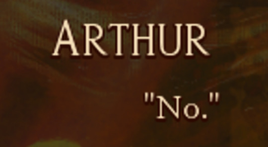
RenPy: Defining Characters
One of the first things RenPy does upon initialization (the boot-up period before the start label executes the game) is read your custom-made character strings to determine what character dialogue will look like.
Although defining usually takes place under the init block, I've chosen to make a separate pre-start label for organization purposes. Really, any time is fine as long as you make sure the pre-start label runs before the game actually executes, or else you're going to encounter errors.
Let's take a look at the code piece by piece.
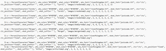
$ a = Person(Character("Arthur", who_color="#F4DFB8", who_outlines=[( 3, "#2B0800", 0, 2 )], what_outlines=[( 3, "#2B0800", 0, 2 )], what_color="#F4DFB8", who_font="riseofkingdom.ttf", what_font="junicode.ttf", ctc="ctc", ctc_position="fixed", what_prefix='"', what_suffix='"'), "Arthur", "images/arthurtemp1.png") $ is a common symbol used by both Python and RenPy to define custom-made variables. Here in the pre-start label section of our script, we're using it to define our characters.
For the sake of propriety, it's probably better to define characters using define, but for ease of use, I've chosen $ instead.
It would be tiresome to have to write "Arthur" every time I wanted to call him in the script. Luckily, by assigning these parameters before initialization, RenPy will read "a" as Arthur.
Most scripts will suffice with assigning a Character object class to your character. If you open the script for The Tutorial, you'll find a basic string that looks like this: $ e = Character("Eileen") As you can see in my batch of code, however, I've done something different by nestling the Character object class within a Person object class. The reason why will become apparent in future posts.
For now, let's focus on the fundamentals.
---

who_color tells RenPy the color of the character's name, determined by a hexadecimal code (either three, four, or six digits). Its sister parameter what_color tells RenPy the color of a character's dialogue text.
If no values are given for these parameters, RenPy will look at your project's GUI file to determine them.
---
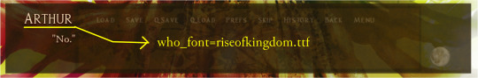
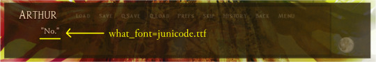
who_font tells RenPy the kind of font you want to use for your character's name, and likewise, what_font determines the font you want to use for your character's dialogue.
Note that these fonts do not have to match. They can be whatever font you wish.
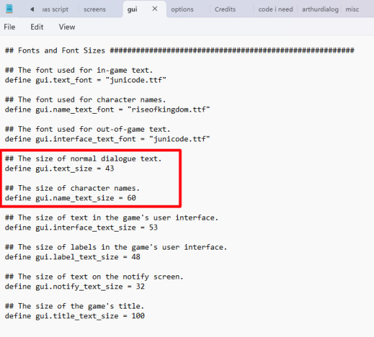
The size of character names and dialogue text can be customized in the GUI file of your project:

---
who_outlines=[( 3, "#2B0800", 0, 2 )], what_outlines=[( 3, "#2B0800", 0, 2 )]
who_outlines and what_outlines add outlines or drop shadows to your text (character name and character dialogue, respectively). This string is expressed as a tuple, or four values enclosed by parentheses.
The first value expresses the width of the shadow in pixels. The second value is a hexadecimal value for your chosen color. The third value offsets the shadow along the X-axis (pixels to the right or left of the text). Because it's set to 0, my drop shadows do not appear to the right or the left of the text. The fourth value offsets the shadow along the Y-axis (pixels beneath/above the text). In this case, shadows appear 2 pixels beneath the text.
My outlines are a bit hard to see because they're only 3 pixels wide and 2 pixels offset.
---
Font files RenPy recognizes TrueType font files. You can download TTF fonts for free online - just be sure to unzip them and put them in your game folder.
If you intend to monetize your project, you absolutely need to make certain your fonts are royalty-free or, ideally, public domain. Most font families come with licenses telling you whether they are free use.
To be on the safe side, I would put the following code before the start label in your script, just so RenPy knows which files to look for:
init:
define config.preload_fonts = ["fontname1.ttf", "fontname2.ttf", "fontname3.ttf"]
---
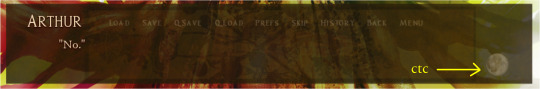
ctc stands for "click to continue." It's a small icon commonly seen in visual novels, usually in one corner of the text box, that indicates the player has reached the end of a line. It's called "click to continue" because the program waits for the reader to interact to continue. To make a custom ctc icon, make a small drawing in an art program and save the image to your GUI folder. As seen above, I'm using a tiny moon as the ctc in my current project. ctc_position="fixed" means the ctc icon will stay rooted in whatever place you specify in the code. Like with most everything else in RenPy, you can apply transforms to the ctc if you so wish. Fun fact: because the ctc is determined on a character-by-character basis in initialization, you can give different characters custom ctcs!
---
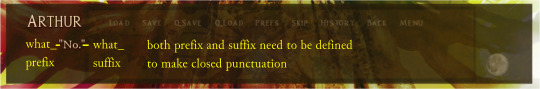
what_prefix="" and what_suffix="" add scare quotes to the beginning and end of a character's dialogue.
One thing you'll notice as you work with RenPy is that "the computer is stupid." That is to say, the program will not execute code you don't explicitly spell out. Things which seem intuitive and a given to us are not interpreted by the program unless you write them into the code.
That is why, in this case, you need to specify both prefix and suffix, otherwise RenPy may begin lines of dialogue with " but not end with ", or vice-versa.
Note that unless you apply these parameters to the narrator character, ADV and NVL narration will not have them.
---
** Note: the next two tags following these ones are extraneous and therefore ignored.
9 notes
·
View notes
Text
fighting the bernina digitization software because it's not actually digitizing the truetype fonts that I paid actual moneydollars for, for this express purpose. >:[
3 notes
·
View notes
Text
#VidaReal Globoface clássica em TrueType, existe?!...
Acabo de descobrir que a famosa “fonte do gerador de caracteres da Globo”, que também frequentou alguns comerciais impressos da Volkswagen, com algumas alterações, SIM, chegou a existir em formato digital.
E mais, em um GC igual ao do SBT (na verdade, todas as emissoras, menos a Manchete e a TV Cultura, já usaram esse equipamento, incluindo outras empresas como Polishop, TVE, Radiobrás, Rede Gospel, Televisa e Walt Disney do Brasil - sei lá, acho que só eu não tive esse GC na América Latina mesmo - e era em Standard Definition, imagine se fosse HD. E mais, a TV Globo usava em programações secundárias, como aberturas de minisséries estrangeiras em uma época em que eles decidiram fazer um visual próprio para cada minissérie - e aparentemente também era o GC do TV Pirata de 1988 a 1990. A TVE fazia um telejornal inteiro, de madrugada, só com as notícias na tela usando esse GC.

(Programa Livre, em 1991. Upload de Êgon Bonfim.)
Era o da Rede Paranaense, em 1992 - a mesma daquelas telas paradas de 1999. Aquela que já me fez arrancar os cabelos de como seu padrão visual era diferente das outras, fora um certo mau gosto nas trilhas sonoras... (tudo isso a partir de 2023 vendo pelo YouTube, eu nunca estive tanto tempo no Paraná que pudesse assistir á essa emissora.)
Na Rede Paranaense, o logo do telejornal era feito pelo próprio GC, em vez de ser um gráfico importado de outro lugar, como costumava ser em outras afiliadas.
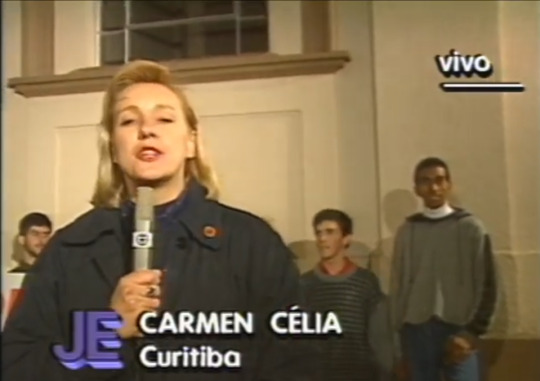
Reparem que NÃO É A VAG ROUNDED (que existe tranquilamente em TrueType e poderia até ser, mas não é). Imagens de 1994.
(Sim, Carmen está com um Micron TX-503, o famoso microfone da Xuxa e do Francisco José, com sua secção quadrada que não tem como adaptar em canoplas... Uploads por Cláudia Vicentin, no YouTube)

> Alguns segundos do GC em ação no encerramento de um telejornal
Esse GC, ao que tudo indica, baseava os tipos de letra em fontes TrueType. Ao contrário de equipamentos da mesma época (como os de Manchete e Globo), onde as letras eram pixel arts de, sei lá, 5 ou 6 tamanhos diferentes, com os dados gravados em placas de expansão - inclua-se o GC das aberturas das novelas globais - mas esse outro equipamento fazia letras de qualquer tamanho, inclusive intermediários que até então não existiam (como visto nas primeiras edições do Aqui Agora, onde as manchetes eram menores do que seriam depois). Qualquer tamanho e qualquer aspecto também (condensado, expandido, etc.), como vimos no Programa Livre. Fora rotacionar e até espelhar as letras, algo de necessidade zero em 90% da programação de TV convencional.
Outra prova é que eu, ávido colecionador dessas coisas, já encontrei todos os tipos de letra usados pelo SBT nesse equipamento em fontes TrueType que só podem ser as próprias, sendo totalmente idênticas - (Helvetica bold e normal, Univers Bold, Futura, Cooper Bold, Prestige, Latin 721 e Windsor - esta última muito rara, mas tá lá. E todos pelo mesmo fabricante, a Bitstream.
(Curiosidade, a Helvetica ‘roman’ nunca foi usada pelo SBT, mas foi abusada por outras empresas, como a Polishop.)
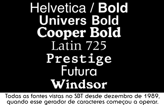
O que eu acho curioso é a, digamos “personalidade” na escolha de alguns desses typefaces. Cooper sempre foi usado a versão black antes desse GC aparecer. Prestige nunca foi unanimidade para quem teve máquinas de escrever elétricas, o pessoal usava mais a Courier. (A Prestige teve seu estrelato total no Canal 21, quando este ainda tinha infraestrutura e jornalismo próprio.)
Também existem da Bitstream outras fontes que eu vi em outros programas (inclusive horários políticos) e “acho” que é o mesmo GC só que numa segunda geração, como Handel Gothic, Brody e Futura Bold Condensed.
E onde estará essa fonte de terminações arredondadas? Porquê mesmo em sites profissionais nós não a encontramos?...
Essa pode ser a fonte digital mais exclusiva do mundo - talvez só perca para a Folha Serif, de Lucas De Groot, desenhada para a Folha de São Paulo, usada há mais de 20 anos e jamais vista em nenhum outro lugar.
2 notes
·
View notes
Text

这是一种TrueType字体,同时适用于屏幕和打印机。
3 notes
·
View notes
Text
Some Tips For Editing Skins
Please keep in mind this was originally created in 2017, and is being moved as is from Caution as it closes. That said, feel free to read it below.
I know there are a lot of people super unfamiliar with CSS that feel a little lost when they choose a premade skin that our lovely coders have so generously offered up and want something ~different~ from all the other sites that have used it, so this is a guide in making a few changes WHERE ALLOWED (please see the coders notes on this prior to making any types of edits, ty) so that you can have the same skin without having the same skin.
First and foremost take a look at Jcink's guide to css and skinning. This will tell you what certain parts of the css (style sheets) are called so that you can find them, see how they are coded, and make the changes you are allowed, such as color or font or font size, etc.
Next take a look at Color Hound. If you are wanting to change the colors of a skin, I SWEAR by this site. You enter the link to the site you have with the skin on and it will give you all the colors listed in the site's css. To be clear the reason this is more efficient than simply searching for 'color:' is because it also pulls rgb and rgba codes and shows you them as well. It's important to find these as well in case the color is set to a certain transparency so that you can add that in with your new colors as well.
On the line of colors, Colorhexa and Colourlovers are useful as well because colourlovers lets you find palettes to use for your skin, so you have a certain aesthetic in your chosen colors, and colorhexa lets you look up these colors to find the rgb of these colors as well, allowing you to edit the rgba and have that transparency needed in certain skins as mentioned above. I would suggest keeping the transparency already set but if you wanna toy with it and are allowed, be my guest. As a side note: the transparency is the a, the last of the four numbers listed. For example - rgba(#,#,#,0.3) it would be the 0.3.
Now custom fonts are cool too so maybe you want to edit those. There are a billion sites for custom fonts and the easiest to deal with is google fonts but try others too. If you download a font, you can upload it to your site and add it to your skin. First you have to access the admin cp and then navigate to the file manager, in jfh resources. The file manager allows you to upload documents to your board, such as images or css or in this case custom fonts. Start out by uploading a new file at the bottom of the page, finding the truetype (.ttf) font file that you downloaded, and uploading it to the Jcink file manager. Jcink will give your new font a direct link beneath the contents heading in the file manager. Grab that link! In your stylesheets you'll probably see something like @font-face and that's what we're going to create with your new custom font, probably near to the others.
@font-face { font-family: FONT NAME; src: url(URL); }
Change the font name to whatever you want to name your font, usually the font's actual name but you can pretty much go with whatever. The url is the link you grabbed in the previous step. Once this is in your stylesheets, just grab the font name you used and edit where you want this font to show up by editing the following code:
font-family: FONT NAME;
Just please remember to remove the previous font name. With a new font you'll probably have to mess with the font size and weight but this can help a lot with making a font look different that is maybe used a lot on other sites.
Another tip would be to focus on images. You can edit images everywhere, not just the header, and these help a lot to editing a skin so try that if you're still feeling a little less than personalized on the skin you're working with.
As time goes on I'll probably add to this guide quite a bit and I highly encourage coders to add to this guide based on your own expertise but this was made to combat that stigma that a site needs a custom skin. A skin can be customized, you guys. You can do it! You don't have to go pay $200 to buy a skin to have a beautiful and personalized skin for your site. Again though please please please make sure you are allowed to edit another person's codes. I cannot stress this enough. Be it templates or skin coding, make sure whatever you are doing is permitted. This is 99% of the time said above a skin in the coder's comments but if not please shoot the coder a PM before editing, just to make sure. OKAY good luck lovelies and feel free to hit up the coding help if you get stuck <3 (coding help is now defunct, feel free to hit me up or ask in any of the resource servers)
5 notes
·
View notes
Text
it's just python?
from PIL import Image, ImageDraw, ImageFont import textwrap
Create an image for the soft guide
width, height = 1080, 1920 background_color = "#fffaf5" text_color = "#333333" highlight_color = "#e0cfc1"
Create a blank image with the background color
image = Image.new("RGB", (width, height), background_color) draw = ImageDraw.Draw(image)
Load fonts
font_path_bold = "/usr/share/fonts/truetype/dejavu/DejaVuSans-Bold.ttf" font_path_regular = "/usr/share/fonts/truetype/dejavu/DejaVuSans.ttf" title_font = ImageFont.truetype(font_path_bold, 60) section_font = ImageFont.truetype(font_path_bold, 44) text_font = ImageFont.truetype(font_path_regular, 36)
Helper function to draw wrapped text
def draw_wrapped_text(draw, text, font, x, y, max_width, line_spacing=10): lines = textwrap.wrap(text, width=int(max_width / (font.size * 0.6))) for line in lines: draw.text((x, y), line, font=font, fill=text_color) y += font.getsize(line)[1] + line_spacing return y
Title
y = 60 draw.text((50, y), "Soft Survival + Divine Creation Guide", font=title_font, fill=text_color) y += 100
Midday Mood Shift
draw.text((50, y), "☀️ Midday Mood Shift", font=section_font, fill=text_color) y += 60 y = draw_wrapped_text(draw, "• Sit up slowly and say:\n “I’m allowed to begin again. Even now.”", text_font, 70, y, 960) y = draw_wrapped_text(draw, "• Make avocado toast + coffee\n• Put on cozy but cute clothes\n• Light something sensory", text_font, 70, y+20, 960)
Mirror Minute
y += 50 draw.text((50, y), "🪞 Mirror Minute", font=section_font, fill=text_color) y += 60 y = draw_wrapped_text(draw, "• Say aloud:\n “I forgive myself for pausing. I praise myself for staying.”", text_font, 70, y, 960) y = draw_wrapped_text(draw, "• Take a photo of yourself as sacred witness", text_font, 70, y+20, 960)
Creative Check-In
y += 50 draw.text((50, y), "📷 Creative Spirit Check-In", font=section_font, fill=text_color) y += 60 y = draw_wrapped_text(draw, "• Pick 1 photo that calls to you\n• Ask:\n “What does this photo want to say?”", text_font, 70, y, 960) y = draw_wrapped_text(draw, "Optional:\n• Title it\n• Caption it or prep it\n• Save it as sacred", text_font, 70, y+20, 960)
Night Grounding
y += 50 draw.text((50, y), "🌌 Night Grounding + Dreamwork", font=section_font, fill=text_color) y += 60 y = draw_wrapped_text(draw, "• Write or speak:\n - 1 thing I learned\n - 1 step I took\n - 1 thing I’m proud of", text_font, 70, y, 960) y = draw_wrapped_text(draw, "• Ask to meet your dream-friend\n• Sleep with notebook nearby", text_font, 70, y+20, 960)
Save the image
output_path = "/mnt/data/soft_guide_divine_day.png" image.save(output_path)
output_path

0 notes
Text
Font Options
Fixedsys is a family of raster monospaced fonts. The name means fixed system, because its glyphs are monospace or fixed-width (although bolded characters are wider than non-bolded, unlike other monospace fonts such as Courier). It is the oldest font in Microsoft Windows, and was the system font in Windows 1.0 and 2.0, where it was simply named "System".

PragmataPro is a monospaced font family designed for programming

ProFont is a monospace font available in many formats. It is intended to be used for programming in IDE environments and it is available in bitmap and TrueType versions for various platforms.

0 notes
Text
fonts
Fonts are an essential part of visual communication. They influence how written content is perceived and can affect readability, emotion, and the overall aesthetic of a design. Choosing the right font is about more than just style—it's about conveying a message clearly and consistently. Typography, which includes the use and design of fonts, plays a key role in shaping user experiences, whether on websites, printed materials, or advertisements.
The design and use of typefaces have evolved significantly over the centuries. Early writing systems used hand-drawn letters, but with the invention of printing, standardization became crucial. The first movable typefaces, such as those developed by Gutenberg, laid the foundation for modern font design. Since then, thousands of fonts have been created, each with its own personality and purpose.
Fonts are generally classified into several broad categories. Serif fonts, such as Times New Roman, have small lines or "feet" at the ends of letters. These are traditionally associated with print and tend to give a formal, authoritative feel. Sans-serif fonts, like Arial and Helvetica, lack these embellishments and are commonly used in digital settings due to their clean and modern appearance. Other types include script fonts, which mimic handwriting, and decorative fonts, which are often used for display purposes due to their unique or ornate designs.
When selecting a fonts for any design, it’s crucial to think about the context and purpose of the message. For instance, a legal document benefits from a traditional serif font for its formality, whereas a tech startup might opt for a sleek sans-serif font to appear forward-thinking and approachable. The font must match the tone and goals of the content it represents.
Another important aspect of fonts is readability. A font may look stylish but if it's hard to read, it fails its core function. Font size, letter spacing, line height, and weight all contribute to legibility. Designers must test their font choices across various devices and resolutions to ensure consistency and clarity. Overly decorative or tightly spaced fonts can create barriers for users, especially those with visual impairments or dyslexia.
Web typography has introduced unique challenges and opportunities for the use of fonts. In the early days of the internet, designers were limited to a few "web-safe" fonts to ensure compatibility across browsers. However, with the development of web font services like Google Fonts and Adobe Fonts, a much wider range of typefaces can now be used online. This freedom allows for more creative expression while still ensuring accessibility and performance.
The technical aspects of fonts are also worth understanding. A font is essentially a digital file that tells a computer how to display each character. These files come in different formats, such as TrueType (TTF), OpenType (OTF), and Web Open Font Format (WOFF). Each has its own strengths depending on the platform and use case. For instance, WOFF is optimized for web use, while OTF provides advanced typographic features useful for print.
Font pairing is another critical consideration in design. Using multiple fonts in a single project can add visual interest and help structure content, but only if done thoughtfully. A common technique is to pair a serif with a sans-serif font, using contrast to guide the reader’s eye and establish a hierarchy. Too many fonts, or poorly matched styles, can create confusion and weaken the overall message.
Brand identity is often closely tied to font choice. Major corporations invest in custom typefaces that reflect their brand values and make their materials instantly recognizable. Think of the bold simplicity of Nike’s typography or the timeless elegance of Vogue’s masthead. Fonts become part of the visual language of a brand, contributing to how it is remembered and perceived by the public.
Licensing is another consideration when using fonts. Not all fonts are free to use in commercial projects. Some require purchasing a license, especially custom or high-quality typefaces. It’s important for designers and businesses to respect copyright laws and use properly licensed fonts to avoid legal issues.
Accessibility is a growing area of concern in font usage. Fonts need to be legible for people with disabilities, and many design systems now include guidelines to ensure inclusivity. This includes using sufficient contrast between text and background, avoiding overly stylized fonts for large bodies of text, and ensuring compatibility with screen readers.
Digital tools have made working with fonts more dynamic and responsive. Variable fonts, for example, allow a single font file to behave like multiple fonts by adjusting weight, width, and other properties on the fly. This technology reduces page load times and increases flexibility in responsive design environments.
Cultural context also influences font perception. A font that feels modern in one region may appear outdated or inappropriate in another. Designers working on international projects must consider these cultural nuances to ensure the typography resonates with the target audience.
Fonts are not just visual elements—they are carriers of meaning. A designer’s ability to choose and apply fonts effectively can enhance communication, evoke emotion, and strengthen brand identity. From headlines that capture attention to body text that supports easy reading, every typeface has a role to play.
By mastering the art and science of typography, designers can create more impactful and engaging experiences. Whether for print or digital, the thoughtful use of fonts is fundamental to any successful design strategy.
0 notes
Text
[Image description: Search result for Windows 3.1x, reading: "Windows 3.1 is a major release of Microsoft Windows. It was released to manufacturing on April 6, 1992, as a successor to Windows 3.0. Like its predecessors, the Windows 3.1 series ran as a shell on top of MS-DOS. Windows 3.1 introduced the TrueType font system as a competitor to Adobe Type Manager." Source is given as Wikipedia. "Initial release date: April 6, 1992. Developer: Microsoft. Latest release: 3.11 / November 8, 1993; 30 years ago." End description.]
Nearly every flight in the U.S. is grounded right now following a CrowdStrike system update error … but not Southwest Airlines flights. Southwest is still flying high, unaffected by the outage that’s plaguing the world today, and that’s apparently because it’s using Windows 3.1.
Good lord. I don't know if I should laugh or cry over this.
#i'm screaming rn that tweet about 'single commodore 64 in Arlington warehouse' was barely an exaggeration#fwiw they're the only airline I fly with and i've never had catastrophic experiences...#...but then I wasn't there for the Great Southwest Technology Fuckenings of July 2021 or April 2023.
14K notes
·
View notes
Text
adobe: here are postscript type 1 fonts--
apple: gtfo everyone's using truetype now
adobe: okay here's my successor to postscript called multiple masters where you can adjust between two styles of the font and--JUST KIDDING we made something called opentype with microsoft that includes variable fonts which are basically the same thing. we're abandoning multiple masters
0 notes
Text
Menu Ghosts
Isso não é bem um menu, é mais um efeito feito com sombras que deixa o menu mais legal, rs.
Vizualize o efeito aqui.
Como você pôde ver, são 5 efeitos. Então, vamos começar:
Os códigos abaixo deverão ser colocado no seu css, mas cada um é um efeito visto no exemplo. Então escolha um e cole-o no seu css:
Se quiser o efeito 1;
Se quiser o efeito 2;
Se quiser o efeito 3;
Se quiser o efeito 4;
Se quiser o efeito 5;
Lembrando que você pode modificar todos os números dos pixels de acordo com o tamanho da fonte. E, se você quiser utilizar a fonte “Bandless” (mesma fonte utilizada no exemplo), coloque esse código no seu css:
@font-face {font-family: "Bandless"; src: url('http://static.tumblr.com/o286adx/hgQm6rhus/bandless.ttf'); format("truetype"); }
E coloque onde você quiser o menu (só pegue a parte que esteja com o mesmo nome da class do seu efeito):
<div class="ghosts">Conteúdo</div>
<div class="ghosts2">Conte��do</div>
<div class="ghosts3">Conteúdo</div>
<div class="ghosts4">Conteúdo</div>
<div class="ghosts5">Conteúdo</div>
E o seu efeito Ghosts estará pronto.
0 notes