#typepography
Explore tagged Tumblr posts
Visit Tumblr Blog
Explore Tumblr blogs with no restrictions, modern design and the best experience.
Last Seen Tumblr Blogs


Fun Fact
Kazakhstan’s Minister of Communications and Informatics has blocked the Tumblr site because it contained 60 sites of terrorism, extremism, and pornography in 2015.
Photo
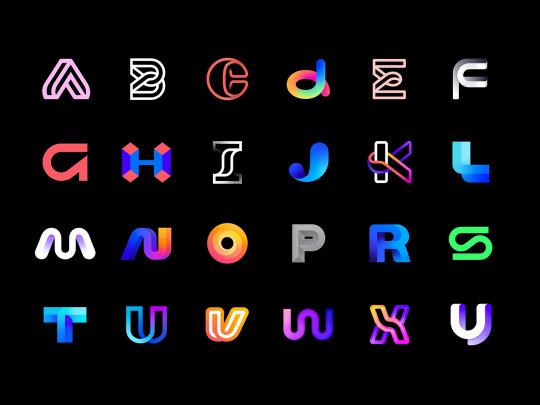
36 days of type - daily logo exploration challenge
by Aiste for smart by design™
Check the full Behance case study here - https://www.behance.net/gallery/95745839/36-days-of-type-daily-logo-exploration-challenge
↓
‣ We are smart by design - Brand and identity studio
#logotypes#logotype#logo design#logos#logo designs#Typography#typepography#type#gradient#graphic designer#gradient logo#abc#behance#behance project#aiste#36 days of type
89 notes
·
View notes
Text


Brief four was to create a poster about a typeface. I chose American Typewriter and used a tea bag to add some texture and give it an aged look 📜
#college#design#graphic design#student#visual communication#mine#typepography#americantypewriter#poster#posterdesign#artists on tumblr#vintage
4 notes
·
View notes
Photo
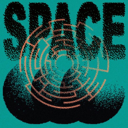
Space #graphicdesign #illustration #printdesign#posterart#retroart#typepography #vintageart#space#scifiart #bitmap #posterdesign #experimentalart https://www.instagram.com/p/B7biVsfBVkD/?igshid=ifhysjk6rlrp
#graphicdesign#illustration#printdesign#posterart#retroart#typepography#vintageart#space#scifiart#bitmap#posterdesign#experimentalart
4 notes
·
View notes
Photo

A & A
Acrylic on canvas 30″x40″
#andrew horne#urban landcscape#type#typepography#vintage sign#toronto#toronto landscape#signs#signpainting
1 note
·
View note
Photo

🤔💦 #Honey #Typepography #Calligraphy #SexCode (en Mexico City, Mexico)
0 notes
Photo

Proposal numbers . . #type #typepography #numbers #typedesign #typedaily #typespiration #typespire #font #experimentaltypography #minimalism #moderntypeface #stenciltype #pmostudio (en Alta Córdoba railway station)
#pmostudio#typedaily#numbers#type#typespire#moderntypeface#font#typepography#experimentaltypography#stenciltype#typespiration#minimalism#typedesign
0 notes
Text
Design Challenge 3: Revise the Assigned Fire Sign

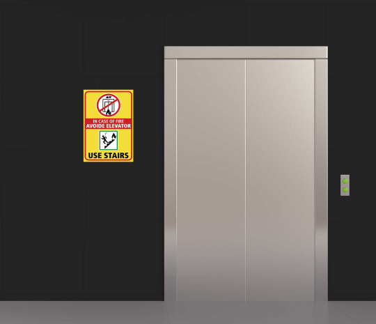
What strategy did you take in order to meet the needs of the sign?
Based on OHSA and ANSI, red is danger or fire, yellow is caution, and green is general safety sign. Thinking about how dangerous to use elevator when there is fire, the fire sign should be red or orange, in other word danger or warning, not yellow or caution. However, the designer of this sign intentionally set the sign’s background yellow because the color is eye catching and yellow can stand out even in the smoke, and I thought that is a crevor idea, so I followed that. From the original design, I only changed the typepography because I thought nothing else needed any change. By changing to the condensed type, I can put many chalacters in small place, and it is still readable. Also, by giving some hierarchy, people can see what is more important to red than others, so the time to understand it will be even shorter.
Did you think about the designer’s design process as you were revising the sign?
I did not recreate the graphics, I just did copy and paste, because it looks good as it is, but how this designer put outside stroke with red circle and green square, and red frame for the sign tells how much this designer paired attention to those small elements and that made this design very solid. This assignment is the second time designing a signage, but when I designed for the first time, I remember I was having hard time designing it and I did not like the design at all. I thought why the signage is so simple and does not need any fancy layout or design, but it is so hard to bold and comfortable design. This designer did good job on designing and also researching.
What did you know now that you didn’t in Challenge #2?
I didn’t know that yellow color stands out in smoke when I was designing my signage. The original designer of this signage said that in class and I was very impressed about the fact and that he did research. Also, I was thinking black and white are the most darkest and brightest color, so that combination would stand out the most, but to be honest, yellow signage stand out more than black and white. However, like in class, there were a sign using green and orange, and we were talking that those colors are not going together well, so I think signage with color depends on proper color usage.
0 notes
Photo

Old-school icicles. Contains lead. Love the typefaces.
81 notes
·
View notes
Photo

Supergood
by Sergey Shapiro
#type#typepography#black#white#logo#logos#logo design#logo designer#logo designs#logotypes#logotype#logotype design
13 notes
·
View notes
Text


The second brief from the Typography unit which was to create a logotype for a business, mine was a dentist's.🦷
First image is the final version, second is the final with colour.
#college#design#graphic design#student#visual communication#logo#logotype#logodesign#typepography#mine
1 note
·
View note
Photo

28 notes
·
View notes
Video
My current portfolio
Click expand for full screen. Hope Ya'll like it.
21 notes
·
View notes
Photo

iDREAMOFYOU on Flickr.
I DREAM OF YOU!
17 notes
·
View notes
Photo

10 notes
·
View notes
Photo

Mod font from a Reader's Digest Condensed Books story (1970)
5 notes
·
View notes
Text


The first brief we did for the Typography unit was to create a bitmap typeface ⌨
0 notes