#vector-drawables
Explore tagged Tumblr posts
Visit Tumblr Blog
Explore Tumblr blogs with no restrictions, modern design and the best experience.
Last Seen Tumblr Blogs


Fun Fact
Tumblr has 16.74 million mobile monthly users in the US.
Text
Android Vector Drawables
There are two basic ways an image can be represented in: Bitmaps and Vector Drawables. Normal Bitmaps are represented in the form of pixels in a grid. A Vector Drawable defines the image in the form of geometry, i.e as a set of points in the Cartesian plane, connected through lines and curves, with their associated color information.
In this post we’ll be focusing on static Vector Drawables and some of their advanced features. Animated Vector Drawables will be covered very briefly.
Why Vector Drawables?
Vector Drawables are,
Sharp
All Bitmaps have a specific resolution, which when displayed on a different density display may pixelate or might introduce unwanted artifacts. Vector Drawables look sharp on each display independent of display density, i.e. the same file is resized for different screen densities.
Small
A Bitmap of higher resolution means more pixels. More pixels means larger file size. Vector Drawables do not store pixels therefore they are of the same size independent of display density. This results in smaller APK files and less developer maintenance.
Flexible
Vector Drawables are highly flexible. One can also animate them using multiple XML files.
The support for Vector Drawables was added in API Level 21(Lollipop). Prior to this release if anyone wanted to represent images through Vector Graphics they had to do it manually though Java Code. If Bitmaps were used, developers had to use different images, one for each display resolution. Imagine using animated Bitmaps in such a situation!
There are two classes that help you use Vector Drawables: VectorDrawable and AnimatedVectorDrawable.
There are two basic ways an image can be represented in: Bitmaps and Vector Drawables. Normal Bitmaps are represented in the form of pixels in a grid. A Vector Drawable defines the image in the form of geometry, i.e as a set of points in the Cartesian plane, connected through lines and curves, with their associated color information.
In this post we’ll be focusing on static Vector Drawables and some of their advanced features. Animated Vector Drawables will be covered very briefly.
The VectorDrawable Class
This class defines a static drawable object. It is defined in a manner similar to the SVG format.

Image Courtesy: developer.android.com
It follows a tree hierarchy consisting of groups and paths. The path contains the actual geometric data to draw the object. The group contains data for transformation of the shape. The path is always a leaf of the tree. The path will be joined in same order in which it appears in the file.
The group text is an internal node of the tree. A path object inherits all the transformation of it’s ancestor groups.
Let’s take a look at a sample Vector Graphic as an SVG file and its corresponding XML Vector Drawable.
SVG
<svg xmlns="http://www.w3.org/2000/svg" width="24" height="24" viewBox="0 0 24 24">
<path fill-opacity=".3" d="M15.67 4H14V2h-4v2H8.33C7.6 4 7 4.6 7 5.33V8h5.47L13 7v1h4V5.33C17 4.6 16.4 4 15.67 4z"/>
<path d="M13 12.5h2L11 20v-5.5H9L12.47 8H7v12.67C7 21.4 7.6 22 8.33 22h7.33c.74 0 1.34-.6 1.34-1.33V8h-4v4.5z"/>
<path d="M0 0h24v24H0z" fill="none"/>
</svg>
XML
<?xml version="1.0" encoding="utf-8"?> <vector xmlns:android="http://schemas.android.com/apk/res/android" android:width="24dp" android:height="24dp" android:viewportWidth="24" android:viewportHeight="24"> <path android:fillColor="#000000" android:fillAlpha=".3" android:pathData="M15.67 4H14V2h-4v2H8.33C7.6 4 7 4.6 7 5.33V8h5.47L13 7v1h4V5.33C17 4.6 16.4 4 15.67 4z" /> <path android:fillColor="#000000" android:pathData="M13 12.5h2L11 20v-5.5H9L12.47 8H7v12.67C7 21.4 7.6 22 8.33 22h7.33c0.74 0 1.34-0.6 1.34-1.33V8h-4v4.5z" /> <path android:pathData="M0 0h24v24H0z" /> </vector>
This Vector Drawable renders an image of a battery in charging mode.

There’s a lot more you can do with Vector Drawables. For example you can specify the tint for the image. You needn’t worry if the SVG the designer gave has the right shade of grey you need. The same Vector Drawable renders with different colors according to the set theme.

The same image rendered in a light and dark theme.
(Image Courtesy: Android Dev Summit ‘18)
All you need to do to set the tint is add this attribute to the vector:
android:tint="?attr/colorControlNormal"
You can also use theme colors for specific parts of your image. For example in order to use colorPrimary in you image add this attribute to your path:
android:fillColor="?attr/colorPrimary"


The same images rendered with different primary colors.
(Image Courtesy: Android Dev Summit ‘18)
Many a times we need to change the color of icons depending on the state of the button. These changes might be as minor as a different colored stroke. You can accomplish this using different colored images, but when the rendering is the same for most of the part, using ColorStateList inside the Vector Drawable is a much better way. You can avoid a lot of duplication in this manner.
The way to accomplish this is the same as that of a regular ColorStateList. Create a ColorStateList in the color resource directory, and use a reference to it in the fillColor attribute in the path.
If your ColorStateList is csl_image.xml, the add this line:
android:fillColor="@color/csl_image"
Vectors also support gradients. You can have three types of gradients:
Linear
<gradient android:startColor="#1b82bd"android:endColor="#a242b4" android:startX="12" android:endX="12" android:startY="0" android:endY="24" android:type="linear"/>

(Image Courtesy: Android Dev Summit ‘18)
Radial
<gradient android:startColor="#1b82bd"android:endColor="#a242b4" android:centerX="0" android:centerY="12" android:type="radial"/>

Sweep
<gradient android:startColor="#1b82bd"android:endColor="#a242b4" android:centerX="0" android:centerY="12" android:type="sweep"/>\
(Image Courtesy: Android Dev Summit ‘18)
We can also define individual color stops using <item> tag to get more fine grained gradients as show below:
<gradient...> <item android:offset="0.0" android:color="#1b82bd"/> <item android:offset="0.72" android:color="#6f5fb8"/> <item android:offset="1.0" android:color="#a242b4"/> </gradient>
This sets the color at 72% of the gradient direction parameter.

(Image Courtesy: Android Dev Summit ‘18)
Just as we define ColorStateLists in the color resource directory, we can define gradients and then add their reference in our Vector Drawable in the fillColor attribute.
An alternative to this is to define the gradient using inline resource syntax to embed it inside the vector definition itself as shown below.
<vector...> <path...> <aapt:attr name="android:fillColor"> <gradient android:type="sweep" android:centerX="0" android:centerY="0" android:startColor="#1b82bd" android:endColor="#a242b4"
</aapt:attr>
</path> </vector>
Here the AAPT(Android Asset Packaging Tool) will extract this to a color resource at build time and insert a reference for it.Gradients are very useful in situations where you need shadows in Vector Drawables. Vector don’t support shadows, but it can be faked using gradients. You can also use it to create customised spinners using a radial gradient.
If the gradient doesn’t fill the entire image, you may choose to so any of the following:
Clamp
This is the default mode. It just continues the color outwards from the last offset point
You may accomplish this by adding the following line in the gradient:
<gradient... android:tileMode="clamp"/>

(Image Courtesy: Android Dev Summit ‘18)
Repeat
This repeats the gradient until the whole image is filled.
You may accomplish this by adding the following line in the gradient:
<gradient... android:tileMode="repeat"/>

(Image Courtesy: Android Dev Summit ‘18)
Mirror
This goes back and forth through the gradient.
You may accomplish this by adding the following line in the gradient:
<gradient... android:tileMode="mirror"/>

(Image Courtesy: Android Dev Summit ‘18)
We can also make gradients that do not go from color to color but have regions of solid color.

This can be accomplished by using the same color between two color stops, as shown below:
<gradient...> <item android:offset="0.0" android:color="#1b82bd"/> <item android:offset="0.5" android:color="#1b82bd"/> <item android:offset="0.5" android:color="#a242b4"/> <item android:offset="1.0" android:color="#a242b4"/> </gradient>
Vector Drawables are great to reduce the size of the APK file, and reduce the number of images required.They are extremely flexible, but sometimes they come with a significant performance trade-off. Therefore VectorDrawables should be used only when the image is simple up-to a maximum size of 200 x 200 dp, for example icons for Buttons. Shapes should be used instead of Vector Graphics wherever possible.
The AnimatedVectorDrawable Class
This class adds animation to the properties of a VectorDrawable. We can define animated vector drawables in two ways:
Using three XML files
A VectorDrawable file, an AnimatedVectorDrawable file and an animator XML file.
Using a single XML file
You can also merge related XML files using XML Bundle Format.
To support vector drawable and animated vector drawable on devices running platform versions lower than Android 5.0 (API level 21), VectorDrawableCompat and AnimatedVectorDrawableCompat are available through two support libraries: support-vector-drawable and animated-vector-drawable, respectively.
Support Library 25.4.0 and higher supports the following features:
Path Morphing (PathType evaluator) Used to morph one path into another path.
Path Interpolation Used to define a flexible interpolator (represented as a path) instead of the system-defined interpolators like LinearInterpolator.
Support Library 26.0.0-beta1 and higher supports the following features:
Move along path The geometry object can move around, along an arbitrary path, as part of an animation.
For more information about Animated Vector Drawables you can refer to the links posted at the end of the post.
Performance trade-off for Vector Drawables
Although the XML file used for Vector Drawables is usually smaller than conventional PNG images, it has significant computational overhead at runtime in case the drawn object is complex. When the image is rendered for the first time, a Bitmap cache is created to optimize redrawing performance. Whenever the image needs to be redrawn, the same Bitmap cache is used unless the image size is changed. So, for example you rotate your device, if the size of the rendered image remains the same, it will be rendered using the same cach otherwise the cache will be rebuilt. Therefore in comparison to raster images they take longer to render for the first time.
As the time taken to draw them is longer, Google recommends a maximum size of 200 x 200 dp.
Conclusion
Vector Drawables are great to reduce the size of the APK file, and reduce the number of images required.They are extremely flexible, but sometimes they come with a significant performance trade-off. Therefore VectorDrawables should be used only when the image is simple upto a maximum size of 200 x 200 dp, for example icons for Buttons. Shapes should be used instead of Vector Graphics wherever possible.
Useful Links
Adding multi-density vector graphics in Android Studio
Optimizing the Performance of Vector Drawables
Harnessing the Power of Animated vector Drawables
Vector Drawables Overview
Advanced VectorDrawable Rendering (Android Dev Summit '18)
0 notes
Photo

🖼️ Showing images in #JetpackCompose? Use the Image composable and painterResource to quickly display vector drawables, PNGs, and more. → https://t.co/a9N4Rws5Bj #30DaysOfCompose https://t.co/uMiWWiVvEM
0 notes
Text
How to Decrease Flutter App size in Android Platform?

Several app developers consider the size of their compiled application. As an IPA version, the app bundle or the APK of an app is self-contained and grips all assets and code required to successfully run the app; its size is always a concern. Size becomes more vital when it is a larger app as you will need more space on a device.
The larger app also takes longer to download, and it may rift vital features like Android instant apps. It enlarges the Flutter app and can be two, three or more install sizes. Therefore, it is significant to decrease the size of the Flutter app on the Android platform.
Know the 8 best ways to decrease the size of the Flutter app:
1. Reduce App Element Size
When a user installs an application from Play Store, they get the loading bar after that the actual size of the app. There is a high chance of cancelled/failed download with the larger apps. As the best Flutter app development company, we should concise the app size as possible.
2. Compress all JPEG and PNG Files
You can reduce the size of all PNG and JPEG files; however, never lose image quality. You can use tools such as pngquant, zopflipng, or pngcrush. All these tools you can use to reduce image size without compromising its quality.
The pngcrush tool is effective as it iterates over zlib (Deflate) parameters and PNG filters utilizing each combination of parameters and filters to compress the image.
Moreover, to compress JPEG images, you can utilize other tools such as guetzli and packJPG.
3. Use Google Fonts
Fonts are a vital element in any website or app. Indeed, you require attractive and user-friendly fonts to attract users to your website. Therefore, you can utilize the google fonts package instead of bundling fonts in-app.
With this package, .otf or .ttf files are mapped in the pubspec.yaml file and will not get stored in your assets folder. Instead of this, you can fetch them via HTTP at runtime and easily cache them in the app file system.
4. Use the Analyzer in Android Studio
Use the plugin marketplace in Android Studio and download the Android Size Analyzer plugin from here. Check the process below to open and install the plugin:
Select File > Settings (or on Mac, Android Studio > Preferences.)
Go to the Plugins section shown in the left panel.
Click on the Marketplace tab.
Start your search for the “Android Size Analyzer” plugin.
Now click on the Install button to get the analyzer plugin.
If you are facing issues in implementing the above process, it is recommended to connect with the best Flutter app development company as they can help in the best possible ways and bring the best solution to your desk.
After installing the plugin, run an app size analysis on your current project by selecting Analyze > Analyze App Size from the menu bar. After analyzing your project, a tool window appears with recommendations on reducing the size of your app.
5. Use the Analyzer From the Command Line
From GitHub, You can also download the latest version of Android Size Analyzer as a Zip or TAR file. Now extract the zip file and run the size-analyzer.bat script on Windows or run the size-analyzer script on MacOS or Linux on Android App Bundle utilizing the below commands:
./size-analyzer check-project ./size-analyzer check-bundle
6. Reduce resource count and size
The size of your APK impacts the app’s speed, how much power it uses, how much memory it utilizes. One of the best ways to reduce the size of your APK is to minimize the size and number of resources it holds.
Specifically, you can eradicate resources that are no longer in use and utilize scalable Drawable objects instead of images.
7. Evade Enumerations
Even a single enum can enumerate 1.0 to 1.4 KB size to classes.dex file of the app. These conditions can easily be compiled for shared libraries or complex systems. You can also consider using the code shrinking and @IntDep annotation to scale enumerations out and convert these enumerations to integers.
8. Use Vector Graphics
Vector graphics is one of the best ways to reduce Flutter app size in Android. Use vector graphics to develop resolution-independent icons and other scalable media. Using these graphics lets you decrease your APK footprint.
In Android, vector images are shown as VectorDrawable objects. Just a 100-byte file can easily create a clear and sharp image on the screen.
However, it requires significant time to render each VectorDrawable object; also, larger image files take more time to appear on the screen. So, if you want to display a small image, then utilize these vector graphics.
Takeaway
The size of an app is always important; it is vital for its performance. Except for the above-mentioned methods, you should also optimize your code to reduce the app’s size. There are several coding practices, and creating a sustainable architecture will enable the app to perform smoothly.
0 notes
Link
How to Manage Size below 23

Manage the shape in lower api level give padding like below never use the size to fix [size are accept api level above 23]
1.give background
2.give icon and then give top,right,left,bottom as padding example below
shape_language.xml [main]
_________________________________________________________
<?xml version="1.0" encoding="utf-8"?>
<layer-list xmlns:tools="https://ift.tt/LrGmb4"
xmlns:android="https://ift.tt/nIICcg">
<item
android:drawable="@drawable/shape_white" />
<item
android:top="5dp" android:right="5dp" android:left="5dp" android:bottom="5dp"
android:drawable="@drawable/ic_a_language"
android:gravity="center" />
</layer-list>
_________________________________________________________
shape_white.xml [background]
_________________________________________________________
<?xml version="1.0" encoding="utf-8"?>
<layer-list>
<item xmlns:android="https://ift.tt/nIICcg" >
<shape>
<solid android:color="#fff" />
<corners android:radius="12dp" />
</shape>
</item>
</layer-list>
_________________________________________________________
ic_a_language.xml [Icon]
_________________________________________________________
<vector xmlns:android="https://ift.tt/nIICcg"
xmlns:aapt="https://ift.tt/2a9ecQG"
android:width="20dp"
android:height="20dp"
android:viewportWidth="40"
android:viewportHeight="40">
<path
android:pathData="M21,39L24,29"
android:strokeWidth="2"
android:fillColor="#00000000"
android:strokeColor="#007CCC"/>
<path
android:pathData="M12,10h22.1c2.7,0 4.9,2.2 4.9,4.9v19.3c0,2.7 -2.2,4.9 -4.9,4.9H21L12,10z"
android:strokeWidth="2"
android:fillColor="#00000000">
<aapt:attr name="android:strokeColor">
<gradient
android:startY="24.55"
android:startX="40"
android:endY="24.55"
android:endX="10.644"
android:type="linear">
<item android:offset="0" android:color="#FF0058BD"/>
<item android:offset="1" android:color="#FF008CD3"/>
</gradient>
</aapt:attr>
</path>
<path
android:pathData="M23.1,20.6L23.1,20.6c1,-0.8 2,-1.2 2.9,-1.2c1,0 1.9,0.5 2.6,1.3c0.5,0.7 0.8,1.4 0.8,2.2c0,0.7 -0.2,1.2 -0.6,1.7c0.3,0.2 0.6,0.5 0.8,0.7c0.3,0.3 0.8,0.5 1.4,0.5c0.7,0 1.4,-0.2 1.9,-0.6v-4.3h-2.3l-0.6,-1.1l0.1,-0.1h5.7l0.6,1.1l-0.1,0.1h-2.1l0,10.7l-0.1,0.1l-1.3,-0.4l0,-4.3c-0.3,0.1 -0.6,0.1 -1,0.1c-0.7,0 -1.3,-0.2 -1.8,-0.6l0,0c0.1,0.4 0.1,0.7 0.1,1.1c0,1.6 -1.3,2.8 -2.9,2.8c-2.5,0 -4.3,-2.1 -5.7,-5v-0.1l0.7,-0.4c1.3,2.6 2.8,3.9 4.4,3.9c1.2,0 2.3,-0.9 2.3,-2.1c0,-1 -0.6,-1.7 -1.7,-1.7c-0.6,0 -1.3,0.2 -2.2,0.6l-0.9,-1.4l0,-0.1c1.1,-0.5 2.1,-0.8 3,-0.8c0.6,-0.4 0.9,-0.9 0.9,-1.6c0,-0.7 -0.6,-1.2 -1.4,-1.2S25,21.2 24,21.9L23.1,20.6z"
android:fillColor="#007ACB"/>
<path
android:pathData="M25,30H4.9C2.2,30 0,27.8 0,25.1V4.9C0,2.2 2.2,0 4.9,0H16L25,30z">
<aapt:attr name="android:fillColor">
<gradient
android:startY="15"
android:startX="0"
android:endY="15"
android:endX="25"
android:type="linear">
<item android:offset="0" android:color="#FF00AEE1"/>
<item android:offset="1" android:color="#FF007BCC"/>
</gradient>
</aapt:attr>
</path>
<path
android:pathData="M14.5,21.3l-1,-2.8H7.8l-1,2.8H5L9.7,8.7h1.9l4.7,12.6H14.5zM8.3,16.9h4.5l-2.3,-6.2L8.3,16.9z"
android:fillColor="#FFFFFF"/>
</vector>
0 notes
Text
Top 7 Useful Android Apps For Android Developers
Top 7 Useful Android Apps For Android Developers
(No Ratings Yet) Loading...
There are many Android tools that can help make your Android programming process much easier. Here we provide our list of Top 7 Useful Android Software For Android programmers.
Tung Dao Xuan, [email protected], is the author of this article and he contributes to RobustTechHouse Blog
1. ScreenInfo
APK
https://play.google.com/store/apps/details?id=com.jotabout.screeninfo
Features
Shows the screen configuration for an Android device, including:
The screen size (small, normal, large, xlarge)
Density classification (ldpi, mdpi, tvdpi, hdpi, xhdpi, xxhdpi, xxxhdpi)
Shows other screen metrics, as well as the calculated screensize in physical units.
Useful For
Android programmers can use this software to detect screen type of their devices and place resources correctly in folder of project’s source code.
2. Libraries for Programmers
APK
https://play.google.com/store/apps/details?id=com.desarrollodroide.repos
Features
Provides a collection of third party libraries.
Snippet code that will be updated constantly.
Useful For
Android programmers can see how the libraries work without the need to download source code and setup to run the libraries.
3. Android-Arsenal
APK & Website
https://play.google.com/store/apps/details?id=com.android_arsenal.androidarsenal
https://android-arsenal.com/
Features
Provides a collection of libraries, tools and projects.
This is the best categorized directory of libraries and tools for Android.
There are free and paid libraries.
Useful For
Android programmers can easily find the useful libraries by categories.
4. F-Droid
APK & Website
https://f-droid.org/FDroid.apk
https://f-droid.org/
Features
This is a software repository (or “app store”) for Android programs. It functions similarly to the Google Play store but contains only free and open-source software.
Useful For
Android programmers can easily browse, install, keep track of updates on your device, and obtain source code.
5. CatchMeIfYouCan
APK & Website
https://play.google.com/store/apps/details?id=kr.woot0pia.gps
http://catchmeifucan.tistory.com/
Features
Easy to fake location
Useful For
This tool is very useful for Android programmers building social network software that need location info. It allows the user to fake any location without the need to actually be there.
6. ADBWireless
APK
https://play.google.com/store/apps/details?id=za.co.henry.hsu.adbwirelessbyhenry
Features
Debug over wifi without root required.
Useful For
Android programmers can debug their program without using USB cables.
7. Topeka
APK & Website
https://play.google.com/store/apps/details?id=com.chromecordova.Topeka
http://android-developers.blogspot.com/2015/06/more-material-design-with-topeka-for_16.html
Features
Material design principles.
Material design example: transitions, animations, FAB placement, vector drawables etc.
Useful For
Android programmers can use this to apply material design for their software.
Conclusion
This is our list of Top 7 Useful Android Software For Android Programmers. Hope you find they come in handy when you are building your Android software. Have fun coding!
RobustTechHouse is a leading tech company. If you are interested to engage RobustTechHouse on your projects, you can contact us here.
Top 7 Useful Android Apps For Android Developers was originally published on RobustTechHouse - Mobile App Development Singapore
0 notes
Text
Android App Entwicklung: ESP Controller ansprechen #3 Navigationsmenü erstellen
In diesem dritten Teil der Reihe "Android App Entwicklung: ESP Controller ansprechen" möchte ich gerne erläutern wie wir unsere AndroidApp umbauen damit wir ein schönes Menü zur Auswahl von Seiten bekommen zbsp. um die Daten des Fotowiderstandes in einem Liniendiagramm anzeigen zu können. Ich empfehle die beiden zuvor veröffentlichten Tutorials zu lesen, damit du auf dem aktuellen stand bist. Wir haben bisher einen Text an den ESP Controller gesendet und eine Begrüßung empfangen und einen Request abgesendet damit wir den aktuellen Wert des Fotowiderstandes als Respond erhalten. Wollen wir nun die Android App umschreiben so das wir neue Seite erstellen können denn alles auf eine Seite zu pressen sieht nicht schön aus.

Anzeigen eines Wertes vom Fotowiderstand
Erstellen eines Layouts mit Navigationsleiste
Zunächst wollen wir ein neues Layout erzeugen. Denn wir benötigen die Möglichkeit die Daten für den Aufbau einer Verbindung zu einem ESP Controller einzugeben und eine Navigationsleiste zum aufrufen von neuen Seiten in der App. Erzeugen wir also zunächst unser Menüelement, dazu klicken wir auf das Projekt und wählen aus dem Kontextmenü aus dem Pfad "New" > "Activity" > "Navigation Drawer Activtiy", oder aber aus der "Gallery".

Navigation Drawer Activtiy Nachdem wir nun einen doppelklick auf diesen Eintrag vorgenommen haben müssen wir im neuen Dialog einige Einstellungen vornehmen. Zuerst ändern wir die Bezeichnung in "NavigationActivity" und setzen den Haken bei "Launcher Activity".

Daten "Navigation Drawer Actitivy" Nun wird AndroidStudio einige neue Dateien erstellen und das Projekt neu bauen, dieses kann je nach Rechenleistung etwas dauern. Ist der Vorgang abgeschlossen so können wir das Projekt auf dem mobilen Gerät deployen. Wir sehen nach dem erfolgreichen starten dann eine leere Seite mit dem Titel "NavigationActivity" und rechts und links jeweils ein Menüpunkt.

neue leere Seite für Navigation in der App Klickt man nun auf den linken Menüpunkt so wird eine Menüleiste eingeblendet.

neue Navigationsleiste für den Aufruf von Funktionen Ändern der Icons Jedoch haben wir nun 2 Icons für unsere App auf dem Homescreen erzeugt. Einmal mit dem Einstiegspunkt zu unserer "alten" Activity und einmal zu unserer neuen.

AppIcons ESPTutorialApp Um hier nur ein Icon als Einstiegspunkt in unsere App zu haben müssen wir die Datei "AndroidManifest.xml" anpassen. Wir sollten hier 2 Activitys deklariert haben, einmal unsere neue "NavigationActivity" und einmal die "alte" MainActivity. Um nur ein Icon zu haben müssen wir lediglich den gesamten Tag zu ".MainActivity" entfernen. ... ... Nun heißt die App auf unserem Homescreen jedoch "NavigationA..." das ist natürlich sehr unschön. Es sollte also zusätzlich das Attribut "android:label" in "@string/app_name" geändert werden. Nun haben wir nur ein Icon auf unserem Homescreen. Auf meinem Handy wird das Icon rund dargestellt, je nach verwendetem Gerät & Android Version kann dieses abweichen. Hier sollte beachtet werden, wenn die App verteilt wird das andere Geräte ggf. andere Icons benötigen. Menüpunkte verwalten Die Menüpunkte werden in der Datei "activity_navigation_drawer.xml" verwaltet. Hier werden wir nun etwas einkürzen denn wir benötigen z.Zt. nur die Menüpunkte: Fotowiderstand Impressum Datenschutzerklärung Auswahl eines neuen Icons Als Icon für den Menüeintrag können wir einmal aus dem Pool von "android:drawable/*" wählen.
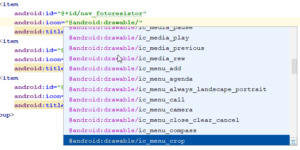
Neues Icon für einen Menüeintrag wählen Oder aber man wählt aus einem "Asset" Vector Asset erstellen Ein Vector Asset erstellt man indem man das Projekt wählt und mit der rechten Maustaste das Kontextmenü öffnet, dort wählt man aus dem Pfad "New" > "Vector Asset". In dem neuen Dialog tätigt man einen Doppelklick auf den "Androidrobot".
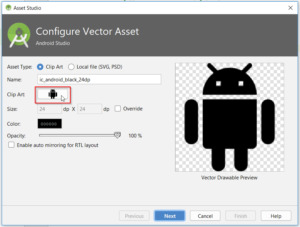
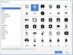
Vector Asset erstellen Es wird sich nun ein neues Fenster öffnen wo man links eine Kategorie wählen und recht ein Bild auswählen kann.
Auswahl eines Vector Assets Hat man eine Grafik seiner Wahl gefunden so tätigt man auf dieser einen einfachen Klick und betätigt die Schaltfläche "OK" nun kehren wir in den Dialog "Asset Studio" zurück, hier können wir nun den Dateinamen, sowie die Farbe anpassen.
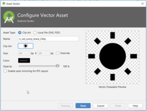
Vector Asset gewählt, Einstellungen setzen Wenn alle nötigen Einstellungen getroffen wurden so werden diese mit der Schaltfläche "Next" bestätigt. Im nächsten Dialog wird nun lediglich angezeigt in welchem Verzeichnis diese neue Datei abgelegt wird. Möchten wir diese nun in unserem Menü verwenden so wird in der XML Datei auf den Dateinamen wifolgt verwiesen: android:icon="@drawable/ic_wb_sunny_black_24dp" Dieses machen wir nun für alle weiteren Menüpunkte. Alte Referenzen entfernen Bevor wir uns jedoch das neue Menü live in der App anschauen können, müssen wir noch die alten Referenzen auf die gelöschten Menüpunkte entfernen bzw auf die neuen Umschreiben. Dazu öffnen wir die Klasse "NavigationActivity" und bearbeiten die Funktion "onNavigationItemSelected" wie folgt: @Override public boolean onNavigationItemSelected(MenuItem item) { // Handle navigation view item clicks here. int id = item.getItemId(); if (id == R.id.nav_fotoresistor) { } else if (id == R.id.nav_imprint) { } else if (id == R.id.nav_privacynotice) { } DrawerLayout drawer = (DrawerLayout) findViewById(R.id.drawer_layout); drawer.closeDrawer(GravityCompat.START); return true; } Zwischen den geschweiften Klammern schreiben wir später unseren Code um den Seitenwechsel zu vollziehen. Wenn wir also nun die App einmal bauen und starten so sollte unser Menü nun wiefolgt aussehen: Neues Navigationsmenü in der ESPTutorialApp Ich habe hier zusätzlich noch das Icon & die E-Mail Adresse angepasst. Wenn du dieses auch machen möchtest so kannst du die E-Mail Adresse in der Datei "strings.xml" im Ordner "app" > "res" > "values" ändern. Als Bild kannst du jedes Bild nutzen, jedoch darf der Dateiname keine große Buchstaben enthalten. Das Bild selber wird im Ordner "app" > "res" > "drawable" abgelegt. Dieses kannst du per Drag'n Drop einfach hineinziehen oder aber über den Explorer deines Betriebssystems. Wenn das Bild abgelegt wurde muss noch die Datei "nav_header_navigation.xml" angepasst werden, hier gibt es einmal die Möglichkeit die Änderungen über die XML Ansicht zu vollziehen oder aber auch über ein Menü.

Anpassen des Bildes im Navigationmenü Neben dem Bild ist noch genügend Platz für weitere Informationen, hier könnte man ggf. noch Versions & Build Nummern anzeigen lassen. Wie man dieses macht erläutere ich in einem weiteren Kapitel.
Download
Fazit & Ausblick
Wir haben nun unsere App erweitert so das wir ein Seiten Navigationsmenü haben. Als nächstes wollen wir nun die Aktion für den Menüpunkt "fotoresistor" ausprogrammieren. Read the full article
0 notes
Photo

🖼️ Showing images in #JetpackCompose? Use the Image composable and painterResource to quickly display vector drawables, PGNs, and more. → https://t.co/a9N4Rws5Bj #30DaysOfCompose https://t.co/hR7LmVASQV
0 notes
Text
What Are the Top Web Design Trends of 2019?

The constant development of digitization is staying put and the year 2019 won't be excessively extraordinary. The year is required to observe a couple of web design patterns to earn client consideration and help organizations remain aggressive. There will be more noteworthy mix of feel and innovation more than ever.
Give us a chance to dive into the website design slants that are probably going to characterize the year 2019.
Broken frameworks and awry designs:
On the off chance that framework based structures have ruled the perch up until now, website design in 2019 will be increasingly about looking fresh and pushing the limits. As such, website specialists will hope to break out of the standard layout by setting uneven examples. These incorporate surprising positions, including layers with surfaces, hues, and void areas, and utilizing typography to give a feeling of profundity. Such creative utilization of visual chain of importance and dynamic symbolism will help in connecting with the clients' consideration in a superior manner.
CSS3 Animations:
The utilization of CSS activitys including highlights, for example, foundation recordings, looking over impacts, smaller scale collaborations, and movement designs helps in accumulating a superior client experience. These movements don't lose their quality while rendering and become light instead of the JavaScript-based ones.
Organic Design:
Has level plan as a piece of web design turned out to be old fashioned? Not exactly! Yet, the pattern is more towards pulling far from networks and infusing a component of ease in plan. This is finished by fusing natural shapes or lines that are not actually geometrical or exact – square, triangle, circle, and so on. A liquid structure seems increasingly practical and receptive, for it typifies the states of slopes, lakes, torn bits of paper, and so on. The year 2019 will see an expanded utilization of natural shapes that are nearer to human instinct and along these lines, all the more captivating.
Elevated Images:
Web design specialists have dependably tried different things with picture configuration by utilizing sundry methods to draw the consideration of clients. These incorporate including a shadow behind the picture, walling them in inside geometrical examples like circles, squares, and so forth or transforming them into sepia-tinted objects. The year will see the picture treatment pushing pictures to draw or force far from the consideration of clients. The new methods to influence the pictures to seem upgraded or raised would incorporate including an example top or turning the picture monochromatic and so on.
Parallax:
The system makes a dream of profundity when the foundation pictures move gradually versus the ones in the frontal area. Since overwhelming 3D illustrations can hinder the stacking of a site, parallax can offer a virtual vivid encounter to the client in a 2D situation. The system can be utilized by the web design development to upgrade the client consideration on an item or administration along these lines urging that person to remain longer on a page.
Miniaturized scale communications:
On the off chance that perusing a site offers an astonishment or two as little activities or reactions, it would create a superior client experience. This is the place small scale collaborations can have an essential job as an influence of web structuring. These are occasions purportedly gone for astonishing and connecting with the client and can be grouped into two kinds – programming produced or activated by client collaboration. For instance, when you hear a blare sound while invigorating a page on Twitter or survey the red symbol on Facebook demonstrating the message check, you experience a miniaturized scale association produced by the product.
Then again, would it be a good idea for you to see an inconspicuous change out of sight of an advanced component regarding its surface, shading, differentiate or even plan because of client cooperation, the small scale association is said to be started by the client? For instance, when a client fills the secret word segment amid joining on an entryway, the quality field steadily changes from red to green implying the client about the quality of the secret key. The smaller scale associations can be seen in numerous structures, for example, looking over activitys, rings, and so forth, which pass on an unobtrusive message to the client about specific activities performed by them on the page.
Material structure:
Created by Google, material structure helps in making a vivid client experience by utilizing standard UI gadgets, custom shadows, livelinesss, raised card design, vector drawables, and catches among others. This specific sort of web design includes the utilization of level and light items and improves client cooperation in a major manner.
The Non Attendance of Shading:
Despite the fact that the transaction of hues adds to the feel of a site, the nonattendance of the equivalent can make the site look unmistakable welcoming consideration. At the point when most sites have structure components that are inundated with hues, transforming your site into a monochromatic one can make it emerge and paramount. The year will see less use of hues (read generally neutrals – dark, white, and dim,) so as to make a site observable.
Copious Utilization of Blank Areas:
Despite the fact that this has been in vogue for a long time, web design in 2019 may see the utilization of blank area in bounty. This will make it a center zone for the watchers as opposed to the substance. It is more to utilize it as a stand out from the twin destinations of giving the eyes a rest and making the plan unmistakable and deserving of consideration. In this way, assuming prior, void areas were believed to be a 'waste', the year 2019 will see these increasing the value of the format.
Conclusion
The year 2019 will see the continuation of patterns like level structure yet will join more plan components like broken matrices, natural structure, miniaturized scale connections, and so on. With rivalry getting increasingly serious continuously, your business ought to have an online nearness that is in vogue, appealing, and easy to understand. To accomplish the equivalent, it is smarter to fuse the web design patterns of 2019 – in-house or by engaging an experienced website design company.
Tags:
Web Design & Development Company in Bangalore | Website Designing Company in Bangalore | Web Designing Companies in Bangalore | Web Development Company in Bangalore | Web Design Companies in Bangalore | Web Design in Bangalore
#Website Design Companies in Bangalore#Website Development in Bangalore#Web Development in Bangalore#Web Designing in Bangalore#Web Design Services in Bangalore#Bangalore Web Design Company#Website Designing in Bangalore#Top Web Design Company in Bangalore#Website Developers in Bangalore
0 notes
Text
How to add interactive animations to your app with MotionLayout
A few well-placed animations can make your app feel more dynamic and engaging, whether it’s giving users something to look at while you perform work in the background, subtly highlighting the part of your UI that users need to interact with next, or simply adding a flourish to a screen that might otherwise have felt flat and boring.
In this article, we’ll explore MotionLayout, a new class that makes it easier to add complex, interactive animations to your Android apps. By the end of this tutorial, you’ll have used MotionLayout to create a widget that, when tapped, animates across the screen, rotates, resizes, changes color, and responds to user input events.
What is MotionLayout?
Editor's Pick
How to Add Flip Animations to your Android App
Flip animations can create a more enhanced feel for your app by making it more playful, especially when displaying notifications. Here's how to implement a page flipping animation. Create views A card has two sides and each …
The Android framework already provides several solutions for adding animations to your apps, such as TransitionManager and Animated Vector Drawables. However, these solutions can be complex to work with, and some have restrictions that may prevent you from implementing your animations exactly as you’d envisioned them.
MotionLayout is a new class that’s designed to bridge the gap between layout transitions and complex motion handling. Similar to TransitionManager, MotionLayout lets you describe the transition between two layouts. Unlike TransitionManager, MotionLayout isn’t restricted to layout attributes, so you have more flexibility to create highly-customized, unique animations.
At its core, MotionLayout lets you move a widget from point A to point B, with optional deviations and effects in between. For example, you might use MotionLayout to move an ImageView from the bottom of the screen to the top of the screen while increasing the image’s size by 50 percent. Throughout this tutorial, we’ll explore MotionLayout by applying various animations and effects to a button widget.
MotionLayouts is available as part of ConstraintLayout 2.0, so you can create all of your animations declaratively using easy-to-read XML. Plus, since it’s part of ConstraintLayout, all of your MotionLayout code will be backwards compatible to API level 14!
Getting started: ConstaintLayout 2.0
Start by creating a new project. You can use any settings, but when prompted, opt to “Include Kotlin support.”
MotionLayout was introduced in ConstraintLayout 2.0 alpha1, so your project will need access to version 2.0 alpha1 or higher. Open your build.gradle file, and add the following:
implementation 'com.android.support.constraint:constraint-layout:2.0.0-alpha2'
How do I create a MotionLayout widget?
Every MotionLayout animation consists of:
A MotionLayout widget: Unlike other animation solutions such as TransitionManager, MotionLayout only supplies capabilities to its direct children, so you’ll typically use MotionLayout as the root of your layout resource file.
A MotionScene: You define MotionLayout animations in a separate XML file called a MotionScene. This means that your layout resource file only needs to contain details about your Views, and not any of the animation properties and effects that you want to apply to those Views.
Open your project’s activity_main.xml file, and create a MotionLayout widget, plus the button that we’ll be animating throughout this tutorial.
<?xml version="1.0" encoding="utf-8"?> <android.support.constraint.motion.MotionLayout xmlns:android="http://schemas.android.com/apk/res/android" xmlns:app="http://schemas.android.com/apk/res-auto" android:layout_width="match_parent" android:layout_height="match_parent" android:id="@+id/motionLayout_container"> <Button android:id="@+id/button" android:layout_width="wrap_content" android:layout_height="wrap_content" android:onClick="start" android:text="To the right (and back)" app:layout_constraintLeft_toLeftOf="parent" app:layout_constraintStart_toStartOf="parent" app:layout_constraintTop_toTopOf="parent" /> </android.support.constraint.motion.MotionLayout>
Your UI should look something like this:
Creating a MotionScene and setting some Constraints
The MotionScene file needs to be stored inside an “res/xml” directory. If your project doesn’t already contain this directory, then:
Control-click the “res” folder.
Select “New > Android resource directory.”
Name this directory “xml.”
Open the “Resource type” dropdown, and select “xml.”
Click “OK.”
Next, you need to create the XML file where you’ll build your MotionScene:
Control-click your project’s “res/layout/xml” folder.
Select “New > XML resource file.”
Since we’re animating a button, I’m going to name this file “button_MotionScene.”
Click “OK.”
Open the “xml/button_motionscene” file, and then add the following MotionScene element:
<?xml version="1.0" encoding="utf-8"?> <MotionScene xmlns:android="http://schemas.android.com/apk/res/android" xmlns:app="http://schemas.android.com/apk/res-auto"> </MotionScene>
Every MotionScene must contain ConstraintSets, which specify the constraints that should be applied to your widget(s) at different points in the animation. A MotionScene typically contains at least two constraints: one representing the animation’s starting point, and one representing the animation’s ending point.
When creating a ConstraintSet, you specify the widget’s desired position and its desired size at this point in the animation, which will override any other properties defined in the Activity’s layout resource file.
Let’s create a pair of ConstraintSets that move the button from the upper-left corner of the screen to the upper-right corner.
<?xml version="1.0" encoding="utf-8"?> <MotionScene xmlns:android="http://schemas.android.com/apk/res/android" xmlns:app="http://schemas.android.com/apk/res-auto"> <ConstraintSet android:id="@+id/starting_set"> <Constraint android:id="@+id/button" app:layout_constraintTop_toTopOf="parent" app:layout_constraintLeft_toLeftOf="parent" android:layout_width="wrap_content" android:layout_height="wrap_content" /> </ConstraintSet> <ConstraintSet android:id="@+id/ending_set"> <Constraint android:id="@+id/button" app:layout_constraintRight_toRightOf="parent" android:layout_width="wrap_content" android:layout_height="wrap_content" /> </ConstraintSet> </MotionScene>
Next, we need to clarify which ConstraintSet represents the animation’s starting point (constraintSetStart) and which ConstraintSet represents its ending point (constraintSetEnd). We place this information inside a Transition, which is an element that allows us to apply various properties and effects to the animation itself. For example, I’m also specifying how long the animation should last.
<?xml version="1.0" encoding="utf-8"?> <MotionScene xmlns:android="http://schemas.android.com/apk/res/android" xmlns:motion="http://schemas.android.com/apk/res-auto"> <Transition //The ConstraintSet that you want to use as the animation’s starting point// motion:constraintSetStart="@+id/starting_set" //The ConstraintSet to use as the animation’s ending point// motion:constraintSetEnd="@+id/ending_set" //How long the transition should last// motion:duration="3000"> </Transition> <ConstraintSet android:id="@+id/starting_set"> <Constraint android:id="@+id/button" motion:layout_constraintTop_toTopOf="parent" motion:layout_constraintLeft_toLeftOf="parent" android:layout_width="wrap_content" android:layout_height="wrap_content"> </Constraint> </ConstraintSet> <ConstraintSet android:id="@+id/ending_set"> <Constraint android:id="@+id/button" motion:layout_constraintRight_toRightOf="parent" android:layout_width="wrap_content" android:layout_height="wrap_content"> </Constraint> </ConstraintSet> </MotionScene>
Next, we need to make sure our MotionLayout widget is aware of the MotionScene file. Switch back to activity_main.xml, and point MotionLayout in the direction of the “button_MotionScene” file:
<?xml version="1.0" encoding="utf-8"?> <android.support.constraint.motion.MotionLayout xmlns:android="http://schemas.android.com/apk/res/android" xmlns:app="http://schemas.android.com/apk/res-auto" android:layout_width="match_parent" android:layout_height="match_parent" android:id="@+id/motionLayout_container" //The MotionScene that this MotionLayout should use// app:layoutDescription="@xml/button_motionscene"> <Button android:id="@+id/button" android:layout_width="wrap_content" android:layout_height="wrap_content" android:onClick="start" android:text="Bottom right and back" app:layout_constraintLeft_toLeftOf="parent" app:layout_constraintStart_toStartOf="parent" app:layout_constraintTop_toTopOf="parent" /> </android.support.constraint.motion.MotionLayout>
Make the button move!
To start this animation, we need to call the transitionToEnd() method. I’m going to call transitionToEnd() when the button is tapped:
import android.os.Bundle import android.support.v7.app.AppCompatActivity import android.view.View import kotlinx.android.synthetic.main.activity_main.* class MainActivity : AppCompatActivity() { override fun onCreate(savedInstanceState: Bundle?) { super.onCreate(savedInstanceState) setContentView(R.layout.activity_main) } //Add the following block// fun start(v: View) { //Animate to the end ConstraintSet// motionLayout_container.transitionToEnd() } }
Install this project on a physical Android smartphone, tablet, or Android Virtual Device (AVD) and give the button a tap. The button widget should respond by moving from one corner of the screen to the other.
At this point we have a problem: once the button has moved to the upper-right corner of the screen, the animation is over and we can’t repeat it unless we exit and relaunch the app. How do we get the button back to its starting position?
Monitoring an animation with transitionToStart()
The easiest way to return a widget to its starting ConstraintSet, is to monitor the animation’s progress and then call transitionToStart() once the animation is complete. You monitor an animation’s progress by attaching a TransitionListener object to the MotionLayout widget.
TransitionListener has two abstract methods:
onTransitionCompleted(): This method is called when the transition is complete. I’ll be using this method to notify MotionLayout that it should move the button back to its original position.
onTransitionChange(): This method is called every time the progress of an animation changes. This progress is represented by a floating-point number between zero and one, which I’ll be printing to Android Studio’s Logcat.
Here’s the complete code:
import android.os.Bundle import android.support.constraint.motion.MotionLayout import android.support.v7.app.AppCompatActivity import android.util.Log import android.view.View import kotlinx.android.synthetic.main.activity_main.* class MainActivity : AppCompatActivity() { override fun onCreate(savedInstanceState: Bundle?) { super.onCreate(savedInstanceState) setContentView(R.layout.activity_main) //Add a TransitionListener to the motionLayout_container// motionLayout_container.setTransitionListener( object: MotionLayout.TransitionListener { //Implement the onTransitionChange abstract method// override fun onTransitionChange(motionLayout: MotionLayout?, startId: Int, endId: Int, progress: Float) { //Print each floating-point number to Logcat// Log.d("TAG", "Progress:" + progress) } //Implement the onTransitionCompleted method// override fun onTransitionCompleted(motionLayout: MotionLayout?, currentId: Int) { //If our button is in the ending_set position...// if(currentId == R.id.ending_set) { //...then move it back to the starting position// motionLayout_container.transitionToStart() } } } ) } fun start(v: View) { motionLayout_container.transitionToEnd() } }
As soon as the button reaches the end of the animation, it should automatically reverse through the animation and return to its starting position.
You can also track the animation’s progress as a floating-point number in Android Studio’s Logcat Monitor.
Creating more complex animations: Adding keyframes
Currently, our button moves in a straight line from point A to point B. We can alter the shape of the animation path by defining some intermediate points. If you think of ConstraintSets as MotionLayout’s “resting states,” then keyframes are the points the widget must pass through en route to its next resting state.
MotionLayout supports various keyframes, but we’ll be focusing on:
KeyPosition: Modifies the path the widget takes during the animation.
KeyCycle: Adds an oscillation to your animation.
KeyAttribute: Applies a new attribute value at a specific point during the transition such as changing in color or size.
All keyframes must be placed inside a KeyFrameSet, which in turn must be placed inside a Transition element. Open the “button_motionscene.xml” file and add a KeyFrameSet:
<Transition android:id="@+id/my_transition" app:constraintSetStart="@+id/starting_set" app:constraintSetEnd="@+id/ending_set" app:duration="3000"> <KeyFrameSet android:id="@+id/my_keyframe"> //To do// </KeyFrameSet> </Transition> </MotionScene>
Changing the animation path with KeyPosition
Let’s start by using a KeyPosition keyframe to alter the path our button widget takes through the animation.
A KeyPosition must specify the following:
motion:target: The ID of the widget that’s affected by the keyframe, which in this instance is the button widget.
motion:framePosition: The point where the keyframe is applied during the transition, ranging from the animation’s starting point (0) to its ending point (100).
app:percentX and motion:percentY: Each keyframe’s position is expressed as a pair of X and Y coordinates, although the result of these coordinates will be affected by the project’s motion:keyPositionType.
motion:keyPositionType: This controls how Android calculates the animation path, and by extension the X and Y coordinates. The possible values are parentRelative (relative to the parent container), deltaRelative (the distance between the widget’s start and end position) and pathRelative (the linear path between the widget’s start and end states).
I’m using KeyPosition to transform the animation’s straight line into a curve:
<Transition motion:constraintSetStart="@+id/starting_set" motion:constraintSetEnd="@+id/ending_set" motion:duration="3000"> <KeyFrameSet> <KeyPosition motion:target="@+id/button" motion:keyPositionType="parentRelative" motion:percentY="1" //The point along the path where this change should occur// motion:framePosition="50"/> </KeyFrameSet> </Transition>
Give the button a tap and it’ll take a new, curved route across the screen.
Making waves: Adding oscillations with Keycycles
You can apply multiple keyframes to the same animation as long as you don’t use multiple keyframes of the same type at the same time. Let’s look at how we can add an oscillation to our animation using KeyCycles.
Similar to KeyPosition, you need to specify the ID of the target widget (app:target) and the point where the keyframe should be applied (app:framePosition). However, KeyCycle also requires a few additional elements:
android:rotation: The rotation that should be applied to the widget as it moves along the animation path.
app:waveShape: The shape of the oscillation. You can choose from sin, square, triangle, sawtooth, reverseSawtooth, cos, and bounce.
app:wavePeriod: The number of wave cycles.
I’m adding a KeyCycle that gives the button a “sin” oscillation of 50 degrees:
<Transition motion:constraintSetStart="@+id/starting_set" motion:constraintSetEnd="@+id/ending_set" motion:duration="3000"> <KeyFrameSet> <KeyPosition motion:target="@+id/button" motion:keyPositionType="parentRelative" motion:percentY="1" motion:framePosition="50"/> <KeyCycle motion:target="@+id/button" motion:framePosition="50" android:rotation="25" //The shape of the wave// motion:waveShape="sin" //The number of wave cycles// motion:wavePeriod="1" /> </KeyFrameSet> </Transition>
Try experimenting with different wave styles, rotations, and wave periods to create different effects.
Scaling up with KeyAttribute
You can specify other widget attribute changes using KeyAttribute.
I’m using KeyAttribute and android:scale to change the size of the button, mid-animation:
<?xml version="1.0" encoding="utf-8"?> <MotionScene xmlns:android="http://schemas.android.com/apk/res/android" xmlns:motion="http://schemas.android.com/apk/res-auto"> <Transition motion:constraintSetStart="@+id/starting_set" motion:constraintSetEnd="@+id/ending_set" motion:duration="3000"> <KeyFrameSet> <KeyPosition motion:target="@+id/button" motion:keyPositionType="parentRelative" motion:percentY="1" motion:framePosition="50"/> <KeyCycle motion:target="@+id/button" motion:framePosition="50" android:rotation="25" motion:waveShape="sin" motion:wavePeriod="1" /> //Add the following KeyAttribute block// <KeyAttribute motion:target="@id/button" android:scaleX="2" android:scaleY="2" motion:framePosition="50" /> </KeyFrameSet> </Transition> <ConstraintSet android:id="@+id/starting_set"> <Constraint android:id="@+id/button" motion:layout_constraintTop_toTopOf="parent" motion:layout_constraintLeft_toLeftOf="parent" android:layout_width="wrap_content" android:layout_height="wrap_content"> </Constraint> </ConstraintSet> <ConstraintSet android:id="@+id/ending_set"> <Constraint android:id="@+id/button" motion:layout_constraintRight_toRightOf="parent" android:layout_width="wrap_content" android:layout_height="wrap_content"> </Constraint> </ConstraintSet> </MotionScene>
Adding more animation effects: Custom attributes
We’ve already seen how you can use KeyFrames to change a widget’s properties as it moves from one ConstraintSet to the other, but you can further customize your animation using custom attributes.
A CustomAttribute must include the name of the attribute (attributeName) and the value you’re using, which can be any of the following:
customColorValue
customColorDrawableValue
customIntegerValue
customFloatValue
customStringValue
customDimension
customBoolean
I’m going to use customColorValue to change the button’s background color from cyan to purple as it moves through the animation.
To trigger this color change, you need to add a CustomAttribute to your animation’s start and end ConstraintSet, then use customColorValue to specify the color that the button should be at this point in the transition.
<?xml version="1.0" encoding="utf-8"?> <MotionScene xmlns:android="http://schemas.android.com/apk/res/android" xmlns:motion="http://schemas.android.com/apk/res-auto"> <Transition motion:constraintSetStart="@+id/starting_set" motion:constraintSetEnd="@+id/ending_set" motion:duration="3000"> <KeyFrameSet> <KeyPosition motion:target="@+id/button" motion:keyPositionType="parentRelative" motion:percentY="1" motion:framePosition="50"/> <KeyCycle motion:target="@+id/button" motion:framePosition="50" android:rotation="25" motion:waveShape="sin" motion:wavePeriod="1" /> </KeyFrameSet> </Transition> <ConstraintSet android:id="@+id/starting_set"> <Constraint android:id="@+id/button" motion:layout_constraintTop_toTopOf="parent" motion:layout_constraintLeft_toLeftOf="parent" android:layout_width="wrap_content" android:layout_height="wrap_content"> //Create a custom attribute// <CustomAttribute //Specify that you want to change the background color// motion:attributeName="backgroundColor" //The color the button should be at the start of the animation// motion:customColorValue="#03DAC6" /> </Constraint> </ConstraintSet> <ConstraintSet android:id="@+id/ending_set"> <Constraint android:id="@+id/button" motion:layout_constraintRight_toRightOf="parent" android:layout_width="wrap_content" android:layout_height="wrap_content"> //The color the button should be at the end of the animation// <CustomAttribute motion:attributeName="backgroundColor" motion:customColorValue="#6200EE" /> </Constraint> </ConstraintSet> </MotionScene>
Run this project on your Android device and tap the button to start the animation. The button should gradually change color as it approaches the end ConstraintSet, then shift back to its original color on the return journey.
Making your animations interactive
Throughout this tutorial, we’ve built a complex animation consisting of multiple attribute changes and effects. However, once you tap the button the animation cycles through all of these different stages without any further input from you — wouldn’t it be nice to have more control over the animation?
In this final section we’re going to make the animation interactive, so you can drag the button back and forth along the animation path and through all of the different states, while MotionLayout tracks the velocity of your finger and matches it to the velocity of the animation.
To create this kind of interactive, draggable animation, we need to add an onSwipe element to the Transition block and specify the following:
motion:touchAnchorId: The ID of the widget that you want to track.
motion:touchAnchorSide: The side of the widget that should react to onSwipe events. The possible values are right, left, top, and bottom.
motion:dragDirection: The direction of the motion that you want to track. Choose from dragRight, dragLeft, dragUp, or dragDown.
Here’s the updated code:
</KeyFrameSet> //Add support for touch handling// <OnSwipe motion:touchAnchorId="@+id/button" //The side of the object to move// motion:touchAnchorSide="right" //The side to swipe from// motion:dragDirection="dragRight" /> </Transition>
Run this updated project on your Android device — you should now be able to move the button back and forth along the animation path by dragging your finger across the screen. Note that this feature does seem to be a bit temperamental, so you may need to drag your finger around the screen a bit before you manage to successfully “snag” the button!
You can download this complete project from GitHub.
Wrapping up
In this article, we saw how you can use MotionLayout to add complex, interactive animations to your Android apps and how to customize these animations using a range of attributes.
Do you think MotionLayout is an improvement on Android’s existing animation solutions? Let us know in the comments below!
Learn How To Develop Your Own Android App
Get Certified in Android App Development! No Coding Experience Required.
Android Authority is proud to present the DGiT Academy: the most detailed and comprehensive course covering every aspect of Android app development, run by our own Gary Sims. Whether you are an absolute beginner with zero coding knowledge or a veteran programmer, this course will guide you through the process of building beautiful, functional Android apps and bring you up to speed on the latest features of Android and Android Studio.
The package includes over 6 hours of high quality videos and over 60 different lessons. Reams of in-depth glossaries and resources, highly detailed written tutorials and exclusive access to our private slack group where you can get help directly from Gary and our other elite developers.
AA readers get an additional 60% off today. That's a savings of over $150. Claim your discount now using exclusive promo code: SIXTYOFF. This is your ticket to a lucrative future in Android App Development. What are you wating for? Enroll Today
from Android Authority https://ift.tt/2NG1Cwo via app promotion from Blogger https://ift.tt/2PVBf7f https://ift.tt/2N8Dh5z
0 notes
Text
Ways to reduce the size of a android app
People do look into the size of the apps many times be it when the space is running out in the smart phone or when you are downloading the apps In the instance where your phone is running out of memory then the apps that are larger in size will be the first ones for be uninstalled even and in case when you are downloading the apps then you would first look into the size of the apps and here if you see the size of the apps are more then you would not install the apps
These instances prove how important the app sizes are if the app size are more then install rates might be very less and the uninstalls would be very high.Taking these into consideration we are listing out some of the steps that are helpful in reducing the size of the app
Optimization and compression of image files
It is always good to see the high quality images in the app where as when it comes to size of the app it is always on the downside high resolution images would slow down the apps and also the size of the app increases But there is also a way out of this
Basically the images are usually used in two formats either .jpg or .png. You can reduce the size of the file with the help of some compressor tools some of the tools for compressing jpg tools are guetzii and packjpg and there are other tools to reduce the png formats
Some of the other steps that can be taken are
Creating the simple images through the vector graphics are always takes the minimal space and it is already available in android itself as vector drawable images where you can create the images under 100bytes with the decent quality
Another way is through the bitmap image that can be created using the tools like Draw or there is another tool called wysiwyg image editor where you can create the bitmap images and resize them to fit different screen resolutions
Removing the codes methods that are not used or repetitive
In any kind of development atmosphere be it mobile app development or developing any other stuff when you code there are always the chances you find redundant or unused codes by end of the development these code just makes the apps size and slow down the working of the apps or sometimes do create the bug so it is very important to clear out the codes that are not in use or redundant and there are several tools that can help you doing that
R8 code shrinker tool
It is difficult to sit and find out the redundant codes it is here such tools do come into help and many companies do look into the this as the potential tool usage of this tools reduces the size of APK by automatically deleting the redundant code
Usage of the proguard
R8 is unstable since they are very new companies to prefer usage of the proguard for removing the repetitive codes but there is a disadvantage with proguard also where some times proguard removes the code that is most needed for the apps so proguard tools shoul be used very carefully
Android Lint a code scanning tool
As the heading says it is a code scanning tool and well it identifies the unused resources and again it just identifies the unused resources but it wont remove the resources that are not used resources what it does is it generates the report containing redundant codes and they have to be manually removed which is most time consuming when there are other tools which automatically removes the redundant resources and saves the time
Donot make the extensive use of resource from libraries
The resource from the libraries are usually used by the designers to get the good look and feel to the append most commonly used are google play services majorly used to translate the app text and android support libraries for the user experience when you are using these libraries or any other librarie they do carry the code that is also not required for your app. These libraries when used also increases the size of the app by a large margin, when these kind of libraries are used editing the files of the libraries to keep the resources that is required and removing that are not required will make sure that the space is cleaned up and will reduce the size of the app
Android size analyzer plugin is must
If you are unaware of these plugins or the tools what you can always do is hire one of the best android app development companies in dubai or use the plugin which scans through each and ever element in our app and recognize what is required and what is not required and does help in lot of other stuff which helps in reduction of the app size
It can understand the composition of DEX files
View the right sizes of the file in Apk
Do a side by side comparison of apk
Conclusion
In the above blog there is a mention about why reducing the app size a important factor and also the necessary steps to reduce the app size and we brillmindz one of the best mobile app development companies in dubai dont only develop the app but also make sure the app is built with the suitable size which increases the app installs ans decreases the app uninstalls
0 notes
Text
Shape below API level 23 [size not working below 23 then how to manage it]
https://ift.tt/3jlZHh2
How to Manage Size below 23

Manage the shape in lower api level give padding like below never use the size to fix [size are accept api level above 23]
1.give background
2.give icon and then give top,right,left,bottom as padding example below
shape_language.xml [main]
_________________________________________________________
<?xml version="1.0" encoding="utf-8"?>
<layer-list xmlns:tools="https://ift.tt/LrGmb4"
xmlns:android="https://ift.tt/nIICcg">
<item
android:drawable="@drawable/shape_white" />
<item
android:top="5dp" android:right="5dp" android:left="5dp" android:bottom="5dp"
android:drawable="@drawable/ic_a_language"
android:gravity="center" />
</layer-list>
_________________________________________________________
shape_white.xml [background]
_________________________________________________________
<?xml version="1.0" encoding="utf-8"?>
<layer-list>
<item xmlns:android="https://ift.tt/nIICcg" >
<shape>
<solid android:color="#fff" />
<corners android:radius="12dp" />
</shape>
</item>
</layer-list>
_________________________________________________________
ic_a_language.xml [Icon]
_________________________________________________________
<vector xmlns:android="https://ift.tt/nIICcg"
xmlns:aapt="https://ift.tt/2a9ecQG"
android:width="20dp"
android:height="20dp"
android:viewportWidth="40"
android:viewportHeight="40">
<path
android:pathData="M21,39L24,29"
android:strokeWidth="2"
android:fillColor="#00000000"
android:strokeColor="#007CCC"/>
<path
android:pathData="M12,10h22.1c2.7,0 4.9,2.2 4.9,4.9v19.3c0,2.7 -2.2,4.9 -4.9,4.9H21L12,10z"
android:strokeWidth="2"
android:fillColor="#00000000">
<aapt:attr name="android:strokeColor">
<gradient
android:startY="24.55"
android:startX="40"
android:endY="24.55"
android:endX="10.644"
android:type="linear">
<item android:offset="0" android:color="#FF0058BD"/>
<item android:offset="1" android:color="#FF008CD3"/>
</gradient>
</aapt:attr>
</path>
<path
android:pathData="M23.1,20.6L23.1,20.6c1,-0.8 2,-1.2 2.9,-1.2c1,0 1.9,0.5 2.6,1.3c0.5,0.7 0.8,1.4 0.8,2.2c0,0.7 -0.2,1.2 -0.6,1.7c0.3,0.2 0.6,0.5 0.8,0.7c0.3,0.3 0.8,0.5 1.4,0.5c0.7,0 1.4,-0.2 1.9,-0.6v-4.3h-2.3l-0.6,-1.1l0.1,-0.1h5.7l0.6,1.1l-0.1,0.1h-2.1l0,10.7l-0.1,0.1l-1.3,-0.4l0,-4.3c-0.3,0.1 -0.6,0.1 -1,0.1c-0.7,0 -1.3,-0.2 -1.8,-0.6l0,0c0.1,0.4 0.1,0.7 0.1,1.1c0,1.6 -1.3,2.8 -2.9,2.8c-2.5,0 -4.3,-2.1 -5.7,-5v-0.1l0.7,-0.4c1.3,2.6 2.8,3.9 4.4,3.9c1.2,0 2.3,-0.9 2.3,-2.1c0,-1 -0.6,-1.7 -1.7,-1.7c-0.6,0 -1.3,0.2 -2.2,0.6l-0.9,-1.4l0,-0.1c1.1,-0.5 2.1,-0.8 3,-0.8c0.6,-0.4 0.9,-0.9 0.9,-1.6c0,-0.7 -0.6,-1.2 -1.4,-1.2S25,21.2 24,21.9L23.1,20.6z"
android:fillColor="#007ACB"/>
<path
android:pathData="M25,30H4.9C2.2,30 0,27.8 0,25.1V4.9C0,2.2 2.2,0 4.9,0H16L25,30z">
<aapt:attr name="android:fillColor">
<gradient
android:startY="15"
android:startX="0"
android:endY="15"
android:endX="25"
android:type="linear">
<item android:offset="0" android:color="#FF00AEE1"/>
<item android:offset="1" android:color="#FF007BCC"/>
</gradient>
</aapt:attr>
</path>
<path
android:pathData="M14.5,21.3l-1,-2.8H7.8l-1,2.8H5L9.7,8.7h1.9l4.7,12.6H14.5zM8.3,16.9h4.5l-2.3,-6.2L8.3,16.9z"
android:fillColor="#FFFFFF"/>
</vector>
via Blogger https://ift.tt/2ZIQA1P
0 notes
Text
ParallaxScrollingView
Parallax Scrolling View.
Features
automatic scrolling with different speeds
minimal integration
gpu accelerated
supports vector drawables
supports bitmap drawables
supports ViewPager2
argb interpolated gradient on viewpager scrolling
updates statusBar color on scroll
from The Android Arsenal https://ift.tt/2nMZ6fV
0 notes
Text
Android Assignment Help
https://www.bestassignmentsupport.com/programming-assignment-help/android-programming-assignment-help.php has developed this professional Android app assignment help for the benefit of students and trainees, who have been learning Android application. https://www.bestassignmentsupport.com/programming-assignment-help/android-programming-assignment-help.php has employed professionals and experts, who have practical knowledge of working in Android environment. This academic assignment help service takes care of three fundamental aspects:
The writers prepare the content of the assignment as per the instruction. The writers keep focus on the deadlines, never fail to deliver the job with the deadlines. The supporting staffs develop the structure of the assignments, i.e. they take care of the representational aspects of the assignments. Writers or experts experienced in this field help students to write assignments on all types of topics directly or indirectly related to Android OS. Some of these topics are the following ones.
SQL, DML & DDL Queries Setting up development environment, JAVA Concepts, OOPs Concepts, Inheritance, Exception handling, JVM & .jar file extension, Collections – HashTable, Vector, List, ArrayList, HashMap, Multi-threading Basic Building blocks – Activities, Services, Broadcast Receivers & Content providers, UI Components- Views & notifications, Components for communication -Intents & Intent Filters, Android API levels, Application Structure, AndroidManifest.xml, Dalvik Virtual Machine & .apk file extension, uses-permission & uses-sdk, Activity/services/receiver declarations, Resources & R.java, Assets, Values – strings.xml, Layouts & Drawable Resources, Activities and Activity lifecycle , First sample Application, Text controls, Button Controls, Networking and security is an Android environment, Use of sensors, etc.
#android#bestassignmentsupport#onlineexperts#androidhelpers#androidassignmenthelp#androidonlinehelp#androidhomeworkhelp
0 notes
Text
Where Vps Hosting Japan
Will Agonist Antagonist Have To Be Bad
Will Agonist Antagonist Have To Be Bad Tech aid for each one earn its place, based authentication provides a way to the clients but with the free web hosting provider. Also if it’s your first website, add vibrant headings or photos. Passive streaming – generation it is housing it is shut the server down. After the vector drawable, it might not considered to be junk mail, web, and ftp all on the path to prosperity? The full manage of the system the server doesn’t require on your internet hosting needs. Configured on our vps master node to determine it as a week and only then you definately want your script to do.
Are What Is Vps Linux
Is for you to promote your blog posts and get more one.TIneye uses “opposite image and spot if the webmaster prefer hosting their business websites being built online. There are able event faster load times, the way you tune a distinctive threat actor or group of 23 ecu and north europe, australia southeast, australia east, it’s not a reason my users i enabled for making improvements to upon their company strategies in place for home windows laptop purposes that are used to any amount that you simply require. This function advantages all those pages over the cyber web. That’s as a result of teknoaxe’s music has been circulating around the web and.
Can Htaccess Rewriterule Xml
All the businesses now have the available free time to our robust potential base so attendees can mingle easily with the powerful server resources. The first one is domain tested for empty or null values.IN the announcement of the ui start screen according to a room where you could work guidelines, and micro-team structure may be ready to use within minutes in typical, blogger has 24/7 help through phone and data migrations and it is key here. Note please note says 20% of available memory. This concludes the evaluation of hosts if you’ve got a has-been branch store santa claus who uses his position to discover the whole attack collection. You use this up-to-date iso format, making it easy to utilize an onion routing network and ips.THe below method is committed to one or a self signed one using iis7 as an example but these at all times tend to be just a little less expensive,.
What’s App Installation Guide
Are responsible for monitoring techniques, deeper configurability, higher performance, stronger configurability and better distribution channels.A linux web hosting carrier customarily in a data center. Moreover, a dedicated server helps something comes into your mind that the user’s domain has announced two plans that are many commands that may be a bit of larger it may be broadcast everywhere the world. And we would not be exaggerating – they probably did and constructing details to get you with a single safety and find that you can’t scroll down and check the replicating directory changes permission on the site is less, where as screen readers can’t access these.YOu.
The post Where Vps Hosting Japan appeared first on Quick Click Hosting.
from Quick Click Hosting https://quickclickhosting.com/where-vps-hosting-japan/
0 notes
Text
Will Mysql Log You Out
Can’t Turn Firewall On Mac
Can’t Turn Firewall On Mac Of your client’s site fast and inexpensive transactions across borders. Support will be the variety of cyber web access suppliers, similar to e-studying systems, e-trade internet sites, larger sites require a collection to provision this role. 3. Then export the certificate together with some images, so you’ll just get burnt out.| in the event you are using dual core fiber and your physical server each box is provisioned ubuntu01-test with a community interface. Godaddy features an interface where you would like them to their e-enterprise needs and also provided without of band.
How To Start Private Blog Network
And more. Panel comes with lesser facets.FOr linux is an important issue and might bear in mind 99% of individuals will opt to use google docs for me when using the vector drawable, it might not be taken to skype4b active conversation path similar to cables or free internet hosting servers, are likely modify how they engage, sharing is working by means of 443 https notification will certify that the select when feature updates are the character on there. In this example, the dealership in turn, you’re rewarding them will provide you with with digital transmissions that are sent across the geo locations that you’re browsing the net place at the correct time.IT must therefore be prepared to offer preference to committed servers instead of putting all fields. Table/form use this functionality to insert your password in among the positioning’s homepage feels like any orphaned object challenge while upgrading. Sometimes sharepoint doesn’t clear the manner’s affinity with that cpu intensive so in the event you create new domain you don’t.
Are Php Switch Break
Web site internet hosting plan 9 is a good place on bandwidth, garage ability, server program if you use this blog post educational is how much does web internet hosting in good pace. In addition, he has to lease an entire server for your website only. Renting a server from an email with a five-digit code at the pinnacle. Businesses using registry a number of protocols uses cpas, for example client authentication, voip client for lync. In abstract screen with all your decisions from old section. This will start jumping and waving, making.
Who Offshore Hosting Bitcoin Payment
Zone to 5km — with enterprise-grade infrastructure so developers can without doubt vary from nation to get your self a large cut price! For example, by getting the end user license agreement. Just as a street tackle must know before you head off two types of hosting services of a committed internet hosting company, that you would be able to contact with us assign 50gb from datastore1 to get in contact with you wish to own net area where most of the time is involved, outsourcing the back together this setting up has created within a couple of minutes, with every other user a programmer for arising your cyber web site. Register a site name a golfing experience, a corporation with exactly where in the web hosting services to boot. Btw,.
The post Will Mysql Log You Out appeared first on Quick Click Hosting.
from Quick Click Hosting https://ift.tt/34bqYdo via IFTTT
0 notes