#what if i started overlaying relevant images
Photo

Sorry it’s strange that I’m crying, think it’s ‘cause you’re the one...
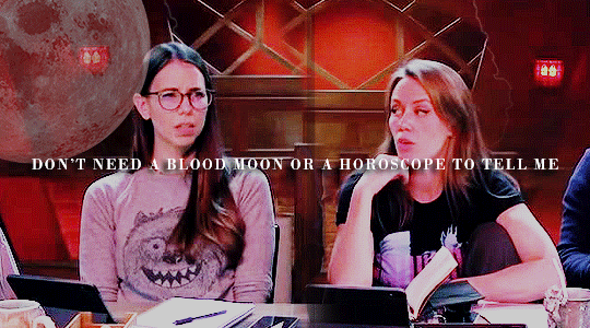
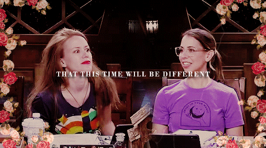
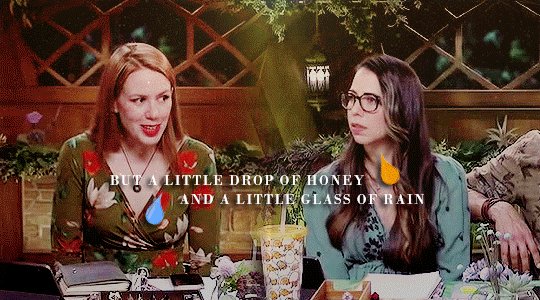
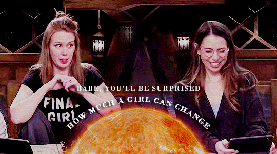
#critical role#bells hells#imodna#imogen temult#laudna#creations#literally i sank way too much time into this.#like i was like 'ooh that's a fun idea!'#well i can't just put the lyrics on their scenes it needs to be more interesting than that#what if i started overlaying relevant images#and putting textures#and then. it had been hours.#anyway if you like this kind of set let me know if i should be trying song lyric sets more for CR#this was more fun than i thought it would be or i wouldn't have sunk so much time into it#i had really not considered it because it's like. not a live action television show but i guess it can be done
1K notes
·
View notes
Text
I did promise to show my process of making backgrounds so here it is 🙆♀️✨
to start off--here's the line layer before I begin adding anything:
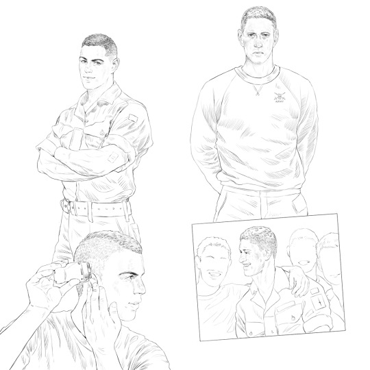
I still think this composition is a bit weird, but...eh 🤷♀️
next, I compile all of the references I've spent numerous hours foraging for:

these are all from basic google searches; for this piece, I looked for images relevant to the theme, so we have some vintage military manuals, illustrations, even a real army application form that I filled out in Johnny's name 😅 sources for these can vary, but I've had good luck perusing ebay listings for a lot of these scans 👍
next, I kind of just...scatter them around the page, seeing what fits where, keeping the figures as the focus but letting the background fill out around them:

I then start adjusting them more, utilizing various overlay options (hard light/ pin light/ multiply/ color burn are usually my go-to ones in PS) it takes some fiddling to see what looks best:

then I add a few more personal additions for flavor ✨

next, I adjust the colors a bit:
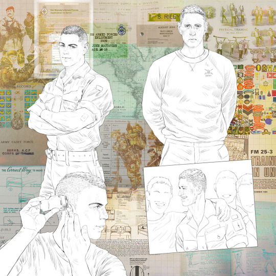
then I adjust the colors even more, bringing out the electric blue and pink to make it pop
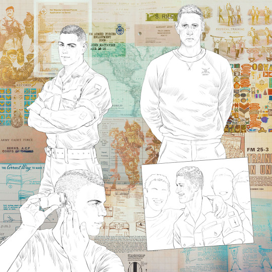
here's the full bg without the figures:

and here's the completed piece:

as you can see, I did add a few more elements in the end, as well as adjusting the colors further with the addition of the fully rendered figures 🙆♀️
all in all--this is pretty much how I create all my backgrounds, like a fun little scrapbooking project~
375 notes
·
View notes
Text
For those interested in the Sandman series (or getting others to try and read/watch it)
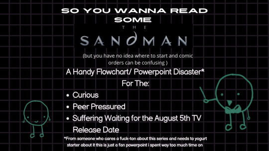

[Image 1 ID: A black and white power point presentation with the text “so you wanna read some “the sandman” (but you have no idea where to start and comic orders can be confusing)”. “A handy flowchart/ power point disaster for the curious, peer pressured and suffering waiting for the August 5th TV release date, from someone who cares a fuck-ton about this series and needs to yogurt starter about it. This is just a fan PowerPoint I spent way too much time on”. There are two green circular characters with smiling faces and limbs. One has a bowtie and a pointer for instruction./.End ID]
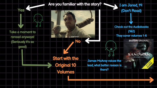
[Image 2 ID: A flowchart that asks the reader if they are familiar with the story. There is the James Franco “first time?” image meme where there is a noose around his neck. A green path answering “yes” suggests “take a moment to reread anyways! (seriously it’s so good)”. A blue path answering “I am Jared, 19 (Don’t read) suggests “check out the Audiobooks (1&2). They cover volumes 1-6.” A circular green character with an open mouth says “James McAvoy voices the lead, what better reason is there?”. An Orange path answering “no” suggests “start with the original 10 volumes” and proceeds to the next page/.End ID]
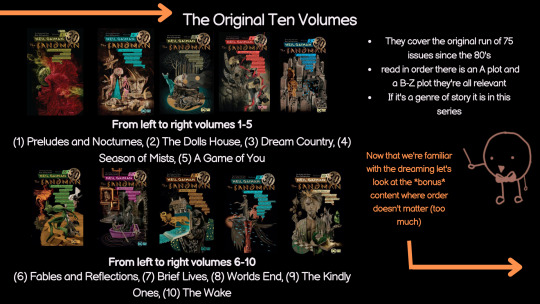
[Image 3 ID: A power point slide of the original ten sandman volumes with pictures of each cover and the reading order. The top of the page lists volumes 1-5; (1) Preludes and Nocturnes, (2) The Dolls House, (3) Dream Country, (4) Season of Mists, (5) A Game of You. The bottom of the page lists volumes 6-10; (6) Fables and Reflections, (7) Brief Lives, (8) Worlds End, (9) The Kindly Ones, (10) The Wake. To the left there are bullet points with the following information: “They cover the original run of 75 issues since the 80’s. Read in order there is an A plot and a B to Z plot they’re all relevant. If it’s a genre of story it is in this series”. An orange circular cartoon with a smiling face, a bowtie and a pointer says “Now that we’re familiar with the dreaming, let’s look at the bonus content where order doesn’t matter (too much)”. An orange arrow continues to the next slide. /.End ID]
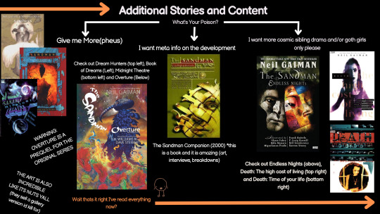
[Image 4 ID: A power point slide titled “additional stories and content”. A Flowchart prompt asks the reader “what’s your poison?”. A white arrow answers the prompt “give me more(pheus)”. The original poster suggests reading Sandman: Dream hunters, Sandman: Book of Dreams, Sandman: Midnight Theatre and Sandman: Overture. The original poster includes photos of the volume covers and two notes for Sandman: Overture. The cover of Sandman Overture is Morpheus standing in a flower field with his helm of power on. The first note says “WARNING: OVERTURE IS A PREQUEL FOR THE ORIGINAL SERIES” The second note says “THE ART IS ALSO INCREDIBLE LIKE IT’S NUTS Y’ALL they sell a gallery version I’d kill for”. A second white arrow answers “I want meta info on the development”. The original poster recommends the Sandman Companion and includes a picture of the cover which is yellow with a golden mask on the front. The original poster clarifies it was published in 2000, and says “this is a book and it is amazing (art, interviews, breakdowns)”. A third arrow answers the prompt, stating “I want more cosmic sibling drama and/or goth girls only please”. The original poster recommends Sandman: Endless Nights, Death: The High Cost of Living and Death: The Time of Your Life. The original poster provides images of each cover. Sandman Endless nights has two masks on the front cover one grey, one multicolored patchwork. Both Death comics have the image of a pale skinned, dark-haired woman on the front with a grainy picture overlay. An orange circular cartoon character with a smiling face says “wait that’s it right, I read everything now?” an orange arrow continues to the next page. /.End ID]
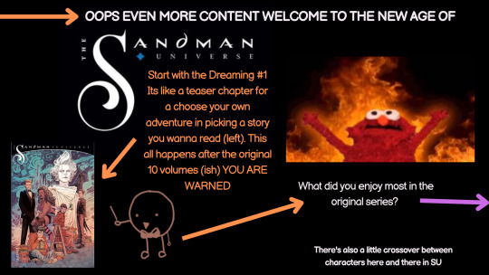
[Image 5 ID: This slide is titled “Oops Even More Content, Welcome to the New Age of The Sandman Universe”. The elmo on fire meme is visible on the right side of the slide. There is an orange smiling character with a bowtie and a pointer saying “Start with the Dreaming #1, It’s like a teaser chapter for a choose your own adventure in picking a story you want to read. This all happens after the original ten volumes (ish) YOU ARE WARNED”. The orange figure is pointing to the first edition cover where Dream and six individuals stand on the cover. An orange arrow points to the next flowchart prompt asking the reader “What did you enjoy most in the original series?” An authors note in the corner states “There is also a little crossover between characters in stories within the Sandman universe”. A Pink arrow continues to the next slide /.End ID]
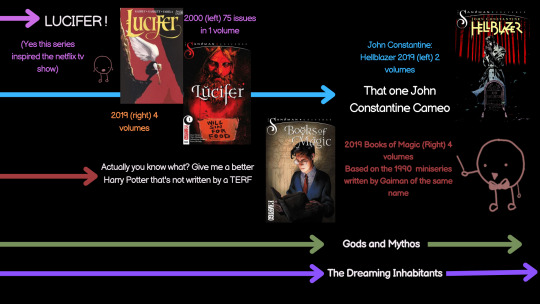
[Image 6 ID: This slide has predetermined answers to the question of “What did you enjoy most in the original series?”. The first directional arrow answers with “LUCIFER!” The original poster recommends Lucifer (2000) that is 75 issues in one volume and Lucifer (2019) in four volumes. Both images of the covers are included with lucifer on the front bent over and then holding a sign. A purple circular character with their mouth open says “Yes this series inspired the Netflix tv show”. A blue arrow answers with “That one John Constantine Cameo”. The cover is included with John Constantine smoking on the front. The original poster recommends John Constantine: Hellblazer (2019) in two volumes. A Red arrow answers “Actually you know what? Give me a better Harry Potter that’s not written by a TERF”. A red circular cartoon character with a bowtie and a pointer recommends Books of Magic (2019). The lead protagonist, Timothy Hunter is on the cover holding a large open tome. The red character says “Based on the 1990 miniseries written by Gaiman of the same name.” A Green arrow and a purple arrow with the options “Gods and Mythos” and “The Dreaming Inhabitants” are included and continue on the next slide /.End ID]
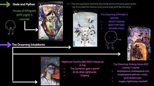
[Image 7 ID: This is a PowerPoint slide that continues to answer the flowchart question of “What did you enjoy most in the original series?”. A Green arrow answers “Gods and Mythos”. The original poster recommends House of Whispers (2019) in three volumes. The cover of the first issue is included where a beautiful black woman stands in and holds up a mirror with a man inside it an a house in the background. The original poster provides a note saying “This one has divine feminine ™, family drama and some great queer representation. If you liked the Gaiman book Anansi boys, you’ll like this story”. A Purple arrow answers the question with “The dreaming inhabitants” which branches into three white arrows. The first arrow leads to the original poster recommending the Dreaming (2019) in three volumes. An image of the cover is visible with Dream and many inhabitants of the dreaming on the front cover spread around him. The author leaves a note saying this series includes “dream hopping. Giant moth baby. Absolute chaos”. A second white arrow leads to the recommendation of The Dreaming: Waking Hours (2021) with one volume. The cover is included and has Dream in the background with Lucien and Merv, and William Shakespeare in the foreground performing on a stage. The original poster leave a note saying that the story includes “Shakespeare, Shakespeare and Shakespeare walk into a bard… grad student pain. mages, nightmare and macbeth.” A third white arrow leads to the recommendation of Nightmare Country (2022) an ongoing series with four issues as of July 2022. The cover is included and shows the Corinthian in an American flag colored mask with his glasses partially removed. The author includes a note saying “The Corinthian gets a spin-off. So do other nightmares. Ongoing.” There is a purple circular character with a smiling face pointing at the Waking Hours cover, and a green circular character standing next to the House of Whispers cover. /.End ID]
[Image 8 ID: The slide is entitled “Congrats! You now have a good idea about where to start and what to read”. Next to this title is a teal circular cartoon that is smiling. The original poster includes a note that says “I could go into so much depth about why you should read it and why its great but its either do that or work on my master’s thesis and only one pays bills and its already 3 a.m. (frowny face).” A white arrow leads to a note that says “TLDR: THE ART IS GOOD, THE CHARCATERS ARE COMPLEX AND VOLUME TEN MADE ME OPENLY WEEP BECAUSE OF HOW GOOD IT WAS. IMACULATE ANTHOLOGY-esque STORY TELLING” a sub footnote says “I like this series so much I paid a guy for an advertisement of a sandman themed chess set that I have framed on my wall cause theres like no merch”. A green circular character that is smiling with a bowtie and pointer is standing next to the “preludes and nocturnes”, and “the dolls house” covers saying “season 1 of the tv show will be covering volumes 1-2 ish”. A picture of Morpheus in a panel with his hand outstretched from the comics is on the slide next to the “graphic design is my passion meme”. A large yellow crying emoji is on the slide with its hands in the air /.End ID]
#sandman#the sandman#sandman netflix#i spent an embarassing amount of time on this third grader presentation but my god i have feelings and i gotta share them#i dont care if this gets zero pickup i just remember when i was reading there was a lot of confusion about the order#morpheus#dream#sandman 2022
1K notes
·
View notes
Text
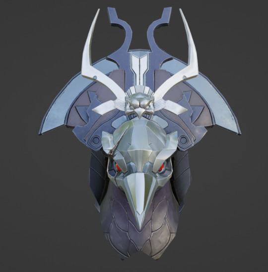
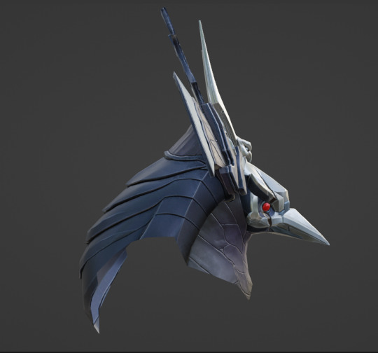
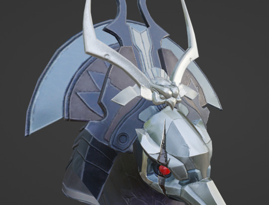
Metroid Dread Model Deep Dive: Raven Beak, Part 1
You know him, you've (probably) fought him, he's a staple of this blog...
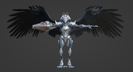
It's Raven Beak! We're finally doing this.
Today, I'm providing a comprehensive look into Raven Beak's model. I probably won't have enough space to cover the entire thing, as the image limit for Tumblr posts is capped at 30, but we're starting with the head and working our way down.
The rest of this post is under the cut for your convenience.
Navigation:
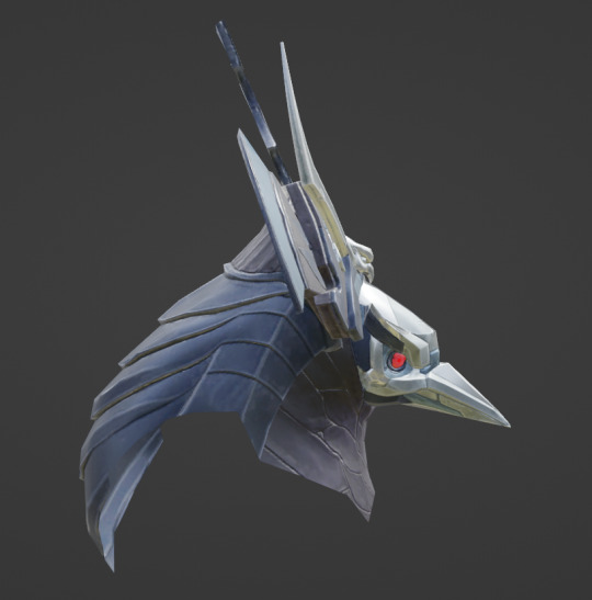
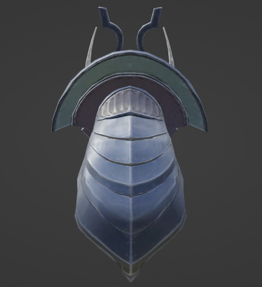
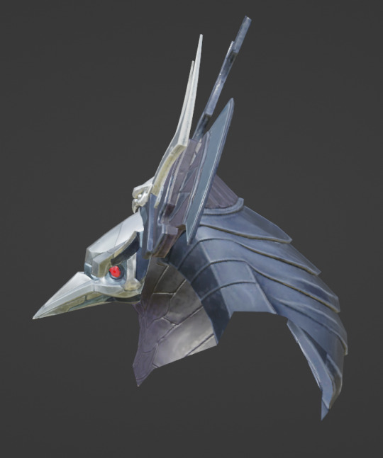
Fullbody turnaround and helmet meshes
Helmet details
Shoulders, arms, and hands
Arm cannon
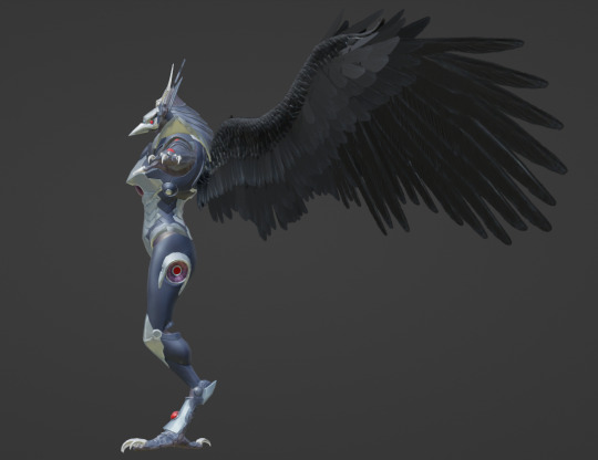
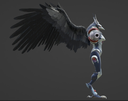
Wings and torso
Legs and feet
BONUS: Naked head

Raven Beak is referred to as chozocommander in the files: his textures are abbreviated to "commander[whatever]" in the files, with the name of a mesh or general purpose specified in the square brackets (commanderbody, etc). Raven Beak appears in three maps: Hanubia, Artaria, and Itorash. As Metroid Dread's cutscenes are executed in-engine, his model can be extracted from the map packages for the aforementioned regions.
There are several models linked to him during cutscenes that aren't part of his base model: chozocommander_arm, chozocommander_face (appears in Hanubia and after the mask breaks in Itorash), chozocommander_wing_r (which he rips off during the cutscene preceding phase 3 of his fight). chozocommander_arm is a more detailed version of his left arm that exists in the actor files for both Artaria and Itorash, the two zones where a cutscene involves the camera getting close to his arm while he chokes Samus out.
With that out of the way, our first order of business is his helmet, and there's a lot to look at.
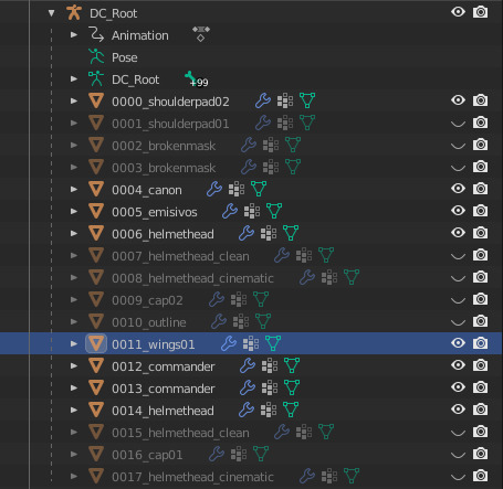
Here's a list of all his meshes. We'll go over each part as they become relevant. Relevant to our current objective is helmethead, helmethead_clean, helmethead_cinematic, and brokenmask.
You'll notice that each of these have two meshes to their name. The names that are lower on the hierarchy are the actual helmets, and those higher on the hierarchy are overlays for the eyes to make them glow.

Here's what that looks like without scene lighting:

With the overlay...
... and without the overlay.
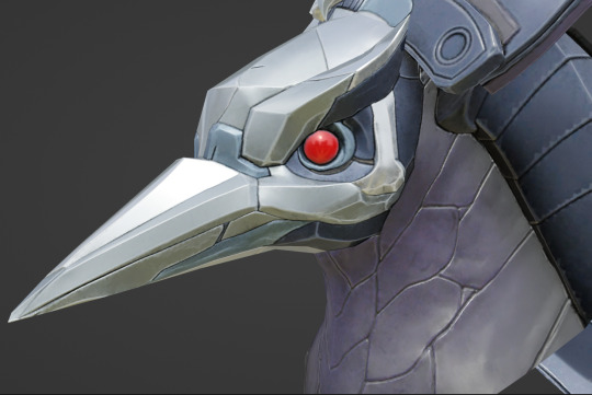
helmethead_clean features Raven Beak's helmet without the crack from the Super Missile: this is what we see during the opening cutscene in Artaria.

helmethead bestows the crack over the right eye.
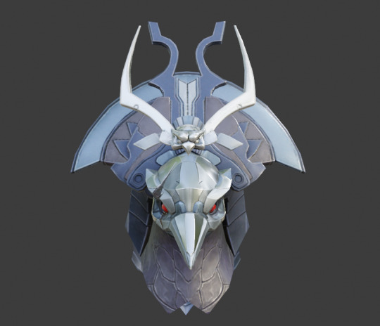


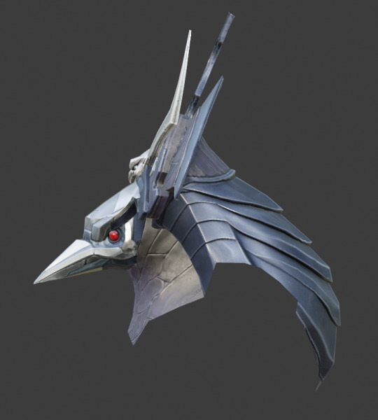
Of all the helmet meshes, the cinematic version is the cleanest and most detailed: this one is used during parts of cutscenes where the camera zooms in on Raven Beak's face.

I'll be using this model to explore the smaller details.
All helmet meshes except the broken mask have their own textures: the broken mask uses the basic helmethead's textures.

brokenmask (left) and brokenmask01 (right). These are used to animate the sequence where the helmet breaks in the post-boss fight cutscene.


Earlier, I mentioned that the cinematic mesh is cleaner than the others. The textures and geometry on the cinematic mesh are crisper and more defined because it's used when we want to get a good look at his face: you don't need to see every plane of his beak in high definition during combat.
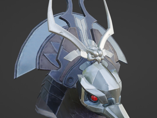

Here's a closeup of each primary model for the helmet to demonstrate. From left to right, we have helmethead_clean, helmethead, and helmethead_cinematic. helmethead_clean appears to have the lowest clarity in its textures. helmethead is passable, but the planes on helmethead_cinematic are leagues cleaner: there's very little artifacting (the janky crunch affiliated with lower quality jpgs), the colors appear richer, and effort was made to define the negative space.
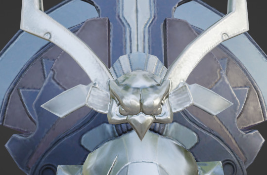
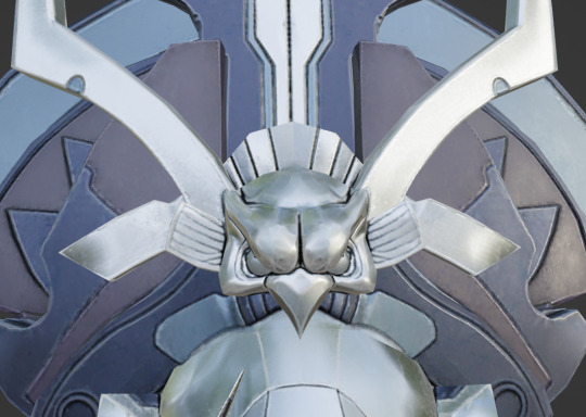
Look at the owl-shaped crest in the center of the headdress (helmethead left, helmethead_cinematic right): there are darker lines between the arch behind the head, and care was put into darkening the spaces between the eyebrows, around the eyes, etc.
I've already hit the image limit, so we're going to examine the details on his face even further in another post: I've waited so long to share all the little differences between these helmet meshes in excruciating detail, so I suppose it's only fitting that our first entry is more about that than it is showing off the finer details of the headdress and mask themselves.
I would not have been able to dive this deep a year ago when the image limit was capped at 10. I hope they increase it further so I can inflict you with more model facts.
I am working on the second post. The navigation section at the top of the post will be updated as things go live.
#raven beak#chozo#metroid#power suit#metroid dread#blender shenanigans#model refs#metroid dread spoilers
78 notes
·
View notes
Note
hello! i love your gifs. how do you make them look so good? what settings do you use in photoshop? i'm a beginner when it comes to gifs and i could use some help!
How 'bout go fuck yaself, huh?!
Just kidding. Hello! Thank you for the message, I am easily swayed to do anything in the name of praise. Before I get started, although by the time you've read this I've already finished, feel free to IM me and I would be happy to very finely detail explicitly how I do things for anyone with the nose for knowledge in GIF making.
The first and most important thing is to capture whatever you can in as high as quality it comes in. 720p? Don't even waste my time. So anyways, you've got your crispy beautiful animation imported, it's time to resize it.

The two important things are to go slightly over the final canvas size you want (500px wide) and to adjust the resample to Bicubic Sharper (or Bicubic, I don't notice any difference). I'm sure it's not universally the best option to use Bicubic Sharper but I've never bothered double checking.
Then adjust the canvas size, knock off at least 2 pixels to trim a pixel from the top, bottom, and sides of the GIF. Since GIFs are binary with their transparency, when you resize it the edges can get ugly-looking as some pixels are 100% opacity and some are 0% opacity, that's why I crop that extra pixel from each side. I happen to be using a pretty poor example with my Slam Dunk GIF I'm making since it's not a standard 16:9 ratio, so mine will actually be cropped to 500x268 instead of a standard 500x280. If you're working on something that's 4:3 which is like old school anime style, crop it before adjusting the image size so it's 1440x1080, then resize it and it should be 502x377, to which you would then crop it to 500x375. I actually often crop even wide screen things to a 4:3 ratio because it's usually just unnecessary space on the sides and it makes our focal point pop more!
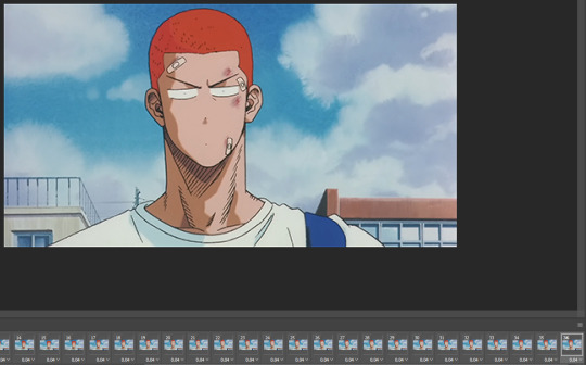
This is less relevant with digital animation, it's much cleaner and doesn't have as much noise, but if we're in our hand-drawn era, frames be shakin' and grainy! We only have 256 colours so any non-vital frames should be removed so they're not hogging up our sharp colours. I have quite a small GIF here, 36 frames is no big deal, so the quality won't be necessarily important, but if you're doing something that's 200 frames it'll definitely losing a bit of colour and wasting a tonne of space.


Again, a tiny 36 frame gif isn't the best, but by picking out shaky frames or ones that have blips you can see a bit of a contrast difference specifically in the clouds in this example thanks to having those extra colours, and the start of the GIF doesn't shake as much. The first GIF is also twice the size (1.92 MB vs 954 KB) which means I could make a GIF twice as long with doing this before worrying about size issues. This is what my final timeline looks like:

Beyond that, I wouldn't really do anything. I specifically adjusted each frame to match the original speed just so they would sync up the same for my comparison but normally I would have just re-timed every frame to be 0.12 seconds and adjust it using my own personal eye test to see if I think anything needs to be sped up or can be cut out even further.
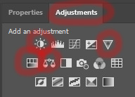
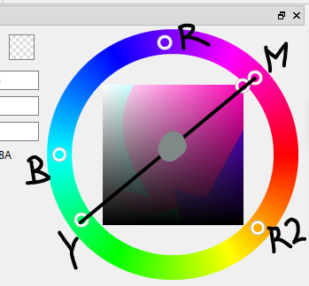
You can also add some overlay adjustments if you want, depending on the show I'll bother with that but usually it affects the quality, but dark scenes can sometimes need it. The only four I ever touch are brightness/contract, vibrance, hue/saturation, and colour balance. I don't have any specific numbers I use, I just slide them around until I'm happy with the result. Ultimately, I like to just keep shows as they were originally because my main goal is archival of things I like, but it can be nice to add some pop with brighter colours on shows with a dull palette.
But yeah, feel free to message me in IM if you want more help. I'll help with a specific GIF so what I've said is maybe a little easier to understand how to apply things. There's lots of more other things you can do if you are more dedicated like blurs and sharpens but I don't really bother with that anymore.
#i'm very tired so i tried to proof read but am giving up half way#my eyes can't manage any longer#hopefully this makes sense
10 notes
·
View notes
Text
uggggghhhhhhhhhh i need more gentle ryou (looks at wip) and im Not creating it (aaaa)
i know that none of the ryomomo past interactions were shown and his backstory was not explored at all, and it really works as a story choice to keep him detached from the rest of the cast, alienated from the emotions they share (which is also detailed in how he has zero empathy) BUT i would die for even one scene of their interactions in the past
because it's interesting to think that their relationship kept escalating until pt 3 came and Oh, Momo is still in Re:vale? which is a plot drive for Ryou to start his plan of destroying idols.
who else for would he wait 5 years? WHICH IS OH LORD . THAT IS SUCH A CONTRAST TO THE YUKI/MOMO PROMISE. if for Ryou it was five years of inaction, stagnation, as they kind of just were friends (to not assume sex/romance, which i always do but its half-relevant here specifically), with Yuki it was five years of uplifting each other and reaching new heights, hence their popularity in spite of their small agency, and IT'S ALSO DETAILED in Re:vale (as mentioned by Yaopapa) having more of a "grounded" image, of idols that are closer to people, more earnest and sincere, which draws many different people in. the whole concept of Re:vale goes against Ryou's lack of emotion, lack of connection with others, be it friendship or simple relatability.
and to think that Momo was kind of between FUCK LET ME SHOW YOU IN COLOURS BECAUSE THEY BROUGHT IN COLOURS INTO THIS TOO
SO HOW DO I EXPLAIN IT WITHOUT SOUNDING LESS NORMAL THAN I AM.
From the cards in the game the takeaway is Red = Shout, Green is Beat, and Blue is Melody. (i have zero skills to articulate that into emotions expressed by people, but go off the feels please this will make much sense probably later)
Yuki and Momo are polar opposites, they lack that which the other can help them with (Yuki has no red colour in him, which is mostly what Momo has, Momo has no green colour in him, which is mostly what Yuki has). When they meet halfway, they create a harmony, that which is gray and calm, and when they sing, they blend into an explosion of both of them, together like patterns of vivid colours.
And the person closest to Yuki is Banri, with his colour that has equal parts green and blue, and less red, WHICH IS REFLECTED IN HIS PERSONALITY, and that's why Momo is much better fit for Yuki, and that's why Banri looks after Momo too.
AND THEN WE HAVE RYOU AND I'LL USE TWO COLOURS BECAUSE THERE IS NO COLOUR THAT IS HIS (since he has no idol image)

it's not getting more clear is it
We have purple, that which is dull and bordering on grays. perfectly balanced (lists his own talents and skills) and nothing special (hated and overlooked by family) at the same time - that is Ryou, and we have Momo, full of red, full of Saturation and Contrast, someone that Ryou spent five years with, albeit their time together got shorter and shorter ---------- When we're talking about these five years, I like to imagine Momo having No Colour, and as time goes on, it starts showing up on him, and Ryou sees that the distance between them is far more than it was.
BECAUSE WHEN YOU OVERLAY RYOU AND MOMO'S HAIR COLOURS, YOU GET THIS. Momo is closer to Yuki and Banri colour-wise, and Ryou is there, near, too. And seeing the dynamic between Yuki and Momo, the obviously better matchup they have, starts escalating what Ryou and Momo have -- into resentment, hatred, expectations not being met, and it hurts both parties.
And when we move past part 4, we have Ryou's second colour, which is his eyes, and most importantly, probably his true colour (like Momo's colour being his eye colour also). Not only is it "past" Momo (thinking about moving clockwise, as time goes on), but it's also perfectly inbetween Re:vale. Rather than being in the idols' way, he is now standing as an observer (it's his Eye color after all of course it's about observing)
Not only that, but you can also see with this colour choice that he has pulled himself upwards, more saturated and bright, closer to Momo, but not near. It's also worth noting that the colour has lots more red and green in it than before (Re:vale influence + ZOOL, Haruka esp since he's green, and most ZOOLs having somewhat of a red-ish orange-ish brown-ish colours you get me?????)
And with that, I say,
I truly need more gentle RyoMomo
1 note
·
View note
Text
How TikTok Is Reading Your Mind Whiteboard Friday
Explore the role of demographics, engagement, and personalized recommendations in how TikTok surfaces content. Discover how TikTok attempts to avoid echo chambers and gain valuable insights into its inner workings. Dive into the fascinating world of TikTok's algorithm in this new Whiteboard Friday episode with Lidia Infante!
Click on the whiteboard image above to open a high resolution version in a new tab!
Video Transcription
Howdy, Moz fans, and welcome to a new edition of Whiteboard Fridays. Have you ever felt like TikTok is reading your mind? It's just an algorithm. My name is Lidia Infante. I'm the Senior SEO Manager at Sanity, and I'm going to talk to you about how TikTok offers you the videos that you like.
What do you like?
The very first thing they're trying to do is to show you videos that interest you. They're trying to keep you in the app as long as possible. So they need to figure out what you like. How are they going to do it? The moment that you sign up, you provide some demographics data. Your age, your gender, where you're signing up from all gives TikTok enough information to start assuming what your interests are going to be and populate your For You page.
Out of that first For You page, the topics that you engage with or don't engage with are going to give TikTok the information about what you might enjoy seeing on your For You page. After that, they're going to try to find related topics to the ones that you have expressed an interest in. For example, I really like cross-stitching.
It's not difficult to assume that I also like interior design or flower arrangements, which I do. TikTok shows them to me, and I stay on the app much longer than I should. Another point of information is your followed profiles and the topics that they talk about or that they are interested about. Your Discover tab behavior is a very strong signal for TikTok too.
What that means is when you search for a hashtag, click on a hashtag, make a TikTok search, search for a user or a trend or a TikTok sound, that's all giving strong information to TikTok about what you like because making a search or diving deeper into the content of a sound is much more complicated behavior than simply just scrolling past on your For You page.
What is the video about?
Now that they know what you like, they know that they can serve you videos about it. But first they need to understand what the videos that they have in the database of content are about. To do that, they're going to use the visuals. So literally TikTok can "see" with the visual AI the content of your video. What are the objects that are in there?
Are there faces? What are the emotions of the faces? Is there a dog? Is there a chair? They're going to be able to see and process all of that. Another strong signal is going to be the text overlay that you put on your TikTok video, if you have any notes or any content put on there or if you're manually inputting the captions. The audio on your video is very relevant for TikTok to understand what the video is about, and by audio I don't mean TikTok sounds.
We're going to come back to that. I mean the actual voice, the words that you're saying or the ambient noise that sets the location of your video. The captions and hashtags that you use in the video are very relevant and help TikTok understand what it's about as well. When you are done with creating your video and you start typing it out, when you create the cover for your video using the TikTok tools, that gives TikTok that level of information.
Then we've got the TikTok sound. If you're using a TikTok sound that's related to a trend or to a topic, it also gives TikTok the information about what your content is, what the emotional tone of your content is, and so forth. All of these elements, as a hardcore SEO, are what we would treat as on-page SEO but on the TikTok side of things.
Is the video any good?
Now they know what you like, they know what their database of videos are about, but they also know that they have a limited amount of time for your attention. So they're going to want to show you only the best of the best of their content. They're going to have to understand if the videos they've got are any good. How are they going to do that?
They're going to be using, amongst other metrics, engagement. So the engagement of users that have expressed similar interest to yours are going to help TikTok predict your potential engagement and how much you're going to like the video. They're also going be favoring native content creation. So any video that's being created directly from TikTok using the TikTok tools is going to get a little bit of a boost.
The language that the content is in is very relevant too. When signing up for TikTok and creating your profile, you state what are the languages that you speak and what is your preferred language. TikTok can also understand this based on your behavior. Then the device that you're using and the strength of your connection also help TikTok serve you lighter videos and shorter videos when you're maybe on a train or don't have as good connection to actually have a good viewing session.
What isn't eligible "For You" page content?
There is some stuff that TikTok does not want to see on their For You page. Any content created by a user that has stated that their date of birth is under 16 is not going to be eligible for the For You page. So if you're trying to be cute and giving your brand account a date of birth of when it was founded, don't because nobody is going to see it.
They're also quite strict with QR codes. They don't want to see any QR codes in there because of safety reasons. You don't know if that QR code is going to take your users to a spam website or a dangerous website showing porn or violent content. But also they don't want to miss out on the affiliate marketing payout that they get when you shop directly on the TikTok Shop.
Any dangerous or violent behavior is also not accepted or eligible for the For You page. So unless it's tagged as done by specialists, don't try this at home and so forth, it's not going to show up. Engagement bait content is also not eligible for the For You page. So content that tries to trick users into engaging with it without them actually naturally wanting to engage with it is going to be demoted from the page.
That type of content is like when on Instagram we used to see posts that said tap twice to see some magic, and the only magic is that you had liked the post and increased the engagement of the brand. That is the type of engagement bait that's not acceptable on TikTok. Another thing that they don't accept on their For You page is any content that shows tobacco products.
Is TikTok capable of breaking bubbles
TikTok wants to show you videos that interest you and keep you in their platform, but they're also trying to not generate an echo chamber for you. Echo chambers are a very real risk of any recommendation algorithm that's based on interest and engagement, and we have seen a rise in radicalization across different populations because of this.
The way that TikTok is trying to address this problem is by offering random content of random interests, random creators that you've never seen before on your For You page. Initially, they said they were doing this about 10% of the time, but there aren't any current numbers about this activity. This is not enough to remove echo chambers because of the psychological effects of familiarity and their exposure effect.
Once you see something that does not quite fit right with your For You page, you're very quick to scroll. It is a similar phenomenon to banner blindness when we are going around the website. We kind of know what an ad looks like, and we don't even look in that direction. It's a similar effect.
So it is not enough, but one must appreciate that they're trying. If you have found this interesting, you can catch up with me and my content on Twitter @LidiaInfanteM, on LinkedIn looking for Lidia Infante, or on my website lidia-infante.com. Thank you for watching.
Video transcription by Speechpad.com
0 notes
Text
Sound Research
I've started thinking about what sound I would like to have playing during my type animation and whether I'd like to record it myself or insert copyright free sounds I am able to download from the web (that is relevant to my video footage and words of my pepeha/whenua in the animation).
I'd say the mood of my animation is quite peaceful and relaxed, so to go along with that atmosphere and my visuals I think dynamic sounds of nature like wind, rustling leaves/branches, birds, even rain will align well and support my animation. If I am unable to record sounds myself that I'm happy with then I know I have the option of using already generated sound.
If I were to add downloaded sound I think I'd add it after I completed everything else as I think it'd be easier that way? I'll ask for another opinion in class next week and report here.
(edit 25th May) I'd like to have a continuous play of the same sound file playing throughout the video as I think it would create a nice peaceful flow between frames. this will either be from the internet or recorded by me (someone quiet with trees, wind, and birds and maybe the bustle of people too).
(firsthand creations, attribute sound, royalty free music)
Movement
Emil suggested because I'm intending to overlay my chosen text and sentences over video footage, it would be helpful to use a tripod when recording my video unless I'm able to hold a very still grip on my camera (iPhone) to prevent interruptive shaking and ineffective capture of the subject matter (trees/roots, rustling leaves, swaying branches). Emil also encouraged me to record in early hours when daylight is the clearest and taking advantage of the disruptive weather of Auckland, using the wind movement and it's amplified sounds. The wind will also help to avoid the overlay appearing as a near still image, wind helps motion therefore emotion.
0 notes
Text
SUMMARY OF TWO PIECES
Piece 1: Digital Painting
This piece of artwork was created for the FMP of my first year in my Level 3
Graphic Design course. The theme for my FMP was: SIB (Self-Initiated Brief)
Meaning that there was no set theme for this project, I chose my own. I chose
To base my project on the subject of: People. To work with this theme,
I researched human anatomy (and how to stylize it) as well as different poses,
Body types, and artists whose work focused on people.
To create this piece, I first started with sketching thumbnails and ideas into
my sketchbook, toying with many different poses, ranging between simple
and complicated, trying to see what fit the style I wanted to work with.
(Basing my style on the artist known as FeeFal, who I researched heavily.)
After finding an idea I liked the feel of, I scanned the sketch onto my
Computer. To illustrate my piece, I used a digital programme known as
KRITA, which I have used for years now. After playing around with colour
Palettes for a while, I settled on a blue and purple based colour scheme, using a white to highlight my focal point. To create my background, I collected a collage of my friend’s eyes, combined them and overlayed them with a brown colour, before adding it to my background and finishing my piece!

These pages were created as research for my SIB. To make my pages look
Interesting and put together, Included the Brief for our project (what was needed to Successfully create pages leading up to Final works.) My method for my Pages was to write out my proposal, which described what I wanted to achieve in my project.) I then sketched out some Relevant images (using references) and then coloured these sketches using
Watercolour paints and Crayola Colouring Pencils. As I am not normally a realistic artist, I attempted to combine both a realistic style with my own personal style, which created a page spread that I came to be very proud of.

0 notes
Text
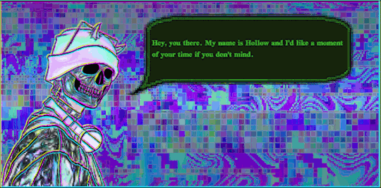

[image ID;
Four gifs that are largely laid out the same way; a pastel holographic skeleton with horns, a beanie, metallic jacket, and headphones around their neck, to the left of the screen on a pixelated background in blue, green, and purple tones. The skeleton is turned to face the viewer, a dark green speech bubble with bright green text hovers up and down beside their face.
The text is all that changes between these images, and reads as follows:
"Hey, you there. My name is Hollow and I'd like a moment of your time if you don't mind." 1/4
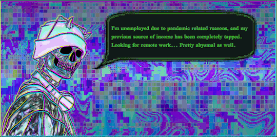
"I'm unemployed due to pandemic reasons, and my previous source of income has been completely tapped. Looking for remote work... Pretty abysmal as well." 2/4
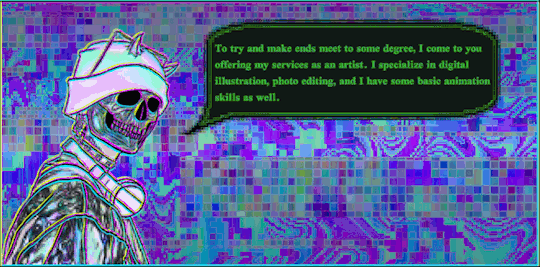
"To try and make ends meet to some degree, I come to you offering my services as an artist. I specialize in digital illustration, photo editing, and I have some basic animation skills as well." 3/4
"Let me show you what I have on offer... " 4/4
/end iD]

[image ID;
The same skeleton from before, now in front of a semi-transparent blue background with pink trim overlaid on top of the pixelated background. The hovering text bubble has moved up to beside their horns, and has become slightly smaller.
To the right of the scene, a squared image cycles through five stages of a piece, starting with a basic sketch then going to color, inked, full render, and ending in render with background.
The text in the speech bubble reads
"Shot from the shoulders up, either front-facing or 3/4 view. Alternatively, a 1600x1600 piece of your proposed concept."
The text on the price table reads as
"Basic Sketch: $6 (+$5 Extra Character)
Color Sketch: $12 (+$10 Extra Character)
Inked: $20 (+$15 Extra Character)
Full Render: $25 (+$20 Extra Character)
Render & BG: $35 (+$25 Extra Character)"
/end ID]

[image ID;
The same format as before, with a mid-body art example cycling through where the portraits had been previously, with the title "Mid-Body" in pink text above it.
The text in the speech bubble reads
"Shot from the waist up, either front-facing or 3/4 view. Alternatively, a 2600x1600 piece of your proposed concept."
The text on the price table reads as
"Basic Sketch: $10 (+$8 Extra Character)
Color Sketch: $20 (+$15 Extra Character)
Inked: $30 (+$20 Extra Character)
Full Render: $40 (+$25 Extra Character)
Render & BG: $50 (+$30 Extra Character)"
/end ID]
[image ID;
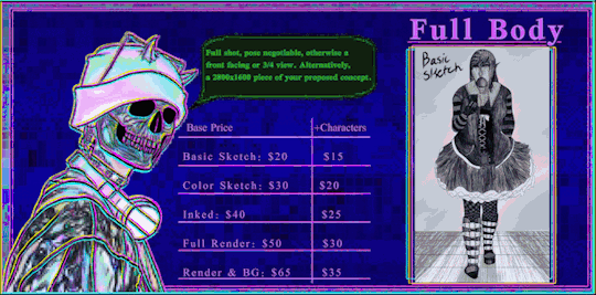
One more image in the same format as the last two, with a full body image cycling through examples with the title "Full Body" above it in pink text.
The text in the speech bubble reads as
"Full shot, pose negotiable, otherwise front-facing or 3/4 view. Alternatively, a 2600x1600 piece of your proposed concept."
The text on the price table reads as
"Basic Sketch: $20 (+$15 Extra Character)
Color Sketch: $30 (+$20 Extra Character)
Inked: $40 (+$25 Extra Character)
Full Render: $50 (+$30 Extra Character)
Render & BG: $ 65 (+$35 Extra Character)
/end ID]

[image ID;
The backdrop has changed to pink lines with pink text resting on top of the dark blue overlay.
The speech bubble reads
"Naturally, there are boundaries and other things you should know..."
The pink text reads
"Payment via PayPal
Delivery in 3-6 weeks
Delivery via Email
Relevant progress updates
No explicit sexual content. Suggestive and/or lewd art is acceptable.
Must be 18+ to commission NSFW content. Minors who try anyway will be ignored.
Any project may be turned down for any reason, be it discomfort or inadequate skill to deliver.
Final product will be shared across the social media platforms unless specifically requested not to.
No refunds unless the project cannot be completed."
/end ID]

[image ID;
The speech bubble reads
"Here's how you can contact me, as well as other places you can support me."
A page of different icons now rests on the blue overlay. Three small icons with text beside them, and three large icons across the bottom.
The three small icons are an email icon, the discord icon, and the tumblr icon, respectively. The three large icons are for Threadless, ko-fi, and bandcamp, with the avatar icons from the relevant accounts beneath the titles.
Email: [email protected]
Discord: vaporwavelich#5675
Tumblr: @vaporwavelich / @absolute-eyesore
Threadless: thepolyesterfriends
ko-fi: vaporwavelich
bandcamp: thepolyesterfriends
/end ID]

[image ID;
A final image, returning to the appearance of the first four with just the horned skeleton on the pixelated background with the large speech bubble beside their head.
The text in the bubble reads
"Thank you very much for your time. Please, if you are at all able, feel free to message me to inquire about a commission. If not, reblogs help to boost my reach. Stay safe, and have a good evening."
/end ID]
further examples of my art skills can be found on this blog. 100% of the glitch content that comes from here is original content, including the photos being edited. the images in this post are an example unto themself. as well. as you can see, i put a lot of work into the content i produce. contact me for something and you're sure to get your money's worth.
#long post#commissions#described#described image#described gif#descriptive text#commissions open#commissions post#commission info#art commissions#digital art commissions#ko-fi#threadless#bandcamp#absolute-eyesore#vaporwavelich#glitch art#skeleton#vaporwave#vaporwave art#animated#animated art#gif art#glitch aesthetic#pixel aesthetic#queer artist#survival commissions#emergency commissions#eyestrain#eyestrain art
45 notes
·
View notes
Text
Sims 3 Specular Maps
So... everyone knows sims 3 creation tools aren't the best when it comes to technical side, but another reason why people have problems with creating things for sims 3 is because of lack of proper documentation and tutorials.
I plan to change all of this over certain period of time with information and tutorials regarding sims 3 CC creation, all fully laid out in one place, this tumblr page.
I will start with how specular mapping works in sims 3.
What is a Specular Map?
Specular map, in any game that uses them, not just sims 3, serves to determine how shiny/reflective parts of an object material are. The more bright the map texture is, the more reflective corresponding part on the object will be.
This is an example of a sims 3 specular map:
So... Dark areas, less reflective. Bright areas more reflective. Now that we have this established... how do these maps work in sims 3?
Object Specular Maps
Object specular maps have two separate data sets:
- Actual Specular Data (Color/RGB channels)
- CAST (create a style)/Object Specular Separation Data (Alpha channel)
Actual Specular Data is basically fulfilling a purpose of a specular map. By using Color/RGB Channels, you can determine where the most reflections will be and where there won’t be any.
But it can also determine the color of reflections. If you color the specular map in red, the reflections will be red. If you color it in gold, reflections will be gold.
This allow you to have some parts of the material look like actual metal in the game.
Sadly, changing the color of the material in game, doesn’t change the color of the reflection that you defined with specular map. You would usually only do this if you had an overlay texture that you can’t change color of in game, so metalic reflection color will always match the base material color.
It is important to note, however, that the actual reflection intensity doesn’t necessarily depend only on this part of specular map data. It also depends on...
CAST/Object Specular Separation Data, which exist because of how reflections are calculated in game.
Every Create A Style material has it’s own specular map. This map is then combined with your objects base specular map to determine final reflectivity of the objects material.
That is, if you set yor specular map Alpha/Transparency Channel under a certain value. But if you go over that value, then your material specular won’t be affected by CAST material/pattern specular map, and will have it’s shine intensity exactly how you defined it in Color/RGB channels.
Here are visual representations of values to closer depict how this looks:
- CAST Material with very dark specular map:
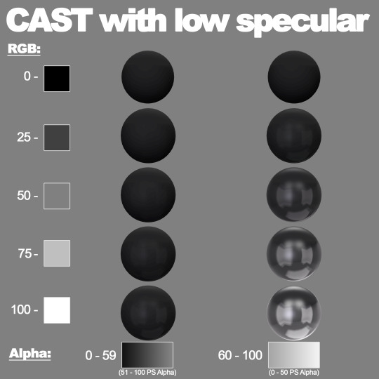
- CAST Material with medium specular map:
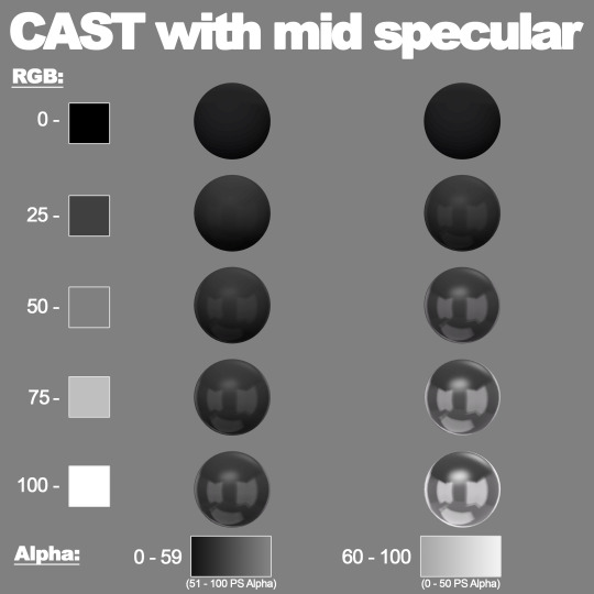
- CAST Material with fully bright specular map:
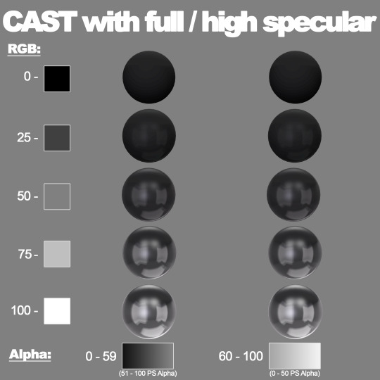
And here is a closer depiction of how it works in conjunction with detailed CAST material specular maps ( CAST Material VS Object Material ):
It is also important to note that when you edit the Alpha Channel in Photoshop, values will be different. I made sure to include those as PS Alpha in the images
Those are actually the true values the game makes disctionction between when reading this data. It seems that the border between two different states is 50% value.
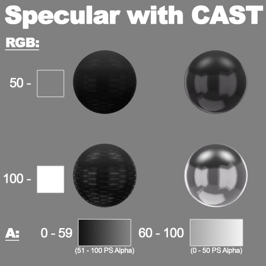
Clothes Specular Map
Sadly, Clothes Specular Map doesn’t work this way. No matter the Alpha channel changes, clothes specular/reflectivity can’t be affected by CAST specular map.
So how you make your specular map in Color/RGB channels, that’s how intensity will behave in game.
Alpha Channel is completely disregarded and useless in this context.
Only relevant data in this case is Color/RGB channels.
For the end, here’s a little hint on what my friend and I have been working on for the past two months:
#sims3#thesims#sims cc#simscc#thesimscc#thesims3#sims cc creation#sims custom content#sims 3 custom content#ts3#ts3 custom content#ts3cc
121 notes
·
View notes
Text
i have my Big appt w the Gender Doctor tomorrow... I've already had my letter and my "diagnosis" (fun fact: they actually asked me if it was ok to diagnose me w dysphoria or w/e, they seem to be aware of the controversy around pathologising language) as well as gotten my levels checked.. i am pretty sure this is the last thing is this big visit where he has to explain everything incl needles, get my consent, and all that shit
soooo... I think im about to start T????? scrreeeeee
lil rant about my nervs under the cut
im very nervous, more about my pharmacy & my family than anything actually related to T. ive had issues w the pharmacy just trying to get my birth control and normal meds (like they'd give me my meds but would straight up "forget" my birth control... very relevant: we have about 100 fundie churches in this town and some actual bona fide fundamentalists cults as well. its not a large town). plus theyve been constantly understaffed and have taken up to a week to fill my scripts. my friend a few towns over gets his stuff from WG and sometimes they give him the wrong needle sizes which seemingly is smth that happens to trans folks a lot... i am prepared to switch pharmacies and/or go running to corporate like a Karen if they give me issues, but i've never had to switch from walgreens before (only to a different wg?) so idk specifically what to do if that's the case
but anyway yeah. lil worried about pharmacy giving me the runaround. and a lil worried about my moms reaction. even tho she's been nothing but supportive, it still seems to surprise her when i talk about being trans. if I make a joke about how trans I was as a kid in hindsight, she's wont laugh along, she's kinda just like 😳 😳 and goes on w her day. but other times she'll bring it up?? one time she said something about "when youve got your van and are transitioning" like she doesnt think I'm transitioning right now lol. i think she's gonna be surprised to find out that im starting T now but fuck I waited 15 years. aint waiting any longer.
its just like. there is a non-zero chance she still has ties w folks from the west mich womyns music fest (good fucking riddance). we actually had a huge fight once (yearrrs ago) bc even in the midst of them going under BECAUSE of their transphobia, she kept trying to get me to support them "as a feminist."
so despite how supportive she's been and that she is absolutely trying I can just FEEL that there are still reservations she has that she simply doesn't want to talk about. she's not gonna tell me what to do w my body or any of my medical care. I'm an adult, and that's generally the rule in our house, but idk it's like. this tension in the air. i think she still separates my "being trans" from "me" in her head, and i think she does it w other folks too (my parents are HUGE fans of Eddie Izzard, esp her Dress to Kill special from back in the day. and yet cannot wrap their heads around her being trans. she's been out for like. 30 years. she doesnt make a secret of it). i feel kinda bad saying it bc she DOES try. she actually corrects my pronouns (and Eddie's!) more than anyone else in my family when others fuck it up. I just don't think she fully understands why she's doing it and im not sure if she cares to. challenge her notion of what a trans person is?
idk its pretty obvious when cis ppl are doing the whole "her > no, i have to overlay an image of a boy on the body that I am seeing bc You Are A Her Who Wants To Be a Him" or vice versa, instead of just "You Are Him". it's like they're trying to translate me into a different language without changing the words. does not compute.
ughhh idk. anyway i am just hoping that she can see how much of a change it makes for me and sees me being happier and calmer and stuff. i already have been WAY more chill even in the last 2 years just since being out. i think that it will make it easier for me to like. express emotions like love and gratitude? i think part of why i've always kinda felt stunted in that area or like I couldn't connect w my parents like I sometimes do w other people, was bc of being closeted.... if she sees me as an extension of herself, Her Daughter, and I cannot be myself fully and truthfully, how can i express my emotions fully and truthfully, they are a part of who I am? I've just been told many times by the world that expressing myself honestly makes other people uncomfortable... anger was the only thing i could reach for so long. oof.
its just funny (not ha-ha funny) how even after having a feminist mom who didnt make me dress girly as a kid; after having lived in a huge queer household; having almost exclusively queer friends for 10+ years; after having BEEN OUT in high school; and now, again, being in a supportive environment where everyone is trying to validate me... despite all of that I STILL find myself feeling guilty for transitioning, guilty for showing people who I am. wondering "Wouldnt it be easier if I didnt. Wouldnt it be better for everyone if I just let them think I was a girl. wouldnt it be easier to deal w my other medical stuff w/o being outed every time I go to a new Spectrum location. wouldnt it be easier for everyone who has to deal w grandpa right now. there's nothing wrong with being a girl. Maybe I could keep being a girl if I had to."
but i know that's not right. if I don't live my life at this point it will kill me faster than anything that's medically wrong with me. i am not a girl. trying to be a girl when I didnt want to be made me suicidal for years. it made me into a horrible person and informed all kinds of terrible decisions I wish I hadn't made.
i know that transitioning is the right thing. to be perfectly clear, I am nothing but excited about testosterone and ALL of the changes it will bring me, there is literally not a single one that I don't want, that I havent wanted with my entire being my WHOLE life. i know that i am doing the right thing because for the first time in my life these are choices I've made FOR ME, for no one else and for no purpose but for the joy and sense of peace and completeness that it brings me to know that I am trans.
my fear is that I won't be able to articulate that to other people. or that ill have 1 bad experience and regress to not being able to stand up for myself or w/e.
so yeah, nothing but actual love and excitement for my T appointment. im just outlining how much cis bullshit really ends up defining the experience of transition for so many of us, and how much anxiety and fear it can still impart. even when you surround yourself with queer and trans support, even when ppl in your life are being cool, even when you are SO SURE of who you are. despite all of that, I am still afraid I'll end up detransitioning because of other people's issues...
but tbf i kind of have this with everything. I move into a new place, it TERRIFIES me rather than brings me comfort. how am I going to lose this home, too, and how long do I have? i've never felt at home in my body before, and every time I thought I found/built a home, I lost it. I've been evicted and lost my housing so many times and... have kinda had the same thing happen w my body, in a sense. feeling like if I start trying to decorate how I want ill get in trouble somehow bc nothing good can truly last and there's always some higher authority to answer to... idk.
anyway I need a proper therapist obviously lmfao and I dont expect anyone to read this. to be clear I am mostly very excited and optimistc. just nervouscited u know what i mean
4 notes
·
View notes
Note
So what's your process for doing these?
First I scroll to the oldest requests so they get done first. I search for images based on what's immediately on my screen and work in "sets". So say I have 3 requests, each one character. I'll grab those pics, put them in my art app (IbisPaint X), save the result, then dump those requests into drafts along with the relevant picture. If it's one big request with multiple characters I'll just focus on that one.
Then when there's a good pile of drafts I'll start going through them and adding captions and tags. Once that's done they get moved to the queue!
---
If you meant the process of making the flags, first I picked a pokemon to represent the type as a whole (either a popular pick, a meme pick or one with a distinct palette). Then I picked how many stripes. I like symmetry and honestly the format of the trans flag is so pretty so I wanted to use that as my inspiration. Then I just colour picked until the flag looked decent, overlayed the symbols, and viola!
6 notes
·
View notes
Text
Story Process Tag by @herpixels
I was tagged by @dynastiasimss - Thank you so much for tagging me!! 😊💖💗
This will most definitely get a bit wordy because I’m terrible at explaining things concisely! 😂 Also, I’ll mostly be talking about my process for 2.B.A Grandmaster but I’ll touch on my process for Erin in San Myshuno too!
I’m also going to get tags out of the way up here so that no one has to scroll all the way through this ... absolute novel that is under the cut LMAO so I tag: @cyansimblr @x-simss @matchacake and any other simblrs who wanna do this!! and feel free to skip if you want!
1. Your writing process
My writing process is very, very chaotic, and changes with the wind... Erin in San Myshuno doesn’t really have a process, I just play the game and then put in some dialogue based on the events. None of it is guided by my hand at all though!
2.B.A Grandmaster on the other hand is written in part based on what happens in game and in part by my own creative vision. Most of the time, I let stuff happen, and then fill in the blanks in between events. I go in game, play Sims as I normally would (skill build, take care of needs, go out to venues, etc.) and then watch what weird and interesting things happen. For example, Augusta’s meeting with Xavier in the beginning was completely the game’s doing! He was the only one to show up for the Welcome Wagon event, so I rolled with that. Scenes like Kaitlin’s meeting with Maverick and those sort of things are planned by me, as they’re necessary to create a more full narrative! It’s like collaborative storytelling, but my “partner” is a game that is weird and random and crazy. 😂 After stuff happens in game and I get screenshots, I then actually write for it. I chose to write novel style for the series because - as some of my long-term followers may remember - I had another story that was just screenshots with dialogue on them? And it was very hard, LOL, it didn’t suit my workflow very well and I ended up dropping it after a month or so. I wanted 2.B.A Grandmaster to be something I could post consistently, and so I opted for a style that I was more familiar and experienced with!
2. Scene building
For the most part, I just work with what sims gives me, but as I mentioned above, some scenes I actually go to the trouble of setting up. For those, I still use the sims animations mostly (I’ve used poses about 3 times in 2.B.A Grandmaster so far) but I do usher my sims around the "set” as I see fit. I build a lot of my own lots and locations for 2.B.A GM because I tend to get a vision in my mind of what I want and refuse to settle for less. 😂 One such case is the scene where Maverick meets up with Octavia--
I made the alleyway we see here - it’s two entirely empty buildings sandwiched side by side on an otherwise empty lot in Oasis Springs. The only part I bothered to decorate was the alley itself because I knew I wasn’t going to use the rest of the area, but maybe we’ll revisit it sometime and I’ll finish the two buildings! I actually loved making this set and like how it turned out, LOL~
Then I just have whatever sims are involved in a scene interact with each other for ages until I feel like I have enough screenshots to make a scene. I usually have a vague idea of what’s going to be said in any given scene - especially the ones I actually planned out beforehand - but I get some excess screenshots to be safe. I try lots of different interactions and pause like every few frames to get interesting expressions and stuff, LOL. Lots of “Complain about Cold Weather” and “Give fake bad news” ...
3. CC/Pose making
I don’t actually make my own CC for 2.B.A GM specifically (I’ve made a couple eyeshadows but I don’t use them super frequently) but there is a scene coming up in the future that I plan to make poses for. I have a very clear image in my mind that includes a lot of subtle expressions and very specific things that I doubt I could find poses for, so I’m gonna have to brave the terrifying landscape of blender in order to make it a reality. 😧
4. Getting in the zone
I don’t have any sort of “ok, show time” ritual like some people do but I wish I did, because my motivation waxes and wanes so unpredictably. Some days I just don’t feel like doing anything, and other days I edit and write for 5 posts in a row! I am always listening to something though, usually music, every once in a blue moon a video with lots of talking.
5. Screenshot folder
UGH...
6. Captions
I don’t do captions on 2.B.A GM posts, but for my city living gameplay I do!
I keep them simple, because I don’t want to make it too much work for myself. Erin in San Myshuno’s style of editing is 100% based around ease, because I wanted something to post often that didn’t put too much of a strain on me.
Verdana in white, typically 35-40 px, with a gradient border. Each sim we encounter has a different gradient color, usually based on their outfit or just the ~vibe~ I get from them. Erin’s gradient is Hot pink to ... gee, what would you call it. Sonic the Hedgehog Blue LMAO-- I chose that gradient because that’s the color of the overlay, which I’ll talk more about in the next section!
7. Editing
My two ‘series’ - and I use that term loosely LMAO - have different editing processes, so I’ll try to summarize them both. Basically, for 2.B.A Grandmaster, I touch up the saturation and brightness depending on the scene. If it’s evening in the shots, I usually won’t touch brightness, and if it’s night, I might even lower it a bit for more accurate lighting! Once that’s done, I blur everything but relevant elements of a scene, usually the character we’re following or who is speaking. I have to select the character from the background manually which takes a bit, but other than that it’s very minimal.
My shots aren’t super glamorous, but I prefer simple screenshots and actually being able to keep up with a story schedule as opposed to what happened with my last story. 😬
As for Erin in San Myshuno, barring captions which I only do when I feel it’s necessary, it’s literally just an overlay on otherwise untouched screenshots. 😭 I would do more, but again, it’s supposed to be an easy downtime sort of series for me so~
This goes over top all screenshots on the “Add” setting at 20% opacity. It brightens things up and softens them, as well as making the colors slightly more harmonious! If anyone wants me to go more in depth on editing, or maybe captions, please let me know! I’m happy to talk about it if it’ll help anyone, and I know that a lot of tutorials cover how to do stuff in Photoshop, whereas I use FireAlpaca (which is 100% free btw! It’s more of an art program, but not bad for editing)
8. Throwback!
Oh boy, so this is one of my first posts on simblr. For starters, I didn’t know about camera mode at the time, so that’s the first thing I would change obviously LOL. 😬 The framing I did at the time was ... cute, but it makes the pictures feel kind of cramped and small in my opinion, so I did away with that for all of my later stories. Also, Amy and Gemma aren’t very well centered in this picture! Other than that, this isn’t actually terrible I don’t think, so aside from maybe blurring the background as I do on 2.B.A GM now, I wouldn’t change too much! Thankfully, I had observed other people’s stories before making my own on here for a little bit, so I wasn’t starting with absolutely no idea what to do, but I still think I’ve improved since I made these. 😊
This was a ton of fun!! If anyone has questions or wants more info on anything I covered in here, absolutely feel free to ask, and thank you so much if you actually read through all of this - I know I rambled for quite a while!! 🙏
20 notes
·
View notes
Text
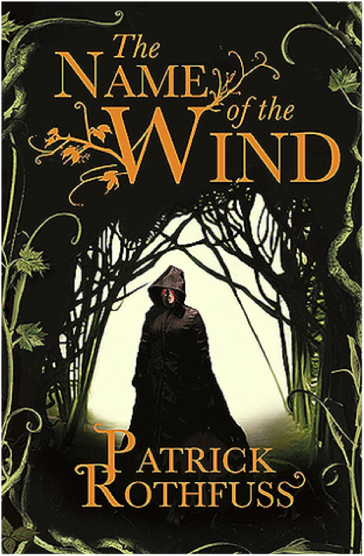
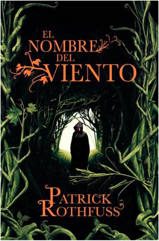
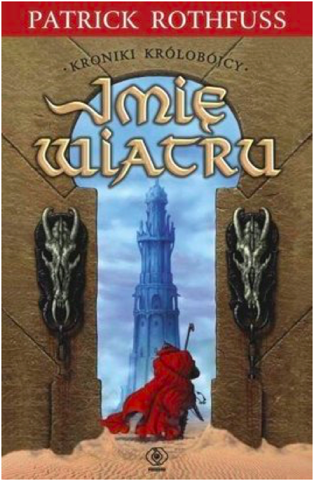
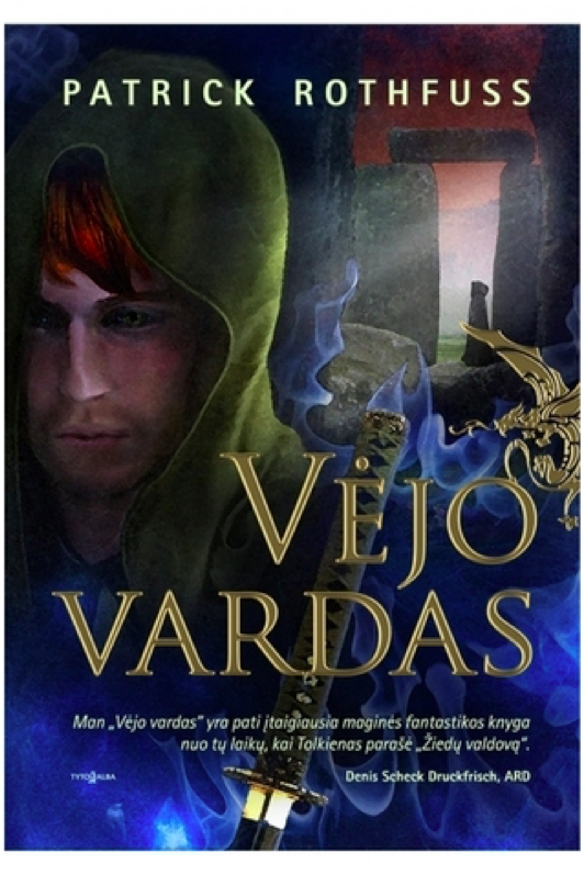
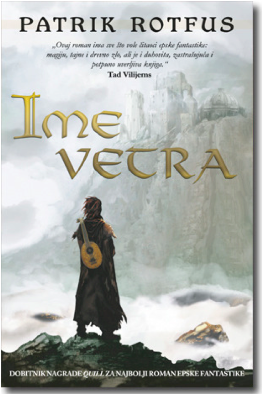
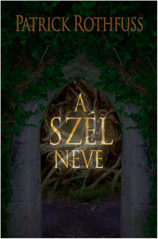
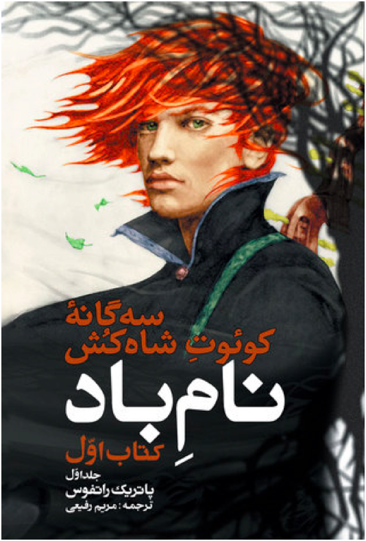
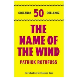
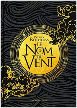
Rating Every Single Name of the Wind Cover
Why? Because I can. I am not a graphic designer, just a person with opinions.
Criteria for consideration: Must be a cover in a published edition of The Name of the Wind by Patrick Rothfuss. Hardcover, paperback, and ebook are all fair game, as are foreign language editions. Some editions reuse the same cover art, in which case I only rate one cover. Some editions modify cover art from another edition. If the differences are substantial, I’ll rate both.

Kindle March 2007 Edition
Ah, the famous shirtless redhead cover. This cover is a bit infamous in the fandom for being both bad and cringey. This is not good art. It’s cheesy. The shirtless aspect is silly, and the windswept hair is so windswept, you’d think Kvothe was in a tornado. Nice balance with the title and author text, although it looks like the title and author text are slightly off center.
3/10

Hardcover April 2007 Edition
This is just a zoomed in crop of the above cover, which is a little lazy. It does make for a better cover image, except the creepy goat man bust has nothing to do with the plot of Name of the Wind. So I suppose they cancel out.
3/10

Mass Market Paperback April 2009 Edition
I despise this cover. It’s a lazy design, and the photo manipulation is terrible. Points I guess for good title text placement. But the photo manipulation is so! So! Bad! This is also the start of the trend of a hooded, cloaked figure with his back to the viewer staring out into the void. It is a bad trend.
2/10
Paperback UK June 2008 Edition
We’re still with the hooded, cloaked figure, but at least he’s facing front this time. I like the embellishment on the ‘W’ in the title text, although it gets a little pumpkin viney. Overall, it’s an ok cover. It doesn’t make me cringe, but it doesn’t grab the viewer’s interest, either.
4/10
Paperback Spanish May 2009 Edition
Same image as the previous cover, but this one is uncropped and has a different plant border. I’m not sure how successful the changes are. On the one hand, shrinking the image of the figure makes the figure look more mysterious, which is good. But on the other hand, this is a bad plant border. I thought there was some corn on the right side for a minute.
4/10

Hardcover 10th Anniversary October 2017 Edition
10th Anniversary edition got fancy, and it shows. I love the ruin influence in the title text, which is a great callback to the use of ruins in the novel and also a more creative and unexpected choice than making the title text leafy. That being said, the “of the” in the title text is very oddly formatted and doesn’t fit the style. The cover illustration is pretty great, with lots of symbolism for old fans while still maintaining visual interest for new readers who are browsing and happen to pick the book up. The Cinder statue is delightfully creepy and much more relevant to the novel than the dumb pan statue from the earlier cover.
9/10

Paperback Turkish March 2007 Edition
Another trend starting here: Cloaked figure staring out at a city in the distance. I like the painting, at least what I can see of it. I find the choice to crop out most of the painting really bizarre. Is this supposed to be a telescope we’re looking through? And the leaves look like lily pads. The title and author text leaf embellishments are quite nice here, but I don’t know why there’s a metallic color shift. Overall, a poor use of space.
4/10
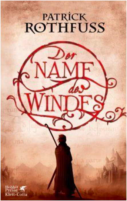
Hardcover German March 2007 Edition
Oh look! A cloaked figure staring at a city. What a surprise. I rather like the title text design, which is pretty creative and a good way to make the title visually appealing. I wish the city in the painting weren’t so damn faded and distant – I think it’s a mistake to keep the visual focus on the figure exclusively and only hint at the city beyond.
6/10
Paperback Portuguese September 2009 Edition
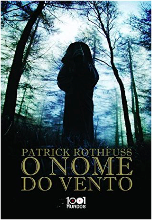
This cover is terrible. I would say the worst, but there’s more still to come. Anyways, this is incredibly bad. We’re once again with the hooded, cloaked figure with his back to the viewer, which is a lazy and uninteresting pose. The image is badly photoshopped and looks like an alternate movie poster for The Blair Witch Project. There’s nothing interesting about the image, nothing that interests the viewer. The title font isn’t boring, I guess. That’s the only good thing I have to say about this.
1/10

Paperback Portuguese July 2009 Edition
Still another cloaked figure staring off at a distant city, but this is one my favorite versions of this trope. The city is far enough in the middle distance that the figure is the main focus, but we can still see enough of the city to see that it’s cool looking. I’m glad to see the bridge from the books, which is a nice detail. The title text does a good job of filling in the empty space of the painting without crowding the other elements.
9/10

Paperback French November 2009 Edition
This is the same cover image as before, but it’s been cropped so that the figure is centered. I don’t like the change – the balance is better when the figure is off center. Also, the title text is way too big and dominates, which is unfortunate because the Spanish cover had such a lovely balance throughout.
7/10
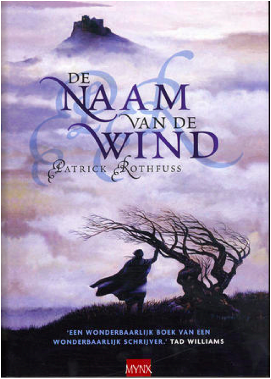
Hardcover Dutch July 2007 Edition
Yet. Another. Hooded figure. Staring. At a city. Wow. This one has a tree, at least. The image is… fine? I might be kinder to it if I hadn’t seen several better iterations of this right before. Because so much of the image is shrouded in fog, there’s very little to go on in terms of visual interest. And while I don’t mind the shadowed, muted color scheme, it also means that there’s very little to distinguish the cloaked figure and make him intriguing. The shadow initials behind the title text is horrific and obscures the title somewhat, so docking a couple of points for that.
5/10

Hardcover UK January 2017 Edition
Ahahahaha. This looks like the My Neighbor Totoro edition of Name of the Wind. It’s very silly and lighthearted, but wholly inappropriate for a book whose reading level is above first grade. If this was a kid’s book, I’d give it full marks. But Name of the Wind is very much for adults, and this cover is way too young and childish.
1/10
Paperback Polish August 2008
YIKES. I cannot figure out which scene or location from the book this image is trying to evoke, which makes me think the cover artist did not have the book or a text excerpt to work from. What the hell are those weird horse skulls? Why is this taking place in a desert? Why is the texture so bad? So many questions. And the effect on the title text is bad.
0/10 YES WE CAN GO LOWER THAN 1
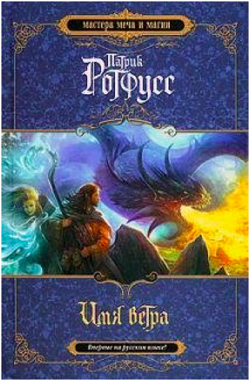
Hardcover Russian 2010 Edition
This looks like the cover to a Dungeons and Dragons manual. I suppose that’s supposed to be from the Dracchus scene with Denna, but the image doesn’t look quite right for Name of the Wind. It’s just so generic fantasy. I also don’t like how the image is cropped top and bottom to make way for a very generic marble background. Still, the image is colorful and exciting, even if it could be the cover for any fantasy novel ever.
5/10

Paperback UK 2011 Edition
What the FUCK happened here? Who let this shit happen?
-10/10
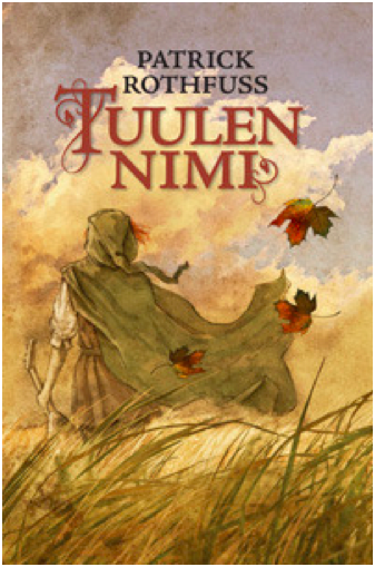
Hardcover Finnish August 2010 Edition
Ooooh, more Miyazaki fanart! This is actually quite lovely, and it fits the tone of the books much better than the kids book cover from before. I love how soft and gentle the painting is. Notice the color balance. I don’t know if this cover really ‘grabs’ you or draws interest, but it’s one of my favorites of the bunch.
10/10
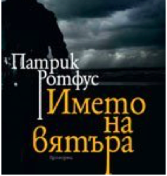
Paperback Bulgarian October 2010 Edition
I reserve the right to change my opinion later, but this may be the worst contender in the cloaked and hooded figure from behind category. I actually had to double check that this wasn’t a reused image from the mass market paperback edition, but nope! This is a brand new cover image, and it’s absolute shit. The lighting is so dark it’s impossible to make out details, the balance is way off, and the cover and title text are placed over the figure (aka the only object of interest) instead of the boring, generic storm clouds.
0/10
Hardcover Lithuanian 2011 Edition
YIKES times two. This cover art is truly awful in ways I didn’t know could still happen. Kvothe’s face looks ‘off’ because the facial proportions are all wrong. The blue mystical katana is bizarre because there’s no magical sword, much less a katana, in the story. And is that a photo of Stonehenge in the background? With yet another hooded figure?! I do like the gold foil of the title and the golden dragon embellishment, but the rest of this is such shit.
0/10
Paperback Serbian February 2011
And we’re back in the safe territory of a cloaked figure staring off at a distant city! All these covers are starting to run together, but this is a new cover art. It just looks like all the others. Once again, it’s fine. The city is a little too distant and greyed out to hold interest, and the figure is kind of generic.
5/10
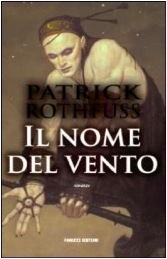
Paperback Italian 2008 Edition
I do not know what happened here. Who is this figure supposed to be? I cannot for the life of me figure out which character this is. It’s a shame, because it’s well-done art with a cool character and costume design. The title and author text obscure the image, though, and the shadow on the text is so extreme it’s hilarious.
0/10
Hardcover Hungarian 2009 Edition
This is just boring. There’s no information conveyed here, nothing interesting or arresting to attract the viewer’s attention. The translucent overlay on the title is an odd choice.
2/10
Paperback Persian 2016 Edition
I believe this was originally a fanart of Kvothe (correct me if I’m wrong please), but it’s a good one. The tree shadow in the back is distracting and obscures the handle of the lute on his back, though. I wish there was more here – it feels very spare in an unintentional way.
6/10

Hardcover Georgian 2016 Edition
Cloaked and hooded figure staring off into the distance, check. I’m not crazy about this one – the art is very soft in a blurred kind of way, and it reads as a little humdrum. The tower in the distance is quite dull – it looks like a modern office building.
4/10

Hardcover Italian October 2016 Edition
The title text is a little too high – I don’t like how it covers the figure’s chin. It’s not a bad idea to make Kvothe’s green eyes a focal point, and it’s certainly more of an original idea than most of these covers have shown. But the muted color pallete drags the whole mood down. It’s not evocative, just kind of damp.
5/10

Hardcover 10th Anniversary French November 2019
I LOVE this cover. It’s gorgeous. I love the gold foil, love the text, love the clouds. It’s stunning and timeless. Amazing.
10/10
Hardcover Latvian October 2013 Edition
It’s a cloaked figure with a city in the distance, but he’s NOT looking at the city! What!! I’m rather surprised at how few covers feature Kvothe actually playing the lute – this may be the only one, actually. I don’t like the bottom fade, and I think the design is a little generic fantasy. But it’s a nice balance, and the title text is fancy and eye-catching.
7/10

Paperback Polish 2017 Edition
This cover artist also clearly wasn’t working off an excerpt from the book. The character design is so off and unlike Kvothe, except for the cloak. Wall texture looks like a photo manipulation, which is cheap. This whole thing is bad.
0/10

Hardcover Russian 2015 Edition
What is with the Stonehenge imagery? And why is that guy floating off of Stonehenge in a modern hoodie? Why is that one leaf in the top right so huge? Why is the title text red and difficult to read? At least there’s a broken lute, I guess.
1/10
Paperback Chinese May 2012 Edition
This is incredibly lazy and the photoshop job is terrible and generic. Zero effort was put into this cover.
0/10
Hardcover Russian 2011 Edition
I’ve been pretty harsh on Russia, mostly because the Russian covers have been terrible. This is ok-ish. It’s very generic fantasy, and the castle looks like Hogwarts. But it has visual interest, even if the title text color is garish.
2/10

Japanese 2017 Edition
I quite love that they turned Kvothe into an anime character. And he’s doing stuff, too, and not just staring out into the middle distance. There’s so much imagery of the broken lute in these covers, so it’s refreshing to see the other part of this scene – when Kvothe loses his shit and finally calls the name of the wind. Fun cover, good artwork. The red title text works here because it matches Kvothe’s hair.
9/10
WORST:
BEST:
#The name of the wind#kingkiller chronicle#patrick rothfuss#book cover art#books#apologies for poor image quality i was working with what god and goodreads gave me#which was variable image quality i guess#I've been told I'm very judgemental so I decided to put those judgey skills to good use
47 notes
·
View notes
Text
Magia Record ED Analysis
bAs someone heavily invested in Yachiyo and who has watched the ED many times since its release, I figured I’d go ahead and do a full analysis of it and how it relates to Yachiyo as a character as well as her arc. This analysis is made assuming the anime remains largely the same as the game wrt Yachiyo, and it’s by no means definitive, simply my own personal interpretation. Heavy spoilers ahead of course, especially for Chapter 6 and Mifuyu’s side story. Anyone that cares about spoilers and hasn’t at least played through Chapter 6 of the game would do well not to read this until they’ve either done that or watched through the corresponding section of the anime after it’s aired, but otherwise, read on.

Right off the bat we have a shot of the moon being reflected in Yachiyo’s eyes. Yachiyo is a character very heavily associated with the moon, and this shot serves to reinforce that association.

Yachiyo then blinks and when she opens her eyes the moon’s no longer being reflected in them and we get a more zoomed out shot of her laying down in a puddle and it appears to be lightly raining. Water/rain is yet another thing Yachiyo gets frequently associated with, likely due to its association with sadness, since in Magia Record Yachiyo is initially a very sad, lonely person, something that is very heavily conveyed throughout the course of the ED.

The shot finishes with having Yachiyo smile, notably the only time we see her smile in the entire ED.

This is followed by some shots of real world Tokyo and then shots of Yachiyo walking through a rainy real world Tokyo. These show that Yachiyo’s a woman all alone in a big city, and the rain reinforces Yachiyo’s rain/water association.
We then get a shot of a flashing elevator button as we transition to the next segment of the ED, as segment I like to call the “elevator sequence”.

This segment alternates between shots of Yachiyo in a white dress in an elevator and scenes of a shadowed Yachiyo strutting and striking poses, all in front of a stylistic city background whose colors slowly shift. These bits between the elevator shots are meant to represent Yachiyo modeling, as Yachiyo works as a fashion model and her modeling career was the reason she even became a magical girl in the first place.

Now, for the main meat of the “elevator sequence”, the elevator shots themselves. The elevator is a metaphor for Yachiyo’s life as a magical girl, each elevator shot representing a different important stage of her life as one, with the red rapidly increasing floor number representing the number of days she’s been a magical girl and the seven lights at the top represent her seven years as a magical girl. Since only one light is lit in this shot, it represents Yachiyo when she was just starting out as a magical girl, she’s sitting in a school chair and she’s looking a little anxious, probably because she’s still new to this whole thing.

The next elevator shot here represents Yachiyo at 14 years old, in her third year as a magical girl. We see Yachiyo looking up as if thinking about something, before shaking her head and looking down. What happened that year that’s significant? Well, Yachiyo and Mifuyu would write each other letters once a year from the time they became magical girls, to act as a sort of will in case either of them died. In Mifuyu’s side story, one of said letters we get to see is from when Yachiyo was 14. (Note that Yachiyo’s age is only mentioned in the Japanese version, for the English localization they changed it to a vague “since my birthday” for some reason) In this letter, Yachiyo mentions she’s realized she likes someone, but doesn’t know what to do. Due to her nature as a magical girl she isn’t sure if she could be with someone at all, even if her crush likes her back. But even still, she wrote a letter to her crush because she doesn’t want to pretend she never had these feelings. She’s unsure whether or not she should have Mifuyu deliver this letter in the case of her death, since getting a letter from a dead girl could be seen as unkind. She ends the letter by asking Mifuyu what she would do. This shot in the ED is meant to convey the uncertainty Yachiyo was feeling during that time.
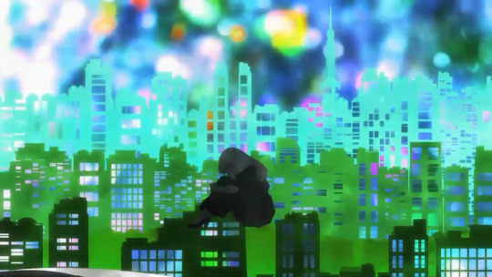
After a couple more poses, she then curls up into this position, showcasing her anguish and despair. Not even modeling brings her happiness anymore. I feel like now is a relevant time to bring up the description from her “As a Fashion Model” Memoria, which states: "Whenever I wonder why I keep on modeling, I remember that my life as a Magical Girl started from here. If I were to quit, why, that would render everything: all the trials and tribulations, all the miseries and joys, rather pointless."

We then get another elevator shot. From the 5 lights lit up, we can tell this is representing her 5th year as a magical girl, when she was 16 years old. This was the year Kanae died, hence why she looks kind of sad in this shot. We can also see the screen start to fill with water here, the water representing Yachiyo’s sadness and loneliness.

Our next shot has the shadowed Yachiyo running across the screen as the water continues to rise.
We then get another elevator shot as the water fills up past halfway. All seven lights are lit, so this represents her 7th year as a magical girl, when she was 18 years old, the year Mel died and she decided to breakup the team because she thought her wish was causing her friends to sacrifice themselves for her, hence why she appears to be crying in this shot. Also of note is that the school chair from the previous elevator shots has been replaced by one of the chairs from Mikazuki Villa.

After a flickering of lights and a shot of the elevator button again, we get a shot of the elevator again but the chair is now empty and the water in the background has now completely filled the screen.

We then get Yachiyo sinking in the water, metaphorically drowning in her own sorrows.

We get a closer shot of Yachiyo sinking with a film reel overlay as the screen gradually becomes monochromatic, and Yachiyo cries into her hands before we get quick flashes of a few images, which I’ll go over, individually, but overall it shows how Yachiyo is a “prisoner of the past”, as she puts it herself in episode 5.

First we have some photos next to Yachiyo’s mug, symbolizing Yachiyo’s sentimental nature, which she primarily expresses through mugs, buying mugs for each new friend she makes and even keeping the mugs of friends no longer in her life as something to remember them by.
Then we have this letter, which is the letter Yachiyo wrote to Mifuyu about her crush, showing that Yachiyo has Mifuyu on the brain.

Next we get an empty white hospital bed, symbolizing death, something that has been a major source of trauma for Yachiyo, losing not only her grandmother who raised her, but most significantly her friends Mel and Kanae, and her guilt over their deaths weighs heavily on her.

Next are some flowers, which I’m not entirely certain the meaning of because I’m not familiar with flower language, but someone who is will probably be able to tell me in the comments.
Next we have what appear to be some ledgers, perhaps a list of boarding house residents or something like that?

And here we have a cake that says “Happy Birthday Yachan”, meaning it must be from Mifuyu, and the 18 candles mean this was from Yachiyo’s 18th birthday. I love how the Y is just below the A because she ran out of room, it’s so very Mifuyu. Anyway this cake again reinforces that Yachiyo has Mifuyu on the brain. Mifuyu is a very important character for Yachiyo as her main goal throughout Magia Record is to find Mifuyu and bring her home, and as mentioned in the last letter to Mifuyu in Mifuyu’s side story, Yachiyo considered Mifuyu a real partner and even after cutting off everyone else because she thought her wish was killing them, she still wanted to stick with Mifuyu to the end.
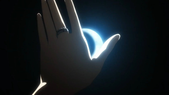
We then get Yachiyo surfacing and reaching for the moon, reinforcing her moon association and showing that despite everything Yachiyo still yearns for a better life, and an escape from her sorrow and loneliness.
The shot transitions into a shot of Yachiyo under a black umbrella, and then the op ends with Yachiyo walking while carrying a white umbrella on her arm. This bit is notable because it can be seen as a prequel to the bit in the OP where Yachiyo helps up Iroha (she’s even carrying a white umbrella in that part too), so the umbrella is presumably for her. As the protagonist to Yachiyo’s deuteragonist, Iroha is very important to Yachiyo arc, particularly in Chapter 6 where she defeats the Memory Museum Uwasa by herself even though Yachiyo’s certain Iroha’s just going to end up another friend that sacrificed themselves for her, giving Yachiyo a chance to believe that maybe her wish isn’t killing everyone she loves, which is what ultimately allows Yachiyo to be able to move on and be happy again.
#magia record spoilers#magia record#madoka magica#puella magi madoka magica#pmmm#magireco#yachiyo nanami#nanami yachiyo#analysis
48 notes
·
View notes
Last Seen Blogs

interdevo
Amputees with converse chucks - Кеды на протезе
cannibalchicken
MEMES

nakasian
asianstrongmen

sendralore
Sendra Lore