#working on making them better in terms of editing and composition
Explore tagged Tumblr posts
Visit Tumblr Blog
Explore Tumblr blogs with no restrictions, modern design and the best experience.
Last Seen Tumblr Blogs


Fun Fact
Tumblr is used by 21% of adults online aged 18-29 years.
Text
synastry + composite notes

RELATIONSHIPS + BREAKUP EDITION: I recently got out of a karmic relationship and felt compelled to write some synastry and composite notes!! Lmk if you have insights to add/advice for moving on from karmic attachments
lilith synastry (conjunctions) - Lilith person often gets scapegoated in astrology circles as being controlling and obsessive over the planet person. While this can be true, it's usually because of boundary misalignment between them. Something that crosses the line for lilith is a part of the planet person's lifestyle. The planet person's way of life is thus threatened by Lilith's standards.
Meanwhile, the planet person unknowingly brings out lilith's worst insecurities and fears. Planet person fears lilith's demands for more consistent treatment, and they either get drawn in more to rise to the challenge or they run away. Chaser/runner dynamic. If the planet person runs from the dynamic, they often leave karmic lessons unfinished between them.
venus conjunct north node synastry - North Node can be heavily invested in Venus, but both parties simultaneously know what they have together won't last forever. It's like they are trying to elude the relationship's expiration date. Regardless, Venus teaches North Node so much about love for better or for worse, and what North Node needs to feel and receive love. Venus breaks them out of their comfort zone. This relationship helps North Node clarify what their standards, boundaries, and non-negotiables are going forward.
south node/north node synastry - SOUL RECOGNITION IS REAL HERE. Especially on the node person's side. Think invisible string and "we meet people twice" theory. It's that person who catches your eye, but you don't give much thought to until you fully meet and they shake your world up completely.
7th house/8th house synastry - As much as we romanticize it, even alongside binding aspects, it's sometimes still not enough to make someone stay. Someone you thought was your person can easily turn into the person who runs with these placements, which makes the fallout that much harder. We forget 8h also focuses on loss and 7h can point to "enemies".
venus conjunct mercury synastry - Yes, Venus can be affectionate with Mercury, but it's often quite superficial and doesn't go too deep unless Moon synastry is involved.
neptune squares in synastry/composite - Can often signal emotional cheating/betrayal on at least one person's end. Even if it's not outright cheating, there is some lying by omission, withholding information, or downplaying at work here that both parties should be aware of. Both parties need to be clear about what they consider cheating/betrayal.
saturn squares in synastry - Karmic baby. Saturn makes planet person feel inadequate or like nothing they do is enough. Like lilith synastry, Saturn gets scapegoated, but sometimes this boils down to incompatible standards. What Saturn considers vital to the health of a relationship is something the Planet person might not be willing or even able to provide. Depending on the planet person's willingness to fight for the connection, they either keep toughing it out or the strain becomes too much for either party to bear.
The funny thing is that Saturn usually wants to keep fighting to make it work, but the Planet Person is more realistic about when to call it quits. In my case (as the Saturn person), I was already struggling in the relationship and felt like my needs weren't being met. I knew the relationship wasn't sustainable, but I couldn't walk away. Planet person (his Venus and Ascendant) was understanding about my needs, but realized he just kept hurting me. He didn't have the capacity to make me happy long-term.
Usually, some sort of external circumstance contributes to the end of their relationship. Such as distance, third party, or other priorities.
mars in 3rd house synastry - Phew the dirty talk is crazyy and often becomes the basis for the intimacy. House person is more into it, and mars knows it lights them up, then runs with it.
eros conjunct lilith synastry - The intimacy will be the death of you. Lilith can feel how badly Eros wants them. Intoxicating.
moon square uranus composite - So emotionally volatile it's unfathomable. Usually, the feminine gets easily triggered and the relationship becomes a minefield of hurt for her while the masculine might have to walk on eggshells.
amor conjunct a personal planet in synastry - Amor loves the Planet person unconditionally. This can be hard because the Planet Person can foul Amor repeatedly, but Amor chooses to see the light in this person even when shown their darkness consistently. Even now, as the Amor person, I find myself still making excuses for the Planet Person's behavior or trying to be extra empathetic with them.
ANYWAY, this was so therapeutic to write and get off my chest and I might do a part two soon with some overlays!

#astro notes#astrology#astrology notes#astro observations#astrology observations#synastry#composite#synastry notes#karmic relationships#north node#lilith
223 notes
·
View notes
Text
Signal > Noise
Gentle, short introductions to media literacy and information literacy
(I keep kvetching about the absence of media literacy and information literacy...and kvetching is useless.
Signal > Noise will be the tag I use for short, digestible intros to concepts in both media literacy and information literacy.
Asks are open if there are specific topics you want covered.)
------
2025-06-18
[Topic: Bias vs Lying]
Our discourse has gotten so ridiculous that we've mostly lost the ability to disagree constructively, think critically, or benefit from the work of smart people with whom we disagree.
We're so fractured and polarized that we routinely say stupid things like:
That source is biased, so it's not valid and nothing it says is true.
If everything is dismissed as bias, and bias is treated as dishonesty, then truth has nowhere to live - leaving us well and truly fucked.
Confusing bias with lying makes us cynical instead of smart. It turns healthy skepticism into hopeless nihilism
"All media is corrupt" isn't enlightenment - it's intellectual surrender and cowardice.
Bias ≠ Lying
A perspective does not prevent a piece of information from being true or useful.
What Bias Is
Bias is all but inevitable and unavoidable, even for those operating at the highest levels of journalistic integrity and discipline. It's baked into how we work.
Below are two paintings of Daniel in the Lion's Den. Same subject, radically different paintings. Is one of them more true? Is one of them less biased?


Maybe photography provides a better analogy. The angle, lighting, composition, saturation, brightness, contrast, and cropping all affect the final image. But the photo is still of a real object, isn't it? Is one of these six photos of the same man in the same room more valid than the other 5?


That's how all media works.
All media selects, frames, and focuses utilizing both conscious and unconscious biases.
That's not inherently deceptive - it's how all storytelling functions. Our brains are wired for narrative, it's how our minds work.
Bias can emerge from:
Cultural worldview (like Western vs. Eastern framing)
Political orientation (like left vs. right vs. authoritarian)
Institutional interest (like corporate vs. activist vs. governmental)
Professional constraints (like time limits, editorial priorities, sensationalism for clicks)
A liberal news outlet might cover climate change in terms of justice and inequality. A conservative outlet might instead focus on economic cost and individual freedoms.
Both might be factually accurate. Both are biased. Both have value.
More examples:
A conservative media outlet may emphasize crime statistics.
A progressive media outlet may focus on police accountability.
A US media outlet might frame a Middle Eastern conflict through geopolitics
A local media outlet might highlight the conflict through individual suffering.
All may very well be reporting true facts, but they frame those facts differently.

If you see journalism without bias, let me know - because that's what I'll read when I need to be put to sleep without learning a single thing.
Lying is a completely different animal.
What a Lie Is
Lying goes well beyond having a perspective. Lying is a choice to mislead - an intentional, deliberate falsehood.
Humans can lie with all media: words, pictures, headlines, graphs, statistics...even silence can deceive.
The key ingredient is always intent. Lies are designed to obscure the truth.
Types of Lies in Media:
Outright falsehoods: "Vaccines contain microchips."
Deceptive omissions: Leaving out exculpatory evidence to frame someone unfairly.
Fake sources or data: Citing studies that don’t exist, or misrepresenting real ones.
Image manipulation: Using photos or videos out of context, or editing them deceptively.
A biased report might emphasize some facts over others, but a deceptive one tries to convince you of something the producer of that media knows to be false.
Framing = Bias ≠ Lying
Framing is one of the most common and most misunderstood forms of media bias.
It's not lying - It's the rhetorical and narrative choices that shape how every story is told.
Examples of framing in headlines:
"Unarmed man shot by police" vs. "Suspect neutralized in police operation"
"Protesters clash with police" vs. "Police attack peaceful demonstrators"
"Israel retaliates after attack" vs. "Israeli airstrikes kill civilians"
The facts might not be in dispute. Someone was shot, a protest occurred, airstrikes happened, etc - but how those facts are framed shapes how we interpret them.
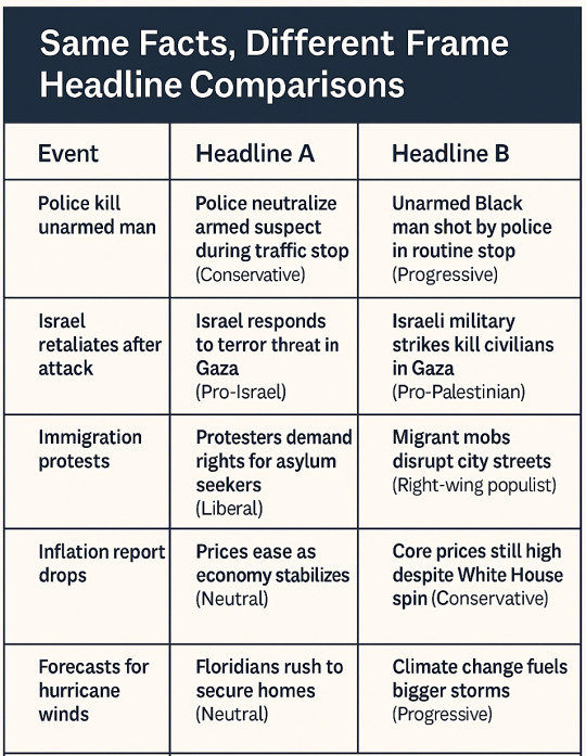
Framing isn't necessarily dishonest. It reflects the values and assumptions of the writer or publication. Understanding framing is essential for media literacy. When you learn to spot frames, you can wring an additional layer of information from the story.
Since it's Unavoidable, Make Bias Work for You
Expecting media to be perfectly neutral is like expecting food to be completely flavorless. It's neither realistic nor desirable. Without a perspective and a framing, a story ceases to be storytelling and our brains...mostly stop processing it.
Every outlet has an editorial mission, an audience, a funding model, a history - so bias is always baked in. That doesn't mean you discard the source. It means you read it strategically, looking for and identifying those biases.
Instead of asking, "Is this source biased?" know in advance that it definitely is.
Instead of asking yourself "should I read this news outlet and regard everything it presents as objective truth"...know that it definitely doesn't, you definitely shouldn't.
Instead, ask yourself questions like:
What kinds of stories does this outlet consistently choose to tell?
Who does the outlet consider trustworthy or quotable?
What kind of loaded language does this outlet use for different groups or events?
Who funds this outlet? Who is its audience? What agenda are they likely to have based on that funding model and target audience?
Bias isn't a disqualifier. It's a clue which tells you more about what you're reading.
Use Biased Sources Without Getting Played
You don't need to trust a source completely to learn something from it. In fact, the most valuable sources are often obviously biased.
1. Identify the Bias
Before even reading, know what kind of outlet you're dealing with. Look at its about page, ownership, funding/revenue model, recurring columnists, and core audience. Does it lean left? Right? Is it globalist? Nationalist? Religious? Secular?
Knowing this lets you anticipate the angle and spot distortions more easily. The more you do it, the easier it gets. After a little practice, you'll see clearly (for example) the huge right wing bias of the Jerusalem Post, the huge left wing bias of Ha'aretz, and how The Times of Israel is mostly pretty disciplined (in their news gathering and framing) about minimizing left/right political biases.
None of these three is perfect, but seeing their usual, institutional biases lets you read them against each other.
2. Use It for Contrast
Biased outlets often highlight stories others avoid or ignore. Fox News may underplay climate change but overplay immigration crime. Al Jazeera will underplay Hamas human rights abuses but spotlight in depth the most embarrassing moments in Israeli politics. The Jerusalem Post will underplay corruption charges against Netanyahu and spotlight the most depraved behaviors committed in the name of Hamas.
Use this to your advantage. Compare coverage across ideological lines. The contrast tells you volumes about outfit AND audience.
3. Look for Hard Facts
Don't quote the adjectives. Quote the data. What happened? When? Where? Who said it? What did the video actually show?
Stop taking an analyst's word as truth - see it as a lens to try on at look at the facts through. If the lens helps it make sense, put it in your back pocket for later use.
Strip away the spin, extract the structure.
4. Cross-Reference Across Angles
Treat each biased source as one side of a triangle. To understand the shape of a thing, you need multiple sides. Balance a left-wing story with a right-wing one. Add an international perspective. Compare them.
Over time, you start seeing the shape of the event instead of the biases of each outfit.
(If you're anything like me, you never want to see or hear another advertisement for Ground News...but still use it sometimes to do exactly this.)
When Bias Becomes Lying
Bias turns into lying when it refuses to admit its own existence or crosses into manipulation. You're dealing with deceptive bias when:
It claims neutrality while advancing a clear agenda
It actively suppresses or distorts opposing views
It refuses to promptly issue corrections or acknowledge errors
It flattens complexity into false binaries like good guys vs. bad guys
It consistently omits key information that would challenge its narrative
It's part of a disinformation campaign (state media, bad actors, bots)
Ask yourself these questions:
Does the outlet ever challenge its own side?
Does it interview or quote those it disagrees with...without distortion?
Does it foster critical thinking or does it push tribal loyalty?
Thesl answers will let you see lying much more quickly.
When evaluating a media claim, ask:
Is this verifiable?
Does this trigger a strong emotional reaction? Was that the goal?
What's missing?
Does this match the tone of propaganda? (overly simplified, emotionally charged, black-and-white framing?)
Is this story meant to inform...or to rally?
And perhaps most importantly:
Do I want this to be true because it confirms something I already believe?
Recognizing your own bias is more critical than spotting it in others. We are all vulnerable to confirmation bias, and most of us seek out what feels good while avoiding what challenges us.
Practice pausing. Breathe a few times between the click and the share. (Confirmation bias will be the topic of a future Signal > Noise.)
Vary Your Media Diet
To understand a complex world, you need inputs from multiple angles.
If you only get your information from one side, you're not informed - you're enlisted.
Real media literacy is not about being neutral. It's about navigating bias with awareness, curiosity, and courage.
That means reading:
Across ideological lines
Across national borders
Across formats (print, visual, audio)
It's not always fun, it takes some time, but it's essential and cwn dramatically reduce your susceptibility to propaganda -
...so go read smart, articulate people you disagree with!
Instead of avoiding bias, learn to read it. Recognize it. Use it. Balance it. Counter it. Triangulate past it.
And when you find actual deception? Name it and reject it.
That's media literacy.
#jumblr#media literacy#information literacy#How to read the news#Signal > Noise#bias vs lying#media bias#media dishonesty#propaganda#Media ecology#epistemology
61 notes
·
View notes
Text
Why the Minecraft Movie looks so bad
Okay, let’s see if I can make this work
Hi, I’m Watercolor, currently a student learning animation and visual effects. I’ve got some more technical explanations for why exactly the trailer looks god awful
I’m gonna do my best to explain this in simple terms, but if I don’t explain something very good, let me know and I’ll explain more. Alright, this is gonna be a long post
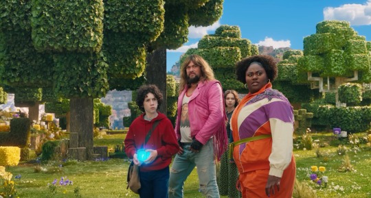
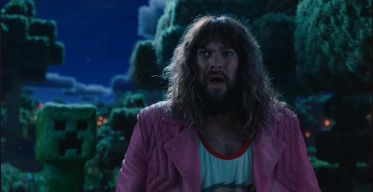
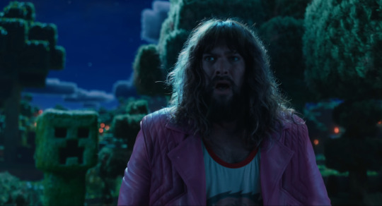
Starting off with the obsession with backlighting. See how it doesn’t really match the environmental lighting? That’s one of the major things that makes it look so weird to a lot of people. It could have been done to better distinguish the actors from the background, but it does that a little too well and makes them look way too out of place. The environment has a very nice constant (most likely singular) light source, which is most likely an HDRI.
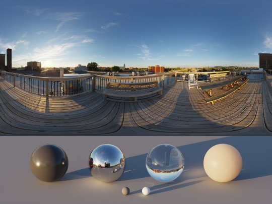
An HDRI (or high dynamic range image) informs the animation software on how the scene should be lit, and is often a weird panoramic image of whatever physical area you want to replicate.
In a reverse case, adding a CG character into a real set, you could take an HDRI of the physical set, and use it to apply similar lighting. Adjustment will most likely have to be hand adjusted by the lighting team (and tbh they add a lot of extra lights in anyway. It just needs to look right) but it’s a fantastic starting point for the compositing and lighting teams.
However, the McM’s live set has way different lights set up then what is seen in the environment.
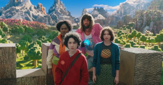
Here, for example, the live set is most likely being lit by standard 3 point lighting, which are not only the wrong color (the lighting on the environment is much more yellow) but also washes out any shadows that would help define the actors. If this movie wasn’t obsessed with backlighting, you could fix that by lighting the actors and environment from the front, but because the sun is in the back, they have to make the front of the actors unnaturally brighter to see them more properly. I have a slight idea on why the kid in red looks especially “photoshopped” in, and it’s mostly because his hoodie doesn’t have a similar reflectiveness to everyone else’s outfit, and his hair is a more neutral color, causing the highlight to be even more washed out. Also, while we’re here, the cube is a physical prop, but it was not lit up during filming, and all the light output was tossed on after. And it’s really inconsistent and honestly, lazy. For the most part they just hit it with a blue blur effect in post, it doesn’t actually cast any light.
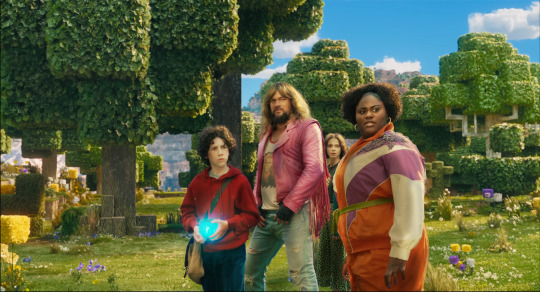
Another major issue is the color difference between the actors and the environment. The color balancing on the actors is particularly garbage, they’re somehow desaturated while also being too saturated, I don’t know how they managed that. But the technical issue on why it looks odd, is because the physical camera cannot physically pick up the same vibrancy as the “camera” in the CG world. You might have seen an example of this when trying to take a photo with your phone, especially of a very colorful event like the sunset. It’s also why “ugly sonic” looked particularly out of place, he was 10x more saturated than anything else around him.
Having the actors on a very low effort green screen stage also completely ruins any chance of getting the proper ambient light or ambient occlusion.
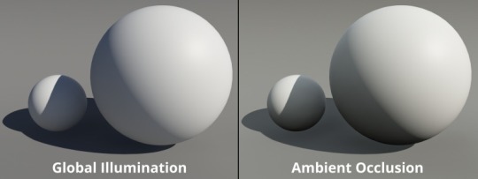
Ambient occlusion is basically the bounce light from other objects in your scene, gamers might know this as a form of ray tracing (ray tracing is live changes in ambient occlusion, games without ray tracing bake in ambient occlusion to get a similar result)

When everything is CG, (again art style aside) looks pretty darn good actually!
I attempted some edits to see if anything could make it look better (left is original, right is mine), and I don’t think proper lighting or anything could actually fix what this movie has wrong with it. They should have made the whole thing animated, I don’t think any amount of bullying would fix this, the studio basically has to scrap the actors, and make new CG characters from scratch in the same style as the rest of the world.
All of this is not the fault f the animators, or any of the vfx team, they did their absolute best with what they had, this is 100% the fault of the higher ups on this project. I have no idea how this good this far into production without ANYONE saying that it was a bad idea (Either that, or a lot of people got fired, which is unfortunately a likely possibility)
19 notes
·
View notes
Text
Edition Redux — Broadcast Transformer (Audiographic)
Methods matter as much as outcomes in Ken Vandermark’s music. That means that when the Chicago-based improviser, composer, organizer and reeds player puts together a band, the way its members come to terms with the way the sounds go together is as much of a creative expression as the way they sound. Edition Redux is Vandermark’s current touring ensemble, the main place where he works out partially pre-planned forms over the long haul.
It is the descendent of a larger band that played just once in late 2022. While its performance showed promise, its membership was not available to devote the time necessary to develop the band’s fluency with Vandermark’s concept. So, he cut it down, switching out the established veterans (no hard feelings, they’ve continued to work with him elsewhere) and reducing the line-up to a quartet comprising three younger players — keyboardist Erez Dessel, drummer Lily Glick Finnegan and tuba/electronics player Beth MacDonald. They’ve toured with Vandermark both in Europe and the USA, and Broadcast Transformer is their second album.
The material that Vandermark has written for Edition Redux references a breadth of artistic impulses; the album’s list of dedicatees includes Scratch Acid, Nan Goldin and Herbie Nichols, among many others. Vandermark uses these lists to acknowledge people whose way of working has in some way inspired pause and reconsideration of how he works. These influences rarely manifest as an emulation of someone else’s sound, but in more of a problem-solving fashion. How long does a segment last? How does it connect to the next one? How disruptive or connective are the transitions? If this is starting to sound as much like film as music, it’s not accidental. Not only did Vandermark study film in college, he’s periodically commented upon it (among other non-musical artforms) in his social media posts.
Sequencing is a profound concern in Edition Redux’s music, and in this regard, Broadcast Transformer feels like a realization of the promise of its first CD, Better A Rook Than A Pawn. The album’s 14 pieces are combined in a modular fashion which leaves open the possibility that they can be shuffled and reordered. The quartet has been working this way for a while, and it shows in a couple ways. The jumps are more abrupt and the segues are more liquid, reflecting a mastery of the music’s transitions. And the places where segments abut also seem to make use of the musicians’ multiple strengths, which suggests that Vandermark’s been writing with them in mind. Dessel can switch instantaneously from funky comping with a clavinet-voiced synth to sharp-edged electronic slabs or a surging piano avalanche; he’s the sharp edge of the editor’s razor. Finnegan’s playing clearly articulates not only the shifting time feels, but the compositions’ contours throughout the contrasting sections. MacDonald’s tuba is a distinguishing sound print that can be a bulky, befogging presence or a strategically reinforcing agent of rhythm. Vandermark sounds like just himself, by turns burly, earthy, and emphatic, but also energized; one supposes that it’s a gas to be able to know that he can trust this posse of younger players to realize his ideas and bring their own strong selves.
Bill Meyer
#edition redux#broadcast transformer#audiographic#bill meyer#albumreview#dusted magazine#ken vandermark#erez dessell#lily finnegan#beth macdonald#interdisciplinary art#free jazz
2 notes
·
View notes
Note
How do you get such nice shots in captura? I wanna get better at it could you share some tips? Been trying to figure it out but I admit I'm not the most knowledgeable in photography etc.
Well.... It's a bit of a complicated process and it relies very very much on personal preference. Much like with any type of art there are different styles that each individual artist will gravitate toward. I can only show you how I do things, so I'd recommend asking other Captura folks on here about their own styles to see where our processes and preferences differ.
I'll also include some extremely helpful videos at the bottom, they go extremely in depth as to best practices and technical exploits.
Alright, lets get started with the background stuff... the tools! ReShade: Shader injection, a MUST if you want to take dynamic and customized captura without using a program like Photoshop to do everything in post.
SRWE: Simple Runtime Window Editor.... the god among programs... It's an upscaler, allowing you to increase the resolution of the game beyond the bounds of your monitor. It's how I was able to get 15K panoramas at one point in time.
Any image editing software. Since I rely mainly on compositing to get the lighting I do, I need something to overlay and mesh the images with. I use GIMP cuz it's free, but even Microsoft Paint will work as soon as it add the ability to layer images.
Those are the tools... what about the tactics?
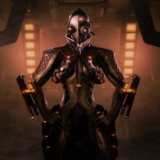
Well, I generally prefer moodier shots with the Warframe being the central focus (though, that's also the side effect of me cropping the image). Just a note! Moody doesn't mean dark, moody is the enigmatic space between dark and light where there is more dark than light... but there's still a good amount of light to be had. Occasionally you can have overexposure in a moody shot even.
Important to note, the overall exposure level of the environment, even is the scene lighting is low, will effect how brightly your Warframe can be lit. Both the Scene Light and Exposure sliders need to be fine-tuned otherwise you won't be able to light your Warframe at all.
Now, for shot composition I prefer low angles with either a cluttered but familiar/recognizable background, or a simple but abstract background. The Subject, be it a Warframe, an enemy, or an NPC, reside in the center with their feet out of shot.
Like so:
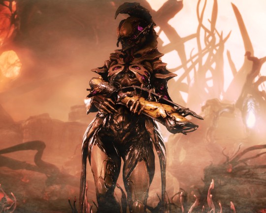
Each of these shots also demonstrate well the way I like to pose my subjects: Symmetry and.... not... not symmetry. The official term for this is Contrapposto, which is Italian for Counterpoise. Basically, even though the Wisp is sedentary, her body is still giving off the impression of movement based on how her waist is curving and hips are tilted, forming a loose 'S' shape. There's a handful of animation sets, Khora (Urushu) Noble, Mesa Noble, and Wisp Noble are excellent for this.
Some examples:
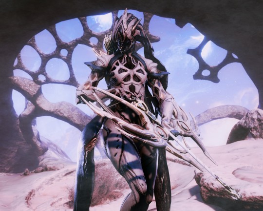
But... what about the lighting? This is where things get technical. So, the standard Captura's three-point lighting system is generally inadequate at properly lighting the entire Warframe. This is where compositing enters the picture, in a very literal sense. Each of these shots, shown above, are composites of between two and four separate images, each with different lighting angles. I actually have an example I made for an earlier explanation made already (thank goodness)

Getting the different lighting angles is really simple, just rotate the 3-way lighting without moving the camera. Then you overlay them in some photo editing software and just start going layer by layer, erasing bits of the topmost layer to reveal your desired highlights or shadows from the shot underneath.
Don't feel obligated to do this compositing process though! Sometimes the 3-way lighting works perfectly well for a shot or environment, don't feel obligated to complicate this process.
And this segues in nicely to the final part of the shot-making process, post-processing and fog layers.
Now, fog layers are important to the overall appearance and vibe of my Captura. They add texture the image that the game doesn't impart naturally, removing large swathes of solid color from the background and foreground. An added bonus is that the added texture makes the image look somewhat better (imo) when compressed, or when viewed at lower resolutions.
The same image with and without Fog

This shot contains two individual fog layers, one in the foreground, washing out the foliage, giving the general uniformity of it texture and implied depth, it also serves to cover up the manual blurring I did (poorly) around his legs. Then there's the background Fog, which is the deeper blue you see in the sky. It adds a more dynamic air to the generally dour set of greys. And, again, the fog is just something I personally like to add, even if it doesn't serve a practical purpose in a shot. No shade if someone feels the fog ruins the shot, I almost always keep a fog-free version about.
After the fog is added, blended, and blurred slightly, I will apply a few gentle blurring filters to remove any jarring or jagged pixelation from the shot, giving the Frame a somewhat smoother appearance and reducing the file-size dramatically.
That's just how I do it though, it's not a particularly popular style, but it's how I do it and how I love to do it! :3 Remember to ask around, I'm sure there's lotsa Captura Artists out there willing to explain their methods and processes.
Helpful vids! How to Captura by Vash Cowaii Hotsampling in Warframe for High Res Shots by PurpleFlurp
good luck, and happy snapping!
#warframe#captura#warframe tag#warframe captura#sorry for writing an essay... sometimes I don't know when to shut up#-_-
13 notes
·
View notes
Text
An interview with my self – 2023
1. What is the one thing you wish you knew when you started taking photos?

2. How did you get good at photography?
It happened during a moonlit night under a starry sky. All of a sudden a beam of light shone down upon me and an ominous voice spoke to me: “Now you’re good at photography!”.
All joking aside. There is one way to get good at photography, and that is to work at it. You need to put in the hours learning the principle of photography. Get your horizons straight. Learn how to use depth of field. How different shutter speeds convey different things. How ISO impacts your images.
Or more correctly, learn how the concept of ISO (ASA) in an analog sense impacts your images as ISO in the digital age is not that big of a thing anymore. Technology has come so far now that ISO in these days is more of an ND filter for your camera than it was in the days of analog film. Yes, a slower ISO will yield a cleaner file in terms of noise, but with today’s quality on high ISO like 800 and 1600 is far superior in that regard than earlier. Beside this you also have composition and image editing as well.
3. What gear do you use?
The one I have at hand. Last time I answered this question I elaborated in more detail about this but I won’t this time. What gear you use has in a general sense not that much impact on your photography. When you start out you often think that gear has so much to do with what type of images you’ll be able to capture. That the latest camera will make you take better images. The reality is that gear plays a far smaller part in that equation than most think. It’s not the pots and pans that make a chef create a good meal, it’s the skill. The knowledge of the ingredients and how to employ them in a dish. Yes, there are some gear that is needed to achieve certain effects like a circular polarizer or a flash.
But having a limited access to gear will also help you solve problems in a more creative manner. By having let say just one speedlight you’re forced into making it work for you. Same goes for having a limited range of focal lengths. Also, if you don’t have the skills to capture a good image you won’t get a better image with lets say a Phase One medium format digital back. All you’re left with is a higher resolution garbage.
But to tackle the question more directly, I personally have used Nikon for 20 years. Both analog and digital. My personal reason for this is that a Nikon feels good in my hand and they are mostly built like tanks that can take whatever beating you throw at it and come back for more. Also with the old F-mount one was able to use a vast array of lenses that date back to 1957.
With regard to lenses, I have for the last 13 years favoured Tamron zoom lenses. The reason for this is that it presents a good mix of quality versus price. This is what makes up the backbone of my gear roster. I also still use filters when I shoot, like ND-grads and ND-filters. My philosophy is that I want to get my exposure right on location instead of blending different exposures in the digital darkroom later. With regards to bags and backpacks I like F-Stop backpacks as they have great quality and modularity. When it comes to tripods I use Feisol legs and either a geared or 3-way head over a ball head as I’m not comfortable with ball heads for the way I shoot.
4. Which lens is your favourite? Why?
I don’t have a favourite lens in that sense, but my most loved lens is my Tamron SP 28-75mm f2.8. The reason for it is that that lens has never let me down. It has taken whatever beating I have thrown at it and like Oliver Twist has come back asking for more. That lens covers the majority focal lengths I often use, and also it has the bonus of having a manual aperture ring which lets me use it on both my digital and analog camera.
5. When you go out to shoot, do you take any essential items other than a camera and lens?

6. Among the photography gear that you’ve purchased, is there something you wish you hadn’t bought? Why?
That’s hard to say. As I said, gear is not the most important part. One will always end up with gear that one regrets buying. Unless one has the chance to rent every bit one needs in advance you need to take chances on things and hope they solve your problem. But if I should say one thing it has to be aluminium tripod and not saving up for a carbon one right away.
7. What are your favourite settings?

8. What kind of tools do you use for post-processing? What’s your workflow like?
I use Photo Mechanic for import and sorting plus to add IPTC data for my images. After I finish in Photo Mechanic I move the images into Capture One. Since Capture One has the option to use both Sessions and Catalog, I first move the images from my import folder into a Session that’s named by year and which sit in the overall hierarchy based on the main subject. For a more specific job/shoot I use a Session name for that job/shoot.
After I have moved the images into a Session folder I start a more detailed culling process where I find the keepers I want to work on further. From there I cull them further into what will be my limited edition prints and what will end up as my stock/regular print editions. For concrete jobs/shoots I only cull my images into selects and output them from that specific Session. I cull my images by star ratings and use colour tags to denote if an image is finished or not.
Once the culling process is done I broadly tweak the RAW-files in Capture One. I only focus on getting the image closest to how I want it to look and then I export them into TIFF master files which I then finish in Photoshop and NIK Software. Also I don’t do my dust removal in Capture One. Photoshop is a far superior engine for that job.
Once I get the image into Photoshop I first start with the dust removal before I move on to the final edits. After dust removal I move into different NIK Software plug-ins depending on what the final output will be. Most often I start in Color Efex where I work the colour aspect of the image. I further tweak my edit from Capture One here. If the final image is gonna be a colour image, this is where I leave editing the image and move to clean it up if needed before I call it done.
If I’ve decided that the image is a black and white I move onto Silver Efex. In Silver Efex I work on the image as if I was to work on it in an analog darkroom. To go into specific details here regarding each slider would make this section a book. So I leave this for something I might write about in the future. After I’ve developed the image to where Silver Efex can’t help me any more I revert back to Photoshop where I do my final retouching. Removing parts that don’t support the image as a whole. This is something I would have burned in if I were to do it analog or that I would employ traditional retouching to remove.
When I view the image as done I flatten the layers and save it as TIFF-file. I flatten the layers because I regard my image as a print, and I will not do any further edits to that version besides going back to do some minor cleaning that I might have overlooked earlier.
9. Out of all your photos, which one is your favourite? Why?
10. Whose work has influenced you most?
First and foremost I have to say Ansel Adams and Joe Cornish. Both of these have influenced me the most, but they are not the only ones. Over the years others have also influenced and inspired me. W. Eugene Smith is one that is not a landscape photographer but who also had a great influence on my work. Mainly his use of light and contrast. In the later years I find that photographers like Ben Horne have influenced me. Not so much in terms of technique but in ways to approach the scene and how he works with his subject matter.
Beside purely photographic influences I’m also very inspired by the Norwegian national romantic painters of the 19th century. Painters like J.C Dahl, Hans Gude, Thomas Fearnley, Theodor Kittelsen, August Cappelen, and Lars Hertervig. This has very much to do with my national identity and my love for Norwegian nature.
1 note
·
View note
Text
Some quick tips for peeps using MJ that don't want it to look like everyone else using MJ.
1. The Ultra Stylish All Dress Alike
First, adjust your style setting (--s (number)). This is how much of the Midjourney 'secret sauce' is added. The lower this number, the closer to your prompt the style will be, at a cost of coherence and 'prettiness'.

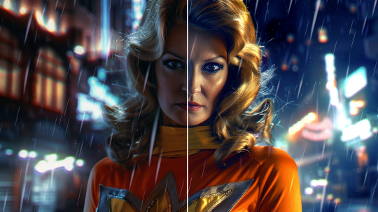
Same prompt, same seed, style 500 on the left, style 25 (my preferred setting) on the right. The differences in lighting, pose, skin reflectivity, etc are apparent. You can think of it as a "de-instagram" setting.
3. Use your Variations


"A dinosaur astronaut", original gen, vary (subtle) and Vary (strong) results
If you get something you like for an initial result, the first thing I tend to do is immediately to a Vary (Strong) on it. The results are usually better than the original one because you're essentially re-running the initial prompt with the first result as an additional image prompt, reinforcing the subject.
Using subtle variations to get closer to what you want is one of the big features of MJ, and it's sorely underused.
I recommend setting to low variation mode so your normal variations are subtle ones, and putting on remix mode. Remix mode prompts you to change the prompt every time you do a variation. If you're close but something's not right, that's an easy way to go.


Changing prompts is especially useful if combined with Vary (Region). Basically, if you like everything about a pic but some select details, you can highlight an area and have the system produce new variations just changing that region. It's obvious use is fixing generation errors, but by changing the prompt, you can get results that the robot can't imagine as a solo prompt.
3. Get Weird With It
--weird is a highly unused setting. It's also very powerful, while it goes up to 1000, I tend to not go above 1-5.
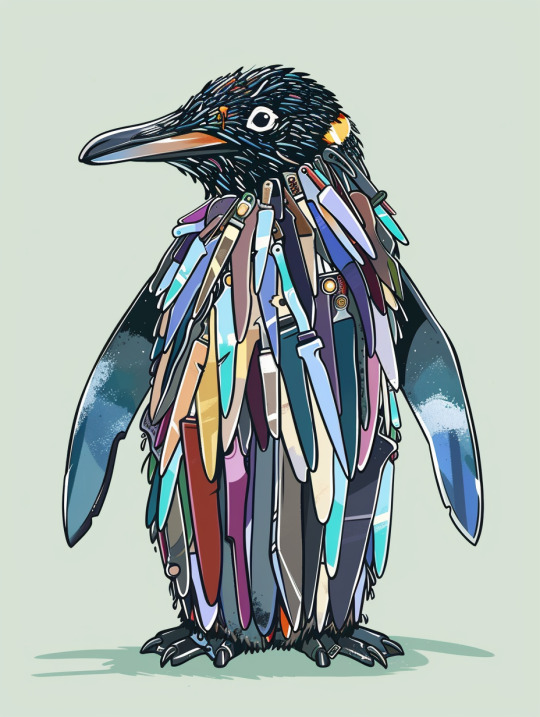
A cartoon penguin made of knives at 0 weird, 1 weird, and 50 weird:
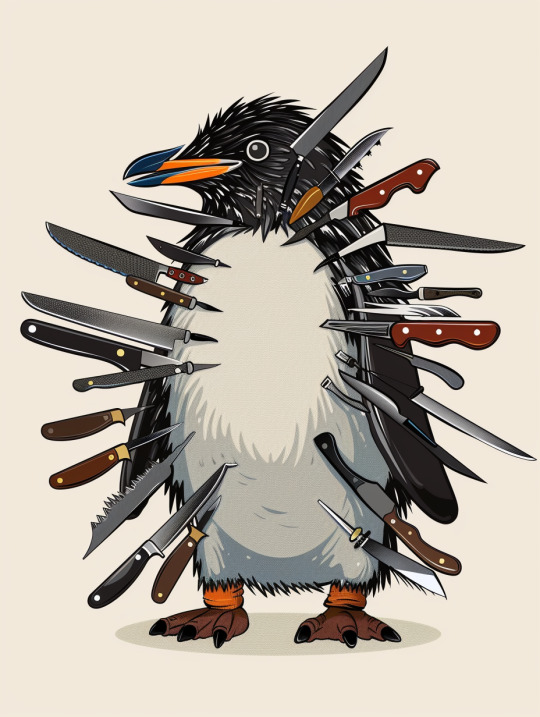

Near as I can tell, weird restricts the 'does this make sense' checks, allowing for more out-there results, both in terms of style and subject matter. At the very low levels (1-5) it increases prompt adherence, at higher levels it reduces it substantially.
4. Prompt Big and Blend your Concepts
MJ deals with short prompts by filling in its own leanings where there's gaps, so short prompts look the most midjourney-esq while longer ones (especially when combined with --weird or a low --s value) fight back against it more.
When prompting for art styles, prompting for multiple art styles/artists at once produces weird hybrids. Prompting an artist with the wrong medium (A painting by a sculptor, a drawing by a cinematographer, etc) also can produce new, strange results.
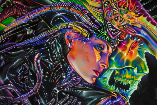
(Lisa Frank/H.R. Giger style mashup using :: technique (below))
But the real trick is in "prompt smashing" or multi-prompting. Basically, midjourney uses :: to split prompts. Intended function is to allow you to add individual weights to each section, if you want something strongly emphasized.


But in practice, it blends the concepts of the two prompts to create a new, third thing.
As above with "an illustration of an armored dinosaur in the woods, in the style of vibrant comics, toycore, ps1 graphics, national geographic photo, majestic elephants, exotic, action painter" then "daft punk & particle party daft punk world tour, in the style of romina ressia, polished craftsmanship, minimalistic metal sculptures, ultra hd, mark seliger, installation-based, quadratura" and then the two prompts run together separated by ::.
Each one was also iterated to produce a better result than the initial gen.
5. Just edit the darn thing.
Learning to edit your works outside of the AI system will always improve your work beyond what the machine itself can do. Whether it's just the simple matter of doing color adjustment/correction:
Or more heavy compositing and re-editing combined with other techniques:


Editing and compositing your gens is always superior to just posting them raw, even if its just a little cropping to get the figure slightly off-center or compiling 20ish individual gens into a single comic-style battle scene before recoloring it from scratch.
But at the very least, before you post, go over the image and make sure there's nothing glaring.
I don't think that making or using AI art/image generation is morally wrong, as you guys know, but I have to admit that slotting a wibbly-lined low effort image selected from the first result set from Midjourney in your content is incredibly tacky. At least select something that looks good. Maybe something without the boring AI "sheen" look either.
You see this a lot in clickbaity content like web spam and youtube shorts attempting to algorithm game.
1K notes
·
View notes
Text
AUDIO PROJECT
This week we attended a museum to look at portraits. We had to choose one to make into a modernised character and story. I have attended this museum multiple times before so I had some ideas in mind. I tried to push this aside and go for something new.
I decided to pair up with my friend Amy and we both looked at the paintings together. We saw a lot we liked and had many different ideas but we kept coming back to one in particular.

This painting interested us most, the composition is striking and jumps out at you. It feels like this woman is here, looking down at you with a sense of superiority. The rendering of the silk is also gorgeous and shows great technical skill.
We imagined her as a goddess before we knew anything about the painting itself. The gigantic sphere representing power over the world, and the godly aura of the glowing clouds made us come to that assumption. We later found out it really was a depiction of a woman as the Roman god Fortuna. This shows how skilled the painter actually was to convey this message so accurately.
I began to work on the character design. Me and Amy agreed that she would be a middle aged, somewhat fancy looking woman in modern clothes that resemble her original outfit. We decided to keep elements from the painting such as her colour scheme and the pears around her neck and head. We also kept the ball and sceptre in a sense, though they are exaggerated.
Our initial idea was to have this woman watching over her descendent and keeping him out of trouble. Keeping with that I edited the sceptre to have a scale on the end to represent the ability to manipulate fate. I drew up some sketches and experimented with different styles of dress, faces and hair styles.

I finished the character design process off with a digital character turnaround which we could use for the animating process

Next we moved into storyboarding, which is my favourite part of animation. I did multiple storyboards, initially my storyboard was not suitable for premier and editing as the ratio was very off. It was a rookie mistake that I didn’t think about much, so I redrew a lot of my panels again in a better ratio so they could be put into premier correctly.
I had already envisioned what the animatic looked like in my head, so doing the storyboard was relatively easy and fun. Both me and Amy worked on the animatic together and highlighted which frames we liked from each others storyboards to add them into the animatic. Once we had chosen which ones we liked or didn’t like, I decided to work on making the complete animatic with camera movements and sound effects whilst Amy did work on Maya for the backgrounds.
This suited our strengths a lot better, I think it was a good way to work as a team.
Overall the animatic came out nicely and we were confident with the direction we were going in. We divided the animatic into 4 scenes around 10-12 seconds long. We’d each do 2 scenes each, I chose the beginning and final scenes as there were elements I think I could animate well. Either way I was intimidated by the project, it seemed daunting and it felt that way the entire process.
As for animating, I found it pretty difficult. This was the largest animation I had ever done, with a combined total of around 20 seconds. I feel I could have done better had I not gotten sick halfway though the term, my animation felt too choppy and I wasn’t overly happy with it. There were a few scenes I liked, such as Rachel running and dropping her sceptre. Overall, the animation was made with panic in my mind, despite having an extension I still would not have the necessary equipment to work at home and so I had to finish my animation work by the 28th at the latest.
For this project overall, I had a lot of fun working with Amy and it was definitely something I’d do again. I believe this project was just a lot for me to handle when I had to miss 2 weeks of classes. I think I did the best I could, but I wish I could have had those 2 weeks back to really push myself and make something I’d be more proud of.
0 notes
Text
Capture the Joy: 5 Simple Tips for Stunning Toddler Photography
Photographing beautiful children is like catching butterflies: exciting, fickle, and fleeting. Toddlers provide an endless supply of camera magic with their boundless energy, active minds, and expressive faces. But the perfect shot is more than just a click. Use these five easy steps to take beautiful toddler photos that capture the moment.
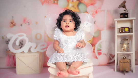
1. Know Your Little Star
Toddlers are spontaneous, curious, and restless. Some of the magic is that they never remain still! Rather than aiming for perfection, relax and be adaptable. Focus on genuine expressions, silly faces, and outbursts of emotion. Make the experience fun—let them play, explore, or even try taking the camera.
Keep in mind that natural and candid photos will often be more captivating than posed photos. Be reasonable and plan sessions when your child is well-fed and well-rested for best cooperation.
2. Create the Perfect Setting
The setting can make a great difference in the quality of your photographs. Choose welcoming and intriguing places—either the cozy warmth of your own living room or the bright sunniness of a local park.
Natural light is a friend. Shoot in the afternoon or morning for soft, delightful colors. Avoid busy backgrounds and scorching midday. Set up a playful situation using toys, items, or a family pet to help your child relax and keep interested.
3. Capture Sincere Expression
Toddlers wear their feelings on their sleeve. Get ready to freeze spontaneous giggles, thoughtful stares, or fits of energy. Angling down to their height helps connect emotionally and results in better framing.
Never mind getting the shot by trying conventional angles—photograph overhead, from the rear, or around objects to inject imagination and background. Permit your child's character to emerge through recording seconds instead of insisting on perfection.
4. Keep It Playful
Photographing must be playtime! Have the child dance, tell stories, or engage in games during the shoot. The most precious moments are captured while engaging in daily routines like snack time, bath time, or reading time.
Keep the mood light with compliments, giggles, or small rewards. A smiling child equals natural, true photos that radiate happiness.
5. Edit and Share with Care
Once you’ve captured your favorite shots, use basic photo editing tools to enhance them. Adjust lighting, crop for better composition, and apply filters lightly to keep the images looking natural.
Make your photos tell a story—create a themed photo album like "A Day in the Life" or "Seasonal Adventures." Be mindful of privacy when posting online and choose settings that keep your child safe. And don't forget to print your best shots to create long-term memories at home.
For parents who would like to get these precious moments of toddlers on camera, Coimbatore Baby Studio offers cozy, imaginative toddler photo shoots that turn your child's daily magic into a work of art.
visit us: https://www.coimbatorebabystudio.com/
0 notes
Text
Capture the Joy: 5 Simple Tips for Stunning Toddler Photography
Photographing beautiful children is like catching butterflies: exciting, fickle, and fleeting. Toddlers provide an endless supply of camera magic with their boundless energy, active minds, and expressive faces. But the perfect shot is more than just a click. Use these five easy steps to take beautiful toddler photos that capture the moment.

1. Know Your Little Star
Toddlers are spontaneous, curious, and restless. Some of the magic is that they never remain still! Rather than aiming for perfection, relax and be adaptable. Focus on genuine expressions, silly faces, and outbursts of emotion. Make the experience fun—let them play, explore, or even try taking the camera.
Keep in mind that natural and candid photos will often be more captivating than posed photos. Be reasonable and plan sessions when your child is well-fed and well-rested for best cooperation.
2. Create the Perfect Setting
The setting can make a great difference in the quality of your photographs. Choose welcoming and intriguing places—either the cozy warmth of your own living room or the bright sunniness of a local park.
Natural light is a friend. Shoot in the afternoon or morning for soft, delightful colors. Avoid busy backgrounds and scorching midday. Set up a playful situation using toys, items, or a family pet to help your child relax and keep interested.
3. Capture Sincere Expression
Toddlers wear their feelings on their sleeve. Get ready to freeze spontaneous giggles, thoughtful stares, or fits of energy. Angling down to their height helps connect emotionally and results in better framing.
Never mind getting the shot by trying conventional angles—photograph overhead, from the rear, or around objects to inject imagination and background. Permit your child's character to emerge through recording seconds instead of insisting on perfection.
4. Keep It Playful
Photographing must be playtime! Have the child dance, tell stories, or engage in games during the shoot. The most precious moments are captured while engaging in daily routines like snack time, bath time, or reading time.
Keep the mood light with compliments, giggles, or small rewards. A smiling child equals natural, true photos that radiate happiness.
5. Edit and Share with Care
Once you’ve captured your favorite shots, use basic photo editing tools to enhance them. Adjust lighting, crop for better composition, and apply filters lightly to keep the images looking natural.
Make your photos tell a story—create a themed photo album like "A Day in the Life" or "Seasonal Adventures." Be mindful of privacy when posting online and choose settings that keep your child safe. And don't forget to print your best shots to create long-term memories at home.
For parents who would like to get these precious moments of toddlers on camera, Coimbatore Baby Studio offers cozy, imaginative toddler photo shoots that turn your child's daily magic into a work of art.
contact us https://www.coimbatorebabystudio.com/
0 notes
Text
I've been sitting on this all day trying to think up an answer... and I don't think I have one? Of these choices I technically was in concert band through high school, but I never really felt I was in that crowd, so to speak. It's difficult to pin my younger identity on a single aspect and try to group myself into a category on those terms. I think a lot of it stems from not really knowing how to social. I was arguably one of the better percussionists, yet despite receiving some high praise for slamming out tom parts on first sightread (among other things ofc), I always felt separated from everyone else in concert band. I was just there to fill in parts that needed to get done, and if I was lucky I got handed a really cool part to contribute. But there was a separation from the other students on my part that kept me from ever feeling like a band kid. Similarly I was part of a robotics club in my senior year. I started off as one of two programmers, but as the other kid excelled way better at it I fell more into a... promotional role? Organizing fundraisers and events to get us to the world championships, going nuts in Illustrator (which I was just getting into at the time) to make all sorts of cool posters that we plastered all over the halls. We placed 17th in our division in the world championships. But when I say "we", it mostly feels like "them", and I was just awkwardly tagging along for the ride. I didn't feel like a robotics kid. I got the incredible opportunity to be in a digital media/movie course for all 4 years of high school. Everything from storyboarding, and script-writing to camera and lighting work to editing and compositing. I learned sooooo much fucking shit there, and the teacher in charge of it all held me in very high regard by the time I graduated. Yet I never felt like a video production kid compared to everyone else in there. Also I abhor partaking in most competitive sports but daaammnn I really really wish I did ski club. Well, snowboarding, in my case, because it is objectively cooler. But given a shaky financial upbringing I entirely ruled out the possibility of joining. I knew equipment and lift tickets could get expensive, but augh if I only just asked, I feel like my parents would've found a way to make it work. So I never got the chance to be a snowboard kid. It's not like I didn't have interests, they were just very... limited. And I was am very picky. I played guitar and bass. I made music with shitty virtual instruments in babey versions of Cubase. I loved old N64 games. I poked around with old school blender and learned how to make shit in its incredibly barebones game engine. I amassed volumes of written notes-- characters, worlds, gameplay, meticulously thought-out plans that were hilariously out of scope for a single person to achieve.... but it felt like I had no one to share any of that with. Y'know thinking about it now, I still feel in some weird limbo. Not that I have to fit into any particular crowd, but this nagging feeling of just... never really belonging in any one particular place. I dabble in this, experiment with that, but not once in any of those fields have I found a place that truly feels like home. ....wow fuck this got long lmfao anyway i'm gay as shit!! While I didn't consider myself gay at the time in school, I absolutely turned out that way like a decade later-- just in a way that I never would've originally expected :3c
instrument or sport if applicable in tags. if you wish
47K notes
·
View notes
Text
Different types of light - Daylight vs Additional light
Because I didn't really achieve a stark enough difference between the scene in daylight and infrared light, I want to now try with additional light at nighttime as I know this will totally change the way the scene looks via the lighting I will be using so the difference will be a lot clearer to the viewer. I am also hoping by doing this that I can capture these grey, almost lifeless buildings in a totally new way that hasn't been seen before.
Gregory Crewdson
Before I started properly attempting to light scenes within my area with additional lighting, I first looked at an American photographer Gregory Crewdson.
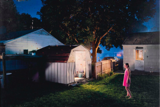
Shooting in large format, Crewdsons work often depicts large scale suburban scenes at night. He along with a massive lighting crew that he controls use light very expertly to add an amazing cinematic appearance and sense of drama to the compositions that draw the viewer in.


I am looking at Crewdson in particular because the way he lights these suburban areas is very relevant to what I want to attempt with lighting these council buildings within my area. Studying his work, the presence of people within the scene to me seems vital to achieving this certain feel, while in terms of lighting he uses it to create a lot of shadows, especially those sweeping across the ground so I shall keep these in mind.
Equipment

I wanted to come prepared to I borrowed from the store a tripod, 4 speed lites, 2 lighting stands and radio transmitters and receivers as I will be lighting a fairly large scale scene so will need these to get my lighting the way I want and efficiently. I will also be using my canon 5D mark II as it is a full frame camera and performs well in low-light conditions without impacting image quality too much.
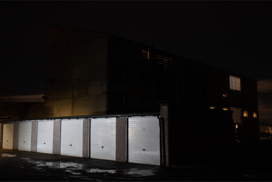
Daylight/Location image

I liked this scene and composition as it shows off the building quite well and the garage in the foreground coming from the opposite angle make a nice balanced composition. These angles should also hopefully allow me to do some interesting things in terms of lighting and creating shadows etc.
**because I want to have the exact same composition with the daylight image and the low-light image, after taking the daylight image I placed Pennys at the edge of each leg of the tripod on the ground. This makes it a lot easier to achieve almost the exact same composition/position when I come back to shoot at night.
Contact Sheets
General Settings: 1 sec. f8, ISO1000
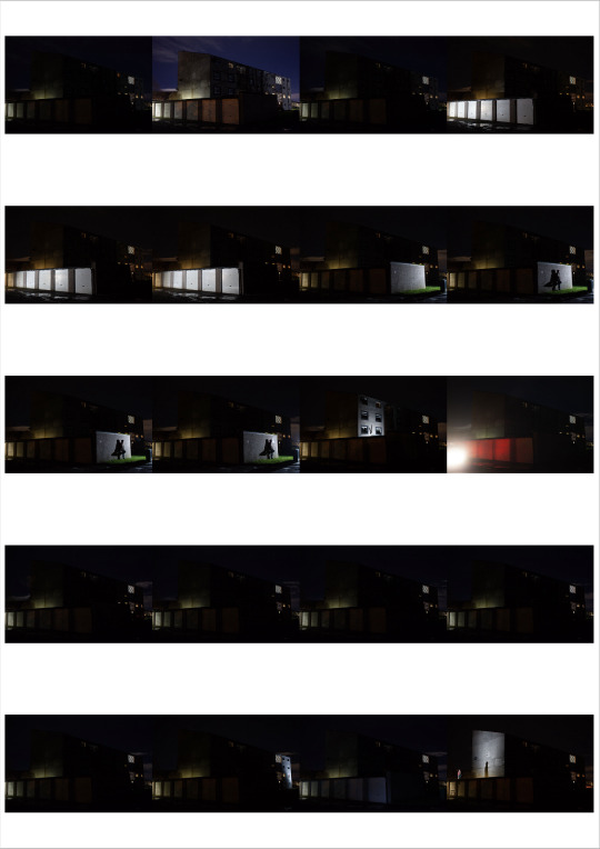
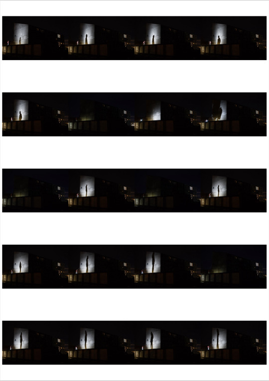
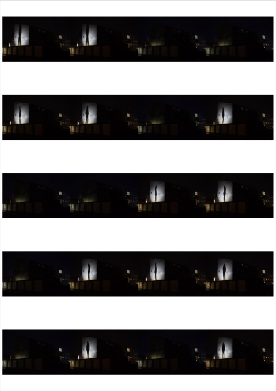
Overall the shoot went well, I attempted positioning all 4 of the flash guns at specific places and getting it in one shot but some weren't going off due to the distance between them and the transmitter on the camera, and also the size of the building itself. To resolve this, I made sure my tripod was in a firm position and took images with different parts of the building lit so I can merge them in photoshop.
Editing
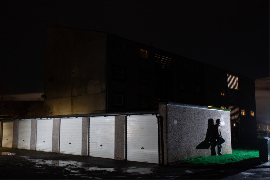
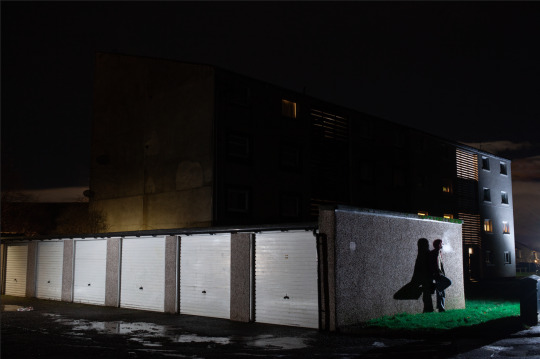
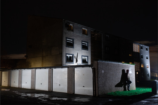
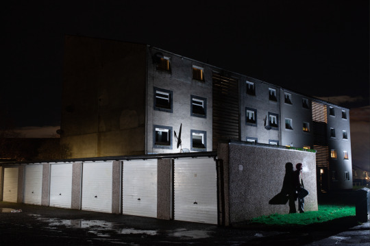
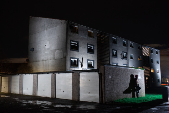
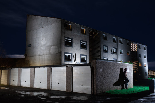
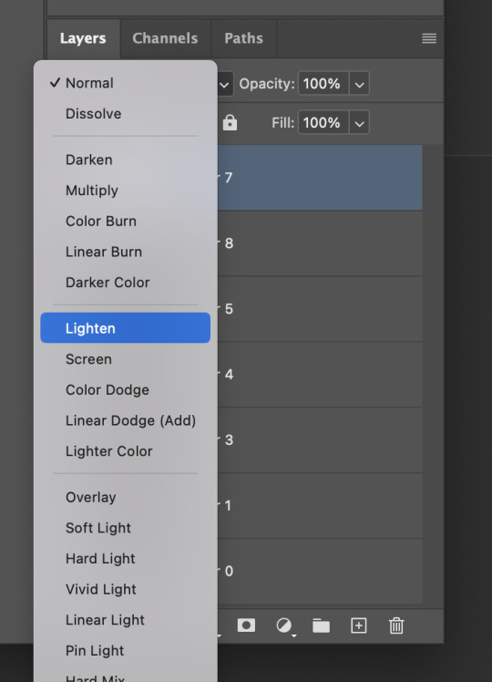
Editing was quite simple, due to me having the exact same composition because of my tripod I could easily layer each image on top of each other, then I set them all to "Lighten", resulting in an evenly exposed image.
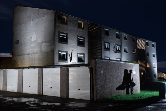
I cropped the image in from the left a bit so there was more balance in the composition with the building in the background and the row of garages in the foreground. I also took an image where the sky still had a deep blue hue to it and layered this in to add a nice bit of detail. Furthermore, I'm glad I took advantage of the garage wall and used it to frame someone in the foreground, while also taking advantage of the angle in relation to the camera to create a strong shadow to add to the drama, much like Crewdsons work.
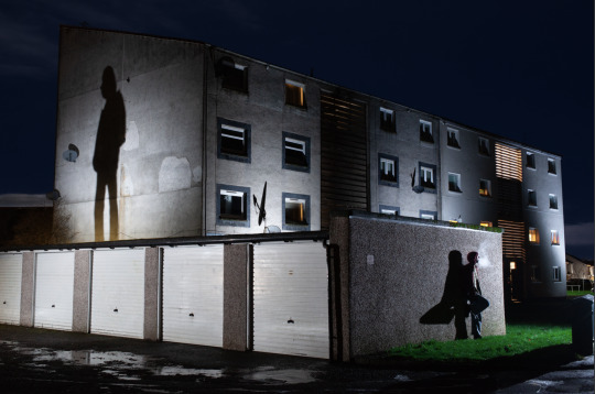
It is also worth mentioning that I also got images of a silhouetted figure that fills the wall of the building in the background to help balance the composition and add an eyre of mystery, but I decided that it works better without and the opposition is still well balanced.
Final Canvas
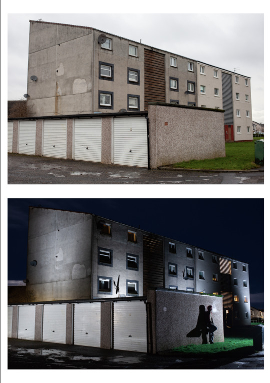
I would say this is definitely an improvement from the infrared attempt as the difference between the two scenes is so stark. The strong shadows created by the lighting I used really make the building stand out and give it form, whereas the other image is looking very flat. I considered waiting for a very sunny day for the daylight image but I think the cloudiness adds a sense of gloom that makes the contrast with the additional light image that much more impactful.
I think I achieved what I was wanting to with this shoot which was to show to the viewer the difference the type of light can make to a scene, and also show my area in a new, interesting way. I definitely want to try this again but with another scene within my area.
0 notes
Text
Live Project Week 3
In week 3 we began to animate! This project is only 6 weeks long including another meeting with the client in week 5 so we really wanted to start animating as soon as possible to make sure we had an almost complete version to present to them. I also knew that the work for my final major project would get more demanding as the term progressed, and so really tried to prioritise this project while I still felt I had a good handle on everything. One of the unique aspects of the advert is just how fluid all of the movements are, because of this there were no traditional 'scene' breaks as every shot smoothly transitioned into each other. Luckily for us, Madde had created a really useful schedule and had broken the advert down into assets rather than scenes. The character is the focal point of the animation and so it is important that she stays as consistent as possible, to achieve this, we tried to limit how many people would be working on the character as although it is part of the project to adapt and animate in a different style, we didn't want slight discrepancies between shots to make the finished result appear less polished. We decided that myself and Madde would animate the character, with the rest of the group animating different assets. The advert is in a liminal space with no background, which means we can edit each asset smoothly in after effects once everyone has finished animating. We also got on to the topic of software, as the style of the animation has no line art, we decided to use Adobe animate to achieve the colour as it has a really useful fill tool and also means each asset could be its own composition. I had only used animate once before and so was excited to use it again and get better equipped with it, although I was also aware that with the time constraints I had to work effectively. Thankfully we decided to animate the sketch layer on TVPaint, which i am much more familiar with.
0 notes
Text
Linkin Park - Hybrid Theory
No better way to open this blog than to review a classic. Truth be told, I'm late to the party - in the 2000s I was far too busy listening to Beyoncé to pay any mind to nu metal acts. We all know late is better than never, and denying how obsessed I currently am with Hybrid Theory would be nothing short of a crime. Without much more to add, I'll dive back into the track-by-track review.
Papercuts - 8/10 Incredible album opener, and a perfect way to set the mood for what's to come; high-energy, yet inviting enough for the uninitiated. This is one of the more rap-heavy tracks, which is not at all a problem in LP's case. The highlight in this track is for sure the bridge though - a beautiful buildup, poetic lyrics and the perfect ambiance for the final chorus. Blends into the next track seamlessly.
One Step Closer - 9.5/10 A song that opens with "I cannot take this anymore" immediately gets a sympathetic reaction from me. I suppose we can all relate, in this economy. Jokes aside, this is one of my favourite cuts from the album - despite the length (or lack of thereof), it manages to capture the right amount of angst. Corny as it might seem, no one can resist a "SHUT UP WHEN I'M TALKING TO YOU". If you think you can, you're just lying to yourself. Either way, Chester's vocals on this song have an oddly soft ring to them during the verses, in particular the first one - and oh boy does it work. It almost makes me think this is going to be a vulnerable track.
With You - 7/10 I admittedly overlooked this track a lot initially, but it's grown on me over time. The screams in the pre-chorus are visceral, raw, gritty - everything they need to be. The instrumental break before the bridge is well-placed and builds up a good amount of hype. Overall a solid track, would probably earn a higher score in a different album. But this is Hybrid Theory we're talking about, and it's bound to be shadowed by the other gems in here.
Points of Authority - 10/10 Singlehandedly my favourite song on the album, and Linkin Park's entire discography perhaps. Controversial opinion, I'm aware. The lyrics are vague enough for anyone to hate on a person of choice while singing along, which I can appreciate on a spiritual level. If you can't find the appeal in this song, just picture yourself screaming the lyrics at the top of your lungs at the face of someone who's pissed you off. Come on now, you can't deny that sounds appealing. The energy in the chorus is just unparalelled, and the rap lines are infectious enough to be sung along to on the first listen.
Crawling - 8.5/10 This song has admittedly become far worse after hearing the demo version that was released with the 20th Anniversary edition of Hybrid Theory, which is miles better than the final product. I believe this might be the best song on the album, lyrically speaking. The contrast between Chester's sweet, almost whisper-like voice in the verses, and the gut wrenching screams in the chorus is haunting. "Against my will I stand beside my own reflection" - couldn't have put it better. This may not be their strongest song in terms of composition but Chester's vocals and the lyrical content make up for it.
Runaway - 6/10 I can't say this song evokes much emotion in me. It is well-crafted, lyrics are nice enough, and the atmosphere is cool. But it pales in comparison to the rest of the album. I still listen to it anytime it comes on, it is by no means a skip (hence the slightly higher score), but it would not feel right to rate this the same as some of the other cuts. The bridge is for sure the highlight, and if I was shuffling my liked music I would for sure not skip it, because it is a high quality song after all.
By Myself - 9/10 One of the best choruses in the whole album. Only one point substracted because the verses themelves are not as strong as the rest of the song. However, the visual this song brings to mind makes this exciting to listen to everytime. Don't ask me why, but the chorus makes me mentally project myself in a car at night angirly driving home from the gas station with a can of RedBull, in the best way possible.
In the End - 10/10 So, funny story. I initially got into this song "ironically". As in, I started listening to it as a "joke". Clowning on emos or something like that, I suppose, but it quickly turned unironic. I can now recite all of the lyrics by heart. Anytime I start I cannot stop. My acquaintances are sick of me breaking into song everytime this absolute anthem gets brought up. I need urgent pyschological help. Please. This has ruined my life. I want my wife and kids back.
A Place for my Head - 7/10 I really dig the instrumental in the verses, that guitar is sick. I can't allow myself to rate this any higher for similar reasons as Runaway - the fact that this is on Hybrid Theory makes the competition far too tough. Chorus is catchy. Bridge is fucking incredible with the blood-curling screams.
Forgotten - 9/10 Much like With You, this was a late bloomer for me. Except for the fact that, when I did get into it, I got into it real hard. The chorus makes me want to go run in the wind or something, the atmosphere is legitimately incredible. It is damn near impossible not to sing along to it. "When the paper's crumpled up, it can't be perfect again." Fucking powerful, man.
A Cure for the Itch - x/x I will not be ranking interludes or intros in this album unless they feel like "songs" to a certain extent. This is a personal choice based on the fact that I simply cannot give them a fair rating for their role/purpose in an album. But I can say this is nice to listen to, and I don't skip it when it comes on.
Pushing Me Away - 8/10 Not sure I enjoy this as an album closer necessarily - but the song itself is beautiful. Some of the lyrics are a bit corny (like rhyming "frown" with "break down"), but the melody is nostalgic-sounding in a delicious and it flows well enough. The experience of finding yourself screaming along (very offkey, might I add) to the chorus is oddly uplifting. Despite the bitter lyrics, this song feels motivational. Source? I pulled it out of my ass. Deal with it.
BONUS TRACK: My December - 7.5/10 Would've rated this slightly lower if it weren't for the lyrics and Chester's haunting delivery of them. This is not the usual kind of sound you would expect from Linkin Park at this point in time, but it would not be fair to bring this into consideration for the rating considering this wasn't part of the main album in the first place. The lyrics hit close to home is all I will say. It took me a couple listens (and a decent amount of emotional turmoil) to "get it", but I got there eventually.
BONUS TRACK: High Voltage - 10/10 Every day I wake up and suffer because my physical copy of the album does not have this track on it. Where Points of Authority is my favourite, High Voltage is likely my second. I believe this is lyrically one of Mike Shinoda's best works, and would probably be one of the first tracks I'd pull out to prove someone that he's actually talented at what he does. The wordplay is incredible. The addition of Chester's short-lived bridge is very much welcome. What a banger, dude.
OVERALL: 9/10. Banger album, worth listening from start to finish everytime. I have added it to my list of "albums that permanently altered my brain chemistry".
1 note
·
View note
Text
Week 8 - Compositions
This week, I didn't have a lot of time to work on my compositions, which was in addition to research and my photoshoot. That being said, a lot of the work was in practical effects, so this is no bother as there isn't tons of editing to do. I am happy with the overall ideas emerging and the order emerging in terms of the final three compositions. First, her in horror, cleaning up after her husband and then a final girl ode. Next week, I will work on editing them a lot more by combining other images and more type.
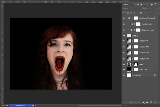
For the editing this week, I worked on shadow gradients and colour grading. For my first composition, I edited the vibrancy of the blood and the hue to make it feel more realistic. I then added a slight contrast to make it feel more dramatic and like a horror film poster-like. I then added the uneasy, claustrophobic black backdrop. I did this by blending black gradients into her hair. I feel this still needs some work, but the overall effect is working. The red hair might need to have the saturation turned up a bit. At least I was able to fool people I showed this into thinking the blood was edited later!
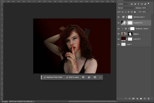
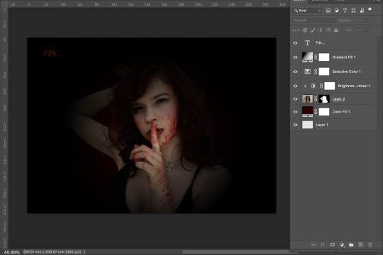
For the second composition, I first tried a blend of red and black for the gradient, but it felt disjointed, messy and flat. When I used just black, it blended better and created depth in the composition. I did it in a way that looked like the old film circle closing in on a point of focus, being the finger. I then added some badly done type saying fin alluding to the final girl ending where she is finally free.
0 notes
Text
Why a Professional Cameraman is Your Secret Weapon for Killer Corporate Videos

Let’s cut to the chase: in the world of corporate video production, you can’t afford to mess around. If you want your brand to pop and your message to hit hard, you need a professional cameraman on your team. This isn’t just about having someone press record; it’s about having an expert who knows how to make every shot count.
Professionalism Makes a Difference
Here’s the deal: your video is a direct reflection of your brand. A sloppy, amateur video sends the wrong message. On the flip side, a video shot by a professional cameraman screams quality, attention to detail, and credibility. You want your audience to see your brand as top-notch, and that starts with high-quality visuals. This is where a pro cameraman comes in—they know how to use every piece of equipment and technique to make your video stand out.
The Edge of a Professional Cameraman
What sets a professional video cameraman apart? It’s their ability to turn a standard shoot into something special. They understand lighting, angles, and composition in ways that make your footage pop. It’s not just about taking nice pictures; it’s about capturing your brand’s essence and making sure it lands with impact. This is the level of detail that can take your video from average to outstanding.
Cameraman vs. Videographer
You might be asking: isn’t a cameraman and a videographer the same thing? Not exactly. A videographer handles everything from shooting to editing and directing. A cameraman focuses specifically on capturing the best footage. For those times when you need top-tier quality, a professional cameraman is the way to go. They’re specialists in making sure every frame is perfect.
Why Investing in a Pro Cameraman Pays Off
Hiring a professional cameraman is more than just an expense—it’s an investment in your brand’s future. High-quality videos drive engagement, boost your credibility, and help you stand out from the competition. Whether you’re a small business or a big corporation, investing in a pro cameraman can lead to higher engagement, better conversions, and a stronger online presence. The payoff is worth it.
How to Find Your Perfect Cameraman
When you’re looking for a professional cameraman near me, don’t just settle for the first name that pops up. Check out their work to see if their style aligns with your vision. Experience with corporate projects is a big plus. And make sure they communicate well—your cameraman should understand your goals and help bring them to life.
Rethinking Terminology
One last thing: the term “cameraman” can be a bit outdated. Today’s industry is diverse and inclusive. Using terms like “camera operator” or “videographer” not only reflects the current state of the industry but also promotes inclusivity.
In a nutshell, a professional cameraman can make a huge difference in the success of your corporate videos. They bring expertise, creativity, and quality that can elevate your brand. If you’re ready to step up your video game, reach out to Astral Studios. They’ve got the skills and experience to make your videos shine and ensure your message lands with maximum impact.
0 notes