#zoom in and you'll see this is only black and white pixels
Explore tagged Tumblr posts
Visit Tumblr Blog
Explore Tumblr blogs with no restrictions, modern design and the best experience.
Last Seen Tumblr Blogs


Fun Fact
Total funding amounts to $125.3M.
Text
Fellowship Cloak Weaving Draft
Hi all! I've been kind of quiet on this blog, but I have something really exciting to share today: after six years, I FINALLY figured out the weaving draft for the Fellowship cloaks from Lord of the Rings.
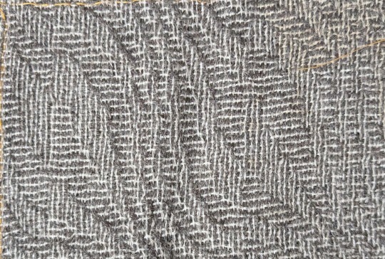
This is a problem I've been trying to figure out since shortly after I made my Legolas cosplay in 2018. The cloaks that the nine members of the Fellowship receive in Lothlórien look like a nondescript gray fabric from far away, but zoom in and you'll see a very complex pattern of horizontal and vertical bars of dark gray and white.
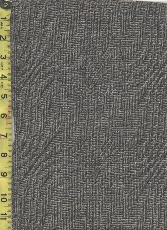
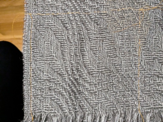
(First image from Alleycatscratch, second is a photo of the scarf of the same fabric I bought from Stansborough where I was attempting to trace the pattern repeat with orange thread)
This is going to be a long post, so I'm just going to lead with the completed draft:

Imagine me Will Smith wife posing at this for the last 24 hours.
It's got the correct size of pattern repeat! It's got the five individual ripples! It's got that dumb little pattern break in the middle that breaks up the center of the leaf motif! I am OVER THE MOON about figuring this out, especially starting out with very little knowledge about weaving drafts in general. More ramblings about this type of draft and my thought process below:
This particular pattern is known as "shadow weave," a subset of color-and-weave where the pattern is created from the interplay of different warp and weft colors plus the weaving draft itself. To get an idea of how that works, let's start by looking at plain weave in one color:

The solid purple bar at the top indicates the color of the warp threads, and the solid purple bar at the right indicates the color of the weft threads. So far we've got our basic under-over-under-over pattern in a single, solid color (purple). But what if we add an additional color (green) to the warp, and alternate those colors? Then we'd get a speckled fabric like this:

The visual effect looks pretty much identical regardless of if you start with green or purple. However, if you also alternate purple and green in the weft, it produces a very different effect depending on if you start with purple or green (note the differences in the bar on the right):


So cool, now we can make either vertical or horizontal stripes! If you double up on the colored threads in some areas, you can even flip between the two and start dividing the fabric into "blocks," like so:


Note that with all these changes, the only thing we've been doing is changing the order of the colors in the warp and weft. The actual weave structure itself is still just regular ol' plain weave. The pattern that we've created in the pictures above is called "log cabin," which you can read about here. But similar effects can be created by skipping shafts/picks in the weaving draft as well. So how do we get from log cabin into the more complicated and general category of shadow weave?
It's weird to describe how to convert a given pattern into shadow weave. There are multiple very good books with chapters on shadow weave as well as books entirely dedicated to it. Despite my best efforts, all these explanations still got so technical so fast it feels like, to me at least, asking a 6 year old to recite an entire Shakespeare play verbatim immediately after confirming that they can, in fact, sing the alphabet song. So I'm going to give my best shot at explaining it, and if it doesn't make sense, just blame it on me and check out some of the linked books above if you're really curious.
Think of shadow weave as a beauty filter for a black and white drawing. If you create a pattern out of black and white blocks/pixels/whatever, the shadow weave "filter" can be applied to it to create a similar pattern that preserves the shapes in the original, but makes them out of vertical/horizontal lines instead of solid color blocks. So in some of these books you'll find mention of converting a twill or an overshot pattern into shadow weave - that's what this is referencing. The original pattern (usually designated with light yarn) gets a secondary shadow pattern (in dark yarn) inserted into in between every other thread (also called an "end" when referencing warp yarns).
I got stuck at this point for literal years. I could find examples of weaving drafts using shadow weave, but couldn't figure out how to generate ones of my own. I imported some of the drafts I found in books into weaving software and poked around to see if I could push the patterns in the direction I wanted by changing individual elements. My experiments in changing individual warp ends and weft picks always ended up looking like stretched or compressed versions of the original pattern (when I was being careful), or incomprehensible garbage (when I was being daring). I even bought a sample of the fabric from Stansborough in the form of a scarf, thinking I could brute force it by using a magnifying glass to figure out the interlacements. I was able to figure out how large the pattern repeat was (approximately 160 x 80 ends), but otherwise I got nothing but eye strain. I ended up tabling the project and coming back to it every couple years, banging my head against it until I gave up.
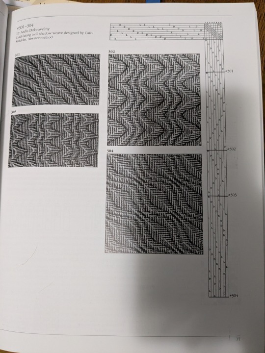
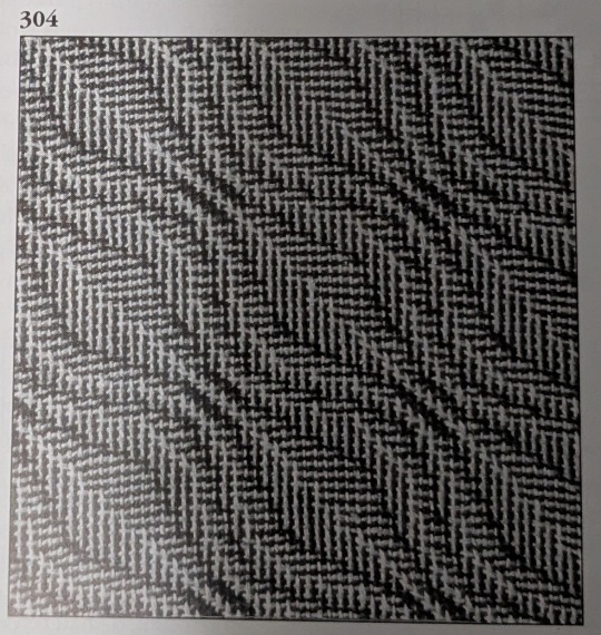
Until one day last week when I was flipping through the Strickler book and saw this page:
And I was like

HOLD UP
IT'S HER
...or at least a close cousin of her. BUT IT WAS A START.
So the first step was to identify what about this pattern needed to change in order to make this look like the Fellowship cloak. Overall, the main differences were:
Pattern repeat on Strickler 304 was too small - it was 42 x 42 ends and I needed it to be somewhere in the ballpark of 80 x 80 before altering the repeat.
The Fellowship pattern has a weird vertical dividing line that runs down the middle of the leaf motif, effectively doubling the width of the repeat by creating two similar looking but different leaves. This was the change I was least concerned about, as flipping between vertical and horizontal lines is pretty a straightforward process as shown above with the log cabin draft.
Strickler 304 also has a different number of waves (peaks and valleys, or whatever you want to call them) compared to the Fellowship pattern. There are 3 waves in Strickler and 5 in Fellowship. Figuring out how to add these extra waves was the biggest obstacle for me to address.
And finally, a couple of things I didn't need to care about for the weaving draft: 1) the Fellowship pattern is elongated in the warp direction, but this has more to do with a little extra spacing between weft picks as compared to the warp threads. When weaving this you'd just need to make sure you don't beat it very hard and you'll get that tall rectangle shape instead of a square repeat. 2) Both patterns have mirrored symmetry around a diagonal line drawn through the center, meaning that for treadling I could "tromp as writ" or basically just mirror the threading diagram to get the treadling instructions. For reasons I can't figure out, the Strickler pattern isn't exactly tromp as writ but looks close enough to it that the effect is still there. But I don't really care enough to figure out why - the important thing is that it gives us a threading diagram to start with!
So to start with, here's what Strickler 304 looks like in my weaving software:

(By the way, this is Fiberworks PCW Bronze. The trial version is free, and the only difference between that and the paid version is that the save/print options are disabled. I'm not sure they know about screenshots, bless their hearts.)
This is a design for 8 shafts and 8 treadles, thus the 8x8 square in the upper right corner. And you can see in the threading diagram (upper horizontal bar) and treadling diagram (right bar) that the curvature of the waves takes a similar shape to the curves of the final pattern. We just have to figure out why. And since I had already tried changing individual warp ends and treadling patterns without much success, I needed to approach in a different way.
What ended up helping me see the forest for the trees was de-shadowifying the pattern. It's relatively easy to get the black-and-white version of the pattern from the threading draft - you just need to delete the shadow, which means removing every other warp end. This is what deleting all the dark ends from the warp and light ends from the weft looks like:

We can also see with a little more detail how the threading diagram is similar to the curve in the pattern. The pattern is 21 pixels tall, but it's been chopped up to repeat over 8 shafts, like so:

OKAY COOL COOL COOL. EVERYTHING'S COMIN' UP MILHOUSE IVORIVET. From this green squiggly line we know two things:
The final number of warp ends in the shadow weave pattern is double whatever the height of the squiggle is. In the case of the Strickler pattern, we're going from 21 to 42. Since we know that we need our final height for the Fellowship pattern needs to be 80, the squiggle for that pattern needs to be around 40 pixels tall.
We needed to stitch three repeats of the Strickler threading diagram together in order to see the full squiggle. How many waves does the Strickler pattern have? Three. How many waves does the Fellowship pattern need? Five. How many shafts do we have to work on? Eight. What is 5 x 8? 40!!!

So how about we make a NEW squiggle, only 40 pixels high instead of 21? (We're gonna drop the pixels in blue, since threading diagrams won't work if you put a single end through two shafts.)


Next, we're going to chop up that squiggle and use it to create a new threading diagram in Fiberworks. I'm also using "tromp as writ" here to create the treadling pattern.

LOOK AT THAT. IT'S GOT MORE WAVES!! FIVE OF THEM!
And then we add back in the shadow by creating a space for a new end between each existing end:


And then add in the shadow. I'm using 4 as my number for the shadow offset since we're using 8 shafts. So shaft 1 shadows to shaft 5, shaft 2 shadows to shaft 6, etc.

And we're going to apply tromp as writ again to get:

AYYYYYY WE'RE GETTING CLOSE! I'm fairly certain that the reason why the Strickler treadling wasn't exactly tromp as writ had something to do with centering the pattern repeat a little more than this, but I don't really care about that so I'm going to leave this treadling the way that it is.
From here out, we need at add that weird vertical dividing line that chops up the center of the leaves. So we double the pattern repeat along the horizontal axis, and offset a 40 pixel section in the middle of the threading diagram by 1 pixel. I've also colored in the differences between the dark and light ends to help differentiate the original and shadowed curves a little bit more. (I also tried offsetting the colors of the warp ends by 1 as well like what we did in the log cabin example, but I ended up liking the way that this looked more.)
THERE SHE IS!!! MY PRECIOUS!!

From here on out, there is still a ton of work I need to do if I actually want to weave this cloak from scratch. I did buy roving in quantities that could be used to spin both the dark and light yarn (dark gray Gotland for the dark yarn, and dove gray merino + white alpaca for the light yarn), but there's still the matter of, like, handspinning a cloak's quantity of extremely fine yarn. I did start spinning the Gotland several years ago as fine as I could possibly manage, and got through maybe 20 ounces of it. However, I'm a much better spinner now and I'm not sure if the my skeins from several years ago would be suitable for weaving, or if it would be worth replicating what I did back then vs. just starting over with a new standard. There's also the possibility of just... buying weaving yarn if I want to skip that step, which would definitely save me a significant amount of time.
Anyway, thanks for reading this far and I hope it helped break down why this was so exciting for me!
#lord of the rings#lotr#weaving#lotr cosplay#shadow weave#handweaving#hand weaving#cosplay#fiber arts
909 notes
·
View notes
Text
How I draw: Silver Metallic Buttons for Sims 2 Textures
As we all know, Sims 2 doesn't really appreciate large file sizes/dimensions for it's textures, so sometimes you have work very closely with the individual pixels. Here is how I draw buttons. Video is sped up so don't feel like you need to draw as fast as me!
Side note: this tutorial is created on the basis that you already know how to use the basic functions of Sims BodyShop to extract the texture file. There's plenty of tutorials out there explaining that so please don't ask me to clarify on that part. Anyway, on to the buttons...↓↓↓
What you need:
A PC
Digital Drawing app (like Photoshop, Krita etc)
A Graphics Tablet with pen - you could try this with a mouse but I wouldn't recommend!
And obviously Sims 2/Sims 2 BodyShop
First off, create a new layer - we don't want this button permanently stuck to our base texture. Then I get a standard hard edge brush (I use Krita as my drawing software, so just use whatever hard brush is available in your preferred software/app). Because I'm making relatively small buttons, I make my brush 7.09px in size. Select a mid to light grey colour as the base. Make a single circle.
Then decrease the brush size to be nice and small. As a comparison to my 7.09px circle, I decrease to 0.01px for this next step. Choose a slightly darker grey colour and lightly sketch in a 'semi-circular line' about 3/4 of the way around just in from the edge of the circle. By lightly sketching - and not pressing down hard, you'll get varying tones on each pixel to represent different reflections on the 'metal'.
Next choose a darker grey again, and lightly sketch around the similar area as the last colour, but don't be too fussy on hitting the same pixels - we want varying tonal values for our shadows.
Then choose white and lightly sketch the 'catch light' part of the button. This doesn't need to be right in the centre, in fact it's better if it's off to the side, or towards the top more. We're not always facing directly towards a light source so this creates a more realistic lighting effect. You'll see me select the same mid to light base grey I used just to lightly dust over the edges of the white area to soften it a tiny bit (only do this if your white edge is a little to crisp).
After that I go back and forth between a few different tones of grey to lightly sketch over the parts we haven't really drawn on yet. This just helps create some gradual shading that enhances the 'roundness' of our very flat, very 2D button texture.
Once you're happy with the shadowing (remember it looks somewhat janky this close up, but you can always zoom out to see if the button looks more smooth when further away), you can then make another layer, and drag it below your newly made button layer in the layer menu. Select a soft edge brush and increase the size to slightly wider than your buttons overall size (I chose 9.14px compared to my 7.09px button)
Choose black from the colour wheel/palette and lightly build up the shadow underneath the button, gradually increasing size and opacity until desired tone. If the colour of the 'garment' in this texture is light then keep the shadow to a minimum, if it's dark then the shadow needs to be deep enough to show up.
Zoom out and inspect how this button looks further out. If you're satisfied, then merge the button and shadow layers together, copy/paste it as many times as needed for the garment you're texturing and Voila! You made buttons for a Sims 2 Texture!!
Feel free to ask any questions below - I'm definitely no professional, especially in creating tutorials so I'm more than happy to clarify if something didn't make sense.
#sims tutorial#digital drawing#retexture#drawing tutorial#ts2#the sims 2#digital art tips#lraerosesims#lraerosesims-tutorials
91 notes
·
View notes
Text
I have unlocked the power known as "OBS Stinger Transition Masking" and now I'm passing the savings on to YOU!
What the hell are you talking about?
If you stream using OBS, there's something called a "Stinger Transition" that lets you create custom fades between two different scenes. So if you have a static "be right back" scene separate from a live streaming scene, a transition will fade between the two.
A "Stinger" transition is something OBS added that lets you substitute a video file as the transition fade. Essentially, you'd have a (usually transparent) video file and at a specific point, that stinger video would cover 100% of the stream, at which point you'd tell OBS the time code of 100% coverage so it could secretly swap scenes underneath it.
But then OBS added "Track Matte" which lets you do fancy masking. Now there's a whole complicated process where, if you want full color animated transitions, you have to generate a special split video but that's too fancy for me. What isn't too fancy is just basic mask transitions, like the GIF you see above, and "Track Matte" lets you take the easy way out and do this instead. I promise, it's not hard!
So, I went through and converted my favorite gradient transitions I have for Vegas to work with OBS's Track Matte Stinger Transition Masks (wow, what a mouthful). And! I'm letting you download them and giving you instructions on how to use them. Before we get to how to install and use them, some credits:
Default Sony Vegas Gradient Transitions
Diagonal Wipe
Side Wipe
Swirl
Puzzle
Curling Smoke
Floral Growth
Iris In
Iris Out
Barn Door Open
Barn Door Shut
Shutters Open
Shutters Shut
Horizontal Alternating Bars
Vertical Alternating Bars
Gradient Transitions I Borrowed From My Old Roxio Gamecap
Quad Clock
Many Clocks
Maple Leaf
Mandelbrot Fractal
Bytes
Star Wipe
Butterfly Zoom
Blobs
Chomping
Diamonds
Checkerboard
Crusty
Balls Out
Burst
Swooce In (Pictured above!)
Swooce Out
Draw Box
Draw Box Smaller
Splat Top
Splat Explode
Overlay Stars
Stargate In
Stargate Out
Scraps
Pinch
(I may have gotten creative with some of those names)
Gradient Transitions I Made Myself
Pixel Infection
Scratches
Slime
Yoshi's Island Wipe
How To Install These
Download your chosen flavor:
OBS Stinger Masks [720p].zip
OBS Stinger Masks [1080p].zip
Extract all the MP4 files somewhere. Preferably to their own folder, and possibly somewhere inside your OBS install if you can help it.
Open OBS. You should have a little menu called "Scene Transitions."

If you don't have this visible, in the drop down menus at the top, click on "Docks" and make sure "Scene Transitions" is checked.
With your Scene Transitions panel available, click the + (plus) icon and select "Stinger."

This will prompt you to give your new Stinger transition a custom name and take you to the customization menu.
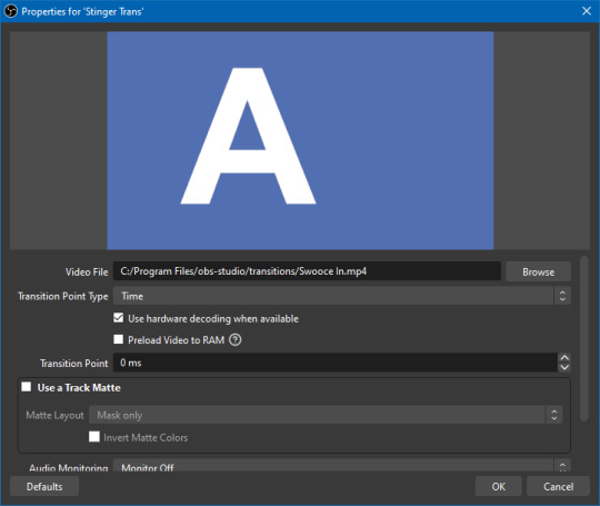
In the "Video File" field, we just point it towards one of the MP4s you just downloaded and extracted. In this case, I have chosen "Swooce In.mp4"
You can probably ignore everything else, but make sure to check "☑ Use a Track Matte" and under the "Matte Layout" drop down, make sure it's set to "Mask Only." The other two Matte Layout settings are for the fancy full-color alpha transparency video transitions, but we're just doing simple black-to-white masking.
At the very bottom of the menu (I'd have to scroll down on my sample image) there should be a "Preview Transition" button if you'd like to see a sample of what it looks like in motion.
Click okay, and you should be done! As long as the custom stinger you just made is the one selected under "Scene Transitions", every time you change scenes, it will blend between them using the video you selected.
Can I make these any faster? Or slower?
Not within OBS, no. You would have to change the speed of the video file itself. I tried to be mindful of how good these looked at what speeds, but if you think they're the wrong speed, you'll have to crack open a video editor for yourself and figure out how to change the playback speed.
And, obviously, if you have even minor experience with video editing, you can probably grasp the concept of how this works pretty easily, meaning it should be pretty easy to make your own stinger masks with all kinds of fun patterns. As long as it goes from black to white!
You could also be a psychopath with Adobe Premiere and learn how to do the full color animated transitions too, if you want. This seems like a pretty decent tutorial on how to do that, but like I said, that's way too much work for me.
11 notes
·
View notes
Text
Tutorial Dog
Hello Everyone.
So I've gotten a few questions about how I make the little animals so I thought I'd do a little process post.
Well the first step really is deciding an animal and a palette. For the animal I try to switch it up and not choose the same species back to back, and then I look for a reference. Usually I want a clear full body image to refer to. Next I pick the palette, which for the most part is random. Other than avoiding the same general colours as the previous animal, I use https://lospec.com/palette-list which has a nice selection of user submitted palettes that you can limit by number of colours. My only rule when selecting a palette was that it could not contain pure black, only off black if it was present.
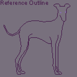
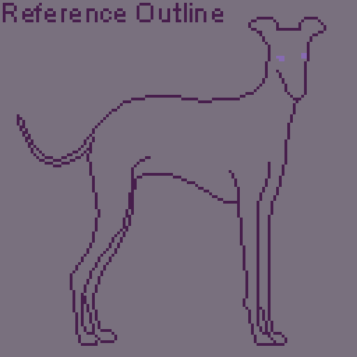
For the animal I've selected an Italian greyhound, which we'll refer to as Tutorial Dog.

For the palette I've chosen: Yana's Modernized Pokemon SGB.

I've numbered the palette to explain better. Next part of the process is making decisions about colours. For me, limited palettes make this step easier since I have fewer decisions to make. Generally 4 colour palettes contain a black, white, and two mid tones. The black and white colours are already decided as colour 1 and colour 4 in the palette, so the big decision is deciding which of the two mid tones is the dominant colour, this colour will cover the most area and be added last. Usually I'll decide this based on if the animal is predominately white toned or black toned. For Tutorial Dog I've decided black toned so the colours will be added in 1,4,3,2 order.
First things first, I do an outline of the general shape of the animal and I'll also use another colour to put the general position of the eyes. The eyes are the most important feature and you'll see me adjust them a few times throughout.
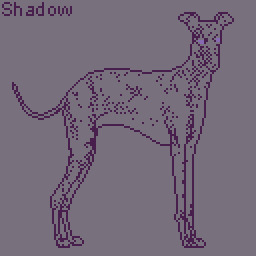
Next we add the shadow. These are the darkest areas and they provide the most detail. It's very easy to muddle the image here so I try to avoid laying down large dark areas. Note that I also place all pixels individually, and use a semi-random placement as patterns or dithering can make areas look too flat. This is also why the little animals are little, the canvas size is 128X128 pixels. This means on average a little animal takes around 4-6 hours to draw, depending on the detail; so drawing 1 a day is very achievable even on work days.
The light is added next using the same semi-random placement, it's best to add the light tone sparingly, using it only to highlight bright areas, as our non-dominant colour with fill out those areas later.

Now the non-dominant colour, this is the point where I usually have a small panic, as the image will always look awkward at this point. This is also the time where if I've made the wrong decision on which colour should be dominant I'll be able to tell. Lucky for me, that only occurred one time while I was drawing the little animals. You can also see here that I've made adjustments to the eyes but they still look a bit wrong.

Now for my favourite part, adding the dominant colour. This is the point where the whole image comes together. I'll usually use the fill tool here. You can also see I've made some adjustments to the nose with the shadow colour, as the detail was unclear.

Now we make final touches, this is the point where really I spend a bunch of time zooming in and out to see if the image looks right; fixing the eyes to make them more clear, reducing some of the shadow colour on the back legs to make it less harsh, and adding more shadow to the ears to give more detail.
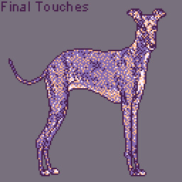
I'll give the animal a 1 pixel wide outline in pure black to help them pop out from the background. The backgrounds use the same palette, but the colours are tinted with a small amount of white so they won't interfere with the animal itself. Then the colours are faded together with dithering. Finally I add my signature and we are done.

Here's a little bonus animation of the process.
If anyone has questions or would like to suggest an animal for future drawings, please send me an ask.
Also any future tutorial or process posts will be found under the tutorial dog tag.
Thank you.
-Vin
10 notes
·
View notes