
Don't wanna be here? Send us removal request.
Statistics
We looked inside some of the posts by the-binx and here's what we found interesting.
Average Info
Notes Per Post
78
Likes Per Post
52
Reblog Per Post
25
Reply Per Post
1
Time Between Posts
1 month
Number of Posts By Type
Text
9
Photo
8
Last Seen Tumblr Blogs


Fun Fact
Kazakhstan’s Minister of Communications and Informatics has blocked the Tumblr site because it contained 60 sites of terrorism, extremism, and pornography in 2015.
Text


UPDATE
It's been too long since I posted here.
I've always felt that art should be accessible. I feel the same way about media in general, but as I continue to delve into my creative pursuits, I know it's never been about money (don't get me wrong, I want money so that I can do as I please and help the people I love) but it doesn't motivate me when it comes to creating. I like what I make, I do it for myself, and if it resonates with others...groovy. I think a lot of creatives lose themselves trying to appease the social media masses and I don't give a fuck.
I created this pleasure zine to express that side of myself more and encourage others to seek and indulge in pleasure, whatever that looks like for them. With only one week left for preorders, I'm so excited to hold a copy. With the zine, I also designed some condoms (something I've wanted to do for a LONG time) and will say it's pretty fucking cool to have a condom business card. I'd love to delve further into the realms of sexual expression, have found opportunities to do so, and enjoy the journey. With this, I've been studying sex education in my spare time, and that's been nice to understand myself better and know what works for me in that realm. I have heard so many stories from others about intimacy, pleasure, trauma, and overall, if I can help others to experience more fulfilling moments and be aware of consent and boundaries...well, that makes me happy. With that, perhaps the connection I seek will also come to me. There is something that drives me to understand and promote connection in a way that feels like it's dwindling in our world. I think it's a mixture of overstimulation and people believing they have more options within the fantasy than they do in reality.

Current WIP doodle
I also went to Hump Fest for the first time and it was fascinating to see what films turned me on, intrigued me, and left me feeling like particular fixations are not for me. It was also cool to chat with others about what films were their favorites and what excited them. I can admit that what gets others "off" is fascinating to me from a psychological point and if there were some way to become a sex therapist without taking on a hellish amount of debt, I would have done so at this point. I have learned from therapy degree friends that there are other ways than schooling to do so, and I find myself researching and seeking those opportunities as well. I'm also looking to get back into nude modeling for art classes and becoming a rope bunny for workshops. Keeping myself busy seems to keep my anxiety and libido at bay. (lol girl...)
I'm always pleasantly surprised when I go back to old musings and journals, and seeing what has manifested from then. Looking forward to what comes from here.
Since my Tumblr is tied to my website, I'll update it in the summer. This space used to be an art journal for me of some sort, but with such a candid demeanor, most places I post are kind of like that now (lol)
Instagram is still the best place to see my art, but I'm looking for the best place to post that is a bit NSFW friendly and has good vibes.
Til next time~
#binx art#ビンクス#binx#art#artist#erotica#adult art#sexual expression#hump fest#life be lifin#updates#musings#rope bunny#kink#pleasure is liberation#pleasure#liberation#creativity
0 notes
Text

#binx art#art#illustration#colors#artists on tumblr#polychromatic#design#lisa frank#fantasy#black girl magic#midsummer#divine feminine
0 notes
Text

#Aztlan graphics#art#design#artists on tumblr#angel#colors#binx art#stripper#pole dancing#polychromatic#erotica#illustration
3 notes
·
View notes
Text

Choose the right vibe!
#art#artists on tumblr#vibrator#sex positive#rose#binx art#polychromatic#design#anime#animation#animated gif#sexy time#video game
1 note
·
View note
Text

1 note
·
View note
Text
I wanted to make a fun animation for Megan Thee Stallion's anime and video game-inspired MV "Boa". I also took it upon myself to redesign the Dance Dance Revolution logo for the final animation. DDR has always been one of my favorite rhythm games.


#art#illustration#megan thee stallion#hot girl summer#dance dance revolution#anime#video games#konami#BOA#logo#kawaii#binx#binx art
44 notes
·
View notes
Text

Feminine Feels
1 note
·
View note
Text


For my "Play" series. A fun way to combine my love for video games and encouragement of kink.
#illustration#artists on tumblr#leather#play#videogames#design#beautiful women#binx art#art#kink#adult art#erotic#erotica
0 notes
Text

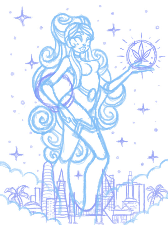
Back cover for High Times March 2024 issue
They wanted a cover for their travel issue that was reminiscent of the work I did for Califari. Since they loved the giant girls, I wanted to play around with that concept again.
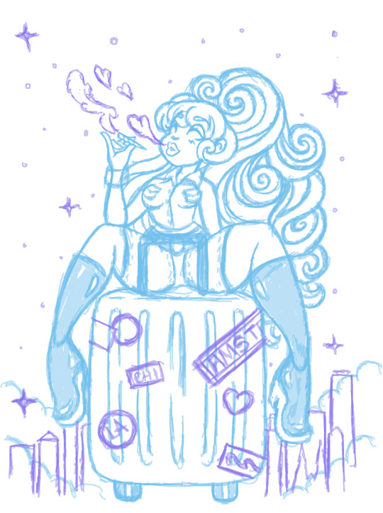


Finalized lineart
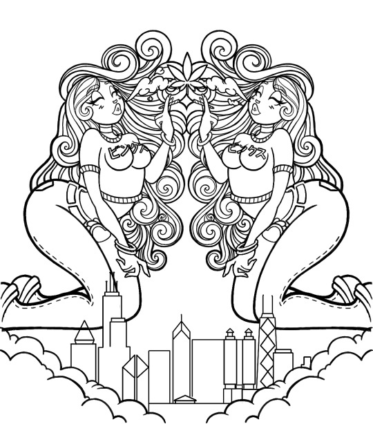
Fun fact: The wording on their shirts is my sig in katakana.
1 note
·
View note
Photo
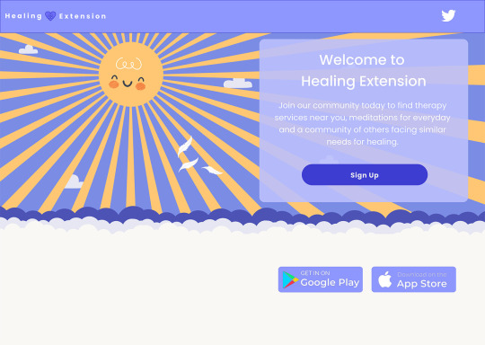
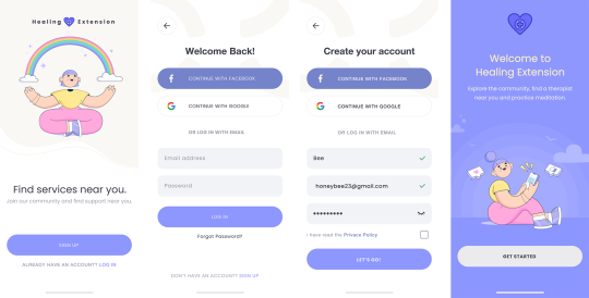

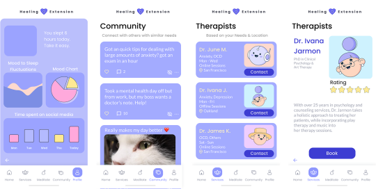

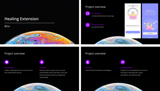
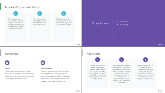
Healing Extension mediation and therapy app for the final project of my UX certification. I wanted an app that not only promoted mental health and wellness but also could provide real-time therapy services as well as build community.
Case Study outlining my process

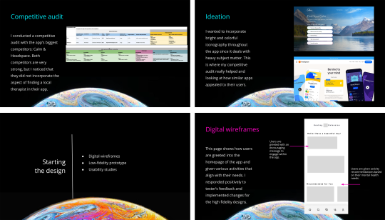
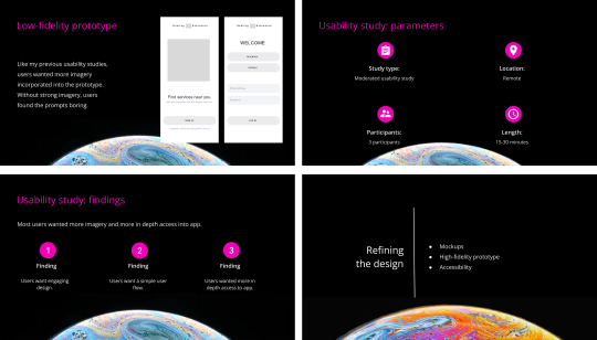
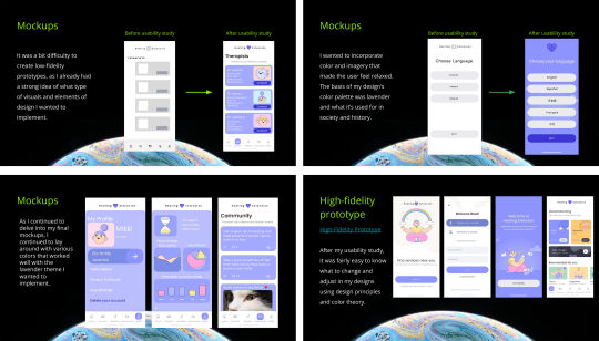
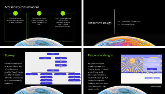
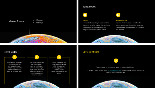
High-fidelity prototype
8 notes
·
View notes
Photo
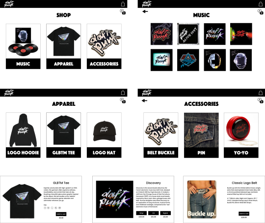
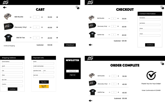
Daft Punk: Shoppin’ After All Case Study
My second project for the Google UX certification.
My prompt was to design a merchandise customization flow for my favorite band.
I created and conducted my research for this project most of June 2023. I used Adobe XD to develop a responsive website prototype to conduct my usability testing.
Initial Sitemap

Low-Fidelity Mockups
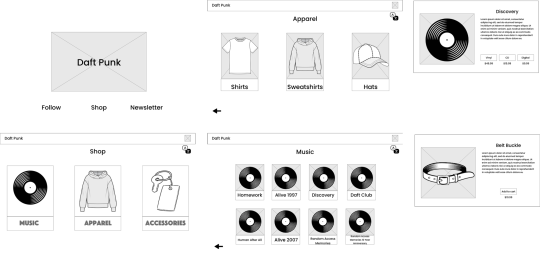

Phone Mockups
These were the initial mockups I used when I conducted my moderated usability study.
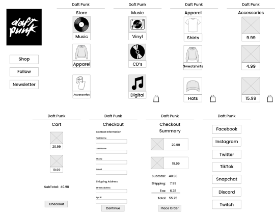
I found after my study that the user flow was pretty simple and that the icons helped when shifting through different products.
High-Fidelity Prototype
My takeaway after conducting my final usability study is to incorporate more iterations for the user while shifting through the products and develop a more interactive user reward once they complete the checkout process.
As always, I welcome feedback as I continue my UX design journey.
6 notes
·
View notes
Photo
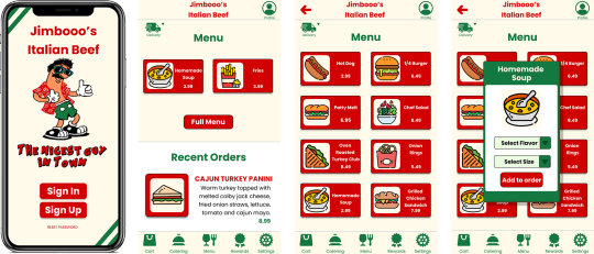
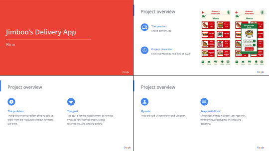
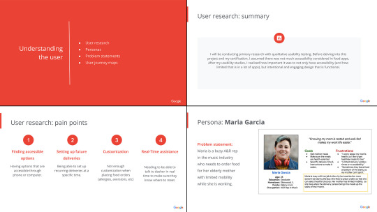
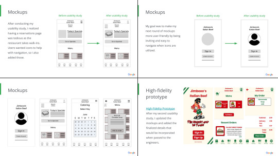
Jimbooo’s Italian Beef - Case Study
My case study for my first project from the Google UX certification. My prompt was to create a food delivery app from one of my favorite hometown restaurants. I chose Jimbooo’s Italian Beef for a few reasons:
1. They have enough branding where I could really get creative and have fun with it.
2. It reminds me of my family, and how we all love the various soups there.
The images outlay the entire case study including my research methods, process from paper wireframes, to high-fidelity mockups.
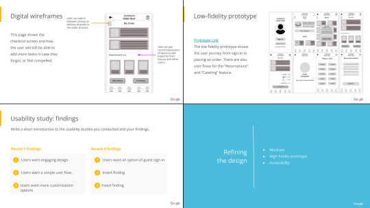
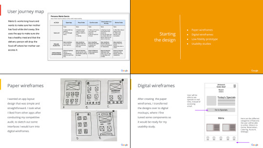
Low-Fidelity Prototype
High-Fidelity Prototype
I welcome being reached out to for any feedback as I continue my UX journey!
7 notes
·
View notes
Photo

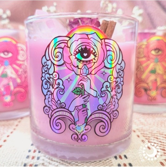

Package label for client CozyWild "Lucid Loves" candle. They wanted an image that correlated with the scents of the candle and promoted self-love.
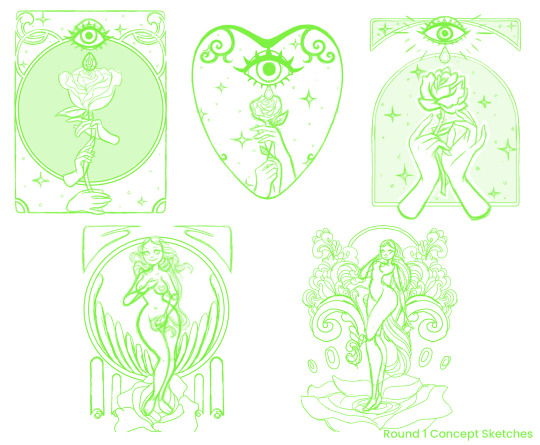
In the first round of sketches I played with the ideas that were spinning in the client’s mind. One was more of a take on the “Birth of Venus” and the other a psychic art nouveau interpretation with the themes of love, self-love, pleasure, reverence and the candle title of “Lust & Found”.
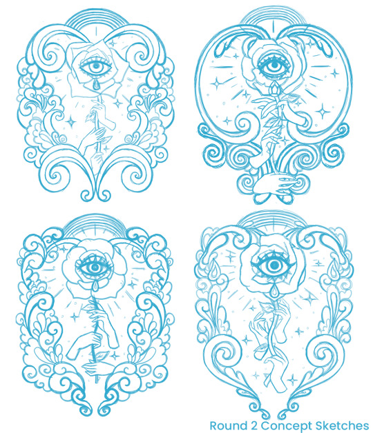
For round two of sketches we went with more ornate play on the nouveau concept. The border needed to be heart-shaped without being obvious and also encapsulate the business logo for the final design and printing process.
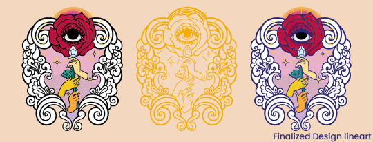
After doing adjustments to the ornate design and flower petals, we reached the finalized line art. From here I adjusted the color palette and glowing light that radiated from the flower into the final design.
#illustration#art#design#rose#candle#love#cozywild#self-love#affirmation#intentions#pyrite#cinnamon#rose quartz
4 notes
·
View notes
Photo
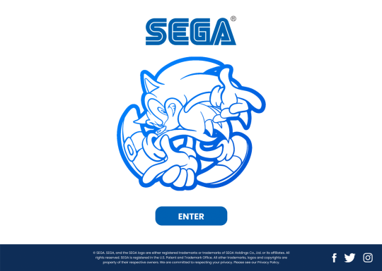

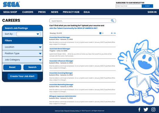
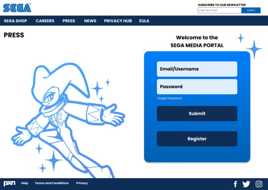


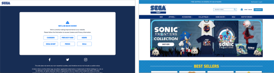
Sega - Website Redesign
Wanted to give myself a quick UI design challenge in Figma.
The Sega website I decided to redesign could make it difficult for users to navigate and find the information they needed. In order to address these issues, I took a user-centered approach and conducted light research to identify pain points and areas for improvement.
To create a more modern and user-friendly design, I incorporated some of Sega's iconic characters and imagery while also implementing a consistent and cohesive design language throughout the website. I also conducted light user testing (friends who are also fans) to ensure that the new design was intuitive and easy to use.
By redesigning the Sega website, I was able to create a more engaging and effective online presence for the company, helping to attract and retain more users and customers.
The current Sega website pages I wanted to recreate:


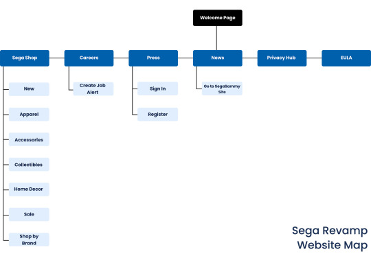
Web site map to help with creating the layout:
I looked at their biggest direct competitor Nintendo to see what I could improve on and for inspiration:

One element I really wanted to incorporate was more interactive design for the user, using the iconic sonic ring. For the “Sega Store” page, instead of a shopping cart, having a moving ring (see below) for the number of items to be encased around would give the end user an interactive feature as they added items to their cart. I saw plenty of opportunities for interactive design to be incorporated, but also believed less was more.

I wanted to create something cohesive and consistent through the pages, that still captured the company’s brand. I had a lot of fun incorporating some of my favorite Sega character’s throughout the years. I’m already looking at what I can improve and what would be great accessibility features to incorporate in my next design challenge.

0 notes
Photo

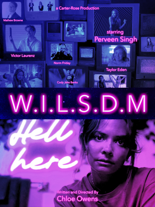
Poster work for short film W.I.L.S.D.M
I also worked on social media campaign and the title credits for the film. A fun film worth watching.
1 note
·
View note
Photo
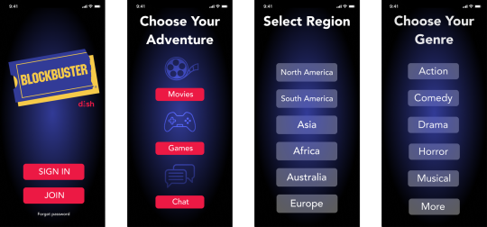
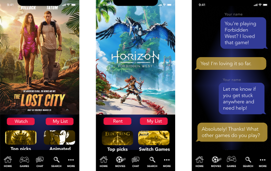
UI/UX design challenge.
We were assigned to create the user flow for a conceptual Blockbuster/Dish mobile app utilizing Figma that could rival competitor Netflix.

We needed to come up with the user flow from signing in/creating an account to getting to the selected features. We had to work with a specified limited color palette and make sure to incorporate the included assets and fonts.
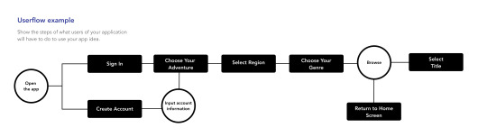
One of the unique features of the app would be a “chat” feature to connect with other members who watch/like the same content as the user.
The app also offered a “games” feature, enabling the user to rent games to download to their console and see what other member’s top choices were.
For my layout design, I used a Iphone 11 Pro Max template size.
0 notes
Photo

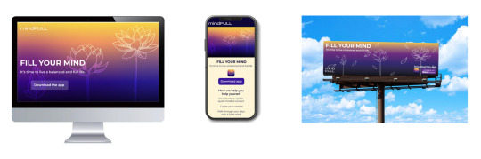
“Elevate Your Mind” Case Study
Mindfull Ott app that provides comfort from home needs a web presence and outdoor advertising. We needed to create and desktop and mobile landing page.
From a design and user interface perspective, what can we do to appeal to a wide age group through the home website and billboard advertising?
Inspiration + Exploration
Inspiration 1: Meditation App Websites
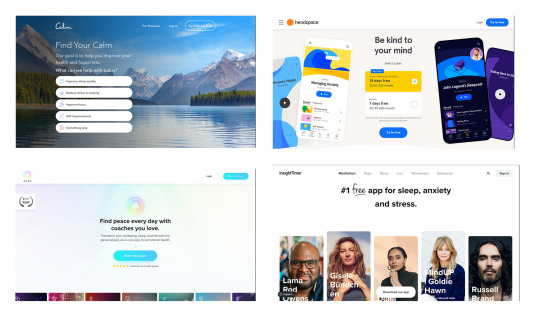
Inspiration 2: Mindful Imagery & Activities

Inspiration 3: Mindful Signage

Conceptual Iteration
After looking through the inspiration I created a mood and sketch board to help me figure out exactly what imagery I wanted to use in the mockups. I kept going back to flowers. Originally I wanted to utilize lavender and use imagery of lavender fields. I decided that the tranquility symbolism could get lost with that flower and settled on the lotus. From this point, the lotus seemed like a great way to create simple icons that could be incorporated, but not too obvious as incorporating a monk or statue of Buddha. The lotus flowers and ornamental lines used in the final landing page were drawn in Photoshop.

Refine & Launch
At this point, I had my color palette and framework for the desktop and mobile design and started with those mockups knowing that any imagery I sketched up could be utilized for the billboard.
1 note
·
View note