
Comic Art | Illustration | Character ArtReach out for Commissions or CollabsTrying to remind my hands how to draw and love the world through drawing.sketchwork blog: @themakingsofbirdnest
Don't wanna be here? Send us removal request.
Statistics
We looked inside some of the posts by themakerbirdnest and here's what we found interesting.
Average Info
Notes Per Post
14K
Likes Per Post
10K
Reblog Per Post
4K
Reply Per Post
42
Time Between Posts
19 days
Number of Posts By Type
Text
13
Note
1
Last Seen Tumblr Blogs


Fun Fact
Tumblr has been banned in Indonesia for providing people with access to pornographic content.
Text

The Ekenäs castle of magical research
Process:


1K notes
·
View notes
Text

CCTV (New Zealand) Austerity Blues EP Cover, 2024, Birdnest
Process work is on my other blog @themakingsofbirdnest
#painting#acrylic paint#ep#ep cover art#cover art#album cover art#cctv#cctv (new zealand)#austerity blues
1 note
·
View note
Text

Horse Thieves' Cave, 2024, Birdnest
10 x 14 Grid map of cave run by horse thieves. Made this for my own campaign which I am running using Frontier Scum
#art#illustration#ttrpg#frontier scum#map art#digital drawing#grid map#map design#tabletop#cowboy ttrpg#cowboy
6 notes
·
View notes
Text


I made yeto’s pumpkin/goat cheese/salmon soup and it’s changing my life a little bit, like holy SHIT this yeti knows what he’s doing
11K notes
·
View notes
Text

Sown visits her friend Mabel, 2024, Birdnest
10 notes
·
View notes
Text

Andromeda and Hemara, 2024, Birdnest

Andromeda

Hemara
oc's belong to @eldritch-rowan-tree
5 notes
·
View notes
Note
Got any tips in shading stuff in black and white digitally?
Hi Anon!
You're in luck! I'm currently wrapping up a book which is shaded digitally, so I've been thinking a lot about this recently.
How I do this is by no means the only way, so take from these tips as much or little as you want! When I add grays and shadows to a line art drawing, I try to think about these things:
Preparing the image
I like to work with a file that has a white background and a layer with only line art on top of it. Between these two layers I add new layers where I use the pen tool and bucket to fill areas with black, then I lower the opacity for that layer to get a value that I want.


This method works well for me, and for simpler pieces I don't need more than 3 layers with different values - light, medium and dark grays.
I work in Clip Studio. Here's a picture of the layers of a recent drawing. Each layer is actually completely black but you can see the opacity percentages by each layer. Lower percentage -> brighter value. This makes it super duper easy to change the value of a layer, no need to repaint it, just change the opacity!

Value composition
For the best result, do a couple of value sketches with a limited set of values and find something that works well for the image. Getting the values right is what will improve the image the most! Here's a quick tutorial on muddycolors. Muddy Colors is a very nice art blog to check out. Looking at grayscale storyboard drawings or value sketches are great ways to pick up on this too.
I try to group values when working with grays. Take this image for example:
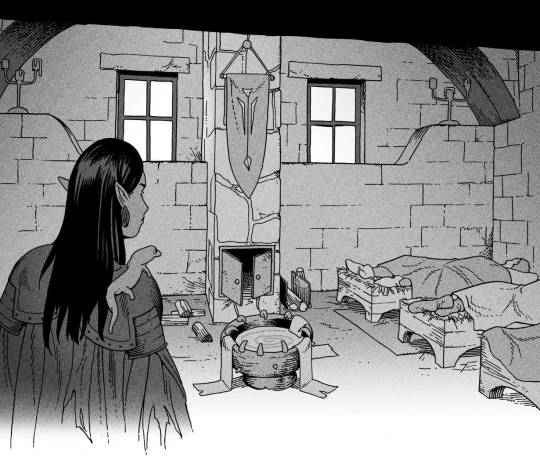
The character in the foreground has mainly dark grays, which separates her from the background, which has mostly light grays. Then the windows are white and the roof black.
Value composition is a huge and complex area and I recommend anyone wanting to learn to be more conscious about their values and to do value sketches. Analysing art you think has good values is great too.
Shadows
Not every piece needs shadows, but they can add a lot to an image! I use three kinds of shadows when I work in grayscale.
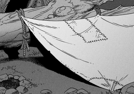
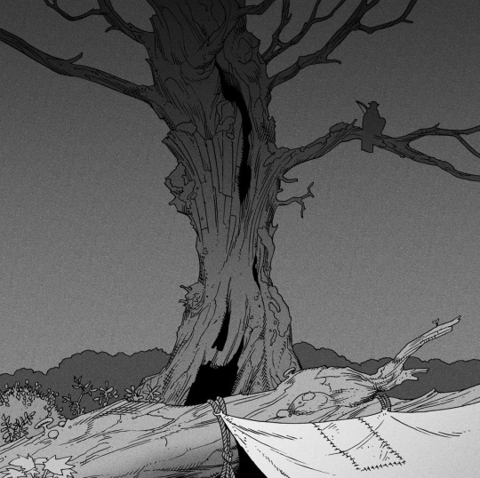
Inked shadows - these shadows are added during the inking stage and usually show areas where light would have almost no way of getting there, such as under this tent.
Gradient shadows - these shadows usually represent something getting further and further away from a light source or an area that would bounce light. This tree receives a tiny bit of light from a campfire on the ground and moonlight that bounces on the ground and up, fading as we get higher up in the tree. But mainly I add these gradients in ways that look cool and will help the overall composition.
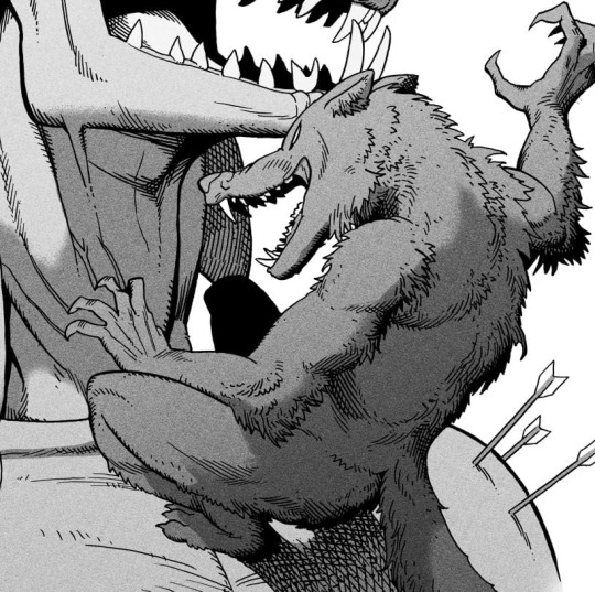
Hard shadows - these shadows appear when a strong light casts shadows and can be used on a shape or to cover something. Here's a werewolf with shadows on its back, which gives it a better sense of mass and is interesting visually!
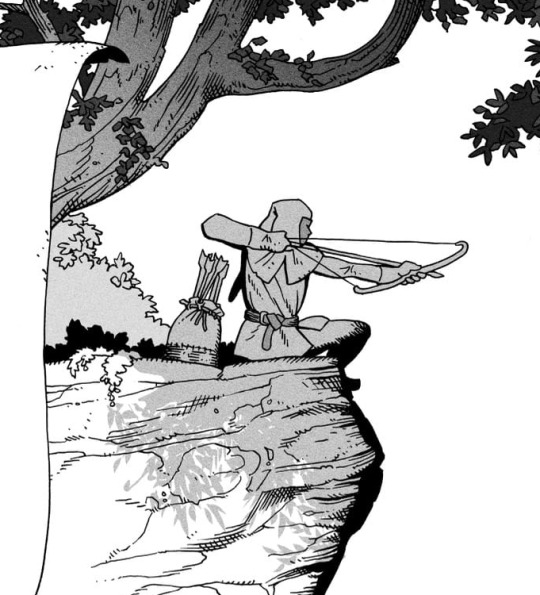
You can also cover an area in shadow like this, where the tree casts a shadow down on the archer and the cliff.
Texture
I like to add a layer of noise as a finishing touch. In Clip Studio you can create a noise layer with Filter->Render->Perlin noise... Find a balance of scale and amplitude that works for the image, then change the layer mode to "Vivid Light" and lower the opacity of the layer to around 30%. I like how this looks, it's not super visible usually but helps make the drawing feel less artificial and digital.

I hope that helps! Here are some nice links too:
Muddy Colors
Android Arts
Gurney Journey - Read his books!
Happy drawing!
352 notes
·
View notes
Text

Hermit Crab Line, 2024, Birdnest
9 notes
·
View notes
Text

Blacktip Shark, 2024, Birdnest
1K notes
·
View notes
Text

Moray Eel, 2024, Birdnest
9 notes
·
View notes
Text
My sketches, workings, thumbnails, storyboards, sketchbook, nick nacks etc... blog
0 notes
Text
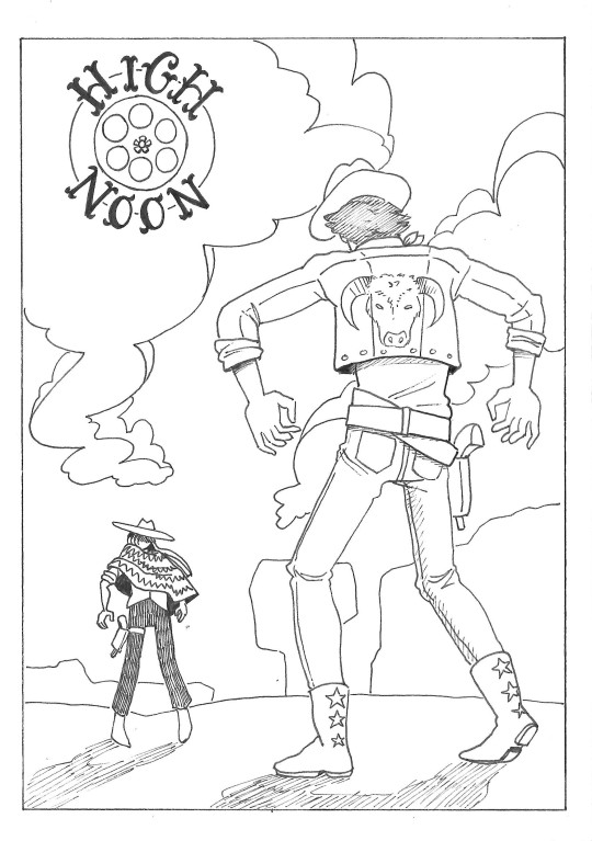
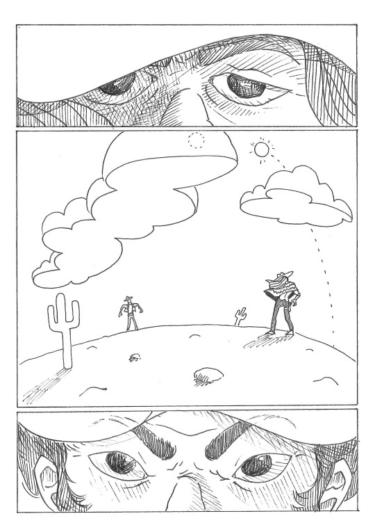
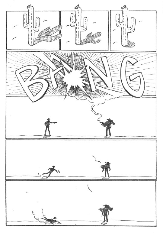
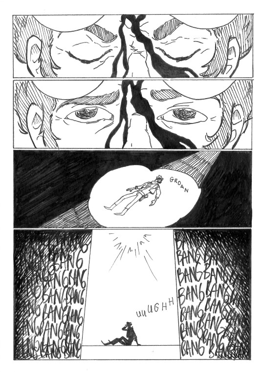


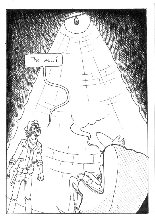
High Noon, 2024, Birdnest
#western#high noon#cowboys#well#comic#illustration#traditional#ink#black and white#art#traditional art#zine#art zine#short comic#hatching#black and white art#drawing#ink drawing#artwork#birdnest
489 notes
·
View notes
Text


Killing the Sun, 2024, Birdnest
#art#comics#experimental#incomplete#digital art#digital illustration#digital drawing#digital painting#sun#Killing the sun#colour#digital comics#short comic#comic in one day challenge#space#end of world
7 notes
·
View notes
Text


The Garden of Eden, 2023, Birdnest
#art#comics#black and white#lineart#linework#ink drawing#devil#angel#devil and angel#dream#inspired by a dream#illustration#hand drawn#traditional art#traditional drawing#traditional illustration
10 notes
·
View notes