
Facing the User Interface while experiencing the User Experience experience. or something.
Don't wanna be here? Send us removal request.
Statistics
We looked inside some of the posts by theuxcruise-blog and here's what we found interesting.
Average Info
Notes Per Post
7
Likes Per Post
1
Reblog Per Post
6
Reply Per Post
0
Time Between Posts
8 days
Number of Posts By Type
Text
9
Last Seen Tumblr Blogs


Fun Fact
Tumblr was named as a finalist in Lead411’s New York City Hot 125 in Aug 2010.
Text
Parkmate Paper Prototype: Designing V2 & V3
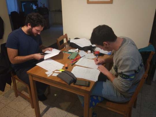
part of a joint project with @asaffeldman
Presentation version
This week’s homework was to design two new design ideas for our app, and create paper prototypes of those versions. We created one new version each.
Parkmate V2


Parkmate V3


see you next time :-)

1 note
·
View note
Text
PARKMATE Project - Flowchart and Paper Wireframes
Part of the PARKMATE Project made w/ @asaffeldman
This week, our homework was to 1) Create basic usage flowcharts for the app, and 2) Draw basic paper wireframes of the various screens of our app.
1) PARKMATE Use Flowchart

2) PARKMATE Wireframes:


1 note
·
View note
Text
User Profiles and Scenarios for the Parkmate App Project
Part of the project of myself and @asaffeldman
This week’s homework was to create user profiles and usage scenarios for our app (The “Parkmate” parking assistant app), to show how our target audience will interact with our product.
Our target user base are going to be anyone with a driving license who sometimes have to park in the city – whether in streetside parking spots, in parking lots, etc. The app will be designed to allow any user profile to use it conveniently – whether they are young and proficient with mobile apps or technophobes, familiar with the city they’re driving in or completely clueless – they are all meant to be able to use this app easily.
To be able to create basic usage scenarios, we have created 3 unique user profiles, each based on a few parameters – technology orientation, familiarity with the area, and their willingness to pay more for parking (as opposed to willingness to spend time looking for free parking spots).
The User Profiles
1) Student (Amit Pango, 25): Young, very proficient with technology and mobile apps, constantly using mobile apps for navigation in the city, so a new “map based” app is no issue for them. Our student lives in the big city (i.e. Tel Aviv or Jerusalem) and is familiar with the streets around his house or commonly visited places (bars, work, university…), has no problem navigating narrow streets to find a good parking spot, and is generally unwilling to pay for parking, if he doesn’t have to.
2) Businesswoman (Tzlil Aharon, 47): The businesswoman is in her mid 40-50’s, familiar with mobile apps but doesn’t use it as constantly as the student. Our businesswoman is always in a hurry, has no time to spend looking for available blue-white parking spots, and would rather park in a parking lot closest to her destination if the other option takes too much time. Doesn’t like navigating small streets and is not familiar with many places except her home and work.
3) Grandpa (Aviad Alter, 77): Our grandpa doesn’t rely on technology at all – he knows all the streets by heart and rarely has to use Waze, Google Maps and the sorts. But he has heard of a new app that helps finding parking easily, and he really had enough of spending 25+ minutes in the heart of Tel Aviv looking for a place to park his car. Doesn’t care about the money, just wants to park as close as possible, whether it’s toll-free parking, parking lots, blue and white parking spots, etc.
4) Suburban Girl (Meital Argaman, 19): Our girl lives in the suburbs, 30 minutes from the big city (be it Haifa, Tel Aviv, Afula or Nazareth). Because there aren’t many good jobs in her Kibbutz (or village), she decided to work in the big city close by, but she has to spend many important minutes of her mornings looking for parking. Needless to say, she doesn’t know the city well, isn’t familiar with the small alleys and streets with available parking that the locals know and keep to themselves, and is very afraid of driving in the busy traffic needlessly. Her goal: just to find an available parking, as quick as possible and without having to drive around too much.
Scenarios:
1) Amit Pango goes to the bar After a long day at university, Amit made plans with some friends to meet up in a bar in the Florentin neighborhood in Tel Aviv. Amit is a Tel Aviv resident, so he has a relevant Parking Sticker, which allows him to park for free in certain street blocks. He’d really rather not spend any money on a parking lot (because all of his allowance for the day is to be spent on a Hamburger and a pint of Guiness), so he spends some time driving around the small alleys of Flornetin to look for a parking spot, but it’s Thursday night and everything is busy and no parking in sight. Desperate to exit his car, Amit opens his “Parkmate” app, and searches the area for available parking – he filters within a 15-minute-walking radius from the bar, and chooses to see both “parking zone” spots and regular blue-and-white parking. After finding on the map some streets he hasn’t visited yet, he drives over to them, and finds the last parking spot in a “special parking zone” block. Happy, he parks his car and walks back 15 minutes to the bar.
2) Tzlil Aharon is late for a big meeting: Our businesswoman Tzlil is on her way to a very important meeting in the Facebook headquarters in Rotschild Boulverad in Tel Aviv. Problem is, Tzlil is going to be late, and has no time to spend looking around for a parking spot. Also, she’s driving her big SUV which barely fits in the small Tel Aviv streets, not to speak of the tiny parking spots people leave there. She knows that the closest parking lot is always very busy at this time of day, so she figures she’d better search for a closer parking elsewhere. So, Tzlil opens the parking app in advance, before reaching Tel Aviv, to prepare her route so she doesn’t have to spend precious time looking. She marks some streets with a good chance of finding an available blue-and-white parking spot at this hour, that are close to the Facebook building. Just to be safe, she also takes note of the closest Parking Lot in the area. Tzlil drives straight to these streets, and after not finding any available spot within 3 minutes of looking, drives straight ahead to the parking lot she saw in the app (by using the app to navigate), and somehow manages to reach her meeting on time.
3) Grandpa Aviad Alter visits his grandchildren in the new house: After living in Herzelyiah all the lives, the Alter family moved to a new home in Ramat Gan. Grandpa Aviad Alter wants to visit his two cute grandchildren in their new home for the first time – but he isn’t very familiar with the streets of Ramat Hasharon. After planning his drive ahead (because he doesn’t believe in using Waze…), he reaches the area of the house, but realizes to his horror that there aren’t any parking spots available in that street – and not in the two closest streets either. Grandpa doesn’t want to walk much (his back is not doing very well these days), and he really needs to find a close parking spot – whether it’s on the street or in a parking lot doesn’t matter, as long as it’s close. Suddenly Grandpa remembers that his daughter has downloaded the “Parkmate” app for him to use if he’s ever in need. He’s not very familiar with mobile map apps, but he has no other options at the time – so he opens the app and looks at the main screen. He sees a search bar asking for his destination – so he slowly types it, and clicks on “search for parking”. Within seconds, the app points to the closest parking lot, just a 4 minute walk, and also suggests that he looks for street parking in the adjacent street – which is only 2 minutes walk through some shortcut. Grandpa decides to try his luck on the street – and luckily finds a big parking spot waiting for him. He isn’t sure what the street signage is – buy luck for him, when he finally stops, a pop up appears in the app with the a picture of the parking sign at the beginning of the block. Grandpa can’t really read anything, but manages to zoom in the picture, and find out he’s OK to park there.
4) Meital Drives to Work in Haifa It’s 8:50 AM and Meital has to head out to work from her house in Kibbutz Yagur. Her shift in Aroma starts at 10:00, and she knows that Haifa tends to get very busy at this time of day, and finds all the traffic a bit scary, so she heads out some time in advance. When she finally reaches the area of her work, she is suddenly reminded that today her manager told her that this day specifically, the worker’s parking spot is unavailable, and she has to look for her own parking. This scares Meital, who doesn’t want to drive in all the traffic again, and really isn’t familiar with the streets surrounding her job. Furthermore, Meital has no “parking sticker”, and she knows that in this area of the city, most parking spots are reserved for residents. Fortunately, Meital has the Parkmate app installed on her phone, so naturally she opens it and looks at the map in front of her. Meital finds in the app that only 10 minutes from her, off the main street, there’s a neighborhood with at least 7 different blocks with parking that’s either toll-free (grey) or available to non-residents (regular blue and white), so she drives over there to look around for a parking spot, and after spending a few minutes looking for a spot manages to find a good parking, and to breathe and relax.
1 note
·
View note
Text
Project Pitch - “Parkmate” Parking Assistant App
Presentation for our HCI course project, where we will be designing a community-based parking app. Made with @asaffeldman


1 note
·
View note
Text
Spotify Wireframe - Figma Version
This week’s assignment was to re-create our wireframes in Figma, so I re-created the same Spotify play flow that I wireframed by hand last week.
A playable Prototype version by following this link, and following this text are side-by-side comparison of the wireframes and the original screens (couldn’t post one picture due to image resolution limitations in tumblr):


0 notes
Text
Wireframing Spotify
This week’s assignment was to wireframe a basic flow in an app or website we use.
Obviously, I chose my favorite mobile app, Spotify. Here’s a wireframed tour of the app, from logging in to searching and playing a song:

0 notes
Text
Waze Design Review
In my last post, I had reviewed the design of my (beautiful & trusty) Stereo receiver using general design ideas and themes. In our following HCI class, we have studied a number of important rules used in designing good products - psychological, technical and graphical laws which can help in designing a good interactive experience. Today, I will try to analyze another product using these rules.

The product I chose this time is the hugely popular navigation app, Waze. This Israeli-founded software, which was purchased by Google early on, became one of Israel’s top tech exports and a standard bearer for navigation apps in the current decade, with the mobile app being well known and used around the world, including as a built-in navigation app in vehicles. Let’s try and see how the app’s design choice helped it become so common.

In the picture to the left, we can see the “default” screen of the Waze mobile app, before a specific destination has been chosen, and the right picture is of the similar-but-a-bit-different navigation mode. Those two screens have a very slick design, mostly consisting of the map (the main feature of the app) and very few buttons.
First of all, we can see that in both cases, there are very few buttons on the screen (between 6 to 7 in each). This is in accordance with two rules:
Hick’s Law, which claims that the time it takes a user to make a choice increases with the number and complexity of choices. In our case, both screens have very few and simple options: quick search bar on top, “advanced” search in the bottom, center the map, reports, etc. Some of these buttons open further menus with more choices - but the main choice is simplified, there’s no need to choose between many different options, just the general idea. If you want to report something on the road, hit the report button - and then make the further, more specific choices in the next menu.
Miller’s Law claims that most people can only hold approximately 7 pieces of information at once. In our case, the fact that there are not more than 7 buttons on screen helps the user in two ways: in the “default” screen, it helps the user easily remember where every option is located; but more importantly, in the main “navigation” mode, it is very important that the buttons aren’t distracting the user from the map, or the actual road - and it is also important that in case the user wants to perform an action while on the road (reporting, searching, seeing more detailed driving instructions), they don’t have to start looking at the screen, searching for the correct option. The fact that there are only 7 buttons in the “main” screen ensures the user can memorize the locations of these buttons, and easily and quickly find the correct button when they have to use the app while driving (which is never advised! ...but let’s be real here).
Another important law that comes into play in these two screens is Fitt’s Law. This law claims that the further the user is from a target (or a button, in our case) - the larger the target should be. In Waze’s case, there are a few buttons that are considerably larger than the others: in the “default” screen, it’s the button that centers the map, and in the “main” screen, those are the “report” and “spotify” buttons. It’s important that these 3 buttons are easily accessible at all times for the user (they are all "quick access” features), so the fact that these buttons are big and noticeable helps the user interact with them easily.
Finally, we can claim that the design of these two main screens is in accordance with the Pareto Principle, where 80% of the effects come from 20% of the causes. In Waze’s case, the buttons in the main screen are definitely not all the options Waze has to offer (let’s call them the 20%); but the options accessible from the main screen are what most users will need in a regular use of the app - which calculates to, well..... 80% of the usage of the app? Pareto scores again!
In conclusion, we can see how the most simple screen in this popular app applies four very important design laws, and uses them to a great effect. Drive safe!
0 notes
Text
The Rotel RX-402 Stereo Receiver
Our HCI homework this week were "[to] Analyze a selected Interactive Product in the real world”. Reading this assignment, I started asking myself - what consists of a real-world Interactive Product? Am I to analyze an app? a website? a specific item that I use?
Looking around my room thinking, I immediately realized which product I should analyze: my trusty stereo receiver lying next to my desk, the one I use daily to listen to music. One of the main reasons I bought this specific receiver was the way it looked, so they must have done something good with its design...
So here I present to you The Rotel RX-402, a Stereo Reciever built by the Japanese home media manufacturers “Rotel”. Let’s take a quick look:

The front panel of the receiver feels very high-end and “techy”. The panel is made of dark aluminum , with the metal knobs giving a very mechanic feeling. The writing on the panel is in a wide font, complete with capital letters, which personally reminded me of spacecrafts and similar vehicles shown in Hollywood films, again giving a mechanic, perhaps futuristic feeling.
Above the knobs there is a lit-up screen with colors of orange and green, which is displayable only when the receiver is turned on and is used to tune the radio. This screen adds to the futuristic feeling I’ve gotten from the knobs and writing - it almost looks like something out of a sci-fi movie. A little bit of online research revealed that this receiver was probably made in 1976 - which could explain the futuristic look the designers were going for.

In this promotional picture of the receiver (mine wasn’t as clear) we can also see the way that the front panel contrasts with the cabinet itself, which has a walnut-colored wood finish. The wooden cabinet seems has a very organic feeling to it - not as futuristic and mechanic as the front panel, and perhaps more “reliable” and familiar to the customer.
I think that the mixture of the futuristic, robotic front panel with the “old-timey” wooden cabinet is not only a bold (and, personally, beautiful) aesthetic choice, but also conveys a message: This product is a futuristic take on a familiar product everyone has at home; it has the reliability of wooden furniture with the new technology built in Japanese labs. Looking at this product today in 2018, I can say that it still looks futuristic, but also very organic - the fact that it isn’t all metal and plastic like most entertainment systems today makes it stand out in my room the same way it stood out in the store I got it from.
3 notes
·
View notes
Text
An Introduction
Welcome, ye who enter here! (Much nicer than Dante’s version, isn’t it?)
This is your host Amir speaking. We are currently traveling through our first steps into the world of UI&UX design. It’s a very nice day outside and our ship is slowly cruising at ease.
This journal right here will be used to document our travels through the Introduction to HCI course, and on behalf of the ship’s crew, I hope you enjoy this ride.
Signed, Your Captain
0 notes