Featuring artifacts from the Massimo and Lella Vignelli papers as they are unpacked and processed at the Vignelli Center for Design Studies.
Don't wanna be here? Send us removal request.
Statistics
We looked inside some of the posts by vignellicenter and here's what we found interesting.
Average Info
Notes Per Post
399
Likes Per Post
320
Reblog Per Post
76
Reply Per Post
3
Time Between Posts
1 month
Number of Posts By Type
Text
16
Photo
1
Last Seen Tumblr Blogs


Fun Fact
After the announcement of the deal with Yahoo!, there were 170K signatures of unhappy Tumblr users petitioning to prevent the sale in 2013.
Text

Important Notice The Vignelli Center for Design Studies will be temporarily closed for infrastructure improvements beginning 17 February 2025. Access to the galleries and physical archives is closed and scheduled open houses are cancelled for the duration of the project; but the Vignelli Design Conversations lectures remain as scheduled. Anticipated completion of the project is May 2025. But never fear! We'll still share archives content and updates even if our spaces are closed. Stay tuned!
4 notes
·
View notes
Text


In 1971, Massimo and Lella Vignelli designed a modular foam seating system but it was never produced. The system consisted of circular shapes that nested together to form an infinite number of seating configurations. Each piece would be made of foam with fabric coverings with zippers to attach everything together so it would stay put. The fabric cover would be removeable for cleaning.
This was around the same time the Vignellis were designing showrooms and exhibitions for Knoll who had acquired the Gavina Collection which included a foam modular seating system by Sebastian Matta. Although his system was much more organic in shape, perhaps they were inspired to give it a try with more geometric shapes?
In the archive we have the painted wooden models of the seating, vintage images, drawings and some correspondence.
Scroll through to see more about this conceptual Vignelli-designed seating system and also the Matta foam seating system on display in the Vignelli designed Knoll Au Louvre exhibition (1972) and the Knoll Gavina Group showroom (1968). Unfortunately, it was never made but we would have love to give it a try!
Images: 1-2. Vintage 35mm slide of model 3. rough sketch of seating components 4. measured drawing of seating components 5.-6. Drawings of possible seating configurations 7. snapshot of model in archives 8. Knoll correspondence regarding making prototypes 9. clipping of Massimo and Lella Vignelli in Gavina showroom with Matta modular seating 10. vintage 35mm slide of Matta seating at Knoll Au Louvre exhibition
#Vignelli #DesignArchives #nevermade #DesignHistory #Knoll #FurnitureDesign #1970s #modular #geometry
#vignelli#design archives#design history#1970s#archives#modernism#design#furniture design#nevermade#modular#geometry#Knoll
30 notes
·
View notes
Text


Now you have another chance to own the Kyoto dishware designed by Massimo and Lella Vignelli AND support the Vignelli Center!
Auction on 10/24/2024!
Thanks to our colleagues at Shop One - RIT Global Village for organizing the sale.
" In 2010, Lella and Massimo Vignelli donated their professional archive to Rochester Institute of Technology in New York to establish the Vignelli Center for Design Studies. Included in their donation was this collection of Kyoto dishware, the last available stock known. The Vignelli’s requested that the dishware be sold to support the Vignelli Center for Design Studies visiting designer series and to further the commitment to excellence in design education.
Lot is comprised of eight large red plates, eight large white plates, eight large ivory plates, four red salad bowls, two white salad bowls, six ivory salad bowls, twenty-four ivory medium plates, eight red small plates, eight white small plates, eight ivory small plates, twelve red cups, twelve red sauces, twelve white cups, and twelve white saucers; 132 pieces total. Embossed manufacturer's mark to underside of each element ‘Design by Lella & Massimo Vignelli Casigliani 1979’. Sold with original packaging.
provenance: The Artist | Gift from the previous in 2010, Rochester Institute of Technology, NY”
10 notes
·
View notes
Text


It’s Manuals Monday! Manuals Monday is back! On Mondays we feature an excerpt from a graphics standards manual from the archives.
Today’s manual is for the Urban Land Institute from 1992.
Back in 2017 we shared some brochures for the Urban Land Institute (ULI) and recently we uncovered these Graphics Guidelines in the archives.
https://vignellicenter.tumblr.com/post/168223666607/vignelli-uli-brochures
According to the proposal from Vignelli Associates, ULI is the “preeminent educational and research organization serving the real estate industry.” In 1992, Vignelli Associates proposed creating a membership kit and a promotional brochure which could later be applied to an institution-wide graphic identity.
As always, if you know more about this project or worked on this project, we would love to hear from you!
#vignelli#design#archives#graphic design#design history#design archives#1990s#modernism#corporate identity#graphic identity#graphic standards manuals#Manuals Monday#grids
20 notes
·
View notes
Text


Abe Hirschfeld, who made a fortune building parking garages, turned a parking garage at 330 East 61st Street into an exclusive fitness club in the 1980s.
In 1979, Vignelli Associates designed a logo, brochure, stationery, and membership materials for what their own brochure deemed “a country club in the heart of the city”
“A unique sporting club offering tennis, squash and racquetball”
“No sport and racquet facility like exists anywhere.”
By 1984, the club was the place to be seen with many celebrity sightings [for example, Cher, Diana Ross, Liza Minelli, Arnold Schwarzenegger, David Bowie, Mick Jagger, Ashford and Simpson, Brooke Shields]
Quotes from a 1984 NY Times article about the health club’s social scene:
''The Vertical Club is today's Studio 54''
“People join other health clubs to get in shape before they join here''
“Pure Fellini''
“It is better socially than a singles bar because it's not so obvious”'
Here is what the VC brochure promised:
“Court time at your convenience is always assured, because Vertical Club membership is strictly limited. … The congeniality and prestige of the club us maintained by our Admissions Committee, which interviews and approves all applicants.”
Staff are ready “to make each visit to the Vertical Club a delightful leisure experience.”
Courts
“Courts are stacked vertically atop one another. Each level of the vertical club is equivalent to four stories; the building is the height of a 20-story structure.”
“Architect Eugene Ho has created tennis “al fresco” through open, retractable siding on the courts.”
Courtside Restaurant and Bar
“The glass-walled, elevated Courtside Restaurant overlooks our two exhibition tennis courts and glass-sided racquetball court.”
Graphics
“Vignelli Associates are designers of tremendous scope.”
Fee schedule
“Resident + spouse Initiation fee $4000 plus $125/mo”
And speaking of the 1980s, join us next week for our next Open Houses which will highlight artifacts from the archives from the 1980s. Check out our events page on our website for more details [link in bio]
9/25-9/26, 2024 10am-4pm
And in the spring with a completely different displays of 1980s artifact!
3/26-3/27, 2025 10am-4pm
#vignell#vignelliassociates#graphic design#design#design archives#modernism#design history#1980s#vertical club
29 notes
·
View notes
Text


I spy… Vignelli!
Summer is always construction season, but we don’t always have Vignelli-designed shipping containers on campus.
“I rarely traveled to any city around the world without seeing one of the containers.” p. 189 “Lella and Massimo Vignelli: Design is One”
From 1992-1998 Vignelli Associates designed the corporate identity for British company Sea Containers (aka Seaco) and their various subsidiaries. In 1995, Seaco was considering a merger with Genstar (the marine container leasing subsidiary of General Electric.)
In a letter to Massimo Vignelli from Seaco says:
“It seems to me the new “GenSeaCo” livery should incorporate some elements of our “Seaco” livery and some elements of the Genstar livery while at the same time saying that GenSeaCo is not wither Sea Containers or General Electric, but instead has its own place in the market.”
In the archives, the Vignellis’ saved some of the process work for the Seaco corporate identity including some ideas that were never implemented.
Images:
1. Snapshot by Archivist Jennifer Whitlock of shipping container with GESeaco logo on construction site on Rochester Institute of Technology campus, 2024
2. page 188 from book “Lella and Massimo Vignelli: Design is One” showing Seaco logo and image of stacked shipping container
3. Master art for Seaco logo
4. pencil sketch of container with Seaco logo
5. sketches for various logo for Seaco and their subsidiaries
6. Color snapshots of shipping containers used to visually test SeaCo logo at full scale with notes
7. SeaCo graphic standards manual draft with sketches and corrections, 1998
8. various iterations of early version logo for Genstar and Seaco merger
9. photocopy of standards manual showing two lengths of shipping container with GESeaco logo
10. vintage color transparency of two trucks hauling GESeaco shipping containers
#vignelli#design#archives#design archives#graphic design#sea containers#1990s#shipping containers#modernism#corporate identity
9 notes
·
View notes
Text


Please join us for our next Open Houses! March 20-21, 2024 10am-4pm.
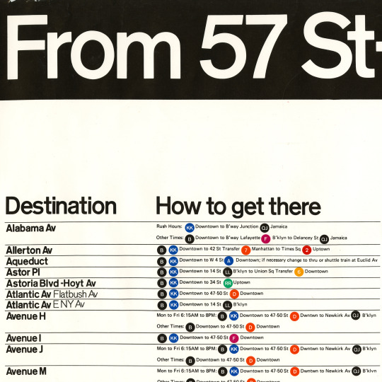
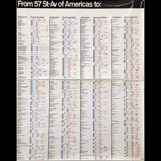
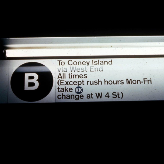
The NYC subway map that never was. Or at least it was never implemented.
The NYC Subway graphics are some of the most requested artifacts from the Vignelli archives. We acquired this unique “verbal map” aka “The Directory” aka the “How to get there” map in 2022. Our archivist put it on display for the first time in 50 years at our Open Houses in September 2022!
“The Verbal Map described how to reach a destination, which train to get, where to change, and when to get out.” – Massimo Vignelli [comment on Michael Bierut’s essay “Mr. Vignelli Map” for Design Observer]
Printed on very glossy paper in full color, this map is large like the station size maps. Printed in two parts [top and bottom] each half measuring 29.5” x 47.5”.
In the Graphic Standards Manual on Page 3 “Diagram of Basic Sign Distribution” it describes the various maps to be installed:
Maps: System maps (implemented, the famous one),
neighborhood map (not implemented),
‘How to get there’ map (not implemented but we have the prototype!)
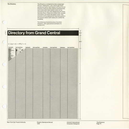
From the Graphics Standards Manual on page 75, “The Directory”:
“The directory is designed to help a passenger find his “Destination” and “How to get there” quickly and easily. Each station will have its own directory listing all other station alphabetically and numerically. Each station will be followed by the color disc designating he trains that stop there. If there is no direct train, transfer information will follow the station name. This directory will be placed at all important points in the subways station both inside and outside the turnstiles.”
We also have the Dekalb Av Signage Study “analyzed and completed by Joan Charysyn and Virginia Macintosh” for Unimark International in 1971 which shows a mockup of the various maps and states “A directory and three maps will eventually be in use in all subway stations.”
Be sure to join us for our next Open Houses and see what other surprises you can discover! Learn more opn our events page: https://www.rit.edu/events/vignelli-center-spring-open-house
Image descriptions:
Detail of “verbal map” aka “The Directory” aka the “How to get there” map
image of entire map
Video clip of map
Photo of Open Houses with logo
vintage 35mm slide of detail of “verbal map”
NYCTA Graphics Standards Manual pg. 75 “The Directory”
NYCTA Graphics Standards Manual pg. 75 “The Directory”
Slideshow of Dekalb St study: coversheet, Directory from Grand Central, System Map, Neighborhood map, and 5 Boroughs map
Vintage 35mm slide of 57th Street station signage
Vintage 35mm slides of 57th Street station signage
28 notes
·
View notes
Text
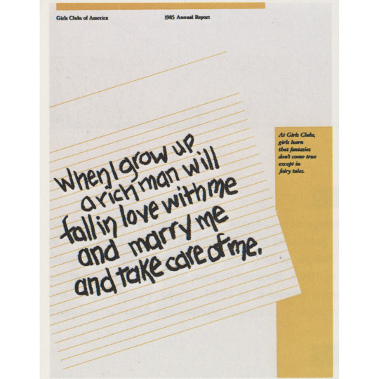


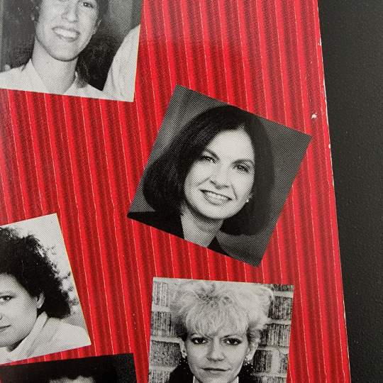
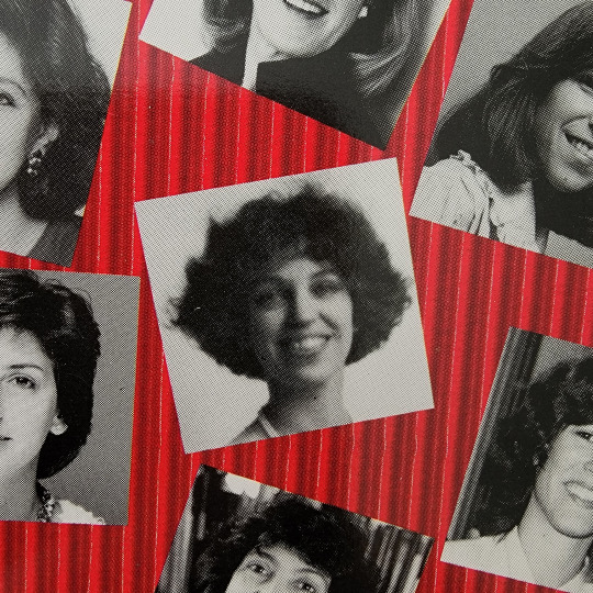


Happy International Women’s Day!
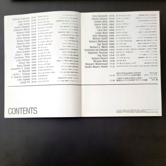
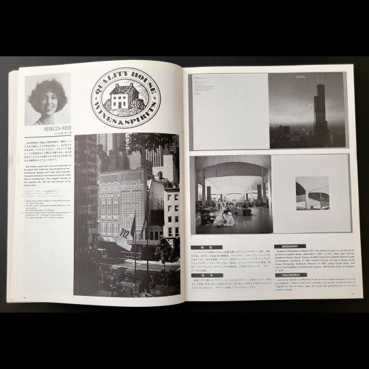
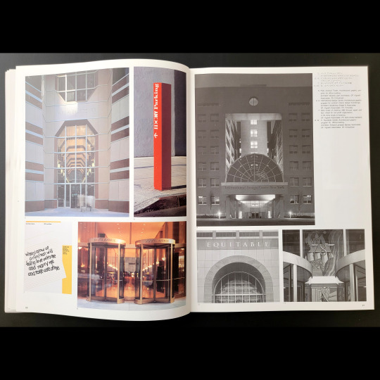
In 1988, Japanese magazine Idea published a special issue “Women Designers of America.” 43 women are featured including Vignelli Associates’ own Lella Vignelli and Rebecca Rose.
This 1985 Annual Report for Girls Clubs of America, designed by Rebecca Rose, warning girls not to dream about finding a wealthy husband to take care of them.
Text: “When I grow up a rich man will fall in love with me and marry me and take care of me.��� At Girls Clubs, girls learn that fantasies don’t come true except in fairy tales.
Scroll through to see more of this Idea Special Issue including the table of contents which lists all 43 designers featured in the issue.
“The intent is to collect and present phenomena involving how and what activities women designers are engaged in the upheaval of the American society of today. Therefore, designers presented here had to be artists having the caliber in one sense or another approved by the severe eyes of the present American society.”
– from the intro essay by Midori Imatake “A Torrent of Women Designers of America”
11 notes
·
View notes
Text


Please join us for our next Open Houses! March 20-21, 2024 10am-4pm.
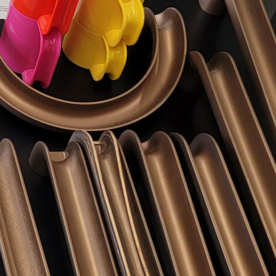
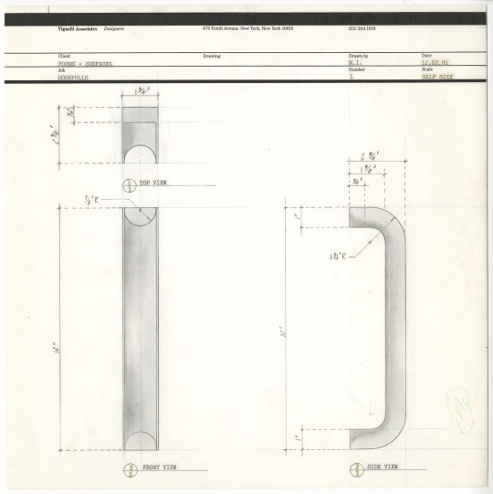
Can a mug handle be transformed into a door handle? In 1992, Massimo Vignelli gave it a try! He took the iconic Heller mug handle and changed the scale, color, and material to do just that. Our archivist dug deep in the archives to put this project on display for November 2022 Open Houses.
Forms + Surfaces (a manufacturer of walls, ceilings, doors and site furniture) invited Vignelli along with architects Richard Meier and William Pederson to create new door pulls for NEOCON in June 1992.
It is not clear if this was ever produced (nor if Meier’s or Pederson’s versions were either for that matter). Prototypes, sketches, and a couple news articles survive in the archives. We only have a bit of documentation for the project, so we would love to hear from you if you know anything else about the project. Be sure to join us for our next Open Houses and see what other surprises she uncovers!
https://www.rit.edu/events/vignelli-center-spring-open-house
19 notes
·
View notes
Text

Rare find in the archives!
Poster design by Massimo Vignelli for the UNFCCC COP3 in Kyoto in 1997. For those that don’t recognize that acronym, that’s the United Nations Framework Convention on Climate Change 3rd Conference of the Parties which was held in Kyoto, Japan.
Although we don’t have a copy of the actual poster, we do have this transparency in the archives which was simply filed under “Kyoto poster.” If you know about this poster, we want to hear from you!
“I love ambiguity because, for me, ambiguity means plurality of meanings.” – Massimo Vignelli
This deceivingly simple poster is an excellent example of ambiguity. What does “Sold Out” mean in this poster? Have we sold out of planet earth, as in there is no planet left? Or have we sold out the long term survival of our planet for sort term interests? What do you think?
Image description:
poster with photograph of the earth with a large yellow band across with the text “Sold Out” set on black background.
#vignelli#design#archives#design archives#climate change#graphic design#posters#deep cut#1990s#ambuguity
14 notes
·
View notes
Text


Happy 2024!
We're celebrating the new year with some deep cuts from the Vignelli archives: 1970s calendars
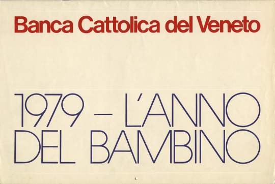
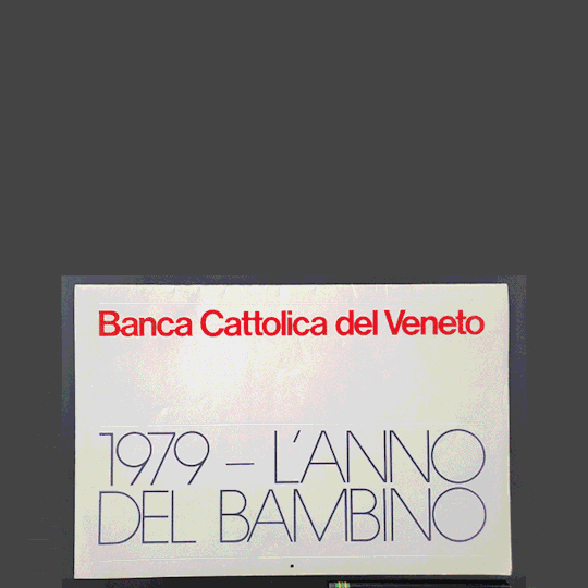
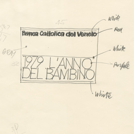
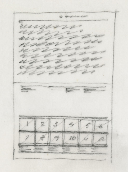
1979 Banca Cattolica del Veneto
We’ve saved the rarest of them all for our 1970s calendar finale! We haven’t seen this one published before! And we’re thrilled it even has some of the original design process preserved in the archives.
The year 1979 was proclaimed as the International Year of the Child by the United Nations and Massimo Vignelli designed this calendar titled “L’Anno del Bambino” for Banca Cattolica del Veneto featuring photography of children by an international roster of photographers.
Featured photographers:
Fulvio Roiter (Italy)
Gerger Tourdjman (France)
Paul Fusco (United States)
Charles Harbutt (United States)
Constantine Manos (United States)
Philip Masnick (United States)
Daniel Czap (France)
Daniel Arnault (France)
George Rodger (UK)
Burt Glinn (United States)
Sam Zarember (United States)
17 notes
·
View notes
Text


Happy 2024!
We're celebrating the new year with some deep cuts from the Vignelli archives: 1970s calendars
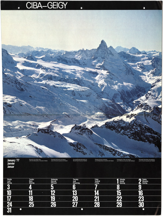
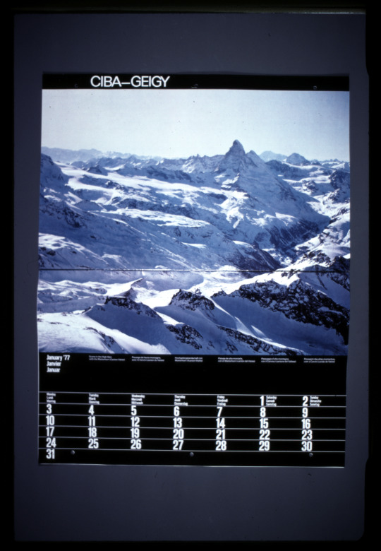
1977 Ciba Geigy
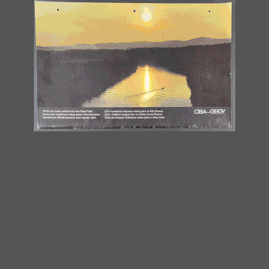
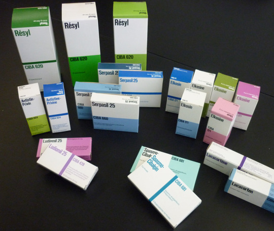
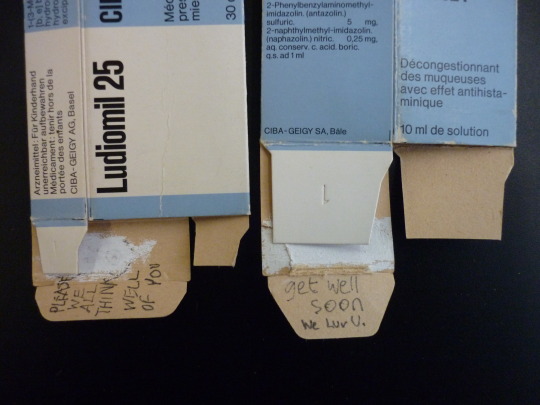
This is a rare one! A calendar for Swiss pharmaceutical company Ciba-Geigy.
The cover reads [in six languages]:
With our best wishes for the New Year
Avec nos meilleurs voeux pour l’An nouveau
Herzlichen Glückwusch zum neuen Jahr
Con nuestros mejores votos para el Año Nuevo
Con I migliori auguri per un felice Anno Nuovo
Com os nossos melhores votos para o Ano novo
Features beautiful scenic photos of Switzerland which are accompanied by an essay about environmental conservation by Dr. Bruno Moeckli, also in six languages.
Excerpt from “Swiss Landscapes” essay in calendar [sorry, only posting in English due to space]:
“Wild scenery in Switzerland is now confined to nature conservation areas and some alpine peaks, In the process, too little thought was given to the preservation of the physical essentials of life, namely water, air and soil. Now, what formerly gave concern only to artists and idealists becomes of vital importance to us all.
With the growing realization of the extent to which the despoilation of air, water, and other natural resources has progressed, it has also been realized that the various aspects of nature conservation and environmental protection share the same ultimate objective: to permit the harmonious co-existence of all forms of life, whether human, animal or plant, all of which require an environment in which they can continue to flourish in the future. Despite his mastery of science and technology, man is no exception to this rule. Furthermore, man as a creature of aesthetic sensibilities is capable of appreciating and benefiting from natural beauty, both physically and spiritually.”
Click through all the images to also see Vignelli-designed pharmaceutical packaging for Ciba-Geigy from 1976.
28 notes
·
View notes
Text

Happy 2024!
We're celebrating the new year with some deep cuts from the Vignelli archives: 1970s calendars
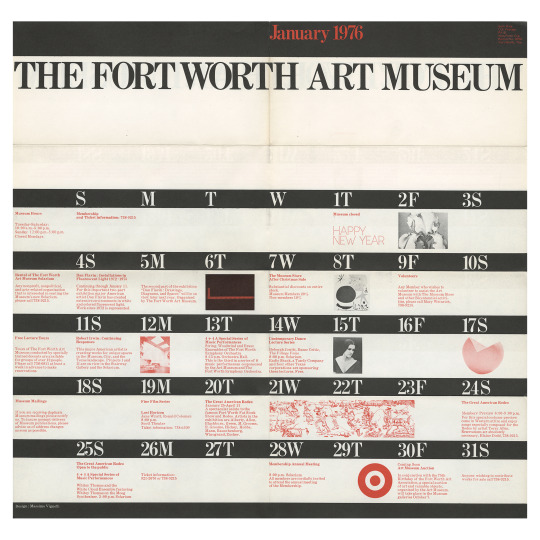
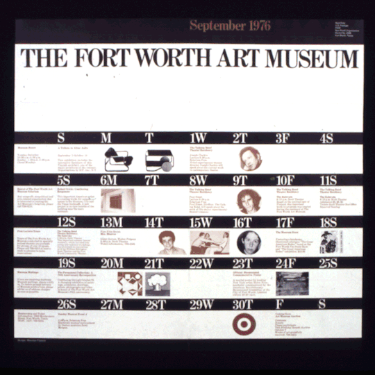
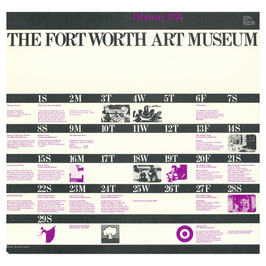
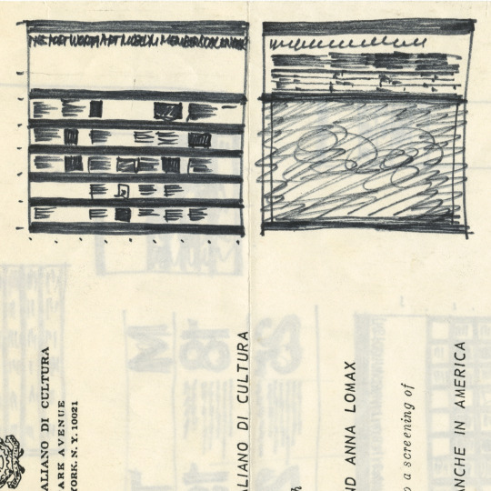
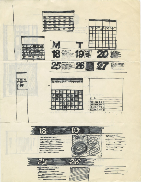
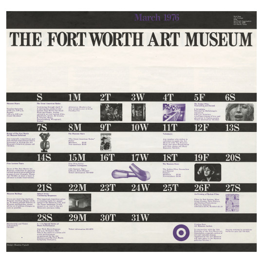
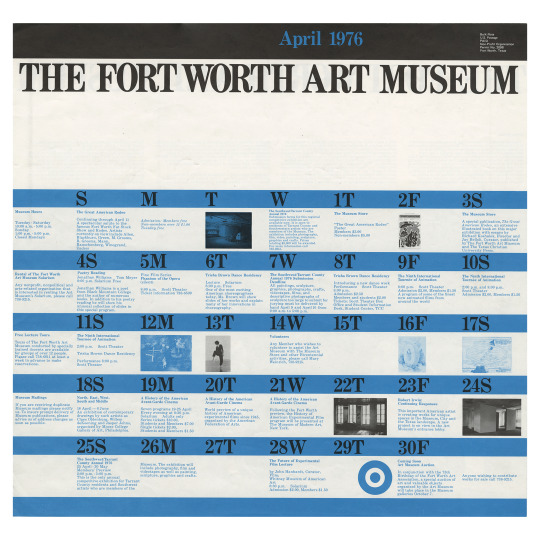
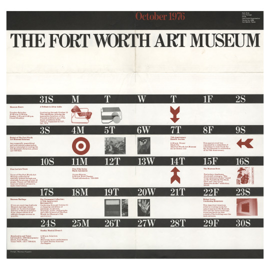
Fort Worth Art Museum 1976
Although meant to be a programming calendar for the Museum and not really a traditional consumer calendar, it would look great on the wall as your primary calendar! The calendars feature a poster on the reverse side and were folded and set to museum supporters.
From design: Vignelli (1990):
“This graphic program, consisting of mainly posters for the museum’s events, was structured to be done quickly, inexpensively, and through long-distance telephone calls. We set up a simple format that we liked, a black band at the top for the museum identification, an information band for the events, and a band for the illustration. For the calendars, too we used a series of alternating bands for the days and events. The change became the pattern. We liked this series of calendars and posters because they have strength, aren’t trendy, and provide information effectively.”
Each month featured the same banded template but used a different second color to distinguish each month. The black bands with white text appear in every month, except for one month. April’s calendar has blue bands with black text for the calendar.
You can find Vignelli-designed Fort Worth Art Museum posters in a number of art museums like the Metropolitan Museum of Art, Cooper-Hewitt, and the Denver Art Museum.
Image captions:
1. January 1976 calendar
2. Gif slideshow from digitized vintage 35mm slides of each month of calendars for 1976 from January to September.
3.- 4. February 1976 calendar and poster on reverse [front and back]
5. – 6. Ink sketches by Massimo Vignelli for calendars on an invitation from the Istituto Italiano Di Cultura.
7. March 1976 calendar
8. April 1976 calendar
9. October 1976 calendar
19 notes
·
View notes
Text

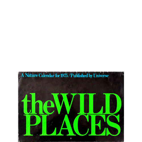


Happy 2024!
We're celebrating the new year with some deep cuts from the Vignelli archives: 1970s calendars
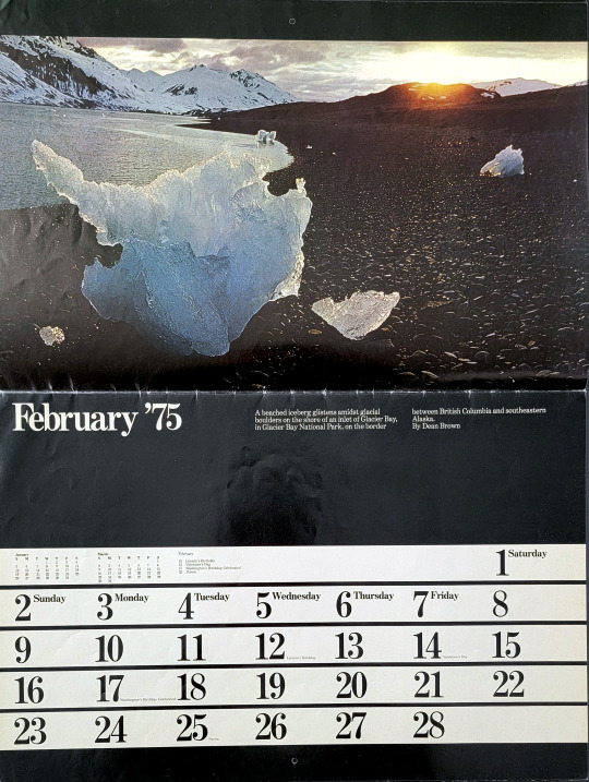
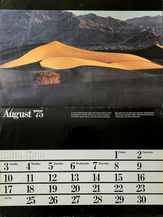
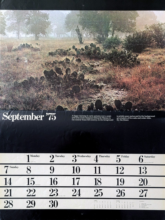
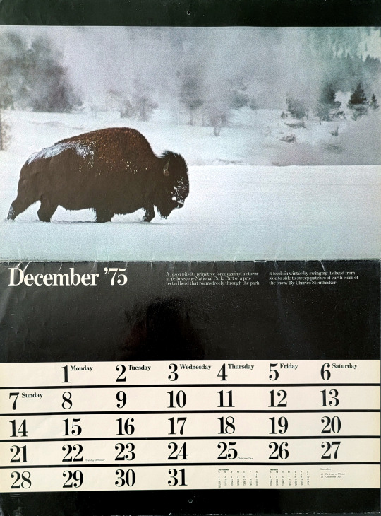
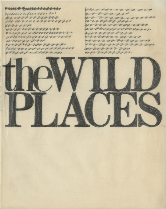
Our first pick is the 1975 the Wild Places calendar
Design: Massimo Vignelli.
Text from the calendar:
The photographs in this calendar appeared in the book The Wild Places: A Photographic Celebration of Unspoiled America. [note: the book was also designed by Vignelli]
This matchless collection of photographs, drawn from a superb book, The Wild Places, is inspiring evidence that the remaining wildlands and wildlife of America are as breathtaking as ever.
Covering the continent from ice-strewn Alaskan tundra to the Southwestern desert and from a bird on a Maine island to a great Florida swamp, they reveal the wonder and mystery of untouched wilderness.
Eight of America’s leading photographers are represented her by their outstanding works, ranging from Eliot Porter’s winter wren, David Muench’s Painted Desert scenes and Charles Steinhacker’s bison in a storm to James Bones’ view of a Texas plateau. This is a calendar for anyone who cherishes the miracle that is nature and believes Thoreau that “wilderness is the preservation of the world.”
Published by Universe Books, New York. Prepared and Produced by Chanticleer Press, Inc., New York. Printed by Amilcare Pizzi, S.p.A. Milan, Italy.
27 notes
·
View notes
Text

“If you can design one thing, you can design everything.”
The Vignellis were the rare type of designers who worked across all design disciplines and often for the same client. Our next round of Open Houses will focus on the theme “Design is One.” We’ll be focusing on the clients which the Vignellis did it all. Graphic identity and publications. Products and furniture. Interiors and exhibitions. See how “Design is One” comes to life through the archives.
Want to see original artifacts from the archives but don’t know where to start? Join us at our Open Houses to have a look! No appointment required. Stay for a few minutes or stay for hours.
As always, our galleries are open to the public and feature the greatest hits of the design work of Massimo and Lella Vignelli. But for the Open Houses, our archivist will be digging deep into the archives to show you one-of-a-kind original sketches and other artifacts of the Vignelli design process. You can see the designs that you know and love but expect many surprises even if you are a Vignelli “superfan!”
Save the dates:
9/20/2023-9/21/2023
3/20/2024-3/21/2024
10am-4pm each day
more details on our events page: https://www.rit.edu/vignellicenter/events
36 notes
·
View notes
Text
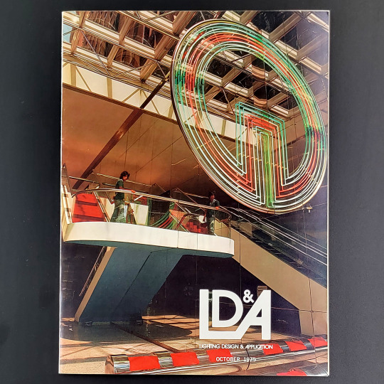

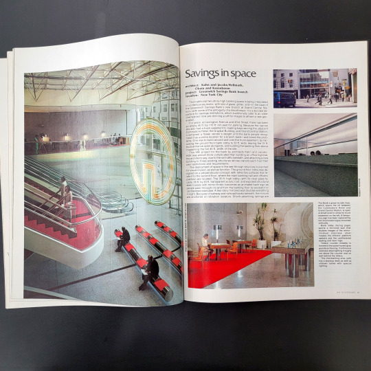
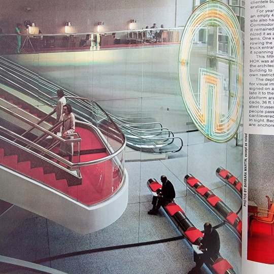
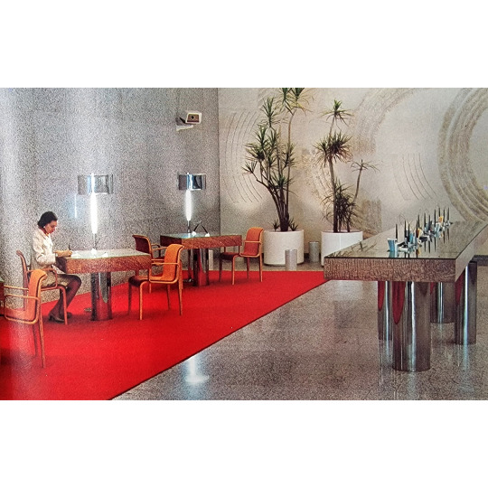
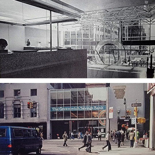

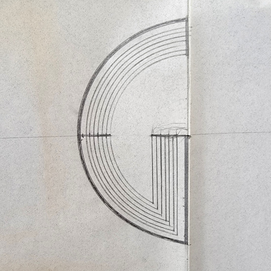
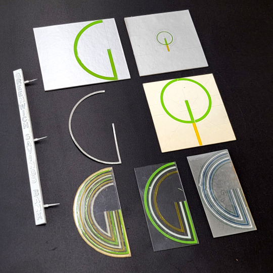
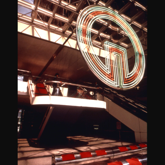
Vignelli Associates designed this huge neon “G” and the cantilevered stainless-steel benches for this for this 1974 branch of Greenwich Savings Bank lobby at Grand Central Station in New York City.
Architects Kahn and Jacobs / HOK designed the interiors of this two-story branch with a narrow entrance lobby and a 2nd floor where the all the banking happened. A huge two-story mirrored wall made the space feel larger but also created a reflection which doubled everything in the space. It made the cantilevered seating look twice as long and made the “G” turn into a circle.
This branch made the cover of Lighting Design & Application in October 1975 and Interiors in January 1976.
In the Interiors article author BR suggests this contemporary bank has a youthful energy which is full of the glitter and ambiguity of a discotheque. “The cantilevered red and green logo, its neon tubes heat-fused into glass, becomes a full circle through reflection, appearing to hang in space and having an almost revolving effect when viewed from the escalator.”
The rest of the spaces have tons of Italian granite, more stainless steel, custom lighting, and to balance all those hard and reflective surfaces, the “G” shows up on wall tapestries.
Cantilevered lobby seating: Concept by Vignelli Associates; fabricated by Scope Furniture Inc.; upholstery: Knoll Inc.
Neon “G” logo: Concept by Vignelli Associates; fabricated by Country Neon (Plainview, N.Y.)
We recently found this drawing and small pasteups for the big neon “G” in the archives. As always, if you know more about this project, we would love to hear from you!
#vignelli#1970s#furniture design#design archives#design history#vignelli red#neon#typography#cantilevered#super warm red#mirrors#Greenwich Savings Bank
40 notes
·
View notes
Photo

Open Houses are back this week! Theme: Photography
Wed 3/22/2023-Thu 3/23/2023 10am-4pm each day. Free and open to all!
Want to see original artifacts from the archives but don’t know where to start? Now you can have a look! No appointment required.
Theme: Photography
The Vignellis’ archives is full of examples of photography. They partnered with photographers again and again in their designs for the artwork in posters, catalogs, and numerous monographs on nature, culture, and even photography itself. Vignelli Associates created graphic identities for photographers and photography exhibitions. We’ll display marketing photographs alongside their actual design artifacts and see for yourself how their thoughtful use of images showcased their designs. The archives contain numerous examples of photo formats from vintage Polaroids to digital images. In some cases, photography is all that survives as record of a design. Join us in highlighting the importance of photography and the Vignellis.
We will have a vintage slide projector straight from the Vignelli Associates office up and running! Stop by and see original slideshows assembled by the Vignellis’ themselves!
As always, our galleries are open to the public and feature the greatest hits of the design work of Massimo and Lella Vignelli. But for the Open Houses, our archivist will be digging deep into the archives to show you one-of-a-kind original sketches and other artifacts of the Vignelli design process. You can see the designs that you know and love, but expect many surprises even if you are a Vignelli “superfan!” Please drop in and stay for a few minutes or stay for hours.
More details about Open Houses can be found on the events page on our website: https://www.rit.edu/events/vignelli-center-open-house-1
Image descriptions:
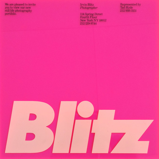
Irvin Blitz graphic identity (invitation on transparent plexiglass), c. 1986, Vignelli Associates (designer: Michael Bierut executed by: Tamar Cohen)
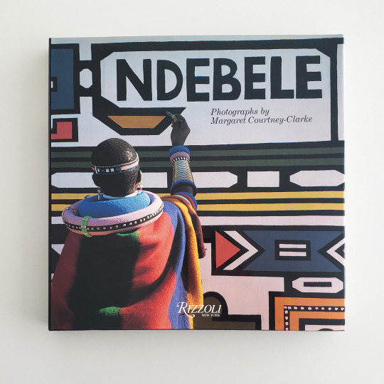
Ndebele: Photographs by Margaret Courtney-Clarke book cover, 1986, book design by Massimo Vignelli
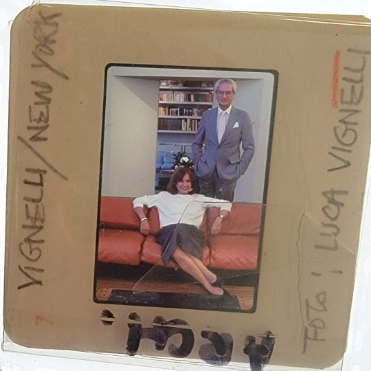
Portrait of Lella and Massimo Vignelli (35mm transparency), c. 1980s, Photographer: Luca Vignelli
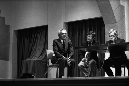
NYC Subway Map Debate (b&w 35mm negative), 1978, Photographer: Stan Ries
Kroin graphic identity examples (35mm transparency), c. 1980s, Photographer: unknown
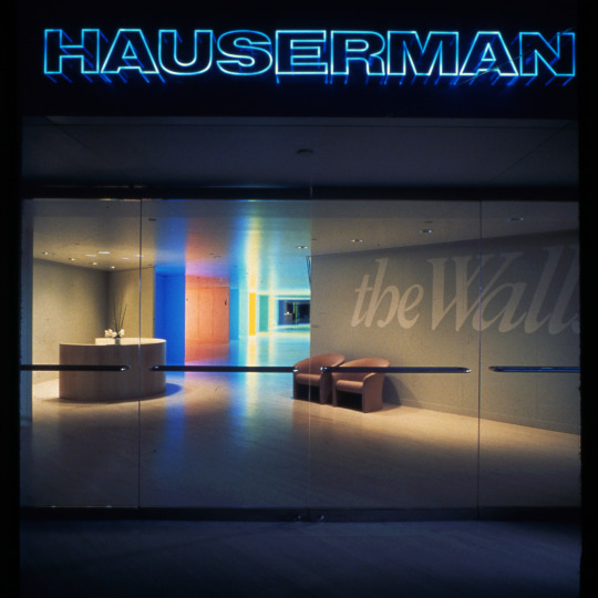
Hauserman Los Angeles showroom (35mm transparency), 1982, Photographer: Toshi Yoshimi
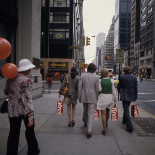
Knoll shopping bags being carried during Designer’s Saturday (35mm transparency), 1973, Photographer: Alessandro De Gregori
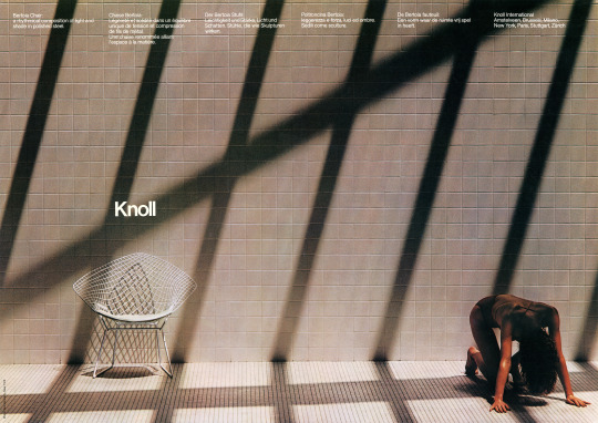
Knoll Bertoia poster, 1979, Photographer: Don Kennedy
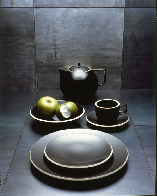
Sasaki Colorstone dishware (4” x 5” color transparency), 1985, Photographer: Luca Vignelli
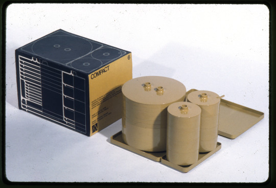
Compact stacking dishware (35mm transparency), 1964, Photographer: Norman McGrath
#vignelli#design archives#design history#photography#graphic design#product design#furniture design#interior design#architectural graphics#open houses#archives for all
58 notes
·
View notes