Instagram @VintageRPG | Chronicling the art and history of tabletop roleplaying games | From the collection of Stu Horvath | Posts daily | Podcast episode every Monday | Book with MIT Press out in October 2023
Last active 60 minutes ago
Don't wanna be here? Send us removal request.
Statistics
We looked inside some of the posts by vintagerpg and here's what we found interesting.
Average Info
Notes Per Post
1K
Likes Per Post
954
Reblog Per Post
318
Reply Per Post
19
Time Between Posts
1 day
Number of Posts By Type
Text
17
Last Seen Tumblr Blogs


Fun Fact
In 2020, 44% of users from Denmark used Tumblr daily.
Text
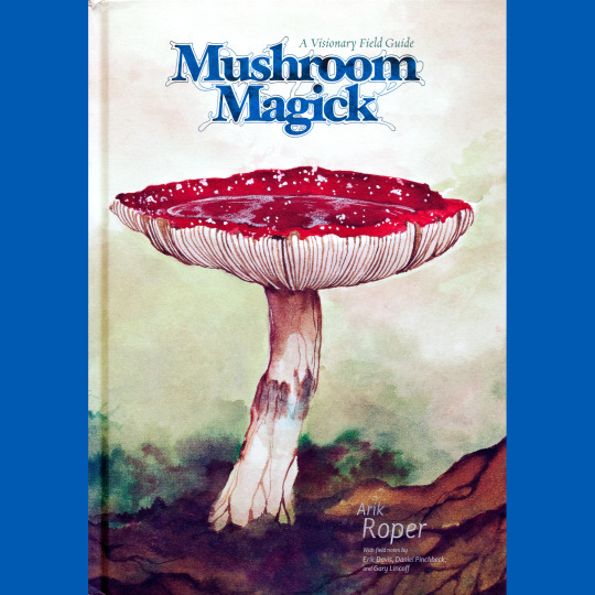


So, originally, this post was about Arik Moonhawk Roper’s amazing Vision of the Hawk retrospective art book. The words were written! But then, I was prepping the posts for November of last year and realized, crap, I already wrote a post about that. Such are the hazards of working a year or so in advance, I guess.
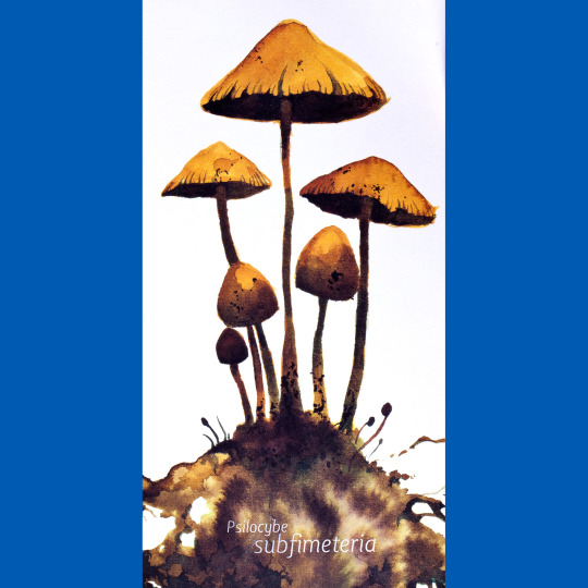
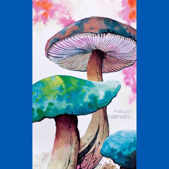
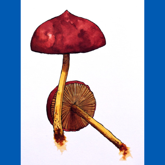
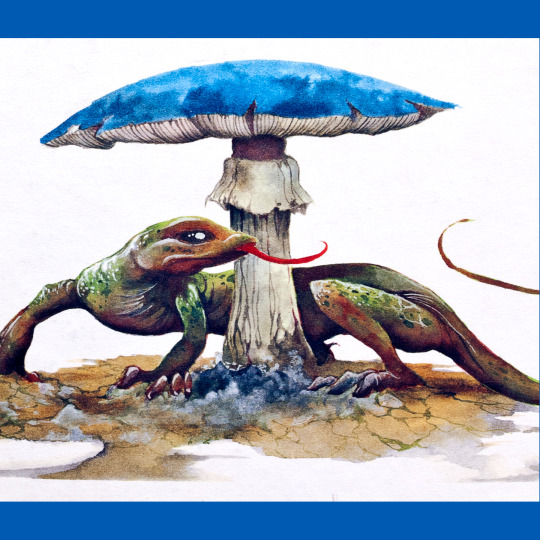
Anyway, the second Visions of the Hawk piece was pegged to my first exposure to Roper’s art, which was not his cover to Sleep’s Dopesmoker, but rather, this book, Mushroom Magick (2009), found in a box of review copies at the New York Daily News left up for grabs circa 2010. While I did not get to keep the book (another photo editor had dibs), I got to flip through it that evening, and I was impressed. But shit was going down in real life in 2010, so I entirely forgot about it until I saw the extracts from it in Vision of the Hawk. Me being me, I tried to find a copy, but it took a while, because it’s sort of expensive and scarce. But now I have one, and am showing it to you!
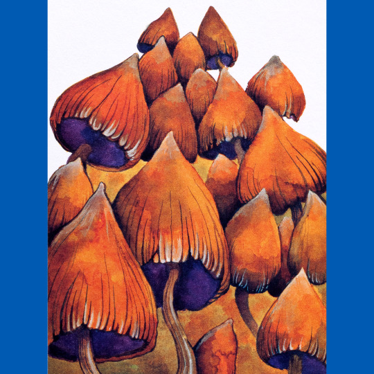
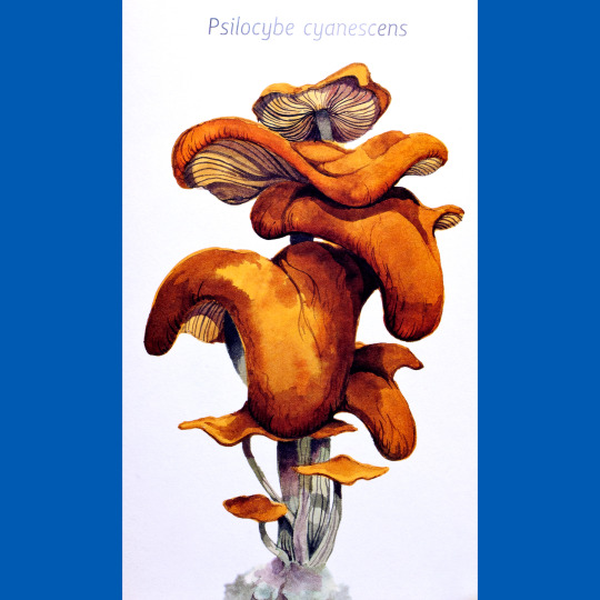
This is a 144-page collection of paintings of mushrooms. And, well, not just any mushrooms, obviously. There are some field notes on the specific types, generally with an eye towards the level of psylocybin they contain, but for the most part, just paintings of mushrooms. Imagine if Fungi of the Far Realms was entirely dedicated to naturally-occurring mushrooms and contained no game mechanics. That’s this. It’s a really lovely book and I think it is testament to Roper’s powers as an illustrator that it never gets boring. He achieves this, I think, by tweaking elements of his style as he goes. Here, a bit of text, next some bold line work, here water color, here a curious crop, and so on. Theme and variation, to an almost mesmerizing degree.
91 notes
·
View notes
Text


Similar to Cobb, I feel like John Jude Palencar doesn’t have the reputation he deserves. Perhaps, in part, because his more recognizable work — the covers to the Eragon novels — seem to my eye to be divergent from his natural style. When I look at most of his paintings, I see an illustrative realism underpinned by a strong sense of geometry (to the point of looking sculptural), with figures and objects often arranged in symbolic-seaming tableau. He often uses palettes and textures that remind me of Andrew Wyeth (though with none of Wyeth’s off-kilter looseness). I also think about Leonora Carrington a lot when I’m flipping through Origins: The Art of John Jude Palencar (2006), but I couldn’t tell you why exactly.
My earliest encounter with Palencar was his work in Time/Life’s Enchanted World, of which “Satan’s Black School” is my favorite. I was weirded out a little years later when I stumbled across his covers for the Del Rey Lovecraft collections which, like Michael Whelan’s diptyche, strike me as both un-Lovecraftian and extremely Lovecraftian at the same time. I was similarly surprised when I realized he did my preferred covers of Octavia Bulter’s work. He’s interesting like that, hiding in plain sight until I see, and once I see, its seems plain as day. I think it’s perhaps his approach to minute texture that gives him away.
Anyway, I think Origins is out of print and slightly hard to come by, but you should give it a shot, as Palencar is a fantastic stylist and a master of a very specific, very strange atmosphere. And oh, man, look at those Tolkien illustrations, can you imagine what the movies would look like if it had been Palencar instead of Lee and Howe in the art department?
84 notes
·
View notes
Text


In the back of Barlowe’s Guide to Fantasy (1996), I believe, there are sketches for a book called Pilgrimage to Hell, which appeared two years later under the title Barlowe’s Inferno. Three years later, a follow-up emerged called Brushfire. All three of these things have had a strange hold on me. The sketches are nightmarish, a big shift from the fairly safe and reasonable creatures in the Fantasy and Extraterrestrial books and an even vaster gulf between them and The Pop-up Book of Star Wars, Barlowe’s first published work. I’ve never come across the actual Hell books, though, only seen their covers and a piece here or there, once in person at the Enchanted show. Until I learned about Psychopomp (2021), that is.
A massive book, it collects just about every piece of Barlowe’s Hell that existed at the time — the contents of Inferno, Brushfire, the art from Barlowe’s two novels about Hell and a gigantic section of character design work (though not the sketches for Pilgrimages, oddly). This vision is both strange and unsettling. I don’t find it horrible, but rather more melancholy than anything. So many of Hell’s inhabitants are petrified to varying degrees, a state I find sadder than upsetting. I also find it so outside my preconceptions of Hell as a medieval torture chamber that it winds up verging on science fiction.
Barlowe is a real master of details, too. The cover alone, a self-portrait, gives you enough amulets and talismans to stare at for an afternoon before you even start trying to parse the background. The city behind is vast, the statues massive, the souls tiny, but is Barlowe a giant or is it a matter of perspective? Psychopomp is rife with these conundrums of scale.
The design section is particularly interesting coming from RPGs — it’s practically a monster manual and sourcebook all in one, and with very few words, at that. Barlowe’s portraits tell stories, but also his subjects’ clothes and ornaments and armor and weapons. No surprise he went on to do production work for del Toro’s Hellboy films.
205 notes
·
View notes
Text


Run for Cover (2006) is a retrospective of Derek Riggs’ art career which, for the most part, means it is a retrospective of all the Iron Maiden art of note. He got his start with some Heavy Metal covers and basically fell right into being Maiden’s go-to art guy. Eddie, their mascot, is really Riggs’ creation — the zombie on the band’s first release was originally called Electric Matthew and was a personal work.
Riggs’ work for Maiden is one of the richest in metal, producing a body of over-the-top, horror-tinged art work that really has no rival in the scene. It’s a real joy to see all of the covers, to the albums and singles, collected in one place, along with the merch designs and sketches and alternate painting and what not. Riggs’ packed so much detail into his works that there are still surprises to be found in nearly every one.
Less delightful is the lengthy interview with Riggs that runs the course of the book. He’s a lot to take in, a little bit of a bullshitter, a lot of a grump. His relationship with the band can be best described as “contentious” and when the relationship fell apart for Fear of the Dark, Riggs makes it clear that he was sick of the band. It also sounds like maybe the band was sick of Riggs, too. The partnership didn’t break up for long, Riggs was back for A Real Live One because he needed the money, and has continued to work with them periodically since.
It’s…weird. I can’t imagine having that sort of career, bound almost entirely to one band, with little ownership of all that work. Riggs, for all his grumbles, doesn’t seem to have any regrets, though. More power to him. And I will say: my enthusiasm for much of the band’s catalog has cooled over the years, but I’ll never get tired of Riggs’ paintings.
If you want a copy, Riggs has them for sale on his site.
#tabletop rpg#dungeons & dragons#roleplaying game#rpg#d&d#ttrpg#Derek Riggs#Iron Maiden#Run for Cover#Art
65 notes
·
View notes
Text

An RPG inspired by the TV show Millennium? SIGN ME UP!
This week on the Vintage RPG Podcast, we check out the primer for Midnight of the Century, from By Odin's Beard! It's a lightweight game in the mode of Cairn, but tailored around investigating supernaturally tinged murders in the mode of Millennium, Seven, Twin Peaks and so on. The rain is always falling, people are always dying and the end of the world is just around the corner!
Check out the itch.io campaign for Midnight of the Century, let's get it to the goal, hey?
#roleplaying game#ttrpg#tabletop rpg#dungeons & dragons#rpg#d&d#podcast#By Odin's Beard#Midnight of the Century
25 notes
·
View notes
Text


I’d never heard of Ron Cobb until I read Paul M. Sammon’s interview with him for Cinefantastique on the set of Conan the Barbarian. He was the film’s production designer and when I checked out his concept art, my brain fell out of my head. Just, tremendous. It suffuses the movie, as you’d expect, but it also offers up a vision distinct from it. I mean, just look, I bet you’ll feel like they are simultaneously familiar and strange, like something dropped through a portal from a parallel universe. I was instantly obsessed.
Cobb is one of those guys whose work in film in the late ’70s and early ’80s is foundational to so many things that came after him, yet he remains somewhat unknown and certainly under-appreciated. In addition to Conan, he was the production designer for The Running Man, The Last Starfighter and Leviathan, and was in the art department for Alien, Aliens, My Science Project, Raiders of the Lost Ark, Total Recall and heaps more. He was also a key part of the team that designed the DeLorean time machine for Back to the Future and created the Hammerhead alien for Star Wars.
Colorvision (1981) collects a range of his early work, including for comics, monster magazines and his political cartoons. All that stuff is good, but I tracked it down for the Conan, Star Wars and Alien concept art. Cobb’s work on the latter is clearly overshadowed in the popular consciousness by H.R. Giger’s contribution, but he’s equally important — all the tech, the vibe of the ship, the sense that the ship is both complex and rudimentary, it’s working class feel, all comes from Cobb, and the movie would suffer without it. And it has a wider web of influence. You can see echoes of Cobb in just about any industrial science fiction, whereas Giger’s xenomorph is so distinct that its influence almost always comes off as imitation (even Giger’s own work struggles in that shadow — look no further than Species for proof that).
Titan released The Art of Ron Cobb in 2022 and it is a more representative look at the late Cobb’s career. It’s also easier to find than Colorvision, though Colorvision has a couple pieces that the newer book leaves out. You can probably just get the Titan retrospective, though, unless you’re a loon like me.
126 notes
·
View notes
Text


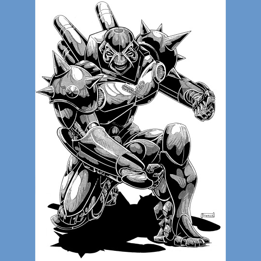


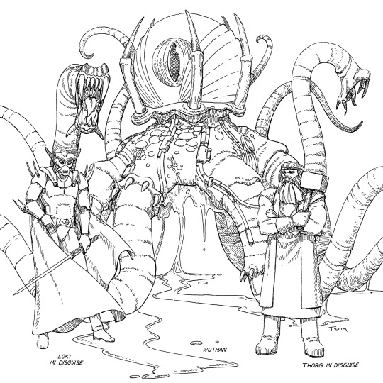
Pantheons of the Megaverse (1994) is a bit like what if Deities & Demigods, but Rifts. But also, not as cool. I don’t know if that is because Deities has a whiff of scandal about it, or if I find Pantheons confused, or if it just boils down to the art not being as wow as I want it to be (Kevin Long only contributes to the Norse gods; I don’t dislike the work of Wayne Breaux, Vince Martin, Tom Miller, Newton Ewell and Roger Peterson, but I do think Long anchors Rifts in a way they don’t, and I miss him).
Why confused? Because it’s Rifts. Gods can’t just be gods, they have to cross dimensions/genres at every possible opportunity. Hecate has Witchblade armor (which, OK, impressive since Witchblade came out the following year), Krishna’s goth, Asgardian dwarves are gunsmiths, Shiva looks like an Ultimate Weapon from Final Fantasy (again, ahead of the curve, but still). Then there is “Huitzilopochtli, the Warrior of the Sun, full conversion cyborg.” And he just looks like a ‘roided out Coaltion bot.
Worse, there are all these impostor gods running around. There are three versions of the Oympian gods. I can barely parse the core pantheons, let alone the knock-offs. When I say I often find Rifts exhausting, this book is the best embodiment of my fatigue that I have encountered so far. And even then…John Zeleznik’s cover is cool enough that I probably won’t get rid of the book. Frickin’ Rifts.
#tabletop rpg#roleplaying game#dungeons & dragons#rpg#d&d#ttrpg#Palladium#Rifts#Pantheons of the Megaverse
64 notes
·
View notes
Text


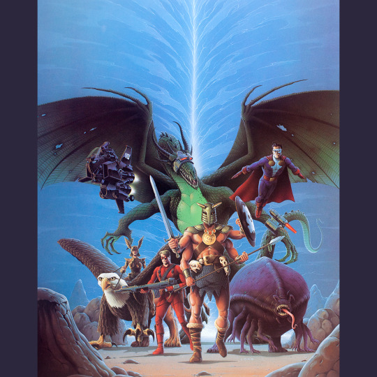
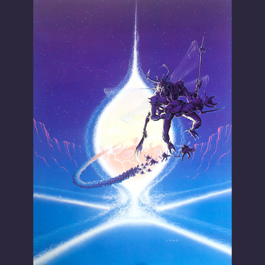


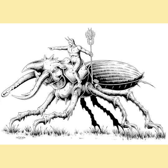
Behold, the Rifts 1993 Calendar, the one and (to my knowledge) only Rifts calendar. What a glorious beast, it features seven paintings (and one impressive centerfold) by Palladium mainstay Kevin Long and five by Keith Parkinson. The pair, for my money, pretty much entirely defined the look and feel of Rifts.
Let’s see what we’ve got. Parkinson’s cover for the Rifts rules is easy, as is Long’s covers for Sourcebook One (seen earlier this week) and Vampire Kingdoms. We also have Parkinson’s covers for Atlantis and Mutants in Orbit. It gets a little harder from there. The red skelebot looking thing is from the cover of the Rifts GM Screen and the group painting with the dragon is from Rifts Conversion Book One. Two of the Long’s — the shaman-looking dude and those rocket pack troopers — were covers of Rifter Magazine. That leaves three. I think the two remaining Parkinsons — the tiger woman and the barbarians on horseback — were just sitting around his studio. They don’t feel particularly Palladium-y to me, though I suppose they could have been on a Palladium Fantasy publication I’ve never seen. Long’s bug invasion does feel Riftsish, though, but again, not sure if it was ever used elsewhere. Ah well.
I gotta say, this is maybe the purest distillation of Rifts for me, because its foregrounds all the cool skull masks and monsters and stuff and I don’t have to worry about the sheer poundage of pages and rules. Shame this is the only one.
I could have reused this in 2021, but I didn’t know you could reuse calendars at that point. Thankfully, 1993 is a pretty common year and will be usable again in 2027. Can’t come fast enough!
105 notes
·
View notes
Text

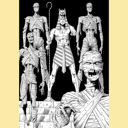


I soured on Rifts World Books after England. Vampire Kingdoms and Atlantis are so fun, and then it all ground to a halt, to the point that I’ve not really gone back in four years. I am pleased to report, though, that World Book Four, Africa (1993) is, once again, a banger.
There’s the basic stuff you’d expect from a book like this, of course. Regional information, (so many) new character classes, monsters. Various types of African mysticism and magic get a lot of attention, as do the gods of Egypt. The latter are important for the Phoenix Empire, which is a techno/theocratic resurgence of the ancient Egyptian culture. All this stuff, off course, mashes together the usual melange of extradimensional hijinx. The Phoenix Empire is extremely similar to Torg’s Nile Empire, but the twist is either silly or bizarre, depending on your temperament: Pharaoh Rama-Set looks like a man, but is actually a Celestial Dragon in disguise? I, for one, approve.
The real star of the show, though, is the introduction of the four Horsemen of the Apocalypse. They are all presented in typically over-the-top fashion (though given plausible weight thanks to Kevin Long’s illustrations). They’re spread out on the African continent, doing their individual things while also seeking each other. Should all four meet, they will fuse into a giant apocalypse beast that will destroy the world, so the book suggests that the players find and destroy the horsemen before that happens. Truly, a wild scaling of power going on here.
75 notes
·
View notes
Text

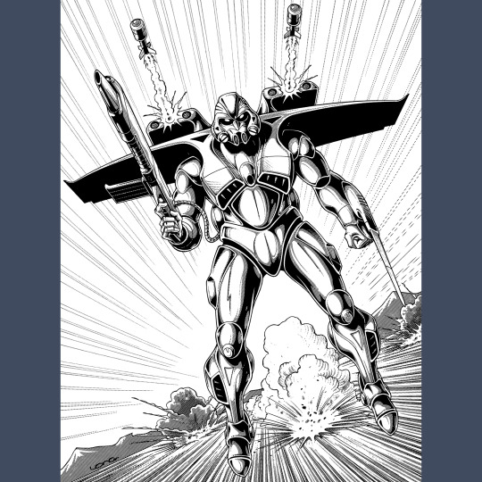


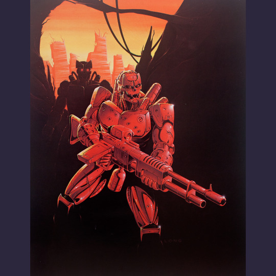
Palladium’s games have always been pretty unified. They started with weapon guides for D&D, then Palladium Fantasy built a whole system around that and TMNT and Other Strangeness and Robotech and Beyond the Supernatural all contributed more pieces to what would become known as the Megaversal system, the rule that power Rifts. But that’s, like, subtle, man. Rifts Sourcebook Two: The Mechanoids (1992) is blatant. It’s the book that signals that Rifts is the melting pot for all things Palladium. It’s always been one universe.
The Mechanoid Invasion (1981) spun out of a never-realized idea for a comic series and was Palladium’s first RPG. It tells the story of an Earth invaded by hostile aliens and humanity’s desperate hunt for ancient weapons with which they can turn the tide of war. The Mechanoids themselves are little squishy alien weirdos with a talent for creating mechanical war suits of various shapes and sizes. They remind me a lot of the Krang, in fact, and I wonder if that similarity was what inspired Siembieda to secure the TMNT license for a game (honestly not sure when the TCRI aliens first show up in the comics, or if they had robot suits when they do; it might be too late to have influenced the RPG deal, but maybe the Mechanoids influenced Eastman and Laird?).
Anyway, this book reintroduces the Mechanoids in the context of Rifts. They’re basically the same murderous conquerors as they were a decade previous, and you might think another faction of robo-skeleton guys would be hard to distinguish (especially since, curiously, ARCHIE and Hagan get further detailing in this book and come with more skelly-robots that are even more clearly patterned on the Terminator). But the opposite is true, I think, the Mechanoids seem cooler to me in the context of all the other bonkers crap that’s going on in Rifts. In their first iteration, they’re basically just rehashed War of the Worlds Martians stomping on pretty ill-prepared humans. And, I mean, the Mechanoids clearly have an advantage over the Coalition, judging from Kevin Long’s cover painting. But how do they measure up against (or how do they make friends with) Atlantis, or the Splugorth, or Triax, or the Federation of Magic? Or even ARCHIE and Hagan? Who can tell, honestly?
Newton Ewell and Kevin Siembieda join Kevin Long in the interior illustrations, but really, it’s Long’s show all the way.
72 notes
·
View notes
Text
What lies beneath the Mucklands? The Underlands, naturally!
This week on the Vintage RPG Podcast, we welcome the creators of Land of Eem, Ben Costa and James Parks! Eem is a bit of a multimedia project, currently consisting of a series of graphic novels, young readers novels and a shockingly massive RPG. It mixes light and dark in perfect proportions for kids and adults alike. And recently nominated for a pile of Ennies, because it's that dang good. But wait, there's more: Turns out Ben and James are making their giant RPG even bigger with a massive campaign world expansion and a beginner's version of the game, currently crowdfunding on Kickstarter!
21 notes
·
View notes
Text


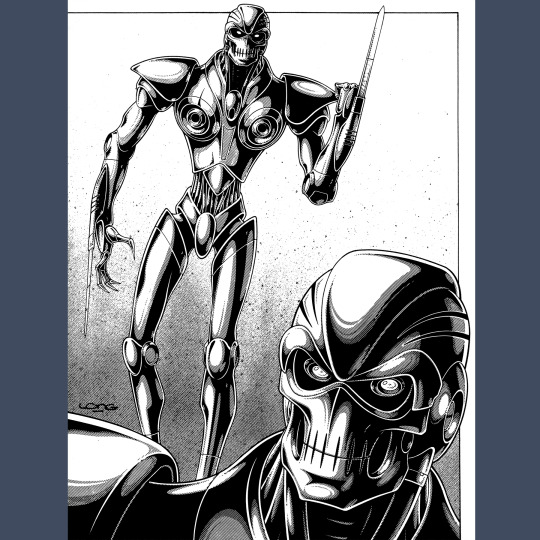
Rifts Sourcebook (1991) was the very first supplement for Rifts and it is sort of a potpourri of material that probably should have been in the core rules. To give you some idea of how true this is, it opens with six pages of “Answers to Questions about Rifts,” a set of rules clarifications that illustrates A. How complex Rifts really is and B. How seat-of-the-pants the initial iteration of the game was.
The best chunk of the book details the Coalition, the fascist empire that has taken over most of the US. The initial foray into the Coalition section is titled “The Coalition: Good of Evil?” and it tries to paint the clearly evil government in shades of gray (these are the guys with the skelebots and the spider skeleton robots and the guys in skull mask armor, just to be clear). Two pages later, the book gives up and the title “The CS Government: The Source of Evil” appears. This is a good example, I think, of what it feels like to read any given Rifts book. So much whiplash.
Lots of material on Triax, the German arms manufacturer, which boils down to a guns chapter. There is a selection of monsters, rules for Bot characters. The “botweiller” is introduced. Also ARCHIE, a giant brain in a jar (er, pool?) that can build all sorts of machine horrors/wonders, but lacks the imagination to come up with designs. So it needs a partner. In this case, Hagan, the fellow on the cover, who is ARCHIE’s literal idea man. I kind of love this? Even if the botweiller is one of Hagan’s ideas.
Kevin Long artwork through and through. That cover is top shelf Rifts, and his interiors are just endlessly entertaining. Rifts really wouldn’t work at all, I think, without Long providing at least some of the visual cement.
125 notes
·
View notes
Text


MIG III: The Meints Index to Glorantha (2022) is a labor of love by Rick Meints, president of Chaosium. It began as the work of an obsessive collector, long before his time at Chaosium; an attempt to catalog all the products released for the various editions of RuneQuest and HeroQuest, as well as non-game Glorantha publications and even stuff from other publishers and independent creators. It’s kinda like Vintage RPG, except just for RuneQuest. It’s exhaustive, and wonderful.
Don’t think of it like the old Overstreet Price Guides for comics and such, though. This is no mere book of lists. Rick provides commentary for just about everything, appraising all the products for both playability and collectability. Just about every cover is reproduced, along with select interiors, often in catalog-like tableau, an approach I find extremely appealing. There’s great quote on the back cover that is talking about the art specifically, but also applies to the entirety of RQ presented: “The varying levels of quality and creativity, or lack thereof, are evident over the span of the 40 years worth of products included.”
Two things make this even cooler. First, it becomes a history of RuneQuest, Glorantha and, to some extent, Chaosium, because it is often necessary to understand the business situations that produced these products to understand the products themselves in the greater context of the line. Second, Rick’s access to the Chaosium archives allows him to present all the products that never made it out of production, or were canceled or otherwise (nearly) lost to history. Both these things make the book invaluable.
It’s also hella fun, if you’re into RQ. Rick is a charming and personable guide, despite his protestations to the contrary on the back cover. I’d love to see books like this for Stormbringer, Pendragon and Call of Cthulhu. Hell, I’d love to write them!
#roleplaying game#tabletop rpg#dungeons & dragons#rpg#d&d#ttrpg#Chaosium#RuneQuest#Meints Index to Glorantha
45 notes
·
View notes
Text

SoloQuest 3: The Snow King’s Bride (1982) stinks. It’s full of corny jokes, the layout still makes my eyes wander and it’s a single-use scenario that lacks the interesting mechanical experiments that allowed the previous volumes to engage me beyond their faults. This one does have interior illustrations, but they’re very low effort pieces from Luise Perrene. The cover character, also by Perrene, lacks the charm of Becker’s little guys.
It also isn’t Glorantha! It’s Vikings. Which is fine. But I understand the frustration players must have felt when they saw Gateway products on the shelves in the early ’80s, and then later with the Avalon Hill third edition. I want to explore Glorantha with RuneQuest!
One curious thing: the credits list Gigi D’Arn as a consultant. D’Arn wrote a very entertaining industry gossip column in Different Worlds magazine, but it isn’t clear that she actually existed (I generally assume the name was a pseudonym of editor Tadashi Ehara, who was credited for layout in the previous SoloQuest books), so it is amusing to see her get a credit here. I wonder if she has any other Chaosium credits?
#tabletop rpg#roleplaying game#dungeons & dragons#rpg#d&d#ttrpg#Chaosium#RuneQuest#SoloQuest#solo#Snow King’s Bride
32 notes
·
View notes
Text


SoloQuest 2: Scorpion Hall (1982) is the best of the three RQ solos. Unlike the previous volume, this is all one scenario. As with that book, Rick Becker delivers a cool little illustration for the cover, this time of a horrible scorpion man. He even has a couple interiors! I love the naga.
Again, the intention here is for replayability and, more, to create a “living” dungeon. As you progress through, the monsters you defeat stay dead and are replaced by different creatures. The difficulty scales with you level. Treasure you removed doesn’t replenish and, if you character dies, their corpse will remain. Of course, all of this requires some elbow grease from the player, use of their imagination and a little bit of ignoring the text about the monsters you already killed. The book is ambitious, though, and I think it largely works, though it is marred by the same hard-to-parse layout and bad jokes as the previous volume. Honestly, the jokes would be fine in a smaller dosage, there’s just too great a concentration of them, and they often undercut what would otherwise be exciting situations.
#roleplaying game#tabletop rpg#dungeons & dragons#rpg#d&d#ttrpg#Chaosium#RuneQuest#SoloQuest#solo#Scorpion Hall
73 notes
·
View notes
Text

SoloQuest (1982) was the first of three solitaires for RuneQuest published by Chaosium (and the company’s first solos generally). I’ve always thought Chaosium’s approach to solos was interesting, particularly the desire for them to be replayable (I may be misremembering, but I believe Pendragon eventually includes short solitaires to aid in the winter downtime phase, which I find very appealing).
The first scenario here, “DreamQuest” is meant to be repeated. It’s essentially a character trainer, in which the player proceeds through a gauntlet of encounters (some friendly, most not) while sleeping, and reaps the usual rewards for completing a quest. This reminds me a lot of the portal solos for Tunnels & Trolls, like Beyond the Silvered Pane and Arena of Khazan. It’s interesting, but also silly: you can possibly encounter a swashbuckling manticore named Errol, a rogue named Dagger Lee and a pair of duck warriors named Huey and Looie.
The other two are not intended to be repeated by the same character. “The Phoney Stones” is an investigation into counterfeit statues that’s pretty OK, though plagued with anachronisms and gags that kind of irk me. “Maguffin Hunt” is similarly benighted, and is also not as interesting. I also have to say, the layout, which boxes the text, and the use of short entries that serve to only redirect you (presumably as a way to minimize cheating) make these far harder to read than they ought to be.
No real interior art, but I love Rick Becker’s duck on the cover. Lots of personality. I think the cover treatment for these is generally pretty eye-catching, too.
68 notes
·
View notes
Text
The local library has fantasy books and air conditioning, what else do you need for a great summer?
This week on the Vintage RPG Podcast, Hambone's cracked into Ursula K. Le Guin's Earthsea novels and asked for more fantasy fiction recommendations. On tap: Fritz Leiber, Lloyd Alexander, Margaret St. Claire, Roger Zelazny and Manly Wade Wellman. Tolkien who?
15 notes
·
View notes