I have 15+ years of experience designing and implementing interfaces for games. I have a reputation for solving difficult problems by working with other disciplines and leveraging my technical expertise. I've grown my skills in remote training and team building, leading talent from Seattle to Brighton. I view leadership as a service role, and each day I strive to provide my team with the clarity, resources, and respect that they deserve.
Don't wanna be here? Send us removal request.
Photo
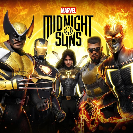
Marvel Midnight Suns
3 Years: 2/19 to 7/22 Released December 2, 2022 Platforms: Playstation 4, Xbox One, PC
Credited Roles
Lead UI/UX Designer (2 yrs, 6mo) Lead UI Engineer (1 yr, 10 mo) UI Engineer (3+ years)
Responsibilities
Lead UI Engineer
When I first came to this project after my maternity leave, I stepped into the role of Lead UI Engineer, given my previous experience with UE4 on my last cancelled project. I took on a team of myself and two additional engineers. Together we formulated our coding standards and Blueprint style guidelines, and I laid out my expectations for a clear MVP separation model. I was responsible for many of the core UI features of our UI, including the HUD, strategy layer, and multiple necessary Unreal controls that we needed - DynamicImageTextDecorator, MaterialImage, AnimatingSizeBox, NotificationContainer, OffscreenIndicator, Signpost (objectives tracker), and InputActionImage, to name a few.
I enjoyed devoting myself entirely to an engineering role for the first time in my career. Around 10 months into my time on this project, our Lead UI Designer left our company. At this time I was assigned her role in addition to Lead Engineering responsibilities. After about a year of having both roles, I was (gratefully!) able to hand off the lead engineering position to the formidable Mike LeGrand.
Lead UI Designer
At the time when I took the lead designer position, there were still many aspects of the project that were undergoing quite a bit of iteration. Notably the open world aspect of the strategy layer, including recipes, crafting, discovery, etc. was added to the project. I moved our documentation entirely into Adobe XD and created a Confluence HUB to view and collaborate on all of our ongoing design. I am responsible for the majority of the shipping UI/UX design for the project. Notably Kaitlyn Magnuson designed the Store and SuperLink designs, and Hannah Montgomery provided an incredible jumping off point for the card display design, 3D UI, and strategy layer screens.
UI Artist
I was responsible for creating a new shape language and visual style for our game. Luckily I had help from Peter Smith to create some incredible flipbooks to create our final UI effects. Peter was also responsible for the vast majority of the iconography, especially the hero logos and game logo. This is the styleguide I created:
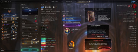
Ultimately our team grew to 6 core members along with many contractors and outsourcers across all UI disciplines.
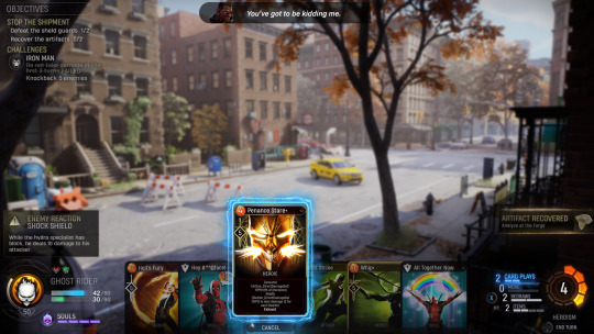
I really have so much more to say about this project and my experiences on it. This post is currently in progress. For now I will add just a few more images and vidoes that reflect my work.
youtube
0 notes
Photo

Chimera Squad
5 Months
youtube
Credited Roles
Additional Support
Responsibilities
I was assigned as the pre-production trailblazer on this project. Initially, the scope was quite small, and it was considered that I might be able to own this entire project’s UI by myself. I formulated a roadmap and man-hour projections to show that this would not be possible. During the five months, my time was split between engineering and design. I had never used ActionScript2 or UnrealScript, so I quickly ramped up and began to establish core tech and practices. I was also establishing the look and feel of the game (full style guide, HUD composition) and working with designers to wireframe their core mechanic.
I left the project when I gave birth to my baby girl, and when I returned I was reassigned to a larger project.
Style Guide

For the style guide, the original art direction was to attempt to take the original XCom styling and imagine it evolved into a future-government police state - Removing any embellishments and creating something for pure function. This led to a very flat, simple, and muted overall look.
Tactical HUD
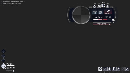
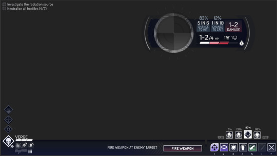
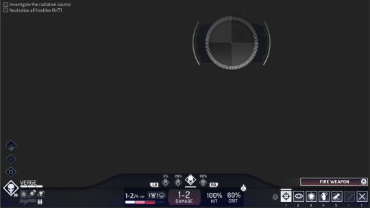
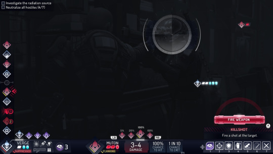
For the HUD, we explored various ways to present the data before landing on our final approach. The look and feel was already beginning to evolve at this point, since the art direction was pushing toward the neon, more fun place where it ultimately came to rest.
Breach
youtube
This is a quick comp I did for showing a possible user experience for the Breach mechanic. For this design, different positions around the door indicated possible actions that unit could take once inside. Before any of the other positions could be assigned, the primary breaching unit would have to be chosen to enter. Then that unit could plan future movement and actions (indicated by yellow).
Overwatch
youtube
This is a comp to show how movement UI would respond as a unit moves into an area that was being watched by another unit. After a movement location is chosen, the player can then choose an area for that unit to watch.
Note
As you can see from the gameplay trailer, much of this work was not used in the final product. I believe the initial style guide and early UX explorations were helpful, however the team ultimately found their own path in a very demanding development environment.
0 notes
Photo

Cancelled Title 1 Year, 4 Months - UE4
Roles Lead User Interface Designer, Interface Engineer
The first several months of this project were spent learning Unreal Engine 4. I dug into the engine and learned Epic’s Blueprint coding guidelines. I developed my own coding standards to add to those, and I had a lot of fun exploring UMG. After many years of CivTech, it was incredibly exciting to see all the new things I would be able to do. I love the speed and autonomy that UE4 grants. I also had the privilege of working with our first dedicated motion graphics artist, Nick Paul. He taught me a great deal about After Effects and the world of plugins. I’m very disappointed that I can’t add assets from this project to my portfolio. I produced some of the coolest animations in my career. I look forward to another opportunity to create motion graphics, but generally my other skills are in higher demand.
0 notes
Photo

Civilization 6
2 Years
youtube
CREDITED ROLES
Lead User Interface Designer
UI Engineer
GOALS
Working with art direction, one of our primary goals was for the UI to be a supporting actor and environment for the game. Each of the primary systems was meant to have its own look and feel to help the player with a sense of locality as they played the game, while still supporting the overall artistic theme - The Age of Exploration.

(Credit to Dave Cory for his work on the Civics/Technology Tree, Religion, Great People, and Great Works)
RESPONSIBILITIES
There are certain general responsibilities that I perform for every project I work on. Please refer to my resume page for a pdf with that listing. In this section I want to call out just the more specific responsibilities that I performed for this project.
Create the practices and documents
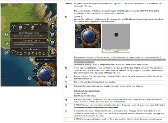
For every piece of UI, we provided in depth descriptions of all possible states in a shared design document. Our goal was to create a useful resource for our team and outsourcers.
Design of the UI systems and direction of the game Aside from my leadership and engineering role, I also designed the core UI systems that governed our approach to each screen and feature.
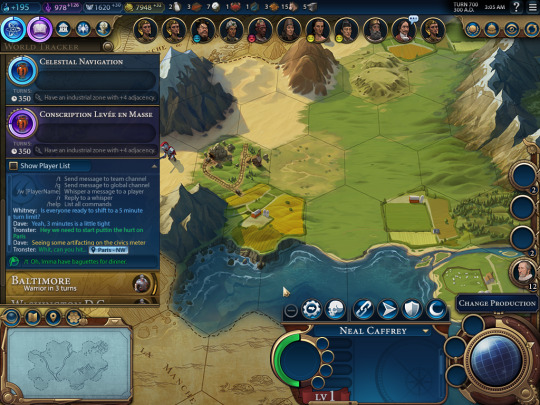
HUD The design of our HUD contains all the primary vectors of communication to the player. I designed our HUD consulting the most popular mods of Civ 5. I tried very hard to make something that would be extendable for future games, moddable by our community, and have the maximum ease of use. (Credit to Dave Cory for his work on Unit Action icons)

Lenses To address the many layers of map information that the player needs, we adopted the ‘lens’ approach. By toggling our map element you could filter your view to only the most relevant information for your decision. (Credit to Dave Cory for his work on the Trade Lens)
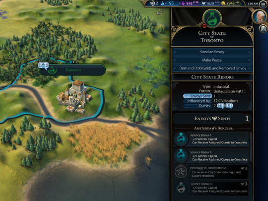
Full screen and Partial Screen approach While our core systems are full screen approach, most of our supporting systems require a great deal of map data to comprehend (Trade, City-States, Espionage...)

Diplomacy I designed and implemented the diplomacy layer of Civ 6. My primary goal with diplomacy was to provide you with all of the necessary data for your decisions, while getting the UI out of the way as much as possible to show off our amazing leader models. I also designed and implemented our approach to the leader backgrounds. This was a complex issue that we had originally planned to solve in 3d. When that became too difficult to implement in our timeframe, I proposed this faked parallax approach that I implemented in the UI layer.


Iconography For most of the atlases in our game, I provided the first several icons at least, to provide our outsourcers with the artistic direction that I wanted. My partner Dave Cory also did a tremendous amount of work here. By the time we shipped vanilla, I believe the count was somewhere in the vicinity of 2,500 icons. I could probably write a paper about all of the icons we created for Civ, so feel free to pick my brain on this subject.
CHALLENGES
A Lot Going On
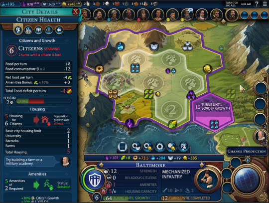
Suffice it to say, Civilization is a complex game. For new players, this amount of data is completely overwhelming. For experienced players, every piece of data in this composition could be essential. My original hope was to create an interface with increasing levels of detail that the player could opt into. Given our timeline, a customized, adaptive approach simply wasn’t in the cards. I had to design for the highest level of complexity at all times.
Prohibitive tooling

Civilization 6 was created using the same tech that was originally conceived for Civ 5. With no editor, we constructed the UI using XML and LUA. We had no ability to create any kind of shared widget, so each screen had to be rolled completely from scratch. Civ 6 also made use of a brand new in house tool for asset management which was originally designed for 3D assets. While this asset management enabled us to impressively optimize our texture space, the tool itself was very new and often crashed, meaning it could take several hours to add a single icon to the game. These two issues made any kind of iteration almost completely impossible. By the time our first idea went in, we had to move on due to our time constraints. Most frustratingly this meant that only the core of the system ever went into production. None of our designed tutorials were ever implemented.
0 notes
Photo

Beyond Earth: Rising Tide Expansion for Beyond Earth 3 Months
youtube
ROLE
Lead User Interface Designer (1 designer, 1 UI artist, 1 engineer) Interface Engineer
RESPONSIBILITIES
Diplomacy My primary push for this expansion was to provide UI engineering and design for the new diplomacy system. These are some samples from that large system.


While my primary focus was Diplomacy, I worked with my team to add artifact crafting.

[ Credit to Dave Cory for this composition ]
After we finished artifacts, I asked Dave to help me with a second pass for the tech tree. The original design used mostly monochromatic icons and even with filtering, it was difficult to read. We worked together to find a shape and color language that could help players to quickly scan the tree more effectively.

CHALLENGES
Limited timeline
This project spent over half its production lifetime without a UI designer. At that time, the lead game designer was directing the UI artist without any additional help. When it was clear that wasn’t going to work, my team was pulled from Civ 6 preproduction to help make up for lost time. I put in many long hours for this project to accommodate the short timeline.
0 notes
Photo

Beyond Earth 1 Year, 5 Months
youtube
ROLE
Lead Interface Designer
GOALS
Create an interface which will resonate with Civilization 5 players while leaning into the science fiction setting of the game.
RESPONSIBILITIES
There is a set of responsibilities that are shared across all of my projects. Please view my resume page for that list.
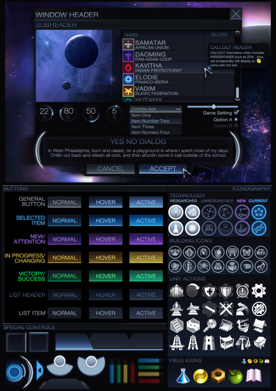
As the lead designer I provided the style guide as well as the icon languages used for this project.

I especially enjoyed the icon exploration for each of the fictitious civilizations that we created for Beyond Earth. I did my best to sensitively combine images from the military and culture of each area.


I designed the HUD for Beyond Earth to be familiar to Civ 5 players while also making some changes to better facilitate our core game loop.

The title screen for Beyond Earth was a challenge. Nothing had been planned, and I felt really strongly that we needed something different to immediately set the tone of the game. I worked with our modeling, vfx, and concept to create the future earth model.

The tech web was one of the biggest new challenges. I needed a new way to represent and navigate technologies for the game. The tech web minimap and filters were our two most successful ways to filter and explore the tech web.


Selecting a particular filter would darken the web and all techs without the specified concept.
CHALLENGES
Limited Staff and Time I was responsible for tasking one on-site UI artist who created icons and one UI engineer. This project was originally conceived as an expansion for Civ 5 and was tasked accordingly. When it grew into a standalone project, staff and time were not added to accommodate that change.
0 notes
Photo

XCOM Enemy Unknown
ROLE
UI Artist
RESPONSIBILITIES
I spent only 4 months on this project. I was working on another project when I was pulled at the end of XCom’s production after an internal review. My role was to help implement the first mission tutorial as well as address some reports and item displays for additional clarity.

The Situation Room - show coverage of the world map and inform the player which areas needed attention.

After action report - Clearly show killed units as well as promotions and status.
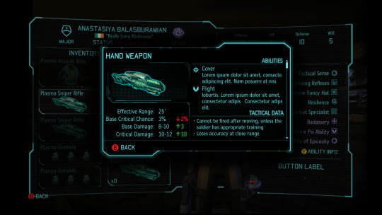

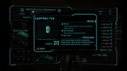
Item cards - design and implement a variety of info displays
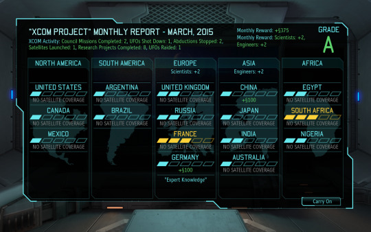
0 notes
Photo

Haunted Hollow 1 Year 1 Month
youtube
ROLES
Interface Designer 2D Artist
GOALS
Create a fun, friendly UI design for mobile platforms.
RESPONSIBILITIES
UI Design and Implementation

This was a relatively simple game design wise. The look and feel was a hand-drawn/toonish look to match the style of the game. Create the logo for the game

Monetization Strategy
Fresh out of my time at Arkadium, my head was filled with all sorts of DAU/MAU goodness. I took a special interest in the monetization strategy for Haunted Hollow. While I was at GDC, I met with some professionals from other successful mobile companies to pick their brains.
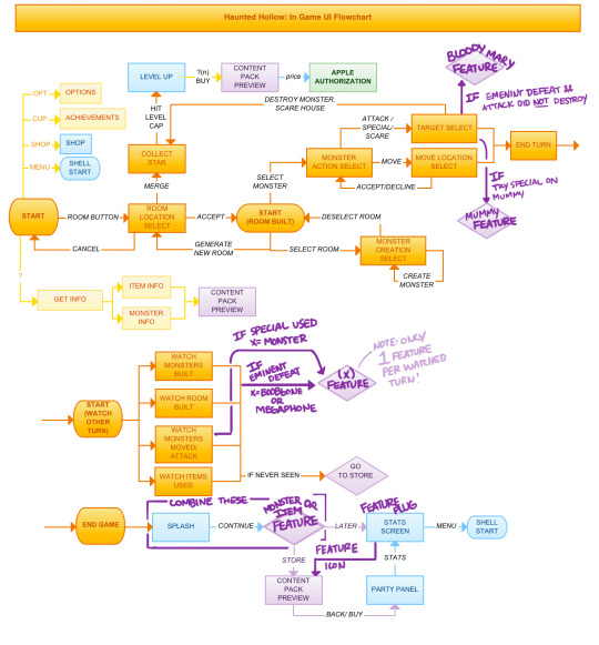
My suggested strategy was adopted, and after our launch we actually got some Kotaku recognition for our approach: XCom Makers’ Monster Mash Conquers Hearts and Wallets Alike
Concept and Key Art
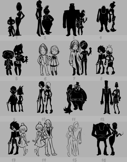
These are some silhouettes I created for our tutorial characters - Shack’N’Bracken. I also created marketing key art. These are some selections:

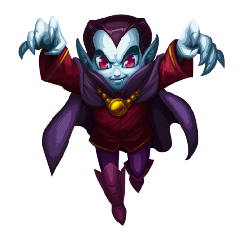

CHALLENGES
During the last 3 months of production, we were given a directive from our publisher to make this game playable on the iPhone as well as the iPad. I had to develop assets for an entirely different SKU in a very short period.
0 notes
Photo

Civilization Revolution - Iphone
DESCRIPTION
This project was a port of Civilization Revolution for ipad and mobile.
RESPONSIBILITIES
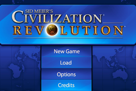
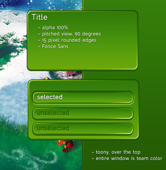
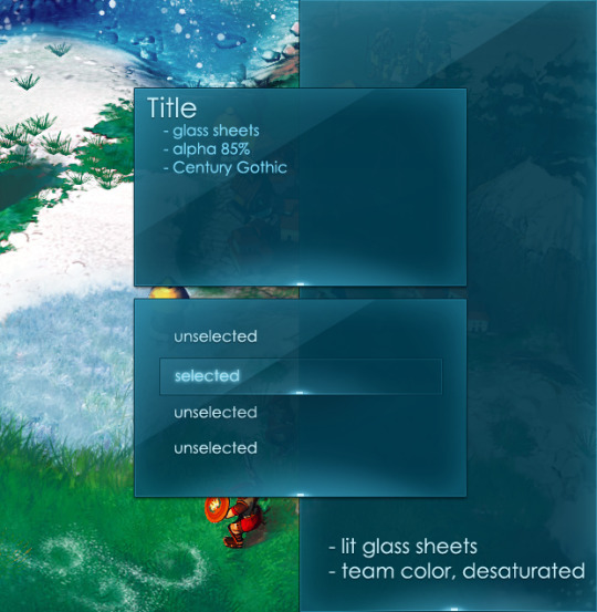
This project was originally outsourced to 2K China, but there were some usability concerns. I was asked to provide the look and feel/iconography as well as the basic touch UX conventions.


[ Credit to Russell Vacarro for the sword and shield models that I used in the creation of these icons ]
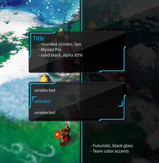
Look and Feel Exploration


0 notes
Photo

This is the project that I spent the majority of my time working on at Arkadium. The game was meant as a design challenge, allowing players to decorate rooms while at the same time learning about the fundamentals of interior design. As you design a room, you accumulate Design Points based on your scores in balance, rhythm, harmony, functionality, and color. We had two goals for the UI - it should both explain very clearly explain to the player what the room needed in order to achieve a high score, while also helping the player to understand the interior design concept.
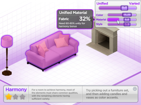
Each room you designed had a view that could be triggered by clicking on the icon for that score, which gave a full breakdown of what was contributing and how to increase your score.

The player progressed through the game by visiting each house and raising the happiness of their neighborhood before proceeding forward to the next set of challenges.
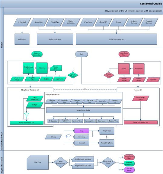
Part of my work for all of my projects was to work with designers to clearly outline the game flow and how the UI fed players through our game and into our monetization strategy.

Because of my interest in interior design, I also took an active role in content creation and selection.


I also created all of the characters and key art for the game. Unfortunately the Martha Stewart Design Challenge was cancelled after I left Arkadium.
0 notes
Photo

Microsoft Solitaire Collection Pitch
ROLE
UI Designer
RESPONSIBILITIES
Create exhaustive wireframes to show a complete pitch for how the solitaire collection could be designed for Windows 10.

One of the artistic directives was to show a version of the interface which incorporated curves. At that time, the screenshots of the Windows 10 UI, made completely of hard squares and rectangles, was getting a lot of negative attention. They wanted to see what a softer, more whimsical take might be.


I am pleased to say that Arkadium was awarded this contract, and several of my original UI designs and concepts made it into the final version that shipped with Windows 10.

[ My icon vectors for solitaire types ]

[ The finals that shipped with the Microsoft Solitaire Collection ]
0 notes
Photo
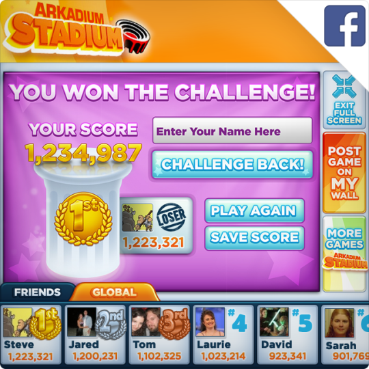
Arakdium began to leverage Facebook's ability to play flash content locally on someone's wall. We started making it so you could play our games right there, instead of having to load a whole new page. While this was a pretty cool little trick, it wasn't super clear to everyone what that meant. They had me consult on this project to spice up the graphics and make the whole process a bit clearer.


0 notes
Photo

Facebook Fantasy Football Pitch
I created all of the assets except for the ad at the bottom of the page, the logos, the facebook framing on the top and right sides, and the photographs of the players.


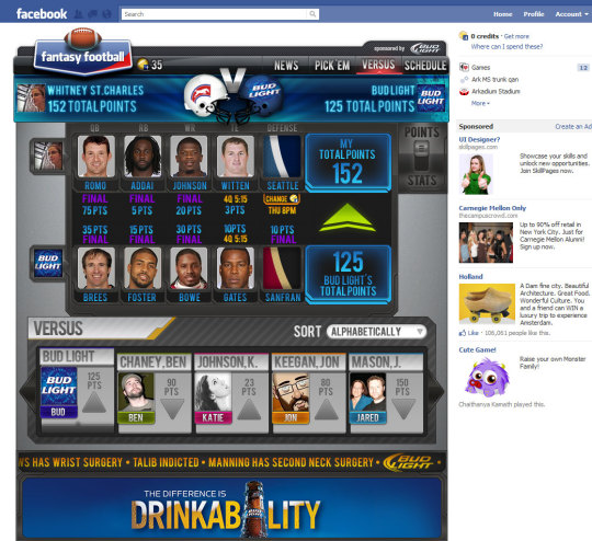
I learned a lot about fantasy football while making this pitch. Frankly, by the end I kind of wanted to try it despite my complete lack of interest in sports.

0 notes
Photo

Full body interface
This was a particularly fun project at Schell Games. Microsoft was looking for pitches for text entry and menu navigation for project Natal ( Kinect ). I created a folio of ideas and flew out to Seattle to talk with the team and do a pitch. I really enjoyed working a very different kind of UX problem. [ Title Image ] Text Entry: "Pokey" Style The name is an allusion to the cactus totem character from the old Super Mario games. The player uses his or her left hand to select a section of the alphabet to be enlarged, and the right hand to knock out the desired letter. This solution has a couple of issues with it. It requires the use of both hands which is both tiring and limiting. However, it does provide much quicker access than a sequential method.

Text Entry: Vetruvian Man This style allows the player to access letters very quickly, but again requires the use of both hands. As the player moves his or her hand through the alphabet, the letters become magnified. The player then makes a throwing gesture downward to send the letter to the text entry field. This has a couple of things going for it - direct access as well as the ability for one hand to be grabbing a letter while the other is finding the next one; you could physically prepare two letters at a time as you type. Unfortunately the hardware wasn’t able to handle the level of precision necessary to make this solution a reality.

Text Entry: Arcade Style This was our first thought and most obvious idea for dealing with this issue. The player would “grab on” to these virtual handles to move left and right through the alphabet. A movement upward would knock a copy of the letter up into the text field above. We thought of this as an absolute worst case solution. Anyone who has ever entered a password on an apple remote knows how awful this is.

Menu Navigation: Blades This interface relies on up and down hand gestures to navigate between categories. The player then extends their hand forward and moves left and right to spin the blade around and accept a selection within it

Menu Navigation: Magic Tiles For this approach, the player physically moves a step to the left and right to select these categories, then selects a subcategory with a hand. The disconnect of having the hand in front of the avatar and the selection BEHIND the avatar was a bit much though.

Menu Navigation: Magic Lanes This was the next logical step. The player selects the primary category by stepping on the key, then selects up and down a vertical list using a virtual handle.
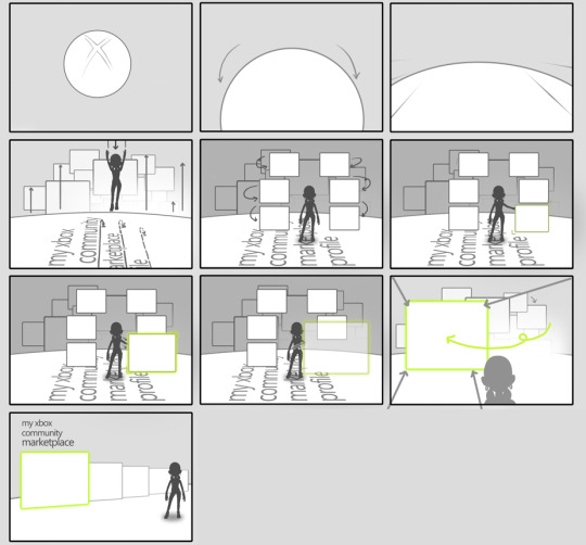
This was the idea that they ended up liking the best, so I came up with this more complete storyboard to illustrate usage.
0 notes
Photo

Mechatars

DESCRIPTION
The Mechatars project was an online game which paired with a physical toy product. We took the toy characters and created virtual counterparts which could be battled online. As the child played with the toy, the virtual version would receive experience and boosts. If you’re curious about more of the project details, please visit this Behance project page which I own with one of my Schell coworkers.
ROLE
UI Designer, 2D Artist
RESPONSIBILITIES
UI Design and Look and Feel This was done at the peak of the blue hexagons and glow era for science fiction. Our toy manufacturer had very strong feelings about how this game should look.


Concept We needed to translate the toy into the model that we would ultimately in the game. I provided the concepts for Rexx the raptor bot.

Iconography

Concepts for the elements that the toys used. These elements had a strength/weakness effect against each other. These were the finals:

This is a picture of my icons on the toy box in a store!

0 notes
