
Statistics
We looked inside some of the posts by yewch and here's what we found interesting.
Average Info
Notes Per Post
135
Likes Per Post
115
Reblog Per Post
18
Reply Per Post
2
Time Between Posts
3 days
Number of Posts By Type
Text
16
Video
1
Last Seen Tumblr Blogs


Fun Fact
Tumblr was named as a finalist in Lead411’s New York City Hot 125 in Aug 2010.
Text
Summary. The End.
My experiences with the Communication Design course has been fun throughout the entire course, it felt as if I was in class only a few weeks ago. I’ve enjoyed the few f-to-f classes we had when we were all playing around with type. It was a shame when we all had to move to online and I was a bit skeptical at first but I’ve actually enjoyed it more than I thought I would. I felt more engaged in the online lectures that I did in a real time lecture. This was solely only because lectures were recorded, it made receiving the information much more better. I felt more comfortable and prepared knowing I could watch it in my own time and it leaves me excited into doing my research after. Moreover, the fact that all of the projects had no limits on what we wanted to create was bliss as the freedom is something the other courses do not have.
Watching this week’s last lecture made me realise the sheer amount of knowledge we covered in these past few months. One of the key learning outcomes I have learnt in Communication Design studies is the understanding and meaning behind graphic design as a whole. From its beginnings to where we are now, it makes me feel proud to be in the design community as one day I hope I will be able to produce such works to contribute to our society that’ll leave its own mark.

sourced from: https://www.flickr.com/photos/thisisamagazine/2382481598/
:)
7 notes
·
View notes
Video
tumblr
Ask Me Anything Final
Link to my zine:
https://issuu.com/yewch/docs/yewqiyap_s3760522_askmeanything
This is my final product of my Zine, I’ve put it under issuu recommended by Andy and it definitely is more pleasant to view compared to a pdf file. It illustrates how it would be if it was printed and an actual physical copy. At the start, I was struggling to figure out my composition even when I have planned it out. Putting it digitally enabled me to make quick and easy changes so I went ahead and scrap through my entire plan. However, by doing so made everything much easier, was just a bit tired trying out all the different compositions by the end of it. I really enjoyed the process of making this vine, and appreciated the feedback I’ve gotten from my peers and teacher. This made me confident in my own art style more and also has made me very interested in digital work (as I tend to prefer on paper). The exploration with the choice of colour and layout design in the middle page is one of my favourite pages in the zine. It gives the viewers a break from all the black, and also highlights some of Müller-Brockmann work. Coming to the end, I’ve realised that I still have much more to learn about graphic design in general but I am proud of what I have produced in this Communication Design course.
(For references, Keep Reading)
Reference for Interview Zine:
http://www.eyemagazine.com/feature/article/reputations-josef-muller-brockmann
https://www.smashingmagazine.com/2009/07/lessons-from-swiss-style-graphic-design/
https://ishinake.wordpress.com/2017/10/27/the-grid/
https://www.britannica.com/art/graphic-design/Graphic-design-1945-75#ref845124c
https://www.famousgraphicdesigners.org/josef-muller-brockmann
https://www.shillingtoneducation.com/blog/josef-muller-brockmann-tbt/
https://www.graphis.com/bio/1/josef-mc3bcller-brockman-1/
7 notes
·
View notes
Text
Zine Updates
First of all, I can’t believe we’re almost done with Semester 1. It’s already June and it felt like I was just in my week 1 classes on campus a week ago :’) I found online classes was a struggle at first and would have love to work on paper for our last assignment: ASK ME ANYTHING. However due to the pandemic, I was forced to basically sharpen up my digital skills!

Above is the first 3 pages, I stuck to a black and white theme because I thought it would be appropriate for a ‘Josef Müller-Brockmann Interview Zine’. This helped me kept a consistency of ‘gluing’ everything together. Moreover, I’ve decided to use Illustrator as my chosen software because I felt more comfortable. In terms of hard graphics, I would tweak it in Photoshop then bringing it in back to Illustrator.

The image above is the last 3 page of my Zine. I love being able to incorporate 2 pages together even though here it doesn't show the question and answer separately, but highlights how everything flows within the zine. I felt as if it was nice to have a bibliography to note to anyone who didn’t know who was Josef Müller-Brockmann. Lastly, adding the title of the assessment on the back cover page because I thought it would be an important text to remember upon. It shows the course module because I want to be able to look back onto it and know that this is from the first semester of my communication design course.
This zine is really personal to me because of its layout and style. It really shows what kind of work I am capable of producing but also the design of the overall doc just speaks to me. I will be posting my final zine on Brockmann soon! (and more updates)
5 notes
·
View notes
Text
Week 11 - A Continuation (Fit Hebrew, F.A.T Lab)
Blow it up, slime it down
Graphic Designer David Jonathan Ross and Oded Ezer created the Fit Hebrew font in 2017, it is based on font placement and space. According to Jonathan Ross, these hyper-stylized series of caps are meant to fill up the surrounding space with maximum impact. He is able to achieve this by expanding the range of widths of each letter. However regardless of the width, the space between the letters must always remain the same in order for the font to display a consistency. I thought this was interesting because I myself am a fan of this work, the chaotic and loud atmosphere reflects upon exactly like how I convey a message in my own art style.

Furthermore, looking at the fit font in use is even more appealing. Above is some examples of it from designers using the font in different application in media, my favourite is probably the Giacomelli’s work for his event in Brazil. It was to promote a type design event, using the fit font was very successful in this example. It just goes to show the different lengths the font is able to take from passing on a news to a sick t-shirt design.

Lastly, here is a screenshot from the main webpage of Jonathan Ross’ website. Even though the font was based through the Hebrew language, he also managed to fabricate it with the english language. Above is a screen capture of my name in the fit font, if I had to describe it in one word: Mazes.
(Please Keep Reading)
F.A.T Lab
Established in 2007, F.A.T Lab is a Free Art and Technology Lab that consists of musicians, lawyers, engineers and artists that are committed to the pop culture of open source technology. They’re known for producing artwork that has been acknowledged as a “traditional intellectual property law in the realm of new media and art technology”. The creator of F.A.T Lab Evan Roth considers himself as an artist and a hacker. He creates 3 different types of art mediums - 1 being performance art, 2nd being art on canvas and prints and lastly, art that is solely designed only for the web. Roth worked with the Eyewriter project group alongside with Tempt1. (as stated in previous post)

I watched this Tedtalk by Evan Roth and was impressed by his views on being a ‘hacker’ and art in general. He showcased many of his works such as the loudspeaker on a van in Vienna or the displaying a message through customs in the airport. I found all his projects so interesting and inspiring as I’ve just realised how vast art can truly be. I would recommend anyone to watch this: https://www.youtube.com/watch?v=2DSe4o45i3o
Hacking = Empowerment
Established in 2007,
References:
Fit Hebrew
https://djr.com/fit-hebrew/
https://fontsinuse.com/uses/21119/diatipo-sao-paulo-2017
F.A.T Lab
http://fffff.at
https://en.wikipedia.org/wiki/Free_Art_and_Technology_Lab
#grap2199#hackers#inspiring#fat#hebrew#font#Typography#communication design#artresearch#art#art community
4 notes
·
View notes
Text
Week 11 - What’s next for design?
In this week’s lecture, Andy and Karen talked about examples of parametric and geometric design. Moreover, they touched on the digital aspects of designs such as AI. An example such as the Eyewriter project is the first thing they’ve introduced to us in the lecture. I want to touch base on this because I felt as if this was a huge milestone for humans to conquer in the 2000s.
Eye Writer
In 2003, A legendary LA graffiti artist named Tony Quan was diagnosed with ALS (a disease which left him almost completely paralyzed except for his eyes). The Eyewriter project gave him back his purpose and ability to draw even if it's with eyes. He described using the Eyewriter the first time as if he was “taking a breath after being held underwater for 5 minutes”.

Above is a collage showcasing Tony Quan using the Eyewriter and his work being displayed on a building using LED lights. To this current day, the project is available to almost anyone. It is inexpensive and is distributed to ALS patients in need all over the world.
More info Video link (was also presented in the lecture): http://www.eyewriter.org
This person does not exist
It is literally in the title. A website called “ thispersondoesnotexist.com ” generates images of people created by AI or in this case GAN (generative adversarial network). It just shows the advancement of technology today because these people look so real but you know it is fake. It is literally generated from 0 pixels.

Above is a series of people I took from the website. If you look closely enough, you may see some fault in each person’s face. I purposely added the last picture because you can tell where her hands is obviously wrong. Which to me, is unsettling. I am not saying if you look like someone from the images above you look creepy but just saying, an AI made your face... from scratch.. This made me think about where AI and tech will achieve in the next decade. We already have Elon Musk’s Neuralink project underway which is so fascinating to me but that’s for another blog.
References:
Eye Writer
https://newatlas.com/eyewriter-art-paralyzed-artists/14566/
https://en.wikipedia.org/wiki/EyeWriter
https://www.notimpossible.com/projects/tempt-and-the-eye-writer
http://xsead.cmu.edu/works/70
This person does not exist.com
https://www.youtube.com/watch?v=UIftoI4nMqE
This Person Does Not Exist Is the Best One-Off Website of 2019www.inverse.com › article › 53280-this-person-does-not-exist-gans-w...
#ai#aitech#advancement#grap2199#whatsnext#future#design#communication design#artresearch#art community#art#elonmusk
3 notes
·
View notes
Text
Ask Me Anything Assignment: Review w/ Class
Out of the 5 designers/type/art movements, I’ve decided to go with my first choice: Josef Müller-Brockmann. I remember being introduced to him during my foundation course in RMIT so I sort of knew a bit about him. But this assignment made me really go the deep end of researching onto Müller-Brockmann. To be honest, I was a bit skeptical at first because I consider my work to be almost the opposite of Brockmann’s. I was wondering how this would affect my overall design but I wanted a challenge so I went for it anyways.

The first week of my progress was really focused on developing a cover page for my zine. I’ve decided to really take my time on this because I wanted it to be eye catching. In the third cover from the left is my take on Müller-Brockmann’s work interpreted to his name. However, Andy mentioned that the multiple use of colours might be too distracting as he preferred the other 2 in black and white. As I’ve mentioned previously, being skeptical and scared that my work did not suit the designer’s work I’ve chosen when I know I wanted the zine to be related to him.
..Hence week 2! (Please Keep Reading)

In the image above, I’ve stated that I have gotten rid of the initial cover sheets but after much debating in class, everyone agreed that my previous cover page was much more interesting than the one I’ve went with in week 1. Knowing it is ‘chaotic’ at least it kept the eyes of the viewers around and perhaps making everything more exciting. Therefore, I’ve decided to bring back my last cover idea but tweaking it so it wasn't too much on the page where it took away it’s ‘elegance’.

So... What do you guys think? :)
#rmit university#rmit#art community#ask me anything#josefmullerbrockmann#interview#grap2199#communication design#commdesign#artresearch#art
5 notes
·
View notes
Text
Week 10 Lecture, a continuation...
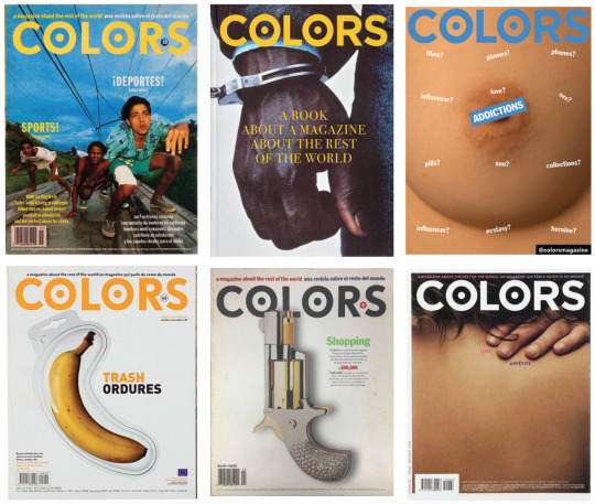
Colors Magazine
The Colors Magazine was established in 1991 by designers Oliviero Toscani and Tibor Kalman. The concept of the magazine was to challenge serious issues in the world. For example, the fight against aids, climate change, cultural appropriation to lighter topics such as toys, fashion and shopping. Keep in mind that it is always viewed with a non-conventional eye.

Below are some images of my favourite Cover art done by Colors Magazine
Other Mediums...
Interesting outtake of selling a perfume brand with the idea of using diversity in our community. Commercial (United Colors of Benetton): https://www.youtube.com/watch?v=odkGhyNvgk0
Short clips on a "Survival Guides” - especially enjoyed the sound that accompanied the animation. Will use this outcome for my Colour course during the making of our GIF. COLORS The survival guides (Happiness): https://www.youtube.com/watch?v=65kPGhsH-2Q
References:
https://www.theguardian.com/media/2002/may/27/mondaymediasection4
http://www.benettongroup.com/the-group/comunication/colors-magazine/
https://www.pinterest.se/evajais/colors-magazine-benetton-t-kalman/
#colorsmagazine#dont sleep on this#grap2199#conceptualism#culture#communication design#world problems
10 notes
·
View notes
Text
Week 10 Lecture - Conceptual Art
According to Wikipedia, Conceptual art, also referred to as conceptualism, is art in which the concept(s) or idea(s) involved in the work take precedence over traditional aesthetic, technical, and material concerns.
When did it all started?
The movement in conceptual art reach beyond the two decades from 1960s and 1970s. However, its origins first came about when an artist name Marcel Duchamp submitted an already made male urinal to a prestige art exhibition in 1917. Although the original sculpture is destroyed, there are replicas now that represented its cast from before. Below are images of the infamous “Fountain” and many other works he have worked on previously.

How to Work Better: Peter Fischli and David Weiss
Peter Fischli and David Weiss’ created a mural that played with the notion of being creative, productive and working better. As a team, they also opened up an exhibition on this whole idea. It is a building that slowly winched its way up to six stories. It is essentially, the first comprehensive overview of their work and collaboration in which lasted 33 years.
In 1979, they started working with a group of photographs that they called “Sausage Series”. It was a series that trademarked their wit and humour. This is by using unexpected materials, the idea of accumulating a series and their interest in popular culture. In this process, they reframed events that people tend to see happen all the time, as part of everyday life.

(Please Keep Reading)
The artists worked in many mediums during the course of their career.
Books
Drawings
Photography
Sculpture
Public Art
Film and video
Slide installations
The first appearance of Fischli and Weiss’ alter egos, Rat and Bear was in their film “The Least Resistance” which they finished in 1981. Throughout their career, these characters are served as masks in order for their work to be less about the creations made by them but the creation made by the characters. Moreover, this was a tactic to get some of the humorous way that they can subvert our expectations about reality.
Fischli and Weiss use deadpan humour as a way to comment on how we perceive the everyday life. They showed case the things we take for granted such as the amateur photograph, the snapshot of out travels, and things that we don’t tend to value is elevated - giving it a place in terms of hierarchy in high art.

(Next blog to be continued...)
References:
Definition
https://en.wikipedia.org/wiki/Conceptual_art
https://www.tate.org.uk/art/art-terms/c/conceptual-art
https://blog.singulart.com/en/2020/05/01/bicycle-wheel-1913-the-story-of-marcel-duchamps-pioneering-style/
How to Work Better
https://www.guggenheim.org/blogs/checklist/how-to-work-better-making-a-mural-on-houston-street
https://www.youtube.com/watch?v=GeRlFbWzzFU
https://www.artforum.com/print/previews/201601/peter-fischli-david-weiss-how-to-work-better-56765
11 notes
·
View notes
Text
Week 10 Activity - Collage
In class this week, we teamed up in groups of 4 to produce any positive word that’s collaged by previously printed material. (Magazines, newspaper, etc)
For our group, we’ve decided to choose a 4 letter word so we could spilt the work evenly (one letter for each person). We only spent 15 minutes on this activity but I made more in my own time as Andy suggested my E looked almost too forced.

Overall, I really enjoy working as a group because it is interesting to see different outcomes and styles put together. This helped my thinking in the sense that when I was looking through the magazines, I was only focused on finding models to work with. Therefore, this made me look back onto our first project on looking out for existing objects and manipulating them (eg: rotate, resize).
(Please Keep Reading)
My own extended Collage activity for ‘LOVE’
Reworked 1

Working alone allowed me to overlap the letters easily giving it a cohesion within the piece. I believe that all letters has at least 1 underlying strength.
L - Utilising it’s size. I really like how I opted for using text to represent the ‘L’ as it was the letter I struggled the most with in this specific composition.
O - Using its original form. How the black inside the block represents the space within the ‘O’
V - Rotation.
E - Cutting out only the pieces that stood out such as the mother’s hand on the child and the shoe to represent she’s sitting with her smiling.
Reworked 2

Going to the end of the second activity, I felt like I had a good idea on what to look for. This time I wanted to not think too hard on looking for the letterforms and just let my eyes guide me as I flip through the pages.
L - Taken from the inside of a building. Really like the slight gradual enlargement towards the end.
O - I was impressed with this because it was another technique of collaging as I’ve ignored the shape of the fire and followed my own cutting line.
V - The shadow and the girl made the exact space to form a V, thought I was a genius at this point.. (sarcasm)
E - Struggled to find this E and ended up using the same format as I did in class.
Overall thoughts...
It was fun to pick and choose which image to use, I especially enjoyed it more when it was time pressured (like in class). This is because I felt like as if it was harder for me to work with so much options and time on my hand (interestingly enough). Though, I definitely did not enjoy the cleaning process after this activity. :’)

13 notes
·
View notes
Text
Week 9 - Punk Rock
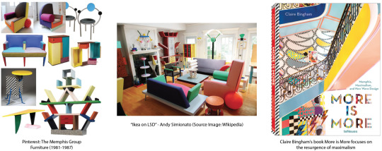
Memphis Group
In 1981, Ettore Sottsass is a designer that founded the Memphis Group with other designers and architects. The name was inspired by a Bob Dylan song titled Stuck Inside of Mobile with the Memphis Blues Again which was played on repeat during their first meeting. This creative movement was a reaction against the status quo as the group challenge the established notions of good design at the time.
Making the exact opposite of the authenticity of modernism made them a hated group between the Bauhaus and Fisher-Price.
*Descriptions such as as "bizarre", "misunderstood", "loathed" were used to described the Memphis Group.
They’re widely known for their design of:
Laminate and Terrazzo materials, which were usually found on floors, were incorporated into tables and lamps. (This means that people weren’t able to tell what material it is made out of, making it unessential)
Squiggles, aka the Bacterio print, was designed by Sottsass in 1978.
Bright, multi-colored objects with a rejection of typical shapes. Often, instead of chair legs being rectangular, they’d be circles or triangles.
(Please Keep Reading)
Jamie Reid, Sex Pistols (disruptive influence)
Punk Design
Raygun
References:
Memphis Group
The Memphis Group Furniture (1981-1987) (With images) | Memphis ...
https://mymodernmet.com/what-is-memphis-design/
https://en.wikipedia.org/wiki/Memphis_Group
https://mymodernmet.com/what-is-memphis-design/
https://www.dezeen.com/2019/09/18/maximalism-design-more-is-more-book-claire-bingham/
8 notes
·
View notes
Text
Week 8 Homework
To find historically significant design person/object/typeface to interview with 5 questions (and of course answers)
Filipino Marinetti
Of course, he would be one of my first top 1 due to this week’s lecture. Really impressed by his approach with text in the olden days.
Josef Müller-Brockmann
The concept of Grids.
Max Fleischer The creator of Betty Bop and Popeye.
Andy Warhol
What would you make if you had the technology we had today?
Conceptual Art
-If it wasn’t for the “Fountain”, what do you think would be the cause of your origin?
(Keep Reading for update)
*extended.
FIRST QUESTION
When you published your book “Grid Systems”, what were you hoping for your readers to achieve?
My book about the ‘Grid Systems’ is a part of a bigger set of aesthetic and social ideas. It is a foundation for designers to learn how to use the grid, no great work is created without material rules. Can you image the Eiffel Tower or the Chartres Cathedral without knowing the ratios or the laws of perception? The aesthetic tastes of our society will keep changing, but the laws last and are independent of time. In my teaching, I’ve always urged my students to know the importance of if you’re interested in music, old and new architecture, theatre and opera, old and new, they must also be concern with politics, environmental issues and town planning.
I have always felt obliged to make a constructive contribution to the future of society. I have never lost the feeling that I have a task to perform. What pleases me is that I have always sought what is better, that I have remained self-critical, and that I am still interested in things outside my own field. My library is the expression of my curiosity. I would advise young people to look at everything they encounter in a critical light and try to find a better solution. Then I would urge them at all times to be self-critical.
SECOND QUESTION
What typeface would you choose if you were a young graphic designer today?
Akzidenz Grotesk
Baskerville
Bodoni
Garamond
Caslon
THIRD QUESTION
With the excessive use of contemporary decorative and digital typefaces now, do you still have a strong opinion on it?
Yes, I dislike the thought of not going by the rule. It makes typography confusing and aesthetically lacking. Text should always be a form of communication for a content, the fact itself is reflected in legible typography and classical typefaces. By building on a shaky foundation, it forces people give an excuse for little understanding on the studies of design. Though some typefaces are interesting but it lacks an area of application. I still don’t see a sense in them.
(will probably add more on this)
FOURTH QUESTION
What do you believe makes your art stand out more than others?
THE ENERGY OF THE GRID ALLOWS ENDLESS INDIVIDUAL VARIATIONS.
FIFTH QUESTION
If you were alive today, what changes would you make in your work?
I’ve always been experimental in my work and have trusted my intuition during my illustrative period up till my 30s, this is when I found out where my talent might lie. Having apparent success with my illustrative work as a result made me self-critical. This mindset has led me to believe that I possessed no essential artistic talent beyond the ordinary. However, it pushed me to improve my playfulness and subjectivity at an objective typographic-pictorial situation.
I wouldn’t be making changes per-say but my work has been mainly harmless. Being known for the illustrations, paintings and drawings was fine but the lack of objectivity disturbs me. Hence to answer your question, yes and no. Being able to combine my work with the extreme of the now new tech and mediums is vast and exciting. But if the idea today is to play around with design as an excuse for too little understanding of the history, then we are bound to the death of creativity.
5 notes
·
View notes
Text
Week 8 - Futurism
After watching today’s lecture, I’ve become very fond of Filippo Marinetti’s works. Marinetti grew in many different places around the world including places such as Egypt, France, Italy and Switzerland. This explained why he wrote in both French and Italian later on in life.
The poster: Parole in Libertà (freed words) by Marinetti is an important stance especially in the italian futurist movement. It radicalise the way that language is being used and its one of the first few times when type is taken on as a voice. This broke the all of the traditional ways in Western Europe in Italy, as it is considered as a sense of harmony in futurism.
Link: https://www.youtube.com/watch?v=3_3O0zOiX-w
This youtube link is to the poem he wrote about sound reproduction of the war violence during the Balkan wars in 1912-1913. In the title “Zang Tumb Tumb”, falling bombs can be already heard in the stretched vowels. Marinetti emphasises that the poem purposes were not to be read as a protest against war but he was simply impressed by the mechanical, modern and industrial warfare.

(Please Keep Reading)
QUOTES
from ZANG TUMB TUMB (1912)
“The poet must spend himself with ardor, splendor, and generosity, to swell the enthusiastic fervor of the primordial elements”
“We will destroy the museums, libraries, academies of every kind, will fight moralism, feminism, every opportunistic or utilitarian cowardice”
Filippo Marinetti in The Futurist Manifesto, translation by R.W. Flint
References:
Filipino Marinetti
https://www.khanacademy.org/humanities/art-1010/cubism-early-abstraction/art-great-war/a/italian-futurism-an-introduction
https://muurgedichten.nl/en/muurgedicht/zang-tumb-tumb-1912
https://en.wikipedia.org/wiki/First_Balkan_War
8 notes
·
View notes
Text
Week 7 Activity 2 - Architexture
https://www.youtube.com/watch?v=bx-CLB1JCoY&feature=youtu.be
(CLASS ACTIVITY INSTRUCTIONS ABOVE ノ)
Due to our current situation (Covid-19), being forced to stay at home makes us view the world only through our screens. However, this class activity enforces us to take a look outside simply on our windows and observe the world around us. We were looking out for typefaces within current infrastructure and rotate/ crop them in order to be seen correctly.
Below are screenshots taken from a course module ‘Communication Design’ Week 7 of our workshop in Google Slides, showcasing a series of photographs from my classmates and I.


9 notes
·
View notes
Text
Week 7 - Bauhaus
https://www.youtube.com/watch?v=aFn-QPaGimk&feature=youtu.be
(LECTURE ABOVE ノ)
Who designs design?
My own research on the Bauhaus School
The architect Walter Gropius created a new school in Weimar called the Bauhaus. In this school, students were encouraged to experiment across many disciplines such as painting, weaving, dance, printmaking and so forth. With this idea in mind, they created a radical new kind of typeface. However, the school did not last long. In 1928, the Nazis believed that the Bauhaus was not following german traditions. They despise their modern products, especially the new typography.
This made Bauhaus spread their ideas across all over the world. Gropius then bought Bauhaus to mythic status.
It's meant to be interpreted and reinterpreted, this is because Bauhaus was not born as a style. It was a revolutionary idea.

(Please Keep Reading)
Joost Schmidt - A man of Bauhaus
Joost Schmidt was a student of the Bauhaus School in 1919 to 1925. However, he later became a teacher at that school till 1932 as a young master. Schmidt integrated activities that included life and figure drawing in his workshops. He used the idea of ‘Efficiency of form’ in many his works. In the image below which showcases a series of exercises in his class, displays colour theory. The ultimate goal of this exercise was to teach a user-friendly functionality and technical standardisation of objects.
(Last image below on the right) Ordinary sculpted from pear wood, sculptor Josef Hartwig (who was also teaching at Bauhaus in 1942) and Schmidt worked together on this now conceptual chess set in a shape of a card box. Reduced to the most basic components of artistic construction of all circle, line and square. This chess set was very abstract but it has been designed to describe its movement on the board. (The bishop, for example, is a simple X, denoting its diagonal movement)

References:
Bauhaus
https://www.youtube.com/watch?v=X59FCW3vOlE
https://www.theguardian.com/artanddesign/2009/nov/07/the-women-of-bauhaus
https://www.qpmagazine.com/long-reads/a28997402/century-bauhaus-design/
https://en.wikipedia.org/wiki/Bauhaus
Joost Schmidt
https://www.bauhaus100.com/the-bauhaus/people/masters-and-teachers/joost-schmidt/
https://www.bauhaus100.com/the-bauhaus/training/curriculum/classes-by-joost-schmidt/
http://www.eyemagazine.com/blog/post/modern-games
http://www.cocosse-journal.org/2016/12/bauhaus-chess-set-1924-josef-hartwig.html
10 notes
·
View notes
Text
Week 6 - Workshop Activity (Shapeshifters)
This activity focuses on the theories on modernism and grids. Revisiting the idea of “Divine Proportion”.
Below is a series of letterforms I made in class on a whim. Using only triangles and squares, it limits the the shape of what I am able to achieve - The ‘S’ highlights that when the curviness of a letter is removed, it may be hard to visualise and recreate its form.

However, after class I made more letters from the alphabet A-O with an additional cut of of semi-circles. This gave my letterforms more of an affirmation to its originality. (Please Keep Reading)
A-E

Although, I might have overuse semi-circles - I really like the abstract nature of the pieces such as the ‘B’ and ‘E’. ‘A’ is my favourite in this example as it showcase the importance of colour (contrast).
F-J

With the attention of using as little shapes as possible, I struggled with creating the ‘F’ in this activity. Using 2 different colours makes dividing and counting each shape easier. However, there are also many successes in this activity such as ‘H’ and ‘I’ - again with its abstract feature.
K-O

In the last attempt of the activity, I’ve understood the nature of the letterforms and had fun with making weird forms (as seen on ‘K’, ‘M’ and ‘N’). It was natural to me to make ‘O’ as a complete circle but playing with the colours of the shapes were also interesting. ‘L’ reminded me of a boot.
11 notes
·
View notes
Text
Week 6 - What is a Grid?
The Divine of Proportion

The usage of grids helps balance and align your design on a page. It achieves cool effects such as diagonal typography. The use of empty space is also another element in design that aids the structure, guide and shape on the page. It felt as if it was an urgency for Tschichold to educate teachers and educators the manual for design.
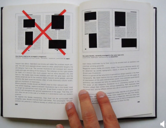
(Jan Tschichold - The New Typography, 1928)
(Please Keep Reading)
From that point on, Type Designers such as Albe Steiner (First Row) and Emil Ruder (Second Row) incorporated a lot of theory and philosophy of the elements of design into their textbooks and works.


Joseph Mullet Brockman is a good example of a designer where image and type starts to merge. The shapes and colours he incorporated in his work still inspire the graphic designers of current generation.
The Beethoven poster done by Brockman in 1955 shows the careful placement of the usage of black and white whereas it creates an imitation of a moving circle. This was done deliberately as it was to highlight the intensity of Beethoven’s music. There is no element of any of Muller-Brockmann’s designs that is not intentional, everything has a purpose for its placement and size.

Beethoven poster showing the placement of each arc
A typographer in the early 20th Century Eric Gill stated in An Essay on Typographer (1939) “Our business is to design things which are suitable for a machine to make” suggests that we work with machines or even for machines. This highlights the fact that it offers us a way of exploring this notion of human machine collaboration in communication design.
Another quote by Ernest Hemingway also strengthen this argument: “There is nothing to writing. All you do is sit down at a type writer and bleed.”
Famous Authors’ Harshest Rejection Letters

The rejection letter sent to Gertrude Stein in 1912 by publisher Arthur C. The rejected manuscript in question became Three Lives, giving Stein the last laugh.
References:
https://www.youtube.com/watch?v=6BoL-6LgflE&feature=youtu.be
https://medium.com/fgd1-the-archive/beethoven-poster-by-josef-muller-brockmann-ce06940edf74
https://en.wikipedia.org/wiki/Gertrude_Stein
http://www.thegridsystem.org
12 notes
·
View notes
Text
Week 5 Lecture Notes & Reviews
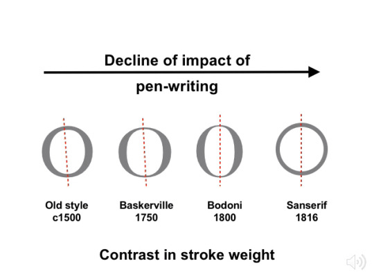
Black Letter C.1450 - Printing Press
It all came about when Gutenburg Bible was published. This is when the Black Letter style font started expanding throughout the world in printshop (later known as Press).
Geometric Specification - An important shift away from humanistic writing
Down below are some of the most famous designers known to type:
Luca Divina Proportione, 1509.
Francesco Torniello, 1517.
Geoffrory Tory, 1529.

Research - Claude Garamond
Garamond is an old-style serif typeface that was created by engraver Claude Garamond in the 16th century. Ever since then, People who make lists of the most readable fonts tend to pick Garamond first. The font has a few distinctive characteristics such as an 'e' with a small eye and the bowl of the 'a' which has a sharp hook upwards at top left. The founder of the font, Garamond was an apprentice of a famous French humanist and an engraver (Geoffrory Tory), best known for adding accents on letters in French. For a 500 year old design, it is perpetually connected with innovative and fresh usage in modern storytelling. Books such as Harry Potter, Dr. Seuss and The Hunger Games books is all set in Adobe Garamond. This is because the font is ideally suited for book design, it works seen from a distance or up close as it is often used for printing body text and books.
https://www.youtube.com/watch?v=9qVOuHnifU0&feature=youtu.be
7 notes
·
View notes