
A personal sideblog for posting about autism, disability, cool things that aren't Fallout (see my main blog @theartofblossoming) or Japanese (sideblog @anagumasaru). I am a colourful mixture of Autism and Ehlers-Danlos Syndrome etc. AS(D), hEDS, POTS, CFS, FND, FM, GAD, OA...diagnosis scrabble, anyone?
Last active 60 minutes ago
Don't wanna be here? Send us removal request.
Statistics
We looked inside some of the posts by zebrasbazaar and here's what we found interesting.
Average Info
Notes Per Post
1M
Likes Per Post
802K
Reblog Per Post
640K
Reply Per Post
1K
Time Between Posts
15 days
Number of Posts By Type
Text
14
Photo
3
Last Seen Tumblr Blogs


Fun Fact
When “GIF” was named word of the year in 2012, Oxford Dictionaries U.S.A. credited Tumblr for pushing the word.
Text


THE LAST OF US — 01 x 03, “Long, Long Time”
#definitely posting this for no specific reason#cw politics#cw american politics#the last of us hbo#the last of us#tlou hbo#tlou#reblogging with original tags above#also reblogging for no specific reason#I'm not even American#rewatched this episode last night#such good soup
17K notes
·
View notes
Text
Reminded me of that banana duct taped to a wall by a 'famous artist' who (ironically) I cannot remember the name of. It was purchased - for a lot of money - then eaten by the buyer. The banana was made for consumption but was it art? Was the buyer making that very point above by consuming it thus, making a conversation out of it and possibly elevating it to the status of art?
Creations contain sparks of their creator. They should be appreciated, not just gobbled up and discarded like junk food.

61K notes
·
View notes
Text
Yuletide Greetings!
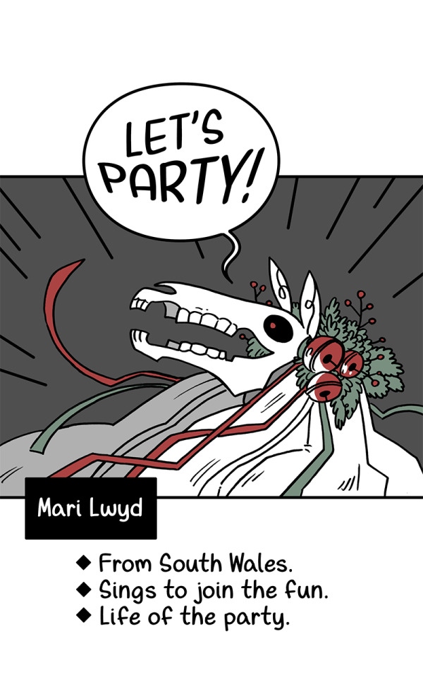
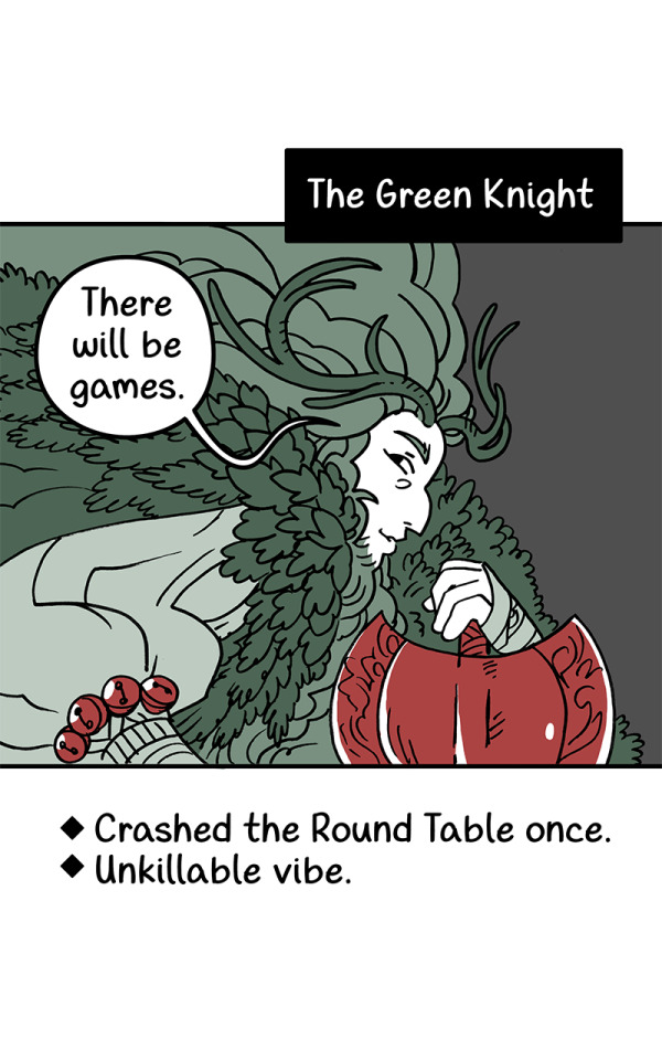
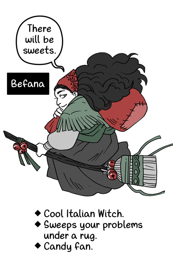

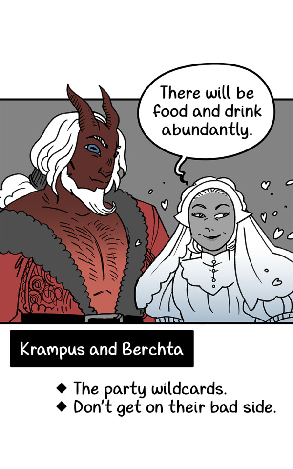

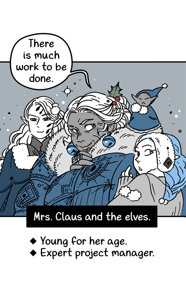
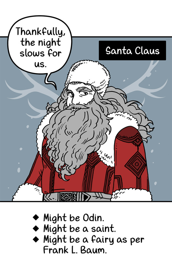

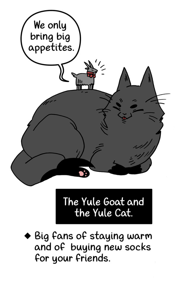
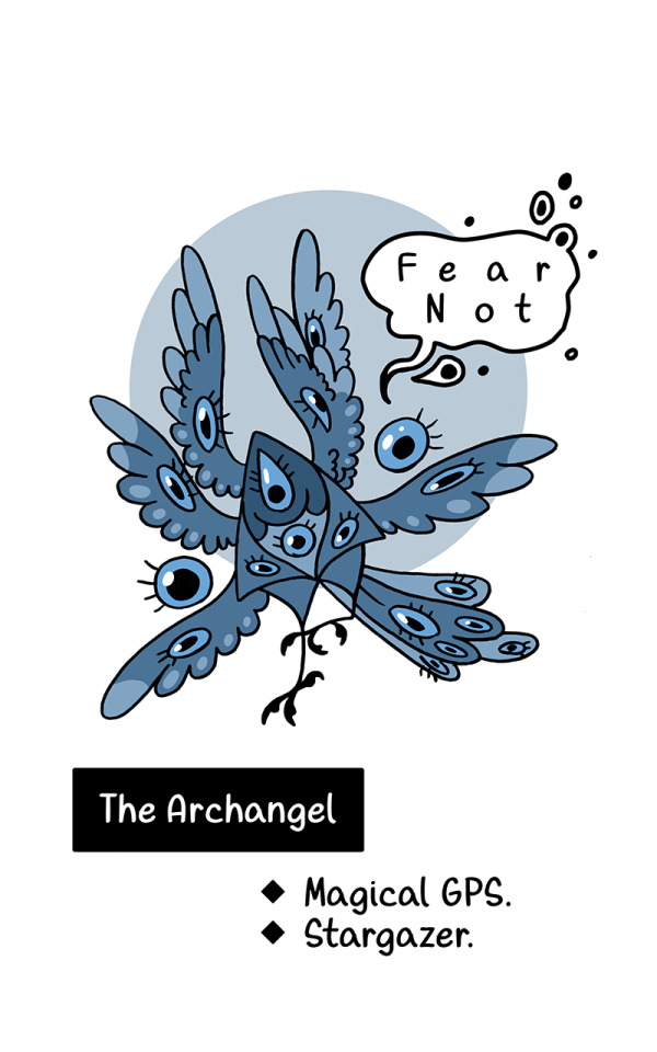
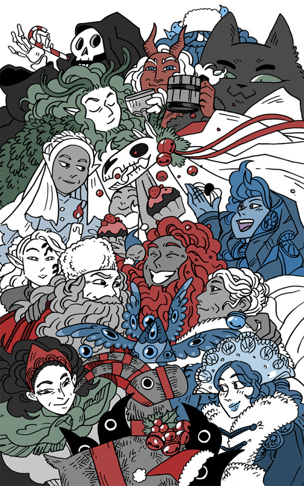

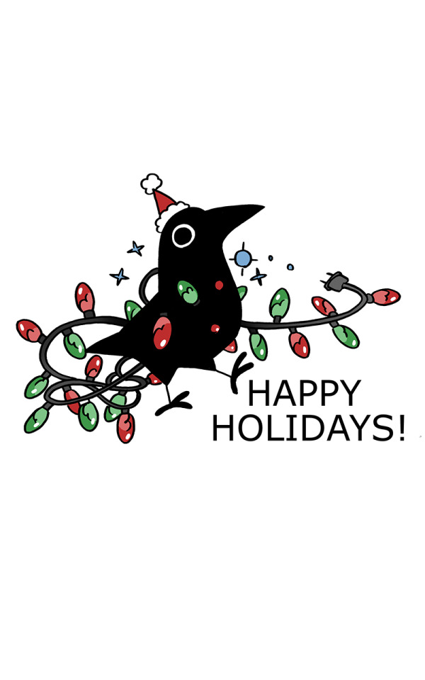
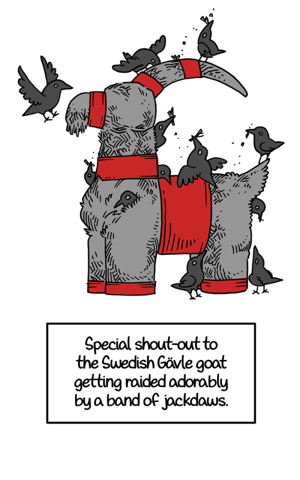
Happy Crowy Yule! It's a reall whose who of Yuletide.
66K notes
·
View notes
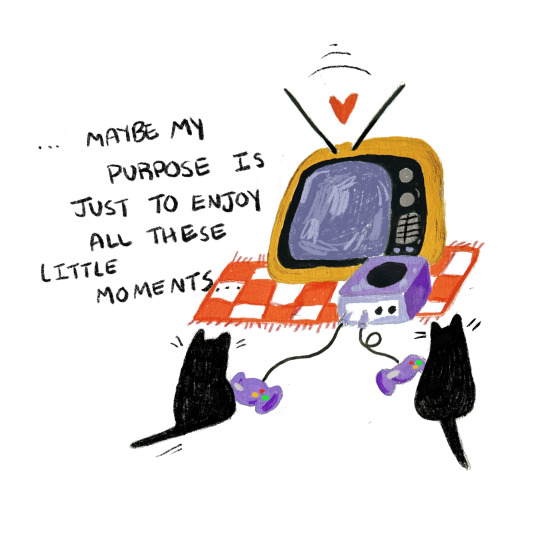
Text

pools. 🐅
5K notes
·
View notes
Text
American trans pals, life is going to get hard. We know that. I could write a long post about strategies for coming years, but I feel like that will only create decision paralysis here on Day 1.
So, some little things to do today and tomorrow towards becoming a more resilient person:
Refill your meds / schedule your next bloodwork appt or other healthcare visits you need - prioritize your health. If you can only do 1 thing today, do this, because it's the end of the year and you might not get on the books for a while.
Cancel a subscription you don't need, or that free trial that is about to expire - small steps to saving money
Pick up a passport form at the post office. If you don't need it, get one for a friend who does
Get a notebook and/or folder for printouts. You will use it soon for collecting hard copies of future healthcare options outside your home state, while the information can still be found online
Get a box or bin. You will want to start collecting items around your home to sell/donate/trash in the interests of downsizing. But just get a box or two today.
Talk to a friend
Get some rest
I can't promise we'll be ok, but we can try to set ourselves up so we bend instead of breaking in this storm.
2K notes
·
View notes
Text
The casting is just 🤌 Especially the Miss Piggy / Jennifer Coolidge part!
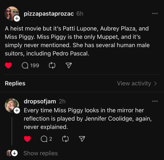
This is the best idea in the history of film.
#also Taika should direct it#Aubrey plaza#patti lupone#muppets#miss piggy#Pedro pascal#agatha all along#jennifer coolidge#threads#meta#funnies
166K notes
·
View notes
Text
Who else has already binge-watched Heartstopper Season 3? 🍂⚡️🩷💜💙🌈

#this is a gift to my inner closeted teen#so sweet and so well written#I'm bi like Nick and Sahar#heartstopper#heartstopper season 3
6 notes
·
View notes
Text
I was wondering, 'why not just use a ruler?' until I saw the perspective application!
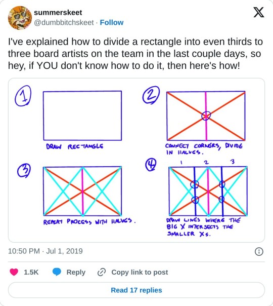
really helpful technique ^ once you know how to divide by halves and thirds it makes drawing evenly spaced things in perspective waaay easier:


#harrs tips#someone mentioned the original tweet on bsky so i drew the perspective ones n figured id also post here#useful art techniques#measuring thirds
134K notes
·
View notes
Photo
150K notes
·
View notes
Text
"This is Jeff"
Coming out letter to parent from a young non-binary teen (image below the cut):

"This is Jeff (hullo). He's been with me for about four years now, the poor sod. You see, with all this talk about 'gender this, gender that', every time I stopped to ponder it, it did my nut in. So, like many other headache-causing thoughts, I kinda left it be, right next to the dusty corner of my brain home to most philosophical puzzlings. PTO.
But at one point I decided to give Jeff a go. Before I even knew of other Jeffs around the world. And what can I say? Sometimes its a Jeff day, sometimes not. He's a nice chap 'n' all, but sometimes it simply is not a Jeff day or week. Anyway, Lord knows what this makes me but I thought this fella deserved some kudos. Jeff says hi.
~ Don't mind being a girl tho! ~ Still your daughter! I know money is tight and all this is undoubtedly a surprise (though it could be just as easily argued the opposite - I've always been... I dunno. A bit of a gender hazy kid?)
- Replacement - a 'Jeff II' perhaps, so to speak?
And you may marvel at my ingenuity. But though Jeff has been with me for a while (not previously named, however), he has seen many iterations. And though he has been ever so helpful, he never really did sign up for this and is looking fondly at the future: retiring back into a pair of socks.
Jeff says bye."
Shared with direct permission, hoping to be of some help and support to other young 'gender hazy' kids.
#this is jeff#pride#pride month#coming out#non binary#enby#gender queer#gender fluid#coming out letter#nb
1 note
·
View note
Text
🧡
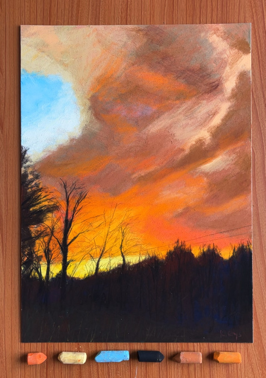
May the hues of this pastel sunset bestow upon you waves of fortuitous whispers. 🌅✨💕
#art#artwork#drawing#original art#artists on tumblr#painting#illustration#traditional art#soft pastel#soft pastel art#pastel#landscape#sunset#kairosrhys' art
3K notes
·
View notes
Text
A tiny dose of cute. Life is just amazing in its variety, isn't it?
Take a break, this cute tardigrade needs time to cross your dash:
87K notes
·
View notes
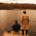
Photo


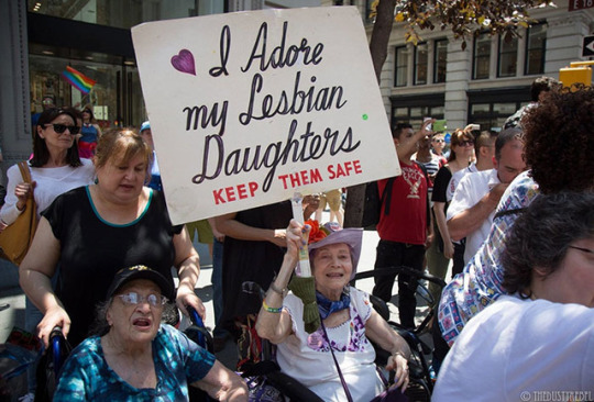


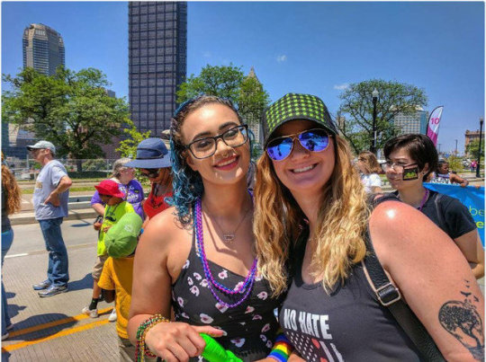
Parents Supporting Their LGBT Kids During Pride Month.
#this is so lovely#good to know there are loving and caring parents out there#lgbtqia+#spread love like wildfire!
510K notes
·
View notes


Text
Fantastic art! I do like Daft Punk too 😁


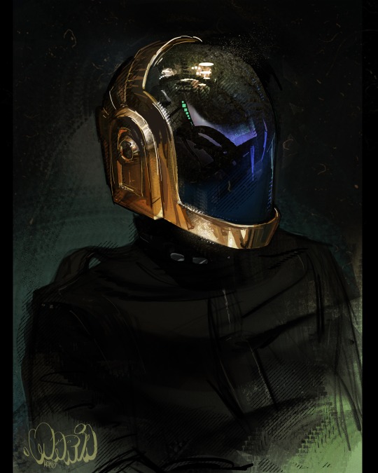
altri studi sui Daft Punk
984 notes
·
View notes