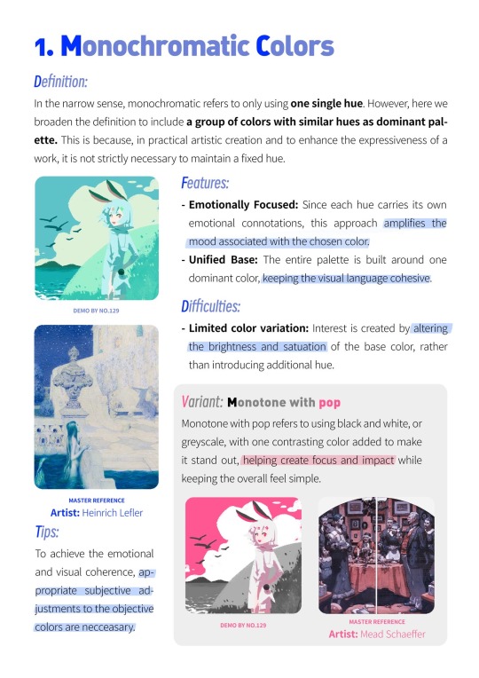
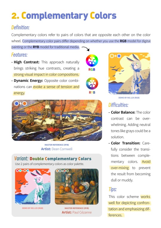
#Color Theory
Explore tagged Tumblr posts
Visit Tumblr Blog
Explore Tumblr blogs with no restrictions, modern design and the best experience.
Last Seen Tumblr Blogs


Fun Fact
There were a total of 171.5 billion posts on Tumblr in 2019.
Text
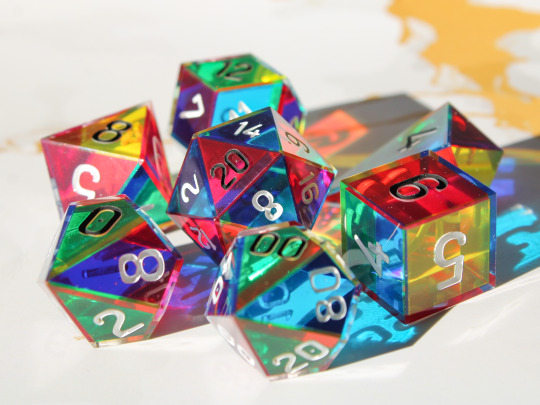

CMYK Rainbow Dice
A dice set made with only the colours cyan, magenta and yellow which combine as you look through the dice to form a full rainbow spectrum.
Plus they cast super colourful shadows!
#dice#handmade dice#handmadedice#dnd#ttrpg#resin dice#transmutationdice#dungeons and dragons#resin#d20#rainbow#cmy dice#cmyk#cmy#color theory
7K notes
·
View notes
Text
Deltarune CMYK Theory


[ Written before Chapter 5 | July 22 , 2025 ]
One of the most glaringly strange aspect of Deltarune is Kris for some reason being bright Cyan , its often brushed off ,
However , we feel Kris being Blue / Cyan is a big key to Deltarune in understanding what exactly is happening .
We've personally haven't seen anyone mention CMYK aspect of Deltarune , so this theory is entirely our (@5thcloud) own theory and take .
--
[ Note: This is about Canon Deltarune , only posting it on our AU blog as this theory is the basis of our AU as well as this place just being more deltarune related , other blog is just art .
This post does Not talk about our AU
Also for easier reading , we uppercased names of colors and important words . ]
---
[Start of Theory]
Color has always been part of UTDR , Undertale as color SOUL traits and importance of color association
And here in Deltarune , the importance of Colors is stronger than ever , more than what you can possibly imagine .

1 . How CMYK and RGB Models works and Ties to Deltarune
You may know CMYK from printer ink and RGB to something like LED lights , its because they're the Primary Colors for their respective Models .
However , they do not work separately , instead they work as one . They create each other and are equivalents of each other , they cant exist without one another , just as the idea of Lightners and Darkners , and how Darkners have equivalent objects
(Red , Yellow , Blue are considered outdated colors for paint as they cannot make all colors , however of course it can still be used)
-
And either way if its Subtractive or Additive Model , Color is light itself , if theres no light then theres no color . The Models are only used for How the color is being created or achieved .
--
As to why we feel Kris is Cyan , its so that the main trio creates a sort of corrupted CMY model , Cyan being Kris , Magenta being Susie , and Green / Yellow being Ralsei / Noelle ( will get into this part in sections 2 and 3 )
--
Also , yes this does mean Cyan and Blue ARE considered different colors on this post and in these Color Models despite both generally being seen as just different shade of blue .
Its also fun note that the color question while making the vessel does mention Cyan separately , we do feel its still poking fun at fact that "its literally just light blue and blue is already here" as well as reference Kris
But this is stronger gesture at these Models as , along with Cyan , the other answers are "Red , Green , Blue" , the 3 Primary Colors of Light
It also important remember that Undertale also counted Cyan and Blue as different things for the SOULs , being Perseverance and Integrity
---

2 . Additive and Subtractive Models for Lightners and Darkners are swapped Despite being Lightners , Cyan (Kris) , Magenta (Susie) , and Yellow (Noelle) are of the Subtractive Pigment Model that mixes to Black , they aren't the primaries for light .
While Ralsei , who is a Darkner , is Green which is part of the Additive Light Model that mixes to white , he Is light .
-
( Though it is noted that Kris can actually be seen as both Blue and Cyan addressed in Section 4 , we also arent addressing Berdly as he never joins party to confirm his color associations as of Chapter 4 , as Noelle is more of a Pale Green-Yellow in Dark World , yet is associated with Pure Yellow without Green )
-
The Cyan and Magenta can also be "mistaken" colors , as they Are lighter than Blue and Red , but reason why the primaries of Subtractive Pigment is lighter is because they mix darker , thus starting lighter helps ,
Think of paint , how you'd mix lighter shades of paint in small parts instead of going too much at once as it can get dark n muddied fast
‼️So in other words , they Appear to be "light" , however in actuality its so they can mix to darker more vivid colors .
-
How we would more specifically word it is that , the Lightners are named that Not because they're the bringer of light or are light , but because they start as light in color and also of course because they reside in light
But truly , Lightners bring darkness
And the opposite is true here , Darkners are not bringer of darkness or Literal darkness , but instead start as dark and reside in dark , and become light .
Darkners are bringers of light .
---

3 . Ralsei's Green and Noelle's Yellow are equivalent Yellow (pigment) and Green (light) are equivalents of each other .
Ralsei is Green and his association is of Pacifism , while Noelle is Yellow and strongly associated with the Weird Route (ie. deltarune's no mercy route equivalent) .
They both draw ties to each other in both idea and color , they both are support , associated with prayer , magic , with same heal spell , and so far in story , Noelle and Ralsei dont appear in battle together
-
So whether its Ralsei or Noelle in party , or if Kris is either Blue (light) or Cyan (pigment) , the party will still make a corrupted form of CMY
-

Also , because Green isnt part of the CMY Model that Kris and Susie are part of , it can be extra reason why Ralsei's room is entirely blacked out . His color isnt part of the trio
Its also noted that the depiction of the Deltarune symbol in Kris' room , its the Green triangle that points away
Additive Light Colors start dark , and mix to light .
---

4 . Kris' Cyan , Blue , and maybe Black of K .
In the Additive Model , you mix Green and Blue to get Cyan , Kris' color . Its been noted at start of game that "the green crayon is missing" , green sweater , as well as Asriel's possible association with Green and Ralsei's resemblance to Asriel (even though he isnt Asriel)

In Subtractive Pigment Model , Yellow and Cyan together makes Green , colors of them in Light World

To make Blue in Subtractive Pigment , you mix Cyan and Magenta , which are already the other colors of Kris in dark world .
The colors they are mix into themselves to create more of their own colors .
- Do also note that , even if feel these are too specific , Kris also inverts into Blue and Cyan , which is another reason why they could be Blue / Cyan
-

Another thing that more of a stretch , youll see that CMYK acronym , Black is abbreviated as K as B is taken by Blue (K being taken from last letter)
Kris' name is more generally spelt more like "Chris" with a C , it can be seen as "changed to K to make more original or differentiate from Chara" which we dont doubt is the main reason or the only reason
However , K is represented as Black and is of course part of the Subtractive Pigment Model . Considering Kris' strange association with the Roaring Knight as well as opening Dark Fountains , its certainly something !
-
Why Kris specifically ? The Dark Fountain is often colored Cyan / Blue ( their colors ) as well as Black , the Prophecy is depicted Blue and Cyan
Black too is also a rainbow of all colors just as White , just that all colors together in a Subtractive Model will become Black .
-

To us , Blue / Cyan is a very interesting choice for Kris cuz as far as we personally know , they're not associated with anything Blue in the Light World ,
But in both CMYK and RGB , Hues of Blue are present in both Models undeniably , while Magenta - Red , and Green - Yellow are seen as very much different colors ,
many people especially non-artists will see Cyan - Blue as the same just different shades ( goes back to the vessel creation joke of both Cyan and Blue being listed as possible favorite colors )
Not to mention here with Black being K because B already taken by Blue , so Kris (to us) being associated with Black , Cyan , and Blue , hell even possibly White because of the odd save point , its a really powerful thing .
They're part of both Light and Dark .
Blue and Cyan are powerful .
-

Extra note , Kris portrait is Very Oddly a very noticeably different shade of "Cyan" , which more strongly reads as "Blue" , which is odd outlier as rest of characters have portrait colors very close to their HP bar
However if color pick their portrait , it says it's still "Cyan" , however we argue that this is simply for accessibility as "True Blue" is very dark and doesn't appear well on Black , As well as lighter tones of "True Blue" WILL appear Purple .

And imo after testing colors that keeps the Brightness and Saturation and just changing the Hue ,
the Color used for their Portrait is closest to Blue as can be while being Saturated and clear on a Black Background as a small sprite .
Remember , Colors are subjective as all eyes and interpretations are different
-
So even if it does sound like a cheap excuse to consider them Blue part of the Additive Light Model despite portrait "really" being more Cyan ,
it doesnt change fact that their portrait Specifically was made into a different shade that strongly reads as Blue instead of Cyan , and nowhere near the same Shade or Hue as their HP bar unlike the other characters .
---

5 . In Pigment , Magenta and Yellow creates Red In Subtractive Pigment Model , Magenta and Yellow mixes to get Red . Magenta and Yellow is associated with Spamton , as well as him referencing being on puppet strings in relation to Kris too

Though , our Spamton association with Magenta isnt perfect as his pink is more so of a Red-Pink while Magenta is instead more on the side of blue , however hes been at least drawn One time with specifically Magenta so , yeah </3
---

Magenta and Red are Equivalents and more interestingly to us , Magenta (pigment) and Red (light) are equivalents to each other , which is something think about as the Player is given several opportunities to try and sway Susie .
Not to mention , Susie's secondary color is Yellow , being her eyes , teeth , etc. , and heart detail on her belt
-
Not only that , Susie parallels the idea of the Player , that being of Control . At the start she is the one to echo "You are not in control" , idea of control is often represented in Red
So for Susie's Magenta to be Equivalent to Red , for Yellow and Magenta to mix into Red , for the Player to also be prompted to sway her , its ... wowie .
---

In Light , Blue and Red creates Magenta Self explanatory , Blue of Kris + Red of Player or Kris' SOUL , itll mix to Magenta
So color wise , Magenta and Red are very strongly associated
---

Magenta in Trio Magenta for the main trio has always been an interesting color to us
Despite the trio being mostly monochrome , Magenta is shared across the whole trio , with Susie being mainly Magenta by default , Ralsei's scarf being Magenta , and Kris' cape having Magenta stripes to reference Frisk
Even more drawing to this is how Ralsei's battle portrait is only one with a 2nd color , being Magenta .
-

Noelle Doesn't have Magenta , however she does keep her Red nose , again Red and Magenta are equivalents .
Her Red nose as well Doesn't change at all whether in Dark World or Light World , which is extremely notable as All character colors have at least a noticeable change even if small (like Berdly's Blue and Yellow)
---

6 . Why Might Kris' Save Point Light be White ?
In Additive Light Model , Green and Red mixes to Yellow , giving the Undertale's signature Yellow save point . If you add Blue into it , itll become White as its RGB all together .
White is also all colors combined , the full rainbow
It can of course also be just interpreted as "all light together" instead of specifically "yellow light + blue light"
---


7 . Dark Sanctuary's Hue Shift
To quickly cover , in Dark Sanctuary of Ch 4 their colors Do change , however we dont know how much this proves or say anything about our theory
At first glance it feels like it Must say something , however its simply just a color shift of all colors to one direction (in this case , clockwise)
it Is interesting as this only place so far in story where their colors are different , Ralsei becoming Blue , Susie being Yellow-ish plus Green secondary color ,
While overall Kris practically stays the same . This goes with the idea of how Blue and Cyan are still Hues of Blue
So despite having the roughly same amount of shift , they still appear as their own color unlike the others .
Blue and Cyan are powerful .
-
Also interesting note , despite Ralsei's and Kris' Magenta being Extremely close in color in their usual form ,
Here in Sanctuary , Ralsei's shifted Magenta to Orange looks much more Yellowish and lighter , lot softer . While Kris' shifted Magenta looks much more of a harsh Red-Orange
-

Not about Deltarune Theory but more just Color Theory relating to light , despite being a simple hue shift with some extra adjustments , we feel this is a great example to show how colors of light and rainbow Arent perfectly spaced even ,
some colors of light take up much more space such as Green , while others like Yellow take up little space (but does blend lot with Orange to Red)
So when shifted , despite our Susie edit overshooting the Green , it still lands on green ! If this was somewhere else on the wheel , itd easily land on a completely different color
-----
[End of Theory]
This whole theory can very much be "looking too hard" ,
but it just feels too uncanny to us with how , to us , it so strongly explains why Kris is Bright Cyan , and why Noelle's color association is Pure Yellow despite being a Pale Green-Yellow in Dark World , all this Magenta , and also the Deltarune's White Save Points being able be explained with Additive Light color mixing
As well as , these are still VERY specific colors chosen , they couldve been Any color , yet they all specifically line up with CMY + Green (and possibly Blue , both still part of the RGB Light model) , and CMY not being of Light primaries .
We dont have any doubts that it Can just be "these colors look good together" or more of a small reference to these models thats not serious , but you never know
--
Anyways , thats all ! hope learned something new from this even if find this theory to be a stretch :]
The color theory , hehe 🐕
Feel free share this around or screenshot , rlly want ppl know this

#color theory#deltarune cmyk theory#THIS THEORY DRIVES US NUTS#PLEASE DO ANY OF U SEE OUR VISION ???#OUR COLOR AUTISM CANT TAKE IT#deltarune spoilers#deltarune theory#utdr#kris deltarune#susie deltarune#ralsei deltarune#noelle deltarune#kris dreemurr#spamton#long post#ramble#info dump#tips#deltarune#I NEED TO INFLICT THIS ON AS MANY PPL AS POSSIBLE#LITTERALLY CANNOT LOOK AT ANYTHING DELTARUNE NORMAL ANYMORE CUZ THIS DAMN THEORY REWIRED OUR BRAIN#BEEN LOOSING SLEEP OVER THIS#WE FELT ILL WRITING THIS#ON THE FLOOR SUFFERING CUZ NO ONE KNOWS OR TALKS ABOUT THIS SPECIFIC PART OF COLOR THEORY IN RELATION TO DELTARUNE#we are not well :]#deltarune analysis
180 notes
·
View notes
Text
Free resource for artists and designers!!
I made a website where artists and designers can get color palette inspo from fire hydrants I've 3D scanned all over the US
Some of my favorites:
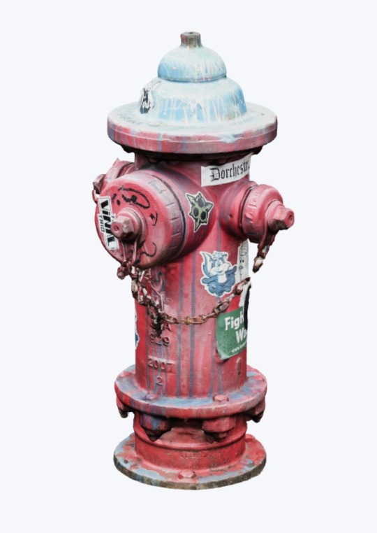
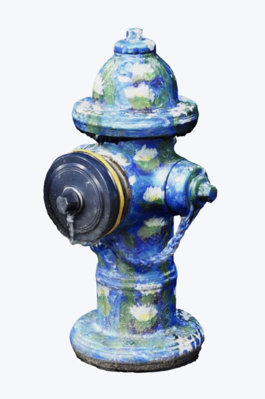
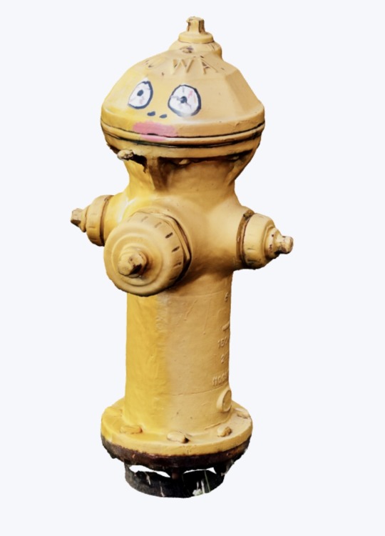
There are about 100 hydrants so far and I'm continuing to add more all the time
Public infrastructure is sexy, baby!!!!!! Pass it on!!
dayroselane.com/hydrants
39K notes
·
View notes
Text


Magenta and Gold may mix to a Bloody Red , but who the hell cares !
--- Theory of CMYK
[ read our Deltarune CMYK Theory here ]
#susie deltarune#deltarune#art#utdr#deltarune theory#deltarune analysis#deltarune cmyk theory#overlay art#color overlay#color theory#cmyk#best of cloud
42 notes
·
View notes
Text
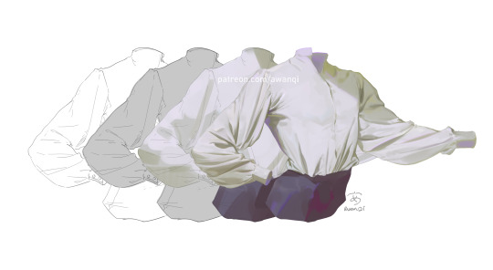

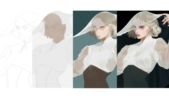
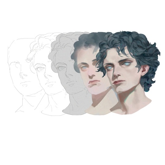
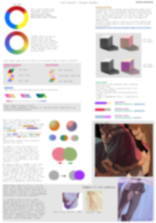
Here's a preview of some of the tutorials that are available on my Patreon!
There are speedpaints, tutorials on how to paint fabric/choose colors, my step-by-step process, and more. There's always more to come, and I'm also open to tutorial suggestions.
-
Patreon | Twitter | Instagram | Artstation
372 notes
·
View notes
Text
Spamton NEO's green wires... Ralsei's green robes... Battat's green clothes....
Could green actually be connected to Heaven?
I wasn't connecting the dots until I realized Noelle's color (yellow) is a combination of maximum green and red (the Soul's color. Possibly the Angel)
This in contrast with Susie's color, magenta, which is a combination of maximum blue (the depths, the fountain) and red (Soul)
35 notes
·
View notes
Text

repost , figured this would be handy for somebody
#robin gives advice 🦇#art advice#advice#my art#digital art#art#artists on tumblr#digital artist#color theory#art resources#art tutorials
851 notes
·
View notes
Text
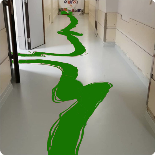
The Vulcan children's hospital recently redecorated. I'm not convinced they chose the most logical option
17K notes
·
View notes
Text
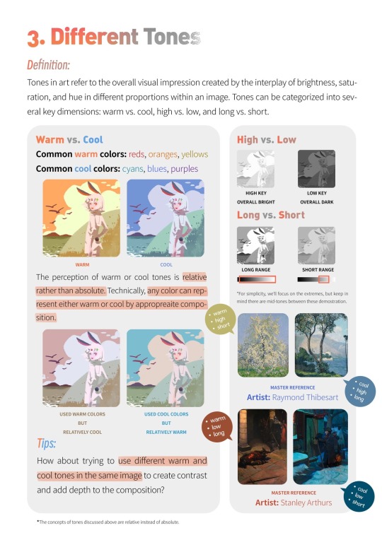
Writing Notes: Color Theory

Color theory is a set of guidelines for mixing, combining, and manipulating colors. Color theory includes ideas like:
Color harmony: Color harmony describes color pairings that are visually pleasing and provide a sense of visual order. Color schemes based on complementary and analogous colors are generally perceived as harmonious. But, since humans respond to colors differently depending on personal preferences and life experiences, there are no universally “right” colors for achieving harmony.
Color temperature: Color temperature deals with breaking colors down into warm colors (associated with sunset and daylight) and cool colors (associated with overcast light). Experimenting with combinations of warm and cool colors can help you mix colors to achieve a particular effect.
Color context: Colors appear to behave differently when viewed in different contexts. For instance, a rusty orange may seem dull and subdued when placed beside a vivid yellow, but when paired with a dark purple, the orange suddenly seems much brighter.

Color Wheel - a circle diagram that illustrates the relationships between different colors.

Sir Isaac Newton developed the first color wheel in his 1704 book Opticks.
Newton created an asymmetrical color wheel with 7 colors—red, orange, yellow, green, blue, indigo, and violet.
In 1810, Johann Wolfgang von Goethe developed a symmetrical color wheel with just 6 colors (eliminating indigo) that is similar to the one we commonly use today.
Artists and designers use color wheels to create color schemes that produce a desired artistic effect.
Primary Colors - colors that combine to make a range of other colors.
Traditionally, these are red, yellow, and blue.
In the RYB color model, the primary colors form a triadic color scheme—a group of three colors spaced evenly apart from each other on the color wheel.
When mixed, these three primary colors form many other colors.
More accurate color theories actually use different primary colors.
The CMYK color printing model deals with printed colors—cyan, magenta, yellow, and black. It is a method of subtractive color mixing in which printed colors absorb (i.e. subtract) light and combine to form a range of colors, including red, blue, and green.
The RGB color model applies to colored light—like the light that emits from a phone or computer screen; its primary colors are red, green, and blue.
The model is a method of additive color mixing, meaning that different colors of light combine (i.e. add) to form other colors, including cyan, magenta, and yellow.
Secondary Colors - the result of mixing two primary colors.
In the traditional color model, the 3 secondary colors are:
green (yellow + blue), orange (yellow + red), and purple (red + blue).
Tertiary Colors - the combination of one primary color with one secondary color.
There are 6 tertiary colors on the traditional color wheel:
magenta (red-purple), vermillion (red-orange), amber (yellow-orange), chartreuse (yellow-green), teal (blue-green), and violet (blue-purple).
Complementary Colors - colors found opposite each other on the color wheel.
Complementary color schemes include blue with orange, red with green, and yellow with purple.
These contrasting colors can make a bold statement when paired in fashion, film, photography, and other forms of art.
Analogous Colors - colors that are next to each other on the color wheel.
Analogous color schemes include yellow paired with chartreuse and green; red with vermillion and orange; and blue with teal and violet.
The 3 colors in each pairing share a common hue, so they appear to match.
Color Temperature - the way to measure the color of visible light.
The unit used to measure color temperature is degrees kelvin.
The best way to understand color temperature is to visualize a piece of metal being extended into a fire.
The color of the metal will change depending on how long it’s held in the fire and how hot it gets.
The metal will range from red to warm white to blue as it heats.
This is also the general range of colors from one end of the color temperature scale to the other.
The Kelvin Temperature Scale. The kelvin scale consists of units of measurement that relate to the color of a light source. The higher the Kelvin number, the closer it is to replicating bright sunlight. In general, higher temperatures on the kelvin scale, the whiter or bluer a light appears. The lower the number, the more yellow and red the light appears.
In order to understand the kelvin range and how kelvin color temperature applies to different light sources, it’s useful to review a few identifiable lights and their kelvin color temperature value.
Candlelight, for instance, generally has a color temperature of around 1500K.
The sunrise and sunset are usually measured around 3200K.
An overcast sky usually has a color temperature of around 9000K.
The current color temperature scale in use is known as the correlated color temperature (CCT) scale and is based around the color emitted by an incandescent bulb.

Sources: 1 2 3 ��� More: Notes & References ⚜ Writing Resources PDFs
#requested#color theory#writing notes#colour#writeblr#writing inspiration#writing ideas#writers on tumblr#writing reference#literature#color#spilled ink#worldbuilding#light academia#dark academia#writing prompt#creative writing#writing resources
482 notes
·
View notes
Note
New propic Is so cute! hey, technical question: how do you manage and entire character's wardrobe's color palette? i noticed donna wears azure, light blue, yellow, orange and pink. How do you keep the palette consistent through the whole outfits' rotation without It becoming repetitive? Is there a tutorial?
Oh funny you should ask bc I do actually have a character specific palette for Donna. You’ll notice that Albin’s colors are also here, but that’s because they’re often drawn together that this is just a result of that.


The azure is actually her eye color, and I often incorporate shades of it in her clothes. The yellow-to-orange gradient is simply bc it matches her hair, and the pink matches her skin. For the colors to match but not look like exact color swatches, I shift two of the three color parameters (hue, value, saturation) just a smidge, but not all three, because then they’re not of the same palette!
in the example here, the center is her skin color, and the outer ones are examples where i’ve shifted either hue+saturation, hue+value (B), or saturation+value just a smidge either to the left or right. The center will match with ONE of the outer ones, and the outer ones will not match each other (technically speaking, they might, but euehgghgueueh something something I don’t have time to check).
now, as to why I picked these colors to begin with— since I have pink and orange in her main palette, I picked a stark blue as an accent color since it’s the complimentary color to orange, which is the “middle” hue between pink (red) and yellow

(Now… ignore the exact placement of the dots on this color wheel, I don’t really like or use the “harmony” function in procreate because it’s not customizable enough to be helpful, you can be a lot more loosey goosey than this and get a good color palette, but I think you get the general gist!)
When it comes to what colors to pick for your characters wardrobe palette that aren’t part of their “body” colors, I’d go with a palette that suits that character’s personality and skin+hair. You can go complimentary colors, analogous colors, split complimentary, etc. it’s really your preference! If your character is dark and depressed; go for a desaturated, maybe monochromatic palette. A character like Lune who is prim, proper, and fashion forward would wear posh, hard to wash clothes, like creams and whites, and colors that compliments her hair and skin. It’s visual storytelling baby!!
So let’s pick Albin for example, and let’s say I want to give him a new jacket, he’s obviously green, and pretty fashionable, but not very flashy (color-wise). So for him I’d pick a simple complimentary palette with one main accent color, that being the complimentary color to green, which is red, but not just any red! The red should either match his green in value, or saturation (bc remember how i said before to move two/three parameters, you’ve moved one (hue) to change colors, so now you have one left).
It doesn’t have to match exactly, but it helps to know that if you struggle finding the right shade, just don’t move the value or saturation too far off from the color you’re matching it to!! Here are two examples of a two reds that are in Albin’s palette:


And for those curious here’s a red that matches in both value and saturation so you can see why they both shouldn’t match

fleshy..
And would ya look at that, I’ve already done it!! ;)

I hope that was at least a little helpful!!! ✨✨
70 notes
·
View notes
Text
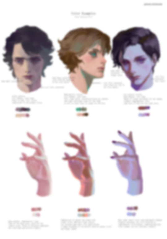
🎨color study note
19K notes
·
View notes
Text


Hey there ! In one week the sign ups for my online course at the Underpaint Academy will open ! If you wanna learn more about composition and colors, join me ! https://underpaintacademy.com/
2K notes
·
View notes
Text

#oh no#i know a lot of audio engineers#it's like a hallucination#dare i say it#because color theory#children's hospital#hotel carpet patterns#color theory#heavy sigh
91K notes
·
View notes
Text
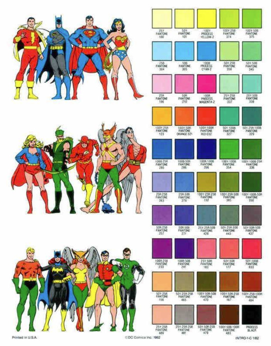
Color Like a Classic Comic Book
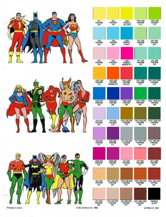
I'm doing some tinkering on Fauxstalgia stuff, and since I believe in sharing resources, here's an RGB PNG version of the official DC pantone guide, with the swatches re-sampled from current pantone standards. This set is from 1982, but should be generally believable for most stuff post-WWII.
The versions floating around online (two of which are under the fold) are scans of prints and are not accurate for color-picking.
Now, these colors would also be altered by the printing process, but for clean, pre-print versions, here's some authenticity.

5K notes
·
View notes
Text
for all the artists out there, here are my favorite resources i use to learn!
Files
The Complete Famous Artist Course
Art Books and Resources
Art, Anatomy, and Color Books
PDF Files of Art Books
Morpho and Other Art Books
Mega Folder
Internet Archive
YouTube
My YouTube Playlist of Tutorials
How to Draw Facial Features
Drawing and Art Advice
Drawing Lessons
Art Fundamentals
Anatomy of the Human Body
2D Animation
Perspective Drawing
Websites
Pinterest Board for Poses
Another Pinterest Board for Poses
Pinterest Boards for References
Reference Angle
AdorkaStock
Figurosity
Line of Action
Human Anatomy
Posemaniacs
Animal Photo References
Humanae - Angélica Dass
Fine Art - Jimmy Nelson
The Met Collection
Character Design References
CDR's Twitter Account
iamagco's Twitter Account
taco1704's Twitter Account
takuya_kakikata's Twitter Account
EtheringtonBro's Twitter Account
Drawabox
Color Wheel
Color Palette Cinema
Free Images and Pictures
Free Stock Photos
FILMGRAB
Screen Musings
William Nguyen Light Reference Tool
SketchFab - 3D Skeleton Model
Animation References - sakugabooru
Animation Screen Caps
Animation References - Bodies in Motion
#art#art resources#art books#anatomy#composition#painting#art tips#art help#art tutorial#perspective#color theory#art reference
41K notes
·
View notes
Note
any advice for picking fun and vibrant colour palettes that still feel true/recognizable to an object/setting/character's base colours? something about intense lighting?
I've been asked about how I choose my colors by a lot of people and I finally sat down and made a whole ass youtube video about it!
youtube
8K notes
·
View notes