#GREEN in the og panel
Explore tagged Tumblr posts
Text

LET HER REST PLEASEEEEEEEE
Can she not stay in prison for FIVE minutes????
I'm not strong enough for this......

#why is DC so fucking pressed to puppet around her soulless husk of a body 24/7#like will the offices expode if they cant draw her committing the stupidest and most heinously cruel war crimes like clockwork?#jesus fucking christ. piss me the fuck off#you have taken every piece of her character away from her and now are just taunting us (amanda waller fans) w this hollow cardboard creature#ridiculous. the first true big L for dc all in from me#no fucking concept of consequences either like LEAVE IN HER PRISON FOR A FEW YEARS. we just finished absolute power. let it settle#not even 6 months in jail. genuinely ridiculous#piss me the fuck off#also banner slapped together rq by me bc i can not have rando tumblr losers hating on my post. we do not do that here. not with her. keep it#to your fucking discord server#oh yeah and the panel in the banner was recolored by me like a few years ago. could be better but was necessary bc shes colored freaking#GREEN in the og panel
7 notes
·
View notes
Text


og if you want it. Idk. Know how to read it. Wtv.
#not really a meme? i just translated it#twflpokespe#pokemon#pokespe#og is from 886 on. uh. weixin??? idk i dont have it and i dont know the english name#their username is in the post#oh yeah the last panel isn’t too exact but it sounds weird without punctuation#in english. in chinese it just doesn’t have punctuation and sounds very normal#i stole this from kiri’s instagram story and thought id share lol#pokemon special#pokespe meme#reguri#trainer red#trainer blue#trainer green#rival green#rival blue#originalshipping#namelessshipping#gurire#uhhrhgg what else#レグリ#グリレ
101 notes
·
View notes
Text
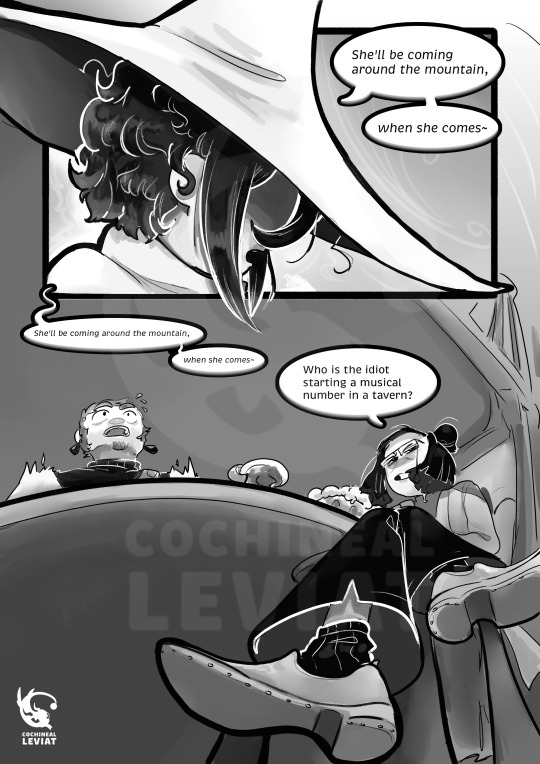
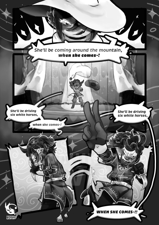
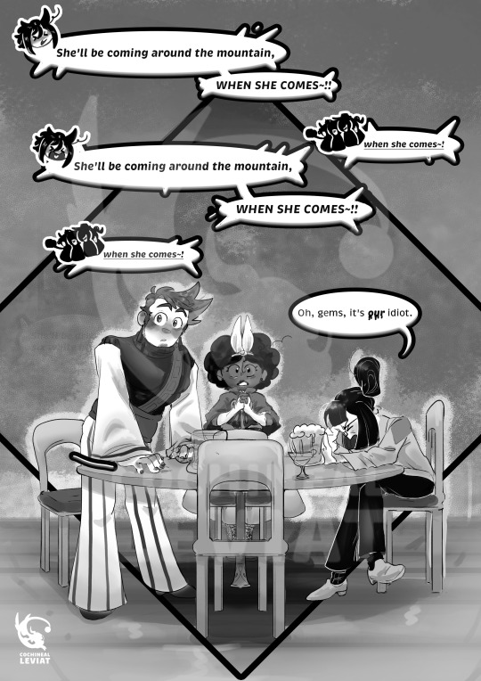
"Our dear party celebrate after acquiring the third orb to unlock the House of Dormont. Their location? A tavern. It is a night to drink your worries and sorrows away. Hopefully, they will be able to relax before continuing their formidable journey.
Unfortunately, the booze has more unintended consequences than the group had considered. Especially on their new roguish member."
This is my first ISAT fic (that I have finished), and I am so stoked to share it with everyone! I also drew a comic with it because I was so excited about the story. This is definitely one of my best comics yet. I have been experimenting with panelling, and I am getting the formula down now after much trial and error.
I had a lot of fun designing Siffrin's clothes under the cloak (I even drew a reference for it in my sketchbook). I love designing clothes <3. Especially tunics. It seems a little too fancy for Sif's tastes, but I am chalking it up it being a gift from someone from a long time ago rather than something Siffrin would buy or get on his own)
Please enjoy~!
*Edit*
I decided to continue the comic because of the overwhelming support I received (o゜▽゜)o☆. The link is under this paragraph.
Part 2
(Also, there are no spoilers for the game itself! Except for the ending notes of the fic, but I will place a warning there)
Different coloured pages without text under keep reading
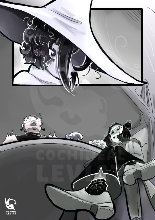
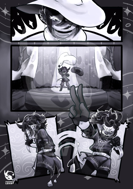
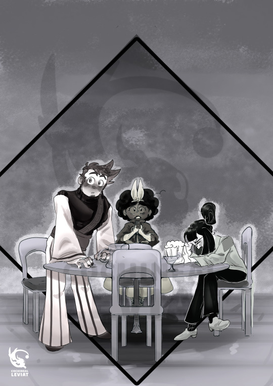
Initially, I worked with different shades of grey for anyone: Siffrin has violet grayscale, Isabeua red, Mirabelle yellow, and Odile Green. But I ended up putting a black-and-white filter on it for unification. Please let me know if you guys prefer the 'coloured' versions more or not, and I will change the comic pages into the OG colouring. The purple for Siff is giving, but I am unsure if it is too noisy.
#my art#my writing#isat#isat siffrin#isat isabeau#isat odile#isat mirabelle#in stars and time#isafrin#the beginning stages of it at least#my comics#isat comic#in stars and time siffrin#in stars and time isabeau#in stars and time odile#in stars and time mirabelle#isat fanart#sadly no Bonnie#sorry BonBon this takes place before you came into the picture#tw alchohol mention#drunken shenanigans#cultural differences#humor#pining#you can pry capable dancer Siffrin out of my dead cold hands#(well until the accident)#rip Isabeau (f in the comments)#I didn't draw the drunk patrons because I didn't want to#that and they would have made the pages too crowded#I hate chairs
1K notes
·
View notes
Text
LET'S GOOOOOO

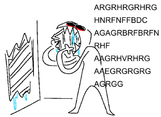
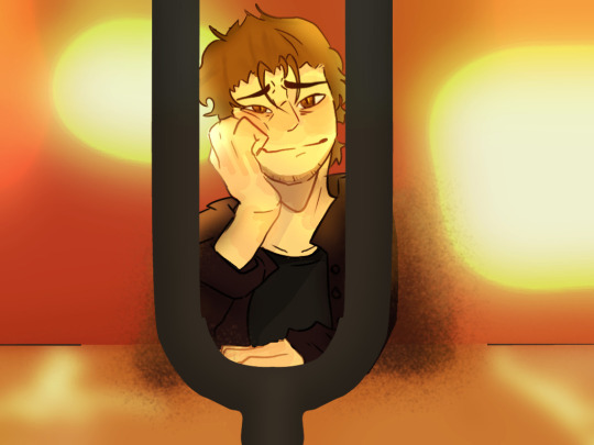

2022 vs 2023
fanart of the dresden files, Ghost Story.
#he looks like a puppydog#feeling things :(((#off topic but whenever I finish hannibal i am so propaganda-ing dungeon crawler carl because I think you'd like later books Carl#later carl the most because he's fucked up he's like Monsignor Pruitt but covered in blood and progressively going insane#but i think you'd also enjoy the ai#it's realizing things. noticing them. it's all right there there if it looks hard enough. and it's sassy. and! that two panel comic i did#the context for that and the ties to the guys because i don't think you've seen that comic... whatever I'm getting too off topic#excellent work on the hands#rho never beating the green jacket allegations i see#i kinda want to draw what molly might look like. for the contrast.#and holy crap the difference between the og tuning fork and the newest. well. i can see *some* shading on the og...#raccoonodysseus art#harry dresden#the dresden files
105 notes
·
View notes
Text
UI & Aesthetic Mods Collection
I've been slowly collecting and creating various mods that prettify & modernize my game and I think it's time I share it! I'll probably update this post from time to time.
Some of these I've collected because they fit well with Cloud Pink UI, but many will still suit other UIs as well.
💖 UI
Obviously I'm using Cloud Pink UI by ✨me✨. You can grab the recolours in Pink, Purple, Blue and Green.
💖 Cursors
Colorful Cloud Cursors: Sims 3 style and Sims 4 style by @sweetdevil-sims
Cursors that match the Cloud UI colours!


Sims 4 Cursors by @arro-now
The OG white cursor used in The Sims 4.

💖 Font
Poppins Font by @shellseaisms

The Sims Sans font by @ohrudi

💖 Icons
4t3 Thought Bubble Overhaul by @fairyexterminator
Updates the images inside the thought and speech bubbles to Sims 4 versions.

4t3 Moodlet Icon Replacement by @fairyexterminator
Updates the moodlet icons to Sims 4 versions.

4t3 Lifetime Wishes Replacement by @fairyexterminator
Updates the lifetime wish images to Sims 4 versions.

Trait Icon Replacement by |usagi
Replaces the trait icons with Sims 4 versions.

💖 Build/Buy Mode
Pretty Build Tools by @cowplantcartel
Edits the build cursors (like the wall/fence tool etc) and the place object squares with prettier colours and also updates the icons to sims 4 versions. I've made the colours match the Cloud UI colours (plus a white version if you want something more plain).

Subtle Build Grid Active Level Only by @alverdinesims
Makes the grid less obtrusive.


Default Replacement Wood Textures by JaneSamborski
Not really a UI mod but I just love this one so much. It replaces the wood textures with a less dark version.

💖 Functional
Clean Main Menu by @arro-now
Cleans up the main menu by removing the login/sims 4 content. Shown here is the cloud pink compatible version.

More Clothing Rows by @arro-now
Adds additional rows in CAS. Shown here is the cloud pink compatible version.

Larger Patterns Panel by Butterbot
Adds more space for patterns and increases the pattern thumbnail size. Shown here is the cloud pink compatible version.

💖 Misc
Plain skill and progress meters by @alverdinesims
Cleans up the skills and progress bars.

Custom Plumbob Colour Tool by CrossTheMersey
A tool that lets you change the default colour of the plumbob!

Heart Plumbob Replacement by @lastolympivn
Replaces the default shape of the plumbob with a heart. This creator has a bunch of other shapes on MTS too.

Cuter speech & thought bubbles by @cowplantcartel
Replaces the speech, thought and scream bubbles with prettier colours that match Cloud UI.

Pretty pausing by @cowplantcartel
Replaces the pause borders with colours that match Cloud UI. Also replaces the map view and recording borders.

Modern Map Tags by vesko_sims3
Replaces the map tags with more modern versions.

Better Ingredient Thumbnails by @tasteslikefridge
Fixes the strange/glitchy EA ingredient images.

Music Note Default Replacement by @necile
Higher quality music note images!

CC Icon Replacements by @sarhxz
Replaces the custom content icon with alternate versions. There are a few different options.


💖 CAS Backgrounds
A few of my faves:
bbygal123 conversion (light version) by @nectar-cellar

Pilar Leon Boho conversion by @simsdeogloria
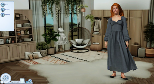
Single color replacements by @agnelid

179 notes
·
View notes
Text
More random things in Blue Lock I find endearing:
-> Appreciation
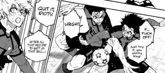
Yes! Tell 'em, Nagi! It feels more sweeter when you remember that this happened before they verbally resolved everything.
I mean, obviously, it's pretty stupid to fight with your own teammate for the ball in such an important match, but it's so heartfelt to see Nagi be like, "Reo did all that for us! Do not let Reo's efforts go in vain!"
Aww.
-> Green Flag + Green Flag = Greenest Flag


I admire Isagi's parents so much. I love them so much. I pray to God every night that after my reincarnation as Nagi's Choki, I'm reincarnated as their daughter because they are exactly the kind of parents every child deserves. God bless them.
-> Silent celebration
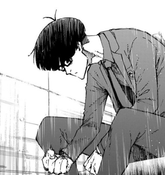
No matter what you say or feel about him, he will forever remain the OG Dad of Blue Lock.
I just know that he was so proud of his team. Yes, yes, he told Anri to stop crying because she was making it look like everything was a miracle, but it only means that he believed in the team!!! Given his personality, someone like him putting his trust on you is the best things that could ever happen.
And you guys remember that he was able to tell at once that Chigiri was unhappy being benched? I understand that he is a cunning man, but to see him call out to Chigiri to do some kind of indirect wellness check on him was his version of going the extra mile.
You getting me?
-> Moonmin
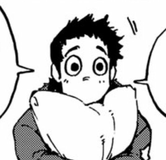
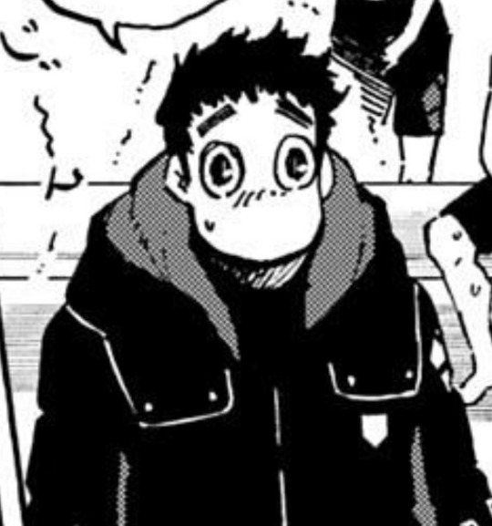
The sweetest boy in existence. Oh god! He is so precious.
I just know he gives the warmest hugs known to mankind. He is just too precious. The big boy everyone deserves <3
Blue Lock Fandom, please give him loads of love.
-> Gang Gang‼️

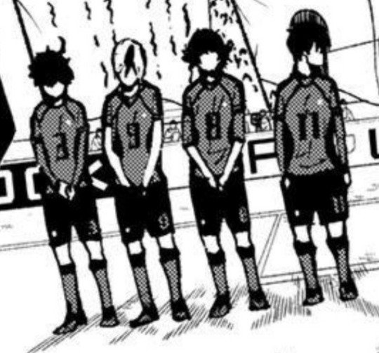
It's maybe the low quality, but they all look so goofy. Like, they all look so adorable.
I remember chuckling at these panel when I first saw them—it was a pretty crucial moment in the match and, then suddenly the focus pans on them which is so un-serious for no reason at all.
Lil guys.
-> Two idiots

You know, unlike what he tries to make himself look like, Barou is actually so effortlessly goofy. Like, he is so.. random??????
I mean, this dude just does and says literally anything—I can never take him seriously.
If I were a Blue Lock-er, I would've definitely befriended him just so that I could slap his ass and run. Like, he just seems like the perfect guy you can irritate without getting bored!
.
.
.
There will be more posts like this because of the 10/10 image limit.
Here's part: 1, 3, 4.
#blue lock#bllk#nagi seishiro#isagi yoichi#ego jinpachi#tokimitsu aoshi#niko ikki#otoya eita#bachira meguru#barou shouei#雪 ranting
690 notes
·
View notes
Text
NIGHTSTAR vs I AM NOT STARFIRE

CHAPTER 1: Designs
Okay, let's begin with this.
Mandy
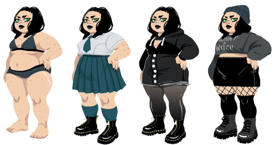
I have NO problem with a fat character. I am definitely not fatphobic, so anyone worried about that, don't worry, hehe <3
My problem with her design... is that she DOESN'T look like Starfire's daughter. Not her skin, not her eyes, not the SHAPE of her eyes, not her nose, her hair (her natural hair neither), NOTHING. I don't buy that the only thing that stick on her genetics was the hair and the eye colors. The color hair doesn't help, cause it looks even more unnatural than her dyed hair. Whenever I see Starfire and Mandy on the same panel, either arguing or just being, I feel the self-insert of the author, which makes me feel a bit uncomfortable...
And I'm not even talking about Mandy not looking like the og Starfire, I mean, not even the comic's Starfire:

The style was ok. It wasn't the best, but considering it was a YA novel, it fits fine.
(BUT, OK, IDC IN WHAT STYLE YOU DRAW HIM, WHY DOES HE LOOK LIKE... THAT????


YES, THE BUTTCHEEKS, WHAT'S UP WITH THAT 😭😭😭?)
Nightstar
What can I say about Nightstar that isn't just... perfect???


She's a perfect combination of both her parents. Starfire's skin was yellow, and Nightwing was melon color (white human color). She was a perfect mix. Hers was a human color, unlike her mother's, but still had the hues of her mother's skin. Kingdom come as proof:

Another thing. Yes, her eyes ARE green like her mom's, but they're tire like her dad's. And her nose isn't exactly like her mom's. Her mom's is button type, while hers is between snub and Nubian, which is the perfect center between her mom's and dad's type of nose. And maybe the cherry on top are the eyebrows (daddy's eyebrows)
I don't know how to explain to you how she's so alike her mom, but still has her dad's features (AND LOTS) which I find perfect. That's why Nightstar is the perfect design for a dickkory child.
POINTS: NIGHTSTAR - 1 ; I AM NOT STARFIRE - 0
CHAPTER 0: INTRODUCTION
CHAPTER 2: PARENTAL ISSUES
CHAPTER 3: LOVE INTEREST
CHAPTER 4: VILLAIN WHO ISN'T AN ANTAGONIST
CHAPTER 5: MAIN CHARACTER
CHAPTER 6: OVERALL PLOT
*THIS LIST IS OPEN TO CHANGE
#dc comics#mari grayson#nightstar#teen titans#dickkory#robstar#dick grayson#nightwing#koriandr#starfire#titans#koriand'r#kory anders#dc#the new teen titans#new teen titans#robin#cyborg#beast boy#raven#victor stone#garfield logan#i am not starfire#kingdom come#kingdom come dc#the kingdom#the kingdom dc#earth 22
56 notes
·
View notes
Text
Batgirl and Robin Car Doodles


I was locked in a car for 8 hours yesterday and had to do something to keep from going insane. I'm not super happy with these renders, but I figure someone out there will enjoy these.
Flat color drawings and design notes under the cut:


I love Batgirl and Robin duos! They're such cutie patooties! Here we have Dick Grayson Robin and Bette Kane Batgirl, Jason Todd Robin and Barbara Gordon Batgirl, Tim Drake Robin and Cassandra Cain Batgirl, and Damian Wayne Robin and Stephanie Brown Batgirl!
All these pairings are accurate to the comics---these characters existed as Robin and Batgirl at the same time and teamed up frequently. The only one I'm missing are the famous Dick and Barbara duo and Cass and Steph during Steph's Robin run (and technically Damian and Babs, but. . . .eh).
I have a /thing/ about giving heroes kneepads. I've seen what they do to their knees! If you have no invulnerability, you will either wear kneepads or I will make you suffer the consequences! Hence Dick, Bette, and Jason's trashed legs here.
I am greatly entertained by the fact that while the Robins' suits stay very similar from person to person with only some style differences, the Batgirls have cycled through damn near everything. Robins range from "how much skin are you covering and how much black are you wearing?" But Batgirls have been everything from "Robin but Girl" to "Knockoff Batman" to "Batman if he was small and possessed by a spooky eldritch entity" to "EAT MY HOMEMADE PURPLE!"
Batgirl Steph originally looked exactly like Barbara but with more purple and less yellow, but I wanted to highlight the contrast between Batgirls, so I went for her Batgirls! design here: that one has the lower face mask that nobody else wears. Buuuut I was also giving everyone white-out eyes for stylistic consistency and because it's easier to draw, so I went for a Raven-esque shadow effect from her hood that I think worked decently. I also gave her a bat-eared hood to match with the other Batgirls all having ears somehow.
(Bye-the-bye, while Robins and Batmans are usually drawn with whited out eyes in their masks, Batgirls in Barbara's suit style are not, and neither are people with Bette style masks. This is fascinating to me because the whiteout lenses aren't actually canonical---it's a stylistic choice that all live action adaptations remove, and many individual comic panels that are close-ups of faces demonstrate that you CAN in fact see their eyes behind their masks. This is with the lone exception of Cass, who I believe has a spiderman thing going in her full-face cowl).
For similar contrast reasons, I gave Babs her navy blue style instead of her OG purple, even though she usually looks better in purple. Sorry Barbara, you generally look best as Oracle anyway.
I hate Damian's edgy gray robin suit with a burning passion. WHERE IS THE GREEN!? YOU KNOW: THE COLOR MOST OF US ASSOCIATE WITH DAMIAN! WHERE IS IT YOU BASTARDS?!?!
Anyway, while I liked the posing, the renders definitely suffered from lack of sleep and car jostling, so I think these may be good candidates for a redraw sometime next year.
#giraffe's ramblings#Giraffe's Scribblings#abby's batshit#batfam fanart#batfam#dc comics#dc fanart#dc robin fanart#dc robin#batgirl#batgirl fanart#dick grayson#bette kane#jason todd#barbara gordon#tim drake#cassandra cain#damian wayne#stephanie brown#batman comics#sorry to my bette stans who were looking for flamebird/titans content#I PROMISE I'm working on Cotton-Eye Joes for you! I'm reading Secret Origins! Life is just INCREDIBLY BUSY right now!#I'd tag all the fanarts but I'm too tired and I don't think tumblr's sorting system listens to that anymore anyways
59 notes
·
View notes
Note
Dreams panel is on main stage and at the same time as the OG YouTube panel which is on a side stage 😭 and it has Hank green, Ian from smosh, Rosanna pansino, and other big YouTubers 😭
dream getting the mainstage over og youtubers thats crazy
52 notes
·
View notes
Text
Just going to find refs of Music Meister. Not going to be every panel, mind.
Meister og color scheme is a dark, desaturated purple (bluish undertones) with a very bright green. In the video game it's a much more bright purple.


Mayhem of the Music Meister!, Lego Villains, Think of Me (DC Pride 2022)
Speed Force gets its own post
106 notes
·
View notes
Text
Magneto and the OGs
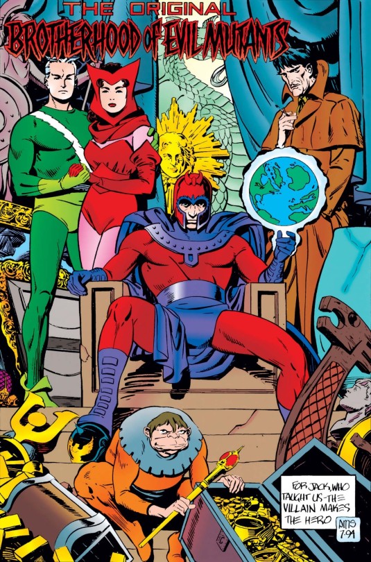
The Brotherhood of Evil Mutants is so damn iconic. Look at them steezing with all the treasure! Where'd they get it? They pull off the album cover/mixtape look so much better than the X-Men. Could be either a portrait or a photograph. With how much this era is homaged and remixed I enjoy a faux archaeology approach of making it all fit together. This panel fits best between X-Men #5 and #6 IMO, when the Brotherhood was living on an island (vibes based.)
- Magneto Rex, manspreading to an obnoxious degree with the world in his hands.
- Toad, in full court jester mode, sadly without the historical immunity to violence.
- Mastermind sucks. How TF did his potato sack wearing self get let in the Hellfire Club? Weird that he's the only smoker. Lifelong creep.
- Wanda and Pietro are like 'we hate it here. Also, fuck you if you're red/green colour blind.'
#x men#x comics#magneto#brotherhood of evil mutants#toad#wanda maximoff#pietro maximoff#mastermind#marvel#comics
17 notes
·
View notes
Text
"That Really Happened?!" DC Comics Tournament Entry #37
Schrödinger's Pregnancy


[ID: Two cropped comic panels of Carol Ferris. In the first she is Star Sapphire and pregnant. She says, "That I carry his child? Yes. Too true." The rest of the dialog is cropped out.
In the second panel she is dressed in a white shirt and is not pregnant. She says, "You're right, Hal. I'm not pregnant. But I guess Sapphire is...inside me somewhere. And I have to think she's going to have to break free again...when it's time to give birth." Off screen Hal says, "Then...we'll deal with that when it comes. For right now, this nightmare is--" /END ID]
What Happened?
Okay so first a little context. Carol Ferris is Star Sapphire, villain to the Green Lanterns and mass murderer. She is also the Predator: the masculine side of her broken off by her subconscious mind so that she could be the perfect girlfriend she felt like she should be. Anyway that's the not purpose of this submission the og predator arc was actually good. Okay so in the 90s, it's revealed that the predator is back, and then its revealed that Star Sapphire was impregnanted by him. (Yes Carol did get herself pregnant don't worry about it). And then, then, its revealed you know who is not pregnant? Carol. Despite her and Star Sapphire being the same person mind some mind control somehow carol got carol pregnant but not carol. Oh and the pregnancy just never gets brought up because three issues later (after a crossover event) Coast City is destroyed so who has time for Carol's pregnancy problems. I feel like I'm downplaying how crazy this was but let me tell you I've never read a comic while going wtf wtf wtf so often before or since.
--
Tournament polls will be posted after all entries are up. As always you can find all posts related to the tournament using #dc-polls-trh
118 notes
·
View notes
Note
hihi lore!! i would love elaboration on the omegaverse panel hijacking if you're down to share!!! owo
oh bitti... BITTI... let me recount to you the omegaverse panel hijacking exploits of anime con of 2024 [name redacted]
if you were not aware, beloved cielo and i are actually from the same area!! so we are irl buds as well as fanfic pals. it was our second time going to this particularly con together. we had highlighted a panel 'intro to omegaverse' that was of great interest however it was an 18+ panel on saturday evening so we had to get there EARLY for a spot. we are nearly in the front row with a handful of my other friends, waiting as the room fills up, but no panelist arrive. i am drunk on three green apple white claws, nursing another in a disposal coffee cup. i am living so well.
five minutes pass, then ten, then a few more, and a someone runs to the front, turns on a mic and says "hey i'm not a panelist, but i'm gonna hijack this until they show up. who wants to help". she proceeded to recruit me n cielo, one other person, and an artist to draw and annotate our words while we spoke LMAO. me, cielo and company BODIED that panel. it was genuinely so fun. the og panelist never showed, so we kept folks entertained the whole hour!! we did give a basic rundown on omegaverse, talked recs of media and fanfic, and talked tropes too. we had great audience participation and it was so fun to be silly as panelist and get good laughs outta folks too :'^)
at the end of the panel, we get rushed by a bunch of audience members. someone takes a polaroid of us panelists (which i still have.) i'm moderately blasted and hand out my ao3 to someone irl and tell them x reader bangs, they just haven't seen the vision yet. out of the crowd, a phone is handed to me by a very normal looking man in his 30s? probably. very different from the folks who'd approached us before. he says, very deadpan, "write your full legal name and email" and i, blasted, do so without questioning for a solid 30 seconds of very difficult typign and then was like... wait... who are you. why am i doing this lol
the guy was the HEAD of programming for the con 😭 he was taking our information because panelist get half-priced badges the following year. we never heard anything further on this even after we emailed con staff, BUT lo and behold, an email came today with our special badge offer 🤩!!!! 2025 is gonna go so hard. we're planning a proper intro to omegaverse panel with the og hijacker. i am so fucking hype. truly a crowning moment, shining arc, of papa salami
22 notes
·
View notes
Text

Okay so I’m making a hearts pirates deck but it needs to be green purple and the in,y leader that works is Doflamingo and I couldn’t have that so I made this :) I used a manga panel and personally added color (that took a while…) and behold!
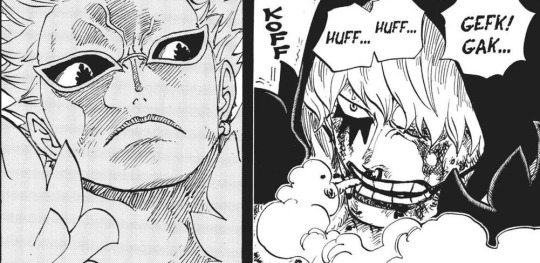

Manga panel used and the og card
14 notes
·
View notes
Note
Sam's has had many different appearances over the years. Do you have a favorite?
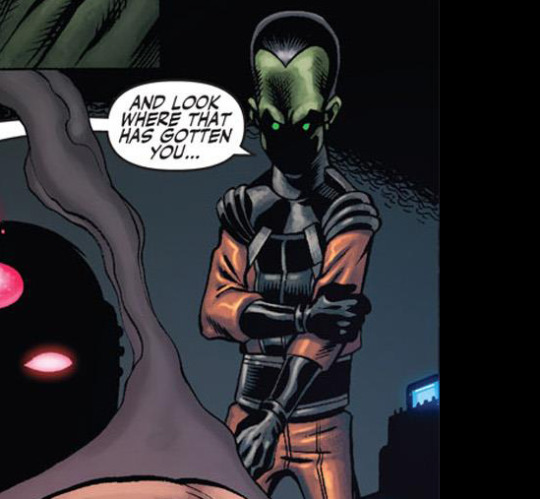
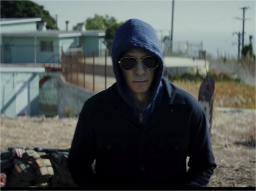
Haha, that's a very interesting question. For those who still aren't aware, Sam is one of the character with the largest panel of design, that's why talking about comics accuracy in his case is dumb af. He wasn't even always green lol Well there's no appearance that I dislike, for sure, but picking one is too hard for me so here're a few I affectionate a lot : I have a soft spot for his OG comics design because Herb Trimpe is one of my all time fav Hulk artist, also because Fall of the Hulks is the first Hulk run I've been reading.
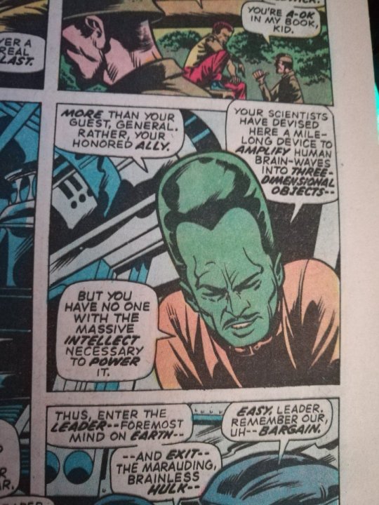
I also deeply, deeply, deeeeply love what they did with his MCU self (especially with the eyes), he's incredibly cool (extra point for the hood + sunglasses combo, it was very sexy of him to do that)
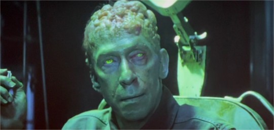
His Avengers Academy (dead mobile game) design (fuck how I miss this game). Idk I like every design they pulled, the casual heroes/villains was fun, it was like watching a Disney Bounding of Marvel characters.

And the other design I love a lot is the Xenomorph shit we got in Immortal Hulk, it's probably my monsterfucker blood talking tho.
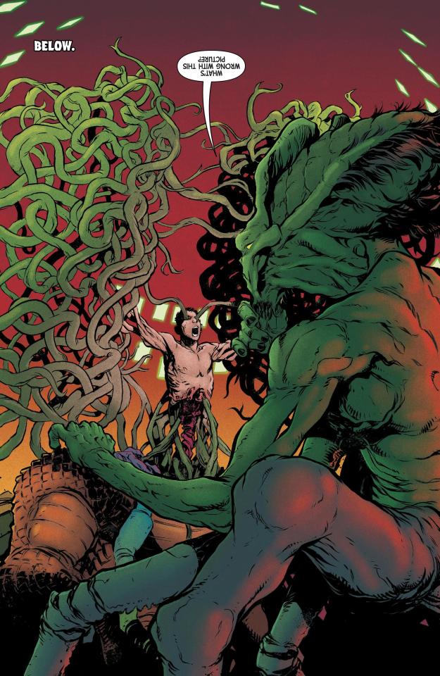
I love when people ask me about Sam so feel free to, folks!
12 notes
·
View notes
Note
please how do you pick colors 😭 I'm trying to learn how to color and I am obsessed with your comics (like your ivantill ones lol) and how do you pick such a cohesive color palette and choose where to put what????
Your art is amazing like actually :) happy holidays!!
😭 tysm anon and happy holidays to you!! i did my best to explain some of the process behind my color picking and choices for the ivantill comics under the cut, i hope its coherent cuz quite frankly it also takes me a long time to decide what colors to use
a little disclaimer: i tend to just put base colors, before i start adding shading or lighting. i also dont usually start off with a fixed color palette in mind, because my process is pretty much figuring out as i go along, and playing with all sorts of colors; however whenever i do end up with a fixed idea on the color palette the process is still applicable anyways so hopefully its helpful for u too :’]
ok so i usually decide colors by asking what kind of mood or tone im going for. for example, the recent ivti comic i did
the comic imo is pretty playful - theres a romantic element ofc but i think the focus is rly on how ivans being kulit / annoying as usual so i thought a spunky, albeit warm color would rly fit. theyre also chilling in tills house so i thought a home-y, comfy feeling would be good
i was still playing around, so for the first attempt at realizing that tone, i added a hot pink multiply layer to see how it looked
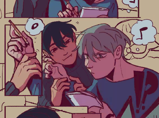
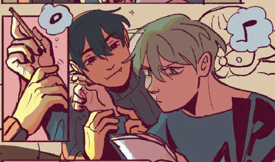
(first attempt vs final colors) (also im sorry for the low quality procreates timelapse is wack)
ironically enough it actually created a really cool looking color palette which was not what i was going for. so i kept testing colors for a bit; the shadow is hot pink, and i ended up going for a bit of a desaturated green as a base / overlay because it mellowed out the pinkness. i also put both the base and the shadow on a darken (50%) layer so that the og colors peek through a bit more compared to a multiply layer. in the end tho, i ditched pink and went for a saturated red
the green also makes for a nice complimentary color to the red, and it overall has that home-y, warm but playful feeling i wanted to include ⬇️
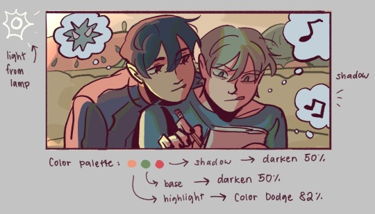
i added a highlight layer (color dodge, 82%) so that it pops a bit more, and also bc i knew i was gonna draw a big lamp on their right in the bg. speaking of the bg i made it a green/yellow hue so that the base for green on ivan n till make sense, and it ended up working for the best cuz the red acts as a nice contrast
(admittedly i think if the lighting of the room is green the shadow should also be green, but tbh i tend prioritize contrast as much as possible regardless cuz it looks nice 🤡 even if it fails to make sense realistically its for the vibes)
^ i ended up remedying this a little bit by adding bits of green to the shadows on ivan n tills hair and clothes, and also because its fairly complementary to the pink palette i have going in for the shadows and even the highlights (esp on ivan)
i also decided to shade in dark parts in the lineart so that it pops a little more
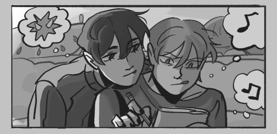
looking at the values also really help! esp in comics, where each panel can have its own lighting depending on what angle ure drawing. u can do this easily by adding a pure black layer above the entire piece, and setting it to color (100%)
for me the values actually made me realize things that may look too similar, which usually leads to me changing the color. for example, the couch and stuffed animals behind ivan and till were actually a lot darker before i changed it. bc it kinda blended into ivti a bit, it also got the eyes’ attention away from them. i ended up adjusting their hue and values so that it matches the bg, and ivan and till stick out more (alongside other color adjustments) ⬇️
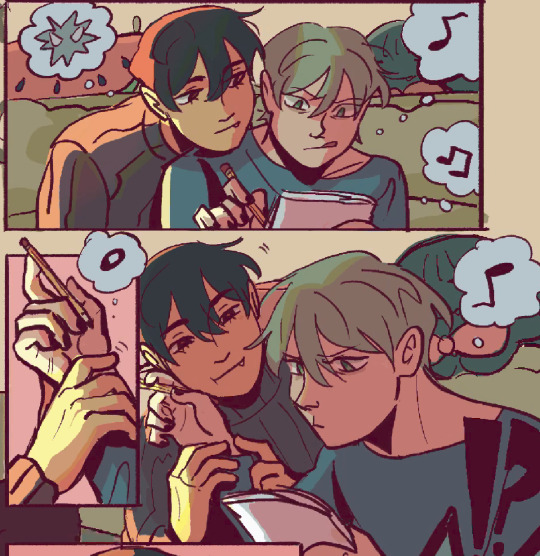
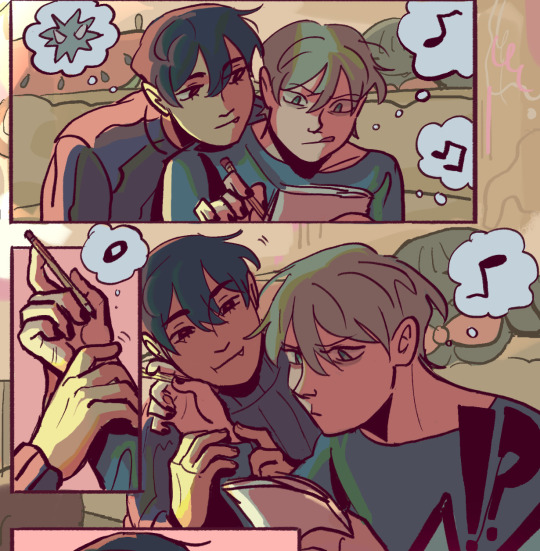
changing the lineart also helps quite a bit! i made the lineart for ivan and till a little darker, while the bg elements got a darker green instead so that the bg elements dont take as much attention
looking at b&w values also helped me realize that the og pink i was using for the panels was a little too dark, so i made it significantly lighter so that the panels stick out more (esp bc they take huge precedence in the second page)
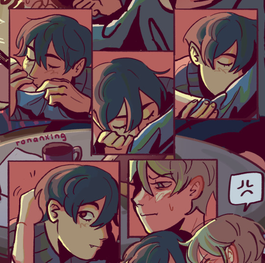
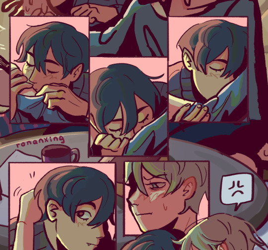
(og panel color vs final)
and finally when i pick all the colors and am satisfied with them, i merge everything into one final color layer for easier rendering :> procreate (and im sure other programs) allows for color / hue adjustments so you can def play around with those!
as for the harana / first ivantill comic i made, it had all the similar steps of the recent comic so ill just talk a little bit about the palette
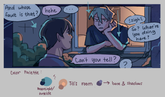
so im ngl this comic was a bit of a struggle to color for me,, cuz i wanted it to be romantic but it was set at night. usually that dictates cooler tones and colors, but i was aiming for something warm. thats when i figured i could just let tills room wash an orange color, which would help with making warm lighting but also help till and ivan stick out again from the surrounding darkness / blues
i went with a purple base, cuz i thought it was a nice warm ish color at night and it makes blue and orange pop. i also figured that i could make the base both purple since the highlights are the most attention grabbing / contrasting colors
also used the moonlight as rim lighting so that ivan sticks out a little more,, i also figured that tills room would be projecting harsher lighting over the moonlight
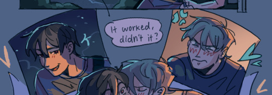
lighting it this way also allows for nice color contrast regardless of what character is in the center: ivans outside but awashed in orange lighting (from tills room), and tills inside but hes sticking his head out a little so hes noticeably purple. it allows for characters to stand out while also being pleasing to the eye
and im ngl i cheated a bit again 😅 i think till shouldve projected a shadow on ivan a couple of times and the highlights might be too harsh but again i just prioritized making their facial expressions seen LOL
for this one i didnt use any layer modes aside from (if i remember correctly) a purple multiply layer and overlay for shadows and base respectively
and thats pretty much my process for figuring out the colors !!
TLDR; i look for the mood or tone im going for, try to make interesting contrasts / complimentary colors and i also double check if each character sticks out by checking values :> it really helps me too to play around a LOT, i think it takes me like an hour or just 30 mins to figure out what colors to use and also adjusting it significantly when i merge everything together
#asks#im sorry this is so long 🫡#hope i was able to help u anon#but ty for the ask it means a lot to me !!#esp cuz i also still struggle with colors
16 notes
·
View notes