#How to Create Different Video Ad Variations
Explore tagged Tumblr posts
Visit Tumblr Blog
Explore Tumblr blogs with no restrictions, modern design and the best experience.
Last Seen Tumblr Blogs


Fun Fact
There were a total of 171.5 billion posts on Tumblr in 2019.
Text
Boost Engagement with Video Ad Variations
Video ad variations are key to optimizing ad performance. By tweaking visuals, messaging, and CTAs, you can test what resonates best with your audience. Tools like Cellit make it easy to craft and share these ads across platforms. Diversifying your video ads not only improves engagement but also increases conversion rates, making your campaigns more effective and impactful.
#Video Ad Variations#Creating Video Ads#How to Create Video Ads#Video Marketing Strategy#Targeted Video Ads#Digital Video Advertising#Video Ad Platforms#Explainer Video Ads#Storytelling Ads#Adapting Video Ads for Platforms#How to Create Different Video Ad Variations#Best Video Ad Ideas for Social Media#Effective Video Ad Types for Businesses#A/B Testing Video Ads#Video Ad Concepts for Increased Engagement#Sell online#sell#ai#artificial intelligence
0 notes
Text
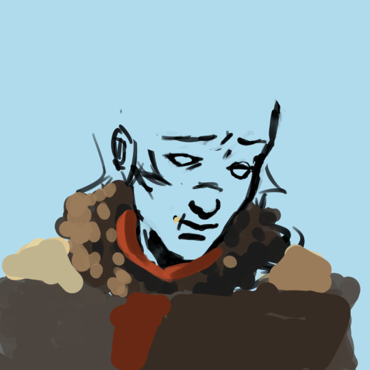
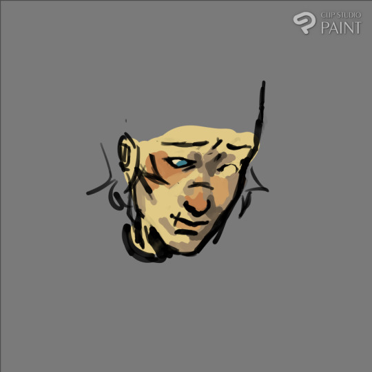
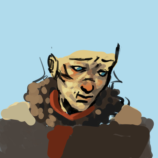
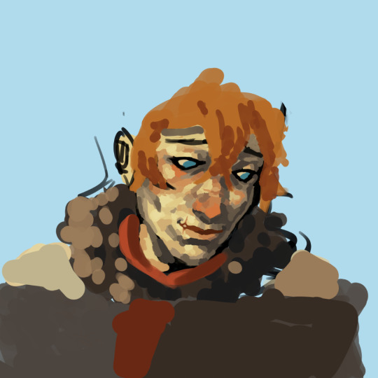
How to steal like an artist (and still create something original): creating an environment, part 1
In a previous post I talked about how it felt to make building thumbnails. But there I got lucky that I came up with details to use — usually I have a really big block with that. I constantly want to make something original. To come up with things myself. Therefore I often forget to use references. I used them, but for inspiration for the bigger forms — and the smaller remained blurry in my head. So I was stuck in guesswork and got frustrated often. Then I explored — what's the path to make this work more smoothly?
I started drawing existing building thumbnails I found and looked what made them interesting. A youtube video also helped me (link at the end of this post). Here's what I found out:
Terrain first: The buildings are built on it. Is it flat? Mountaineous? Are there broken off rocks nearby? Is the building on a cliff?
Complexity factors to make them look interesting: height and width variety & depth (overlap of different parts) and size variety
Surrounding nature: Maybe there is a tree or ivy growing at the building?
Use simple forms to create: Simple forms are simple, but adding them together or cutting parts of them is what creates complexity & interest
These are the fundamental things to build the silhouette. But how do I come up with detail? Here's what I found out:

I decided to take Chinese and mediterranean architecture vibes and threw together some references found on shutterstock and normal image search. Usually it's better to use few references so that the results remain cohesive, but I gathered a bit more for the exploration part — for the separate designs I'll limit myself on fewer forms.
I put these references together and outlined some forms that I liked on these pictures. Now I need to decide: what kind of building will it be? Important buildings would be bigger & detailed, while simple houses are kept less eye-catching for composition purposes. I will go with a gliding tower placed on the highest point in the kingdom.
I am doing a wind kingdom on plateaus — so this time I need to have an image of a place, not just a building. The building is just the focal point. But I have big difficulties imagining a whole place together (usually photos of cities look like a lot of houses thrown together into a pile and organically grown cities are too structureless for me to understand and implement at this point), so how will I do it? Let's take a look on a few top-down views of villages (because cities are too complex to understand):

Often villages and cities form around its terrain. The buildings are arranged in an imperfect grid. Simplest layout. But if I build a top-down layout of a lot of buildings arranged in a single grid it will look too uniform.

Radial layout from the center creates some "pizza slices" and continues the road in different directions (up/down/right) and break in smaller branches. The center is a clear focal point + the right road leads to a second, secluded one, on a more mountaineous terrain. But generally, we can see how these houses are grouped together in clusters.
That's something we can try now. I will go with this shape of plateaus arranged around a lake:

I roughly divided the platforms into a grid going from the tower. Doesn't have to be final, we just need something to put our houses on.

Randomly spread some houses on the "slices" I created and added some shadow to roughly indicate the landscape (value variation would also do, just haven't thought of it right away). The streets naturally formed in-between the houses. I haven't done everything since I just need the part around the tower.
Now I have an idea of how the environment looks like and I can map it better in my head. Now we need to define the buildings in this area: the tower, safety gear store, maybe a small restaurant, pantry with stuff to maintain the tower or an administrative building, since it's the focal point of the city, someone's houses. Normally defined by function. We also can add some nature around. When I have difficulties deciding what's going to be there — I ask ChatGPT what types of buildings could be in such an area or research. Doesn't always come naturally to me.

Now to thumbnailing the buildings! I start with just randomly stacking some boxes in 2d frontal, rooftops and some forms using the observations stated before: terrain (flat), height and width variations & overlap and size to make this look interesting. I'll explore some more iterations behind the scenes (the first idea usually isn't the best one).
In my experience, it's inadvisable to start with complex shapes right away. Use simple shapes (boxes).

Once I'm satisfied with the silhouette I go back to the details I outlined on the references and use some of them to bring these boxes to life. Basically the things we "stole". Some simple shadows for depth. I will do the same again for smaller buildings, but with less complexity.


I will continue with drawing this in perspective and thumbnailing in part 2 so it doesn’t get overwhelming all at once :) (I am out of breath myself)
#tower entries#worldbuilding#celestique teachings#clarity frameworks#environment design#environment#layout#cityscape#thumbnails
7 notes
·
View notes
Text
Why the claim like that of extra credits that fantasy races have a good/evil alignment being wrong, so wrong that it can't be applied in media, is itself wrong, is what I am going to argue here.
I think what is necessary to fundamentally express why their opinion is wrong, is the background of why they made it. They made it aligned with the academic view that man is purely a blank slate, with no rationality, no genetics shaping him in anyway, and are ultimately a product of their nurture rather than nature.
One aspect I want to point out is they often claim, "this is morally flawed" only because they try and relate them to real kinds of people. Or that "this is boring" or "this is lazy writing" or some other claim.
It isn't because they believe these things are argued on that basis, because they don't as they don't argue on that basis, it's because claiming its boring changes the debate from them applying their ideology directly to an issue as in "my ideology, which you don't practice says this is wrong" to "this is boring" which is an aesthetic debate rather than the naked policing of other people.
I am not adding what they are policing people on. Which you gain the police someone on their hobbies you do it on the rest of their life as well.
Fantasy races, are not just some endless variations on human. Whether defined by evolution, science fiction, magic and etc, they are different from humans, in both form and/or nature in some way.
This is why you make a fantasy race to show, create and strain the contrast that comes in comparing the fantastical to what is human.
It's why humans are often the everyman of every setting because while human nature can be complex, the fantasy race is the contrasting element, the nature of the contrast can change by degrees but not that it is a contrast.
They fundamentally must be of a different nature to us, even if we are blank slates which we aren't, that fact alone provides the contrast. You could do culture differences but then you have to constantly deal with the fact that contrast when it erodes the very second that race is separated or living in shared space. The inherent to the species implies the constant application of that contrast and how the human deals with it.
In short, their series of videos on the topic are just wrong. Races of evil or good nature are not boring, lazy, or whatever aesthetical judgement they are pretending it is, and the view of humanity in regards to the blank slate is fundamentally wrong.
88 notes
·
View notes
Note
I love Larian and divinity but I agree, bg3 should've been called something else. Larian keeps adding to their games and are overly ambitious (both a good and bad thing). They still have bugs to fix in DOS2, and ignore fans who bring them up, and these are big bugs. There are broken endings and quests that go nowhere (actually). I think people underestimate how similar bg3 is to dao and other crpgs (including past divinity games) and overestimate how much plot is from the first 2 baldur's gate games. Another confusing thing I saw, (must be because a lot of people's first crpg was bg3) people were saying bg3 had an infinite amount of content and how new that was for video games? Have they never played WOTR or any crpg with several playthroughs worth of content? It also does not help bg3 that D&D, despite being the inspiration for a lot of other ttrpgs, isn't that interesting (to me).
Before bg3 was released I finally finished dos2 so I had flashbacks while playing it, especially with the group of chosens and dealing with the gods (it's not really important, but I didn't like this variety of gods because it took the focus away from the Dead Three and Bhaal in particular, especially in Tav playthrough). Later I realized it was DAO with illithids. The infection, the camp (interactions with companions, strange dreams, attacks, guests and more), the slow move to the city, gathering an army, the battle for Denerim, oh, sorry, Baldur's Gate, illithids ー darkspawn and Brain ー Archdemon suppressing their will and controlling them. And that's just the most obvious stuff. It's anything but Baldur's Gate. Larian did a clever thing by calling this game Baldur's Gate 3 to increase its popularity, but I don't respect them for it. Maybe they tried to tie it to BG2 with the Underdark, illithids, vampires and so on, but they missed the point.
Yeah, for many people it’s their first introduction to rpg and dnd. It's good that this game got them interested because many of them want to play other games, including DA and Pathfinder. On the other hand, because of this, there is so much admiration for bg3, praising it for typical rpg elements and turning a blind eye to its flaws. Same with people, who haven't played the original bg and aren't familiar with FR, talking about bg3 as a good sequel that respects the lore (especially after datv, I even left the veilguard community because I couldn't read it anymore).
About the content, I don't get it either. Variability is the basic characteristic of rpg. And bg3 is not that great in this regard to praise this game as something unique. In general, bg3 has so-called good or evil playthroughs and different ways to achieve the same result. Pathfinder, for example, has much more global choices. The most of the variations in companions, but that's nothing new either. Shadowheart has the complex plot, but Daeran is similar, his plot has 4 outcomes depending on the mc’s choice and his trust. The only unusual thing I see in bg3 is that they tried to cover every possible scenario.
I like dnd and Forgotten Realms, but I understand it could get boring. But I think if you take a deeper lore, you could make something interesting. They could have revealed more of Bhaal and Durge. I like Durge, but it's more because of my headcanons and dnd lore that I'm looking for myself. The game itself gave me almost nothing. The lack of interaction with the bhaalists, Orin, and Sarevok, as well as the general hollowness of the world, made me miss the old games. The bhaalspawn crisis is over, and it can't be like before, but why make it so boring. Durge is the former cult leader and Chosen. It could have been an interesting end to the series if they had done a proper sequel with more emphasis on Durge and Bhaal, cult and so on. Durge is the creation of Bhaal’s blood and flesh. Titans, who are above demigods with mortal parents, were created from blood. Elves, divine children who inherited Corellon's characteristics, were created from blood. They could add more depth to explain the connection between Durge and Bhaal, the divine nature, than has been shown.
Their attempts to reference past games made me want to roll my eyes. Especially references to Gorion's ward and stories of how they escaped their fate, because to me Durge is in a slightly different position. It was funny when Wyll said that considering in the canon Abdel was killed, and Bhaal was resurrected. That's the point, you can't escape, especially Durge, Larian literally showed it in the game with Sarevok. Unless you have a powerful patron, in this case Jergal (and this is interesting but the game also gave nothing). The problem is that you have to guess and headcanon everything. A lot of people outside the fandom still don't know Withers is Jergal, plus a lot of people played as Tav, who lost the logic of the story. I've seen people justify this (and Tav's poor connection to the story) by saying that bg3 is like a dnd campaign and you can create your own canon. Pathfinder WOTR is an adaptation of ttrpg, but the necessary lore has been explained (and mc was tied to the plot). It creates the complete story. BG2 also gave me freedom, the fulfilling world and story.
Anyway, if bg3 was made by a group of nerdy dnd fans, it would be better, I think. Because I got the impression that they read the FR and BG wiki and then wrote the script for the game. I know there are dnd fans among them, like Welch, and it shows in Durge and ascended Astarion, who copied Strahd (vampire lore in the game is weird though), but all those moments and superficiality gave me that feeling.
7 notes
·
View notes
Text
Inside Sunrise Interview

Inside Sunrise interview with Masayuki Ozaki and Kazuhiko Tamura. This is transcribed from an Anime News Network video linked below.
The Origin of Tiger & Bunny
Ozaki:
The idea for Tiger & Bunny came from two different roots. The first was Director Keiichi Sato's sentiments. To Director Sato, it's a story about heroes with mundane problems. The director said he wanted to depict a superhero drama with a sense of life to it. The other was my sentiments, as a producer. I wanted to depict the conflict and drama one sees when they've belonged to an organization for a while.
The impetus for the project came from the controversy over the competition swimsuits in the Beijing Olympics. I saw in an interview that wearing one particular kind of swimsuit gave you a chance at setting a record but, well, the athletes who had contracts with Japanese companies couldn't wear that fast swimsuit.
At the time, we were coming up with the project, so we thought the conflict of those athletes who belonged to those industries was very interesting and intriguing. And so we thought it would be nice to take the Director's desire to make a hero story, the story of heroes who have to bear the weight of sponsors, and depict the conflict, drama, and culture that lies behind all of that. So that's, well, how the idea came to fruition.
Tamura:
This is where we work on the storyboard for Tiger & Bunny. We're very particular about using pencil, and, um, the expression of performance, you could say. There are things you can't express without using pencil to depict motion, so we pay extra attention to those parts.
This is called the layout. A layout, you see, is this image, framed here by the screen. It's an image we use to make sure how it'll fit in the television frame. We use this as a base to create the key animation.
Oh, this character is Blue Rose. It's a scene where Blue Rose is drinking soda. It's part of a TV ad campaign in Japan. The drink is for one of the sponsors, but this is the test layout for that. We'll use this as a base to draw the animation.
Thoughts on the Characters
Ozaki:
When we were working on the costume design for the heroes of Tiger & Bunny, we paid special attention to their variety. There are 8 heroes who appear in this work, but from the start we had the idea that their suits should be diverse. We set the story in a near-future city that's anethnic melting pot, so the characters themselves were set to be a variety of races. There's a Russian character, a Chinese one, a Hispanic one, and a Japanese one too. We thought the hero suits should be designed to match those different characteristics.
Character Designer Masakazu Katsura, himself is very knowledgeable about superheroes. He loves superheroes, in particular, those from American comic books. Director Sato really liked that aspect as well. So Mr. Katsura pulled out a whole lot of ideas for what he wanted the superhero designs to be like. Fire emblem really is the kind of suit-wearing super hero you might find in American comic books.
A hero made with a bull as it's motif. Rock Bison is the kind of design you'll find in Japanese Tokusatsu, but not in American comics and that was the kind of variation we wanted it to have.
Tamura:
This right here is the CG check movie. We're running a check on the motion. We work on drawing the animation after we first make the CG.
Visual Effects Efforts
Ozaki:
Also, one of the visual aspects of Tiger & Bunny we were really conscientious about was depicting the heroes primarily through CG. The female character Blue Rose is the only one that's frequently hand drawn, but basically Tiger, Barnaby, and the others are all CG. They're designed to actually bear industry logos so since those industry logos would change over and over, we'd have to draw it over and over if they were hand drawn. That'd make it very difficult. But by making them CG, that kind of work, the swapping out of corporate logos, is not big deal.
One other reason is, we were keeping the world market in mind, and because of Pixar and Disney, CG animation is the visual style people around the world are most used to seeing. Hand-drawn animation certainly has its own good points, but in the end, we thought CG had the most universality and we designed each hero in CG. In doing it that way, we're able to come up with some pretty detailed imagery. For example, the hero Fire Emblem wears a cape, and that cape constantly flickers with fire as a pattern. If that was hand-drawn we couldn't do something like that. Those are the kinds of visual effects we focused on.
About Kotetsu
Ozaki:
The design for the character Kotetsu was clearly risky. For starters, he's middle-aged, has a beard, and is a single father. Characters like that in animation are, well, how do I say…it's a fact that they're hard for viewers to accept. The truth is, we were half hopeful and half fearful, but in the end we went with that design for the animation, and luckily, he's well accepted right now. We're actually getting word from the fans that they can empathize with him, and we're very happy to hear that reaction.
Kotetsu wasn't the only character, there's his partner, the younger Barnaby. This is a buddy story. By having another main character, we think we've established a very nice balance. Kotetsu's a middle-aged guy who used to be popular back in the day, but lately he's not doing so well. That's his character background. That said, there were things we wanted to illustrate thematically with him, like the importance of never giving up, of the bonds between people, things of that nature.
Plus, Hollywood movies, especially lately, are getting lots of sequels, and as the main character's actor gets older, they write the character to age with him. By part 4 or 5, he's already middle aged. Their refusal to give up, their continued fight, gave us some queues as well. You can say it's targeted more towards adults. As for me, I want to create dramas with universality, dramas that people of any generation can sympathize with and to keep making them in the future. That's what I hope for.
Source:
youtube
30 notes
·
View notes
Text
Acting and Accents in Animation
As I move closer to finishing the imagination sequence, my focus is now shifting toward the acting shots. I believe the most technically demanding part of my animation is nearly complete, and to give the remaining scenes the quality they deserve, I want to prepare myself to approach them in a way that feels natural and effectively communicates the dialogues. These scenes will carry a lot of the emotional weight of the story, so getting the acting right is key. I started this phase with a humble approach by watching acting shot tutorials on YouTube. Alongside the standard guidance on poses and expressions, I came across a video that introduced the concept of "accent" in animation. At first, I assumed it was related to speech, but it turned out to be something else entirely, and it caught my attention. The more I looked into it, the more I realized how important this technique is when it comes to creating engaging and believable performances. One of the examples referenced was from the series Arcane, which is known for its high-quality animation and expressive character work.
youtube
Accents in Animation - Youtube
So, what is accent in animation? In this context, an accent refers to a brief, impactful moment or gesture that adds emphasis to a particular action, sound, or emotional beat. It helps give clarity and rhythm to a performance and often makes the scene more memorable or expressive. I also learned that there are two types of accents commonly used: hard accents and soft accents.
Hard accent and soft accent A hard accent refers to sharp, sudden movements that feel like a hit or a jolt. These are often used to convey intensity, surprise, or a shift in energy. On the other hand, soft accents are more about gentle transitions and subtle shifts in motion. They can help ease the audience into a new emotion or idea without being too abrupt. I found a blog on "Animation Apprentice" that simplified these ideas and gave visual examples that were really easy to understand. There was also a post from the Animator's Survival Kit that showed the difference in a side-by-side comparison.

Example of Hard and Soft accent In the above image, the first action is considered a Hard accent and the second one a soft accent. The difference is basically more to do with how timing changes the meaning of an action for instance a wave of palm at normal pace can be seen as a greeting gesture like a "good bye" or a "hey!" while when you move the same motion too quickly it could be interpreted as "No !" "Stay away". What i was able to understand is accents use these subtle variation to make the performances more impactful and meaningful so that the message is crystal clear to the audience.

Example of going through the script from the video posted above One of the biggest takeaways from my research is that adding accents to a performance helps make character emotions more readable and believable. However, it is also important to avoid overusing them. If every action is exaggerated, then nothing stands out, and the performance can become flat or confusing. My next step will be to revisit my script and go through each line of dialogue. I plan to make notes on the tone, emotion, and intention behind each one so I can match the animation accents accordingly. This is a new layer of detail for me, and I am excited to explore it further. As I start animating the acting shots, I will be experimenting with accents to help shape clearer, more emotionally resonant performances that do justice to the story.
References:
Filip Animation (2024) Accents in animation | How boost your acting shots in 5 easy steps. https://www.youtube.com/watch?v=QcupF4F7XlM.
Williams, A. (no date) Soft -vs- hard accents. https://animationapprentice.blogspot.com/2020/03/soft-vs-hard-accents.html.
#2d animation#personal practice#reflection#short film#visual development#animation#acting#accents#Youtube
3 notes
·
View notes
Text
Shenandoah — Geoff Castellucci music video
youtube
Geoff seems to approach the changing of years as a time for rest and introspection, and that's often reflected in the music he releases around that time. With this song as his second solo January release, he offered a beautifully wistful rendition of an established classic. And while it may not be as flashy as some of his other projects, it does showcase many of his talents as a singer, pianist, and arranger in a deceptively simple fashion.
Details:
title: Shenandoah (bass singer cover)
original song: 19th century North American travel song; early recording by Charles Rosher (1906); partly inspired by the early Paul Robeson version (1935)
written by: unknown; excerpt of sea shanty "Shanadore" first printed in The New Dominion Monthly magazine (April 1876)
arranged by: Geoff Castellucci
release date: 7 January 2022
My favorite bits:
setting the mood with gentle piano and legato humming
lead Geoff singng the first verse solo with just the barest instrumental reverberation to emphasize the yearning in the lyrics
the way he extends the last word in each line and leaves silence in between to create the feeling of a broad landscape
standing Geoff taking the second verse up an octave into a lighter timbre as he starts singing about the object of his affection
the seated clones adding even higher, softer harmonies on ♫ "for her I'd cross" ♫
that lovely riffing on the repeated ♫ "wide Missouri" ♫
breaking into a canon at the start of the third verse to add more texture and evoke both the ♫ "rolling river" ♫ and the narrator's inner turmoil
the clones "interacting" as they sing, particularly the pair sitting on the righthand side (He's so good at that.)
love a good key change
lead Geoff earning that "bass singer cover" label with a subharmonic drop on ♫ "near yo-ooou" ♫
those delicious layered harmonies leading into the ending
letting the final note breathe before the video ends


Trivia:
The earliest recorded mentions of this song come from colonial American and Canadian fur traders travelling on the Missouri River during the early 1800s. Because it was spread through contact between different boating crews, the lyrics developed multiple regional variations over the years, and it became a popular sea shanty around the world by the mid-19th century. Older versions of the lyrics more explicitly refer to Shenandoah, the chief of the Oneida Iriquois, rather than the river in northwestern Virginia that now bears his name.
This project was Kathy's request, and Geoff would never deny his beloved's wishes. It's so sweet how besotted they are with each other, even after more than two decades together. (Also, she's usually correct in her produciton advice.)
The little upright piano at the PattyCake studio is only intended as set dressing, so it isn't properly tuned. When Geoff played it so that his finger movements would match the recorded music, it sounded awful. (See his "Hearing Loss" video for a behind-the-scenes clip.)
The Shenandoah River is also referenced in "Take Me Home, Country Roads" by John Denver, which Geoff had covered the previous spring.
Legendary bass singer Tennessee Ernie Ford performed a version of this song on his television show in early 1961. Geoff had covered Ford's hit song "Sixteen Tons" the previous January.
This song has been performed and recorded by countless singers over the years, particularly by a cappella groups, including Geoff's occasional collaborator Peter Hollens a decade earlier.
Geoff's rendition got some love from old friend Erik Winger, and fellow YouTube singer Colm McGuinness.


3 notes
·
View notes
Note
Hi! I'm thinking about making a podfic of one of my favorite fics and I wanted to ask for a couple of tips because I adore your podfics and I have run into a couple problems very early on.
how do you do deeper voices? my voice is fairly high (I'm a soprano that can occasionally deep down into lower alto) and most of the voices in the fic are male. I also always sound about twelve in recordings lol
how do you make distinct voices? again, I have a lot of different voices (probably 5-7 that talk the most, with many many other reoccurring characters).
pacing of reading. I tend to speak/read very quick and in my practice recordings, it sounds like I'm talking much faster than I felt I was. any tips on that?
what recording programs are best? currently I'm using voice memos on my phone. which. is clearly not going to give me the best sound, regardless of the app I use, but I don't have many options.
I am living in a dorm right now and live in fear of my suite mates hearing me (my roommate not quite as much as she likes to dub and does a lot in our room--though she does it in mandarin so I cant understand it). not to mention background noise of doors opening and whatnot. if you have any tips on that as well, that would be great!
I love your podfic, you put so much soul into them, and I hope that I could do that too!
Hello fellow podfic-er! I’m so excited for you to make a podfic!
The nice thing about podfics is that I usually don’t have to create characters from scratch, they already exist in the TV show. If I’m struggling with a character, I just rewatch some clips of them talking and imitate it!
Deep voices: I, too, have a high, childish voice and struggle with deep, Manly Men. I guess the main tip I have is to...give up. What I mean is focus less on pitch and more on tone. If you speak too low, it’ll be less expressive and will probably hurt your throat. It can work for minor, 2D characters, but don’t do it for main characters that have a wide range of emotions (you may notice that my Mighty Oaks Fire Sage Zuko voice swings higher when he’s emotional oops). Instead, use your normal pitch, and make a character sound adult by using an authoritative tone. Another thing I do is play up the childish and feminine voices. We might not be able to make the adults sound adult, but we can make the kids sound extra kiddish by comparison.
Distinct voices: I’m a tactile learner, so for me, it’s all about the physicality. Every time I do Azula’s voice, I make a pinched face like I’m eating a lemon. When I record Ozai, I sneer. For Sokka, I jut out my chin and flail my arms. It looks silly, but no one is around to see. There’s lots of YouTube tutorials about how to make different voices by varying speed and tone and nasal quality, but I get kinda lost in the sauce with those theory lessons. The only way I can really get myself to do different voices is if I’m working off of a reference. I just watch videos of other cartoons and live actors and then copy them.
Pacing: Pacing is hard. I especially struggle with the editing and often end up cutting things wonkily. Audiobooks tend to be slow because you’re less likely to get tongue tied that way. If I have a big hunk of text that I find myself racing through, I slow myself down with physicality again. I’ll lean in on important words or mime out the actions. For example, on the line, “Zuko turns, grabs the bar at the side of the ship, and throws himself back over,” I'll turn my body on the word “turn,” grab an imaginary bar on the word “grab” and then lurch forward on the word “throw.” Adding in movement can bring variation to those big blocks of text.
What recording programs are best: I don’t know! I use Audacity because it’s free. Adobe Audition is great too, but it’s expensive. I am very lazy with the podfics. I don’t have a professional set-up. Basically, I make a comfortable nest of pillows in bed or my closet, use an iPhone VoiceMemos app to record straight into the phone mic, send the audio file to my computer, convert the audio to a WAV file, put it in Audacity, add a Noise Reduction effect, and then cut it down. Once I’m done editing it, I export the Audacity file as an mp3, upload it to archive.org and Spotify, and then embed those links into Ao3. Feel free to DM me if you have other tech questions. I am not particularly savvy, but we can Google it together? If any voice actors on Tumblr have professional advice, please chime in.
Silence and privacy: Background noise is a big headache for me too. I live in a noisy area with lots of planes and a squeaky elevator. I usually record now in my closet surrounded by pillows and blankets, so it’s fairly soundproof. If there’s a noise, I usually wait for the sound to stop, record the line again, then edit out the mistake in post. At the end of the day, though, sounds will slip in. It’s just a podfic; we’re doing this for fun not professionally, so it doesn’t need to be polished. I think most listeners’ attitudes is that something is better than nothing. If you’re in a school dorm, there might be music practice rooms, a radio recording booth, or empty classrooms you can use instead.
Storage: Something I didn’t realize going in was how much storage the audio clips take up. Make sure you save and delete projects as you go. One time I finished editing an Audacity project, but it wouldn’t let me save it because I ran out of storage and I had to start over.
I’m so glad you like the podfics I’ve done and that it could help inspire you to make one too! I started making podfics because I fell in love with @pixieinthesky’s fantastic Salvage podfic (it's an absolute gem). Keep the chain going!
Have fun!
66 notes
·
View notes
Note
So is 4 traumatized from being parallel cannon? And if so does 3 help or sympathize with her? Since they know what it feels like to be controlled
My Four is separate from Parallel Canon so this turned into a word vomit dump about how it works sorry (also i've been working on this since i got the ask since i actually have Motivation for once and im scared to see how long this took)
I'm interpreting Parallel Canon as a modification of the initial security system that was based off of data collected from Four.
My current concept is that the security system was created by Four fighting an incredibly basic simulation of an inkfish enemy that when splatted, respawned with recorded data from a mask that Four was wearing (along with the basic starting data extracted from a bunch of videos of Four going through Octo Canyon) which allowed the simulation to learn, making it get a little better at combat each time. The reason it was done like this and not just copying Four's soul is because Marina has Ethics and didn't want to Ship-of-Theseus her security system.
The end result is something weaker than the original, due to a slew of different factors (primarily worse improvisational skills.). Though the numbers difference should (in theory) make the difference negligible. After all, quantity is a quality in itself.
Parallel Canon differs from the original security system in that instead of a team of equals, it's a hierarchical system, with one "alpha" and a slew of lesser copies, each with the added abilities to summon Jelletons and mimic the color chips of the enemy's palette. The Alpha itself is derived from the original system and combined with a copy of the "soul data" from Four's palette for an extra boost, which is then copied again for the drones. Though each time the data is copied, it loses "potency", meaning that a drone with soul data straight from the palette would be 3-4 times as strong as a drone copied from the alpha. This is done to save processing power, as instead of a bunch of power-sucking supersoldiers, there's one and a bunch of less annoying scraps. (This is also why they are sent out in waves, to save processing power)
To maintain effectiveness, the lesser drones function similar to the Geth from Mass Effect, meaning that the more there are on the field, the sharper their mental faculties become. By doing this, it allows the drones to each be of similar competency to the Alpha when in large enough numbers, while making it less strenuous on the system by having them support eachother. (Don't @ me about the logic Marina made a full-dive VR that eats souls)
While the Parallel Canon are an overall improvement on the original security system in nearly every way, it shares a weakness with the original: the age-old strategy of "divide and conquer." Individually, the Canon soldiers are about on-par with a standard inkfish, so while it would be a toss-up against a normal invader, against someone like Eight, it's a bloodbath, and it only gets worse as more fall due to the Geth-like modification made by Order.
Back to the soul data, luckily the palette isn't enough to make an actual copy of Four, only making the Alpha like a Four-based chatbot. Emulating her behaviors the best it can with the restrictions put upon it by Order and its environment, though it's not actually alive, just responding to stimuli in a Four-like manner without any thought or intention behind the behaviors. (The drones also have an amount of variation due to imperfections in the copying process, as the initial copy was modified to learn towards combat skills, but a small error remained in the process that made subsequent copies lean towards random personality traits (the copy preference no longer had a target due to the battle data already being maxed out, so it defaulted to random), though they are even less "alive" than the Alpha)
TL;DR: The original security system was a machine learning algorithm that was based off of and fought Four to advance in skill, which was then modified and subsequently copied into the current form of Parallel Canon, meaning that Agent Four and the Alpha Canon are two separate entities.
TL;DRTTL;DR: Four fought a robot a bunch and doesn't even know what a "Parallel Canon" is.
6 notes
·
View notes
Text
Texturing Process: Buildings
Upper City Buildings
I first began testing my textures on a basic cube shape, as it would make real time editing with the cycles rendering engine much faster.
I followed one of the tutorials from my latest research blog to create this panel texture.

Unfortunately I could not use the displacement modifier to implement variations in height and depth, as this is only possible with a significantly higher-detail mesh.
Once this texture was applied to my buildings, I thought that they all looked slightly too similar to each other, so I decided to seek out more tutorials on how to create different types of panel line textures.
These tutorials by Ryan King Art were particularly helpful:
youtube
youtube
Combining these tutorials and my own experimentation, I was able to achieve these results:


After applying them to my buildings, I decided to add some subtle colour variations to make them appear more different to each other.

Power Production Facility
For this level, I wanted my textures to be dirty, as this is the lowest level of my fictional city and my intention is for the environments to become cleaner as the tour progresses upwards. I used a tutorial from my research blog to create a rusty metal texture.
The process was quite complex and took many adjustments until I was satisfied. However, an advantage of using this method was that the texture provided control of exactly how rusty and dirty my models looked.

I also used this video to try a different method of adding a “wear and tear” effect, but in practice this was not very noticeable.
youtube
Sources:
Ryan King Art (2024) Easy Sci-Fi Metal Greeble Material (Blender Tutorial), YouTube. Available at: https://www.youtube.com/watch?v=CC0pyI7rR90 (Accessed: 24 June 2025).
Ryan King Art (2023) Procedural Sci-Fi Greeble Material (Blender Tutorial), YouTube. Available at: https://www.youtube.com/watch?v=ttcBJ-A8e3s (Accessed: 24 June 2025).
Sah4D (2025) How to Create Realistic Edge Wear in Blender 4.3 (Cycles), YouTube. Available at: https://www.youtube.com/watch?v=HAwu9nj1CgE (Accessed: 26 June 2025).
1 note
·
View note
Text


POTATO CHIPS (1817)
This weekend, my husband and I were feeling snacky, so I decided to make a Tasting History recipe that would scratch that itch: Potato Chips from 1817, a recipe published in The Cook's Oracle; and Housekeeper's Manual by Dr. William Kitchiner. This book was a bestseller in England and the United States when it came out. Kitchiner was an English optician, inventor of telescopes, amateur musician, and an experienced cook; he was a household name during the 19th century. Despite many crediting the origin of the potato chip to George Speck in Saratoga Springs, NY in 1853, the earliest known recipe of the potato chip can in fact be traced earlier to Kitchiner's recipe from 1817. While the Saratoga Springs origin story of the potato chip oft repeated in the United States can easily be disproven, it was very likely in Saratoga Springs that the potato chip grew massively in popularity. George Crum founded the company Saratoga Chips in 1853 and began selling the chips on the streets of New York, and the snack's popularity only grew from there. Now, the chips come in a long list of flavours and are enjoyed worldwide. Today, I decided to make three varieties of chips, varying in thickness and seasoning. See Max’s video on how to make this dish here or see the ingredients and process at the end of this post, sourced from his website.
My experience making it:
I adjusted the recipe only slightly. I used sunflower oil instead of lard, as it was what I had on hand, and I used six small russet potatoes. In terms of method, I decided to make three batches of potato chips varying in thickness: the first was the original recipe's suggestion of 1/4 inch, the second was Max's variation of 1/8 inch, and the third was the super-thin potato chip that is popular today, which I created by using a potato peeler (I don't have a mandolin). To finish, I used two different types of seasoning: the classic salt and Kernels cheesy dill popcorn powder seasoning (one of my favourites!).
First, I peeled the potatoes, cut some into 1/4 inch slices, some into 1/8 slices, and used the potato peeler to peel very thin slices for the rest. I then put a large layer of paper towel down and placed the slices one by one onto it without any overlapping. I placed another layer of paper towel on top and pressed down on the slices so as to absorb as much moisture from the potato slices as possible. Next, I sorted the slices back into their batches based on thickness, and began to heat up the oil. I used a meat thermometer to make sure the oil reached 365 degrees Fahrenheit, then added the first cooking batch (about 15 slices at a time). I checked with the meat thermometer and made sure the temperature came down to about 250 degrees Fahrenheit. I tended to keep the temperature around here overall, as I found the slices cooked too fast when I had the temperature above 300. The 1/4 inch batch indeed took about 10 to 12 minutes to cook, like Max described, but I also noticed that they really puffed up and filled with oil inside due to their thickness. They deflated a little after removing from the oil, but they nevertheless didn't have that 'classic' potato chip look to them. After removing the chips from the oil, I placed them into a sieve sitting over an empty pot to sit for a minute, then would move them to a plate with a paper tower on it to absorb the excess oil. After throwing in the next batch of chips into the oil, I would then add the previous batch of dried chips to a bowl, season them, then mix them around. Working in batches this way worked great. It only got a little more difficult time-wise when I was deep-frying the last batch, the paper-thin slices, since they turned brown in only a couple minutes! I was quite happy with how lovely and golden-brown the chips looked, and I especially thought the last batch looked super similar to potato chips straight from a supermarket bag from today. I served each batch in separate bowls in order to compare, with the medium-thickness batch seasoned with cheesy dill instead of salt. Such a good snack, and I was excited to serve these potato chips up in the new-to-me enamel bowls from the Norwegian polar exploration ship, Fram, that I got in Oslo - not too far off in origin time-wise from this recipe's publication.
My experience tasting it:
I'll be honest, this might be the first recipe that I literally couldn't help myself from eating as I was cooking. I just had to try a chip or two when they were still hot! They were definitely best like this, but I had to be careful not to burn my tongue. The thicker ones, true to the 1817 recipe at 1/4 inch thick, were only crispy on the edges despite their light golden brown colour, and while there was a hard outer texture, the inside was almost like mashed potatoes soaked in butter - very decadent, warm, and lovely, but ultimately not as crispy as today's potato chips. Their flavour reminded me of the Japanese snack, Calbee potato sticks, which have a strong butter and potato flavour. Perhaps I needed to fry them longer in order to get more crisp. However, the 1/8 inch and paper-thin batches I made had a perfect crisp on them, and were absolutely great with a hint of salt and also with the cheesy dill seasoning. Overall, my favourite combo was the paper-thin potato chips with the cheesy dill (I only made a couple of these)... which may just mean I prefer the trappings of the modern potato chip! My husband and I scarfed these down like the snack-gremlins we are. Every single chip tasted wonderful, and I would happily make this recipe again, perhaps keeping the thickness under 1/8 of an inch. Next time, I would try experimenting with different, unusual seasonings, and I could see myself making this for a house party or small get-together with friends. Of course, because deep-frying is such a chore and not very healthy, I can't see myself making this very often - just as a special treat. One thing's for certain - potatoes are delicious in almost every form! If you end up making this dish, if you liked it, or if you changed anything from the original recipe, do let me know!
Potato Chips original recipe (1817)
Sourced from The Cook's Oracle; and Housekeeper's Manual by Dr. William Kitchiner (1817).
Potatoes fried in Slices or Shavings Peel large Potatoes, slice them about a quarter of an inch thick, or cut them in shavings round and round, as you would peel a lemon; dry them well in a clean cloth, and fry them in lard or dripping. Take care that your fat and frying-pan are quite clean; put it on a quick fire, watch it, and as soon as the lard boils, and is still, put in the slices of potatoe, and keep moving them till they are crisp; take them up, and lay them to drain on a sieve; send them up with very little salt sprinkled over them.
Modern Recipe
Based on the recipe from The Cook's Oracle; and Housekeeper's Manual by Dr. William Kitchiner (1817) and Max Miller’s version in his Tasting History video.
Ingredients:
A few russet potatoes or other high-starch potato, about 1 lb (450 g)
2 quarts (2 L) lard or other oil
Salt
Method:
Peel the potatoes and slice them into 1/4-inch rounds, or thinner if you prefer. A mandolin is handy for this if you have one because you want very even slices, and they would have had mandolins in 1853, so it’s even period-accurate!
Dry the potato slices well.
In a pot, heat the fat to 365°F (185°C).
Carefully add the potato slices. The temperature of the oil will drop and you actually want it to get to between 240°F and 250°F (115°C and 120°C). This temperature range is where you want to keep it for most of the frying. How long they need to cook will depend on how thick the slices are: 1/8-inch slices took about 5 to 7 minutes, and 1/4-inch slices took about 15 minutes.
Move the chips around occasionally in the pot so that they don’t stick and will fry more evenly. When a lot of the bubbles stop bubbling and they start to brown, raise the temperature close to 300°F (150°C), but don’t go over 300°F. Cook the chips at this temperature for about 5 minutes to get them to really crisp up and darken.
When the chips feel firm when you stir them and are a nice brown, take them out and set them either in a large sieve or on some paper towel laid over a cooling rack to drain.
Let them cool for about a minute, then sprinkle them with some salt and toss them.
Cool to room temperature, and serve them forth.
#max miller#tasting history#tasting history with max miller#cooking#keepers#historical cooking#europe#england#great britain#potato chips#snacks#potatoes#deep fried#19th century#comfort food#William Kitchiner#vegetarian recipes#vegan recipes#The Cook's Oracle; and Housekeeper's Manual#crisps
2 notes
·
View notes
Note
if youre comfortable sharing, whats your rendering process? what are some ways you learned? your art is very yummy
HSHSHHSHS hello!!!!!!!!!! first off omg,,,, thank you so much,,,,🤭🤭
secondly!!!! heres my attempt at a rendering process explanation. uhm. warning ive never really been asked to explain it before please bare with me
BUT. here goes. this'll probably be ungodly long apologies
so when i render my biggest rule is basically Do Not Blend Ever. what i do is do my sketch, then flats, then basic placement of blush/shadows+darkest parts/etc and then i go in and just colourpick the inbetweens+place them between colours in small strokes until the changes in colour don't look too sharp/jarring
here's some examples of the process;;;
(still a wip but HSHSHHS) so i work on 3 layers primarily (sometimes i do the hair+items that cover the face on another layer, too, though they might end up getting merged):
^ with just the sketch layer n flats / and then with the render layer added
i go in with a bigger brush to block in colour variation on the face on the flats layer and then paint over that, as well as over the sketch, with smaller strokes on a render layer- i never do lineart lol, and any "lineart" thats visible is just the sketch peeking through. I try to rely on colour and shadow to create shapes and boundaries instead of lines though this isn’t a hard and fast rule.
i also try to stick to the same pallette the entire drawing- once the flats and shadows are first roughly blocked in all the other tones/midshades/colours are basically just inbetweens picked directly from the drawing. Just me zooming in real close till I can see the pixels and colour picking where they sort of mix. (any smaller shifts in hue/tones are just colours with saturation slightly turned up or down, usually) im also not sure if this helps but i use the Sol brush from the clip studio assets store for literally everything from sketch to render, which is basically just a slightly soft opacity brush which ive deluded myself into thinking helps give my art a softer look. idfk if it does or not.:)
I like to use really saturated blush and for shadows I usually use two base colours; a warmer one and a colder one- a warmer one for smaller shadows and shadows near light and then colder ones for planes more in darkness. Also, usually, at the very end of the drawing I’ll add a layer that’s just fully yellow with colour burn or linear burn or multiply turned on and the opacity turned low just to make everything warmer. (a little thing I like doing for shadows sometimes is never making them reach the edge of the plane; the actual edge is usually a slightly lighter shade and it sort of looks like stylised bounce light that would probably not be there but anyhoo)
but yeah,,,, Never Blend But Make It Look Almost Blended. I’ve been doing it forever,,,,,, and I really like the almost shiny feeling it gives things:)))
And where did I learn. Ough. A lot of what I do I figured out through trial and error and just drawing a bunch (IM SORRY THATS REALLY NOT HELPFUL) but some sources I looked towards were sinix design and bluebiscuits on YouTube!!!!! Sinix has a really good video on rendering skin which is where I sort of took my principles from and ran. And bluebiscuits was a huge inspiration for me when I started trying to render things beyond flats!!!!!!! They’re also where I found the sol brush, lol. Also just,,, the impressionist movement as a whole is a massive inspiration. The use of light and shapes to create form is just,,, omg. Especially Claude Monet in particular. (and for the basics of drawing I learnt from my aunt!)
and honestly, just observing people. A lot of the time when I’m watching a movie or on a walk or even just talking with someone I tend to start looking at their face, and the different planes, how light hits it and how shadow interacts with it, where the shadows are harsher/softer……….people are wild man
I really hope that made sense!!!!!! I’ve never tried explaining it before and honestly, I’m not even really sure how I do it. I just sorta. Switch off and start drawing, yk? BUT I HOPE IT HELPED!!!!🫶🫶💞💖
in case that was all utter nonsense here’s a speedpaint that’ll hopefully demonstrate my process;;
I also have straight up screen recordings of me drawing but. I don’t think anyone wants to sit though that
thank you for the ask!!!!!have a nice day/night and SORRY THAT ENDED UP THAT LONG
7 notes
·
View notes
Text
How does riot games generate money through skins in their free to play game valorant?
not sure if I want to stick to this question. I want to analyse their skins and banners and analyse what makes it so appealing and how they generate so much money yearly. However I'm finding it difficult to see the significance in researching this other than the gaming industry being a multi million dollar industry creating many jobs. "The global video game market size was estimated at USD 217.06 billion in 2022 and is expected to reach USD 242.39 billion in 2023."
I though of another area I might want to research into and its those terrible mobile games where one company just comes up with one gimmicky game and suddenly there's a billion variations of the same exact game with all these games playing ads constantly and to even level up in these games you'd watch more adverts and then even the cross to exit out of the game is like tiny and often causes people to accidentally click on the advert. or those fake interactive adverts where it makes it look like you can interact with it but you just click it and it takes you straight to the app store.

most of these are same game but different apps pretty much a reskin and they all have the same/similar mechanics.
maybe I can research why the evolution of mobile games are going way down hill but idk maybe frame the question better.
2 notes
·
View notes
Text
AI Summary Cyberpunk RPG Tools
We recently tried an AI tool with one of our ttrpg sessions.
But before I explain that, let me say this:
I effing loathe what AI has done to art. I used to really enjoy browsing Pinterest to find cool images for my campaigns. But now it is a slog. Its more than just the pure act of theft and lack of acknowledgement, combined the the tech-bro “if we can do it, it must be right” attitude. It’s that there’s a rush to the bottom. So many images look the same, glossy and weirdly plastic doll-like. You see the same elements repeated over and over again. It’s particularly unpleasant when you really look at the default vision this AI bs presents of certain people and genders.
I use Adobe Stock for images and it has been wild to watch it go from useful to an absolute PITA. To be fair, they added a filter which allows you to exclude generative AI. But that’s clearly self-defining and I’d say at least half the images I get in a search clearly come from AI but aren’t marked as such. You look at their artist’s page and see fourteen slight variations of the same piece and then another dozen blocks of images done in radically different styles. And Adobe doesn’t offer a tool to report folks.
It’s made me depressed when I scroll through new Drivethrurpg releases and see how many are using AI assets for art. DTRPG clearly has asked folks to state that in their description— but there’s no way to filter them out in searches. And we’ve now seen shovelware ttrpg supplements created with both AI art and text.
I’m skeptical of AI tools. I’m especially skeptical where they build on the work of others (uncredited) and are being used to force out workers or push down their wages (online articles, translations). So I was a little hesitant when Rich Rogers showed me a new tool for Zoom: an automated meeting summary. Zoom had already made me a little leery with the the AI-encompassing ToS they posted and then walked back. But it made me curious, so we tried it out.
It’s an app you set up in your Zoom call. Like with video recordings, participants have to give consent for the meeting summary to be made. It goes on in the background during the call and then a little while after its over, it sends you the text. And it is pretty decent.
Keep in mind I’m talking about summarizing TTRPG sessions. It has trouble distinguishing between meta, gameplay, and narration. That’s understandable. The spelling of things can be an issue. It gets some things absolutely wrong, but it gets more things right. I especially like how it breaks sections up. In the example below, I love how it assumes that this is a business meeting and uses our end of session Stars and Wishes to create a set of next steps.
You can see the summary at the link, with a few comments for clarification. It is a two-hour session of The Veil, appropriately a cyberpunk ttrpg.
4 notes
·
View notes
Text
How DaBRANDe Helps Brands Stand Out with Ad Films in India?
In a world overflowing with content, where every scroll brings a new visual or message, it has become increasingly difficult for brands to capture the attention of their audience. Especially in a market as diverse and competitive as India, a strong narrative and impactful visuals are essential. That’s where DaBRANDe steps in. As a full-service digital marketing and ad film agency in India, DaBRANDe specializes in helping brands cut through the noise with emotionally resonant, high-quality ad films that not only captivate but convert.

The Power of Ad Films in Modern Branding
Ad films are more than just commercials. They are visual stories that breathe life into a brand’s voice, values, and vision. Whether it's a 30-second spot for television, a digital ad for YouTube, or a short film for social media, ad films are among the most powerful tools to influence perception and build brand identity.
In India, where cultural diversity, language variations, and regional sensibilities play a huge role in marketing success, ad films become the bridge that connects brands with their audience on a human level. DaBRANDe understands this nuance better than most. The agency takes a deeply research-based and creative approach to ensure every frame resonates with the intended audience.
Storytelling that Sells
One of DaBRANDe’s strongest capabilities lies in storytelling. In today’s fast-paced digital environment, the audience doesn’t just want to be sold to—they want to be engaged, inspired, or entertained. DaBRANDe crafts brand films that don’t feel like advertisements but experiences. These stories are built around emotions, cultural relevance, and the human connection, which are far more likely to be remembered and shared.
DaBRANDe works closely with clients to understand the core essence of their brand. Whether it’s the journey of a local business, the innovation behind a new tech product, or the aspirations of a youth-oriented fashion brand, DaBRANDe weaves these insights into compelling scripts that reflect authenticity and originality.
A Team of Visionaries
DaBRANDe’s creative team includes scriptwriters, directors, cinematographers, editors, and motion graphic artists who bring a unique vision to each project. These are professionals who have worked on everything from national brand campaigns to regional ad films and digital shorts. Their collective experience and creative instincts ensure that every film produced is polished, professional, and strategically aligned with the brand’s objectives.
The agency also believes in collaboration. While the creative direction is led by DaBRANDe, clients are kept in the loop at every stage—from script to storyboard to the final cut. This results in a seamless process where brand values are never compromised, and the final product reflects the client’s vision along with DaBRANDe’s expertise.
High-Quality Production and Technology
In the world of ad films, visuals matter. The quality of production directly reflects on the brand’s credibility and appeal. DaBRANDe uses industry-standard equipment and post-production tools to ensure every film meets broadcast and digital quality benchmarks. Whether it’s a product showcase, a festive campaign, or a lifestyle montage, the attention to detail in lighting, sound, color grading, and editing makes all the difference.
The agency is also at the forefront of integrating new technologies such as drone videography, 3D product animation, augmented reality experiences, and interactive video formats to push the creative boundaries for clients.
Customized Ad Films for Every Platform
One size does not fit all when it comes to video marketing. A TV commercial needs a different structure and pacing than a Facebook video ad or an Instagram reel. DaBRANDe creates platform-specific commercial ad films optimized for engagement and conversion. Whether the goal is brand awareness, product launch, lead generation, or social cause promotion, each video is tailored to the platform and audience behavior.
For YouTube and OTT platforms, DaBRANDe creates cinematic, longer-format ad films that offer more narrative depth. For social media, they craft short, catchy, and highly visual content that grabs attention in the first few seconds. For websites and landing pages, explainer videos and brand story reels help increase retention and conversions.
Understanding the Indian Audience
India is not one single market—it is a mosaic of multiple subcultures, languages, traditions, and consumer behaviors. What works in Mumbai may not connect in Chennai or Lucknow. DaBRANDe’s strength lies in its deep understanding of Indian audiences and its ability to localize messaging while maintaining brand consistency.
From scripting in regional languages to casting local actors and adapting cultural nuances, DaBRANDe ensures that the brand message doesn’t just reach the audience, but speaks their language—literally and emotionally. This localization has helped many brands expand their reach into Tier 2 and Tier 3 cities with great success.
Success Stories That Speak for Themselves
Over the years, DaBRANDe has worked with startups, SMEs, and established corporations across industries such as fashion, food, technology, education, and health. The impact of their ad films is evident in increased social media engagement, higher conversion rates, brand recall, and even industry recognition.
One notable example is a festive campaign for a D2C ethnic wear brand, where DaBRANDe created a heartwarming story around family values and celebration. The campaign went viral, generated millions of views organically, and significantly boosted sales during Diwali. Another case involved a tech startup for whom DaBRANDe developed a crisp explainer film that led to a 40% increase in sign-ups within a month.
From Vision to Virality
What sets DaBRANDe apart is its ability to transform a brand’s vision into viral video content without losing depth or meaning. In a digital landscape where trends change daily and attention spans shrink, DaBRANDe blends speed, style, and storytelling to produce content that doesn’t just go viral—but builds lasting brand equity.
The agency doesn’t just stop at production. DaBRANDe also supports clients with video marketing strategy—right from deciding the ideal launch platform and time, to optimizing thumbnails, titles, and CTAs for maximum reach and impact.
Conclusion
Ad films are no longer optional—they’re essential. And in India, where every region has a different story to tell and every audience responds differently, having a partner like DaBRANDe can make all the difference. With a combination of creative brilliance, production expertise, and deep cultural insight, DaBRANDe helps brands not just stand out but stay remembered.
If your brand is ready to go beyond the ordinary and make a lasting impact through powerful visual storytelling, DaBRANDe is the digital marketing agency to call. Because when it comes to ad films in India, DaBRANDe doesn’t just deliver content—it creates conversations, builds communities, and drives conversions.
0 notes
Text
How Can AI Revolutionize Indie Video Marketing MN Projects?

Indie filmmakers often struggle with limited budgets while competing against major studios that spend millions on marketing campaigns.
Traditional promotion methods drain resources while failing to reach target audiences effectively through crowded media channels.
AI technology offers smart solutions that level the playing field for independent creators working on Minnesota-based projects.
Script and Storyboard Generation
AI writing tools help you develop marketing scripts that capture your film's essence while maintaining professional quality throughout the content creation process.
These programs analyze successful campaign patterns while suggesting improvements that boost audience engagement rates significantly.
Storyboard generators create visual concepts quickly while saving weeks of manual planning time that indie teams cannot spare. Your marketing materials develop faster while maintaining creative control over final outputs completely.
Social Media Content Production
Modern AI tools generate social media posts that match your brand voice while adapting content for different platform requirements automatically. These systems create:
The automated approach saves hours daily while maintaining consistent posting schedules across multiple social platforms effectively.
Audience Analysis and Targeting
AI analytics tools examine viewer behavior patterns while identifying potential audience segments that traditional methods often miss entirely.
These insights help Film Production Studio Minnesota teams understand which demographics respond best to specific content styles and messaging approaches.
Machine learning algorithms process viewing data while predicting which marketing strategies will perform best for your particular project type.
This targeted approach increases engagement rates while reducing wasted advertising spending on uninterested audiences.
Intelligent Ad Placement
AI advertising platforms optimize your marketing budget while ensuring ads reach viewers most likely to engage with indie content specifically.
These systems adjust bidding strategies automatically while monitoring performance metrics that indicate campaign success rates. Your advertising dollars work harder while generating better returns on limited marketing investments.
Smart placement algorithms identify optimal timing while selecting platforms where your target audience spends their viewing time regularly.
Real-Time Performance Monitoring

Advanced analytics provide instant feedback about which marketing elements perform best while identifying areas that need immediate adjustment for better results.
Video Marketing Minneapolis campaigns benefit from continuous optimization that traditional methods cannot match practically.
Performance data helps you shift strategies quickly while capitalizing on successful elements before competitors copy your effective approaches completely.
Dynamic Content Adaptation
AI creates personalized marketing experiences while showing different content variations based on individual viewer preferences and past behavior patterns.
This customization increases engagement while making potential viewers feel personally connected to your project.
Personalized trailers highlight different aspects while appealing to specific viewer interests that data analysis reveals through browsing history examination.
Budget Optimization Benefits
AI tools stretch limited marketing budgets while providing enterprise-level capabilities that were previously available only to major studio productions.
These systems eliminate wasteful spending while focusing resources on strategies that generate measurable results consistently.
Automated optimization reduces the need for expensive marketing consultants while providing data-driven insights that improve campaign performance over time naturally.
Final Thoughts
Start with one AI tool while learning how it integrates into your current workflow before adding additional systems gradually. This measured approach prevents overwhelming your team while ensuring smooth adoption of new technologies effectively. Your indie project deserves marketing tools that compete with major studios while respecting your creative vision and budget constraints completely.
#film production studio minneapolis#videography services minneapolis#video production company near me minnesota#video production company near me minneapolis#corporate video production#production houses minnesota#film production company minneapolis
0 notes