#I design and build 3D models of characters
Explore tagged Tumblr posts
Visit Tumblr Blog
Explore Tumblr blogs with no restrictions, modern design and the best experience.
Last Seen Tumblr Blogs


Fun Fact
Forty percent of Tumblr users are between the ages of 18 to 25.
Text
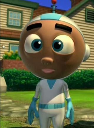
Needle Felt Siffrin Build Log: (oct 6 - nov 20, 2024)


Credits goes wholely to @insertdisc5 for creating ISAT and siffrin's design! I am just here to attempt to make cool fanart (and get more people to play isat.. my devious plans are going great so far :3) As always, this isn't a tutorial- it is just a log about how i go about approaching a sculpture and I hope this collection of resources can help others make their own sifs!!
PSA: this has some spoilers for endgame CGs/sprites on my references image board ( also might see it in the backgrounds of my process pics). And bc this is needle felting, you will see some sharp needles! beware!
my inspiration was the intro cutscene where Sif eats the star, so my main goal was to adhere to the style of ISAT as closely as possible while transfering it to 3D space. And I knew i also wanted to try making the cloak for stopmotion purposes, so my process was tailored towards having control over the fabric with wire inlaid within the cloak (more on that later).
I ended up not sticking eyebrows on top of siffrin's bangs lol but anyways, first order of business is Gather Reference! v important. pureref is free and an awesome program. I also do some sketches to visualize the pose and important details i wanted to include in the sculpt.
behold the isat wiki gallery page! tawnysoup wrote an awesome ISAT style guide that absolutely rings true in 3d space too!! adrienne made a sif hair guide here!! (sorry i couldnt find the original link, but it's on the wiki). It says ref komaeda hair so that's what i looked at, along with other adjacent hairstyles! I also like doing drawovers on in progress photos to previs shapes n stuff to get a better idea of the end result.
Also if you're like me and struggle with translating stuff into 3D space, take a look at how people make 3d models and figurines! sketchfab is also a great resource! I looked at the link botw model by Christoph Schoch here for hair ref. (I used Maya, but there's a blender version too ! you can pose characters too if your model has been rigged!)


Face:
Started off blocking out the main shapes of eyelids and iris, and then filling in the colour details in the iris and the star highlights before moving onto adding thin black outlines and eyelashes. I didn't take many in-progress photos cause i kept ripping stuff out to redo them many many times, sorry!! This eye took about 3 hrs bc i just wasn't happy with it!! Sometimes it do be the vibe to give up, go to bed and see how it looks in the morning (more often than naught, it looks fine and it was the "dont trust yourself after 9pm" speaking)
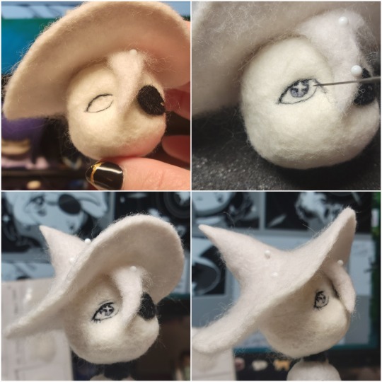
The Mouth:
Couldn't decide if i even wanted to add a mouth as per usual with all my humanoid sculptures.. but i did some drawover tests first to see what expression i liked and to try to visualize it from multiple angles. (I was also testing the placement of stars on the hat brim here)

And then I redid the mouth like 3 times cause the angle just wasn't right (this went on for about the course of a week yay!)
Hair: woe baldfrin be upon ye
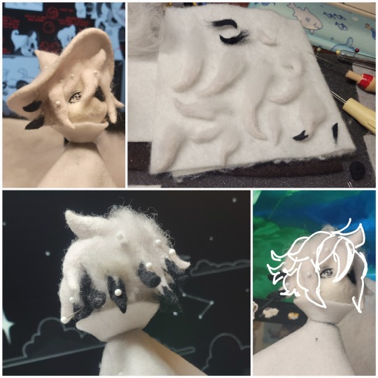
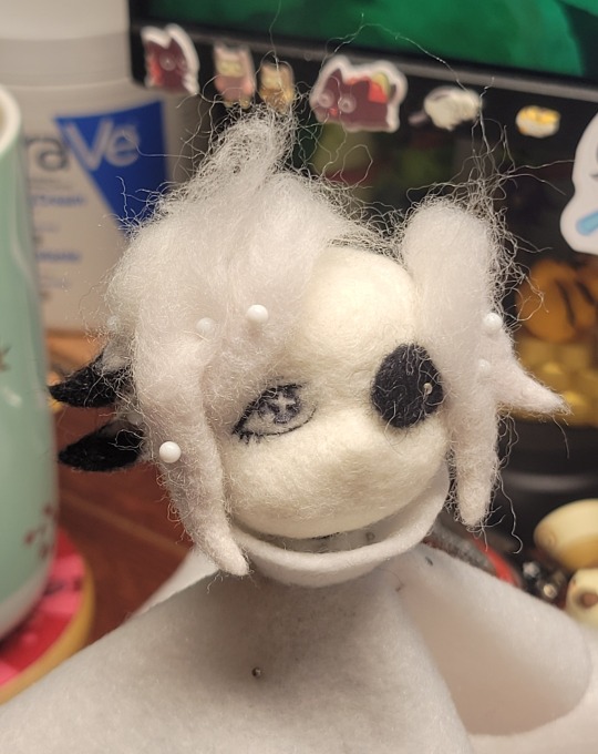
I made the hair strands individually first, and then since Sif has some of the hair at the back dyed black, i covered some of the tips with black wool (manually) (I think it would go much faster if i just took a marker to it, but hahaha i love pain and detailing!! )
And then the rest of it was positioning strands with sewing pins layer by layer, always looking at it from different multiple angles- sometimes tailoring the angle or swoop of individual hair flippies. At one point I thought the back looked too cluttered, but the hat covers a lot of it anyways!! yay for hiding mistakes! (imo this is a similar process to how cosplayers style wigs, but on a smaller scale and the same level of time consuming)
As always, look to your reference for guides, and I always do a whole bunch of drawovers over in progress photos to ascertain what was working and what wasn't.
Hat:
A trick to get a super pointy tip, make another tip seperately while keeping the connection point unfelted, and then combine the two to make super pointy hat!! (this also helps if you made the hat too short and need it to be taller. ask me how i know)

The embroidery on the hat brim was done in a hoop and then invisible stitched to the felted top portion. Technically you don't need a hoop but it helps keep the fabric tension, so you avoid puckers in your embroidery. You can also use iron-on stabilizer if your fabric is loose weave or particularly thin. this is the tutorial i used for the stars embroidery! particularly the fly stitch one, french knots, and the criss-cross stitches. highly recommend needlenthread for embroidery stitches and techniques! i learned all my embroidery from this single site alone.
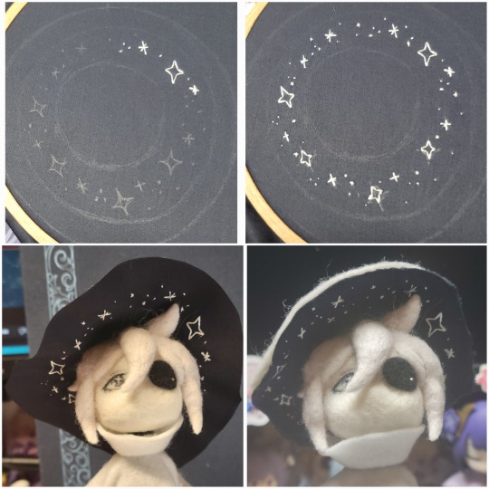
For fabric, I think I used a polycotton i had in my stash,, unsure of the actual fiber content bc i bought it a long time ago. I used DMC Satin floss which was nice and subtle shiny but frayed a lot so it was kind of a pain to stitch with... but keep a short thread length and perservere through it!! After the embroidery was done, I folded up the raw edges and invisible sewed it to the top portion of the hat.
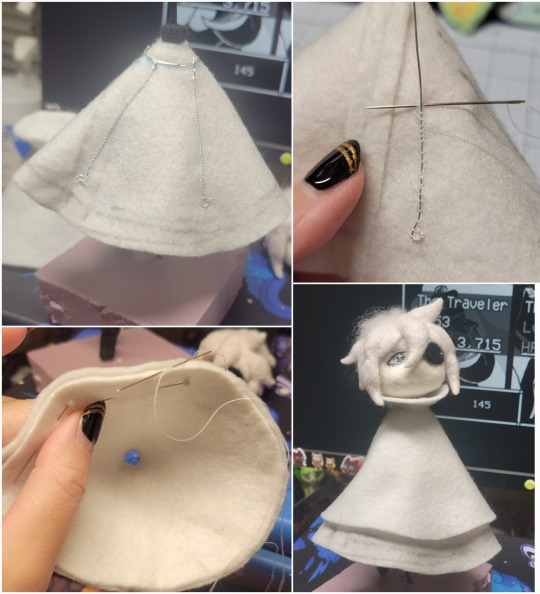
General shape:
Ok general structure of the body is this: wire armature body covered with black wool -> cloak lining & wire cage -> edge of lining is invisibly sewn to the main cloak at the hem -> head

Don't be afraid to mess around with the pattern, it's essentially a pizza with a slice taken out of it to form a steep cone shape!! Use draft paper before cutting into felt to save material! (i think i made like 3 cloaks before i was happy with the shape lol).
You can also hide the seam of the cloak and collars by gently messing up the fibers of the felt with your fingers or a felting needle btw! you can also sandpaper the seams according to Sarah Spaceman in this vid (highly recommend them for their in depth cosplay/crafting builds holy smokes), though since sif cloak is at such a smol scale, I just blended the seam with my felting needle.
For the lining wire cage section, I sewed in wire around the cloak, so the main rotation point is at the top neck area under the collar. These paddles are used to keep whatever pose I need the cloak to be in for stopmotion purposes. Then after the wire is done, I invisibly sewed the lining to the cloak at the hem (same technique as the hat brim to the lining there).
In hindsight, I should've used a thinner fabric for the lining, but i only had sheer white in my stash so had to go with double felt, thus resulting in a really bulky lining but oh well!
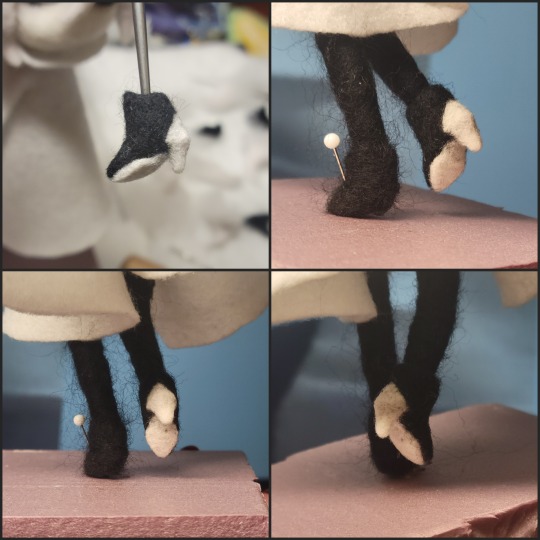
Heels:
started with the general boot shape, then tacking on the diamond shape heel stack and also diamond shape sole bc we're committed to the bit here. I skewer the boot onto the armature which also conveniently hides the connection point into the base to keep the whole thing upright and also I can rotate the boot to tweak the angle if needed.
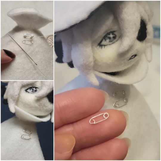
Pins:
I kinda just trial and error'd jewellery wire with pliers into the pin shapes. They're itty bitty!! had a whole bunch of fails before i got two nice ones. A hot tip is to use needle nose pliers and wrap the wire around the tip to get a smooth circle shape!
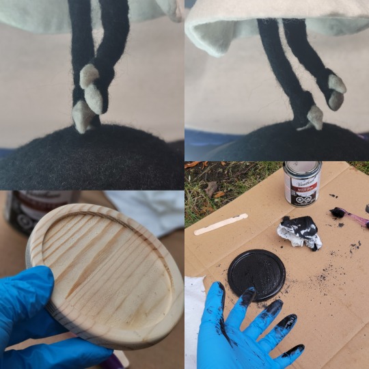
Base:
I smoothed out the edge of a circular wood base with a dremel, and then used wood stainer to get the black colour. It ended up kinda looking like I took a sharpie to it, but whatever.... now i have a whole ass can of black wood stainer........ I then made a rough mountain of black wool and stuck the feet armature in. And now he's standing!!
Normally at this point when I'm done felting everything, to get a smooth finish, I'd take a small pair of scissors and carefully snip away any flyaway fibers, but this time, I just left them fluffy cause i think that's what sif would do :3c
Photoshoot:
Normally I do shoots using daylight but it was winter so the sun was nonexistent. So I broke out the home lighting setup aka dollarstore posterboard for a nice smooth background, and then hit it with the overhead Fill, side Fill 2, and Rim light, and use white paper/posterboard for bounce light if one side feels too dark. But if things are overexposed, you can move the light sources away until the harshness dims down. I'm using a Olympus mirrorless camera (handed down to me by my sibling so i dont remember the model exactly), which can connect to my phone as a remote so I can avoid shaking the camera when i take photos. Pretty nifty for stopmotion purposes! (yes my camera stand is a stack of notebooks, a tissuebox and some eva foam under the lens, don't judge me)
Stopmotion animation:
I'm still figuring stopmo out on my part, but my process was straight ahead animation ... move the cloak a cm, take a pic.... move another cm, click.... and repeat until i get a version I was happy with. My ref was the cloak animation from Gris (beautiful game btw). The 2d star animation was also done straight ahead using procreate, exported in png with a transparent background, and finally stitched together with the stopmotion footage in photoshop.

My turnarounds are also stopmotion! also secret hack, the turntable is a fidget spinner sticky tacked to a cake platter.
And i think that's all! i mainly wanted to share how I go about thinking about taking a 2d concept and moving it to 3D. I also didn't go in depth into how to actually do the needle felting bc I don't think I''d be very helpful I'm a very good teacher by telling yall to just keep stabbing until it looks right (i'm self taught for this hobby),,, if anyone wants it though, i can share a bunch of tutorials and other felters' process that helped me learn more needle felting!
Hopefully this was helpful to someone! Feel free to send asks if ya got any questions or if anything needs clarification! Or show me your works! I love seeing other people's crafts :3
here have a cookie for making it this far 🥐
#in stars and time#siffrin#isat#isat siffrin#isat fanart#needle felt#soft sculpture#know that i am devouring all the nice words yall leave in the tags/comments of my posts :holding back tears:#I hesitate to call this a tutorial bc this is just how i fumble my way through crafting anything lmao#the only reason I know how long I worked on a project are timestamps on wip photos and however long the day's video essay or letsplay is#sorry time is immaterial when i get into crafting mode#reason why this log is so late is bc after i finish a project i'm perpetually hit with the ray of 'i dont ever want to look at this again'#hence why photos never get edited#AND THIS POST SAT IN MY DRAFTS FOR 2 MONTHS DUE TO BLOODBORNE BRAINROT SORRY#done is better than perfect!!!#sorry i dont control the braincell#sorry for using a million exclaimation points! i am not good at this.. conveying my anxiety in written form!!! my toxic trait
1K notes
·
View notes
Text
✦ LOST IN LIMBO DEVLOG #16 | 03.03.2025
Aaand February is gone! Obliterated! Sent to oblivion! Which means a new devlog of Lost in Limbo is here to keep you updated about our work on the game. This has been a very eventful month in our private lives, and there has been a lot of work behind the scenes—but I know that's not what you're here for!
Let's jump into it! 💜

This month, Raquel has managed to finish Amon's new expressions and I've already coded them! She has also been working on Envy's new coat and their expressions, and we can't thank her enough for her hard work. Remember she now works from 8 to 13 and 15 to 18, and is still working for LiL, too!

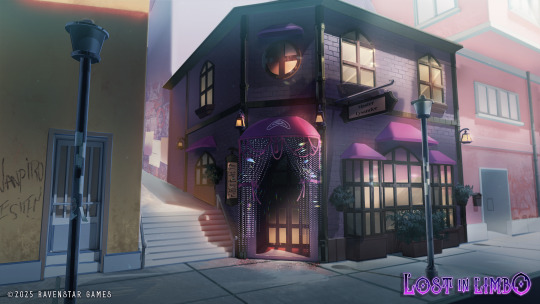
Our second background for the Extended Demo's prologue is done, thanks to Airyn and Astro! We may make a few tweaks to it but here it is—Master Lysander's shop from the outside! Quite an interesting place, huh? Suspiciously different from the other buildings around it, some would say...
Astro has also finished the 3D modeling of the third background, which our Kickstarter Backers will be able to see in our Kickstarter devlog! :^) Now that he's free from 3D modeling hell, he'll be free to do a few adjustments to our artbook! 💜

This time, I'm talking about writing and programming in the same section, as process has been going well but there's not much to 'show' without spoiling scenes of the Extended prologue—which is something we don't want to do yet!
Kayden is still working on the new mini-cgs for the new prologue, which I hope we can show really really soon!
Our voice actors have also been sending over more voiced names, and we've been working with them to get the best takes for y'all!
This month we have also had to focus on taxes, paperwork, and going back and forth with our manufacturer, plus a few irl things we'll tell you all about in the next section!

Our discord peeps already know, but our Raquel has found a full-time job and we are very happy for her. She finally can start supporting herself, and even if that means she can't work on LiL as much as before, she's doing great sacrifices to keep up as much as she can. Astro now has three jobs and I myself have spent half of February hosting classes in college about character design, which is great! However, I got home at 11 pm (blame it on the flood that stroke my city on October), so I've been a bit all over the place.
We want to apologize if this devlog seems a bit short, or if progress this month lets y'all a bit down. On a happier note, we've joined our first festivals this month, including The Storyteller Festival, and Steam's Visual Novel Fest! Also the Amare Games Festival 2025 over at itch—we hope we can do at least a small update for the deadline, but I'm not so sure about that T_T

Phew! This month has been hectic, and sadly not for the right reasons. As irl things keep happening, you get a bit scared of not being up to the task of developing your game at a pace that satisfies not only your supporters, but yourself. As I write this I'm itching to go back to writing the prologue, haha.
So, yeah! I hope we can keep balancing our lives and LiL as best as we can. I also hope we get a bit of good news from our counselor regarding taxes, and I hope this month is full of cool opportunities for us! 💜
As always, thank you so so much for your support! See you in the next one! 💜
163 notes
·
View notes
Note
Do you have any advice or tips with drawing? Any will help me I hope you have a good day
I think it would help to analyze references in the beginning, to build up a visual library

I was taught at university to first see the general masses, the silhouette. This method is called “general to particular”. And due to this stage, it is much easier for you to perceive the image, the composition as a whole, rather than running straight away to draw eyes, hands or other details
Starting with a silhouette also helps to create character designs in the future ✍️

Then you can already outline the construction, the middle forms. Again without small details, but you can leave a hint of them with the help of auxiliary lines.
I don't really work with tone so much at this stage, I just showed you how you can even use it to outline light shading (also common masses)

It also helps to do chopped, rough construction with a couple lines. I would generally advise practicing confidence in hand movements and understanding of general shapes. How clean your sketches are will help you navigate more easily in the future. And general shapes affect mostly how you can stylize body parts, how you understand their construction based on simple geometric shapes. It's a mistake to think that working with a reference is a one-to-one repetition of the original image. Artists use some kind of distortion of proportions, changing details or a little pose based on experience to make a character or work more dynamic

And then you can go into detail 💅
--------
I mean, already as in my experience I say that repeating or re-learning the base, which is lines, shapes, improves your drawing skill.
Because the faster you get through sketches, the faster you can move on to other stages of drawing, and still make fewer fundamental mistakes
And if you want to study anatomy, plastic anatomy would be the way to go for artists. I worked up my anatomy by looking at books and tutorials from the authors belowotome ↓


The authors of this book post tutorials using 3D models on Pinterest and ArtStation
I realized for myself that I am not a classical artist, that learning from the works and books of old academic masters is boring and not interesting to me. My approach is to analyze not only nature, but also 3d models. Analysis of 3d models helps with understanding of shapes in space, light shading and “what are occlusions” for game rendering ↓

Like this :D. But this is already relatively my old work and now I can do better, but I'm lazy
I hope my tips were helpful 🗣️
134 notes
·
View notes
Note
Currently in game dev as a student and I’ve been looking over your art and concepts for a little bit now—I’m FLOORED. I haven’t checked on your art in a while and had forgotten just how much it inspires me.
Your style holds so much identity, and your skill bleeds through every brushstroke! The way you do silhouettes, the insanely unique and beautiful choice of colors, the ferocity in some of the expressions, the quality of your brushwork, again the USE OF SILHOUETTE AND FORM OH MY GOODNESS!!!
You have SUCH a striking visual style and the way you incorporate similar themes to tie character designs together in your world is incredible! I was able to pick out what I believed to be symbolism and understand it a few seconds after asking the question (it may have been explained in the text and I missed it, but the fact that I was able to draw a conclusion that quickly says a lot about your skills as a designer and artist!).
Please forgive me if this has been asked before by the way, but what program do you use? I have a number of them and am trying to work out how you managed to get the line quality that you do on the brushstrokes (they’re like. Creamy looking??? Does that make sense? They blend together very nicely but don’t blend so much that it muddies the contrasting colors you put on top.)
Anyways as I was reading the game idea you have, I was actively trying to envision how it would look and was immediately feeling a 3D-2D mixed style, especially since your artwork has a very clear visual identity that would benefit from being the focus rather than something like plain or simplistic 3D models.
And then I immediately stumbled onto the low poly model you made and fell in love. I had already thought a Disco-Elysium inspired + low poly (less development time, plus requires less budget for an indie project) would look amazing especially considering how your brushwork means that high-poly models might not benefit nearly as much from it. And I think it might be the right call to continue with that!
What perspective (2D/platformer, 2D platformer with depth [Ex. “Paper Mario”] top down, isometric, 3rd person, 1st person, etc.) do you envision when you think of your game idea?
Personally I feel like it’d work as a 3rd person perspective 3D game, but using extremely low poly buildings and set pieces that let the textures do the work. But keeping in mind that if every character is 3D and rigged, it can and will still take monumentally more time to make.
I could also see it going the direction of having flat 2D characters in a 3D environment (Like “Smile For Me”) which would take less development time and save more energy to focus on good gameplay.
I’d love to hear more about your ideas, and think that you should definitely give more thought to making that game a reality!
Just as a word of advice though, start small. ;^^ Don’t begin with your dream project, make some goofy little games first to get your feet in the water, then dive in once you have that experience. And don’t get too wrapped up in it either, take breaks and divert from the project every so often to regather your creative energy. Like doing game jams for example!
o7
first of all thank you for such a LONG text oh my god T_T I cannot express in words how much this means to me and even if I knew English well, I still wouldn't be able to tell you... I use drawpile a lot for sketches and light stuff like doodles! And Photoshop for more complicated works and render. If you need brushes I have them in this post on my side acc. As for ynstbh, well... Here goes the rambling haha. I was thinking about it being either 2d platfomer /LISA was my main inspiration at the start/ or isometric 3D thing. Isometric still wins in my head because it gives some space for movement in different planes, if that makes sense, my favorite example of it being player is walking through the City and at some point you see a tower on a foreground plane just getting up and running off the screen to ambush you later haha (yes, the City is like that. nothing unusual here). When this game idea first appeared in my head, I also wanted it to have some kind of frame, medieval-inspired, around the gameplay, that would change drawings depending on the location. But now I think that's gonna be too much visual noise. And I would love to make cutscenes because I like my 3d models and I like to animate stuff, although it would take an abysmal about of time to make backgrounds.. Also ynstbh would probably have a lot of dialogues, since I really love to show characters through their interactions with each other. Notably the Devil, who loves to break the 4th wall and look right at the player in his portraits.
Either way yeah, I know about starting small. Right now I only have experience in drawing, 3d, just a little bit of code (I think I forgot everything actually lol) and I'm just really good at googling problems. I hope somewhere in the future I will have enough energy to start. My lore and characters became really important and dear to me so I really hope to make sth with them. :) If game doesn't work out, I'm thinking to give an animated short a chance, I need to put this world somewhere or I'll probably go insane. Once again thank you and good luck with your studies! thanks for letting me ramble about ynstbh haha <3
86 notes
·
View notes
Note
Looking at your recent commissions, those backgrounds are soo pretty!! Do you have any tips for backgrounds? I always struggle with them :>
aAA many many thanks!!
backgrounds can absolutely be a struggle but they don't have to be! they just require a little more creative planning~!
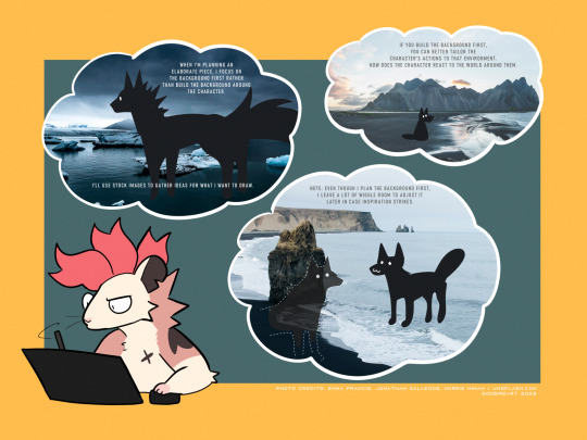
whether it be a commission or a personal drawing, if I'm building an elaborate art piece i focus on establishing the background First.
the background is the stage for your character! planning the background first will make it easier to tailor the character's actions and how they interact with the environment around them.
planning the background first can be the difference between your character standing awkwardly front and center with the setting going on behind them, or actually participating in their environment.

if i'm super stumped for background ideas, i browse stock image sites to get inspiration. sometimes it helps to doodle on an image to generate some ideas - kinda like you're playing with JPEGs like dolls.
that said - while i'm pinpointing WHAT i want to draw, i keep the ideas loose. i don't want to focus on the itty-bitty details until i've got the overall aesthetic and layout in mind, as i might get inspired to add something in later!
THUMBNAILING
if you're planning a big piece it can be helpful to break it down into something bite-sized before you go all in and start lining or painting. these are "thumbnails" - fast little sketches that establish the scene in a way that doesn't consume a lot of time or effort. it's also great as a little perspective exercise as a treat.
here i decided i want to draw a character walking home in a back alley street. with these photo references in mind, i can plan a layout and how the character will act in the scene. is this a candid shot? are they posing cutely? are they looking down at us in a tense way? there are many ideas to be had!
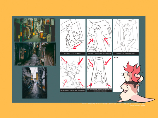
after you've chosen the layout / vibe for your idea, you can scale up your thumbnail to your preferred canvas size and start fleshing out the details. be sure to keep referring to your reference images to get additional ideas, such as storefronts, items, props etc!
3D MODELS
If you're trying to create a unique environment that photo references simply cannot help you visualize, 3D models exist! This gives you that ability to rotate / scale things for better visualization. Clip Studio has a vast catalogue of 3D models to download For Free that you can fiddle around with. i know there are many 3D builder sites out there as well, though i've never made use of them so i'm afraid i cannot recommend any off the top of my head. hell, you can even use the Sims game to design a setting and go from there!
also if anyone is going to come into my house and say 3D models are cheating: they are not. using a 3D model to better grasp an angle or get a better idea for perspective is not cheating. using 3D models to help plan the environment in your art is not cheating. they are no different than brushes; these are tools made to HELP YOU. use them!
PERSPECTIVE
perspective and angles can make a HUGE difference in the art piece. there's nothing wrong with static long shots! if that's what you want to draw, do it!! there's no right and wrong here!
but if you're finding your work to be a little robotic and stiff, slap an angle in there. consider an overhead view. these same techniques are applied to photography and film! nothing wrong with wide shots, but every once in a while it can help to throw in a dutch angle.
if there is one note i'd like to leave off on, it's that your backgrounds do not have to be 100% accurate-to-life to be Good. unless realism is something you're really striving for in your style, don't feel compelled to nitpick every brick and leaf in your art. us artists can tend to over-prune our work until our art looks a little bare and soulless. flaws can give your work character, and that's often a lot more appealing than how accurate the scale ratio between background building A and building B are [again, unless you WANT to go for that realistic look then you can fuss over those details all you like].
i hope this helped a little! MY APOLOGIES FOR MAKING IT SO LONG AH
632 notes
·
View notes
Note
I'd seen a comment that the finalized design for Venom seems to have an unbuttoned shirt when compared to the buttoned vest of the concept art from the S4 trailer (which had leaked unfortunately), so maybe that's where the confusion might be coming from. Does make me curious how often they change a detail like that so close to model work being done, given so much of Strive's concept art (at least the ones I've seen) does tend to match what we get in the final game.
I must've blocked the correct amount of people because the last character leak I knew about was the Slayer one that was like a whopping 12 hours or something before the actual reveal anyway lol
We were actually talking about concept art through alpha then beta designs in the wiki server yesterday!! It's really interesting how far some concepts made it in the timeline before getting changed. @shmuelbrain dug these up.
Elphelt from the 3rd location test for Xrd Sign (late 2013?) still had a pink clover on her ear that she's got in her concept art (it got changed to green in the final release):

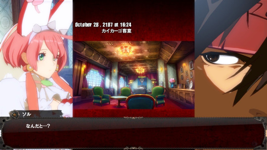

Sol's outfit changed pretty late in Sign's development too. The story preview they showed there had an interesting saturated color filter. I like it, but the more natural colors in the final version definitely look/read better. From the 3rd loc test.


We were musing over what could have made them change their minds about Sol's outfit for the story that late into development and decided that it was possible his arm anatomy kept bugging during animation so they gave him sleeves to hide it lol
Sol's story mode outfit (with the longsleeve jacket) seems to be a light reworking of the outfit he had in the Xrd prototype from 2011 (!!). He's on the right in this screenshot, but the imposter on the left's outfit is really similar too

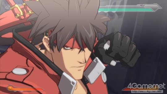
Throwback to the fingernail gloves from his Holy Order uniform...
The Xrd prototype design fascinates me because it's essentially a 3D version of Sol's Vastedge XT design. He's even got the Junkyard Dog Mk.II in the prototype build. The design there is 1:1 to its design in VXT.
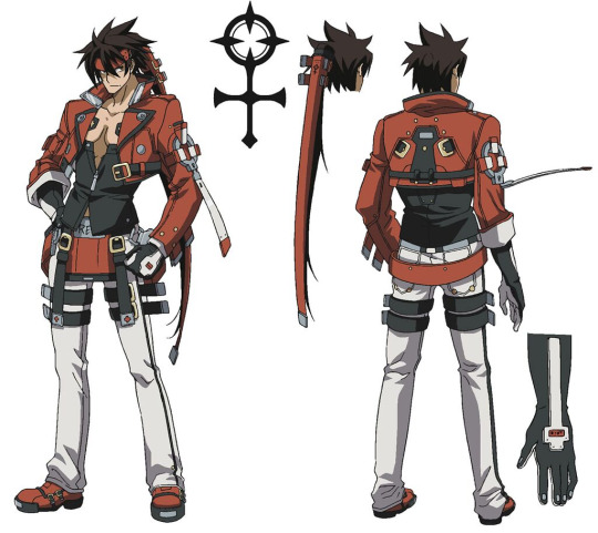
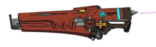
Note: The neon colors here are placeholders, it doesn't actually have that bright cyan in Vastedge.
The Xrd prototype/Vastedge design is cool because you can still see elements of it in Sol's Strive outfit. They tightened up his silhouette and made things like the gloves/hands read easier, but it's almost possible to argue that this is likely the same jacket. They've been tweaking this for at least 14 years!!

It's tricky to figure out this stuff for most of the cast, but Sol's design changes are really well documented. I think he's usually the first character they make for games, so he's usually their graphics and gameplay test dummy
#asks#long post#sol badguy#The tag can have this one. As a treat#I bet I could make a long blog post documenting Sol's design changes across the series....#From the ML prototype through Strive#Maybe I will. Blow the dust off my Substack and get a new newsletter out for the first time in like 6 months haha
37 notes
·
View notes
Text
. ݁₊ ⊹ . ݁ Sir Meteor ݁ . ⊹ ₊ ݁. A Kirby OC Masterpost
Born from the last wishes of a dying planet, Sir Meteor is a genuine celestial being dinosaur!! He’s been around for millions of years and might be in a history book or two, but any past escapades don’t really matter! Currently he scours the stars looking for any more dinosaurs, and the rest of his family.

Find him on:
Toyhouse, Art Fight, and by using #Kirby OC: Sir Meteor. Toyhouse contains the most comprehensive library of artwork, followed by his tag, and his Art Fight has lovely art done by other people <3
Additional Resources:
Allosaurus Skull 3d Model by ramon.gonzalez.cabrera, viewable for free online, no download needed.
╔═*.·:·.✧ ✦ ✧.·:·.*═╗
Artwork:
>> It's Tough to be a God- April Fools Animatic >> Dizzy! Animatied Character Turnaround >> The Dinosaur Hunts >> Brothers Together >> A Plan for You--ft. Crux
Follow the story of Sir Meteor : STORY COMICS >> On Wishes >> Birds and Dinosaurs >> Do you want to make a wish? ALTERNATIVE UNIVERSES: >> Tournament AU >> Frostbitten Fossil AU >> Warrior Cats: Meteor Fall AU MIRROR WORLD >> Mirror World: Mosaic Meteor >> Mosaic Meteor and the Shadow Queen
Misc. Posts:
>> Sir Meteor Design Process >> Star Allies PFP >> Favorite Food >> Sir Meteor's Little Brother >> Dinosaurs and Birds: A Lesson in World Building and Biology >> New Encounter
╚═*.·:·.✧ ✦ ✧.·:·.*═╝
Other:
-⭕Fanart of him is welcome and encouraged! I would love to be tagged in it! -⭕ I love getting asks about him! Be warned i can be slow to respond. -❌ Meteor is uncomfortable with romance, I discourage shipping him unless platonic or with my approval! -❓ His skull mask belonged to his mother so he is uncomfortable with other -people handling or stealing it. It is not forbidden to show, but important to consider. - ‼️Meteor will dislike being told he is not a dinosaur. - ‼️Being inspired by my work is okay! If you heavily reference or base an OC/any work off of Sir Meteor please credit me.
#my art#snappy's art tag#kirby oc: sir meteor#oc masterpost#Sir Meteor Masterpost#kirby oc#original character
106 notes
·
View notes
Note
I'm a big fan of your drawings, especially your drawing process!
Question, what brushes do you use to make your backgrounds more dynamic? And any recommendations on how to implement backgrounds?
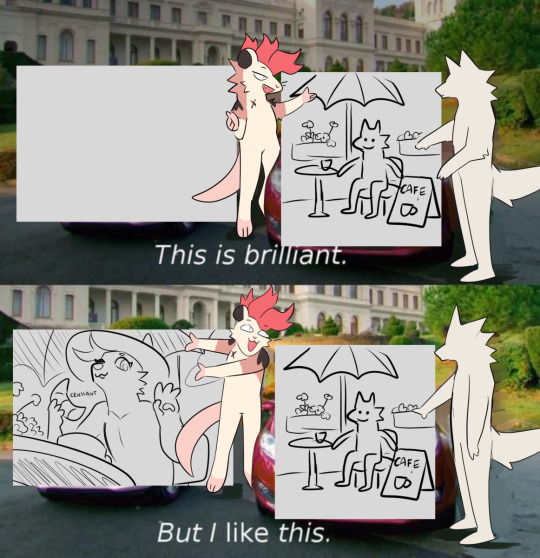
ahhh thank you! on implementing backgrounds, the way i do it is that i usually thumbnail before starting on what would be the final drawing. here's some thumbnail vs final drawing stuff lol


they dont have to be the most polished but they should give you an idea on what you want the final drawing to look like! though, sometimes, i don't thumbnail (WHICH U SHOULD THUMBNAIL, IT MAKES THE PROCESS SM EASIER BC U ALREADY HAVE AN IDEA OF WHAT YOU WANT THE FINAL PRODUCT TO LOOK LIKE) --
BUT!! when i don't thumbnail, i do use references that have a similar perspective on what i want to draw and go from there. i also add some extra stuff to it to give some personality and atmosphere to the background i want to draw (i wanted to draw an overgrown and abandoned building so i added tons of plants everywhere! which is my favorite thing to do lol)


i'm extremelyyy inspired by how steven universe's backgrounds look, so i implement some things I've observed from them! namely, how the lineart of things offset with the object itself, i like to do it a lot with plants bc i feel like it adds pizazz


also, something i try to do with every drawing with a background is to make use of a foreground element that would lead the eye of the viewer to the main focus of the drawing (which is usually the character) having some moving parts to your bg whether that be leaves, petals, curtains or whatever add some dynamism to bgs i feel


and uhhh another piece of advice that i heard that i thought was pretty useful to me is to treat designing backgrounds like you're designing a character! is this place neat or messy? brand new or ancient? what kind of person/people hang around here and what kind of stuff do they leave here?
also, if fullass bgs are difficult for you to draw, sometimes you don't even have to draw the whole thing! you can just give the suggestion of a background via some props and scene elements! put that background in a box for all i care!


(also if you're struggling to draw props, 3d models are your best friend)
ok onto the brushes LOL it depends on the background really bc when i draw rooms or buildings, i just use my regular brushes for that since i just line and ink them like i do with characters.
when it comes to backgrounds set in nature, however, i tend to go a lot more free/abstract with it so here are the brushes i usually use! they're also pretty helpful for painting, i just try to achieve a lot of texture with em
Custom Brush (i use this one for the leaves i gave in my examples!)
Stamp Table Pen Set スタンプ台の線画
Flat_Dirty_Archv
Rake Brush
Oil Brush
Thickpaint Superflat
MB_Wood
Smoke Brush (used this on that abandoned building drawing and could lady, it's really fun for like fog and mist too)
anddd that's it, i think! hopefully these are helpful!!!
#if this feels rambly its bc it is DFDGHD im kind of loopy rn so sorry if some of the things here dont make sense#sunnysideanswers#zygmainthedark#sunnysidetutorials#undescribed
97 notes
·
View notes
Text
my magia exedra thoughts so far!
stuff I liked:
- original artwork and animations are really nice! always fun to see some new original stuff.
- the girls are 3D! love love love the models, I feel like they did a good job translating all the characters' visual styles.
- combat is really fun. feels smooth and enjoyable, I've been enjoying it a lot. I have it on reasonable authority however that it's kind of pulling pages out of honkai star rails' book- which is fine, I have no interest in hsr, but I'm curious what hsr players think of magia exedra, if you've played both please share!!!
- Namae-chan and AQ are really fun!!! I can feel the roots of a very interesting story, but I fear that her unknown origins will drag on.... More on that in the next section. The idea that AQ is something "special" and "non-kyubey" is really compelling.
- the setting is lovely- I really like the lighthouse and its layout.
- I actually really like the little scenes where Namae-chan walks through the memories and the silhouettes of the involved girls appear and vanish around her. it's a nice compromise to get the points of the memories across while keeping the rehashed story as optional.
okay. now my gripes, below the cut.
stuff I didn't like (note: a lot of this will probably change! hopefully!!! I hope that as I progress through things and they take time to update the game these points will become moot!!!! In a beautiful, perfect world I will look back on this post and laugh at my own naivete):
- this game seems to be struggling with whether it's for established fans of the series or trying to pull in new people, which is... A hell of a piece of indecision for a game relying so heavily on its legacy characters. it acts as though it's trying to appeal to newer fans in rehashing the story of madoka and others as its main quest, but the character stories and vignettes that are supposed to give us more character insight are a confusing mix of backstory rehashing and kind of unsatisfying little side stories so far. I've been enjoying some of them, but everything feels more disconnected than it did in magireco, where many of these characters were introduced (therefore kind of allowing the writers to build their stories from scratch).
- speaking of, the UI is such a downgrade! (I guess technically Ui was pretty central to the magireco plot....... lol) I miss the opulent buttons and skeuomorphic, gemstone-y designs of the buttons and menus in magireco. everything in magiex is so flat and generic :(
- the... main gameplay. I hesitate to even call it that. How sad that a concept like labyrinths, which seems absolutely tailormade for a more persona-esque dungeon exploration mechanic, are reduced to a mechanic so linear you can literally automate it. I don't even dislike the atmosphere of the labyrinths! the fixed camera angle is interesting as an artistic choice! but WOW it is not used that way. really genuinely such a bummer, kind of my biggest beef with the game so far to be honest. there are definitely some elements that I like though- the liminality of some of the levels, the map overlays are fun, and even the ambient familiars are nice (the distant line of Anthonys dancing on top of the buildings :3 )
- I miss doppels and connects :(
-i am both excited for and nervous about Namae-chan's story... On the one hand it could turn out to be really interesting! It could be a deeply compelling story! On the other, more-likely-due-to-the-nature-of-mobile-games hand, it could drag on forever, with Namae-chan basically just eternally going "wow. emotions are crazy huh." I am hoping and praying we get the compelling plot we deserve and it doesn't just string along with the same, status-quo ass premise ad nauseum. I choose to believe in Namae-chan 👍
- a surprising amount of asset reuse. holy shit the anime screenshots being used for the main story is so egregious. tons of stuff that clearly just copy pasted from magireco. and not even the good stuff!!!! please for the love of God give Yuma better art at this point!!!!
- honestly it just needs a lot of optimization. drains my phone battery like crazy. menus and cutscenes get laggy and I know I'm not alone in thinking that.
I'm sure I'll think of more things that I both like and dislike- I'll probably make more posts as I see things but these are the big immediate standouts. would love to hear others' opinions, tell me what you liked, what you disliked, if you agree or disagree with my opinions! I'm definitely going to be playing regularly, so I'm excited to see this game change and evolve over time. :)
#magia exedra#puella magi magia exedra#pmme#magiex#magireco#magia record#puella magi madoka magica#puella magi magia record#pmmm#madoka magica#mobile games#gacha games
19 notes
·
View notes
Text
Diving through the leaks from today (I have not slept yet) in regards to the cut gen 5, 4, and even 3 content has been such an adventure. I feel like I've discovered several more AUs in which 1 small decision could have had a ripple effect on the franchise for years to come.
Especially the gen 4 beta lore that was apparently dug up. Yall thought shit was religious now, they had a straight up PANTHEON planned. Not to mention it makes that church suddenly make sense- this wasn't just worshipping a Pokemon, this was literally a god with god like mythos. Like Arceus hatched from an egg in the middle of chaos at the beginning of time, his own egg shards became GIANTS that tried to kill him, and Arceus rapidly grew and beat them all. He made Dialga and Palkia to be his alter egos out of his own blood and to be God's of time and LIGHT, apparently, and Dialga and Palkia LOVED EACH OTHER- not hated and tried to kill each other, LOVED EACH OTHER. HAD CHILDREN. And assuming I read correctly, those two had the lake trio, who made the tree of life, destroyed it, and Rayquaza, Groudon, and Kyogre were born. In fact, Rayquaza may have been the shadow of ANOTHER POKEMON that became the pillar of the heavens?
It's pretty hardcore and confusing stuff. The giants stuff absolutely puts the Fighting Plate lore into perspective with its text "the power of giants fills this plate with power" or something.
I think it's pretty obvious why it was all cut or severely dumbed down, but it is actually very interesting to see that at some point, they were extremely dedicated to the world building of the franchise before they kinda said "fuck it it's whatever now."
On a mechanical end, it's also incredibly interesting. Gen 5 was almost the gen to introduce 3d models for players, apparently. I think it's pretty obvious why they went with an enhanced 2.5d approach, given the ds wasn't ready for much beyond ps1 graphics, but it's still incredible to think that was even a concept at the time.
And the lost beta Pokemon, oh my God. Gen 3 had a bunch that were eventually redesigned. Lickylicky in gen 4 almost made sense because it's body looked READY TO ROLL OUT! Archeops in gen 5 was almost cool af with some slightly different proportions. There's just a bunch that go completely unused.
And characters- yall, Team Galactic almost served cunt. Saturn almost was cool, and Mars and Jupiter would have DONE something to people. There's also in depth profiles on certain characters- Skyla was apparently modeled after Jennifer Lopez and was coded to be Hispanic. Each gen 5 gym leader had races assigned to each, and a real life inspiration behind each.
Even mechanics are talked about- a lot of scrapped ideas, such as one from Morimoto that was basically Pinkan Pokemon from Orange Islands but shifting your Pokemon's colors depending on the berries they ate. Masuda apparently had some reservations about following Pokemon- hence why it was so limited in DP and other games he directs.
It's information like this that really amazes me. So much of what could have been, so much info fans have theorized just kinda confirmed in some cases. I wish they'd talk about this stuff, because this is all genuinely interesting to see. Genuinely, I want to know the thought processes going on for some of these ideas and designs.
37 notes
·
View notes
Text
Something I do find interesting about the Jimmy/Timmy Power Hour is the fact that Jimmy Neutron characters get redesigned much more to work in the FOP-verse than vice verse.


Part of it is down to the fact that the FOP style is very distinct even while seeming fairly simple, so you can build characters into it fairly easily, and depth based details like eye sockets get kind of washed away. The most out of place thing is the level of detail on the shoes. But it's also a 2D show so like. I get it


Vs taking Timmy and making him as close as possible to his 2d incarnation in 3d, complete with huge that you can see through and eyes that bulge wildly out of his head due to the circle eye style FOP has. Plus his hair often obstructs his face due to maintaining its shape but obeying some level of physics
Chester and AJ get the same thing when they come over in Jerkinators where like. If you were building these designs from the ground up they would have much different head shapes, their eyes would fit on their models, and Chester's teeth would be hugely different. But for whatever reason they elected to directly model the FOP style instead of adapting the characters into JN designs, which wasn't as true in reverse. It makes me wonder what these characters would actually look like if they had been fully designed for 3d.
Also so it's clear I'm not picking and choosing, take a look at Carl Wheezer's 3d model vs how his official 2d renders are vs how he looks in these specials


The detail loss is one thing, but he also gets a much more simplified pallete and a unique mouth/nose shape thats more congruent with how those work in FOP
#jimmy timmy power hour#jimmy neutron#fairly oddparents#my best guess is that its a lot cheaper to wholly redesign a 3d character to 2d#and also DNA Productions was famously running low on funds and staff at a certain point#also i get the feeling Butch probably wanted the design to be closer to his idea than to be fully reworked#m post
11 notes
·
View notes
Text
The Arcane art style (from the League of Legends animated series) is gorgeous — it's rich, painterly, expressive, and very cinematic.
Here are tips to help you capture that vibe:
1. Focus on Shape and Silhouette First
Arcane characters have strong, clear silhouettes. Their designs are recognizable even in shadow.
When sketching, exaggerate important shapes — Vi’s strong arms, Jinx’s wiry frame, Viktor’s sharp lines, etc.
2. Painterly Textures Over Clean Lines
The show doesn’t use hard "anime-like" outlines — instead, it paints edges with color and value.
After your sketch, paint over your lines and blend them into the forms.
3. Dramatic, Cinematic Lighting
Arcane lives on mood lighting: backlights, rim lights, dappled light through windows.
Think "how would this character be lit in a movie scene?"
Use high contrast lighting to create drama.
4. Rough but Thoughtful Brushstrokes
Arcane art looks a little rough close-up, but the strokes are very intentional.
Use bigger, visible brushes for hair, clothing, and backgrounds, but don't over-blend. Let the brushwork show.
5. Color Palette: Muted, But Punchy Accents
Most backgrounds and outfits are muted earthy tones (grays, browns, dark blues).
Then they pop the characters with vibrant accents — like Jinx’s neon blue hair, Vi’s pink gauntlets.
6. Subtle Facial Expressions
Arcane expressions are extremely realistic and detailed.
Focus on micro-expressions: slight eyebrow lifts, small mouth movements, tension in the jaw or cheeks.
7. Backgrounds: Soft and Detailed at Once
The backgrounds are softly painted, with layered depth.
Focus detail around the midground where characters interact; background details fade out.
8. Mix 2D and 3D Mindsets
Even though it's 2D painted, Arcane was built with 3D models.
Try to build solid volumes with your painting — imagine your characters as 3D sculptures.
9. Master Edge Control
Not all edges are sharp!
Use soft edges for less important areas (like the lower body or background) and sharp edges for the face, hands, or anything you want to draw the eye toward.
10. Study Screenshots
Pick a few screenshots from Arcane, and break them down:
What's the lighting setup?
Where are edges sharp vs soft?
What color palette is used?
How loose or tight are the brushstrokes?
---
Brushes for Arcane Style
You want a painterly set that has texture, variation, and isn't too "perfect."
Here’s what you should look for (or set up):
Sketching Brushes
Pencil-like Brush: Light texture, not too opaque.
Charcoal Brush: For rougher sketches and underpaintings.
Painting Brushes
Chunky Oil Brush: Big, slightly rough, opaque strokes. (Great for hair and clothes.)
Soft Round Brush: For smooth blending where needed (like cheeks or soft fabrics).
Grainy/Texture Brush: To add subtle grit and realism to skin or metal.
Detail Brushes
Fine Brush: Thin strokes for things like wrinkles, scars, or stitching.
Dry Brush: For faded effects, dust, scuffs.
> Programs like Procreate, Photoshop, or Clip Studio Paint usually have these, or you can download free brush packs that say "painterly" or "oil paint" style.
---
Mini Practice Cheat Sheet
Here’s a simple practice plan to start learning Arcane style:
---
Day 1: Shapes and Silhouette
Pick 2 characters (like Vi and Jinx).
Just draw their shadows — focus on big, bold shapes without details.
Goal: Recognize them just by silhouette.
---
Day 2: Lighting Study
Grab a screenshot.
Do a quick grayscale painting (no color!) focusing only on light and shadow.
Goal: Understand how cinematic lighting builds drama.
---
Day 3: Painterly Brushstrokes
Paint an object (a glove, a boot, a bottle) using big brushstrokes.
No tiny blending!
Goal: Let brushstrokes show. Focus on "where do I need detail?"
---
Day 4: Color Palette Study
Pick a scene.
Eyedrop the main colors.
Make a tiny color palette swatch of it.
Then repaint a small area using only those colors.
Goal: Muted base + bold accent colors.
---
Day 5: Face Study (Micro-Expressions!)
Zoom in on a character’s face in a dramatic scene.
Draw just the expression — forehead tension, tiny smile, furrowed brow.
Goal: Subtlety and emotion.
---
Bonus Tip:
Overlay a grainy noise texture (low opacity) over your final painting.
Arcane scenes often have a slight gritty texture that ties it all together and keeps it from looking too "clean."
---
#arcane league of legends#arcane x reader#arcane art#art tips#art style#painting#i don't know if anyone will read this
10 notes
·
View notes
Text
3D ARTISTS WANTED
I'm looking for a 3D artist to create the sets & props for an animation I'm making. It's going to be a 2+ hour long film, all made & animated in Blender 4.0.
This is an UNPAID project.
The film is based on Maggie Stiefvator's series ‘The Raven Cycle’. Half of the voice acting cast are fans of the series, the other half joined up due to being interested in the project when they found out about the plot line.
I'm currently finishing the puppets, and am behind schedule. I need you to help create sets, ranging from house interiors & exteriors, streets, forests, countryside, an academy, to many others. You will also need to create posters, menus and signs to be used as decoration on the sets. You will also be creating props, cars (interior & exterior) and food.
There is a lot more which I'll tell you about if you are interested.
I have the sets designed as floor plans and 3D concept images made on HomeByMe, and I have links and photos to the correct items of furniture and accessories and home goods for in each of them.
All of the sets must be ready for animation. Some of the sets will need to be rigged with minor movements (doors opening and closing, breezes catching flyers, leaves rustling and falling / flying in the wind, twigs moving in the wind) and some will need to be rigged for major movements (earthquake, etc). There are also some details I'll fill you in on if you are interested in this project.
Ideally, I'd prefer to be painting the sets, but if we end up not having time for that, I have resources for you to follow in terms of colour palettes & textures.
To be considered for this project, you MUST:
Have experience with Blender 4.0
Have experience with Greasepencil
Have experience using the two together
Be patient, since this is my first collaborative project (& also the biggest one I've done to date)
Be chill with the fact I'm trans
Be chill with the fact some of the animation features lgbt+ rep & spiritual stuff (witches, ghosts, magic, demons, curses, etc)
Be available to reach via Discord
Be chill with zoom calls & using VC a lot to go over what I'm on about, because I like talking about this out loud (zoom because the lights on Discord’s video call bugs my eyes)
Be able to match / replicate the art style for this film (I'll show you the characters, and I'll show you the reference images for the sets, and the art inspiration for textures, colour and lighting, and I can infodump about all of it)
Be able to copy / reinterpret the mock-up designs I've made for posters (they're made with Canva, so you're welcome to tweak them so that they actually fit the aesthetic of the film while actually fitting in the buildings without looking out of place)
Be able to model objects to the same standard as the puppets
Be able to work to a deadline
Be chill with the fact the voice cast range from 14 to their 40s/50s
I need these sets finished by August 5th, 2025. Final artists will be picked between the 20th and 25th of June, 2025.
If you are interested in taking part in this project, please reach out to me via Discord (RabbitPr1nce) with some information about yourself & your portfolio. Please also include why you're interested in this project, if you've read the books or not, and whether or not you think pigeons are aware that they are related to Cassowaries & dinosaurs (to see if you actually bothered to read this far).
Closing date to come on board is June 18th, 2025!
#trc#the raven cycle#blue lily lily blue#richard campbell gansey iii#richard gansey#animation#corvus cycle: animated#the dream thieves#the raven boys#fanimation#the raven king#the raven cycle film#the raven cycle: animated#3d set#3d artwork#3d film#3d model#3d art#3d artist#blender 3d#3d animation#character moodboard#character development#background art#background#landscape art#landscape architecture#architecture#3d artwrok#3d architectural visualization
14 notes
·
View notes
Text

Uh oh! Another yap post!
Hello everyone! Since I don't have any cool art or videos to post at the moment, I bring forth a hot take post about The Freedom Fighters. I've been growing an appreciation for all of them as of recently, except for one... Purple Elephant in the room... Let me explain why I don't like Rotor Walrus very much. Side note before we begin, if you like this guy that's fine! This is just my opinion, and explaining why I don't include him in most of my projects. Please be respectful if you wanna comment your thoughts. ^^
One nitpick I have about him that I have before getting into actual issues I have with him as a character, is his design. And how it got worse overtime. I hate how buff they made him in later issues of the comic. Bro is a WALRUS, one of the blubbery big boy animals of the entire animal kingdom. If any character is to be plus sized, HE would be the one to be! And he used to be in older panels. I love little details about his chunky belly, freckles, and slight tufts of hair. His newer design, even when not in 3D, looks kinda bland to me.


Here comes the issues I have with him as a character I've only watched Sonic STAM one time, but even so, I can remember important moments that most of the characters did. Like Sally helping Sonic with the final fight, Bunnie getting an entire episode dedicated to her, and being a big sister to Tails, and Antoine being ANNOYING AS FUCK. But for Rotor, I forgot he was there 90% of the time. That includes him next to other characters like Tails or Nichole who had significantly smaller roles. I had to LOOK UP if he did anything important to the show, that's how forgettable he was in the show. His design is great, but his personality falls completely flat for me. The most I can say about him in the show, is that it's cute that he gets a little flustered around the girls. It shows off a shy side that I wish we saw more of. Although one thing I regrettably remember about him in the show, is that he's responsible for the WORST episode in the entire show! Yippee Rotor, you left one impact on me at least...


If you don't know the episode I'm talking about, it's that one where he builds the ugly robot on the second photo, and it sexually harasses Antoine. Man I hate him in this show too, but he didn't deserve that.


Now to give him some credit, he had some great character moments in Archie, including a really well done and cute design. As well as fighting and standing up for others like in the pictures shown above. But other than those two moments, I can't think of anything notable he really does. I guess that's the point of a character who stands by the sidelines and all, but all his moments are usually overshadowed by another character in the Archie Comics. I also think his character development isn't as strong as someone like Antoine, who I went from HATING, to actively loving when I saw him in later issues. And even though Sally's arcs are a bit all over the place, she still changes significantly Pre-Reboot. His personality really doesn't change from the cartoon Pre and Post Reboot, which sucks! I feel like Manic from Sonic Underground, was a more complex and interesting version of him. I do find Rotor's backstory in Archie to be absolutely carrying him from being the worst character there.


I think if they met, they'd be total besties though. >w<
Another pro I'll give him is that his Anti Counterpart is really cool. Being a mad scientist kinda, and doing anything to keep creating his inventions. And also, using Rotor's Beta Name as his full name is a neat touch. I think his design is really ugly though, and I haven't found an excuse to make him a model for TMOM because he's so unappealing to me. His concept gave me the idea for Blue Prism, and Adams as a character. So thank him for Adams' creation lol.


Overall, I'm not a huge fan of Rotor. Compared to the other Freedom Fighters, he often leaves my mind due to the lack of cool moments, character development, or personality traits that make me remember he's a part of the squad. He kind of falls into that "Genius Boy" trope, but does nothing to make him stand out from the others in that trope from any other show. He's so inoffensive, that he's not even notable enough for me to call him "White Bread" like I do with other character's I think are boring. Maybe I'll gain more fondness for him if I rewatch SATAM again? But I kinda doubt it. I don't hate this guy, but I don't love him either. And that makes him my least favorite Freedom Fighter.

Hey thanks for reading my yap session! If you guys have your own thoughts, be sure to tell me in the comments, or ask me more about it in my Ask Tab! What other characters should I give my thoughts on? Anyways, I'm gonna get back to video work now. ^w^
#hot take#sonic#sonic fandom#sonic the hedgehog#sonic series#sth#sonic comic#sonic satam#sonic comics#sonic archie#archie sonic#freedom fighters#The Freedom Fighters#rotor walrus#opinion#sonic characters#sonic trash#comics
10 notes
·
View notes
Text
Games to use for face claim + designing dr houses, waiting room, etc
Life Simulation are great to well…simulate your dr and offer visuals for your shifiting script. I did a post like this in the past, it was one of my very first one, so I thought I would update it.

-Inzoi
I just tried it and it’s kind of what prompted this post. it’s great, more on the hyper realistic side, except the eyebrows colour on the female character wouldn’t change colour in my game but for the male model, it was working fine ? I have no idea how it works, but this is just a demo, not the final game. For some reason I couldn’t change the features on the child model either, I tried to do my younger siblings and nothing was moving.
The different life stages are here (no teens and no toddlers though but there are three adult life stages) and i thought the elderly looked really great. I definitely encourage you to try while the demo is on. You can see below my attempt at my dr Dad and grandma (I did try to do me, but the dark eyebrows are throwing me off, especially because I have close to no eyebrows irl)
The demo is just the character creation but I think the build mode for apartment and house might just dethrone the sims 4 for me. Although i love making fantasy houses with the sims so maybe not.
But I saw a video about the build mode and apparently you will have the ability to scan in 3D objects in your house and put them in the game, which sounds absolutely crazy !


I will also just mention paralives here, who looks interesting especially the building mode, but it’s not out yet when I’m writing this.

- the sims 4
As long as you are ok with the cartoonish style, I think it’s still a good option. Especially since mods exist and there is a way to make your sims look hyper realistic with them. Normally I don’t like alpha ccs personally , but If the goal is to make a face claim/ body claim and you don’t care your sim looks off with the rest of the game, why not?
I love building in the sims 4, i didn’t build anything in a while though. I always recommend downloading the base game since it’s free and download cc, there are tons of good one. The expansion packs are so expensive and often not worth the full price imo, especially if you’re like me and not really interested in playing in life mode.
I do think it’s a fun way to channel your dr though, by seeing how your dr sims interact with each other ( I did it for a little bit, got a lot of unexpected things happening)

- Life Makeover
The game is free, as long as you’re not weak with gacha games. I don’t spend too much, because I feel like there is enough possibilities with the outfits you gain by playing, so I’m fine not finishing limited sets. The last mermaid set was a close one, ngl but the universe heard my prayers and I got the mermaid tail with the gems I already had, so I’m not paying to pull more.
Anyway, the character creation is the best one I know. The style is in between realism and cartoony. My profile picture is made with that game. Bigger, animated like eyes look better on the character in my opinion, but I definitely saw very realistic looking characters made by people more talented than me lol. It’s one of the only game I own where I can make myself pointy elf ears and it’s very important to me lol.
Only down side for face claim is there is no male model. Then again, there is always way to work around it by making the character look more androgynous (kind of unrelated but I think there would be a market for male dress up games, they should think about it)
The big plus though is to get inspiration for your dr wardrobe ! I might have spent a whole day screenshotting my favourites piece of clothes + styling some outfits to put into my script 😂
I think it’s especially great for idol / K-pop or even celebrity dr with the style of the outfits, there is also things that would work for a fantasy/royalty dr.
Since I am talking about my addiction for dress up games once again, for fantasy outfits I also use Shining Nikki, but it doesn’t have a character creation which is why it’s not officially on this list.


Life makeover on the right, Shining Nikki on the left
Surprisingly, there is also a house building mode, which looks really great imo but definitely more limited than the sims (doing cool roofing is a nightmare in this game because the roof doesn’t disappear inside a room like it does in the sims 🥲) . Here is one of my waiting room as an exemple, my mermaid retreat:

- Baldur gates
Now, I’m starting with games I haven’t tried yet. Baldur gates is on my list but I’m waiting to have money to spend for it, and to have time to spend hours obsessing over a new game, which I don’t really have either right now 😂
The character creator looks incredible for fantasy drs. This is the kind of game where you spend a whole day in the character creator before you actually play.
literally any fantasy races you could think of is there, I think there are mods that add more too. I love how versatile it looks, there are a lot of skin tones, horns, lizards guys (I’m not familiar with dnd races, I’m sorry) I saw wings too but that might have been mod
- Once human
I found about this game in this post from @elizabethhearts-shifts : https://www.tumblr.com/elizabethhearts-shifts/758372410780221440/once-human-for-face-claims-hey-shifters-i
I don’t have a computer, don’t have the money for the kind I would need, the steam deck was a much more affordable option for my games, but unfortunately the steam deck doesn’t take in charge this particular game, I don’t really know why, it wouldn’t even let me try to download it anyway, like I had to do with Inzoi.
In any case, you can see the face claim of Elizabeth on her post, and it looks incredible so I still wanted to include it in the list ^^

I realise this is a post for the gamer shifters x)
Personally, Pinterest is not enough for me. I think it’s my autistic brain but I need to have a clear idea of the space I live in my drs, and find that having a 3D representation of the space really helps. When I get into meditation, I then get very real images about my drs in those spaces. Same goes for people, I create a representation and then can get vivid images about them in my head.
So as usual, I hope this helps and inspire,
Happy shifting 🧚🏻♀️
25 notes
·
View notes
Note
okay, enough talk about the greasy ass boy let's talk about someone who actually has some self worth. Why is Xilonen your favorite character and what will she be in the modern au?
Personally, I only like her for her aesthetic not really for character (I just don't know her that much) and I'm curious why you think she's pookie.
I'M UPPP !!! I AWOKEN FOR XILONENPOSTING !!!!
i wasn't really interested in xilonen when she was first revealed. i liked her aesthetic, sure, but at that time, my favorite character from natlan was kinich (and he's still one of my faves !). it was only when the archon quests dropped that she started catching my attention, and she became my all-time fave in natlan after I did her story quest !!
xilonen is incredibly caring
for all her nonchalance presented at surface, xilonen is someone who actually cares deeply. we first see this aspect of her in the archon quest, with how she was willing to sacrifice her life to forge the traveler's ancient name, which in turn would greatly increase the chance of success for natlan's war against the abyss. in her story quest, xilonen saves a young girl named 'nepecha' after having suspicions against a woman whom she's known since her youth - she even takes it a step further by taking nepecha under her wing, and she now lives with xilonen and helps out in her workshop 🥺🥺 my wife and daughter,,,,,

in her character stories, xilonen originally doesn't care much for stories and tales that were passed down by her tribe through generations, thus making the basis of the tales shaky. but because of her teacher, she grows to appreciate the ones that have factual proof and evidence. when her teacher passes of old age, xilonen stayed the entire day of her funeral :( and even traveled all six tribes to collect any stories or information relating to her teacher in order to drive away baseless rumors.

and when her tribe's dance-off stage had a malfunction, xilonen was the one to repair it <333333 she cares so much it hurts.
she's very passionate about her job !! research and all !!
her very first work as both blacksmith and name engraver was forging an ancient name from her teacher's legacy. she leaves no gaps in her work and aims to do her research thoroughly, even going hands-on should it be required of her.

and because of her expertise, outside of forging ancient names, she prefers building and making items !! she was the one who single-handedly made most, if not all, of the natlan cast's items.

knows how to relax and have fun
xilonen places great importance on the balance between work and relaxation <333 this is seen in mavuika's story quest when she tries finding xilonen even though she just wants to chill in the scenery </3. in her free time, xilonen is often found bathing underneath the sun and/or taking a nap 🥺🥺 which is why she's seen perched on a tree branch and yawning in the natlan teaser. she even DJs for her tribe on some occasions.
very pretty 😣😣
when i'm in a lethal face card competition and my opponent is xilonen: 💀💀💀


i absolutely adore her design !! i grew to love it when her 3D model came out. her colorful braid, her pretty eyes, her torn jean shorts, her ears and tail, her blonde hair,,, 10s across the board.
loves music !!
she's just like me fr,,, as previously mentioned, xilonen DJs for her tribe, and her entire kit's aesthetic is heavily centered around soundwaves <3 she's probably always playing music because she has her earbuds in 24/7

look at them on top of her fluffy ears,,,, 🥺🥺🥺 my love,,, I adore,,,,,,
as for the modern au, if we're putting her in the same verse as modern au scara with (y/n), then I like to think of her as an engineering student, or any STEM field in general. she's probably the type of girl you see always studying in the campus cafe of library, but the moment she passes her midterms and finals, she'll be out clubbing until she passes out <3 that's probably the way you meet her, too. you're new to clubbing and you see a familiar face from college so you can't help but gravitate towards her. you become club buddies after that event, and maybe even drunkenly kiss one time 😳😳😳
8 notes
·
View notes