#Logo outline image
Explore tagged Tumblr posts
Visit Tumblr Blog
Explore Tumblr blogs with no restrictions, modern design and the best experience.
Last Seen Tumblr Blogs

Fun Fact
130K people were victims of a chain letter scam that affected Tumblr in May 2011.
Text
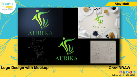
#kashitij vivan institute#photoshop#image#googel#large images#background change#pixels.com#unplace .com#reffrence#coreldraw#gradient colour tool#Aurika hotel#mockup#png image#Logo outline image#draw the logo#pen tool#landscap place holder
2 notes
·
View notes
Text


Jaded Punk Rock Fall Guy, literally.
Beloved. He's like a poison dart frog. This version of Ashton is brought to you by my own cosplay, so the patches you see are ones that I've made :0
Lyrics are from Best Friends by Granson, a very Ashton song.
[Image Description. Two drawings of Ashton Greymoore from Critical Role. The first is a collection of Ashtons in different poses, all in their original black and red outfit. First is them sitting and leaning back with one leg up and arm propped up on said leg. Second is them kneeling down with one knee on the ground and an arm propped on the other knee with their head in their hand, looking bored. Third is a shot of them kicking the camera, with his boot taking up most the space, he gives the middle finger and smiles at the person he's kicking. Fourth is them squatting down with one hand on their face and the other relaxed to the ground, they look as if they are hearing someone say something stupid. The final is bust up with Ashton making a two-finger gun to his unbroken temple, their tongue is out as they smile. The figures are outlined in red, purple and blue with chaotic lines in the empty space. The words 'Ashton Fucking Greymoore' are in the upper left corner behind the figures. The second drawing is two drawings of Ashton around a box, the first figure is laying down with his legs up in the air, one straight and one bent, his head is facing to the camera and he flips off the camera while looking up. The second is of him lounging with his hand propped on a knee. he smiles and has his hand up, gesturing vaguely off screen. The first figure is red tinted and the second is blue tinted. The backgrounds for both drawings are light blue and have a square marked out in the middle. In both drawings, the hole in Ashton's head has no rendering so it is the background blue color. Also, there are several new patches on the drawing. such as a Bells Hells logo in blue and gold, a hishari and beacon patch in black and white and generally more chains and saftey pins. In the second drawing, the lyrics 'All of my Best Friends like to go and get fucked up then they talk about all the lives they never got to lead' are partially obscured behind the two Ashtons. END ID]
#critical role#bells hells#ashton greymoore#cr3#believe it or not refs make art go faster#wow#im gonna submit this to the gallery#will it get accepted? prob not but more people need to know that i love him#obsessed
303 notes
·
View notes
Text
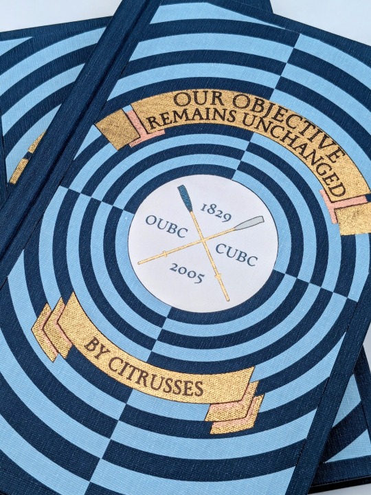
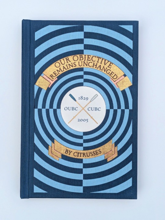
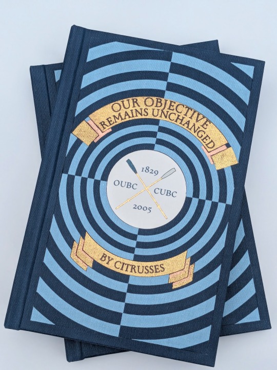
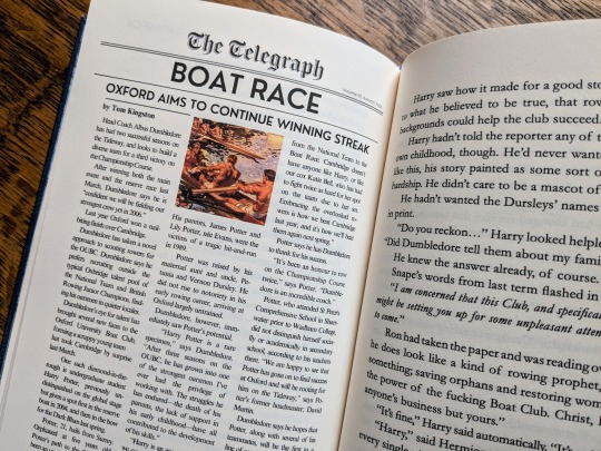
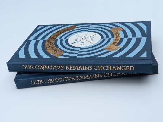
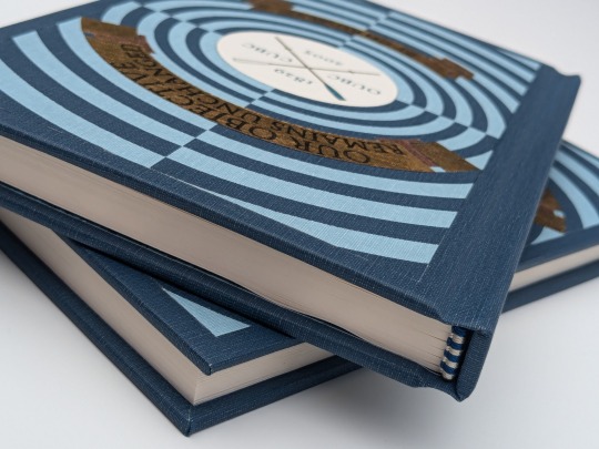
Our Objective Remains Unchanged by @citrusses
"Harry Potter, returning member of the Oxford University Boat Club, has two goals for the spring of 2005: beat Cambridge, and beat Draco Malfoy. Perhaps not in that order."
This has to be one of the most creative and meticulously researched fics I have ever had the pleasure of reading. If you haven't read it yet, don't walk— run! Citrusses is an absolute genius, and kindly gave me permission to bind her masterpiece.
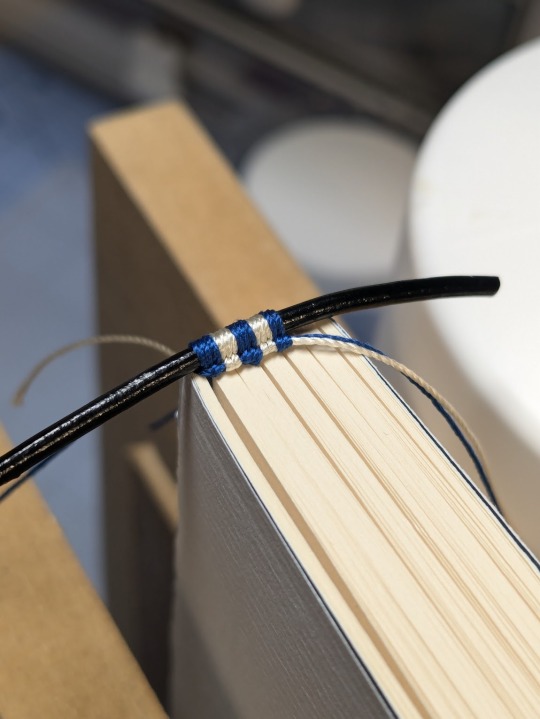
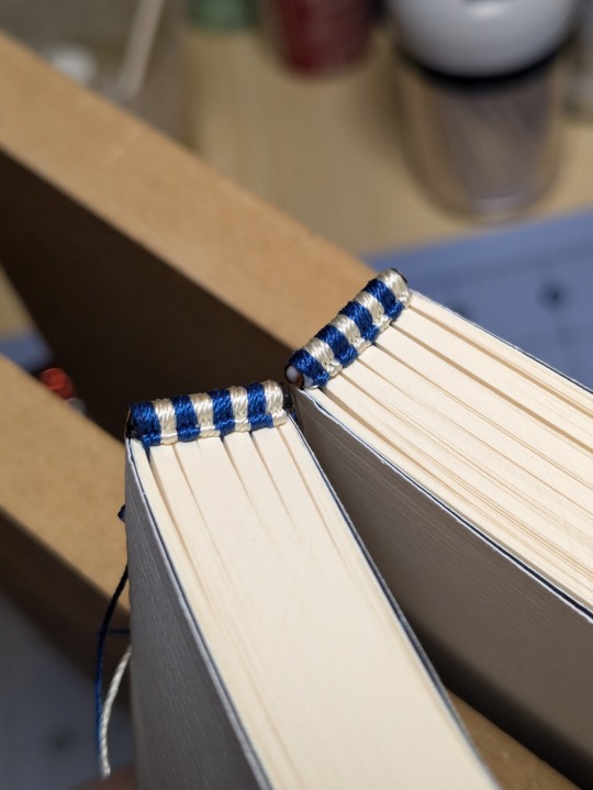
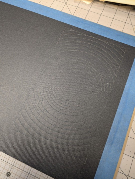
The cover of this bind is made out four different shades of Allure bookcloth cut by my Cameo 4, and the centerpiece is printed and hand foiled. The banners were machine foiled in gold and black with hand foiled rose gold shading. The endbands were hand sewn with Gutermann silk thread.
You can find more pictures and information about my process under the cut.
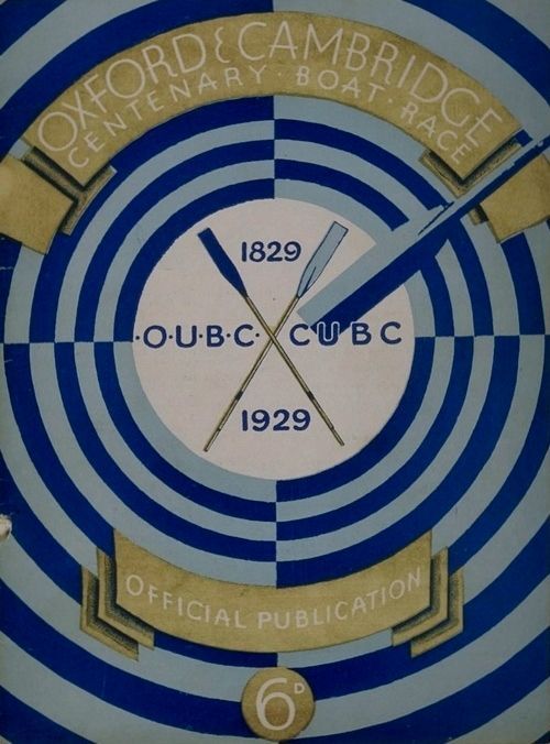
The amount of inspiration this fic gave me was overwhelming, and Citrusses' writing fully immersed me in the world of competitive rowing. While designing this bind, I was struck by the sheer wealth of Oxford rowing memorabilia available to me. I settled on this 1929 illustration from an official publication on the Oxford and Cambridge Centenary Boat Race for the cover.
"How hard could it possibly be?" I thought, foolishly. The answer was HARD, but I'll get into that later.
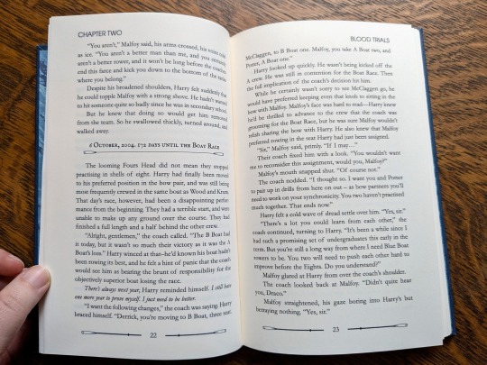
Due to the wealth of design options, I believe that this may be the best typeset I have created to date. Thanks to the help of my friend @tsurashi-bindery, I was able to learn the basics of InDesign (kicking and screaming all the way). There will be spoilers in the text of these photos, so try not to read them if you haven't finished the fic!
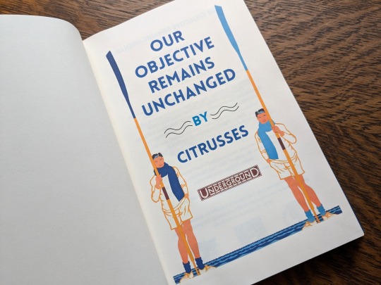
For the title page, I modified To See the Crews in Training by Charles Pears (1930). I believe that this was part of a series of advertisements for the race in the London Underground.
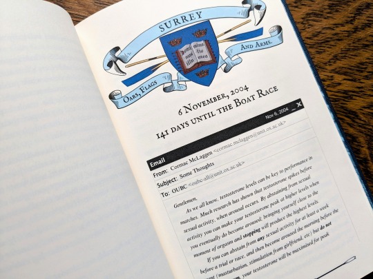
For the chapter headers, I redrew the crest from an Oxford Oars, Flags, and Arms postcard, presumably pre 1914. I also had some fun creating a mock email using La_Temperanza's How to Mimic Email Windows on Ao3. Cormac's email makes me laugh every time I read it, and Citrusses provided an appropriately pompous subject.

I also had lots of fun editing the oars from the official OUBC logo to serve as dividers and decorations for the page numbers.
Additionally, I got to edit a full newspaper page for the fic! I was very excited find an opportunity to slip Leyendecker's The Finish (1908) in.
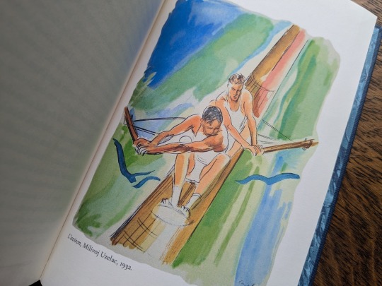
The fic ended beautifully, so I wanted to include one last element at the end to capture the atmosphere. I settled on L'aviron (1932) by Milivoj Uzelac. It makes me feel as though Harry and Draco will continue rowing together long after I've closed the book.
I of course had lots of fun sewing the headbands, and got to do it with not one but TWO copies!
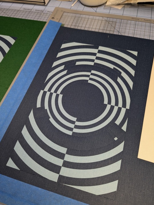
Things got tricky when I had to recreate the cover. I had a poor understanding of how vector images worked, and ended up having to redraw it three times. Once I finally cracked and taught myself how to use Illustrator, the program crashed...and I had to redraw it a fourth time!
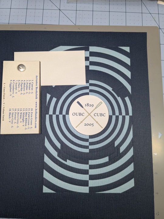
I set the vector to cut on my Cameo 4, and I assembled the pieces together like a puzzle on my Silhouette mat. I used Allure's indigo, skylight, white, and black bookcloth in the process. I will be making a tutorial video on this method, so I will keep it brief here.
I also cut a piece of bookcloth to 8.5"x 11" and fed it through my inktank printer to print the center design. I then cut it out using the print and cut feature on my Cameo 4. Both of these methods were a first for me, and they were very scary!!
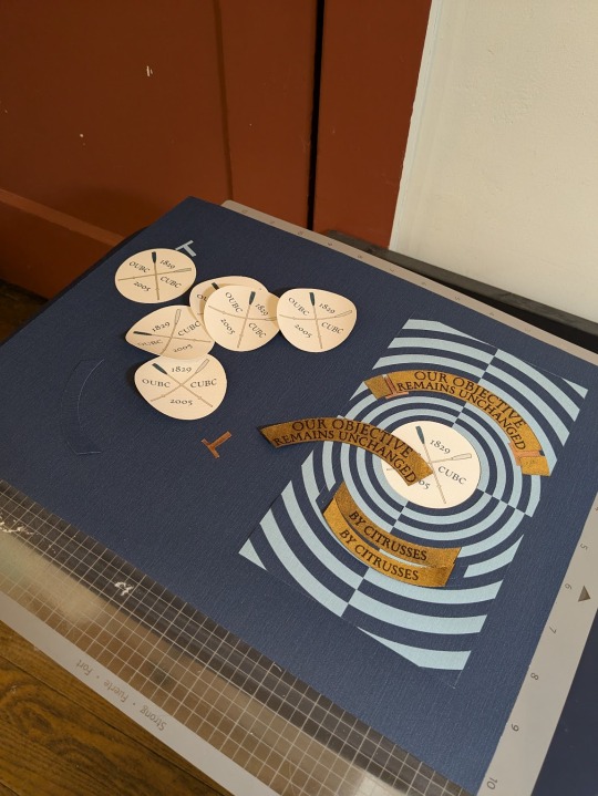
To be perfectly frank, the foiling was a nightmare and I don't want to get into it. I machine foiled the gold, and then foiled black lettering on top of it. I foiled the rose gold shading by hand, and then foiled a thin black outline along the edge of the banners to make them stand out more.
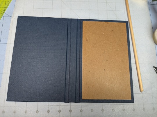
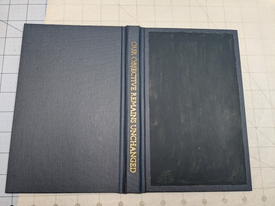
I hand foiled the spines (because I'm scared of measuring), painted the exposed board (to hide any gaps in the inlays), and used transfer tape to lift my design from the Silhouette mat and onto the cover.
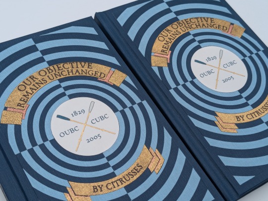
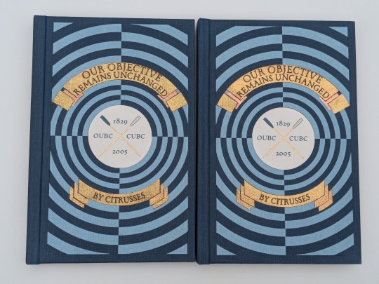
One more fun detail— my copy and the author's copy are sisters! The dark blue and the light blue are inverted on the author's copy, making it distinguishable from mine. This is the first time I have made an author's copy for a fic, and I was admittedly incredibly nervous. I always worry about what authors will think of my work, but Citrusses gave me an incredible amount of encouragement and support throughout the process! Thank you for trusting me with your precious fic!
This story is a work of fanfiction and can be read on Ao3 for free. My bind and typeset are for personal use only and not for sale or profit. Keep fandom free!
#book binding#fic binding#fanbinding#fanfic binding#drarry#our objective remains unchanged#harry x draco#my binds
345 notes
·
View notes
Text
Hello *throws coalectra at you and disappears into fog*
Had a lot of fun with these I've been loving cutting up paper bits and layering them 😂 brings me right back to junior school and my grandma teaching me decoupage.
If you want the deep dive of the small details and symbolism in each, read below the cut (HAHA finally learnt how to do it)
ELECTRA:
-Electra's side is inspired by business posters, their emblem in the corner like a logo, simple stark shapes making the background with a thinner outline and blocky text in lines. Electra is the future and a surefire business person after all.
-the text is red, showing how, even though they push him to the background in a kind of shame of being in a relationship with him, their true desires and thoughts are always based on Porter. They don't need to mention him by name to know that he's who they're referring to. It's also placed behind them as they are always in control and the main focus of things, pushing their thoughts and their partner out into the background to favour other things.
-the minty green shape is based off of (a squished version) the chiltern railways line between london marylebone and aylesbury, which is where the Wembley park station is situated. The circles are the different stops on that line.
-the whole thing has a solid black frame to symbolise how structured and simple Electra's usual life is, with achievable goals and the distaste for things that challenge that norm (like dating an unpredictable, fiery and slowly rusting coal truck)
-if you're wondering what the ruffley looking things are on Electra, they're essentially jellyfish oral arms. This is just because I see Electra as a jellyfish😂 the shapes on their skates are also linked to jellyfish.
PORTER:
-Porter's side sees the truck as bodily physically facing Electra, more relaxed than their formal stature.
-its framed as if it's a camera photograph, symbolising Porter's importance of memories and how he's an old model. It also juxtaposes how, unlike a photo, Porter is only temporary and every image that captures him is just a flipbook animation of how he's deteriorating.
-the rocky purple surroundings are made to not only represent coal as Porter's pride and purpose, but also make him almost look like we're viewing him from above a hole like a well. His love for Electra is a deep, never ending fall with rough edges and an inevitable sudden end. However, when that happens, his siblings will be there, seen with the yellow, green and blue lines near the centre.
TOGETHER:
-overall, Electra's side can be taken alone and will make sense. However with Porter's starting with 'and', his side is unable to be taken alone. Take this how you like, I'll leave it up to interpretation.
Hope this is interesting or, at least, you like the art 😂 I really did enjoy drawing these guys I think I need to start drawing bigger because it was super freeing.
Hope everyone's alright and if you're in the UK, you're coping alright with the heat :) things are cooling down around my area now.
#stex#porter the coal truck#electra the electric engine#coalectra#something a little different this time :)#but still accompanied by a long ass ramble😂
69 notes
·
View notes
Text
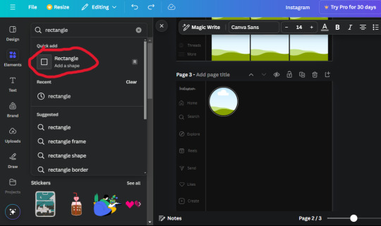
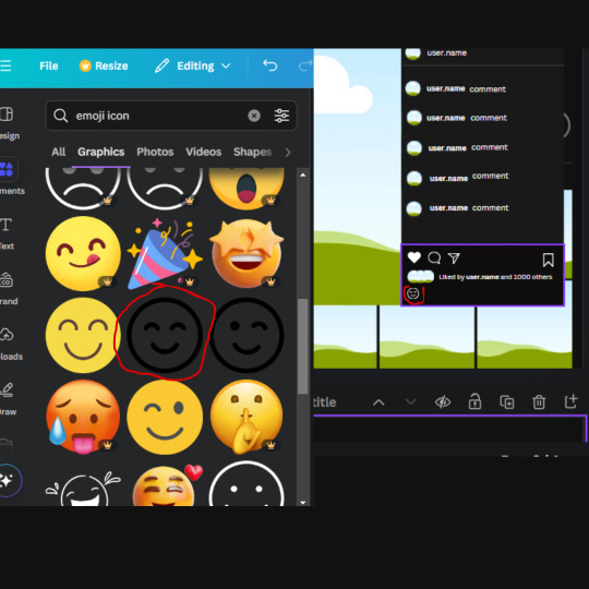
𓈒༷♪˚.✧ How to make a mockup like this for smaus, ocs, etc. (step-by-step tutorial ☆ no Photoshop, easy, free) (requested by @lovebittenbyevans) ✿
guys this took me two hours to make and you could probably get this done in like, 30 minutes :) I hope this is coherent <3 Please look back this image for comparisons, if my explanation is not well explained, etc.
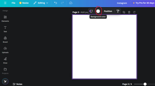
first of all, if you dont already have one, make a free canva acount. once you're signed in, hit the purple "create design" button on the sidebar. A pop-up will appear with different design template options. For this design, we want the dimentions to be 1080 x 1080, so you can either make a custom size or choose the instagram post (square) template by either searching or scrolling through the list.

2. Now you have a blank page. Zoom in with the slider at the bottom of the page if you need to (Mine is currently zoomed in 41%). Click on the page and change the color to an off black (hex code #111111).
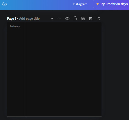
3. Now that the color is changed, click the "elements" tab and search "line". Click the shape and it will add it to the page automatically. These line are particularly hard to navigate and hard to get it at the right angle and length so this part might take a little longer than the rest.
4. stretch it from top to button and turn in a 90 angle so its straight on the left side of the page. Change the color of this as well to a grey tone (hex code #2F2F2F).
5. Now we'll add the Instagram logo. Click the "text" tab then click the purple "add text box" button. Write "Instagram" in the box and change the font to "apricots". This is the closest font I could find that resembled the logo font but if you find a better one, feel free to use that instead. Make the font size 19.3 (you can do this manually or do it in the text options). Change the color to grey color (hex code #707070). Add it to the upper left corner of the page like this:
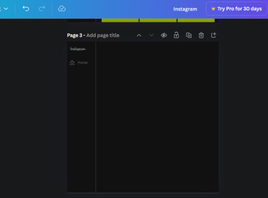
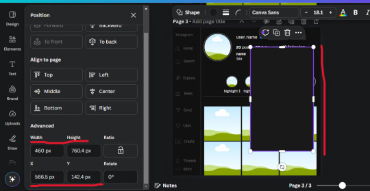
6. now we're adding icons and a menu inside the border we just made. Click the "elements" tab again and search for "instagram home icon" and add the element by sketchify to the page. Click the home icon, an options icon with pop-up above the page. Look for the "Position" button and click it. Scroll to find the advanced options and you can manually type in the width and height at 26.6 and 28.7.
Move it inside the border, under the logo (photo below). Change the color again (the hex code is #707070).
7. Open the text tab and add a text box. Change the font to Canva Sans and write "Home" in the box. Change the font size to 18.1 and align with with the house icon. It will look something like this,
8. Go into the elements tab again and search "instagram search icon". Scroll until you find the one by sketchify and add it to the page.
9. Shrink it so the W and H is at 36.6 and 31.3. Move it below the home icon until a purple "67" pop ups and aligns under it. Change it to the same color as the Home text and icon (#707070). Go ahead and Duplicate the the "Home" text box and clicking it and a pop-up will show up then edit the text so it says "Search" and align with the searcch icon we just added.
10. You know the drill. We are continuing to search up more icons in the "elements" tab. Search "instagram compass icon" and choose the one by sketchify (are u seeing the pattern?). Add it to the page and change the width and heigth to 33.1. align it under the search icon just like how we did before and change it to the say colors as the other icons.
11. Do the same as before and write "Explore" in a text box and align it with the icon. We're doing the same thing for all of these.
We'll be using the same search prompt for all of these icons so just change the type of icon you're looking for like we've done before hand. Next look for the Instagram reel icon and add the outlined one by sketchify and change the W and H to 31.2 x 30.9. Change the color to the ones we've used before, align it underneath the icons above and add your text ("Reels").
12. The next icon is an outlined, "sent" one. W and H is 31.1 x 27. The text will say "Send". Then an heart outline by sketchify; W and H is 34.2 x 29.1 and the text is "Likes". Next is the "create" outline icon by sketchify, W and H is 36.8.
(p.s if you are struggling to align the icons and text correctly, shoot me a message and I'll send you the X and Y positions ;D)
If you followed it through, it should look like this,
13. Now onto step 13, we'll be adding the Threads logo. You don't have to add this but to make it look more like the actual website, I will be adding it. Open the "text" tab and add a text box. Write an "@" symbol in the box and change the font to Nanum Sqaure and the size to 24.9. Add in the bottom corner below all the icons we just added to our page. We need another text box now (Color is still #707070), write "Threads" and align it to the "@" symbol.
14. We're adding another icon now. Search "Instagram menu icon" and find a wireframe menu icon by sketchify. the W and H are 42.5 x 24.6. Add a text box that says "More". It will look like this:
We are a quarter way done now :D
15. Search in the elements tab "circle frame" and look for the one with a little border around it.
At first, the circle will be green and inside the circle will be white. Change the white to color of the background of the page (hex code #111111) then change the green to a grey color (#8D8986).
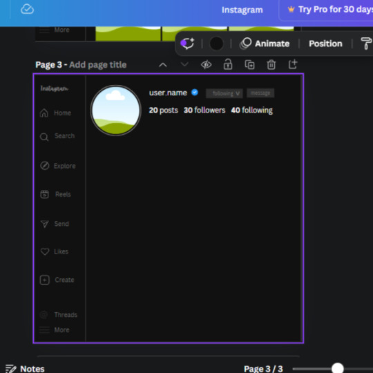
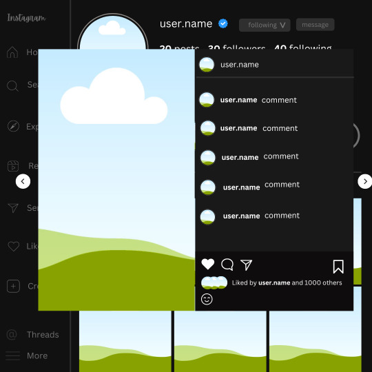
16. Add a new text box, change the font to Canva Sans and the size to 22.8 and the color is white. I just wrote "user.name" in the box. the W and H will be 153.3 x 35.7.
Enter the "elements" tab and search for a blue checkmark and find the icon by Victor Aguiar. The W and H is 28.1 by 28.
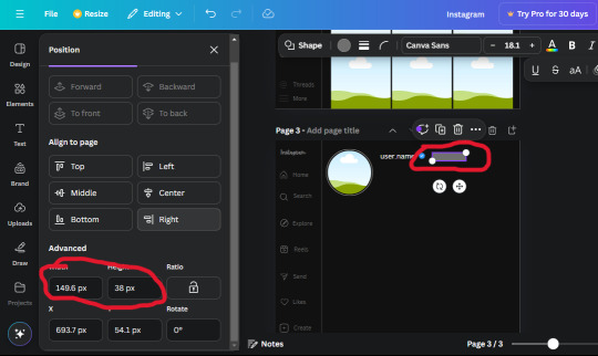
17. Search in the search box for a rectangular shape and add it to the page. Place it next to your username and checkmark icon and make the W and H to 149.6 x 38. Add another and place it next to the other rectangle shape. the W x H is 111.4 x 36.7.
Change the color of both boxes to #2F2F2F. Add a text box and write "following" then change the W and H to 82.6 x 21.8 and fit it inside the first box. Add a second text box and write "message" in it then change the W and H to 77.8 x 21.8. Change both text colors to #7A7A7A

18. Add another text box. Write "<" and turn it upside down and place it beside the "following" text inside the rectangle. Adjust the size as you need to. I also like the round the corners to around 8 so its not so pointy and square.
19. Add 3 new text boxes. Write the amount of posts, the amount of accounts you're following and the amount of followers your have. Write "20 posts", "30 following" "40 followers". Bold the numbers and change the text W and H to 116.4 x 32.7. These are just place holders that I use.
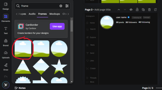
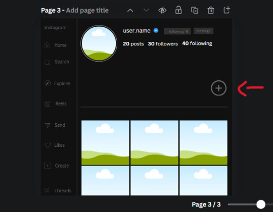
20. Open the "elements" tab again and search "frame". Choose the first one.
We want the height and width to be 268 x 252.4. Place it at the bottom of the page but we want some space between the frame and the page.
Now we'll duplicate the frame we just placed (the icon between the comment and trash can on the pop up above the frame). Place it next to the previous frame but we want to leave a bit of space between them like this:
If its a little wonky, don't worry. You can always adjust it so it looks right.
Duplicate the frame again and place it next the second frame you just placed, same distance between. Make sure they're even. Now we have a row.
Select all three frames and duplicate them. Move them above our original frames but leave a little space between them.
Again, if they're uneven, adjust them as you need to.
21. Select the line again from the elements tab. Stretch starting from the top frame to the last frame and make the color grey (#2F2F2F).
Because the line is stupid hard to navigate, use something like a text box to mark where you want it to end like this:


Delete the text box and the line with be where we want it.
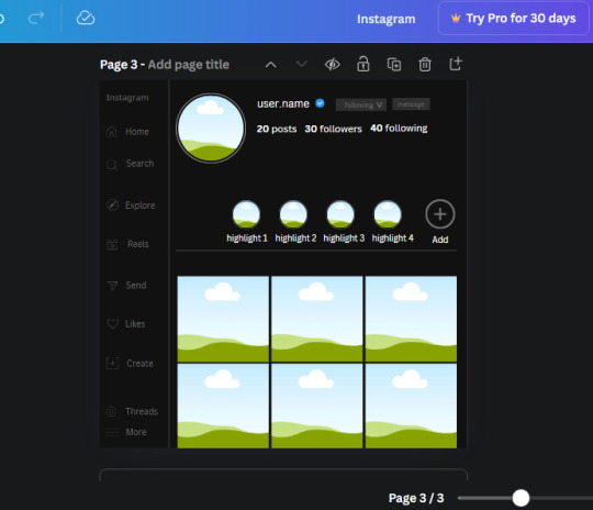
22. On to the highlight reels. Seach for "add button" and find the one by Barudak Lier.
Change the heigh and width to 81.1 and move it above the border.
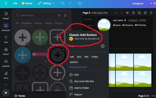
Search for circle frames now and add this one to the page (The same one we used for the pfp), change the width and height to 85.4 and move it next to the add button. Since this is a generic, blank template, I add about 4 of these highlight frames but you can do however many you want. You can change the border color to a gradient or leave it grey.
Add a text box now. The font will be Canva Sans, the size will be 18.1 and the color will be white. Change the text to "Add" and place it under our add button. Make more of these text boxes to place under the circle frames. Depending on which frame its under, write "Highlight 1", "Highlight 2", etc. etc. or you can give them different names and such.
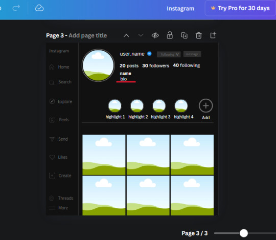
23. Add another text box, write "name" and bold it, change the size to 19.1 and the W and H to 69.2 x 28.8. The font will be Canva Sans and the color will be white. It will go under the amount of posts, followings and followers.
Add another box. The font is Canva Sans, font size to 20.1, the W and H is 40.8 x 31.3 and the color is white as well. This is our "bio". Place it under "name".
Yay!🎉🎉🎉 You're halfway done!
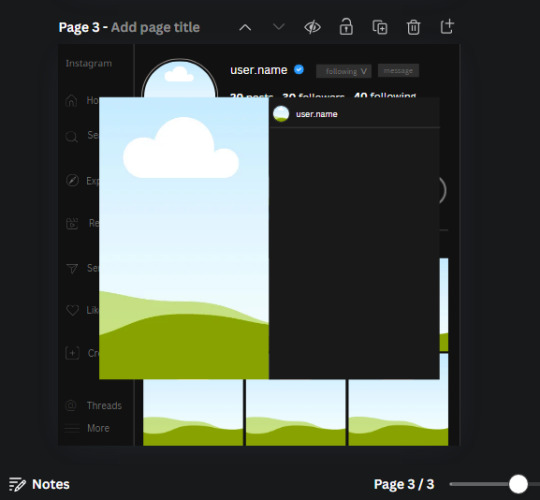
24. Search for a shape in the elements. Look for the rectangle again and add it. Change the width and height to 460 x 760.4 and the color to an off black/grey color (#191919), placing it like this:
Get the same kind of square frame we used before to make the profile grid and make it the same size as the rectangle we just added. Place right up against the rectangle like it's its other half. Add another line like before and span across the upper half of the black rectangle as a border then add a circle frame inside the border.
Add a text box, "user.name" and align it with the frame. The text is white and the W and H is 111.5 x 25.9
25. Add more circle frame along the inside of the rectangle to resemble the comment section. Make sure the W and H of the frames are 46.1.
Add more text boxes that align with the frames you just made and write "username" again and bold them. Add even more text boxes that align with the usernames and write "comment". These are place holders for when you decide to use this template.
Add another rectangle on the lower part of the rectangle and make the color black. and search for "instagram heart icon", "instagram comment icon" and "instagram send icon". Make sure the lines are thick. Find the heart icon by sketchify, and the the comment and send icon are by Mirazz Creations. Make the lines white and make sure the W and H are the following:
Heart icon: 38.7 x 32.9
Comment icon: 35.2 x 35. 8
Send icon: 35 x 32
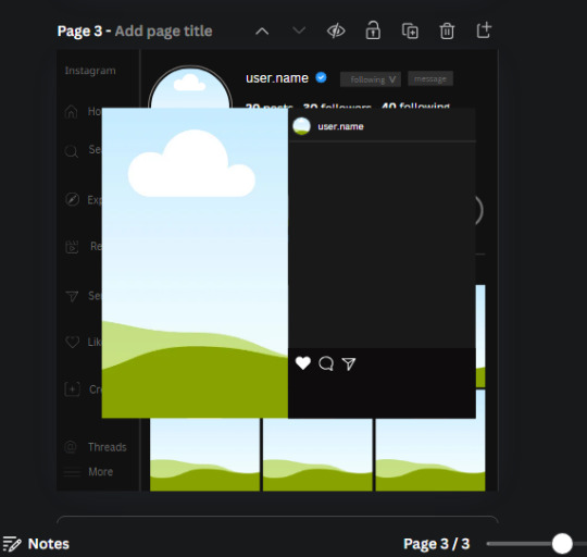
Next, look for "instagram bookmark icon" and find the one by Adricreative. Change the color to white and the W and H to 29.7 x 40.2. Move it to the other end of the rectangle.
26. Now add three circles frames and change the W and H to 37.2. Move them below the heart icon and have them overlap each other some. Then, add a text box and write "liked by username and 1000 others". Change the font size to 13.6 and change the font to Canva sans. the color will be white. Align this with the three overlapped frames.
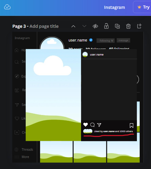
27. Look in the elements tab for an emoji icon and choose the one by Soni Soukell from Noun Project. The W and H will be 32.8 and the color is white.
Now add a another text box and write "Write a comment". The color will be white, the font size will be 14.2 and align with the emoji icon you just placed.
Search for "next arrow button" by Pixeden and make the W and H 42.8 then add it to both sides of the post.
And you're all done with your template! All that is left to do is fill it but before doing that, duplicate the page so you always have an extra blank mockup if you want to use it again.
To fill the frames, upload an image (or use a Canva stock photo), drag and hover it over the frame and it will fill the frame.
Hope this was helpful and you you successfully made one :D <3
#requests#text#smau#template#mockup#moodboard#instagram#instagram moodboard#instagram mockup#graphic design#canva#psd#free tutorial#tutorial#instagram au#social media au#free psd#photoshop#resources#fanfiction resources#graphic design resources#graphic design tutorial#psd tutorial#photoshop tutorial#au#au ideas#mockups#digital design#digital design tutorial
182 notes
·
View notes
Text
What’s Project 2025 and Why Is It So Freaking Terrifying?
If you’ve been around any queer, feminist, or politically engaged communities lately, you’ve likely heard people talking about Project 2025, often in a tone usually reserved for asteroids heading for earth, wildfires, and other disastrous scenarios, and for good reason. What the heck is Project 2025? Why should you care? Is there anything that can be done to stop it (hint: there is)? This new guide from Sam Wall is here to help you understand some of what the project is and some of what’s at stake. Project 2025 is a step-by-step plan that outlines exactly how the United States political system can be taken over, gutted and repurposed to reshape society in the most extreme and violent ways. Unlike offensive tweets or hateful campaign speeches, it isn't just opinion or rhetoric, it's something far more dangerous: a clear and detailed plan, backed by rich and powerful groups. The ACLU summed Project 2025 up as “a federal policy agenda and blueprint for a radical restructuring of the executive branch authored and published by former Trump administration officials in partnership with The Heritage Foundation, a longstanding conservative think tank that opposes abortion and reproductive rights, LGBTQ rights, immigrants’ rights, and racial equity. Project 2025’s largest publication, “Mandate For Leadership,” is a 900-page manual for reorganizing the entire federal government agency by agency to serve a conservative agenda.” The project is a blueprint that will most certainly be used if Trump wins the election in November, no matter how much the Trump campaign currently claims to be completely ignorant of it. “Mandate for Leadership” is 900+ pages of the most nightmarish policy imaginable if you’re queer, trans, a woman, a person of color, a young person, and/or someone who cares even the tiniest bit about living in a democracy. To find out some of what's in this dystopian nightmare of a plan and what you can do about it, head over to the piece on Scarleteen here:
<images are text that describe the piece on top of a soft version of one of our logos>


#Voting#Politics#Octavia Butler warned us#United States#Election 2024#Project 2025#Sex Education#Queer Sex Education
233 notes
·
View notes
Note
okay so yet again i was scrolling through insta reels and i saw this and immediately thought, 'oh jason would love one of this with his helmet' so i thought i'd share (hopefully the video doesn't just disappear into the ether or this wont make much sense but yeah)
https://www.instagram.com/reel/C8XdIwStYFg/?igsh=MWdzZXVpZHV3dm8zbw==
((in case it does for some reason disappear, it was a reel of a girl making a diy spiderman mask shirt with a pattern and then the red colouring bit of the mask was filled in with kisses using paint))
but yeah, i think making a red hood one for jason would be so fun and i just know the man would be so so smitten when it's given to him
anyways, love you, glad your posting again
- the ever present 🦊
"the ever present" OMG I ADORE YOU!!!!!! hi baby, been missing you with your brain tickling requests (i have one on hold but just you wait)
i've been looking to do one of those for me with red hood's logo bc i'm as single as one can be and i know i won't be getting someone to do this for me but okayyyyyy i can do it on my own. here comes something short but done with a lot of love
ㅤㅤㅤㅤㅤㅤㅤㅤㅤㅤㅤㅤ𔓕 ۪ ۫ ୭
jason had been waiting outside the room for hours maybe, he was just sitting on the couch as he looked at the door like a sad puppy because he had arrived this morning to your apartment looking foward to spend time with you. some cuddling, watching a movie together or reading, jason just wanted some quality time with his beloved.
he knew you had been busy during the week with a huge amount of projects you wanted to do but he wasn't expecting you to get so fixated over one to lock yourself into your room and not even peek to see him and he didn't knew why, what jason also didn't knew was the fact that you were already getting dizzy by the smell of paint inside your closed room as you placed the shirt over your desk again, grabbing a pencil to fix the outline of the desing for the hundreth time in the day.
"fuck, fuck, fuck..." you muttered as low as you could to keep jason from darting into the room and ruin the surprise and it took you a good couple of hours to finally have it done, the paint almost completely dry now and the image of it was neat, making you smile and giggle happily.
and it's just then when you decide it's time to open the door, peeking your head through the small space to find jason almost melted on the couch, his head resting against the wall as he kept his eyes closed but it wasn't even a second by when he snapped his eyes open to look at you with a small frown.
"baby? why are you-?" she stopped mid sentence, taking in the sight of your paint smeared lips and chin, the red bright color now cracked on your skin as you smiled back at him as if you just made the biggest discovery in your life.
"hush! c'mere, jaybirdie" you say, leaving the door to your room wide open just to reveal the fact that your whole frame was a mess and that the paint was not only on your face but it had dripped to your shirt and also to your bare thighs to the skin that wasn't covered by the sleeping shorts you were wearing.
jason stands up from his seat, stretching completely from his quick nap and walks into the now messy room. the small paint pots across the floor and desk in different shades of red, paint brushes here and there and then the sight of you standing in front of the middle of your desk, covering something jason couldn't quite see well enough to know what it was.
"i saw something and i had to do this... it's probably the cheesiest thing i've ever done so feel free to laugh at me" and those words make jason tilt his head because what on earth could be so cheesy and made with paint that needed this much time leaving him out of your room? because yes, jason wanted to cuddle and don't blame him.
"princess-" he starts but goes silent the second you pull from the desk a black shirt with a print of his helmet on it, all made in different shades of red kiss marks that emulated the shade of light and everything. his lips remain parted as he walks slowly towards you, his fingers gently tracing the outline of the print on the shirt before he looks at your face, the paint in your skin the evidence of the time you spent painting your lips and pressing kisses to the shirt to make something so sweet for him.
"is it too much? you know, you can just put it into your closet if you don't like-" but your words are cut by a tender kiss, jason cups your face in such a delicate embrace as he lets all his feelings pour into that simple kiss.
"i love it. i love you" he says, his voice a soft whisper even in that deepish tone of his and it makes your heart flutter because jason looks completely happy with the shirt as he holds it into his hands, still admiring the way you decided to replicate a part of him "it's just perfect..."
"can i wear it already?"
the question itself is the sweetest reaction he could give you, the eagerness to wear something you made for him making you giggle excitedly as you shook your head with a small pout.
"not yet, red... i should iron it and give it a quick wash so the paint stays on the fabric" and he pouts slightly because god knows how much he wishes to have your kisses closer to his heart.
#⭒ k2ntoss ⭒#⭒ ��� ⭒#🦊 anon#jason todd fluff#jason todd headcanon#jason todd fanfiction#jason todd imagine#jason todd blurb#jason todd fic#jason todd x reader#jason todd x you#jason todd x fem!reader#jason todd x y/n#jason todd songfic#jason todd#red hood imagine#red hood headcanon#red hood fluff#red hood fic#red hood fanfiction#red hood blurb#red hood x fem!reader#red hood x you#red hood x reader#red hood x y/n#red hood#dc comics#dc comics reader insert#dc comics imagine#dcu
276 notes
·
View notes
Text
Quick (Informal) PSA For Therian Minors
I see a lot of minors in the community who seem very...comfortable, I guess, with sharing personal information and photos on here and other sites, and I just wanted to speak my piece about it.
Something I remembered from another post that I wanna steal because I love the wording: before you share something on the internet, think what could someone who wanted to hurt me do with this information? Not trying to be condescending, I'm an adult and I think that exact sentence in my head before I post/comment/DM anything related to myself.
Just saw a post where a well-meaning therian minor linked their Youtube channel, which has videos of them irl (wearing a mask, but still) doing quads outside and at an indoor non-chain business with the name/logo of the building clearly visible.
I cannot emphasize how much I was taught to be extremely careful about posting any irl images as a kid/teen, as people can infer your location from very minor details, MUCH LESS VIDEOS OF MY WHOLE BODY IN AN EASILY GOOGLE-ABLE LOCATION. What happens if someone with malicious intent sees that video, which is public on youtube? What will you do when someone attempts to blackmail or doxx you? Not only would this would-be criminal know where you are, they can also see how old you are and exactly what you look like. Terrifying.
(I understand we're in a culture of many people posting videos of themselves online, but (in my opinion) it's just not safe to be uploading public content that's advertising "Hi I'm bodily a child/teenager and this is what I look like and this is close to where I live and I'm also a therian who's probably hiding this account from my parents")
This individual is essentially just trusting that no one on the entirety of Youtube will just google the name of the indoor facility (along with any other location-identifying posts they may make) and either threaten them via doxxing or just straight up threaten their life/safety.
I knew someone in school who got too comfortable in an in-game chat, and was lulled into a false friendship and tricked into mentioning his address. Then he was threatened and told to send them money or they would physically find him. Thankfully he felt safe enough to tell his parents, who knew how to stop the situation. I know a lot of us aren't out to our family, and I dread to think what would have happened if the boy I knew hadn't felt safe enough to explain the situation to his parents.
------------------------------------------------------------------------------
TLDR; before you post personal info/photos, think of the absolute worst evil that someone could do to you with that information. I know it's a bummer, but doxxing/blackmail happens more than you think, and even if your posts only seem to get low notes/likes/whatever, they can theoretically be seen by ANYONE, including people who want to hurt you.
(also I don't mean to call out or harass anyone, I'm not trying to be mean, I just wanted to use an example bc it's what inspired me to make this post and also I wanted to outline why real behaviours I'm seeing can be dangerous, rather than just making up hypotheticals)
#🐊#therian#long post#sorry for serious-posting i won't do it often#i hope i dont come off preachy or condescending thats the last thing i want#i dont think i'm better or smarter than any of you i just have more years on the internet and was raised in a different internet culture
187 notes
·
View notes
Text
How to Paint on Leather Jackets:
A Relatively beginner friendly guide.

Things you will need:
- A leather jacket.
-Card stock ($6 for 50 sheets at staples, or steal it from work)
-Xacto knife ($12 or wander around an art campus for a few minutes, and you'll find one)
- A surface to cut on (cutting mats are relatively affordable, but a flat piece of glass or ceramic will probably also work fine. The mat I use for this is a tempered glass one)
Paint markers. the main thing is to make sure you are NOT using oil-based paint. Some brands make both oil and water/acrylic based pens, and it can be hard to tell which is which at a glance.
Ok lets start!
Find an image you want to use. Once you get used to it, you can get extremely detailed results with this method, but for now we'll use a more simple example.

Ok, I don't really like the common Mischief Brew patch logo, so were using the twxt from this album instead. I'm doing this all at work, so you can also see that you don't need any fancy software for this. I'm using MS Photos for this whole process.

So crop the image close to your text

Fiddle with the settings in edit if you want, i usually think making it b&w with a higher contrast helps.

Now we're gonna cut. With stencils, start with fine details near the center of the design and work outward. This way you keep as much solid paper around your cuts as possible, which helps prevent ripping or deformation and mis-cuts. I also usualy cut in two stages, all horizontal cuts and vertical cuts.

Heres the big difference between what we're doing here and making a regular stencil. We don't care about islands. You see the empty spaces in the B, the e's, the S, etc. We arent cutting that out, we're taking the whole shape and we'll add that shit back in later.
So now we cut it out, we have something like this:

You can see how anything I came across that seemed mildly irritating to cut out, I ignored.
Thin lines connecting parts? We can draw a line. Islands? We can do the basic shape and refine it later. The point is that this stencil will put the right shapes together with the right scale and spacing.
Next we'll put it on the jacket.

Tape that shit down, you don't want if moving more than it's already going to. Next, trace the outline, that's it, then remove the stencil and burn it or something.
Should have somethong like this

Now by hand, fill in the stencil. I advise tracing the outline again as you fill. It helps prevent overflow. If you feel confident, try and build the empty space here instead of later.

So it's filled in and we have a general shape. I recommend at least two layers with 10-15 min dry time between. More layers might look a little better but also run the risk of cracking if it gets too thick (this ended up needing 3 layers).
You may have noticed that the outline looks kinda shit, here's the main thing we're gonna do here, editing.
I hit the photo limit here, so hang on for the next part.
76 notes
·
View notes
Text
Things you might have missed in God of Tides companion outfits [PART 1]
i also posted this on twitter btw


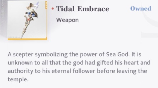
At the end of GoT myth, Rafayel gives MC his heart and power, and that's how (in Rafayel's branch) MC got the aether core in her heart. This concept is engraved even in their myth outfits, or at least, that's my interpretation :]
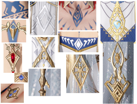

There are a lot of diamond shapes in the outfits, so this isnt all of them but the collage on left shows the important ones imo. And i realized this after making the collage, but the outline of mc's accesories on her chest seems to be echoing the same symbol (pls tell me im not crazy)
Another thing i noticed 👇At first i thought that all the protocore symbols in the outfits must be representing the same thing, just with different depictions. But on Flux Nexus we can see similar diamond shapes, so maybe the different shapes we see on GoT fits also represent different stuff
(this isnt to say that rafayel is directly connected to that stone btw, i'm aware that cutscene was about xavier and sylus but i'm just focusing on the shapes)

The lower part of the image above is about the "<" shape: It's used a lot in the GoT myth outfits and i just assumed that its because it looks like a fish tail, so it must be a lemurian thing? But after rewatching the ch3 cutscene i realized that the "<" shape might be related to protocores instead (i still like the fish tail theory tho... I might be thinking too much about that Flux Nexus cutscene anyway)


[👆Examples of the < shape, it's literally used everywhere in the design]
Anyways i was able to get God of Tides from the rerun and i had already bought mc's outfit before so i decided to post the results of my overthinking about the outfits and stuff. I'll be posting things that might be obvious to some people cuz it's fun to look at the details together with everyone✨✨
Ps. I forgot to add this but this symbol is literally GoT's logo, it's used in the trailer and sns posts. I think as a summary it's supposed to be a symbol of the Sea God's Temple
56 notes
·
View notes
Text
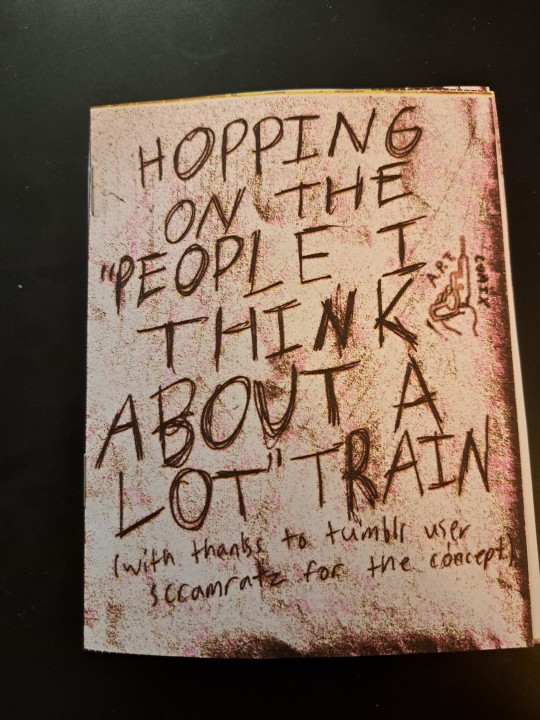
[Image Descriptions: photos of a quartered, 8-page stapled zine featuring handdrawn pencil sketches on printer paper that has been edited on gimp to enhance all the flaws of the paper in a purpley-red sloppy effect. The cover is just the penciled words "Hopping On The 'People I Think About A Lot' Train (with thanks to tumblr just scramratz for the concept)". There is also the logo on the side, showing a drawn hand holding a power drill with the words "A.P.T. comix" on either side.]
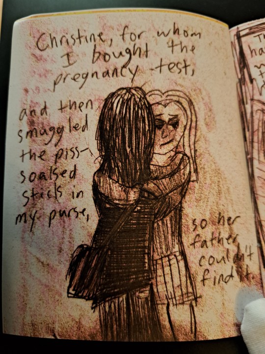
[first page. "Christine, for whom I bought the pregnancy test, and then smuggled the piss-soaked stick in my purse, so her father couldn't find it." A barely-adult blonde girl in a t-shirt and skirt hugs a barely-older adult with too long tangled dark hair wearing black shirt and jeans with a purse hanging from their shoulder. The blonde is crying with her eyes closed but smiling, as one of the hands wrapped around the brunette holds a pregnancy test with just one line on the screen.]
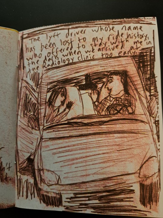
["The lyft driver whose name has been lost to my ride history, who offered to stay with me in the dark when we arrived at the Radiology clinic too early." The drawing shows two adults, one an older and tired version of the first brunette now with shorter hair, smiling and exiting a car driven by an equally-tired man with a mullet. The background has been scribbled in black with the pencil.]
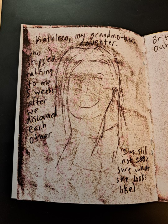
["Kathleen, my grandmother's daughter, who stopped talking to me 5 weeks after we discovered each other." The drawing shows the faint outline of an oldish woman with long, light hair, smiling with her eyes closed as she props her face up with her hand. In the corner it says "(I'm still not entirely sure what she looks like.)
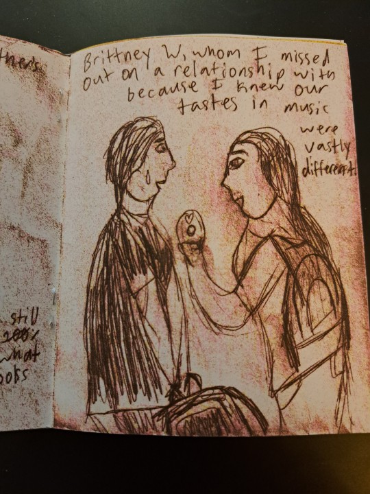
["Britrney W, whom I missed out on a relationship with because I knew our tastes in music were vastly different." It shows the brunette person, now a teenager with short hair that has long strands of hair on the side, holding a backpack and looking dismayed as a teenage girl (also brunette) excitedly holds up a CD with a heart drawn on it.]
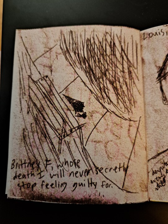
["Brittney F, whose death is still never secretly stop feeling guilty for." It shows an empty park bench at the edge of a pathway, a bouquet of flowers on the ground in front of it. Of note, because of the enhanced flaws, it shows the ghosting of the cover's words mirrored on it.]
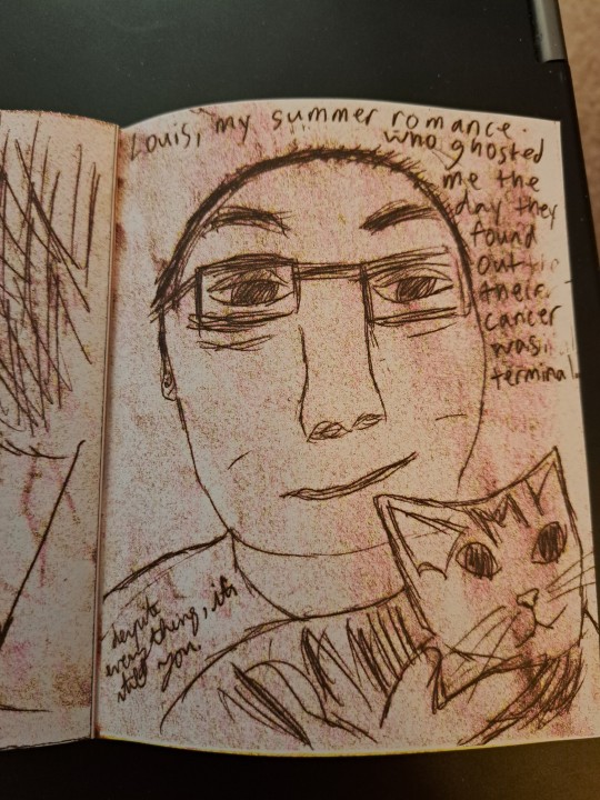
["Louis, my summer romance, who ghosted me the day they found out their cancer was terminal." It shows the sketched photo of a person with very short, thin hair and wearing glasses. They look tired as they hold a happy cat. On their sleeve it is written "despite everything, it's still you."]
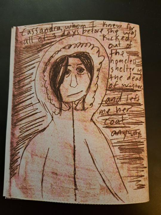
["Cassandra, whom I knew for all of 3 days before she was kicked out of the homeless shelter in the dead of winter, and left me her coat anyway." It shows a woman in her thirties, exhaustion aging her, staring at the reader with a wry smile while wearing a winter coat with the fuzzy hood pulled up. In the background it is penciled dark. End I.D]
The scramratz comic that inspired this can be found here (my reblog with the image description)
Commentary under cut
Some day I'll make a lighthearted comic
Rip my ink levels lmao. The intent until the very last moment was just a plain pencil comic on white printer paper, but while trying to clean up and heighten contrast on one of the panels on GIMP, I clicked a button to see what it would do and it was baller as hell so I did it for the whole thing. It has blue tones on my laptop but printed more red, even tho it's quite clear on my tank printer that I had plenty of blue ink
First comic without Electric Zine Maker bc it doesn't work on my new Linux 😭. Instead I used Scribus Zine Templates by MetaParadox on Itch, then had a hell of a time trying to get my setup to actually print the page and not the individual panels, before I realized I needed to export it as a PDF then print it from my native PDF viewer, not from Scribus directly. So much wasted ink 😭😭
I was originally going to do a comic just on losing Louis twice, but this is all you're going to get about it bc i couldn't get thru editing it and realized it came out more as making their cancer about me than I felt was justifiable anyway
I haven't spoken to any of these people in years, some in a decade or more
#comix#mini comic#zine#image described#mixed cd#life#loss#memories#people#tumblr gods pls don't eat this caption it took forever 🙏
26 notes
·
View notes
Text
Hey sunday artists! heres a tip for if ur tired of drawing his fuckass halo over and over; Trace over a flat image of it ((i used the frame from his logo reveal at the end of his trailer, thats why its 3 pixels resolution)) with ur outline brush to match ur style and just make it a fucking png. now you can just slap this badboy onto ur canvas, stretch it around a bit and Boom insta sunday halo, fresh out the mind of the laziest motherfucker you know💛💛💛

feel free to use mine aswell if ya dont wanna bother w ur own, thats what im here for✨
#honkai star rail#hsr sunday#sunday honkai star rail#hsr fanart#honkai star rail fanart#hsr#art tips
33 notes
·
View notes
Text

[Image ID: A coloured digital artwork of Kamen rider character Yuriko Misaki / Electro Wave Human Tackle, a woman in a thigh up pose stretching out her arms across her chest with a confident expression. She’s wearing a red and black lady bug themed helmet with white antenna connected to a black ski mask with yellow goggle lenses, a yellow scarf, yellow gloves, a yellow belt with a white red and black circular buckle with a T shaped logo, red mini skirt dress and pants with long sleeves, and black circular chest armour with yellow T shaped logos on the largest circles. There is a white outline around her, then a smaller black outline, another black outline a little further away, and the rest of the background is red. /End Image ID]
Day 1: Red/Black
The first day of Tackle week has now commenced! Her original costume grows on me the more I see it 🐞
#kamen rider#kamen rider stronger#showa kamen rider#yuriko misaki#electronic wave humanoid tackle#electro wave human tackle#electrowave human tackle#tackle kamen rider#kamen rider tackle#dinu yells into the void#dinu yells in the void#tackleweek#dinu's sketchy art
21 notes
·
View notes
Text

Some information on what this account will be posting since I havent made it clearer lol, first time on here and already getting confused lmao seriously don't mind if you guys laugh I've only heard the nevermore community being on here as of recent so I do apologise in advance.
Anyways, getting back to what I was saying this account is to post art, projects and graphic designs that is ONLY nevermore related but it's also an rp account so please feel free to interact how you please to, I'm not exceptionally great at rp but I'll try my best regardless I generally can't say I'm a pro but I can say I enjoy doing rps.
The rp role I'm doing is Lenore, as I wouldn't know how rp as anyone else since lenore is my favourite poem, including the Raven from Edgar Allan poe.

Some rules about this account:
- being respectful and mindful as the ages of people differ within social media.
- my content is of both rp and content in art and graphic design so feel free to interact with rp posts or other content.
- go wild, no like seriously you can but none of the below:
- No NSFW
- Keep it PG
- I'm 20, but do be mindful of what you say. Ages range on here.
- be respectful and enjoy.
( I'll update this over time if needed, enjoy everyone)
ART:
The art I'll post on here will only be nevermore related or AU related to nevermore and won't divert to anything else. Some art will be posted with multiple other art pieces or will have descriptions of art projects or ideas of AUs like those of K/DA-N.
Some created art will be studies of panels in nevermore from season 1 and 2 to learn perspective and style for future art pieces. The art studies will be of one or more characters from several different perspectives with colours unblended and note analysis written to explain the process behind the study, which would also include a breakdown of outline Base, fineline finish and colour process.
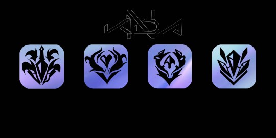
PROJECT: K/DA - N
Project: K/DA-N is an AU K-pop idol group but nevermore themed. The idea was to choose characters closest to the K/DA members from League of Legends and custom make a logo with graphic designs and concept art.
The designs were from popular music and closely to K/DA. However, this project is still ongoing. Most of the projects roadmap has been complete with graphic designs of icons, album covers, poster and custom signatures there is still more to finish and show.
(Due to how many images i can put in a post, i can not add the other album cover/covers)
The League of Legends band K/DA has several members. Evelyn, Akali, Ahri, and Kai'sa, which have unique personalities and specialities within the group. The decision was made to consider the knowledge of the personalities of the nevermore characters I had chosen (Annabel, Lenore, Ada, Morella) to be the ones taking up the roles of those in K/DA that could have similar personality points without ruining the projects idea.
The process of choosing only took a day as I was also preparing the roadmap for showing, including the designed logo;
■ Annabel is Evelyn
■ Lenore is Akali
■ Morella is Ahri
■ Ada is Kai'sa
More will be added to this project, and to any future ones I'm thinking of developing, I'll also be updating this part of the post to talk about my process of development and streams.
FUTURE AU PROJECTS:
Future AU projects will focus on genres or themes that look appealing to the eye, vibrant colours, or inspiration that's been given to me.
Themes would be from anything with inspiration or have creativity that can be used in creating graphic designs and possible concept arts like films, shows, comics, games, songs, etc. In the bullet point section, I'll add any type of theme, including names of shows, etc.
Genre will give the project unique focus in areas that could prolonge the projects first roadmap, making it more exciting for future updates.
Possible genre focus:
■ k-pop
■ Sci-fi
■ Fantasy/Dark fantasy
■ Rock
(More will be added here when possible)
Possible theme focus:
□ animated films;
■ k-pop demon hunters (Saja boys & Huntr/x)
■ kubo and the two strings
■ paranorman
□ music;
■ Golden by Huntr/x
■ Ma colombe by Nej
These genres and themes will be updated with new ideas of what to expect for future AU, nevermore projects.
NEXT NEVERMORE AU PROJECTS:
HUNTRIX AND SAJA BOYS (NEVERMORE)
COLLABORATION (UNOFFICIAL)

#nevermore webtoon#nevermore webcomic#lenore nevermore#annabel lee nevermore#ada nevermore#will nevermore#nevermore montressor#morella nevermore#duke nevermore#prospero nevermore#berenice nevermore#eulalie nevermore#Spotify
21 notes
·
View notes
Text
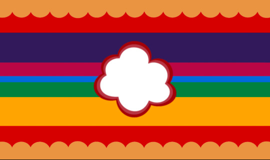
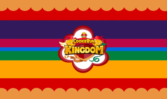
I may or may not be on a Roll (img ID under cut)
Cookie Run Kingdom Paracosm Flag
[pt: Cookie Run Kingdom Paracosm Flag]
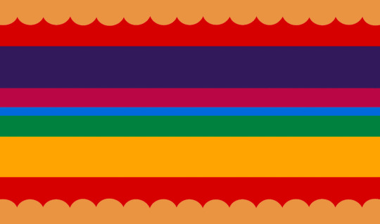
“A Paracosm Flag for those who’s Paracosm(s) is/resembles the world of Cookie Run Kingdom. (could also be just for the world of Cookie Run in general, I’m a crk exclusive player so I only put it)”
This flag is intended for those with Maladaptive Daydreaming or Immersive Daydreaming, but can be used by anyone with a Paracosm.
Tags/credit: Symbol Credit (link), Flag Template Credit @vocaloidgender (dm if want removed)
Color Meanings
[pt: color meanings]
Beige: The Cookies/Cookie People
Red: ?? Idk I just needed another color ima be fr
Dark purple: Dark Cacao/Mystic Flour Cookie
Dark Magenta: Hollyberry/Eternal Sugar Cookie
Blue: Pure Vanilla Cookie/Shadow Milk Cookie
Green: White Lily Cookie/Silent Salt Cookie
Yellow: Golden Cheese/Burning Spice Cookie
Color picked from these images:

[IMAGE IDS:
Image 1: a 9 stripe flag. Colors from top to bottom. A beige, frilled stripe. A brick red stripe. A dark purple stripe. A dark magenta stripe. A thin blue stripe. A green stripe. A marigold stripe. A brick red stripe. A beige, frilled stripe.
Image 2: The same flag as Image 1. there is a cloud/thought bubble png in the center, with a dark red + pale red outline.
Image 3: the same flag as Image 2. the Cookie Run Kingdom logo is over the cloud/thoughtbubble.
Image 4: a badly cropped png of the cookie run app icon
Image 5: the cookie run kingdom logo
END ID]
#lgbtqiia+#lgbtq community#pro mogai#mogai#mogai community#lgbtq#lgbtqia#Cookie Run Kingdom#Cookie Run#Cookie run Ovenbreak#actually maladaptive#maladaptive daydreaming#madd#actually madd#paracosm#paracosm flag#mo0nlit.coins
24 notes
·
View notes
Text

Thank you so much for supporting us as we create ExtraColonist! We are now officially the largest IWATEX mod and just hit 400 members on our Discord so there is an exciting reveal attached... Helios silhouettes!
Our patreons voted on what to reveal, and they wanted to see a teaser for our future crash-landed characters. Do note that there will be 5 main Helios, but only 4 are complete- that's how early you guys got us here! What do you think their augments and personalities are?
and don't worry, progress will be moving smoothly and faster than our first year from now on! We have a clear workflow and thorough mod loader created during this first year.
So let's see what we've been working on since we founded...
April 2024 to March 2025
Art
39 cutscenes
13 backgrounds
78 cards made
50 full character sprites made (multiple expressions each)
18 map sprites drawn and animated
125 emotes
9 character redesigns
4 characters discarded
7 sol accessories
19 celestial tier artworks
72 cards coded in
3 music tracks made
78 memes (internal)
Main menu extended background and logo change
Designed website and reveals template
2 trailers
Writing
Writing fully complete for the first 3 game years
Lore expansions
Full character outlines and documentations
All heart events outlined
New endings conceptualized
Alterations to existing events
Year 1 artbook
Coding
Custom gear capability
Pronouns can change with life stage
Childhood friend mechanic
Full compatibility with other mods
Death capability
Custom music capability for specified events and seasons
Characters can spawn in expeditions
Custom collectables
Custom pets
Pet aging mechanic
Custom map spots per season
Main menu revamp- scrolling capability and new images
Animated map sprites
Lowered memory usage
Load recources at start of game + custom loading scene
Expanded upon dating capability
Custom endings and backgrounds capability and in gallery
Custom credits
Character can optionally age past 20 capability
Disable mods without uninstall (patreon request)
Indicate which mods are active on savefiles
Most remaining exoloader removed and replaced
Complete codebase refactor error reporting and better performance
Custom locations
All vanilla characters, cards, locations, collectables, and jobs overwritten
Collectables scroll bar implimented
Seasonal background changes
Non-windows capability
Sol sprite editing
Random number within range exoscript extension
63 cards coded in
All year 10 characters coded in
Year 10 fully coded with 11 started
BUGS FIXED
Overridden characters stop becoming a woman
Fixed week not being found in saves
Fix for spaghetti characters on slower PC
Fixed animation speed on slower PC
Prevent invalid songs from breaking code
Fixed anne not showing up
Fixed some invalid peri choices & sprites
Fixed wrong use of quotations being used in dialogue
Other
Seraphic LLC registered
400 Discord members
510 unique mod downloads
36 nexus endorsements
18 notes
·
View notes