#gradient colour tool
Explore tagged Tumblr posts
Visit Tumblr Blog
Explore Tumblr blogs with no restrictions, modern design and the best experience.
Last Seen Tumblr Blogs


Fun Fact
Tumblr.com rank in the US is 25.
Text
#kashitij vivan institute#photoshop#image#googel#large images#background change#pixels.com#unplace .com#reffrence#coreldraw#gradient colour tool#Aurika hotel#mockup#png image#Logo outline image#draw the logo#pen tool#landscap place holder
2 notes
·
View notes
Text

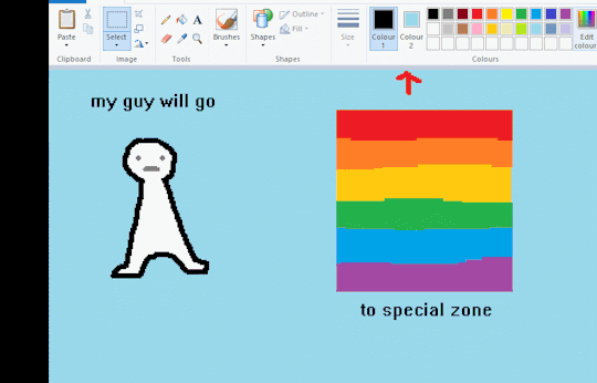
Pride flag inspired by this absurdly long dictionary definition, and this font because it feels the most iconically Nigerian.
<Previous Next >
Notes:
There isn't a word with the same connotations as queer in Yoruba, the words « ẹgbẹ́ ìṣàrà » roughly translates to "community that is strange". Roughly because I am not at all fluent.
The « àrà » in the word « ìṣàrà » means wonder, so I liked the word.
Progress variant + inverted variant:


Space filling variants:


#i was fighting for my life with the gradient tool#that's why i didn't do the intersex variant. i could not figure out a way to make that many colours work#described#pixel art#i don't have a pixel font that i used for this i just drew more letters as i needed them#pride
3 notes
·
View notes
Text

guess what I just discovered on Pixilart 🤩
#I've been using pixilart for a while but I never really went into settings#where this lovely tool option was#in case you couldn't tell it changes the colour you're working with into different gradients#used on the alien girl on the right :>#it reminds me of those scratch pen books I had when I was a kid#when you scratch beneath black to draw rainbow stuff :D#my art#my ocs#oc art#they do not have names at the moment-#have a nice day/night
21 notes
·
View notes
Text
baby steps.
#i gave up on colour aside from the skin ill be selling my soul to gradient maps very soon. trust.#liquify tool and i will also be besties i can tell. many things r bothering me woho!#nno#my art#wip
10 notes
·
View notes
Text

Drawing my water bottle stickers as characters.
Day 3: The Astronaut
#I'm SUPER proud of this one#I didn't draw the sticker because I didn't want to do lineless#doodle#digital art#I really like the way I wrote the word “Astronaut”#The background is the reason I didn't put the picture of the sticker on the drawing#I also didn't want to ruin the vibe#I also love the colours#:]#the gradient tool was my saving grace
1 note
·
View note
Text
1 note
·
View note
Text

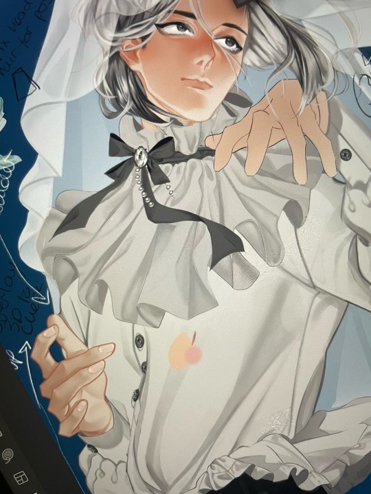
Some CRK style studies & prop design :]
Props for friends’ OCs in a fanganronpa I’m a part of smiles :]
It’s not- that different from my own colouring style -w-. Cookie Run uses a combo of both cel shading, gradients, and airbrush tools anyway
The references I used to study and attempt to imitate the likeness of certain materials from thickness to bounce light blah blah
I’ve still got a lot to learn and improve on I hope to do complex scenes one day in this style
#stufffsart#character concept stufff#alienssscapes#original character#oc#fanganronpa#crk#cookie run kingdom#bizarre list of hashtags here
767 notes
·
View notes
Text

ms paint. you know her. u used her age 8 to make loads of rainbow ovals all over the canvas and then scramble it with selection tool. now u will know her true powers with my handyrandy tips under the readmore. some will be pretty basic and others are very special.
this post has 8 cool trix to learn for you. enjoy and i may do another in the future if i remember/learn more stuff
some of it might be common knowledge. but its got some deep cuts. all tips have gifs to show process easily.
🙂 enjoy and i hope this encourages you to fuck around in mspaint more
soundtrack for this post (loop it while you learn for advanced learning experience)
TIP 1) the right click trick
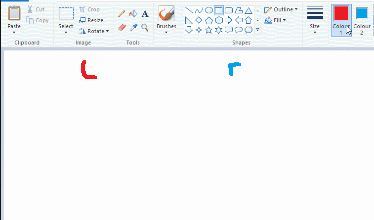
left and right mouse click correspond to col1 and col2 respectively, which u can see in the top bar. this applies to all brushes and the fill tool like above. when using shapes col2 will be the fill colour (if you have solid fill selected). right clicking with shape maker will reverse the colours use on the shape.
TIP 2) right click eraser
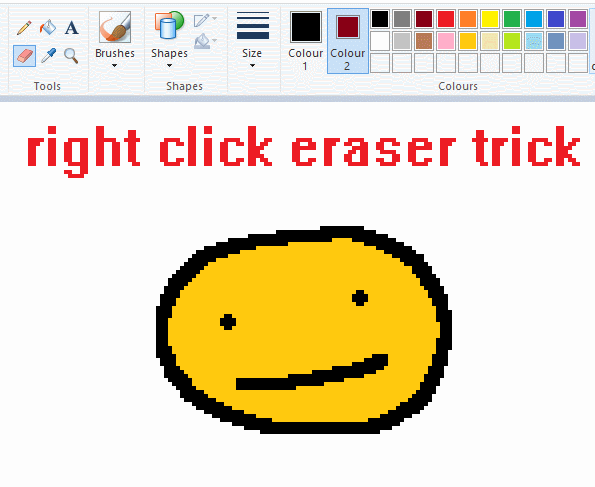
this one is extremely helpful for lineart or add shading. the eraser always uses col2. so your eraser can technically be any colour. but here's where you get powers: right clicking with eraser will only erase onto col1, with col2.
TIP 3) transparent selection change a guy destination
the beloved transparent selection tool works based on what is selected as col2. so long as you have the correct colour as col2 you can make any image transparent and put it on top of anything else. and yes this works with photo bg as you can see.
TIP 4) the gradience
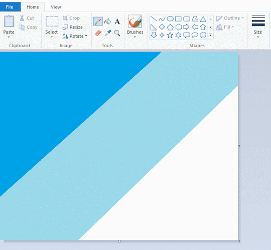
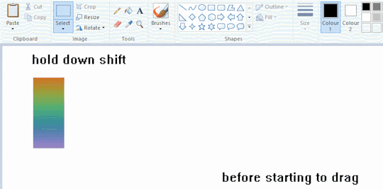
this one is a little more complex. you want to start off with any canvas size, and make as many diagonal coloured bands as you want. (protip: holding down shift makes a perfectly diagonal line with line tool)
then you need to resize the canvas to a width of 1px (make sure you resize by pixels, and do not maintain aspect ratio). then resize again back to its original width (or a different width i cant stop you). you will have your lovely gradience.
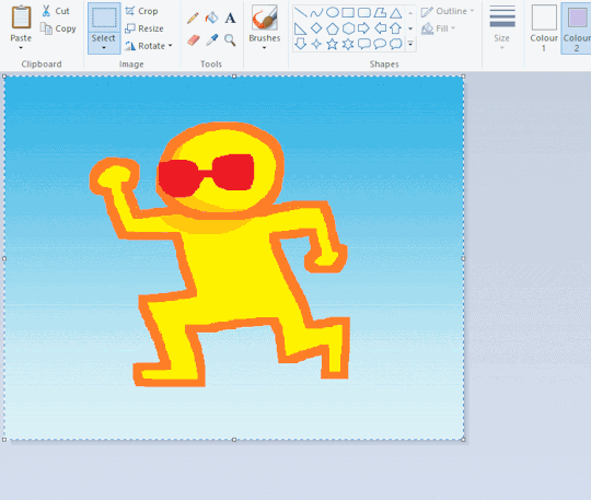
TIP 5) superimposter

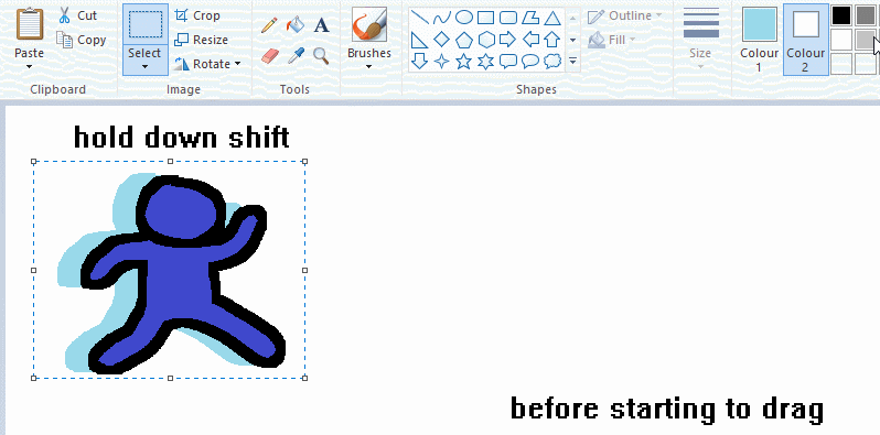
so. you got a cool gradient and wanna put a guy on it. heres what i do:
i open a 2nd mspaint with same canvas size and draw whatever i want on there. i then pick a completely unrelated colour to my entire piece, and set that as the bg. you could use white, pink, geen, whatever you want as long as it doesnt appear somewhere else in ur drawing. copy the guy.
go back to your gradient tab. ensure that col2 is set as that bg colour you picked (lilac for me). have "transparent selection" enabled. paste your guy in. cue fanfare
TIP 6) advanced superimposter
the great thing about this method is u can put multiple gradients in multiple areas of the image. this is where it gets all japanese printmaking type of shit. ukiyo-esque
all you need to do is make another canvas with a new gradient, ensure col2 is set as the colour you want to replace, then paste your original piece onto the new gradient. now my guy has a soft fade. you can do this as much as you want. (you could even make a canvas with a texture or photo and paste your drawing onto there)
TIP 7) "sketch layer"
so as you now know, col2 is what is removed when you click "transparent selection". which means you can also remove any instance of a colour from ur drawing. which means you can have a unique colour for sketch layer and remove it from the drawing later. i admittedly dont do this but it is a great trick to have.
now combine this with lowering your dpi for smoother lines. may seem obvious but it helps. its like a free stabiliser whenever u want.
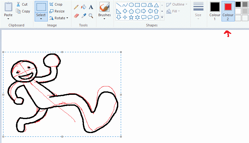
TIP 8) rainbow art
now this is where you can get dizzee rascal "bonkers". check out my small and shitty rainbow trick. you can select anything and hold down shift, then drag with left mouse, to turn that selection into its own brush. i even did it with a guy. and you can of course do this with a photo as well.
🙂well that it for now. hope you liked it thanks for reading now back to your regularly scheduled tgcg programming
2K notes
·
View notes
Text
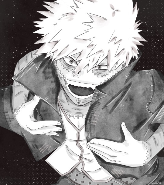
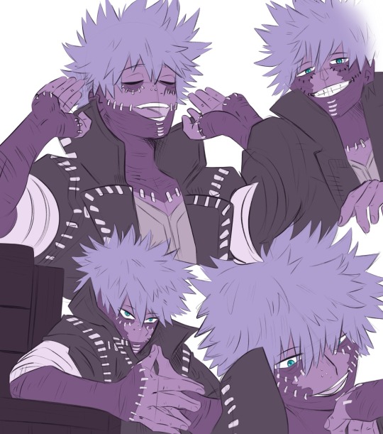
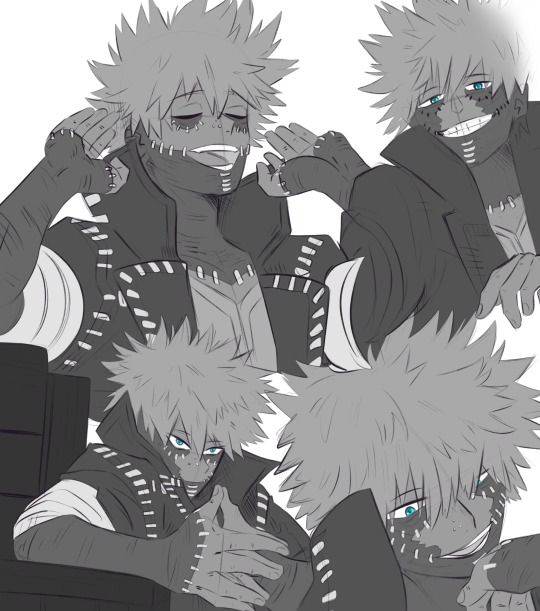
Dabi sketches
(Colour variations below cause I wanted to try the gradient map tool)
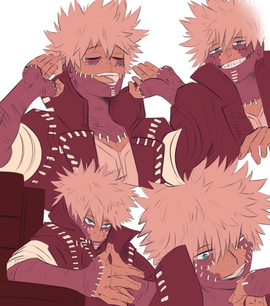
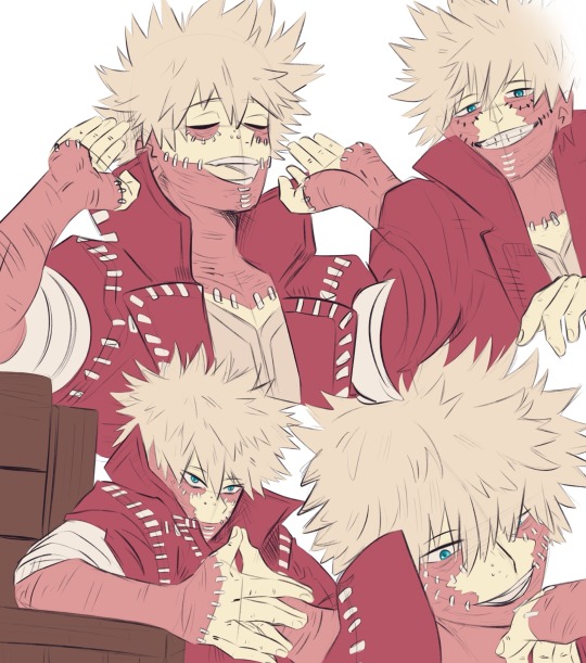
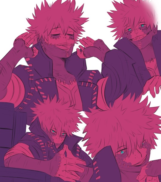
#digital art#art#sketch#procreate#artists on tumblr#fan art#digital illustration#illustration#dabi#mha dabi#bnha dabi#todoroki touya#touya todoroki#bnha touya#mha touya#mha#bnha#boku no hero academia#my hero academia
131 notes
·
View notes
Note
sorry if this has been asked before but how do you make your gradients look so good?
Hi Anon! First of all thank you so much 🫶
I like to use gradient maps (which I've explained here) or gradient fills + gradient tool. I'll drop a little tutorial under the cut:
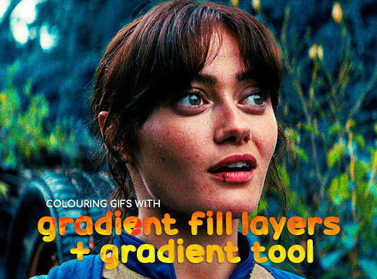
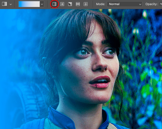
GRADIENT FILL
I'll be using this gif which I've already sharpened and coloured:

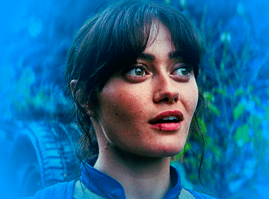
First of all let's make the background pop so I'm going to add a gradient fill (Layer -> New fill layer -> Gradient) with these settings (I'm using this colour #0099ff):

Now it's the time to play with the blending settings! Depending on your scene some will look better than others but I usually switch between Soft Light, Overlay, Color or Hue. 90% of the time I use soft light but this scene looked much better using overlay:

As you can see the background looks more blue and vibrant but it's not too much you know.
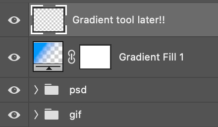
GRADIENT TOOL
Now it's time to use the gradient tool to give this gif a hazy look. I haven't seen many gifmakers talk about this tool but it's soooo useful and it takes gradients to a whole new level.
Before using this tool we'll need to add a new layer above the gradient fill, like this:
(HELP I just realised I typed “later” instead of “layer” 🤡 but let’s ignore that)
You can choose the gradient tool by pressing 'G' and then clicking here:
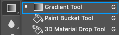
Make sure your gradient goes from any colour to a transparent background.

Okay so next to this gradient settings we have five different styles and each one will create a different shape. Depending on the scene I'll use the first, second or fourth one. Here are how they look:
1. Linear gradient
2. Radial gradient + Reverse (if you don't click this you'll end up with a blue circle above your gif)
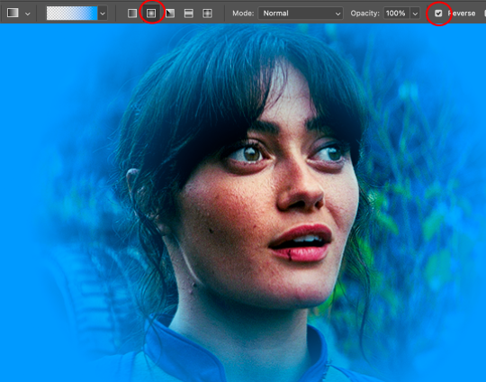
3. Reflected gradient + Reverse
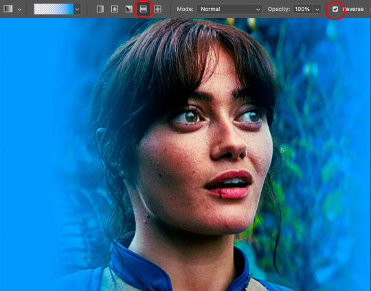
This time I'm going to use the radial gradient so to draw it start by clicking on the centre of the gif and drag the line (the farther you drag it the less intense the gradient looks):
And this is the gradient:
And here comes the fun part again, playing with the blending setting and the opacity! Before doing anything I duplicate my gradient layer because I always use more than one so this is how your layers should look like:

Let's go to the first gradient tool layer and again try different blending modes: soft light, overlay, hue... Most of the time I'll use 'Soft layer' and I'll leave the opacity at 100%.
For the second layer choose 'Screen' and don't worry if your gif looks too bright because we're going to fix this by decreasing the opacity. Anything between 20-60% should look good but it depends if you want a more vibrant or more natural effect. I ended up using 40% and this is the result:

And we're done!!! As you can see the result looks much different from our first gif and it only takes a couple of layers!
Honestly the best advice I can give you is to play with the opacity and blending mode of the different gradient layers because depending on the scene some will look better than others!
#ask#Anonymous#ps tag#tutorial#usernolan#userrin#useraljoscha#uservalentina#userbunneis#userlockescoles#usernik
570 notes
·
View notes
Note
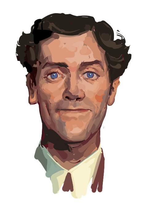
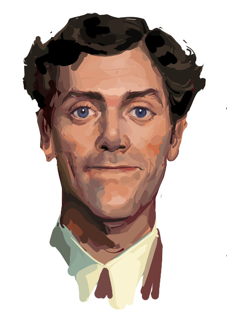
Hii I saw your bertie and jeeves portraits and I was wondering how you made your colors not look "blocky" or patchy even if you layer/use opaque paint? I guess, how do you know what transition colors to use? Sorry, I'm self taught and still learning! Thanks in advance and I love your art 💕
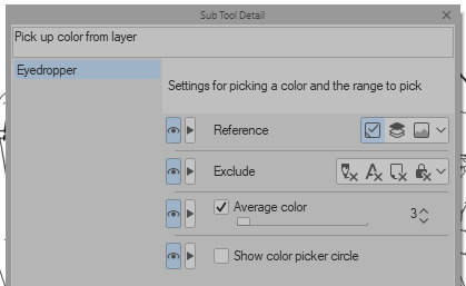
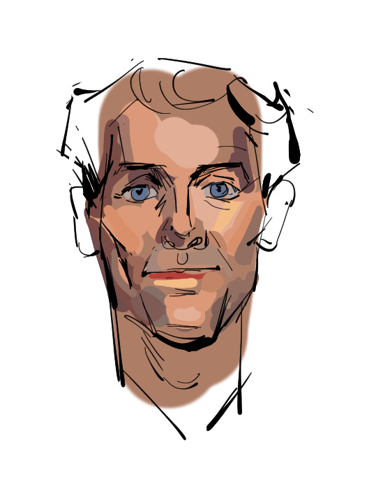
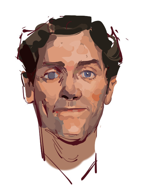
Ah You're lucky i actually have the progress shots of one of those heads. The only real thing i do is have "Average colour" selected on my colour picker tool so after i lay down all the rough blocks i can just select between them and start to create the faux gradient

you can also see how i still add colours throughout the process like the red to bertie's cheek but after a point it just becomes refinement. i try not to use small brushes to shape the gradients until im close to the end which is where most of the "blending" happens.
2K notes
·
View notes
Note
have u ever done a colouring tutorial?
yeah! kinda. ish. it was a while ago and just on bsky LOL i'll try and recreate it by copypasting from the post
*I DO NOT FOLLOW THIS PROCESS EXACTLY LIKE THIS ANYMORE, i actually do all my shading on a single hard light layer now using both a hard brush and an airbrush, and i do the same with the highlights using a lasso tool and airbrush! maybe i'll make an updated tutorial soon*

layer 2 is the base color layer that i clip the colors (folder 2) to; i select everything outside the lineart and invert it before filling it with my shortcut ctrl + f. this is so i have a base to see my colors that isnt pure white (it helps everything look filled just in case i do miss spots too)

i put down each flat color on its own layer just in case i need to adjust or use individual color layers; all of these are in folder 2 which i clipped to the base color layer. these are local/base colors that will be adjusted using the shading layers and such

a buncha hard light + add glow layers for shading and lighting! i add a few of each depending on what i want it to look like; the hard light is for shading and the add glow is for highlights and bounce lights

lineart colors clipped to the lineart layer + a gradient map above everything to bring it all together ^^
108 notes
·
View notes
Note
this a gorgeous gifset for wicked 💗
https://www.tumblr.com/tidescaller/781106467228073984/glinda-in-wicked-part-i-happy-birthday?source=share
I would appreciate a tutorial for the first gif blending and colouring

Hi anon! thank youuu, i'll leave the tutorial under the cut ૮(˶˃ᆺ˂˶)
As always, basic knowledge on making gifs is required to do this type of edits. I linked some useful guides on my previous tutorial here.
PART I: BLENDING
STEP 1, BASE GIF
I recommend getting ready the gifs you're going to use before any try on blending them. And which ones are right to blend? That's just depends on the scenes you're working on. On this gifset, I made two previous blends that didn't make it to the final version cause I didn't like how it turned out. It's all about trial and error.
For this specific blending, as I'm working with only 2 gifs, I'll start editing first the base and then the one "blended". Adjust your BASE GIF in your canvas as you want.

I sized mine like this cause I imagined the second scene of Glinda behind this one.
STEP 2: BACKGROUND
i followed becca's coloring tutorial for this part, except I didn't add any adjustments yet. only coloring the background for a later gradient blending.

STEP 3: BLENDING
Duplicate your other gif into the canvas and change its blending to screen

Now add a layer mask (the button marked with red in the picture) and, with a soft brush at 200px/300px, start erasing whatever you don't want. Remember black is 0% opacity and white is 100%.


STEP 4: THE BLENDED GIF
The problem I noticed by this point is that my background coloring on the BASE GIF was kinda irrelevant cause now the BLENDED GIF completely covered it (。•́︿•̀。) and I also wanted this one to be pink. In order to do this, I created a gradient map layer and made it as a clipping mask so it wouldn't affect my main gif.


PART II: COLORING
STEP 5: BASE
For the base coloring, I always follow this tutorial cause it's literally how I learned how to do it. Honestly, check all maziekeen's tutorials (she made A TON) cause they are so good and your learn a lot. However, I tend to give my personal touches like adding another vibrance layer if i feel like it, cause I like the colors to pop; or skipping steps if I don't think they fit my gif/style. Anyways, this is the result for now:

and these are my settings


i tried to translate as much as possible (,,>﹏<,,)
STEP 6: SMALL TOUCHES
Could leave the gif as it is, but when I was working on it, I felt like something was missing. So the last step is to apply/paint some small touches of pink (or whichever color you're working on). This trick I learned it from this beautiful and very detailed tutorial from dani (she is awesome!! and her tutorials and gifs are flawless!!)
Create a new layer, use the soft brush tool at 1000px, zoom out your gif and start painting out of the canvas (you can totally paint inside if you feel like it) Play with different opacities and blending modes of the layer, this is literally how I created all these gifs. I know it sounds stupid ajskjas but it's true!! Try what best fits the structure of the gif. The first one I made is with multiply at 60% and you can see how much the gif changed already.

The second being color at 100% and the third one hard light at 30%
STEP 7: THE CHERRY ON TOP
Finally I added an animated overlay from this post. Changed the blend mode to screen and erased a bit of it on glinda's face creating a layer mask and with a soft brush. Added my texts... and that's a wrap! :D

I used the same process on gifs 3 and 5 ⸜(。˃ ᵕ ˂ )⸝♡
#*tutorial#gif tutorial#photoshop tutorial#blending#coloring#allresources#completeresources#dreamcreations#dailyresources#gifmakerresource
95 notes
·
View notes
Note
I want to know how you render.
A lot of people seemed to be oddly interested in how I render so...
Shape first
I use solid brush or lasso to block in the light and shadow first.
You can see this in the Till drawing because it's all hard edges


2. Add high saturation colour in the area where the light turns into shadow.
I like to do this cause it gives a glassy transparent feeling to my drawing.
like these:


3. Cause most of my drawings are 70% in shadow + 30% in light, i will render the shadow
that means, adding another "light" to the shadow, like reflective light or so. For the till drawing, its a blue light from the left

However, we need to make sure the secondary light doesn't destroy the main light source, so this secondary light will only cause hue and or saturation changes instead of value changes
...
Above are the logic for my doodle drawings, but if i want to continue, i will do the following:
4. Separating more forms
ie, for the till drawing
if the form faces left, it will be affected by the blue light.
if the form turns away from camera and not affected by the blue light, it will be redish
if the form is hard, shape will have hard edges
if the form turns, shape will have soft edges
5. Separate space
Things in front are solid and things in the back are blurry


---
Well, in my art logic, i think "rendering" is separating more layers of information, ie
separating form's plane (via lighting, edges etc)
separating space (via blurriness and light decay)
separating material (e.g. if hair strip is thin, it will be more transparent etc)
oh and i usually add gradients, so it contrasts with the hard blocks i make ✌
---
hope this helps
I posted some of my drawing process on Bilibili @356Migoro, if anyone is interested.
---
🤔Actually, I intended to make a YouTube channel to share my art shenanigans, but I'm just a bit too busy lately, let me know if there's anything else you are interested✌
---
also, normally I don't paint in a solid step-to-step process, its usually i realise that after i have done something, there's still not enough information, so that i "add logic" to my drawing. (e.g. adding the blue light for the till drawing)
---
and since people asked before:
i use CSP to paint everything
I only use 5 type of pens, they are my main partners in crime✌✌✌ (1) lasso and Default G-pen to line and block in hard edges, (2) Transparent pens for mixing colour (3) Blur tool, (4) Gradient (5) texture pen

glhf
#art tutorial#digital art#art process#thanks for having me lols... have a good day#and the reason why my art style changed a lot after my Slow Damage period#is that i traveled to a mountain in China to seek art knowledge from Ale-sensei#(its actually a proper art training institution in China called Magic Leaders but I'm just trying to be funny here)#so yea I am still trying to find my balance between what i already knew and what i learnt there...#and there's a period where i learnt too much and i became really confused so my art style is not very consistant
236 notes
·
View notes
Note
Ik vind het geweldig hoe levendig en karaktervol je gezichten zijn! – en de manier waarop je je haar tekent is ook prachtig! Zou je, indien mogelijk, wat tips kunnen delen over je proces?
Dank u!
Process:

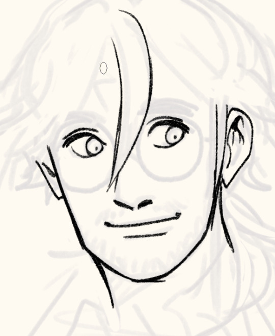
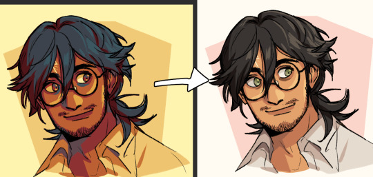
I sketch very loosely, usually using a pencil brush. Drawing quickly and lively is the priority here, but sometimes it means the drawing quality is really awful lol. I try to flip the image a few times to make sure it's not like, Wrong. Which it will be, to be clear. I hold my pen at a dramatic slant, so my faces are always distorted.
Here's a corrected face next to how I instinctively sketch it out (after flipping the image):

Bad
I wanted to say you can tell when I use 3D models to expedite this but actually they look identical because I not only correct my natural distortion but I also correct the 3D jank. Is correction my art style...?

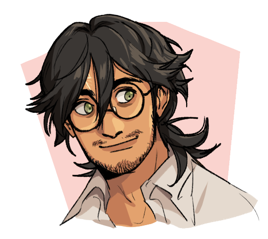
Anyway, the rest of the piece.
I find it easier to use a thinner brush and go over the lines a few times to make it thicker than use a brush with thick line weight. This gives me more control and looks more natural.

I build up thickness on the beard with condensed hairs curling one direction and then in the other. Layering them makes it look thick and natural. (Mustache is more sparse, so it's just single curves.)
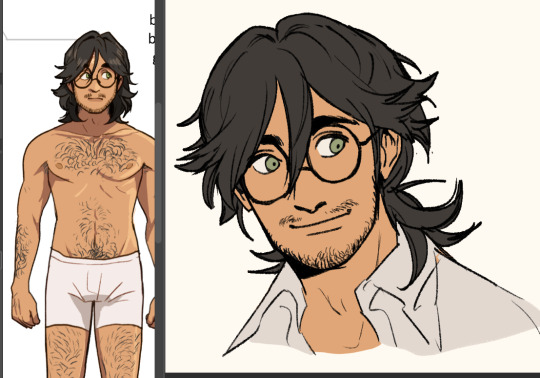
Then I pull up old colours to flat it. I usually work in only 2-3 layers, one for darks and one for lights - dark and light colours will fill differently, and splitting them like this means I can use a lasso fill faster. If there's a really detailed element, I give it its own layer for ease of lasso.

When colouring, big gloopy pen pressure is actually useful to livening up the piece. Make sure theres a light source. I always pick the one that makes the nose easier to draw. Add a second, deeper shadow in corners (like just under the chin) for some depth.

Now that he has more dimension, I can actually see there's a wee bit more to correct. What am I correcting? I don't know. It just looks wrong. I use mesh transform and the liquify tool until my brain stops hurting.

Good enough! Now for the mandatory filters.
I use mzxmmz's iikanji gradient sets (all 3), because they're very drastic and make interesting colour splits. I set them to 20%~30% opacity on a soft light correction layer.
And there he is. Crazy stalker handsome rogue Harry
As for the way I draw my hair, there's actually a quick cheat:

Draw the curls like ribbons (orange). Note how the thickness varies, like the angles of a ribbon. Add texture with little accent lines (green). Fill it out by following along the edge of the curl (purple). Repeat this with a bunch of different strands. It will end up looking very full and with a strong sense of shape.
You can establish this shape by just drawing single lines of the curl pattern/shape you want and then filling out the rest with the ribbon form, detail, and following-line.
Beautiful complex-looking organic curl pattern in minutes!
76 notes
·
View notes
Text
Gaming GIF Tutorial (2025)
Here is my current GIF making process from video game captures!

PART 1: Capturing Video
The best tip I can give you when it comes to capturing video from your games, is to invest in an injectable photomode tools - I personally use Otis_Inf's cameras because they are easy to use and run smoothly. With these tools, you can not only toggle the UI, but also pause cutscenes and manually change the camera. They are great for both screenshots and video recording!
As for the recording part, I personally prefer NVIDIA's built-in recording tools, but OBS also works well in my experience when NVIDIA is being fussy.
PART 2: Image Conversion
Do yourself a huge favour and download PotPlayer. It is superior to VLC in more ways than one in my opinion, but is especially helpful for its Consecutive Image Capturer tool.
Open the video recording in PotPlayer, and use CTRL + G to open the tool. If this is your first time, be sure to set up a folder for your image captures before anything else! Here are the settings I use, albeit the "Every # frame" I change from time to time:
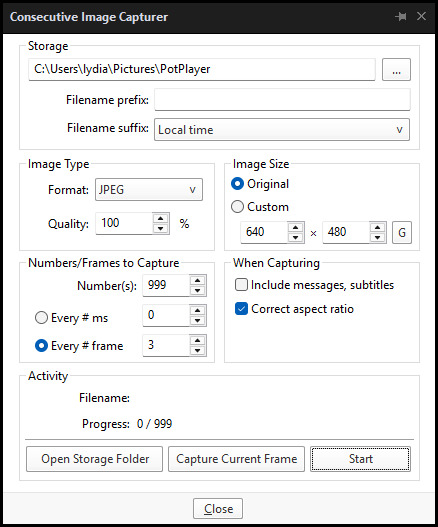
When you're ready, hit the "Start" button, then play the part of the video you want to turn into a GIF. When you're done, pause the video, and hit the "Stop" button. You can then check the images captured in your specified storage folder.
(TIP: Start the video a few seconds a head and stop a few seconds after the part you want to make into a GIF, then manually delete the extra images if necessary. This will reduce the chance of any unwanted cut-offs if there is any lagging.)
PART 3: Image Setup
Now, this part I personally always do in GIMP, because I find its "Open as Layers" and image resizing options 100% better and easier to use than Photoshop. But you don't have to use GIMP, you can do this part in Photoshop as well if you prefer.
Open the images each as an individual layer. Then, crop and/or scale to no more than 540px wide if you're uploading to Tumblr.
(TIP: This might just be a picky thing on my end, but I like to also make sure the height is a multiple of 10. I get clean results this way, so I stick to it.)
If you use GIMP for this part, export the file as .psd when done.
PART 4: Sharpening
If you use GIMP first, now it's time to open the file in Photoshop.
The very first thing I always do is sharpen the image using the "Smart Sharpen" filter. Because we downsized the image, the Smart Sharpen will help it look more crisp and naturally sized. These are the settings I mostly use, though sometimes I change the Amount to 200 if it's a little too crunchy:

Here's a comparison between before and after sharpening:


Repeat the Smart Sharpen filter for ALL the layers!
PART 5: Timeline
First, if your timeline isn't visible, turn it on by click on Windows > Timeline. Then, change the mode from video to frame:

Click "Create Frame Animation" with the very bottom layer selected. Then, click on the menu icon on the far-right of the Timeline, and click "Make Frames from Layers" to add the rest of the frames.
Make sure the delay should be 0 seconds between frames for the smoothest animation, and make sure that the looping is set to forever so that the GIF doesn't stop.
Part 5: Editing
Now that the GIF is set up, this is the part where you can add make edits to the colours, brightness/contrast, add text, etc. as overlays that will affect all the layers below it.
Click on the very top layer so that it is the one highlighted. (Not in the timeline, in the layers box; keep Frame 1 highlighted in the timeline!)
For this example, I'm just going to adjust the levels a bit, but you can experiment with all kinds of fun effects with time and patience. Try a gradient mask, for example!
To test your GIF with the applied effects, hit the Play button in the Timeline. Just remember to always stop at Frame 1 again before you make changes, because otherwise you may run into trouble where the changes are only applied to certain frames. This is also why it's important to always place your adjustment layers at the very top!
Part 6: Exporting
When exporting your GIF with plans to post to Tumblr, I strongly recommend doing all you can to keep the image size below 5mb. Otherwise, it will be compressed to hell and back. If it's over 5mb, try deleting some frames, increasing the black parts, or you can reduce to number of colours in the settings we're about to cover below. Or, you can use EZGIF's optimization tools afterwards to reduce it while keeping better quality than what Tumblr will do to it.
Click on File > Export > Save for Web (Legacy). Here are the settings I always use:

This GIF example is under 5mb, yay! So we don't need to fiddle with anything, we can just save it as is.
I hope this tutorial has offered you some insight and encouragement into making your own GIFs! If you found it helpful, please reblog!
141 notes
·
View notes