#a warmer palette for a change
Explore tagged Tumblr posts
Visit Tumblr Blog
Explore Tumblr blogs with no restrictions, modern design and the best experience.
Last Seen Tumblr Blogs


Fun Fact
In 2020, 27% of US Tumblr users had an annual household income of over $100,000.
Text
See Ya'!
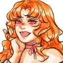
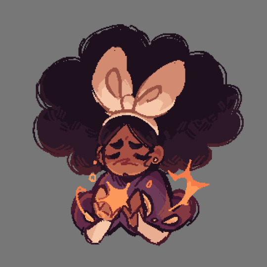
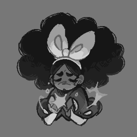
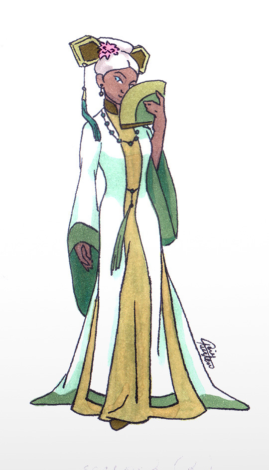
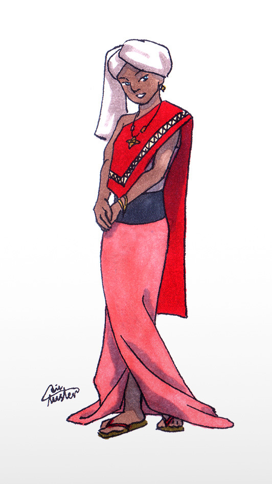
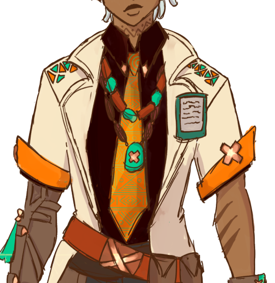
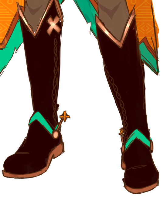
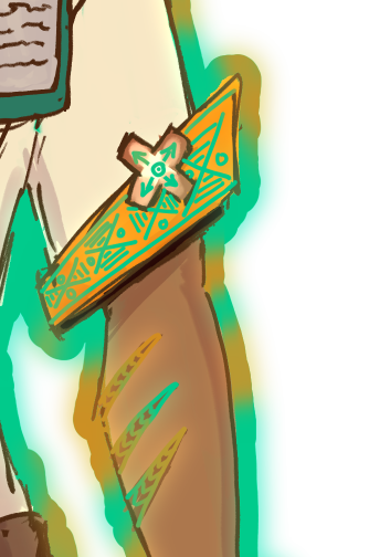
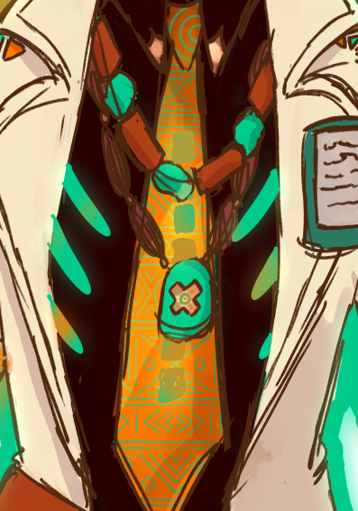
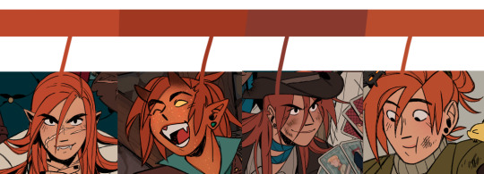
#skk#fem skk#art#fanart#bsd#bsd fanart#iztea draws#dazai#bungou stray dogs#illustration#chuuya#femzai#fem dazai#fem chuuya#a warmer palette for a change#it's been a while#painting#bsd dazai#bsd chuuya#soukoku#fem soukoku
2K notes
·
View notes
Text
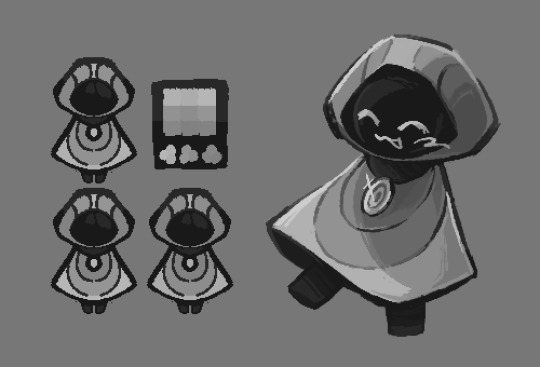
ChordStriker!Poppy

Speaking of ChordStriker, I did some Rock!Poppy sketches to plan out her ref. Not entirely sure about the colors but she was too cute not to share!!

Rock Concert Outfit!!
She always has bat wings (Rock Troll HC), but she makes them a bigger for concerts! (Their wings can grow or retract similar to the way their hair can!!)


Tattoos and a closeup of her eyes! Aren't they pretty? 🩷💕
---
I know people are pretty curious about my au so hopefully I can finish that comic teaser poster and give you guys an official synopsis and overview!! :]
#ain't she just the cutest#i changed Poppy's palette just a tad#she's slightly darker and warmer in color#trolls#dreamworks trolls#trolls poppy#trollsbuzz#rock poppy#cs!poppy#chordstriker!poppy#chordstriker au#trolls world tour#cs!art#my trolls art
369 notes
·
View notes
Text
Yours, Mine, Ours
Simon ‘Ghost’ Riley x Reader
wc: 1.5k words
warnings/tags: fluff

“So did the other two actually say no or did you just never invite them?”
“‘Course I invited them, you asked me to, so I did.” Simon replies with ease, keeping his eyes fixed on the road ahead of him. “They’re smart lads, lovie, they knew to say no all by themselves.”
You shake your head at him in disbelief but the smile that’s been plastered across your face ever since the two of you pulled out of your flat’s parking doesn’t budge. Simon’s been driving for a few hours now, and as stressful of an experience as that is alone, you’re too excited to mind the long journey in the car.
Simon is on leave for the next two weeks, something about Price having to attend a funeral following a death in the family, and deciding that everyone on the force was due for a bit of time off. Seeing as the Captain was going to be preoccupied during his time off duty, he had asked if Simon wouldn’t mind checking in on his house for him, making sure things were alright. He’d even offered for the two of you to stay in the guest room for the duration of their leave.
Simon had explained how Price knew that the two of you were living in a small flat in London, and apparently his home was in a beautiful, forested, isolated area which meant he had essentially no neighbours, something he also knew would appeal to Simon. He offered for the two of you to stretch your legs out there at enjoy the property, including the privacy that came with it.
Wanting to be polite, you’d told Simon he should extend the invitation to Soap and Gaz, thinking they might enjoy a nice, quiet stay-cation as well at their Captain’s place away from it all. It would appear your lover had different ideas in mind however. Though you couldn’t blame him entirely, the thought of having the cozy cabin all to yourselves was certainly more appealing.
Every which way you look outside the car, your vision is filled by endless blurry trees as you zoom by, the colours of the leaves having finally changed into the warmer, more vibrant colour palette that came along with the autumn chill. If the drive up to his property was any indication of how beautiful the area really was, then you were in for quite the treat.
Entranced by the beauty of the landscape in comparison to the city lights you’ve grown so used to, you fail to notice the glances Simon keeps sneaking your way, the smallest of satisfied smiles seemingly permanently etched upon his face beneath his balaclava. He was grateful that after explaining the situation and Price’s generous offer to you, you had been too excited to ask many questions, instead getting a jump start on packing a duffel bag or two.
You were one of the most intelligent, clever, curious people he’d ever known, and it was normally quite difficult to get anything by you. He was therefore feeling rightfully proud of himself as he drove you nearer and nearer to the home you believed belonged to his Captain. In actuality, there was no funeral for Price to attend, the sergeants had certainly not been invited along on your getaway, and the home you’d be staying in wasn’t Price’s.
It was yours.
Yours, and Simon’s.
The two of you had been living in that shoebox of a flat he’d considered as ‘satisfactory’ when he was only staying there as a bachelor, for far too long. As ideal as the location might have been, there simply just wasn’t enough space for two people to live together, even considering Simon’s absences for work and that fact that when he was home, you two were essentially always on top of one another anyways.
You’d both been searching for a new flat for what felt like ages now, none of the places you visited feeling like the right fit. Simon would be weary about a certain neighborhood, you’d be concerned with the lack of any balcony or outdoor space, he’d ignore the price tag that felt your eyes bulging, and you’d shake your head as you walked through doorways that had him needing to duck down.
Little did you know, Simon had been doing his own house hunting, outside of the city. You had told Simon you were fine with staying in London, understanding that it’s convenient to have everything near by. But Simon didn’t want to give you just ‘fine’. He wanted to give you a home. The home he intends to spend the rest of his life with you in, plans on carrying you over the threshold in your wedding dress, hopes to carry sleeping newborns in their car seats through the door.
For months now, Simon has subtlety been learning more about what that home looked like to you. He’d look over your shoulder as you scrolled through Pinterest, casually asking if you could show him your boards, you know just for fun, and paid very close attention when you showed him the one named ‘future house’. On his phone, he had a list a mile long in his notes app, from secretly writing down every comment you made while watching your home reno shows. He’ll casually ask you what you think of the houses you drive by, jotting down your answers in his mind, remembering likes and dislikes.
He believes that like you, it’s the people filling the home that matter more than the structure itself, as proven by the way you continue to put up with his minuscule flat. He knows you mean it when you say you’re alright with another flat. But he has the money goddammit, he has the means to do this for you, and when the listing came up for a home in what you’d revealed as being your ideal area to settle down in one day, the house resembling the amalgamation of everything he believed you’d described as being your perfect place, he knew he had to put an offer in.
And if there ever was anything about the house you didn’t like or wanted to change, he’d gladly do it for you, no questions asked. You want to paint the bedroom? Just tell him what colour you want. You want to change the railing on the wrap around porch? He’s on his way to the hardware store already. You need him to dig a stump out of the backyard to make room for your garden? Sit back and enjoy the show lovie, he’s on it. And when the time comes to build a crib? Well he may as well baby proof the whole house while he’s at it too.
He’s pictured your reaction a thousand times over in his mind. He imagines you’ll maybe give a small gasp when he turns the corner of the long driveway and you first see the cozy, two-storey home, surrounded by never-ending foliage of red, orange, and yellow leaves, the time of year perfect for appreciating autumn in the UK, as well as the privacy the tall trees grant you. He thinks the first thing you’ll comment on will likely be the windows, an item high on your priority list he knew to adhere to.
He imagines you kicking off your boots as you step through the door, pace quickening to explore every room, spinning in the kitchen as you joke about how jealous you are of Price. He pictures you groaning with envy when you spot your dream master bathroom, insisting to Simon that since you’d been tasked with checking in on the home you may as well see every room, right? He plans to explain away the obvious sparseness of the home as the Captain not having lived here long, as being very non-materialistic after all his years in service.
He’ll continue to play along for as long as he can, part of him knowing that you know him well enough that you’re likely to catch onto his deception at some point. However he hopes that before you start rummaging through kitchen cabinets and find them empty, too empty even for an absentee captain of a homeowner, that you’ll mention something along the lines of wishing you could stay here longer. That’s when he plans to slip a key into the palm of your hand, revealing that you might be able to stay longer than you believe.
The small piece of metal that’ll unlock the rest of your lives together, sits heavy in his pocket, in contrast to the light feeling in his heart when his hand reaches across the dashboard to grab a hold of yours, knowing that the content, lovesick smile you offer him is likely stretched across his face as well, staring right back at you.
Though you’re unaware that Simon is currently driving towards your home, and not away from it, you’re gently stroking the scarred skin across his hand, feeling as though your home is sitting right next to you, holding your hand and your heart at the same time.
#call of duty#call of duty fanfic#call of duty fic#simon ghost riley#simon riley#cod fanfic#ghost x reader#simon ghost x reader#simon riley x reader#simon riley x you#cod simon ghost riley#cod simon riley#simon ghost riley x reader#simon fluff#simon ghost riley x you#simon ghost riley fluff#simon ghost fluff#ghost x you#ghost fanfic#call of duty ghost#ghost cod#ghost#readwritealldayallnight
2K notes
·
View notes
Note
Okay, doodle request:
Reigen meeting Serizawa before Claw got to him. Maybe helping him start leaving his room?


I had a lot of fun with this one. I wanted it to parallel the scene of Serizawa meeting Suzuki, and so pages 6-8 are directly referenced from the manga (just in a flipped format so it reads left to right like the rest of the pages) and I also referenced some shots from the anime (like the final panel of page 10). For the dialogue in those middle pages, I referenced lines from the unofficial English translation of the manga, the official English translation of the manga, and the anime. (I was picking and choosing which lines I liked better). I also had fun with the colouring, which is something I love to do in comics especially. It starts out with Reigen in a muted, paler, desaturated palette with no highlights. But when he meets Mrs. Serizawa (I gave the name “Azumi” because it means something along the lines of “safe home/harbour”), she’s much more warmer and saturated and she has highlights. Once she starts explaining her son’s situation, that’s when Reigen has the variation of colour as well as the introduction of some small highlights. Then, the colour palette changes in every panel after that point. Serizawa is done with a grayscale palette, with the only colour on him being the bright light of the TV screen (reflecting video games as his only joy and his escape from reality). As Reigen talks to him, Reigen slowly start to lose some of that variety and saturation (AKA hope) he got from Mrs. Serizawa until he goes grayscale as well when he thinks that Serizawa might know he’s a fraud. He decides to switch up his approach and actually open up, which is what causes the variations in colour to return. Serizawa stops being grayscale in the panel where Reigen reveals that he too is lonely. (He’s a gray-blue palette, but it’s not true grayscale). The next page is in bright colours as Reigen opens up and doesn’t lie, which causes Serizawa to have bright colour as well, since now there is light and hope. In the page after that, Serizawa’s colour fades until he is grayscale again because it’s him not believing fully and still having doubts, while Reigen maintains that bright colour. (Also silly Falsettos reference on that page). I have Reigen’s colours shift from yellow until he reaches pink which is the colour I just have assigned as His Colour (since his tie is pink). Serizawa gains colour again and he shifts from that muted dark blue to finally orange (which is his colour) as he finally accepts Reigen’s help. The light from the TV is no longer coloured, and is just white, because Serizawa now has a new source of colour in his life (that being a real friend.) It ends with them being in their normal palettes at a normal happy saturation, contrasting the muted colours of the start of the comic. With the umbrella, I still wanted to include it and give it a role in the story, but in a different way from how Suzuki used it. While Suzuki used it to directly manipulate and control Serizawa, Reigen used it as a way to open up a choice for Serizawa to either let Reigen stay or make him leave. He asks Serizawa if he can sit and stay for a while since it’s raining outside and he didn’t bring an umbrella, despite clearly having done so. And then I ended the comic with a shot of the umbrella to emphasize that point.
Sorry for the long and probably unnecessary explanation. I just really love explaining my intentions and symbolisms in my art. Yeah I just had a good time over the last few days doing this :) I thought it was an interesting idea and I couldn’t think of a way to reflect it better than in a comic (which was also partially inspired by this wonderful Ageswap AU comic made by @fend13th about Reigen helping Serizawa)
#doctorsiren#mob psycho 100#reigen arataka#serizawa katsuya#serirei#<- in a way hehe#mp100 fanart#mp100 au#comic#digital art#my art#procreate#doodle requests#long post#me when i say “doodle requests” and then proceed to spend a couple days making a 15 page long comic OOPS#I have fun doing this dw#I feel like i forgot something i was gonna say but this post is too long already oops haha
3K notes
·
View notes
Text
HAPPY (kinda late oops) BIRTHDAY MIWA!!!!!!!! ignore the other two LOOK AT HER!!!! IT’S MIRABELLE MSUNDAY!!!!
greyscale versions + my very normal color ramblings below!
ok full disclosure i already had this post drafted before realizing that mira’s birthday was coming up. i kinda debated just posting the mira doodles on their own but!!! i want to talk about my craft/general color headcanons still. and the mira art is part of that!! so be warned. also, this is going to reference my post about my craft headcanons a lot so like. read that if you so desire.
i personally think that mira’s healing craft is some form of creative craft, since the game describes her holding her palms up when she uses it (iirc anyways). this doesn’t really have an effect on anything, but it’s why i decided to color it yellow!
(also i ended up making mira’s scissors craft a lot more orange than i initially planned but that’s ok!!! i think both of her crafts would be pretty Orange. just thought i’d mention that since it’s a bit different from my first post)
i already explained sif’s craft in my last post so now i get to talk about the change god!!!!!! this is like. probably the most out there in terms of my color headcanons? but i have a reason for that. since the change god is, well, a deity, i thought it would be fitting for their design to match the colors of the 3 craft types (red, blue, and yellow)! this was a little hard to work around given that i also try to give my vaugarde designs warmer color palettes, but i think it worked out!
i also gave them a few slightly different palettes, since i think it’ll make sense for the change god’s colors to be variable. they never look the same, so why would their palette look the same? + i’m indecisive and liked all of these palettes lol
sorry for the ramble! i really like talking about character design and i’m not. very succinct. thanks for reading all this (if you did, perfectly fine if you didn’t!), here’s the greyscale versions as promised!!!
#marshdoodles#isat#in stars and time#isat spoilers#HAPPY BIRTHDAY MIRABELLE!!! sorry for hijacking your birthday to ramble about colors 🩶#i usually reserve my character design infodumps for the tags but i REALLY wanted to talk about my change god design. sorry#dont mind the fact that the change god palette looks like mettaton#this isn’t the first time i’ve drawn the change god btw! i just. haven’t posted those#because they’re for isatscryption#also posting this at a different time than usual because i don’t want to actually miss her birthday lol#anyways again!!! sorry for the infodump!!!!
3K notes
·
View notes
Text
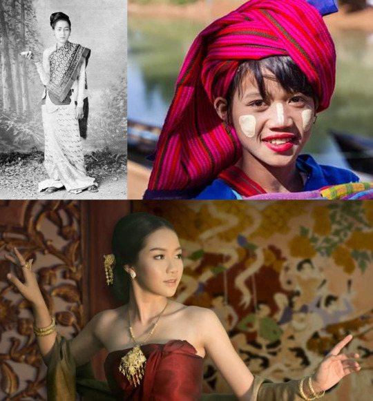
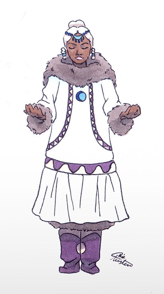
Some "if Yue is alive and went travelling with the Gaang" designs
With a ton of text about cultural inspiration.


The main book 2 look
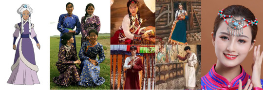
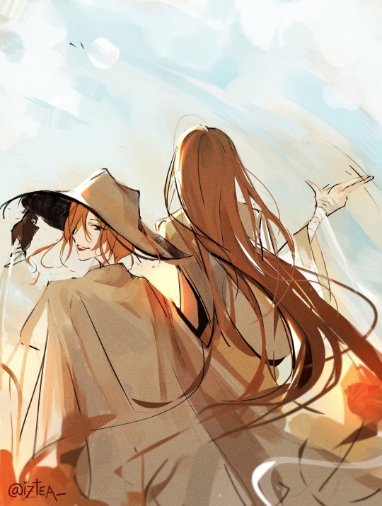
I wanted to show cultural differences between the tribes, so Yue's look is sort of Mongolian. There were Mongolian-styled hats in the Northern tribe, and Yue's dress under the coat looked like a Mongolian deel (thanks @atlaculture for all these posts about clothes and everything else!), so it's not much against the canon information.
So she's wearing a deel again with a second layer - there are chinese actors on photos as far as I know; I hope it's okay. One-shoulder silhouette refers to later Aang's clothes because Yue is still kind of a spiritual person (she wasn't a fighter, so I want her to have some other useful talent – not a bender or healer like Katara or a non-bender warrior like Suki). Violet, pink and white were originally her colors, no changes here. Three blue characters would be too much for a group of five, and total white is not practical at all. I like to think that violet color shows high rank in the Avatar universe; in the original series it was only worn by princess Yue, Kanna, the chief Hakoda's mother, and by king Bumi.
Yue's boots here are mongolian gutals/gutuls (the collage is already big, but I used them again for one of Book 3-looks).
Her hair become simpler – just two braids and a hairpiece, to match her previous decorated hairdo. I guess if she's travelling with the Gaang she's not that much of a Moon Spirit anymore (maybe she returned the part of the moon spirit that saved her and was healed other way?), so I decided to forego the moon-referring part. Also it will be easier to do by herself since she has no servants now... The headdress I took from modern Mongolian dancers; the front part is crescent-moon-shaped.
The Ba Sing Se dress
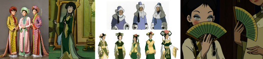
I fell in love with this Ao Dai dress, it's simple, long and elegant. But... it's mostly Vietnamese… and I'm afraid that it's modern and not historically accurate. Also it does not really go together with other Ba Sing Se dresses :( because I did not want to just copy-paste some background look. But there is at least one dress with a tail, thigh high slits and a standing collar on the dress underneath, so... I guess my choice is not that bad? The tail makes her look more royal. The fan is the same which Toph and Katara had. For the palette I chose Yue's white color with EK greens and warm yellow/ochre to match Katara and Toph. The hairdo is copied from the series; I chose one with the tassel on the right, to refer the NWT/Korean accessories.
The Fire Nation disguise
A confession – I don't like FN clothes. I wasn't sure if I would be able to do it properly, so I almost copied that attire (left one) – asymmetry, as a Thai touch, which again matches Aang's Invasion Buddhist-like clothes. The palette keeps Yue's signature white, with some pink of a warmer shade, as they wear it in the Fire Nation. And the "royal" long skirt, 'cause she's still not a fighter. The look is simplified so I could not keep zigzag ornament on her longyi skirt, therefore I moved it onto the top part.
I used Thai dancers jewelry and... flip flops? idk how they are called in Southeast Asia (don't like Sokka and Katara's FN shoes at all, why the design is so complicated?).
For covering her hair I used a turban, inspired by Myanmar turbans; a white one, so if some hair will show, it won't be too noticeable. Also Yue could still be easily recognised on screen/page by her white head. The long end of the fabric on her right resembles burmese hairstyle silhouette.
The Invasion-and-till-finale look
For her dress I used a deel (again); the sleeveless jacket is an hommage to her original design and has some Korean vibes, like Toph's Ba Sing Se dress (at least I hope so). Katara and Sokka's season 1 looks have Korean influence, so I guess it's okay. Gutals are from her Book 2 main look. I have a soft spot for them.
My favorite thing is her hair :)))) It's a mix of Inuit/Mongolian braids and a hairpiece, also from the Book 2 look. This time there will be more braids. Two on the front – I wanted to keep them from her original hairdo, but now they are braided together (I saw this on the Alaskan Inuit women photos). On the back there are five, inspired by a Mongolian hairdo for young unmarried girls, who wore multiple braids. I decided to make five, because Alaskian Inuit language uses this amount for counting and with two front braids it'll make seven, which is a lucky Mongolian number. And in theory a limited number should be easier to animate.
The post-canon noble look
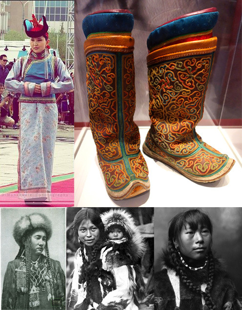
After the final battle I thought Yue will come back to Agna Qel'a and become a more active political figure. I chose a white kuspuk (blue color is still for Katara and Sokka), showing that she is ready to lead her tribe after this journey, not the passive perfect princess she was before. "She is associated in canon with the masculine yang of the yin and yang and the moon which, in most Inuit and Eskimo cultures, is considered masculine as well. While white kuspuks are associated with men and specifically family patriarchs, a feminine kuspuk in white makes plenty of sense for Yue's character" – @mostly-mundane-atla helped me a lot with the cultural meaning of the clothes (I am so grateful!). Also it's an hommage to her total-white Moon Spirit look. And I changed her hair again to Greenland updo with two tied braids on the front – more complicated than the simple braids she wore during the journey. It looks formal.
NWT is less Inuit-inspired and has a strong Mongolian touch (to make them look more "modern"? dunno) but I guess the formal wear for the spiritual princess could refer to older traditions. Which should be the same with SWT, 'cause SWT was originally a part of NWT – or so I heard. For example, Kuruk, the NWT Avatar who lived about 400 years ago, has nothing Mongolian in his look.
All the looks are simplified to match the style of the original cartoon. I know there should be more details and embroidery, but my goal here was to draw something (at least theoretically) applicable for animation. And no Hahn's betrothal necklace of course.
Also I want to mention here other great Yue designs, since they are the inspiration behind the overall idea of the post – the moon looks and "Yue joins the Gaang" outfits by amazingly talented @chiptrillino.
P.S.: an important note
This is my first attempt ever to design outfits that could fit the world of A:tLA. I am not Asian or ingenious, not an expert in their cultures or costume history at all, not a professional character designer. I am just a fan who tried to create designs with respect to real cultures and people. Nothing here was supposed to be offensive in any way. If something still is – please inform me so I could fix it as soon as possible.
I hope, as a fan, I have the right to draw fanarts looking for an inspiration in the cultures that inspired the original cartoon.
If you see mistakes in my post, be it in drawings or a text, also feel free to tell me. I will deeply appreciate it.
#avatar the last airbender#atla fanart#princess yue#yue#yue's alive#yue redesign#yue atla#yue avatar#all these links almost killed me...#i am a nitpicker#bad alt text#sorry i'm so done
1K notes
·
View notes
Text
Six of Crows Character Design Notes
Character design notes for my most recent character lineup for The Crows! I did this last time for the super old ones I did right after I read the series, so these new ones are much closer to how I imagine them. There probably will be a good amount of rehashing from the old notes, but I hope you enjoy these nonetheless!
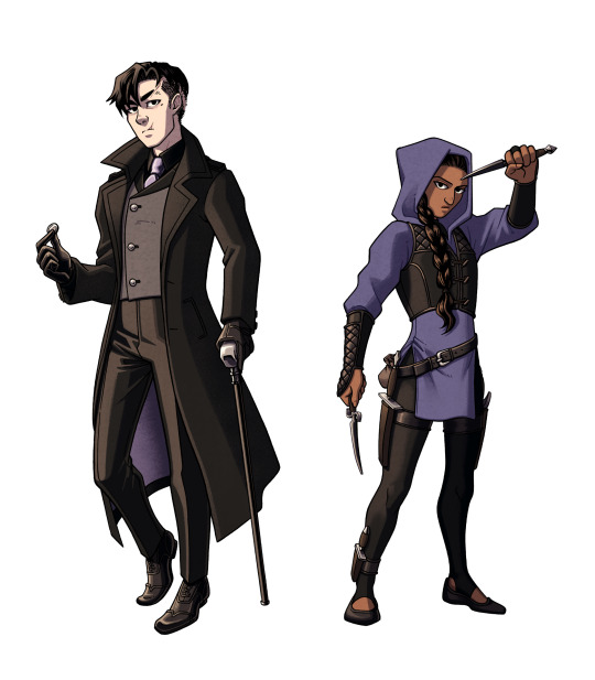
Kaz and Inej
Closest in color scheme due to how close they are at the start of the series, though there is a difference between the purples. Kaz's purple accents are light and muted (similar to the color of Kruge). Inej's tunic is more indigo, shifting away from the warmer purple she wore at the Menagerie. After she realizes her dream in the incinerator shaft, I imagine her theme color changing to dark blue, then dark teal by the end of the series.
I often see Kaz in a red tie, but he had to wear something different for my design since him and Van Eck would basically be in the same outfit. His black shirt is also meant to distinguish him from the real merchant class.
Coin added to Kaz's pose to refer to his magician and thief personas (and a callback to his backstory)
Their vests symbolize their morality. Kaz's is asymmetrical ("crooked and wrong...") while Inej's evenly goes down the center (more balanced and true to herself).
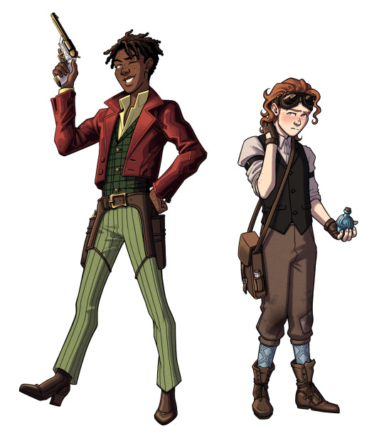
Jesper and Wylan
They're meant to contrast each other, since they don't exactly see eye-to-eye at the start, but their similarities are important. Both have patterned elements, brown leather boots, and freckles. My favorite differences: vibrant vs muted, gold vs silver, open vs closed poses
Jesper has freckles just because I feel like they suit him but also as a visual connection to Jordie. :)
Wylan is holding a Victorian fire grenade! They were actually used for extinguishing fires back then, but I can imagine Wylan replacing the ingredients to do the exact opposite.
I used to draw Jesper in a longcoat just because that look from the show is so iconic, but I changed it to something more cropped. The shorter coat makes him look taller and differentiates his silhouette from Kaz's.
Wylan's black vest is meant to hint at his merch family ties.
Nina and Matthias
Another couple who clashes through color palette! Nina's Heartrender red vs Matthias's northern blue. They also differ in leather color (black vs brown).
Matthias was a bit harder to design since he's not wearing clothes that he'd pick out himself. These are whatever Kerch dockworker clothes the gang could find for him, but I feel like they suit him enough to convey his personality.
Nina's necklace pendant is teardrop shaped (The Queen of Mourning).
Nina is wearing makeup and nail polish. From my limited research on Victorian culture, this was seen as improper, but I think that fits Nina's boldness all the better. I don't try to make any of my designs authentically Dutch Victorian (It's a fantasy series after all! Why not make semi-anachronistic designs that value personality over accuracy?), but it is fun to think about how these characters would be interpreted with that lens.
#next week's post isn't a comic but it's still gonna be real cool#six of crows#six of crows fanart#soc#soc fanart#grishaverse#grishaverse fanart#kaz brekker#inej ghafa#jesper fahey#nina zenik#matthias helvar#wylan van eck#wylan hendriks#kanej#wesper#helnik#character design#design talk
493 notes
·
View notes
Text

Fluttershy 😌
I did tweak my original redesign a bit. I simplified it, removed the mud on her legs, gave her less flowers in her mane, and removed some of her markings.
I did want her to be very doe-like. Gave her deer markings on her nose, and I thought if I gave her freckles on her back they would look like fawn spots. Also gave her dainty little hooves.
Overall, I wanted her color palette to be much warmer and gave her an earthy green eye color, rather than the teal she has in canon.
Her personality still stays the same, of course.
I actually really need to figure out what exactly I want for this AU. Idk if I want it to be a rewrite of the main show, or if I want to change more. Maybe I can make a separate AU with even more tweaks to their characters. I have a lot written down for the princesses and the rest of the creatures.
#mlp#my little pony#my little pony friendship is magic#mlp g4#mlp redesign#mlp fim#mlp au#mlp fluttershy#fluttershy#mlp fandom
239 notes
·
View notes
Text
Writing Notes: Neutral Colors

Neutral Colors - muted shades that appear to lack color but often have underlying hues that change with different lighting. Examples:
beige,
taupe,
gray,
cream,
brown,
black, and
white.
Types of Neutral Colors
The basic neutral color palette comprises black, white, brown, and gray, with varying shades in between. Here is a breakdown of the various types of neutrals:
Pure neutrals: The pure neutral color palette includes black, white, brown, and gray, all of which fall under the category of pure color, which means they are fully saturated and do not have an undertone (underlying color). By mixing different pure neutrals and primary colors, you can influence the resulting color’s saturation and vibrancy.
Near-neutrals: Mixing a primary color with a pure neutral color creates a near-neutral. For instance, to make the near-neutral color tan, mix the primary color yellow with the pure neutral brown. Near-neutral colors have lower saturation than pure neutral colors. Similarly, pairing a neutral color with a bright hue increases the vibrancy of the hue, attracting the eye to that particular spot of color.
Warm and cool neutrals: Mixing different pure neutral colors with primary colors creates either warm neutrals or cool neutrals. Warm neutrals have yellow, orange, or pink undertones, such as beige, tan, and gold, while cool neutrals have blue, purple, or green undertones, such as gray, taupe, and ivory.
Advantages of Decorating With a Neutral Color Palette
Interior designers use neutral color palettes to create different visual effects, playing with focal points, depth, saturation, and highlights to enhance a living space. Here are some of the advantages of decorating with a neutral color palette:
You can build off neutral tones. When you paint or decorate a space with a neutral color, you can build off that tone, incorporating accent colors or bold patterns. Overusing bold colors makes the room overwhelming and distracting for the eye. Neutral colors help balance a room so that you can add different accessories and patterns.
Neutrals pair well with a range of colors. Through different seasons, your style and preferences may change. Changing your home décor with a new pattern piece or set of curtains is easy when your room has a neutral color palette because it's versatile and pairs well with different color schemes and design elements. Simply adding new throw pillows to your couch can change the look of your living room and match your new style.
Neutrals can have a calming effect. While bright, bold colors are loud and vibrant, neutral paint colors are calming and gentle on the eye. With little saturation, neutral colors seamlessly flow from one color into the next. Most neutral palettes also reflect naturally occurring colors, shaping a living area into a relaxing, nature-based space.
You can use any decorating style. Different interior design styles incorporate neutral colors, from modernism to rustic to art deco. As a natural foundation for any background, neutral colors enhance different tones and patterns. For instance, neutral shades balance geometric patterns in an art deco room, whereas darker neutrals create a streamlined, sleek effect in a modern room.
Tips for Decorating with Neutral Colors
When working with a neutral color scheme, find subtle DIY ways to add texture and color ideas for versatility.
Use different tints: Tonal color palettes add highlights and accents to a neutral color palette, making areas of a room pop. Incorporate different tints and neutrals to create a more lively and engaging space. Consider pairing sage green with a predominantly gray and white room to add a tint of color—a pop of pink pairs nicely with warmer neutrals, such as gold or beige.
Consider the lighting: A room’s lighting influences how your eyes read a color. Artificial lighting tends to have a yellow hue, so it intensifies warmer neutrals. Consider factors such as the season, time of day, the sun’s position, and the room’s location when choosing your color schemes. For example, natural light from the north creates a blue tint, making neutral colors appear darker and less saturated, while eastern or western light creates a warmer hue. White paint comes in various shades; they also appear differently depending on the natural lighting.
Add color with accessories: Pairing neutral walls with neutrally colored large furniture pieces can create a calming effect, but that doesn’t mean you must sacrifice color. Instead, incorporate color in the different accessories in the room, such as throw pillows, artwork, or curtains. Choosing accessories with color makes it easier to change the room’s style and décor to match different seasons.
Choose the right color: Different near-neutral and pure neutral colors have varying effects on a room. Dark, cool colors create a cozy feel within a room, while lighter neutrals make a room appear larger. Choose a room color that aligns with the design and feel you want for the space.
While neutral colors are not on the color wheel, they complement primary and secondary colors.
You can combine primary colors—like red, white, and blue—to make a range of other colors.
Secondary colors are the result of mixing two primary colors, like green (yellow plus blue), orange (yellow plus red), and purple (red plus blue).
Neutral colors can be complex in tone, as mixing different colors creates unique shades.
For example, greige is a mix of light gray and beige, with yellow hues in natural light and gray in fluorescent lighting. (Natural light refers to lighting generated from a natural source like the sun.)
Source ⚜ More: Notes & References ⚜ Writing Resources PDFs
#colors#colour#writing reference#writeblr#neutral#literature#dark academia#writers on tumblr#spilled ink#creative writing#writing prompt#light academia#writing inspiration#writing ideas#worldbuilding#writing resources
87 notes
·
View notes
Text
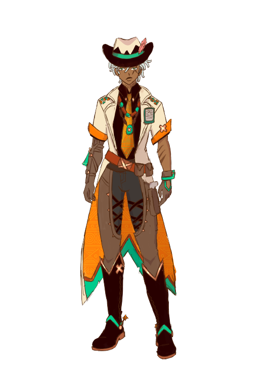
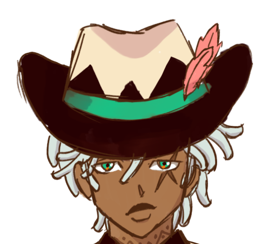
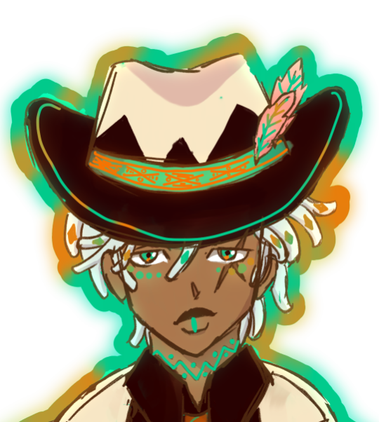
a rough little ifá redesign !!
i love him deeply, however, with the way that he's based on a yoruba god (again) and a cowboy, i wanted to lean into both a little more (and make the colors feel a little less platypus-like iykwim). so i did it!
i think his design is genuinely solid, so i didn't change that much, like, at all, i just embellished it a little.
design notes under the cut <3
normal style:
we'll start small: i loc'd his hair!! very easy way to keep the shape language of straight hair without compromizing a character's visual blackness. even though i don't like the 'dark skin, light hair trope', ifá's design motifs rely pretty heavily on visual contrast, so i decided to just keep his hair the same color.
i removed most of the embellishments on his hat, since i think it needlessly complicates the top half of his design and draws attention away from the fact that its a cowboy hat, which is, of course, the important part. plus, the buttons and the stitching reminded me too much of a voodoo doll, and with the addition of the bones in his nightsoul state, it kind of muddied the actual influences of his design.
i also kept his neck tattoo, since it was fun and worked with some of the patterns i introduced in his design, and i also made his skin less gray to work better with his colors
speaking of colors, i did actually lessen the contrast between the white, teal and orange by unifying the palette, allowing for it to be a little easier on the eyes and a little more warm toned in a way that makes him feel more grounded in genshin's fantasy environments, especially with the modern feeling of the nametag and the style of the clothes.
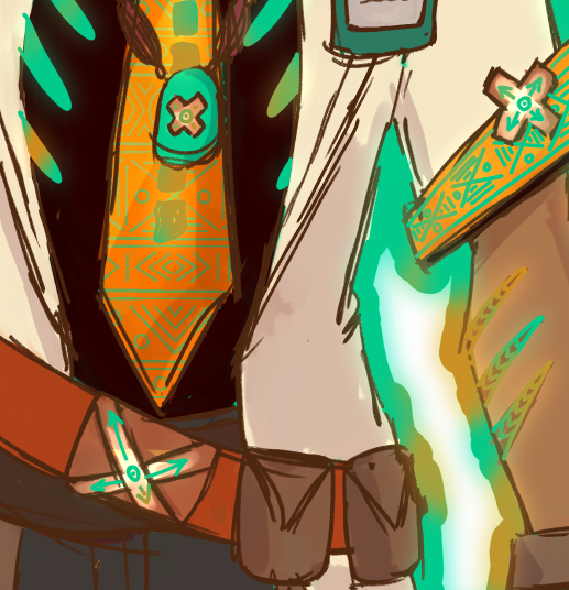
with his top half, i wanted to add a little more visual intrigue, since all of the complexity of his design felt imbalanced toward his hat, rather than the center of his body. the easiest way to do this was to draw on the african cowboy aesthetic and add a tie and beads to his shirt and jacket combo. the opele chain that his constellation is named after is actually based on the method of divination that the worship of ifá entails, since he's the god of destiny, and so i wanted to give him a little more of that influence, since in his constellation it seems to refer to the string of his hat, which i removed.


on his tie, you can see ankara patterns, which is a direct callback to his yoruba basis, along with turquoise and burnt orange beads which are also yoruba. in addition, i kept the nametag, since it was doing a lot of heavylifting fro denoting him as a medical professional, but i moved the feathers to his hat, and made them cacucu's feather's specifically. i also changed his primary color from the teal to orange to add to the less futuristic feel and to cut the 'a platypus???'-ness.
i also changed the metal accents to be bronze, since bronze is a commonly occuring precious metal in nigeria, and kept the cross motif. i added some pouches to his belt to make his outfit feel more like something he would work in, without over-complicating his silhoutte.
when it comes to his pants, i kept them jawns the same, idk mannn. if it ain't broke don't fix it. i did change the colors to warmer ones and changed the blue to a charcoal gray situation to keep the colors harmonized.
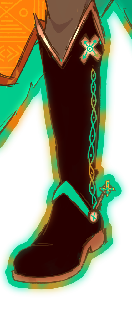
his boots, though?? i changed those a little. they just weren't cowboy enough for me, plus there was a chance to add a couple more instances of yoruba patterns to his design. i just flipped the tops up, added spurs and some stitching down the sides, and that was it.

in putting changing his main color, i also swapped the colors for the inside of his coat, and added ankara patterns on the orange part to match his tie.
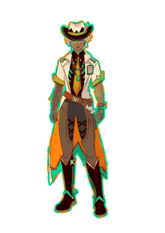
nightsoul state
upon realizing that both he and chasca (and i assume the other vision-holding members of the flowerfeather clan) have skeleton motifs in their nightsoul state, i knew i couldn't take it out entirely. since chasca's is more subtle, i just kept the ribs from the original nightsoul design and added lil' vertibrae to his tie.
i also aded ankara patterns to his sleeves as well, and highlighted the scars on his arm.
when it comes to his face, i wanted to incorporate actual yoruba face paint, and since he already has markings under his eyes in the original, i wanted to keep that too (especially since the other option was above his eyebrows which doesn't make sense since you can't see it under his hat and hair).
additionally, i put ankara patterns along the band of his hat, and highlighted cacucu's feathers, since i thought they were an important part of his new design.


on his boots, followed the lines of stitching. i also added little embellishments on the metal accents, just for fun.
closing statements
first, this was fun as fuck. second, to anybody who wants to represent a culture in a fantasy way like this? don't do what genshin did with natlan. don't take the name of our gods and give it to white ass blorbo bleebus who isn't even associated with us in any way. don't take the names of sacred items and just give them to any old thing. do your research. consult real people. be respectful. if you want somewhere to start, @creatingblackcharacters is my favorite resource for all things black character designs. read through all the lessons, i promise you it'll change the way you think about character design forever.
#merqti art <3#merqtio does fanart !!#merqtio does a redesign !!#ifa#artists on tumblr#ifa genshin#genshin impact#genshin redesign#yayyyy first ever in-depth character design post !!!!
71 notes
·
View notes
Note
How did you go about redesigning the clothes in you remaster?
Ooh great question! I'll go into more detail below, but the gist is that I broke down each character into their vibes and general aesthetic and tried fitting it to my design biases.


I tend towards more grounded designs than the original JRPG-inspired armour and clothes, so I referenced a lot of medieval fashion for the setting. You'll usually see me covering bared skin in battle outfits or toning down extra details I struggle to draw

Then, using those references, I'd try to thumbnail basic shapes and colours to figure out which works best


(More specific character notes below)

For some characters like Iseul, I didn't feel much need to change his outfit so I mostly toned down the detail to suit my style. I shifted the colour scheme to something warmer and removed the fur and extra armour to serve his image as animal-loving and battle-avoidant. This serves as great contrast to his timeskip outfit where he then commits to being both a warrior and a prince, with more ornamentation and practical armour


I designed Helena and Alain as contrasts. They have very similar themes and designs, so I decided to smooth Alain down into the picture-perfect metal knight while Helena's wilder and asymmetric. I referenced more realistic armour for Alain but overall I wanted to keep his clothes similar.
For Helena, my design style is more practical and thematically I want to avoid Helena baring skin and vulnerability so I extended her corset into more of a chest armour and covered her other thigh. To add to her duality of magic and metal, I gave one arm armour and bared the other to show off magical scars.


August and Altea's designs are where I start to venture off into more vibes-based outfits. August is humble and traditional, a knight with proud loyalty to his Lord and family, so I gave him medieval colours to represent both on his tabard. The armour is still there, but it's less focus on metal and more on "cheaper" materials to serve as a contrast to his timeskip where he becomes a proper knight in shining armour. For that reason, I took away the cape and other unnecessary decoration.
Then Altea is flashy, wealthy, and bright. I kept the focus on light armour, with scalemail as the only obvious protection. I've mentioned before but I took inspiration from south east asian fashion (mostly cambodia and malaysia) as a grounded but ornate basis for her magical girl theme. Here the colour scheme and fabrics are what mostly connects it to the original

Similarly, Lennox is where vibes rule and the overal aesthetic changes quite a bit. He's often described with "choir boy" hair, so I wanted to combine choir robes with ornate priestly outfits to sell him as a vain cult-leader. I kept the symmetry, long coat, and lack of obvious armour, but I wanted him to look less modern and stick with less structured outfits.

One thing specific to the generals, is that I wanted to give them more of a variety to colour palettes to sell that while they're working together, they're not exactly happy about it. While they all have a focus of blue and silver to keep them cohesive, they each have a motif: Alain - silver, Helena - pale blue, Jinhai - brown, Lennox - dark blue, Magnus - turquoise
#love and legends#character design#costume design#whyyy did the image orientation all fuck up??#art#art ref#tutorial#ish#i love doing redesigns#or well converting designs to fit my biases :P
237 notes
·
View notes
Text
Okay NOW I'm done with those designs
In the end I barely changed C Pep's colors lol, I scrapted the green fade 'cause it wasn't harmonious with the rest of the palette and went with a dark colder blue instead, I also made the fade on his skin less pronounced. I think the bluer colors make the overal palette more balanced and simple than before

Also I made C Noise's purple warmer/more pinkish, the old purple was too cold for my liking.

And yeah that's it for now guys, now if you excuse me I'm gonna go to sleep 'cause figuring out those colors really worn me out believe it or not
318 notes
·
View notes
Text
the color of you

painting with bachira was supposed to be just a fun, messy kind of date—sunshine, color-splattered clothes, and a little harmless teasing. but between soft glances and shared memories, something warmer begins to take shape. and when he posts your finished masterpiece online with a cryptic caption, the fans start to wonder… but only you know that yellow has always meant you.
blue lock masterlist. leave a little stardust on my ko-fi
starring. bachira meguru x fem!reader
genre: fluff, romance
wc: 1.2k
author's note: this is a bit self indulgent since i really want to experience going on a painting date

the sun stretches lazily across the sky, lighting the grass in patches of gold as you sit side by side with bachira meguru on a worn-out picnic mat. he hums as he paints, brush in one hand, palette balanced on his thigh. you’re both surrounded by open tubes of acrylic, half-used paper towels, and the smell of fresh earth and turpentine.
his hoodie sleeves are rolled up, and there’s a bold smear of yellow on his cheek that you’re almost certain he put there on purpose. his hair is tied loosely at the back of his neck, a few strands falling in front of his face as he leans toward his canvas. the light catches in his eyes, and for a moment, you forget how to breathe.
“you’re doing that thing again,” he says without looking up.
“what thing?”
“looking at me like i’m a painting you don’t want to mess up.”
you blink, caught. “maybe you are.”
bachira snorts, dipping his brush into blue. “if i’m art, i’m abstract as hell.”
“that tracks.”
you glance down at your own canvas. you haven’t painted much yet. a soft background wash, some pale oranges and cool shadows. you're not sure if it’s supposed to be a landscape or a feeling.
“why do you always start with yellow?” you ask suddenly, eyeing the streak of sunlit gold that runs diagonally across his canvas.
“because it’s loud,” he says simply. “it demands space.”
you watch him work for a moment. “kind of like you.”
he grins. “exactly like me.”
the moment is peaceful, but your mind drifts back—just once—toward the day that started all of this. the first brushstroke that changed everything.
it was early spring, and you'd snuck up to the school rooftop to paint after a long week of exams. the sky had been grey and heavy, your mood matching the weather. you just wanted space. quiet.
but when you pushed open the rooftop door, bachira was already there—dribbling a soccer ball barefoot across the concrete, his headphones blasting something energetic.
he noticed you, smiled, and said nothing.
you hesitated, but sat down anyway, pulling out your sketchpad and watercolors.
ten minutes passed. he didn’t leave.
then, without warning, he jogged over and plopped down beside you.
“whatcha painting?”
“nothing yet,” you said. “i was going to do the skyline, but the clouds are kind of ruining it.”
“then paint the clouds.”
“they look heavy.”
“so? heavy can be beautiful.”
you turned to him. “you paint?”
“sometimes,” he said, grinning. “when i can’t score goals, i make my own.”
he borrowed your brush without asking and painted a messy swirl of grey and gold in the corner of your page.
“it’s a storm,” he said. “but it’s clearing up.”
you stared at it, surprised. “that’s… actually kind of nice.”
he nudged your shoulder. “told you. i’m full of surprises.”
that was the first time you painted together. the first time he quietly sat with you, not needing to fill every second with words or motion. the first time he made you feel like maybe your quiet didn’t need to be fixed—just shared.
“hey,” he says now, breaking you out of the memory. “do you ever think about that day on the roof?”
you blink. “i was just thinking about it.”
he sets his brush down and leans back on his hands, gazing up at the sky the same way he did back then. “that was the first time i thought—‘huh. maybe quiet isn’t scary.’”
you glance at him. “what did you think it was before?”
“lonely,” he says simply. “but you made it soft.”
you reach over and swipe your thumb gently along his cheek, smudging the yellow paint.
“hey!”
“payback,” you say, smiling.
“oh, it’s war now,” he warns.
you barely have time to dodge before he grabs a brush and streaks a line of pink across your forehead. you gasp and lunge for him, and the two of you end up tangled together on the grass, laughing until you’re breathless.
eventually, the giggles settle into silence. his head rests beside yours, your fingers idly playing with the frayed hem of his hoodie.
“i like days like this,” he says, voice softer now. “where we don’t have to be anything but here.”
you hum in agreement.
then he rolls onto his side and looks at you—really looks.
“you know i like you, right?” he asks.
it’s not a confession out of nowhere. it’s something that’s been there, woven into paint-stained fingers and late-night doodles and quiet companionship. but hearing it aloud still makes your heart skip.
you nod, lips parting. “i know. i like you too.”
he smiles—not his usual wolfish grin, but something gentler, more careful.
then he leans forward and kisses you. light, tentative. like a brushstroke he’s still unsure will dry the way he hopes.
it’s warm. familiar. just right.
when he pulls back, he bumps your forehead with his.
“we should paint more storms together,” he whispers.
you smile, paint on your face, grass in your hair, and his heartbeat echoing somewhere beneath it all.
“only if we make them yellow.”
a few days later, curled up on your bed with sketchpads scattered around you like fallen leaves, you catch a glimpse of something familiar on your screen.
it’s the painting.
the one you made with bachira.
he’s posted it online—a photo taken in natural light, where every color pops exactly how you remember it. his signature bold streaks of yellow dance across the page, colliding with your gentler hues like sunbursts on a rainy canvas. and in the middle, barely noticeable unless you knew where to look, are your initials intertwined with his in the softest black ink.
he hadn’t told you he was going to post it.
but there it is—his brushstrokes, your fingerprints, your afternoon stretched across canvas and time.
beneath the painting, he’s left a single sentence.
no emojis. no tags. just the quiet kind of sentence that lingers longer than it should.
"yellow feels like you."
the words settle somewhere behind your ribs, warm and heavy. you can almost hear him saying it in that gentle, unhurried way of his—the way he talks when he’s not trying to be funny or loud or anything else but honest.
it’s subtle, the kind of post that only someone who knows would recognize for what it really is. but the ripple it causes is instant. not loud, not dramatic, just… curious. like the moment before a secret slips.
you can picture his fans now, scrolling with wide eyes and tilted heads, wondering who this “you” might be. they don’t know. and they won’t—not yet. but the painting says enough.
later, when you ask him why he posted it, he shrugs with a crooked grin.
“felt like time.”
he doesn't explain further, but he doesn't have to.
he looks at you the same way he looked at the canvas that day—like whatever you are together is something he wants to keep coloring into the world, one brushstroke at a time.
you think about the paint smudged on your clothes, the wind in your hair, the way his fingers had trembled just a little when he kissed you. and now this—this quiet, public sort-of love letter disguised as art.
you press your fingers against your lips, remembering.
and you smile.
because you don’t need a caption to tell you.
you already know exactly what yellow feels like.
#yukkiji#blue lock#bllk#blue lock x reader#bllk x reader#blue lock x you#bllk x you#blue lock imagines#bllk imagines#blue lock fluff#bllk fluff#bachira meguru#bachira meguru x reader#bachira meguru x you#bachira meguru imagines#bachira meguru fluff
54 notes
·
View notes
Text
Hazbin Hotel Redesigns - Part One!
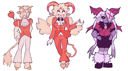
brainworms told me to hyperfixate on hazbin hotel and i did. so here are some redesigns! i'm planning on doing all of the cast, starting with the big (little) guy of hell himself, charlie, and vaggie! next is going to be the hotel staff (niffty, alastor, and husk)! individual pngs and redesign notes under cut
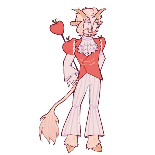
Lucifer Morningstar - He/him, trans man, bisexual he has goat hooves, horns, and ears, as well as a little goatee:-) his tail is a lions, since lions symbolize jesus, royalty, and also are a little nod to pride.
he doesn't keep his wings after he falls from heaven. i know he has his wings in the og show, but i never understood why. he lost his wings in the fall and still has feather growth, but they turn into these weird malformed lumps of flesh and feather instead of actual wings. they're quite itchy and uncomfortable for him.
longer hair, for fun! as well as lots of apple motifs. he has little lines coming from his lips like a ventriloquist doll or puppet. i've seen it in a lot of charlie and lucifer redesigns and i think it's super cool.
he wears pretty fancy clothes but doesn't go overboard with it, as he doesn't particularly like his royal status.
he has a special interest in toy making and is specifically hyperfixated on rubber ducks! he's able to use toy making as a creative outlet to distract himself.
no shoes cuz he has sensory issues and shoes made for hooves don't seem comfortable!!!
still wears his wedding ring even though there hasn't been any sign of lilith for years
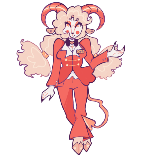
Charlotte 'Charlie' Morningstar - She/her, cis woman, bisexual she also has goat hooves and ears, but unlike her father, she has horns more reminiscent of a ram's, much like her mother's horns. her tail is more of a classic imp shape, since she is a hellborn demon and not a fallen angel like her father.
the bottom of her pigtails are meant to resemble angel wings! she's a little piece of heaven in hell:-)
i didn't change her outfit too much, but i did want to add things to it to make it stand out more. she has gold details like her dad, as well as a bowtie with an eye detail to nod to biblically accurate angels.
she has the ventriloquist mouth like her dad! in general, she also looks more like her dad than her mom.
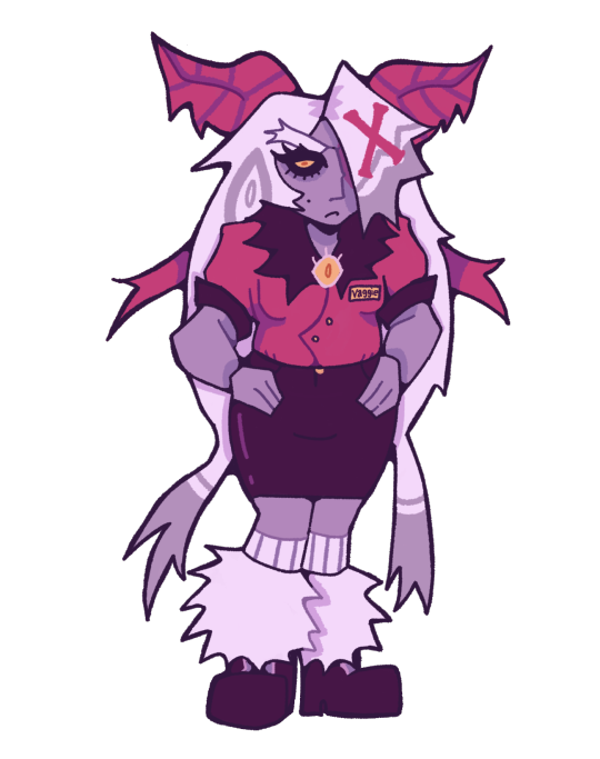
Vaggie - She/her, intersex, lesbian SHE DESERVED A MORE PURPLEY COLOR PALETTE!! purple is definitely her color.
i changed her body type a lot in this redesign, i think it makes more sense for her to be buffer, because of her history.
she's not a moth demon, but disguises as one to blend in, since most sinners have animal motifs.
fur collar and fur leg warmers because i think they're really fun. i also think she's most definitely a pencil skirt + combat boots girl.
i actually do kind of like the X on her hair in her og design, but i wanted to make it look less?? plastered on?? since in her og design i genuinely can't tell if it's meant to be part of her hair or not.
she has a big bow like her og design, but it's meant to be reminiscent of moth antenna. it also adds to her biblical angel silhouette! another eye detail on her chest, like charlie, to nod to angels. this nod is particularly relevant considering her past!
#hazbin hotel#hazbin redesign#hazbin art#hazbin lucifer#hazbin hotel fanart#hazbin hotel art#charlie morningstar#charlie hazbin hotel#vaggie hazbin hotel#chaggie#vaggie#lucifer morningstar#lucifer hazbin hotel#hazbin hotel lucifer#character redesign#redesign#hazbin#hazbin hotel rewrite
165 notes
·
View notes
Note
Sorry if you’ve answered this before, but I really love how your illustrations have such a cohesive color palette, how do you pick your colors to have a certain theme without looking monochromatic?
(In your breakdown on the saloon/western BP illustration, you mentioned that the overall color was reddish brown so you added blue to the main group to set them apart. But like how did you decide on which reddish brown colors to use for the flats?)
Thank you!! Your art is really expressive and the colors always work so well in the illustration. I’m always in awe of your pics
That’s an excellent question! My drawings actually start out pretty monochromatic because I tend to put most of my effort into the lighting and shading part to help differentiate where I want people to look.
For all of my pieces, I want my characters to be in focus. So no matter what, I always have to keep their main colors in mind and make sure their outfits and the background don’t clash with them (Kain’s red hair tends to be a problem, pft).
For my flats, I generally work with two main colors that tend to contrast each other and then I mix a lot of neutrals around them. (Sometimes the main colors are in the light and shading itself, but I’ll just focus on the flats!).
Sometimes, I will change the hue of their colors. So while Kain has bright orange hair, I will dull it down if it overwhelms the piece or doesn’t fit with the tone - like I did for the cowboy drawing - but never so much that it no longer looks like him.
With the cowboy drawing as an example, if I strip it down to my flats, it instantly becomes very dull and monochromatic. I really enjoy working with these colors because they’re easy on the eyes (or my eyes specifically) and I can see the difference in subtle hues a lot better than if they were very high in contrast. I like working with subtleties when I want background characters to become a single unit but still be separated as individual people.
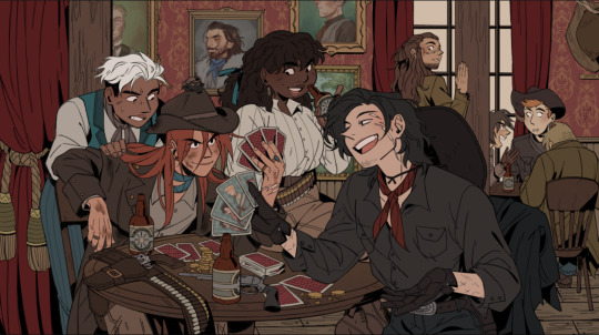
When I picked the colors for the background, I wanted to separate the characters from the walls. Therefore, I kept the walls red and gold, and the characters brown - they’re still within the same warm-colored family, but they’re far enough away from each other that they don’t become one with each other. I also like to not have clothes from different characters blend together, so overlapping colours can't be the same. I made one coat lighter than the other, the glove warmer than the dark jacket, and so on.
(their coats are also in the same realm as the green/gold colour of the details for the curtains and the frames on the walls)
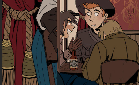
For the paintings I actually chose to put a bit of blue and green in to help create some interest for the main characters and keep your eyes around that area, as it matches the blue they’re wearing, just a whole lot darker. It also makes them pop just enough so they look interesting against the wall, but not enough to overshadow the main characters
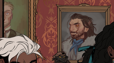
I know, because of the way I work with layers, that when I add my overlays, I automatically brighten and saturate the colors a lot. It’s a lot easier for me to saturate something “dull” and move it into all kinds of hues than saturating something already high in contrast and then trying to force it into a new color theme.
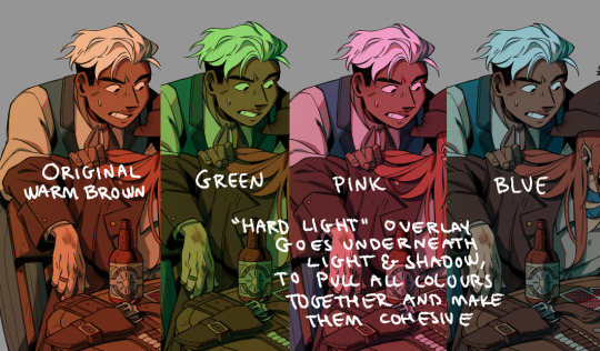
But because of this, I usually have to go back and change the colors I work with constantly while the overlays are on. Since the overlays don’t know what sort of materials they’re laying on top of, everything gets lighter and washed out, so dark skin tones, hair, and clothes have to be corrected one by one afterward. If I were to remove the overlays after I corrected it to make it feel like a dark blue outfit on Raki, it’s basically just a black void now; but with the overlay, it’s a dark blue outfit. Before that, he simple blended in with the background too much and he didn’t feel like he was a part of the group either.
I always try to put down colors how I imagine they’re going to look like, unaffected by light, but I’m also naturally drawn toward more earthy and warm tones, so all of my color choices will tend to lean that way.
Here’s another example of main colours vs. neutrals; the main colours are red and green/turquoise, with dark browns and greys to encapsulate them, and gold for accents or to make certain things pop (the chair, Dakon’s dark coat, etc.).
I never want them all to wear the exact same color, but I want them to feel connected and be in the same 'colour family,' so Dakon and Kain have nearly the same dark red/brown, and Christie and Raki have nearly the same 'bright'/red.
The blacks and browns, I’ve kept warm as well, so they stay within that realm of red. I also make sure that none of them are too close to Kain’s hair since he’s in the middle of the piece, and I want your eyes to be drawn toward the middle, and his orange hair helps with that.
The paintings I basically do not care too much about, as long as each individual painting has a single dominating colour. I mute them down with a darker overlay and ensure they don’t have strong shadows and light, so they get pushed to the background, so despite being a bunch of different colours, each painting feels like a solid color and they’re still cast in the same light as the rest of the piece, so they feel like they belong in the same room.
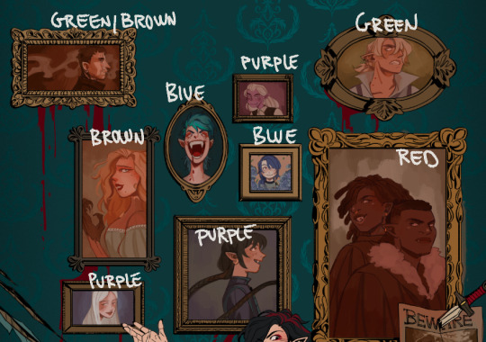
I try to help move the eye around the piece as well, so I keep the big painting sort of in the same realm of red and brown as the main characters, because it’s so big it shouldn’t dominate with a new color and force interest toward it. The blue/purple ones melt in with the background as they’re close to the turquoise background, but without disappearing, the yellow ones work sort of like the gold accents and blend in with the frames, and the green paintings at the top give the illusion of a monochrome fade, so everything gets more eerie and green as the image goes up - there’s also a subtle green fade that affects the gold accents from the top down, to enhance that effect.
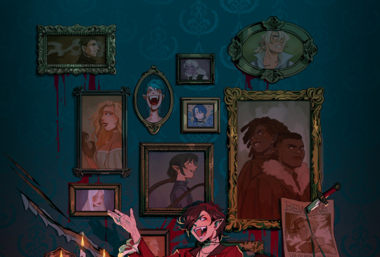
This is just a few examples, if there are any pieces in particular you were thinking of, and it’s neither of these, just let me know, and I can break those down as well!
Thank you for the question; I hope I answered it somewhat, and thank you for the kind words! <3
412 notes
·
View notes
Text


father of the year!!!
in order: goblin, tabaxi (caracal), lizardfolk (gold dust day gecko), fire genasi, human, bugbear, brownie
I really like to use goblins as an excuse to draw really angular, exaggerated facial features :3 generally speaking I draw goblins like that, with protruded chins and brow ridges and real long noses and ears. I will say I struggled exaggerating nose in particular across every character's goblin designs, what I ended up doing is mentally assigning like. a point of articulation or something? or like a slider? At the very tip of the nose and just sort of. dragged it down following the path of the bridge if that makes sense. Arguably the most consistent feature between goblins (and other goblinoids) is the lil bump in the ear, a small detail that means the world to me <3
Gricko's tabaxi design is another fun case of Silliness :) idk what prompted me to draw him as a caracal but the SECOND I did it solidified the design for me, he's just so silly to me lol and I really liked the vibes. Not a lot else happening there.
For his lizardfolk design, Gricko is the character I had the clearest vision for, specifically in that I wanted him to be a gecko. I just though it was funny lol and I WAS RIGHT!! Anyways I ended up going with this specific gecko because as I was looking up reference, the color palette SCREAMED Gricko to me and I couldn't resist.
I don't have a lot to say about his human design lol, I did kind of de-exaggerate some of his features to fit better on a human face. His hair obviously didn't change a lot between his canon design and his human design, although in retrospect perhaps I should have made it a little warmer in tone bc I think it looks weird when not paired with his greenish skin tone but oh well lol
#snek sketches#digital art#fanart#artists on tumblr#small artist#digital artist#art#dnd#dungeons and dragons#once upon a witchlight#ouaw#legends of avantris#loa#loa fanart#ouaw fanart#ouaw gricko#gricko grimgrin#goblin#dnd goblin#tabaxi#dnd tabaxi#lizardfolk#dnd lizardfolk#genasi#fire genasi#dnd genasi#dnd fire genasi#bugbear#dnd bugbear#brownie
63 notes
·
View notes