#full-width-layout
Explore tagged Tumblr posts
Visit Tumblr Blog
Explore Tumblr blogs with no restrictions, modern design and the best experience.
Last Seen Tumblr Blogs


Fun Fact
The “We are the 99%” Tumblr blog became the slogan for the Occupy Wall Street movement.
Text

I CANT USE CSS ON ARTFIGHT...............
#I WAS REALLY HOPING TO FIX THE FUCKING. PARAGRAPH WIDTH. SIGH#idk why but it stretches across the ENTIRE page like. it takes up the full width of the browser and it BOTHERS ME. ON ALL THE PAGES#i could try manually putting shift breaks but im worried it might not look so good on mobile. ugghh... auyggghhh.....#im already learning CSS and API so i thought i could put it to good use but. AUGH#this whole time ive had to go into the inspect panel myself and change the padding so i dont have to read the length of the screen#like a fucking typewriter... i would have also loved to use custom fonts and animations......#i did find a guide for BBCode which the site uses on default and it covers basic styling but its not the same. sniffle#you CAN unlock CSS if you donate $25 to the page which seems fair. and if i could do it i would but. i do not have any way of#sending or receiving money online </3 i really need to figure out how to do that so i can set up comms like i said i would last summer#but it intimidates me.... and im already kept on a short leash when it comes to that so it feels like a lot of things could go wrong#i think toyhouse allows CSS or some sort of code...?? i remember seeing some oc pages with custom layouts#if thats the case i'll try fiddling with it but im not very familiar with using toyhouse so thatll take a while#(thanks again for the code sal ^_^ ill put it on my pin once its ready but im trying to learn my way around the site heh ;;)#at least i can use my pixel dividers.. ive been digging around for pixels to use and found some really cute ones#yapping
51 notes
·
View notes
Text
Dashboard Unfucker v3.3.0!
As I first discovered today from the massive surge of people reblogging my previous update posts, the shitty new layout is now universal despite widespread protest, since us existing users are now apparently backseat to a Tumblr's hypothetical endless stream of high-revenue new users who are allergic to using social media sites that don't look like every other site. Well, thankfully at least for the time being, reverting the update via userscript is still as easy as ever!
Version 3.3.0 even fixes the new server-side bug where avatars next to posts disappear, because apparently I spend more time reviewing my commits than a multimillion dollar social media platform.
Installation Guide:
A userscript extension is required to run the script. Currently, the only tested extensions are Tampermonkey and Violentmonkey, but you might have still have luck with a different extension if you already use it.
Once you have the userscript extension installed, simply click this link to open the install page. This also works for updating, but make sure the version listed near the top is up to date, since it only fetches the script from GitHub every so often.
And of course, it's all open-source! Contributions, bug reports, and general insights are all appreciated.
Common troubleshooting info under cut:
Script not working
I can't offer specific help without knowing exact details, but two common issues are caching (try clearing your browser cache) and conflicts with New XKit (the script works fine with XKit Rewritten, which I would recommend anyways). If neither of those solve it, you can open an issue on the repository with more details.
Content takes up the full width of the page
This is an XKit feature, Panorama.

6K notes
·
View notes
Note
You know, it's always struck me as a little odd how little most webcomics actually attempt to adapt to their medium. There's basic strips, the old 2k era 4-square, the endless scroll of Webtoons, and a few weird experimental things like Homestuck, but most webcomics I run into tend to stubbornly stick to conventional portrait-oriented page layouts.
It's… readable, I guess, but that format doesn't seem to work very well for either desktop or mobile viewing. It wastes a lot of screen-space, and usually makes it impossible to actually view the full page without making the text too small to read.
Have you encountered any interesting webcomics that experiment with more landscape-oriented layouts? I'm kinda curious about how well that would work.
So, there's this dude Scott McCloud who wrote about comics in the 90s. His first book, Understanding Comics, is literally the book on comics, it's the one schools make kids read. This third book, Making Comics, is a pretty good practical advice guide I'd recommend, even if it's not his groundbreaking seminal work. In between those two books was one called Reinventing Comics
Reinventing Comics, written in 1993, was basically a book of predictions about how this newfangled Interweb was going to revolutionize the art of comics creation. Like a lot of early-90s stuff "Wow the internet!" stuff, it has a lot of inaccurate predictions, and thus isn't super well remembered (though, unlike a lot of early-90s predictions of the internet, it at least vaguely resembled reality).
Anyway, one of the big things from that book was the idea of the "infinite canvas".

Which was basically the idea that a comic didn't have to be constrained by the size of the screen because you could scroll it. And this was a big idea in early webcomics, you heard this phrase a lot. And you'd see infinite canvas techniques like "What if the characters are falling and the comic is really tall to sell that?"
(Read Narbonic)
Which is basically the one and only example that actually took off, because it turns out that scrolling horizontally sucks and no one really wants to do it except as a one-of gimmick (as Homestuck does). The much bigger impact of the internet was that a webcomic could be infinitely long and still reasonably expect it's readership to have read it all, but I think McCloud missed that one. So while there were a bunch of "landscape" webcomics where you scrolled horizontally, none of them took off, and even the ones that were well received are long gone.
Adams himself would make Zot!, which is a vertical scroll comic that had a bit of a gimmick with parallel story beats being literally parallel. I think he even did some branching paths, and experimented with comics that you could read in different directions or that looped back on themselves.

But then Homestuck just did that better because, as I mentioned, infinite depth ended up being a lot more impactful than infinite width. It turns out that making a comic really wide calls a lot of attention to itself and makes the comic annoying to read. And it doesn't mean you can't do it (Homestuck did it!), but it does mean it can't be the gimmick you hang your comic up on unless you've got a really good reason for doing it.
#Scott McCloud#Homestuck#“Webcomic creators should be more creative”#“What if we made the comic WIDE?”#“Wide is not a creative color”
2K notes
·
View notes
Text
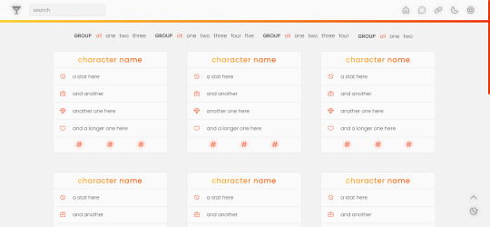
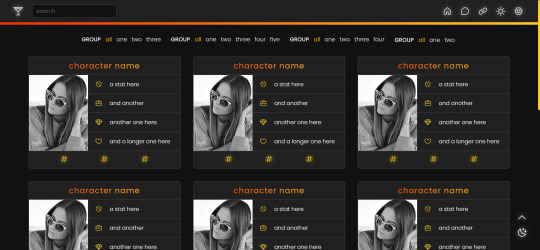
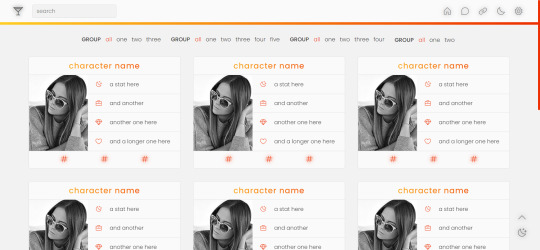
page 002: valentina
a character page that can be used with or without images, but with enough imagination and intermediate level coding skills, it can be edited to be used for other purposes. instructions are in the code and in the spreadsheet.
v1 (no images): preview / code + spreadsheet / code (without gsheets)
v2 (with images): preview / code + spreadsheet / code (without gsheets)
features
navigation links, filters, search filter and hide/show controls
endless muses boxes with a title, stats and links in each box
customizable colors (gradient, links and accent), font-size and width of the boxes and images
140x180 images in v2
google sheets integration
day/night mode
responsive
terms
reblog this post if you like it or use it
do not edit, move or delete the credit
do not use as a base code and take credit for it
full terms of use
credits and notes under cut:
credits
google sheets integration by @nonspace
day/night mode tutorial by @mournstera
masonry layout by desandro (+ tutorial by @suiomi)
isotope combination filtering + combination of filtering and search by metafizzy
hide/show controls by @seyche
phosphoricons by helena zhang and tobias fried
images taken from unsplash
full list of credits
notes
instructions on how to integrate google sheets are both in the code and in the spreadsheet, as well as on this page
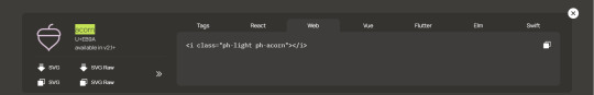
to change any of the icons in the code, visit phosphoricons, find the icon you want to use and change the weight and icon like in the example below:
#rph#tumblr page#character page#free content#free page#themehunter#supportcontentcreators#completeresources#allresources#dearindies#resourcemarket#userthmrec#*#* page#* valentina
306 notes
·
View notes
Text
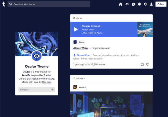


Ocular — Version 3
Preview // User Guide // More Info & Install
your favorite sidebar theme just got an upgrade, babeyyy
I went to update Ocular to make it NPF post-compliant and then my hand slipped and I redesigned the whole thing lmao. here's a brief update about Ocular 3; if you're looking for a full list of changes between versions 2 and 3, click the "Read More" below)
Ocular comes with the following features:
Colors: easily change the color scheme of your sidebar and posts using any colors you want
Post sizes: 400px, 500px, 540px, 600px, 700px
Sidebar: can be on the left, right, or above the posts. pick from a list of sidebar sizes, header image heights, and avatar shapes
Fonts: 20 different fonts, sizes 13px to 18px
Background: solid, gradient, full-size image or repeating image
Links: choose either regular navigation or drop-down navigation. unlimited custom links (visit the help desk FAQ for a tutorial) and ability to rename home, ask, submit, and archive links
Endless scroll, custom ask box text, Tumblr's full-width controls and search bar, optional header, avatar, and favicon images
if you already have Ocular installed, version 3 should be coming at you as soon as the update passes the theme garden. if you installed this theme with GitHub, you'll have to re-install manually.
now let's get to the fun stuff. what's new in version 3?
wow, do I have some updates for you!
1. goodbye color schemes, hello post background and text colors
you can now directly control the color of the posts rather than relying on color schemes to do it. want your posts to be a very specific shade of navy? all yours, buddy. go wild (make sure it's readable tho)
2. hello, color schemes! wait I thought we got rid of that guy
a lot of the color schemes I made became redundant now that the new post background/text color options exist. if you were married to the old color schemes, all of them can be recreated using those options. so the new color scheme options are as follows:
"My colors" — uses the colors you picked for post background/text
"Light preset" and "dark preset" — sets the posts to white with black text, or off-black with white text
"Translucent" — uses the colors you choose for post background/text, but makes the post backgrounds semi-transparent. there are NINE different translucent color schemes, ranging from 90% (only slightly see-through) to 10% (VERY see through)
3. navigation dropdown option
you can either use the sidebar links like they were before, or you can turn them into a cute little dropdown (helpful if you have lots of links or links with long titles!) you can enable this using the "use dropdown navigation" setting. you can also customize the label for the dropdown using the "dropdown menu label" setting. for instance, the dropdown on my blog currently says "oooh you wanna click me"
4. RIP google fonts I always hated your load times
decided to stop using Google Fonts and instead I'm providing the font files directly in the code. this will help speed up load times drastically when using custom fonts, plus I don't have to use Google. win-win! there's quite a bit of coverage overlap with the old fonts, but some of them that were too similar to each other got the ax. I also added all of the system fonts as options (hit classics like Arial, Georgia, and Comic Sans MS are now available TO YOU!)
5. more layout, sizing, and spacing options
the sidebar used to be either on the center-left, center-right, or above the posts; now it can go in the top-left or top-right! you can now control the border radius on the posts and sidebar. the header height, sidebar width, and post spacing all have additional options.
6. some options have been renamed for additional clarity
"background color 1" -> "background color"
"background color 2" -> "gradient background color"
"background" -> "background style"
"font override" -> "use body font everywhere"
"title" -> "sidebar title"
"description" -> "sidebar description"
"ask box text" -> "custom HTML above ask box"
7. removed some options
you win some, you lose some. I removed the uppercase sidebar links, theme credit, and inline media spacing options, mostly for redundancy reasons or because they produced unclear results.
8. as previously stated, now NPF-compliant
Ocular was ALMOST compliant with Tumblr's new post format, but had a few tweaks that needed to be ironed out. they're now ironed.
9: now user-friendly right out of the box
I updated the default color and content options, so new users installing this theme will have a much easier time using and customizing it immediately. no more ugly ass green background!
10. and finally, new JS
I had to rewrite some of the javascript for this theme, which turned into me rewriting ALL of the javascript. doing so meant that I could eliminate dependencies on third-party JS libraries and run the whole thing on plain JS. that should improve load times!!
bonus: custom CSS can do some nifty stuff now
want to change the size of your avatar? you can do that now! just do this to your Advanced > Add custom CSS section
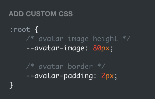

super helpful if you're using the Avatar shape: Uncropped setting and you need your image to be a specific size (like a pixelated GIF)
for more info, check out the Ocular user guide. thanks for reading my updates!! hope you all have a fantastic start to your 2024 ❤️
#tumblr theme#tumblr themes#themes by rachael#codingcabin#ocular#blog#you should've seen me writing the JS for the audio posts lmfao I was on my hands and knees begging it to work
597 notes
·
View notes
Text
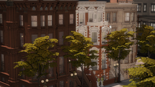
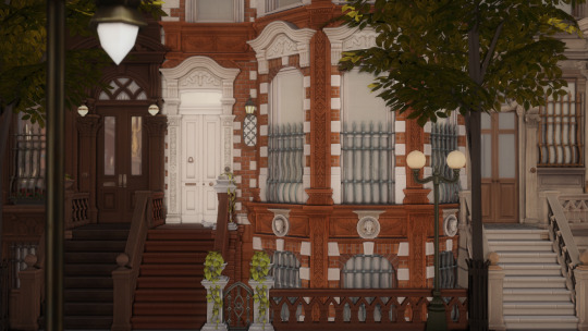
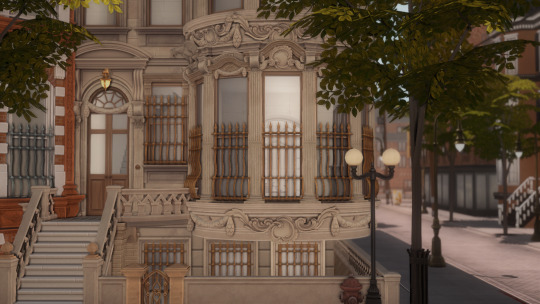
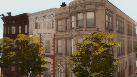
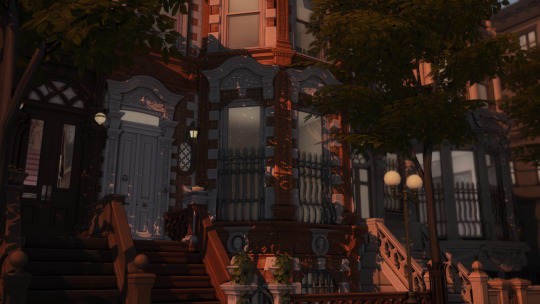
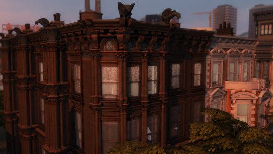
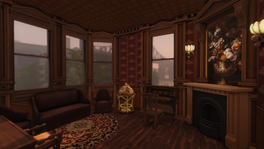
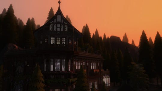
WIP - West 70th
1880s-1910s row of Upper West Side townhomes.
Been working on this row of late 19th c. brownstones on and off for the past year now, so needless to say when I heard about For Rent I was hype.
Download Here
This initially started because I was homesick for NYC during the pandemic. Specifically for the area of the upper west side my dorm was in while I was a student. I mainly blame this experience for my obsession with historical architecture - walking along central park west past the Dakota on the way to the subway, smoking on the stoops of the brownstones late at night, going to classes in the wedding cake that is the Ansonia - it was just everywhere, and so, so beautiful to look at.
Except a lot of it is faded glory - buildings subdivided, details chipped or covered in the thickest coats of grime or paint. So I wanted to replicate some of the old New York from around the turn of the century. The one I read about in the Luxe series and saw in the Samantha movie lol.
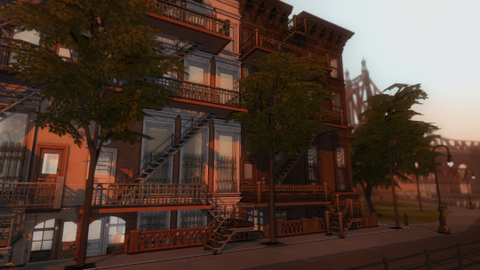
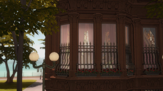
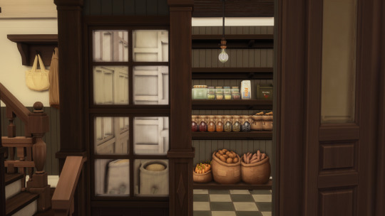
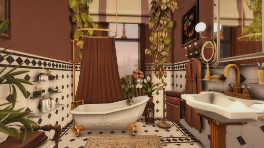
The basement or garden level of each four-story brownstone will be dedicated to the original purpose as the main workplace of the service staff. Unfortunately no room for the actual garden, so laundry lines and planters are on the roof. There are bedrooms and bathrooms for a cook and a housekeeper/butler, along with the staff dining and the kitchen. The butler's pantry is directly upstairs from the kitchen, and the top floor is almost exclusively made up of staff bedrooms and washrooms.
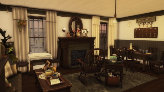
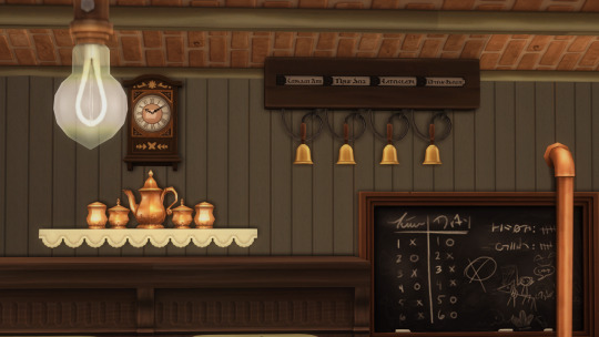
I usually do the service areas first because they're the most interesting, and there was nothing more interesting than a full edwardian brownstone kitchen. Lots of exposed piping, beadboard, subway tile, and shelves of clutter. Has a separate scullery, pantry, and stairs down to a basement storeroom to keep your best champs-le-sims nectar in. There's also a servant's bellboard in the kitchen and the staff dining room. It along with the "boiler" system are made with tool and CC-free.
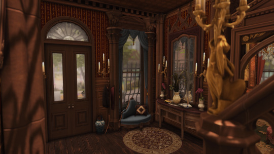
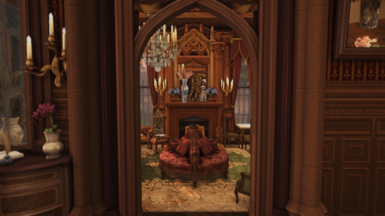
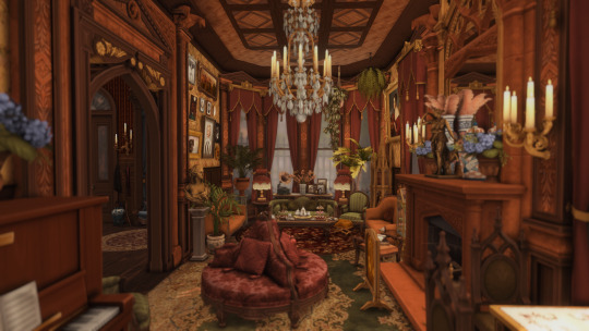
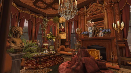
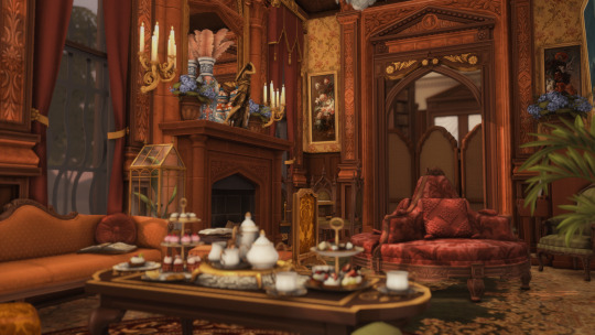
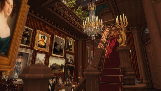
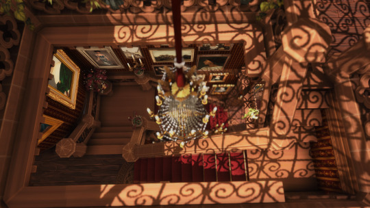
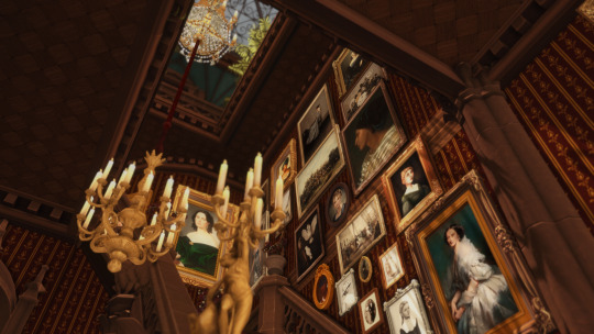
The main entrance and parlor are doing their best to continue the gothic revival theme of the exterior. The library and dining room follow in the enfilade starting in the parlor. Since this first house is a corner lot, it has a bit more width and space than a true brownstone. The only actual brownstone I've been inside of is Lady Mendl's, so ofc I had to have an extensive tea setup. Def took a lot of inspo from these two pics alone for these rooms.
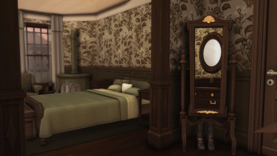
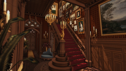
The main stairwell and picture gallery lead to three large bedrooms on the second floor, and then up to the children's room and nanny's bedroom on the third floor. I really like skylights. I learned the importance of decent lightwells in staving off depression one semester when my window looked out onto a brick wall
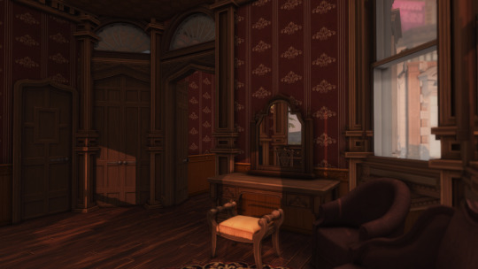
The master bedroom and the children's room above it both have their own private sitting rooms and bathrooms. All rooms have either fireplaces or cast iron radiators.
There's no way this is going to be finished by the time For Rent comes out, so im just going to release it in whatever state it's in when it does come out. The exteriors and interior room layout for all the townhomes will (hopefully) most likely be set by then anyway.
Now available for download!
Also the anniversary of Chez Cromwell is coming up! Ive been gone for the better part of the year due to starting a new job, but I havent been idle. C.Cromwell has been updated for infants and ceilings, which led to me redoing the exterior and almost every room, so a rerelease is coming v soon! Sneak peek below. Happy Thanksgiving!
#sunblind by softerhaze#picture amoebe#drift reshade#heyharrie#lilis-palace#felixandresims#pierisim#reticulating builds#west 70th#the sims 4 for rent#ts4cc#the sims 4#ts4 build#ts4 wip#sims 4 apartment#ts4 architecture
1K notes
·
View notes
Text
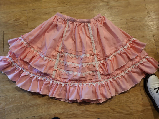
If anyone is wondering, this tutorial to make this skirt is still a method that works. Both those links are from wayback machine captures from a time before Photobucket betraying us all and deleting pictures.
Yes, I'm still mad about that.
Anyway, in the spirit of seeing if budget lolita was still doable in 2023, here we go with a cost breakdown:
>Main skirt fabric was a $10 walmart 4-yard precut; enough fabric to make waist ties not pictured here >Skirt is fully lined with a polyester bedsheet I got for $1 at a surplus store >The bow lace was part of a bulk purchase, ended up costing 21cents a yard. Skirt probably has 6-8 yards of lace on it. The little vertical strips were scraps from another project. Back shirring on skirt is 1/4" elastic, which covid conveniently made super cheap. >I didn't have the zipper on hand, so I had to buy one for $1 at walmart. As anyone who has been on Wawak knows, that's massively overpaying for zippers.
This skirt is 3" longer and a few sizes larger than the one in the post. I had to make a new cutting layout for the skirt, and it took a fair bit of additional fabric. In addition, to save on fabric width, the "side seams" on this are actually a little bit farther back than the side of the skirt. I cut the back of the skirt to full fabric width, and then added the adjustment for the fullness into the side front pieces. Clarice, who wrote the original tutorial, mentions that the person she made it for was very small, so I sized it up a little bit.
I make sketches like this as I go for personal reference, but maybe it'll be helpful.
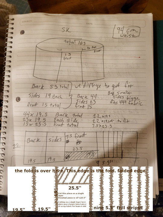
In the spirit of livejournal, I "clarified" my sketch by making it more confusing in GIMP. (Your pieces you need to cut will be back: 44"x19.5", cut 1. Side Front, 22"x19.5", cut 2. Center Front, 15"x25.5", cut 1. Frills, 5.5"x44", cut 9 or 10).
So, when we get into it, yeah, if you have a good design (or can copy a good design) and you're willing to put some time into it, you can still do a budget lolita skirt for under $20 of materials, if you're careful. I'm mostly making this post to save which archive.org captures are the ones with working pictures.
(It also helps if you don't mess up on the waistband so many times that it slowly shrinks into a 1" waistband.)
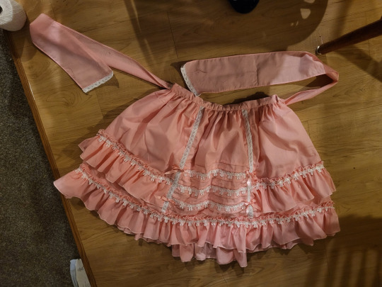
Fun fact: the trim on the ends of the waist ties may or may not be because I hemmed them sloppily and the hem came up bubbly, and zigzagging some lace onto the bottom handily covered up the bubbling. One of the advantages about knowing a decent amount about lolita fashion is that you can look at things and go, "Yeah, if I added x here, it'd be fine," and knowing enough about sewing to go, "yeah, if I do x cheat here, it'll look better" and being able to put the two together and go, "hey, if I cheat here, it'll still look lolita!" It's a good feeling.
Anyway, if anyone else has ever used Clarice's tutorial to make a skirt, I'd love to see it! This is my second time using it, but the last time was almost a decade ago at this point, and I think I've improved a lot since then.
473 notes
·
View notes
Text


We've talked about the revolution of the car industry that was the Volkswagen Beetle so today, we're gonna talk about another revolutionary car that was from the height of European car manufacturing and its across the pond of Germany in right ol' England and that's the Mini.
Pics from left to right, top to bottom in a zigzag pattern: Original Mini -> Half-cut of the Mini to show how it looks like internally -> Mini Traveller -> Mini Cooper Works S -> Mini running up the 1965 Monte Carlo Rally -> Mini fighting for positions with a Lotus Cortina at a BTCC race
Britain and Europe in general was still reeling from the effects of post-WWII but the car industry was steadily bouncing back. As technology improved so did engines get bigger but.. Problem. In 1952, the Suez Crisis basically halted all fuel imports into Europe and the one struck the worst was Britain. Not only that, the economic situation in Britain wasn't good still thus everyone would literally buy bubble cars from Germany. However, the then-boss of British Motoring Company/BMC (which would be British Leyland later on), Leonard Lord, hated the bubble cars calling them utter garbage and not even fit to be a vehicle thus he decided to change the game and make a small car that people really want to drive. Lord would immediately invite the Morris Minor's designer, Alec Issigonis to head the project.
Alec and his team of engineers would design three prototypes ranging from a big car XC9001 to the smallest car XC9003. Upon reading the brief from Lord again then did they realize that they were going into the right direction about designing a small car thus they scrapped all the other drawings and kept the XC9003 concept. The team would scalp and work on the designs further and would submit for review by Lord on 17th July 1957 and he liked it too much that he immediately greenlit for the project to go on and renamed the project as ADO15.
Alec, listening to the brief, switched the engineering methods that wern't seen before. Back then, cars mostly have their engine layouts in a longitudinal layout but that would also cause the bonnet to be extremely long just to compensate for the engine placement. Plus, most cars of that time were also rear-wheel drive meaning that the differential will be at the back thus a hump would be needed to be made on the floorboard which would eat up rear space area. Alec then came up with an ingenious idea of sticking everything in one area instead of separating them both. He would stick an inline-4 engine horizontally with the gearbox and have the drivetrain at the front also as a front-wheel drive system. This also had an added effect that the car can be short as the engine is now horizontal rather than longitudinal and the car's now also wider. Also, unlike other cars of its time where a separated chassis was still the norm, the ADO15 concept was one of the few that utilized a full monocoque chassis which was indeed revolutionary back then. To complement the car, they initially tested it out with a 948cc 4cyl engine which made 38hp but the team determined that the engine was too powerful for its purpose and thus, they destroked the engine and in return it made 848cc and a reduced power of 32hp and from a speed drop of 80mph/129kmh to 75mph/121kmh. By 1958, everything was ready for production and off to the factory it went for it to be built.
Morris was the first company to be set up to build the car and it was rather quick to build instead that after just passing the production calls, Morris had already built over 3000 units and BMC was ready to reveal the car to the general public in April 1959. BMC would send 2,000 cars across the world to promote it whilst keeping 1,000 for national reviews. The car would be an instant success as it was tiny thus easy to drive and it was agile too due to the width. BMC would make 1.1 million models with both Morris and Austin making the Mini just within a span of 1959-1967 and that wasn't the end of it but would only be the beginning.
Alec's good friend, the boss of Cooper Cars, John Cooper received a model of the Mini and he immediately liked it. He immediately saw the potential of the car and knew it would be a success for racing but as he didn't have the connection to do it, he went and find Alec for assistance. Alec initially disliked the idea but after the insistence from Alec that it would work, they would appeal to the top brass of the BMC management who, surprisingly, agreed to let Cooper run the program thus off to work the two went. They immediately increase the displacement of the engine from the 848cc to 1L and bumped power to 55hp. They also swapped the brake system from drum brakes to frontal disc brake which was rare at that time. BMC would make 1000 of these specced cars for homologation under Group 2 rules and immediately toss it into racing once the details are done by 1961 and would also rename the model as the "Mini Cooper". Straight off the gate, it was a success. It entered into the British Touring Car Championship/BTCC and would win the very season in 1961 despite facing heavier and faster cars. It would also race and dominate other race series overseas besides the BTCC. 1963 would see an upgrade of the Cooper with a displacement bump yet again to 1071cc and another power upgrade to 65hp. This time, they took it rallying and unsurprisingly, it won again this time due to its agility, lightweight and stability round corners.
Whilst the racing thing was going on, BMC wasn't slouching either. Noticing the rise in sales of the Mini, they started to experiment where they could expand one car into many other models and that, they did. From the normal supermini concept, they spawned many different things from wagons like the Traveller and Clubman models to the pickups and panel van models to a coupe and even cabriolet models. BMC would switch name to British Leyland in 1975 but nothing much has changed as the Mini kept on being produced the same method albeit abit of small changes here and there. Austin and Rover would merge in 1982 to form BL's subdivision, Austin-Rover and with Morris also being culled on the same year, Austin-Rover was left as the only maker to produce the Mini. However, Austin-Rover would once again split leaving Rover to be alone once again and with Austin being culled. Now, Rover was the only one left to produce the Mini.
Rover would keep building the Mini but they hit into financial troubles after the dissolution of BL. BMW came and bail Rover out in 1990 thus Rover kept on working on the Mini. However, the situation still wasn't good as Rover was still losing money and by 2000, BMW had enough and killed off Rover entirely. Despite that, they liked the Mini soo much that they actually kept the rights of the Mini namesake for future use and BMW eventually did revive the name as its own subbrand under BMW and rebuild a whole new car with the name. They would also ask John Cooper's estate to use his name for their souped up variants of the Mini to pay tribute to the guy that made the Mini famous in motorsports. The original Mini would be built from 1959-2000 with over 5.3 million units total.
Despite not being built as long as the Volkswagen Beetle, its the same as iconic as the "Bug" as it changed how cars will be made in the future and its also iconic in its own way in the movie world and racing world with movies and TV shows utilizing it like "The Italian Job" and "Mr.Bean".
23 notes
·
View notes
Text
How to make your own notion script ?
You guys had really cool reaction to my post about my scripts so here is a step by step tutorial to make a script like mine :
1. First step is to find a main color for the aesthetic
I often just pick the color from my aesthetic in my dr (i have no idea if you understand what i mean but be used to my nonsense, this post will be long)
for instance : I'm a goth so I'll choose a goth aesthetic with dark red as a main color
2. Then it's time to pick everything for the aesthetic
An icon for the main page (I often simply use the logo of the place I would like to shift when there's a logo or a symbol)
A cover for the main page
A divider, pretty easy to find, just tap the color you want and "divider" on tumblr and you'll find EVERYTHING (I often, just use line dividers)
Back to icons but now it's for all the pages of the scripts (keep in mind that it will be small, you won't have all the details you see when you find the pic. That's why i usualy choose paterns or simple forms) (or you can just don't upload pics and choose the notions icons)
2 new icons and a divider (we will talk about it later)
TADAAAAMMM you have everything for the aesthetic say goodbye to pinterest for now
3. Clean it, do the basics
Go to the settings in the upper left and put the full width
Also change the police, Sherif is just so pretty
if you want other police for the title you can use this site
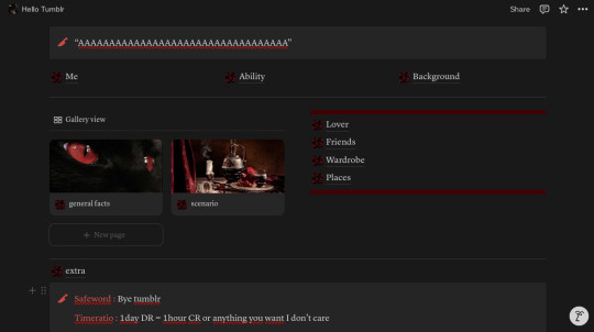
2 callout
-> One for a quote, something you or anyone in your DR would say
-> The second for your safeword and your time ratio (I always color them)
so in the end it must look like this odd thing

empthy and boring let's fix that.
4. Your real script
If you already have a script, you must have everything but here's the pages I usually have
Me
Ability
Background
Lover
Friends
Wardrobe (because I'm fashion, i need an whole page for it)
places
scenario
general facts
extra
you have penty of pages now.
5. Move everything
pick the first three and put them all next to each other (if you don't know how to move, just point the page you want to move and click to the points next to the +, now you can drag it whereever you want)
drag the callout with your safe word and your time ratio as down as possible
add a gallery view
-> go to the seetings then layout
-> turn down "show database title"
-> at "card preview" pick "page cover"
-> at "card size" pick "small"
put 2 of your pages in your gallery view
remember when i told you to find 2new icons ? put them in cover of the two pages in the gallery view
drag all the others pages right next to the gallery view (except extra, put that down, just on top of your safeword and timeratio
add two notion dividers
-> put it on top of gallery view and the pages next to it and on down of it
add two tumblr dividers
-> put it on top and down of the pages next to gallery view
you should end up with something like that :

the last part is to add a header (or just an icon that you crop) in the middle and TADAAAMMM you have your script !!
I might not have be clear on some part, so DON'T HESITATE to ask anything, on comment or in my inbox
also, i can make another tutorial to show you what i put inside the pages
I hope i've been able to help XOXO dear shifters !!
#shifting script tutorial#shifting realities#shifting#reality shift#shifter#shifters#shiftblr#shifting community#shifting blog#reality shifting#shifting script#shifting to desired reality#shifting reality#desire reality
46 notes
·
View notes
Text
Small Run Printing for Explicit Comics, a review of Ready Comics!
I know that the future of smutty publishing is real sketch in America right now, so I just wanted to put down info in case it's helpful for anyone at the moment or is perhaps relevant in the future.
At the end of last year, 2024, I was ready to self-publish a small run of my Critical Role wizard comic anthology, Who Else But You. There are many options for self-publishing comics, but the issue is that the middle one is entirely explicit, so I needed someone more specialized. I was running sales as a pre-order so I went into the purchase process without knowing how many copies I was actually going to need.
Thus my requirements were 18+ content, small run. And I found 2 printers in America who fit that requirement: Greko Printing, now known as Comix Wellspring and Ready Comics
Comix Wellspring: The slightly cheaper option, has a 25 volume moq, will not take custom sized books, but they have a lot (but not all) of available sizes. Their faq states that they will take adult material.
Ready Comics: Their moq is 10, they do custom sizes, they are slightly more expensive per book, but they also have a lot of fancy cover options. I had to message them, but they are fine with explicit material.
For a price comparison, I put in numbers for 8.5 x 11, 100 interior pages, all color, 100# for cover, 60# for interior, and that came out to be 11.44 for Greko, and 13.50 for Ready Comics. Printed proofs are $40 for greko, and $35 for Ready Comics but will vary based on book size.
In the end, I went with Ready Comics because WEBY was a weird size and I didn't want to do the extra work to make all the pages compliant with a new size, and I honestly was not sure I would hit the necessary 25 moq.
The Process
I've only done true POD printing before, upload a file get a book. Ready Comics was a much more hands on process.
I started asking for samples of their papers. There is a reserved page for ordering free samples, but it doesn't have anything on it. I had to tell them "what I was interested in" rather than there being an already put together package, which was weird. So I guessed at some things I might like. Their cover stock drop down was extensive. When I made my guesses, the ordering person told me that not all of the options were good for cover stock and recommended to me the best ones. (so why are those options all listed???) This sample pack was put together and shipped quickly.
I was getting a custom size, so I could not simply add something to the cart, I had to have it input special. This took MULTIPLE days. It was a little frustrating how long it took to make an invoice. I guess in reality it was probably 3 or 4, but I was IMPATIENT to start. However, I was allowed to only order a proof and not have a number for the final run beyond 10, their minimum, which was extremely helpful.
Once the invoice is placed, files can be uploaded. Weirdly, the files are put in as JPG, individual pages. You then deal with the layout person Alex. Alex was a delight. They were excited for some gay D&D content and were hugely helpful and patient. I was hoping to do a full wrap around cover of a solid piece of art, but because of the file set up process it can be difficult to make the wrap around completely line up so I ended up doing a solid spine. (I also think their spine calculator is a little off, overestimating the width).
I was absolutely getting a proof because I wanted these to be beautiful. It shipped a few days after the initial estimate. The colors were VIBRANT. I was flabbergasted. I did not expect it would print that well. (below, just look at them!)


HOWEVER, there were some issues. There was persistent banding throughout (top two images), and there was a weird line on the screen-toned pages at exactly the same place (bottom two images). It wasn't on EVERY screen-toned page, but it was present on many of them.


I contacted Alex who apologized and rushed a second proof.
The second proof arrived in about a week. It was also free. So this was some top tier service far as I was concerned. The banding disappeared, but the screen-tone line never fully vanished (top book is 1st proof, bottom book is second). Alex had the printers do testing on their end to see if they could get rid of it, and it was persistent. It was not a huge enough issue that I felt like I wanted to abandon the toning or this printer, but if I knew I were going to print toned stuff I would try a different printer just in case. Alex was prepared to do more testing but I also didn't want to run much further with the production timeline so we moved on. I will reiterate that all this work was done for a run of books that was, on paper, still listed at their minimum 10. So their customer service in this regard is amazing.

Also In the second proof, the colors on the cover were identical, it was lovely. HOWEVER, the colors on the inside were noticeably different. (top book is 1st proof, bottom book is 2nd).
I asked about it and was told that they were transitioning to a new kind of printer that made things more high quality but less vibrant. And the second proof and full run were . . . good! Like these bottom images are still legitimately lovely. I just kind of wish I hadn't seen the color possibilities in the first proof because I loved them SO MUCH.
Final run: The run printed and shipped on time. I was invoiced for the full run more quickly than the initial run. The packaging was stellar. small wrapped batches of books inside boxes with styrafoam peanuts, inside a bigger box with more peanuts. The outer covers protected with a thick piece of paper so you can safely cut through the plastic. One book of the 30 had a small scratch on the cover when it arrived. And there's quite a few books that have a little wrinkle on the first page in the corner near the spine. Overall, the customer service here was top-notch, and I am pleased with my final book product.
Final thoughts: I looked further into pricing, and if you are getting a long book, the price differential between CW and RC gets LARGE. The customer service was good, even for a run that was on paper going to be 10 books. The product at the end was good, as long as you don't do screen tones. If you have a small to mid-sized book, say up to 150 pages or so, and need only 10 copies instead of 25, or have a weird size RC is am excellent option. I haven't tried CW printing at all, but I will be aiming for it when I have something longer to print, and as such will be making sure it fits one of their sizes out of the gate. (If you are looking for a larger run, that puts Keness into the run as well.)
Here's to hoping these will both still be options in the future. If you have any good or bad things to share about either company, let me know!
20 notes
·
View notes
Text


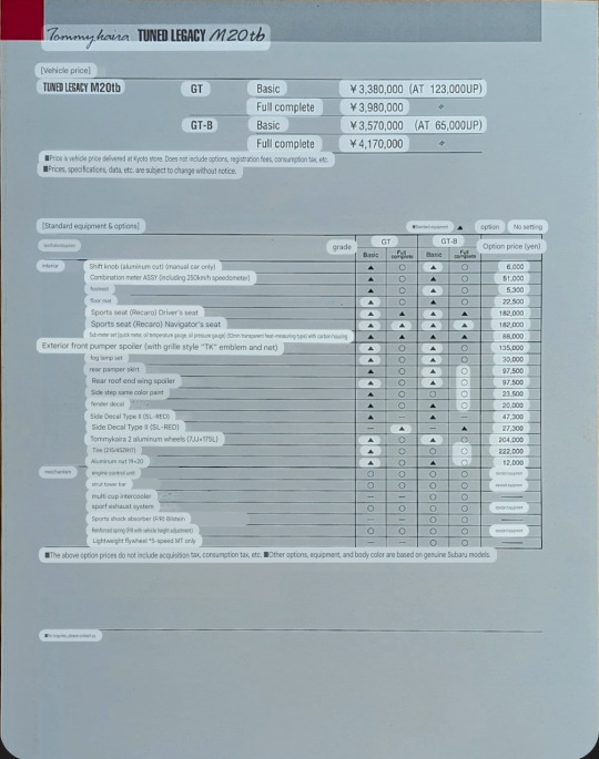

Tommykaira Tuned Legacy M20tb.
TUNED LEGACY M20tb
The challenge from GT to racing sports, the fastest wagon
Tommy Kaira's pedigree on the wagon. TUNED LEGACY M20tb, the flag bearer of the wagon era
A high level of perfection that can only be achieved by Tommy Kaira's complete car, which pursues total balance. Thorough pursuit of the well-established BOXER-4. The 297 horsepower produced by its reliability and high level of perfection gives it the edge of a sports car, and even though it is a wagon, it is enough to stimulate the true sports car mindset.
The torquey power that rises smoothly from the low rotation range brings you a world of endless possibilities.
It makes wagonists forget about the body and truly invites them into the world of sports cars.
The suspension tune is also the traditional Tommy Kaira tune, and its biggest appeal is the unique flavor that pursues the fun of sports driving while taking advantage of the appeal of 4WD.
The M20tb will demonstrate its true worth in all environments and conditions, including winding roads, highways, and if you're looking for a full-fledged circuit.That's the true joy of driving with the M20tb.
Powerful form
The front bumper spoiler, rear bumper spoiler, and roof end spoiler are Tommy Kaira Aero originals, and 17-inch wheels and tires are standard on the suspension. Completely tuned car, Tommykaira's status is modeled. It can be said that it is an object that harmonizes with any world in which wagonists drive.
SPECIFICATIONS
Max Output: 297ps/6600rpm
Max Torque: 35.3kgm/5800rpm (GT-8:5MT)
Max Output: 278ps/6600rpm
Max Torque: 33.3kgm/5800rpm (GT-8: AT)
Max Output: 270ps/6400rpm
Max Torque: 32.8kgm/5300rpm(GT: 5MT.AT)
BODY Length: 1680mm Width: 1695mm Height: 1490mm Wheelbase: 2630mm Tread: Front 1470mm Rear 1460mm.
■ENGINE
BOXER MASTER-4, DOHC 4cam 16Valve Twin Turbo with Multi-cup Intercooler Bore x Stroke: 92.0mm×75.0mm Piston Displacement: 1994cc
LAYOUT 4Wheels Drive 5-Speed Manual/E-4AT
Brakes: 2Piston Type Caliper+Ventilated Disk
Wheels: 7.0Jx17(Front & Rear)
Tire: 215/45ZR (Front & Rear)
Suspension: Strength Sports Spring
Steering: Rack&Pinion
●Interior
A comfortable design that lets you enjoy sports driving.
It features a shift knob made of aluminum, a 20-meter console that stands out in Tommy Kaira red, and an original meter made of three-dimensional carbon.
●Engine
Tommykara
The 297 hp power effortlessly guides the driver into the experience zone from the moment the car starts. Easy-to-handle engine characteristics are the hallmark of Tommykans.
●Front view
The originally designed spoiler with large openings above and below the bumper line maximizes cooling effectiveness. Together with the large integrated sub-light, it creates an impressive front view.
●Rear view
The fiberglass sports stabilizer and spoiler create a dynamic range that improves stability through downforce at high speeds.
●Fender decal/side decal
Flowing Tommykara, the confidence of a tuned car.
37 notes
·
View notes
Text
Piecing Together the Inside of the Noceda Residence
Hi, hello, it's me again, posting some more work my brain forced me to do before I'm allowed to get back to writing again 'cause none of it will be seen by anyone if I don't.
tl;dr, I tried to use the scenes we get to put together two possible floorplans for the Noceda residence, though, surprise surprise, there's no definitive answer.
Introduction
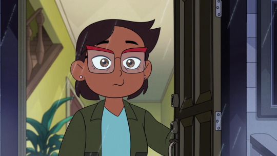
Alright, so we all know that houses in cartoons are innocuous suburban homes that inside are secretly eldritch shapeshifting nightmares hellbent on driving anyone trying to put together a definitive interior insane, answering only to the whims of the storyboarders. And typically, the longer a show runs and the more scenes we get inside a house, the more contradictions etc. build up. Thankfully, the Noceda residence, which I think I'll call Walnut Grove, or the Grove for short from here on out (since Noceda is losely translated to grove of walnut trees, and the Grove or Walnut Grove sounds like something people might name their house). Petering out sentence aside, thankfully we only see the inside of the Grove in a couple episodes: Camila's room in Enchanting Grom Fright's last scene, the living room in the ending scene of Keeping up A-fear-ances, several scenes of the kitchen and Luz's bedroom in Yesterday's Lie, the kitchen and entry hall at the end of King's Tide, Luz's room and the upstairs hallway in the epilogue, and of course every single room we know of in Thanks To Them.
Since the scenes establishing the Grove's interior are mostly isolated to single rooms or all within one episode, hopefully the paradoxes and contradictions remain somewhat low. And of course, before we fully dive into things, this is not meant as a critique towards the show. Setting up a scene, joke, or otherwise, trumps a fully logical, realistic layout, and putting together a full floorplan prior to boarding or animating makes it almost impossible to account for any later rooms or more useful arrangements that are needed in the future.
So, with the introduction aside, let's first take a look at the exterior of Walnut Grove.
The house is a quaint suburban home with two floors, possibly an attic, and (a later revealed) basement, with a forward-facing gable roof that has one shed-style dormer window at the front. There's a chimney off on the right, slightly off-center, and there's two windows on this side, one for each floor. The front door is to the left, along with six windows, two thinner ones on either side of the door and four big ones, though the second thin window is occasionally missing, such as in the picture above. There's no garage, just a driveway. The back and left-facing sides of the Grove are never seen, so they're a blank slate, though it's very likely there's a backdoor. The general dimensions of the house seem to have a comparable width to length, close to a square.
First attempt
With that out of the way, now for piecing together the actual inside. Let's have the first attempt start right at the front door, which opens up into the entry hall, where the staircase resides.
In the second half of Thanks to Them, there's a perfect shot that shows the full entryway.
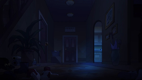
Here you can see the stairs on the left, a door on the left near the back of the stairs, a door all the way at the end with ventilation up top, and two openings on the right, one leading directly into the kitchen.
As a funny aside, in the extended intro in Thanks to Them there's a shot of the hall that looks like this, where the stairs have to be fit in a seriously thin slice on the left to not be visible.
Anyway, going counter-clockwise, the living room is easily established as being the first opening on the right of the hall (hard to see due to low lighting), the stairs are also visible from the living room. The majority of this room is occupied by drawers and small tables, plus a large sofa in the middle with a TV against the front wall. There's also a window off to the right.

The back right corner of the living room is never seen properly, nor is the front wall beyond a close-up shot of the TV, but the back left has this additional inward corner.
The other room visible in the prior establishing shot of the entry hall is the kitchen, being accessible through the second opening. These two opposing shots give a full view of the kitchen. There's a counter that runs along the back three walls, along with a kitchen island and a breakfast table on the other side. The microwave and stove top plus oven are on the left along with the fridge, and the sink's at the back.

The opening on the right of the second picture leads into the hallway, with the other exit being a regular door.
There's also a different angle where the opening is seen more clearly, with the room opposite the hall being the downstairs toilet. This also means the door on the left of the establishing shot of the entry hallway belongs to the downstairs toilet, leaving only the door at the back of the hall unaccounted for, though the presence of the window in the kitchen makes it very likely this is the backdoor, or something that leads into a small room that has the backdoor.
And that should be all the known rooms on the ground floor done with. Here's a crude sketch for the layout (not necessarily to scale):
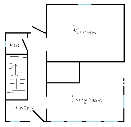
Before making anything more definitive, let's move on to the other two floors. First, the basement is probably the easiest and most well-defined. These two opposing shots map out the majority of it.
There's a small work station and a sofa seated up against the stairs down to the basement, a closet on the wall to the right, alongside a washer/dryer setup. In the opposing corner is a small bar. This was definitely the mancave. The one thing that's missing is a pool table. The only trouble the basement has is…where are the stairs to the basement located? The space right under the stairs in the entryway is already occupied by the downstairs toilet, and the front of the house is already mapped from left to right: left wall -> entry hall -> living room -> window on the right wall. The only bits with space undefined/left is in the back right, as the kitchen's right wall has no windows or anything to indicate it's actually an outside wall, or the back left, with the unassigned door which may or may not be the backdoor obscuring things. The unassigned door has ventilation above it, and while I'm not sure, I presume it's common to have those above interior doors rather than exterior ones, so perhaps there is indeed another room back there. Especially if it's the entry to the basement, which has no windows or access to the outside for ventilation. Plus, the way the kitchen extends further back than the hallway in its establishing shot suggests there is room back there.
Lastly, let's move on to the upper floor.
The main thing we see on this floor is Luz's room, which is almost fully mapped by these shots, leaving just one corner unseen.
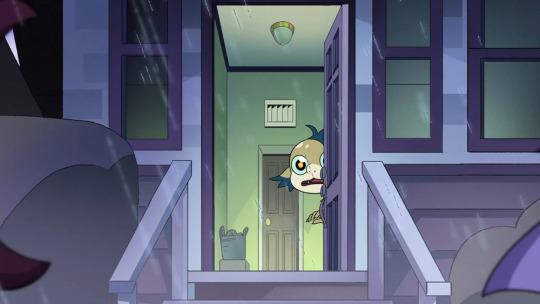
It has a bunk bed, a window on either side on both walls, a built-in closet with sliding door on the opposing wall, a small bookcase, and a desk under the right-most window. This is also where we run into the first definitive irreconcilable contradiction. You can see the slanted roof of the house here, with Luz's ceiling going up diagonally from the wall with the bookcase to the door at the back. However, in Yesterday's Lie, Vee jumps out of the desk window on the right, and comes out the shed window at the front of the Grove.
Furthermore, we also have a shot at the end of the extended intro in Thanks to Them, where Luz sits at her desk on the right and directly sees the school bus arrive at the front.

So, the ceiling says the desk window should be on the side of the Grove, but two instances say the window is at the front. There's sadly no way to reconcile this, so any future layout will have to compromise and pick one or the other. One thing that's clear though is that Luz's room has a front-facing wall. Whether that means her room is at the front-right corner or the front-left corner is up to us to pick.
The ceiling's slant in Luz's room should start a lot lower near the floor anyway, as the roof at the front slants down all the way to the bottom of the upper floor, along with the shed window being obvious from the inside, while in Luz's room the diagonal ceiling is only near the top, and the windows are both on flat walls. But of course, fitting in a bunk bed with that kind of ceiling is much more difficult for animators with these shots, so let's just let that slide.
Moving on, we also get a few shots of the upstairs hallway.
Now, I definitely think this hallway has been stretched out in the right picture, namely to add in all the photos on the wall, so let's go with animation trickery and assume the length is shorter than this, otherwise it'll probably be wider than the entire house, length- or width-wise. We also have at least two doors on one side of the hall, possibly three since the door in the left picture is white, with the other door further back in the right picture being brown. There's also room behind the camera on the left for a door, as well as the stairs leading up to the hallway. There's no serious slant visible in the ceiling like in Luz's room, so the hallway isn't directly up against an outside wall, so that's one point off.
When it comes to Camilla's room we basically see nothing except the bed and the door, so nothing more to say about that.

Before I go ahead and show my first attempt at a complete floorplan, I'll also mention that we're missing a proper bathroom, so that's something that has to be around somewhere. Since there's at least three doors in the upstairs hallway, and convention, the bathroom will be upstairs.
There's also this inward corner in the back-left of the living room, and the kitchen doesn't have an alcove back there, so another room has to be back there. Though from all possible angles, no door can be seen. So apparently the Grove just has a hole in its center?

Lastly, there's the already mentioned possible location of the basement stairs behind the door at the back of the hall. I'll leave out a highly possible attic space, as it's never shown, and adding it to the floorplan is pretty easy. Just a singular room with a collapsible ceiling ladder somewhere in the upstairs hallway.
With all this kept in mind, the floorplan that arises from this looks like this, though proportions can be altered a little:
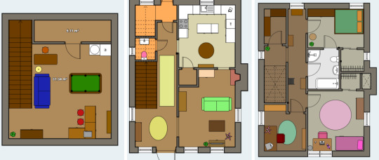
Some clarifications, I turned the mysterious gap in the center of the house into a pantry, with kitchen-access, even if there's no actual access visible in the show. The second doorway in the kitchen also directly leads into the living room, in the corner we can't see. A fireplace is also added, as there should be a chimney/fireplace around that location. The space behind the door at the back of the hall is turned into a room with access to the basement, though I can also see it containing the breaker box and that kind of stuff on the right wall.
For the basement, nothing more needs to be said, except yes, I did add the pool table. And for the upstairs, by making things fit with the parameters set with the ground floor, the additional space in the front-left corner becomes a home office (for Manny, rest in peace), with Luz's room at the front-right and her desk window becoming the shed window, and Camila's room at the back-right. Using up some of the remaining space for built-in closets, the potential third/middle door in the hallway becomes the missing bathroom, which is an en-suite here. Lastly, the remaining space in the back left just becomes more storage space.
So yeah, a few clunky things, but it works overall.
Now to tear this apart and point out all the inconsistencies I left out up until now.
The inconsistencies #1
Obviously, Luz's room is a Schrodinger's room that's in either the front-left corner state or the front-right corner state. For the sake of illustrating both options, I collapsed the wave function into front-right for this attempt, but I'll get back to the other state in a bit.
This also means the hallway is oriented wrong, as none of the slanted roof can be seen at the back, which would be the case if the orientation was front to back. The upstairs hallway is depicted as being oriented from left to right, parallel to the rooftop, especially with the window at the end.
Speaking of windows, the sideview of the Grove's exterior shows there's no window near the front at the right-facing wall, even though the living room has a window at the right. No matter what, the living room is solidly depicted as being in the front-right corner of the house, making this missing living room window the second irreconcilable contradiction we've encountered so far.
Keeping up with windows, the exterior window in the back of the right-facing wall is nowhere to be seen in the actual floorplan, belonging to the kitchen, which has no window on that wall. Furthermore, the side of a neighbor's house is visible in the kitchen window, meaning that wall is side-facing. This means the kitchen is either in the back-left corner or the front-right corner, though the latter is already occupied by the living room, so if anything, the kitchen would be in the back-left.
And, as mentioned previously, there's absolutely no entry to this mysterious hole in the center of the floorplans in any of the interior shots.
Based on these floorplans, it should also be clear that the house stretches back more than it is wide, which doesn't match up well with the outside, where the layout is more square.
Oh, and I left out the biggest inconsistency so far.
You remember that second entry to the kitchen? The one with the door, not the one to the entry hall? The one I assigned to being a direct passage into the living room?
Yeah, there's a whole-ass second hallway beyond there, one we never actually see from within in the show.
So…big oversight on my part there.
With all these big inconsistencies pointed out though, barring the two irreconcilable ones, let's try again, and attempt to work out these kinks.
Second attempt
I'll spare you the same pictures of the rooms (partly because I actually hit the picture limit of Tumblr and had to resort to screenshotting pairs/triplets in-draft to turn them into single pictures (did I trick ya?)) so let's get to the meat of this second attempt.
Rather than base things off the entryway, let's instead build things up on the ground floor around the kitchen, since that one had the biggest inconsistencies in attempt one.
Well, let's start with putting the kitchen at the left of the house, with the kitchen window facing left. We also still have the downstairs toilet across the hall from the opening, and we now also have this second hallway visible from the other door, which has a corner, if not a T-junction, right where the kitchen door is, and two doors, one for each wall of said corner.
A crude sketch of this arrangement looks like this:
We now have a weird mess of hallways and turns, but to further build on this, let's just connect the two bits of hallway we can see into one, which you'll see just below in the final floorplan.
Of course, the location of the entry hallway and the living room doesn't change whatsoever, so let's just go ahead and show my full second attempt:
As you can see here, the new kitchen direction with adjacent hallway system, combined with the entryway and living room, fills up quite a bit of floorspace. That, and the downstairs toilet now neatly explains the back-left corner of the living room. Concerning the two additional doors visible in the second hallway, I've assigned one to the pantry, and the other to a small closet containing the breaker box.
The long stretch of hallway parallel to the right of the kitchen did create some empty space between the living room and the pantry, but I filled this up with a proper dining room. This also now happens to be the spot where the chimney/fireplace would be located, which seems very fitting.
The basement does not change in any significant way, besides needing to figure out where the basement stairs are, as the kitchen now occupies the space right behind the entry stairway. As the weird second hallway section seems to extend beyond the windowless kitchen wall, the implied space right beyond the kitchen is turned into the basement stairs. This also turns the whole basement by ninety degrees.
Lastly, there is the upstairs. As the placement of the staircase really does not change, the floorplan of the upstairs is not determined by that of the downstairs. In reality, the floorplan of the first attempt and that of the second attempt here could be interchanged if you fudged the proportions a little. Anyway, for this upstairs I collapsed the Luz Schrodinger's room wave function into the front-left corner state, meaning we're now adhering to the sloped roof visible in Luz's room rather than the desk window. I also gave the one corner that's never actually shown in the show an indent to give some room for the stairs to go up without the ceiling being in the way.
With her room in the front-left, this makes the hallway stretch from left-to-right, also solving that discrepancy discussed with the last attempt. Beyond that, I assigned the three visible doors upstairs to Luz's room, a hallway closet, and the home office (otherwise an empty space), with the shed window now being part of said office, and in the back there's Camila's room, a walk-in closet, and the en-suite bathroom to fill the remaining space.
All in all, a decently put together floorplan, I'd say. Now let's point out what's wrong with this one.
The inconsistencies #2
Let's get the obvious ones out of the way. Luz's desk window now doesn't face the front anymore, but this was one of two irreconcilable contradictions anyway. The other one is the lack of a living room window on the right side of the house, which again can't be fixed.
Speaking of windows, the one in Luz's room, above her low bookshelf, is not visible on the exterior, where only the shed windows are visible. Proportions just won't allow this shed window to belong to Luz's room, unless you fudge with things and make the other room on the front end be much thinner. At least there's now space for a window on the lower right wall near the back, which I added to the bit of hallway that reaches the right wall, between the dining room and pantry.
There are two glaring inconsistencies though, one being the fact the entrance hall no longer matches the one establishing shot, where the kitchen is visibly established as being oriented where its one window is facing the back. This kitchen window both facing the back of the house as well as showing one of the neighboring houses is the third irreconcilable contradiction.
The other big inconsistency involves the downstairs toilet, which happens to have a small window on the wall opposite the door. The stars are even visible through it.
In this layout, this wall is an interior one, with the living room being on the other side. It seems this window is somehow capable of quantum tunneling to the exterior wall, which doesn't sound very realistic. (As an aside, I'll skip on figuring out a floorplan for the actual Owl House, citing magic as my excuse. That, or 'Hooty was feeling a little quirky with his insides that scene' when contradictory shots show up).
Concluding remarks
In general, the Noceda residence is decently well established, and does not have too many irreconcilable contradictions, as hoped for predicted in the introduction. Trust me, other cartoon houses are notorious for being extremely inconsistent in their depictions.
Luz's desk window suggests her room plus upstairs hallway stretch front-to-back, but the ceilings of her room and hallway show they stretch left-to-right.
The kitchen window is facing left, but the entry hall and kitchen are established to face front-to-back.
The living room is established to be in the front-right corner, but the window visible on the right wall is absent on the outside.
Anyway, I'm pretty happy with the two layouts I put together, though I personally prefer the second attempt. Besides the three irreconcilable contradictions, which you'll just have to pick and choose or ignore altogether, there's only three other contradictions here, compared to the five of the first attempt, which included the missing hallway. That, and things just fit together more neatly. I do like how both have at least one loop in them. I can just picture younger Luz doing the human equivalent of zoomies on the ground floor.
So, dear reader who's somehow found this post and read it to the end, which floorplan do you prefer, or think makes more sense? Keep in mind that you can swap the layouts for the upstairs between the two attempts as long as you adjust the proportions a little.
But that's enough out of me. I'll see you once the next side-tangent for fic writing hits and I put too much effort into it to not show it online.
#the owl house#owl house#toh#owl house theory#toh analysis#overanalysis#overanalyzing#cartoon houses#why are they like this?!#theory#discussion#analysis
43 notes
·
View notes
Text
AGARTHA Aİ - DEVASA+ (2)

In today’s digital landscape, a captivating and functional website is crucial for any business looking to thrive online. Full service web design encompasses a comprehensive approach, ensuring every aspect of your site is tailored to meet your unique needs. From the initial concept to the final launch, this service provides an array of offerings, including website service, responsive web design, and custom design services. Whether you’re a startup seeking to establish your brand or an established enterprise aiming to enhance your online presence, understanding the elements of full service web design is essential.
Full service web design
Full service web design encompasses all aspects of creating a website, from initial conceptualization to ongoing maintenance. This approach ensures that every detail is carefully considered to meet the specific needs of a business or individual. With a team of experienced designers and developers, full service web design offers a seamless experience that integrates aesthetics, functionality, and user experience.
One of the key advantages of opting for a full service web design is the cohesion of the website elements. Since all parts of the project are managed by a single team, there is less chance for miscommunication or inconsistency in design. This results in a more polished final product that reflects the brand’s identity while providing an engaging experience for visitors.
Additionally, full service web design allows for customized solutions tailored to unique requirements. Whether you need an e-commerce platform, a portfolio site, or a blog, a full service provider will offer dedicated support and expert advice throughout the entire process, ensuring your vision comes to life exactly as you imagined.
Website service
In today's digital landscape, website service is essential for businesses to thrive and maintain an online presence. A well-structured website serves as a powerful tool that encourages customer engagement and drives sales. By investing in a comprehensive website service, businesses can ensure that their website not only looks great but also functions seamlessly across all devices.
A key aspect of website service is the ability to optimize for search engines. By implementing SEO best practices, businesses can enhance their visibility and attract more organic traffic. This is where a reliable website service provider plays a crucial role, as they possess the expertise and techniques necessary to elevate your search engine rankings.
Furthermore, ongoing support and maintenance are vital components of a reliable website service. As technology evolves and user needs change, having a team that can promptly address issues or updates will keep your website relevant and effective in reaching target audiences. This ongoing relationship is instrumental in achieving long-term success in the digital realm.
Responsive web design
Responsive web design is an essential aspect of modern web development that ensures a seamless user experience across a variety of devices. With the increasing use of smartphones and tablets, having a website that adapts to different screen sizes is not just a luxury but a necessity.
The core principle of responsive web design is fluidity. This means that the layout of your website adjusts dynamically based on the screen width, ensuring that content remains accessible and visually appealing regardless of the device used. This approach improves usability and can significantly boost conversion rates.
Incorporating responsive web design techniques involves using flexible grids, images, and CSS media queries. These elements work together to create a layout that responds gracefully to changes in screen size, making your website not only functional but also competitive in the digital marketplace.
Custom design services
In today's digital landscape, custom design services have emerged as a vital component of creating a strong online presence. Businesses understand that a one-size-fits-all approach does not cater to their unique needs and branding. Therefore, opting for custom design services allows them to differentiate themselves in a crowded market.
These services offer tailored solutions that resonate with a company's specifics, from colors to typography and layout. By leveraging custom design services, businesses can ensure that their websites not only reflect their brand identity but also provide an intuitive user experience. This is crucial for keeping visitors engaged and encouraging them to take the desired actions.
Investing in custom design services ultimately contributes to better customer satisfaction and improved conversion rates. With a website designed specifically for their target audience, businesses can more effectively communicate their message and achieve their goals. This bespoke approach is invaluable in today's competitive environment.
43 notes
·
View notes
Text
MEDIEVAL AND RENAISSANCE ROMANI DRESS CODES IN OLDER ARTWORKS
@the-blue-fairie @the-blue-fairie @mask131 @princesssarisa @professorlehnsherr-almashy
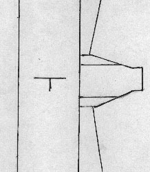
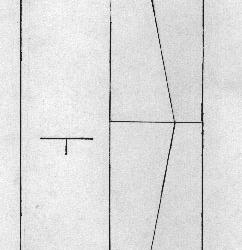
"A basic gown with some gathering or pleating around the neck to make it fit. It may have a keyhole neckline opening for breastfeeding of young. This would have been worn over a undergown or chemise of basically the same construction. (See layout and cutting diagram below.) A drape is worn over one shoulder. This is sometimes of a striped fabric, and could be used to carry children or objects. The outfit was completed with a turban of cloth."
Full Bust
Waist
Hip
Arm Length from top of Shoulder
Hand width + 2"
Upper Arm
Length from shoulder to floor
Shoulder width.
6 notes
·
View notes
Text

Hi! Faz um tempinho que passei a usar o Notion para organizar meus muses e outros aspectos da minha vida rpgística — e da mesma maneira, faz um tempinho que uns amigues me pedem ajuda para usá-lo. Entretanto, percebi que muitas pessoas não estão familiarizadas com o Notion e suas possibilidades. O Notion é um aplicativo grátis e prático. Não é tão personalizável quanto o Tumblr e possui algumas limitações quando comparado ao Google Docs; entretanto, ainda é uma opção muito boa para aqueles que querem um espaço prático e facilmente personalizável, mas acham outras plataformas muito inconvenientes. O Notion não é complicado, mas pode ser intimidador no princípio! Por isso decidi fazer um tutorial!
⭒ Neste tutorial, irei ensinar a montar uma MUSE PAGE com personalização avançada! ⭒

Na verdade, esta é a TERCEIRA PARTE do meu tutorial. A primeira e a segunda podem ser encontradas no google docs — as primeiras partes são focadas em explicar detalhadamente a Interface, Páginas e Elementos do Notion. Como algumas pessoas podem não estar interessadas e, como ficou muito longo, me pareceu melhor deixar no google docs. Se estiver interessade em aprender desde o princípio a como utilizar o Notion, recomendo checar o google docs!
(1) Vamos criar uma página e escolher a opção PÁGINA VAZIA / EMPTY PAGE. Depois, vamos para as configurações de página e escolher a opção TEXTO PEQUENO / SMALL TEXT e LARGURA COMPLETA / FULL WIDTH. Dessa maneira teremos um espaço maior para trabalhar.

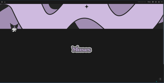
(2) Sinta-se à vontade para colocar um título! Para o tutorial, em vez de escrever um, colocarei um espaço no bloco de título para ficar em branco — minha intenção é utilizar uma imagem para usar como título. Para o banner e ícones da página colocarei uma coisinha simples. Por enquanto, minha página está assim:
(3) Agora, adicionarei uma imagem para título. Vou ensinar o primeiro "truque": como quero deixar a imagem centralizada na página, eu vou clicar no primeiro bloco de texto da página, onde está escrito CLIQUE NA BARRA DE ESPAÇO PARA A IA, OU "/" PARA COMANDOS… / PRESS 'SPACE FOR AI, '/' FOR COMMANDS. Vamos digitar / para aparecer a lista de opções de comandos; então, digitar columns e escolher a opção de 3 COLUNAS / 3 COLUMNS.
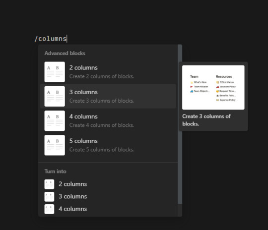
É autoexplicativo, mas essa opção fará a página ser dividida em TRÊS COLUNAS. Nós iremos clicar na coluna do meio e digitar /image. Depois que escolher uma imagem para o título, ela ficará centralizada. Assim:
Se você passar o mouse sobre a imagem e/ou sobre as colunas, verá que aparecerá uma opção para ajustar o tamanho delas. Eu ajustei um pouco para ficar maior!
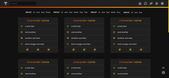
(4) Agora, vamos clicar num bloco que esteja fora das colunas, para que a nossa database fique com o tamanho inteiro. Isso mesmo, nossas muses vão ficar numa database — dessa vez, vamos escrever /database e escolher a opção VISUALIZAÇÃO EM GALERIA / GALLERY VIEW.
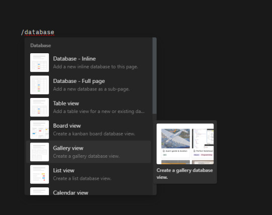
O Notion irá criar uma visualização em galeria, mas você precisa criar a database. É simples:

Se o menu na lateral direita não aparecer automaticamente, basta clicar onde está escrito em DEFINIR FONTE DE DADOS/SELECT A DATA SOURCE. Então, você vai clicar no campo onde permite escrever (na imagem, ali onde está selecionado escrito Muses!) e escrever… Muses. Você pode, em fato, dar o nome que preferir! Em seguida, é só criar em + NOVA BASE DE DADOS "[NOME QUE VOCÊ ESCOLHEU]" / + NEW DATABASE "[NOME QUE VOCÊ ESCOLHEU]. Ele irá aparecer assim:
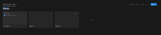
(5) Por questões de organização, vamos faxinar essa galeria. Primeiro vamos excluir a Página / Page 2 e 3 — basta clicar sobre elas com o lado direito do mouse e escolher a opção excluir / delete. Depois, vamos clicar nos três pontinhos e abrir o menu de opções de personalização da galeria.
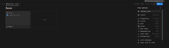
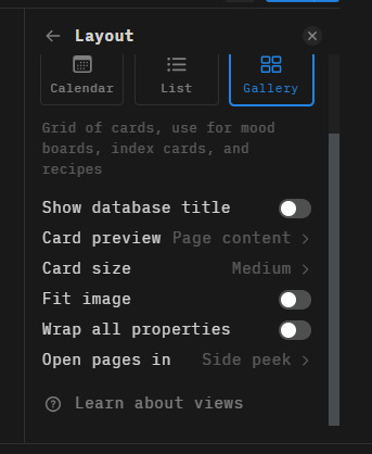
Em Layout, iremos DESLIGAR a opção MOSTRAR TÍTULO DA BASE DE DADOS / SHOW DATABASE TITLE; em VISUALIZAÇÃO DO CARTÃO/CARD PREVIEW, a opção CONTEÚDO/PAGE CONTENT; em TAMANHO DO CARD/CARD SIZE, a opção MÉDIO/MEDIUM; ABRIR PÁGINAS EM/OPEN PAGES IN, a opção MODO LADO A LADO/SIDE PEEK.
(6) Agora, vamos para a subpágina na galeria (página/page 1). Nós vamos clicar nela e excluir tudo o que está nela, deixar ela sem nada.
Essa é a hora que eu ensino o truque mais poderoso do Notion — você deve ter percebido que ele possui uma opção de inserir equações: graças a essa opção podemos usar o KaTeX para expandir as opções de formatação do Notion. Como vamos fazer isso? É muito fácil. Você irá clicar no bloco do TÍTULO e escrever: \large{Nome\;do\;Personagem}
\large é a propriedade para mudar o tamanho da fonte. Há 10 opções disponíveis: \Huge, \huge, \LARGE, \Large, \large, \normalsize, \small, \footnotesize, \scriptsize, \tiny.
{} todo texto que não for um "código", por assim dizer, irá entre {}.
\; é o "código" que indica que deve ter um espaçamento ali.

Você pode acessar o site do KaTeX para olhar outras opções de formatação!
Agora, selecione tudo e aperte (no seu teclado) CTRL + SHIFT + E.
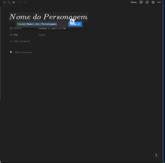
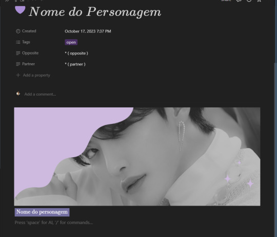
CLIQUE EM DONE PARA CONFIRMAR, e pronto! Por enquanto, não vamos colocar o nome do personagem, okay? Nós iremos usar essa primeira subpágina que estamos montando como MODELO / TEMPLATE. Por isso deixaremos as informações em branco.
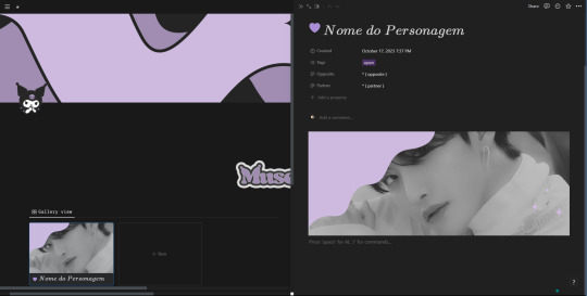
Okay, agora podemos colocar o ícone e a capa da subpágina. A minha está assim:

(7) O próximo passo é adicionar as propriedades / properties que iremos dar para os nossos personagens para organizá-los. Você vai ver que há uma pré-criada chamada Tags. No campo da frente estará escrito VAZIO / EMPTY — clique nele! Agora, só precisa escrever as tags. Sinta-se livre para ir criando quantas quiser! Por enquanto, eu somente farei duas: OPEN, CLOSED. Para criar, é só escrever a tag e, em seguida, clicar nela no campo que aparecer abaixo na frente de CRIAR / CREATE.
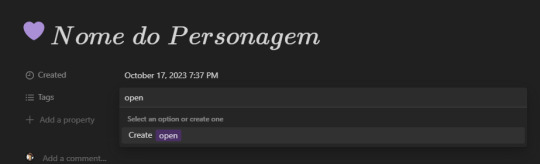
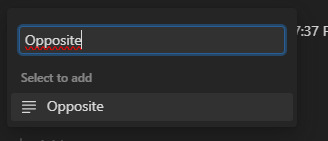
Agora, clicaremos em + ADICIONAR PROPRIEDADE / + NEW PROPERTY. e criar uma propriedade chamada PARTNER. Depois, uma propriedade chamada OPPOSITE. É a mesma lógica de antes: escreva no campo, e para criar clique na opção que irá aparecer.
Por enquanto, elas ficarão vazias! Ou, se preferir, pode deixar um modelinho para ser preenchido depois. Por exemplo:

(8) Com o "cabeçalho" pronto, vamos passar para o conteúdo da subpágina. Lembra que em VISUALIZAÇÃO DO CARTÃO/CARD PREVIEW, escolhemos a opção CONTEÚDO/PAGE CONTENT? Então! Isso significa que a "imagem" que ficará aparecendo na galeria, serão os primeiros elementos da subpágina. Por isso, para ficar bonitinho, vamos adicionar uma imagem!
Vamos escrever no bloco /image e selecionar a opção que aparecerá. Então, adicionaremos uma imagem. A minha ficou assim:
Viu ali na galeria? Ficou a imagem que colocamos!
(9) Por fim, vamos colocar as informações de nossa muse. Mas vamos deixar bonitinho, né?
Para isso, de novo, usaremos as equações! Dessa vez vamos digitar: \color{#ffffff}\colorbox{#7471a2}{Nome do personagem}
\color{#ffffff} é o código que mudará a cor da fonte! Sinta-se à vontade para mudar o #ffffff por outra cor!
\colorbox{#7471a2} é o código que irá mudar a cor do fundo! Sinta-se à vontade para mudar o #7471a2 por outra cor!
Dessa vez não é necessário utilizar os \; para marcar espaço.
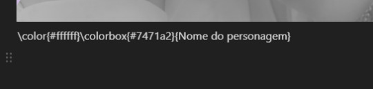
Novamente, selecione tudo e aperte (no seu teclado) CTRL + SHIFT + E. Não se esqueça de CONFIRMAR clicando em concluído / done. Vai ficar assim:
Para colocar o nome do personagem, iremos clicar para fora da equação e escrever. Assim:

Bom, agora nós iremos duplicar esse bloco, mas mudando para outras informações! Para duplicar, basta clicar no bloco e apertar CTRL + D no seu teclado. O meu ficou assim:
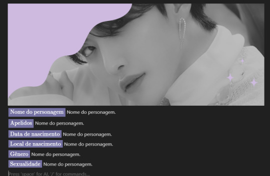
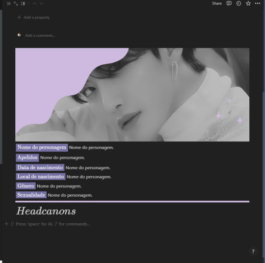
Você pode ir adicionando quantas outras informações quiser / precisar! Eu quis, depois, colocar uma imagem de divisória e adicionar uma parte para headcanons!
Depois que adicionar todas as informações que você deseja, você pode fechar a subpágina — clicando naquele ícone lá das setinhas!

(10) Para o toque final, iremos voltar para o menu de opções da database e clicar em PROPRIEDADES / PROPERTIES. Você verá que, ao lado das propriedades que criamos, há um ícone de OLHO. Você vai clicar neles para habilitar que essas propriedades fiquem à mostra na galeria.

Você verá que a galeria, agora, irá mostrar essas propriedades assim:

(11) Lembra que eu disse que essa subpágina seria usada como MODELO / TEMPLATE? O que quis dizer com isso é que, para facilitar, sempre que você for criar uma muse nova, você pode duplicar essa página "sem informações" e depois só substituir! Assim você não precisa criar tudo desde o princípio de novo…
Para isso, basta clicar com o lado direito do mouse sobre o "card" na galeria e escolher a opção duplicar! Fácil, não? Depois é só ir modificando o quê precisar.
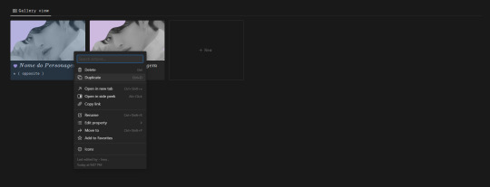
(*) Eu sei que o Notion oferece uma ferramenta para criar templates dentro da plataforma, porém, acho muito mais complicado do quê fazer assim!
Prontinho! Está pronta a sua página de muses no notion! Mais do que fazer uma página super elaborada, meu propósito com esse tutorial era apresentar / ensinar funções que irão ajudar vocês a começar. Com o tempo, pretendo disponibilizar alguns templates mais estéticos! Assim como fazer outros tutoriais sobre a plataforma!
Caso possua dúvidas, não hesite em me mandar uma mensagem e tentarei ajudar!
Sem mais delongas, espero ter ajudado de alguma forma!

97 notes
·
View notes
Text
Build a Seamless Online Store with the Ecommerce TNC Webflow Template
Ecommerce TNC empowers you to offer an exceptional digital shopping experience — without writing a single line of code.

Standout Features
Modern, Clean Layout
A minimalistic yet stylish design puts your products in the spotlight. The airy white space, crisp typography, and bold visual hierarchy create a professional and trustworthy first impression — critical for ecommerce success.
Customizable Homepage Hero
Grab attention instantly with a full-width hero section designed to showcase promotions, bestsellers, or new drops. Add call-to-action buttons, dynamic images, or sliders with ease — no code needed.
Dedicated Product Pages
Each product page includes customizable fields, image galleries, size guides, and reviews — so you can provide every detail a shopper needs before clicking “Add to Cart.”
Flexible Collection Grids
Effortlessly categorize and display your products with responsive grids that adapt to mobile and desktop devices alike. Organize by category, popularity, or tags for a smooth shopping experience.
Conversion-Optimized Cart & Checkout
Designed with usability in mind, the cart and checkout flow is sleek, straightforward, and mobile-ready — helping reduce cart abandonment and improve customer satisfaction.
Fully Responsive Design
From mobile to tablet to widescreen desktop, this template ensures your store looks sharp and functions flawlessly on any device.
CMS Integration for Content Marketing
Launch a blog or news section in minutes using the integrated CMS. Perfect for announcing sales, sharing customer stories, or improving SEO with fresh content.
Global Styling System
Quickly change fonts, colors, or component styles from one centralized place. Ideal for maintaining brand consistency or testing new seasonal looks.
Smooth Interactions & Animations
Add motion without overwhelming the user. Scroll-triggered animations, hover states, and button transitions make for an engaging and delightful experience.
Built-in Contact and Newsletter Forms
Grow your list and stay in touch with ready-to-use contact and subscription forms — fully integrated and customizable.

Who Is Ecommerce TNC For?
DTC (Direct-to-Consumer) Brands
Digital Product Sellers
Fashion & Lifestyle Businesses
Home Decor or Tech Gadget Stores
Startups building MVPs quickly
Launch Your Store with Ecommerce TNC Now
Don’t wait to bring your store to life. Explore the Ecommerce TNC Webflow Template and start customizing today. Whether you’re launching a new product line or scaling your business, this template helps you look polished and professional from day one.
👉 Get the Ecommerce TNC Template Now
#webflow#webflowtemplates#websitetemplate#template#web design#ui ux design#webflowdesign#web development#businesswebsite#degital marketing#ecommerce
3 notes
·
View notes