#gradient map advice
Explore tagged Tumblr posts
Visit Tumblr Blog
Explore Tumblr blogs with no restrictions, modern design and the best experience.
Last Seen Tumblr Blogs


Fun Fact
There were a total of 171.5 billion posts on Tumblr in 2019.
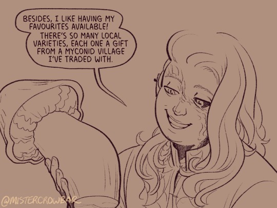
Text

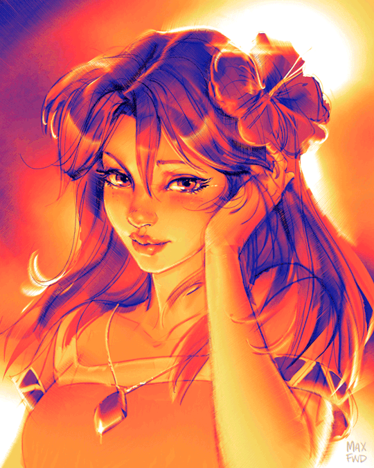
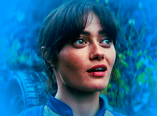
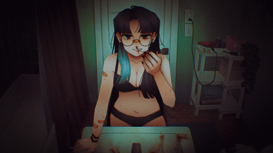
OooOOOooO GUYS I NEED UR HELP ,IM WORKING ON A SHADOW MILK GRAPHIC AND IM TRYING GRADIENT MAPS FOR A SECOND TIME BUT INSTEAD USING PHOTOPEA.. DOES THIS LOOK OKAY.. </3
#userbars#carrd stuff#carrd decor#editing resources#shadow milk cookie#carrd#crk fandom#crk#cr kingdom#shadow milk crk#shadow milk#rentry inspo#rentry resources#rentry stuff#rentry gif#rentry#rentry decor#bundlrs#editblr#editblr community be nice to me i beg im still learning#gradient#gradient map#gradient map advice#gay cookie
65 notes
·
View notes
Text
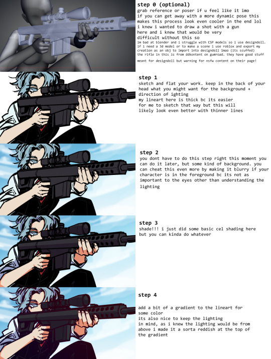
Sketch-to-Final Art Process for "Marin" As demonstrated above, the process had a clear compositional intention from the beginning, with a quick repositioning so that her eye was in the midline of the image because I like that. Then I refined it into a tight construction sketch, then some quick "flat" tones, and then just focused on compositional shading to give the hint of a sunlit back and reflected light presumably coming off the beach sand. Tiny details like the tears and jewel highlights always saved for last. The color is via Gradient Map filter which works really well if you can manage the values right in grayscale first.
#zelda fanart#the legend of zelda#tloz#rough sketch#art process#concept art#art timelapse#marin#links awakening#gradient map#art tips#art tutorial#drawing tips#art advice#zelda
169 notes
·
View notes
Text
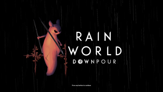
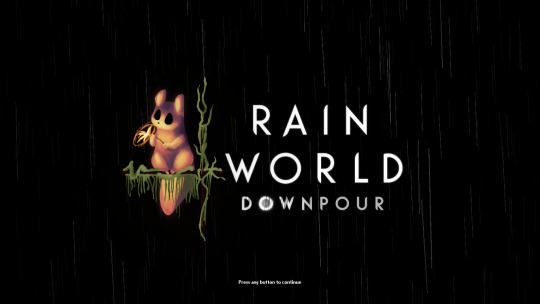

i finally finished these!! i felt bad that hunter and monk didnt have their own titlescreen art, so i started on making my own for them a few months ago. nailing the official rendering made this harder than i thought haha
also, when i originally made these, i had the idea of making this into a sort of challenge for other people to make their own title art for these two. im still standing with that! if you want to take a shot at making your own version of titlescreen art for these two, go ahead! hell, tag me if you want.
#thank you pansear for giving me the most comprehensible advice on rendering these ..... doing the whole thing in B&W first helped a LOT#and thank you gradient mapping for making things easy#my art#rain world#rain world downpour#the hunter#the monk#hunter rw#monk rw#slugcat
2K notes
·
View notes
Note
what helps you with your lighting techniques?
Gradient maps, gradient maps, gradient maps 👏
#asks#Anonymous#art advice#granted this isn't much in the way of actual advice but gradient maps are a huge lifesaver for me
42 notes
·
View notes
Note
If I may, how do you typically approach choosing colors in your art? It always has just a lovely feel to it, so I was a bit curious; don't feel pressured to answer ofc :]
I’ve been using a lot of gradient maps lately, they work by switching the greys in your piece with a corresponding colour according to its value. Basically, I colour in black and white, grab a gradient map, and then I adjust the colours by hand until I’m happy with it. This isn’t the only kind of colouring I do, but it works great if you’re in a rush or you’re struggling to find a good starting point for your colours. I’ve been operating under a time crunch for these Sketchbook Week drawings and the Plenism promo stuff I made, so for all except one I used gradient maps. I’m actually in a bit of a funk with my colours right now soooo I’ll come back and do a proper colouring tutorial for my style once I’m happier with how my non gradient mapped colours are looking !
#after sketchbook weeks over I wanna sit and do some colour studies to find palettes I’m more happy with#even these gradient map ones I’m not thrilled with#they’re fine! but I could do better#in terms of other tricks I use I’ll often adjust the hues and saturations if the whole piece to give things more unity if I’m struggling#and/or add a new layer on top of everything and fill it with one base colour#and play around with different layer settings and opacities on top#I’ve found a luminosity layer on a low 5-10% setting is quite nice#basicslly I fuck around and find out#and if I’m in a rush I use a gradient map#they’re not neccesarily a quick fix! if you’re like me you’ll still want to do some tweaking after it’s been applied#and you need to pay attention to your values when you’re colouring in black and white#but that’s another good thing about gradient maps - they force you to focus on value over hue which is an important skill to build#so yeah I’ll come back to this and make an actual colouring tutorial once I feel like I have actual good advice to give#cause rn I’m just very meh in my colouring and I don’t think I have anything very helpful to add#need to find some tutorials myself first !#ty for the ask!#ask#art#my art#bpcol-reblogs#textpost#blethering#for this piece the adjustments were minimal in comparison to what I usually do btw#because I was rushinggggg lol#I did more for my Plenism posters n such#but I can’t really show good comparisons because I. didn’t save them like that#I usually smush all my layers together when I’m drawing sooo yeah makes it hard to go back my bad whoops#but I saved as I was going whilst drawing this so I could provide examples yipee!#if I’d been smarter and remembered more I could’ve had more process screenshots butttt oh well lmao
19 notes
·
View notes
Note
can you do tumblr sexyman with greed? thanks!

i feel like i mightve gotten possessed while drawing again.
#terrible writing advice#twa art#inner greed#ask#ward-leon#im like crazy :3#this was rlly fun tho like fr#oh gradient maps what would i do without you...#!!! forgot to mention lyrics r from Sensaatio by Apulanta!
10 notes
·
View notes
Note
What advice would you give to someone who wants to start draw comics?
Read comics. Try to absorb the layouts and lettering - there’s so many ways to tackle it! Also even in published comics you’ll see that the art is messy and scrungly and you can take that as permission to be messy and scrungly too.
Comics are about efficiency and Good Enough. If you try to make each panel a masterpiece you’ll be there forever. Reasons why I mostly do simple pencil comics.
Start small. Do a scene or gag comic at a time. Get a feel for the medium and all the steps you have. If there’s a step you hate, find a way to emphasize the steps you love. EG I hate laying down flat colours but love shading, so I make my page form comics painterly greyscale with a gradient map to spruce them up.
Thumbnail!!!!! Figure out your page or panel layout before you start pencils. It can just be chicken scratch and sticken figures but it will help make sure there’s a clean line of action carrying the viewer from panel to panel and that your lettering fits.
don’t skimp on lettering. you can have beautiful artwork but if your dialogue is time new roman on half transparent ellipses or somehow unreadable it’s gonna drag everything else down. Blambot is a great source for free and affordable comic fonts and even has guides from an industry pro.
There are a huge bajillion elements to making comics but once you’ve made like, literally 100 pages you’ll start just intrinsically knowing things like the 180 rule, how to place a speech bubble when the first speaker is on the right, and that you can draw one nice background and then have gradient colour blocks carry you through most of the page/scene. And then you’ll still keep learning. Always learning!
LOTS of example stuff under the cut, mostly for lettering and layouts:
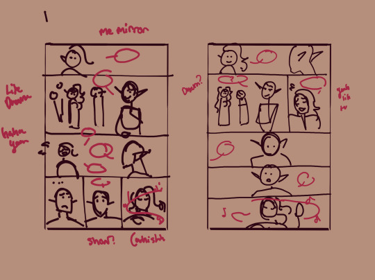
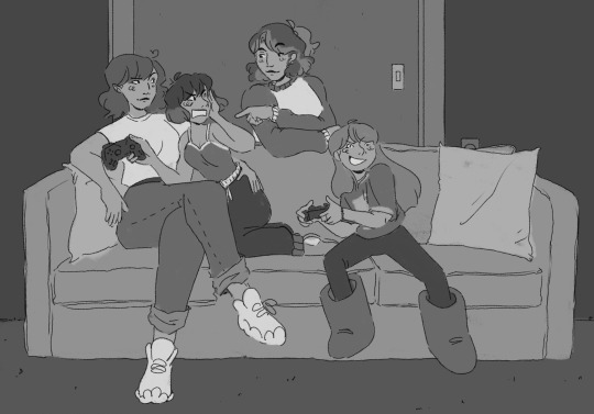
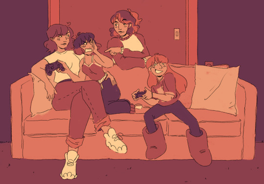
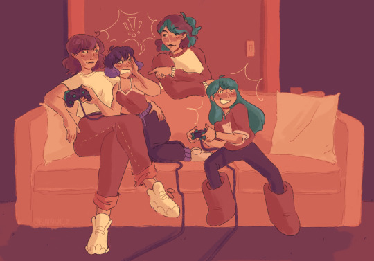
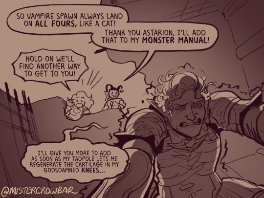
thumbnails vs finished page. The detail is just enough to remind me who goes where. You can see I mostly played with the last part of the scene, going from three panels in one row to making each panel an entire row across three rows. Panels on the same row have less “time” between them as the eyes skips from one to the other faster, whereas there’s a little more gap skipping back to a new row (think resetting a line on a typewriter). Here, the first thumbnail may have fit the artwork more neatly, but I wanted to give Astarion more time to deliberate his decision.
You can also see that I changed the top panel from a close up on Aldiirn to a wider shot showing both. This sets the scene, and the rest of it uses simple/abstract backgrounds until the final panel, which makes a nice bookend while making the overall load easier. One good environment panel will carry you for a while, but don't leave your characters in the void for too long.
Make a script before you start layouts but don’t be shocked if you need to cut things out to have them fit a page. Less is more, generally. This also goes for visual elements - what's most important to the scene? What's just extraneous detail you find fun but is creating clutter?
For the 4-panel comics I don’t put time into thumbnails unless it’s a difficult panel, but I always put the lettering and speech bubbles down first so they have enough room and nothing important gets covered. If you do this much you’re a step ahead imo.
This one I’m working on now and there’s a lot going on with four characters speaking to each other! It’s important to keep a clear line going for the dialogue. Astarion’s first line has the top left corner and clearly starts the conversation. The tail of the bubble carries over to where he whispers to Aldiirn, and we pick up Aldiirn’s lines. The rock wall on the right then draws the eye down to Shadowheart and Gale’s bubble at the bottom. I don’t think the tails on the bottom bubbles are 100% ideal, but it’s Good Enough.
There’s also slightly different points in time going on in this panel, because the art is static but it’s a long convo going on. Gale’s signature finger isn’t in response to Astarion whispering, but to his answer to Aldiirn that comes after. Think of how time works in your panels, especially when you got a big one because size = time.

You can use all sorts of things to direct the eye across a comic page, but I find the strongest things are the bubbles & tails and where characters are looking. Here, Gale’s “stop by” line breaks the panel line to help draw the viewer to him in the last panel, since otherwise the eye was likely to end up at Aldiirn.
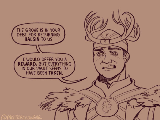
I generally like bubbles to be tucked into their panels, either fully inside or up at the edges like “my condolences.” It looks neater than when bubbles are willy nilly over the edges which I see as a sign of poor planning. And! it means when you do break panel lines it can be more meaningful.
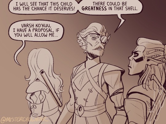
the 180 rule is a film/stage thing for composition to avoid confusing the audience, but the simplest way to put it is: if a character is on the left side of the scene, they should stay there until the action or whatever moves them. You can see here that Aldiirn is always on the right facing left, even when the camera is a bit behind him or a bit behind Gale. the 180 line is the front of Aldiirn’s tent, and the camera never crosses it in a way that would put Gale on the right.
I find it distracting when a conversation is happening in comic and a character breaks the 180 for no particular reason, though are times I’ve done it because a panel worked much better that way. The book Framed Ink has some great guides on composition and how to change the 180 line.
You can also see in the above comic that it’s arranged so that Gale’s always the first speaker in the panels he appears so there’s no criss cross bubble tails. Buuuut what if the first speaker is unavoidably on the right?
Stack the speech bubbles. You want the first speech bubble CLEARLY and undeniably the closest to the top left corner and then other speakers can go below.
the middle example above also has some examples of playing with the speech bubbles. Wyll’s “square-y round-y” bubble is the standard, the boxy ellipse. The tail has a slight, lanquid curve. He;s comfortable teasing the poor vampire. Aldiirn’s bubble is pointy! the tail straight! with urgency! And Astarion’s bubble and tail are burbling and grumbling through gritted teeth and pain. Varsh Ko’kuu, even though he’s speaking with a standard shaped bubble, has a sharp point in the tail that speaks to his assertiveness in protecting the egg. And Shadowheart has some hesitation with that wiggly tail.
Either hand drawing or using vector shapes for bubbles is fine, but I recommend staying away from true ellipses because they look static. Square-y round-y is where it’s at. Just make sure there’s enough space between text and edge of the bubble, usually enough to fit a capital H or W, but you can play with that spacing too.
The second panel here breaks the “first bubble goes top-left corner” rule, so it’s ambiguous if Gale or Aldiirn speaks first. However! In this case everyone is giving their responses in a jumble to Rath, so order matters less. I’m pretty sure every rule I’ve mentioned has a time and place to break it, but it’s still important to learn the basics first.
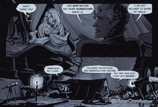
Key thing about comics typefaces: the capital I will have bars and the lower case will not. The barred I is used for I, as in, “I am not inclined to share” where the unbarred is used everywhere else.
When choosing a font, I recommend grabbing one that has Regular, Italic, and Bold/Bold Italic typefaces. I use Milk Moustache for my 4-panel comics because it’s very casual and similar weight to my own handwriting, but it doesn’t have an italic typeface and that drives me nuts sometimes. For the most flexibility, choose a font that has lower case AND uppercase type faces. I stick to upper case 90% of the time but lower case adds more options, like Aldiirn’s “really?” being so small due to his stressed state.
There are some official guides on what should be bold or italic in dialogues but they don’t matter as much unless you’re working for a big publisher with a style standard. Italics for thinking and whispering are common. I go with my gut, like Astarion’s speech is so dramatic I use italics and bold liberally, whereas for most others I may or may not just choose a key word to bold.
I think some programs will let you make text to fit a bubble instead of a square box, but tbh I just spend a lot of time manually making the text fit nicely in that bubble shape.
267 notes
·
View notes
Note
sorry if this has been asked before but how do you make your gradients look so good?
Hi Anon! First of all thank you so much 🫶
I like to use gradient maps (which I've explained here) or gradient fills + gradient tool. I'll drop a little tutorial under the cut:
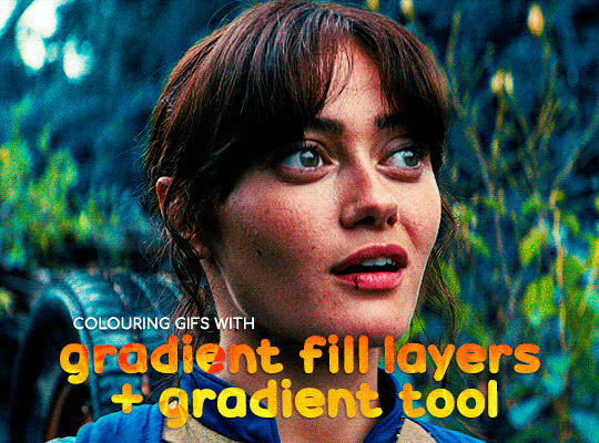
GRADIENT FILL
I'll be using this gif which I've already sharpened and coloured:

First of all let's make the background pop so I'm going to add a gradient fill (Layer -> New fill layer -> Gradient) with these settings (I'm using this colour #0099ff):

Now it's the time to play with the blending settings! Depending on your scene some will look better than others but I usually switch between Soft Light, Overlay, Color or Hue. 90% of the time I use soft light but this scene looked much better using overlay:

As you can see the background looks more blue and vibrant but it's not too much you know.
GRADIENT TOOL
Now it's time to use the gradient tool to give this gif a hazy look. I haven't seen many gifmakers talk about this tool but it's soooo useful and it takes gradients to a whole new level.
Before using this tool we'll need to add a new layer above the gradient fill, like this:
(HELP I just realised I typed “later” instead of “layer” 🤡 but let’s ignore that)
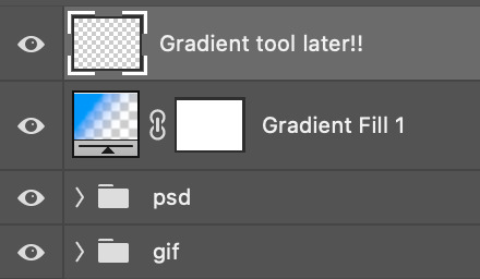
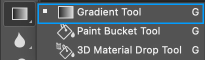
You can choose the gradient tool by pressing 'G' and then clicking here:
Make sure your gradient goes from any colour to a transparent background.

Okay so next to this gradient settings we have five different styles and each one will create a different shape. Depending on the scene I'll use the first, second or fourth one. Here are how they look:
1. Linear gradient
2. Radial gradient + Reverse (if you don't click this you'll end up with a blue circle above your gif)
3. Reflected gradient + Reverse
This time I'm going to use the radial gradient so to draw it start by clicking on the centre of the gif and drag the line (the farther you drag it the less intense the gradient looks):
And this is the gradient:
And here comes the fun part again, playing with the blending setting and the opacity! Before doing anything I duplicate my gradient layer because I always use more than one so this is how your layers should look like:

Let's go to the first gradient tool layer and again try different blending modes: soft light, overlay, hue... Most of the time I'll use 'Soft layer' and I'll leave the opacity at 100%.
For the second layer choose 'Screen' and don't worry if your gif looks too bright because we're going to fix this by decreasing the opacity. Anything between 20-60% should look good but it depends if you want a more vibrant or more natural effect. I ended up using 40% and this is the result:

And we're done!!! As you can see the result looks much different from our first gif and it only takes a couple of layers!
Honestly the best advice I can give you is to play with the opacity and blending mode of the different gradient layers because depending on the scene some will look better than others!
#ask#Anonymous#ps tag#tutorial#usernolan#userrin#useraljoscha#uservalentina#userbunneis#userlockescoles#usernik
563 notes
·
View notes
Note
Hihi, I'm not the same anon from the other question, but may I ask how do you make grading maps look so good? I just keep messing up and they look ugly af or change all the colors
<|:(
i'm actually going to just paste a post i made about it on main with an example from my graphic novel
this at 50%, set to normal, turned the mess on the left to the harmony on the right.


but when you intend to work with a gradient map or any sort of color overlay, the best thing you can do for yourself is have it on the entire time. like while working on it i never saw that version on the left. it's a bit of trial and error but generally if you have a good idea of your color values, you can make anything look good with a map. also if you want something to Look like a particular color that isn't on the map, you'll have to saturate it like crazy. like that's why the colors look so fucked over on the left. if i wanted something to look bluish or gray, it had to be Very Very blue to compete with the yellow. and even then it wasn't going to be straight up blue.
basically my take home advice for you is that if you want to use a gradient map, figure it out before you color, and color with it on. an overlay applied at the last minute on top of something colored normally won't give you the results you want, because gradient maps operate off value, not hue or saturation. so you need to have a solid understanding of the values in your image before you can start using them effectively.
156 notes
·
View notes
Text
recoloring sky


SEE HERE IS MY ISSUE, without the layer of color underneath, and only the color gradient map, it looks a lot more shaded, more dramatic, maybe i should just not have the skin or eyes colored underneath, but the hair? to keep the depth? but maybe that would be noticable....
BUT like who would want an only gradient mapped picture? i like it better personally, but like people who would have it on their wall,,, maybe not. Help a girl out here, any advice?
#rambles#myart#fanart#digital art#linked universe#lu sky#linked universe fanart#lu sky fanart#old inktober art
59 notes
·
View notes
Note
hello i love ur art <3 may i ask how you shade/render? or if you can share any helpful tutorials you learned from ^^


Unhinged Art Tutorial
Well, anon and @merlucide! I'm not sure if I'm the best person to learn from (I'll attach some video links at the end to people who I personally look to for art advice) but I happen to have a series of screenshots for how i render with a strawpage drawing I did recently(at the time I drafted most of this a month+ ago), so I'll go over what I do, at least in this case.
Warning: A bit rambly. Not sure if intelligible.
Tutorial..? Explanation? under the cut.
I have a few different shading styles based on ease of program usage and effort level, but in this case i had to individually streak the shadows. I'll be focusing on hair and skin for the most part here.
My sketches are pretty poor, because I'm hasty:


Honestly I find the better the initial sketch, the easier the final profuct will come. So take your time, use layers when sketching to be clean. The airbrush layering shows vaguely how I tend to shade hair.

Backlighting *Applicable mostly when there is a bright background, light behind the subject, or in neutral lighting.
The 'underside'/inside I tend to use a peachier, brighter tone closer to the skin color (for tanned skinned characters I'd use a shade closer to a rosy orange, since that's just a more saturated peach. For darker skinned characters, I'd recommend a slightly redder & brighter version of their skin tone. This works pretty well with dark hair+dark skin, but in the case that your character's hair color is a lot lighter compared to their skin tone [also in the case of a fair skinned character with WHITE hair] it's totally fine to ignore the natural undertone of the character and shade it with a pinkish white.) This works for any hair texture but can be more time consuming for coily hair textures. (2c-4c)

Lineart when I take my time / Old rendering video


It looks more stable if you start off with a solid lineart base because you won't struggle with big-picture placement issues.
"Lineart" when I just try to pump out a drawing

I first did a rough sketch, kept it as an overlay layer and drew over it.

(Chickenscratching is valid though, honestly. I think it has a look to it!) I usually block out base colors, and vaguely where I want the shading to go, unless I need a special type of lighting, which then I'd do the base colors and either choose to wait until I'm finished rendering or do light processing* (*will discuss this later in this post) with different blending modes and layers.
For example if I'm doing the colors mostly FIRST (Choosing a grayed out palette) and then rendering, it'd look a little something like this: Left (Trackpad, on FireAlpaca) / Right (iPad, on Clip Studio & Procreate)


Sometimes, I'll shade with a dark, grayed out tone and then fill it in with something slightly more vibrant. This kind of gives it a bounce-light feel? Also with a lot of pieces I do recently I try to block out entire parts as white because lighting especially on white background pieces looks better if you pretend that it's white behind the character due to an intense sunlight.

Also, I use gradient layers to tweak with the colors. It's pretty useful and looks nice!!!! Gradient maps are available in every software I use: Procreate, FireAlpaca and Clip Studio Paint.

I find that the more intense the light (but not scattered, as in the source is either very bright or it's very close) the darker the shadows usually look? And if there's a brightness coming from behind the figure and the hair is splayed out in some way, it will appear semi translucent because it's just a bunch of strands made of keratin and collagen, something like that....


Anyway this is all very messy but I hope it helped

Here's a process photo for how I shade if that helps too.


More examples..

I broke down my thought process in my lighting so here's a close up of that.
i totally forgot about the video links so here's my idol the one and only:
And I think this guy makes quick but concise tip videos:
Finally I really like the in depth professional explanations from a long time illustrator:
I've personally taken advice from all three's videos and used them to improve my own art, so take a peek!!!!
81 notes
·
View notes
Note
Heya, you are an absolute beautiful person and seeing the way you make colors and values pop always make my day.
I'd love to see the tips for the progress of rendering if you can.
Nevertheless, good luck with school and remember you are the coolest cat ever to exist.
<3
oh man this made my day now YOU are the coolest cat to ever exist
since my most recent drawing was done in greyscale and simply adjusted with gradient maps, i thought id base a ‘tutorial’ off my second most recent piece since it has more substance to it
sorry if this isnt the most helpful haha… feel free to modify and interpret the following ‘advice’ as you wish, i am not at ALL qualified to be teaching people shit about art i kinda just fuck around and hope it looks cool in the end


let me know if yall are interested in a greyscale/gradient map tutorial
oh and to the people wondering yes the lighting symbolism was intentional!!!
#foreversagacious asks#rendering tutorial#i guess????#homestuck#digital art#artists on tumblr#hs#my art#sorry if the terminology is way outta wack ive never taken an actual art class#woohoo
184 notes
·
View notes
Note
hii just wanna say that ur art is so so pretty and so so cute... ^_^ i absolutely love the way u shade and color its so mesmerizing to me
while we're on the topic how do you pick out your colors? especially when theres complicated lighting or effects (affects? idk) if that makes sense.. i love coloring and shading my art but it always finds a way to kick my ass lmaoo
anyways ur work is so awesome and definitely a huge inspiration to me ^_^ have a good day/night whenever ur reading this
THANK YOUUUU!!! you know what. I will not gatekeep any longer and reveal my secrets............... The Secret Is!!!!!!!!!!! um,
its just gradient maps and photoshop camera raw tbh... OBV LIKE. i know color theory a little but more i honestly really rely on post processing more than anything. while im an artist and i love doing art im.... i'm just really good at bullshitting LMAO i'm better at little tricks to get to the finished product than like. being actually knowledgeable and practicing things..... which i should do more. I need to do more studies when i have time.... there's no harm in shortcuts or references or tricks and i've learned to not be ashamed of it!! (obviously, this is not referring to generative image AI or directly tracing/stealing from other creators i need to be clear) end product- creating cool visuals/scenes is what is my passion for art has really come to in the past few years and while it's made me, sadly, a very ambitious perfectionist (the worst combo), it's the most fun i have with art!
anyway. i actually made a bullshitting tutorial for some friends who wanted to know my process for my more quicker art pieces last year and so i will now present it to the public. Behold!!! the fucking thing!!!!

i pulled open some other, more complete pieces so you can see the change from Raw Colors ↓ First Pass Post-Processing (CSP layer effects mainly and adding gradients/vignettes where needed for depth) ↓ Second Pass Post-Processing (Photoshop Camera Raw + back to CSP for finalizations like noise/chromatic aberration) here's the shrimpku print


and for something a little crazy heres the salt wound routine art evolution LOL (this may not be exact, the layers are weird and i did many passes before figuring out what i wanted)


i wish i had more like...... genuine advice or something more substantial to recommend HAHA but i hope this helps in some way at least!!!
64 notes
·
View notes
Note
hey!! Those gifset for scrubs looks amazing!!
https://www.tumblr.com/billysjoel/776944203704975360/scrubs-jd-elliot-turk-pscentral-event-36?source=share
would you mind doing a tutorial on how you made the colouring and colour isolation and text effects on the second gif?
hi, thank you so much!! this is the post and i'd be more than happy to make a tutorial for you!

so, i'll start with the coloring:

step 1: as with almost every single coloring/psd i make, i start with a blank brightness/contrast layer set to screen. this is especially helpful with really dark scenes! in this case, i left it at 100% opacity, but sometimes i'll decrease it if it blows out the scene.
step 2: curves. i rarely, if ever, manually adjust this layer and instead use the eyedropper tools. click the black eyedropper (1) and then click on the blackest part of the scene and then use the white eyedropper (2) to select the whitest part. in this case, it didn't make a huge difference, but this is a big help with heavily tinted scenes.

step 3: selective color. my next step is always adjusting the blacks and neutrals (and sometimes whites) in selective color. how much i adjust these totally depends on the scene and messing around with the neutrals can definitely affect the skin tone of people of color, so keep that in mind!


step 4: color balance. this step is usually optional for me, but i found the scene was leaning kind of yellow. again, this will vary dependent on the media you're coloring, so my best advice is to play around with the sliders and see what works!


step 5: gradient map. after this, i added a black & white gradient map set to soft light and reduced the opacity to 25% just to add a bit more contrast and depth to the blacks.
step 6: brightness/contrast. another blank layer set to screen and set the opacity to 15% to brighten things up just a little.
step 7: vibrance +50.
step 8: selective color. adjusting the blacks and neutrals again.


step 9: selective color. my favorite part is just cranking the blues and cyans the FUCK up lmao


step 10: selective color (again) on cyan and blue (again).


step 11: selective color under the reds because elliot's face was looking pretty red.

step 12: selective color under the yellows. again, i recommend just playing around to see what slider does what. a little can go a long way!

and that's it for the general coloring that i used for all the gifs in this set. for the next part, you'll either want to be proficient with keyframes or pick a scene where your main character doesn't move much (this will make life so much easier).
step 13: create a new layer (ctrl+shift+n or layer > new > layer). choose the color you want to use and either fill the layer using the paint bucket tool (g) or use a brush (b) to color it all in. you should have something like this now:

step 14: set the layer to color (or another blending mode of your choosing) and apply a layer mask (the 3rd icon across the very bottom).

step 15: with the layer mask selected (as you see above), not the color thumbnail, use a soft black brush and color over your character. this will remove the blue from from whatever areas you color. if you need to "undo" what you've colored, switch to white (x) and that will bring back whatever you color over.
step 16: typography. i've actually done a few tutorials showing how i do my text like this, so check out this one, this one, or this one!
if you have any other questions, please let me know! i'm happy to help however i can!
#answered#Anonymous#my tutorials#gif tutorial#gifmakerresource#completeresources#dailyresources#chaoticresources#coloring tutorial
48 notes
·
View notes
Note
hii sky skywerse !!! i really enjoy your art, and i was wondering if you had any tips /advice on how you choose colours for your drawings, or just use colour in general :) thanks !!
I usually paint in greyscale first, just thinking about the light source and values. Then I lay down base flat colours using layer blending modes like multiply, overlay, or colour (mostly those three), and after that I just go wild with gradient maps and colour adjustments until it looks right?? I also lighten/darken areas as I render to push the contrast more! I think this guy's tutorial is the closest to my current process:
youtube
And here’s a little timelapse of me drawing Rose from like a year ago! My process has changed a bit since then, but the overall approach is still pretty much the same??? So yeahhh,,,
Starting in greyscale honestly saves a ton of time, so I definitely recommend learning to work that way,,, Work smarter, not harder, am I rightttt
46 notes
·
View notes
Note
Hello, this is not a request it's question because I really want to learn how to make graphics with gifs and idk how to do it 😭😭😭
Like your agar agar cookie layouts, I really like your work and would like to learn how you make it
Thank you for reading this, if you don't want reply it's okay, have a very nice day

Haiii!! It's no problem!! Unfortunately, I'm VERY bad at explaining stuff LOL, so here's the best I can do!! (Also, have a sneak-peak to another post :3)
How to make a gif edit.
How I decorate my edits.
How I make my PSDs.
VERY LONG POST BELOW. MASU LOVES TO HEAR HIMSELF TALK.
Okay so step one is to use photopea. I used to be an avid ibispaintx user until I realized that photopea can make gif edits and suddenly I'm photopea's #1 fan (and hater). Photopea is a website, BTW, here's the link!
First, open up a project. Good job! We're 1/4 of the way there! You can import a PSD if you want (Here's a different tutorial for that), but let's just say you DON'T have a PSD, for the simplicity of this tutorial.

Next, find the animation you want! For this example, we'll be using the Wind Archer sprite below (I took this from the CRK wiki). It can be anything - but preferably nothing too big, because Tumblr for SOME REASON HATES high quality gifs. Siiiigh...

From here, you want to go to FILE > OPEN & PLACE. It'll show a window of all your downloaded items. Click on the animation we just downloaded.


Wam-bam! We're almost there!! Okay, if your image is a WEBP file, it will not animate if you export as a GIF. But! That's okay! Because with trial and error, I found out how to fix this!
On the downloaded layer, double click on the layer. After this, go to SMART OBJECT > CONVERT TO LAYERS...

Now, if your photopea tries to explode and pretend it don't know nobody, that's okay! Just let it load a bit. The file is very. very big. It should turn into a folder! You have nothing else to do from this.

After this, you can do, well, whatever ya need!! Slap a stroke on, put a gradient map on this bad boy, anything else! Once you're finished, go to FILE > EXPORT AS... > GIF. Your photopea might try to explode again, for like, a few minutes. Just give it some time. It's a lot of trial and error!! Don't feel bad if you didn't get it the first time!!
Now, before I talk about my edits, I want to make it clear that you should FIND YOUR OWN STYLE! Don't try to copy off of someone else, or try to replicate another style. Every editor is different!! While I overuse overlays and gradient maps like I won't see tomorrow, you may like a more simple style, or something less over and out there ~ ! That's alright! Don't be afraid to branch out.
Now, as we said - we love to use overlays + gradient maps. I am an artist, so a LOT of what I do correlates to that as well (having an interesting silhouette, making a focal point, color theory, color contrast, composition). It'll be WAY, WAY too much to explain in one single post, so I'd just say to go with the flow! If something looks off, try something else! There's no shame in scrapping an entire project - especially if you're unsatisfied with the result. Do what you need to do!! It's your edits.
For making PSDs, our process is actually pretty simple. We just use a gradient map and adjusts it till it works LOL. We add a few others things too - but that's mostly what I do. If you want to learn how to make your own, my word of advice is to dissect from others. Take inspiration!! If you don't feel like doing that, there's no harm in just using a F2U PSD floating out there. Feel free to look at our Squid Ink post and use that as an example of our PSDs! (If you don't feel like going to go get it, yeah I understand, here it is right here.)
All in all, my biggest tip (besides to have fun), is to edit until you like it. Don't try to compare yourself to big editors - they've had TONS, AND TONS, of experience and editing. Experiment with your style, put yourself out there, edit some new media you've never edited before, find resources to help you out, find tutorials, ETC. It takes time to learn, so make sure to take that time!! You got this, don't feel discouraged by other people's work!!!
That's all from us folks!! Peace out!! ^_^


#໒꒰ྀི ․ ․⸝⸝⸝ ꒱აㅤ﹑﹫ㅤtalks.#໒꒰ྀི 𖦹 ˕ × ꒱ྀིაㅤ﹑﹫ㅤasks.#editblr#edit tutorial#editing#edit blog#psds#photopea tutorial#tutorial
38 notes
·
View notes