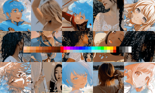
#and thank you gradient mapping for making things easy
Explore tagged Tumblr posts
Visit Tumblr Blog
Explore Tumblr blogs with no restrictions, modern design and the best experience.
Last Seen Tumblr Blogs


Fun Fact
Tumblr has a low social media market share in South America.
Text
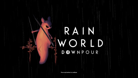
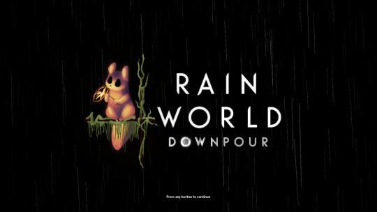

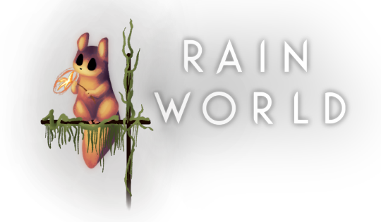
i finally finished these!! i felt bad that hunter and monk didnt have their own titlescreen art, so i started on making my own for them a few months ago. nailing the official rendering made this harder than i thought haha
also, when i originally made these, i had the idea of making this into a sort of challenge for other people to make their own title art for these two. im still standing with that! if you want to take a shot at making your own version of titlescreen art for these two, go ahead! hell, tag me if you want.
#thank you pansear for giving me the most comprehensible advice on rendering these ..... doing the whole thing in B&W first helped a LOT#and thank you gradient mapping for making things easy#my art#rain world#rain world downpour#the hunter#the monk#hunter rw#monk rw#slugcat
2K notes
·
View notes
Text
Gamma Knife - painting process
I had so much fun painting this piece and I want to share some behind-the-scenes stuff on how it was made.

I would like to thank MagicPoser for making it possible to try poses, scale, angles and lighting and saving my ass so many times. I use the app on my iPad but there's a free browser version too.
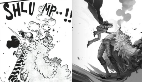
So I wrangled these 3D dudes into the poses I wanted and then I cut them to pieces and stretched them out to make them as leggy as they're supposed to be. Before I did that though I spent forever trying to pick the angle I wanted to paint. Including two other screenshots I considered using before settling, because it's fun. (nevermind Doffy's weird arm angle, it wasn't going to show anyway. The smoke-placeholder makes it looks like he's in The Sims though which is cute. That thing's about to go so red.)

Then I started sketching. I quickly moved Law higher up and changed his pose to make him more curled up, elbow-to-knee, legs bent etc for more intensity. MagicPoser is great as a reference but the end result gets pretty stiff and boring if you follow the 3D models too closely, and I wanted swoosh. So I painted some swooshy shapes to figure out the movement I wanted for the whole painting. Purple swooshes for the curve of Law and the direction of his jump. Pinker purple for Doflamingo's leg and spine arcs.
The b/w image below also shows the rough base for the feather coat. It's painted with a flat, tapering oil brush that created nice curves that I could refine later.


Skipping lots and lots of work to get to the next step. It's all rendering and detailing, mostly done with the HB pencil brush.
Coloring! I started by creating a gradient map bit lots of color steps. I kind of knew what I wanted but there's a lot of trial and error involved while picking colors and dragging sliders. In Photoshop I'd do this on an adjustment layer but in Procreate I do it by copying all visible layers (three finger slide, copy all visible) and making a new layer out of them where everything's merged (three finger slide, paste)

I then put that layer in Color-mode on 77% over the grayscale image after playing around and testing lots of things. I rarely know what I want before I see it. I copied that layer again and put it in Add-mode on a very low opacity because it looked neat. Every image is a new adventure when it comes to layer blending modes, there is no right or wrong here, you just have to test things until you find an effect that you like. Huge potential for happy accidents in this step.
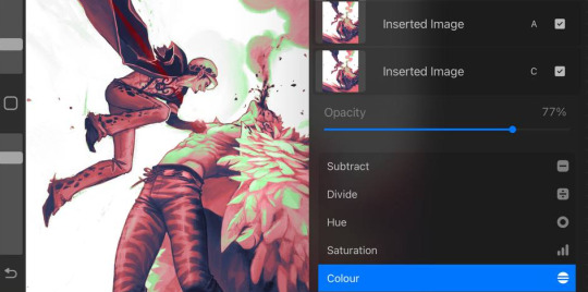

I didn't want everything to be pink so I created a new Color-layer to paint skin, clothes and radiation. Lowered opacity to let the pink base shine through slightly, for a cohesive and more natural look. Color-mode on full opacity often looks a bit flat and washed out unless combined with something else.
There's a lot more that happened after that but it's all detail stuff, effects, lots of layers with soft airbrushed gradients on various blending modes. Also directional perspective blur where I masked out some feathers to still be sharp against the blurry ones in the back, a quick and easy way to create a sense of movement and depth.
Again, thanks MagicPoser, I would have cried so much and probably given up over the angle of Doflamingo's head without your help 🙏
112 notes
·
View notes
Text
…make a psd look interesting?
aka, how to fuck up a psd no glue no borax. have you ever looked at your psd and gone, damn, this shit doesn’t fuck? happens to the best of us. here are easy ways to spice up your psds so you don’t end up with the editor equivalent of communion bread
for example purposes, i made a simplistic psd to test these methods on. they should work with most psds, but, as always, fuck around and find out on your own for best results <3
i. threshold + gradient map
this one is an easy way to add specific colors to your psds. step one: add a threshold layer, and adjust it your liking. typically, i set mine to somewhere between 60-40. if you’re making a psd to work on dark skintones, you may want to set it even lower, but if you’re working with, say, pjsk characters, you can go pretty high
wow flashbang. you can see on my example behind that it doesn’t work super well on irl pictures, and my pjsk images don’t have threshold at all lol. next thing you want to do is set the blending mode of your threshold layer to either multiply or darken—they’re basically the same thing
(psst, if you want to know more about blending modes, check out this post!)
waow crunchy! but still boring right? still boring. not to worry, here’s the fun part: add a gradient map layer, tap it, and go to the slidey icon on the side, which’ll bring up a page like this:
click the gradient in the middle there to edit it. once in, edit the black color to be at about 80-90%, and then change the white color to whatever you like. edit out, and tap the little square next to the text that says “reverse” which should make your gradient look more or less like this:
then change the blending mode on your gradient map to ‘screen’ which’ll axe all the black and just leave your color. now your image looks like this:
boy howdy, isn’t that fucked up! it is more interesting, but if you don’t want to be looking at that abomination, change your color in your gradient map to be darker, which’ll give you something more along the lines of:

…which is much more reasonable. this is a fun way to add color to your shadows slash lineart, and can be a quick and easy way to make a psd look less flat.
ii. noise gradient map
some of you may be thinking, but, canarysage, what the fuck is a noise gradient map? to which i reply: you’re boring. let me show you.
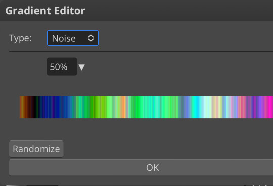
kinda fucked up, right? well, that’s the goal. unfortunately, there isn’t a way to directly edit a gradient map, but you can just click that little button that says ‘randomize’ a couple times until you get something you like! you can also mess with the percentages but i don’t do that because it looks weird

boy howdy, that’s weird looking. not to worry, though. once again, our best friend blending mode is going to come in handy
i typically go to soft light and set the opacity to about 20-30%, but, as with anything, feel free to mess around and do whatever you want. luminosity is also a fun setting for noise gradient maps, just make sure to crank the opacity way down for the sake of my eyes

wow, much better! you can see that the gradient map added a bit of purple coloring and a funky little texture. super cool! thank you, gradient map!
iii. channel mixer
i already have a post on channel mixer and i’m not rewriting all that so if you don’t know how channel mixer works check that shit out but the tl;dr is: ideally, all your channels should add up to 100 (including negative numbers) but that rule can be broken if it looks cool enough. capiche?
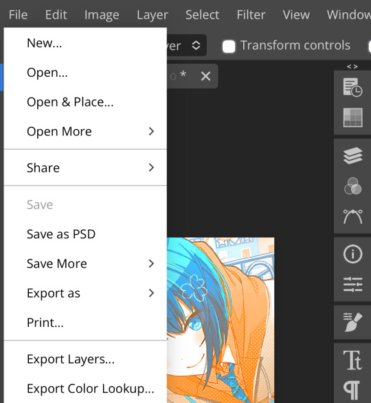
iv. color lookup
photopea has a few default color lookups that are pretty easy to use, but i have a couple of presets that i like to add if i’m feeling stuck. to make your own color lookup, open up a psd, and go to file > export color lookup
then save it and open it from your files. when you open a color lookup layer, you’ll see an arrow next to the text saying LUTs—click that and your new color lookup should be there
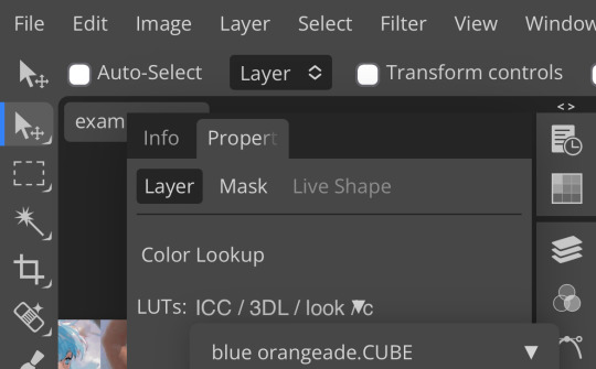
once you tap that, you’ll get a compressed version of your psd added to your folder. it’ll look something like this:
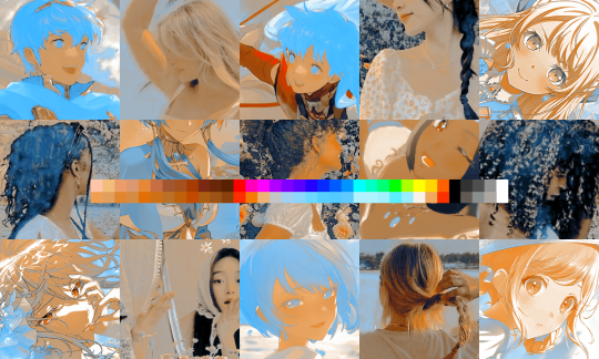
holy orange and blue, batman. luckily, you can apply blending modes to color lookups just like any other layer—mess around with them until it looks how you want!
waow much more reasonable! i set this one on color and about 55% opacity, but that is really dependent on what your color lookup looks like and how you want your psd to look. remember, there’s no right way to do things!
an additional note: if you want to, you can save the psd you’re working on as a color lookup instead. if it looks too simple or just isn’t turning out how you want, that’s a good way to incorporate it later :3 just follow the same steps as above!
v. no shame in starting over
if you’ve added and taken away, duplicated and removed, fucked around and found out, and your psd still isn’t how you want: it’s alright to just axe it. the edit police aren’t gonna kill you for it, i promise. if you’re worried about wanting it later, just save it as a psd and come back when your brain is refreshed ¯\_(ツ)_/¯
psd-making isn’t an exact art, so, obviously, there’s no real simple solution to making it look how you want. you just have to mess with it and see what you’ve got. these are just my methods of making my psds less blagh, but, obviously, my editing is moderately more deranged than your average editor.
…so that’s how you do it.
127 notes
·
View notes
Note
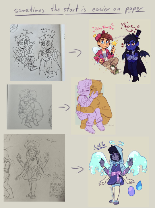
I absolutely adore your art style! Do you have any tips? Specifically for the fairies cause I am struggling to draw them.
thank you so much! well, this is gonna be a long post.
Im gonna be real, the best art advise anyone can give you is to use references and to break complicated stuff down into easier shapes. for example:
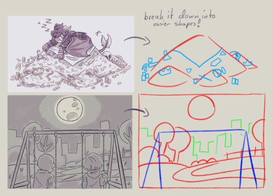
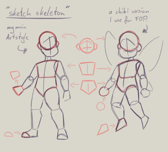
this is my basic body skeleton! i always start with the circle of the head and work my way down to the feet. i have highlighted some part of the body which are actually just simple shapes.
the center line down the middle of the torso also helps me draw on collars, bra cups, ties, or any other more difficult clothing more accurate!
However i have to ask you, are you comfortable while you draw?
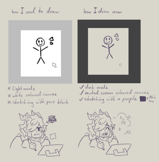
I remember when I first started drawing digital, i was really uncomfortable with the basic set up of my program. The white canvas and the light setting of the program was really bright and irritated my eyes. And the contrast of the pure black I used for drawing wasn't really helping. sketching and doing line art was my least favorite part of drawing because of this.
you don't have to draw on a white canvas, you can also use multiple colours for sketching if you wanted. Once I stoppend using a pure white canvas I noticed i stopped staring at a empty canvas not knowing what i wanted to draw anymore!
also sometimes when a drawing doesn't want to look right, i switch back to traditional. idk why but when my brain sometimes struggles with a specific pose or character design, it comes to me a lot more easier when I switch back onto paper. i guess the change of scenery opens up the creativity again haha.
don't be afraid to simplify stuff, you don't have to draw everything! As long as it still translates to the thing, it should be fine.
these two are a bit clip studio exclusive,
but Gradient maps! god how I love my gradient maps, it just makes the colours pop! I never draw without it anymore. I always pick the sunset gradient, put it in Linear light mode and put it on 10% (cus its really saturated on 100%)
usually i have it on while i sketch and line, and turn it off so i can properly colour and shade. i turn it back on at the end again
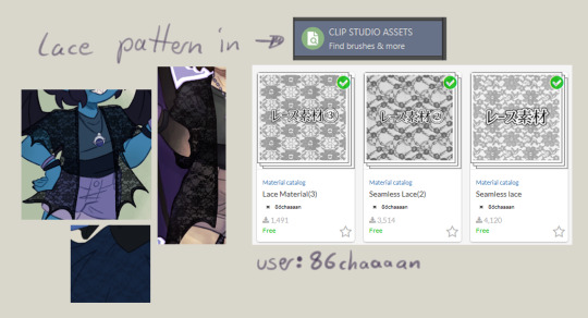
the clip studio assets has a lot of beautiful stuff in there created from other users. (a good amount for free too) for example I got the lace pattern of my shawl from there. and its really easy to import the downloaded stuff into the program.
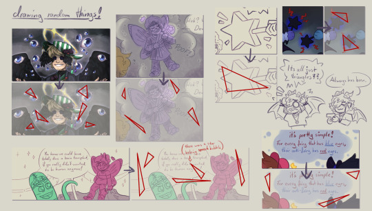
now this is a drawing hack that blew my mind when I first saw it! i use it all the time and I just have to share this!
whenever you want to draw something random like sparkles, stars, bubbles, feathers, falling leaves, or anything that you want to float around your characters, position them in the form of a triangle.
its even better if you put two points of the triangle closer together and then the third further away. this makes it look random but still looking appealing to the eye, and not oddly placed.
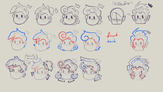
now that thats out of the way! Fairies! The one thing i struggled with when drawing them first is their hair. I suggest looking through the fop tag to see how other people have drawn them and take inspiration from your favorites and make up your own. (do not trace tho! that should be obvious!)
when I draw hair I think of it separated in two parts, the front and the back. I usually start with the front hair pieces, then draw in the jaw, ears and rest of the head, then continue with the back section of the hair.
the only outliers of this are Timmy and Peri. when I draw Timmy (Ymmit as well) I start with his hat, before drawing his hair. Since I draw Peris hair-swirl over his hairline, i start drawing his upper back hair style first before drawing his head and then his mullet.
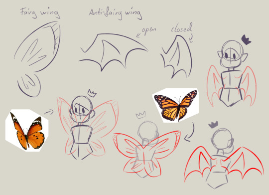
wings can also be tricky. the fairy wings i have given then have a more butterfly look. if you also want to base off the wings to real life animals or bugs you can use them flying as references to. Or you could even cut out the wing shape out of paper, fold it in the middle and take pictures in the angle you desire.
I hope this somehow helped, I thought about what could have helped me if I had known it sooner. even if most of these were for generic drawing.
#my art#asks#art tips#drawing advice#clip studio paint#fop#if anyone has more questions about how i draw#once i open up the ask boy again feel free to do so
52 notes
·
View notes
Note
Your color is SO lovely would you mind if i asked for some tips on how you render and choose your colors 😭?
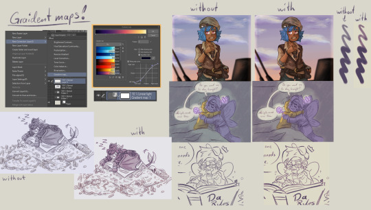
Thank you !! <3 I usually go in with base colors and focus on getting the values I want first. Then I work with color correction layers and gradient maps! For characters/objects/scenes that have rlly tricky, similar values or I just want to be rlly quick, I sometimes start of with grayscale (did smth similar for the blades).
Gradient maps are rlly rlly useful for when I want to make color palettes that oppose each other in a way seem more coherent or just pull a color palette together either way. You can see me struggling with doing that after I used that first gradient map (teal-pastel green-light orange-white) that totally washed out the purple, because it was between orange and green value wise and got pulled towards grey.
Another thing love doing is trying to reuse colors over and over again throughout the painting. So when you have a rlly strong color in one area only, I try and incorporate it in the rest of the drawing subtly to tie it in better. Underpaintings are a big thing as well. I draw over things; esp in backgrounds that‘d usually be one color, so all the colors still shine through a little bit. I do use that more for drawings that are more painterly tho. If you want that, dramatic underpaintings are the best thing ever! Have smth with lots of green to paint? RED UNDERPAINTINGGGG
I also am constantly thinking ‚where can I somehow put in a complimentary constrast‘ bcs those are heaven sent when it comes to nuance in color. Warm skintones/light pulls to green in the shadows and you don‘t even have to use green to convey that. Desaturation is my best friend. Though it‘s important to not that different complimentary colors will have different quantities in terms of visual value. Green and Red are on the same level in terms of color quantity, which makes them easy to shade with; whereas it‘s more difficult to shade blue/purple colors with orange/yellow. I could talk about colors forever ahhhhhhhhhh
Maybe the speedpaint helps! I‘m ramblingggg :OO
(I swear I typed out this whole essay and tumblr just didn‘t let me post it so now I had to write it again D:)
21 notes
·
View notes
Note
hi! Thank you for making your guide, it’s been so helpful as a new skin artist. I’m still confused about how to make good festival submissions (?) I thought my submission for Rockbreaker’s Ceremony fit all the conditions you talked about but no one seemed interested in my skin. Do you have any advice on how newer artists can make a good entry?
I'm happy the guide's helped! It is less of a checklist and more on how I personally approach the contest. There are a lot of things I don’t think I described well technique-wise, so I’ve considered making step-by-step tutorials to approach each contest that would better encapsulate the win conditions I described. But for now, here’s one way you can approach a contest, particularly if you’re a new artist.
1. Pick Your Breed (and Battles)
Breed variety, as I stated in the guide, is the Number One reason I win any contest. This is where I think I should’ve gone more into why I favored the Ridgeback F base - it’s important to pick a canvas that will not impede your ability to create and more importantly, a canvas that makes you comfortable as an artist. Ridgeback F has a big wingspace that serves as a good canvas and the anatomy is easy (for me) to design on, which is why this is the canvas I default to.
Here are some of the best “starter” canvases for new artists, in my personal opinion:
Wildclaw M and F: these bases, particularly the F pose, don’t get many submissions (look at their submission rate in the Gala!) They have a standard dino anatomy that’s easy to understand and work around.
Fae M: Fae rarely get entries. The big wingspace is a great canvas, and more importantly, the M Fae canvas is pretty small compared to the others, so it’s less daunting. The shrimp posture can be a bit hard to grasp, but you can honestly just do a wingcent.
Coatl M and F: Coatl is a great base for new artists if shadows and lines are disrupting your creative process, because they don’t have as much of those. (You can also turn shadows/lines off while you’re drawing. I usually have shadows off and lineart at 30% opacity. Just remember to turn them back on when you submit!)
2. Theme Your Skin: Canonical Elements
August goes into this better in his guide, but you generally want to stick closer to canon. Think of skin contests like an art contest for a fandom. If you were submitting to, say, a Percy Jackson art contest, you’ll probably draw inspiration from Greek and Roman mythology, not Aztec or Chinese mythology. Flight Rising is the same. So, here are canonical places you can draw inspiration from:
Past festival familiars and apparel
Existing vistas, scenes, and World Map locations
Artistic interpretations of the canonical lore
If you do want to go outside of canon, my suggestion is to pick a neutral element. This means something that doesn’t have any religious/otherwise connotations, and is still related to the flight. I.e.: icy mountains for the ice flight, different types of minerals for the earth flight, different types of plants for nature. You are making an official item for the site, so work with that in mind.
3. Skin Composition: Balance
Composition is how the elements in an art piece work together. I struggle a lot with it, so I am not the best person to speak on this. What I’ve found that works for me is focusing the canvas on one big thing and putting small elements around it. That big item is usually wings, which is a great neutral component that can take on attributes of different elements. If you look at my skins, they usually follow the equation of skin = 1 big element (wings, bones, crystals) + 2 small elements (gradients, sparkles, butterflies, leaves, flowers).
[RBC 2023 = bones + crystals + rocks] [TC 2022 = wings + gradient + wispy shadow things]


4. Skin Execution: Actually Drawing the Thing
The best part of festival contests is the skill bar is quite low. I am going to contradict myself slightly by saying you do need a basic understanding of how to draw, but aside from that, contests are forgiving if you aren’t an experienced artist. I had six months of experience when I won my first contest and more recently, I was drawing with zero wrist mobility. These are some of my recent skins that were created when I could not render the way I usually do or use line weight.
[TCC 2023 & ROR 2023]

In comparison, here are skins when I could render and line weight.
[WS 2023 & GG 2023]

Importantly, all of these skins won. So that’s why, from my perspective, whether you’re an experienced artist or not, whether you know how to render or not, is not the point.
I don’t want to imply that you don’t need any skill to win a contest… it is a contest, after all. I think what I’m trying to say is: to make the best entry you can, you need to know the skills that complement YOUR art style. It isn’t necessarily the skill difference between artists that determines who wins, it’s how you use the skills you have to bring out the most in your piece.
There is no one way to making good art. And the hardest obstacle as a new artist is finding out what enhances your art style. You may not even have an art style yet, and that’s okay. That’s why it’s vital you continue exploring - which contests are great for.
Again, everything in this post is only what I have personally observed. This approach will not work for everyone, since everyone’s creative process is going to be different. But I hope this is a good bare-bones, structured, guide as to what I personally focus on – and I hope that it’s good for reference, even if the specific steps aren’t helpful for you ^^
114 notes
·
View notes
Note
good evening boss i don't know if you're okay with answering these kinds of questions (totally okay if not !!) but could you share how you clipped the floyd card into the gif in koebi's header? thank you so much if you do!❤
good afternoon! wa, sorry this is late you sent this while i was asleep </33 but yes, i love explaining things actually, im always happy to teach. this is pretty easy to do!
first things first, set up your canvas with whatever size youd like, and place the picture you want to "splash" through!

^ im just going to remake my header on koebi lol, so im using floyd!
next, open up the gif you would like to use. the one im using is the very last splash here! the splash needs to be on top of the image you want to show through!
*gifs in photopea come in folders, with each frame present and named '_a_0,50' or '_a_frm0,50' with the 0 being replaced by frame number, and 50 by the time that frame is shown. if they are not labeled like this, they wont animate. gifs work differently in photoshop!

because i wanted the outside to be black, and the splash to be white, i inversed the colors of the gif. to do this, you need to select all of the layers in the gif, it wont work by selecting the folder. you can select them all quickly but clicking on the top frame, holding CTRL, then clicking on the very last frame in the folder, then it should select them all. do CTRL + I or on the top bar, select image -> adjustments -> invert.

now the edges will be black! if you liked them white, skip this step! if youd like to change its color to something not black or white, you can use a gradient map! the left of the gradient map replaces dark colors/black and the right replaces light colors/white

so you can alter your colors to whatever you want! do keep in mind, however, if you make the blacks too light or the whites too dark, the contrast of the gif might not be as good and/or, the blending modes might not apply exactly like you want them to.
if you have an inverted gif, you can change the blending mode to darker color for the white to turn transparent and show your image underneath. the blending modes are the drop down options next to opacity and fill, above the layers panel.

if you want the black to disappear and white to stay, you can use the screen blending mode

then you would end with a gif like this:

if you are trying to overlay a gif with a gradient map coloring, you might need to play around with the blending mode options to find one that fits. a good rule of thumb is that if you want the lighter color to stay, use the lighten modes in blending modes. if you want the darker colors to stay, use the darken modes in blending modes.

^ here's a little chart of the blending modes and their general purposes. taken from this article, which does a decent job at going over them in a brief manner.
once you are satisfied, you can export just like that, or you can drop a psd/coloring of your choice for colors!

AS FOR CLIPPING IN GIFS! its the same way as you would a picture! this time, move your image on top of the gif, and then right click your image then select clipping mask. it should be noted that this only really works if your gif is transparent, like so:

then you would end with a gif like this:


this doesn't necessarily work on gifs that aren't transparent. however, if they are two, different, solid colors, you can use the magic wand tool to get rid of the color you don't want. just be wary that 1. you would have to go through every single frame, one by one, and delete the color in each individual one and also 2. the magic want tool isnt perfect and may leave a rough outline. and if the two colors are too similar or the shape is too abstract, it might not be able to grab very well. you can change the magic wands tolerance to adjust how much of a color it 'grabs'.
i hope all of this helps!! if something didn't make sense at all, let me know, i loove rambling about how to edit lmao.
16 notes
·
View notes
Text
youtube
Urasawa MEP intro
Thanks @marshmallowgoop for all your hard work in hosting this MEP! It was so fun seeing the final video put together, everyone should be proud of their work c:
Here's a little breakdown of my part below-


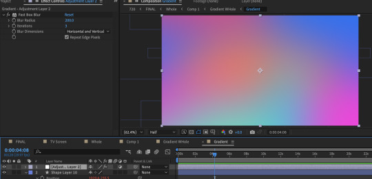
The base of the gradient consists of ten circles all moving in wacky ways thanks to wiggle expressions. Putting the wiggle expressions to extreme values means the circles will occasionally disappear entirely from view or massively take over the screen, leaving the gradient with a lot of evolving variety.
To add expressions: Alt click the stop watch and type wiggle( , ) The first number is how many times per second it will move and the second is the extreme to which it will move. (Frequency, Amplitude)
To quickly view your written expressions: click the layer and double click E on your keyboard
1st gradient comp: Masked into a circle. Double click the shape for it to be centered and fill the whole comp. Animate the scale so it disappears and covers the whole comp. And because I don't want to copy paste the keyframes a million times: Alt click the stop watch, click the arrow, scroll to properties, and click the loopOut cycle expression. The animation will repeat immediately from the beginning.
Duplicate gradient comp: Scaled up to the max size of the last keyframe in the masked gradient layer
Adjustment layer: A displacement map
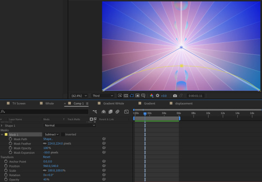
Okay, so what's informing the displacement map?
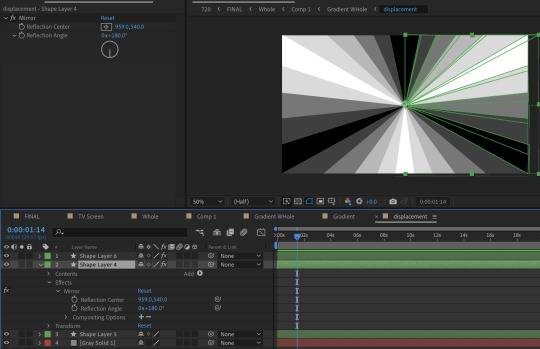
It's another comp layer that's the same ray pattern made out of shape layers. (Quick tip, use the mirror effect so it's less work). Displacement maps work by using areas of black and white to inform how an image is moved. Middle gray is neutral, black pushes in one direction, white pulls in the opposite.


The displacement is pushed to such an extreme that clicking 'stretch map to fit' isn't resolving the areas of black. I couldn't figure out why, so I resorted to scaling up the comp to hide it. It's also doing a fun thing were the circles fall to the center first before expanding outwards. I didn't intend for that to happen, but it's a very nice flow of motion.
Okay, but how do you keep the pattern precise when making the rays?
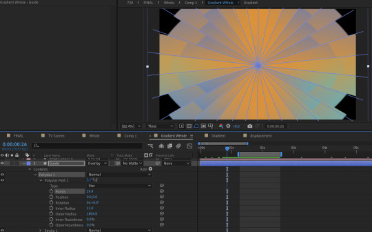
I played with the polystar shape to make a guide.
But this still looks pretty flat, right?
Some additional adjustments:
A white shape layer (blue) to fit the bottom triangle with a feathered mask (yellow) to form a luster across the shape. This is on an overlay blend mode and the opacity is turned down.
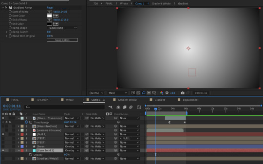
And a radial gradient ramp that is also on an overlay blend mode with the opacity turned down.
What about the reflections?

They're the same comps but duplicated, flipped vertically, with some added blurs (including vertical only) and the opacity turned down.
You may notice that the car's reflection doesn't move in a way a flipped layer should.
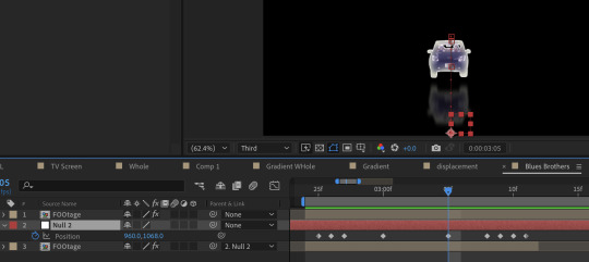
That's because I have it following a null where I animated the position to match how I think a reflection going down a road works. (Additionally I exported this whole comp with a transparent background because I wanted to make some time adjustments without screwing up the mask animation)
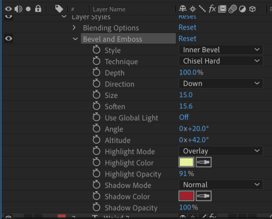
About the text:
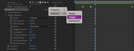
The title is using a bevel and emboss layer style, that's why the text appears to melt together when I squish the tracking inward. (Side note about tracking, add a line anchor and type 50% if it stubbornly refuses to be centered by default) Text animators also have a wiggly setting! A little bit hidden, but fun. I only added this for the main title.
I also added posterize time to change the fps to 12, which gives it a little bit of a choppy animated look.
The "TV opening" look consists of an animated white shape layer with some blurs, grain and noise across the whole comp. And since it's already black and white I can use it as a track matte for the final, whole comp of the title opening. I use the offset effect to create the 'rolling footage' of the title with scale wipe to create that bit of warping.
I like making sure there's always an easy to follow direction of motion, so after a lot of downward fast movement, everything is timed to burst outward, from the title to the gradient.
#dcmk#my animation#motion graphics#my video#curse tumblr for not letting me upload more than one video#I had the itch to write some type of breakdown but I really don't know how thorough I should be#I don't expect most people to do more than glance at it so I went on until I lost steam#but if anyone really does have questions I'm happy to answer!
7 notes
·
View notes
Note
I really love how soft your art is and makes me want to eat it. I would like to ask some questions if it is fine with you?
What type of brush do you use/do you do anything that makes your drawings so serene? How do you color your drawing? (I always have trouble with this personally)
oh my gosh thank you!!! and questions are welcomed!
admittedly my process is mishmashy, i doodle more than finished works, but ill do my best!
first, i use procreate for my art,
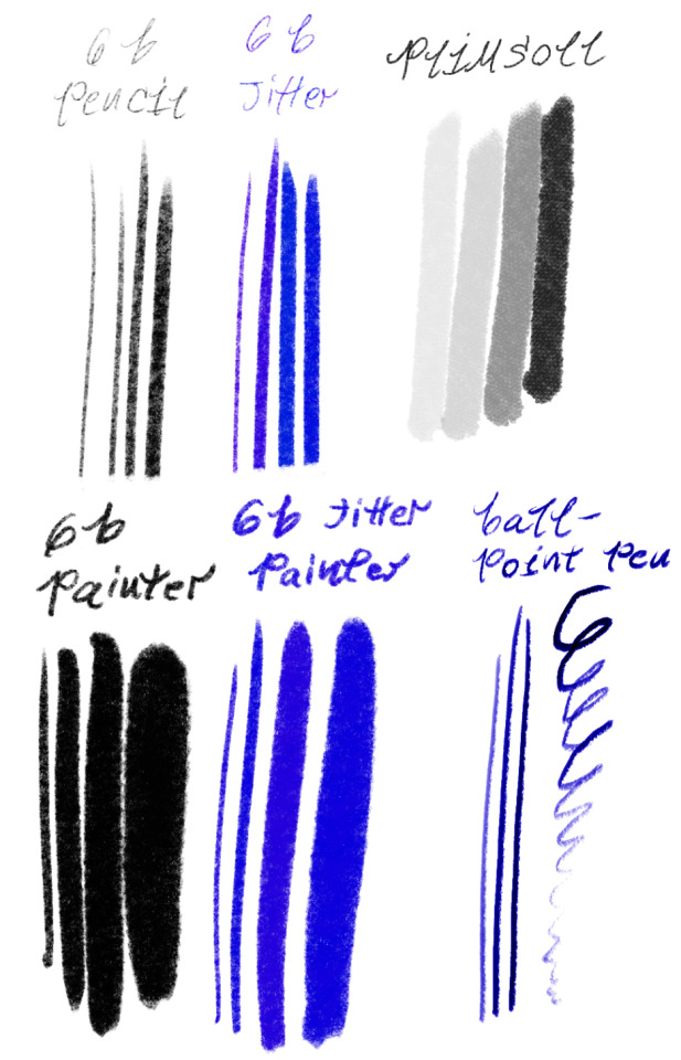
these are my brushes. (6b pencil my beloved) (the ballpoint pen) and also the presets i have for them.
i keep my hand light, i use very low stabilization, i tend to have the brush size medium to big, i use rounder shapes, i also use these same brushes as erasers, to keep texture!
now, to make my drawings serene? alright.
i focus on the mindset of characters, on small- frequently affectionate actions, and also more tender/emotional scenes- maybe think about a downtime scene, like looking out the window, sitting beside a friend quietly, how your character is when left to their devices at home, sleeping is a quick and easy one, as even the most busy and workaholic characters pass out eventually. perhaps look to your own moments of serenity, also mindfulness. (also ghibli)
...and expressions, i love expressions.
getting the feelings of a character and portraying it well i think is really what helps adding to the serenity of my art, a slight smile in the eyes and the slightly furrowed brow, or a hint of curiosity as the other character gazes at them- thats my jam.
but color, oof, color is tricky, lately, i use gradient maps, which i think is a lesser known feature in procreate, dont quote me.
you tap the little wand button, top left, then its the fourth option down.
i fill the art in greyscale, then start gradient mapping, i reference other art plenty, but besides that its just seeing what works, do whatever till you find colors ur happy with, its easy to undo and adjust things, but i always take a break before deciding, its shocking how warped your sights get when you stare at colors too long...
i hope that something helps! if you have any more questions or something is too unclear, you can ask again! :)
#thank you so much for the ask!#you can reference any of my art#just ofc credit if my art shows up#asks#my asks#my rocks with words on them#my rosy doodles
4 notes
·
View notes
Note
how did you edit it, it’s so pretty
thank you <3 i used photoshop! idk how to explain it lmao but i'll leave the process under the cut.
(also if anyone wants one of these and doesn't have the means to make it just contact me off anon and i'll edit it for you, i can change the colors really easily 🤍)
i opened it and then clicked here (on the layers window) to unlock it:

then i pressed ctrl+alt+c and changed the canvas size to 640x360, and then ctrl+t to resize the image like this

after that, i pressed ctrl+j to duplicate the layer, changed the opacity of the top layer to 50% (just so i could see things better) and moved both layers around, bringing the top one down to place the "panic" under the drawing

then i changed the opacity of that top layer back to 100% and changed the blending mode to darken


now i added a layer mask to the top layer by clicking this button

and then i used the eraser (i used a big and soft setting, 77px/41%, but you do you) to erase the darker parts and make it all blend better


moved the layers around a little more to my own liking, selected both of them and pressed ctrl+e to merge them together. i converted it into a smart object (right click on the layer > convert to smart object OR click on filters menu > convert to smart filters) and used an old sharpening action that also reduces noise, i'll leave the settings below. (they're in portuguese sorry but they should be easy to follow)
first one is found on filters > noise > reduce noise. second one is filters > sharpen > smart sharpen. third one is filters > blur > gaussian blur.


when you click on one of these buttons you can set the opacity of each filter. i set reduce noise to 100%, smart sharpen to 80% and gaussian blur to 25%

finally, i added a gradient map with the colors i wanted (brighter color on the left, darker color on the right) and a few other adjustment layers (selective colors and exposure) to adjust it to my liking!
#💌#anonymous#hope this helps!#but like i said if you want one in a different color and don't have access to photoshop i can make it for you no problem <3
2 notes
·
View notes
Note
Hey, I'm a big fan of your work. I wanna make my own default eyes based on some contacts I found. I've already done the first default colours, but how do you go about making the eyes for the occults and pets? Would I need to draw the eyes?
if theres no swatches in the contacts you think you can use then yeah i would say draw them for occults. you can get pretty far with masking the iris in ps and using curves/overlays or gradient maps to alter the colours how youd like, but its kinda just try ur best! the method is the exact same however. pets are a pain because they use a entirely different texture space and have seperate textures for each eye. AND the pupil is bigger/different shaped in pet eyes. the way i did it was make a photoshop action to turn a human eye swatch into an animal eye swatch. ie it would resize, duplicate and then translate the eye tex, paste the bigger pupil etc in an action, so all i had to do was mess with the colours, apply that action and i had a pet swatch ready to go! also for ur other ask about duotones. a quick and easy way to do it is literally paste one swatch over another and erase parts of the top with a very soft eraser to blend the two together, then you can change the opacity if it looks too harsh! theres no easy way to do most of this stuff unless u make ur own actions as u go so its just kinda mess abt until things look good! and also thank u sm !!!<3
7 notes
·
View notes
Note
hi, i'm that yannqi who asked you about making gifs, it really helped me to make yangyang gifs and upload them into tenor, thank you so much!! can i ask about the sharpness, smart sharpen, curves etc. settings for your gifs, you really helped me so much, I'm so grateful.
aw hi friend !! i'm so glad <3 and i hope you'll post your yangyang gifs here on tumblr too so i can see them !!! tag me !!! hehe
as for my settings - they are different with every gifset. i make all of my coloring from scratch and i adjust sharpening based on the source video depending on the quality, lighting, etc. but i'll try to share my most often used options, so you can play around and see what you like.
sharpening:
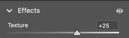
opt 1 (what i'm using most often currently, creates a smoothing and fine detail sharpening effect) - i use camera raw filter with texture to +25 and noise reduction to +15
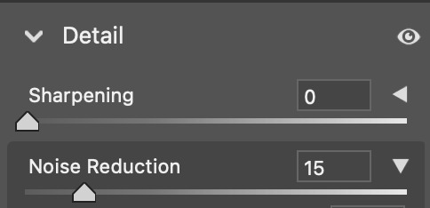
opt 2 (for a quick, easy way to create HD sharpening) - i use high pass at 4.0 px in soft light blending mode
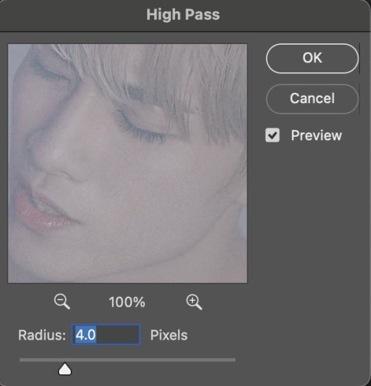

opt 3 (for a classic look with fine detail and definition) - i use smart sharpen in these settings

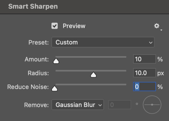
you can also combine some of these together! and if i am not using the camera raw noise reduction, i often will add a gaussian blur layer. usually just 1 px at ~20% opacity.
coloring:
you can see some examples of my psds here ! they are not the most up to date for me now but they are a place to start. some other coloring things i pretty much almost always do:
set my darkest point with curves (always always my first step!)
increase reds and blacks in selective color
mattify / even out overexposure (esp of stage lights) with a gradient map layer in black&white, reverse box checked, soft light blending, 50% opacity 50% fill
color correct with color lookup, color balance, and/or color fill layers
add a top coat with an exposure layer set to multiply or soft light at 25% opacity
as always ... try things out and see what you like and what makes your own style come together :) if there is a specific set of mine you want the exact settings for, let me know, and i'll pull them if i have it saved ! i don't save a lot rip but i can also try to remember what i did ahbghsb . good luck, happy giffing, and PLEASE TAG ME IN UR YANGYANG GIFS 🫶🏻
#sorry it took a while to respond i was at work today <3#hope this helps u !!!#erimail#mail from: anonymous friend!#gif help#.resource tag
4 notes
·
View notes
Note
Hi, this is Dani (aka @5racha) and I just saw your "event 12: loss" gif set (which is a spoiler for me but i don't care) and I absolutely love the fact you can do black and white with the gold showing. Is there a tutorial out there how to gif black and white with a colour? I mean, an easier way than to just colour each frame individually. Do you have one or is there one? I've been wondering about that for a while now and your gif set is looking absolutely incredible.
ah hello!! thank you for liking my set ;u; <3 fair warning, i notably love talking about this kind of thing and i am incredibly longwinded so i'll get the direct answers out of the way first and then i'll ramble at you about my own gif process for a bit
here is a color isolation tutorial (found via @usergif, who have many such good things). i havent specifically used this one but it's good and im basically about to rephrase it for many words
and basically.... there are ways to do it and sometimes it can be genuinely quite easy (hue/saturation is your friend!) but if your scene is problematic (lots of movement, the color youre trying to isolate is a skintone, low contrast between colors etc) it's still going to be really hard, and in the end some things Will be an every-frame or close to it kind of deal if youre still determined to do it
my eclipse prefects set basically demonstrates -- the blue ones were really really easy, since you just have to desaturate all colors except blue. the reds, because some of the backgrounds also contained red and because it's a skintone you then need to readjust, is much harder. you can kind of tell by the curtains in the first gif how this might cause a problem
and now im going to talk your ear off trying to explain applying that to the gaipa set in. far too many words. sorry
this set, being that the color is "yellow", is one of these problem children, some more than others -- for example, i tried to do the first one like this but gave up (check out the cool gray spots near his temple and his collarbone :'D)

the middle two were problematic using keyframes too, but a bit easier because they have less movement and the backgrounds are also darker, so ill try and show you, in case it helps??
here is the base coloring (ignore the orange skin, i knew i wasnt keeping this and also moonlight chicken is kind of like that)
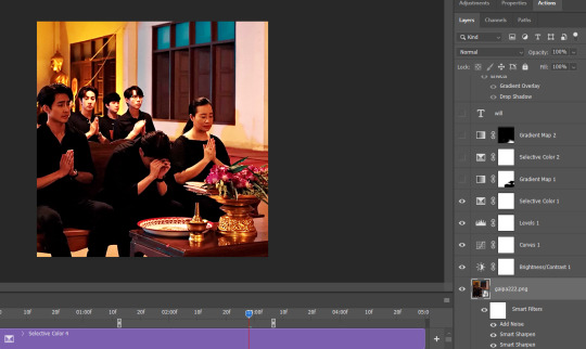
then, the bw layer is added (i use gradient maps for grayscale usually), and then i crop out the section i wanted to stay colored using the ps pen tool -> path -> selection and then use that to apply a layer mask. you can also kind of handpaint this sort of thing if that's easier for you
the next couple layers up are color adjustments for this section, to make the yellow that already exists at base brighter & tone down the red. i have four more layers at the very top to do this and adjust the colors golder & more vibrant.
now then the actual trick is in keeping the layer mask on the correct part of the gif. so if i just did the layer mask on the b/w layer like that and didnt keyframe, because this gif moves itd stop working - it isnt Super movement, so it's not actually that big of a difference, but you can see (no keyframes on the right:)

the gray creeps onto the vase, the table, and the upper part of the flowers. if you overcorrect in the other direction, the skin of the woman right behind the flowers will become visible. so ! problem solving: keyframes

that's how it looks like - you start at the beginning of the gif with your layer mask selected, then click the stopwatch next to 'layer mask position'. then i usually use the move tool and arrow keys just to shift it along with movement of the object, and you press the yellow diamond at each point you do so
this is not foolproof and im still sort of new at it, so it can sometimes look odd. case in point if youve spent as long staring at this gif as i have you probably noticed the keyframe movement (it kind of jumps.....) but i decided i could live with that. sometimes you just have to figure out where your standards for 'looks bad' are, too OTL
gif 3 is like this too -- the only notable difference is that, instead of just desaturating the colors i didnt want i covered over them with a gold gradient map layer


so, basically, all of these gifs do originally have yellow in them, but i bass boosted the shit out of it and also colored over it in some places, and i used keyframes to fix movement
i hope this is at least interesting & that you can get use out of the tutorial, hehe. thank you for asking! enjoy finishing moonlight chicken, my belovedest of series
#ro's ps adventures#rowan asks#long post#this is too much. i know. you can basically just take the link hehe#i enjoyed talking about it though !
1 note
·
View note
Text
Thank you!! I'm assuming you're asking about all the effects... hopefully this makes sense, I love explaining my process but I'm not always the clearest and this was somewhat technical ^-^'
rambling below~
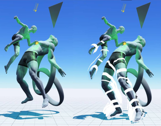
I painted Hunter and the void worm first, nothing too weird there. Then copy/pasted the layer they were on and put the copy through a filter in the G'MIC plugin (I use krita which comes preloaded with G'MIC, which is awesome and I should really use it more), the filter's just called "Water" and it creates the melting/dissolving effect. Using a gradient tool, I erased the bottom halves of the worm and Hunter on the melty layer to show the normal painting underneath, which is why their undersides aren't as distorted. This is probably most noticeable with the worm's eyes: about halfway down, they stop dissolving. To create the void fluid-esque effect above Hunter and the worm, I copied the melty layer and used a gradient map to change their colors to match void fluid, which luckily was pretty easy since it's just gold and black. Moved that layer behind the normal one and normal-colored melty one, then set it to a super bright blending mode to really make those yellows pop. It turned out even better than I expected!
Then I copy/pasted all of that (Hunter + worm) a couple times, tinted it yellow-orange, lowered the opacity a lot, moved them around, then set those new layers to the addition blending mode. This way, they're a bit brighter against the background, and that creates the ghostly effect.
Last main thing is the chromatic aberration, which is lot less fussy: I do that just by creating a new layer that basically flattens the entire image (krita's lovely "new layer from visible" button) and, well, do that again actually. Then I set those each to have only one color channel enabled in their layer's properties, then simply use the transform tool to make one a bit larger and one a bit smaller than the image. quick and dirty way to add a fun, variable lens effect (notice how it gets more distorted the closer you get to the edges of the frame)
haha thought this would be a short post but I got carried away ^-^" but yeah I don't often use filters and stuff this heavily, it was super fun though

rain world art month day 2 - swim
#long post#rain world#rw art month#process#riantart#hope you were actually wanting an answer#and I hope this was clear lol
134 notes
·
View notes
Note
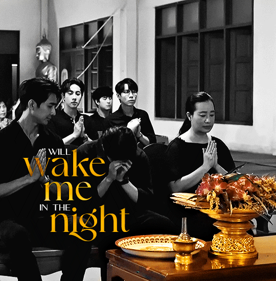
Hey, I love how you did the B/W strip + the text effect on your margaret atwood set, would you be willing to do a tutorial? 🙈
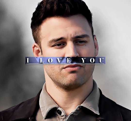
Hey Nonnie, thank you! Sorry this is a little late, but I did manage to hang onto this PSD for you.
We'll be making this gif:

This tutorial assumes basic knowledge of gif-making, Photoshop, and coloring. I’ve only described the text tutorial in this, but you can reach out if you have any questions.
(This is a different version of my gradient text tutorial, but the same principle applies!)
Tutorial under the cut:
Couple things to note beforehand:
There is a lot of trial and error involved when doing any sort of effect, and this is no exception! You might have to play around with the colors and the settings before you find something that looks good and readable and that fits your set!
This text effect works better on big gifs (540px width) that have quite a bit of movement below the shape so you get that effect.
For this effect, I find that a simple font works better than a cursive one, but play around with what you like.
We're going to start with this gif:
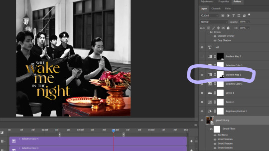
First, I'm going to add my text and center it. For this text, I used the font, Solar vesta Serif, with these settings:
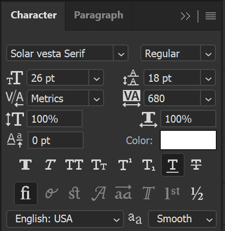
Note: when you do letter spacing + underline, sometimes, the space after the last letter can lead the underline to stretch a little too far past the letter, making it look like the underline isn't centered properly.
To get past this, I just select the last letter separately, and put the VA setting to 0-10, depending on the font/letter.
We're also going to add a drop shadow here itself, and this is fully up to preference, but I used this:

All of that should give us this (yeah, it's the simplest thing because I'm lazy and I like easy things xD nothing too fancy)

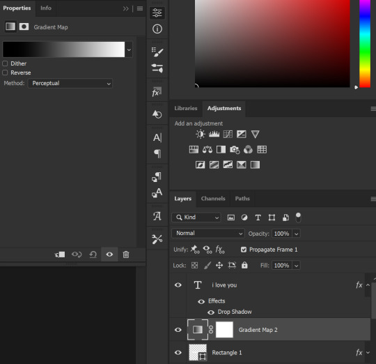
Next, we're going to draw our rectangle around the letters. I like to keep even spacing around all the letters on all sides (in this gif, it's 4px on all sides) but just eyeball it initially, and then adjust accordingly.
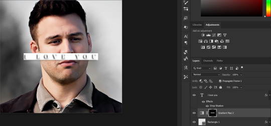
I changed the fill to white (this color isn't important, I just used white because it's easier to show) and moved the layer in the back so the text is on top. It should all look like this:

Next, we're going to add a gradient map between the rectangle and the text later. I simply used a black and white gradient, and my gif now looks like this:

Here are the settings:
Next, we're going to delete that white box - the layer mask - next to the gradient map. Just click that and press delete (or right-click > delete layer mask). Your layers should look like this:
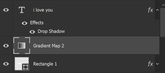
Now, we're going to add the rectangle as a layer mask. While pressing Ctrl, we’re going to hover our mouse over the square box next to Rectangle 1. Your cursor should show a white box with a dotted border. Click the square box with that dotted cursor and you should get a dotted selection line all around the box, like so:
Next, we're going to select our gradient map layer, and then create a new layer mask. At the bottom of the layers panel, you should see a box with a circle in it (denoted with a red arrow). Click that - make sure you have your gradient map layer selected, or you'll end up putting the mask on the wrong layer.

The black and white will disappear, leaving you with just the box again. It'll look like this:
Now, just hide the rectangle layer so it looks like this;
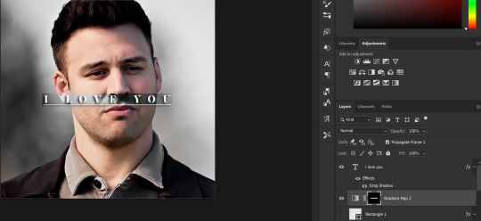
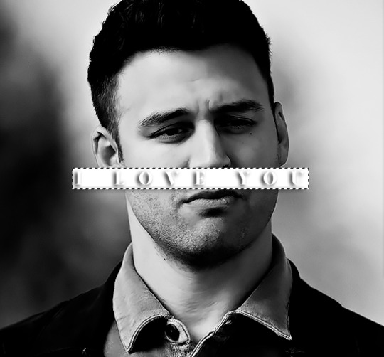
And you're done! This is my final gif:
Once you get this basic thing down, you can play around with it all. For example, I like to adjust my gradient sliders so they emphasize the colors:
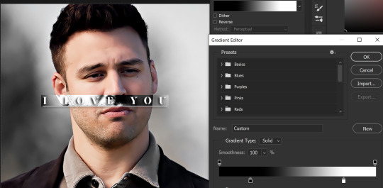
You can also just change the colors;
Unlike my previous text effect, we're not going for inverse X-ray effect, so for this, I like to make sure the lighter shade of the gradient is on the lighter parts of the gif, and same with the dark shade.
(If that's confusing, here's a side by side comparison of what the "X-ray" effect vs normal color effect looks like)
Anyway - it's fully up to you!
Because of the effect I was going for, I didn't add a drop shadow underneath the rectangle itself, but you always can if you want to make that a little bit more 3D.
You can also do this with any other shapes, too, with the same procedure.
Hope this helps, Nonnie! Let me know if you have any questions.
#zee's tutorials#tutorials#gif tutorial#photoshop tutorial#resources#dailyresources#completeresources#itsphotoshop#allresources#dailypsd#userisha#userdahlias#alielook#userabs#tuserheidi#userelio#userjaelyn#userisaiah#usermorgan#usergert
181 notes
·
View notes
Note
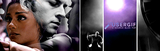
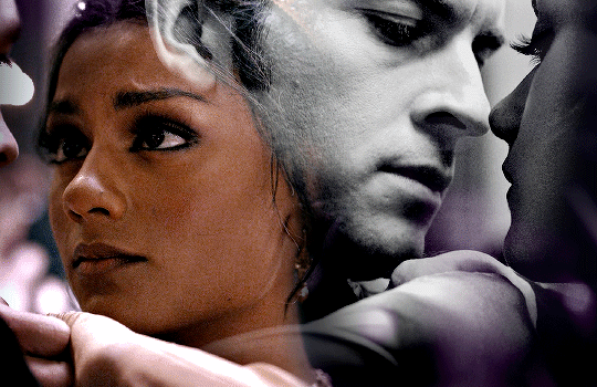
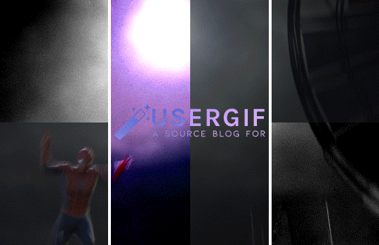
Hii, your blog is amazing!! Could I request a tutorial on how to make that text effect in the first gif of your pinned gifset (the one that says “welcome to” ft kanthony in the background)? And also (if it isn’t too much to ask) a tutorial on how to make the purple/black and white effect in the second gif of the same post (the three Spider-Mans)?
hi, thank you so much! I'd be happy to help! the effects from our welcome post are super easy, so this will (hopefully) be very straightforward. tutorials under the cut!
HOW TO CREATE: fade-animated text & color-blocked layouts
for both effects, you'll need to understand the basics of gif-making! check out our resource directory for some helpful tutorials :)
🪄 FADE-ANIMATED TEXT
1. after you finish arranging and coloring your base gif, add a text layer and style it however you like (my font/style details at the end of the tutorial)
2. add a blank (white) layer mask to your text layer and then erase your text using a soft black brush (I just used the default brush with hardness set to 0%!) like so:

(I also did another pass with my brush set to around 30% opacity. that’s the light grey bit on the left. this was just so it looked super smooth and seamless)
3. be sure to toggle off the chain icon shown above ^ this will unlink the mask layer from the text layer. if you leave this on, your animation effect will shift the entire layer, instead of the mask only.
4. with the text now fully erased, create two keyframes (diamond icon) on the line called "layer mask position" (shown below). put one at the start of your gif and wherever you want to end your animation, like this:
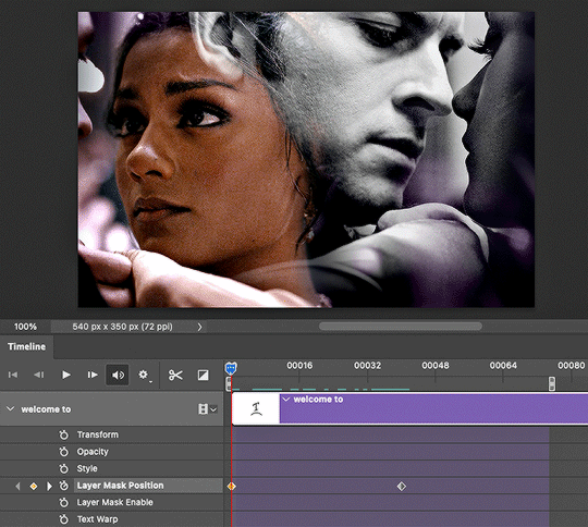
5. don't make any changes to the first keyframe. click on the second keyframe (where the animation will end) so we can move the layer mask position.
6. while the second keyframe is selected, go back to the layers panel and click on your layer mask. simply move the layer mask all the way to the right so your text is fully visible again. here's how mine looked:

7. and voila! when you play back the timeline, you should see the magic in action! if you think it's moving too fast or slow, simply move the second keyframe to another spot on the timeline. it'll keep your layer mask settings.
8. the last thing you MUST do is convert your timeline back to frame animation and delete the duplicate frames. when animating with keyframes, photoshop tends to put extra frames (I think as a buffer). if you don't remove these frames, your gif will not look smooth. here's the gif before deleting extra frames:
↳ you’ll notice it’s a little choppy as the animation plays. the base gif looks like it lags a bit or moves slower at the start.
here's the gif after deleting extra frames, ✨nice and smooth✨:

and lastly, here are more details about my typography:
font: lust script
warp transform: "wave" > bend = 50.0
blending mode: difference
gradient overlay: blend mode = hard light; gradient colors = #815dd3 -> #6549df -> #7e39c5; style = linear; angle = 137; scale = 150%
drop shadow: blend mode = multiply; color = #000; opacity = 20%; angle = 145; distance = 2; spread = 100; size = 1

🪄 COLOR-BLOCKED LAYOUT
1. start with your base gif, without coloring. unlike other multi-gif layouts, we’ll be using one gif and simply splitting up the canvas. for an overview, here are my dimensions and my layers panel:

* don’t ask me why it’s 154-225-153 instead of something balanced 🤦🏻♀️ i only just noticed that while doing this tutorial lmao
2. put your base gif in a group (command+G on mac) and add a layer mask. you could start with a blank mask or you can do what I do:
i like to map out my layout first. so I like to use the shapes tool to create rectangles in a new layer and see each section blocked off like this:

with this map in place, I just command+shift+click all the rectangle layers, select my group, and click add layer mask on that group! you should see black filling the spaces that you want to be transparent (see the group in the overview image titled “full gif”)
3. to block off your coloring, we’ll use groups and layer masks again! put your color layer adjustments (my group is called “center coloring”) and black and white layer adjustments (my group is called “outer coloring”) in separate groups
4. add your layer masks! you can use the same guide as your “full gif” mask. but this time, we won’t use all 3 rectangles at the same time. select the center rectangle only (command+click) and add a mask to your color group. your mask should look like a white vertical rectangle with two thinner black rectangles on either side
5. select the outer two rectangles (command+shift+click) and add a mask to your black and white group. (you could also just select the color group’s mask, add that to your bw group, and hit command+i to invert the mask!)
6. that’s it! make sure you have no background layer on your canvas, so your gutter lines stay transparent.
re: my coloring process — i have a process that i haven’t deviated from for years but mainly, i use a lot of levels, curves, selective color, and my fav for vibrant sets: hue/saturation <3 here’s a before and after:
also, the usergif team is filled with creators who are MAGIC with coloring. here are some extra coloring resources from our talented members:
elio’s coloring tutorial by spacedjarin
giffing and coloring tutorial by sashafierce
gradient coloring tutorial by sashafierce
isolating colors by sashafierce
the beginner’s guide to channel mixer by selinakyle
coloring yellow tinted shots by nobodynocrime
I hope this helps! if anything isn’t clear, feel free to send another ask! :) — nik
#ask#anonymous#completeresources#allresources#onlyresources#resourcemarket#gif tutorial#photoshop help#photoshop tutorial#resource#tutorial#animated#layout#typography#request#*usergif#*tutorial#by nik
768 notes
·
View notes