#mine | tutorials
Explore tagged Tumblr posts
Visit Tumblr Blog
Explore Tumblr blogs with no restrictions, modern design and the best experience.
Last Seen Tumblr Blogs


Fun Fact
Total funding amounts to $125.3M.
Note
your gifsets are perfect, I'm always in awe of what you can do and you're creativity!!! Could you please explain how you made the broken glass gif with different gif in it on photopea? https://www.tumblr.com/dengswei/754916132337729536/userdramas-creator-bingo-green-asiandramanet?source=share and would it be possible to do something similar with other shapes? Thank you for your lovely creations <33
heyy thanks so much!! and of course! i have to admit the way i do it might be a little bit tedious compared to like everyone else (though i don't know how photoshop users or other photopea users might do it 🤣) okay this is gonna end up being so long because of the way i do it so i'm sorry about that and i hope it makes sense 😭
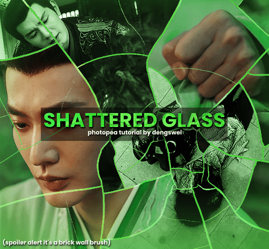
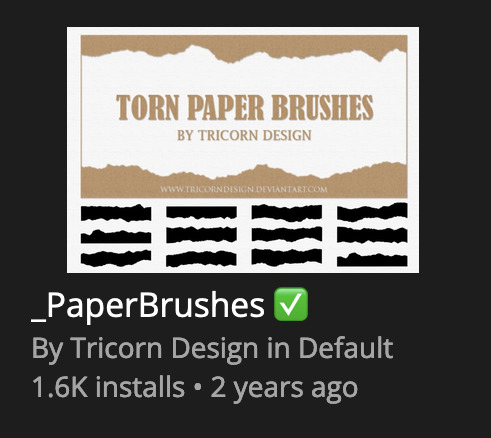
okay i have to admit i couldn't find the texture i've seen people use for the shattered glass effect so i actually used a photopea default brush from this pack
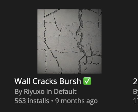
to download the brush set go to window -> plugins -> brush and then search for wall cracks brush (it's literally the only wall related brush set in photopea so it'll show up the moment you download it)
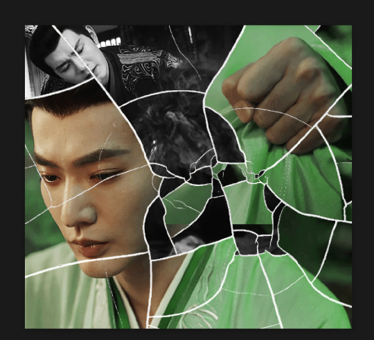
so for the gif i did above i did my giffing the usual way of creating & colouring for different gifs seperatly and then adding them all to one project (it doesn't have to be 4 gifs i just chose 4 because that's what i wanted to show in this gif)
i've done this twice once for this set and another time for this the blood of youth set and i have to say the most important part of this is keep multiple versions of the brush in the position you want as you can so once you've used it to test it out and you like that version keep it because unless you can manage to position the brush in the exact same place every time you're gonna need to reference those (or even use the magic wand tool for it later) and also you need to keep at least a white on black background version for the outline
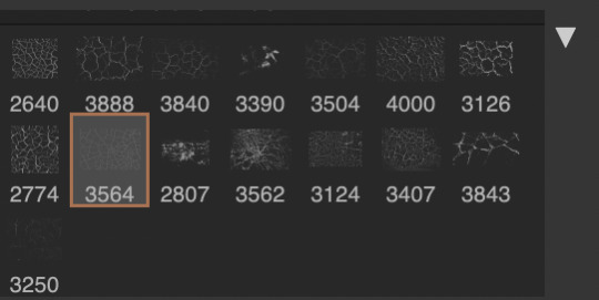
in the brush pack the one i used was this one: (3564, crack b 9)
for this part i just say play around with both positioning and sizing of the brush, it automatically opens with the size 3000+ which is fine i think with the tushan jing one (the green gif above) i stuck with that size and just kept clicking around until i got the positioning i wanted (this is another reason why i said what i said in the paragraph above because if the brush size is bigger than 1000 it's doesn't come out in the exact positioning as you expect it too
i decide the positioning of the gifs on the way i like the brick brush looking rather than the other way around, this is the positioning i went with if you're curious & would like to use it if that's easier 🤣
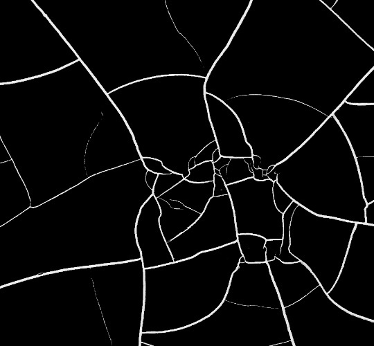
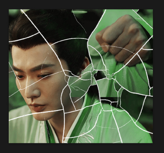
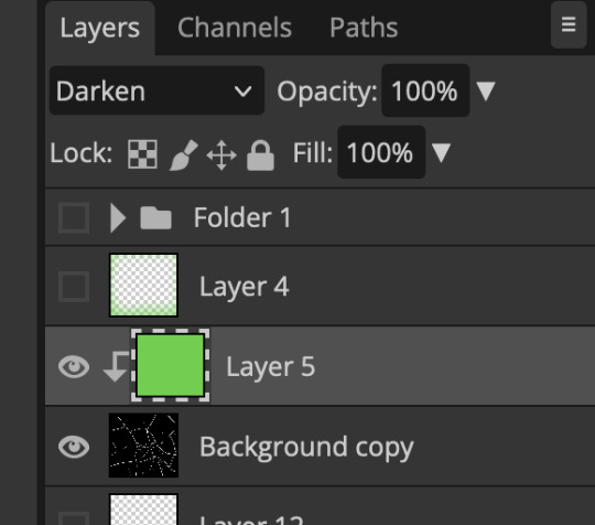
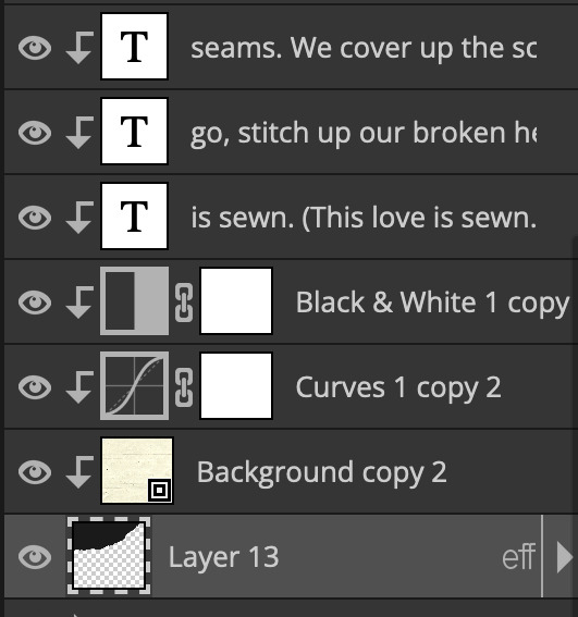
you'll need to keep this as a seperate layer at the top, i had it set to screen and then added a colour fill layer clipped on later so that i had the outline for when i was masking
so to start off i have the base gif which i do nothing to, that stays as it is, with the brush layer above set to screen
next is where you want to position your other gifs it may benefit to figure this out all at first before doing any of the masking so you know which parts you want to erase and which parts you want to keep
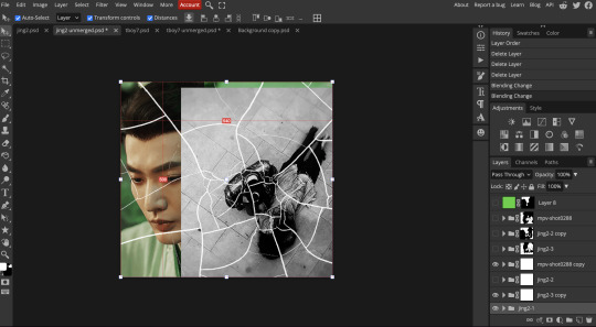
so this is what i decided with my positioning looking at where each of the cracks are
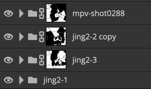
now comes the tedious part, in some ways the way i do this is a lot similar to how i do grid but it's not as easy (for grid photopea automatically locks onto the squares making it easier to mask, here you have to do it all manually)
first put a raster mask on all of the other gifs except for the base gif & use the magic wand tool on the brush layer so you get the outline of the brush and you mask that away from your gif (so if you turned off the brush layer it should look a little something like this: (it's not perfect but it won't matter that much because you should have the original turned on at the end anyway) (you don't have to do this step tbh i just did it because i thought it looked better)
so with the brush layer turned on you can use that as a template to which parts of the cracks you want to erase, you can either use the magic wand or the paint brush tool it really depends on how much of a perfectionist you are and whether or not the sharp edges bother you (plus some of the cracks have small openings so it might erase another part you don't want if you use the magic wand tool so it really is another instance of playing around and seeing what you like, and it might also change once you add the other gifs too)
so this is how it looks after i've done that (notice in the middle you can still see the edge of the gif? that won't matter because one of the other 2 gifs i still have yet to mask will cover that) & just repeat the same thing for the other gifs you want to add
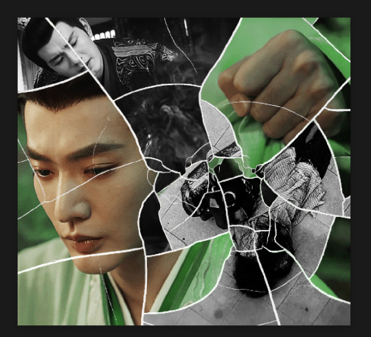
this is how my masking folders look if you're curious
& last but not least i added a green colour fill layer clipped to the brush layer and set that to darken to get the green effect (make sure that the brush layer is still set to screen)
& once you've merged all of the gifs together you should get your desired outcome like the gif above (make sure that all the gifs have the same amount of frames too)
when it comes to other shapes i'm sure you can! like i did a tutorial with the grid version here, i guess it'll just be a lot of trial and error & finding a texture or brush with different shapes to try it out with kinda like how i did with both versions of this (i definitely did it a lot better this time around compared to the first version i did of this)
hopefully this wasn't too long or too confusing, if anything is please feel free to ask me again and i'll try and explain it a little better 🤣
#replies#Anonymous#photopeablr#usergif#tutorials#photopea tutorials#completeresources#mine | tutorials#gif tutorial#photopea#resources#gif resources#gifmakerresource#photopea tutorial#tutorial#gif tutorials
133 notes
·
View notes
Text
⭐ So you want to learn pixel art? ⭐
🔹 Part 1 of ??? - The Basics!
Edit: Now available in Google Doc format if you don't have a Tumblr account 🥰
Hello, my name is Tofu and I'm a professional pixel artist. I have been supporting myself with freelance pixel art since 2020, when I was let go from my job during the pandemic.


My progress, from 2017 to 2024. IMO the only thing that really matters is time and effort, not some kind of natural talent for art.
This guide will not be comprehensive, as nobody should be expected to read allat. Instead I will lean heavily on my own experience, and share what worked for me, so take everything with a grain of salt. This is a guide, not a tutorial. Cheers!
🔹 Do I need money?
NO!!! Pixel art is one of the most accessible mediums out there.
I still use a mouse because I prefer it to a tablet! You won't be at any disadvantage here if you can't afford the best hardware or software.
Because our canvases are typically very small, you don't need a good PC to run a good brush engine or anything like that.
✨Did you know? One of the most skilled and beloved pixel artists uses MS PAINT! Wow!!
🔹 What software should I use?
Here are some of the most popular programs I see my friends and peers using. Stars show how much I recommend the software for beginners! ⭐
💰 Paid options:
⭐⭐⭐ Aseprite (for PC) - $19.99
This is what I and many other pixel artists use. You may find when applying to jobs that they require some knowledge of Aseprite. Since it has become so popular, companies like that you can swap raw files between artists.
Aseprite is amazingly customizable, with custom skins, scripts and extensions on Itch.io, both free and paid.
If you have ever used any art software before, it has most of the same features and should feel fairly familiar to use. It features a robust animation suite and a tilemap feature, which have saved me thousands of hours of labour in my work. The software is also being updated all the time, and the developers listen to the users. I really recommend Aseprite!
⭐ Photoshop (for PC) - Monthly $$
A decent option for those who already are used to the PS interface. Requires some setup to get it ready for pixel-perfect art, but there are plenty of tutorials for doing so.
Animation is also much more tedious on PS which you may want to consider before investing time!
⭐⭐ ProMotion NG (for PC) - $19.00
An advanced and powerful software which has many features Aseprite does not, including Colour Cycling and animated tiles.
⭐⭐⭐ Pixquare (for iOS) - $7.99 - $19.99 (30% off with code 'tofu'!!)
Probably the best app available for iPad users, in active development, with new features added all the time.

Look! My buddy Jon recommends it highly, and uses it often.
One cool thing about Pixquare is that it takes Aseprite raw files! Many of my friends use it to work on the same project, both in their office and on the go.
⭐ Procreate (for iOS) - $12.99
If you have access to Procreate already, it's a decent option to get used to doing pixel art. It does however require some setup. Artist Pixebo is famously using Procreate, and they have tutorials of their own if you want to learn.
⭐⭐ ReSprite iOS and Android. (free trial, but:) $19.99 premium or $$ monthly
ReSprite is VERY similar in terms of UI to Aseprite, so I can recommend it. They just launched their Android release!
🆓 Free options:
⭐⭐⭐ Libresprite (for PC)
Libresprite is an alternative to Aseprite. It is very, very similar, to the point where documentation for Aseprite will be helpful to Libresprite users.
⭐⭐ Pixilart (for PC and mobile)
A free in-browser app, and also a mobile app! It is tied to the website Pixilart, where artists upload and share their work. A good option for those also looking to get involved in a community.
⭐⭐ Dotpict (for mobile)
Dotpict is similar to Pixilart, with a mobile app tied to a website, but it's a Japanese service. Did you know that in Japanese, pixel art is called 'Dot Art'? Dotpict can be a great way to connect with a different community of pixel artists! They also have prompts and challenges often.
🔹 So I got my software, now what?
◽Nice! Now it's time for the basics of pixel art.
❗ WAIT ❗ Before this section, I want to add a little disclaimer. All of these rules/guidelines can be broken at will, and some 'no-nos' can look amazing when done intentionally.
The pixel-art fundamentals can be exceedingly helpful to new artists, who may feel lost or overwhelmed by choice. But if you feel they restrict you too harshly, don't force yourself! At the end of the day it's your art, and you shouldn't try to contort yourself into what people think a pixel artist 'should be'. What matters is your own artistic expression. 💕👍
◽Phew! With that out of the way...
🔸"The Rules"
There are few hard 'rules' of pixel art, mostly about scaling and exporting. Some of these things will frequently trip up newbies if they aren't aware, and are easy to overlook.
🔹Scaling method
There are a couple ways of scaling your art. The default in most art programs, and the entire internet, is Bi-linear scaling, which usually works out fine for most purposes. But as pixel artists, we need a different method.


Both are scaled up x10. See the difference?
On the left is scaled using Bilinear, and on the right is using Nearest-Neighbor. We love seeing those pixels stay crisp and clean, so we use nearest-neighbor.
(Most pixel-art programs have nearest-neighbor enabled by default! So this may not apply to you, but it's important to know.)
🔹Mixels
Mixels are when there are different (mixed) pixel sizes in the same image.

Here I have scaled up my art- the left is 200%, and the right is 150%. Yuck!
As we can see, the "pixel" sizes end up different. We generally try to scale our work by multiples of 100 - 200%, 300% etc. rather than 150%. At larger scales however, the minute differences in pixel sizes are hardly noticeable!
Mixels are also sometimes seen when an artist scales up their work, then continues drawing on it with a 1 pixel brush.

Many would say that this is not great looking! This type of pixels can be indicative of a beginner artist. But there are plenty of creative pixel artists out there who mixels intentionally, making something modern and cool.
🔹Saving Your Files
We usually save our still images as .PNGs as they don’t create any JPEG artifacts or loss of quality. It's a little hard to see here, but there are some artifacts, and it looks a little blurry. It also makes the art very hard to work with if we are importing a JPEG.

For animations .GIF is good, but be careful of the 256 colour limit. Try to avoid using too many blending mode layers or gradients when working with animations. If you aren’t careful, your animation could flash afterwards, as the .GIF tries to reduce colours wherever it can. It doesn’t look great!

Here's an old piece from 2021 where I experienced .GIF lossiness, because I used gradients and transparency, resulting in way too many colours.
🔹Pixel Art Fundamentals - Techniques and Jargon
❗❗Confused about Jaggies? Anti-Aliasing? Banding? Dithering? THIS THREAD is for you❗❗ << it's a link, click it!!
As far as I'm concerned, this is THE tutorial of all time for understanding pixel art. These are techniques created and named by the community of people who actually put the list together, some of the best pixel artists alive currently. Please read it!!
🔸How To Learn
Okay, so you have your software, and you're all ready to start. But maybe you need some more guidance? Try these tutorials and resources! It can be helpful to work along with a tutorial until you build your confidence up.
⭐⭐ Pixel Logic (A Digital Book) - $10 A very comprehensive visual guide book by a very skilled and established artist in the industry. I own a copy myself.
⭐⭐⭐ StudioMiniBoss - free A collection of visual tutorials, by the artist that worked on Celeste! When starting out, if I got stuck, I would go and scour his tutorials and see how he did it.
⭐ Lospec Tutorials - free A very large collection of various tutorials from all over the internet. There is a lot to sift through here if you have the time.
⭐⭐⭐ Cyangmou's Tutorials - free (tipping optional) Cyangmou is one of the most respected and accomplished modern pixel artists, and he has amassed a HUGE collection of free and incredibly well-educated visual tutorials. He also hosts an educational stream every week on Twitch called 'pixelart for beginners'.
⭐⭐⭐ Youtube Tutorials - free There are hundreds, if not thousands of tutorials on YouTube, but it can be tricky to find the good ones. My personal recommendations are MortMort, Brandon, and AdamCYounis- these guys really know what they're talking about!
🔸 How to choose a canvas size
When looking at pixel art turorials, we may see people suggest things like 16x16, 32x32 and 64x64. These are standard sizes for pixel art games with tiles. However, if you're just making a drawing, you don't necessarily need to use a standard canvas size like that.
What I like to think about when choosing a canvas size for my illustrations is 'what features do I think it is important to represent?' And make my canvas as small as possible, while still leaving room for my most important elements.
Imagine I have characters in a scene like this:
I made my canvas as small as possible (232 x 314), but just big enough to represent the features and have them be recognizable (it's Good Omens fanart 😤)!! If I had made it any bigger, I would be working on it for ever, due to how much more foliage I would have to render.
If you want to do an illustration and you're not sure, just start at somewhere around 100x100 - 200x200 and go from there.
It's perfectly okay to crop your canvas, or scale it up, or crunch your art down at any point if you think you need a different size. I do it all the time! It only takes a bit of cleanup to get you back to where you were.
🔸Where To Post
Outside of just regular socials, Twitter, Tumblr, Deviantart, Instagram etc, there are a few places that lean more towards pixel art that you might not have heard of.
⭐ Lospec Lospec is a low-res focused art website. Some pieces get given a 'monthly masterpiece' award. Not incredibly active, but I believe there are more features being added often.
⭐⭐ Pixilart Pixilart is a very popular pixel art community, with an app tied to it. The community tends to lean on the young side, so this is a low-pressure place to post with an relaxed vibe.
⭐⭐ Pixeljoint Pixeljoint is one of the big, old-school pixel art websites. You can only upload your art unscaled (1x) because there is a built-in zoom viewer. It has a bit of a reputation for being elitist (back in the 00s it was), but in my experience it's not like that any more. This is a fine place for a pixel artist to post if they are really interested in learning, and the history. The Hall of Fame has some of the most famous / impressive pixel art pieces that paved the way for the work we are doing today.
⭐⭐⭐ Cafe Dot Cafe Dot is my art server so I'm a little biased here. 🍵 It was created during the recent social media turbulence. We wanted a place to post art with no algorithms, and no NFT or AI chuds. We have a heavy no-self-promotion rule, and are more interested in community than skill or exclusivity. The other thing is that we have some kind of verification system- you must apply to be a Creator before you can post in the Art feed, or use voice. This helps combat the people who just want to self-promo and dip, or cause trouble, as well as weed out AI/NFT people. Until then, you are still welcome to post in any of the threads or channels. There is a lot to do in Cafe Dot. I host events weekly, so check the threads!
⭐⭐/r/pixelart The pixel art subreddit is pretty active! I've also heard some of my friends found work through posting here, so it's worth a try if you're looking. However, it is still Reddit- so if you're sensitive to rude people, or criticism you didn't ask for, you may want to avoid this one. Lol
🔸 Where To Find Work
You need money? I got you! As someone who mostly gets scouted on social media, I can share a few tips with you:
Put your email / portfolio in your bio Recruiters don't have all that much time to find artists, make it as easy as possible for someone to find your important information!
Clean up your profile If your profile feed is all full of memes, most people will just tab out rather than sift through. Doesn't apply as much to Tumblr if you have an art tag people can look at.
Post regularly, and repost Activity beats everything in the social media game. It's like rolling the dice, and the more you post the more chances you have. You have to have no shame, it's all business baby
Outside of just posting regularly and hoping people reach out to you, it can be hard to know where to look. Here are a few places you can sign up to and post around on.
/r/INAT INAT (I Need A Team) is a subreddit for finding a team to work with. You can post your portfolio here, or browse for people who need artists.
/r/GameDevClassifieds Same as above, but specifically for game-related projects.
Remote Game Jobs / Work With Indies Like Indeed but for game jobs. Browse them often, or get email notifications.
VGen VGen is a website specifically for commissions. You need a code from another verified artist before you can upgrade your account and sell, so ask around on social media or ask your friends. Once your account is upgraded, you can make a 'menu' of services people can purchase, and they send you an offer which you are able to accept, decline, or counter.
The evil websites of doom: Fiverr and Upwork I don't recommend them!! They take a big cut of your profit, and the sites are teeming with NFT and AI people hoping to make a quick buck. The site is also extremely oversaturated and competitive, resulting in a race to the bottom (the cheapest, the fastest, doing the most for the least). Imagine the kind of clients who go to these websites, looking for the cheapest option. But if you're really desperate...
🔸 Community
I do really recommend getting involved in a community. Finding like-minded friends can help you stay motivated to keep drawing. One day, those friends you met when you were just starting out may become your peers in the industry. Making friends is a game changer!
Discord servers Nowadays, the forums of old are mostly abandoned, and people split off into many different servers. Cafe Dot, Pixel Art Discord (PAD), and if you can stomach scrolling past all the AI slop, you can browse Discord servers here.
Twitch Streams Twitch has kind of a bad reputation for being home to some of the more edgy gamers online, but the pixel art community is extremely welcoming and inclusive. Some of the people I met on Twitch are my friends to this day, and we've even worked together on different projects! Browse pixel art streams here, or follow some I recommend: NickWoz, JDZombi, CupOhJoe, GrayLure, LumpyTouch, FrankiePixelShow, MortMort, Sodor, NateyCakes, NyuraKim, ShinySeabass, I could go on for ever really... There are a lot of good eggs on Pixel Art Twitch.
🔸 Other Helpful Websites
Palettes Lospec has a huge collection of user-made palettes, for any artist who has trouble choosing their colours, or just wants to try something fun. Rejected Palettes is full of palettes that didn't quite make it onto Lospec, ran by people who believe there are no bad colours.
The Spriters Resource TSR is an incredible website where users can upload spritesheets and tilesets from games. You can browse for your favourite childhood game, and see how they made it! This website has helped me so much in understanding how game assets come together in a scene.
VGMaps Similar to the above, except there are entire maps laid out how they would be played. This is incredible if you have to do level design, or for mocking up a scene for fun.
Game UI Database Not pixel-art specific, but UI is a very challenging part of graphics, so this site can be a game-changer for finding good references!
Retronator A digital newspaper for pixel-art lovers! New game releases, tutorials, and artworks!
Itch.io A website where people can upload, games, assets, tools... An amazing hub for game devs and game fans alike. A few of my favourite tools: Tiled, PICO-8, Pixel Composer, Juice FX, Magic Pencil for Aseprite
🔸 The End?
This is just part 1 for now, so please drop me a follow to see any more guides I release in the future. I plan on doing some writeups on how I choose colours, how to practise, and more!
I'm not an expert by any means, but everything I did to get to where I am is outlined in this guide. Pixel art is my passion, my job and my hobby! I want pixel art to be recognized everywhere as an art-form, a medium of its own outside of game-art or computer graphics!

This guide took me a long time, and took a lot of research and experience. Consider following me or supporting me if you are feeling generous.
And good luck to all the fledgling pixel artists, I hope you'll continue and have fun. I hope my guide helped you, and don't hesitate to send me an ask if you have any questions! 💕
My other tutorials (so far): How to draw Simple Grass for a game Hue Shifting
28K notes
·
View notes
Text
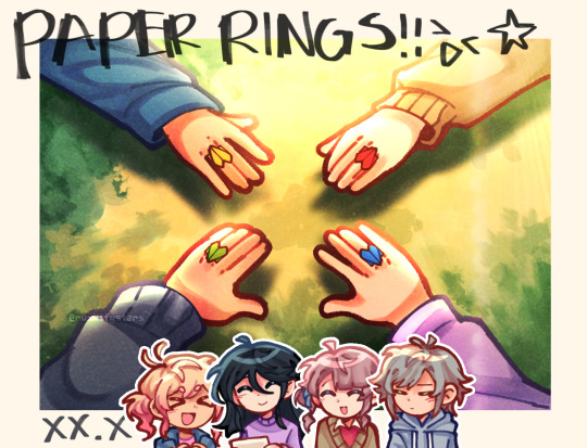
rings made out of papers.
#project sekai#prosekai#prsk fa#fanart#hatsune miku colorful stage#pjsk#leo need#leoneed#l/n#ichika hoshino#saki tenma#honami mochizuki#shiho hinomori#my art#ruxxifyart#a headcanon of mine where childhood leoni would make paper rings together#small ichika found a video tutorial on how to make paper rings at the ipad and she immediately uhhh thought of her dear friends
703 notes
·
View notes
Text

Keep me here I'm right where I belong
#used ru's tutorial for the background yay!#anyway listen to that song i linked#it's so good#911edit#911 spoilers#eddie diaz#buddie#911 abc#911#sofia.gif#mine
610 notes
·
View notes
Text
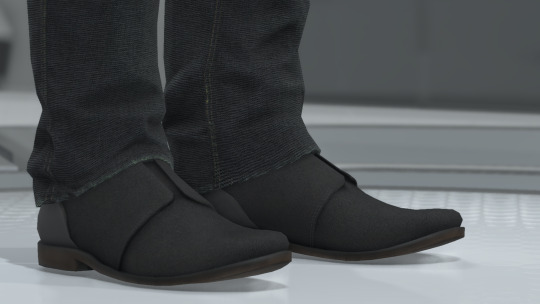
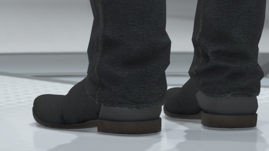
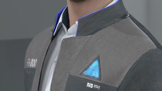
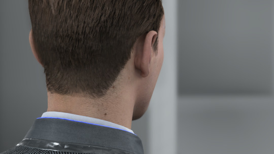
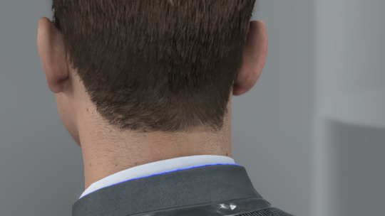
i caved and got dbh for my pc (despite already having it for my console) and honestly it's nice to be able to have have my monitor so close to me and be able to really just stare at all the details in the gallery (i may have spent an obscene amount of time staring at each character model)
here's some details i noticed about connor's model
firstly, wtf is going on with his shoes. like does it have laces???? is it just a slip-on??? I WANT TO KNOW WHAT THE TOPS OF THE SHOES LOOK LIKE. also why are his jeans unhemmed?????
at the bottom of his jacket there's the two little dark grey rectangles that honestly i never really noticed and i don't think i've ever included it in my art bc my brain just erases them from my brain. it's such a random design choice and i can't decide if i hate them or not.
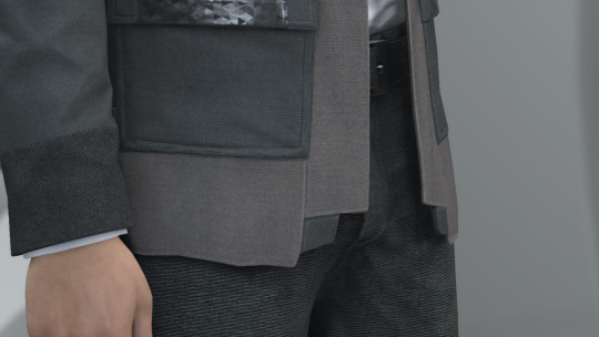
also why tf does he have two random button holes on the front of his jacket??? his jacket doesn't have buttons???? i cannot fathom why these exist or what their purpose is
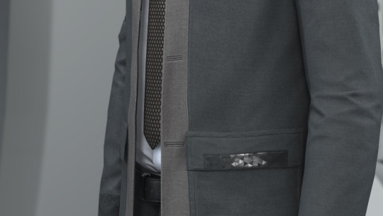
never really took the time to analyze connor's jacket so closely and i love the detail of the different materials on his jacket. like the tessellated triangle motif throughout his jacket clearly being some sort of synthetic material compared to the cotton/wool fibers
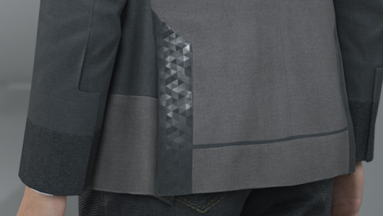
also i love the seam detail on his sleeve? like i love how it's not just one straight line but adds more shape and design to his cuff.
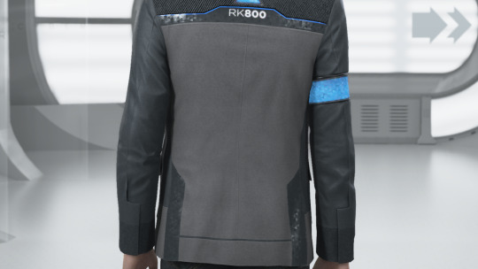
i love the texture on the top back half of connor's jacket. it reminds me of carpet or those really textured couches. it's like some type of corduroy likely or something. i wanna touch it. also the cyberlife branding right under the ANDROID text how did i never notice that??

if you look at the inner lining of his white collar, it has a darker liner on the inside. i don't think you typically see that on white button-ups???
lastly LOOK AT HIS NECK MOLES. HE'S GOT SO MANY LITTLE NECK MOLES. and after extensive zooming in and out and looking at it from all angles, i have determined that he has a little tiny mole on the back of his right ear on the rim. idk if you can see it in these screenies BUT IT'S THERE I SWEAR TO YOU. he's also got the little divot some ppl have on their ears near the top of his ear.
anyway, uhm, yeah i totally haven't spent more time staring at the character models than i have spent playing the actual game
i was also staring at kara's and markus' models and might post my thoughts observations on those at another time. but for now we got connor.
#duda if you're reading this just know i am 1000% going to consult you on how to take screenies bc the in-game camera is ass#also nine if you are reading this imma ask you too and ask you for a tutorial on how to add your mods to the game bc ANDROID HANDS#mine#reference#connor#dbh screenshots#dbh reference#dbh connor#connor rk800#detroit become human#detroit: become human#d:bh#dbh
537 notes
·
View notes
Text
Hello! I've decided to make an updated tutorial on how I gif, since some of my giffing methods have changed since I made my first one (and this one is still valid, by the way! I've just changed a few things and I thought the update would be good.)
In this tutorial you'll find:
A download link for Photoshop CC 2020;
Step-by-step instructions on how to make gifs and color them;
A sharpening action for your gifs;
A base psd for gifs.
Get the tutorial here (just type 0 to get it for free, and if you'd like to support me, any amount is extremely appreciated).
I accept commissions for tutorials + support me on ko-fi?
#tuserdee#dailyresources#completeresources#userbecca#gif tutorial#gif resources#mine#resources#*#my tutorials#tutorials#my resources#gif#my psds#my actions#psds#actions#reposting it on main bc fucking sideblog is shadowbanned LOL!!!!!!!!!!!
422 notes
·
View notes
Text
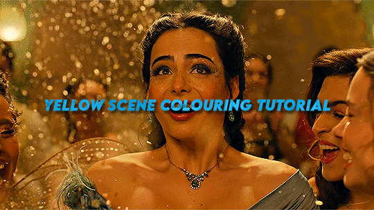
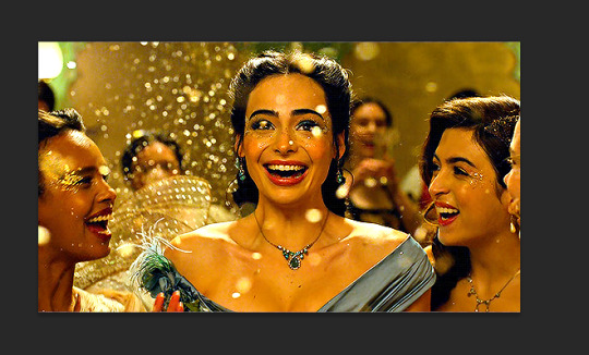
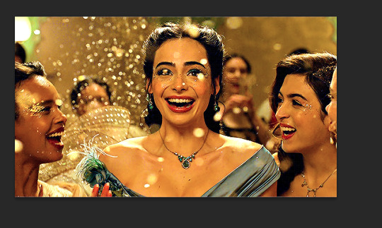
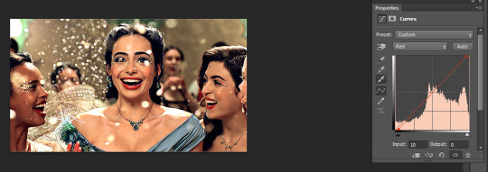
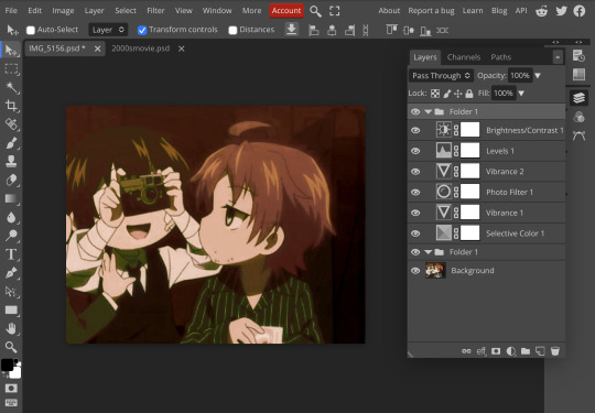
Hi everyone! I got an ask from @adamusydneys about how I coloured the scene from my header.
The scene in question started with an ugly yellow filter which can be super annoying to colour correct. Luckily I still had the psd open with all my colouring layers so should be easy to go layer by layer with what I did
Tutorial below the cut as this is screenshot heavy
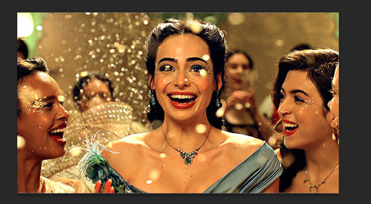
Full disclaimer - there is no real set method for what I do to colour my gifs, as it changes depending on the gif and my mood. In the case of this gif I used lots of selective colour layers, but I have also used channel mixer in the past to correct similar issues or have done most of the correction in curves (like in my basic gif tut). I will also add in the case of my header gif, I applied the previous colouring from my theolizzy gifset, so I'll try and recreate how I got the curves but it may not be exact.
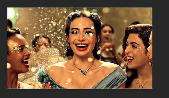
Step 1: Start with your base gif sharpened and ready to colour
I always start any gif with a Curves layer.
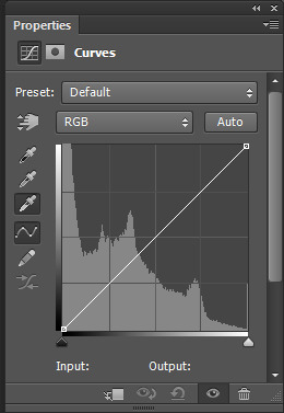
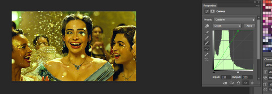
I select the white eyedropper tool and select a white point on the gif to get a base to begin my colouring.
For this gif I selected the bit of confetti in the red box
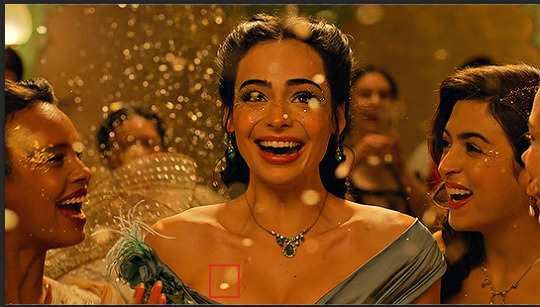
This is what the result of the curves was there
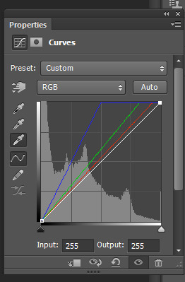
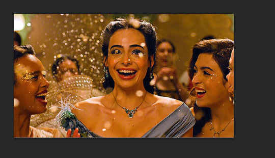
As it can be seen this added some brightness but the scene is still very yellow
To start with I go into my curves layer and start by manually adjusting the RGB channels.
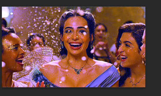
Normally to get rid of yellow, I would add more blue. But this will not work for this scene. This is what happens when adding more blue:
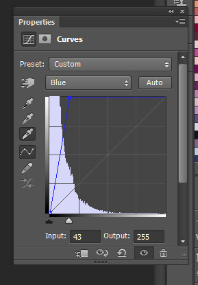
So instead of just adding more blue I go into each channel and adjust to get a better foundation for what I can colour later.
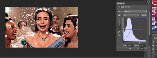
I started with the green
Then added more red in
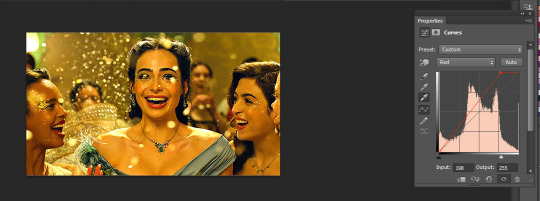
then added a bit more blue
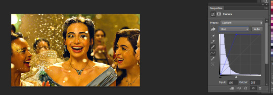
After that I went into the main channel and dragged the little black slider down to add some depth/contrast
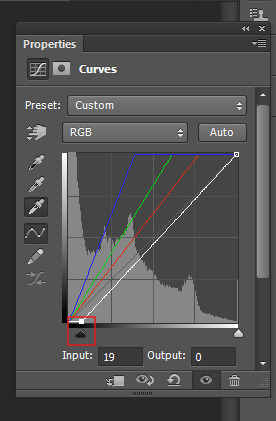
This is what my final curves layer looked like
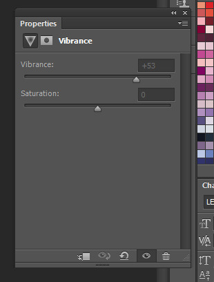
My next step is to add a Vibrance layer (which I do for all my gifs)
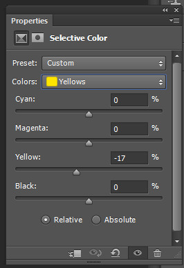
After that I started working in the selective colour layers. As the tint is quite strong I used a lot of layers and built upon them.
For the first selective colour I adjusted the reds and yellows
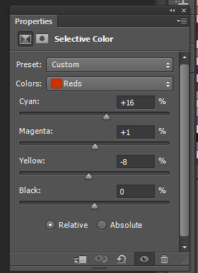
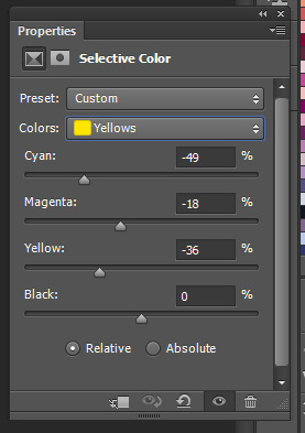
These adjustments resulted in this, which is already looking more natural but needs some more adjustment still
I went back in the reds and yellows again and adjusted further
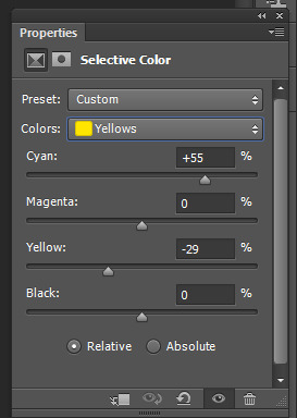
leading to this which is a pretty good result:
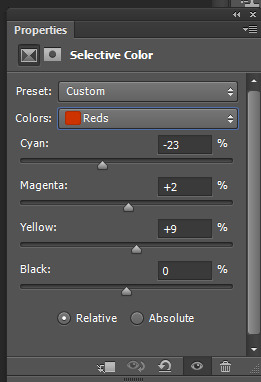
The gif now is mostly colour corrected but I still want to do some minor adjustments (cos I'm a perfectionist) so I make another selective colour layer.
This time I just add some more cyan to the reds, which is a small change but neutralises a bit of the shadows which were too bright for me
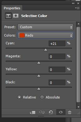
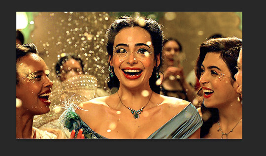
Next I take out some more yellow as the tint is still there a bit
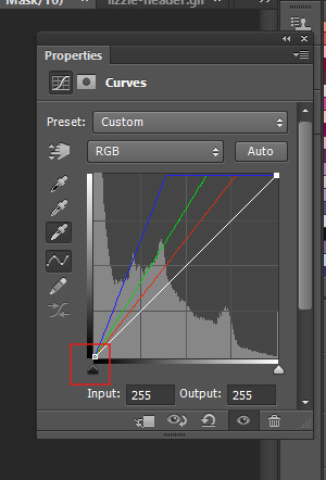
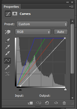
The above is pretty good, but I decided I wanted to do another curves layer on top to do a final bit of colour correction.
I manually went into each colour channel and adjusted as so:
I started by adding more blue as now I can use this to get rid of the remaining tint without it looking weird
the gif was now slightly magenta/pink so I added a bit of green to balance it out and slid the bottom slider a bit to add some depth back into the shadows
Then I added some red. I also dragged the black bar at the bottom to add a bit more depth/cyan to the shadows.
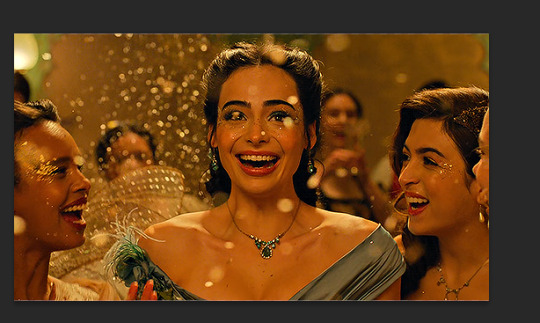
This is the final result of the basic colouring for the scene I did.
Since you also asked about the header in particular I'll expand on how I did the pink colouring for the header. tumblr is telling me this post has too many images so i'll include this info in a reblog as part 2 :)
#*mine#request#gif tutorial#resources#ps help#photoshop tutorial#usergif#allresources#yeahps#completeresources#resourcemarket#dailyresources#userelsbeth#usersavana#useraurore#userrobin#usersole#uservalentina#tuserheidi#usernivi
257 notes
·
View notes
Text
warsaw n3
#found a lifechanging gif sharpening tutorial#taylor swift#tswiftedit#taylorswiftedit#tscreators#tsedit#tswiftgif#candy swift#the swiftie tag#userrcmanticpoetry#networkthirteen#tswiftdaily#usertaylorswiftdaily#mine.#tegan .gif#warsaw n3#song: midnight rain#midnight rain#era: midnights#midnights#era: eras#the eras tour#best of teg#100.#200.#500.
592 notes
·
View notes
Text

Did you know you can modify your game files to start with custom lots in the lot bin? Did you know you can add your favorite lots to the program files and you'll never have to import them ever again? I sure didn't. Here's how.

Part 1: Freshen Up That Lot!
Locate the lot you want to freshen up. If it's in your Documents > LotCatalog, it'll be named something like cx_00000001.package. [Hint: you can use CleanInstaller to browse your LotCatalog with pictures!]
Clean it up using LotCleaner and LotCompressor (and Magic Wand, if you want). Here's a tutorial. Do NOT skip this step, or you risk contaminating future save files with old sim references.
Make it a spiffy new picture. Personally I like to lump my similar lots together with a similar title/street name. And I color-code using CatherineTCJD's color-coding format. If you want to match me, you can download my template psd here.
Open your lot in Simpe and replace that old preview. Click 'jpg/png image'. Right click the property > Replace. Change file format to 'all files' to see your image. Click either 'yes' or 'no' on the 'resource changed' popup (it doesn't matter--one updates the image preview immediately, the other doesn't). Click save.


Part 2: Relocation Time! *MAIN LOT BIN*
You cleaned up your lot, right? No sim references left? Don't skip this step or you risk messing up future hoods. Clean up that lot!
Select your lot file and rename it to the cx_00000000.package format. You can use any numbers but it must be in that format and have 8 digits. The number denotes the order so get creative with your categories. (ex: lots cx_00000100-150: modern houses / cx_00000200-250: beachy, etc.). You can use any bulk renamer to rename files in order without having to manually number each one.
Pick an Expansion for your files. Mansion and Garden comes first in the lot bin, Base Game last. The expansion you select will denote the location of your lots within the catalog. The file location is the same in every expansion, so you can even spread your lots around for max organization.
Move your cx_#.package lot file to Program Files > The Sims 2 > [expansion of your choice (ex. Nightlife)] > TSData > Res > UserData > LotCatalog. You will already see some files here. These are the maxis lots that fill the lot bin every new game. You can delete them if you really want to, or just change the extension to something else to make them go away. (Catherine has a backup if you need them back.)
Done! Now your custom lots will prefill the lot bin every time you generate a new The Sims 2 save file in your documents!
This will not pre-fill existing games. If you want to put your new clean lots into your current file, rename your main The Sims 2 save file (in your Documents folder) something else. Launch Sims 2 so it regenerates a clean copy. Create a new Hood, let the game load, and check out the LotCatalog. It will be now filled with your brand-new lots. Copy them over to your main file's LotCatalog. [Check your main LotCatalog in game to make sure you won't be deleting/overwriting anything you want to keep (make a backup just in case!) Check it again with CleanInstaller. Do not delete/overwrite occupied homes! And delete your old and crusty lots in game if you want to be extra safe.]

Part 3: Relocation Time... 2! *SPECIALTY LOT BIN*
You cleaned up your lot, right? No sim references left? Don't skip this step or you risk messing up future hoods. Clean up that lot.
We will now populate the second tab in the lot catalog, the Specialty lot bin that holds Hotels and Apartments. You can put whatever you want in here; it doesn't have to be hotels or apts. You can move lots from the main catalog to this one, if you want. These lots do not appear in the LotCatalog of your main save file, in case you try to look for them there later. They only exist in the program files.
Rename your files. Unlike the previous lots, you can name these lots anything you want, as long as it ends in _Permanent.package. stinky_Permanent.package is perfectly fine. Name it something descriptive.
Pick an Expansion for your files. You can put them in any Expansion folder, but personally I keep my apts in Apartment Life to stay organized.
Move your files. Take your stinky_Permanent.package and move it to Program Files > The Sims 2 > [expansion of your choice (ex. Nightlife)] > TSData > Res > LotTemplates. You'll see some other files here already. These are blank lots and hotels/apts (if you're in Apt Life or Bon Voyage). Don't touch the blank lots, but you can remove the hotels/apartments if you don't want them. (You can move them to the main lot bin by renaming the files to the cx_# format and moving to the location in part 2). You can open them in SimPe to check what they are, but Catherine has a visual list here.
Done! These lots will appear in the Specialty lot bin every time you boot up the game, even in your current saved game.
Have fun and enjoy organizing!
[PS: did you know you can not only delete or relocate existing bin lots, but replace them with better, and cooler lots by simply overwriting the existing cx_0000000 files in your UserData > LotCatalog folders? Catherine has a visual guide which file is which, if you want to reinvent them all. The lot bin is your oyster!]
credits: CatherineTCJD for the Lot Refresh project that made me learn this. Bluerubberbear for the majority of the lots in my thumbnails and the lot in the psd file. Plumbtales for the other lots in the thumbnails and for the beautiful lot makeovers that I replaced maxis's community lots with.
#sims 2#the sims 2#ts2#sims 2 tutorial#ts2 tutorial#lot tutorial#tutorial#mine#this literally blew my mind when i learned you could do this. i hate how messy the lot catalog is!!!!!!!!#and how you cant tell apart community lots from residential. smh.
375 notes
·
View notes
Text
Oliver Stark as Evan “Buck” Buckley 9-1-1, S08E06 - Confessions ((Guide))
#911#911edit#911verse#tvedit#911 abc#mine#evanbuckleyedit#evan buckley#tvarchive#i slept 4 hours and got home from work and said let's tackle some colouring#massive shout out to eddiesblr for their tutorial
248 notes
·
View notes
Note
I LOVE this set and i was wondering if you could pls explain how you did the text, including how you added texture to the ripped text and the highlighting/circling/etc of words? thank you for posting your beautiful gifs 😊
thank you!! 🥺 & of course! (photopea tutorial)
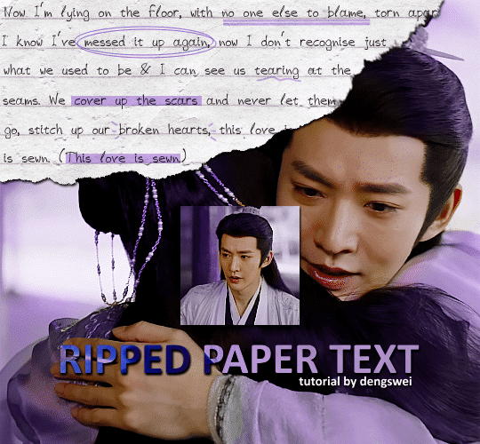
the majority of the texture for the ripped paper effect i can't really take credit for it's on the paper it's self all i did was make the paper white (because the texture was yellow) and used curves to darken the texture), i got the texture from one of photopea's templates but it seems their whole template section has changed drastically and no longer has like anything i used to see before ???? so i'll just share both versions here:
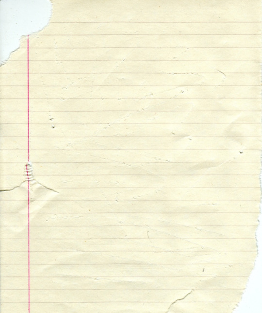
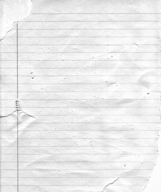
(original & my edited version)
for the ripped parts i just played around with this brush set in the plugins
once i decided which of the paper brushes to use i had a new layer and used it where i wanted, so top left in the gif above, i clip masked the paper texture (and the adjustment layers as well) onto it so you get that ripped effect (if you don't like or want to add to that you can always use the brush tool again (or the erasure tool) set as the paper brush to add or remove sections i did this a lot when i realised certain words i wanted to show weren't on there (also changing the size of the paper brush when wanting to add a little bit or take a little bit away was a massive help)
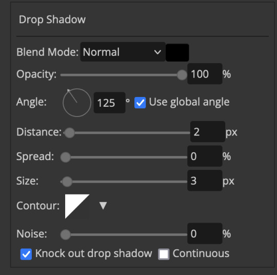
i also always add a drop shadow to my paper textures, the settings i used is mostly the same EXCEPT for the angle for all of the ripped paper (it's also my text drop shadow settings) because depending on how the ripped paper looks you might have to change the angle
also i know in the screenshot below it's on but make sure the use global angle is off if you're going to have multiple different angles of drop shadow in your one gif (so if you want your paper texture on 125° but anything else on 60° the global angle needs to be off but if you want them the same then you can keep that on, which is why it's on for me because the angle is the same for both the text & the ripped paper) (and by text this isn't the text on the ripped paper, there isn't any drop shadow on the text itself there, just to clarify this was for my "ripped paper text tutorial by dengswei" text)
as you can see i also clipped my "handwriting" text to the paper layer this is so it stayed on the paper rather then going onto the gif itself (and it saved the fiddly part of masking it away & it felt more authentic this way too)
i found for me it was easier to seperate the text line by line so i knew exactly which part of the text was on which and if i wanted to change anything either it being a typo, changing the paper texture, or wanting a different word on a different line it was easier that way because it didn't end up messing up all of the text (though you don't have to do it that way, it's just what worked for me here)
font i used was: vag-handwritten (a default photopea font)
all of the next part needs to be above the text on your ripped paper:
for the highlighting, circles, and the lines it's pretty much all the same, i chose the colour which matched the gif (so say purple), for the highlight used the rectangle select & colour fill tools and set that to multiply & then played around with opacity (for most of my highlighting it's set to 50%), for the circles it was the same except the circle shape tool (no fill just stroke) set to purple, set to multiply, with 100% opacity (i found the circles looked better with 100% on some gifs depending on what colour i used), & then duplicated it once or twice and then just moved each circle to where i thought it looked best & the double lines is also the same using the line tool, set to multiply, & playing around with the opacity, & positioning them where i like
for the squiggly lines, the hearts, the 3 small doodle lines at either side of a word, & any other doodles i had on there i doodled them myself with my drawing tablet (you probably don't have to use a drawing tablet i just found it easier that way) using the free pen tool and then did the same thing set it to multiply and played with the opacity
if the colour you choose looks too dark or too light with it set to multiply either try a lighter/darker colour, try out something else like lighten, or screen, or increase/decrease the opacity more (i found i had this issue with the yellow being hard to see on the white paper so i used a darker yellow and kept everything at 100% opacity rather than 50%)
hope that helps! and please if anything is confusing or you want to ask any more don't hesitate to ask i know i ramble on a bit and it can sometimes get a bit confusing 🤣 or if there was anything i missed feel free to ask again 🥰
#replies#edwinas#mine | tutorials#gifmakerresource#photopeablr#photopea tutorial#photopea tutorials#gif tutorial#gif tutorials#usergif#tutorial#tutorials#photopea has so many great default fonts i just spend hours searching through them i barely download fonts now 🤣#i hope i didn't miss anything#also i don't know why the paper textures & my screenshots posted this way i had them side by side#okay they're side by side on mobile but not desktop ??? but mobile doesn't have the read more okay
137 notes
·
View notes
Text
Digital Stamp Making Tutorial
Hello, and welcome to the long-awaited(at least on my part) digital stamp-making tutorial from neosprites! I’d like to preface that I learned what I was doing from this tutorial so it may be a bit redundant, but if anything I get a bit more specific. Thank you so much to @graphic--horde for your work, it changed me as a graphic maker. This is gunna be a long post so feel free to bookmark it for later. Now, onto the show!

The frame I will be using for this tutorial (which is the frame I use on 99.9% of my stamps) I found from the above linked post, which I believe is from a creator that OP lost track of. Its inner dimensions are 94x50 pixels and its outer dimensions are 99x56 pixels. Here it is!

Find your material! - I recommend using websites like Tumblr and searching with the “GIF” filter only on, or alternatives such as Giphy or Tenor. Your browser may let you directly save the .gif file; if not and you are noticing it restricts you to save it as a .webp file you can try an extension like “Save webp as PNG or JPEG” (for Firefox but I image other browsers have similar functions, but I really recommend you switch to Firefox). To use this you will right click on your source .gif like normal but instead of clicking on “Save image as…” click “Save webP as…” and then click “GIF”. You should be redirected to the website ezgif.com where we will actually be doing all of our editing! Here’s the .gif we’ll be working with.

Convert to GIF (optional) - if you used the extension from the above step you should already be ready to click the blue “Convert to GIF” button. If not, go ahead and open ezgif.com and click on “webP” and then “WebP to GIF”; then convert to a gif with the blue button.

Resize the GIF - now that we have a gif ready to edit, let’s make it the right size. The easiest method I have found is to change it directly to the frame’s inner dimensions, 94x50 pixels. [EDIT: Make sure in the aspect ratio drop drop menu you select "stretch to fit" and not "center and crop to fit" like I did in the photo example.] Click “resize” and then type [94] in for the width and [50] for the height. Next press the blue “resize image” button.


Add the frame - next click “overlay” then click the thin blue button that says “Extend canvas size(use if overlay exceeds GIF sizes)”. This will give us some extra room to add the frame onto the design. Next click “Browse…” and find the frame you have saved onto your device, then click the blue “Upload image” button.


After that it’s going to be misaligned, that’s normal! It will say you have the option to drag it into place, but don’t bother. That’s one of the reasons my old stamps look wack, it’s just harder to do. Instead type [44] in for the Left box and [22] in for the Right box. It took me a while to figure out these dimensions to be honest, and I’ve only tested it with this frame so I don't know if it works with others. Then click the blue “Generate image” button.


Crop the transparent edges - click on “crop”. You will have the option to check a box that says “trim transparent pixels around the image” however, I don’t recommend this as it tends to crop a few of the frame’s pixels with it sometimes. Next, set the Left position to [44] and the Right position to [22]. For the other dimensions we will use the outer dimensions of the frame which are 99x56 pixels, this will trim everything except the tiny spaces in between the stamp frame’s spikes. Type the width as [99] and the height as [56] and click the tiny blue button that says “set”. After that click the blue “Crop image” button.


Save and use! - all that's left is to click “save” and upload the graphic to your liking. (best seen on dark mode obviously)

If you’d like to tag me in stamps you’ve made using my tutorial I would love to see them, but it’s not required!! Make sure to always give credit for pictures/gifs when you can and try not to make stuff out of personal/fan art. Thank you to the person in my inbox who requested this tutorial, I had been meaning to for a while but it was just the kick I needed. :)
#carrd graphics#carrd resources#carrd stuff#rentry graphics#rentry resources#rentry decor#rentry pixels#rentry stuff#rentry inspo#deviantart#neocities#mine#my graphics#my tutorials#resources#tutorials#tutorial#how to#stamps#blinkies#graphics#web graphic#old internet#early internet#spacehey#da stamps#page decor#custom#old web#frames
496 notes
·
View notes
Text


Are you intending to talk all the way through this?
#my lady jane#myladyjaneedit#jane x guildford#janeford#myladyjanecentral#janefordarchive#userninz#chrissiewatts#usertina#userelliee#tusermira#mine*#yeah. YEAH!#like. she got with the programme QUICK#its all about the hands#she had multiple opportunities to shut him up and took them#her hair is so good i need a tutorial asap#took a creative license with the caption but y'all get the idea
719 notes
·
View notes
Text


Hello guys! Today ill make a tutorial on how to use psds! Dont be scared, its really easy and very fun too!

First, open photopea with the image you wanna use. click “File” and press open, after that, you open your files and select your psd!


Great! Now we have the psd! But what do we do with it…?
well, first you need to check that youre on the right layer: Make sure youre selecting your psd folder before doing anything here!

great! Now click “layer” and after that, “duplicate into”

Now make sure you change it to the name of the project you wanna apply the psd to!


Enjoy your edits!
Feel free to send in an ask if you have any questions or something wasnt clear enough! Im always happy to help. See ya!

#⌗ 🍦 ⊹⁺ Marking what is mine#rentry decor#photopea psd#psd#psd tutorial#editing resources#edit tutorial#rentry inspo#editblr#rentry resources
569 notes
·
View notes
Text

This art shits easy
#I seriously recommend following this tutorial javert is so fun to draw#and you don’t have to feel bad about the low effort bc he deserves it#drawtism#les mis#les misérables#inspector javert#javert#les miserables#mine
130 notes
·
View notes
Text
A Micro Tutorial on Blending Face Presets for Sims 3 CAS by Papermint-Airplane

So I have this Sim here and I'm using this mouth preset. It's nice but it's a little downturned for my liking and I'd prefer more of a Cupid's bow.
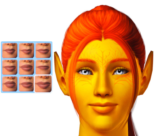
I choose the next preset which is more upturned and has the Cupid's bow I want but it's a little too sharp.
What if I merge the two presets?

I right click the first preset to blend it with the second preset. Now I have everything I want! It's not too downturned, not too upturned, and the Cupid's bow is nice and soft.
You can do this as many times as you want with as many different presets you want to get different effects. Experiment with it!
Happy Simming! 💚
#sims 3#ts3#mine#sims 3 cas#sims 3 tutorial#tutorial#tutorials#sims 3 cas tutorial#resources#sims 3 resources#just simblr things
490 notes
·
View notes