#parallax scrolling animation
Explore tagged Tumblr posts
Visit Tumblr Blog
Explore Tumblr blogs with no restrictions, modern design and the best experience.
Last Seen Tumblr Blogs


Fun Fact
Mobile US users spent an average of 115.8 minutes on Tumblr app monthly.
Text

Parallax Scrolling Animation with SVG Text Mask
#parallax scrolling animation#parallax effect#parallax scrolling#SVG Text Mask#text effect#text animation#html css#javascript animation#learn to code#code#javascript project#javascript#codingflicks
1 note
·
View note
Text

Repost Classic : NES - Jetpack Shoot 'Em Up
1/25/21
BlueSky | Ko-fi | Upwork
#animation#pixel art#pixel artist#pixel art animation#looping animation#digital animation#digital art#2d animation#pixel dailies#artists on tumblr#jetpack#shoot em up#nes color palette#parallax scrolling#nes#repost classic
4 notes
·
View notes
Text
Smooth Responsive Parallax Scrolling Library For The Web - Parallax-Scroller
Parallax-Scroller is a lightweight JavaScript library for creating smooth, responsive parallax scrolling effects on web pages. How to use it: 1. Install and import the Parallax-Scroller. # Yarn $ yarn @grokku/parallax-scroller # NPM $ npm i @grokku/parallax-scroller import { init, destroy } from "@grokku/parallax-scroller"; 2. Initialize the Parallax-Scroller. If no root element is specified,…

View On WordPress
2 notes
·
View notes
Text
BizPage Template: A Seamless Free Bootstrap 4 Business Template
Why Every Business Needs a Modern Like BizPage Template You’ve got a brilliant idea, a powerful product, or an inspiring service. But your website—the digital storefront—is either nonexistent or underwhelming. That’s where BizPage template steps in. As startups and small businesses race to stand out online, BizPage offers a solution that’s both elegant and efficient. This article unpacks what…
#Animation#Bootstrap 4 Agency Template#Bootstrap 4 Business Template#Business Consultancy Web Template#Carousel#clean design#consulting business template#corporate design#developer-friendly HTML5#Free Business Website Template#Free Responsive Agency Template#free template#Gallery#One page#One Page Business Website#Open source#Parallax Effect#Responsive Corporate Template#Slider#Smooth scroll#Social Media Icons#Sticky Navigation Bar
0 notes
Text
And here it is! My first fully completed Procreate Dreams animation. I used audio from one of Technoblade’s more famous rants during his Potato War series. I love Technoblade and miss him every day, so I hope that I was able to capture the magic of his energy in my animation.
I animated the roughs and drew the backgrounds in Procreate, but then I imported that into Dreams to do all the cleanup. It runs at 24 fps, but there’s a lot of variations to spice it up in there.
I wanted to really challenge myself so there’s a LOT going on in this short 9 second clip. There’s a camera move with multiple layers to achieve a subtle parallax scroll, there’s two lighting changes with one being a completely animated shadow layer, and there’s a warp effect on the curtains for when it opens and closes.
There’s still a lot that could be cleaned up. Some of the linework is a little more jittery than I would prefer, and the coloring process was awful. Every color was its own separate layer, which was exhausting to do. I really hope i can figure out a faster and easier way to do the coloring process because that took me over a week to complete! Yikes!
Overall I’m extremely proud of my work here. I’ve been working on this 9 second clip since Dreams released and I really wanted to showcase to everyone just how powerful Dreams is. I know a lot of people were complaining about it when it released and I wanted to do something to help reorient people’s expectations. I genuinely cannot believe that I did all of this on my iPad!
If anyone has any questions or would like to see a breakdown of this animation, please feel free to contact me!
And remember… Technoblade never dies!
#procreate dreams#procreate#animation#2d animation#procreate animation#hand drawn animation#dreams#technoblade#technoblade never dies#potato war#Minecraft#hypixel#squid kid#rip technoblade
11K notes
·
View notes
Text
The Kung Fu/China Warrior (TG-16 Mini)
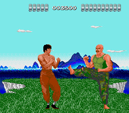
Well, let's get started with the games on the TurboGrafx-16/PC Engine Mini consoles. I'll be covering the lot, including the games exclusive to each version. I'm going to look at them in the order the games first released globally, which is the Japanese release date in most cases. I think it's fun to do it that way, as we can see how the games evolved on the platform.
That means our first entry is The Kung Fu, also known as China Warrior. This was not a launch title for the console. Bikkuri Man World and Shanghai were the only games available when the PC Engine first hit the Japanese market on October 30th, 1987. Neither of them are available on this mini-console, so the oldest game here is The Kung Fu, which came a few weeks later. However you slice it, this is a very early game for the platform, and it really shows.
The huge sprites are a clear statement about what the PC Engine offered over the then-market leader, the Famicom. Big, colorful, detailed, and technically animated sprites pressed against a vivid background with parallax scrolling was something the Famicom simply could not do. The difference was huge, even at a glance. And in that respect, I suppose The Kung Fu did what it needed to do.
Still, it's important to remember that this is a 1987 game. We're only a few years past Irem's seminal Kung-Fu Master here, and barely a year had passed since Technos Japan broke the beat 'em up mold with Renegade. The late arrival of the PC Engine's North American version combined with the admittedly great graphics for the time create loftier expectations for the gameplay than The Kung Fu was ever going to live up to.
This is a very simple spin on Kung-Fu Master with a fancier presentation. Nothing more, nothing less. You more or less auto-scroll through each level, stopping to punch or kick or jump-kick enemies as needed. Sometimes you kill certain enemies or collect power-ups and get a boost to your life bar. At certain score intervals, you'll get an extra life. At the end of each stage, you'll fight a boss. Repeat for all twelve stages and that's the game. Lose all your lives and it's back to the start.
As you play, a few new enemies and obstacles will be introduced, but the gameplay doesn't change much from start to finish. It's shallow, and I think it lacks the verve of Kung-Fu Master or the soon-to-arrive Vigilante. There isn't much to make it stand out beyond the graphics. This isn't a very good game, and it's one a player would likely get tired of quickly. But again, a 1987 game that was scant days off from a launch title for its platform. Every console has one or two of these. It looked good in magazine ads, and that's perhaps the point. We can only go up from here.
5 notes
·
View notes
Text
Family Computer - Akumajo Densetsu (Castlevania 3: Dracula's Curse)
Title: Akumajo Densetsu / 悪魔城伝説
Developer/Publisher: Konami
Release date: 22 December 1989
Catalogue Code: RC845
Genre: Platform Action


Akumajo Densetsu aka Castlevania 3 is the last installment of the heavyweight Castlevania franchise on the Famicom and it went out fighting. Konami looked at every feature of the first two games and managed to improve every concept substantially. This is evident from the time you power on the cartridge. Rather than the same side-scrolling filmstrip title screen as seen in the first two episodes, #3 grabs you with a vertical-scrolling filmstrip animation introducing you to the story. Fantastic! Gets better since this Japanese version employs Konami's custom sound processor inside the cartridge itself - the VRC6.
Say a prayer at the ruins of a church and then jump right into the action, whipping those monsters into shape and teaching them to stay dead. Let your eyes feast on the gorgeous graphics every step of the way, from the stained-glass windows of the ruined church at the start, to the meticulous inner workings of the clock tower, to the eye-popping landscape below as you are climbing the castle walls. The music, as always, does not disappoint, and remains some of my favorite melodies of any Famicom game produced.
The lead character's play control is still as slow and awkward as ever. However, that is addressed somewhat by the fact that Trevor can enlist the help of various allies: Grant, the pirate, is nimble and can climb anywhere; Sypha, can attack with powerful spells; and Dracula's own flesh and blood son (wait, do vampires has flesh?) is every bit as slow as Trevor but makes up for it by his capacity to transform into a bat.
I am glad that the creators scaled back on the adventure approach in this game. Trevor still has some say in which path he takes to reach his ultimate goal-- Dracula. But it is not a total adventure as seen in the previous installment.
One thing about this game that still sticks out in my mind is the ultra-tedious brick-climbing you had to go through in order to reach Dracula's castle. At one point in the game, these mysterious bricks fall from the sky in a predictable manner. You have to figure out the pattern by trial and error and keep on top of the bricks in order to reach the castle. That is painful. And time-consuming. During this time, you get a good view of the landscape below. However, as more advanced console and arcade systems were gaining ground at the same time this game was released, the slow scene only gave me time to contemplate how neat it would be if the game could perform parallax scrolling to give a real sense of depth and vertigo.
Overall, I was very impressed with this game, particularly with the fact that Konami managed to keep the series from getting stale. Excellent! Many series get stale on the 3rd installment since they continually follow the same formula.

youtube
6 notes
·
View notes
Text
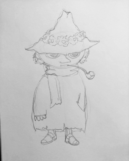
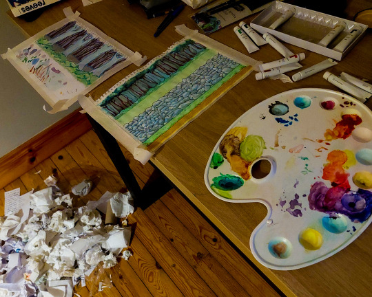
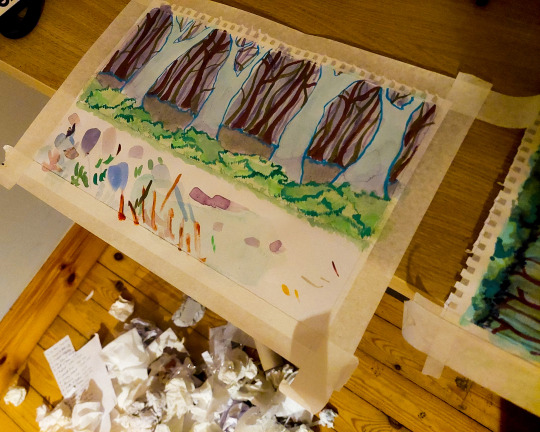
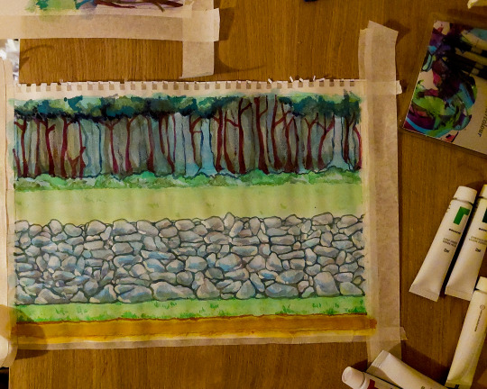
Animation Brief 01 - Week 2 - Parallax Background
Above: Snufkin just chillin
Putting together a full parallaxed background was the biggest individual step in our "World Building" brief, which is why I kept putting it off. I was told by Yvonne that the work had to be produced physically before being digitally composited, for someone who hates painting this was bad news.
I guess like always, the first step was research and gathering reference. I chose Tove Jansson as my artist-to-emulate which proved a bit of a headache in itself. Jansson was prolific and diverse, working with different styles in different mediums regularly in her seven decades long career. A lot of my favourite works of hers are simple black ink on white paper illustrations. But mimicking that style would've gone against the spirit of the project.
I decided to buy a beginners set of gouache paint for a tenner and try to emulate her painted work, the likes of which can be seen on the covers for her children's books. I'd never used gouache before so I don't really know what I was thinking, other than that I knew I was sick of acrylic. Anyway, the first step was a sketch.


Above: Yeah not much going on...
Honestly looking back on this I probably should have spent more time drafting a good composition and actually thinking through the shot I was intending to make. It's not that I didn't give it any thought, just that when you're on a tight schedule and commit to an idea, you're stuck with it. The longer I worked on this project the less I liked it, a bit more foresight at the beginning could've helped prevent that. Ah well.
The composition I went with was a combination of a couple of my landscape sketches. I decided with my "mini-me" limited to being shot from the shoulder up, a horizontal parallax would work best. Basically a simple side-scrolling shot, like holding a camera out a car window. I took the forest backdrop from Cratloe Woods, the classic Irish dry-stone wall from the farm, and I threw in some road signs (and Snufkin) for a bit of fun. The only problem was now I had to paint it...

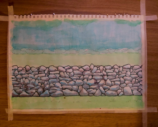

Above: A real Artíst's palette...
I had no idea how to use gouache. I even used the regular ass paper from my sketchook which was probably a mistake considering the number the water did on it. I started out dampening the paper a bit before going over the major areas with a wash of an approximate colour. You can really tell I worked left to right on the wall because it gets slightly less shitting as your eyes pan across it. The wall was great fun in general, basically just laying down shadows, darkening the crevices and building up the tone. I think I overworked it looking back, although that's true for the painting in general.

Above: Cameos
Don't have much to say about these sketches, I was working fast and trying to have fun with them while keeping in Jansson's style. Also if it's not obvious I take all these photos at night when there's no natural light cause I'm stupid...


Above: Ignore the giant pile of rubbish, I cleaned it up after I promise
At first I really wasn't happy with the treeline in my first painting so I tested out some ideas on another sheet. I liked how it turned out, and I was thinking of incorporating it into the animation, but as the trees are the furthest element in the composition, they will move the least in the parallax shot, making it a bit infeasible. I did reuse the bushes as a foreground element though.
The next step was a tedious one, scan the water-warped paintings on my shitty scanner, disassemble them in Photoshop and stitch the edges as to make them tileable. Honestly I actually enjoy this kind of tedious Photoshop work, I just hated my painting and the shot in general so having to look at them over and over wasn't exactly fun.
Anyway, having made liberal use of the offset filter in Photoshop I had all the layers cut and tileable and ready to import into After Effects. I kind of suck at After Effects so this took longer than it should have. I tried to create the parallax effect in an old school manner by parenting all the layers together and setting a keyframe on their position, and adjusting their start position individually to control the speed at which each layer scrolled. Sounds easy.
I wasn't. Apparently I can't parent properly cause it was anarchy trying to control the speed of the individual layers. Eventually I just watched a Youtube tutorial and used that guy's method, creating a new camera and parenting everything to a null object, then moving the individual layers back in z-space to create the parallax effect as the camera pans.
I'm tired as I write this and I'm unsure how intelligible it is. Here's the horses mouth explaining things if you want to watch for yourselves:
youtube
The worst part is after all that it's still just a rough composite. Even beyond the obvious absence of my mini-me, there's a lot of problems in regards to the speed of the individual layers, the foreground elements look more like they're moving on a treadmill than receding in space. A particular cardinal sin I committed was not matching the speed of the grounded elements to the ground on which they're well, grounded.
Anyway I can fix all that later, I'm just sick of looking at it for now.
7 notes
·
View notes
Text
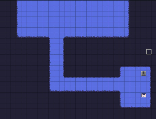
Devlog #001 - Starting Progress
Hello! This is the first devlog for my current game project called "Love, Death."
As stated in my previous post, this project was originally a research assignment for one of my university classes. As I had already made quite a few assets already, I have lots of stuff to show off in this devlog!

(Pictured Above: A screenshot of a work-in-progress shot of one of the opening scenes of the game)
Characters
So far, I have created the two central characters that I want the game to be focused on: Ghost and Shepherd. As this is incredibly early in development, I hope to update these sprites in the future should I make any major changes! (Especially Shepherd's sprite since it feels the roughest)

(Pictured Above: A gif of Ghost and Shepherd's sprites doing their walk-cycles)
Concept Art
While most of the concept art I have so far are in the rough-sketch stage, here is one piece that I've been working on for a while now that takes place further into the game's story :)

(Pictured Above: A work-in-progress illustration of Ghost and a mysterious man in the foreground)
Level Design
With the original rooms I made in the prototype, I learned a lot about how RPG Maker MZ handles parallax mapping and in general, how maps should be laid out.

(Pictured Above: the opening room of the "Love, Death" prototype - a long blue room with a glowing door to the left and a gravestone to the right.)

(Pictured Above: another room from the "Love, Death" prototype -Shepherd's office which is basked in hues of red. In the far left, there is a desk in front of a window.)
With all that information, I've started planning out the room layouts of the levels I want players to go through with an emphasis on good composition, exploration, and different points of interest.
In the coming days and weeks, I hope to assemble some placeholder rooms with layouts I've created to see how they turn out and figure out ways I could improve upon them.

(Pictured Above: A mock-up of a level with different rooms and interaction points)
Tilesets
(Pictured Above: A screenshot of a test room with a custom tileset.)
When planning out this game, I was unsure of whether or not I should use RPG Maker's default tiling system or if I should focus more on parallax mapping for the game's maps. In the end, I decided to do a little bit of both!
I've created a placeholder tileset for the first area of the game that works with RPG Maker's autotile system and some other tiles that I could use for different variants.
When it comes to parallax mapping, I'll save the maps and their tiles to a png and use those as a reference point for the elements I want to parallax map. These include lighting effects, foreground elements, and scrolling backgrounds.
Gameplay Mechanics
Below are a few things I've been working on during my testing!
(Pictured Above: A video showing a few tests in the game.)
Idle Animations
I made simple idles which happen to characters when they are idle for more than 5 seconds.
Character Switching
When pressing the [TAB] button, players will be able to quickly switch between playing as Ghost or Shepherd. Depending on who they are playing as, new mechanics would become available to them.
Shepherd Crawling
One of the unique mechanics that would be available to Shepherd would be crawling! While small spaces would be unreachable to a tall sprit like Ghost, Shepherd can reach them with ease!
When interacting with small spaces, Shepherd would crawl into the space, giving players access to whatever lies within.
Goals for Next Update:
Complete a draft layout of the tutorial area of the game
Create at least one area-specific puzzle
Create a Ghost-specific mechanic
Fun Facts and In Closing!
I thought I'd take this portion of this post to talk a little about myself and why I'm developing this game.
For those of you who don't know me, I'm Somewhatcold (you can call me Jan), an 18-year-old university student in Canada interested in game design and concept art. I've always been in love with RPGs and some of my favourite games include the Dragon Age series, Final Fantasy XV, and OneShot.
I'm currently doing a Bachelor's of Design in Illustration with a minor in Games and Play and hope to use this experience as well as further projects to learn more about game development.
Although I've made different RPG Maker games in the past for a few school projects, I've never actually made something of this scale. It's always been a long-term goal of mine to create something like this so I'm incredibly excited to see where this goes!
Feel free to ask me anything in my ask-box or to contact me via the instagram I linked above!
The next devlogs are definitely not going to be this long - this one in particular had a lot of information simply because I already started this project a few weeks ago. Going forward in the future, the devlogs are mostly going to be smaller updates and new things I've added to the game.
Below, I've also included some samples of my previous illustration work just for funsies :D
(Pictured Above: An illustration of Hebra Mountain from The Legend of Zelda: Breath of the Wild)
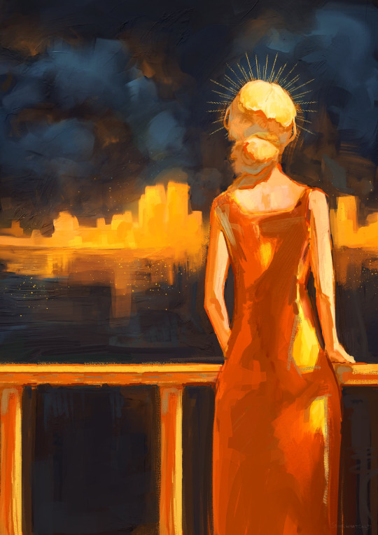
(Pictured Above: An illustration of a woman on a balcony overlooking a cityscape.)
4 notes
·
View notes
Text
Sonic 2 Absolute 1.2 Patch Notes
Sonic 2 Absolute is being updated on Friday. The Hidden Palace Zone boss and the Menu Rework aren't done yet, but a lot of progress has been made on bugs so it's time to get something out.
Here are the patch notes!
New and Updated Features! --Gamble Scramble is now available in the Extras menu! Collect 1000 rings in Casino Night 2 before time runs out. Watch out, there might be some extra obstacles… --Music from Sonic 3 and Sonic & Knuckles is now available for super forms in the Options menu --Spring animations can now be toggled between Sonic 1, Sonic CD and Sonic 2 --The options menu has been organized into sections –A new Graphics Mode toggle has been added to Options menu, allowing you to choose between Hardware, Emulated or Mobile colours –Music and SFX volume can now be changed in the Options menu –The aspect ratio of the game screen can now be changed in the Options menu –A new random monitor toggle has been added to the Options menu --VSync can be turned on and off in the Options menu --Scaling Mode can now be selected in the Options menu. Choose between Nearest, Integer, Sharp Bilinear or Bilinear --Max dash animations can now be varied between different characters. --The time attack menu has been overhauled
Quality of Life Improvements --Fadeouts on level completion have been made faster --The drop dash now produces unique dust sprites --‘ACT’ text has been added to the title card –The HUD position has been adjusted to match the original game more closely --The Level Select menu is now center-aligned --The continue screen has been tweaked to be more in line with Sonic 1 (1991) --Tails has been given a unique drowning animation --A button prompt will now appear in the top-right of the screen when a character is able to turn Super --Characters can now move while hanging on hang bars in Wing Fortress --The red spring at the start of Casino Night Act 2 has had its properties adjusted --Knuckles can now see and climb the walls in the final boss fight --An act results screen now appears in Wing Fortress Zone when playing Arcade Mode --The movement speed in Chemical Plant Zone’s tubes has been increased --Jumping form a vine or bar will now use the jumping/rolling animation --The directional buttons can now be held throughout the menus for continuous movement --The L and R buttons can now be used to quickly cycle through the Options menu sections --The Tornado will now always keep up with the player in Sky Chase --Chemical Plant and Oil Ocean’s backgrounds now have additional parallax scrolling --Characters can now spindash in the oil floods found in Oil Ocean --The Spiny and Grabber badniks now have additional SFX
General Tweaks --The engine has been updated --Sonic and Super Sonic’s sprites have been reworked --Knuckles’ sprites have been overhauled to be more like the original S3 sprites – An extra frame has been added to Knuckles’ glide & flume animations --Tails’ sprites have been updated to match his Sonic 1 Forever appearance --Emerald Hill’s graphics have been tweaked --The end-of-act singpost sprites have been reworked --The HUD graphics have been tweaked --The special stage HUD has been tweaked --Transparency issues on Wing Fortress’ cranes have been fixed --The title ribbon has been updated to match Sonic 1 Forever --Knuckles’ hat™ on the main menu has been reworked --Arcade Mode has a new icon --The graphic from a broken monitor is now always visible --The control test has been updated to use the S2 font --The unused special stage has been added to the level select --The animal sprites have been tweaked --Sonic’s pushing sprites are now closer to the Genesis original --Various ending sprites have been tweaked --Monitor icons have been tweaked --The life counter will no longer show if Infinite Lives is enabled –Extra Life monitors are now replaced with Ring monitors if Infinite Lives is enabled --Various Save Select SFX have been changed --Tails’ continue animation from the Sonic 2 2013 has been restored
Gameplay Tweaks --Knuckles glide has been made more accurate to Sonic 3 and Knuckles --The Peelout has been made more accurate to Sonic CD --Tails' tails & Knuckles’ fists now deflect projectiles like in Sonic 3 and S1F --Characters are now invulnerable for 60 seconds after being invincible or super --It is now possible to move left and right while falling in a spindash state --The collision behaviour of monitors has been changed
Bug Fixes –The DLLs for Microsoft Visual C++ Redistributable are now included –A section of Chemical Plant Zone has had its collision fixed --A bridge rotation bug has been fixed --Using the Insta Shield a few frames before getting an invincibility power-up will no longer remove the power-up --Super Sonic’s time attack record in Wing Fortress Zone will now be saved properly --Touch Controls have been removed from the Special Stages –HUD elements now use the correct palette indices –Knuckles' signpost continue icon sprites now use the correct palette indices --The drop dash has been tweaked --A pause bug at the beginning of Special Stages has been fixed --Sonic’s balancing animation has been fixed --Characters will no longer be prevented from ending a level in wider aspect ratios --The speed required to trigger Super Sonic’s max dash animation has been increased --The HUD is now capable of displaying seven digit scores --The rocket on the Tornado is now burning in the ending --Tails' helicopter SFX now restart properly after pausing --CD Drowning SFX now restart properly after pausing --A path swapper was fixed in Emerald Hill Zone Act 2 --A path swapper was added in Aquatic Ruin Zone Act 1 --The Arcade Mode results screen now appears when exiting an Arcade Mode run from a Special Stage --Various collision has been fixed in Chemical Plant and Wing Fortress --The water ripple sprite no longer gets cut off in wider aspect ratios --Tails can no longer break walls when he is accompanying Knuckles --Tails’s AI will no longer constantly jump in certain situations --A Wing Fortress Zone tile has been changed to make a ring monitor accessible --Players can no longer end up on the wrong draw layer in Aquatic Ruin Zone act 2 --Tails' tails will no longer appear twice during a speen --Super Sonic's crouching hitbox now matches Sonic's --It is no longer possible to pause during the act results screen if the level has taken a minute or longer --The player score is now correctly wiped to zero after a game over --Characters can no longer launch into the sky after finishing an act
5 notes
·
View notes
Text
Lodi Palle - What is Web designing and its Types?
Web designing refers to the process of creating and designing the visual and functional aspects of websites. It involves various disciplines and skills to ensure that a website is aesthetically pleasing, user-friendly, and functional. Web designers combine elements such as layout, typography, color schemes, graphics, and user interface (UI) design to create an engaging and effective online presence.
There are several types of web designing, each focusing on different aspects of the website's design and functionality. Some of the common types of web designing explained by Lodi Palle:
Responsive Web Design (RWD): This type of design focuses on creating websites that adapt and respond to different screen sizes and devices, ensuring a consistent user experience across desktops, tablets, and mobile phones.
User Interface (UI) Design: UI design involves creating the visual elements and interactive components of a website, such as buttons, navigation menus, forms, and other interactive elements that users interact with.
User Experience (UX) Design: UX design aims to create a seamless and user-friendly experience for visitors to a website. It involves understanding user behavior, conducting research, and optimizing the website's layout and functionality to enhance user satisfaction.
Graphic Design: Graphic design for the web involves creating visually appealing elements like logos, banners, icons, and other graphical elements that contribute to the overall aesthetics of the website.
Interactive Design: This type of design focuses on creating engaging and interactive elements on a website, such as animations, sliders, carousels, and other features that encourage user engagement.
Typography Design: Typography plays a crucial role in web design by selecting and arranging fonts in a visually appealing and readable manner. Typography choices impact the website's overall tone and readability.
Flat Design: Flat design is a minimalist approach that emphasizes simplicity, clean lines, and vibrant colors. It eliminates unnecessary embellishments to create a sleek and modern look.
Material Design: Developed by Google, material design is a design language that emphasizes realistic and tactile interactions. It uses depth, shadows, and animations to create a sense of depth and realism in the digital environment.
Minimalist Design: Minimalist design focuses on simplicity and elegance, using a minimal amount of elements and content to convey information. It often uses ample white space and clean layouts.
E-commerce Design: E-commerce design focuses on creating online shopping experiences that are user-friendly, visually appealing, and optimized for conversions. It includes features like product listings, shopping carts, and secure checkout processes.
Landing Page Design: Landing pages are designed with a specific goal in mind, such as collecting leads or promoting a product. The design focuses on encouraging visitors to take a specific action.
Parallax Design: Parallax design involves creating a scrolling effect where background and foreground elements move at different speeds, creating a sense of depth and immersion.
According to Lodi Palle These are just a few examples of the types of web designing. Depending on the goals, target audience, and nature of the website, designers may incorporate elements from multiple types to create a cohesive and effective web presence.
10 notes
·
View notes
Text
Godot Game Development
Parallax Backgrounds and layers
Okay, so I had an idea, something I had seen in a few other platformer games, as a way to add a sense of depth, speed and character to a map, long story short you create layers that scroll at different speeds as the player moves. I tried it. A few ti..many times...but I got there in the end!
What we have now is a static background image for the sky, some quickly drawn-in-mspaint hills and mountains and some quickly slapped in grass(its actually the background layer of a forest👍)that both scroll.
Tomorrow, I plan to tidy this up and fix the problems with the sprites animation sequences. They have a weird issue whereby the frames are rubber banding. More on that tomorrow.
2 notes
·
View notes
Text
Animate Elements Within A Specified Scroll Range - MiniParallax.js
MiniParallax is a lightweight JavaScript library that animates elements within a specific page scroll range. Think of it as parallax scrolling with a twist. The background remains static while elements move within a defined vertical space. This library makes it easy to add dynamic, scroll-based animations to your document. Instead of continuous parallax effects, MiniParallax focuses on targeted…
1 note
·
View note
Text
Sunfest – The Ultimate Free Event Template You Didn’t Know You Needed
Why Every Event Organizer Needs a Great Event Template When planning an event—whether it’s a festival, concert, corporate conference, or even a community gathering—your online presence plays a pivotal role in building excitement and driving attendance. But not every organizer has the time or budget to hire a web developer. This is where a feature-rich, visually stunning, and easy-to-use event…
#Accordions#Animation#app landing page template#Architecture Business Template#Art Studio Bootstrap template#Bootstrap 4 event landing page#Bootstrap countdown template#Burger Menu#conference#developer-friendly HTML5#Email Subscription#event planning website template#Event Template#festival website template#free Bootstrap event template#free event website template#free one page website#Free Responsive Agency Template#free template#Gallery#Ghost Button#Google Maps#HTML5 event template#Multipage#music festival#On hover effect#one page event site#Parallax Effect#responsive event landing page#Smooth scroll
0 notes
Text
Top 10 Web Design Trends That Will Dominate in 2025
Web design is evolving faster than ever, and staying updated is crucial for businesses aiming to create a strong online presence. In 2025, web design will be all about creating fast, user-friendly, and engaging websites that not only look great but also deliver results. From minimalist aesthetics and AI integration to immersive storytelling and advanced UI/UX design, the trends of tomorrow are already taking shape today. If you’re planning a website or thinking about redesigning your current one, this guide covers the top 10 web design trends for 2025 that every website designer, business owner, and digital agency should know.
1. Minimalist & Clean Design
Simplicity will continue to rule. Clean layouts with lots of white space, minimal text, and well-organized visuals make it easier for users to focus. This design trend not only improves readability but also helps pages load faster, which Google loves.
Why It Works:
Faster loading times
Better mobile experience
Improved user focus
2. AI-Powered User Experiences
AI is no longer just a buzzword. In 2025, expect websites to feature AI-based chatbots, personalized product recommendations, and intelligent search. These tools enhance user interaction and improve conversion rates.
Examples Include:
AI chat assistants
Smart content suggestions
Voice-based navigation
If you want an intelligent interface, consult a ui ux design company to integrate AI without compromising usability.
3. Dark Mode & Light Mode Toggle
With more users becoming conscious of eye strain and battery usage, offering both dark and light modes will become standard. This gives users the control to choose how they want to experience your website.
Benefits:
Enhanced accessibility
Stylish look
Better battery performance on mobile devices
Website design are already offering this toggle feature as a standard part of modern web design.
4. Immersive Storytelling with Scroll Animation
Websites that tell a story as you scroll keep users engaged longer. Scroll-triggered animations make the content more interactive and memorable.
Popular Features:
Parallax effects
Image zoom-in/out
Text reveals as you scroll
If you want to wow your visitors, consider hiring a website designer who specializes in scroll-based storytelling.
5. Advanced Micro-Interactions
Micro-interactions are tiny animations that occur when users interact with the site (like clicking a button or hovering over an icon). In 2025, these will become more dynamic, adding to the site’s overall feel.
Examples:
Lottie animations
Button hover effects
Loading animations
Partner with a web design services provider to implement smooth, performance-optimized micro-interactions.
6. Mobile-First Design Approach
With over 60% of web traffic coming from mobile devices, designing for mobile first will no longer be optional. A responsive website ensures that your content looks great and functions well on all screen sizes.
Why It’s Crucial:
Better Google rankings
Faster load speed on mobile
Improved UX
Work with a website design company that specializes in mobile-first design to make your site future-ready.
7. Bold Typography
Big, bold fonts are making a comeback in 2025. They help communicate your message instantly and make your site visually striking.
Design Tips:
Use custom or branded fonts
Keep it readable
Combine with minimal layouts for best impact
Ask your ui ux design company about the best typography choices for your brand.
8. 3D Visuals and Illustrations
3D elements can add depth and realism to your site, making it stand out from the crowd. Expect to see more 3D illustrations, animations, and even product models.
Benefits:
Higher engagement
Better product visualization
Unique branding
A professional web designing company can help you implement 3D visuals without slowing down your site.
9. Accessibility-First Design
Web accessibility ensures that people with disabilities can use your website with ease. In 2025, this will be a necessity, not an option. Features like keyboard navigation, alt text, and readable fonts will be standard.
Must-Haves:
Proper contrast ratios
Screen reader support
Text alternatives for images and videos
A website design company should always build your site with accessibility in mind.
10. Voice Search Optimization
Voice search is growing rapidly. As more users rely on virtual assistants like Siri, Alexa, or Google Assistant, optimizing your site for voice search is essential.
How to Prepare:
Use natural language keywords
Structure content with questions and answers
Improve page speed and mobile responsiveness
Let a website designer guide you in making your website voice-search-friendly for a seamless user experience.
Final Thoughts
Web design in 2025 will be about more than just good looks—it will focus on speed, personalization, and user satisfaction. Whether you are starting from scratch or planning a redesign, it’s essential to stay on top of these trends. Partnering with a trusted web designing company or a skilled ui ux design company ensures that your website not only looks modern but also performs at its best.
If you’re ready to revamp your digital presence, Click Design Solutions—a top-rated website design company —is here to help. From responsive layouts to AI integration, we deliver future-ready web solutions that grow your brand online.
0 notes
Text
And here is my second animation in Procreate Dreams! This time it’s a little Moomin scene.
This started off simply as a test to see if Dreams could do multi-plane camera effects, but it quickly got out of hand and took me WAY longer than I thought it would.
The problem was that in order to have the closeup shot look decent, i had to have an extremely large canvas and had to paint the background with much more detail than I normally would. In addition, it still needed to be able to fit the much smaller resolution insert of the window opening. I’ve never had to paint a scene in 4K resolution before and that presented a lot of challenges for my poor outdated iPad. Getting the right amount of detail and aligning the two layers was much more trouble than I anticipated and resulted in a lot of trial and error.
Getting each layer of the scene to move at the correct speed to make the parallax effect work also took a lot of work. And of course animating Moomin opening the window and Snufkin playing the harmonica added to the time needed to complete the scene. Honestly I didn’t think this simple scene would take me close to a month to complete.
For those curious, using the groups feature in Procreate Dreams was a lifesaver. Once I animated Moomin opening the window I was able to just group it together with the house layer and then scale both at the same time. The same went for Snufkin on the bridge. Being able to link those layers together into one layer made adjusting the parallax scrolling much easier to deal with. I really love how much groups help tidy up your timeline.
The song Snufkin is playing is a 90’s Moomin harmonica cover by Bat-Hen Zarfati.
#procreate dreams#procreate#2d animation#procreate animation#dreams#procreatedreams#moomin#moomin valley#snufkin#snufmin#90’s moomin#moomin house#snufkin x moomin
225 notes
·
View notes