Don't wanna be here? Send us removal request.
Text
Using a color wheel
The three common properties are hue, value, and intensity.
Hue
The name of a color (red, blue, green, and so on) is its hue. Hue is just one of three dimensions of any color.
Value
Value is the amount of lightness or darkness in a color.
Values progress from white (the lightest value) to black (the darkest value), with graded values of gray between white and black.
Light values, obtained by adding white to a color, are called tints. Dark values, obtained by adding black to a color, are called shades.
In the center of the scale is the pure color.
The colors to the left of the pure color are tints — white has been added to the pure color in increasing amounts to create lighter and lighter tints.
The colors to the right of the pure color are shades — black has been added to the pure color in increasing amounts to create darker and darker shades. No matter what color is used, value changes are made in terms of lightness and darkness only.
Color value scale for gray, from pure white at the left to pure black at the right.

Color value scale for green

Intensity
Intensity, the third property of color, is the amount of brightness or dullness in a color. A pure violet, for example, is high in intensity, a dulled lavendar is low in intensity.
Primary Colors
The primary colors are yellow, red, and blue.

All of the other colors are made from combinations of those three colors. Color schemes based on primary colors are often used in informal settings.
When you combine these you get the three secondary colors: orange, violet and green.
Tertiary Colors
Tertiary colors are formed by mixing equal amounts of a
primary color with a secondary color next to it. When you mix the primary color yellow with the secondary color orange, you get the tertiary color yellow-orange.
The other tertiary colors are red-orange, red-violet, blueviolet, blue-green, and yellow-green, as shown on the color circle.
In referring to intermediate colors, always put the name of the primary color first, as in yellowgreen, blue-green, and red-violet.
This is where we get the color wheel from.

Warm and Cool Colors
Colors, such as yellow, red, and orange, are considered to give sensations of warmth. They’re associated with sources of warmth such as the sun and fire. They appear to advance toward the viewer.
Other colors, such as green and blue, are considered to give a sensation of coolness. They’re associated with cool waters, skies, and dense forests. The cool colors seem to recede from the viewer.
Monochromatic Schemes
A monochromatic scheme involves the use of only one basic color with its many values and intensities. For instance, you might use the color pink as the basis for your color scheme. The carpeting might be a muted medium pink, the walls a very pale pink, and the sofa a lighter value of pink than the rug. This monochromatic scheme would produce a very pleasant and restful room.
A monochromatic scheme is one of the easiest color schemes to work with. But, it’s also one of the more difficult schemes to use, it can easily become dull and boring.
To keep a monochromatic scheme from becoming blah, you must plan to add interest to the room by using a mixture of patterns, shapes, textures, and accessories.
A monochromatic scheme may consist of any color in the spectrum with its various values and intensities. But all variations must be derived from that one color. For example, in a
scheme based on blue, you wouldn’t use a tint of blue-green. It ceases to be a monochromatic scheme when a second color is introduced.
The only exception to this scheme is that a neutral color such as blacks, whites, beiges, and grays can add variety and interest. These neutral colors can be used as backgrounds, or
they can be used to separate the various values and intensities in a room.
Analogous Schemes
Analogous colors, or related colors, are comprised of two or three colors that are next to each other on the color circle. One example of an analogous color scheme is yellow, yelloworange, and orange. These three colors are considered related because all contain the same color (in this case, yellow). The first color, yellow, is a primary color. Orange (a secondary color) is comprised of yellow and red. Yellow-orange (an intermediate color) is made of a combination of yellow and orange.
You can move around the color circle and find many pleasing schemes created from related, or neighboring, colors.

Complementary Schemes
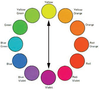
Colors directly opposite each other on the color circle are called complementary colors. Violet and yellow are complementary colors. Another way to say this is that violet is the complement of yellow. Refer to the color circle and look for other examples of
complementary colors.
Choose one color and then find the color directly opposite it. For instance, blue-green is opposite red-orange. Therefore, blue-green and red-orange are
complementary colors.

When two complementary colors, such as red and green, are placed side by side, their strong contrast makes each color look more intense.
Split-Complementary Schemes
A variation of the complementary scheme is the split-complementary scheme, which consists of one color and the two colors on each side of its complement. For instance, the
complement of red-orange is blue-green. The colors on each side of blue-green are blue and green. For example of a split-complementary color scheme is red-orange, blue, and
green. The colors in a split-complementary scheme don’t vibrate with each other as much as they do in a complementary scheme.

Double-Complementary Schemes
Another variation of the complementary scheme is the double-complementary scheme, which consists of two adjacent colors on the color circle and their complements.
For example, the colors orange and red-orange are two adjacent colors on the color circle. The complements of these colors are blue and blue-green. These four colors comprise a double-complementary scheme.
Because this scheme has more colors than any other scheme you should carefully control how you use these colors in a decorating plan. Possibly the best approach to working with a double-complementary color scheme is to choose one of the colors to be the dominant color and make the other three colors subdued. If all four colors are used in
the same amounts, the scheme will be unbalanced.

Triadic Schemes
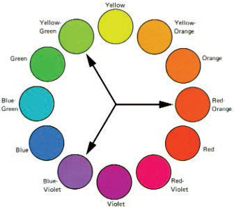
A triadic scheme uses three colors that are equal distances from each other on the color circle. You’ve already read about two triadic schemes, the primary colors (yellow, red,
and blue), and the secondary colors (orange, violet, and green). Other triads can also be developed on the circle, such as red-orange, blue-violet, and yellow-green.
One or more of the three colors in a triadic scheme are often grayed, or toned down, leaving only one to be used at full intensity.
An example of a grayed color scheme is pictured below.

Neutral Schemes
Neutral colors, such as white, black, gray, and toned down browns and beiges, are sometimes considered no-colors. Neutral color schemes are used widely for modern settings. Interest is added to such decors through a wide variety of textures and surface finishes.
Using a Color Wheel
A color wheel allows you to visualize various color schemes, like complementary and
analogous, in a variety of base colors.
Color schemes are created in a variety of ways by starting with the basic color circle
concepts.

How do you choose colors for your decorating project?
Do you have an instinct for picking colors?
Was this helpful?
0 notes
Text
Interior Designers vs. Interior Decorators
What’s the Difference?
Click the link to find out! https://dsnco.wordpress.com/interior-designers-vs-interior-decorators-whats-the-difference/
1 note
·
View note
Text
The Rule of 3
An easy rule to follow is the rule of three. This rule means that you choose three colors and use them throughout the room in various patterns, textures, values, and intensities.
Many color schemes begin with one fabric or one wallcovering. From this, one pattern, print, plaid, or stripe you can pull out three basic colors from the material and begin working with carpet, paint, and coordinating fabrics that repeat the same color scheme. If you use this idea of three main colors, it’s fairly easy to create a room with interest.
Take a look at nature for inspiration, there are so many beautiful colors.


Or maybe a friend has a rug or home decor you love


Going shopping? Take some time and look around, inspiration is everywhere!

Photos courtesy of pixabay
What inspires you?
0 notes
Text
Fully Editable in Interior Decorators Printable Planner, Instagram Post's, Instagram Highlight Covers and Printable Thank You Cards Template Bundle
#planner#printable#template#interiordecorator#instagram#story#insta post#social media#marketing#advertising#calendar#appointment#beauty#bedroom#creative#home decor#home design#furniture design#lighting design#decoration#decor#diy#design#entrepreneur#fashion#furniture#home & lifestyle#house#home#landscape
0 notes
Photo

Furniture Styles and Periods
The furniture styles used today are often grouped into four general categories: traditional, provincial, contemporary, and modern.
More here https://dsnco.wordpress.com/furniture-styles-and-periods/
0 notes
Photo

Want to know what type of fabric to select for a particular application? Find out here! https://dsnco.wordpress.com/fabric/
0 notes
Photo

The Principles of Color You have a treasure chest full of colors at your disposal—even more colors than you see in a rainbow! Rainbow colors do represent the three primary colors: red, yellow, and blue and the colors between them that result when the primary colors are mixed. For example, mixing red and yellow produces orange, mixing yellow and blue produces green, and mixing blue and red produces violet. These six colors—red, yellow, blue, orange, green, and violet are the basic colors that everyone is familiar with. If you go to any paint store and examine its extensive collection of colors, you’ll begin to understand the marvelous range of colors available to you. Color is extremely important in room decor, It can unite furnishings that may otherwise seem unrelated. • It can minimize architectural faults, such as a too-low ceiling or a poorly placed door. • It can make a small room look larger or a large room look smaller. Color is one of the most exciting and versatile tools available to you. The colors below are listed in the order of their popularity with most people, along with the impressions and moods they generally give: 1. Red—strong, stimulating 2. Blue—serene, cool, remote 3. Violet—impressive, stately 4. Green—restful, calm 5. Orange—cheerful, warm 6. Yellow—sunny, bright This list consists of just pure colors—the bright colors you see in children’s paint jars. But any of these pure colors can be modified to make them more attractive to people. Colors can be made lighter, darker, or duller to change their impact on people. https://dsnco.wordpress.com/the-principles-of-color/
0 notes
Photo

The Elements and Principles of Design Learn more at https://dsnco.wordpress.com/the-elements-and-principles-of-design/
0 notes
Photo

Bling Boards See the cuteness here https://dsnco.wordpress.com/2017/03/21/bling-boards-2/?wref=tp
0 notes
Photo


Upcycled Door Knobs Have you done something like this? https://dsnco.wordpress.com/2017/03/21/upcycled-door-knobs/
0 notes
Photo

Beach in a Bottle Instructions here https://dsnco.wordpress.com/2017/03/21/beach-in-a-bottle/
0 notes
Photo

Learn how here https://dsnco.wordpress.com/2017/03/21/535/
0 notes
Photo

Stop paint bleedthrough First paint on your base color, let dry. Then put the tape where you want it. Push edges down real good, an old credit card or wallpaper roller works great. Brush the base paint color over all edges of tape, not to thick and not to dry. Let dry. Then paint the contrasting color over the areas that are not taped and to just a little past the tape edges. Pull tape off and you should have perfect lines. The base color is the color that bleeds through, once you let it dry the contrasting color won’t get bleed through because the base color already has and acts as a barrier. Pull tape off before paint dries completely. Do you have techniques for stopping bleedthrough?
0 notes