
Don't wanna be here? Send us removal request.
Statistics
We looked inside some of the posts by dtw42 and here's what we found interesting.
Average Info
Notes Per Post
11
Likes Per Post
9
Reblog Per Post
2
Reply Per Post
0
Time Between Posts
7 months
Number of Posts By Type
Text
7
Photo
1
Last Seen Tumblr Blogs


Fun Fact
28.6 is the average number of monthly visits per US mobile user.
Text
Skirwingle crossword #67
If you've come here manually, sorry – this is the solution explainer for my October 2024 crossword, which can be found here.

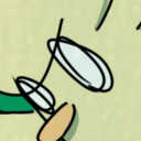
Image: Brian Leadingham, CC BY 2.0 https://creativecommons.org/licenses/by/2.0, via Wikimedia Commons.
Did you spot the theme? It was pretty blatant. Aside from several references to cars generally, there were a few that related to Herbie specifically. He's a 1a, 4a, 17a with the number 31a-32a on his hood. According to the title of his 1974 film, he 7d, 19d, and in its 1977 follow-up he went to 9d, 23d. It's no 13d to say he's 18a.

The 'lemon' reference in the clue 9/23 is to a famous 1960s VW advertisement.
0 notes
Text

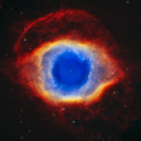
Some time ago I did a variety of what I called "pixel portraits" - pure black-and-white illustrations in a woodcut-ish or scraperfoil-ish style. Most were of film composers, but this one was of Isaac Asimov.
3 notes
·
View notes
Text
Crossword reminiscence #1
First in a series looking back at my old crosswords.
Far back in the swirling mists of time (this is poncy-speak for ‘I have lost the date details’) my first ever crossword appeared on t’internet in the ‘Guest Puzzles’ area of the Alberich Crosswords site created by the late great Neil Shepherd. This was long before I adopted my current setternym of Skirwingle, so it used the name Marvin ... maybe I’ll use that again one day. The clue surfaces were ... well, let’s say less polished than I might hope to achieve today, but in my defence I was imposing some quite tough constraints on myself.
The original is still available here, but I think enough time has passed to allow me to also reproduce it below.

CLUES
Midday food including a bit of wadding from which Apollo was shot, amongst many (6,3)
Typographic layout involving caryatids, possibly (8)
Cry out our quahog should go first (7)
Ask: was it turning too far right, symbolically? (8)
Much ballyhoo found at a fairground (4-2)
Slowly start to kill animals, causing row (5)
Jocular chap aboard cart (5)
Hard knock to light way of burning off paint, say (9)
Hold up! Don’t go! (4)
Conscript’s in conduit (6)
Wrongly put as “pimply”, possibly? (8)
Whip hanky out – ta! (5,3)
Irish intimidators start to quail in this hot country (4)
“You twit,” says Stan to comic pal? That’s rash (9)
Shout out from a military building (7)
It's going round sun on tracks with a sort of thrombosis (8)
Dub carton “thing to ring from” (4,3)
Initially lacking in puns or good rational anagrams – must show what this crossword is (8)
Look into top of cranium for a mollusc (7)
Old autocrat not finishing crazy mix-up (4)
Tacky path? (6)
It throws Kitty a poor, untidy London taxi, initially (8)
Canopy's put aslant (4)
A position by a batsman is absurd (5)
Virtuous as a harpsichord (8)
Catalog fruity mix as “a standstill” (3,3)
Put shroud round capacity for a lavatory (9)
Vulgar jollity at Oxford? (5)
Yes, this was also before the days of online solving apps, so you’ll have to [gasp!] print it out or draw on it with a graphics program or something.
Spoilers follow...
.
.
.
.
.
.
.
This was an exercise in ‘constrained writing’ – OuLiPo, if you like. A lipogram is a work that deliberately excludes the use of a particular letter. Obviously, given the massive variances in letter frequency in English, you could easily write a novel excluding the letter ‘x’ and practically nobody would even notice, but try excising ‘e’ or ‘t’ (our language’s most commonly used vowel and consonant) and things become a lot trickier.
Filling a grid with lipogrammatic answer words is also not really particularly tricky (in fact, Crossword Compiler software has a setting where you can specify the alphabet to use in a puzzle, so deleting, say, ‘e’ from that and then running an autofill practically automates the process), but the challenge I set myself was to omit ‘e’ from not just the answers but the clues as well.
Solution is here.
The gridfill is otherwise pangrammatic. Hmm, does that make it penpangrammatic? I hope it wasn’t too clunky. It’s kind of a shame that the word ‘Clues’ has got an ‘e’ in it really, because that heading spoils things a little. Still, it got me hooked and only a few short years [ahem] later I was coughing new puzzles up on a more or less monthly basis.
0 notes
Text
Massive Plug
This is a massive plug for https://offgrid.tlmb.net/, the not-really about-crosswords podcast. Fun, wordplay, general knowledge, everything you need to get you through your dull, wretched lives.

0 notes
Text
Some Hitch-Hiker’s Guide-inspired book covers...
...made using the Penguin Classics Cover Generator (https://penguin.jos.ht/)

Oolon Colluphid: Where God Went Wrong

Oolon Colluphid: Some More of God’s Greatest Mistakes

Oolon Colluphid: Who is This God Person Anyway?

Oolon Colluphid: Everything You Ever Wanted to Know About Guilt But Were Too Ashamed to Ask

Paula Nancy Millstone Jennings: Collected Poems

Dr. Dan Streetmentioner: Time Traveller’s Handbook of 1001 Tense Formations

Zem: Squornshellous Swamptalk

Grunthos the Flatulent: Zen and the Art of Going to the Toilet
4 notes
·
View notes

Text
Language and typography trivia!
While the French and German languages distinguish between singular and plural/formal forms of “you” (tu/vous, du/sie), of course English doesn’t bother and uses one word for all of it. But it’s not always been the case: originally “thou” and “thee” were singular, while “you” and “ye” were plural. For some reason most of these fell by the wayside, although “thou” still survives as “tha” in many northern dialects.
Meanwhile “ye” only EVER meant “you”, and never meant “the”, so the idea of “ye olde shoppe” is a modern mistake. The origin of the mistake lies in some characters that have dropped out of our alphabet: eth and thorn. While we get most of our letters from Latin, these two came in from Gaelic and runes.
Both eth and thorn represented the “th” sound.
Eth looks like this: Ð (capital), ð (lowercase), and it’s still used by Icelanders (think of the Joker composer Hildur Guðnadottir).

Thorn looks like this: Þ (capital), þ (lowercase). Note that the lowercase thorn is the only letter we’ve ever had with both an ascender and a descender!
But if the thorn is written a Gothic script, it looks more like this: þ. When printing from metal type began, the character sets were imported from continental Europe, so didn’t include these characters; typesetters substituted the letter they thought looked nearest, which was y, so “þe” became “ye”.
(see https://glyphmag.wixsite.com/glyph/single-post/thorn)
Another character from Gaelic which the European type sets didn’t have was the yogh: ȝ (which represented a sort of “gh” sound), so again the typesetters substituted the letter they thought looked closest, which was z. This is why the politician Menzies Campbell is known as “Ming” – the correct pronunciation of the Scots-Gaelic “Menzies” is more like “Minghis” because the letter in the middle should be a ȝ and not a z!
(see https://en.wikipedia.org/wiki/Yogh and https://en.wikipedia.org/wiki/Menzies)
On the subject of uppercase and lowercase, that also comes from the days of metal type – the characters were literally stored in two cases; the capitals in the upper one and the small letters in the lower one.

Looking back further to medieval scribal manuscripts, when the monks wanted to introduce a new topic, they would mark it with the Latin “capitulum”, meaning a “small head” (i.e., like “this is a subheading”), which was abbreviated to a decorated letter C. To help it stand out, it was written in a different colour – normally red.


To save having to keep switching pens, the scribe writing the majority of the text would just leave spaces where these were expected to go, and then hand the otherwise finished pages off to another monk, the “rubricator”, to fill in the red bits – these capitulums and some enlarged initial letters. When printing came in, for a while the same practice continued: the main body text was typeset, printed in black, and then the pages were still handed off to a rubricator to fill in the gaps by hand. Eventually time and economic constraints meant it wasn’t always possible to finish the job, so books got bound and sold without the rubrication being done (in some cases it was implied that the buyer would do it themselves) … and THAT, ladies and gentlemen, is the reason why modern book typesetting has always had a first-line indent on paragraphs: it’s the space where the capitulum should have gone!
(see https://shadycharacters.co.uk/series/the-pilcrow/)
The decorated C of the capitulum often had one or two vertical lines drawn down the right-hand side; in time these grew longer, and the bowl of the C filled in, and THAT is the origin of the paragraph mark character (or “pilcrow”): ¶. (Check the character out in various fonts – in some of the more historically-inclined designs, it still looks more like a C.)

Rubrication means marking something in red, typically for emphasis. Even today, a “rubric” means a set of rules or general instructions given at the start of something and to be paid attention to: if we’re being historically accurate, we should print it in red!

One of the things the medieval monks would produce is a liturgical calendar. Again, the scribe would do the majority of the content, and then the holy days would be emphasised by the rubricator. And THAT is where we get the phrase “red-letter day” from!

The paragraph mark or pilcrow ¶ is also used as a reference mark, of course; but only later in a sequence after *, †, ‡ and §.
* is of course the asterisk (from the Greek asteriskos, meaning a “little star”) and the reason for its name is pretty obvious.
† is commonly referred to as a dagger (again because of the look of the thing) but its official name is the obelus, from the Greek obelos, meaning a “pointed pillar”). It’s from this that we also get the obelisk – literally a pointed pillar, like Cleopatra’s Needle in London.

Hang on, asterisk and obelus? Yes indeed: the names of everybody’s favourite Gaulish villagers Asterix and Obelix are French puns on reference marks. And what is it that Obelix lugs around with him everywhere? A menhir – which is “a tall upright monumental stone” … or … pointed pillar?

The Greek name for the double dagger ‡ is diesis, but that’s a lot less common and hasn’t got a cartoon Gaul named after it.
The § is called the “section mark” (it’s used a lot in legal citations to refer to the number of a section in a document) and it’s literally just a ligature of two letters S.
On the subject of ligatures of the letter s, that’s exactly what the German eszett or “sharp s” – ß – is. Think back again to early printing, and there were two forms of the lowercase letter s – the one we still retain today, and the “long s” which looked a bit like an f without the crossbar: ſ. Stick the two side by side: ſs and then run the first into the second with a joining stroke and that’s what you get: ß. This is why words spelled with an ß turn back into “SS” when set in capitals.
The ampersand – & – is also a ligature of two letters; in this case “et”. In some fonts you can still see the original letters, but in many it’s become more stylised. Of course, the reason for this is that “et” is the Latin (and, yes, French) word for “and”.
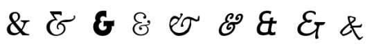
The name of the ampersand is a corruption of the phrase “and, per se, and”, which sounds pretty nonsensical until you learn that it was at one stage thought of as a letter in its own right, and children being taught the alphabet would recite it at the end of the list of letters: “…w, x, y, z, and – per se – and.”

Many attempts have been made down the years to introduce new punctuation marks that people thought writing “needed”. These have included the “percontation point” (a backwards question mark) to represent a rhetorical question; the “point d’ironie” to represent (fairly obviously) irony or sarcasm, and the exclamation comma and question comma (the top halves of exclamation and question marks paired with a comma at the bottom) for when you want to put an exclamation or a question but it isn’t the end of the sentence yet. But the only one that’s caught on at all is the interrobang; it’s another ligature, this time of the exclamation mark and question mark combined. It’s not completely commonplace because you can’t get at it directly from the keyboard, but the Unicode Consortium (who rule on what characters get “official" recognition for font designers and code developers to use) gave it a thumbs up and so many modern fonts do include it.

The educational publishing company Pearson even adopted one as their logo (well, some versions of it do look a lot like the letter P, don’t they?).
https://www.pearson.com/en-gb.html
0 notes
Text
Reverse-engineering the Two Ronnies crossword sketch
Among the catalogue of classic sketches by the late and much-missed Two Ronnies, sits this little piece: https://www.youtube.com/watch?v=cVWdbO6FFfw
Give it a watch all the way through then come back here.
Done? Okay.
Being of a cruciverbal mindset, it occurred to me to try and see whether the clues Ronnie Corbett’s character was struggling with could actually be worked into a plausible grid. When writers have characters doing crosswords, they often throw out clue numbers willy-nilly, without paying much attention to their structural plausibility – something I found pretty quickly when I tried to reverse-engineer The Owl crossword from Jasper Fforde’s Lost in a Good Book (but that’s a post for another time).
Ronnie reads out the text of seven clues. In four of these, he’s already got some letters in. Can we assume that’s because those letters are from crossing answers? The only alternative, that they (or at least some of them) are “givens” (i.e. actually printed in the grid by the publisher) is too dull to contemplate for the purposes of this (admittedly silly anyway) exercise, so let’s assume they are from crossing answers.
For three of the clues, we are told the actual clue position and number.
This, in essence, is what we have to go on:
2ac. They peck holes in your milk-bottle tops (4). ? ? T S
6ac. Often found in the bottom of a birdcage (4). ? ? I T
16ac. It’s green and often found on football pitches (5). G R A ? ?
??. It’s red, it smells, and it’s often picked in the garden (4). ? O S E
??. Place where fish are kept (4).
?ac. Strange animal found in a hive (5,3).
?dn. He always plays with Big Ears (5).
We are told that the fifth letter of the penultimate of these crosses with the first letter of the last of these.
For the fifth clue, Ronnie Barker’s character mocks Corbett’s for having filled in “coop” (or “Co-Op”) but doesn’t suggest a correction, and we’re not told what letter or letters he might have had in already. There are plenty of four-letter possibilities for where fish might be kept – tank, bowl, pond, maybe even pool – and note that many of them share the second letter “O” with Corbett’s guess, so let’s make it one of those (instead of “tank”) and make the second letter check with another crossing word.
For the sixth and seventh clues, Barker’s character confirms that the correct answers should be “queen bee” and “Noddy” (not “queer bee” and “Roddy”).
Let’s make one more basic assumption: since this is in a daily newspaper (Corbett describes it as the “Sun Junior Coffee-Time Easy Clues”), it should abide by the normal standards of crossword symmetry. That is to say, most likely 180° rotational symmetry. We initially don’t know the dimensions or style of the grid, but it’s not likely to be huge. If we start trying to construct a grid that would take these clues in the positions indicated, come constraints quickly start to show themselves.
Firstly, if there’s a 2 across, we can pretty much rule out there being a 1 across (since it would have to have no more than the first letter checked), so 1 is a down answer only.
Secondly, note that we have the third and fourth letters of 2ac in already – T S. Likewise the second, third and fourth letters of that “It’s red…” clue; the first, second and third letters of that “It’s green…” clue, and so on. Multiple consecutive checked letters? Well, for a blocked-grid crossword you might be able to envisage that somewhere in the middle of the diagram, but 2ac is clearly in the top row (and 6ac very likely is as well). No – this is sounding distinctly like a barred-grid puzzle. This puts our own meta-joke layer on top of those intended by the writers, since barred-grid puzzles are normally used for advanced/difficult puzzles (probably akin to the “Financial Times Mephistopheles” that Ronnie Barker is trying to concentrate on), and peppered with recondite vocabulary – not the sort of thing one might describe as a “Junior Coffee-Time Easy Clues”.
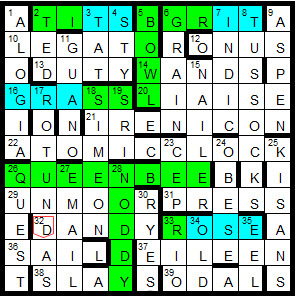
So my initial attempt to fit the answers we know into the positions we know, gave me something like this:
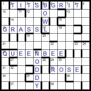
A bit of careful work with the grid-filler function and we can populate the rest of the diagram with a mix of common, harder, and obscure words typical of the barred-grid puzzle.
But we have a problem. Look at 16ac: the two letters that Corbett says he hasn’t got (the fourth and fifth) are parts of 3dn and 4dn – which also supply the last two letters of 2ac, the very two letters that he says he has got. If he’s solved 3dn and 4dn, then he’ll have both sets of these final letters, and if he hasn’t, then he’ll have neither. This arrangement of bars can’t support both scenarios. Therefore, if 16ac is going to be positioned there on the left side of the grid, we need bars above those letters, making 3dn and 4dn both three-letter words. We need to think again about the position of the bars.
Because we need to have the last two letters of 2ac not give away the last two letters of 16ac, and we need the second letter of 16ac not to give away the first letter of 2ac, those parts of those two words need to be cut off from each other by bars, and that in turn means adding more three-letter words into the grid. There are already going to be quite a few of them, and we really want to keep the number down as best we can (because it’s poor form in crossword setting to have too many three-letter words), so this means removing bars in other areas of the grid to make longer words (making sure as we go along that we don’t introduce or delete bars that would change the clue number for “grass”). That in turn increases the likelihood that we will have to accept some pretty obscure words.
In the next screenshot I’ve marked the given words in green, the known letters in blue, and then re-done the pattern of bars preparatory to trying another grid fill.

So – having filled the grid (and yes, as was inevitable, there are a few obscurities – but actually fewer than I expected) – it’s time to write the remaining clues. So, do we attempt to give all the other words “easy clues” like the ones the Ronnies read out? Or do we contrast those seven with cryptics more in keeping with the style of grid?
I went for cryptic clues in keeping with the style of the grid, and then decided to omit the clues for the seven given words and get the solvers to seek out the sketch for themselves (I circled the letters ‘TWO RONNIES’ in the grid to give a nudge in the right direction). Okay, link to the puzzle here: http://crossword.info/skirwingle/coffeetime/
Next here’s a long scrolly bit so you don’t see the answers by mistake. (see you after the dots)
.
.
.
.
.
.
.
.
.
.
.
.
.
.
.
.
.
.
.
.
.
Let’s have a look at the words I fitted around the givens, and separate them out by vocabulary difficulty:
EVERYDAY WORDS (26)
legato, onus, duty, wands, liaise, atomic clock, press, dandy, sail, Eileen, slay, ted, tat, sty, grain, tussocks, aspen, guano, rotundas, Simeon, obese, quest, email, Rio, old, eel
IN-BETWEEN OR GUESSABLE WORDS (6)
unmoor (to cast off moorings), Indic (the Indian branch of Indo-European languages), nailer (a maker of nails!), sri (an Indian title roughly equivalent to Mr.), cep (a mushroom), ryes (slightly unusual plural of the grain or the whiskey derived from it)
“HARD” WORDS (4)
irenicon (same as eirenicon – a peace-making scheme)
odal (same as udal – an Orkney or Shetland estate without feudal superior – possibly the most obscure word in the grid, and therefore the one most in need of a simple clue that gives you the necessary letters – such as a hidden or initials clue; thankfully 75% of it is checked by down words)
alogia (inability to speak, due to a brain lesion)
kisans (Indian peasants – probably the next most obscure word, and only 50% checked, so again in need of a plain clue)
I don’t think that’s too bad! If you add the “hard” words to the in-between words, that’s still less than half as many as regular familiar words (and then there are the seven original answers from the sketch as well).
2 notes
·
View notes