
A terrible artist annoyed with the lack of visual communication on those Canva romance book covers
Don't wanna be here? Send us removal request.
Statistics
We looked inside some of the posts by fixing-canva-book-covers and here's what we found interesting.
Average Info
Notes Per Post
29
Likes Per Post
20
Reblog Per Post
7
Reply Per Post
2
Time Between Posts
2 days
Number of Posts By Type
Text
4
Last Seen Tumblr Blogs


Fun Fact
Tumblr was named as a finalist in Lead411’s New York City Hot 125 in Aug 2010.
Text
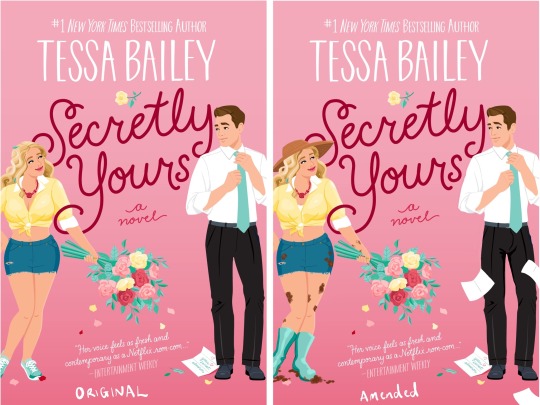
Adjustments to the cover art of Secretly Yours by Tessa Bailey.
This one suffers from a couple of my pet peeves: generic character drawings, anatomical flatness, and the ever-present “a novel”. The heroine is meant to be a hands-dirty garden landscaper, and the only horn of that in the cover art is her holding a bouquet. So, since the backmatter literally makes a point of describing her as permanently being covered in dirt and mud, I added smears of dirt to her and a trail of it at her feet. I also switched out her tennis shoes for (poorly drawn but you get the idea) gum boots, and since she’s a physical labourer out in the sun all day I gave her a hat! Now she looks like a gardener.
The generic design for the male character gives me nothing - is he a doctor, a politician, a security guard, a CEO? No, apparently he’s a professor trying to write a book. So I adjusted his facial features a little, tapers the shape of his body a little to look a little more natural and dynamic for the eye (with simple vector art like this, the silhouette is everything!) and I scattered some pages around him to make him look ✨learned✨.
I do like the touch of the single secret admirer letter at his feet, and I think the extra pages actually emphasise that rather than detract from it.
#Tessa Bailey#Booktok#bookblr#booklr#book illustration#Canva art#Romance#secretly yours#contemporary romance#romance novel cover#cover art#cover art illustration#books books books#TikTok#death to lazy Canva covers#visually code your novels again#it can be done
7 notes
·
View notes
Text
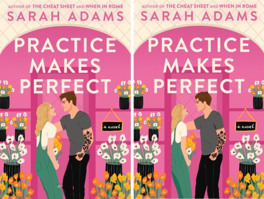

Fixing Canva cover art: Practice Makes Perfect by Sarah Adams.
This is one of the first ones I fixed. Design-wise, I actually really love this cover! I just wish it didn’t fall down so spectacularly on the dozen or so weird anatomical issues on display. I reshaped their faces, provided a subtle contrasting outline around their profiles to make them pop a little more (they’re the main characters after all!) and gave this poor girl back her ass. And the back of her head. And her shoulder. I can see what they were going for with the guy, but again, this poor guy is just totally lacking shoulders and like, human joints. So I de-plasticened him a little bit. And I gave him more human proportions for his face and head, and bulked up that lacklustre looking hair.
It’s subtle, but I think the changes make all the difference!
#practice makes perfect#Sarah adams#Canva art#Canva book cover#fixing Canva book covers#booklr#Booktok#TikTok#TikTok book club#I genuinely do like this cover though#it’s got a lot going for it!#the colour palette is great#the general layout is fabulous#just wish they hadn’t phoned in the people so badly#romance authors#romance books#literary romance#rom com
3 notes
·
View notes
Text

Another fix, this time for Elena Armas’ The American Roommate Experiment.
There are several frustrating things at play in this one for me: the lack of a defined colour palette, the inconsistent style of artwork, the faceless people and overly realistic shadowing on clothes (indicating that the people in these drawings were originally just photos, traced over and filled with basic colour), the randomly cluttered in assortments of motifs and vectors… it gives it a confused, cluttered feel.
I tried to follow the good old rule of thirds here while also establishing a more structured colour palette, giving the author’s bottom third a little cityscape to provide setting context. I removed the pizza and the gramophone entirely, replacing them as a feature with the little brass apartment key and adding the paper manuscript sheets for the lead’s romance book as a more obvious and compelling motif. I shifted the text down and filled the top third with the legs of the two character vectors (to avoid having to try and make the faces look less empty and slender man-esque) and I switched out the colour of the lady’s pants to draw the same pink through the cover art and lead the viewer’s eye down the page.
What do we think?
#Canva cover art#booklr#bookblr#Booktok#tiktok#tiktok books#romance authors#romance#romance novel#contemporary romance#book illustration#illustration design#I should probably put a disclaimer on these soon so no one comes to hate on me#this is not shade against the artists who created the original cover art#I am sure that they are doing the best they can with the briefs they are given#and likely have their hands tied by whoever ends up filtering their art through dozens of marketing hands and briefs and whatever#all power to them#this is more an exercise in personal vindication#and if anyone wants me to put together a cover for their book please hit me up#happy to do commissions#also happy to try and fix other book covers that you hate so send them#over to me#graphic design is my passion#lmao#Elena armas#cover redesign#the american roommate experiment
10 notes
·
View notes
Text
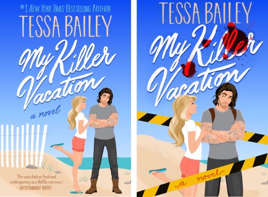
I am sick of seeing Canva cover art on books.
Not because I think the art style is bad, necessarily, but because I find the way these covers are constructed is more often than not profoundly lazy. Plastered wall to wall on TikTok and permeating the shelves of mass-market bookstores and airports alike, this cover art, while cute, communicates very little about what the book actually is about.
I can not tell if this book is a closed door romance or a smutty no-holds-barred work at all. I don’t even know the faintest thing about the characters from this cover, except maybe that there will be some grumpy-and-sunshine type dynamics at play. I am challenging myself to redo/alter canva-style romance covers in an attempt to make them feel less painfully generic and prove that it’s not actually difficult to use this art style in a way that is communicative and effective with minimal changes.
Here, all I did was shuffle the elements around a bit, bringing the main couple to the forefront of the image. I added a blood spatter to drive home the fact that this book does indeed contain a murder and some level of violence, but is overall a sweet and somewhat cutesy romance. I did find the pose of the couple a little bit stiff and lacking dynamic, so I messed with the lines of her body a little, gave her more of a rib cage, and brought her in closer to him on the whole.
If you find any particularly egregious covers, send them my way! I would love to take a stab at ‘fixing’ them.
#book art#booklr#bookblr#romance books#romance#canvadesignchallenge#canva art#canva#canva is the devil#Canva romance cover#corporate cover art#illustration#book illustration#books#bookaholic#book cover redesign
9 notes
·
View notes