halmayman
GIFs & WIP by Haitham Almayman
GIFs & WIP by Haitham Almayman
57 posts
Don't wanna be here? Send us removal request.
Last Seen Blogs
rainbow-and-black-like-my-soul
I Guess I'm My Own Better Half
whirling-fangs
WILD BOAR COMIN' THROUGH!
syncedalone
S E V E N Z E E


colalkkkkk
castaway
Photo

It was a pleasure to design this year’s @TEDxKidsRyd event branding. Check out project here:
https://www.behance.net/gallery/25331047/TEDxKidsRiyadh
6 notes
·
View notes
Photo
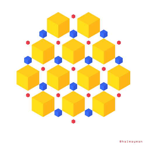
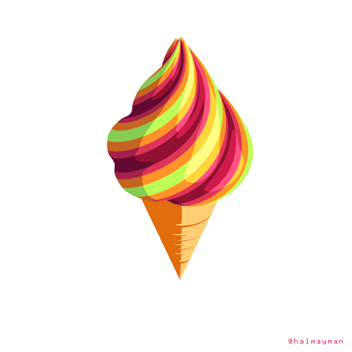
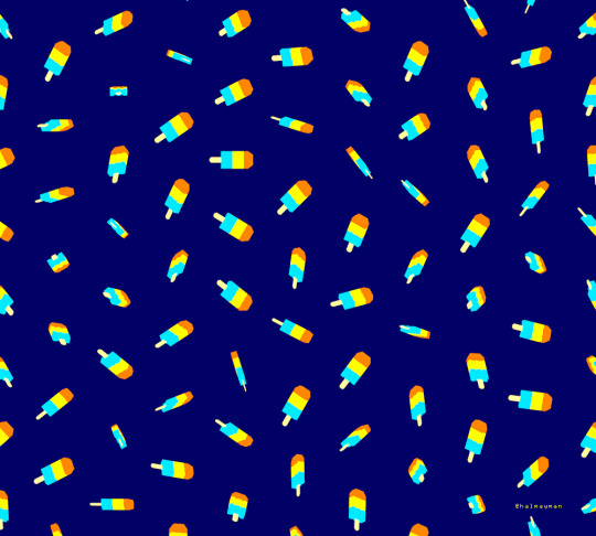
This is a repost of all ‘Summer loops’ series gifs in one post. enjoy!
#HaGifs#gif c4d#gif#artists on tumblr#Summer#LOOP#ice cream#hot#cold#motion#graphic design#art#beach#ready for summer#Cinema 4D#animation#colouful
12 notes
·
View notes
Link
One of my icons on The Noun Project is featured on this limited edition #CreativeComons t-shirt
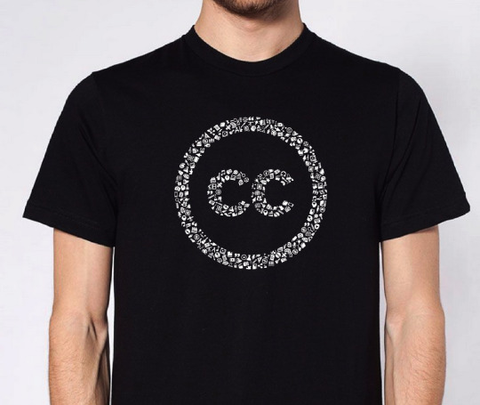
We’ve been long-time supporters and proponents of Creative Commons here at Noun Project. Creative Commons is internationally recognized as the standard in open content licensing. Ever since we opened our platform to submissions from creatives around the world, we’ve been huge fans of...
7 notes
·
View notes
Photo
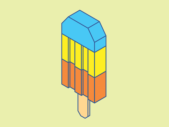
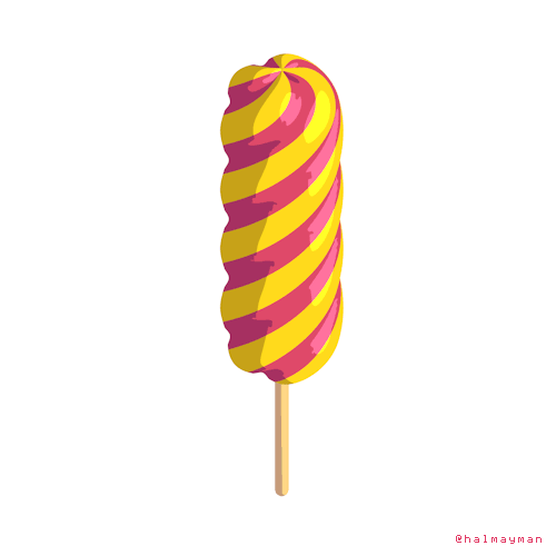
http://society6.com/halmayman
#popsicle#ice cream#cold#hot#Summer#c4d#isometric#3d#art#artists on tumblr#design#Illustration#yellow#orange#blue
4 notes
·
View notes
Photo
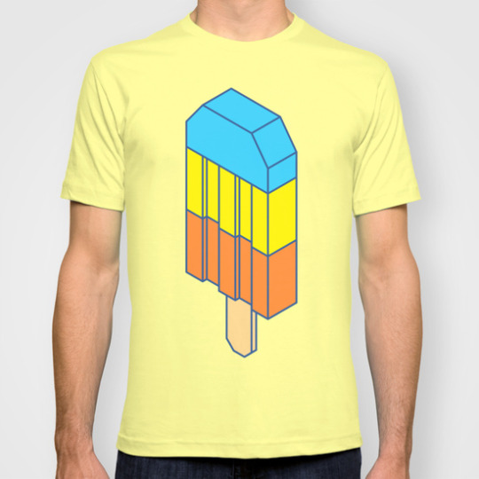
Prints, t-shirts and more are now available: http://society6.com/product/popsicle-3ta_t-shirt#11=49&4=101
0 notes
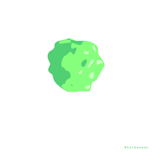
Photo
17 notes
·
View notes
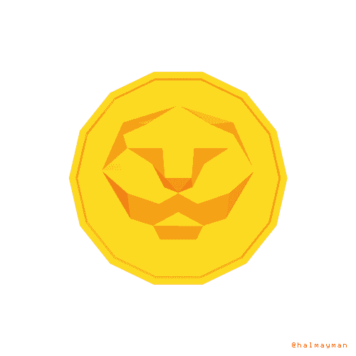
Photo
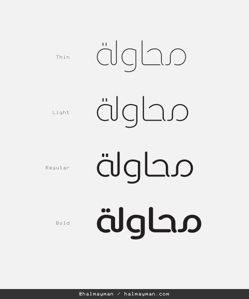
Working on a custom logotype
6 notes
·
View notes
Photo
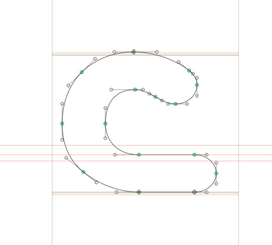
Seen as in seen by your eyes despite the gaps and hidden intersections in the letters. Seen (س) is also the 12th letter in the Arabic alphabets. Seen is the name for the typeface I’m working on.
I enjoyed working on the letter (haa’). I have gone back and forth with tweaking to achieve what you see here. I think it still needs some more refinements once I have more letters to compare with. The goal is to achieve harmony and a balanced overall colour. You can also see some of the specs (or rules) of the typeface that I set for myself to follow in all letters.
6 notes
·
View notes
Photo
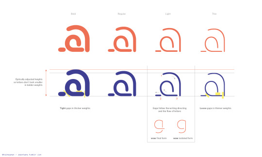
Testing weights for my new Arabic Stencil typeface. I completely redrew the letters to achieve what you see here. I have made the bolder weights with higher x-height to optically adjust the size. Otherwise the letter “حـ” for example will look smaller in Bold than Thin and Light. I’m thinking about these 4 weights with little adjustment along the way.
3 notes
·
View notes
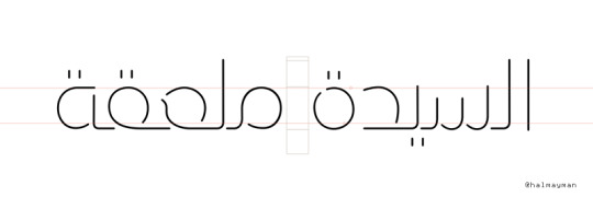
Photo

The typeface is coming along nicely. Still early work in progress. For example the gaps need a lot of work. Once I have enough letters I will start the adjustments (true and optical). This is a display typeface, so I'm trying to balance between legibility and style. I'm planning a few weights, it'll become clear once I have finished the basic forms of all letters.
Check the progress here:
https://www.behance.net/wip/796845
3 notes
·
View notes
Photo
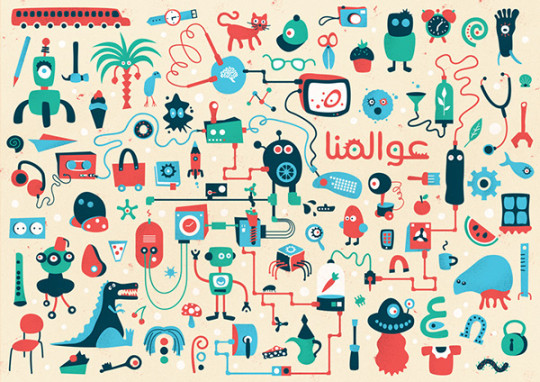
A sneak peak into the letter ع in Bold. I got a lot done today.. setting up my work flow, grid and weights. working on a strict grid system can be very rewarding. so far so good.
https://www.behance.net/wip/796845/1461923
2 notes
·
View notes
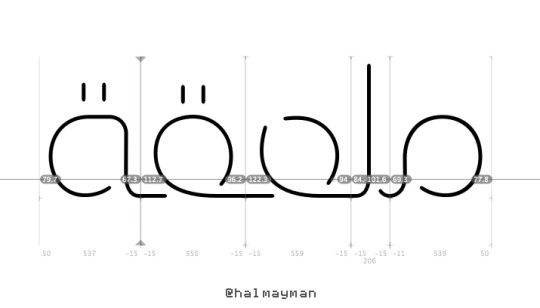
Photo
Still super early in the process.. I made a few changes to the letters to increase legibility. I wanted to make sure that the letters ( ـعـ ) and ( ـقـ ) are clearly different. I added a few letters and tweaked some corners.
"Stencil Arabic (working title)", a work-in-progress: https://www.behance.net/wip/796845/1452107
3 notes
·
View notes
Photo
work in progress..
4 notes
·
View notes
Photo
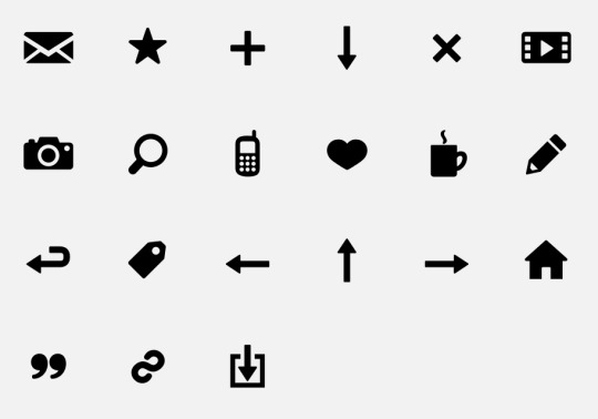
Free Blog icons ➔
Need an icon for your web/blog/tumblr project? Check out my *free* icon collection on the Noun Project
2 notes
·
View notes
Link
Check out Objects of the Emirates project on my portfolio.
0 notes
Photo
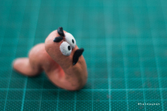
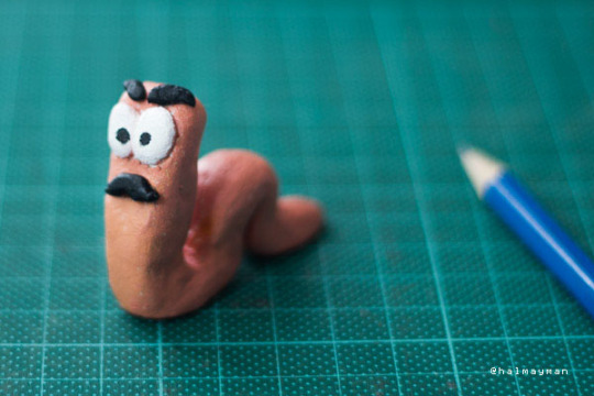
I made my own Worms figurine. I'm calling this guy Worm Swanson!
7 notes
·
View notes
Photo
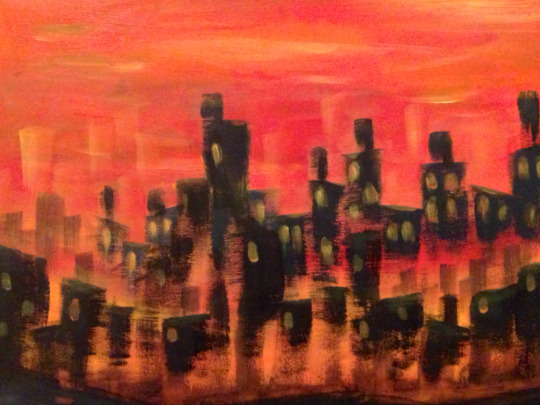
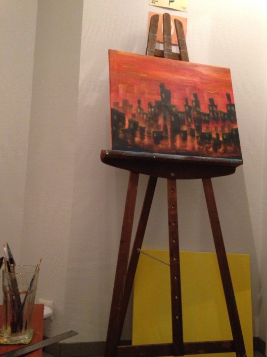
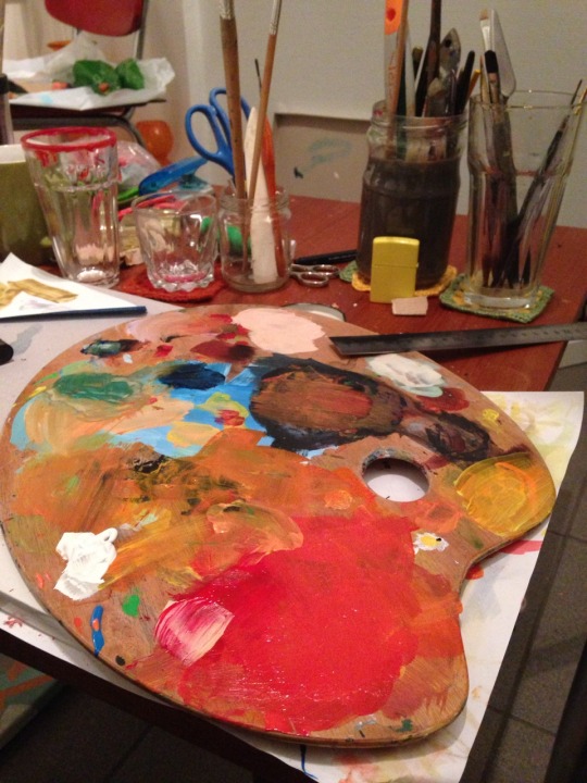
Saturday painting :)
14 notes
·
View notes