
hbreference
Reference
Architecture that is actually pretty good, we think.
201 posts
Don't wanna be here? Send us removal request.
Last Seen Blogs

ladycatashtrophe
Lady Catashtrophe

earthlydice
earthly dice 🌿

eytea
prev. ec-lips-e

schattenhonig
whatever lives in my head rent-free

keyblack
It's 106 miles to Chicago...
Text

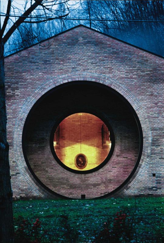

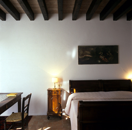

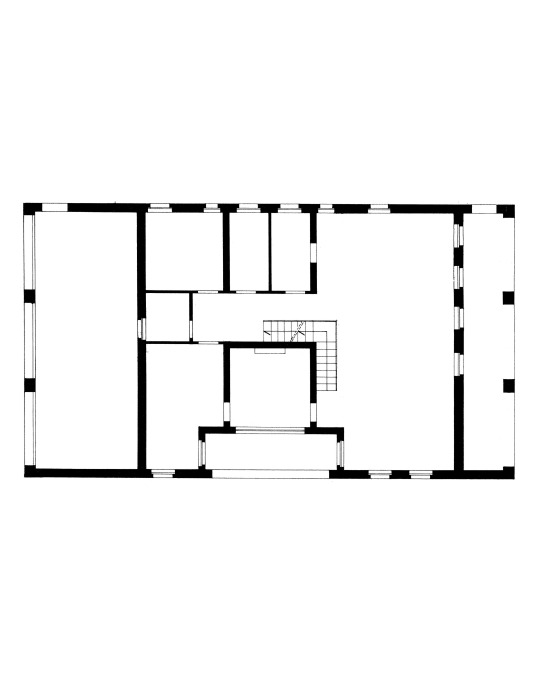
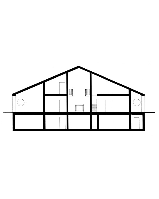
Casa Zermani, Zermani e Associati, 1997, Varano Italy.
Primary forms. Feels like the Italian version of Ungers, i.e less German and less fussy. More about the touch than the numbers.
It's a house but it feels like a monastery. Looks great to read in. Live a simple life there. Pretty sure the left side of the plan is a garage that is totally hidden inside the geometry, absolutely based. No outdoor cars to disrupt the surroundings.
Not trad and not modern. A third possibility. Every part (lintels, doors, frames) looks totally bulletproof. Enter through the side, circular window views a square room, love it.
Hey, we're back baby.
1 note
·
View note
Photo


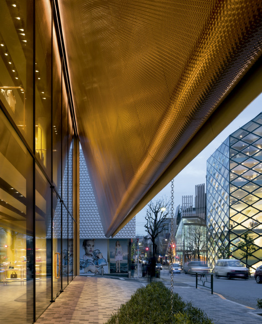

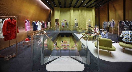


Miu Miu Aoyama Store, Herzog & De Meuron, Tokyo Japan, 2015.
Turns out HdM has designed half of this street. Crazy to walk down, every building is a brand trying to make its image as iconic as possible. Prada flagship is right next door. HdM actually recognizes this themselves when they say:
“Contrary to expectations for a site that is home to so many luxury brands, Miyuki Street in Aoyama Tokyo is not particularly beautiful or elegant. The architecture is heterogeneous – a hodgepodge of freestanding buildings of different heights and shapes, with neither historical tradition nor common standards."
Didn't know who it was by when I visited, but it's certainly the most striking on the street. The presence of the wall angled above glass and the perfect proportion between the two is very well-done. Set back a little bit farther than most of the other buildings so people naturally gather in front. Build quality is unreal of course.
Inside leaves something to be desired but the bones are there. I am sure the brand will leave at some point and it will be changed. Position of the changerooms on short sides and stairwell in the middle works well.
Can't believe I came all the way to Japan just to be swissposting again.
10 notes
·
View notes
Photo


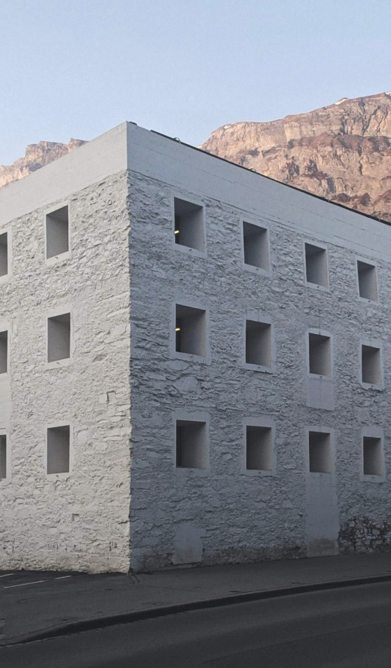


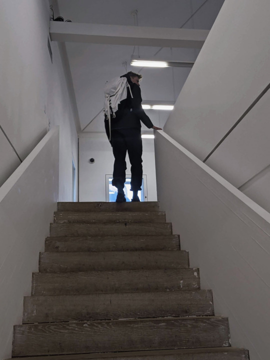


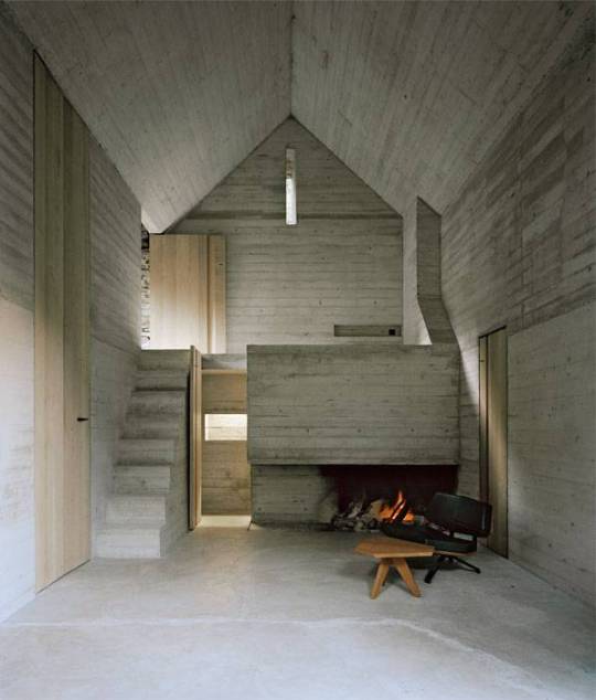
Yellow House, Valerio Olgiati, 1999, Flims Switzerland.
This is a big one for the smalt boys – post 200 on the site. Foundational reference here, and one we have seen in person.
The last ski trip of the season, around number 10, and it was a slushy March afternoon in Laax. Hell of a day. Culminated in one of us breaking a pin binding clean off the ski, and the other being deemed the God of Snow. After a sweaty and revelrous gondola ride down the mountain, we had some time to kill before the bus brought us to Chur and the train took us back home to Basel. These ski days often involved 6hrs of transit time and 8hrs ski time but we were committed to shred. We came, we shred, and now it was time to take snacks from the shop and wander around Olgiati’s playpen of Flims.
We dropped our gear on the side of the road next to a restaurant where the Swiss were enjoying their apres-ski (unlocked – high trust in these places) and began to hunt for the goods. We were rewarded instantly. 100 meters down the road, in the center of the town (which is more of a layby on an alpine highway) sits this absolute unit of a building.
It stands in stark contrast to everything around it, yet somehow feels like it has been on this mountain since the rock was thrust upwards during the collision of the African and European tectonic plates, 20 million years ago. Those 15 black voids on the streetside façade silently judge everything that passes. It is solid and ominous and completely unique, yet for some reason there is a warmth and genuine soul to the thing. We showed up and realized that Olgiati’s grumpy exterior conceals a deep understanding and (maybe even) care for the people who live here and visit this place.
The building is a cultural center, converted from a home for the town Parish. Valerio’s father Rudolf, an architect himself, offered to donate his collection to the Parish foundation on the condition that it be renovated instead of demolished. Work began after his death and was completed in 2000. The interior is gutted, with a new wood finish over the whole space. The roof was replaced with a new structural shape and slate shingles. Some openings were left, others covered up, and all refinished with cast concrete frames. The entire exterior is painted and finished in a very fine lime wash, blending all the old textured pieces into one whole.
We had 10 minutes until closing so decided to speed-run the interior. We spent most of the time touching the window frames, admiring the weep holes, and whispering, “holy fuck”. There was a temporary exhibition on and the kid at the desk spoke perfect English. He told us he didn’t know anything about the building when we asked.
The inside is rock solid and completely cozy. You could run a boxing match on the top level and sleep on the wood floor on the ground level at the same time. The plan is dead simple and the same on all levels, but at the top you get the special angled column and pitched roof. The structure and enclosure are so locked down and well-executed they can be forgotten, and the architect can start to consider higher aims.
It’s hard to say exactly why this all works together. It weaves together mountain town culture, physical landscape, heritage buildings, religion, material mass, phenomenology, and one man’s brazen disregard for all that bullshit. I still don’t quite believe Olgiati’s non-referential thesis, but the fact that he genuinely tries it every time means that his buildings are the only stable and true reference points I have for pure architectural thought. He’s insane, but he’s useful and maybe a genius.
After we were ushered out of the building, we visited a few other bangers, hopped on the postbus, tried to eat a poke bowl using a popsicle stick and a rolled-up m&ms wrapper, and received a horrified look from a well-intentioned bus seat neighbor.
Happy 200, we still don’t know what good architecture is.
8 notes
·
View notes
Photo


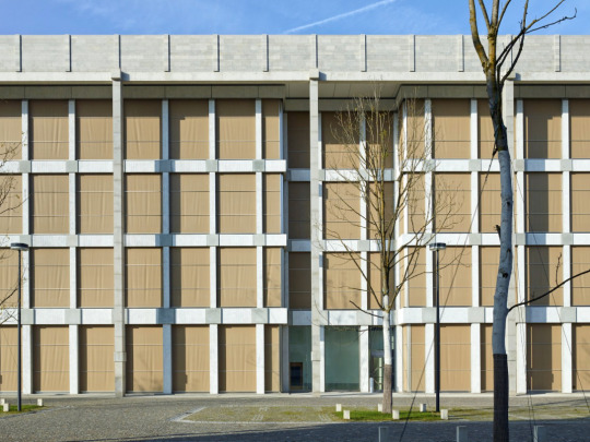


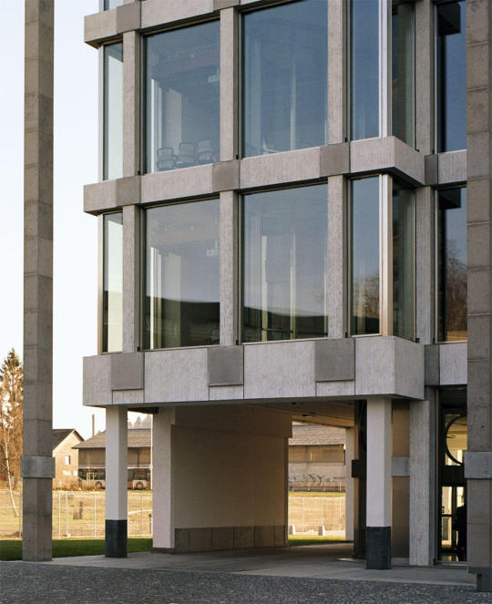
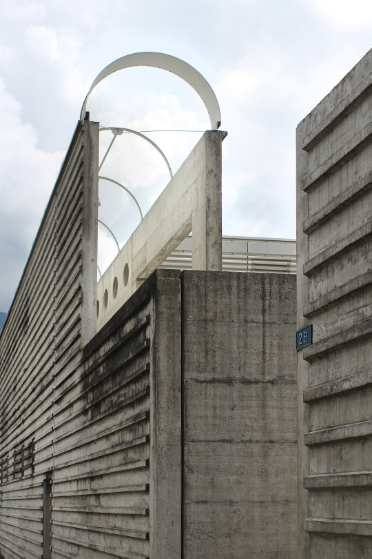
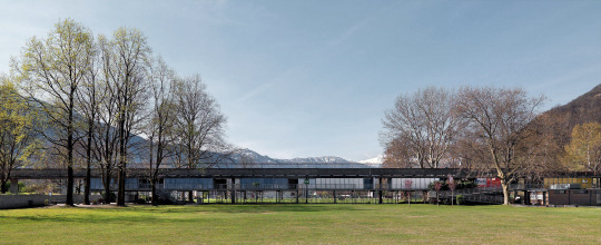
Synthes Headquarters, Peter Märkli, 2012, Solothurn Switzerland.
Deep office building on former military grounds. Aare river to the north, and a wide road / rail corridor to the south. Quite an imposing urbanistic and natural context, and the building matches the severe surrounding.
170m x 32m x 22m tall, this building is a unit. The rigour of the structural system on the outside, matched with small details on the outside and warmth on the inside makes a nice whole. At first glance it seems too huge on the river-front, but when you see the width of the river at this point it suddenly feels all right. The parking lot in front of the building is beautiful cobblestone and pretty nice planting.
A handsome office interior without feeling gaudy or childish - something rarely seen these days.
0 notes
Photo


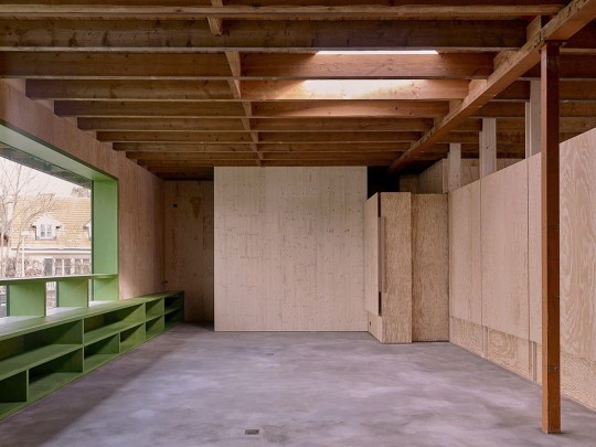
Art Room, Office KGDVS, 2018.
One of my favourite KGDVS projects - a good example of how a strong conceptual framework can be super clear in a very straightforward small project.
Very nice how the very typical maisonette interior spiral stair is used purely for entrance.
Project reminds me a bit of carmody groarke's connected pavilions in the way the building deals with the grade change. Simple but obvious upstairs door leads you to very private seeming garden below.
Details with curves and window running along roofline are quite nice. Makes it seem a little more playful.
Having Bas Princen take your photos seems a bit like cheating.
4 notes
·
View notes
Photo


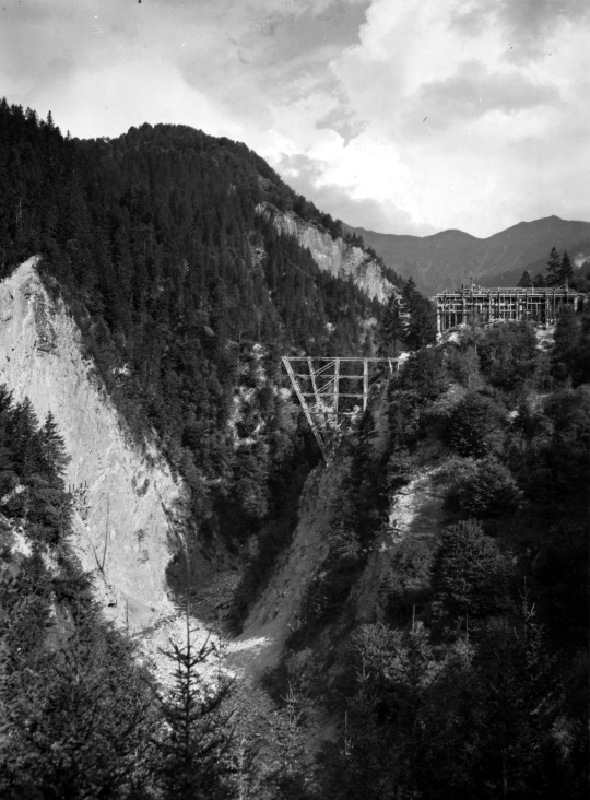

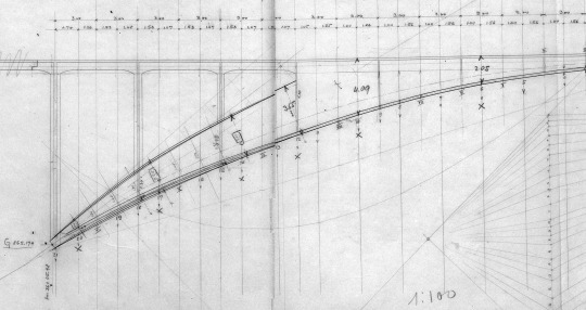

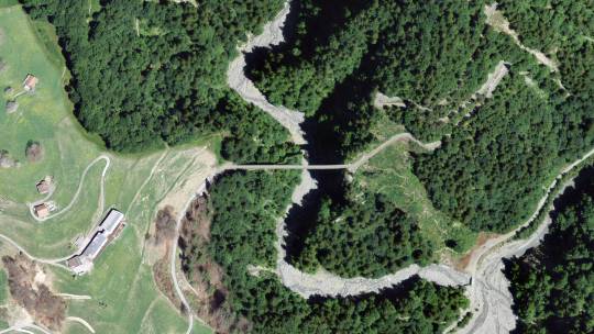

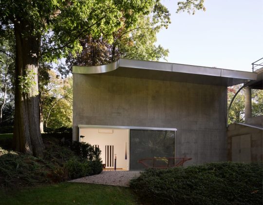
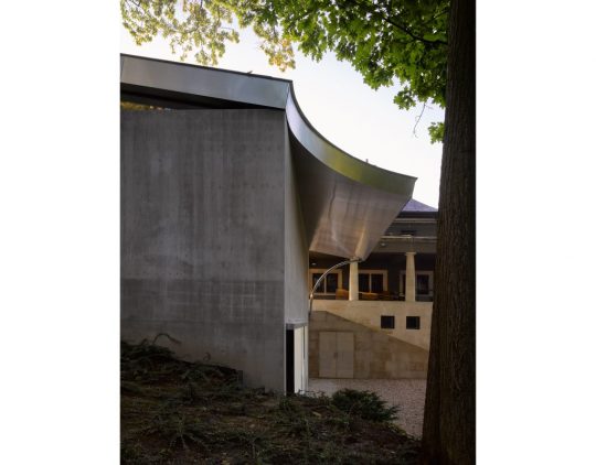
Salginatobelbrücke, Robert Maillart, 1930, Schiers Switzerland.
This springing greyhound of concrete connects the hamlet of Schuders (100 people) with the rest of the alpine road that leads to Schiers (2600 people). Literally it is the middle of nowhere yet it was considered important enough for excellence. Also, it was designed and built within 2 years.
133m x 3.5m, with 90m total height. Yes, that is wide enough for cars. Robert Maillart was a creative genius and understood the capacities of concrete early in the material's development. This bridge is a 3-hinge arch (the main shape of the bridge) with a concrete box girder (the part you walk on), vertical tension members, and concrete piers to connect it to the edges of the ravine.
It was extensively repaired from 1975-1991, improving the waterproofing and drainage, and replacing most of the elements with shotcrete.
Elegance and grace.
0 notes
Photo

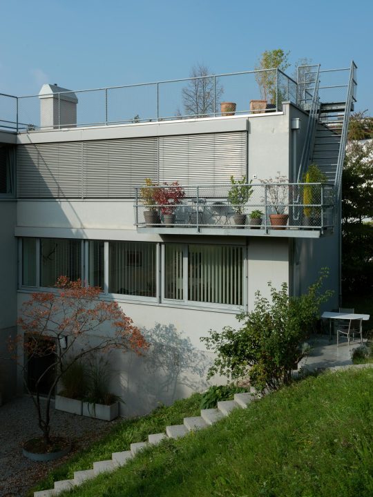


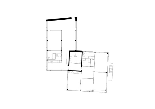

House at the Railway, Christ & Gantenbein, 2001, Zollikon Switzerland.
Photography by Stefano Graziani and Roman Keller.
Sets a foundation for the rest of CG's work. Their interest in the elements of urbanism that are pesky to architects, in this case the railway right beside the site, and addressing them head-on, is very successful. It's honest as architects working in the 21st century. Poor-quality urban areas exist and you only make them worse by ignoring them instead of elevating them.
They are interested in typology and tweaking type by way of geometry. Here as they offset a typical block-shape apartment, they create two communal outdoor spaces, and interestingly - a way to see your neighbors from in your unit. The facade and proportions resemble an industrial building scaled way down. Some synthesis of these things which can never be predicted, only vibe-checked, seems to work here.
I think you need to see some of CG's work in person to understand just how solid it is. The materials are bulletproof and that is important - it improves the feeling of being there and reduces costs, hassle, and maintenance for residents and operators.
Swiss projects in general can often feel austere and cold at first glance - but when you feel the weight and warmth of materials, see one building be converted into four flats, and when you look at the plant-life all over that second image, you must realize that there is a deep care for humanity woven through the work.
While not their very first project, this one is so interesting because the work is sandwiched between the early trip to Italy, and is essential to the founding myth of the office. Even if it isn't true it might as well be; it's a great story.
Basically, Christoph has a cool uncle.
6 notes
·
View notes
Text


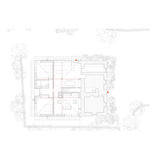

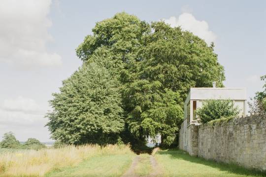
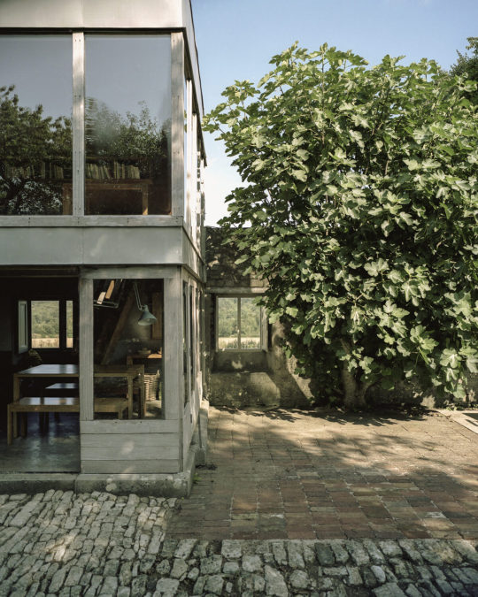
Ballyblake House, Steve Larkin Architects (@stevelarkinarchitects), 2021, Ireland.
200 year old farmhouse, uninhabited for 30 years, now with oculus extension. Incredible sensitivity to existing without being afraid of it.
Lots of landscaping done to replant trees and recover the hedgerow. Always an underrated aspect of the project but necessary to make it fit.
New Irish are developing their own language. A bit foo-foo-ey, a bit material phenomenalogical, a bit post-modern fun with big shapes, splash of social and cultural awareness, I dig it.
3 notes
·
View notes
Photo
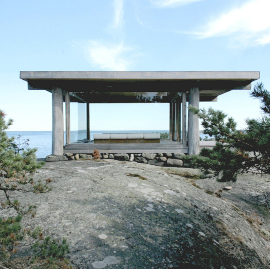
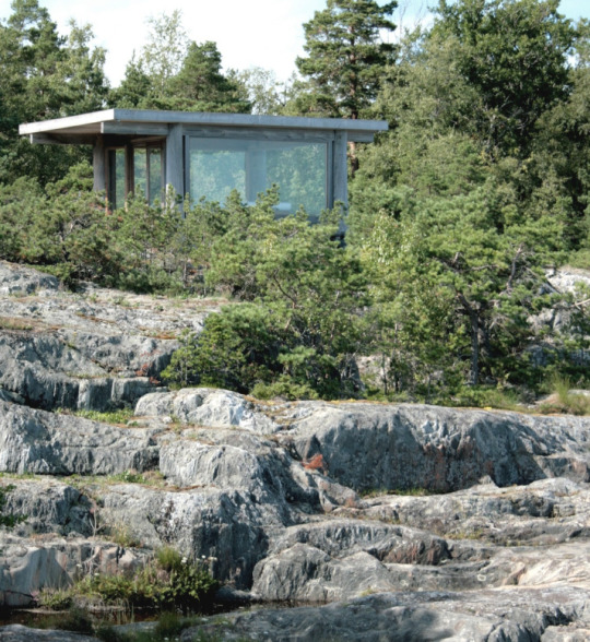

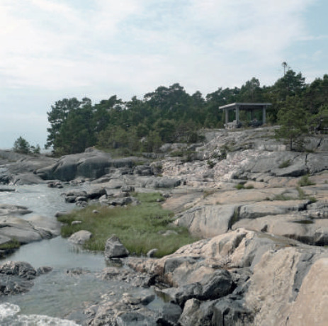
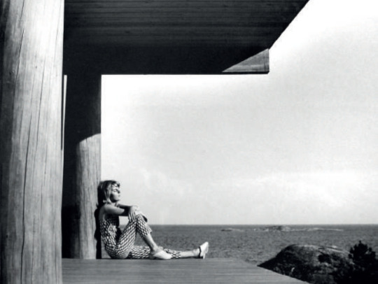


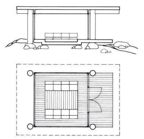
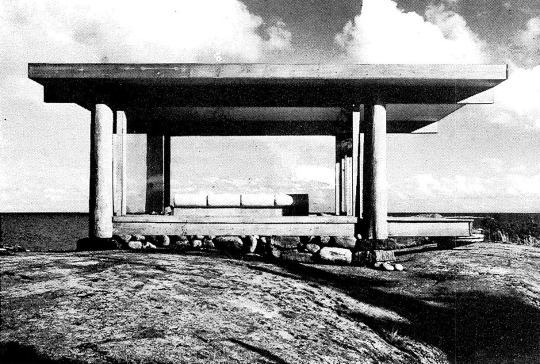
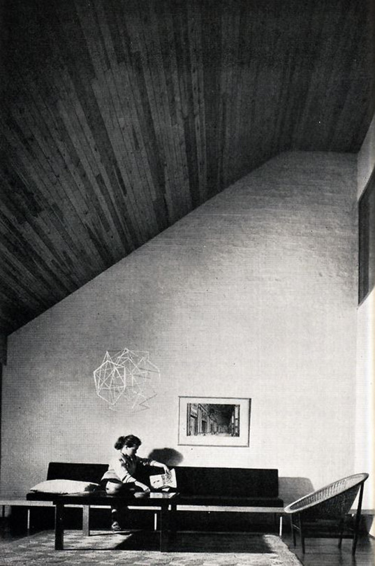
Lingonsö Summer Pavilion, Heikki and Kaija Sirén, 1969, Finland.
Photos 1-4 by Logan Amont.
Must be difficult to get to because there are no photos of this thing.
Part of a summer house complex that deserves its own post. The daughter of Heikki and Kaija was married on this island, with the pavilion acting as a chapel - and the name stuck.
The glassiest box around. The architecture conditions the outside temperature and wind. It means you can have a nice pillow and a backrest out on a barren rock in the Baltic Sea, and that's pretty cool. Doesn't need to be much more than that. Human intervention in landscape for our comfort and delight.
But then it becomes so much more. The columns signify both tree trunks and the Greek doric order. The glass corners are set in from the structure proving its modernity. Offset roof structure for the symmetrical entry, it is approached like a temple. It inverts the greek temple's "gaze towards a dip in the horizon" where instead we gaze at the horizon through the structure.
It is for the purist and the tourist.
2 notes
·
View notes
Photo
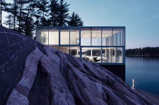


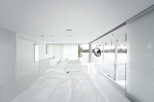


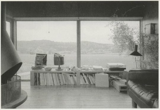
Boathouse Studio, gh3*, 2010, Ontario Canada.
Photography by Larry Williams.
In my glass box era. An exercise in rigour and commitment to a concept. Dematerialize the interior completely and leave nothing to distract from the view out.
Understanding that buildings react to landscape, are framed by and influenced by landscape, but are resolutely not landscape themselves.
The house faces north so is washed in diffuse light all day. The client is a photographer and uses the house as a studio as well, achieving results not possible in most indoor environments.
The dark granite plinth has a lot of thermal mass, so the home does not need active systems even in winter. To be honest that is surprising given how most of the granite is only visible to the north. The building has radiant floor slabs and uses deep-water exchange to heat and cool (amazing tech).
Huge sliders on the facade, along with automated curtains and wall panels around the mezzanine floor + studio lighting tracks make this thing feel like it is always in motion. It is completely still and stark from the outside but active within. Love that the mezzanine is pulled back from the facade on all sides, suspending it in space. I can't imagine what it would be like to live in a home like this - otherworldly.
1 note
·
View note
Photo


Upper Lawn Pavilion, Alison and Peter Smithson / Sergison Bates Architects, 1962 / 2002, Tisbury United Kingdom.
Photography by @ioanamarinescu_photo and @lorenzozandri
House with wall or wall with house. Kept existing structure from old cottage and built on top of it. Tiny with wonderful character. Apparently the family would pull out mattresses to sleep on the ground floor.
The English know how to contain and curate the wild. A nice casually defined garden. Entering through the wall into this oasis must be magic. Then being on the top floor and peeking back out into the "unknown".
Wonderfully restored by Sergison Bates, adding higher-performing windows and in-floor heating, garden modifications, and a million other small tweaks I'm sure.
A little slice of good. The current owner articulates it well: “For such a small house there is so much written about it, but unless you actually live there you can’t fully understand or appreciate it. To experience Upper Lawn is to understand it; to sleep here, wake up here, see the changing weather coming over Fonthill Woods and Salisbury Plain, see the constantly changing light, see and hear the wildlife. To experience the different atmospheres in the pavilion and patio, the concrete floor and cement rendered walls of the ground floor, its connection to the garden, and the cosy, more intimate, Douglas Fir-lined rooms above."
5 notes
·
View notes
Photo


Cherry Storehouse Nuglar, Buchner Bründler + Lilit Bollinger, 2018, Solothurn Switzerland.
Photography by Rory Gardiner
Conversion of a 1968 storehouse for liquor into a home and studio. I didn't realize this was a renovation at first, and it makes the project much more rich.
Concrete and wood ceiling was found in the old building, so they were used for the renovation. All the wooden elements were made with a carpenter on-site. Steel window at the rear (which faces a valley) fitted outside the concrete structure.
Idk what to say. It is casual, cool, functional, you can beat the hell out of it, yet also feels special. The quality of the concrete, especially in the living area and the fireplace, makes it feel bespoke and cared-for. It even fits to scale with the extremely low-rise residential surroundings.
Painting the front door with a black circle is hilarious.
0 notes
Photo

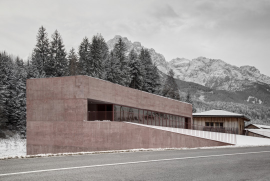
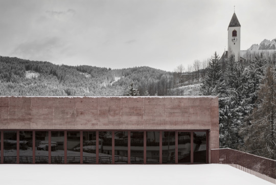
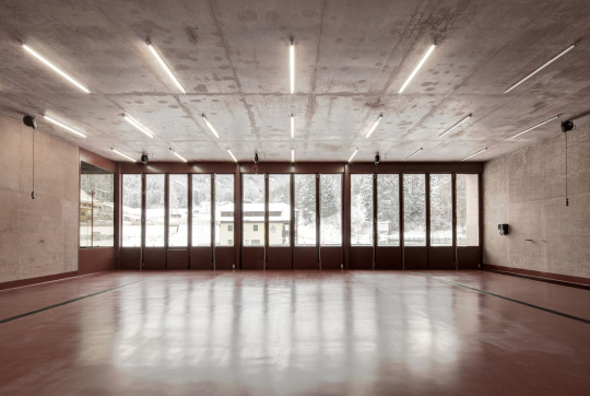
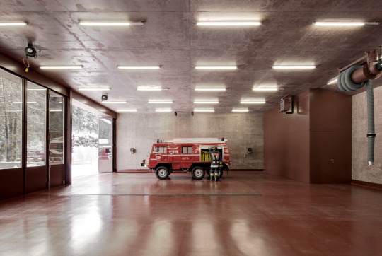


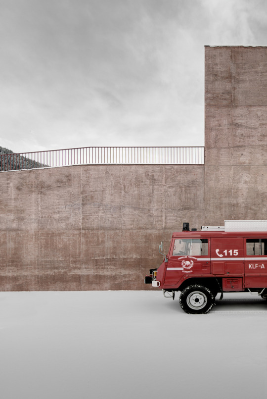
Rose of Vierschach, Pedevilla Architects, 2016, Tyrol Italy.
Photography by Gustav Willeit.
Incredibly precise project. Literally thought these were renderings for a full day. I wonder if the signage, accessibility, and material restrictions around fire stations are more lax in the alps, or if these photos were taken before completion.
Regardless this thing is gobsmacking. The red-toned concrete indicates fire station without being gaudy. Plan is simple and rational, great negotiation of the sloped site with two access roads.
A lesson in architectural photography too. Gustav makes this shit look tight.
1 note
·
View note
Photo
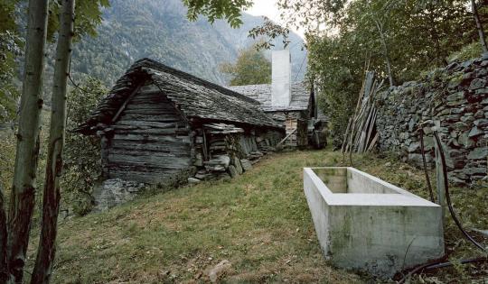


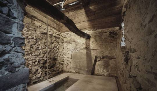


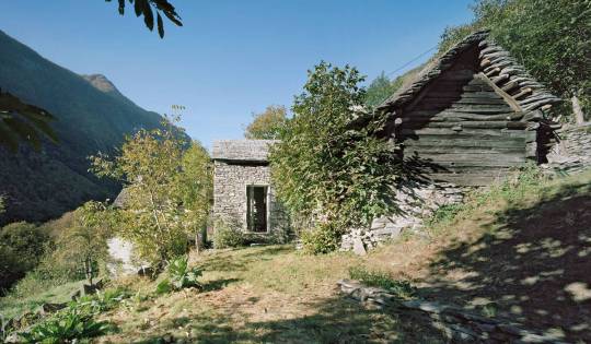
Casa D'Estate, Buchner Bründler Architekten, 2010, Linescio Switzerland.
Photography by Ruedi Walti and BB.
Encasing the inside of a 200 year-old stone barn in concrete. Converted into a summer home with no need for heating or window coverings, and I imagine the cold requirements are easier to deal with. Sleeping niche is above the concrete fireplace, which stores heat throughout the night, warming the space above.
Facade is left in it's original state - the barn had been abandoned for 50 years so it is very rough. Just as you might have structural reveals, this building has architectural reveals - curated spots where the new design is indicated on the exterior. The concrete chimney, glass garden doors, and new water trough are the only spots.
It is inexpensive overall (the price per square meter will be high but it is so tiny that the total cost would be low) and completely reinvigorates something otherwise lost to the world.
1 note
·
View note
Photo
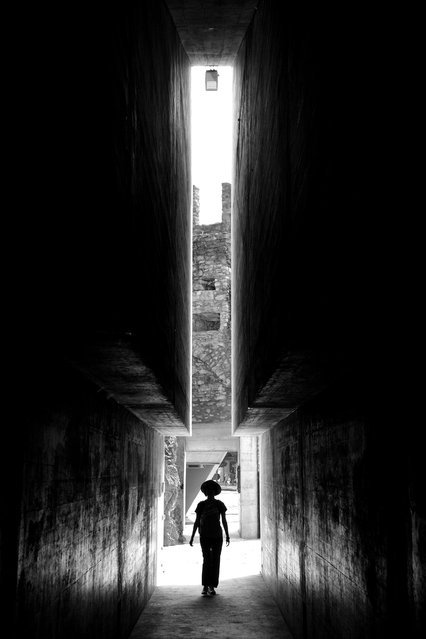
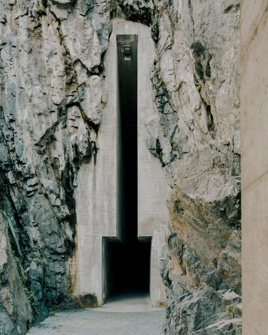

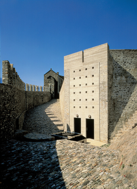

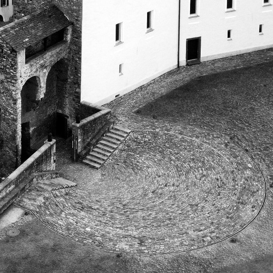

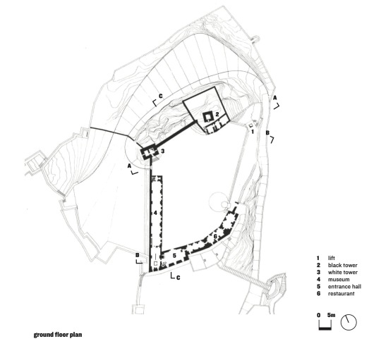

Castelgrande, Augustus / Diocletian / Constantine / Frankish Kingdom / Aurelio Galfetti, 100BC, 300AD, 774, 1991, Bellinzona Switzerland.
Originally a fort on the rocky outcrop in the center of what was then a small trading village for the Roman empire. Bellinzona sits at the mouth of the alps and a key intersection of trading routes, so it has historically been a strategic asset. As such, it has a ton of history. The restoration by Galfetti, born in the city, took over 20 years. It was a direct commission. A donor (another architect, Mario Della Valle) gave a large sum to the city with two stipulations - a restoration be done to give new life to the castle, and that it would be approved by the end of the year. More of this patronage with radical stipulations would be amazing.
You really can't tell what is new and what is old in this project. It just is what it is. Historic preservation isn't put on a pedestal, nor is any other part of history. Every moment in time is taken at face value, including the present.
Almost nothing is constructed, instead, he digs into the rock below the castle. He creates new access and connections between the castle (now partly a museum) and the city center below. The door that brings you into the castle is monumental in a Roman sort of way - it is bold, new, and structural, with no ornament. The innovation is the opulence.
Visiting in November during the pandemic there were still tourists and locals milling around the grounds and the plaza below. Seemed massively successful in being a public amenity, not falling into the tourism trap. Galfetti was one of the greats, rest in peace king.
Maintain = Transform.
9 notes
·
View notes
Photo
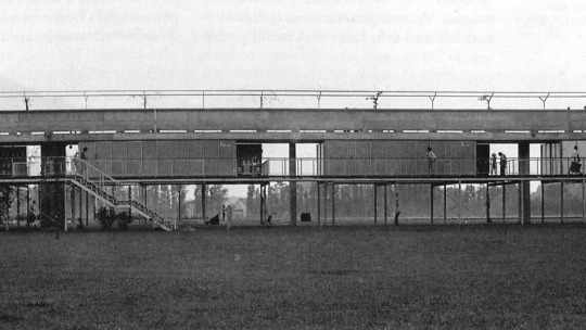


Il Bagno di Bellinzona, Aurelio Galfetti, 1970, Switzerland.
A raised path above the Ticino floodplain, with suspended changerooms beneath. Pools sit at grade (doesn't matter if pools flood right)? This boy is all articulation of forms. Everything is laid bare, and he makes sure that the truth looks hot.
Bring back massive public pools. Unfortunately, this is now positioned in a difficult spot in the city, with some really busy streets severing it from the center, so its use has declined. To be honest it has aged pretty well for public works concrete. Maintenance seems to be managed well.
2 notes
·
View notes
Photo

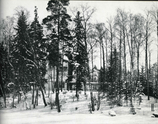


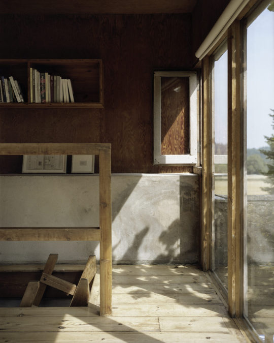
Own House and Studio, Heikki and Kaija Sirén, 1950-60, Helsinki Finland.
Axo Drawing by Anna Badia.
On an island west of Helsinki, rural surroundings but with neighbors nearby. Built and expanded over 15 years, and seems to have been recently refurbished. Added to as the family and office grew. The office sits lower than the house, looking outwards and leaving the courtyard private for the house. Keeps organization, material, and structure simple then has fun with some geometry.
The Scandinavians seem to have a power to weave building with the landscape that is more refined than anywhere else. They don't try to "make the building landscape" or other dumbass ontologies - but they understand what it means to live in a house in the forest by the sea.
Wish I could find the excellent street wall of this building, go find it on @atelieramont profile.
1 note
·
View note