
Statistics
We looked inside some of the posts by iddp-lea-blog and here's what we found interesting.
Average Info
Notes Per Post
25
Likes Per Post
19
Reblog Per Post
5
Reply Per Post
1
Time Between Posts
2 days
Number of Posts By Type
Photo
16
Video
1
Last Seen Tumblr Blogs


Fun Fact
Kazakhstan’s Minister of Communications and Informatics has blocked the Tumblr site because it contained 60 sites of terrorism, extremism, and pornography in 2015.
Photo


design thinking / ideation process
The double-diamond approach is an interesting method we learned in at ZHdK. Basically it suggests that the design process should have four phases:
Discover Define Develop Deliver
A progression between divergent and convergent thinking can assure that the idea / the concept / the solution is the essence of a good design thinking process. Well thought-through, qualitative and relevant concepts should be the outcome when working with this approach. It can be tiring after a while to open and close a topic again and again. Nevertheless, it is worth trying and adapting an own version of this design thinking approach.
2 notes
·
View notes
Video
tumblr
over and over
Process is key. It really helps to just take a tracing paper and try out different options of a floorplan. Not thinking too much about precise measuring. It is about generating variations in a rather quick way to see if something could work or not. It is freeing and helps to not stay in our heads. A way to increase the flow and diversity within the process.
1 note
·
View note
Photo


new living district
We had the chance to visit several clustered apartments in the newly planned living area called Rietpark which will be built right next to Schlieren train station. It is a unique place with an eventful history and a great future. Where once glue was produced in the Geistlich Areal there will rise a new, dynamic area. A diverse urban district with an area of 125′000 m² and a 600-meter long park as the green heart.
1 note
·
View note
Photo


patchwork cluster
This 5.5 bedroom apartment is placed in one of the newly planned residential towers for Rietpark areal in Schlieren, close to Zurich. The concept is called DU & ICH, so togetherness in various ways and new living concepts are put into focus. We could visit the construction site to get an impression.
This was our briefing for the third studio project: It should be a new family constellation, minimum of 5 people. Create a home that meets today’ s needs, which involves dealing with family heirlooms, patchwork situation, and the given architectural style.
Scenario Carina, Sharon and I created a Scenario where an elderly couple from Sweden (Ingrid, Bjorn) would live together with their daughter (Malin) as well as her partner (Robert) and his son (Jonas). A real patchwork family and three generations. One room is used as Ingrid’s massage studio where she would have a few customers a day, mostly when everybody else is out of the house.
Kitchen and bath in every room? What is really special about their concept is that each room has its own bathroom and kitchen section. We had to keep three of those kitchen units in there so we took it out in the rooms of the two couples as it didn’t make much sense that they would need their own kitchen a lot next to the shared one. However, in the massage studio, it could be useful to heat up oils, make tea for customers. Also for the teenager, it is cool to have some kitchen supplies to meet his need to become more independent.
Key theme The key theme, what connects the patchwork family in the shared space, is music. They are all into music, though quite different directions. Together they possess a big collection of records. The main enjoyment is listening to music together while relaxing and chatting in the living area or during a dinner that hobby-cook Robert made.
Interior Style (in shared space) The furniture is a playful mix of precious older pieces and modern elements. They are not shy to choose different colorful things to celebrate the patchwork style also in this mix-match. The floor is a pattern of two matt tiles (sand, taupe), the ceiling stays concrete. Besides that, the family likes to be surrounded by solid wood in different shades which you can find mainly in larger furniture such as the tables and and storage elements.
Presentation technique Because the main theme was music we decided to make an analog presentation and use put the records in focus. We chose a song for each person and started playing it when we introduced their character. The mood board of each room was printed on the cover. Inside we put further sheets in the same format. We took them out to show the portraits, material- and furniture collage as well as the layout of their room. A fun and persuasive idea which was very well perceived.
1 note
·
View note
Photo


It’s a match - find the piece of furniture that fits you best
...
1 note
·
View note
Photo


Restaurant Volkshaus
Studio Project 2 of this block at ZHdK. The task was to rethink and renew the interior at the prestigious well-known Volkshaus in the heart of Zurich.
Jonty, Julia and I formed a team and started with analyzing the space. How do we perceive the interior now? SECRETIVE, TRADITIONAL, A BIT OUTDATED or DULL
What would we like the character of the renovated Volkshaus to be? We wanted to keep it STRUCTURED and SECRETIVE, but without being repetitive. Furthermore, we aimed to focus our choices to be SWISS and AUTHENTIC, create a COHERENT concept throughout the whole place and make it more CONTEMPORARY, especially with an improvement of the lighting.
We wanted to keep the little different niches which we found really interesting. However, we developed this idea and loosened up the straight aisle to create more versatile half-hidden spaces (like a maze) who differ in size, sitting options, etc.
We designed new space dividers. The formal language is geometrically more clear, contemporary with a postmodern touch. We chose a dark green sound absorbent textile (Création Baumann) as a cover around a wooden structure which would be custom-made by a carpenter. We played around with different heights to create an interesting, playful yet balanced arrangement of room dividers of different heights. This is an intriguing way to play with leveling and the depth of the space.
The whole floor would have a nice green stone (verde spluga) from the Alpes. We wanted to choose materials and textiles which are produced in Switzerland. A leading way through the restaurant will be made in a traditional fishbone pattern in oak, interlacing with the stone. This is to quote a historic feature, laying it in an unusual way and - in the end - working as footfall insulation.
The neon lighting now is a nice approach, yet still too shy, not connecting with the rest of the restaurant. We want to remove all the little kitschy lighting next to the tables and exaggerate the neon idea. The tubes will come down the ceiling into the room and alongside the walls, reflecting the playful movement of the room dividers to unite the spatial concept and introduce a very contemporary, guiding element of our planned Volkshaus revival.
1 note
·
View note
Photo


structure & rhythm
inspiration
My inspirational picture shows paper lanterns rising up in the dark night sky, creating a virtuous transforming pattern in the sky. Our view shifts towards the sky, the pattern is repetitive because it is always the same lantern, yet they fly dynamic in an organic way, leaving us stunning.
ancient place
The ancient space I chose is no less fascinating. A medieval lecture hall, build between 1427 and 1483. This place is part of the divinity school of Oxford University and is used for lectures and discussions. The building was build in the medieval Perpendicular style ceiling consists of very elaborate lierne vaulting /stellar vaulting.
the dark, more simplistic bottom part, black benches build the fundament
strong vertical lines
clear architectural divisions
repetitive patterns which lead the eye to the organic, yet clearly structured stellar vaultings
big windows, lot of light sideways
transition
The lecture reminded me of another magnificent architecture, the Sagrada Familia in Barcelona. This again led to the picture of a more organic surrounding like an underwater scenery. Then again the form of the shells reminded me of the Acapulco chair which is light and airy, has an organic form in a stellar way. With this link, I discovered visualizations of Ozeanium in Basel and I found similarities to my medieval hall but in a modern way. So I took this architecture as a model and put it in another context.
concept visualization
My visualization shows an outer space of a hotel in Egypt which is built close to the sea. The walls and floor are completely made out of sandstone. Acapulco chairs in different colors are loosely placed on the covered outside area. They can be moved and used according to the guest's needs.
The shell of the Acapulco chair is also attached to the ceiling. During the day it looks like a shell living on a blue stone. During the night it transforms into a light installation. Its led strings can change color and brightness and light up during the night in a mesmerizing way, like glooming jellyfish in the sea or stars in the sky.
3 notes
·
View notes
Photo


Warp and Werft / the flying carpet
How can we transform a former carpet factory in Berlin into a hip, modern, inspiring restaurant without overpainting the history of its origins? This question was the starting point for Sharon and me when we started to think of a concept within this one-day workshop.
We started the creative thinking in an unusual, yet highly recommendable way We were brainstorming in sketches on a big Flipchart paper. It is a very effective and mind-opening way to find ideas and to loosen up in a fun way. Funnily enough, the thinking process is somehow illustrated which can be interesting to show in a presentation which we did.
It was clear that we want to bring the carpet back in the factory, yet in another way. But it had to become a central element. We were thinking of the use of a carpet, its origin, purpose, and structure. We had a strong association with the Arabian culture or countries like Marocco where people often eat much lower on the floor, on beautiful carpets. However, wanted to bring the carpet on more levels than just in a flat way on the floor and that’s how we came up with the idea of a carpet which looks like it is flying.
The flying carpet would be a custom-made giant upscaled structure of a carpet, floating between the columns through the factory hall. People can sit on the carpet and cushions, around small tables. The rhythm of the carpet will rise and lower, creating a bench or a step in between floor- and flying level.
On the central carpet element, they will serve tea, mezze and finger food whereas in the two other seating areas alongside the factory walls you could also order whole menus like tajine, etc. One area will have a wooden structure, like a pergola, creating a semiprivate feeling which should let the guests dream about a beautiful covered outdoor space on a warm summer evening in Marrakech.
I almost forgot to say: In the entrance, people would change their normal shoes to special slippers - as a ritual of the restaurant experience and that the flying carpet stays nice. Just like in real Riads, we thought of adding water as well to either wash the feet before or as a large water basin or fountain. Too bad we didn’t have more time to continue working on the concept.
3 notes
·
View notes
Photo


Kraftwerk - where electricity turns into creative power
Kraftwerk is a former power plant. In the big hall where electricity was produced are now over 20 containers stacked on each other.
Kraftwerk is an extraordinary collaboration and innovation space located directly at the river Sihl in Zurich Selnau. On 1200sqm, Kraftwerk offers various project-, workshop- and meeting rooms, a distinctive event hall for up to 180 people (seated), as well as a lively café & restaurant. Besides offering high-quality infrastructure Kraftwerk is also an access point to a broad network of innovators worldwide.
It fascinates me how important transparency (literally and figuratively) and open exchange is at this location. The mix of Vitra furniture and pieces from secondhand shops is well done. Red, decorative carpets offer the welcoming, cozy living-room feeling where the atmosphere automatically shifts to a more personal level.
I will definitely come back to this extraordinary place where traces of the past embrace the minds of the future.
0 notes
Photo

the richer the vocabulary, the better the designer
People who thrive to improve their language skills are also more and more able to diversify their designs. Text is a creation tool which is often underestimated. Therefore it is really worth it to invest in precise vocabulary. To express myself accurately and use the right vocabulary is helpful in many ways.
Language is and shows knowledge.
Language is communication.
Language is key to better creation
Some favorite new words:
hyperboloid
orthogonal (rechtwinklig)
flush (flächenbündig)
concentric (mittig)
rebound (Rücksprung)
lenticular (linsenförmig)
crown line (Scheitel)
frugal innovation (low-budget innvoation)
anthropometric (human-centered)
contrived patina (manmade patina)
whimsical (wunderlich /skurril)
ambiguous (mehrdeutig)
crimped (gekräuselt)
monolithic (aus einem Stück)
triclinic (dreifach geneigt)
volute (Spirale / Schnecke)
0 notes
Photo


chairs, chairs, chairs
How many places can you find in the old town of Zurich if you want to buy a nice classic or vintage piece of furniture? The answer is, quite a few. There are several little vintage furniture stores, sometimes linked to a restaurateurs atelier.
The task was to go to those stores and draw chairs, like 7-10 minutes per chair. I forced myself to not be shy to use colors. I tried different methods. I guess the drawing utensil should fit the character of the product you want to visualize.
My favorite sketches are the red wooden chair and the pinkish version of a wooden chair down in a cellar. They show form and proportion quite accurate. Still, I could lose a bit accuracy and go for a bit more emotion.
1 note
·
View note
Photo

Bird talk
Another session at the atelier. This time’s topic: light and shadow. For once we had the task to not draw with dark charcoal on white paper, but figure out the illuminated spaces around the still-life with white charcoal.
I think I have quite a good feeling when it comes to creating an intriguing composition. How I choose to frame my view is really crucial for an interesting result. I love how - with practice - I start losing the fear of the blank paper. I just start and the process will lead me somewhere. With good intention and trust in myself, those sessions are valuable and fun.
1 note
·
View note
Photo

HOW over WHAT
Words and knowledge matter. But what is even more important in connection with what you are saying is how you transfer the message in your own way. How is the tone of your voice, how is the dramaturgy of your presentation? And moreover, does your body language support the message or is it more disturbing your speech, does your body re s“upstage” you?
0 notes
Photo

4 ears model
The way I talk to someone isn’t always received as intended. In fact, there are those 4 main ways a message can be received. Communication is key. A good communicator is someone who delivers a message as clear as possible. So the receiver knows instantly which kind of information was sent. Avoid misunderstanding and conflict.
0 notes
Photo

One cannot deny this statement.
0 notes
Photo


The scenography of a religious room
“Create a space with a religious atmosphere/dramaturgy.” Sharon and I chose an interesting layout of a residential apartment and opened it up for a combination of unusual spaces where you could sense a spiritual, some may say religious feeling.
We thought of three different rooms which are open to everyone, or maybe members of that place. Which element do we need to bring in to connect with either ourselves, others or intangible spirits? We realized that nature and calmness play an important role, also the freedom to either interact with others and feel welcome and belonging or find your own space within a place. The long hallway would be a guiding element which connects all the rooms (also visually).
1. The sparkling Cave A darkened room. Sitting elements spread within the room in organic forms. Light reflecting on the water. Strips of little glowing lights illuminating and filling the space with a mysterious play like fireflies. The sound of water.
2. The Zen garden within a kitchen The wisdom of a tree, a peaceful oasis within the concrete walls, greens right in the kitchen, down-to-earth.
3. The curtain maze and circular meeting place Light, airy layers of sheer curtains flying in the biggest room, almost like a soft maze. Warm colors, from yellow to dark red, a reminder of a sunset. Somehow it seemed to be natural to think of a circular center in that room. Modular sitting/table elements, including everyone, not having any spatial direction. A place to talk, to interact.
Interesting how it seemed to be clear that in a religious space we would include the basic elements nature offers, a play with darkness and light, sound, air, enough empty space, organic or circular shapes, warm colors and materials.
0 notes
Photo
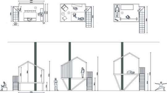
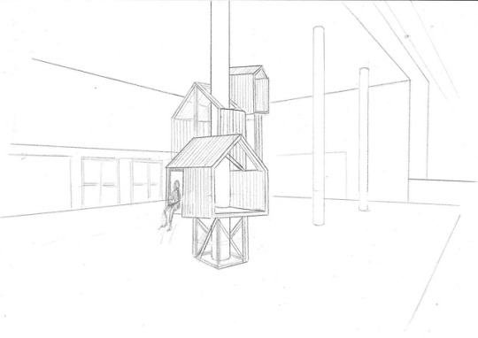
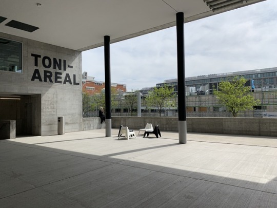
Life at school - the IKEA neighborhood at ZHdK
Small space living, togetherness, and social interaction. Our concept (Collaboration between Giada, Carina and me) incorporates topics which are highly relevant.
We felt that within the environment at Toni areal you find a lot of busy public space and a rather grey surrounding which might not be experienced as very inviting or comfortable. There is a lack of semi-public places or just a shelter where you can have a break from the noises and relax, make a phone call, take a break with only a few other people for example. The other thing is that there is not much exchange between the disciplines (design, art, dance, music, film, etc.)
That’s how we came up with the idea of the treehouses. We developed a model of around 8 square meters which could be placed on different heights, integrating the pillars which you find on different levels at ZHdK as well as the entrance shown above. On the layout, you can see how interesting it would be to figure out what fits in this limited space.
The concept is that each IDDP student would co-create a little house together with a student from the different ZHdK studying fields (dance, film, design, art, music...). This way there is social exchange during the creation process as well as in the following encounters. This neighborhood installation could be a perfect opportunity to promote IKEA, their sense for innovation and relevance amongst the creative students. To show how individual an unusual room setting could be and to promote certain products.
10 notes
·
View notes