
Statistics
We looked inside some of the posts by jamiewrandall and here's what we found interesting.
Average Info
Notes Per Post
54
Likes Per Post
44
Reblog Per Post
7
Reply Per Post
3
Time Between Posts
3 months
Number of Posts By Type
Text
8
Last Seen Tumblr Blogs


Fun Fact
Tumblr has a 66 index score for customer satisfaction in the US.
Text
The Killer: Going in Blind, Leaving Pleasantly Surprised [SPOILERS]
I’ve always had a stance of fuck trailers, especially in the case of something that just appears on Netflix (if I haven’t been anticipating it or committing to watching it). I heard some word of mouth that The Killer was good if a bit confusing and I briefly saw online from r/thesmiths that a new David Fincher movie had a notable soundtrack but not knowing much else allowed for a pleasant surprise.
★★★★☆

This felt long, always a good impression in terms of suspense thrillers for me. Crafted with intention of tension but in hand intrigue, I want to know the minutiae of everything yet the discrete nature of our protagonist The Killer only allows us privy to the then and there. No time is wasted on explicit exposition or defined foundations, none of John Wick’s world building and shallow answers for example. I was happy just to follow Michael Fassbender’s psychopath.
Not just the soundtrack (I feel this film puts in a bad word for fans of The Smiths) but also the score and recurring sound effects immersed me equally in the action and also the waiting. Beeping locks and smart watches are slick ques and abstract gurgling and rhythmic, drawn-out deep tones accompany uneasy proceedings. Maybe I just especially enjoyed the soundscape because there was little conversational dialogue to distract me, and my earphones (with a slightly too loud volume) provided nice intimacy; still there were bold choices that made the audio experience uncharacteristically stand out for me.
Just the opening alone would make a stunning short film, the precision of The Killer is demonstrated almost documentarily until he fucks up. I was disappointed to see everything go so well for him after that though, we have plenty of perfect killers in the cinematic canon of hired guns. Reflecting on that opening I feel the film kind of peaks too early in terms of showing its hand and we only reach new highs over an hour in during the violent fight against The Brute. If I didn’t find the protagonist so successfully investing this would of caused more drag.
Overall, I enjoyed The Killer and felt it was unique in a saturated landscape of revenge, action, thrillers.
0 notes
Text

MW Reboot trilogy box art redsigns by me! With some more colour and consistency. Made them quick in Photoshop just for self satisfaction. Wish I had a better pic for Soap 🧼🙃
#cod#box art#call of duty#cod mwii#modernwarfare#mwiii#mwii#john soap mactavish#simon ghost riley#captain john price#xbox#video games#cod fanart
30 notes
·
View notes
Text
Finally Five Night's at Freddy's Finds Flawed Fruition in Film
After 8 years I'm dissapointed but not surpised. From merely the logo and trailer I got a sense that the Five Nights at Freddy's mythos wouldn't be adapted to film in a satisfying way.
★★☆☆☆

There is a lack of style and atmosphere, a lack of horror; it doesn't lean into the sci-fi/ fantasy of it’s animatronics or the gruesome suspense of the missing children that are both core to the beloved fan crafted story.
An opportunity to compound nearly 10 years of videogame and book lore into an engrossing story for both fans and newcomers is squandered and only weak foundations are built. Foundations that don't contain the iconic Bite of '87 or the clandestine luring and murder of children by an ambiguous figure.
The final product, dethatched from pre-existing franchise conceptions, is meandering and aimless but not an endurance test, with its tame violence still offering action and struggling protagonists creating some enigma. Set design and creature design is pretty great but the direction doesn't take full advantage of the towering animatronics (built by The Jim Henson Creature Shop) or all the grimy retro rooms of the pizzeria. In terms of story, I don’t think there’s much in it for anyone who can’t fill in blanks with existing knowledge and even that makes for a scrappy experience.
Overall, I'm not sure who this film was made for. It’s very mild content perhaps suggests tweens, but aren't those 2014 fans old enough now? It's genre and Blum House stamp suggests horror film viewers, but where's the scares? Another victim of films and tv aiming so broad with their targeted audiences that it just alienates fans and befuddles curious outsiders.
The FNAF movie has been a long time coming, with a slow, and what I hoped to be considerate, production history dating back to 2015 and a relationship with Warner Bros (a relationship which spawned the gorier Banana Splits Show the Movie). This development hell is potentially to blame on FNAF's God Scott Cawthon, who I believe this film was made for, an opportunity to rewrite his story with a decade of hindsight and ambitions for sequels... sequels that I’m actually optimistic for, there is definitely a goal in mind for this strand of the franchise, we’ll just have to wait and see what that is.
7 notes
·
View notes
Text
(2021) Entertainment after isolation: a sudden shift or acceleration of the inevitable?
I wrote this article in 2021 as a piece of A-Level English Language coursework, it reflects on and evaluates the state of entertainment media after and during the pandemic.
Everybody was affected by COVID 19 and the subsequent lockdowns. The restrictions put in place resulted in many things we took for granted changing, amongst these being the way we consume media.
Audiences fulfil many needs by interacting with entertainment mediums however the pandemic changed our priorities. The social impact of a hit show has been amplified far beyond the water cooler, expanding across the internet, but in a world without social events and workplace chat Tweets counted more. An example of this social importance during lockdown can be seen with Marvel Studios first TV escapade, Wandavision, which for all its viewers spawned an inescapable current of rumours and debate which a lot of people seemingly felt the need to be a part of hence Wandavision being 2021’s most pirated show.
It’s been easy to spot trends in a society deprived of anything non covid related to talk about, we’ve seen some surprise viral hit; you must remember watching Tiger King or at least seeing Tik Tok’s take on the Netflix show. It’s not a shock to see outlandish content entertaining people especially with the phenomenon of ‘News Blues’ hitting hard as people tune into weekly broadcasts and controversy.
Through all of this what happens to cinema? The new Spiderman proved that audiences are still willing to venture into the frightening wild as long as you have enough fanfare around a product however if you’re not pushing an action epic it will be a struggle, with the reopening of cinemas in August 2021 only seeing 50% of pre pandemic profits. The return of the entertainment industry as we remember it won't happen, rather an evolved form will take its place.
Television can continue to prosper
COVID restrictions were in force and headlines reported news of disease and social unrest but shows like It’s a Sin and Line of Duty still garnered high viewership even with stories focussing on health and corruption, topics you’d assume had been saturated by current affairs. However, with the suspense carried by episodic dramas and social discourse generated it begins to make sense why people would be interested, and having relatable topics isn’t a bad thing. It’s not only hard-hitting dramas delivering quality entertainment. As identified by the Thinkbox the ‘doing shows’ show of the past have gone through a renaissance with hits like The Repair Shop and Clarkson's Farm taking the instructional, informative style but infusing drama and emotion whilst maintaining some reality. Even with the heralded demise of broadcast television it’s clear people will continue to tune in given that your show has the social impact, relevance, and gravitas to interest viewers. Niche products do still have a place when they can connect more with viewers.
2. Viral Viewing and Cultural Relevance
Not everyone will consume your product based on supposed quality alone, especially when a trip to the cinema could be risky, or its exclusive to a new SVOD service, this requires any release to have some ‘hype’ and with all the spare time people have had to tweet about and meme things we’ve seen even more devoted fandoms and viral successes. This is why unique iconography and memorable musical motifs are even more important when trying to create mainstream content and the mockery of your product not necessarily being a bad thing. Social media trends allowed some releases to transcend their target audiences notably with Squid Game’s popularity on Tik Tok leading it to reach primary school playgrounds despite its 15 rating.
3. Social Connections in the digital world
As everyone’s day-to-day lives adapted, so that they could be conducted from home, the take up and development of various online platforms was greatly accelerated and it’s no surprise to see companies desperately leveraging this market with new communications features and the elusive but vague promise of “The Metaverse”. These changes are easier to observe in the videogame industry where convergence of social events, general discourse, and entertainment has already taken place inside huge online experiences like Fortnite and Roblox where concerts and even businesses are taking place within them. It's no longer just enough to offer entertainment, audiences will be expecting more of an expansive social experience that fulfils all their needs. As this way of socialising becomes more common, we can hope for enhanced awareness as to the effects and dangers that could come from this future. Though all the events proceeding the news of lockdown in March 2020 have been controversial we all can agree that the restrictions on our lives have irreversibly accelerated some inevitable changes in the media industry and primed us for a future where we become an active audience in all forms of entertainment we interact with. As we move towards this, we can continue to look back on how TV, film and videogames changed and attempted new things as they tried to figure out entertainment after isolation.
0 notes
Text
Call of Duty Cover Art Reviewed: MWII and MWIII - Part 3
As Call of Duty continues it legacy of awe inspiring and artful design, I must contiue to waste time evaluating it.
#19) Call of Duty Modern Warfare II (2022)
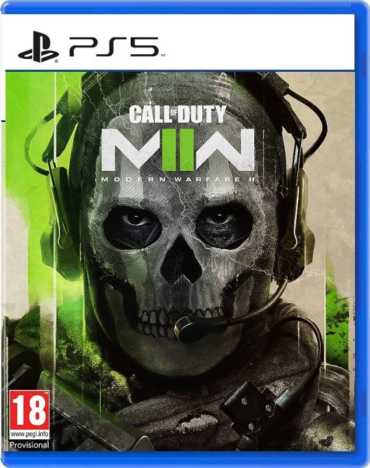
After last year's innovative Vanguard box art, Modern Warfare II (2022) chooses not to rock the boat and instead settles back to past trends; the character portrait close up seen with WW2 and Cold War. However, this forgoes dramatic or artsy design and embraces the unsatisfying combination of lime green and tan. Asides from the vague colour theming and odd lightning effect (over the face, for some reason) this design relies entirely on Simon ‘Ghost’ Riley’s excellent and mysterious design from Modern Warfare (2019). It gets some points for being relatively colourful but quickly loses them for being forgettable.
4/10
#20) Call of Duty Modern Warfare III (2023)
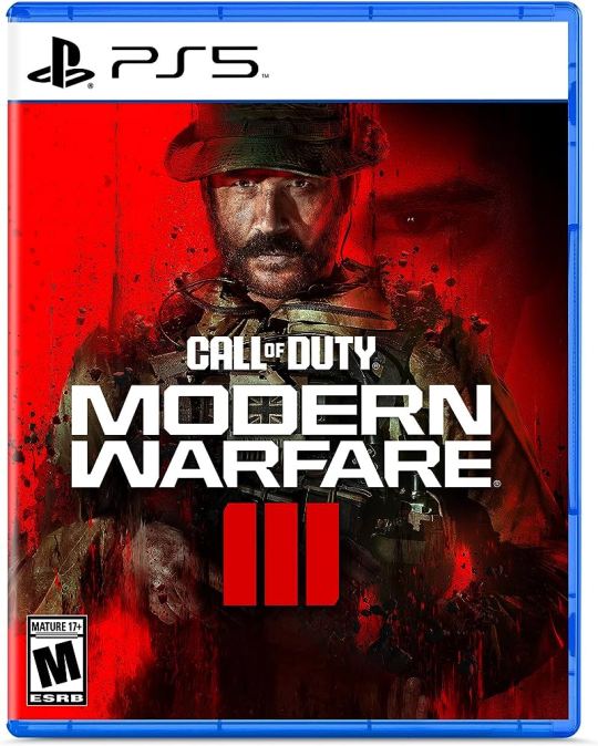
Modern Warfare III (2023) will be COD’s first direct sequel, therefore the first, perfect, opportunity for consistent branding and design... Firstly it’s ditched the stylised logo that combines the MW initials and number and instead lets the words MODERN WARFARE dominate the front in an ugly type face. As for the main image, the opportunity to highlight a different character has been missed and instead features Capt. Price, framed in a medium shot, squandering the bold choice of the close-up portrait used last year. There’s very little to say as this is just some particle effects and a vague silhouette above being a character model on a red background.
3/10
1 note
·
View note
Text
Call of Duty Cover Art Reviewed: It may just be guns and men but it's still art - Part 2
#11) Call of Duty Advanced Warfare (2014)

A new studio helms the development of 2014’s Call of Duty to help keep the yearly barrage ongoing. Sledgehammer Games introduced players to the controversial advanced movement system and the cover does a good job at showing a new arsenal of gear with cybernetics and exo-suits but other then that it doesn’t show much else and is rivalling MW3 in overall blandness.
3/10
#12) Call of Duty Black Ops 3 (2015)

Mr Gun has got an upgrade, tech-tical armour, some chunky new pistols and the fiery roman numerals give BO3 a far bolder cover then Black Ops 2 and does a better job representing it's game's campaign. I still maintain my personal gripes with the Black Ops cover style yet BO3’s somewhat alleviates that by being brighter and generally cooler.
6/10
#13) Call of Duty Infinite Warfare (2016)

First it was modern, then it was advanced and now it’s infinite. Call of Duty’s endless need to up the antics brings us to space in Infinite Warfare which saw Infinity Ward switch away from their modern warfare setting and create a pseudo sequel to Advanced Warfare but you wouldn't really know any of that from the cover. Embrace the space or the robots instead of sticking tons of futuristic crap to some soldier again. This cover art is uninspiring and plain, failing to convey how unique Infinite Warfare actually was.
2/10
#14) Call of Duty WWII (2017)

After an oversaturation of double jumps and jet powered slides COD WWII sees Sledgehammer Games take call of duty back to its boots on ground, historical roots and uses an extreme close up to highlight the games 4K visuals, cinematic campaign and serious grit, with cold grey eyes staring at you and an almost complete lack of guns this suggests a more hardcore experience far from the floaty and wacky experiences of recent previous titles and in some instances WWII delivered on that. A cover that accurately represents the game, is unique, and somewhat thought provoking, a definite contrast to all previous cover art and hopefully the sign of change for future designs…
8/10
#15) Call of Duty Black Ops 4 (2018)

Guns, angry men (and a women for the first time!), smoke, rubble, and incorrect roman numerals, COD’s back to it's old self with the fourth instalment in the Black Ops series. Despite this return to form BO4 does offer a far more interesting cover to BO 1, 2 and 3 with a cast of characters featured, more exciting composition and high vibrancy. BO4’s artwork succeeds in some areas yet is actually far less memorable for me then the previous Black Ops titles but that could be a wider comment on the game.
6/10
#16) Call of Duty Modern Warfare (2019)

The grand comeback of the Modern Warfare series that also heralded a comeback the Call of Duty franchise on a whole, bringing players back through a mix of nostalgia, compelling gunplay and a certain battle royale gamemode. Though, I doubt the cover art played much of a role in this success story. Featuring the memorable Captain Price it’s the first COD to show a star of the games on the cover but for some reason his iconic boonie hat and cigar are omitted from this appearance on the cover which sadly makes this revamped version of FPS icon slip into the pile of generic soldiers. MW 2019 may have been big in it success (and file size) however its cover doesn’t add to it especially since it’s digital icon changed each season and is still changing now; killing all chances of becoming as iconic as the cover art of MW1 or MW2.
6/10
#17) Call of Duty Black Ops Cold War (2020)

Now this may sound preachy or ridiculous but Black Ops Cold War’s cover art is a work of art; it is hyper detailed, relevant, colourful, unique, dramatic, clean, modern, nostalgic, fresh and overall a huge step up over anything previous in the franchise. If this were painted on the Berlin wall in the 80s it would be a peice of world and artistic history. A collage of nondescript Cold War era looking posters and papers enhance what would've already been a cool presentation of both an American and Soviet soldier with, for the first time ever, not a gun in sight - yet it still manages to convey Call of Duty's indescribable identity. Even with it’s great list of merits Cold War’s cover art isn't perfect as it does not represent the game with perfect accuracy; the campaign focuses slightly more on a psychedelic, Hollywood experience of the Cold War rather than a historical one, and it's multiplayer has a lack of technical accuracy (e.g. the nightmarishly incorrect arsenal of weapons and attachments). It isn’t perfect but it’s still pretty excellent and will be hard to beat…
9/10
#18) Call of Duty Vanguard (2021)

The soon to be released Call of Duty Vanguard is the last main title on my list and excellently follows on from the new standard set by Cold War. With an entirely unique design once again as well as the first major change to the Call of Duty logo since the metal style colouring was dropped around 2009, Vanguard has a pretty awesome cover. The cinematic sliver of a battleground in the top portion of the box art is simply cool; featuring four of our main operators as well as intense weather and a smoke filled sky. But what really makes this box art stand out is the bottom half of the box which is solid black and is the background to the words ‘of duty’ which hold a reflection of what's above. To top this design off the red lettering the subtitle Vanguard is bold and invigorating however determining if this cover accurately represents the game is hard as it's yet to release, but for now its scores a flawless 10.
10/10
There's a small handful of spin off titles and releases with 'unique' covers that I could cover but there isn't much else to say...
#call of duty#black ops#modernwarfare#cover art#box art#videogames#playstation#xbox#xbox 360#nostalgia#FPS games#shooters#review#critical#COD#call of duty black ops#call of duty cold war#bocw
0 notes
Text
Call of Duty Cover Art Reviewed: It may just be guns and men but it's still art - Part 1
With 20 main titles and numerous side games the COD franchise has given itself a somewhat defined identity within the FPS genre which is amazing since the series flip flops between historical settings, modern settings and the future. One way it maintains this identity is through it's branding and key to that is each games cover art. So what makes a good Call of Duty game cover art and which one is the best...
#1) Call of Duty (2003)

Call of Duty number one, with no set expectations and a need to attract players. So, how better to do that than point and shout as to say ”Hey, get your ass off Medal of Honor, duty calls!". It's design, as well as ordering demands at its potential buyer, creates this idea of a first-person perspective making its the game's genre clear. Overall, it serves its purpose, its iconic and undeniably it’s war.
7/10
#2) Call of Duty 2 (2005)

Since it worked the first time why bother being creative again. Call of Duty 2 swaps COD 1's background of grey urban architecture for a particularly grey beach. Despite its lack of uniqueness it still maintain the identity of the previous one, highlighting everything that’s integral to a shooter, guns, shouting, explosions and guns.
6/10
#3) Call of Duty 3 (2006)

We’ve done urban, we’ve done the beach now get rural with the cover of Call of Duty 3; featuring the same American soldiers, the same Thompson machine guns and same battle-hardened faces... Call of Duty 3's cover art is less similar to 1 and 2 but somehow feels more generic, lacking that 1st Person POV of the others and by this point the game could be doing more to show the other countries you play as in the campaign asides from the USA . However, it succeeds in adding more colour to the box.
5/10
#4) Call of Duty 4: Modern Warfare (2007)

Now onto the CODs I’m more familiar with, starting with 2007’s Call of Duty 4, a game that brought the first person shooter genre into an era of modern warfare. Night vision, red dot sights, under barrel launchers, helicopter rappels, digital aids and an abundance of new kit all represented in what for me is a very iconic box art especially when paired with a vibrant green Xbox 360 case. With a harsh contrasts, lots of subtle details and the overall hue of gamer-green, call of duty 4 understandably set the standard for COD box art and in some cases the majority of FPS games that followed.
8/10
#5) Call of Duty World at War (2008)

Following on from Modern Warfare was a return to the second world war, but not a return to the cover art style of COD 1 - 3, instead maintaining COD 4’s style of a lone soldier running with a backdrop of coloured mist contrasted with dark debris In front. The pallet swap to a bluey hue and the overall similar design gives continuity to the two games but are different enough to help them maintain their own identities. World at War builds positively on COD 4’s cover art but wastes an opportunity to be more unique.
7/10
#6) Call of Duty Modern Warfare 2 (2009)

As first direct sequel in Call of Duty franchise MW2’s box art is perfect, upping the destruction of the first Modern Warfare with fire and sparks as well as the faint outline of the Whiskey Hotel itself - foreshadowing the campaigns events in Washington. The switch to yellowly hue doesn’t only embrace the flames but also suggests the sandier environments you visit in the campaign as well as in classic multiplayer maps like Rust. This cover emulates similar feelings to that of COD 4 and for good reason, however, it doesn’t quite maintain the same glory that its green predecessor has.
7.5/10
#7) Call of Duty Black Ops (2010)

8After trailing in the shadow of Infinity Ward’s CODs, developer, Treyarch makes an effort to give their new Black Ops title it’s own identity; fully embracing the imagery of Mr Gun. A silhouette who is nothing more then the 1911s (Mustang and Sally) he’s dual wielding and then the two Commando assault rifle on his back that he’s questionably and symmetrically equipped himself with. If it wasn’t for the unique identity and success of the first three Black Ops games this cover art would probably be perceived as more lackluster and bland instead it’s an image that goes in hand with the Call of Duty name.
7/10
#8) Call of Duty Modern Warfare 3 (2011)

To round off the MW trilogy comes Modern Warfare 3, a game with a reveal trailer that focussed on multinational settings and fighting in WW3, and a game with a cover that would suggest some glossy, sterile futuristic setting... MW3 missed an opportunity to show all out warfare, upping the antics shown in the cover of MW2 whilst making for a neat looking collection of the trilogy with three different colours. The failure to display the grandiose experience that is MW3 makes this cover very disappointing but as a more minimalist COD box art it works alright; a greater commitment to this style without the green subtitle and dust at the bottom could of made for an excellent more memorable cover.
4/10
#9) Call of Duty Black Ops II (2012)

Mr Gun is back! And this time with a more sensible loadout, a pistol and combat knife (good to see him expanding to melee combat). This cover loses B01s hint of blue and goes far more monotone pallet giving the impression of a far grittier, more serious entry, sadly this just makes for a blander cover. It doesn’t represent the bright Nuketown or the wacky zombies maps that come to mind for me, it would have been excellent to see a similar style to the first 3 CODs except swapping Normandy or Berlin for Nuketown 2025. Despite this the cover art doesn’t do anything wrong expect from not being as cool as the game it’s representing,
4/10
#10) Call of Duty Ghosts (2013)

Now we get closer, closer to the face of the man dawning the cover of 2013’s Call of Duty Ghosts, the first COD for PS4 and Xbox One, where they're already showing off the enhanced graphical potential by using this detailed photo. Despite this detail, Ghost’s cover art may actually be the most nondescript COD cover of them all which is additionally annoying consider the title doesn’t give anything away, this results in an incredibly uninteresting cover that isn’t really replicated so at least it stayed unique.
3/10
#call of duty#black ops#modernwarfare#cover art#box art#videogames#playstation#xbox#xbox 360#nostalgia#FPS games#shooters#review#critical#COD#call of duty black ops#call of duty cold war#bocw
0 notes
Text
Red Dead Revolver: Wrongfully Forgotten or Rightfully Obscure?
Definitely not a must play experience but still worthy of attention as the first game in Rockstar's iconic series and a good game to play for any fans of westerns.
★★★☆☆
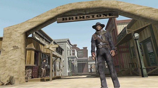
Red Dead Revolver is a western shoot-em-up released for the Xbox and PS2 in 2004, published by Rockstar Games; the makers of the critically acclaimed yet controversial Grand Theft Audio series. Does Revolver hold up to the standards set by Rockstar’s previous and how has it aged?
In the opening level you are introduced to a younger version of protagonist, Red Harlow, a child with concerningly good gun skills, a child who is soon to be an orphan. His farther is murdered by his own partner’s thugs and his mum perishes in a fire, from that point on Red’s sole objective (and his personality) is a murderous desire for unforgiving revenge….
So, a sharp shooting bounty hunter with a lust for blood must result in a serious, moody game, right? Yes and no, tonally the game can change on the drop of a dime, from fighting dynamite loving circus freaks to closing the eyelids on the corpse of a long-time friend back to machine-gunning a freakish spiked train. Revolver is a game which struggles to settle on an identity for its roughly 8-hour story, not ever fully committing to its cinematic drama or its slapstick characters, however, you reach the end before its identity crisis becomes too annoying.
Our protagonist is joined by a handful of archetypal characters who serve to liven up the gameplay offering unique abilities and some more personality which only highlights what Red lacks as a protagonist. He is quiet, confident and remorseless which may sound similar to heroes of the classic cowboy movies such as The Man with No Name, but sadly Red’s traits come off as boring instead of replicating the stoic nonchalance of someone like Clint Eastwood.
Whilst story and characters may be lacking this can be recovered by the quality of the gameplay and in some instances, it is, with waves of enemies that sometimes die in spectacular fashion with guttural sound effects and dramatic animations, usually culminating in epic set-piece battles against a stronger unique enemy, your bounty target. This all sounds pretty epic especially when you’re omitting the negative parts. For example, the Kevlar like properties of the enemy’s skin or little variation in enemy type and unpredictable and downright stupid AI.
Despite many complaints, I did enjoy the game, its iconic weaponry, outfits, and events (like shoot outs) do help to draw you into the classic American wild west and redeems what otherwise would be just another jank early 2000s action-adventure game.
Is it worth your time? If you want to play a western action shooter, there’s better options that won’t have you fighting clunky controls or straining your eyes for poor graphics. But, as the first entry in the now massively successful Red Dead series it’s an interesting romp. Ultimately, Red Dead Revolver is an alright game that has its charms but is hindered by a weak plot, repetitive design and poorly aged visuals and mechanics leading to it fading into relative obscurity.
16 notes
·
View notes