
The (mostly) fan creations blog of a fellow lurker with a following of fandoms and a smattering of other stuff.
Don't wanna be here? Send us removal request.
Statistics
We looked inside some of the posts by logicheartsoul and here's what we found interesting.
Average Info
Notes Per Post
252K
Likes Per Post
136K
Reblog Per Post
114K
Reply Per Post
2K
Time Between Posts
8 hours
Number of Posts By Type
Text
16
Note
1
Last Seen Tumblr Blogs


Fun Fact
After the announcement of the deal with Yahoo!, there were 170K signatures of unhappy Tumblr users petitioning to prevent the sale in 2013.
Text


#reblog#executive dysfunction#so true!!! There are so many things I want/plan/like doing but body is just like nope
35K notes
·
View notes
Text

Poké-Koinobori
2K notes
·
View notes
Text


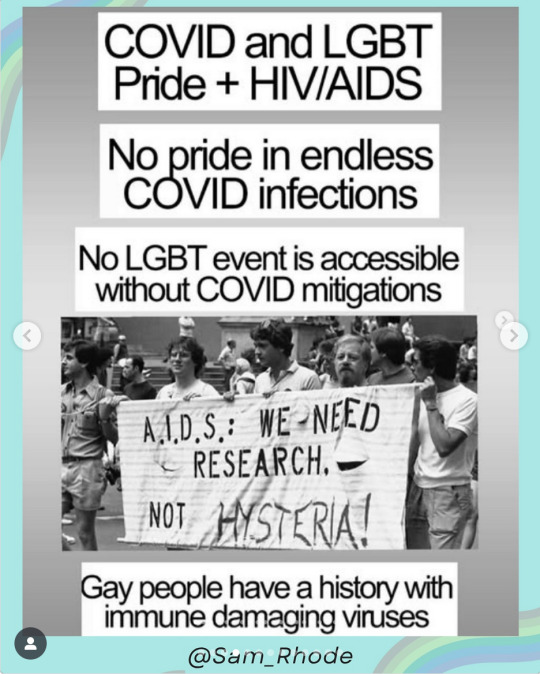


source long covid justice
'Brilliant at Survival' - Long Covid affects trans and bi patients at highest rates | ClearHealth.Costs.com
Long COVID is More Common in Bisexual & Trans People. The Reasons Why Are Complicated | Miles Griffis for them.com
Biological Sex Differences: Key to Understanding Long Covid? | Medscape
Why Are Women More Likely to Get Long Covid?
Long Covid More Common in People with HIV | aidsmap
More Evidence that Long Covid is More Common in People with HIV
COVID-19 is Still a Major Health Concern. Why Are Some HIV Organizations Acting Like It Isn't? | Emmett Patterson, TheBody.com
HIV may increase the risk of Long Covid. Why Aren't major advocacy groups addressing it? | Miles Griffis for The Sick Times
As Queer Spaces Return to "Normal," Disabled LGBTQ+ People Are Being Left Behind
COVID IS A QUEER ISSUE. MASK UP, FIGHT FASCISM AND EUGENICS
longcovidjustice
212 notes
·
View notes
Text
Oscar de la Renta: 'Crafted like a mosaic, discover the making-of the #odlrfall2024 stained glass gown — ushering in a a new House-signature embroidery technique.'

Constructed from hundreds of polyamide panes, hand-sewn together in an Art Nouveau style reminiscent of Tiffany glass. Ready-to-wear: £36,546.


38K notes
·
View notes
Text

Weekend
144 notes
·
View notes
Text

Backsplash wave © Peter Solarz
31 notes
·
View notes
Text
Being an adult in this recession and being like wow I am totally "splurging" on 3 new sets of cotton underwear and 3 pairs of socks like whoaaaaa hold your horses duke of the land where's all this money gonna come from
#reblog#this is me except I was looking for pj sets coz I need to replace mine lol#haven’t gotten them yet coz I had to calculate the cost with my budget but yeah we will see how it pans out lmao
37K notes
·
View notes
Text
Yes there's a typo in the first option but I am not redoing the whole thing
#reblog#tumblr stuff#poll#ao3#about fanfiction#feedback#writer stuff#i chose the other coz mostly I just do not have physical brain energy but when I do I try to respond
5K notes
·
View notes
Text
Spin this wheel first and then this wheel second to generate the title of a YA fantasy novel!
(If the second wheel lands on an option ending with a plus sign, spin it again)
Share what you got!
#reblog#tumblr stuff#poll#i got throne of homoerotic skulls#that could be a very good book or a bad one but I picked sure why not? Lmao if it was bad I would just ditch the book
31K notes
·
View notes
Text
The best advice i can give any creator is do it before you're good at it, do it BEFORE you're happy, do it while you suck, do it while you're doubting yourself and get stuck the fuck in, because waiting around to be "good enough" is a motherfucking trap of the highest degree. You'll get good along the way and better after every project is complete. Remember, this is the greatest thing you've ever created, and then you'll do something else. You're only ever gonna get better, but not if you stand still.
#reblog#creator stuff#artist stuff#writer stuff#the writer's struggle#definitely need this reminder all the time
12K notes
·
View notes
Note
Lake Bled, Slovenia!

#reblog#tumblr stuff#poll#slovenia#i havent but I would love to#ive been wanting to go to slovenia for years so one day
56 notes
·
View notes
Text

#reblog#science#research#ai#despite knowing water is wet we need those studies so we can point ‘yeah water is wet’ and no one claim we are lying#but it’s nice to have a study show with brain scan evidence of ‘yeah your brain atrophies if you don’t use it and use AI/LLM to do your#thinking instead’
51K notes
·
View notes
Text
Wait, they dont love you like i love you

#reblog#fanart#mcu#sam wilson#eye contact#scopophobia cw#all I could think of is talk to the hand the face don’t wanna hear it and 😂#he’s cap if he’s got so many things to do if you’re gonna say something stupid there’s the door LOL#love this
155 notes
·
View notes
Text
It's Juneteenth yall. And I'm not letting this day go unmarked.
Black people fight for everybody. We stand in solidarity with women, lgbt people, poor people all over the world of every skin color and background. Every religion and nationality.
Today, stand with us. Be with us. Tell a black person you love them. Hug a black person (with consent). Ask that hot black girl out today. Make a black person smile. Black lives matter to everybody and you matter to us.
Stand with us on Juneteenth like we stand with you all year round, and I hope a happy Pride month continues for all of us
💝
26K notes
·
View notes
Text
It's Juneteenth, I'm a Black Texan, descendant of enslaved Black Texans. Texas is the only state that fought two different wars to protect slavery and chattel slavery ended the last for it. Juneteenth to me is to celebrate that part of overt white supremacy coming to an end, but it was not the end of white supremacy. It did not stop, with the lynching, the police violence, the redlining, the environmental racism, the segregation. Juneteenth represents a good win aganist the fight against white supremacy, but it's not over.
And for this Juneteenth, I ask for help for my friends that are the victims of this same US white supremacy. Not just today, but everyday Gazans deserve any type of help that you can give them. The technology that is used to segregate and attack and police and destroy Palestinians is the same technology that is sold to Texas to be used for the border patrol and to harass and control immigrants and border communities. This is one, connected fight aganist white supremacy and US control and destruction of Black and Brown bodies. So I ask today if you could donate this, or share, to help provide for a mother and her 2 now fatherless children in Gaza, or anyone else in Gaza who needs help. Like this family with a sick baby. Just do something, especially if you got the day off.
5K notes
·
View notes
Text
PSA to Naturalized Citizens in the US
Some time ago I went to request a new ss card on the social security website and it said I wasn't a citizen despite being naturalized over 15 years ago as a kid. Then found out my parents and siblings have the same problem.
If you're a naturalized citizen of the US check on the Social Security website
You're unfortunately going to have to make an account if you don't have one and confirm your identity.
When you're done request a new card (even if you already have yours) and it'll tell you what the status is
There's an issue where some people were never told they had to change that status with SS after naturalization and that it doesn't automatically change
I'm of the belief that no one should be illegal and fuck ICE all the way, but this is a way to make sure that my fellow immigrants, documented or not, are safe
Please reblog to boost.
6K notes
·
View notes
Text
🇺🇸recall of chicken fettuccine alfredo sold nationwide at kroger and walmart due to deadly listeria outbreak, multiple deaths reported🇺🇸
as a reminder, listeria can take months to cause illness after eating contaminated food.
it is currently unclear if a specific ingredient is contaminated or if there might be further recalls. I will update everyone when this information becomes available, and with any further updates. but if you have these in your fridge or freezer, clean and sanitize anything it may have touched, and keep an eye on your health.
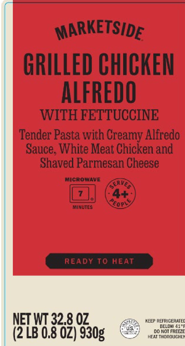
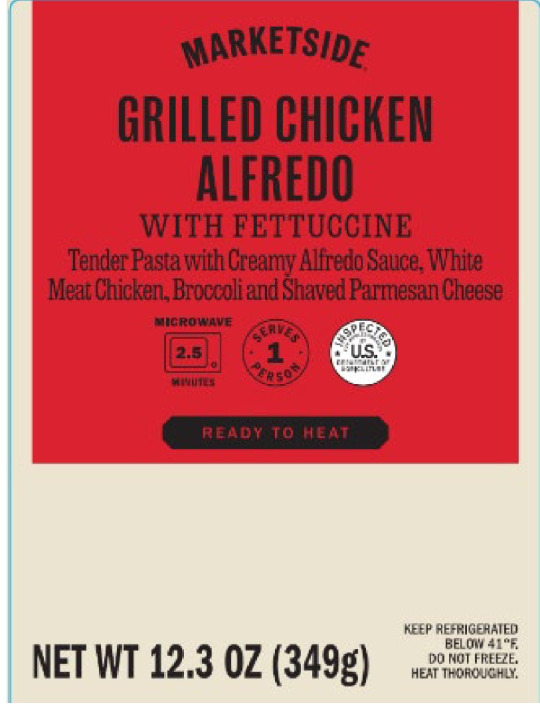

https://www.fsis.usda.gov/recalls-alerts/freshrealm-recalls-chicken-fettuccine-alfredo-products-due-possible-listeria
WASHINGTON, June 17, 2025 – FreshRealm establishments in San Clemente, Calif., Montezuma, Ga., and Indianapolis, Ind., are recalling chicken fettuccine alfredo products that may be adulterated with an outbreak strain of Listeria monocytogenes (Lm), the U.S. Department of Agriculture’s Food Safety and Inspection Service (FSIS) announced today. Out of an abundance of caution, the company is voluntarily recalling all products produced prior to June 17, 2025, that are available in commerce under the following brand names.
ALL lots of food produced before june 17 2025 are being recalled. if you have these in your fridge or freezer, you are affected.
The following ready-to-eat products were shipped to Kroger and Walmart retail locations nationwide [view labels]: -32.8-oz. tray packages containing “MARKETSIDE GRILLED CHICKEN ALFREDO WITH FETTUCCINE Tender Pasta with Creamy Alfredo Sauce, White Meat Chicken and Shaved Parmesan Cheese” with best-by date 06/27/25 or prior. -12.3 oz. tray packages containing “MARKETSIDE GRILLED CHICKEN ALFREDO WITH FETTUCCINE Tender Pasta with Creamy Alfredo Sauce, White Meat
-Chicken, Broccoli and Shaved Parmesan Cheese” with best-by date 06/26/25 or prior. 12.5 oz. tray packages containing “HOME CHEF Heat & Eat Chicken Fettuccine Alfredo with pasta, grilled white meat chicken, and Parmesan cheese” with best-by date 06/19/25 or prior.
The products bear the USDA mark of inspection on the product label as well as establishment numbers “EST. P-50784,” “EST. P-47770,” or “EST. P-47718” printed on the side of the packaging.
some emphasis mine. the brand names are marketside and home chef, sold nationwide by walmart and kroger. their packaging labels are at the top of this post.
FSIS and public health partners are investigating an outbreak of Lm that currently includes 17 ill people in 13 states. As of June 17, 2025, there have been three reported deaths and one fetal loss associated with this outbreak. The outbreak strain of Lm was isolated from ill people on dates ranging from August 2024 – May 2025. The same outbreak strain was isolated from a routine chicken fettuccine alfredo sample collected by FSIS in a FreshRealm establishment in March 2025.
...
The subsequent investigations at the establishment that produced this product, and into the product ingredients, have not identified the source of contamination.
...
This investigation is ongoing. FSIS is sharing what is currently known regarding products associated with the outbreak as the agency continues to work with public health partners to identify whether a specific ingredient in the chicken fettucine alfredo may be the source of this strain of Lm.
some emphasis mine. I cut out some parts about sick people confirming they ate chicken fettuccine alfredo. routine inspection linked a contaminated sample with cases of illness, and sick people were interviewed.
as of june 18 2025, there have been 17 cases of illness from 13 states linked to this outbreak. the true number of people sick is likely higher, and the number of states with currently linked illnesses does NOT represent all of where these products were sold. products were sold nationwide. reported illnesses were dated from august 2024 to may 2025. it can take months for listeria to cause illness, followed by weeks for an illness to be linked to an outbreak. there have been three deaths and one fetal loss, as listeriosis infection is especially dangerous during pregnancy.
the contaminated ingredient has not yet been identified and there may be further recalls related to this outbreak. I will update everyone when there is more information available, so check the notes or keep up with the FSIS USDA link.
Consumption of food contaminated with Lm can cause listeriosis, a serious infection that primarily affects older adults, persons with weakened immune systems, and pregnant women and their newborns. Less commonly, people outside these risk groups are affected. Listeriosis can cause fever, muscle aches, headache, stiff neck, confusion, loss of balance and convulsions sometimes preceded by diarrhea or other gastrointestinal symptoms. An invasive infection spreads beyond the gastrointestinal tract. In pregnant women, the infection can cause miscarriages, stillbirths, premature delivery or life-threatening infection of the newborn. In addition, serious and sometimes fatal infections in older adults and people with weakened immune systems. Listeriosis is treated with antibiotics. People in the higher-risk categories who experience flu-like symptoms within two months after eating contaminated food should seek medical care and tell the health care provider about eating the contaminated food.
some emphasis mine. it can take up to TWO FUCKING MONTHS for listeria to cause illness, and that illness can be deadly. listeriosis is treatable with antibiotics. please seek medical attention if you are high risk, have eaten the recalled chicken fettuccine, and experience any suspicious symptoms up to two months after eating it. in some cases antibiotics may be prescribed before potential symptoms show up.
FSIS is concerned that some products may be in consumers’ refrigerators or freezers. Consumers who have purchased these products are urged not to consume them. These products should be thrown away or returned to the place of purchase.
return them or throw them out!
for more information, check the recall announcement.
and if you experience any issues with food in the united states, PLEASE report it. US or not, reporting issues with food saves lives.
stay safe and take care!
5K notes
·
View notes