This account is compilation of work from the Fundamentals of Design Module at National Institute of Design(NID)
Don't wanna be here? Send us removal request.
Statistics
We looked inside some of the posts by myexistentialspace and here's what we found interesting.
Average Info
Notes Per Post
43
Likes Per Post
41
Reblog Per Post
0
Reply Per Post
2
Time Between Posts
4 days
Number of Posts By Type
Text
17
Last Seen Tumblr Blogs


Fun Fact
Tumblr has been banned in Indonesia for providing people with access to pornographic content.


Text
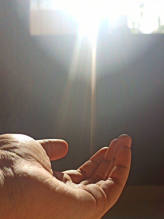
As it Floweth!
- FVD final video
youtube
The Creation Process :
As the name suggests, our basic theme was the transition of a river. A river is a natural flowing watercourse, flowing towards an ocean, sea, lake or another river transitioning with time.
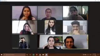
While our team was collectively brainstorming on the different aspects we could include as a part of this transition, we came across various topics such as gender fluidity, culture and so on. We eventually tried relating it to the obstacles the river as a flowing water body came across it's course. We later decided to share our story outline with our mentors.
After our discussion, we realised that we were trying to portray the scenes in the way we perceived it first and not in their abstract representation. We got back together and revised the script scenes. We later assigned roles per scene and compiled it accordingly.
My contribution :
I was mainly involved in documenting the scenes as we created the storyboard. Also, was involved in creation of a few visual snippets in the video.
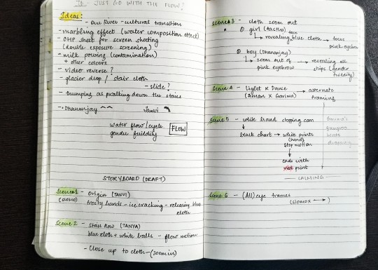
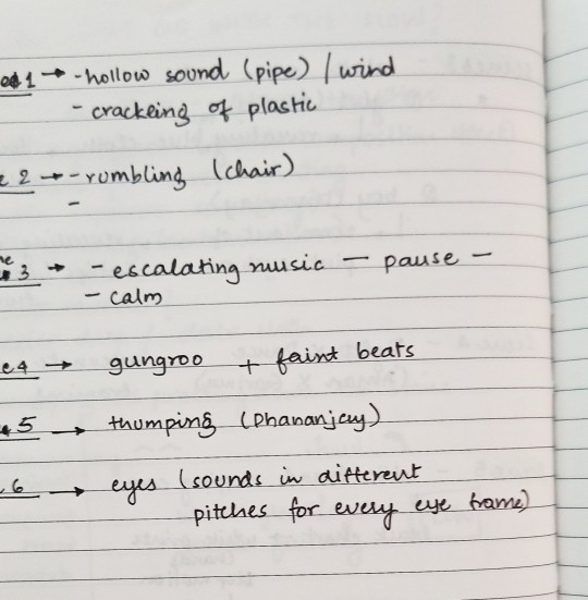
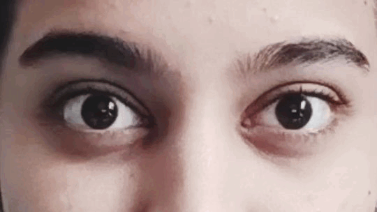
Some of the trial shots for a few scenes :
For the sound of a river flowing across a rocky surface, I used some plastic covers of varied densities to create that variation.
While framing this scene, I had to reshoot a number of times just because I couldn't coordinate my eyelid movement and capturing the frame at the same time.
Overall experience :
Unlike the other assignments, this included some amount of "acting before the camera" which was new to most of us. While conceptualizing and later executing a few scenes, I learnt framing the elements on screen. Since we all belonged to different backgrounds with different skill sets, working together was a fun experience.
The Team :
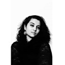
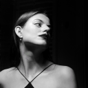
Kajal, Aman, Tanvi, Tanya, Garima, Aakash, Dhananjay, Aastha and Janet
1 note
·
View note
Text
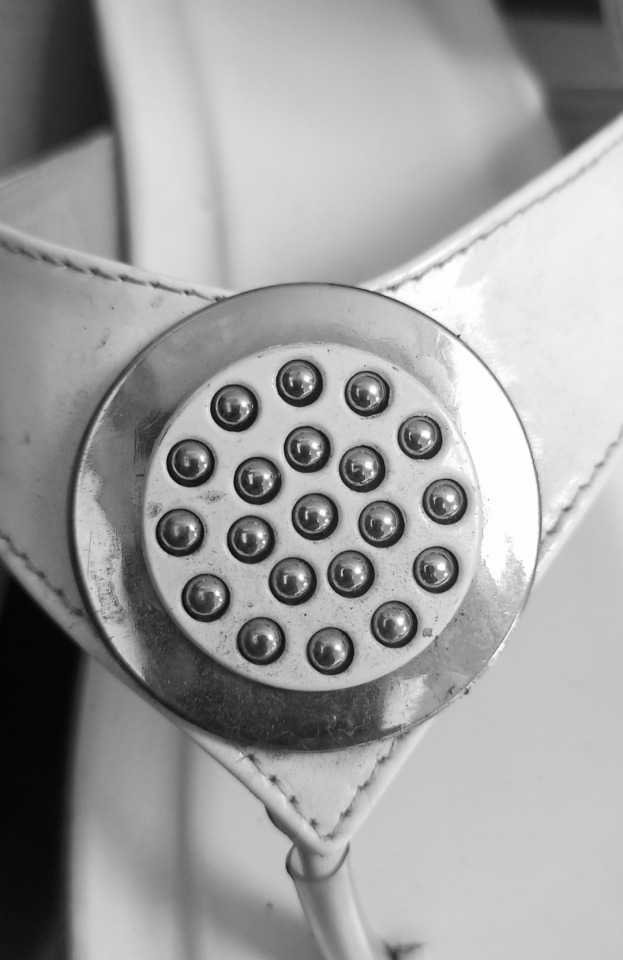
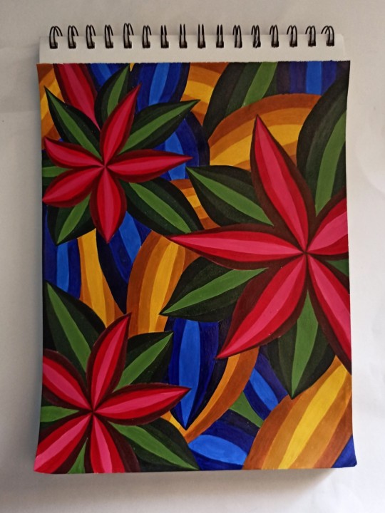
Principles of Visual Design
Visual Design principles describe fundamental ideas about the practice of visual design. These principles inform us how to represent and arrange design elements such as line, shape, color, grid, or space go together to create well-rounded and thoughtful visuals.
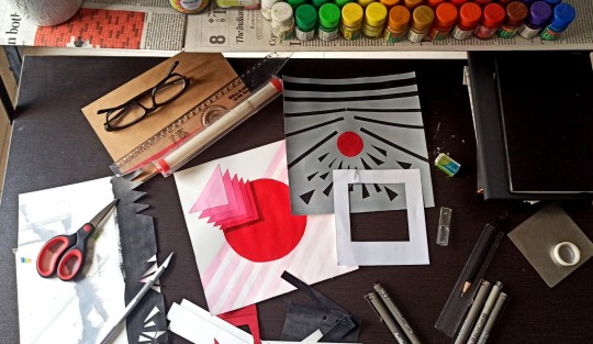
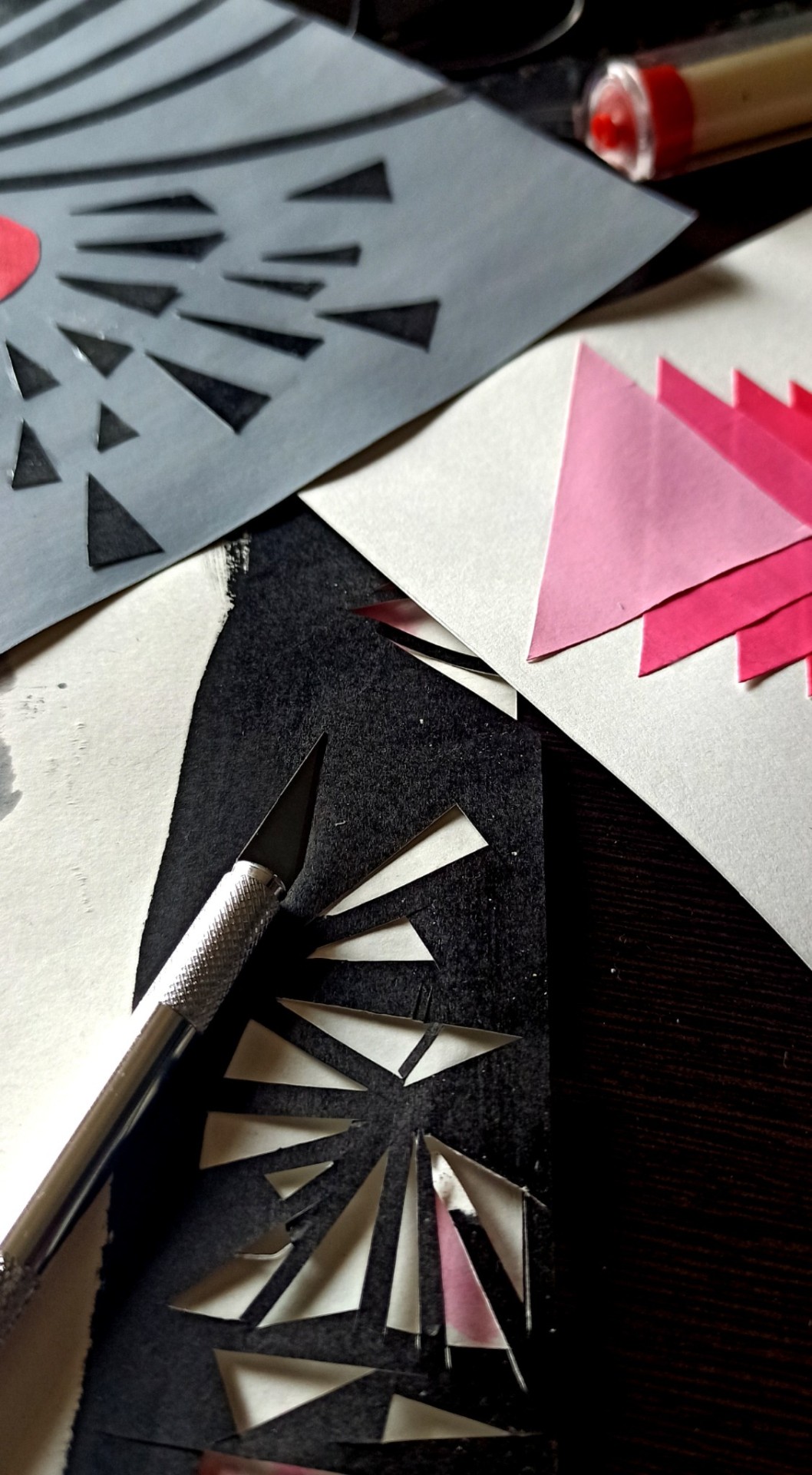
Ab: Here, I've used only dots and lines to create the visual. The size of the dots is 5mm in diameter and the length of line segment is 3.5cm. The thickness of the line is equivalent to 2mm. After choosing 3 principles, I represented it in a (20X 20)cms, drawn on A4 size paper in black and white only.
Final drafts :
Point of Interest
A point of interest (POI) is a specific point location that someone may find catchy at the first sight. It draws the attention of the viewer at the first go.
The third line from the top, trying to breaking the conventional flow of following a path satisfies the POI condition.
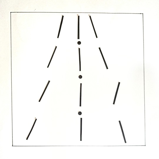
Rhythm
Rhythm is basically a visual tempo or beat. The principle of design that refers to a regular repetition of elements of art to produce the look and feel of movement.
To depict rhythm, I tried portraying the progression of a vertical line to a horizontal line in sync to each other.
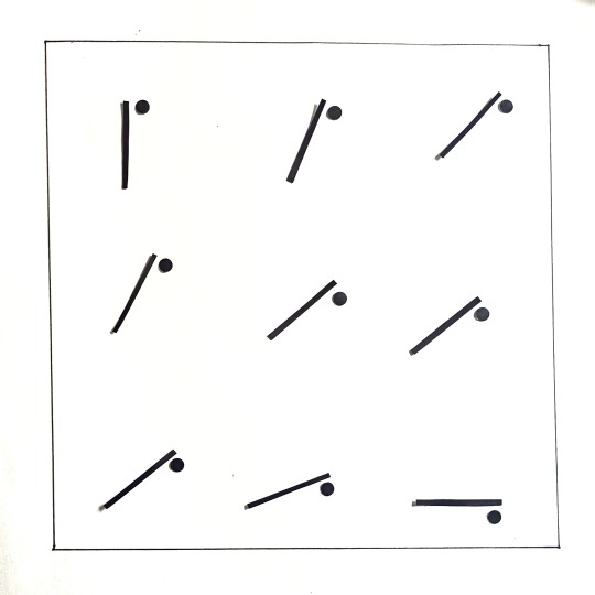
Balance
Balance feels stable and aesthetically pleasing. While some of its elements might be focal points and attract your eye, no one area of the composition draws your eye so much that you can’t see the other areas. Balancing a composition involves arranging both positive elements and negative space in such a way that no one area of the design overpowers other areas.
To create a balance in elements, I tried using a flipped bilateral balance creating a warm space between the elements.
Some explorations on principles :
Point of Interest
Rhythm
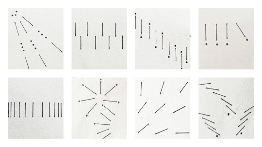
Balance
2 notes
·
View notes
Text
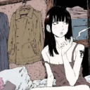
Music Video - Color
youtube
Here's a Stop Motion Film based on a tragic story of color 'White'. This film includes an understanding of color around us in Indian context and it's perception in it's own. Music adds an emotion to what a particular color feels in our society and the dominance of the same.
Unlike every other color, WHITE is one such which is highly unacceptable and controversial, not only as a color but also in our society. For instance - A widow being forced to wear white all her life and being thrown away by every other group in our society.
The Creation Process :
To begin with, we started with a few basic idea frames we were working on individually. Post this activity, we discussed our ideas with the frames we created and settled for digital medium (initially). After a few brainstorming sessions, we decided to use a traditional medium - clay as it portrayed raw flow in emotions. By understanding the color psychology and eventually creating the storyboard, we stitched a visual video. With reference to the visuals, we composed music for each scene according to the storyline.
My contribution :
Majorly involved in the creation of the frames in the storyboard. Also, created the stop motion visuals using clay.
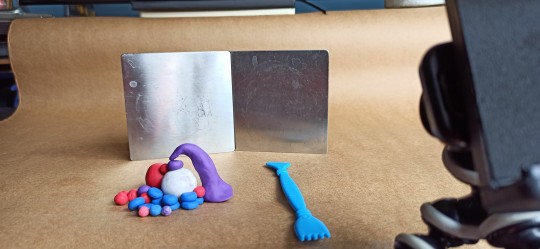
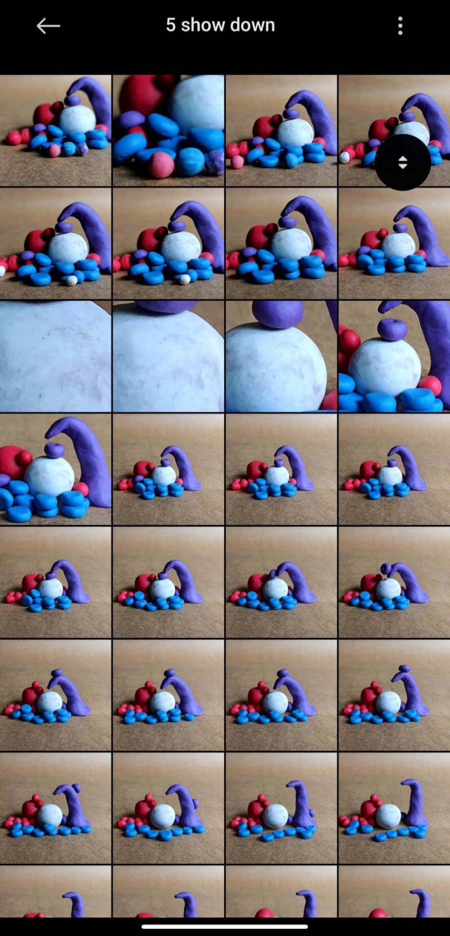
Trial attempts:
The Team :
Garima Bhardwaj, Janet Jacob, Dhananjay Kumar Pandey, Meeta Bhushan and Aayushi Yadav
Module Credits :
Fundamentals of Visual Design
Batch 2020 | National Institute of Design
1 note
·
View note
Text
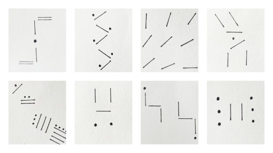
Exploring Composition
Using composition in shapes, lines and dots here's an attempt to understand composition from a wider perspective. For the compositions, fear and love are the two emotions considered.
1 . Fear
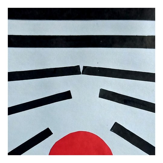
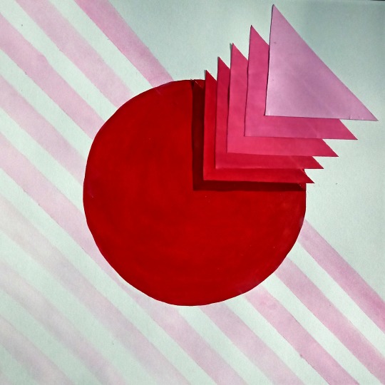
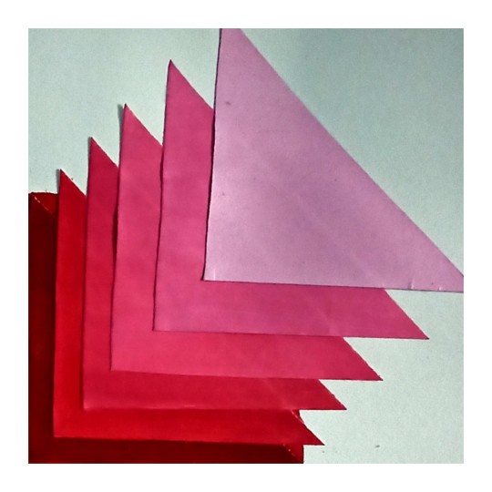
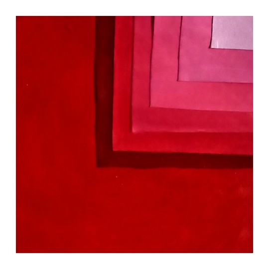
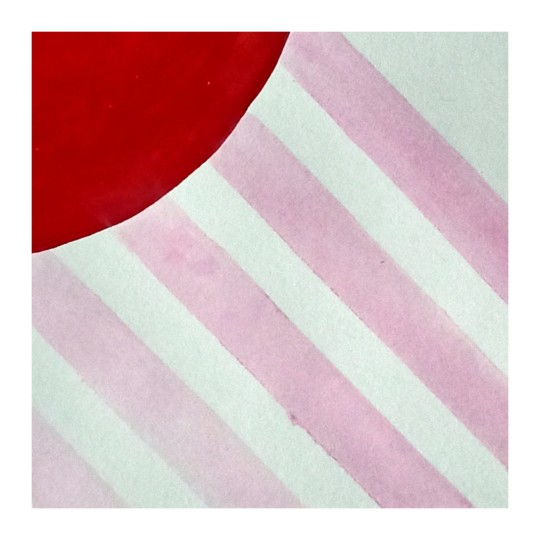
To represent the emotion of fear, the elements used are : lines of varying thickness, triangles of varying sizes and a circle. Here the lines represent our fragile emotions at varied intensities. A red bold circle indicating fear is breaking through these lines of emotion. Adding in the fear are the sharp edged triangles indicating the external forces that shoots the fear through the way to move forward.
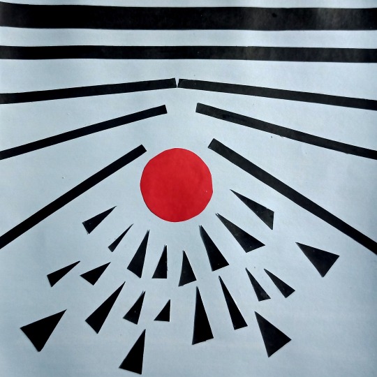
Some of the principles used in this composition are:
Scale and proportion
Point of Interest
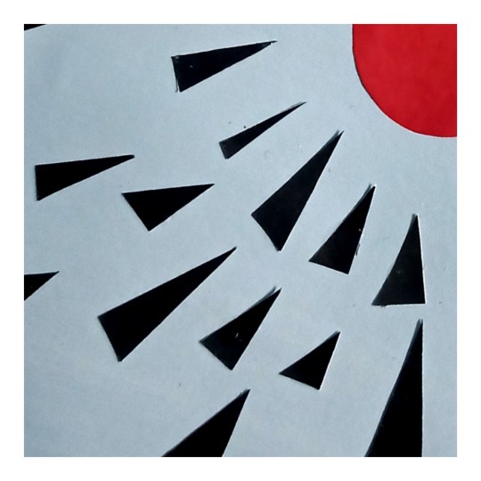
Rhythm
2 . Love
To depict the composition for love, the elements used are : tints of triangles, tints of lines and a circle. Love is delicate and soft emotion. Thus to indicate love, I've used a rounded circle with a bold red color. Into this circle, there are triangles indicating external emotions shooting in at different intensities. But love soaks these emotions to mold in its own. The faint pastel pink lines passing below the circle indicate the vibrance of the circle in outward direction.
Some of the principles used in this composition are :
Pattern and Balance
Rhythm
Point of Interest
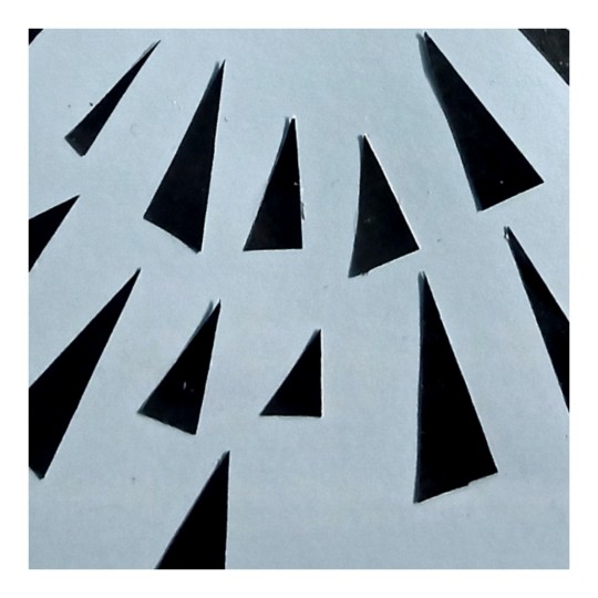
BTS:
For this assignment, I decided to cut the elements after painting sheets with a color. Cutting the shapes and lines with some precision was a major task. At times, I ended up changing the shape ratio altering the sides and edges constantly. Also getting a consistency in shades was a challenge. Adding layers of paint helped in the process of uniformity.
2 notes
·
View notes
Text
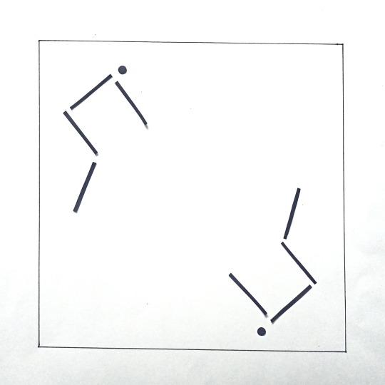
Gestalt Laws
Gestalt laws/principles are a set of rules that describes how a human eye perceives visual elements. Following are a few attempts to capture these principles within my home premise.
Law of Similarity
Elements that are similar to each other tend to be perceived as a unified group.
Law of Proximity
Grouping closer-together elements, separating them from those farther apart. Hence, while clustering individual elements into one area or group it will eventually be visualised as an entity all together.
Law of Continuity
Elements that are arranged on a line or curve and are perceived to be more related than elements not on the line or curve. It forces a flow in motion of eyes from one point to another.

Law of Symmetry
Elements that are symmetrical to each other tend to be perceived as a unified group.
3 notes
·
View notes
Text
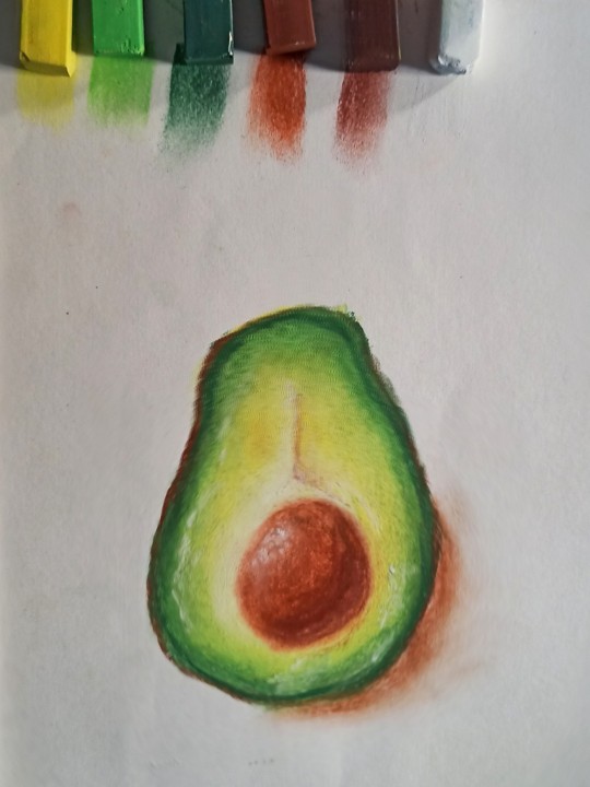
Understanding taste, color and music pt. III
Have you ever wanted something spicy and cheesy, while also mercilessly sprinkled with a ton of veggies? There’s a Pizza for that. Pizza can cater to the most indecisive tastebuds, and there are even places people can walk in and create their own personal ones. My love for pizza is unparalleled. And since those babies are a reflection of the foodie artist in me, I tried to capture it using abstract art in acrylic medium. Wander is the instrumental jingle that I can most relate to while crunching this.
Acrylic colors helped in maintaining the boldness in emotion of warm shades at the same time retain the original form of the color.
Medium used : Acrylic paints
2 notes
·
View notes
Text
Understanding taste, color and music pt. II
I enjoy soups the most; especially when its raining or during the winter time. It is too comforting to sip and sip from a bowl of steaming hot soup in cold weather. The times when I'm down with sore throat or fever, palak soup helps me through. For this abstract, instead of normal colors I used the vibrant palak puree and gloomy coffee solution to paint it out. While painting, the smell helped me in understanding the emotion well. Canon - D is the instrumental cover that I could relate the most with creating this. It's rhythm syncs well with my emotion for the soup.
Using natural colors as a medium helped me to play with the texture and consistency of the solution at the same time experience an aromatic process.
Medium used : Palak puree, coffee solution
1 note
·
View note
Text
Understanding taste, color and music pt. 1
How can anyone not love these absolutely delightful, juicy, mouth-filling wonders? So popular is this chompy dish, that even the smallest of eateries are sure to reserve a slot for them on the menu. Despite the fact that they do pack in enough calories to significantly alter our waistlines, we still can’t resist the temptation of sinking our teeth into one! While creating this abstract for a burger, I added some texture and some vibrant colors to the crunchy layers and spaced them out - because that's how we savour it, right? Good time is the mellow jingle that reminds me of this dish.
Poster colors provide a grainy inconsistent finish that helps in exploring textures in different ways. Using these colors, the muddy texture can be obtained.
Medium used : Poster colours
2 notes
·
View notes
Text
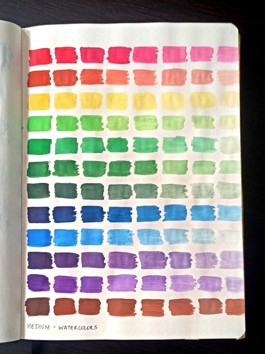
Color therapy
Color Journal pt. 2
Understanding color using different mediums:
Using Acrylic paints
First attempt with watercolors as base. Messy but fun progressions.
An attempt with soft pastels.
8 notes
·
View notes
Text
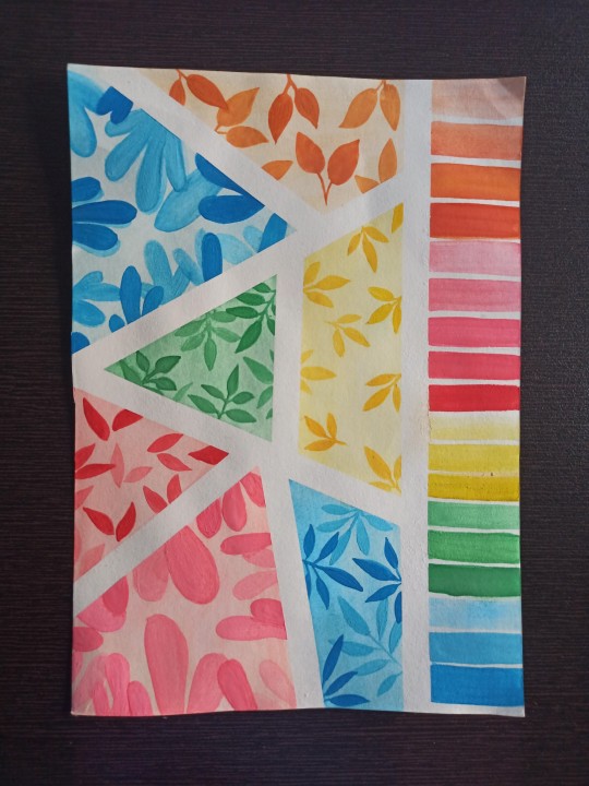
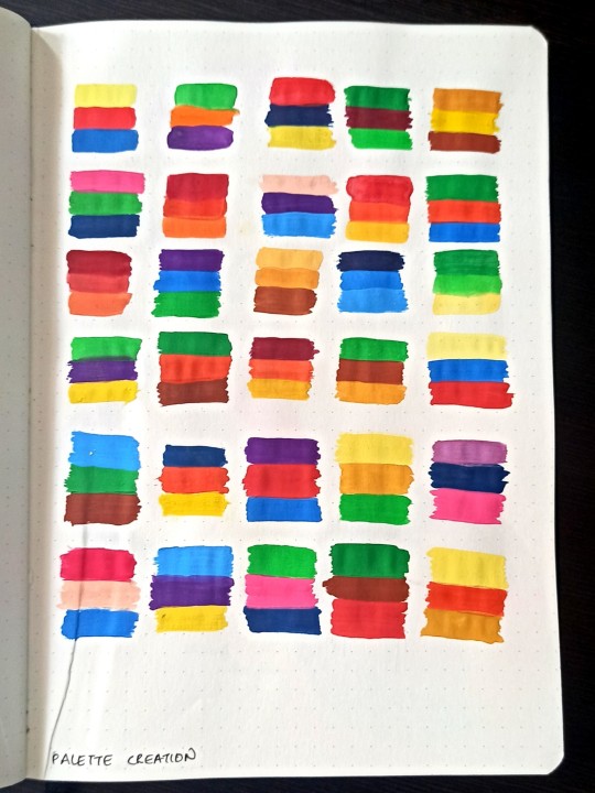
Color Explorations
Color Journal pt. 1
For the introductory pages of my Color Journal, I tried creating a tint sheet.
Medium : Watercolors
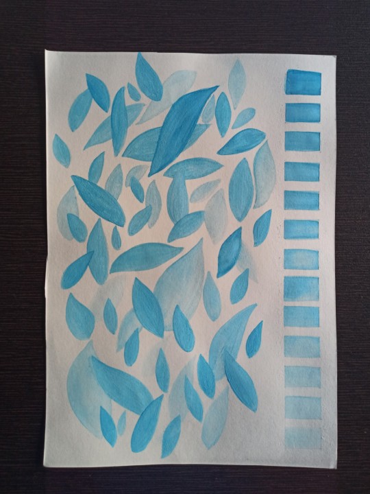
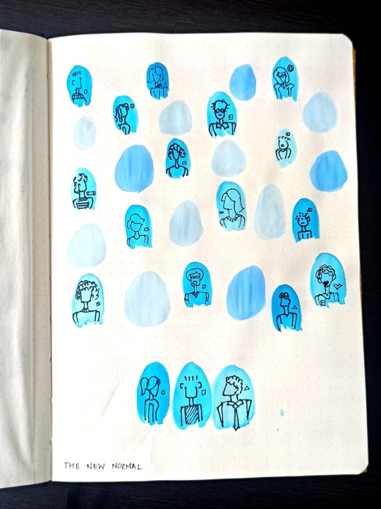
"The new normal" - Zoom calls are now a part of our daily routine. Using the color blue in different shades, I tried portraying the emotion in every screen.
Medium : Watercolors
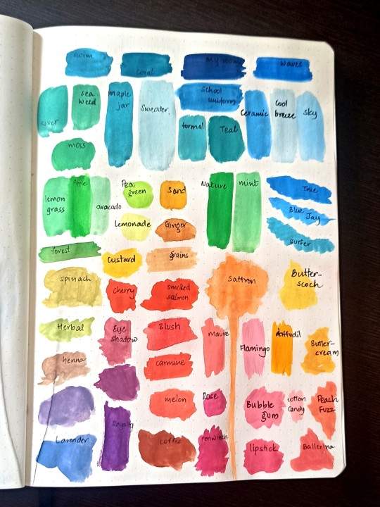
By observing a few pictures, I tried creating its triad color pallette for each by understanding the dominance of colors in that frame. It was a fun activity as I learnt how a few colors in a frame manage to capture your attention unknowingly.
Medium : Poster colors
Here, I randomly painted a few swatches over and later tried relating each swatch to the first thing that came across my mind.
Medium : Poster x Watercolors
0 notes
Text
Color perception - pt. II
"Look! On the skin! The symbol of what lies within. Now, turn red, to tempt Snow White, to make her hunger for a bite."
Was it the skin that looked red? Or was there more to it?
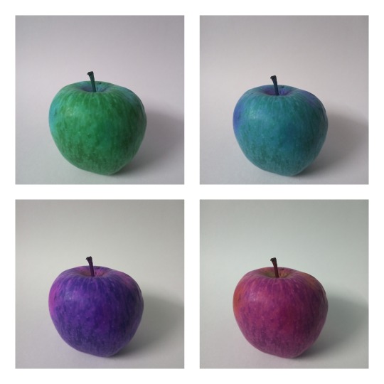
By manipulating the color, the apple looked more and more poisonous.
1 note
·
View note
Text
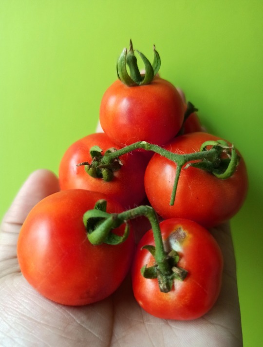
Color perception - pt. 1
While gathering these ripe tomatoes from my little balcony-garden, I realised how much the redness of the tomatoes dominated it's appearance.
By digitally manipulating the color of these tomatoes, I attempted portraying it's ripening in 4 stages (CW)
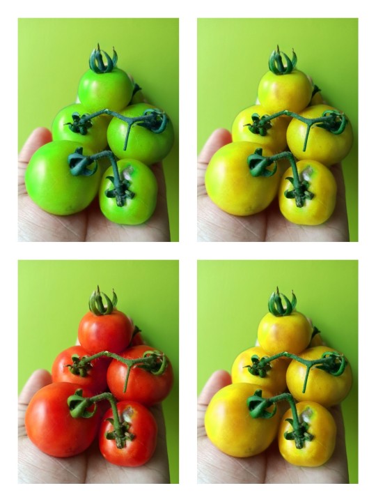
Also, here's a transition of the above frames from the original image to the ripening stages.
10 notes
·
View notes
Text
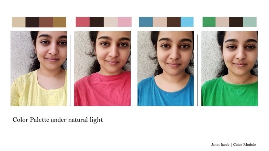
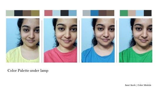
Color perception
In this experiment, I tried understanding the shift in color perception under natural light and lamp light.
My observation :
Under natural light, the colors in the frame got brighter and more vibrant. Also, my skin tone shifted slightly to a yellowish tint. The dress I wore had a brighter shift as well.
Under fluorescent lamp light, the colors looked slightly manipulated. The dress color looked duller than the one in natural light.
0 notes
Text
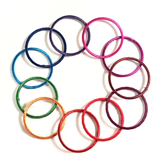
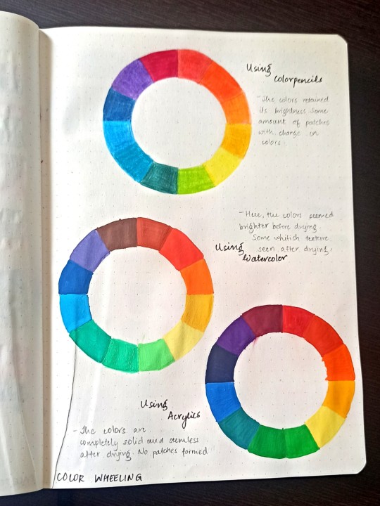
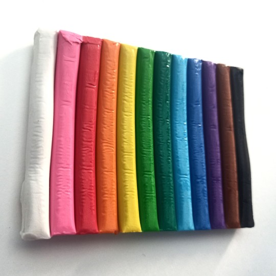
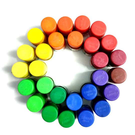
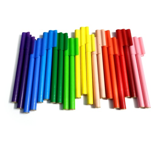
Color wheeling
Here's an attempt to understand color using the objects around. To maintain uniformity in understanding colors, I've maintained the object used in each.
Used a few colored threads to spin around bangles
Here's an attempt to create a color wheel using different mediums of colors :
Some other color wheeling :
0 notes
Text
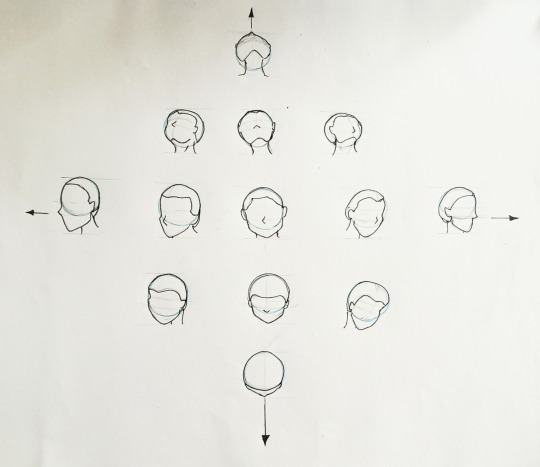
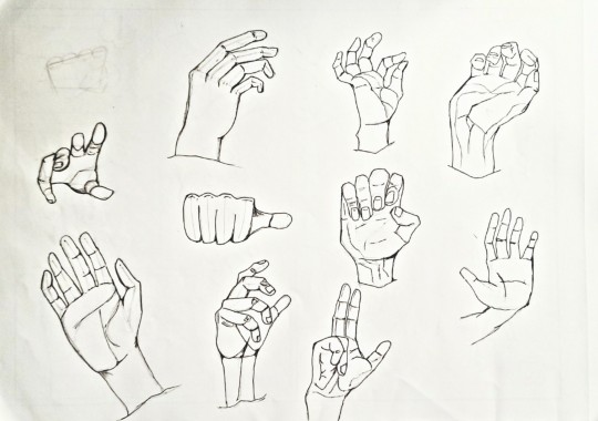
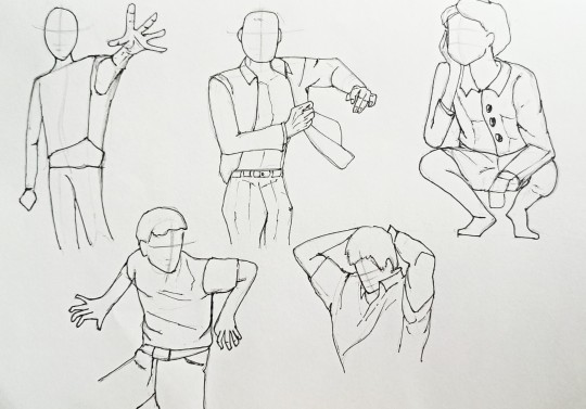
Human form study
An attempt to understand human postures in perspectives.
9 notes
·
View notes

