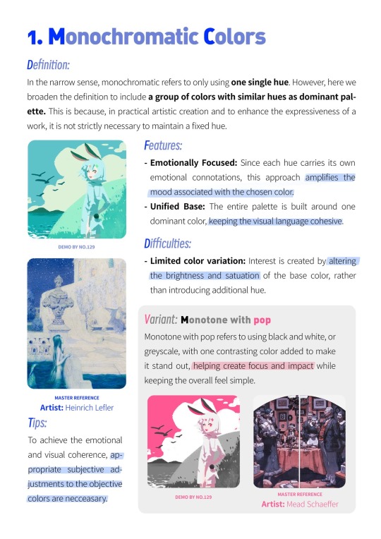
#Color theory
Explore tagged Tumblr posts
Visit Tumblr Blog
Explore Tumblr blogs with no restrictions, modern design and the best experience.
Last Seen Tumblr Blogs


Fun Fact
The most popular pages on Tumblr are about Minecraft, GIFs, and David J. Peterson.
Text
Out of context reimagined parts from my new #HHStargazersAU!
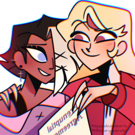
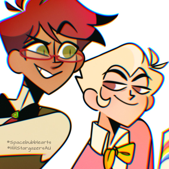
⚠️ TW: Nerdy word vomit about my coloring choices ahead:
My take on human Chaggie & Radioapple's color scheme! Yes. I headcanon the Magnes as beautiful blondes with just as beautiful brown eyes. Because there's no WAY warm red & yellows translate to cool baby blues! If anything, Vaggie's eyes would be the lighter shade. (At least in my AU.) Because her canon eyes are white and I think the dark skin contrast nicely with blue. As for Alastor's green... Look. Give me a chance! I swear I can later explain it through lore!
As for their clothes, I just chose hell's red for Charline, heavenly hues for Vaggie, earthy colors for Alastor to balance the green (with some white rather than black to show his employment under the Magnes), and pastels for Lucius (though out of everyone in my story, he may undergo the most palette switches. Just saying).
Spoiler for my recent comic update: As you can see, Vaggie & Alastor's human disguises aren't perfect. Thus some parts of their hair remain unchanged. Vaggie's ineffable white bangs and Alastor's brown-passing too-vibrant red hair (which mind you, was a difficult balance to achieve. Specially to match the greens-) still ever so distinct. People think they dyed it, but I assure you, it's all natural~! Along with their near supernatural ability to charm. Lol. -Bubbly💙
#spacebubblearts#hazbin hotel#chaggie#radioapple#hazbin ships#appleradio#vaggie x charlie#HHStargazersAU#color theory#ramblings#headcanons#lucifer x alastor#alastor x lucifer#charlie x vaggie#duckydeer#duckiedeer#family dynamics#fluff#mystery#romance#queerplatonic#human au#angel#demons#charlie morningstar#hazbin vaggie#hazbin alastor#lucifer morningstar#lucius magne#charline magne
1K notes
·
View notes
Text
This is the worst floor I’ve ever seen. It’s amazing

Ok, this house is weird. Firstly, I was wondering what was up w/the garage door.

Turns out it's a mirror. Built in 1955 in Palm Springs, CA, it's been remodeled and you must see the choices. 3bds, 3ba, 2,319 sq ft, $1,499,999.

Check out the floor, like a mass murder scene.

Conversation pit decorated with a sofa and tables. Was this once a hot tub?

The stains continue throughout the kitchen.

Two lone side chairs in a corner.

Gray cement walls in the kitchen.

Snacks for the buyers?

Looking out toward the pool from the pit.

Cement dining table. I think it's built-in. It also appears to have a convenient electrical outlet.

It's such a huge space to fill. The sun is casting shadows, but it looks like there are steps here.


The glass wall opens to the pool.


There's a shower room here, but it's open. At least the shower & toilet are behind a wall.

The bedrooms and baths have floors that look watercolor stained. Interesting how they put the bed partly under the arch.

The bed from behind. Is that a fridge?

The ensuite is big, but so sparse and spread out. I would've expected a sink under the neon mirror. This is so ugly.

The secondary bedroom is plain and has floating nightstands installed.

The primary bedroom has folding doors to the patio.


Out by the pool, it looks like they repainted the statues pink and black, themselves. The lamp is broken.

Matching statues.

Nice fruit tree.

Fancy ceiling lights in the garage.

.28 acre lot.
https://www.zillow.com/homedetails/2275-E-Belding-Dr-Palm-Springs-CA-92262/18019319_zpid/
37K notes
·
View notes
Text


something that took me some years to figure out is that desaturated colours are much easier to vary in hue because they are literally closer together


also the greys make your more saturated colours stand out more. if its all saturated then nothing really is
thats the power of the greys my friends
goot bye
2K notes
·
View notes
Note
New propic Is so cute! hey, technical question: how do you manage and entire character's wardrobe's color palette? i noticed donna wears azure, light blue, yellow, orange and pink. How do you keep the palette consistent through the whole outfits' rotation without It becoming repetitive? Is there a tutorial?
Oh funny you should ask bc I do actually have a character specific palette for Donna. You’ll notice that Albin’s colors are also here, but that’s because they’re often drawn together that this is just a result of that.


The azure is actually her eye color, and I often incorporate shades of it in her clothes. The yellow-to-orange gradient is simply bc it matches her hair, and the pink matches her skin. For the colors to match but not look like exact color swatches, I shift two of the three color parameters (hue, value, saturation) just a smidge, but not all three, because then they’re not of the same palette!
in the example here, the center is her skin color, and the outer ones are examples where i’ve shifted either hue+saturation, hue+value (B), or saturation+value just a smidge either to the left or right. The center will match with ONE of the outer ones, and the outer ones will not match each other (technically speaking, they might, but euehgghgueueh something something I don’t have time to check).
now, as to why I picked these colors to begin with— since I have pink and orange in her main palette, I picked a stark blue as an accent color since it’s the complimentary color to orange, which is the “middle” hue between pink (red) and yellow

(Now… ignore the exact placement of the dots on this color wheel, I don’t really like or use the “harmony” function in procreate because it’s not customizable enough to be helpful, you can be a lot more loosey goosey than this and get a good color palette, but I think you get the general gist!)
When it comes to what colors to pick for your characters wardrobe palette that aren’t part of their “body” colors, I’d go with a palette that suits that character’s personality and skin+hair. You can go complimentary colors, analogous colors, split complimentary, etc. it’s really your preference! If your character is dark and depressed; go for a desaturated, maybe monochromatic palette. A character like Lune who is prim, proper, and fashion forward would wear posh, hard to wash clothes, like creams and whites, and colors that compliments her hair and skin. It’s visual storytelling baby!!
So let’s pick Albin for example, and let’s say I want to give him a new jacket, he’s obviously green, and pretty fashionable, but not very flashy (color-wise). So for him I’d pick a simple complimentary palette with one main accent color, that being the complimentary color to green, which is red, but not just any red! The red should either match his green in value, or saturation (bc remember how i said before to move two/three parameters, you’ve moved one (hue) to change colors, so now you have one left).
It doesn’t have to match exactly, but it helps to know that if you struggle finding the right shade, just don’t move the value or saturation too far off from the color you’re matching it to!! Here are two examples of a two reds that are in Albin’s palette:


And for those curious here’s a red that matches in both value and saturation so you can see why they both shouldn’t match

fleshy..
And would ya look at that, I’ve already done it!! ;)

I hope that was at least a little helpful!!! ✨✨
38 notes
·
View notes


Text
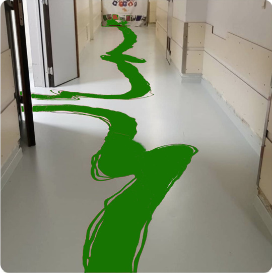
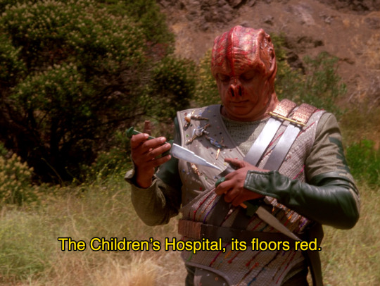
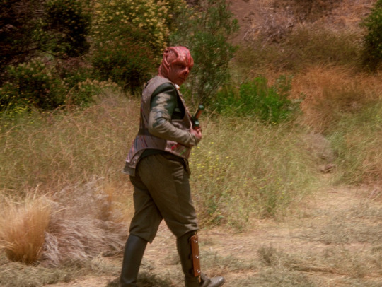
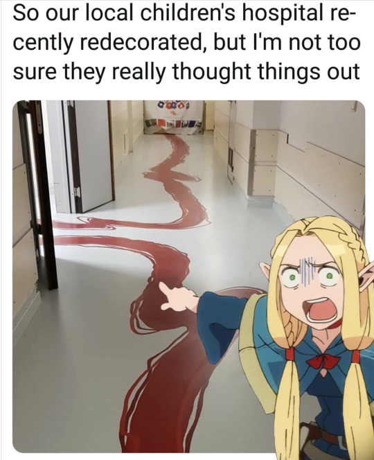
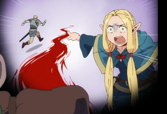
The Vulcan children's hospital recently redecorated. I'm not convinced they chose the most logical option
15K notes
·
View notes
Text
Free resource for artists and designers!!
I made a website where artists and designers can get color palette inspo from fire hydrants I've 3D scanned all over the US
Some of my favorites:
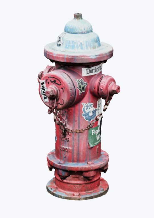
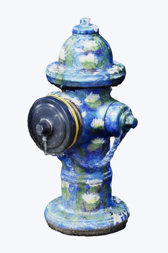
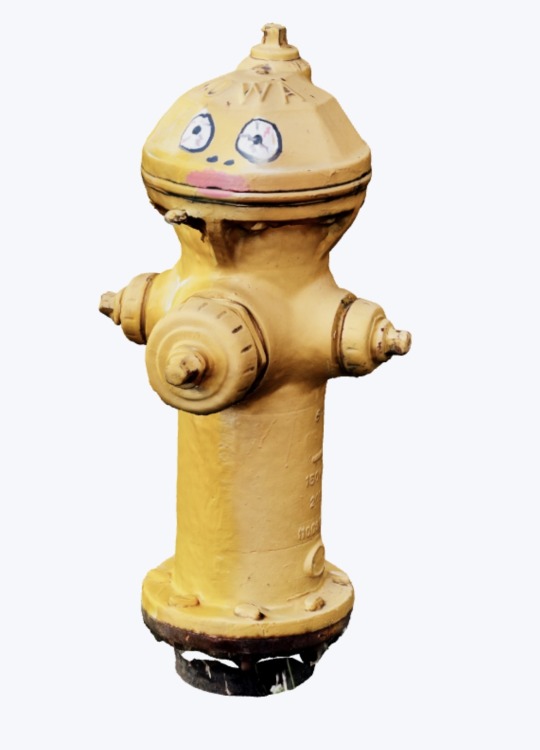
There are about 100 hydrants so far and I'm continuing to add more all the time
Public infrastructure is sexy, baby!!!!!! Pass it on!!
dayroselane.com/hydrants
38K notes
·
View notes
Text
1K notes
·
View notes
Text
🎨color study note
17K notes
·
View notes
Text
venus placements and color theory ౨ৎ

Aries venus
you guys already know by now. REDS. we love seeing you guys embody any shade of red. From the bloody reds to the burgundy. i also would associate you guys with *burnt* orange. Think of fire, since you guys are so fiery, mostly red and orange. red hair looks amazing on Aries venus. like AMAZING. even, again, burnt orange hair colors as well.
Taurus venus
love browns on you guys. deep dark browns. all i can think of is victoria monet, who is a taurus sun and taurus venus and she really OWNS that color. like you guys really invented brown. quite literally. More wood colors, like dark wood browns. mahogany. *chefs kiss*
Gemini venus
bright yellows. yellow gold jewelry. you all are very open with color and don’t mind wearing variety of colors. but because yellow is such a social color, a more inviting and expressive color, it just works for you guys every time. skin pops with the color yellow with gemini venus people. gemini venus and blonde hair, beautiful. blonde hair fits so well.
Cancer venus
white. because cancers are such a feminine sign, the sign of the mother, such a pure and soft yet bright and shining like the moon, white looks absolutely gorgeous on cancer venus. also i feel like because cancer venus can keep white clean as well. cancer venus people like looking clean and not busy or whimsical.
Leo venus
alright leo venus’s, y’all know how stunning y’all look in orange. but like the original orange color. it’s so lovely on you guys. even men with orange suits. it just works, all the time. silk orange material to represent royalty.
Virgo venus
GREEN. please y’all look so good and rich in green. very grounded color. can even be seen as sensual. deep emerald green makes you guys also look like royalty.
Libra venus
pinks, y’all knew this was coming. light pinks to hot pinks to soft pinks. it doesn’t matter, it makes you guys extremely approachable and inviting. you look very confident in pink.
Scorpio venus
y’all know y’all own the color black. its natural and effortless. its such a power move to wear black to important events for you guys. this color just demands respect. ESPECIALLY when all the black pieces you’re wearing matches. black hair as well.
Sagittarius venus
my sag venus’s yall can never do any wrong in the color purple. dark purle to light lilac purples. you look astonishing in purple clothing. definitely breaking necks with that color choice.
Capricorn venus
grey grey grey. so conservative and stoic like in that color. literally grey looks so dry and boring on others but on you guys it commands attention and it fits so well. silver jewelry as well with dark or light shades of grey. such a effortlessly sexy color choice for y’all.
Aquarius venus
deep royal blues. dark navy blues really demands so much attention when you guys wear it. very attractive and gorgeous on you guys. jewelry with sapphire crystal.
finally
Pisces venus
you guys are very experimental with your appearance. im saying iridescent and light blues. baby blues look so good on you all. very shiny material thats out of this world. eye catching. diamonds looks great on pisces venus’s. multicolor choices. and dreamy light blues. also highlights in your hair looks so good on you all.
*make sure we are giving credit when its due and not stealing other people’s work*
Copyright © 2025 Lunar Liyah. All rights reserved.
#color theory#astrology tumblr#astro notes#astrology observations#astrologynotes#astro.txt#rising sign#sun#astrology forecast#spirituality#scorpio#aries placements#taurus placements#capricorn#virgo venus#venus#astrologer#astro#astrology community
1K notes
·
View notes
Text

#oh no#i know a lot of audio engineers#it's like a hallucination#dare i say it#because color theory#children's hospital#hotel carpet patterns#color theory#heavy sigh
91K notes
·
View notes
Text
for all the artists out there, here are my favorite resources i use to learn!
Files
The Complete Famous Artist Course
Art Books and Resources
Art, Anatomy, and Color Books
PDF Files of Art Books
Morpho and Other Art Books
Mega Folder
Internet Archive
YouTube
My YouTube Playlist of Tutorials
How to Draw Facial Features
Drawing and Art Advice
Drawing Lessons
Art Fundamentals
Anatomy of the Human Body
2D Animation
Perspective Drawing
Websites
Pinterest Board for Poses
Another Pinterest Board for Poses
Pinterest Boards for References
Reference Angle
AdorkaStock
Figurosity
Line of Action
Human Anatomy
Posemaniacs
Animal Photo References
Humanae - Angélica Dass
Fine Art - Jimmy Nelson
The Met Collection
Character Design References
CDR's Twitter Account
iamagco's Twitter Account
taco1704's Twitter Account
takuya_kakikata's Twitter Account
EtheringtonBro's Twitter Account
Drawabox
Color Wheel
Color Palette Cinema
Free Images and Pictures
Free Stock Photos
FILMGRAB
Screen Musings
William Nguyen Light Reference Tool
SketchFab - 3D Skeleton Model
Animation References - sakugabooru
Animation Screen Caps
Animation References - Bodies in Motion
#art#art resources#art books#anatomy#composition#painting#art tips#art help#art tutorial#perspective#color theory#art reference
37K notes
·
View notes
Text

Thousands of Josiah Wedgwood’s Glazed Ceramic Samples Paved the Way for 18th-Century Ingenuity
728 notes
·
View notes
Note
any advice for picking fun and vibrant colour palettes that still feel true/recognizable to an object/setting/character's base colours? something about intense lighting?
I've been asked about how I choose my colors by a lot of people and I finally sat down and made a whole ass youtube video about it!
youtube
8K notes
·
View notes
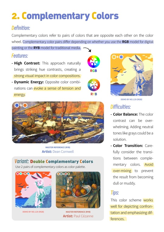
Text
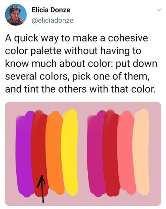
Palette tip form Elicia Donze
#art#color palette#how to create a palette#color inspiration#elicia donze#color theory#color design#palette building#palette design#color selection#art tip#art hack
333 notes
·
View notes
Text
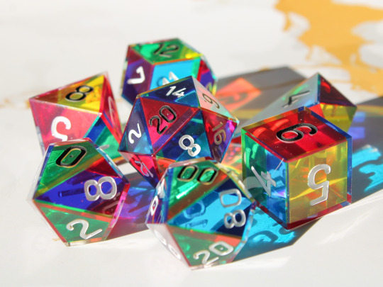

CMYK Rainbow Dice
A dice set made with only the colours cyan, magenta and yellow which combine as you look through the dice to form a full rainbow spectrum.
Plus they cast super colourful shadows!
#dice#handmade dice#handmadedice#dnd#ttrpg#resin dice#transmutationdice#dungeons and dragons#resin#d20#rainbow#cmy dice#cmyk#cmy#color theory
7K notes
·
View notes