
Is this the real life? Is this just fantasy? Caught in a landslide, no escape from reality
Don't wanna be here? Send us removal request.
Statistics
We looked inside some of the posts by sacchafiction and here's what we found interesting.
Average Info
Notes Per Post
44
Likes Per Post
43
Reblog Per Post
1
Reply Per Post
0
Time Between Posts
1 day
Number of Posts By Type
Text
8
Video
2
Photo
7
Last Seen Tumblr Blogs


Fun Fact
Mobile US users spent an average of 115.8 minutes on Tumblr app monthly.
Text
As it floweth!
youtube
- Read it after watching the video -
The Idea -
Transition - As simple as this word seems, it’s as much vast and difficult to capture it with few elements. Transition, if we start to define it, is the flow from one state to another. And that’s one reason to justify why we went ahead to represent flow through our video.
It’s started with not so silly idea of ‘water cycle’ from one of our members which turned into a big discussion on river, culture and topics like gender fluidity which many of us were completely unaware of. But we need to stay focus and limit our ideas, thanks to the short time and the sense of abstraction that we needed to achieve n it. After a while, we decided to share what we collected with our group mentors.
Because of this discussion, we realized that we had to break out from our preconceived notions and to do that we had to think about a broader term like flow or fluidity. The discussion was really groundbreaking for us, since now we could think of various types of flow and not just how a river behaves. Although we decided to go with the river story (integrating with gender fluidity) which are not so abstract, we could now think in terms of abstract ideas.
Now we had a basic plan which we could detail out. After few more zoom meetings, we divided our roles. I was mainly responsible for video editing/compiling (Adobe Premiere Pro), researching about river and few sequences but I have to mention, we all helped each other in some way or other.
The Process -
I had to shoot a sequence where I was required to throw things at the camera. The initial setup which I did was simple (below)

But I soon realized that when I throw thermocol balls, they just covers the whole lens after a point. So, I decided to go with some kind of glass before the lens. (Final setup below)

In the first few tries, my hand movements were gentle which were not fitting well with our narration. Since our main element in the narration was much more aggressive, I had to reshoot a few more time with more energetic and swift movements.

The Learning -
This was group assignment where we all were required to work together and pitch in our unique ideas from different places. The most difficult part of this project was not the lack of ideas but the integration of those ideas together. The way we composed so many varied ideas and sequences together, so that they all look harmonious together and tell a single story - is probably my greatest learning from this project.
I also learned to break out from my existing thoughts and boring ideas by taking a step back and broadening our theme. This is really a good method to come up with unique ideas.
This assignment was an excellent opportunity to apply what I learned about color and composition and evidently so, helped me understand their real application.
Cheers!
2 notes
·
View notes
Text
Photo Diary - Gestalt Principles
Exploring Gestalt principles by capturing the surrounding. All photos are original and belong to me.
0 notes
Text
Composition
For this task, I chose the word Vast and Hate.
Vast -


The above picture captures the feeling of empty space and a dot in it (earth), highlighted by a yellow triangle. This painting is inspired from ‘Pale Blue Dot’ picture taken by Voyager 1 space probe. The dot is placed in the frame following the rule of third.
Hate -

The above picture shows our normal feelings in form of lines deviating from the red square (Hate). This image simply gives us a message of avoiding the feeling of hate.
Visual Design Principles seen in ‘Vast’ image -

1. Balance

2. Point of Interest

3. Point of Interest

4. Point of Interest

5. Balance
Visual Design Principles seen in ‘Hate’ image -

1. Rhythm (Balance also)

2. Rhythm

3. Balance
Other explorations -

1 note
·
View note
Text
Principles of Visual Design
After doing multiple explorations, I decided on below three depictions after getting feedback from mentors. I have tried to keep the depictions minimal and such that the individual elements retain their identities.
Point of Interest
In the below image, our eyes lead from the dot at top left corner to the line at the top right corner giving us a sense of direction. Since our eye stops at the line, it gives us a sense that the line is the focal point of this image.

Balance
I chose this image since it is balanced even though it is not symmetrical. The length of the lines is compensated by the number of dots present. The elements are arranged almost in the center, leaving some space around which accentuates the presence of these elements even more.

Unity in Diversity
The depiction below very clearly shows the relationship between the dots. They are scattered around without any visible pattern helping them retain their individual identity. These dots have different positions in the space yet these are unified in the sense that all the dots surrounds the line.

Before choosing the final three, I explored vast number of ideas through thumbnail sketches attached below.
2 notes
·
View notes
Text
The Metro Life
youtube
Read it after watching the video.
The Idea -
The main idea behind the video was to show how our day looks like but with a different set of colors. Our video shows a smooth transition from morning to afternoon and then to night. Correspondingly, our video transitions from a white background to yellow elements to blue elements and then finally to the dark background. It's amazing and almost a new experience to imagine each of our activities in a new color.
The music also accompanies our idea very well with different melodies having a distinct pace signifying our mood at different phases of our day. The rhythmic melody tells us that the activities are routine and repeat themselves after a day.
The Process -
The process of making this video kickstarted with recollecting all that we learned during the color module - color wheels, color interaction, color harmony, lights, and pigments, etc. We quickly started doing ideation after that.
There were quite a few good ideas including representing the human lifecycle, a love story depicting the color harmony, the concept of getting out of the comfort zone but we finally decided upon depicting our daily routine through this opportunity. Simultaneously, we were also thinking about the medium to represent our ideas. Because of ease of collaboration, easy integration, and limited time we decided to go with creating digital frames to make an animation video.
After deciding upon the basic idea we developed it further. We detailed out our plan and the timeline and divided the work into ourselves. Although every member of the team was involved in each task in some way, I was mainly responsible for putting together the music and compiling the final video. Most of the sounds in our video are natural and everyone was responsible to record sounds around them.
Cheers!
1 note
·
View note
Text
Color Journal - Aakash Mangla
A visual diary to document my understanding of colors.
2 notes
·
View notes
Video
tumblr
Sketching faces
Trying different mediums for the same face.
1 note
·
View note
Video
tumblr

Maggi Noodles
If I have to think about a food that I can eat anytime it’s served to me then that would be Maggi noodles. It’s easily the most relatable food that any student can have.
To start, I thought about the elements and feelings I could associate with the noodles - exciting, unique taste, cheap, hot, spicy.
The music that I can relate to Maggi noodles is the opening bit of Black Mambo by Glass Animals. I chose warm colors to represent that it’s better served hot. I painted the background to show that the taste is consistent and you can taste it in each bite you take. Yellow round elements represent the unique taste it has. I have also put some red dots and patches on yellow elements to show the spiciness. But kept the red elements low to show that it’s not alarmingly spicy but adequately seasoned. The orange wavy elements represent the fun, watery mouth and the anticipation I have just before the first bite.
Explorations -


1 note
·
View note
Photo

Crawl - To those who always say, “It still counts.”
Medium - Digital
Inktober 31
5 notes
·
View notes
Photo

Ominous
Medium - Fountain Pen
Inktober 30
2 notes
·
View notes
Photo

Shoes
Medium - Pencil Sketch
Inktober 29
2 notes
·
View notes
Photo

Float
Medium - Watercolors
Inktober 28
4 notes
·
View notes
Photo

Music
Medium - Digital
Inktober 27
5 notes
·
View notes
Text
Color Wheel
Used Tempera colors for these color wheels. Initially, I used colors with very less water but the color in sectors wasn’t consistent. So on my next take, I used more of the water to have better consistency.
Attempt 1


Attempt 2


2 notes
·
View notes
Photo

Hide
Medium - Fountain pen and Glass Marking pencil
inktober 26
2 notes
·
View notes
Text
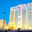
Train to the Blood Town

Changing color of natural light to red makes this look like that something horrible is going to happen on next station
4 notes
·
View notes
Photo

To all my chai buddies
Medium - Water Colors
Inktober 25
8 notes
·
View notes