
Statistics
We looked inside some of the posts by sophiessue-blog and here's what we found interesting.
Average Info
Notes Per Post
808
Likes Per Post
507
Reblog Per Post
301
Reply Per Post
0
Time Between Posts
4 days
Number of Posts By Type
Text
2
Photo
15
Last Seen Tumblr Blogs


Fun Fact
Tumblr is used by 21% of adults online aged 18-29 years.
Text
Reflection
The Communication Design studies class was the best class to come to because of the vibe and connection that the class shared with Andy and Karen. I think the way that they taught us was extremely relatable and the ideas they brought to the lectures were thought provoking and related to the following workshop which was always productive, fun and an enjoyable way of learning. My personal objectives in the beginning focused on learning new techniques and strategies of communication and learning how to think outside the box. I’ve achieved this and I’ve learnt more than I ever thought I would about the course and I feel that my creative designer self has grown and inspired new ways of thinking. I discovered more about the history of communication and where these ideas originate which has inspired me to research more about old and new design. The people in my class really inspired me. It’s amazing to see how much everyone has progressed, especially looking through everyone’s Tumblrs. The standard is so high and I’m truely amazed at how talented everyone is, and that really inspires me to push myself. Seeing my friends create amazing things is incredible. Thanks Andy & Karen!
0 notes
Photo
I honestly think that Dom’s zine was fantastic and probably my favourite zine from today. The work and end product was super clean and she interviewed fricken DION LEE!!! Well done Dom, I loved your zine.


Week Twelve
After perfecting the final touches on my digital file and spending far too much money at Officeworks, I began the process of putting the zines together. I slightly changed the blue colour, adjusted the font sizes and a few more minor changes after assessing my trial copy. This time I used a cutting board and knife to trim the edges as I found it to be much more precise, although time consuming. This method also allowed me to trim the entire zine once I had bound it together. Although the hand-stitching suited the zine, I didn’t think it represented Dion Lee’s designs the best as his pieces are always very clean and perfect. Instead, I decided to use copper staples to add a sense of luxury, rather than just using regular silver staples. I am really happy with the effect all of these improvements had on the final design, resulting in a very sleek and sophisticated outcome.
6 notes
·
View notes
Photo


7/6/19
ZINE THERE DONE THAT!
It’s all over
...for now.
Today we had the Zine There Done That exhibition. It was spectacular, Andy and Karen really put on a show. The zines magically hung from the ceiling and we were surrounded by countless amounts of amazing zines, all with very different styles and ideas. It was awesome seeing everyone’s work and picking up new zines. I loved talking to people about the way that they created their zine and so many people did some really creative things form paper choice, texture, cut outs, pockets, etc... It was next level. Showing everyone my zine and getting feedback was really exciting too. I loved seeing what everyone brought to the table and it also opened my eyes to some new artists that I really like and have never heard of before.
Here are pictures of me having a blast in the magical hanging zine wonderland.
1 note
·
View note
Photo


6/6/19
This is my completed zine! I printed the zine in a few different ways, I printed it on A3 silk stock and folded an 8 page zine that way, and I also got the guys at snap print in the city to make me a couple too! In total I had produced six zines. I wanted to have all my work done and copies produced by the 6th because my chosen creative, Tazmyn, was having a film premiere of his new film Boys Will Be Boys. I wanted Taz to be able to have copies of my zine so that before the screening of his short his friends and other creatives could view my work and read about Taz's journey into film making and the motivation behind his new film. I had five copies I to give him and I had five different polaroid pictures in each zine, to add something extra and unique to each zine. I was overall really happy with the outcome of my zine and so was Taz, he was really amazed and so honoured to have a zine written for him. I got postive feedback from his friends and other who were reading the zine at the show. Overall, I am really proud of my work and seeing other people reading my zine at a public event was really fulfilling. I am super happy with my zine and can’t wait to make more in the future.
0 notes
Photo


Layouts and ideas
I’ve done more research into the way I want to present and layout my zine. I’m testing out visual mockups on photoshop and then applying the layout ideas to the InDesign file. I’ve sketched different uses of page space and then tested this out with Taz’s pictures too. I have been writing out the text by slowing down the audio and re-writing our conversation transcript. I have a lot of material to choose from so I’ve been thinking about what story I’d like the images to tell when related to the text.
0 notes
Photo
WEEK 11!!
Whats next for design?
In our week 11 lecture we discussed Why Design? And hence the following question What’s Next For Design? We brainstormed and the next step, I believe, is going in a direction towards AI design, algorithmic generated systems and robotics. Parametric Move is a project by the Yamanaka Research lab at the University of Tokyo. The project is “producing prototypes of robots with the aim of improving communication between humans artificial objects.”
This project is called “SEER” - Simulative Emotional Expression Robot. “SEER is a small-sized humanoid robot that pursues eye-gaze and facial expression. The control that ties the eye toward the fixation point and the mechanism that “draws” the eyelids with a soft elastic wire gives the eye a lifelike impression.”
The artist behind the work, Takayuki Todo is a brilliant designer. This work makes me feel an emotional connection to the robot instantly, maybe due to its cute Japanese anime characteristics, but the fact that we can create artificial intelligence that can mimic human emotion is a one huge step into the future of design. The development of these type of robotics has the potential to change the way that the entire world works. I think this work is beautiful and I’m very excited for where this will take design and Ai technology.


Parametric Move
125 notes
·
View notes
Photo


My Creative for Ask Me Anything
After some ambitious searching and being seened by Dewey Saunders (he replied after this interview) I decided that instead of trying to find a big artist name who probably wouldn’t help me out for my uni project that I would look at the creatives that I already know, and that are already accessible in my networks. My friend Tazmyn is very creative. He is a filmmaker, actor, photographer, fashion designer, painter etc etc, he can do it all. I’ve known him since I was 13 years old, we grew up in the same city, Hobart Tasmania. He moved to Melbourne to pursue his career in film making and so I decided to hit him up for this project, which he welcomed with open arms.
For the interview I visited Taz at his house in North Melbourne. Seeing Taz was lovely and we caught up before executing the interview. I wanted my interview to be in a relaxed environment and I wanted the interview itself to be casual and conversational where we could talk and discuss the questions I posed. This is because I want the layout of the body text in the zine to look like a film script so that it ties in with the idea of cinematography and the fact that I’m interviewing a film maker. I broke the ice with a Yes or No questionnaire where I asked a series of personality defining questions to which he responds Y/N. This is the introduction of my zine so people become familiar with Taz instantly. I voice recorded the interview on my phone and we talked for about an hour. Currently I am listening to the audio over and over again and frantically typing out the discussion. As shown, my fingers are a bit too slow, but its good typing practice.
After the interview I asked if I could take some pictures of him, as I would like to have my own pictures feature in my zine. I took these pictures using my Nikon L35AF point and shoot camera, which I picked up earlier that afternoon. It was the first roll I shot and I’m super happy with the outcome of the pictures, it’s definitely my style and it captures Taz and his own style really well too.
Taz has supplied me with a huge collection of film stills, photographs and his fashion design work. I’m very excited to see it all come together
0 notes
Photo


14/05/2019
In our week 10 workshop we explored different ways of making our zine. Andy and Karen taught us the essential skill of prototyping and how to prototype 8-page and 16-page zines by folding a single piece of A3 paper. I didn’t realise how easy to actually is to make a zine instantly. I always thought that you need to go to a printer to get a zine printed on fancy gloss paper but, no, a zine is a zine and anything goes. We then took a look at the program InDesign. Andy and Karen supplied us with templates to create our zines in an 8-page layout and then in an A3 paper layout, where we copied an pasted our images into the A3 document and, with our knowledge of 8-page zine origami, were able to instantly create a zine. I used existing images to create a Kanye West “The Life of Pablo” inspired zine.
With our blank prototypes we began to explore layouts and different uses of page space for our zine. I’ve decided to call my zine “Zinematography” because my chosen creative is a cinematographer. It’s a nice play on words. The prototyping and creative process is one that I’m really enjoying at the moment, playing around with different layouts really helps me think about different ways of exploring my creativity and how I can make things look unique and different.
2 notes
·
View notes
Photo


Ask Me Anything Artists
I’m currently waiting on replies from a couple of artists about my interview questions but during this time I thought I’d share my favourite collage artist, Dewey Saunders. I think he finds most interesting pieces and collates them in a way that brings new life to the singular image by bringing coherence with an overall feeling. He’s from Florida, California and a lot of his works relate to this sunny, warm, vibrant and beachy aesthetic. I think its crazy how he can arrange images to fit like a puzzle in some of the most complex, and simplistic ways, and it always delivers such an eye catching and mind twisting effect. I’ve contacted Dewey and if he replies then I’m really to base my zine on his work! I think its really cool to compare him to some of the collage artists that we’ve been learning about such as Sergei and MM Paris, original collage artists that have visually inspired Dewey in some ways.
All images from Dewey Saunders instagram: @deweysaunders
4 notes
·
View notes
Photo


7/5/19
Week 9
For our week 9 workshop we got to play around with collaging! Taking pages from all sorts of magazines, our challenge was to find letterforms in the images and cut them out to make the letterform visible. There are letterforms found in many different objects. As Paul Klee famously said: “Art does not reproduce the visible; rather it makes the visible.” These collage works were similar to those produced by MM Paris who created beautiful typography of the first letter of the model’s name whom featured in the photograph they cut out. I really enjoyed this workshop, it was really interesting trying to find the hidden letterforms and we were able to be really creative with it. As a class we created the whole alphabet and it was really interesting to see what letterforms some people found in images as opposed to others.
2 notes
·
View notes
Text
REPOST!
WHAT IS ALL THIS BAUHAUS ANYWAY?
In our week 8 lecture we learned about the Bauhaus, a German creative school from the early 20s teaching the art and craft of making, with its teachers being some of the most influential artists from the time such as Walter Gropius, László Moholy-Nagy, and Wassily Kandinsky to name a few. The motivation behind the Bauhaus was to make creation more accessible, to let regular people indulge in the art instead of just the affluent. Bauhaus was the place in which the crafts of making beautiful things occurred. In their practice, the Bauhaus believed in the “truth to materials” letting the material be itself when used in a creative form. The Bauhaus used industrial materials that were easily accessibly and already in production. The often used materials such as glass, concrete, clay, wood, metal and so on... However, the Bauhaus was never just limited to these tactile crafts. Andy and Karen showed us in our lecture the Triadic Ballet by Oskar Schlemmer (1922), a ballet of geometry and form which breaks all rules of traditional ballet. The ballet itself goes on for approximately 30 minutes and it full of colour, shape and is a clear representation of the aesthetics the Bauhaus popularly constructed. The stagnant forms of solid shape and diverse abstract ways of thinking have inspired design in a fun and positive way until this day. With it being the 100th anniversary of the Bauhaus, I hope to see more of its influence and to perhaps incorporate some of this as inspiration into works in the future.
Oskar Schlemmer’s Triadic Ballet
In 1922 Oskar Schlemmer, famed Bauhaus artist and choreographer, premiered the Triadic Ballet, an avant-garde dance performance that toured Europe in the 1920s. Inspired by his own experience in the First World War, Schlemmer constructed the performance around the idea that the human body could be a new artistic medium. These costumes, designed by Schlemmer, had the effect of restricting the body, and thus helping to determine the ballet’s choreography. By limiting the participants’ freedom of movement due to the weight of the materials they are made from, their forms, and the masks worn, Schlemmer’s dancers are architectural structures forced to move as comic actors; dancing both playfully and clumsily across the stage.


122 notes
·
View notes
Photo


Architexture
In our week 8 workshop we were sent on a scavenger hunt for letter forms all over the RMIT campus. The workshop followed after our lecture that focused on type and the grid system. Hannah and I sought to “make visible” the letterforms hidden around campus. It was a really enjoyable experience, we talked and searched with the limited time we had and found quite a selection of letterforms. Since the workshop I’ve been noticing letterforms all over the city and its quite remarkable at how many hidden letters there is! I’m really excited to see how all our letterforms will turn out in the RMITabc that Karen is producing.
0 notes
Photo


16/04/2019
For our Week 7 class we reviewed our work for the “Ask me anything” assignment. We got a copy of our A3 photograph and were set the task by Andy and Karen to create a pop up exhibition in, and around the building so that we could tour around and view everyones work. My group chose to exhibit on the outside stairs. The idea of the pictures floating around the air was one that really appealed to me, so we used string to hang up three of the works from the stairs above, threading the string to the landing below and attaching with bulldog clips. The stairs allowed us to walk through levels of the works, and we could view different works along the stair barriers and fences along the landing. The element of movement with the floating pictures gave another dimension to the exhibition and made the work appear interesting against the grass backdrop, especially since many of our questions related to the environment and sustainability. Our group worked really well together and pulled a great effort and we were all really happy with the outcome of our exhibition. The only downfall was trying to get the whole class down the stairs at once to view the works, but as a single person walking through, this exhibit worked really well. Go team.
1 note
·
View note
Photo


9/4/19
Last week in Communication Design studies, Andy and Karen gave us the task of creating the alphabet with shapes. Firstly, our small group were given orange quarter circles, which we then made into a smooth, spaced version of the alphabet. Our initial idea of using some negative space between shapes added to the overall theme and connected the letterforms together so they looked consistent in a sequence.
Then, for our second challenge, Andy and Karen gave us a limited number of black squares, which we then used to enhance some of the odd looking letters in our alphabet. The addition of a black square tied the alphabet together and make it look more visually appealing, as well as assisting in creating clearer letter forms, such as the “N” and “P”.
For our third challenge, Andy and Karen really challenged us, by making us form a huge group with two other groups, adding another two shapes to the alphabet challenge; the blue quarter circles and green squares. We decided to start the typography from scratch but the idea of keeping the shapes separate and using negative space still remained. We came up with the idea of colour blocking, to create a sense of order and (hopefully) a more visually pleasing outcome. We also challenged ourselves to have one black square in each letter, to tie it all together. It was hard to arrange people in the group, some took leadership roles and others felt timid and wanted to be told what to do. We ended up getting into smaller groups of about two or three and each group self assigned a few letters that needed to be made. As the process continued, we collectively looked at the shapes smaller groups had made and critiqued what might work better and if anything needed to be changed, subtracted or added to the letter.
Overall my group came up with a modern font of commercial style text. The alphabet letterforms that we created look fresh and creative whilst being quite visually appealing. This activity was really fun and it was amazing to work with such a big group and actually make something half decent. I was stoked.
0 notes
Photo


Communication Design Studies Project 1
5/4/2019
Hello! My question question is... “Has the digital age instantly impacted the way we consume design?” I chose to focus my question around the topic of the digital age and how design consumption has shifted since the ease of digital technology came to be. I chose to use instant mee goreng noodles as my material for the typography, as the letter forms are all different and you get some really unique, curvy shapes. It was challenging to control myself and not eat all the letterforms before the final product was made, and to find pieces of noodle that had enough shape and enough noodley-bits to really communicate the letterforms. I chose the words "instant” and “consume” to highlight the fact that the letters are made from instant noodles and they are consumable.
Overall, I had a really fun time designing this project and I decided to add the scattered noodles on the side to really emphasise the fact that the words are made from instant noodles. This was a tasty assignment.
4 notes
·
View notes
Photo

Wow! Instant photography studio set up by Karen and I using some lovely LED professional lights, light reflectors, a big tripod and a nice camera, all hired from RMIT. Using this technique for product shooting is quite necessary is your lighting conditions are not up to scratch! In this class we learnt about the basics of photo editing in photoshop and how to take still pictures.
2 notes
·
View notes
Photo
Looking back at our lecture, we talked about the relationship between pictures and letters and how over the centuries how characters were used visually in illustration. We looked at Japanese script and the extent of the Japanese alphabet which has three different alphabets all with different purposes, and a kanji alphabet with over 1,200 common kanji characters. My own study of the Japanese language carried over 7 years and I still don’t know most of the primary school kanji. We have long way to go. This typesetting by Yoshihisa Shira is a gorgeous contemporary example of page space.
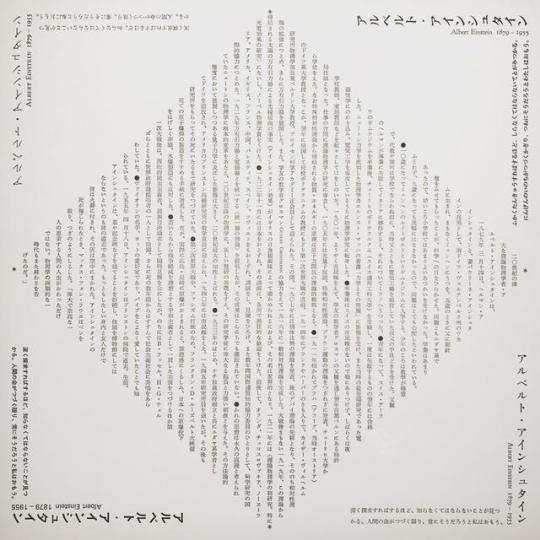
Yoshihisa Shirai, Typesetting at Ginza Graphic Gallery
539 notes
·
View notes