
Statistics
We looked inside some of the posts by summersartythoughts and here's what we found interesting.
Average Info
Notes Per Post
35
Likes Per Post
32
Reblog Per Post
1
Reply Per Post
2
Time Between Posts
1 month
Number of Posts By Type
Text
10
Last Seen Tumblr Blogs


Fun Fact
Premium Tumblr themes are available from anywhere between $9 to $49.
Text
Hi!!!
Hi there!! My name is Summer, and as a university student I wanted to divulge my brainpower into something productive and for anything I love (art wise) without restrictions of deadlines and particular studies! I hope this serves as a space for interesting topics and challenging discussions, I'm always up for a chat about anything mentioned on my page, and would love ideas of what to talk about in the future!!! <3
Summer Marshall-Miller
#introducing myself#history#art#painting#sculpture#collage#student life#i am tired#interesting#assignment#studyspiration#friends#memories#music#dance#performance#movies#films#film noir
1 note
·
View note
Text
Truck Art of Pakistan
Unlike many other countries, Pakistan finds its popularity lying with literature, poetry, and calligraphy. Visual arts like painting and sculpture have only in recent years come to the forefront of art representation in Pakistan. Traditionally, visual arts in Pakistan have been highly influenced by the preference in Islam for geometric shapes. In Islam, there aren’t many paintings with religious undertones due to the rule that Allah and the Prophet Muhammad are beings to be felt and believed in, not seen – people that have been known to create cartoons and depictions in human form what Allah looks like have faced major backlash and even threats of violence; sometimes the threats have even been followed through.
Pakistani artists do not rely solely on canvas and paper to display their two dimensional art. They create their art on furniture, walls and even trucks. Most Pakistani paintings are modern due to the representation of urban landscapes, and country scenes in abstract styles. Handcrafts are the pinnacle of Pakistani art, they are found everywhere in buildings – on pottery, carpets and fabrics; people also wear the decorative arts on jewellery, leather and textiles. Sculptures found in Pakistan tend to be mostly ancient, from the Indus Valley civilization and are thought to be some of the first instances of sculpting in the world; sculpture ruins have been found of all sizes in stone and bronze. In the 1st and 2ndcenturies BCE, sculpting became a much more complex form of art representing Buddha’s life and teachings through techniques and styles brought by invading armies, wandering artists, and local and technical artistic advances, (Arts Edge., 2021).

Truck painting in Pakistan is a form of indigenous art and features floral patterns and poetic calligraphy – it is not limited to trucks and can be found on buses and vans, too. Truck art is more than just a piece of cultural expression; it dates back to the 1920’s making it a part of traditional Pakistani artistic expression. It can cause businesses to thrive due to their eye catching and bold designs. Their first appearances came after England invading the streets of Pakistan, the trucks were fitted with large wooden prows on top of the truck bed. The prows, also known as taj or crown, were also accompanied by decorative bumpers and wood panelling along the cabin. During the late 1940’s, trucks began long journeys delivering goods, so each business created colourful logos in order for illiterate people to be able to spot the design. The logos became increasingly more colourful and decorative – “the more flamboyant the design, the better business became,” explains Durriya Kazi, head of the visual studies department at the University of Karachi and expert in truck art, (Zahra’s Blog., 2013). In the 1950’s Karachi became the capital for truck art and when artist known for his palace murals, Hajji Hussain, moved to Karachi, he lacked subjects for his murals and so turned to decorating trucks causing his floral, ornate style to push the genre forward.

Yaari Baba is seen on many trucks on the GT road as truck drivers hold on to a belief in his protective powers.
Pakistan, although not the only home to truck art, is the most prominent and is described to be a sole industry in itself. There are 50,000 people employed in Karachi dedicated to the art form, with most truck drivers willing to pay large sums of money to have their trucks made up. The trucks are also known as jingle trucks due to the bells decorating the exterior. Truck art dates back to the Sufi tradition of painting shrines in religious favour. Durriya Kazi states that “truckers don’t even spend so much money on their own houses,” and recollects an anecdote of a driver who explained that he put his own life and livelihood into the truck, and dedicates his care to the truck because he fears being ungrateful if he didn’t honour his truck with a ‘proper paint job.’ The art is seen as much of a business investment as it is an art form.

The expression of truck art is not only a visually beautiful and expressive form of creativity, but is a representation of hobbies, interests, inspiration and is able to physically demonstrate an incredible relationship between man and vehicle - and the pride the owner will hold after sprucing up their designs.
Haji Habibur Rehman is amongst a group who first studied with truck artists and has been painting trucks for the past 58 years, having started when he was only 14 years old. The master of truck art has gradually became more and more concerned with the progression of truck art, or lack thereof. “Truck art is slowly vanishing with stickers and plastic and steel ornaments, replacing the tedious work of painting by hand,” he said, (Dawn., 2015.)

Haji Habibur Rehman, 72.
BIBLIOGRAPHY
1. Daily Pakistan (2018) The Pride of Pakistan. Available at: https://en.dailypakistan.com.pk/03-May-2018/truck-art-the-pride-of-pakistan (Accessed: 11th April 2021)
2. Dawn (2015) A Driver's Pride and Joy. Available at: https://www.dawn.com/news/1199360 (Accessed: 11th April 2021)
4 notes
·
View notes
Text
Part 2: The Evolution of Car Marketing in America
Example of Beetle ad, 1956.

The layout of the Volkswagen ads became so notable that Krone even began creating advertisements without even showing the car itself off. A recognised ad demonstrating this is the 1969 model Lunar Module ad with the headline, ‘it’s ugly but it gets you there’ with the Volkswagen logo directly underneath.

These Volkswagen ads inspired viewers to view ads with intelligence and understanding, they were graced with no pressure to buy the newest models and makes, there were no terms and conditions to the purchase, and it was not demanding of money. This cultural shift caused the Volkswagen to become an integral part of American counterculture in the sixties. Bill Bernach, Helmut Krone and Julian Koenig are seen as pioneers for the creative revolution all because of this one advertisement.
Modern Car Advertising
The 1980’s experienced the United States stock market in full swing and the luxury industry was clawing its way back to the top. The automobile was back to being viewed as a status symbol and surpassed being used for only a family. Porches and Lamborghinis insisted that you were of the higher class, and - better than everyone else. Not only this, but international cars began getting advertised in the United States beginning an even larger and more diverse automobile industry. The ads focused on bold colour, small writing or snappy headlines accompanied by sleek photographs of the vehicles of the time in action.

Porche 944, 1980-1990
The nineties were much like the eighties but began seeing the incorporation of celebrities in adverts to sell - mainstream media was of high interest to the public and marketing strategies played on this effect.

Toyota 992 Celica, 1992
Today, car marketing is much more prominent through television and video clips. They are often depicting scenes of the vehicle all but saving the person’s life and defying its intended purpose of transport. Automobiles have begun to include many other factors like entertainment, comfort, and speed. It has been noted that through research, the public has come to an agreed conclusion that the days of poster adverts in magazines from the fifties and sixties introduced a feeling of danger, spontaneity, and fun. The dramatized action and drama intrigued the everyday viewer and engaged them with words and photographs instead of celebrities and sizing. It leaves the viewer wondering, will marketing campaigns and ad agencies ever be able to achieve the level of impact that the Volkswagen did in 1959? Or the Cadillac of the 1930s? Or will we be forever dissatisfied by the quality and repetitiveness of automobile marketing?
BIBLIOGRAPHY
1. Wired (2009) July 30, 1898: Car Ads Get Rolling. Available at: https://www.wired.com/2009/07/dayintech-0730/ (Accessed: December 8, 2021).
2. Coal Canary Region (2019) On April 1, 1898, A Port Carbon Man Bought The First Car In America. Available at: https://coalregioncanary.com/2019/04/01/on-april-1-1898-a-port-carbon-man-bought-the-first-car-in-america/ (Accessed: December 14, 2021).
3. The Henry Ford (2015) Advertising the Model T. Available at: https://www.thehenryford.org/explore/blog/advertising-the-model-t/ (Accessed: December 14, 2021).
4. Heimann, J. and Patton P. (2009) 20th Century Classic Cars. Germany: Taschen.
5. Supercars (2021) The 1930’s Cars Chugged Along Despite the Great Depression. Available at: https://www.supercars.net/blog/cars-of-the-1930s/ (Accessed: December 14, 2021).
6. Rear View Prints (2021) A History of Car Advertisements and Vintage Car Prints Available at: https://rearviewprints.com/magazine/history-car-advertisements-vintage-car-prints/ (Accessed: December 15, 2021).
7. Motor Cities (2015) Cadillac: Standard of World Advertising from 1930s-1970s. Available at: https://www.motorcities.org/story-of-the-week/2015/cadillac-standard-of-world-advertising-from-1930s-1970s (Accessed: December 15, 2021).
8. Saturday Evening Post (2015) Vintage Auto Ads: Cadillac. Available at: https://www.saturdayeveningpost.com/2015/10/vintage-auto-ads-cadillac/ (Accessed: December 15, 2021).
9. Forbes (2009) The Man Who Saved The Cadillac. Available at: https://www.forbes.com/2009/04/30/1930s-auto-industry-business-cadillac.html?sh=799674819d26(Accessed: December 19, 2021).
10. Hagerty (2019) How Nicholas Dreystadt ended racism at Cadillac in the 1930’s or tried to. Available at: https://www.hagerty.com/media/automotive-history/nicholas-dreystadt-ended-racism-at-cadillac-in-the-1930s/ (Accessed: December 19, 2021).
11. Medium (2015) The ad that changed advertising. Available at: https://medium.com/theagency/the-ad-that-changed-advertising-18291a67488c (Accessed: December 21, 2021).
12. 4 A’s (2021) Truth in Advertising: DDB and VW Encourage the World to Think Small. Available at: https://www.aaaa.org/timeline-event/vw-encourages-world-think-small/?cn-reloaded=1 (Accessed: December 21, 2021).
Summer Marshall-Miller
8 notes
·
View notes
Text
The Evolution of Automobile Marketing in America
Automobiles are one of the largest and most important items that an individual can own, often prioritised beside owning a house and can become a crucial part of an every-day routine. Therefore, advertising alongside automobile sales is critical for car companies to successfully adhere to society. The first noted vehicle advertisement came to the public’s attention on 30th July 1898, (Wired., 2009), with the marketing of ‘Dispense with a Horse’, showcasing The Winton Motor Carriage in the Scientific American, which is known for detailing the works of Einstein and Fermi.

1898 July issue of Scientific American.
The advertisement encouraged an idea of ‘save the expense, care and anxiety of keeping a horse’ and was on the market for $1000, which in modern transaction would be around $26,800. Alexander Winston, of The Winton Motor Carriage was a Scottish-immigrant bicycle maker who switched to building cars in 1896 and had managed to create the world’s largest auto factory by 1900. The advertisement was published in a magazine targeting the typical educated man of the time, and was received by the likes of such, as the first person to buy the car was Robert Allison, a mechanical engineer from Port Carbon, Pennsylvania. The payment for the car took longer than one week to receive in Cleveland, Ohio, where Winton Motor Carriage was based, and right after receiving the money, the vehicle was promptly shipped to Allison (Coal Region Canary., 2019).
In comparison to early advertising methods, the modern car is seen everywhere. Billboards, television, magazines, newspapers, social media, and so on… However, is the impact still as severe as the days of posters and magazine articles? The bold colours, statements, and sought-after sex appeal, is car marketing more than hiring a Hollywood actor to fake drive a car around a mythical place? This article will explore the evolution of car marketing and how advertising became inclusive to all genders, classes, and ages.
Black and White to Bold and Beautiful
Simple black and white adverts for the invention of automobiles were a sign of the times and symbolized a certain wealth and luxury. They were not an art piece or a dramatized scenario for the people’s entertainment, but rather a means to sell, their only purpose was to demonstrate an acceleration in mass production, affordability, and technology. In 1912, Henry Ford said, “Ford advertising never attempts to be clever”, but as time passed into a new decade, the 1920’s proved to be a step in the right direction for eye catching detail, with snappy and savvy punchlines that were hard to miss. However, this did not come without its share of past advertisements. In October of 1908, a full-page advertisement announcing the introduction of the Ford Model T, the full A4 page is covered with rich text and technical detail - the text in summary furthers Ford’s motto - which is still enforced to this day - ‘Ford: High Priced Quality in a Low-Priced Car’, and the advert was posted in Life and Saturday Evening Post magazine, (The Henry Ford., 2015). Ford was introduced in 1908 with the rise of interest within the automobile market, and marketed itself on the promise of affordability, efficiency, and reliability, which many other car companies decided to use as their standard to follow. By 1918, half the cars in America were Model T’s and by 1927 when the Model Ts were discontinued, more than 15 million Model Ts had been produced. From 1911 to 1915, Ford moved onto using quarter page advertisements, they continued using text for much of the advert over art and emphasised the price as this was the most attractive attribute of their invention. There were bold borders containing the advert and the use of empty space around the text disassociated these ads from all others on the same page. This ad ran on June 12, 1912, in the Horseless Age magazine. Henry Ford did not believe in paid advertising being worth it, and so during the 19 years that Ford Motor Company produced Model T, the company routinely discontinued national advertisements when the demand for the car stripped the company’s production capacity. As Model T sales declined in the 1920’s, Ford reinvented their national advertising department and caused the shift from the previous types of advertising characteristics and began featuring coloured illustrations to appear attractive to the public who were desiring fashionable goods and social standing. As well as being advertised as an affordable alternative for transportation, the Ford Model T was now offering practicality and style - ‘Among those women who are recognised in their communities as arbiters in matter of taste, the Ford Four-door Sedan enjoys unusually high favor.’

Published in national magazines in January 1924.
Furthering into the 1920’s, 1925 saw Ford beginning to use women and children as a selling point and portrayed the Model T as a ‘key’ charm to the outdoor activities families would take part in, this advert appeared in the July 1925 issue of the Ladies Home Journal.

July 1925 issue of the Ladies Home Journal
Heimann and Patton (2009, p.107) noted that ad agencies were brought in during this time for marketing campaigns to drive sales and continue being eye-catching as well as unproblematic and the public were sold the idea of action car chases from the Hollywood big screen. Moving into the 1930’s, America even though struggling with The Depression, car adverts sliced open the darkness enveloping the nation.
Surviving The Depression and Racism
1929 onwards was a particularly tough time for the American automobile industry due to the Wall Street crash which took place in October 1929, triggering the economic depression. The following years of 1931 and 1932 were especially difficult for the automobile industry to rebegin their business success, (Supercars., 2021). Due to this downfall of profit and sales, car companies soon realised they needed to design their cars to become more attractive to new buyers. This was no different for the advertising at that time. Much like Ford’s later advertising for Model T, the thirties revealed a love for vibrant colouring and sleek illustrations, (Rear View Prints., 2021). In 1930’s America, the cars stealing the attention of the public were the likes of the Cadillac and the Chevrolet. The Cadillac brand became a distinguished and luxury car brand that automotive historians and consumers have enjoyed for a very long time, (Motor Cities., 2015). Enthusiasts of the brand have always been keen to share the history of Cadillac designs, and the ads for the company never disappointed. From the 1930’s to 1970’s, the Cadillac was promoted to consumers in a series of ads that inspired hope and modernity within a down and depressed community. The first ad to appear for a Cadillac was in 1903 and was the first automobile advertisement to be published in The Saturday Evening Post. This ad from 1904 boasted about a Cadillac owner having driven a 93-mile journey without a single breakdown, emphasising the average speed of 13 miles per hour, (Saturday Evening Post., 2015).

February 6, 1904.
Up until 1927, Cadillac ads were the norm for the time, with its black and white illustrations with a lot of text to support the selling of the item, however, as a new decade dawned closer, colour became a prominent selling feature. Due to Cadillac being rather unattainable for the time, the company began building a less expensive alternative named, La Salle, which remained in production until 1940.

September 10, 1927
The inclusion of detailed drawings being the centre of the ad successfully attracted new consumers and appealed to a wider audience, instead of just gaining traction from higher class rich folk. By 1921 Cadillac was the most expensive car at a price of $5190, which would be $61,670 in 2009 dollars. However, by 1930, the luxury of the golden age automobiles virtually collapsed, in 1928, General Motors manufactured 1,709,763 vehicles in the US, 41,172 of them were Cadillacs, but by 1933 there was a decline of more than 54% in production. 779,029 vehicles were made, with only 6736 of them being the sales for Cadillac, an 84% decline, (Forbes., 2009). This all changed when Nicholas Dreystadt, the head of Cadillac’s service division, crashed a General Motors executive committee meeting, and put forward his ideas to increase profit in the following 18 months, with or without the great depression. Cadillac, known as a luxury car division, strategized to not have any black customers to keep their image with the higher public. The blatant racism was of the norm for the time and did not distress the public whatsoever and was practised by most other companies, but Dreystadt became curious as to why he saw so many black customers waiting for their cars to be serviced in the dealerships he would visit. He came to learn that these black customers had purchased their Cadillacs by hiring white men to act as the face of the customer. This caused him to realise without this barbaric rule of not selling to people of colour Cadillac would sell more cars as these people were willing to pay a middleman’s fee to invest in the vehicle, (Hagerty., 2019). The went on to brand themselves as, ‘The Worlds Standard.’
Although Cadillac were a step in the right direction to ease discrimination in the world of marketing, racist and discriminatory marketing campaigns did not end altogether. Volkswagen, founded by the Nazi government in the 1930’s, built the ‘people’s car’ and used slave labour from concentration camps in its manufacturing processes, (Medium., 2015). Aside from the terrible origins of the Volkswagen, the advertising for this company became knows as the marketing that changed advertising forever.
The Golden Era
The 1950s -1960s saw a change in advertising and the advertiser’s reliance on photography and artwork to impress the consumer and educate them on what they are going to be buying, (Rear View Prints., 2021). The ads depended on their audiences being somewhat familiar with the products without any nudging, they also began to depict upscale living that meets a feeling of ‘white picket fences’ and 1950’s modern living. The station wagon became more sought after and was often depicted in scenarios of familial activities such as days out, sports and the families themselves. Specifically, the Chevrolet Nomad and Pontiac Safari which the adventure of travel, from road trips to running the basic daily errand.

1959 Chevrolet Nomad 4 Door Wagon Ad.
The ads took on a whole new purpose of not only selling a vehicle, but the American Dream.

1955 Pontiac Safari Ad.
With the 1950’s being a notable time in history for its glamour, fashion and stars of Hollywood, women became more interested in furthering their interests to the luxurious cars of the time, thus leading the 1950’s to turn a corner with its automobile design and marketing. Cadillac began offering new colours to attract women buyers to the dealerships, these colours being Princess Green, Duchess Green and Mountain Laurel, which was a soft pink colour. They were manufactured in 1956, (Motor Cities., 2015).

Cadillac advertising fashion inspired vehicles, targeting women, 1956.
The years 1953 to 1962, Cadillac advertised more female designers and fashion trends than any other car manufacturer in the United States. 1959 saw Cadillac advertising featuring beautiful women alongside the slogan, ‘take a lovely lady, place her at the wheel of a new Cadillac car and you have a delightful picture indeed.’ The most recognizable Cadillac advertisement for the 1967 Fleetwood Eldorado. The headline stated, ‘only one car can make a Cadillac owner look twice,’ and featured a man looking out of his half rolled down window at a 1967 Eldorado, and thus became the most talked about ad amongst peers of the time and historians to this day.

Think Small Campaign of 1960
The end of the 1950s marked the beginning of Doyle Dane Bernbach and Volkswagen destroying the status quo of style and attractiveness for cars, as in drives the notorious Volkswagen Beetle. 1959 was the peak of automobile sales prioritising fashion statements, speed, style and design, but Volkswagen had other plans as they introduced their legendary ‘Think Small’ campaign, introducing the Beetle to the American audiences. ‘Think Small’ created by Doyle Dane Bernbach steered in an opposite direction to all other advertisements of the time, the typical ad would be brutally honest, bold and colourful - but the Beetle was small, slow and in theory an ugly foreign car created by the Nazi party. However, the admittance to these things appealed to the American consumers and soon became an iconic piece of American pride. The ads were not supposed to be lifestyle ads, but adverts to acknowledge their dependability and durability, making their case to encourage owning small, ugly car to be bold and smart, (4 A’s., 2017.)

Think Small Campaign 1959.
The Volkswagen sold extensively through Europe in the 1950s, but competing manufacturers came to the realisation that small cars were up and coming and the people wanted them. This meant Volkswagen had a looming threat of competing car manufacturers and so sent a man named Carl Hahn to America to advertise their small wonder. Carl Hahn searched and searched for an agency to accompany him on this venture, and eventually found Doyle Dane Bernbach and received a pitch from Bill Bernbach - taking Hahn through DDB’s portfolio of works and Hahn was quickly impressed and believed he had finally found the agency to work with and rely on. Volkswagen and DDB signed a contract agreeing that DDB would get paid $600,000, which was a miniscule amount in comparison to the ad expense other manufacturers would pay, Chevrolet alone was spending $30.4 million on advertising. Joined by colleague Helmut Krone, Bill Bernbach and Carl Hahn travelled to Germany to visit the factory and, the DDB employees were extremely impressed with the work ethic and pride factory workers took in inventing these cars. Julian Koenig, a Jewish man born in New York City, unbothered by Volkswagens ties to the Nazi party, joined the team as a copywriter besides Krone and Bernbach. Soon the line, ‘maybe we got so big because we thought so small’ began making rounds amongst the men and the headline ‘Think Small’ came into play. Art director Krone was not happy with this development, but after much persuasion from Bernbach, they settled on ‘Think Small’ and began creating the advertisement.
The ad itself was traditionally laid out on a traditional ad layout, with an untraditional image. Krone is described as a ‘genius’ with his ability to take something familiar and boring and alter it just enough to make it brand new. There was the headline, the car - placed in the upper left corner, on a slight angle - and was engulfed in white space leading the viewers eye directly to the car. There were no ‘fancy’ illustrations, but just a simple black and white photographed advert. The decision to print in black and white was made mainly because Volkswagen did not have enough money to pay to print in colour, but this turned to work in their favour as the black and white ad struck the viewer and made impact when beside the colourful pages in Life Magazine. The advert was initially received with suspicion by other advertising agencies, but the public adored it. Of all ages, people were talking about it - to the extent that teenagers were ripping the page out of magazines to pin it on their walls - and this began the ad that became more than an ad, but a cultural impact.
The impact of the Volkswagen ads were continuously furthered through the whole of the 1950s-1961. The appearance of the car never changed which immediately eased pressure off those who could not afford to keep up to date with the newest in style, but impressed people of all kinds with its ability to withstand time, weather and other determing factors.
Continued in next post!...
#cadilac#history#volkswagen#painting#cultures#world history#art history#design history#cars#fast cars#old cars
4 notes
·
View notes
Text
Sally Mann
There is an extensive list of artists that fall under the contemporary art genre. Contemporary art being the time of the now that will eventually become divided into subcategories of the past - meaning at some point, every artist has been creating contemporary art. The mediums used within contemporary art are also long, including, painting, installation, performance, video, film, music, photography, sculptor and drawing - and personally, as much as I love the aestheticism of all these practises, I find myself particularly fond of contemporary photography.
More specifically the work of Sally Mann.
Sally Mann is an American photographer known for her large format, black and white photographs, her subjects being mainly young children, then evolving to landscaped depicting decay and death. The photography involving her children tend to mimic and act out social and familial roles in the landscape of their Virginia home. The incorporation of her home life with her career creates a personal addition to the works, a sense of inclusivity to the viewer creating a togetherness between all people including the models, artist and viewer. Sally Mann uses an 8x10 view camera to zone in and present fine detail. The ‘Immediate Family’ photographic series have Mann’s children as the subject matters, and are posed or occupied in their own activity, often appearing nude. Mann created this series to capture both primal and playful aspects of human behaviour.

Sally Mann, 'Immediate Family', 1992.
The inclusion of her children in vulnerable states can make viewers uncomfortable and has been the subject to controversy in the past. Mann says about photographing her children from newborn, ‘for years I shot the under-appreciated and extraordinary domestic scenes of any mother’s life with the point and shoot, but it wasn’t really until 1985 that I put on my photography eyes and began to see the potential for serious imagery within the family.’ She became attracted to creating art that displayed the darker side of childhood instead of the typical pristine and overused visions of innocence after taking a photograph of her daughter Jessie’ face swollen from insect bites.

Sally Mann, 'Damaged Child', 1984.
In 1988, Mann captured the confusing emotions of developing identities of adolescent girls, book, At Twelve: Portraits of Young Women. The book contains 37 duotone images of twelve-year-old girls - her children and her relatives - in her Virginia home, again. The photograph, ‘Candy Cigarette’ has been the standout image from this book and received the most appraisal.

Sally Mann, 'Candy Cigarette', 1989.
Candy Cigarette depicts Mann’s striking combination of careful planning and luck, portraying her daughter Jessie stagnant in her activity and delicately balancing a cigarette between her fingers. She is appearing as a blonde twenty-something year old, when she is in fact still a child, the only indicating factor of her age is of course her appearance - but her stance, and mannerisms direct otherwise. Mann is thought to be telling a story of a defiant young woman straying from the straight and narrow path. The use of shallow depth of field to explicitly focus on Jessie, but the background provides additions to the narrative. As it is only up for interpretation, I believe that the two blurred figures - potentially Jessie’s siblings - could represent the normality of childhood and sticking to the typical childhood activities in attempt to recapture Jessie’s attention as she is groomed by adult rebellion. The path is also a part of the blurred background and could refer to the hypothetical ‘path’ of childhood that Jessie is moving away from, whereas her siblings look down the path wanting to further their adolescence. The path happens to be the colour white, often connotating to hope, future, innocence and all things positive, furthering the idea of this being the ‘right’ path to follow, and everything the girl is rejecting by turning her back and smoking a cigarette. However, ironically the girl is also dressed in white, showing she is still a child, opposing her actions, and is a beacon of light - or supposed to be. The image is shocking upon first glance, as the viewer is struck by the complete opposition of the young girl doing an adult activity. The taboo theme behind this concept is what makes it remarkable. Jessie’s messy hair and clothing attire also contribute to the rebellious nature of her activity, stance, posture and facial expression. The lack of happiness and carefree nature in those things indicate the unhappiness and thrive to become an adult by this adolescent child. Like most art, this is also up for interpretation, so my analysis is solely based on my own life experiences, world views and outlooks on life.
Andy Gundberg from The New York Times reviewed the work, saying, ‘Ms Mann is at her best when she concentrates on flesh and blood. Her picture of a girl in a tank top, taken over the subject’s shoulder from behind so that all we see is the curve of her shoulder melding with the shape of her breast, shows how powerful simplicity can be.’
Controversy only arose after the release of ‘Immediate Family’ in 1992. This series featured images of her children in her family home - in the nude, injured or otherwise vulnerable positions. Bloody noses, urine-stained bed sheets, and even naked dances - typical children behaviour, but when documented, particularly disturbing to promote. Especially with the children’s age ranges of 1-12 years old. Mann was aware of the effect this photographic series could have on her children as they grew up, and so had a psychologist assess the impact the series would have on them and confirmed they would be just fine. The New York Times Magazine ran an article by art critic Richard B Woodward, titled, ‘The Disturbing Photography of Sally Mann.’ Although the piece wasn’t necessarily overly critical, it was focussing specifically on the sexualisation of her children and how it raises ideas about child abuse and incest. Backlash from this article consisted of both complaints of how Mann’s actions were affecting her children’s sexuality, but in contrast, praising Mann’s novel and striking depictions of intense maternal love.
The Wall Street Journal published a paper accompanied by a photograph of nude Virginia (Mann’s other daughter) that had ran on the cover of Aperture Magazine in 1990, but The Wall Street Journal censored her intimate areas and eyes with black bars over them. Mann responded by saying, ‘It felt like a mutilation, not only of the image but also of Virginia herself and of her innocence,’ arguing that the censorship - thick black bars - made the image come across like that of pornography.'
In regard to the controversy, I agree with Mann. Some viewers treated the images of her children like pornographic material, but in reality, the images were typical scenes of children behaviour, but in comparison to the everyday person, Mann made the bold decision to publish them for everyone to see. It shows childish actions of young people, as well as their unaware, innocent mannerisms. The children aren’t posing or being posed for sexual reasoning, so the audience should not be looking at it with views as such.
'These are not my children; they are figures on a silvery paper slivered out of time, I believe my morality should have no bearing on the discussion of the pictures I made.’ Sally Mann.

Sally Mann, 'Dog Scratches', 1991.
Moving on from art of her family and children, Mann’s first project exploring themes of morality and decay began after the death of her pet dog, Eva, who she photographed through various stages of decomposition. Leading on to further works of morality exploration. Due to this work, she began accompanying New York Times reporter, Kathy Ryan, and photographically documenting the decomposition of human bodies whilst on tour of the University of Tennessee Forensic Anthropology Facility. The work is collected in a five-part project entitled ‘What Remains’ and is a gritty meditation on the mechanics and aesthetics of mortality.

Sally Mann, Untitled, from series 'What Remains', 2001.
Sally Mann’s work is a conversation starter for people all over the world. Although it isn’t the typical appearance of contemporary art, it most certainly is. It tackles subjects that have been revised over and over - motherhood and children - but in ways that have never been explored before. Somewhat taboo juxtaposition and themes - but at the same time completely normal and everyday life of children that aren’t usually documented in such gritty and gripping ways. The sparked controversy her work caused is a typical kind of response to contemporary art from my own experience of research. The works are either too taboo, too plain, too much, too real, too fake or too simple - and no matter the work, you will never be able to win every viewer in the audience. That doesn’t matter as long as you have moved one person in that crowd. I happen to be this one person for Sally Mann.
Summer Marshall-Miller
12 notes
·
View notes
Text
18th Century Onwards Representation of LGBTQ+ Art
Queer art, or LGBTQ+ art, broadly refers to modern and contemporary visual art practises that draw on lesbian, gay, bisexual and transgender issues, imagery and experiences. Although queer art is often viewed just as art made by members of the LGBTQ+ community, it is much more than that. It tackles themes of identity, sensuality, eroticism, crisis, violence, shame, but also pride, happiness and embracing one’s true self. The boldness behind the artist intentions of their art works under this genre is often met with controversy and backlash from people still holding their old-fashioned and sometimes religious beliefs. Queer art holds various different meanings depending on national, religious and ethnic contexts.
Historically, the term ‘queer’ has been used in a derogatory and homophobic way, stemming from the AIDS crisis in the United States during the 1980’s, but it has since been reappropriated and embraced by queer activists. ‘Queer art’ was also a term used to refer to the work of historic LGBTQ+ artists who worked before the use of modern-day labels, lesbian, gay, transgender, bisexual, and further on. The genre doesn’t specifically relate to only one medium of practise, it includes a wide range, from performance art, video art, installation, photography and film, to the more typical mediums of painting, drawing, sculpture and mixed media.
Queer art is mostly universally accepted these days, but it of course hasn’t always been like this.
Before 1861, homosexual acts in England and Wales were punishable by death, but laws were a little more liberal in parts of Europe, but in the United States, some states were allowing punishment of sodomy by mutilation. This terrifying threat lingering above closeted members of the LGBTQ+ community members heads meant that homosexual themes in art had to be heavily disguised and hidden.
British art critic Laura Cumming explains tell-tale signs of homosexual desires in historical artwork; ‘bee-stung lips, bare breasts, togas slipping discreetly from shoulders and half-closed eyes in ecstasy. By invoking the classical tradition of same sex love, artists could paint Sappho embracing Erinna and David strumming Jonathan’s harp and speak surreptitiously to particular viewers. ‘

Simeon Solomon, 'Sappho and Erinna in a garden at Myteline', 1864.
Art history discussions of queer experiences began in 1870 when a paper by German psychiatrist Carl Friedrich Otto Westphal opened conversation on ‘contrary sexual feelings’ - later known as homosexuality. Michael Foucalt describes this paper as the birth of the identity of homosexuality rather than a set of conditions. History of Sexuality (1976) reads, ‘The sodomite had been a temporary aberration; the homosexual was now a species,’ hinting that the future of identity politics would have an important branch in the queer experience. The trials of playwright Oscar Wild in 1895 for the conviction of sodomy helped in shaping the emergent identity of his homosexual artistry.
Upon examining the portrait of Oscar Wilde by Henri de Toulouse-Lautrec’s, the conclusion that artists do not need to have homosexual backgrounds to be able to create queer art. Lautrec may not have been homosexual, but he was considered as much of an outsider due to his disability and height, causing him to sympathise with Oscar Wilde’s situation. Richard Meyer explained, ‘As Lautrec’s portrait suggests, the dialogue between art and queer culture cannot be confined to homosexual artists. Shifting constructions of desire and deviance have shaped modern art in ways that extend beyond sexual biography or individual preference.’

Henri de Toulouse-Lautrec, 'Oscar Wilde', 1895.
History purposefully concealed queer artists sexuality, Alex Pilcher says, ‘important biographical information about artists has too often been excised altogether, downplayed or interpreted in terms that fit with a presumption of heterosexuality. The same-sex partner becomes the close friend. The artistic comrade is made out as the heterosexual love interest… Be prepared to find gay artists diagnosed as celibate, asexual, or sexually confused.’
During the interwar period (1918-1939) there came a shift in outlook and culture meaning in Paris and Berlin homosexuality was no longer seen as a sin.
During the interwar period (1918-1939) there came a shift in outlook and culture meaning in Paris and Berlin homosexuality was no longer seen as a sin. The ‘roaring twenties’ saw speakeasies (also known as blind pig or blind tiger, an illicit establishment that sells alcoholic beverages) open in Harlem and Greenwich Village that welcomed gay and lesbian clients. Artist groups in Europe, Latin America, Granada, Moscow, Mexico City, and Warsaw, became helping hands with integrating gay men into mainstream cultural development. Despite acceptance becoming more prominent, America was still oppressive, meaning there were still hidden codes within works left open for viewer interpretation. Jasper Johns ‘White Flag’ of 1955 was a statement about being a gay man in a restrictive American society. Art historian Andrew Graham-Dixon wrote, ‘he was in a relationship with Robert Raushchenberg but if he admitted he was gay he could go to jail. With White Flag he was saying America was the land where… your voice cannot be heard. This is America we live in; we live under a blanket. We have a cold war here. This is my America.'

Jasper Johns, 'White Flag', 1955.
1962 America saw the decriminalisation of sodomy, and 1967 saw the pass of the Sexual Offences Act in the United Kingdom - meaning no consensual act between men was illegal anymore. This didn’t mean homosexuality was accepted by society, however, meaning LGBTQ+ members were still forced to ‘stay closeted’.
The 1969 Stonewall riots were riots caused by New York City Police raids of a gay club called the Stonewall Inn, in Greenwich Valley. The riots were 6 days of protests and violent clashes which became the spark for the gay rights movement in the United States and across the world. Gay liberation flooded past closeted members, encouraging them to finally be themselves and express their true identity within their sexuality. Artists began using their work to discuss sexual identity and documented and celebrated the depictions of the ‘queer experience. The AIDS crisis in the 1980’s became the brunt of yet more negativity and violence due to the deadly disease being seen as somewhat of a ravaging beast. Artists became activists and demanded their plights to be heard by the government as right-wing journalists were spreading anxiety about HIV transmission, thus causing scapegoating of gay men in particular. In America, during the same time, more controversy arose as Robert Mapplethorpe (a queer artist) and Karen Finley were given the National Endowment for the arts grant. The conservative right wanted to eliminate the funding of ‘controversial’ art, causing the US laws preventing federal money from being used to ‘promote or encourage or condone homosexual activities,’ and the defunding of AIDS programs. 1987 UK government banned local councils from using public funds to ‘promote homosexuality’ or a ‘pretended family relationship.’
‘One epidemic was called AIDS, and it raised the stakes of homosexual visibility to a matter of life and death. The other was the word queer. It spread from closets to the streets, from sensationalised exposes to countercultural magazines, from bars to zines, from alternative galleries and to the occasional museum. Naturally, the concept insinuated itself into the academy,’ Queer theorist Paula Tredlicher said about the significance of epidemics.
‘The label (queer) has a history of being spoken in hatred - many of us remembering being on the receiving end of it as a term of abuse - but from the mid 1980s onwards there has been a defiant move to reclaim the word,’ Alex Pilcher says on the reappropriation of ‘queer’ to be prideful.
Queer art has been the perfect way for subversion of repressive gender norms. Female artists wanted to dismantle the patriarch and their views of the gender.
‘A feminist view argues that gender should be overthrown, eliminated, or rendered fatally ambitious precisely because it is always a sign or subordination for women.’ Theorist Judith Butler said.
Queer art and feminism walk hand in hand to tackle these gender norms and societal norms pushed forward by the patriarch. Feminists helped in health activism during the AIDS crisis as significant amounts of helpful information was being withheld from the gay communities, critic Catherine Lord says, ‘much of the historical research, cultural analysis and legal defence that laid the groundwork for a sex-positive queer culture during the AID crisis was instigated by the queer leather community and pro-porn lesbians and feminists.’
Claude Cahun was a queer, female artist that I have found to be incredibly interesting in research over the past two years. Cahun, born Lucy Renee Mathilde Schwob, was a French Surrealist photographer, sculptor, and writer. Her name change was inspired by the desire to be gender neutral and able to take on different personas in her artworks. Her works explore gender identity, and the subconscious mind.

Claude Cahun, Self-Portrait, 1928.
The self-portrait of 1928 created by Cahun shows herself looking directly down the camera lens with a shaved head, and a cube patterned outfit that looks neither masculine or feminine, defying gender norms and bringing sexuality into question. Cahun was recognised by her lack of masculinity and femininity, she had a shaved head and wore gender bending clothing, proudly. She is known for her notable quote; ‘Under this mask, another mask. I will never be finished removing all these faces.’ She was fearless in her work, being a Jewish born person, in the 1930’s, herself and lover Marcel Moore disguised themselves as non-Jews and designed and distributed anti-Nazi propaganda. They did get caught and sentenced to death, but were ultimately liberated by allies in 1945, escaping death. She created a self-portrait the same year, further showcasing her fearlessness by portraying herself after liberation, she is stood in front of the camera gripping a Nazi badge between her teeth (she was given the badge and uniform by a fellow prisoner who happened to be a German soldier). The boldness of this image is remarkable and outstanding with everything she had been through, but a complete encapsulation of what her whole life meant through the one singular image - rebellion to oppression and stereotypes.

Claude Cahun, Self-Portrait (with Nazi badge between her teeth), 1945.
With regards to contemporary art, queer art has become more than the identity and sexuality of the artist. The artists still incorporate their experiences and sexuality within their works, but it is not the sole focus, and they want you, the viewers to remember to separate their identity and work.
📷

Christina Quarles, 'I Wake With Yew in Mourning', 2017.
Christina Quarles created a wall sized, surreal painting, chanelling the volatile combination of power and vulnerability in being a queer woman of colour. Her work is political and focuses on identity in reaction to being mistaken for white her whole life. The woman’s body dances across the canvas in remarkable colours and odd textures.
‘As a queer, cis-woman, born to a black father and white mother, I engage with the world from a position that is multiply situated. My project is informed by my daily experience with ambiguity and seeks to dismantle assumptions of our fixed subjectivity through images that challenge the viewer to contend with the disorganised body in a state of excess… The contradiction of my black ancestry coupled with my fair skin, results in my place always being my displace. Throughout my paintings, there are perspectival planes that both situate and fragment the bodies they bisect - location becomes dislocation. Fixed categories of identity can be used to marginalise but, paradoxically, can be used to gain visibility and political power. This paradox is the central focus to my practise.’ Christina says about her work.
Summer Marshall-Miller
4 notes
·
View notes
Text
Contemporary Art Vs Traditional Art
Contemporary art is typically defined as the art of today, produced at the second half of the twentieth century or in the current twenty first century. Contemporary artists are globally influenced, culturally diverse in a technologically advancing world. Unlike many other art movements, contemporary art has no distinct features or characteristics - the content is established by the artists intentions and often display themes of personal narratives or relevant world issues like racism, LGBTQ+, mental health etc. The lack of limits within the genre mean that artists have endless materials, landscapes and objects to implement within their artistic visions. These materials vary from obscure and sometimes disgusting things to unconventional pieces of food and fabrics.
Jim Shaw, 'Before and After Math.'
A previously mentioned example of these uses of materials is Chris Ofili’s use of elephant dung and Tracey Emin’s incorporation of various things, including even her own bedroom. Painters are not the only artists to use different materials, sculptors similarly use junk to produce junk art, often using cars, chairs, boxes, and many other things, thus producing assemblages.
Chris Ofili, 'The Adoration of Captain Shit and The Legend of The Black Stars,' 1998.

Tracy Emin, 'My Bed', 1998.
Colours have also massively changed in terms of their use with artists unconventionally creating textures and themes with said colours. However, contemporary art hasn’t just introduced the experimentation of colours and objects, it has developed the world of techniques and furthered the basis of todays contemporary art. Decalcomania is an example of this, it is the process of blotting in which paint is squeezed between two surfaces to create a mirror image - the most common example of this involves applying paint to paper and then folding it, after applying pressure, the paper in unfolded to reveal a mirror pattern.

Paul Kolker, 2016.
The origin term is linked back to the eighteenth-century French engraver Simon Francois Ravenet, who named his image transfer printing techniques ‘decalquer’. Many painters from this period of time began experimenting with ink blotting and discovered they could introduce accidental forms of expression in artworks. Painter Alexander Cozens explored ink stains being transferred from paper to canvases, once writing, ‘the stains, though extremely faint, appeared upon revisal to have influenced me, insensibly, in expressing the general appearance of landscape.’ The 19th century saw decalcomanie become more prominent in England - doctor slash poet Justinus Kerner transformed folded inkblot experiments into symmetrical forms, which he called ‘creatures of chance,’ published in book Klecksographien in 1857, while Victor Hugo’s ‘stain’ transfer paintings reveal a fascination with ghosts, spirits, and the afterlife. Swiss psychoanalyst Hermann Rorschach developed inkblot tests in 1921, believing ambiguous ‘butterfly printed' forms could reveal the inner workings of the human mind.
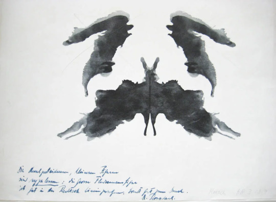
Early example of Hermann Rorschach's inkblot test, 1921.
This technique was then adopted into art movement Surrealism. French Surrealists introduced this technique as one of several automatism techniques including grattage and frottage, which allowed chance and subconscious thought to dictate the final form of their art. Oscar Dominguez is thought to be the one who coined the term decalcomania, describing his work as ‘decalcomania with no preconceived object’, and is often referred to as ‘butterfly print’. Dominguez generally worked in black and white, painting a thin layer of gouache onto paper or glass and pressing this sheet onto another surface such as paper or canvas to create strange forms suggestive of beasts, figures or rocky landscapes.
📷

Oscar Dominguez, Untitled, 1936.
Max Ernst believed decalcomania to be a random act to ignite his imagination, applying transfer print techniques in oil paint as a starting point onto canvases - which he would then further to build on elements of realism, suggesting mythical creatures in strange, unknown places, (National Galleries Scotland., 2021). E.g, Max Ernst, 'Europe after the Rain', 1940-42.
Although so far, I have discussed this technique through only the eighteenth, nineteenth and mid twentieth centuries, this technique has been implemented into the contemporary art movement, too. Artists have continued to explore image transfer as an ‘automatic’ form of image making, the Abstract Expressionists of the 1960’s in particular. More recently, Cornelia Parker has made drawings which incorporate contemporary materials into the decalcomania process, such as her works of 1996, ‘Pornographic Drawing’, in which an inky substance extracted from pornographic film material was applied to paper, folded in half and opened again to reveal surprisingly sexualised imagery through the process of chance.

Cornelia Parker, 'Pornographic Drawing', 1996.
The art movements Abstract Expressionism, Tachisme, Pop Art, and Minimalism are examples of only a handful of the contributing movements towards what we know today as contemporary art.
Personally, my favourite contemporary artist is Maria Qamar, a female Pakistani-born artist and author. She was exposed to Bengali culture and Gujarati culture growing up. She moved to Ontario, Scarborough, then Mississauga, when she was still young, experiencing the rest of her childhood here but in turn became the victim of bullying. The exposure she faced to the prejudice towards South Asian pupil’s - especially after the September 11th attacks in 2001, she recalled, ‘I started going home and drawing comics about these experiences. But I would change the outcome. In my comics I always got the last laugh.” She aligned her works with her Desi identity and with Western teen goth, punk rock, and heavy metal subcultures. Qamar’s successful art career is mostly recognised by her satirical lens commenting on the combination of South Asian and Canadian culture. She tackles themes surrounding her experiences of racism, the first-generation experience, body shaming, classism, and the patriarchy. She is influenced by Roy Lichtenstein and also by Indian soap areas with one of her first works being captioned; ‘what if Lichtenstein parodied Indian soap operas.’ She doesn’t target her work towards western audiences but Desi audiences instead - meaning she does not translate any of her works.
“I realised that if you take a still from an Indian soap opera when its zoomed in on somebody’s face and you take a Roy Lichtenstein piece and you put them side by side, it’s the exact same expression - but it’s coming from two opposite ends of the planet. I decided to merge the two because it kind of described who I was as a person - I’m not one or the other. I don’t have to choose.” - Maria Qamar
Maria Qamar, 'SR8 Like a Jalebi, Baby!'
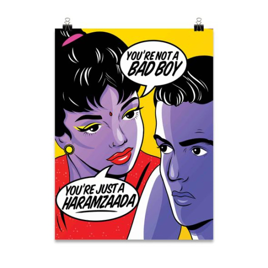
Maria Qamar, 'Haramzaada.'
On the other side of the spectrum is classical art.
‘Classicism’ is usually referred to as the ‘art of classic antiquity’, and more prominently ‘Greek art’ and ‘Roman art’, as well as ‘Aegan’ and ‘Etruscan Art’. Classical art came into light during the seventeenth century and is characterised by its harmony, balance, and sense of proportion. In its painting and sculpture, it employs idealised figures and shapes, thus treating its subjects in a non-anecdotal and emotionally neutral manner. (Neoclassicism is commonly used to describe the specific revival of Greek and Roman art, which occurred in Europe and America between 1750 and 1860.) In classical art, colour is second to line and composition, which are usually the typical focal points for any art pieces - besides the content. The content often contains classical mythology like various myths, and legends of the ancient Greek and Roman gods and heroes - it also encompasses the culture of Greece and Rome, enduring the cornerstone of Western civilization. The artworks are generally associated with harmony, restraint and obedience to recognised standards of form and craftsmanship. The genre includes painting, sculpture, decorative arts, and architecture - it pursues beauty, harmony and proportion ideals, even as they changed through time. Connotations of moral virtue and stability clung to classical art, making it attractive to new nations and republics trying to find an aesthetic vocabulary to convey their power, while, later in the 20th century the genre came under attack by modern artists who wanted to disrupt and overturn power and traditional ideals, (The Art Story., 2021). Classism strived to create a greater realism in relation to anatomical depictions, and emotional and psychological representations that create dramatic tensions to draw in the viewer.

Nicolas Poussin, 'Echo and Narcissus', 1630.
However, this entire conversation of contemporary art vs classical art, and the debate that is; which is more popular? More relevant to the art world? To life? To history? There is one overruling factor; contemporary art will eventually become classical, and future artists will become the contemporary artists of today - introducing further elements to distinguish itself from past art forms. There should be no debate on which is better and which is more relevant because both play enormous roles into the making of culture, life and history all over the world.
Summer Marshall-Miller
#old and new#history#art#painting#collage#sculpture#traditional drawing#traditional art#traditional marriage#contemporaryart#contemporaryfigurativeart#contemporary fiction#contemporary design#modern
1 note
·
View note
Text
The Purpose of Intentionality
Within art I believe there is one running theme - intentionality. Through the decades, that has been one thing all periods of art have in common: they provide purpose - whether that be in relation to religion, romance, mythology, sexuality, mental health, and so on. Sometimes, the art concepts can be that there is no purpose... Queue the Dada art movement.
The Dada Movement consisted of artists who rejected the logic, reason, and aestheticism of modern capitalist society, instead expressing nonsense, irrationality and anti-bourgeois protests in their work.
An artwork I like to zone in on when thinking of intentionality is Yoko Ono's 'Ceiling Painting, Yes'.

‘Ceiling Painting’. Yoko Ono, 1966.
The interactive object known as 'Ceiling Painting' was an important work shown at Ono's historic 1966 Indica Gallery shown in London. The viewer is invited to climb a white ladder, where, at the top, a magnifying glass, attached by a chain, hangs from a frame on the ceiling. The viewer uses the reading glass to discover a block letter "instruction" beneath the framed sheet of glass, it says, "Yes". This work is what lead to the meeting between John Lennon and Yoko Ono.

John Lennon and Yoko Ono, 1969.
Yoko created this piece of art at a time in her life where she was going through a depressive episode, and wanted to, "give some positivity to my life." Ono describes the work as representing the pain and journey towards hope and affirmation, which can be difficult to attain and exists up high like some sort of cathedral, reflecting her personal philosophy, (2020., The Art Story).
John Lennon went to John Dunbar's gallery in London to view the exhibitions and came upon the Ceiling Painting. In 1966, John Lennon was also going through an extremely tough time; at the height of his fame, under the magnifying glass from the entire world, and pressured by the whole population to continue writing record breaking music. He experienced this piece of interactive art and was provided with an overwhelming wave of positivity, (2020,. Taysom and Osbourne). He is quoted saying, "I felt relieved. It's great relief when you get up the ladder and you look through the spyglass and it doesn't say 'no' or 'fuck you' or something, it said 'yes'." Her ability to communicate with a lack of words appealed to Lennon.

My thoughts during this research were plain and simple:
- IMAGINE if Ono had placed another word or phrase instead of yes.
- IMAGINE if Lennon hadn't attended the exhibition.
- IMAGINE if Lennon narrowly missed her artwork.
If Lennon had been experiencing a different impact from his mental health, the work may not have drastically touched him. Or, as previously mentioned, if the word/phrase had have been different or slightly negative, it could have furthered Lennon's depression and not impacted him - or anyone for that matter. Further leading on to the thought: could rock and roll history taken on an entirely different path?
- Would The Beatles of carried on releasing music to such standards that they did?
- Would they have even split up?
- Would we have had the iconic band for longer?

The Beatles, 1967.
Yoko Ono's intentions were to provide a window of positivity and the idea that when it doesn't come straight away - like most people believe - and when things are low, you can always work your way up to the top and experience the highs of happiness.
I strongly believe the intentions of the artists coming across in their artworks can be exactly what certain audiences will need to see in that moment in their life. It can be powerful and emboldening - it can have a type of control over people in their moments of vulnerability to the point of more or less, changing their life - John saw the exhibiton, and it started a domino effect, ending with him being completely in love - in the process changing the path of The Beatles, the marriage he was already in when he met Yoko, and - well - his eventual murder.
Intentionality - personally - is the most important part of any art piece. It is needed in order for the artist to express themselves and touch the viewers in an authentic, real way. I also believe without the correct execution of projects, they will not receive the correct response. E.g. if Yoko Ono had placed the 'Yes' painting on the wall instead of the ceiling. Even the miniscule details can lead to extremely different audience responses.
Everything comes together perfectly if all stars align with the work. The context has to line up with the execution - or what's the point?
Summer Marshall-Miller
Bibliograhy
Far Out (2020) The Moment John met Yoko. Available at: https://faroutmagazine.co.uk/when-john-lennon-met-yoko-ono/ (Accessed 19th March 2021)
The Art Story (2020) Yoko Ono Artworks. Available at: https://www.theartstory.org/artist/ono-yoko/artworks/#nav (Accessed 18th March 2021)
#john lennon#george harrison#paul mccartney#ringo starr#the beatles#yoko ono#lovers#interpretation#art#sculpture#painting#history#collage#purpose#insight#change#hope#trust#mindset#butterfly effect#intentionality
1 note
·
View note
Text
Lecture with Eve Provost Chartrand
During the session with artist Eve Provost Chartrand - she discussed all things practice - the method and madness behind her concepts and contemporary artworks. Her interest in death in art is what intrigued me the most throughout her lists of inspirations and fascinations. I enjoyed listening to her delve into her very personal reasons of wanting to create death and old age-related art, after witnessing both of her parents age and be devastated by degenerative diseases. She explores the nature of women's negative body in association with aging. Her visual iterations explore the implications to self-identity and agency of current negative body definitions in women’s lives through the implementation of creative case studies. Provost Chartrand offers compassionate and vibrant humanism prone to generating re-interpretations and re-considerations of aging negative bodies (Transart Institute,. 2020).

Icons of Absence: The Body as a Memorial Site(detail). 2021 Eve Provost Chartrand
During her lecture, she showed us a presentation including her own inspirations and their influences on her own works. She referenced a series of photographs by artist Andres Serrano called ‘The Morgue’ in which he photographs bodies in a mortuary, and that interest caught my attention more than the rest – so, in immediate response, I, of course, went onto look a little into the series. The outrageousness of the concept is what first springs to mind when looking through all the images – titled ‘The Morgue’ with their causes of death in brackets beside it. The works immediately drew criticism and controversy due to the morbid subject matters, however, it intrigued me to no end. Serrano’s use of the deceased as models, combined with the bright artificial lighting is almost his treatment of the dead as living participants – I view it almost as a rebellion against death. Each image carefully shot, composed and lit, the care to compose each singular photograph is present.
Quote, “The Morgue is a place built up around the human body, which is always present. Each photograph works as a portrait, all the stronger because of its singularity. First thing is that I wanted to protect the identity of the people. That’s why they are masked. Using close-up and focusing on details gives their individual qualities more expression. As well as the human being still present, these details symbolize death, sometimes horrible and violent barbaric, sometimes cunning and peaceful.” (Regine., 2016).
The image ‘The Morgue (Hacked to Death II)’ is zoomed into the upper corner of a deceased man's face with his open eye surrounded by the blood covered skin of his cheek. This image is incapsulating due to the immense sense of presence behind the eye – almost the soul of the model. The eye of the model staring directly down the lens to the audience is bone-chilling to know the cause of death and the horrific circumstances – but Serrano has a beautiful way of showing the most brutal, heart-breaking and sometimes evil circumstances and creating a sense of peacefulness and tranquillity.

Andres Serrano, Hacked to Death II, 1992. From the series The Morgue
The image ‘The Morgue (Hacked to Death II)’ is zoomed into the upper corner of a deceased man's face with his open eye surrounded by the blood covered skin of his cheek. This image is incapsulating due to the immense sense of presence behind the eye – almost the soul of the model. The eye of the model staring directly down the lens to the audience is bone-chilling to know the cause of death and the horrific circumstances – but Serrano has a beautiful way of showing the most brutal, heart-breaking and sometimes evil circumstances and creating a sense of peacefulness and tranquillity.
Summer Marshall-Miller
Bibliography:
We Make Money Not Art (2016) Andres Serrano. Uncensored Photographs. Available at: Andres Serrano. Uncensored photographs – We Make Money Not Art (we-make-money-not-art.com) (Accessed 19th February 2021)
Andres Serrano (1992) The Morgue Series. Available at: Andres Serrano - Series - The Morgue (Accessed 19th February 2021)
Transart Institute (2020) Eve Provost Chartrand. Available at: Eve Provost Chartrand — Transart Institute for Creative Research (Accessed 22nd February 2021)
Eve Provost Chartrand (2020) Artist Statement. Available at: Artist statememt | mysite-1 (eveprovostchartrand.com) (Accessed 24th February 2021)
#alive#morgue#photography#art#sculpture#collage#history#interpretation#student#student life#study#lecture#readmorebooks#read#liverpool
0 notes
Text
What Does Contemporary Art Mean to Me?
Before researching into Contemporary Art to provide an answer to this question, I had one underlying opinion to the whole genre; the concepts behind the artworks can generally be repurposed to fit in with the viewers personal narrative – and after beginning my research, this idea has just been solidified. Art of the now, due to its relevance to today's day and age can sometimes be exactly what one person in their life needs to see at that moment in time (John Lennon experiencing the ‘Yes’ Ladder by Yoko Ono.) The relevance to modernity is, what I believe, the means of success to the majority of these contemporary art pieces– they are brave and tackle previously perceived ‘taboo’ subjects such as mental health, racism, LGBTQ+ etc...
Of course, Contemporary Art is forever changing to adapt to the time – for example, renaissance art was once contemporary and relatable to the public – so, understandably, the hot topics of the twentieth century such as equality, sexuality and acceptance is what is most attractive to the young artists, and general public of today. And eventually, this period of contemporary art will become the past, it will be split into subcategories like, pop art, abstract, surrealism etc. Then whatever time period comes next, it is in that future present time, will be contemporary art.
To me, Contemporary Art is art that gives back.
Art that makes you think. Reflect. Ponder. And most importantly, feel.
The first piece of artwork I researched that made me understand the purpose of contemporary art, was ‘No Woman, No Cry,’ by Chris Ofili.

'No Woman, No Cry.' Chris Ofili, 1998.
This painting shows a stereotypical (appearance-wise) black woman's side profile with a tear stream running down her cheek. This woman is murdered boy Stephen Lawrence’s mother, and this crying pose is a portrait of what Ofili saw when watching the funeral of Lawrence on the news. He was deeply touched by the entire ordeal – Stephen Lawrence was a teenage boy who was attacked in a racially motivated attack – and was killed in the process. The police were accused of institutionalized racism due to the lack of effort to investigate when the case first came to light. Chris Ofili is known for projecting the spotlight onto racism, stereotypes, identity, black history and self-awareness. He painted this portrait in honour of Stephen Lawrence – his mother's seeming crystal blue tears are collaged photographs of Lawrence. From my understanding, this piece pf contemporary art draws light to racism within the means of authority, and the materials he used to produce not just this piece work but all his pieces. He uses paint, resin, glitter, dung and much more.
Yes, dung.
Elephant dung is a staple material in all his artworks. In ‘No Woman No Cry’, he uses the dung as the pendant of the crying mothers' necklace, as well as two stumps to prop the painting against the wall when being exhibited.
All in all, this artwork and my starting research into this period of art made me realise that, almost anything can make it into this category. You can take already made pieces of furniture and place a new concept behind them, making it art, (thanks to Marcel Duchamp) and use materials ordinarily seen as unconventional - elephant dung (Chris Ofili) and used sanitary products (Tracy Emin) as just a tiny example, to create beautiful pieces of work with extraordinary backstories and concepts which relate to many people's personal lives and experiences.
Although, most people nowadays believe anything can be art, and the quote, “a four-year-old could have done that” seems to be the most heard thing around art galleries, I believe under further inspection and research – if the artworks aren't properly executed and thought into tremendously – it would never successfully guarantee a place in the modern art gallery in the first place, and hopefully my further research will solidify this.
Summer Marshall-Miller
#contemporaryart#art#painting#sculpture#collage#history#student#chris ofili#true crime#no woman no cry
0 notes