#[ tutorial ]
Explore tagged Tumblr posts
Visit Tumblr Blog
Explore Tumblr blogs with no restrictions, modern design and the best experience.
Last Seen Tumblr Blogs


Fun Fact
Tumblr Inc. has $15.1M in annual revenue.
Note
i aspire to edit like you - please give me some advice so i can be as good as you = where do you get all those cute phone things / emails / icons / boxes etc. ps. love you <3
Hiya lovely!! Thank you so much that's really kind of you to say <3<3
You asking this made me realise I haven't done a full resource list for editing yet :O
Before I start, I'm gonna give a BIG shoutout and recommendation to Honeywine sims' Sims 3 Resources for Storytelling & Screenshots list - if you're looking to improve your screenshots then the tutorials linked on there are a very very good place to start :)
Anyway, here is just the stuff I personally use:
My Simblr Editing Resource List:
TS3 Ultimate Icon Collection from MTS
Trait Images from TheSimsWiki OR Here by Hexagonal Bypyramid
TS2 High-Quality Icon Pack by EddySims
Sims 4 Icon Collection
Sebastian Hyde's Sims Icon Portfolio (requires a bit more editing as you need to erase the background & isolate the icon - but the TS3 ones tend to be much higher quality, so for certain stuff it's worth the effort)
Created by me:
Blackout UI Gameplay PSD Collection (includes moodlet, wish & career templates) - CleanUI Versions here: Moodlet & Wish / Career
Photography / Camera Template
Interaction Box Templates
Notification Templates
Location Templates
Any more PSDs I create in the future can always be found linked here
Created by others:
AwkwardWhims PSD Collection (I have made a personal edit of these to make them dark-mode)
Windslars PSD Collections (both versions - again I've edited these for personal use)
Simblr trading card - I have borrowed the Skill Template from these
LoeySims PSD
Sterina-Sims' PS Action
The full tutorial on how I made my editing bases is here (aka making the curved outline and combining the PSD & action templates)
BePixeled Gradient Backgrounds - I use these for photoshoots etc.
I use Photopea to edit everything - It's a free, online alternative to adobe photoshop
I have a folder on my desktop with alllll the PSDs & resources I need in it
Then inside that I have a sub-folder containing my main editing bases & any of the UI PSDs I use super regularly
When I go to start an editing session, I open up the sub-folder (called 'quick editing access' - I have it pinned to my file explorer as well) and just select all the PSDs to open altogether in Photopea
Then I go from there just going with vibes & screnshot framing to judge what size template to put my screenshots in
I know some of ya'll will just want the links to resources, so I've kept my editing advice behind the cut for those who are curious ⬇️
My (kind of embarrassing) Credentials:
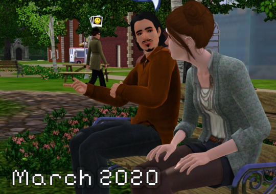
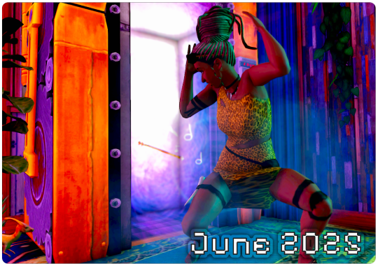
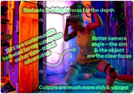
Here is a comparison of what my edited content used to look like back when I first started Simblr 5 years ago VS. what it looks like today - I'm gonna now dissect what made the biggest difference for me in improving my editing game
Obviously adding visual interest to your screenshots with icons, UI elements etc. does help them look more interesting - but for me the biggest difference between these two pictures actually comes down to colour grading, lighting, camera angles and overall staging
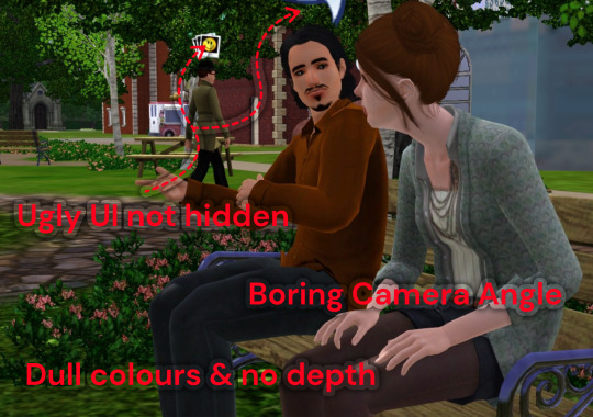
To break down the differences more visually:
So, how did I make my screenshots better?
1: Work out what visual style you want your simblr to be, and start emulating that style in your game
A lot of this actually comes down to the aesthetic things you do in-game before even taking the screenshots (eg: what skin you use, the kind of outfits and colour-scheme you dress your sims with and how you furnish their homes)
I'm sure you know a few simblrs off the top of your head that you like the content of, look through their posts and figure out what stands out about the ones you particularly like Is it the colour scheme? How are they staging their camera angles? How are their sims styled & dressed? Most simblrs have resource pages you can scroll through which will tell you exactly what aesthetic mods they are using to make their game look the way it does & sometimes they also have CC finds blogs where you can find similar clothing & cc to the stuff they use
To break this down in practice: I realised that I really like a maxis-match style when it comes to how my sims & their homes look, I want it to look simple, kind of cartoony and visually quite colourful So, when I went on a CC shopping spree to do a visual overhaul in my game a few years ago, and I only downloaded stuff that fit into that style I was looking for skins and hairs which had flat, less detailed textures, and objects / clothing that had been converted from other sims games to TS3 - if you like alpha style instead then you can only shop for stuff that fits in with that, or if you like a specific vibe (such as cottagecore) then only look for themed cc etc. etc.
2: Use Reshade, seriously!
I put off using reshade for the longest time because I thought that it was complicated to install & use - and while (like with everything) there is a learning curve, I got my head round it really quickly and now I use it without thinking
Again my advice for finding presets would be to look at simblrs you admire and find what presets they're using - or search up 'Reshade Preset' on tumblr and just pick one you like the look of - this will really come down to personal preference & what kind of vibe you're going for in your game
3: Colour-Grading & aesthetic design
I'm not the greatest decorator or home builder when it comes to creating something entirely off the top of my head with no reference, so when I'm building homes or decorating a room I always like to look on websites like Pinterest for inspiration


For example, here is a bedroom I recently designed based off a pinterest room - I added in some decor objects which are more specific to my sim's personality, but you can see the basic colour scheme & vibe is very similar to the other photo
In terms of picking a colour scheme for sims & their homes, I always use their favourite colour & traits as a guiding tool - this makes all of my sims look more unique and have a clear & defined sense of personal style that really helps me when coming up with ideas for decorating
Can you guess my sim Betty's favourite colour? lol - but having red as a starting point seriously helped me when deciding what vibe to go with for her bedroom, I just looked up 'cosy red bedroom' and that picture popped up - she's also a Snob and a Virtuoso, so I decided she'd probably be a classical music buff & a fan of old Hollywood - and I incorporated those aesthetics by using vintage posters and some music decor objects such as the CDs on the floor
I know this probably seems like it’s not relevant to photo editing but it 100% is - you need to have well-designed rooms and sims in order to take good photos!
4: Experiment with camera angles
This one is really difficult to describe but I'm gonna give a recent example of a screenshot I took:


You can see the second one (from a higher angle) is much more visually interesting and IMO just looks a lot better With the first one, I'd probably be inclined to put a moodlet or something over the empty space - whereas the second picture is full enough on its own not to need anything else
5: Useful mods & game cheats for you to know...
Game Cheats: -> hideheadlineeffects ON hides most of the headline effects like speech bubbles, plumbobs etc. -> moviemakercheatsenabled TRUE You need to do testingcheatsenabled true first but this cheat basically allows you to direct your sims to do any animation you want, which is useful for posing or storytelling purposes -> moveobjects ON I assume you already know about this cheat, but I use it all the time for moving my sims to a better location for screenshots - you do have to reset the sim afterwards though otherwise they will get stuck in the floor lol
Mods: -> no drift / lower level camera mod Allows you to get to those more interesting angles I was talking about earlier! -> Create your own visual effects mod Follow the instructions and create your own custom mod to remove the effects that you don't like the look of (eg: I got rid of the university life social boost things cos they annoy me) -> No camera fade Allows you to get way more up close & personal with your sims! -> Sethour cheat Suuuuper useful for scenery pictures or photoshoots
I hope that's useful, honestly, just keep at it! Keep experimenting, keep posting and make mental notes of what performs well vs. not well - the only way to get better is with lots and lots of practice in my experience
Like 5 years ago I had no idea how to use anything on photoshop - and now I'm really familiar with most of the tools - It took me a long time to get to this point, so don't beat yourself up if you're just starting out and stuff isn't looking how you want it to - just use it as motivation to try and get better!
Youtube / blog tutorials and other simblrs resource lists are your best friends when it comes to learning how to improve your game style & when learning how to use photo-editing tools :)
Also, an important final note is that I really really enjoy photo editing, it's part of the fun of playing the game for me! - If you don't, that's totally fine! Don't force yourself to do something you don't enjoy, you can just post your screenshots no matter how they look, this is simblr after all, we're all posting about games which are decades old atp, it's really not that serious :P
51 notes
·
View notes
Text


Hello everyone! I finally finished the swimsuit tutorial for the adult sized critters :D As always, i tried my best to explain the process but, if needed, i will still answer any questions to the best of my ability :3 Thank you to @quin-weasel for checking if its written clearly too!
The pattern:

#sylvanian families#calico critters#custom clothes#doll clothes#tutorial#doll pattern#ternurines#ansof
51 notes
·
View notes
Text
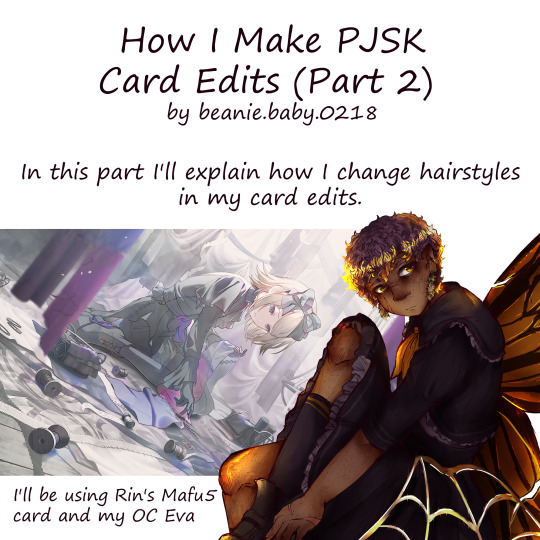


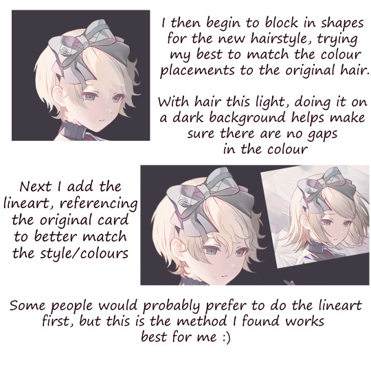
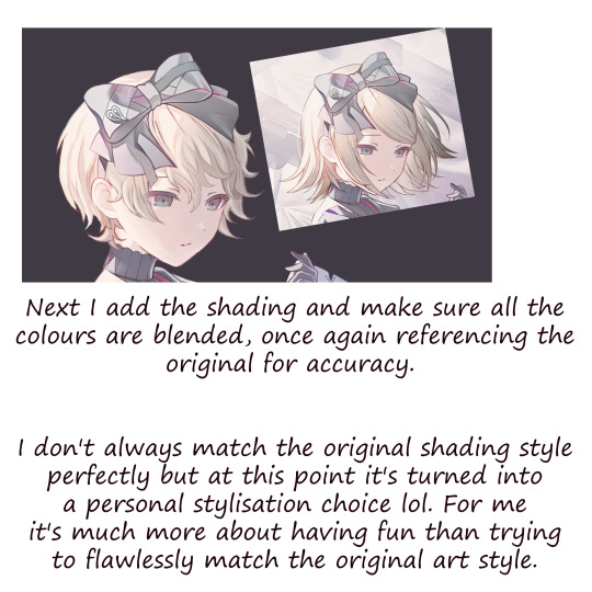
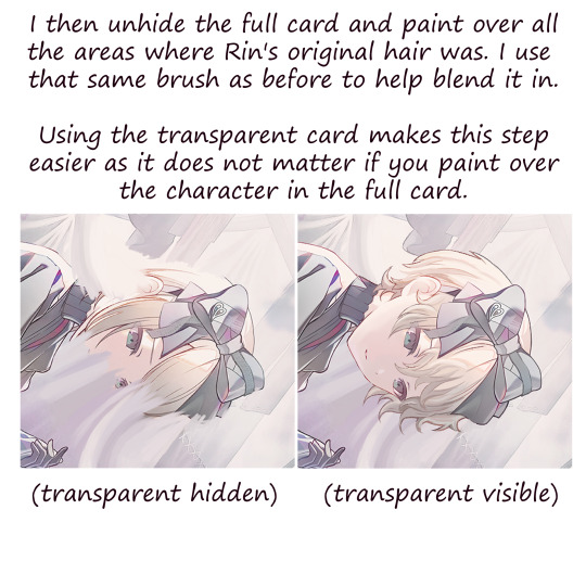
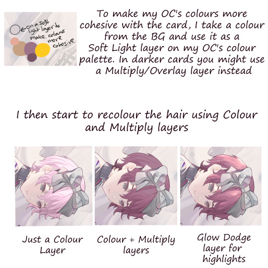


Part 2 of my pjsk card edit tutorial !! For anyone who missed it, part 1 just focuses on recolouring a card
#art#digital art#digital drawing#anime art#prsk#pjsk#project sekai#pjsk edit#prsk edit#prsk card edit#pjsk card edit#pjsk fa#prsk fa#project sekai card edit#project sekai cards#tutorial#card edit tutorial#card edit#art tutorial#this is how i found out you can only post a max of 10 images from the phone app lol
51 notes
·
View notes
Note
I just wanna say I really admire your art. I was curious if you had any art tips on getting good dynamic poses and such.
Hiya dear Potato-san! Thank you for the kind words <3
I think I can ramble a bit about dynamism. Hopefully it'll be understandable.
When it's for research purpose or fast comics, the simplest way to get good dynamic poses is basically just to let your hand go wild. Take a sharpie bigger than what you're used to work with, and sketch fast poses. The sharpie won't let you erase, so the art as a whole will feel more instinctual compared to big illustrations. It's a very good first base to prepare comics.

If you freeze before even starting (because drawing something that can't be erased can do that), draw the vaguest bit of directory lines first. That will be the main dynamic of your pose. The two big base shapes are usually straight and pointy (triangle), or soft curves (circles). If you want something dynamic, the first shapes will be needed. If you want something cozy, make sure your main dynamic line is a smooth curve.

The best practices to get used to drawing dynamic poses are either to draw people dancing, or to draw Spiderman poses (I'm not kidding).
You will naturally have a dynamic here. Your first step will be to find the main line, as stated earlier. Then you put your shapes following the main line you found.

If you have a particularly dynamic artstyle, or like exaggeration, you can increase the shapes you see. A lot of art is exaggeration. It goes for the main line (see below, I accentuated the bow of her back), or the body shapes (legs and arms are very easily malleable to convey sharp dynamics).

The main point when you draw something really dynamic (like fights or dancing) is to ignore the usual, realistic shapes of the limbs to instead focus on the feeling of direction you want the reader to follow. When you do semi-realistic (like me for my COD art) it can be a bit hard to find the right balance between realistic proportions/shapes and the dynamic you want, but then that's just trial and error until you get what you want.


Well, there you go. Sorry if it's messy ^^'
TLDR: Have a really strong and easily identifiable direction line. And exaggerate. Always exaggerate.
#hey look at that :D Arts of two of my big projects are in this post#someday I'll finish them...#mello's drawings#art tips#tutorial#tuto#drawing tutorial#ask me anything#my art#i spent far too long wording and rewording this TwT
38 notes
·
View notes
Text


Aquí unos ojitos que he hecho y sus paletas de colores.🖌
#artists on tumblr#artwork#design#digital art#drawing#fanart#illustration#my art#painting#ibispaintdrawing#digital illustration#ibispaint art#ibispaintx#art#colorful#dibujo#digital drawing#digital painting#eyes#my draws#tutorial
23 notes
·
View notes
Note
Please make a tutorial on how you made the gifs in this post!
Hellow! I'm not the best at explaining, but I'll try my best. Not comfortable doing a video tutorial. My apologies!
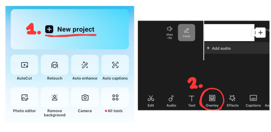
Basic Tutorial of This Post
Or, how I did this:

Applications -> ibisPaint X, CapCut, Photopea
Step 1 -> Separate your edit into layers
Please see below for reference.

Notes:
Don't make too many layers. I recommend no more than 5 if possible. Doing so will create more difficulty later on.
Have a background for your edit. This will be the image you will first import into CapCut.
By background, I mean this in my example.

Step 2 -> Save each layer individually as a transparent PNG.
Select which layer you want to save.
Click the three dots at the bottom right of your screen
Click "Save Layer as Transparent PNG."

Step 3 -> Import your background into Capcut.
Click on "New Project" — this will open your gallery.
Import your background, then click the check mark at the top.
Click "Overlay" at the bottom to add your layers.
NOTE: If your layers aren't layering properly, scroll to the right. There's a "Layer" button to adjust.
Step 4 -> Animate your layer.
Click "Animations".
Stay on "In" animations. Choose an animation to your liking.
Repeat for all layers.
Once done, export by clicking the export button at the top right.
NOTE: CapCut has a watermark at the end of each export. Make sure to remove it using your gallery editor.

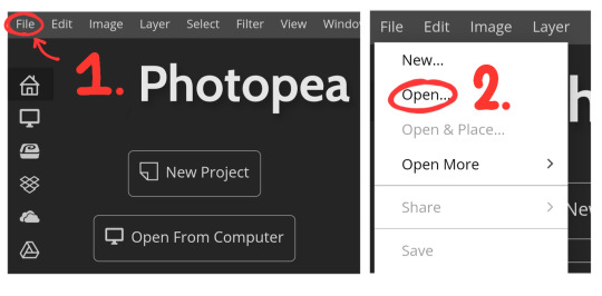
Step 5 -> Import your video into Photopea
Open Photopea
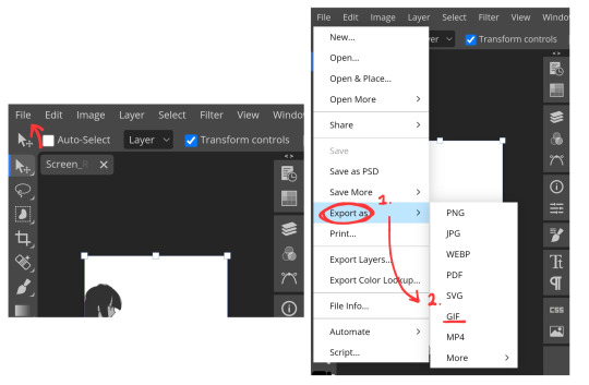
Click "File" in the top left.
Click "Open..." — this will open your gallery.
Select your video.
It will ask to input your FPS. I personally do 13 FPS, I recommend 10-15 FPS if your device lags a lot like mine. But you can use whatever FPS you like.
Step 6 -> Exporting your GIF
Click "File" again.
Click "Export as..."
Click "GIF".
Click "Save". You're done!
NOTE: This might take awhile for some devices, please be patient.
OPTIONAL, Step 7 -> Making it repeat once
Before saving, change the "Repeat" to 1.
Click "Save". You're done!

Conclusion
I hope this was simple and explanatory enough! 😓 If you have any questions, feel free to ask!
Thank you for reading! Spheal wishes you a great day/night. 🌟🦭
22 notes
·
View notes
Text
Just in case someone needs this, you can download tumblr videos on your computer/phone. Go to this website, and then copy the original url with the video, you need the op's link. For instance this link would work, but sometimes a reblog wouldn't.
Paste the link on the website, click enter, and it will offer you a download. You can right click -> Save Link As, or click the link and it takes you to a website that is just the video, and then you right click on the website -> Save page as, and it will download the video.
Have fun hoarding videos! You do need this specific link to the site, when I try to find the site from the search engine for some reason it doesn't work.
#downloading tumblr videos#save from net website works on tumblr#i accidentally discovered it one day#have been hoarding videos since#i just realized people didn't know this lol#the video in the link is the washing machine video#tumblr videos#resources#information#tutorial
20 notes
·
View notes
Text
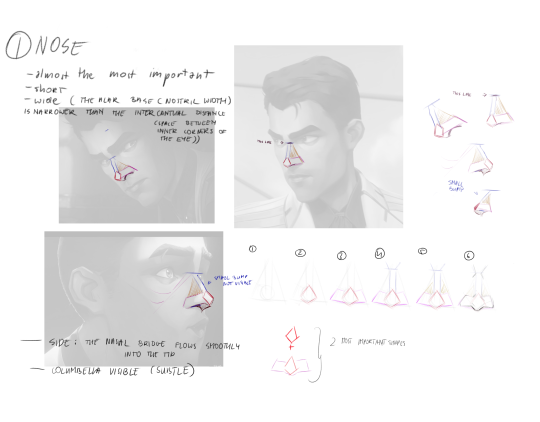
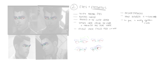
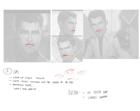
Jayce's key features breakdown
#i hope it's useful#i left some notes on my patreon too#I'm gonna do Gale next#my art#tutorial#art tips
17 notes
·
View notes
Text
Tutorial: How to Draw as a Young Artist
Hi, I have heard that some parents don't believe in artistic nudity, despite A) useful art books traditionally using imagery of unclothed people, (note: I have never seen these books, as I didn't think of it or of going to a library 🤷) and B) the aforementioned strict parenting harms the artistic progression of the youth.
I suggest finding reference.
Urgent
The human body is "perfect" and no 3D modeling software, app for 3D models, Barbie doll, ball-jointed doll, action figure, or anime posing figurine is able to capture it fully and properly.
You learn a little more with every person (or animal, plant, object, or building) you draw.
For references, use...
Anatomy using medical quality, musculoskeletal images
Stock images of people in diving suits, superhero costumes, ballerinas, ice skaters, gymnasts, beachgoers
Sequence photography
Screenshots of moving people from videos
360 degree photography (?) or videos (?)
Modeling digitals (clothed)
For free websites, use...
Adorkastock (clothed, but it's humans who appear to have beachwear)
Pexels
Pixabay
Pinterest, although copyrights may be hidden somewhere in there
Youtube for sports videos
Other
For non-virtual options, use a sketchbook with grid paper, head to the park, and draw random people.
For daily instructions made by me, use...

Please reblog, note, and follow. Drawing is important and artists are struggling to draw better as early as possible.
#artists on tumblr#how to draw#art#illustration#teaching#art reference#reference#tutorial#art tutorial#purity culture#Please be creative and resourceful in order to learn
16 notes
·
View notes
Text

Microsoft Productivity Pack for Windows (1992)
42K notes
·
View notes
Note
could you please do a tutorial on how you do your risograph style drawings? they look so cool 😭😭


15K notes
·
View notes
Text
How to Be The Dominant Male in Any Situation

Let's say you walk into a party.

You are wet and pathetic. Not only are you a worm, but even among worms you are the runt of the litter.
There's a way to fix that. Even you can be the alpha male in every situation you're in. Here's how:
Alpha Male Rule 1: Stand Tall or Very Short
In some things in nature, like rats and giraffes, the biggest creature in is leader.
However, in other things in nature, like the mafia, which has large goons but a small boss, the smallest creature is the leader.
You need to lean into whichever option is closest to you. If you are almost short, try wearing a big suit like a mob boss would wear to also make yourself wider like a mob boss. If are you almost tall, like I am, trying wearing these bad boys:

Now, I know what you're thinking: "High heels?? But isn't that for women???" Women have been hiding them from us men because they are afraid of how powerful we would be with them. But, why do women alone get to augment so much about themselves?? Look at all the eyeliner and mascara they need to even begin to mimic the power and seductiveness of our male eyelashes:

So, let's take a look at how we're doing now having applied just this one piece of advice:

It's a whole new situation. Let's move onto rule 2:
Alpha Male Rule 2: Always Get What You Want But Never Ask For It
I notice the man next to me has cookies. I would like one. Not only that, but there's also a woman next to me, watching. Asking another man for a cookie is extremely un-alpha behavior, so here's how you go about this situation:
1) Point out that someone else has something that you want

2) Cry until they give it to you

If everything has gone according the plan, you now have a cookie, and the woman is thinking something like this:

Let's move onto the last rule.
Alpha Male Rule 3: Always Up the Ante
Whatever you want to do or say, do or say it at least 3 times as hard as a regular person. When your coffee is $3, you should give $9 to show how wealthy you are. When you say "I'll be back in 5 minutes" you should actually be back in 15 minutes -- but really, you should say "I'll be back in 15 minutes" and be back in 45 minutes.
You should also start every task at step 3 rather than step 1. So, a normal (read: beta) guy might tell a girl "I think you're pretty" and then later ask "will you be my girlfriend?' But you should just say this:

99% of women will say yes, but if she needs further convincing, it can be helpful to offer her a small present, like a trinket or snack.

Congratulations. You have now learned how to be the most dominant male in any situation. Here are a few more tips for the road:
Claim to be descended from an ancient king or emperor. You can make a map or your lineage and fold it up to carry it in your pocket, so that you may unfold it whenever it needs to be presented.
If a woman takes a genuine interest in you, do the full body blush animation rising from bottom to top like you're a cup filling up, then run away, leaving behind a small cloud and a few speed lines. The idea that woman can actually like you is a lie perpetuated by Big Women.
If you want to further increase your height, try wearing bunny ears.
16K notes
·
View notes
Text
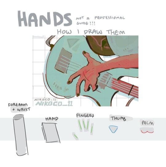


my recipe for drawing hands!
(small note that this is a shortcut that is more abt style and ease than anatomical accuracy. it helps to take time to really properly study hands, makes it easier to bend the rules a bit like this and have it still look good!!)
(learn rules b4 u break them or whatevah)
#qna#tutorial#guide#drawing tutorial#digital art#illustration#drawing#artists on tumblr#my art#clip studio paint
60K notes
·
View notes
Text
@blazing-shadows This is awesome 😎
hot artists don’t gatekeep
I’ve been resource gathering for YEARS so now I am going to share my dragons hoard
Floorplanner. Design and furnish a house for you to use for having a consistent background in your comic or anything! Free, you need an account, easy to use, and you can save multiple houses.
Comparing Heights. Input the heights of characters to see what the different is between them. Great for keeping consistency. Free.
Magma. Draw online with friends in real time. Great for practice or hanging out. Free, paid plan available, account preferred.
Smithsonian Open Access. Loads of free images. Free.
SketchDaily. Lots of pose references, massive library, is set on a timer so you can practice quick figure drawing. Free.
SculptGL. A sculpting tool which I am yet to master, but you should be able to make whatever 3d object you like with it. free.
Pexels. Free stock images. And the search engine is actually pretty good at pulling up what you want.
Figurosity. Great pose references, diverse body types, lots of “how to draw” videos directly on the site, the models are 3d and you can rotate the angle, but you can’t make custom poses or edit body proportions. Free, account option, paid plans available.
Line of Action. More drawing references, this one also has a focus on expressions, hands/feet, animals, landscapes. Free.
Animal Photo. You pose a 3d skull model and select an animal species, and they give you a bunch of photo references for that animal at that angle. Super handy. Free.
Height Weight Chart. You ever see an OC listed as having a certain weight but then they look Wildly different than the number suggests? Well here’s a site to avoid that! It shows real people at different weights and heights to give you a better idea of what these abstract numbers all look like. Free to use.
330K notes
·
View notes
Note
spec. spec. spec youve changed the game. i never realized your pointer finger and your wrist artery are the same. holy shit. im going to draw hands thank you


aasdjsd its not really an artery but its a useful landmark to facilitate the Flow of a pose imo
#nd then the thumb meat is just kinda tacked on there#u will notice also that i like to use the wrist as a tension point so the hand and forearm kind of drape off it#that has nothing to do with anatomy i am just gay#ask#doodle#tutorial#i gueass.
13K notes
·
View notes