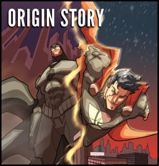
#[The layout of narrative and things in the About pages is super super interesting and Im a sap hello!!]
Explore tagged Tumblr posts
Visit Tumblr Blog
Explore Tumblr blogs with no restrictions, modern design and the best experience.
Last Seen Tumblr Blogs


Fun Fact
The average Tumblr user visits about 67 pages every month.
Note
2, 7, 13

2. Has your muse been mainly attracted to masculinity, femininity, androgyny, or an even split (between two, many, or all of the options specified)?
Most of his attraction comes from the personality or engagement with a person, though in a purely physical sense those who he's had direct attraction too have varied greatly - most people however are often smaller than him both in height and musculature so he's had a penchant for that (Varied in form and identity); though people of his build have also haunted his thoughts from attraction.
7. Where is your muse most sensitive?
Beyond the obvious places that most people are, the scale-scarring is highly sensitive to touch (Feeling akin to oversmoothed snakeskin, or when primed arrowhead-scales) so that carries over to most of his right side, though beyond that would be his throat - direct as it is to sensation, and underused in talking - the collar often keeps him from wearing things that would cover it beyond higher collars so it's sensitive from that lacking touch.
13. What traits does your muse value in a romantic partner?
Respect of his comfort in silence, Fully-Capable in their own right without his help (but allowing him to show affection through assistance or action), and Understanding of 'why' he doesn't talk about certain things (at least right away, eventually in a relationship he would share very specific things he doesn't talk about.)
#[asks: memes]#[aramis information]#[Thank you for sending things!! Yoinking tags to be anxious as I be and say I enjoy your character very much]#[The layout of narrative and things in the About pages is super super interesting and Im a sap hello!!]
3 notes
·
View notes
Text
What's New In IF? Issue 31 (2024)

By Aj, Dion, Briar, Jen and Peter
Now Available!
Itch.io - Keep Reading below
If you read the zine, consider liking the post: it helps us see how many people see it! And sharing is caring! <3

~ EDITORIAL ~
Apologies for the delayed Issue!
As you might know, we unfortunately had to delay this Issue due to some personal matters. But as promised, it’s finally here! We wouldn’t want you to miss out on any news.
As this Issue says on the front page, it contains news from November 23rd to November 29th.
But! The Events should be updated to match their status on December 4th, as they are more time-sensitive.
Issue 32 should be released on time. That means two Issues this week!
We want some feedback!
As we’re starting to get a hand of things, we would love some feedback from you guys! What you enjoy, want more or less off, how we could improve... Anything goes! We even have a nifty form.
We hope you enjoy this new issue!
AJ, DION, BRIAR, JEN AND PETER
~ BE A PART OF THE ZINE ~
THIS ZINE ONLY HAPPENS WITH YOU!
Want to write 1-2 pages about a neat topic, or deep-dive into a game and review it in details? Share personal experiences or get all academic?
WRITE FOR THE COLUMN!
Prefer to be more low-key but still have something to share? Send us a Zine Letter or share a game title for Highlight on…!
WE WANT TO HEAR FROM YOU!
Came across something interesting? Know a release or an update announced? Saw an event happening? Whether it's a game, an article, a podcast… Add any IF-related content to our mini-database!
EVERY LITTLE BIT COUNTS!
Contact us through Tumblr asks, Forum DMs, or even by email! And thank you for your help!!

~ EVENT SPOTLIGHT : Videotome Jam - "Waiting" ~
November 16th to December 1st 2024
Videotome Jam is a two-week-long game jam for games made in any of the Videotome engines with the optional theme of "Waiting".
What is Videotome?
Videotome is a series of small homebrew IF/VN engines made by Freya Campbell (communistsister), an indie game developer focusing on narrative games that are usually:
science fiction, horror, &/or romance
close to 100% LGBTQ characters
free/PWYW with low tech requirements
liable to make players keysmash due to feelings
Videotome was first released in April 2022 as a part of a game entry for the Domino Club collective. The initial idea for the engine was to make writing text-heavy games as hassle-free as possible, focusing not that much on the visual presentation format, but more on the writer's experience. It would allow writers to write in a notepad and then it would somehow grab the .txt file and parse the lines into an array, spitting them out one line at a time as a kinetic novel.
At the moment there are four engines available:
Videotome, for linear, no frills text / images / music;
Videotome ADV, adding a more conventional layout with ignorable choices and branching;
Super Videotome, for more fully featured and freeform image/canvas use;
Videotome Heartbreak, adding a stat raising dating sim & storylets structure to the above.
If you're more interested in the process of making these engines, check out the devs blog post - Words, Friction, Syntax: Stuff I thought about when making Videotome. (The post also includes a very interesting case study concerning other game engines Freya has experience with.)
If you want to check out some examples of projects made with Videotome, take a look at this collection. It includes games made by both Freya and other devs.

~ ENDED ~
The Educational Jam has ended. Check out the thirteen entries and learn something new!
The voting for ECTOCOMP 2024 is officially over! Check out the results!
You can now check out all 16 entries to the Videotome Jam!
Disabled Rep VN Jam has a very simple premise but a very important message. Check out the submissions!
~ ONGOING (VOTING) ~
A Very Hallmark Game Jam has entered the voting phase. You can now vote for your favourite out of the five entries.
~ ONGOING (SUBMITTING) ~
Media depicting healthy examples of polyamory isn’t that common. The PolyJamorous 2024 is trying to break the status-quo!
This year’s Yuri Game Jam is in full progress. The devs have until December 2nd to submit their projects.
Once upon a time, a game jam was held to create stories around the theme of fairy tales… and that game jam is the Once Upon A Time VN Jam. It’s running from October 1st to January 31st.
Concours de Fiction Interactive Francophone 2025 is for all French-speaking enthusiasts. Submissions are accepted March 3rd 2025.
Are you perhaps a fan of more somber, melancholic themes? Then check out the Dying Year - Visual Novel Jam! You have until the end of the year to participate.
The Black Visual Novel Jam is all about working with creative professional developers who work in visual novels to bring more Black stories to life. The goal is to create a space where Black creators can show their unique storytelling through visual novels.
IF Short Games Showcase 2024 is a great way to shine some new light on your projects made in the past year (Jan 1, 2024 to Dec 31, 2024), regardless of whether or not they are previously released! You have until January 15th 2025 to join.
Winter Visual Novel Jam 2024 is here! You have until January 1st 2025 to submit your projects.
Are you familiar with Decker? Then why not take a part in the Deck-Month 2?
Another bitsy jam is here. This time with the theme "better late than never".
~ OTHER ~
PIZZAPRANKS is accepting submissions for their Indiepocalypse Issue #61. If you’re a dev and would like to try out your luck, definitely check it out! Any game is welcomed, not only IF.

~ NEW RELEASE ~
You stand at the edge of a vast and foreboding cave system, its mouth yawning like the jaws of some ancient beast. This is no ordinary cave—it is the entrance to the Caverns of the Forgotten, a labyrinth of twisting tunnels, hidden chambers, and unfathomable mysteries that have claimed countless explorers before you.
Generations ago, invaders brought magic to the Kingdom of Jubai, setting battlemages at the top of the noble power structure and leaving everyone else oppressed. Now, a secret organization of mage hunters has risen up, phoenixlike, to stand against the mages' power and overthrow their rule. Can your secret order of mage hunters save the kingdom, or will internal strife tear you apart in Magehunter: Phoenix Flame (CScript)?
Today is your first day of work here at Toy Maker’s TOY BOX (Ren’Py). Pull apart stitches or rip off an arm or two; we support whatever you must do to ensure that you only save toys of the highest quality. Should you ever feel unsure, there’s no need to panic! Simply toss the trash where it belongs: the incinerator. After all, it’s of the utmost importance that inspectors upkeep the Maker’s image.
You're struggling for friends in a new town and decide to check out a cute diner! — 'That New Diner', huh? Odd name for a restaurant, but I see advertisements for it everywhere. Might as well check it out. Who knows, maybe I'll meet somebody?
What does the glass sound like? Quite tinkly. It crumbled into sand under the feet of all those worried people circling around. As for you, there was darkness in your eyes for a long time. And the glass has melted into silence long since. But what is this place? And who is this stranger standing in front of you? And most importantly, where — or who — did the bullet hit? — Monarch (Ren’Py) is a short visual novel game that was made during Ukrainian Micro Visual Novel Jam in 10 days.
Halloween is a big deal in Port Gillain, steeped as the town is in old folklore and ghost stories. You, the local psychic, regularly attend the festivities. This year, you can bring a friend. The Second Sight: All Hallow's Eve (Twine) is a companion story to The Second Sight: Dead Reckoning.
Your Aunt’s House (Adventuron) is a short story about mourning. @kessielrg
The story centers around Larry, a cab driver eking out a meagre existence in a dystopian near-future, until he unwittingly finds himself centre-stage in the midst of a technological revolution. — For the first time this multi-media project can be experienced in the form of an interactive novel. Larry Folger Volume I contains all the chapters of the ongoing narrative complete with music from the series.
Your feather, my wing is a game about getting close to the object of an experiment that your 'super-secret lab' leads! It's all about fun, fluff and cuddles. Nothing serious and if anyone from the "normal world" came to this organization, they'd be disappointed by the lack of pathos, mystery and seriousness. But do you care?
Nestled at the edge of an ancient forest, Ravenwood Hill looms like a shadowed sentinel against the pale moonlight. This is no ordinary place; whispers of its dark history echo through the trees, carried by the wailing wind. The townsfolk speak of disappearances, of mysterious lights flickering in the mansion atop the hill, and of secrets buried deep beneath its crumbling foundations. In Ravenwood Hill, you are the only one brave—or foolish—enough to uncover the truth.
As always, don't forget to check out the submitted entries to the events mentioned in the previous pages. They deserve some love too!
~ NEW RELEASE (WIP) ~
Iberian Tales (Twine) - Life was once tranquil on the isolated coast of your city, surrounded by a loving family and promising prospects for success in your societal position. However, tranquility shattered as flames engulf your city, escape becomes the only viable option, if luck favors you enough to evade the soldiers blocking your path that is. @iberiantalesif-game
The Thorned Garden (CScript) is a Harem Intrigue game where you can die at any turn. Build up skills and connections to survive and climb the rankings. @opossumfern
Locked in a luxurious but ominous hotel, you are forced to face trials alongside five other people. Who abducted you and for what reason? What does the future hold with different organizations fighting for power over the world? And just how much is at stake when you play a twisted game without rules? Whether you want it or not, welcome to the Threshold (Twine). @thethreshold-if
5 days (Ren’Py) - Every step forward feels like another memory slipping through your fingers and yet, the world moves on — forcing you to find a way to follow, even when it feels impossible to let go.
~ UPDATES ~
As Gods Fall (CScript) released Chapters 4 and 5. @asgodsfall-if
Knight of Greenhaven (CScript) released Chapter 2.
Lost in your eyes (CScript) released part five of Chapter 3 on Patreon. @kathrinesadventures
Saturnine (CScript) added new content to their demo. @satur9-if
The Thousand Of Us (CScript) added new content to their public demo. @ivanwm-05
Weeping Gods (CScript) added new content to their demo. @jcollinswrites
The Summoner (CScript) released a part of Chapter 4.
Ashenmaw - Dragons of Marrowoods (CScript) added a part of Chapter 1 to their demo. @ashenmaw-if
Our Life: Now and Forever (Ren’Py) added Step 2 introduction scenes to their public demo. @gb-patch
Wasteland Pony Express added new content to their demo. @katieaki
The In-Between (CScript) released Chapter 11. @dalekowrites
Crown of Exile (Twine) released Chapter 10 on Patreon. @ramonag-if
~ OTHER ~
350p Adventure has been ported from Infor 6 to PunyInform. You can either download it or play it online in your browser. — (Some interesting trivia: The game is sometimes called Advent, because the system it was created on in the 70s would not allow filenames to be more than six characters long. This game is sometimes considered as the very first text adventure.)
~
As always, we apologize in advance for missing any update or release from the past week. We are only volunteers using their limited free time to find as much as we can - but sometimes things pass through the cracks.
If you think something should have been included in this week's zine but did not appear, please shoot us a message! We'll do our best to add it next week! And if you know oncoming news, add it here!

~ MAYBE YOU NEXT? ~
We did not get a submission this week. But if you have an idea for a short essay, or would like a special space to share your thoughts about IF and the community...
Shoot us an email!

~ HIGHLIGHT ON ~
A couple of games that we thought were cool.
Your favourite game here?
Do you have a favourite game that deserves some highlighting?
An old or recent game that wowed you so much you spam it to everyone?
Tell us about it! And it might appear here!

WE LOVE TO HEAR FROM YOU ALL! WHETHER IT'S GOOD OR BAD, OR EVERYTHING IN BETWEEN...
Have something to say? Send us a message titled: Zine Letter!

As we end this issue, we would like to thank:
our awesome mysterious anon!
all you readers who liked, shared, and commented on the last issue! What might be tiny actions are huge support and motivators to us! Thank you for cheering us on this journey!
~ ~ ~ ~ ~ ~
And see you again on Saturday!
AJ, DION, BRIAR, JEN AND PETER
WHAT'S NEW IN IF? 2024-ISSUE 31
#NEW ISSUE IS (FINALLY) OUT!!#What's New in IF#interactive fiction#if news#visual novel#parser#choice of games#choicescript#twine#ink#twine games#ink games#itch.io#interactive game#interactive novel#IF#games#hobby#indie dev#choose your own adventure#if-whats-new#zine
109 notes
·
View notes
Text

Interview: Aatmaja Pandya
What are some of your earliest memories of making art? What's your first memory of comics?
Art-making has always been part of my life, in the way it is for all kids. I do have a really specific elementary school memory of having to make a Halloween diorama for a school assignment. We had this program on the school computer that would let you design and print one. But I made one with paper shapes instead because I knew it would look more distinctive and even at that age I liked that handmade touch. When I think back on that it makes me laugh so much - what a little snob! But to this day I really value analog process, so I guess it is pretty indicative of the person I became.
My first comics were graphic versions of the Ramayana and, like, stories about the god Krishna. My parents must have bought them for me and my brother in India. Weirdly I wouldn't consider them artistic influences at all - my strongest earliest influences are manga - but I think it's proof of the power of comics that I remember those stories so clearly and fondly now.
What makes a good story?
I ask myself this question all the time and the answer changes all the time too. We live in an era of easily consumed art and this isn't necessarily the fault of creators. Big companies are in control of a lot of our media, and art as a corporate product is designed to reach the maximum number of people but is made with as few resources as possible. So inevitably, a lot of mediocre art gets made. I find it pretty unnerving how many books or movies I feel totally lukewarm about, or how many just leave my mind completely after I've finished them. As a storyteller I find that so tragic!
So, at this moment I think a really good story is one that provokes strong emotion. One with some very visible humanity, I guess. Just technically speaking, I also love a really tight, snappy story with a sense of humor and an element of surprise.
What was your time at SVA like? How has it impacted your career?
I loved my time at school. I'm just a dweeb and have always liked learning environments. Art school was a pretty fraught experience for some friends and it was out of reach for others - I got lucky with my teachers and peers. It was definitely a huge financial gamble, though, and the fear of professional failure has been the fire under me basically my whole career. I owe a lot to my community but in a way I also owe a lot to that pressure.

I know you're currently working on your first published book that is both written and drawn by you. How's that going and any updates you want to share?
Yes I am! Thank you for asking about it!
It's chugging along - it's a challenge in a way I wasn't expecting. My first book project had a script ready (by author Marika McCoola) and in a way it was much easier, even though the actual labor of drawing a graphic novel is not an easy thing. This time along the book is my special little baby and I want it to be super, super fun and interesting and emotional... it feels like I could tweak it infinitely and I wish I could! I'm also just finding it difficult to hold the shape of this story in my head. I've done lots of short stories and I can usually visualize those in full, but this one is going to be 250+ pages for sure and needs a lot more brainstorming, both on paper and in the literal brain. Thankfully, I really enjoy the process of writing and layout. The feeling of a story clicking into place after you've been fiddling with it for ages is the best feeling in the world. Sometimes I think I write just to feel that satisfaction.
How much planning goes into your books and do you stick to it? Does a page ever dictate or change the narrative as you work on it?
It depends on the project! Artists either follow rules or instincts and I am definitely an instincts person. Traditionally a comic page has four or so steps - script, thumbnails, pencils, inks, and then tones/colors if the project asks for it. I used to follow this system when I was younger, but these days drawing the same thing over and over just makes me nuts and I find that it takes a lot of life out of my drawing. What I do now is write a rough outline, do a rough thumbnail pass on paper, and then I scan those into a digital program. I use them as a guide and move straight to inks, and then do a clean-up pass so I can retain as much energy as possible while improving readability. If a page or scene is giving me a lot of trouble, I will flesh it out in more detail. I also like to have some flexibility so I can adjust the narrative if it's needed. In my opinion, if you're bored while working on your own story, the game's already over.
I don't find that a page changes the narrative as I'm working on it, exactly, but I often start thumbnailing with a couple of key "scenes" in mind and structure the story around them.

What advice would you give to aspiring cartoonists?
Unfortunately it's probably advice they've already heard elsewhere - just draw! Draw just for the pleasure of making marks on a page! Start with something small - adapt a story if writing one is daunting. Try not to get caught up in perfectionism. Try and make everything you do better than the thing before it. And try to hold on to the pride and pleasure of creating through it all. Artists make art because we can't live without it!
0 notes
Text
New(ish) book reviews

Yes, yes, it’s been the better part of a month, but below find my reviews of the three Carmen books that came out on Oct. 1: the two Chase-Your-Own-Caper books and the look-and-find book. I’m going to review each in the order I read them...
Chase-Your-Own-Caper: Endangered Operation
This is not the first time there have been Choose Your Own Adventure-style Carmen books; Golden published the You Are the Detective series in the early ’90s, when the genre was at its most popular. Now, admittedly I’m not huge on the genre to begin with, partially because I find the second person present tense writing style awkward, though these two do handle it better than, say, the Scooby-Doo series I read as a kid.
But I just wasn’t feeling this one, regardless. Carmen doesn’t even show up in half the paths: it’s really more focused on VILE than on Team Red. The setup for the books is also kind of iffy, as the reader character in each is an everyday person who somehow encounters Carmen as she tries to head off a VILE theft at their workplace. In contrast, the reader’s role in You Are the Detective was self-explanatory, and while the detective role was gimmicked up, it made more sense for the reader character, given that it was the same as that of the player character in the computer games.
On the other hand, it did afford the opportunity for the infodumps to be a bit less info-dumpy than in the show, since they’re split among Player, Carmen, the reader character, and the narrative itself. They’re still awkward, but not nearly as awkward as on the show.
I guess I was also expecting more of a focus on, oh, the endangered animals the story’s built on. Instead, there’s very little, the bare minimum to move the plot forward.
Compared to the first two HMH books (the excellent Who in the World and the very good Clue by Clue), this was a disappointment. 3/5.
Chase-Your-Own-Caper: Jetpack Attack
Most of what I said above applies to this one too. The story works a bit better for me by virtue of actually providing detail regarding the titular jetpacks, but it’s still an awkward way to insert the reader character. I’m not sure if the intent was to make the reader character like the one-off characters who help Carmen on the show or if it just wasn’t thought through.
There’s also more Carmen in this one, which is good, though again she barely appears in some of the routes. Paperstar is also present and delightful though a bit ooc, and Dr. Bellum appears rather than Coach Brunt, a more than fair trade if you ask me. But I’m just not as interested in jetpacks as I am in endangered animals, which I knew up front. 3.5/5.
(An additional note regarding the format of the two CYOCs: the eBook edition adds a link back to the previous choice at the end of each passage, which was a super helpful addition to the format as it allows you to backtrack without starting back at the beginning. I wish that the page number had similarly been included in the print copy.)
Where in the World Is Carmen Sandiego?
If Choose Your Own Adventure was the oft-imitated kidlit trend of the ’80s and early ’90s, its early to late ’90s counterparts were look-and-find series, namely I Spy and Where’s Waldo. And once again Brøderbund hopped on the trend at the time, with Golden publishing Where in America Is Carmen Sandiego? in 1992, and Publications International publishing Where Is Carmen Sandiego? in 1996.
This one certainly has more meat to it than its predecessors, adding a few pages of geographical info on each featured location before the look-and-find puzzle, though how much there is and at what level (country vs. state vs. city) is inconsistent. The puzzles themselves are fine, though it’s a little obvious that some of the art is reused from the TV series.
In keeping with the smaller dimensions of the book, the format of the puzzles is a bit different from the norm. Except for the last two, each consists of a mostly horizontal crowd of people, drawn head-to-toe in the midground, as opposed to the intentionally busy bird’s eye view of Waldo and I Spy, and thus the previous Carmen books. Each scene features a few objects and two VILE agents to find, but Carmen also appears in each, along with at least one other character (Devineaux in the first; Tigress in the second; Zack and Ivy in another), which is a nice touch.
Nevertheless, the whole thing somehow feels half-assed. It’s as if someone had a grand idea for what the book could have been, but it was rushed through and turned out kind of flat. If I see another “fast facts” type layout, ever, I will scream. The book, at least my copy, is also really tightly bound, which ordinarily I wouldn’t complain about - better too tight than too loose, right? - but it is an issue for look-and-find books where you need to see the picture all the way to the inner edge of the page. 2.5/5.
Disclaimer: I received review copies of these three books from the publisher in exchange for an honest review.
49 notes
·
View notes
Text
May 6th-May 12th, 2020 Reader Favorites Archive
The archive for the Reader Favorites chat that occurred from May 6th, 2020 to May 12th, 2020. The chat focused on the following question:
What’s a detail in someone else’s comic that few people notice but deserves praise?
shadowhood (SunnyxRain)
I have a couple. For @Eightfish (Puppeteer)’s webcomic I like how the style in general reminds me of a notebook. The font, the pen used to draw the line art...makes me think of a diary/journal and as a result it sucks me into the story. @Deo101 [Millennium]’s webcomic that I like is that the way the dark past of the characters are revealed naturally through dialogue. Instead of being spoon fed exposition I was treated to sage in the shower, depressed and with bloody holes. You feel emotion for these characters and as a result it’s more immersive.
Finally, for @LadyLazuli (Phantomarine)’s webcomic I liked the horrific implications of her world under a veneer of bright strong colours and characters. While it may seem like a world you want to live in, you are constantly reminded that it is NOT safe and there are monsters around. I liked that it was fun to read, but I loved it even more when Claire wasn’t afraid to shy away from the more menacing, gory details.
FeatherNotes(Krispy)
Not a lot of people gush about this, but I love to see the setup of their sites, specifically the cast pages of comics! One of my absolute favourite cast pages is Black Out Citys. Jay did an old school video game aesthetic mixed with 80's pink vibes, and it's so so beautiful! Layouts on comic sites specifically dont get enough praise, like how there is hover icons that tie in the comics aesthetic, headers that draw intrigue, font that just clicks- all details that usually aren't a point to be discussed when praising a comic but definitely should! Another is the way Giselle does StarTrip lore at the end of each chapter- they way they render each planet and have these tidbits are one of my favourite details in that comic.
Miranda
I just gotta say, I love how Ghost Junk Sickness does the little bio blurbs about every character. They are informative and don’t interrupt the story heavily, and the Interests sections are hilarious
Elliot
Oh, I’ve been meaning to read that one!
I always love the expressions in Sunny and Rainy. The main characters are real, chaotic people.
Cronaj (Whispers of the Past)
Something I just noticed in the most recent chapter of @keii'ii (Heart of Keol)'s Heart of Keol was how gradually Ethan has been improving at speaking the language. Such a subtle detail that I love.
RebelVampire
Archive pages. While many comics have them, few comics actually take the time to make good archive pages. I think weve all been there where we want to ref a specific page/event, but heck if we remember if it was page 26 or page 100. Some archives though really put in that extra effort. For example: http://www.phantomarine.com/archive/ and http://sarilho.net/en/archives which use thumbs to make it visually easy to spot a specific page or https://moonslayercomic.com/archive/ which besides being a well designed archive visually includes little tidbits about what happened in each chapter without spoilers. Overall, good archive pages make life easier when talking about them.
Elliot
^I tend to totally reread long comics every time I need to go looking for a specific page, good archive or no, but I’ve definitely had a few friends give up on reading comics I love because they couldn’t navigate the archive pages. It means a lot to some people.
LadyLazuli (Phantomarine)
A thumbnail archive is so convenient both as a reader and a creator. And it’s really fun to see a whole swath of pages that you’ve done, all in one place. It acts as its own motivation! I think I understand if more ‘daily-strip-like’ comics have only text archives, but for narrative comics, I really love visual archives. I absolutely had to do one myself.
keii’ii (Heart of Keol)
I can't imagine a thumbnail archive working smoothly for comics with 500+ pages... but I do appreciate a functional, existing archive page. Simply having one > not having one.
LadyLazuli (Phantomarine)
True. I use an image gallery plugin that's convenient for a lot of images. I just swap out the 'expand image' code for 'go to page' code, and voila But I've only got 98 pages posted, so... once it hits a couple hundred, I'm not sure how it'll run
keii’ii (Heart of Keol)
(ooo 100th page celebration coming soon?)
LadyLazuli (Phantomarine)
(more or less, haha! the page itself is its own celebration)
keii’ii (Heart of Keol)
(my favorite type of celebration TBH)
LadyLazuli (Phantomarine)
Yokoka's Quest (https://yokokasquest.com/) does a really fun thing to go along with every chapter - character status pages! It treats the comic like an RPG, with party stats and inventory slots and HP/MP gauges. I really like it - gives it an extra fun flavor.
Miranda
Oh that's clever!
FeatherNotes(Krispy)
Ohhh love that!!!
eliushi [a winged tale]
I don’t think it’s something few people notice but I absolutely love the paneling in Kochab comic by Sarah Webb which simulates architecture. https://www.kochab-comic.com/comic/page-67 The painterly look and fairytale aesthetics are chefs kiss
LadyLazuli (Phantomarine)
Oh my... Those are beautiful panels!!
snuffysam (Super Galaxy Knights)
One thing that some comics do that I quite like are recap episodes. Some comics can have stories that are quite long and convoluted, with a non-linear narrative, and it can be nice to get a recap of the events from time to time. Especially if the comic's updates are infrequent and/or irregular. Example: https://www.webtoons.com/en/challenge/scoob-and-shag/recap/viewer?title_no=210827&episode_no=84
#ctparchive#comics#webcomics#indie comics#comic chat#comic discussion#comic tea party#ctp#reader favorites
1 note
·
View note
Text
RPG Highlights: Shadowrun

Ah, Shadowrun. I have a lot of complicated feelings about Shadowrun. This one might be is a bit rambly. Shout out to the anonymous suggestion for this one.
So, first off, I’ve mostly played 5th edition with some slight dabbling in 4th. So those editions are what informs my opinions on Shadowrun.
What Is It: Shadowrun is a d6 dice pool, skill-based, fantasy cyberpunk/corporate dystopia rpg. You can play an ork decker (hacker). Or an elf marital adept. Or a chromed up street sam(urai). Get hired as corporate disposable assets, but a shit ton of gear, and go cause a ruckus.
The Sixth World (the world of SR) is, easily, one of my all time favorite rpg settings. For those not familiar, SR is a fantasy cyberpunk. The long and short of it is that in 2012, magic came back into our world (though the timelines between the real world and that of SR split a bit earlier than that, mostly concerning the rise of megacorporations). It’s very fun to just, get lost in the SR wikis or peruse the more setting focused books (which is all of them really). Everything you’d expect from modern cyberpunk you can find in SR. Now just add fantasy. Magic, orks, elves, overpowered mages, etc, etc. (There’s arguments to be made that, the “punk” part of a lot of current cyberpunk products is kind of lost, and its more of a “corporate dystopia”, but there are better informed people out there who can write a lot better on that than me. Minimum, SR contains at least the aesthetic you’d be looking for in cyberpunk)
At one point, an actual dragon was the president of the “US” (technically UCAS if I’m remembering my lore correctly, but you get the idea). It’s a blast. That being said, there is some, problematic writing. Again, I’m not the expert on this, but you will probably come across some stuff that leaves a sour taste in your mouth One major examples is how the game mechanically deals with cybernetic augments. The more chrome you pick up, the less Essence you have. In-lore, Essence is more or less described as one’s “humanity” or connection to the earth/world. The lower your Essence, the less “magical” you are. If you get too much chrome, you can go full “cyberzombie”. So, from a pure gameplay mechanic, I get it. You need to balance cybernetics with magic otherwise you’d have chromed up mages running around and it would probably be a mess. But it’s, kinda messed up that if you want just a regular not-fancy prosthetic leg you have to mechanically lose some of your humanity.
There’s a few other bits and pieces of lore writing that is also not super great, but I also don’t have any of them on hand, so just kind of a warning. There’s a tone of cool stuff in SR but be prepared to come across some not as cool parts.
Playing The Game: Okay, so moving on to the mechanics as I understand them. And I am by no means an expert.
At it’s core, SR is a pretty simple classless d6 dice pool. You make skill/action rolls which are based off the points you have in an attribute plus the points you have in a skill. It can be remarkably flexible. I honestly like this core.
On top of that, when you build a character you have a massive pool of positive and negative traits to play with. You can make very unique characters, and a lot of them. I mentioned classless but there are some general archetypes you can build toward, like mage, adept, street sam, decker, and others.
Where things can get messy is where the more, “simulationist” begins to come into play. So, your character is just as much defined by the gear they have as the skills they possess. Gear is very important mechanically. And it’s also once you start to get into gear (and to an extent the pos/neg traits) that you begin to run into a lot of the situational modifiers that makes SR difficult to learn. There are rules for, a lot of things. Rules for different bullet types, firing mechanisms, explosive calculations, magical strain, summonings, astral projects, falling, jumping, skydiving, basically an entirely different game for decking (hacking), and more.
This sort of style suits some people! If you love to optimize and get really granular, there’s a ton to work with here! But for me, this is where the game starts to break down. Just personal taste.
All the extra rules and exceptions is also where mechanically, the game can start to feel kind of broken. In my experience, mages are overpowered, with adepts being even more overpowered. I never really look for a perfectly balanced game (if such a thing is even possible), but it can get out of hand in SR, again at least in my experience.
The RAW intended “core loop” of SR (if that idea can be applied to ttrpgs) is basically, get a job, do the job, try not to die, get paid (hopefully), buy knew gear and repeat for as long as you’re having fun. And let me be clear, you can easily have a blast in SR. I had fun, even with all my personal issues with the mechanics. Just keep in mind what kind of game it is if you’re thinking of picking it up. There is also Shadowrun: Anarchy, which is billed as a more rules-lite and narrative focused version of SR, but I’ve only barely skimmed it so I can’t offer much on it.
Production Values: So, the SR books look nice. Plenty of nice art, interesting layouts, packed full of lore and world information. They’re nice to read like a book. Where they utterly fail is a game tool and resource. The books are riddled with errors requiring pages of errata, are horribly, unintuitively organized, and occasionally hide rules and mechanics in little sidebars. You will be flipping through the books a lot when making a character. The whole book. Hope you’ve picked up a character builder too.
Why You Should Play It: The cyberpunk base provides a unique foundation for telling stories. Cyberpunk can be a lot of fun to explore, the addition of fantasy just helps set SR apart from other cyberpunk products. But you can also just put on some mirror shades, straighten up your pink mohawk and have some wild adventures if all you’re looking for is explosions and action. That’s totally cool too.
End of the day, SR is worth checking out. It will require some effort, Catalyst Labs doesn’t make it easy. And it may not be the system for you. But the setting can carry it pretty far. Also, I recommend checking out the podcast Neoscum if you want an actual play example. It’s on the zanier (pink mohawk) side of things, but it is seriously great, and an equally great examples of what you can do with SR.
Where You Can Get It: Various editions of Shadowun, including the most recent sixth edition are available on DriveThruRPG and Catalyst’s website.
9 notes
·
View notes
Link
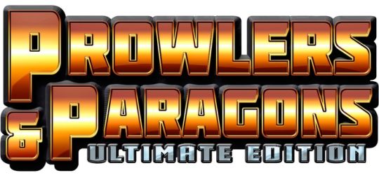
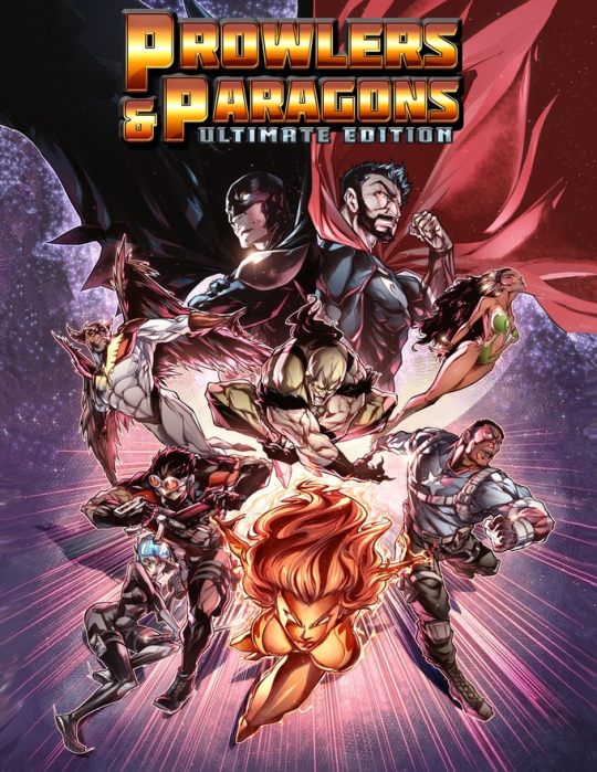
Welcome, Heroes!
This Kickstarter will fund the release of Prowlers & Paragons Ultimate Edition, the second edition of our superhero roleplaying game, and the companion volume Pinnacle City’s Most Wanted, a compendium of villains and information about Pinnacle City.
We also hope to fund two supplements: Modern Gods, an epic modern-day superhero sandbox setting by Sean Patrick Fannon, and Blood & Justice: Shadows of Nocturne, a gritty and mysterious "Iron Age" superhero setting by Bill Keyes.
If things go really well, we have a few surprises in store, as well.
Originally released in 2013, Prowlers & Paragons proved to be a sleeper hit that developed a loyal fan base and made its way onto a few “Best Of” lists, despite its cult status.
After five years of playing, expanding, revising, and updating the original game and listening to your feedback, Mastermind Len Pimentel called in "Henchman #1" Sean Patrick Fannon to help him create Prowlers & Paragons Ultimate Edition.
The spirit of the game remains the same, but the rules have been taken apart, refined, and carefully put back together. The new and improved rules have more depth than the original game engine, but they make for a faster, easier, and more exciting experience.
GAME MECHANICS
Want a preview of the game? Download the free Quickstart Rules here!
Prowlers & Paragons Ultimate Edition is designed to let you play any kind of superhero game you can imagine. Because we aren’t tied to a specific world, setting, or property, we made sure you can play characters of any power level, from street-level vigilantes to iconic mega-heroes who deal with intergalactic threats. Whether you're dodging bullets or battleships, we've spent the last five years finding the perfect balance of abstraction and crunch to make sure the game is just as fun either way.
We also made sure you could tailor the rules to suit your style of play. From lighthearted Saturday morning cartoons, to modern day comic books or superhero movies, to the dark and grittier side of supers, you can do it all in Prowlers & Paragons Ultimate Edition.
Character creation is fast and flexible, using a simple point-buy system that gives you lots of choices and enough detail to make those choices matter. Once you know what you’re doing, you can throw a character together in minutes and create exactly the type of hero you want to play.
Don’t know what you want to play? We’ve all been there. That’s why there’s an optional Random Hero Generator to help you get going. Or you can use one of the 15 fully playable heroes provided in the core rules.
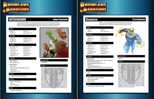
Prowlers & Paragons Ultimate Edition uses ordinary 6-sided dice and a simple yet robust dice pool mechanic that makes action resolution fast and exciting. The rules allow for both narrative and traditional success-or-failure based task resolution, letting you play however you prefer. In fact, you can use both methods at the same table!
Whether narrative or traditional, the rules are designed to keep you in your character’s head. When you play Prowlers & Paragons Ultimate Edition, you aren’t playing an author, narrator, or comic book publisher: you’re playing a hero!
Combat is fast and cinematic, striking a balance between abstraction and simulation that gives players meaningful choices without bogging them down. We’ve even used these rules to run epic battles with hundreds of combatants on the table!
If you're ready for that preview, you can download the free Quickstart Rules here!
READ ALL ABOUT IT: TESTIMONIALS!
We introduced Prowlers & Paragons Ultimate Edition to Bruce Harlick, Steve Peterson, and Ray Greer, three guys who know a thing or two about superhero roleplaying games, and here's what they had to say.
BRUCE HARLICK (Editor, Writer, and Designer for Champions and many other tabletop and electronic games): "P&P is an elegant super heroic system that is loose enough to let people play larger-than-life heroes while still providing enough crunch during conflict resolution to be totally satisfying. It's like a bridge between the crunchy games of the 80s (Champions) and the modern day aesthetic. It plays fast and fun and players' actions are only limited by their character conception -- and their imagination. Two toasts from Foxbat's Secret Lair on this one!”
STEVE PETERSON (Co-Creator, Champions; Original Partner, Hero Games): "P&P is a smashing amount of superheroic fun that I've enjoyed playing. And did I mention fistfuls of dice? If you like a game that's fast-moving and gives you the feel of your favorite comic-book heroes, P&P delivers.”
RAY GREER (Writer & Designer, Champions; Original Partner, Hero Games): “I really had a fine time with the playtest. It offers a really interesting balance between flexibility and customization for character creation. And it is rich in detail without feeling like a miniatures game for combat. The highest compliment I can pay is that if we were designing Champions today, there are several ideas I’d have liked to steal wholesale.”
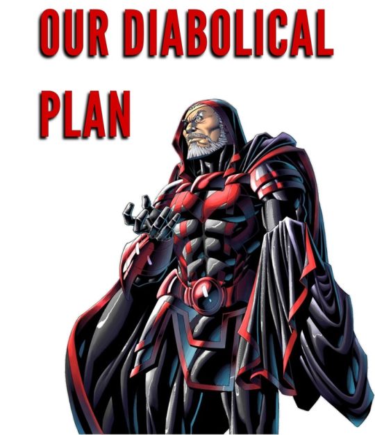
THE CORE BOOKS
When our diabolical plan comes to fruition, the two core books we'll be releasing as part of this Kickstarter campaign are the Prowlers & Paragons Ultimate Edition Core Rules and the Pinnacle City's Most Wanted villain sourcebook.
Let's take a look at each!
Prowlers & Paragons Ultimate Edition is a full color book that contains everything you need to roleplay in any kind of superhero setting. It includes …
Streamlined rules designed to help you create exactly the hero you want to play, from street-level prowlers to iconic paragons and everyone in between.
An optional Random Hero Generator for when you just don’t know what kind of hero you feel like playing.
A simple and intuitive system for advancement that lets you decide how quickly the heroes develop and ties advancement to reaching milestones in the story.
A core game engine that allows for either a narrative action resolution or more traditional action resolution system, and in fact lets you use both in the same game.
A fast-moving combat engine that emulates all the action and excitement of comic book combat. Plus optional rules to make your superheroic slugfests as four-color and fantastical or gritty and realistic as you like, letting you set the tone of your game.
A huge list of weapons, armor, gear, and vehicles you can use in your games, plus rules for superheroic gadgets, customizing your gear, and building your own headquarters.
Guidelines for using the game’s narrative ruleset to handle disasters, hazards, hostile environments, and other extreme conditions and situations.
A massive library of animals and extras—some ordinary and others less so—plus 15 fully fleshed out villains and 15 ready-to-play heroes.
Loads of advice, tips, tricks, shortcuts, strategies, and suggestions to help you create nefarious villains, exciting adventures, memorable campaigns, and game sessions that feel like a comic book stories instead of super-powered dungeon crawls.
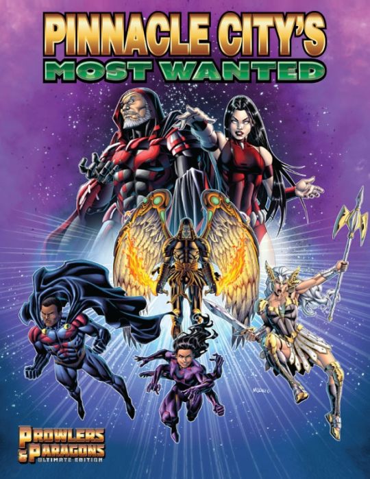
Designed as a combination rogues gallery, adventure supplement, and setting guide, Pinnacle City’s Most Wanted is intended to help make life as easy as possible for gamemasters. Within its pages you’ll find …
An assortment of opponents and supervillains of varying power level, from street-level criminals to cosmic beings that threaten the entire planet, if not the entire galaxy.
Every villain described in enough detail to let you use them as they are, but with enough room for you to make these characters your own and fit them into your game word.
Every villain's entry also includes a description of an important location in Pinnacle City or in the greater Pinnacle City Universe, plus a number of adventure seeds.
A variety of groups, organizations, and peoples, from assassins’ guilds to ninja clans, organized criminal enterprises to shadowy government agencies, technological overlords to supernatural underworlds, hidden races to alien invaders, and more.
As with villains, every group, organization, or people is described in enough detail to give you a taste of who they are while leaving room to make them your own, and each description includes additional adventure seeds.
To combat all these menaces, the book introduces readers to AEGIS, one governmental organization the heroes might actually consider their ally. Maybe.
Last, because players may one day grow tired of doing the right thing and yearn to take a walk on the wild side, the last Chapter of this sourcebook includes rules and advice for playing the villains and running villainous games.
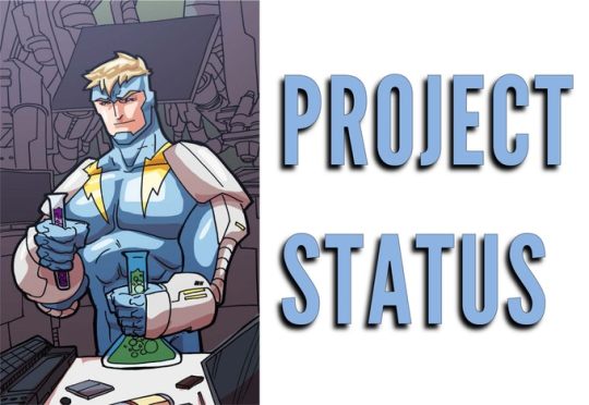
The main purpose of this Kickstarter is to give these books the treatment they deserve and provide you with the best product out there, one filled with full color artwork by amazing artists. As of the time this Kickstarter went live, the status of each book is as follows:
Prowlers & Paragons Ultimate Edition is already complete, fully written, edited, and ready for layout.
Pinnacle City’s Most Wanted is nearing completion. Should it fund, we expect the book to be fully written and edited and ready for layout within 30 to 60 days after completion of this Kickstarter.
Modern Gods [stretch goal sourcebook] is nearing completion. Should it fund, we expect the book to be fully written and edited and ready for layout within 30 to 60 days after completion of this Kickstarter.
Blood & Justice: Shadows of Nocturne [stretch goal sourcebook] is nearing completion. Should it fund, we expect the book to be fully edited and ready for layout within 30 to 60 days after completion of this Kickstarter.
Kickstarter campaign ends: Mon, April 8 2019 5:00 PM BST
Website: Evil Beagle Games
18 notes
·
View notes
Text
Breaking Down Comics
A friend of Amanda Donahue, one of my co-creators on THE MARGINS, asked me some questions, and they were so good I felt it was worth dusting off Tumblr to answer. Thanks, Nick, and I hope these rambles give you something worth your while!
Below are Nick’s two questions and my VERY long answers.
Sooo, my first question would just be how you got into it. Is it your primary form of writing?
Great question. So, is it my primary form of writing? Hmmm. I just finished a commitment to a set of 4 interactive mobile game scripts that took up quite a chunk of the last few months. In that time frame I also released a one-shot licensed 22-page comic and a 12-page digital creator-owned comic. So, on balance, I don’t think it’s currently my primary form of writing, but it’s definitely my favorite form, and it’s a medium and industry that I’m both very familiar with and passionate about, so whenever I’m given the chance to write comics, I take it.
However, comics as an industry is a difficult one to navigate. With the two biggest publishers owning incredibly popular franchises, the prime means for writers to make a living on comics is to essentially write super-heroes that you don’t own. And that, in itself, is neither good nor bad. It’s just worth noting that if you want to make comics your primary form of income, then DC and Marvel are going to come into your orbit in some shape. And that type of writing will come with its own set of thrills and challenges.
On the flip side, creator-owned comics and graphic novels can be an extremely fulfilling creative experience, if financially tricky to produce and sell. But the comics industry is still intimate enough that you can find ways to make and sell your comics. There’s a lot more to talk about there with regards to distribution and comics retail, but that’s another conversation.
It’s also worth noting that while the prevailing understanding is that digital comics sell only a fraction of the numbers of printed comics, it’s also a very accessible platform. With time and effort, you can put a comic book out to a global audience.
I may have veered slightly off topic here, but I think the point I’m trying to make is: if you want comics to be your primary form of writing, they most certainly can be. And you can and will make comics passionately and whole-heartedly, and you’ll put them into the world.
But making a living off of them is much more complicated scenario and every creator out there will have different advice for you, but be prepared for an equation that’s pretty familiar to any who has ever freelanced: less control = more money. Generally speaking, of course. There’s always a Walking Dead situation, if all the stars align.
Oh, and I never answered the first part of that question — how did I get into it? I’ll try to bullet point my personal path, which is super wonky, but probably not much stranger than most writers.
It kinda went like this:
Dave’s Writing Career: A Timeline
I always loved comics. In high school, I even wrote and drew 80 pages of a comic that was a horrible pastiche of Marvel/Epic’s Elektra: Assassin by Frank Miller and Bill Sienkiewicz and DC’s The Question by Denny O’Neil, Denys Cowan, and Rick Magyar. However, in my 20s, I’d attend conventions and discover that I had no idea how to move from fandom into professional writing.
I went on to study English and Creative Writing, thinking I’d write prose novels.
Then I moved to LA and fell in with a crowd of Hollywood screenwriter types. I wrote a few screenplays with a writing partner, Jeremy Rogers, but when nothing really came from it, we decided to make our own short films.
We made 3 short films that went into film festivals. At this point, I was tired of spending so much time and money making 10-30 minute films that didn’t result in much. We hatched a new plan: what if we availed ourselves of the iTunes platform and released an audio drama as a podcast?
Wormwood: A Serialized Mystery was the result. It allowed us to tell long, serialized stories, much like my first love: comic books.
Toward the end of the Wormwood run, an illustrator named Jared Souza contacted us. He’d adapted scenes from Wormwood into sequential art, and was curious if we ever thought about turning it into a comic book. We jumped at the chance, and with Jared we wrote and drew an 12-page mini-comic that we printed and took to the San Diego Comic-Con. Hermes Press was interested in our book, and they offered us a deal shortly after the show was over.
From there, I kept thinking about what else I could do with comics. I partnered with Chris Anderson for Lost Angels, and we made another 12-page mini-comic as a sales pitch, and we were offered a digital-first deal with a new publisher, Comicker.
And it keeps going from there, but that is the long and windy road telling stories in a LOT of different formats, each with its own strengths and weaknesses. Learning the strengths of one format does help you to understand the strengths of another. For example, for Wormwood we could really lean into long, twisty passages of monologue because it was all about the actors’ voices. However, as soon as you bring that to comics, you realize the amount of word balloons those monologues would take would utterly cover up any artwork on the page. And so you adjust.
Which is a nice segue to your other question…
Secondly, I'd love to hear how you work things out. As far as layout in regards to story. The most challenging aspect for me is to convert my thinking from imagining in film to now these static images. Do you put a lot of thought into that area, or do you focus mostly on the story and then sort of work that out as you are getting it down?
My initial thought is: “I do both.” But let’s break those up.
In terms of static images: think about the key moments. The perfect still frame of film that sums up the core of a moment of story in your mind. You want to build out from there.
But almost more importantly: think about the gutters. The space between panels. The gutters are actually where all the magic in comics reside. I recommend reading Understanding Comics by Scott McCloud. McCloud is great for understanding how a reader processes the information when we’re as absorbing art in a sequence. And the key is the gutters: The narrative “time” between panels can last a millisecond or a millennium. And the reader understands that from the context. So you’ve got to figure out how much you can get away with in between panels.
A panel exists in one moment in time. One action can occur. Imagine a father and son playing catch. What’s the most important part of that scene? The father throwing? The son catching? That’s two panels. Or, it could be a wide shot of the two, the ball in mid-air, but that wide shot probably should take up as much space on the page as two close angle shots of throwing and catching.
So, you ask yourself: what’s the emotional context of the scene? Is it important to show the father about to throw the ball (perhaps metaphorically teaching his son)? Is it important to show the son catching that ball (perhaps showing the son absorbing the lesson)? Is the activity itself the most important part (the wider shot might work best). It really depends upon the what you want to get out of the scene.
Another example: A man sits in his living room. There’s a knock at the door. He answers. It’s his landlord.
How many panels is that? The only concrete answer I can give you is that it’s ”more than one” — because the of multiple actions involved.
It could be two panels: 1) the man sits reading a newspaper, but his head is cocked because he’s JUST heard the SFX of knocking on his door. 2) he’s standing at the open door and the landlord is asking him for a rent check.
It could be five panels: 1) the main sits reading a newspaper. 2) We show the front door, with knocking SFX. 3) The man opens the door, but we don’t show who it is, building suspense. The man is nervous. 4) we reveal it’s the landlord, standing there, arms crossed and angry. 5) The landlord asks for the rent check.
How important is that scene to your overall story? Five panels is roughly a whole page. Do you want to spend a whole page to show that the man is late with his rent?
That’s brings us to the next part of your question, and the other aspect that’s really important to comics: page count.
Page count is crucial because of the amount of time it takes an artist to draw a page, and also because of the printing costs. A standard issue of a comic is roughly 20-22 pages. So you’ve got to start by knowing how much space you’ve got (some writers will refer to this as “real estate”).
As a general standard, I’m going to assume that you’re looking at a mini-series or story arc that’s probably 5-6 issues, at 20-22 pages per issue. That works for comic book issue publishing, and it collects nicely into a graphic novel.
Even if I know I’m writing a graphic novel (as we did with The Margins), I tend to think in those general terms because it helps me break the story down.
So, I might start by assuming I have 5 chapters that are each 20 pages. Then I figure out — where is the best place to end Chapter One? It shouldn’t just be a moment of pivot — a cliffhanger, something that pushes the reader to start the next chapter as quickly as they can.
I’ll use the film THE MATRIX for this example, but I’m doing this from memory, so this may not be the best story breakdown.
At first thought, knowing I have 5 chapters of 20 pages each, it seems to me a great end to the first chapter might be Neo waking up in his pod in the real world. I mean, you have to read Issue #2 if that’s where Issue #1 ends, right?
If that’s page 20, you now have 19 pages to get there. And you have to get through: Trinity and the agents, Neo following the white rabbit, Neo meeting Trinity, Neo getting a call phone from Morpheus, Neo taken by the agents and getting the tracker put in him. Neo getting the tracker removed. Neo taking the red pill.
That’s a LOT! (It’s probably more than 20 pages, but please bear in my I’m just using this as an example.)
Next I’d think about: how much real estate do I give to Trinity vs. The Agents. Maybe four pages. The first two are the fighting and running across the rooftops. The second two could be a DOUBLE-PAGE SPLASH (two pages that make up one giant image) of Agent Smith ramming his truck into the phone booth. That’d also make for a good title/credits page.
I can probably script that, but I first have to think if I can get though the rest of it with 15 more pages. Ack!
Luckily, the next bits contain a lot of conversations, so we can probably get away with 5-9 panels per page, lots of back and forth conversation, condensed onto fewer pages. And that’s key because we’re going to have to go to larger panels for key action sequences like Neo climbing out on the building ledge. Neo getting the tracker put into his belly.
To be honest, at this point, I’d probably have to rethink some of this — this feels like too much for 20 pages. But hopefully that example shows you how I approach the process. It’s basically taking the whole story and then breaking it into issue-sized chunks, then pages, then finally panels.
And as you think about panels, you do want to make sure you have a mix. Some kind of big splash page is important — it allows you to focus on the biggest moments, and it also gives the reader a bit of a chance to relax, slow down and take in the art. A sequential page can have more panels, but it becomes denser, and each panel can contain less information — one or two dialogue balloons, limited backgrounds, etc. The more panels, the less room and detail each panel can contain.
Personally, I like to think about most of my sequential pages being about 4-8 panels, peppered with one or two splash pages. I can bump up or lower the panel count as needed. If you start by thinking about 3-4 panels for big cinematic action and 5-9 panels for dense conversation or smaller actions, then you’ll probably find yourself with a decent balance through your comic.
Those are my long-winded answers. I hope this helps. There’s much more to talk about in terms of craft, but this covers most of what I think about when breaking down a comic book story.
24 notes
·
View notes
Text
BARGAIN BIN COMICS 2
The New World by Ales Kot and Tradd Moore. Credit where it’s due, this was not only a lot better than the last comic by Ales Kot I read, it was maybe the best thing I pulled out of a bargain bin. This is largely due to Tradd Moore’s art. His art is slick, sort of in the vein of James Harvey. There’s this sort of HD sheen to it I assume comes from working digitally, where the characters don’t lose definition as they’re drawn smaller. This cartoonishness stops the book and its overt politics from lapsing into pretentiousness or didacticism. It does make the book feel very cute, where even as the narrative seems like it’s copying Transmetropolitan it feels like it’s for younger millennials or Gen Z. For a book taking place in the future, the young protagonists sure do relate to their parents in a very 2018 way, and it kind of feels like YA. It seems as if the author’s optimism about the future comes from certain trends among current youth, though in turn I find the protagonists annoying. I respect that the book has two protagonists and gives ample time to both of them, as it tells its Romeo-And-Juliet-style story. There’s a confidence to the storytelling, a sense of knowing how much real estate to allocate to a moment, that I admired; and there is always something of visual interest happening. I would gladly pay up to two dollars each for the issues I don’t have (2 and 5) to complete my reading experience.
Moonshine by Brian Azzarello and Eduardo Risso. The four issues I got from this were all from late in its run, and I basically couldn’t make sense of it at all. I kept thinking scenes were flashbacks but maybe they weren’t. It seems like the cast is pretty large but I have no idea what any of these character personalities are. I don’t think knowing what was going on would’ve made me care, but Eduardo Risso is worth looking at, he has a similar approach to moving the “camera” around a sequence as Jose Munoz but a much slicker line and consistently dynamic layouts. Azzarello can write in a way that allows this style to manifest, but this one has a dumb high concept. Each of these issues contained a preview of some other, pretty terrible looking, Image Comic, like as the “value-add” for buying the single issues which doesn’t add to the value at all. The first issue of The New World threw in a self-contained short story by comics makers who don’t have an Image project, which is much cooler.
Xerxes by Frank Miller. Found 4 out of 5 issues of this and initially thought this the most exciting find of the day, but it’s beyond bad. Heavy on narration, with drawings that could maybe be interesting if the computer coloring wasn’t so overpowering and uninteresting, but I think most of the underlying drawings are pretty bad too, really pared back and simplistic and not much in the way of engaging sequences here. It’s more like the illustrations to a book that is really just the outline of a book. Definitely feels like you’re reading the work of a brain falling apart from age and alcoholism and while it’s kinda interesting on that level, it’s honestly one of the worst comics I’ve ever read/struggled to read. It’s unreadable.
Dominion: Conflict 1 by Masamune Shirow. I never read Ghost In The Shell or Appleseed, so these 3 noncontinuous issues are the first I’ve read by Shirow. He’s a good cartoonist. I’m surprised by how dense and fast-moving this is, seemingly fitting a complete book into what would probably be less than 150 pages. The sci-fi world it’s about involves cops driving around in tanks, and I don’t think this is being offered critically, there’s that weird right-wing dismissal of pacifism and praise for might that seems pretty sincere. There’s also catgirl androids in this, and a lot of the like “superdeformed” or “chibi-chibi” style, (are these the words I mean for this trope, where the characters turn into the muppet baby versions of themselves?) alongside super-detalied urban landscapes and depictions of tanks. Something that is interesting about manga published in the U.S. in the nineties is how I feel like I’m being presented with “anime” in its purest form. I know what to expect, and I recognize the exoticism that was a part of the initial appeal, though at this point it has shaped a subculture’s minds enough for me to know it’s not for me, even though I can appreciate it as being well-done.
Head Lopper by Andrew Maclean, issue 8. This comic is not for me, and I can’t really read it, due to my distaste for fantasy stuff. I’m also not really a fan of his linework, though his having a cartoony style and probably liking some of the stuff I enjoy makes me want to like it. It feels like a toned-down version of Orc Stain, which I don’t like either. I know I called Xerxes unreadable, but this comic makes my eyes just glaze over. With Xerxes I made an effort and felt “what the fuck is this” as a result, this I “get” intuitively what it’s going for and cannot make myself care. I read the first issue of this a few years ago and didn’t like it then either.
Thief Of Thieves by Brett Lewis and Shawn Martinbrough: Total outlier in the stack, in that I bought this for the writer, Brett Lewis. Me and many other people consider his comic Wintermen really good, but this is him doing the finale to a series that was I think created by Robert Kirkman and drawn consistently by the same artist, whose art is functional but not particularly interesting. The scripting is ok enough but obviously I only kind of understood it, as it deals with long-running characters I have no investment in. Ideally Brett Lewis would just be able to do creator-owned stuff. Anyway, I found most of this final arc, all except for the final issue. I’ve only read the first 2 issues but am posting this because I don’t think my take will change that much,
4 notes
·
View notes
Text
Level Design Workshop: Blockmesh and Lighting Tips
I watched this talk from David Shaver about level design with blockmesh. The talk is packed full of amazing tips for any aspiring level designer.
Level Requirements
Environment Type
Time of Day
Location in Story
Available Character Abilities
Enemy Types
You should think of these before starting the level design as these will influence how you design your level
Affordance
A way to communicate to the player what to play with or where to go
Players learn the affordance rules via consistent color and shape and a trust contact is formed.
Ensure affordances work consistently game-wide.
Add to your blockmesh for playtests
Affordance is a way to tell the player where they should go or what they can interact with. For example when we look at a door we can tell its push or pull just by seeing the handle.
You can use colour and shapes to tell the player where to go. For example Mirror's Edge uses the colour red. Or you can use shapes, such a piece of wood partially hanging off a building to indicate you can jump off it.
You can also use both, such as having an edge on a cliff that sticks out and is a different colour.

Denying Affordance
A way to communicate to the player where they can’t go
This is using the same techniques from before but you are achieving the opposite result
If you did not want a player to climb up a wall, you could push foliage on top or have spikes on top. This will let the player know they can’t go there
You can use this together with affordance, an example being having a door boarded up but the window open, indicating to the player they need to enter the house through the window.

Visual Language - Shapes
Shape Consistency is important - communicates affordance
Primitive shapes have an effect on player psychology
We can use this to guide players.
Certain shapes have an effect on player psychology.
Round Shapes are considered safe and not dangerous
Rectangular shapes are considered stable, like a safe house.
Diagonal Shapes are viewed as dangerous
You can use Round shapes to indicate safe area the player can walk, while using diagonal shapes to nudge the player on the right path.
And finally having a square building will give the player a goal to arrive at where they know they will be safe.

Visual Language - Colour You need this to be consistent with the environment. For example, if you use a bright green in a mossy cave to indicate where you can climb it would feel right and consistent. However if you used bright green to climb a rock in the middle of a desert it would not be consistent with the environment.
Colour consistency is important - it communicates affordance
Colour provides context in a blockmesh
Gets the team on the same page without explanation
You can contrasting colours to guide the player, such as having the top of edges you can climb be a colour that stands out.
Landmarks
Orients players.
Distant object seen from many vantage points in the level.
A goal to work towards.
Using landmarks creates a goal and can guide the player. It also lets them know they are going the right way.
When building the level, a good way is to create the landmark and build backwards from it. This lets you shape the level around it.
Half Life 2 does this well with its Citadel, acting as something the player was going towards at the start, then away from the Citadel and eventually back to it.

Openings Attract
Caves, doors, arch ways, etc.
Often leads to a refuge space, which psychologically feels safe
Mystery -”What could be Inside?”
Having an opening in a wall encourages the player to enter.
If you have an opening, try and make it stand out so the player can see it.
Using opening can encourage players to explore different paths in your level.
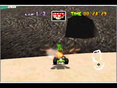
An example I can think of was when I first played Mario Kart 64, on the Koopa Troopa Beach level. I remember when I first saw the hole in the mountain and was wondering what was in it, and I stopped racing and my new goal was to try and get into the cave, just to see what was inside.
Gates and Valves
Gates stop progress until conditions are met
Valves prevent backtracking.
Both reduce the possibility space and prevent aimless wandering.
Great for linear games, but can be sprinkled into open worlds too.
Gates are pretty straight forward. The player has to achieve something before they can progress, such as killing all the enemies or solving a puzzle.
Valves however stop the player from backtracking. You can do this with a door closing behind the player, or the player jumping down from a ledge they can’t climb back up.
Gears of War would do this a lot, and do it quite well. You would go into a room where you have to push forward and fight enemies who have a strategic position. You would then fight more enemies once you are in the strategic position.
Leading Lines
Lines that draw your eyes to the intended point of interest
Composition technique
Roads, pipes, cables, etc.
Leading the players eyes if one of the most important things with level design. If you need them to find a certain object or see a certain event, using leading lines can help you lead the players eyes.
For example, this photo of Titanfall 2 uses pipes to lead the players eyes towards a door. An enemy will barge through the door and without these pipes the player might miss the moment that happens.

You can also use leading lines to guide the player where you want them too. In the photo below, you can see the pipes on the right encouraging the player to follow them.

Pinching
Angle shapes to funnel players to a specific spot.
Good for redirection
Great for setting up a reveal.
Depends on your mobility mechanics.
Pinches are useful forcing a player to look in a certain direction. You can use these when you want the player to see something important.
In the example below, by forcing the player to go walk through this pinch, they will clearly see the hospital in the distance and know they are going the right way.

Framing and Composition
Draws attention to point of interest by blocking other parts of the image, making it stand out.
Google photography composition techniques - lots of good websites
Great when combined with Pinching.
You can use the layout of the level to frame important objects. In the photo below you can see that river helps lead the players eye towards the dam, which helps frame the building.
In the Last of Us 2 trailer, there is a moment where the car is facing to the right which draws the players eyes there, and then there are two perfectly framed trees with light shining from them. This clearly shows the player the way to go even though the player is in a forest.

Breadcrumbs
Attract/lead the player, a piece at a time to a goal
Can be almost anything that draws the eye
-Stuff that breaks up the negative space of floor/walls. -Pickups -Enemies -Lit Areas
Usually better to add after early playtests of blockmesh to see if they are even needed.
Breadcrumbs help lead the player. You essentially litter the ground with a trail of objects. A classic example is Super Mario games, where they use coins to lead the player. I really like this technique as its super simple but highly effective.
Textures
Just point the way to go
Examples
-Arrows pointing the way -Scrapes on the ground/walls -Signs -Etc.
You can use textures to act as an arrows to tell the player where to go. In my narrative game I have used blood smears and drag markings on the ground to guide the player. In some games you can even just use an arrow if it matches the environment, such as in a street with a sign that tells you where the area is you have to go. You should try and block these out in your blockmesh.
Movement
Use movement to grab the eye.
Examples: -Big Scripted moments -Birds -Spark FX -Enemies -Something flapping in the breeze
Guides the eye to where you want the player to go
I like the idea of using movement to grab the players attention. It helps them to notice things you want them to see.
Doing this in the blockmesh phase is highly dependant on your game
Try to do it anyway for your playtests
Cubes triggered to lerp in a direction or along a spline will suffice
Can be a late game bandage for guidance
Light and God Rays
Players are attracted to the light
God rays draw attention and a line to the goal
Important in blockmesh phase.
I believe lighting is one of the most important things to think about when designing a level. It helps guide the player, show them points of interest and can hide areas you don’t want them to go too.
God Rays in particular act as a beacon. What I really liked was how he mentioned a squint test. The Squint Test is where you squint your eyes and have a look at your game. What stands out when everything is blurry? Whatever stands out is the first thing people will see when they play your game.
This entire talk is amazing and is so jam packed full of information.
This talk taught me of so many things I should be thinking about in the blockmesh stage of level design and how to think of ways to guide the player throughout your levels.
As an aspiring level designer, this video is the best video to teach you about everything you need to know.
2 notes
·
View notes
Text
What's New In IF? Issue 30 (2024)
By Aj, Dion, Briar, Jen and Peter
Now Available!
Itch.io - Keep Reading below
If you read the zine, consider liking the post: it helps us see how many people see it! And sharing is caring! <3

~ EDITORIAL ~
Event Highlight!
In this Issue we take a quick look at the Videotome Jam hosted by Freya, the dev behind all the Videotome game engines!
Continue reading to find out more!
We want some feedback!
As we’re starting to get a hand of things, we would love some feedback from you guys! What you enjoy, want more or less off, how we could improve... Anything goes! We even have a nifty form.
We hope you enjoy this new issue!
AJ, DION, BRIAR, JEN AND PETER
~ BE A PART OF THE ZINE ~
THIS ZINE ONLY HAPPENS WITH YOU!
Want to write 1-2 pages about a neat topic, or deep-dive into a game and review it in details? Share personal experiences or get all academic?
WRITE FOR THE COLUMN!
Prefer to be more low-key but still have something to share? Send us a Zine Letter or share a game title for Highlight on…!
WE WANT TO HEAR FROM YOU!
Came across something interesting? Know a release or an update announced? Saw an event happening? Whether it's a game, an article, a podcast… Add any IF-related content to our mini-database!
EVERY LITTLE BIT COUNTS!
Contact us through Tumblr asks, Forum DMs, or even by email! And thank you for your help!!

~ EVENT SPOTLIGHT : Videotome Jam - "Waiting" ~
November 16th to December 1st 2024
Videotome Jam is a two-week-long game jam for games made in any of the Videotome engines with the optional theme of "Waiting".
What is Videotome?
Videotome is a series of small homebrew IF/VN engines made by Freya Campbell (communistsister), an indie game developer focusing on narrative games that are usually:
science fiction, horror, &/or romance
close to 100% LGBTQ characters
free/PWYW with low tech requirements
liable to make players keysmash due to feelings
Videotome was first released in April 2022 as a part of a game entry for the Domino Club collective. The initial idea for the engine was to make writing text-heavy games as hassle-free as possible, focusing not that much on the visual presentation format, but more on the writer's experience. It would allow writers to write in a notepad and then it would somehow grab the .txt file and parse the lines into an array, spitting them out one line at a time as a kinetic novel.
At the moment there are four engines available:
Videotome, for linear, no frills text / images / music;
Videotome ADV, adding a more conventional layout with ignorable choices and branching;
Super Videotome, for more fully featured and freeform image/canvas use;
Videotome Heartbreak, adding a stat raising dating sim & storylets structure to the above.
If you're more interested in the process of making these engines, check out the devs blog post - Words, Friction, Syntax: Stuff I thought about when making Videotome. (The post also includes a very interesting case study concerning other game engines Freya has experience with.)
If you want to check out some examples of projects made with Videotome, take a look at this collection. It includes games made by both Freya and other devs.

~ ONGOING (VOTING) ~
The voting for ECTOCOMP 2024 has officially started! To vote and participate as a jury, you must do so by giving between 1 to 5 stars on each entry page of the jam. The voting period ends on November 30.
~ ONGOING (SUBMITTING) ~
A Hallmark movie is a feel-good, family-friendly film, often centered around romance, personal growth, or holiday themes. A Very Hallmark Game Jam with a theme of “Charming Love Interest with a Secret” is also all about that!
Are you a fan of Videotome games? Then the Videotome Jam with an optional theme “Waiting” is for you!
This year’s Yuri Game Jam is in full progress. The devs have until December 2nd to submit their projects.
The Educational Jam is a perfect place to learn something new. Discuss some obscure tidbit. Showcase your insight about a specific thing, your pub trivia skills, or that Wikipedia rabbit hole you went down last time.
Disabled Rep VN Jam has a very simple premise but a very important message.
Once upon a time, a game jam was held to create stories around the theme of fairy tales… and that game jam is the Once Upon A Time VN Jam. It’s running from October 1st to January 31st.
Concours de Fiction Interactive Francophone 2025 is for all French-speaking enthusiasts. Submissions are accepted March 3rd 2025.
Are you perhaps a fan of more somber, melancholic themes? Then check out the Dying Year - Visual Novel Jam! You have until the end of the year to participate.
The Black Visual Novel Jam is all about working with creative professional developers who work in visual novels to bring more Black stories to life. The goal is to create a space where Black creators can show their unique storytelling through visual novels.
~ OTHER ~
PIZZAPRANKS is accepting submissions for their Indiepocalypse Issue #61. If you’re a dev and would like to try out your luck, definitely check it out! Any game is welcomed, not only IF.

~ NEW RELEASE ~
In Arctic Adventure unearth forgotten journals, repair malfunctioning equipment, and solve puzzles to piece together the station’s dark past. But beware—some secrets are better left buried in the ice.
You are a dragon - huge, winged, flying and even capable of magic. Only here, in a system of caves created by your magic, you can be yourself. But the time has come for you to leave your home. The old map, that you've been keeping since times immemorial, is now ready to unravel it's secrets in A Dragon and the Tower.
You’ve spent your whole life visiting the majestic Hotel Lexington, and now you’ve inherited it! The once-grand building is in disrepair, and rumored to be haunted! You’re the only one who can restore its former glory before it’s lost forever. Check in to your hotel, and check out the ghosts in Haunted Hearts Hotel.
As always, don't forget to check out the submitted entries to the events mentioned in the previous pages. They deserve some love too!
~ NEW RELEASE (WIP) ~
You are a key member of "The Constellation Club," a close-knit group of friends brought together by your shared love for music and dreams. Over time, the club members drifted apart, but a mystery brings you all back together. Reunite with your friends, uncover secrets, and chase the dreams that first united you in The Constellation Club (Twine).
Have you enjoyed the first Volume of Oblivious Melodies? Then be sure to check out Chapter 1 of Volume 2 (Twine)! You play as the Horne siblings, navigating their emergence into gentry society. You will delve into a country divided by class, religious dissent, political factionalism, and the ever-encroaching interests of empire. @oblivious-melodies
In Ashenmaw - Dragons of Marrowoods (CScript) you play as a freshly hatched dragon whelp, navigating the odds and ends of the politics and mysteries of the five flights. Intermingle with the younger races, and jump headfirst into uncovering the secrets of Ashenmaw and the Marrowoods. @ashenmaw-if
Aydan joins his husband Leo in this important family reunion that takes place 2 months after his father’s death. Suddenly, they are all trapped in the house for 3 days and the lawyer states that one of the siblings is the murderer of their own father! Find out who the real culprit is in Guilty at 5PM (Ren’Py).
In a realm of forgotten tales, you emerge as a ghost to yourself. Stranded in a land where memories fear to tread, the icy breath of solitude kisses your bare flesh, a chilling reminder of your forsaken existence. In this realm where salvation dances with oblivion, Snowborn (CScript), awaken to tread the treacherous path through a world steeped in sorcery and demise.
You are a young nobleman, in a stagnating empire, either on the verge of resurgence, or it’s final demise. An Empire held together by fragile institutions, led by ego-driven men. And here you are, in the middle of it all. As this den of vipers strike, where will you fall? Find out in Scion of the Alason (CScript).
You wake up suddenly with a system telling you that you are occupying the body of a green tea b!tch! The spy of the fearsome overlord, Hasthael who betrayed him for the male hero, resulting in the death of his beloved lightning hound. Avoid the fate of dying and accomplish the missions given by two of the available systems in Project Dominion (CScript).
You are the Aeon, an omniscient entity as old as time. When your powers begin to malfunction and the source of an incoming threat is unbeknownst to you, how will you protect the fabric of the universe? Abandon your omnipresent form for the first time in millennia and craft an identity as a demon to infiltrate the Ethereal Plane in The Time Keeper (CScript).
~ UPDATES ~
Aesemyr: The Withering (CScript) released 3/4 of the "university gathering" path of Chapter 3.
After Dark (CScript) released the last part of the fifth day of the journey.
Eldritch Tales: Inheritance (CScript) released part one of Chapter 3. @darielivalyen
Honor Amongst Thieves (CScript) updated their public demo. @leoneliterary
Oh Mother, Where Art Thou? (CScript) started Act 2 of Chapter 1.
Our Life: Now and Forever (Ren’Py) added extra content to their Patreon demo. @gb-patch
The Abyssal Song (Twine) released Chapter 5. @ri-writes-if
Virtue’s End (CScript) has updated their Patreon demo. @virtues-end
When Life Gives You Lemons (CScript) updated their public demo. @when-life-gives-you-lemons-if
~ OTHER ~
Is playtesting something that interests you? Check out part one of Drew Cook’s let’s TEST IF #1: being a playtester. @golmac
GlasswingGames is currently running a giveaway! You can enter to win either a chibi or emote of a character of your choice! @glasswinggames
~
As always, we apologize in advance for missing any update or release from the past week. We are only volunteers using their limited free time to find as much as we can - but sometimes things pass through the cracks.
If you think something should have been included in this week's zine but did not appear, please shoot us a message! We'll do our best to add it next week! And if you know oncoming news, add it here!

~ MAYBE YOU NEXT? ~
We did not get a submission this week. But if you have an idea for a short essay, or would like a special space to share your thoughts about IF and the community...
Shoot us an email!

~ HIGHLIGHT ON ~
A couple of games that we thought were cool.
God-Cursed by @wings-of-ink (Twine)
I think this game is fantastic. Plot, ROs, writing, everything. Deserves thousands of reads and compliments!
//recommended by Briar [Team]//
Your favourite game here?
Do you have a favourite game that deserves some highlighting?
An old or recent game that wowed you so much you spam it to everyone?
Tell us about it! And it might appear here!

Hello! I appreciate what you all do. As a living thing with a 9-5 job, I couldn't regularly check updates from existing WIPs, especially the ones I really like. I also tend to be the last person to know new IFs with lots of potential. So, I'm glad that with your zine, I get weekly updates from everyone in one place. Thank you, thank you so much!
- a very mysterious anon
WE LOVE TO HEAR FROM YOU ALL! WHETHER IT'S GOOD OR BAD, OR EVERYTHING IN BETWEEN...
Have something to say? Send us a message titled: Zine Letter!

As we end this issue, we would like to thank:
our awesome mysterious anon!
For a very encouraging message!
As always, huge thanks to all you readers who liked, shared, and commented on the last issue!
What might be tiny actions are huge support and motivators to us!
Thank you for cheering us on this journey!
~ ~ ~ ~ ~ ~
We actually have a separate Zine for all our individual Interviews!
Last Issue’s Interview with Leia Talon will be added this upcoming week.
And see you again next week!
AJ, DION, BRIAR, JEN AND PETER
WHAT'S NEW IN IF? 2024-ISSUE 30
#What's New in IF#NEW ISSUE IS OUT!!#interactive fiction#if news#visual novel#parser#choice of games#choicescript#twine#ink#twine games#ink games#itch.io#interactive game#interactive novel#IF#games#hobby#indie dev#choose your own adventure#if-whats-new#zine
137 notes
·
View notes
Text
7 Best Shopify eCommerce Themes That Help to Increase Sales
Ecommerce is on an uptrend right now and there is no shortage of inspirational Shopify success stories. Whilst many gurus say that product sourcing is the most important aspect of a successful eCommerce store, they often fail to mention the importance of a good theme.
Having started and scaled my own Shopify store to five figures a month, I want to share the best themes that I’ve found work most effectively to convert viewers into buyers.I also added an example of a website using the theme so you can see how it works in action.
Selecting the right theme is important because it allows you to design your site in a way that resonates with your brand. The right themes have built in elements that make it easier and quicker to create your storefront.
For example, if you are selling a single item, it would be wise to choose a theme that highlights the features and benefits in an attractive way.
However, if you have multiple items, choose a theme that recommends similar products to increase average order value. Pick the theme based on your specific needs.
Let’s dive into the list.
1. Shoptimized - Best for Conversion

We might as well start our list with the #1 unofficial Shopify theme, Shoptimized.
This theme has been around since 2015 and is in use by more than 20,000 Shopify store owners.
We can attribute its effectiveness to the fact that the responsive template was developed according to conversion rate optimization guidelines from the Baymard Institute - the World’s leading eCommerce UX research organization.
Key Features
Loads 38% faster than competitors’ themes
An urgency-countdown timer on the product page
Shipping time estimator
Stock availability counts to mimic a feeling of scarcity
Marketing integrations with Google AdWords, Bing Webmaster, etc
Built-in social proof pop-up
Video embedding
Currency converter
Highly customizable call-to-action button
Live traffic count
Product analytics
Email pop-ups
Pros
Mobile-Friendly
Pleasant UI and loading screens
One-time payment with lifetime access
One-year support and free updates
Well optimized and highly customizable to suit all niches and store type
Easy to manage
Comes with several free features replacing paid apps such as the email pop-ups
Two free courses available with the Pro and Ultimate plans
Good customer support team
Cons
Although the cost is a one-time payment, you only receive support and updates for a year
To update the theme, you will have to reinstall
No refund policy
Shopify eCommerce Theme Example: Perfotek

2. Multifly - Best Universal Theme

When it comes to themes, Multifly is a fantastic example of universality and impeccable design. It comes with seven stunning templates for jewelry, fashion, cosmetics, fishing, electronics, tools, and wholesale stores.
Multifly is an exciting theme with an eye-catching look, flexibility, and powerful features. Those qualities make it one of the most responsive and highest converting themes on Shopify.
Almost limitless customization options will enable you to turn your website into an attention-grabbing sales booster in a matter of minutes. The lightweight and responsive theme also has a perfect score on PageSpeed Insights.
Key Features
Drag and drop functionality
Very responsive
Works well on smartphones, laptops, and tablets
Product quick view
Ajax cart to make shopping a pleasant process
Dropshipping
Valid semantic coding
Sorting options
Megamenu
Parallax effect
Add to wishlist feature
Product countdown feature to show the remaining stock and new arrivals coming soon
Registration forms
Online chat
Google fonts
Admin panel
Minimalist style
Pros
Highly responsive
Multipurpose template
Compatible with the official Shopify apps
Multi-currency
Multi-lingual
The minimalist style brings the users focus of attention to your store’s items
Free 24/7 professional technical support
Fast theme color switcher
Cons
Not as beginner friendly as its competitors
It is expensive
Shopify eCommerce Theme Example: Multifly

Narrative - Best for Storytelling
If you want to build a brand that stands out, storytelling is one of the most effective ways of doing this. One of the best themes for putting this strategy to action is Narrative.
Narrative is a free theme created by Spotify with a focus on stores with small catalogs. The boutique theme is specially designed for visual storytelling, featuring a full-width slideshow on the homepage by default.
Due to its strong visual impact, Narrative is ideal for;
Using videos and photos rather than text to tell your story
Delivering a strong message about your brand
Highlighting the uniqueness of your single product or small inventory
Since this is a fully customizable theme, you’ll be able to have your site up and running in minutes.
Key Features
Four different styles; warm, cold, light, wide
Support for full-screen video
Easily customizable sections
Social media integrations
Autoplay hero videos
Mobile optimization
Vertical slideshow, showcase more information on the homepage without forcing the customer to leave the page
Fixed navigation
Blogging functionality
Pros
Completely free
Fully customizable
Optimized for small devices
Free template updates
Ranked 7th among other Shopify themes for speed
Cons
Product page design is limited
The layout is difficult to reformat
Wishpond + Shopify: Supercharge Your Ecommerce Store
Book a free call to learn how our team of marketing experts can help you to boost sales for your Shopify store today!
Shopify eCommerce Theme Example: Mor For Moms

4. Debut - Best Free Theme

Debut is one of the most popular Shopify themes and I’ve seen multiple shop owners scale their store to six figures a month with this simple theme.
As the name suggests, Debut is a great starter theme for beginners. However, it still packs a punch in comparison to even its premium competitors. It looks simple and clean, yet it is alluring. The mobile-optimized theme is also suitable for all types of stores and is ready to go with minimal customization.
Key Features
Two different styles: Default and Light
Multi-level menu feature
Slideshow feature on the home page - use this to display multiple products
Customer testimonials on your homepage and product pages
Newsletter
Footer - put links to social media pages and contact information
Magnifier - zoom into product images
Product filtering
Pros
Free
Mobile and SEO-Friendly
Clean & professional design
Ideal for small catalogs
Free lifetime updates
Cons
You need to install additional apps to suit your needs
Limited customization
Shopify eCommerce Theme Example: Veronique Collection

5. Wokiee - Best Overall

If you’re looking for more than just a theme, Wokiee is an outstanding design tool as well. In addition to being a fantastic theme, it has all the modules and tools you need to create a stunning website that is super-fast and has an impressive UX.
Boasting an average rating of 4.96 from 303 ratings (at the time of writing), this is one of the best Shopify themes. The theme offers 21 layouts for the homepage of your website. All of them are categorized depending on the website niche and optimized for mobile view. One thing that makes Wokiee stand out from the rest is its powerful admin panel, which aids in the design process.
Key Features
20+ homepage layouts
Eight shop page layouts
Mega menu for a good user experience
Banners
AJAX search
Instagram feed integration
Newsletter
Numerous filters
Dynamic checkout buttons
Wishlist and product comparison system
Well-designed product pages
SEO-optimized
Pros
A vast range of features
Versatile design and a lot of layout options
Quick loading speeds
Cons
Setting up may take too long. Wookie’s many design options and features could take a long time to get used to
Shopify eCommerce Theme Example: Wookie Demos

6. Universe - Best for Dropshipping

If you are interested in dropshipping, Universe is a theme worth checking out. It is a multipurpose theme that comes in two main variations, the light Earth mode and the dark Mars option.
Regardless of which variation you choose, you’ll be able to author a modern, professional-looking Shopify store in no time. This theme also has a large number of Shopify sections and customization tools. These will allow you to easily adapt it to any purpose or niche. Some of the features you’ll have access to include product image zoom, support for video backgrounds, and Google Maps and YouTube integration.
The selling point of Universe is its ease of use and great social media integration features, perfect for dropshipping.
Key Features
Fully customizable thanks to the extensive built-in settings
Interactive product carousels
Powerful mega menu
Video backgrounds
Color swatches
Parallax sections
Sticky header
Product filtering
Slide-out shopping cart display
Social media integration
100% mobile-friendly
Pros
Wide range of features
Lightweight but versatile
Fast loading times for maximum conversion
Good for dropshipping
Suits both large and small-sized brands
Cons
Not suitable for every niche
Shopify eCommerce Theme Example: Universe Theme Demo

7. Porto - Best User-Interface

The Porto theme provides you with everything you need to create a fantastic website of your choice. The popular theme is in use by more than 110,000 satisfied business owners, so it is tried and tested.
The main reason for Porto’s success is the superb UI and UX experience, both of which get better in time thanks to the constant updates. The ever-growing number of Demos also means you can get your website up and running in minutes. Prefer to do your own thing? The customization tools and options leave plenty of room for some creative freedom. Porto also has full support for WooCommerce, the leading WordPress online store builder plugin.
Key Features
More than 20 pre-made demos
Vertical mega menu
One-click demo import
Multiple content and sidebar layout configurations
Custom widgets
Optimized for speed
AJAX
Powerful admin menu
Fully responsive on all devices
Light and dark color skins
Unlimited skins and color
Retina ready
Unlimited headers
Pros
Outstanding support team
Great drag-and-drop builder plugin
Good selection of pre-made demos
Reasonable pricing
Cons
A lot of competition from similar multi-purpose themes
Shopify eCommerce Theme Example: Porto Demo

Conclusion
An elegantly designed store is one of the most important components to an effective online sales funnel and selecting the right theme can quickly jumpstart your progress. A correctly chosen theme can get you 95% of the way there - you don’t need to build your store from scratch, instead you can just add minor tweaks.
Summarising our list, we have:
Shoptimized - Best For Conversion
Multifly - Best Universal Theme
Narrative - Best For Storytelling
Debut - Best Free Theme
Wookie - Best Overall
Universe - Best For Dropshipping
Porto - Best User-Interface
This list should have something for everyone.
So, what is your pick? Let us know in the comments down below.
About the Author

Eddie is a strategy consultant with a passion for helping those build online businesses. He shares his best tools, tips and tricks on earning passive income on his blog Passive Income Tree and has built two successful online businesses.
from RSSMix.com Mix ID 8230801 https://ift.tt/2MuMB56 via IFTTT
0 notes
Note
Any advice for someone who might be writing scripts for a comic sooner than later? I've written regular stuff before, but I know it's a bit different when you have to account for layout and bubble sizes and whatnot.
This depends pretty heavily on whether you’re drawing it yourself or collaborating. If you have a dedicated artist, they probably know a lot more about layout and bubbles then you do, and you can just write the comic script as a screenplay and only micromanage in special cases. Most artists prefer this, too, since they can be more creative (Sabu doesn’t even want a page breakdown!). But everyone is different so talk it over with your artist and make sure to remember that they’re probably creative and brilliant as well.
If you’re drawing it yourself, the only art-relevant advice I can give you is to do the bubbles first so you don’t draw the whole page before realizing you didn’t leave space for them; I’m not an artist.
Anyway.
One thing that I don’t do nearly enough considering how well it works for me is write out the story in the simplest possible “Just the facts, ma’am” terms and then scripting based on that. It’s a good way to see if your are properly using but/therefore instead of “and then”s. For example, borrowing heavily from Household Slime Mold:
Mildew is a girl who wants to be a witch BUT she sucks at it THEREFORE she works as a delivery girl THEREFORE she has to make deliveries BUT she meets a wizard THEREFORE she wants to be his apprentice BUT he says he's not hiring THEREFORE she's has to hurry to make her delivery BUT she sees weird magic shit THEREFORE she goes after it BUT it turns out she's a monster BUT she beats it with her limited magic as the wizard arrives THEREFORE the wizard decides to train her after all.
Just writing this out this way helps streamline the narrative. If we were writing page-by-page, we might wait until Mildew saw the Wizard, and have her go "I want to be a Wizard, too!". But because we wrote it this way, we intuitively realized that "Mildew is a girl" is not a super-interesting start, and established her motivations right away. This is 12 story beats, so if we do one per page, we can expect a 12-page story. That'll be our starting budget. We might be able to do it in less, but it's our baseline. So, let's start
PAGE 1: Mildew is a girl who wants to be a witch
Well, this sounds like a job for an establishing shot. We can have Mildew in her room, which has some various witch shit like a cauldron in it. She's at her desk reading a spellbook.
Oh. Wow. That was easy. Sometimes you find that you can do stuff in less time than you budgeted. We can have the page just be this one splash panel of Mildew doing magic stuff in her room and the logo. Or, we could have more than one panel on the page. Let's go with making this a whole page, since it's the first one and you can put the logo and "By anon, drawn by artist" and shit on it. We can also establish the character a bit more here, too, and a full page to the image makes the reader more inclined to take in details rather than moving on to the next panel. So:
PAGE 1FULL PAGE SPLASHMILDEW is alone in her bedroom. It's neat and tidy, with multiple bookshelves full of books. She's sitting at her desk reading from a book while a cauldron bubbles. There's a poster on the wall of a wizard hanging from a clothesline with HANG IN THERE BABY on it, and a poster that looks suspiciously similar to the cover of Harry Potter and the Sorcerer's Stone. The bed is made neatly, and a teddy bear is tucked in. It's fucking adorable. Midlew is wearing a witch hat, but otherwise normal modern clothing: a tank top and jeans.
On to story beat 2!
So, the easiest way to show that someone sucks at something is to have them fail at it. Let's think visually. For someone to fail at something in a comic format:
1. She has to try something 2. It has to not work
So that's two panels, and let's include a reaction to the failure as well. We also want to make clear that her problem is that she sucks at magic, not that magic doesn't exist.
PAGE 2
Panel 1Mildew points a magic wand at her desk Mildew: Appeario Birdyosa!
Panel 2 Mildew's wand explodes in her hand, sending embers everywhere. She is terrified by thisSFX: Boom!
Panel 3Mildew's hand is on fire. She's waving it around while crying, but in a funny cartoonish way, not that she's really hurt.Mildew: Aaaaahhhh!
Well...that’s the story beat established. But it only took three panels, and none of them need to be particularly big. We have some space left. Let’s get a head start on the next beat, and set up Mildew’s job!
Panel 4Mildew, still crying cartoonishly, sticks her burnt and blackened hand in her mouth. On her desk, her cell phone vibrates. The phone is pink with a broomstick charm on it.
SFX: Bzzt! Bzzt! Mildew: Mmmph....
Panel 5Without changing her position, Mildew looks at her phone. Mildew: Mmmph?Panel 6Close up on the phone. It’s showing a text message from “boss”, which has a profile picture of an angry man. The text reads “You were supposed to be here ten minutes ago! Where are you?!”Mildew: Mmmph!
And you kind of work from there. The next page can show the pizza place she works at, and you have time in your budget for the boss to chastise her for being late before giving her a delivery and telling her not to fuck it up this time. I think this kind of budgeting is a useful way to make sure you have your pages paced out properly, and it’s something I need to do more of (it’s also a great way to avoid writer’s block, since you have a structure to follow but not a restrictive plan you’re stuck in).
Hopefully that helps, anon!
49 notes
·
View notes
Text
PAGE x PAGE ANALYSIS -- BATMAN: GOTHAM ADVENTURES #1 (PART TWO)
PUBLISHED: DC Comics, June 1998
SCRIPT: TY Templeton
PENCILS: Rick Burchett
INKS: Terry Beatty
COLORS: Lee Loughridge
LETTERS: Tim Harkins
EDITORIAL: Darren Vincenzo
Picking up where we left off last week, we’re gonna dive back into1998′s BATMAN: GOTHAM ADVENTURES #1. You can check out part one here, but for those with time against them, the setup of the issue is: The Joker has killed the only son of industrialist G. Douglas Reid, who has put a fifty million dollar bounty on the killer clown’s head. With all of Gotham gunning for the reward, Batman and his affiliates have taken the Joker into their private custody until they can resolve the situation. With Batgirl guarding the Joker in the Batcave, Batman and Robin head off to answer a Bat Signal from Commissioner Gordon. We’re eleven pages in.
Along with the regular discussion of story flow and scene direction, I’m also gonna get really into some tiny moving parts that particularly interested me as an artist. That might ultimately make this one of the dryer entires in this feature, but hey -- if you wanna skim through the analysis and just enjoy some great pages, friend of mine, it’s okay by me.
BATMAN: GOTHAM ADVENTURES #1 and all characters contained therein are property of DC Comics, reproduced here solely for educational purposes.
***
PAGE TWELVE
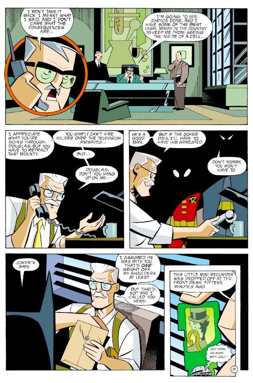
Such a good design on that little Riddler iPod Shuffle (hereafter referred to as a “?Pod”). The question mark motif is clear enough to read, while still subtle enough to keep from being distracting. Loughridge does a good job of keeping the vibrant greens of the ?Pod distinct from the soft greens of Reid’s office in panel two. Burchett choses to include the Riddler’s staff on the ?Pod screen, which makes him immediately recognizable as the classic Batman villain and visually echoes the ?Pod’s design, helping us catch the motif.
Props to Bruce Timm for giving each of the Batfamily distinctive mask eyes, so they can be easily identifiable even in the shadows.
I’d also like to point out something so small it might even be an accident, but something I’ll definitely be using in the future: the different way Reid and Gordon hold their phones.
The angle of Reid’s hand in panel one suggests he’s holding the handset microphone closer to his mouth so he can better make his demands. His posture in panel two emphasizes the anger he feels, the power he’s trying to assert.
Compare with the angle of Gordon’s right hand, turning the handset so that the speaker is closer to his ear. Added to the way he’s gesturing with is other hand, this clearly shows us a man who’s trying hard to reason with somebody who just doesn’t want to hear him.
Try acting this out yourself -- imagining how you’d have to be talking to be holding a phone in each of these two ways. Like I said, it’s small, but it’s some real fine acting.
PAGE THIRTEEN
The ?Pod’s great design continues to help us out in the first panel -- it’s distinctive screen becomes an easily identifiable panel shape. Since the rest of the scene takes place in a green/teal environment, Loughridge gives that first panel a red boarder to help break up the scene. See also; the magenta sky.
There’s an interesting relationship between the Batmobiles in panels two and six. Here’s the page again, simplified to just those two panels:
See how the front bumper (gouger?) of the panel two Batmobile asserts itself over panel five? Somehow, this doesn’t interfere with the reading flow. Maybe it’s the simple black shape of the bumper, encouraging you to view it more as graphic element than a pice of diegetic matter. Or maybe it’s because the Batmobile is essentially a location, so we don’t expect it to interact with Batman and Robin inside -- and as a result, it doesn’t throw us when we see it encroach into their space. See also: the Uptown sign in panel seven.
Furthermore! The panel seven Batmobile’s rear fin creeps all the way back into panel two. It’s definitely purposeful -- it’d be easy to avoid with a very minor alteration in the angles of the cars so that they fit entirely within the panel borders. So why this atypical staging? It’s certainly a lively layout, for one thing. For another, liberating the Batmobile from the bounds of panel boarders makes it feel fast and powerful -- driving at liberty all over the page.
PAGE FOURTEEN
Look at that great smirk in panel three. The New Adventures redesign of the Riddler has nothing on the amazing sport coat and slacks look of the original, but it does have a certain stripped-down charm. It’s clean, distinctive, and devoid of redundancies.
This scene suffers some a little bit of messy geography, as we’ll soon see. For now, just take note of the balcony railing at the bottom of panel one, which is unquestionably where the gunmen are in panel four.
PAGE FIFTEEN
“Or merchandise worth an equivalent amount.” Templeton immediately ties the Riddler subplot to the main Joker narrative. Again, everything in this comic radiates from the clown prince’s murder of Reid’s son. The universe of the comic feels huge, but also connected.
The Riddler’s pose in panel two is his question mark motif writ large. Lowering himself on that ball, the “dot” in the question mark of his body, is a really good visual idea. Unfortunately, it’s at the heart of the geography problem in this scene.
But before we get to that, I want to point out a great example of setting up, execution, and finishing off an action: in panel one, the Riddler uses his cane to pull the rope towards him -- the setup. In panel two, he descends on the rope -- the execution. Then, in panel three, he’s still touching the ball -- finishing off the action.
PAGE SIXTEEN
Burchett makes great use of negative space to increase the tension of the Riddler’s countdown in the last two panels.
Sidebar: I’m remembering this bit from a Dan Olson video about -- don’t freak out now -- Triumph of The Will and the Cinematic Language of Propaganda, where he talks about the paradoxical perception strength and weakness of the enemy as viewed by fascism. Check out this segment of his video, and watch until about 10:50. It’s only a minute of video, and it’s interesting food for thought when viewed in the context of how to depict super villains, especially trickster-style villains like the Riddler (see also: Loki, Mysterio, or the Flash rogue who’s actually called ‘The Trickster’). Just try not to overthink the Nazi stuff.
PAGE SEVENTEEN
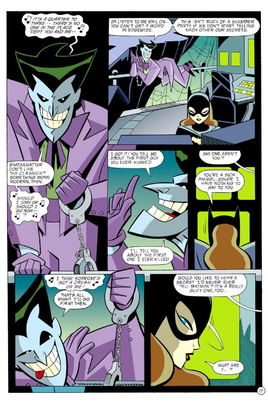
We jump from a panel of the Riddler to a panel of the Joker. Note how both of them are looking straight at us, both gesturing with their left hands -- the Joker’s even echoing Riddler’s countdown with his “Quarter to three” lyric. All of this means that we get to ride the tension of the Riddler scene right into this one, and multiply it by the demonstrably greater potential danger posed by the Joker.
The scene wrings extra tension out of the metatextual history that exists between Barbara Gordon/Batgirl and the Joker in the mainline DC universe. Even without that, we feel the threat he poses to her by the way he’s staged on the page. Look how the Joker dominates the layout: In Fig. 1 below, we have all the Joker panel appearances and dialogue (darkened so as to make the contrast more apparent), and all of Batgirl’s in Fig. 2.
He’s a talker, alright. But this serves another purpose as well: it reminds us that Batgirl is isolated -- trapped in that space with the Joker.
PAGE EIGHTEEN
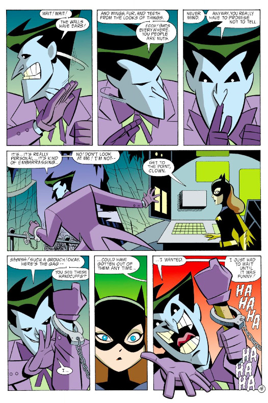
On this page, the creative team and the clown prince have the same objective -- they’re trying to draw us/Batgirl in, commanding our attention, using a repetitive visual/verbal rhythm to hold our/her attention. The rhythm breaks when the Joker reveals his little magic trick in the final panel; on the art level, this is achieved by having the Joker break the panel border, along with the sudden snap to red.
PAGE NINETEEN
The intensity spikes with this page, both through the warmer colors and the more action-y diagonal gutters. Some clever staging here; Burchett is able to convey Batgirl’s jump in the first panel by showing us the railing behind the Joker, giving us a concrete landmark by which to place her in space.
Check out the motion lines Burchett and Beatty have given us here; see how no two actions take place along the same axis, creating a ton of energy on the page.
That black silhouette in the last panel is as gritty as this comic gets, but Burchett keeps it respectable by only showing the Joker, not the Batgirl he’s clobbering. On the next page, it’s immediately made clear she’s just knocked out, not fully Jason Todded.
Also, props of everybody for never messing up which of the Joker’s hands was cuffed. It’s the easiest thing in the world to accidentally switch it up, especially when a character turns their back to the reader.
PAGE TWENTY
The Joker is now free to move about the Batcave -- Burchett gives us a detailed look at the cave in panel one so that we viscerally feel this dangerous new liberty. He breaks the panel boarder again in panel two, which adds to that great double exposure as he sees the Batcave entrance. Sure, he saw it earlier when Alfred was coming down the steps, but it’s still a great moment. And anyway, it’s the Joker -- maybe he just forgot about it in all the excitement. Who’s to say?
PAGE TWENTY ONE
And we’re back. Here’s the heart of the geography problem -- or at the very least, a continuity problem. Back on pages fourteen and fifteen, we saw the Riddler’s goons are up on the balcony, along with him.
The Riddler then descends to the stage where Batman and Robin are standing. He then begins a one-two-three countdown; we leave the scene when he’s on two. Now he’s about to count three, and suddenly the goons are on the stage as well.
Gunfights are logistically tricky in any medium, especially when your heroes are unarmed. In this instance, the goons had to be down onto the stage so that Batman and Robin could realistically (”realistically”) take them on hand to hand. But since we never saw them descend to the stage, nor would they have had enough time to believably get there via stairs or whatever, their sudden appearance on the stage is very jarring.
A fix; in panel three on page fifteen, pictured below, we just have the goons descending on their own ropes.
If they’re fully rendered, they can be placed behind Robin, The Riddler, and Batman without interfering with their silhouettes.
PAGE TWENTY TWO
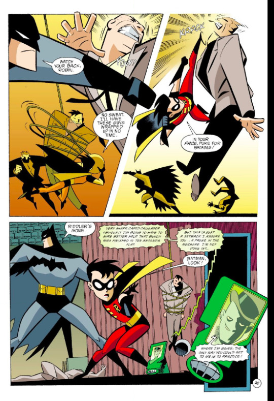
This is real solid action blocking. First panel has Batman in the foreground, Robin in the back. Batman’s punch leads organically into panel two, perpendicular to Robin’s kick -- now he’s in the foreground, with Batman in back. In each panel, they have their own fights on their own planes of movement, making the space feel huge. It’s a very short, simple fight scene, but this variety of staging from panel to panel makes it feel much bigger than it actually is.
Burchett also manages to maintain a consistent rightward movement throughout. It totally feels like Batman and Robin are just tearing through these guys, and the uniform direction of movement is a big part of that.
PAGE TWENTY THREE
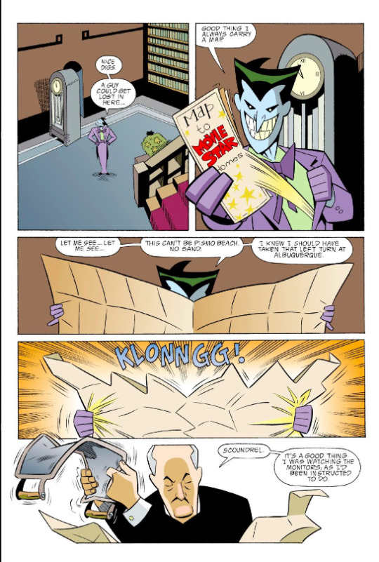
Back to Wayne Manor with this very cool page. Check out how the action funnels towards the bottom:
By placing the Map to Movie Star Homes where he has, Burchett guides the eye back to the central axis of the page. The action then travel’s straight down the central axis, getting narrower and narrower panel by panel, from the Joker’s wide stance to Alfred’s tactical crouch.
(The vibrating tea tray is a very nice touch.)
PAGE TWENTY FOUR
Wobbly panel shape as a shorthand for a woozy character coming back to lucidity is an evergreen technique. I’m also a big fan of the popping bubbles thing, but your milage may vary. When Batgirl comes back to full consciousness in panel three, Burchett cuts to a wide shot, soberly showing us all the characters in relation to each other, which is a great way to indicate a return to reality. We end this subplot, which preyed on themes of isolation and home-invasion danger, with Batgirl and Alfred standing together. An satisfying emotional mini-arc -- and appropriately, Alfred gets a joke in on the Joker.
***
You can get this entire issue -- for free! -- on Comixology, along with every other issue of GOTHAM ADVENTURES for around a buck apiece.
For a couple of my own comic creator bona fides, check out WILL EISNER’S THE SPIRIT RETURNS and SAN HANNIBAL, and pre-order the trade collection for BATTLESTAR GALACTICA: GODS AND MONSTERS.
Additional content can be found on my website, danschkade.com, as well as my twitter!
Be well, talk soon, etc
PREVIOUS PAGE x PAGE ANALYSES:
BATMAN: GOTHAM ADVENTURES #1 (Part One)
GANGBUSTER: SWING ANNA MISS
MINI-ANALYSIS — FIRST SIGHTING: SUPERBOY
ULTIMATE SPIDER-MAN #69 (with Aud Koch)
THE SHADOW STRIKES! #13
PETER PARKER: SPIDER-MAN #13
BATMAN: GOTHAM ADVENTURES #17
#Batman#page x page analysis#dc comics#educational purposes#Ty Templeton#rick burchett#lee loughridge#comics#Dan Schkade
13 notes
·
View notes
Text
Class and wireframes
1.1
Massive Magazine
To have an opinion and take desicisions, to experiment, to exchange or interrogate the ideas through the work
Active participation
Gain confidence
No prescribed output for sem 2. You choose the right medium for the behaviour
Studio:
Interaction Design
User Experience
Experience Design
Concentrate on the user and website through narrative
Sketch, XD, Photoshop, Invision, Atomic
Do not use InDesign
The User/Human Centred Web Design Process:
Collaborative (working with the user, interviews with testing))
Iterrative (Design, test and making a newer better one)
Comprehensive: (How the person gets to the website, the different scenarios)
36 steps
Wireframes and sitemaps to know how the info is structured
Sitemaps are the pages and how they relate to one another
User Journey: describes all the things that someone does to interact with the website and get to where they want. The user journey is going to describe all the pages they through, and the before to like when, how, where, why.
Persona: fictional person you might want to design for, include (name, picture, who they are?, what they do?)
Persona (at least 6 people) <- then the steps to get to where they want to get to
Paper prototypes to test ideas and lots to be flexible (b&w)
Clickable prototypes (styling of the page, on the page, colours, layout, typefaces)
Style guides (what each element will look like, keeping it consistent)
Build (Html, Css, Js)
At least 1 article page (responsive)
Six60 Newspaper

"Smokers stub out Six60 dream” Newspaper content analysis
Headline: Smokers stub out Six60 dream
Straplines: Underneath the article goes around the article
Byline: Kelly Tantau
Advertising: None
Lists: None
Images: One(kid in a stretcher with a Six60 Strap)
Opinion
Rags are not appropriate for reading, OCD
The text in the image does not make it important. Would be better for it to be a pull out quote
Six60 Stuff


“Smokers stub out Six60 dream″ newspaper vs Stuff
Headline are different
Online has time and date stamps, newspaper only has date
Stuff is much more readable and legible
Photo credit on images in stuff
More ads on the stuff website
Much more easy to read about online since one page is one article
Stuff has a search button which makes it easier to find articles
Related article links on the bottom of the stuff article
Able to zoom in on the article online
Proper image captions, placed right beneath the image
The navigation bar on the website was fixed at the top throughout the page, which mean when scrolling through the article the navigation is still accessible
Psych Newspaper

"Psych holding order appealed” Newspaper content analysis
Heading: Psych holding order appealed
Straplines: Underneath the article to help know when the article finished
Byline: Anon
Advertising: None
Opinion:
The heading is very catching, big and bold
The layout makes the info look way too long and boring to read
Pull quote with over rule helps know the info is important
Lists: None
Images: None
Categories: Court part of the news paper
Psych Stuff

Psych newspaper vs Stuff
Headings are both different
Images on stuff and not newspaper
Caption included with images
The pullout quote is shown on Stuff but not as a quote, it’s in a the paragraphs
Ads in the stuff article
Related articles included on stuff article
Flights nurse Newspaper

"Concern flight nurse jobs at risk” Newspaper content analysis
Headline: Concern flight nurse jobs at risk
Strapline: On top & right side of article
Byline: Ruby Macandrew
Advertising: None
Lists: None
Images: One
Opinion:
Widows at the end of paragraphs
Caption is at the bottom of the image, easier to find
One place has a massive space between two words, typography looks bad
Flight nurse Stuff


Flight nurses newspaper vs Stuff
Different headings for newspaper and stuff
More images shown on stuff article than the newspaper article
Ads on stuff article
Learning the difference between newspaper and stuff:
I think personally I prefer the stuff articles much more. This is because the website is much more accessible and free unlike newspapers. The type on the website is much more readable and legible (ability to zoom in too) with nicer layouts for a person with poor eyesight like me. There are much more images to see on the articles on stuff which make it more interesting. All the images have captions to explain what is going on that image which is super useful. The navigation bar on stuff is fixed to the top which makes it easier to navigate to other articles. There are also sections for other articles related to this or the category which makes it easier to learn more about the incidents. There are lots of ads on stuff which I don’t enjoy but its managable.
0 notes
Text
9 BEST TIPS FOR FUTURE TRAVEL BLOGGERS
A few weeks ago I wrote about how to start a travel blog (you can read this post HERE), because I have repeatedly encountered this question in emails, in messengers, or even in private from people who were also curious about what my beginnings looked like. Anyway, it surprised me how many people hesitate to start a blog. They are mainly restrained by uncertainty related to the unknown results, considerable amount of work and time they would have to invest, unavoidable criticism of some readers and saturation of the blogging market. Despite the above, there are people who decide to set up a blog and it is them who support and dedicate today's entry. The following advice is not to discover a wonderful recipe and it will not guarantee success, but it shows the best things to focus on and invest your time in. Sometimes it's worth recalling the obvious at a first glance standards, to make sure that we are heading with our blog in the right direction.
In my experience, the changes happen every day in the blogosphere, so you have to keep your finger on the pulse and constantly learn to be up to date. Unfortunately, on our way there is also a whole lot of useless information that encourages to invest a lot of time, and ultimately not bring any concrete results. How to defend against them? Using some of the following tips, of course! So if you take your blog seriously and you care about its success, be sure to read the text below and start implementing!
1. TAKE CARE OF THE STYLE AND THE VISUAL SITE OF THE BLOG!
Nobody likes to check themselves, but unfortunately it is necessary in blogging. Therefore, don’t leave writing text at the last minute. Write it and give yourself at least a day to get some distance. Then go back to what has come out from under your fingers and see if everything is correct, whether the syntax is correct and creates a meaningful whole, whether there are no missing dots, commas and whether there are no spelling mistakes or typos. Look for your own style, which doesn’t necessarily have to be in the form of an original narrative; maybe your trademark will be a specific font, headline or paragraph layout? Don’t exaggerate with fantasy, because your post must remain readable and not distract from the most important, that is, the content itself. On the other hand, the graphic design, layout and photos you place on the blog can have a great impact, and sometimes can even be crucial in getting a loyal reader, which leads to another super important advice...
2. LEARN TO TAKE AMAZING PICTURES!
To be honest, photographers usually don’t set up blogs, rather more or less aspiring writers do. However, to stand out from hundreds, like not thousands of travel blogs, you have to post photos on blog posts, and not just any photos, but great ones. OK, not everyone has an artistic eye, but the basics of photography can be easily learned from videos on YouTube. And here there is no room for excuses. It is also good to invest in a better camera, although in the era of fancy mobile phones, it is not necessary if you only have great ideas. However, it's worth considering the photo editing program and spending more money there in the first place. And what about the practice? There is no other way than to just take pictures - the more, the better. Shoot the flash at every step, and then verify what looks better and what is worse. You can also ask your friends which pictures attract their attention - certainly other than you would have thought ;)
3. SET UP ONE PUBLICATION DATE AND PLAN, PLAN, PLAN, PLAN!
Think of your blog as a morning newspaper, which your readers will always read at the same time. Making a habit in people return to your site for more is really important. If they know when something new appears on the blog, they'll be more likely to regularly check it, even if the topic doesn’t particularily interest them. Remind them of newly published posts on social media, and probably these media will become the gateway to the blog, which will increase the media traffic and ranges by the way. Analyzes show that there is no perfect day and time to publish, as they depend on the characteristics of the people who follow you. At the beginning, you can go a little crazy and look for a timing that is perfect for your readers. It must also be appropriate for you, because you do not want to take a night out during the week, or give up on Tuesday's activities to write a post, do you? For me, the perfect day turned out to be Sunday, which I chose, because one of my favorite YouTube videos also published videos on that day. It turned out to be a hit, because a lot of people visit my blog on Sunday before noon, and besides, if I didn’t manage to finish everything in the middle of the week, I can do it on Saturday, which usually is a day off for me (cleaning and cooking can wait;)) And one more thing: you don’t have to create new content all the time! Perhaps you only need to publish it once or twice a month? It is better to give yourself more time in the beginning and then increase the frequency rather than in the other direction.
Once you have chosen the time of publication, please take the time to plan the topics of your posts. Brainstorm and write down everything that comes to your mind - some things may prove to be useless, but you will definitely benefit from the rest. It is worth to prepare a list of universal themes, that is, the ones you can use at any time - an example is even this post ;) It doesn’t matter if I publish it in March, August or November, because it will always be up to date. Ideally, you could write a few extra entries to use them in difficult times, for example during illness, lack of inspiration or long holidays. Of course, bloggers are not robots and have the right to take a break, so as long as it doesn’t become your routine, don’t make it too harsh on yourself!
4. PROMOTE YOURSELF!
The best way to reach the right reader is to promote your content in social media. Invest in advertising from the very beginning. Don’t go crazy with the budget, just test what works and what does not. Facebook and Instagram provide you with all the data you need to create the right ad. Take time to analyze them and then think about what could appeal to people who visit your blog most eagerly? With this foundation, design an ad without giving up your style, because it will make you stand out. When you notice that something works, try to invest a little more and for a longer period of time - the effects will pleasantly surprise you :)
5. WRITE ABOUT EVERYTHING!
Not literally ... just do not belittle the rank of trips to a nearby forest, a lake, another city or even a local museum, and you'll be surprised how popular they can become! We know it would be great to write about long journeys to other continents, but let's face it: you probably will not be able to spend two weeks a month in the Caribbean, or half a year in India, and above all, if your target is not a wealthy heir, it will not be possible for most of your readers. People like to read about things that are for them to reach. It's like with clothes: it's nice to take a look at luxury, branded clothes, maybe even buy one thing at a discount for the majority of savings, but we will usually look for these high-street native brands. My blog works in a similar way and the most popular posts are those from the series Alternatively through Poland, not the fancy Seychelles.
6. DON’T write WHEN YOU TRAVEL!
When travelling, are you tempted to sit down in the evening and write down everything that happened that day? Preferably in the form of an article to be able to publish it as quickly as possible and then share it immediately? You have so many ideas, lots of inspiration around, and you don’t want to forget anything! Great, but it’s so much better to go for an evening walk on the beach, talk to a lady from the local information office, or try an exotic drink whose name doesn’t tell you anything. Seize the voice recorder (every phone has it!) and record what is the most important. Take the camera not to forget the view of the sunset at the ocean, because even if the photo is not good enough to be later published on the blog, it will remind you the emotions accompanying that moment. And simply enjoy it, live it, without thinking that Instagram will go crazy about your pics tomorrow.
7. LET SEO BE YOUR GOD!
SEO is like a Bible for bloggers, so don’t waste any more time, just learn about keywords and positioning pages as much as possible! It is worth reading about the basics of SEO, e.g. on Google. Remember to write texts so that they appear as high as possible in Google search. And more about SEO will appear on my blog soon! :)
8. connect!
Your friends most probably don’t understand your fascination with blogging. In fact, they are wondering why you are constantly posting holiday pictures on Facebook? Perhaps they think it’s enough of this bragging, eh? Well, all you need is blogger friends! No, not to like and comment your posts...although they may be useful here, of course, if they are happy to it unwillingly. In the group, strength is also reflected in the blogosphere, and despite the fact that it sometimes meets with criticism, I think it is a good idea to promote and support each other. So instead of criticizing and getting jealous of amazing travels from your blog colleagues, comment on their posts and then come back to comment and like more! This selflessness will pay you back with a vengeance. Do not, however, force it, just look for accounts at a similar level and start working with those that you think are worth it. Why not get to know bloggers in real life? Blog festivals are a great opportunity for this, more and more often organized in larger cities. Last year I had the opportunity to participate in one and in addition to the invaluable knowledge I gained, I also got some contacts. But this year the situation has reversed and for the first time I will meet with a person I only know from Instagram. Not bad, huh? :)
9. GET INSPIRED, DON’T COPY!
Last but very important advice. Remember that a few are going dry boldly copying (David Bowie is an exception!), so try to at least change some details if you can not resist inserting something similar to something that already exists on the Internet or wherever (and you know it well!). Inspiration doesn’t mean copying word by word, but it’s an attempt to recreate something that we like in our own style. And keep it! And the more extraordinary you are, the more original and unique followers you will gain. And such a great collective of people is the faithful and not easy to bribe. That's what I wish you! :)
If you are already at the end, I congratulate you! With such knowledge it's easier to get together and start working. It is not always easy and pleasant, but without trying, you will not find out whether blogging is something for you or not. I would like to know one proper way to run a successful blog, but unfortunately such doesn’t exist, so you have to find your own way to success. And maybe this is the uncertainty and at the same time the freedom that attracts so many people to the blogosphere? In the end, you can always give up, actually losing nothing ;) I warn you, however, that if you once devour this teaser, you will not be able to free yourself from it xD
BACK
0 notes