#3d text hover effect
Explore tagged Tumblr posts
Visit Tumblr Blog
Explore Tumblr blogs with no restrictions, modern design and the best experience.
Last Seen Tumblr Blogs


Fun Fact
In 2020, 44% of users from Denmark used Tumblr daily.
Text

3D Text Hover Effect
#3d text hover effect#text effect css#codingflicks#html css#frontend#html#css#frontenddevelopment#webdesign#css text effects#css text shadow#css text hover effect
4 notes
·
View notes
Text
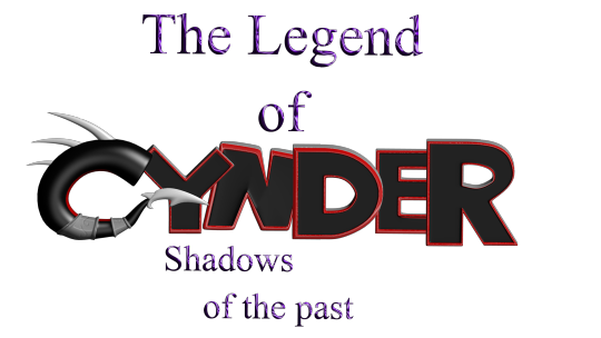
Ok so the saga with my old PC continues and is only fueling my desire to get back into fanfiction lol because I found all of the files from my attempt at making a legend of spyro fan-game! I honestly thought they were lost, I'm so excited to see all this stuff again! This was the "logo" for the game (I know its nearly unreadable lol, so it says "The Legend of Cynder, Shadows of The Past". 14/15 year old me didn't seem to care much for readability, I think I'd just discovered photoshop's layer effects lol)
Here's a bunch of random stuff I found.
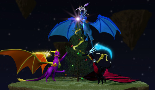

I'm defiantly going to do a redraw of that last one at some point. That was like, THE thing I remember being super proud of when I first did it. I think it was going to be part of the trailer my now-partner was putting together for the game lol.
Actually, a lot of these were actually just frames from animations, but either the files are either just corrupted, or high school me didn't know how to set fps and resolution properly in the output so I got a headache trying to watch them lol. It's probably the second one honestly. Also I remember my old laptop wasn't able to play back the animation because it would lag so much, so I just had to kind of...guess at timing, and that went about as well as you'd expect. It didn't help that blender used to have this bug where your audio would move around your timeline so it really was just random guessing. I'm amazed anything got done at all, let alone how far we actually got (that is to say, not far at all but we had something playable at least).
I also found the demo files and footage of the "game" running (running at 12fps but running)! I'm curious if they still work, I'll have to download an older version of blender to test them out!
There's actually a lot more but actually finding it is proving to be quite a challenge since this laptop seems to be the digital equivalent of an ADHD "doom box" - meaning nothing is sorted into folders that make even a remote lick of sense to me, it's all just kind of thrown in together lmao.
I wanted to post these though because even though I don't really do 3D stuff anymore, It still made me really happy to see how much progress I've made over the years and how far I've come. Also a few folks who worked on this project with me back on Deviantart have started finding me lol, so in case there's anyone else out there, hello! I'm not dead, I'm still around, I'm just a lot more (openly) queer now lmao.
Image descriptions:
[ID 1: A game title that reads "The Legend of Cynder, Shadows of the Past". The two lines, "the legend of" and "shadows of the past" are written in dark purple text. The purple material is supposed to look like liquid, but instead just looks hard to read. "Cynder" is writen in black, 3D text with red outlines, with the exception of the C. The "c" is modeled as a black tube instead of in a blocky style like the rest of the letters. The inside of the C has a red underbelly, and the bottom of the C ends in a tail, resembling Cynder's from the Legend of Spyro Series. There are 3 white spikes at the top of the C. /end ID]
[ID 2: a 3d render of 4 dragons around a christmas tree. A black dragon at the front, Cynder, is using her tail to hang tinsel, a pruple dragon, Spyro, on the left is reaching up into the branches of the tree. A blue dragon, Ignitus, is hovering behind the tree, his paws outstretched, implying he is placing the glowing star at the top. On his head is a silver dragon, Zerali, balancing on his horns. behind them is a series of floating islands. /End ID]
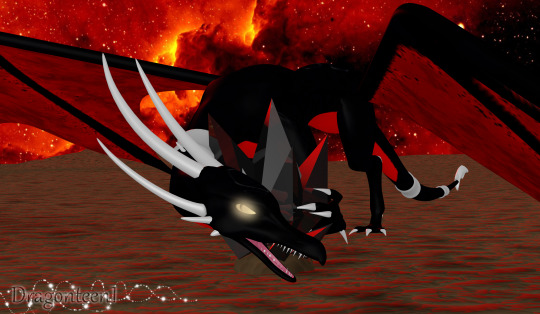
[ID 3: A render of Cynder with a darker colour pallet than the previous image and glowing yellow eyes, snarling at the camera, guarding a black gem. The sky in the background is blood red and the terrain is flat and barren. /End ID]
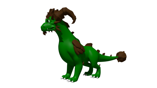
[ID 4: A render of an incomplete model of Terrador, a green dragon with brown horns and rocky shoulder decorations. He has no underbelly or wings. /end ID]
[ID 5: A render of a fan character named ekkosel, a blue, anthropomorphic dragonfly with an unsettling, uncanny face and green wings, T-posing. Her green wings are a blur /End ID]
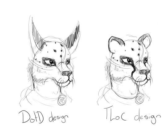
[ID 6: two sketches of a anthropomorphic cheetah heads. One has long ears like a lynx and is labeled DotD design, the other has small, rounded ears like a cheetah usually has, labled TLoC design. /end ID]
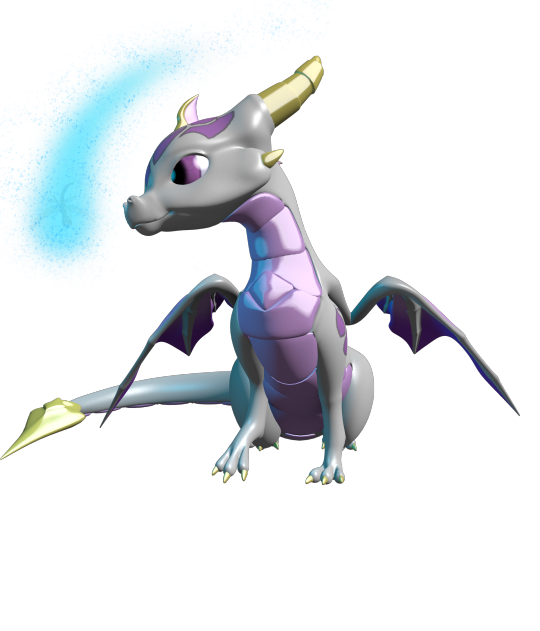
[ID 7: A render of Zerali, the silver dragon from the second image, and ekkosel, from the 5th, playing together. In this image, we can see Zerali has a pinky-purple underbelly and shiny gold horns.]
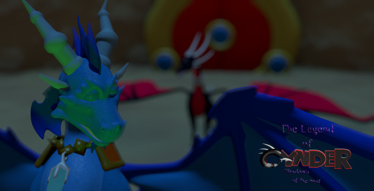
[ID 8: A rendered scene showing a close up of blue ignitus with his eyes closed. He appears to be talking to Cynder, who is in the background, but blurry. The game's logo is visible in the bottom left of the image. /end ID]
#nostalgia#old art#image descriptions#Spyro#The Legend of Spyro#tlos#cynder#spyro the dragon#spyro fanart#cynder fanart#queer artist#old projects#Blender#Blender Game Engine#I had no idea what I was doing but I had a blast!#tlos spyro#spyro oc#legend of spyro#old ocs
66 notes
·
View notes
Note
how about 8 best graphic design/visual direction?
I don't know why I expected this one to be short and sweet when I literally got my degree in graphic design. Whoops. Hope you don't have anything else you wanted to see on your dash if you open the readmore
From worst to best:
5. sweet pool sweet pool was experimental in a lot of ways, but imo it really fumbled the landing on graphic design. The logo is... weird, visually it's fine I guess but it doesn't totally match either of the two aesthetics they have sort of competing against each other in the rest of the UI, and it doesn't really convey much on its own. Your main menu is largely plain black (with a teal accent that does not appear anywhere else), which is funny given that EVERY other menu is this weird, almost a bit maximalist design that seems to be going for an alchemic look? It's all vivid splashed warm tones, paper textures, and indecipherable cursive script. Why did they make the Extras menu all circular text like that. I'm not even sure what they were trying to do with the layout of the Save/Load menu but the odd random spacing of the save slots combined with arrows pointing in arbitrary directions between them just makes it confusing to look at and parse what order they're going in. The parts of the design that don't look like a medieval alchemy tome are what I assume is supposed to look like veins or nerves? Which is arguably better suited to the concept, but a strange choice for something like an Exit Game menu. In-game, rather than traditional VN choices, sweet pool presents every decision as a reaction of either reason or instinct... which is telegraphed to the player by glowy red and blue membranes in opposing corners of the screen, which when hovered over fill the screen with either a pulsating meaty frame and heartbeat sound, or like a film filter and windy sound effect I guess? It's not appealing to look at and not very intuitive, I can kinda see the vision they were going for but it just wound up weird. I'm running out of synonyms for weird. As for what you'll be seeing most in the game, their text box is just a transparent black gradient at the bottom of the screen, no further design and no name plates for character dialogue. The icon signaling the end of text looks like it's a cycling gif of the letters in the logo, except there's also some other letters going on in there, so I have no idea what's up with that and it's kind of distracting for a while at first. Its merch and official art couldn't decide on a direction either, they barely made any for it and most of it is Yupon chibis or otherwise has no particular theme or graphic element that makes it unique. As an IP it kind of coasts by on its whole identity being "high school", since none of the other games happen to (visually) feature just a normal school. Overall they obviously had something going on here, it's just non-cohesive and, consequently, forgettable.
4. Togainu no Chi There is branding in tnc, but interestingly it's not really carried in the game's visual design. The UI is generic; other than a couple elements that have the logo shape lightly incorporated, you could slap most of it on any other visual novel without even noticing. It's simple, letting a clean red/white/black color scheme tie together the assets that look completely off-the-shelf like the dialogue box with clearly custom elements like the choice buttons. The main menus are understated, using backgrounds and CGs with a couple solid red graphics for pop. It serves its purpose, but none of it really adds anything to the visual identity. As plain as it is in the UI/UX elements, it kind of makes up for it by doubling down in other places. The music and very consistent narrative tone give just as much of a distinct mental connection to the aesthetic it's going for as the deeply 2000s 3D render backgrounds and dramatic choices of CGs (specifically the ones with solid black backgrounds that are rendered about twice as much as any of the rest). The logo has so much edgy symbolism crammed into a tiny space that even the designer who made it basically said it was way too much lol. They also have easy motifs for working with merch: barbed wire, stainless steel, a splash of blood, it's easy to design something that calls to mind tnc's style and tone. It's just interesting that it seems to maybe have come together after the game's development without it really being reflected in the in-game visdev.
3. Lamento Lamento took me a bit to get used to, but I kinda dig what they had going on. They knew what they wanted and they stuck to it. The logo is a simple wordmark, but the font is stereotypically fantasy and has just the tiniest hint of the celtic-style design that forms the base of their aesthetic. Honestly a lot of the menu UI leans on basic fantasy visuals, leaves and filigrees in just about every element. Some of it doesn't completely match, they switch out the color scheme on different menu pages that separate them a bit, but the consistent and highly decorative fonts still leave them feeling related enough imo. In-game it gets just slightly more muddied; they sort of have a filigree that rims the screen most of the time, but it looks more blade-like and honestly I've thought it matches tnc more than the rest of the game. It does not use your typical text boxes - instead a transparent and slightly feathered black rectangle will take up however much of the screen they want for that moment, whether there are two sprites on either side with text between them, one sprite with text below or beside, or just full-screen text. It doesn't really add anything to the UX, but it is unique and once I got used to it I didn't mind it jumping around at all. The most interesting part to me is the sprite backdrops. Rather than let their characters stand against the environment backgrounds, rectangles of intricate, vaguely celtic patterns with some cat designs woven in will appear and become a bounding-box for the sprites. At first I didn't like this, it felt like it separated the characters from the world they were supposed to be inhabiting in a random and artificial way. However it let them add a lot of really cool movement that doesn't really work as well when a sprite has to inhabit the full screen, like a character slowly inching out of sight or Asato coming in upside down. Anyways, graphic design wise though they're a little bit busy and I also found myself wanting to see what the full image looked like without the sprites blocking 80% of it. Honestly the only thing I don't get is the game's icon; it's the only main game that doesn't use a picture of the protagonist, and the compass rose isn't very representative of the rest of the game's style. (It also, for some reason, has an alternate icon in the files that you can switch it to — but it's a picture of Kaltz? This only raises even more questions. None of the other games have alternate icons, at least on my copies.) Out of game, the little bits of merch Lamento did get similarly had an easy enough time matching the branding. Give it a fantasy forest, some celtic knots, most of their non-crossover designs are pretty effortless to the point you can pick out that one plate they made despite it not having any characters or saying Lamento on it at all.
2. Slow Damage Surodame is the culmination of the 15 years of experience prior, and it looks every bit of it. I was going to put it first, but I don't think its out-of-game branding is quite as strong even though it's still mostly consistent in its identity. The main menus are creative, formed out of a diagetic space instead of intentionally flat graphics, and it hinders the readability/accessibility some but I don't think it's too bad apart from the settings page being a bit cluttered and hard to parse. In-game most of your informational menus are formed by notebooks, sticky notes, and brushstrokes. It's all beautifully cohesive without being repetitive. Your text box is a painterly splotch of pink and purple, and when a sprite appears as a dialogue bust instead of full screen, they come with a tiny matching background accent of their associated color. It's understated while still neatly accentuating the visual style they're going for. This game also has "interrogation" segments, which come with their own swath of unique UI; it's not quite as fitting as the more diagetically-styled portions, the meter targets for madness and euphoria don't fit in as well as the other elements, but I really like the tearing stitches as a background graphic and it blends with the rest of the aesthetic more than you'd think it would. Overall the graphic design is straightforward and harmonious, you get a crystal clear image of the intended visual direction and could easily evoke its style without having to think about it too hard. But to step away from the design side into performance for a second, I do not like how the smoke/aura was done as a VFX because whatever they did for it holy shit they did NOT optimize it. I have never had a VN crash so much or so consistently why the hell does it animate in a way that lags my whole ass gaming laptop I run triple A games at max graphics on this thing
1. DRAMAtical Murder Listen. I don't know that I could describe to you what DMMd's visual style is in any number of words. I swear it's like seven different things at once but it just works, everyone understands the assignment and can replicate it, it's so ingrained in the games that you can just conjure it even if you don't directly reference. Maybe it's because it's so disparate that anyone can pull it off. I don't know what they laced it with but DMMd's graphic design is as iconic as it is completely nonsensical. The menus are tech-y but in a pop sort of way, bright colors and clean vector art, all straight lines and rounded corners. It's geometric in that faux futuristic way and perfectly matches the vibe of the setting. The dialogue box and choice buttons are the same way with a decorative frame and slight scan-lines like it's a screen, and if I'm going to be honest it's a tiny bit reminiscent of how Kim Possible rendered backgrounds and gadgets. The pseudo-sequel Re:Connect mostly reuses the same UI assets, other than the main menu using an 8-bit layout that was only a cutscene element in the base game, but its opening movie and official art really hammered in the non-futuristic elements of DMMd's art direction: floaty, somewhat surrealist iconography, pastel colors, repeated and sticker-like images. This era had the look of a teenage girl's over-decorated three ring binder, but in a stylistically pleasing way. Out of game I would say more of its merch and branding leans into the pixel-and-pastel vibe that Re:C brought than the 2000s pop-scifi of the base graphic design, but the two flow together pretty nicely into a shockingly well-defined aesthetic. If anything the issue is almost that the others have gotten dragged too much into DMMd's visual territory, presumably because it has the strongest identity and sells the best. Crossover events feel overwhelmingly like they are bringing the darker, somber characters into the colorful and accessorized terrain of DMMd rather than anything daring to make Aoba look grunge.
{"Make me stack-rank my toxic yaoi" asks}
2 notes
·
View notes
Text
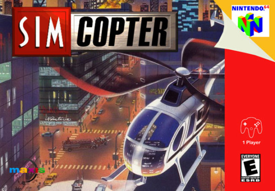
SimCopter 64 (Prototype)
PAL release: N/A
NA release: N/A
JP release: N/A
Developer: Maxis
Publisher: EA
N64 Magazine Score: N/A
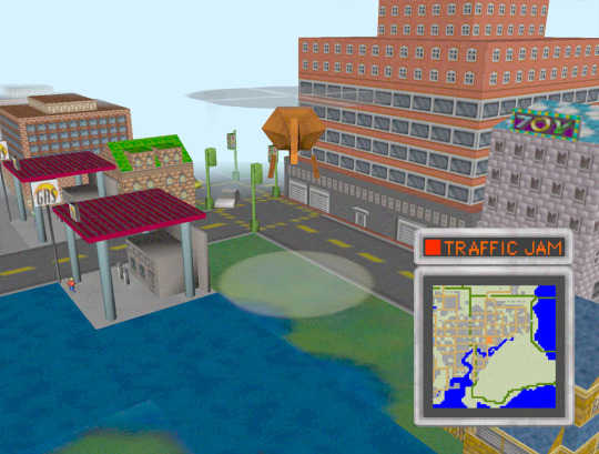
In my previous looks at franchises, I noted all cancelled games. Due to the amount of N64 games, I will be just looking at playable prototypes, the first of which is SimCopter 64, which was playable at E3 1997. It was planned to work as a standalone title, but would be compatible in some way with SimCity 2000, SimCity 64 and Mario Artist (all ended up being Japan-only games), although none of that was ever integrated.
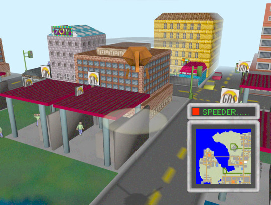
In this prototype, you fly around as you please and can help sort out emergencies such as traffic jams and speeding cars (the full game would have had more, like the PC version). These are solved by hovering your spotlight on the cars and pressing a “shout” button. You get money for completing these tasks (there’s a sound effect but no HUD display).

You can also get out of the helicopter and walk around. In both flight and on the ground, none of the buildings have collision, so you go straight through them. The city looks nice, but draw distance is very low. It’s very likely that this was adapted into the free roam aspect of SimCity 64, which was from a first person view.
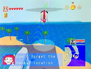
Footage from a later build has been see, but this is just a few seconds of footage and the build itself hasn’t been shared. This version has some text explaining what to do, a HUD showing health and money and has collisions.
SimCopter 64 is an impressive early demo of a 3D city on the N64, but I don’t think it would have performed well on the platform.
The PC version of the game received mixed reviews in its appearance earlier this year, but the Japanese developers promise the 64-bit version will be veritably rejigged with 30 new pre-built cities.
- N64 Magazine #5
Should it be finished?
SimCopter was released on PC with better integration and better graphics, so there’s no reason to see the finished version of this. That said, I would be much more interested in SimCity if minigames like this were part of the package.
4 notes
·
View notes
Text
Futuristic Laptop Interface
A modern, sleek laptop rests on a clean, minimalistic desk surface, viewed from a slightly elevated front angle. The laptop is open, its screen glowing with a soft white or light gray background. Emerging from the laptop screen and hovering above the device are various user interface (UI) elements, as if they are floating in mid-air in a semi-transparent 3D space. The UI elements are stylized form fields—such as text input boxes, dropdown menus, checkboxes, and buttons—arranged in a layered, slightly staggered formation. They appear to be interactive, with some form fields filled in, some with blinking cursors, and others showing hover effects or highlighted borders. Each form element casts a faint glow or subtle shadow, enhancing the depth effect and suggesting an augmented reality or futuristic holographic interface. The background is softly blurred or softly lit, with a focus on the laptop and the floating UI elements. The color palette is clean and modern—think whites, grays, and soft blues—giving the image a high-tech, digital workspace feel. Optionally, include a faint bokeh or gradient lighting effect to add a sense of atmosphere and realism.
0 notes
Text

CSS 3D Text Hover Effect
#css 3d text hover#3d text effect#html css#frontend#css#html#css3#frontenddevelopment#webdesign#neduzone#pure css text effects
1 note
·
View note
Text
Architecture Website Design Best Practices: What Works in 2025

Introduction
In 2025, an architecture firm’s website is more than just a digital brochure — it's a virtual showroom, brand ambassador, and client acquisition engine rolled into one. The expectations from architecture website design have evolved significantly, driven by advancements in design technology, user behavior, and the competitive digital landscape. For architects looking to stand out, adopting the latest best practices in Architecture Website Design is essential for building trust, showcasing expertise, and winning new business.
Let’s dive into the most effective architecture website design strategies that are defining success in 2025.
Core Elements of Successful Architecture Website Design
At its foundation, every architecture website must seamlessly blend aesthetics with usability. The following core elements ensure a strong foundation:
Visual Storytelling: Architecture is visual by nature. In 2025, websites are leveraging high-resolution imagery, short cinematic videos, and immersive galleries to communicate design philosophy and project details.
Responsive & Mobile-First Design: With mobile usage exceeding desktop for most web traffic, responsive layouts that adapt fluidly across devices are non-negotiable.
Performance Optimization: A slow-loading website will quickly lose potential clients. Optimizing images, using lightweight frameworks, and leveraging CDNs are standard practices.
Clear Navigation Structure: Architecture Website Design should include intuitive menus and logical content hierarchy so users can easily browse portfolios, services, and contact information.
Design Trends That Work in 2025
2025 introduces new visual and interactive paradigms that elevate user engagement:
3D Models and Interactive Walkthroughs: Cutting-edge firms now embed real-time 3D models and virtual tours using WebGL and tools like Matterport to allow users to explore spaces dynamically.
Minimalist and Grid-Based Layouts: Clean lines, consistent spacing, and a grid-first approach help maintain visual clarity and elegance — essential for architectural firms.
Micro-Interactions and Animations: Smooth hover effects, project loading transitions, and subtle animations enhance the user journey without overwhelming the design.
Dark Mode & Accessibility-First Design: Offering dark mode toggle options and ensuring color contrast and screen reader compatibility are now part of inclusive design.
Technical Best Practices
Under the hood, robust architecture ensures a website is visible, secure, and future-proof:
SEO-Optimized Architecture: Use of semantic HTML5, clean URLs, schema markup (especially for projects and team pages), and optimized image alt tags improve search engine visibility.
Accessibility Compliance (ADA): Architecture Website Design in 2025 must meet WCAG 2.2 standards. This includes keyboard navigation, alt text, ARIA labels, and color contrast.
Website Security: Secure SSL (HTTPS), anti-spam forms, and up-to-date plugins/frameworks protect client data and enhance trust.
Core Web Vitals: Google’s performance metrics — Largest Contentful Paint (LCP), First Input Delay (FID), and Cumulative Layout Shift (CLS) — must be optimized to ensure ranking and user satisfaction.
User Experience and Conversion Optimization
Design should not only impress but also convert:
Strategic CTAs: “Schedule a Consultation,” “Download Portfolio,” or “Request a Quote” placed contextually across the site.
Integrated Tools: Live chat, appointment booking tools, and downloadable lead magnets (like design brochures) improve engagement.
Smart Portfolio Filters: Allow users to filter projects by type (residential, commercial, interiors, etc.) to quickly find relevant examples.
CMS and Tech Stack Recommendations
Choosing the right technology is as crucial as design:
WordPress with Elementor or Webflow: Ideal for firms needing full control with visual editors.
Headless CMS with Next.js or Gatsby: Perfect for high-performance, custom-built sites with decoupled frontends.
Reliable Hosting: Use providers offering global CDNs, automatic backups, and high uptime. Services like Vercel, Kinsta, or Cloudflare-backed hosting are great choices.
Case Studies and Real-World Inspirations
Here are a few standout architecture website examples that reflect 2025’s best practices:
BIG (Bjarke Ingels Group) – A masterclass in minimalist, content-first design with immersive project visuals.
Zaha Hadid Architects – A clean UX with strong branding, video headers, and interactive case studies.
Snøhetta – Uses storytelling and bold typography with structured navigation to guide users effectively.
Each of these websites exemplifies how great architecture website design combines beauty with performance.
Conclusion
The bar for Architecture Website Design in 2025 is higher than ever. It's no longer enough to showcase projects — your website must create immersive experiences, offer intuitive functionality, and load flawlessly across all devices. From implementing 3D walkthroughs to optimizing Core Web Vitals and integrating modern tech stacks, every element matters.
0 notes
Text
Top Web Design Trends to Watch in 2025 🔮💻
The digital world is shifting quickly, and staying ahead of the curve in web design is no longer optional — it’s essential. As user expectations evolve and technology advances, websites must not only look modern but also function intelligently, adapt to user behavior, and deliver on performance and accessibility.

Below are the most important web design trends of 2025, each thoroughly explained to give you actionable insights and ideas for your next website project.
1. AI-Powered User Experiences 🤖
AI isn’t just a buzzword anymore — it's changing how websites behave and interact with users. In 2025, smart personalization will define success in web design.
🔍 How it works:
AI-powered systems can now analyze user behavior in real-time. This includes what pages a visitor clicks, where they’re located, and even how fast they scroll. Based on this data, the website dynamically adjusts content, layout, or recommendations to match the user's preferences.
For example:
A first-time visitor might see a product overview.
A returning customer might be shown personalized offers.
AI can auto-recommend blog content or services based on user interests.
💡 Why it matters:
This level of personalization improves user satisfaction and boosts conversion rates. People are more likely to stay engaged when a site feels like it's made just for them.
2. 3D Design & Augmented Reality Integration 🧊📱
Visual storytelling is evolving beyond static images. 3D elements and AR integrations are now crucial for creating immersive, product-driven websites.
🛠️ How it’s used:
3D models allow users to interact with products — rotate, zoom, and explore items before purchasing.
AR features (especially on mobile) let users visualize products in their real-world space — whether it’s a couch in their living room or sunglasses on their face.
This tech is especially powerful for eCommerce, real estate, and educational platforms.
💡 Why it matters:
Interactive design increases user confidence in their purchases and reduces returns. It also creates a wow-factor that keeps users engaged longer, improving session times and SEO.
3. Minimal Interfaces with Smarter Navigation 🧭✨
As design matures, the goal is clarity over clutter. In 2025, minimalism will go beyond aesthetics — it will define how users move through websites.
🎯 Key shifts:
Replacing complex menus with floating icons, collapsible sidebars, or context-aware navigation that adapts based on scroll position.
Emphasizing micro-interactions like smooth scrolling, hover effects, and loading animations to guide user flow.
Breaking down long content into interactive sections, reducing overwhelm.
💡 Why it matters:
Users want information quickly and without friction. By reducing cognitive load, you help visitors focus on what's important — which results in faster decisions and lower bounce rates.
4. Accessible Design for All ♿📣
Designing with inclusivity in mind is not a trend — it's a standard. But in 2025, accessibility will become a leading factor in both user trust and SEO rankings.
✅ Core elements:
Proper color contrast for readability.
Keyboard navigation and logical tab orders.
Screen reader compatibility, including descriptive alt text and clear heading structures.
Responsive typography that adjusts based on screen size and user settings.
Many companies are now auditing their websites to meet accessibility guidelines like WCAG 2.2, and rightly so — inaccessible sites may face legal risks or be penalized by search engines.
💡 Why it matters:
Accessible websites serve a larger audience, reflect well on your brand, and meet growing legal and ethical standards. Inclusion isn't just the right thing — it’s also smart business.
5. Bold Typography & Unique Visual Branding 🅰️🎨
Typography is no longer a background player — it’s front and center. In 2025, many brands will use bold, custom fonts to define identity and guide the user journey.
🔤 Implementation:
Large, impactful headers that capture attention instantly.
Pairing minimal content with expressive fonts to reduce visual noise while keeping things dynamic.
Unique typefaces (sometimes custom-designed) to set brands apart from competitors.
This trend is especially embraced by graphic design firms that want to showcase creative edge and visual personality.
💡 Why it matters:
When executed well, bold typography enhances branding, clarifies content hierarchy, and builds a distinct user experience. It’s one of the most cost-effective ways to make your site stand out.
6. Sustainability in Web Performance 🌱⚡
With growing awareness of climate change, websites are now being designed to reduce digital carbon footprints.
🌍 How to build sustainably:
Compress images and use next-gen formats like WebP.
Write efficient code with fewer requests.
Choose green hosting providers powered by renewable energy.
Use lazy loading and caching to reduce unnecessary bandwidth usage.
💡 Why it matters:
Eco-friendly design isn’t just about saving energy—it’s also about speed and performance. Faster websites rank better, load smoother, and consume fewer resources. Consumers are increasingly drawn to brands that align with sustainability values.
✅ Final Thoughts
In 2025, web design will be all about intelligence, simplicity, accessibility, and impact. Each of these trends represents not just visual innovation but a deeper commitment to creating meaningful digital experiences.
Here’s a recap of what to focus on:
Embrace AI-driven personalization for smarter user flows
Invest in 3D visuals & AR to create immersive touchpoints
Design with simplicity and accessibility at the core
Build sustainable websites that are fast and responsible
Use typography and branding to tell a bold visual story
If you’re ready to future-proof your online presence, now’s the time to start.
1 note
·
View note
Text
Animatory — A Stunning Creative Agency Webflow Template for Animation Studios and Creatives
If you’re an animator, creative agency, or production studio, you need a website that showcases your work in the best light. Animatory, a premium Webflow template, is designed specifically for animation studios and creative businesses that want to impress, engage, and grow their online presence.

Whether you create 2D animations, 3D graphics, explainer videos, or full-scale productions, Animatory is built to highlight your creativity beautifully and professionally.
What is Animatory?
Animatory is a modern, bold, and highly visual Creative Agency Webflow template made for animation studios, creative agencies, videographers, and production houses. Built with Webflow’s powerful no-code platform, it’s easy to customize, even if you have no coding experience.
Why Choose Animatory for Your Animation Website?
Here’s why Animatory is the perfect choice for animation studios and creative professionals:
✅ Designed for Visual Storytelling
As an animation studio, your work is your biggest selling point. Animatory is built around visual storytelling, with full-screen video headers, beautiful project showcases, and dynamic motion effects. You can easily upload your demo reels, short films, client projects, or animated content in a way that instantly grabs attention.
✅ Project Portfolio to Highlight Your Best Work
The template includes a dedicated portfolio section where you can display your animation projects with detailed descriptions, high-quality images, and embedded videos. Each project page is designed to tell a story, helping you impress potential clients and partners.
✅ Built-In Services Pages
Animatory comes with well-organized services pages where you can explain what you offer — whether it’s motion graphics, character animation, video production, or visual effects. Clean layouts and creative icons make it easy for visitors to understand your offerings at a glance.
✅ Interactive and Dynamic Elements
What makes Animatory stand out is its dynamic interactions. Smooth scroll animations, hover effects, and creative transitions make browsing your website an exciting experience. It feels alive, just like your animations.
✅ Mobile-Responsive and Lightning-Fast
Animatory is fully responsive, meaning your website will look perfect on smartphones, tablets, and desktops. It’s also optimized for fast loading times, ensuring that your visitors don’t have to wait to experience your content — super important for retaining attention!
✅ SEO-Optimized to Reach a Bigger Audience
This template is built with SEO best practices in mind, helping your site rank higher in search engine results. Better visibility means more opportunities to showcase your creative work to potential clients worldwide.
✅ Easy Customization with Webflow
You don’t need to be a developer to use Animatory. With Webflow’s drag-and-drop editor, you can easily change text, swap out images and videos, update colors, and tweak layouts — all without touching a line of code. This gives you total control to make the site match your brand and creative style.
Ideal for Many Types of Creative Businesses
Animatory is flexible enough for a wide range of creative professionals and businesses, including:
Animation studios
Motion graphic artists
Video production companies
3D design studios
Freelance animators
Creative agencies
Whether you work independently or as part of a team, Animatory gives you the tools to create an outstanding online presence.
Final Thoughts
Your animation work deserves to be showcased on a website that’s as creative and dynamic as your projects. With Animatory, you can create a stunning, interactive portfolio that not only looks incredible but also helps you attract more clients, collaborations, and opportunities.
If you’re ready to take your animation business to the next level, Animatory is the perfect Webflow template to bring your creative vision online.
Launch your studio’s online presence today with Animatory — where creativity meets professional design!
#film#film photography#movies#cinema#cinematography#website#webflow#web design#digital marketing agency
0 notes
Text
Tutorial: 3D effect em textos
Exemplo do efeito aqui!
Existem dois tipos de efeitos! O sem hover (o exemplo de cima) e o com hover (o exemplo de baixo)
Agora, vou ensinar a fazer o efeito sem hover.
Primeiramente, você deve colocar esse code no seu css.
3dht {color: #666;
font-family: ‘Calibri’;
font-size:25px;
line-height:25px;
font-weight: italic;
margin:0px;
padding:0px;
text-align:center;
letter-spacing: 1px;
text-shadow: -2px 0px #E86060, 2px 0px #54d2cb;
}
(o que dá o efeito 3D é o que está em negrito, no código acima)
Para aplicar o efeito 3D, cole esse código onde você quiser que apareça.
<3dht>Título em 3D aqui</3dht>
Agora, vou ensinar a fazer o efeito com hover.
Cole esse código no seu css.
3dht2 {
color: #666;
font-family: 'Calibri’;
font-size:25px;
line-height:25px;
font-weight: italic;
margin:0px;
padding:0px;
text-align:center;
letter-spacing: 1px;
text-shadow: -2px 0px #E86060, 2px 0px #54d2cb;
}
3dht2:hover {
text-shadow: 0px 0px #666, 0px 0px #696969;
transition: all .5s ease-in-out!important;
-webkit-transition: all .5s ease-in-out!important;
}
(o que dá o efeito hover é o que está em negrito, no código acima)
Para aplicar esse feito 3D com hover, você deve usar esse código.
<3dht2>Título em 3D aqui</3dht2>
0 notes
Text
12 Web Design Trends to Watch in 2025
the digital world moves fast. Web design in Melbourne shapes how users interact online. It builds trust and improves engagement. In 2025, new trends will change websites, making them simpler, smarter, and more immersive. Businesses and designers must adapt to stay ahead. Here’s a look at 12 web design trends that will define the industry in 2025.
1. AI-Driven Personalisation
Artificial intelligence is changing website experiences. It customises content, layouts, and suggestions based on user activity. In 2025, AI will enhance chatbot responses, handle customer service tasks, and predict preferences accurately. Web design in Melbourne will adjust based on location, past searches, and live interactions. This high level of personalisation will improve user engagement and create seamless digital experiences.
2. Dark Mode Evolution
Dark mode improves readability and eases eye strain. In 2025, websites will include smart dark themes that change with time or user settings. These auto-switching modes will adjust contrast for better visibility. Also, energy-saving web design in Melbourne – https://www.makemywebsite.com.au/ will help mobile batteries last longer. Expect more user-friendly, customisable dark mode features across various platforms.
3. Advanced Micro-Interactions
Micro-interactions bring websites to life. These small effects respond to user actions, making browsing more engaging. In 2025, they will improve with real-time feedback, cursor tracking, and gesture controls. Hover effects, animated buttons, and interactive icons will keep users interested. Web design in Melbourne will feel smoother, faster, and more interactive than ever.
4. 3D Elements and Immersive Experiences
Websites will become more engaging with 3D elements. Advanced tools will create realistic textures, smooth transitions, and interactive product views. Brands will use 3D visuals to bring digital spaces to life. Users will explore products, spaces, and concepts in detail. This trend will reshape e-commerce, architecture, and education, making online experiences more immersive.
5. Voice User Interfaces (VUI)
Voice search is expanding fast. In 2025, voice navigation will be a standard web feature. Users will browse hands-free, using simple commands for search, navigation, and support. AI-driven voice tools will tailor experiences to help users with disabilities. Businesses will refine content for natural voice search, boosting online presence and accessibility.
6. Augmented Reality Integration
Augmented reality (AR) will transform digital experiences. Web design in Melbourne will offer AR-powered product previews, allowing users to see items in real-world settings before purchasing. Virtual try-ons for fashion and accessories, 3D home decor visualisation, and interactive educational content will become mainstream. This evolution will reshape online shopping, travel planning, and property exploration.
7. Scroll-Triggered Storytelling
Web design in Melbourne is changing fast. Scroll-triggered animations will transform static pages, making them interactive. Users will see text, visuals, and transitions unfold as they scroll. This creates an engaging, cinematic feel. It will enhance branding, education, and portfolios, keeping visitors interested from start to end. Businesses can use this feature to share their journey, highlight key services, or present product showcases with compelling effects.
8. No-Code and Low-Code Web Design
Building websites is getting easier. In 2025, no-code and low-code tools will let businesses build sites without coding. These platforms will provide more control, quick design changes, and AI-powered help. Small businesses and startups will enjoy fast website setups and affordable digital solutions. More companies will use drag-and-drop tools to create and customise their sites. This shift will make web development simpler and open to more people.
9. Sustainable and Eco-Friendly Design
Sustainability is influencing web design in Melbourne. Websites will prioritise lightweight coding, optimised images, and energy-efficient hosting. Green web hosting solutions will reduce carbon footprints, while minimalist designs will enhance speed and efficiency. Some brands will integrate carbon tracking tools, giving users insights into the environmental impact of their browsing activities. A growing number of businesses will commit to sustainable design practices, ensuring a greener digital future.
10. Adaptive Typography
Typography will change based on user needs. Fonts will adjust size, weight, and contrast to match screen resolution and lighting. This shift will boost readability, accessibility, and consistency across devices. Designers will explore fluid typography, ensuring content stays clear and engaging in all display settings. This will make websites more visually appealing while improving the overall user experience.
11. Inclusive and Accessible Design
Websites should be easy for everyone. In 2025, accessibility will be key. High-contrast modes, keyboard shortcuts, and screen reader support will be standard. Web design in Melbourne will focus on inclusivity, making navigation smooth for all users. Better access will improve the experience and attract more visitors. Businesses will invest in compliance tools and automated accessibility checks, ensuring their sites meet global standards.
12. Hyper-Personalised E-Commerce Experiences
E-commerce is moving toward hyper-personalisation. AI-powered platforms will adjust product suggestions, layouts, and user experiences. Advanced data tracking will predict shopping habits, offering custom discounts and price changes in real-time. Shoppers will get smooth, intuitive browsing with AI assistants helping them find the right products easily. Brands will implement personalised loyalty programs and exclusive member benefits, creating deeper customer connections.
Stay Ahead with Cutting-Edge Web Design
Web design in Melbourne is evolving quickly. AI, accessibility, and interactive tools shape the future. Businesses must adapt to stay ahead. Smart strategies enhance engagement and build strong brands. Following trends helps websites stand out. Investing in modern solutions ensures success in a fast-changing digital world.
Make My Website is a leading web design company. We create high-quality websites for all businesses. Our team blends creativity, technology, and function to craft smooth digital experiences. Whether you need a simple website or a full e-commerce platform, we build solutions that help your brand shine.
Ready to boost your online presence? Get in touch today for expert web design services that drive results.
0 notes