#css text hover effect
Explore tagged Tumblr posts
Visit Tumblr Blog
Explore Tumblr blogs with no restrictions, modern design and the best experience.
Last Seen Tumblr Blogs


Fun Fact
The average Tumblr user visits about 67 pages every month.
Text

3D Text Hover Effect
#3d text hover effect#text effect css#codingflicks#html css#frontend#html#css#frontenddevelopment#webdesign#css text effects#css text shadow#css text hover effect
4 notes
·
View notes
Text

CULPA MIA - MULTIMUSE MUSE PAGE !!!
This page is completely free. Please support me and my work by liking or reblogging this post.
[ INFORMATION ]
THIS CODE IS 100% JAVASCRIPT FREE!!!
This code comes in three versions: one with rules pop up and one without. one version is with filters.
Info on the filter version: For the sake of proper styling, the filters won't work on all browsers! A pic preview can be found here. Further explanations can be found in the code! Please read carefully.
The theme will adjust to (almost) all screen sizes.
All colors and effects are easy editable. Not many colors are needed.
The code offers 2 main links (Home and Ask) but also two free individual links.
Muse boxes come in two versions (with and without text box).
Hover effect on the muse pictures that reveal individual links (the amount of links is up to you!). Links can be easily edited out to remove the hover effect.
Grayfilter & Colored overlay for Muse Pictures available! (Please read in the root section of the css code very closely. It comes with explanations)
[ GUIDELINES ]
Do not claim as your own.
Do not remove the credit!
Do not use as a base code or take parts of this code for your theme.
Feel free to edit as much as you want!
Further credits and inspiration credits can be found in the code.
Click the SOURCE LINK to be redirected to the preview and the code!
#multimuse page theme#free theme#muse page#muse page theme#page theme#rp theme#theme#indie rp#rph#rpc
457 notes
·
View notes
Text

🧡 Tuesday Tips #3 🧡
Your website is more than just a collection of pages—it’s your digital home. It should reflect you, your interests, and your personality. But with so many sites out there, how do you make yours stand out?
Here are 25 ways to make your website feel more personal, unique, and personalized to you!
........................................................................................................
🎨 Design & Aesthetics
1. Custom Color Palette – Pick colors that resonate with your personality and aesthetic.
2. Unique Typography Choices – Use a mix of fonts that match your vibe.
3. Handwritten or Doodle Elements – Add personal sketches or notes.
4. Custom Cursor – Let visitors use a fun, themed cursor on your site.
5. Personalized Favicon – A tiny but powerful detail that makes your site feel complete.
6. Themed Layouts for Different Pages – Make each page visually distinct but cohesive.
7. Custom Backgrounds – Textures, gradients, or even a personal photograph.
8. Retro or Experimental CSS Styles – Go wild with unique styles that make your site stand out.
9. Create a Custom Hand-Drawn Logo – Instead of a standard logo, try sketching one yourself for a unique touch.
10. Add Subtle Animations – Small hover effects, background animations, or cursor trails can bring your site to life.
11. Play With Layering Elements – Overlap images, text, and shapes for a more dynamic look.
12. Design a Personalized Loading Screen – A custom loading animation or message adds a fun detail visitors will remember.
13. Add Your Own Handwriting as a Font – Convert your handwriting into a web font for a truly personal touch.
14. Design a Seasonal Theme Switcher – Let visitors toggle between different seasonal or mood-based color palettes.
........................................................................................................
📜 Content & Personality
15. Create a Behind-the-Scenes Page – Show how your website was built, share your thought process, or include fun bloopers.
16. Add a "The Making Of" Section – Share drafts, sketches, or early concepts behind your creative works.
17. Include a Personal Dictionary of Words You Love – A list of favorite words, phrases, or slang you frequently use.
18. Design a "Things That Make Me Happy" Page – A simple, uplifting page filled with personal joys.
19. Show Your Progress on a Learning Goal – Track and share your journey in learning a new skill, language, or hobby.
........................................................................................................
💾 Interactivity & Engagement
20. Add a Clickable Mood Indicator – Let visitors see your current mood with an emoji or phrase that changes over time.
21. Create a Dynamic Banner That Updates Automatically – Display different messages depending on the time of day or special occasions.
22. Add a "What I'm Listening To" Widget – A live-updating display of your current favorite song or playlist.
23. Embed a Poll or Voting Feature – Let visitors vote on fun topics or help you make creative decisions.
24. Introduce a Mini Personality Quiz – Something quirky like “Which of my favorite books/movies are you?”
25. Make an "Ask Me Anything" Page – An interactive page where visitors can submit questions for you to answer.
Closing: Make It Yours!
Your website should be you in digital form—fun, unique, and engaging. Whether you add just one or all 25 ideas, the most important thing is to have fun and make it your own.
If you try any of these ideas, let me know—I’d love to see what you create!
-----------------------------------------------------------------
Want to help the Small Web movement grow?
Join us on other platforms. ♥
FB Page & Group:
facebook.com/thesmallweb
facebook.com/groups/thesmallweb
Twitter/X:
x.com/smallweblove
Tumblr Community:
tumblr.com/communities/thesmallweb
Mastodon:
indieweb.social/@thesmallweb
#small web#indie web#web revival#old web#blog#neocities#2000s web#decentralized social media#decentralizedfuture#old internet#decentralization
17 notes
·
View notes
Note
Sorry to throw another ask at ya like this, but I meant to ask this in the last one.
How did you do that cool text trick in the new chapter?
It's alright! I'm actually really proud of being able to get that effect to work!
It's a little bit of CSS i managed to find! You can find a whole explanation here!
It was a bit of a pain in the ass because every time i wanted to make a new line with that effect, i needed to add a new class to the Work Skin. So the Work Skin Page wound up comically long and looking like this:

i had them labeled as hovertext1, hovertext2, hovertext3 etc.
Also it doesn't like quotation marks. Broke the whole thing because i added quotations out of habit since it was dialogue. so it would be best to format it like "<changing text here>"
But yeah if you want the full details then check out that link!!
27 notes
·
View notes
Text
Weekly News for Designers № 727 - Fixing CLS Problems, CSS One-Line Upgrades, Future Roles for Designers
New Post has been published on https://thedigitalinsider.com/weekly-news-for-designers-%e2%84%96-727-fixing-cls-problems-css-one-line-upgrades-future-roles-for-designers/
Weekly News for Designers № 727 - Fixing CLS Problems, CSS One-Line Upgrades, Future Roles for Designers
Happy Birthday, Macintosh Forty years ago, Apple introduced the world to the Macintosh computer.
Free Instagram Story Templates A collection of Instagram Story templates for Photoshop, Figma, Sketch, After Effects, Premiere Pro, and Final Cut Pro.
12 Modern CSS One-Line Upgrades Learn about the CSS properties to enhance your projects, reduce technical debt, eliminate JavaScript, and improve the UX.
The Diagram that Shows the Value of Great UX
Fading Content Using Transparent Gradients in CSS Here are two methods for achieving text content fading with CSS. One uses mask-image and the other background-clip.
Top Logo Stinger Premiere Pro Templates We share a collection of logo stinger templates for Premiere Pro that stand out with their style, functionality, and ease of use.
Five Future Roles for Designers Jorge Arango shares five possible future careers for designers in our now AI-driven world.
CSS Blurry Shimmer Effect Learn how to create a CSS blurring effect, but not with box-shadow.
The CSS Snippets Every Developer Should Know Discover the CSS snippets that every front-end developer should know about in 2024.
What’s the Environmental Impact of Your Website? Eric examines the relationship between the web and the planet and shows how to measure your website’s impact.
Git and GitHub Essentials If you’re new to Git or GitHub, this extensive beginner’s guide of the most common commands is for you.
Fixing Cumulative Layout Shift Problems
The Most Underused CSS Media Queries: hover & any-hover Learn how to use the hover and any-hover media queries for responsive design and better experiences on all devices.
Improve Your Logo Design Skills Melinda Livsey shares how she improved her logo design skills by studying the work of Paul Rand and Saul Bass.
#2024#After Effects#ai#amp#apple#background#background-clip#bass#birthday#box#box-shadow#Careers#computer#content#CSS#CSS Snippets#Design#Designer News#designers#Developer#devices#effects#Environmental#environmental impact#figma#Future#git#github#gradients#hover
2 notes
·
View notes
Text
Create Inline & Floating Social Share Bars With The Socializer.css
Socializer.css is a CSS library that makes it easy to create inline or floating share buttons for all major social platforms including Facebook, Twitter, WhatsApp, Reddit, LinkedIn, Pinterest, and more. With 6 button shapes, 9 hover effects, 5 text styles, and over 15 customization options for borders, backgrounds, and shadows – you have over 13,000 possible variations to fit any design…

View On WordPress
2 notes
·
View notes
Text
Mastering Z-Index in Elementor: Everything You Need to Know
When designing websites with Elementor, managing layers and ensuring proper content visibility can be a challenge—especially when multiple elements overlap. This is where understanding Z-Index in Elementor becomes essential.
What is Z-Index in Elementor?
Z-Index is a CSS property that controls the stacking order of elements on a web page. In simpler terms, it decides which element appears on top when two or more elements overlap. The higher the Z-Index value, the closer the element appears to the front.
In Elementor, every widget or section can be assigned a custom Z-Index value. This is especially helpful when creating advanced layouts such as overlapping text, layered images, sticky headers, or pop-ups.
How to Use Z-Index in Elementor
Select the Element: Click on the widget, column, or section you want to modify.
Go to the Advanced Tab: Under the 'Advanced' settings, scroll down to the 'Z-Index' field.
Set the Value: Input a positive or negative number. Higher values will place the element in front.
Example: If your text is hidden behind an image, increasing the text’s Z-Index will bring it forward.
Common Uses of Z-Index in Elementor
Making sticky headers stay on top while scrolling.
Creating interactive hover effects.
Layering background shapes or graphics.
Fixing overlapping issues between sections and widgets.
Tips for Using Z-Index in Elementor
Avoid unnecessary high values: A Z-Index of 9999 might work, but keep your values logical to avoid conflicts.
Use relative positioning: For Z-Index to take effect, elements often need a relative, absolute, or fixed position.
Check responsive views: Overlapping might differ between desktop, tablet, and mobile views.
Special Features of Z-Index in Elementor
The Z-Index in Elementor isn’t just a basic layering tool—it's a powerful feature that gives you full control over how elements appear in relation to each other on your webpage. Below are some standout features and benefits of using Z-Index effectively in Elementor:
1. Precise Layer Control
Z-Index allows you to manually control which elements appear on top or behind others. This gives you the freedom to design complex, multi-layer layouts without coding.
2. Works Across Widgets, Columns, and Sections
Elementor makes Z-Index available for:
Widgets (like buttons, images, headings)
Columns
Entire Sections
This means you can adjust layering at any level of your layout.
3. Dynamic with Position Settings
Z-Index works best when combined with Elementor’s position controls:
Relative
Absolute
Fixed
You can create advanced designs like sticky headers or floating call-to-action buttons that stay on top of all other content using Z-Index.
4. Responsive Control
With Elementor’s responsive settings, you can tweak Z-Index for mobile, tablet, and desktop individually. This ensures your designs remain visually consistent across all devices.
5. Conflict Resolution
Z-Index is your best friend when solving layering conflicts—like when a menu hides behind a section or a popup doesn’t appear as expected.
6. Supports Negative and High Values
You can assign negative values to push elements further back, or high values (e.g., 999) to bring elements to the front. This flexibility is crucial in layered design scenarios.
7. Improves User Experience
Using Z-Index properly ensures that clickable elements like buttons and menus stay accessible and visible, leading to a smoother UX.
Unlock the Full Power of Elementor Pro at an Unbeatable Price
Want to take your web design to the next level with advanced features, templates, and custom controls?
Get Elementor Pro @ Just ₹499 through CVWorld’s Elementor Group Buy and access premium tools affordably!
0 notes
Text
So I heard about a site called bearblog.dev and decided to make an account. What's interesting about it, is that it's not connected to anything like most social media sites are. So really, the only way for people to find you is through word of mouth, or by paying (which tbh I prefer not being on a discover page tbh).
I liked their mission statement, about never wanting to sell, that it's run on donations and no ads, etc. But the biggest plus for me, was how you can customize things!
I haven't remotely worked on my own theme yet, but I poked around the code a bit, and it seems pretty straight forward; so I think I should be okay! Though, I can only play around the css, and not html without being a paid member.
Buuut I have experience though the sheer torture of having to customize everything through just css, so I think I'll manage.xD
I can't work on it rn, as I am finishing up on my Dreamwidth theme, as well as a drawing I need to get done soon.T.T But apparently, you can customize your dashboard!!! And, well, I couldn't resist.xD

This is, again, just the dashboard; so essentially, only I can see this lol. But I needed a break from my other 2 projects, and it seemed easy enough.xD
I definitely didn't go all out; as this is just my writing page. But I still wanted it to be calm yet exciting for me to work in! I chose colours similar to the Tumblr Classic (low contrast) theme, as I use that as my base on AO3 as well.xD (But I did shift the hue lol)
Initially, it was just gonna be solid plain colours but then...whoops! I had fun, and I did learn a few new things~
I had found a few codes a few months ago, and decided to play around with them, and made something new from them aha!
Which, if you would have asked me months ago, I would not have been able to figure out, but I managed to make something work.xD You can't see it here, but the headers have a subtle rainbow animation.:-P And when you hover over the boxes, they pop up, and have an animated rainbow shadow! Oh, and all links appear white, but when hovered, have animated rainbow on the text.:-) Yes, lots of rainbow!xD
Which like, technically these have been done in the past; but required Java Script back then. Now, they can be done through css only!:-D (Which was super helpful, since I can only play around with the css lol)
I could not install custom fonts, so went with a browser standard. I think for journal themes, it should work? But dashboard seems like a no go! (Idk tho, I'd have to test!)
Also, not very noticeable in the screenshot, but the body has a blur effect, so anything behind it will make it blur.:-)
And yes, couldn't resist adding Ranka.xD She makes me happy!
Also, yes, this is very busy for most. But I made it for me. The spacey background makes me feel calm and a bit nostalgic over some themes I had made in the past, or of other sites I enjoyed browsing. The rainbow is subtle, not too annoying; but still sparks something fun for me! The colours for the body do well for my eyes as I type/edit stuff, which is what I wanted. And having a character I love in the bg/cursor (which you can't see here either) is just a nice bonus aha~
There are still some very minor bugs I need to fix, but that will be for another time. I would like to make this code public eventually, but not sure how or where, or if anyone would actually want to use it.xD I'm thinking once I have an ACTUAL site one day, I'll post it there?
So uh yea, I'm working on a Dreamwidth, I have a Tumblr already; so why the fuck would I want another blogging platform?xD
A few reasons, which I feel like I've already kind of mentioned here lol. But another big reason, is I do enjoy having multiple spaces for different purposes if that makes sense? I like the idea of having Tumblr for whatever the fuck I do here.xD And Dreamwidth for more art and fandom related stuff (and maybe a few other stuff; but definitely long form posts; idk yet, I still haven't tested the waters. But think art/fandom blogging, mainly). And maybe a bearblog for more mmm...personal or intimate entries. Stuff I don't want too many eyes or engagement on.
Like, yea sure I could keep certain thoughts to myself. But I find myself always afraid of sharing thoughts, feelings, or ideas in my own spaces (I have soooo many drafts). Perhaps of fear of being "too much" or making someone mad; but I feel like I should learn to being okay being me, having opinions or thoughts on stuff, to be able to even change over time, and not worry about an algorithm showing it to the wrong person, ya feel?
And yea, I just want another site to test out coding/design without committing to having my own site again JUST YET lol. (I SWEAR I'll make one eventually...I'm just intimidated + unsure of which host to choose lol)
So yup! Uhhh idk when I'll be done all of this lol. I'll definitely finish my Dreamwidth first, which I will announce~! Once that's done, might work on my bearblog, and let you guys know of that.xD
0 notes
Text
What Makes a Website Visually Appealing in 2025?

As digital landscapes evolve, the expectations for website aesthetics and functionality continue to rise. In 2025, businesses can no longer afford to have outdated, cluttered, or uninspiring websites. Visual appeal plays a critical role in shaping first impressions, user engagement, and brand perception. Whether you’re revamping your existing site or building a new one from scratch, understanding the key elements that make a website visually appealing is essential.
Modern web design and web development go hand-in-hand to create immersive, intuitive, and visually stunning user experiences. So, what exactly makes a website stand out in 2025? Let’s dive in.
1. Minimalist Design with Purpose
In 2025, minimalism continues to reign supreme — but with more personality. Clean, uncluttered layouts with plenty of white space help users focus on the core message. However, minimal doesn’t mean bland. Through smart use of typography, colors, and interactive elements, designers can create websites that are both elegant and engaging.
Web design today focuses on intentional simplicity, where every visual element serves a purpose. Combined with streamlined web development, minimalism enhances usability while ensuring faster load times and improved performance.
2. Bold Typography and Custom Fonts
Typography has become a central element in website aesthetics. In 2025, we see more brands using bold, oversized fonts and custom typefaces that reflect their personality and tone.
Well-executed typography does more than communicate text — it sets the visual tone of the entire site. Designers are strategically combining serif and sans-serif fonts to build hierarchy and clarity, while developers ensure these elements are responsive across all devices.
This fusion of web design creativity and web development precision ensures readability without compromising style.
3. Dark Mode and Dynamic Color Schemes
Dark mode isn’t just a trend — it’s a design standard in 2025. Offering users the ability to switch between light and dark themes enhances accessibility and visual comfort, especially in low-light environments.
Color psychology continues to play a huge role in web design, with brands using dynamic color palettes that shift based on user behavior, time of day, or interaction. Developers implement these features seamlessly using CSS variables, JavaScript, and custom settings to enhance user personalization.
4. Micro-Interactions and Subtle Animations
Micro-interactions — small, interactive design elements like hover effects, button animations, or progress indicators — add a touch of sophistication to any site. They guide users, provide feedback, and make browsing feel more natural.
In 2025, web development tools will have made it easier to integrate these micro-interactions without compromising performance. Combined with thoughtful web design, they make your website feel more alive and intuitive.
5. 3D Visuals and Immersive Experiences
Thanks to advancements in WebGL and high-speed internet, 3D elements and immersive animations have become more accessible in web experiences. Whether it’s interactive product showcases or animated backgrounds, these elements can captivate visitors and keep them engaged longer.
Integrating 3D design elements requires close collaboration between designers and developers. A visually appealing website in 2025 often includes motion graphics, augmented reality elements, and layered scrolling, powered by robust web development frameworks and creative web design strategies.
6. Personalized User Interfaces
One-size-fits-all design is no longer effective. Today’s websites must adapt to user behavior and preferences. Personalization includes showing relevant content, adjusting layouts based on user activity, and even modifying themes or layouts depending on device and location.
From a web design perspective, personalization enhances the user journey, while web development enables dynamic content rendering through AI, machine learning, and data tracking.
7. Mobile-First and Responsive Design
With more than 60% of users browsing on mobile devices, mobile-first design is a necessity. In 2025, it’s not just about being mobile-friendly — it’s about delivering seamless, high-quality experiences across all screen sizes.
A visually appealing website must be responsive, fast, and easy to navigate on any device. This requires an expert combination of fluid web designing principles and adaptive web development practices.
8. Accessible Design for All Users
Accessibility is no longer optional — it’s a design requirement. In 2025, visually appealing websites will also be inclusive. This means clear contrast ratios, readable font sizes, keyboard navigation, screen reader compatibility, and more.
Inclusive web design ensures your site can be enjoyed by everyone, including people with disabilities. Meanwhile, web development ensures that accessibility features are implemented correctly and in compliance with WCAG guidelines.
Conclusion
In 2025, a visually appealing website is the result of thoughtful design, advanced development, and a user-first approach. It’s not just about looking good — it’s about delivering a seamless, immersive, and meaningful experience.
From minimalist layouts and bold typography to interactive animations and personalization, successful websites are built on the synergy between web design creativity and web development precision.
If you’re ready to elevate your online presence with a visually stunning, high-performing website, Bpointer Technologies is here to help. Our expert team blends innovative design with cutting-edge development to create websites that not only look great but also deliver results.
#hire developers#web design company in pune#mobile app development company in pune#web development company in pune#web development services#mobile app development services
0 notes
Video
youtube
Use Chrome Inspector to Create Stunning Divi Hover Effects!
In this tutorial, you'll learn how to add CSS hover effects to any module in the Divi WordPress Theme using Chrome Developer Tools and simple custom CSS. Whether it's a text module, image, button, or blurb, this step-by-step guide shows you exactly how to bring your site to life with interactive hover animations.
We'll explore how to inspect elements in Chrome, apply class names in Divi’s advanced settings, and paste in custom CSS to trigger eye-catching effects. No need for plugins or extra tools—just pure Divi power. If you're ready to boost your design skills and make your site pop, this video is for you!
0 notes
Text

CSS Animated Text Overlay
#css animated text overlay#css animation examples#html css animation#css animation tutorial#html css#codingflicks#frontend#css#html#css3#frontenddevelopment#learn to code#webdesign#animation#css image hover effects
11 notes
·
View notes
Text
Yet Another Age Verification Pop-up for Squarespace
I wanted to add an Age Gate / Age Verification pop-up for Squarespace. The top search engine result had some code, but it A) didn't work B) didn't look very good and C) didn't have any functionality for tracking cookies. Instead, use this code:

First, put this into the injected code in the Header
<!-- Age Verification Pop-up HTML --> <div id="age-verification-popup"> <div class="popup-content"> <h2>ARE YOU 21+?</h2> <div class="image-circle-container" style="margin-bottom: 24px;"> <img src="https://images.squarespace-cdn.com/content/6788837817ec6330feff09fe/a0416e38-e21f-4f14-88b3-0a8c8589e435/lambi_lamb_black.png" alt="LAMBI" class="centered-image" fetchpriority="high" loading="eager" decoding="async" data-loader="raw"> </div> <div class="button-container"> <button id="verify-button-yes">YES</button> <button id="verify-button-no">NO</button> </div> <p class="disclaimer"> You must be of legal drinking age in<br> your respective country for entry.<br><br> We encourage drinking responsibly! </p> </div> </div>
Next, inject this CSS:
/* Style for Age Verification Pop-up */ #age-verification-popup { display: none; /* Initially hidden, JS will show it if needed */ position: fixed; top: 0; left: 0; width: 100%; height: 100%; background-color: rgba(0, 0, 0, 0.8); /* Semi-transparent black overlay */ z-index: 9999; font-family: Arial, sans-serif; /* Or choose a font that matches */ } .popup-content { position: absolute; top: 50%; left: 50%; transform: translate(-50%, -50%); background-color: #fff; /* White background */ padding: 40px 30px; /* Adjust padding as needed */ text-align: center; border: 1px solid #ccc; /* Optional: adds a light border */ min-width: 300px; /* Minimum width */ box-shadow: 0 4px 8px rgba(0,0,0,0.1); /* Optional subtle shadow */ } /* Optional logo styling */ /* .popup-logo { max-width: 80px; margin-bottom: 20px; } */ .popup-content h2 { font-size: 1.2em; /* Adjust size as needed */ margin-top: 0; margin-bottom: 25px; font-weight: bold; line-height: 1.4; color: #000; /* Black text */ } .button-container { margin-bottom: 25px; } #verify-button-yes, #verify-button-no { background-color: #000; /* Black background */ color: #fff; /* White text */ padding: 12px 30px; /* Adjust padding */ border: none; cursor: pointer; font-size: 1em; font-weight: bold; margin: 0 5px; /* Space between buttons */ min-width: 80px; /* Minimum width for buttons */ transition: background-color 0.2s ease; /* Smooth hover effect */ } #verify-button-yes:hover, #verify-button-no:hover { background-color: #333; /* Slightly lighter black on hover */ } .popup-content .disclaimer { font-size: 0.9em; /* Smaller font size for disclaimer */ color: #555; /* Grey text */ line-height: 1.5; } .image-circle-container { width: 70px; /* Adjust size of the circle as needed */ height: 70px; /* Must be the same as width for a perfect circle */ background-color: transparent; /* Black background */ border-radius: 50%; /* This makes the div circular */ display: flex; /* Enables flexbox for easy centering */ justify-content: center; /* Centers content (image) horizontally */ align-items: center; /* Centers content (image) vertically */ overflow: hidden; /* Ensures image doesn't spill outside the circle if it's too big */ margin-left: auto; /* Centers the circle container itself horizontally */ margin-right: auto; /* Centers the circle container itself horizontally */ } .centered-image { display: block; /* Removes extra space below the image */ height: 50px; /* Your desired image height */ width: auto; /* Let width adjust automatically to maintain aspect ratio */ max-width: 90%; /* Optional: Prevents image from touching the circle edge */ max-height: 90%;/* Optional: Prevents image from touching the circle edge */ }
Finally, inject this code into the footer
<script> // JavaScript for Age Verification Pop-up with Cookies document.addEventListener("DOMContentLoaded", function () { const popup = document.getElementById("age-verification-popup"); const verifyButtonYes = document.getElementById("verify-button-yes"); const verifyButtonNo = document.getElementById("verify-button-no"); const cookieName = "ageVerified"; // Name of our cookie // Function to set a cookie function setCookie(name, value, days) { let expires = ""; if (days) { const date = new Date(); date.setTime(date.getTime() + (days * 24 * 60 * 60 * 1000)); expires = "; expires=" + date.toUTCString(); } // Add SameSite=Lax and Secure attributes for better security, especially if using HTTPS // For local testing (http), you might omit 'Secure' // document.cookie = name + "=" + (value || "") + expires + "; path=/; SameSite=Lax; Secure"; document.cookie = name + "=" + (value || "") + expires + "; path=/; SameSite=Lax"; // Use this line if not using HTTPS for testing } // Function to get a cookie function getCookie(name) { const nameEQ = name + "="; const ca = document.cookie.split(';'); for(let i = 0; i < ca.length; i++) { let c = ca[i]; while (c.charAt(0) === ' ') c = c.substring(1, c.length); if (c.indexOf(nameEQ) === 0) return c.substring(nameEQ.length, c.length); } return null; } // Check if the age verification cookie exists const isVerified = getCookie(cookieName); if (!isVerified) { // If the cookie doesn't exist, show the pop-up if (popup) { popup.style.display = "block"; } } else { // If the cookie exists, keep the pop-up hidden (it's hidden by default CSS) console.log("Age already verified."); } // Event listener for the "YES" button if (verifyButtonYes) { verifyButtonYes.addEventListener("click", function () { // Set a cookie to remember verification for 365 days setCookie(cookieName, "yes", 365); // Hide the pop-up if (popup) { popup.style.display = "none"; } }); } // Event listener for the "NO" button if (verifyButtonNo) { verifyButtonNo.addEventListener("click", function () { // Redirect the user to the specified URL when they click "NO" window.location.href = "https://www.youtube.com/watch?v=s50vvwTystA"; }); } }); </script>
Enjoy!
0 notes
Text
Tutorial: 3D effect em textos
Exemplo do efeito aqui!
Existem dois tipos de efeitos! O sem hover (o exemplo de cima) e o com hover (o exemplo de baixo)
Agora, vou ensinar a fazer o efeito sem hover.
Primeiramente, você deve colocar esse code no seu css.
3dht {color: #666;
font-family: ‘Calibri’;
font-size:25px;
line-height:25px;
font-weight: italic;
margin:0px;
padding:0px;
text-align:center;
letter-spacing: 1px;
text-shadow: -2px 0px #E86060, 2px 0px #54d2cb;
}
(o que dá o efeito 3D é o que está em negrito, no código acima)
Para aplicar o efeito 3D, cole esse código onde você quiser que apareça.
<3dht>Título em 3D aqui</3dht>
Agora, vou ensinar a fazer o efeito com hover.
Cole esse código no seu css.
3dht2 {
color: #666;
font-family: 'Calibri’;
font-size:25px;
line-height:25px;
font-weight: italic;
margin:0px;
padding:0px;
text-align:center;
letter-spacing: 1px;
text-shadow: -2px 0px #E86060, 2px 0px #54d2cb;
}
3dht2:hover {
text-shadow: 0px 0px #666, 0px 0px #696969;
transition: all .5s ease-in-out!important;
-webkit-transition: all .5s ease-in-out!important;
}
(o que dá o efeito hover é o que está em negrito, no código acima)
Para aplicar esse feito 3D com hover, você deve usar esse código.
<3dht2>Título em 3D aqui</3dht2>
0 notes
Text
8 CSS & JavaScript Snippets for Creating Sticky Elements — Speckyboy
New Post has been published on https://thedigitalinsider.com/8-css-javascript-snippets-for-creating-sticky-elements-speckyboy/
8 CSS & JavaScript Snippets for Creating Sticky Elements — Speckyboy
Modern websites often feature extensive scrolling. Long pages are common on desktop devices, but are even more frequent on mobile screens. The practice creates usability challenges for tasks like navigation and referencing important information.
That’s where “sticky” design elements come in handy. They allow users to scroll without losing access to your site’s menu. You can also use them to keep ads in view, attach social media sharing buttons to the viewport, or create fun special effects.
Implementing a sticky element can be simple, as CSS has a dedicated position property for this function. JavaScript can be used for building more robust features. As usual, there are several methods to achieve your goals.
We searched the CodePen archives to find interesting examples of sticky elements in use. Below, you’ll find various options that enhance the user experience. So, get stuck in your easy chair and be inspired by these code snippets!
Pure CSS Header Animation to Sticky Navigation
Created by Amit
Sticky headers are among the most popular use cases. On Chromium browsers, this snippet uses CSS to transform a tall and narrow header into a full-screen bar upon scrolling. Unsupported browsers receive a narrower, taller, sticky header. Keyframe animation is used to create smooth transitions. The feature is useful, lightweight, and attractive.
See the Pen Pure CSS header animation to sticky nav by Amit
Sticky Responsive Sidebar Navigation
Created by Areal Alien
Sidebar navigation can also take advantage of staying put during scrolling. Hovering over the sidebar expands the navigation to include text labels – it works on mobile too. However, you might also reserve this concept for large screens and use the traditional “hamburger” menu for mobile.
See the Pen Sticky responsive sidenav by Areal Alien
CSS Sticky Table Header & Column
Created by Mike Golus
Long HTML tables can be a pain to read. You have to memorize the column headers to understand the context. Sticky headers make even the busiest tables easier to read. Using position:sticky (and a few other tricks) on the first row and column enables scrolling without losing sight of key information. The examples in this Pen demonstrate how it’s done.
See the Pen CSS Sticky Table Header and Column by Mike Golus
Long Scroll Sticky Sections
Created by Burmese Potato
Here’s a unique way to denote the various sections of a long page. Scroll down the page, and the episode number (displayed in the left column) sticks until you reach the end of the section. The snippet combines sticky positioning with the calc() property on the container’s height to keep the number in view. This little bit of CSS adds a nice touch to the user experience.
See the Pen Pretty Sticky by Burmese Potato
Just Another Sticky Section Layout
Created by Misala
Sticky design elements can also be used to show off product features. Scroll down this page and watch as featured text and videos change. The layout occupies the entire screen viewport and is responsive for mobile devices. It’s a high-end feature sure to capture a user’s attention.
See the Pen just another sticky section layout by misala
Multi-Navigation Sticky Bars & Layout
Created by Den
This snippet asks the question: What if you have more than one navigation bar? The first bar is sticky by default. Scroll past a few sections, and a second sub-navigation bar lines up underneath. That second bar also features a neat frosted glass look as content scrolls underneath.
See the Pen Sticky layout + filters #2024 by Den
Sticky Video with CSS @container scroll-state()
Created by Jhey
We’re seeing more websites implement sticky videos, where the presentation sticks to the bottom corner upon scrolling. It allows users to view the rest of your content without losing sight of the video. Here, CSS container queries are used to reposition the video player. Use the included config panel to see how different settings impact the animation effects.
See the Pen CSS @container scroll-state() faux PiP video by Jhey
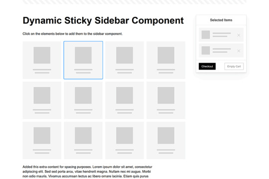
Dynamic Sticky Sidebar Component
Created by Ryan Mulligan
Features like shopping carts are a perfect fit for sticky sidebars. The UI makes it easier for shoppers to keep track of their cart and, most importantly, finish their purchase. This sidebar widget keeps track of cart contents and sticks to the screen while you scroll in the page content area.
See the Pen Dynamic Sticky Sidebar Component by Ryan Mulligan
Stick With What Works in Your Designs
We may think of sticky elements as being used for site headers and navigation. However, the examples above show that they can do much more. There are so many creative possibilities for informing and entertaining users.
What’s more, CSS can do a lot of the heavy lifting for you. Several snippets in this collection don’t require a single line of JavaScript. Still, it’s nice to know you can add some DOM manipulation when needed.
We hope this collection sparked your imagination! Check out our CodePen collection for even more sticky snippets.
Related Topics
Written by Eric Karkovack
Eric Karkovack is a web designer and WordPress expert with over two decades of experience. You can visit his business site here. He recently started a writing service for WordPress products: WP Product Writeup. He also has an opinion on just about every subject. You can follow his rants on Bluesky @karks.com.
Read more articles by Eric Karkovack
#2024#ADD#alien#amp#animation#Articles#attention#Building#Business#buttons#Capture#change#chromium#code#container#content#CSS#CSS Layout Snippets#CSS Snippets#Design#desktop#devices#easy#effects#Featured#Features#Filters#Full#glass#hamburger
0 notes
Video
youtube
Mastering Animated CSS Text Effects with Animate.css in Minutes!
YOUTUBE DESCRIPTION
Looking to master Animated CSS Text Effects with Animate.css in minutes? This video is your ultimate guide to making your website stand out with stunning animations! Whether you're a beginner or an experienced developer, I'll walk you through the best Animate.css effects, customization tips, and real-world applications to make your website visually engaging.
🚀 What You’ll Learn: ✅ How to easily integrate Animate.css into your website ✅ The top CSS text effects that grab user attention ✅ Real-world examples and best practices ✅ Advanced customization to enhance user experience
No prior coding experience? No worries! This tutorial is beginner-friendly and gets straight to the point. By the end of this video, you’ll be creating smooth and eye-catching text animations like a pro!
💡 Want more CSS tricks? Subscribe for weekly tutorials and hit the bell icon to stay updated!
📌 10 SEO-Optimized Hashtags
#CSSAnimations #WebDesign #AnimateCSS #TextEffects #WebDevelopment #FrontendDevelopment #HTMLCSS #CSSTricks #AnimatedText #WebDesignTips
🔑 35 SEO Tags
animated css text effects, animate.css tutorial, how to use animate.css, css animations, web design animations, text animation css, best css animations, easy css text effects, css animation library, animate.css examples, css motion graphics, how to animate text with css, cool css text effects, web design tricks, modern web design, html css animations, css animation tutorial, css hover effects, front-end development, animate.css cdn, smooth text animations, css transition effects, animate.css for beginners, how to create text animations, css3 animations, css keyframes, website animation effects, css typography, best css libraries, how to use css animations, text effects with css, best css animation library, animate.css vs gsap, simple text animations
0 notes
Text
Lightboxes
YAYINDA! https://mguzel.com.tr/lightboxes/
Lightboxes
Lightboxes Shortcodes
The lightboxes are driven by Visual Composer Single Image shortcodes.
Single Image
Simple popups with different styles.
DEFAULT
DEFAULT WITH BORDER
WITH ICON
HOVER EFFECT
Simple Image Gallery
Image gallery in the same row.
Zoom Image Gallery
Image gallery in the same row.
Zoom Image Gallery + Carousel
Dialog with CSS animation
Animations are added with simple CSS transitions, you can make them look however you wish.
Open with fade-zoom animation
Dialog example
This is dummy copy. It is not meant to be read. It has been placed here solely to demonstrate the look and feel of finished, typeset text. Only for show. He who searches for meaning here will be sorely disappointed.
Open with fade-slide animation
Dialog example
This is dummy copy. It is not meant to be read. It has been placed here solely to demonstrate the look and feel of finished, typeset text. Only for show. He who searches for meaning here will be sorely disappointed.
Popup with video or map
In this example lightboxes are automatically disabled on small screen size and default behavior of link is triggered.
Open YouTube Video
Open Vimeo Video
Open Google Map
Open YouTube Video
Open Vimeo Video
Open Google Map
Ajax
You have full control of what is displayed in popup, align it to any side via CSS, enable or disable scroll on right side of window.
Load Ajax Content
Form
Entered data is not lost if you open and close the popup or if you go to another page and then press back browser button.
Open Form
Hata: İletişim formu bulunamadı.
0 notes